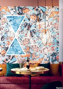
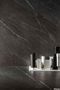
Buildtech/2.0 Midnight

florim > Synthetic Floor
Buildtech/2.0 assures the realization of ever-current projects To the four colors, White, Bone, Mud and Coal in Tinta Unita, Granigliata and Cemento, 10 solid bold colors are being added, only intensifying the "brutality".<br />
Crayons MIST
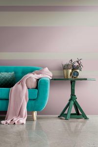
florim > Synthetic Floor
<p>Color and design through Contemporary Design's characteristic fresh and functional approach.</p> Eight pastel shades, designed to create both lively and balanced compositions, harmonize with each other and with the context. It moves from the dusty 1950s-inspired hues of dove-gray, hazelnut, pink, faded yellow and sky blue to the more decisive shades of dusty gray and moss green, all perfect for creating spaces with both retro style and contemporary character.
Neutra 6.0 11 melanzana

florim > Synthetic Floor
After a decade of success, the Neutra collection becomes a container of colors and increasingly advanced materials and transforms into Neutra 6.0. The surfaces thereby create scenery for pure sensory pleasure, where nothing is left to chance, but everything is always skillfully calibrated to the search for a new bon ton where the body and mind can be rejuvenated. The perfect integration between man and the space in which he lives is expressed through a simple architecture where you can spread your artistic sign on the surfaces, in the colors and in the furnishing for an unrepeatable result from which your own creative identity emerges.
Rawtech Raw-White
florim > Synthetic Floor
Where imperfection becomes a distinguishing sign and an essential prerequisite Rawtech is the worn cement effect fine porcelain stoneware where imperfection becomes the distinguishing character of a product with markedly industrial traits. The range of modern colors develops over modular sizes and surfaces that are resistant to the stress of the most complex building applications, meeting the needs of the most sophisticated dwellings with modern style and taste.
Studios Sand
florim > Synthetic Floor
<p>Studios, with its sophisticated but discrete personality, defines the evolutionary path of modern cement-inspired surfaces for interior architecture.</p> <p>The structure of the surfaces, delicately textured, suggests the effect of the manual skill and plasticity of the hand crafted finish. Essential but intense, it is highlighted by meeting natural or artificial light. </p>
Airtech London_Black
florim > Wall tile-stone-brick
Airtech/ is a collection designed to create spaces that interact with each other in a uniform and discreet manner. <p>The collection offers six stones available in shades of gray, the quintessential metropolitan color. The 60x120 cm size with a high-gloss finish gives a bright and appealing nuance to this very austere project. There are two available thicknesses, 9 mm and 20 mm.</p>
Airtech Berlin_Red
florim > Wall tile-stone-brick
Airtech/ is a collection designed to create spaces that interact with each other in a uniform and discreet manner. <p>The collection offers six stones available in shades of gray, the quintessential metropolitan color. The 60x120 cm size with a high-gloss finish gives a bright and appealing nuance to this very austere project. There are two available thicknesses, 9 mm and 20 mm.</p>
Airtech Basel_Grey
florim > Wall tile-stone-brick
Airtech/ is a collection designed to create spaces that interact with each other in a uniform and discreet manner. <p>The collection offers six stones available in shades of gray, the quintessential metropolitan color. The 60x120 cm size with a high-gloss finish gives a bright and appealing nuance to this very austere project. There are two available thicknesses, 9 mm and 20 mm.</p>
Airtech New York_Light Grey
florim > Wall tile-stone-brick
Airtech/ is a collection designed to create spaces that interact with each other in a uniform and discreet manner. <p>The collection offers six stones available in shades of gray, the quintessential metropolitan color. The 60x120 cm size with a high-gloss finish gives a bright and appealing nuance to this very austere project. There are two available thicknesses, 9 mm and 20 mm.</p>
Airtech Stockholm_Greige
florim > Wall tile-stone-brick
Airtech/ is a collection designed to create spaces that interact with each other in a uniform and discreet manner. <p>The collection offers six stones available in shades of gray, the quintessential metropolitan color. The 60x120 cm size with a high-gloss finish gives a bright and appealing nuance to this very austere project. There are two available thicknesses, 9 mm and 20 mm.</p>
Airtech MIAMI WHITE
florim > Wall tile-stone-brick
Airtech/ is a collection designed to create spaces that interact with each other in a uniform and discreet manner. <p>The collection offers six stones available in shades of gray, the quintessential metropolitan color. The 60x120 cm size with a high-gloss finish gives a bright and appealing nuance to this very austere project. There are two available thicknesses, 9 mm and 20 mm.</p>
Antique Marble Pantheon Marble_06

florim > Wall tile-stone-brick
Six essences inspired by the beauty of marble become stylistic shades to create modern and functional environments The collection is available in various finishes and sizes suitable for private spaces and the light commercial world with shades that go from white to beige, from grey to desaturated black.
Antique Marble Ghost Marble_01
florim > Wall tile-stone-brick
Six essences inspired by the beauty of marble become stylistic shades to create modern and functional environments The collection is available in various finishes and sizes suitable for private spaces and the light commercial world with shades that go from white to beige, from grey to desaturated black.
Antique Marble Pure Marble_02
florim > Wall tile-stone-brick
Six essences inspired by the beauty of marble become stylistic shades to create modern and functional environments The collection is available in various finishes and sizes suitable for private spaces and the light commercial world with shades that go from white to beige, from grey to desaturated black.
Antique Marble Imperial Marble_04
florim > Wall tile-stone-brick
Six essences inspired by the beauty of marble become stylistic shades to create modern and functional environments The collection is available in various finishes and sizes suitable for private spaces and the light commercial world with shades that go from white to beige, from grey to desaturated black.
Araldica Cemento
florim > Wallcovering
The miscellany of bright, contrasting, pure colours. The manifest extroversion of decor. The solutions provided to complete the range are in a different tone: reflecting the desire to "stage" a clear contrast with the multicolour ceramic wall coverings, these slabs are in completely neutral shades, in the grey frequencies of concrete.<br /><br />«The collection is intended to create a struggle, a fight. Between something very stiff, which sees itself as governed by clear rules, and a variable, marbled paper, which aims to be completely free.»<br />Federico Pepe "Once upon a time, there was a Roman emperor who lived on a huge splinter in space, a spaceship of multi-coloured marble, where techno music played incessantly. That day he left his spaceship to go to dinner at the Sun King's home, riding his sinuous golden dragon with blood-red eyes."If there were a book with these opening words, Federico Pepe would have designed its cover. And if the book were made into a film, he would definitely be its writer and director. Federico is not an author, director or screenwriter, but this does not prevent him from drawing on his natural ability to create stories through flashes of imagination.Federico Pepe's career started in advertising, a family tradition, which he gradually transformed and built into many other things, in a constant, inevitable investigation of creativity in all its possible forms. He very soon understood that commission work was not enough for him, and he began to explore further afield. The first of these other fields was art, but the consolidated mechanisms on which galleries and gallery owners operate soon became a new limit from which he had to break free: this apparently expanding horizon turned out to be a restrictive cage, more a defining label than an infinite learning opportunity. And definitions are one of the things which least describe Federico: anyone trying to distil his work into two words would find its essence disappearing before their own eyes. He has occupied many roles and engaged in many professions to give shape to his ideas, and in all of them he has excelled, created and led teams, and won awards. Adman, creative director, graphic designer, printer, gallery owner, publisher, curator, performer, painter, designer, director: Pepe does, rather than is, all these.<br /> He works, builds and makes things happen because he is not led by instinct alone and does not succumb to idle whim; he does not rush aimlessly around and does not simply await the inspiration or idea of the century. Quite the opposite. His work comes about and produces results only thanks to strict self-discipline, a design method made up of constant verification, the precise sharing of tasks and roles, the compulsive exploration of unknown contexts, daily physical exercise, the carefully measured use of social media, and occasional spells of isolation in the mountains he loves. It is no coincidence that he created Le Dictateur, a dual-faced entity which may be both his child and his spiritual guide, both friend and boss, part madness and part dictator. Le Dictateur is not Federico's alter ego: it is his superpower. It is not a mask, since in it he actually transforms himself into an artistic project.Le Dictateur is both result and origin of Federico Pepe's work. "I think ideas are born from predisposition," Federico explained to me in 2014. "Not in the sense that "˜we are born predisposed,' but for daily preparation. In this domain I believe that discipline is pivotal. The real talents today are very rigorous people, those who work hard, exchange a lot, think a lot, and know how to apply and balance many different things." An approach which has made him the best-kept secret on the Italian creative scene, a fact well known not only to Pierpaolo Ferrari, Maurizio Cattelan, Nico Vascellari, Jacopo Benassi and Patricia Urquiola, but also to the companies, both large and small, which have turned to him over the years. He has worked and continues to work with them all, designing by laying the foundations of designs naturally expressed in episodes, in a serial pattern which not only gradually builds up Federico's own creative story, but also offers his clients designs so special that they would be virtually impossible without him.<br /> This self-discipline generates heat and energy in such quantities that "“ if it were not imprisoned within the geometrical grids of graphic design "“ it might generate a thermonuclear reaction. The blood running through the veins of his images is black as ink, red as sealing-wax, white as plaster and golden as lava. But there is more, too. His crystal-clear visions are able to break down the slender membrane which separates analogue from digital. He sees matter as absolutely central, but he makes it vibrate with an unusual two-dimensional quality. This can be seen in the way he carves marble with coloured squiggles, recollections of faces briefly sketched as vectors. It is discovered in the skill with which he invades plates and bowls of the finest, monitor-shiny porcelain with geometrical patterns. It becomes tangible in the love with which he brings to life the paper of his publishing projects, peopled with highly elegant, powerfully symmetrical, often kaleidoscopic graphics. It can be admired in the precision with which a metallic factory flooring becomes fabric on an ancient loom, after its resolution is decreased from 300 dpi to 8 bits. It is enjoyed in the hyperbolic repetition of faces and hands in acrylic on canvas in his painting studio, in which every work conserves copy and paste reminders of its predecessor. It amazes in the doors of exquisite metal sideboards, profane glass panels, hand-made but born through the glass of a screen.<br /> A career which has led almost naturally to an encounter with CEDIT, with whom he has created an aesthetically courageous collection, part punk and part aristocratic austerity. The Araldica project's very name evokes strength and nobility, and it is grounded in a past whose weight does not drag it backwards but rather catapults it forwards into the future. Here, Federico's digital geometries become the most solid of materials, taking shape in a graphic object, condensing stories and images into three or two dimensions. In Pepe's and CEDIT's space, Euclidean geometrical forms encounter the marble of Phidias, the intricate patterns of the floor of Milan Cathedral merge into the Baroque images of the marbles found in Roman art galleries, and private space opens out to the infinite space of a thousand possible universal histories.
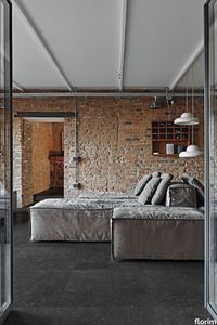
Ardoise NOIR
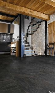
florim > Floor tile-stone
A timeless material whose authenticity, sensual and elegant, is implemented in modern environments, where precious and recovered elements coexist in perfect harmony. <p>A precise chromatic choice selected 6 neutral and modern shades that cater to the vivid texture, the absolute protagonist of the collection. The delicacy of the colors chosen give the space a strong sense of light that contrasts with the hardness of the stone. The experience of Florim manages to join three dimensional texture and graphic movements in a play of optical effects to make a timeless material modern, giving it new life.</p>
Ardoise Ecrù
florim > Floor tile-stone
A timeless material whose authenticity, sensual and elegant, is implemented in modern environments, where precious and recovered elements coexist in perfect harmony. <p>A precise chromatic choice selected 6 neutral and modern shades that cater to the vivid texture, the absolute protagonist of the collection. The delicacy of the colors chosen give the space a strong sense of light that contrasts with the hardness of the stone. The experience of Florim manages to join three dimensional texture and graphic movements in a play of optical effects to make a timeless material modern, giving it new life.</p>
Ardoise Blanc
florim > Floor tile-stone
A timeless material whose authenticity, sensual and elegant, is implemented in modern environments, where precious and recovered elements coexist in perfect harmony. <p>A precise chromatic choice selected 6 neutral and modern shades that cater to the vivid texture, the absolute protagonist of the collection. The delicacy of the colors chosen give the space a strong sense of light that contrasts with the hardness of the stone. The experience of Florim manages to join three dimensional texture and graphic movements in a play of optical effects to make a timeless material modern, giving it new life.</p>
Ardoise Plomb
florim > Wall tile-stone-brick
A timeless material whose authenticity, sensual and elegant, is implemented in modern environments, where precious and recovered elements coexist in perfect harmony. <p>A precise chromatic choice selected 6 neutral and modern shades that cater to the vivid texture, the absolute protagonist of the collection. The delicacy of the colors chosen give the space a strong sense of light that contrasts with the hardness of the stone. The experience of Florim manages to join three dimensional texture and graphic movements in a play of optical effects to make a timeless material modern, giving it new life.</p>
Ardoise Gris
florim > Floor tile-stone
A timeless material whose authenticity, sensual and elegant, is implemented in modern environments, where precious and recovered elements coexist in perfect harmony. <p>A precise chromatic choice selected 6 neutral and modern shades that cater to the vivid texture, the absolute protagonist of the collection. The delicacy of the colors chosen give the space a strong sense of light that contrasts with the hardness of the stone. The experience of Florim manages to join three dimensional texture and graphic movements in a play of optical effects to make a timeless material modern, giving it new life.</p>
Ardoise Ivoire
florim > Wall tile-stone-brick
A timeless material whose authenticity, sensual and elegant, is implemented in modern environments, where precious and recovered elements coexist in perfect harmony. <p>A precise chromatic choice selected 6 neutral and modern shades that cater to the vivid texture, the absolute protagonist of the collection. The delicacy of the colors chosen give the space a strong sense of light that contrasts with the hardness of the stone. The experience of Florim manages to join three dimensional texture and graphic movements in a play of optical effects to make a timeless material modern, giving it new life.</p>
Artifact Worked_Charcoal
florim > Wallcovering
Artifact of Cerim refers to the simplicity of spatulated cement crafted by skilled hands, whose uniqueness becomes a distinctive feature, an identifying factor that reveals the taste of those who select it for their daily lives. <p> The collection is available in a thickness of 9 mm and offers two sizes (60x120 cm and 80x80 cm) with the relative modular sub-sizes (the 30x60 cm is also available in the <em>grip</em> outdoor finish). The graphic shade variations of the cement are declined in 6 different neutral shades ranging from white to coal through gray and beige.</p>
Artifact Vintage_Taupe
florim > Wallcovering
Artifact of Cerim refers to the simplicity of spatulated cement crafted by skilled hands, whose uniqueness becomes a distinctive feature, an identifying factor that reveals the taste of those who select it for their daily lives. <p> The collection is available in a thickness of 9 mm and offers two sizes (60x120 cm and 80x80 cm) with the relative modular sub-sizes (the 30x60 cm is also available in the <em>grip</em> outdoor finish). The graphic shade variations of the cement are declined in 6 different neutral shades ranging from white to coal through gray and beige.</p>
Artifact Used_Grey
florim > Wallcovering
Artifact of Cerim refers to the simplicity of spatulated cement crafted by skilled hands, whose uniqueness becomes a distinctive feature, an identifying factor that reveals the taste of those who select it for their daily lives. <p> The collection is available in a thickness of 9 mm and offers two sizes (60x120 cm and 80x80 cm) with the relative modular sub-sizes (the 30x60 cm is also available in the <em>grip</em> outdoor finish). The graphic shade variations of the cement are declined in 6 different neutral shades ranging from white to coal through gray and beige.</p>
Artifact Worn_Sand
florim > Synthetic Floor
Artifact of Cerim refers to the simplicity of spatulated cement crafted by skilled hands, whose uniqueness becomes a distinctive feature, an identifying factor that reveals the taste of those who select it for their daily lives. <p> The collection is available in a thickness of 9 mm and offers two sizes (60x120 cm and 80x80 cm) with the relative modular sub-sizes (the 30x60 cm is also available in the <em>grip</em> outdoor finish). The graphic shade variations of the cement are declined in 6 different neutral shades ranging from white to coal through gray and beige.</p>
Artifact Aged_White
florim > Wallcovering
Artifact of Cerim refers to the simplicity of spatulated cement crafted by skilled hands, whose uniqueness becomes a distinctive feature, an identifying factor that reveals the taste of those who select it for their daily lives. <p> The collection is available in a thickness of 9 mm and offers two sizes (60x120 cm and 80x80 cm) with the relative modular sub-sizes (the 30x60 cm is also available in the <em>grip</em> outdoor finish). The graphic shade variations of the cement are declined in 6 different neutral shades ranging from white to coal through gray and beige.</p>
Atmosphères Mystère
florim > Wall tile-stone-brick
A collection of profound and mesmerising energy which conveys all the informal elegance of luxurious contemporary spaces Lightness and solidity, combined with a sophisticated colour scheme, evoke the sense of craftsmanship associated with this wonderful stone whose stratified fossils, trapped in the slender sediments formed over the centuries, embody its time-honoured yet contemporary beauty. Tradition and innovation therefore come together in a unique project, creating an attractive surface that respects the culture of places and the history of time.
Atmosphères Désir
florim > Wall tile-stone-brick
A collection of profound and mesmerising energy which conveys all the informal elegance of luxurious contemporary spaces Lightness and solidity, combined with a sophisticated colour scheme, evoke the sense of craftsmanship associated with this wonderful stone whose stratified fossils, trapped in the slender sediments formed over the centuries, embody its time-honoured yet contemporary beauty. Tradition and innovation therefore come together in a unique project, creating an attractive surface that respects the culture of places and the history of time.
Atmosphères Aurore
florim > Wall tile-stone-brick
A collection of profound and mesmerising energy which conveys all the informal elegance of luxurious contemporary spaces Lightness and solidity, combined with a sophisticated colour scheme, evoke the sense of craftsmanship associated with this wonderful stone whose stratified fossils, trapped in the slender sediments formed over the centuries, embody its time-honoured yet contemporary beauty. Tradition and innovation therefore come together in a unique project, creating an attractive surface that respects the culture of places and the history of time.
Atmosphères Lumière
florim > Wall tile-stone-brick
A collection of profound and mesmerising energy which conveys all the informal elegance of luxurious contemporary spaces Lightness and solidity, combined with a sophisticated colour scheme, evoke the sense of craftsmanship associated with this wonderful stone whose stratified fossils, trapped in the slender sediments formed over the centuries, embody its time-honoured yet contemporary beauty. Tradition and innovation therefore come together in a unique project, creating an attractive surface that respects the culture of places and the history of time.
Atmosphères Charme
florim > Wall tile-stone-brick
A collection of profound and mesmerising energy which conveys all the informal elegance of luxurious contemporary spaces Lightness and solidity, combined with a sophisticated colour scheme, evoke the sense of craftsmanship associated with this wonderful stone whose stratified fossils, trapped in the slender sediments formed over the centuries, embody its time-honoured yet contemporary beauty. Tradition and innovation therefore come together in a unique project, creating an attractive surface that respects the culture of places and the history of time.
Atmosphères Ombre
florim > Wall tile-stone-brick
A collection of profound and mesmerising energy which conveys all the informal elegance of luxurious contemporary spaces Lightness and solidity, combined with a sophisticated colour scheme, evoke the sense of craftsmanship associated with this wonderful stone whose stratified fossils, trapped in the slender sediments formed over the centuries, embody its time-honoured yet contemporary beauty. Tradition and innovation therefore come together in a unique project, creating an attractive surface that respects the culture of places and the history of time.
Atmosphères Harmonie
florim > Wall tile-stone-brick
A collection of profound and mesmerising energy which conveys all the informal elegance of luxurious contemporary spaces Lightness and solidity, combined with a sophisticated colour scheme, evoke the sense of craftsmanship associated with this wonderful stone whose stratified fossils, trapped in the slender sediments formed over the centuries, embody its time-honoured yet contemporary beauty. Tradition and innovation therefore come together in a unique project, creating an attractive surface that respects the culture of places and the history of time.
Biotech Soap Stone
florim > Wall tile-stone-brick
<p>The Biotech collection by Florim embraces the principles of sustainable architecture. </p> <p>The collection is born from a sustainable and virtuous approach and is part of <a href="https://www.florim.com/en/company/sustainability/carbonzero-florim/">CarbonZero</a>, Florim's range of Carbon Neutral surfaces.</p> <p><br>Florim provides the scope to contribute to sustainable architecture projects with <strong>green design methods</strong>, proposing materials that are made with a particular focus on the energy efficiency of processes, removing pollutants, and selecting suppliers and stakeholders that can comply with the established quality parameters.</p> <p>Sustainable architecture could be described as <strong>contemporary organic architecture</strong>.<br>It means designing and constructing green, eco-friendly buildings, with the aim of protecting the environment and human well-being by taking an ethical stance towards ecosystems.<br>A systematic approach, the broadest possible interdisciplinarity and parsimonious use of resources all play a key part in the design process.<br>Sustainable architecture seeks to establish a balanced relationship between the natural environment and the built environment, satisfying the needs of the people of today without compromising future generations through indiscriminate use of resources.</p>
Biotech Crema Stone
florim > Wall tile-stone-brick
<p>The Biotech collection by Florim embraces the principles of sustainable architecture. </p> <p>The collection is born from a sustainable and virtuous approach and is part of <a href="https://www.florim.com/en/company/sustainability/carbonzero-florim/">CarbonZero</a>, Florim's range of Carbon Neutral surfaces.</p> <p><br>Florim provides the scope to contribute to sustainable architecture projects with <strong>green design methods</strong>, proposing materials that are made with a particular focus on the energy efficiency of processes, removing pollutants, and selecting suppliers and stakeholders that can comply with the established quality parameters.</p> <p>Sustainable architecture could be described as <strong>contemporary organic architecture</strong>.<br>It means designing and constructing green, eco-friendly buildings, with the aim of protecting the environment and human well-being by taking an ethical stance towards ecosystems.<br>A systematic approach, the broadest possible interdisciplinarity and parsimonious use of resources all play a key part in the design process.<br>Sustainable architecture seeks to establish a balanced relationship between the natural environment and the built environment, satisfying the needs of the people of today without compromising future generations through indiscriminate use of resources.</p>
Biotech Lapis Greige
florim > Wall tile-stone-brick
<p>The Biotech collection by Florim embraces the principles of sustainable architecture. </p> <p>The collection is born from a sustainable and virtuous approach and is part of <a href="https://www.florim.com/en/company/sustainability/carbonzero-florim/">CarbonZero</a>, Florim's range of Carbon Neutral surfaces.</p> <p><br>Florim provides the scope to contribute to sustainable architecture projects with <strong>green design methods</strong>, proposing materials that are made with a particular focus on the energy efficiency of processes, removing pollutants, and selecting suppliers and stakeholders that can comply with the established quality parameters.</p> <p>Sustainable architecture could be described as <strong>contemporary organic architecture</strong>.<br>It means designing and constructing green, eco-friendly buildings, with the aim of protecting the environment and human well-being by taking an ethical stance towards ecosystems.<br>A systematic approach, the broadest possible interdisciplinarity and parsimonious use of resources all play a key part in the design process.<br>Sustainable architecture seeks to establish a balanced relationship between the natural environment and the built environment, satisfying the needs of the people of today without compromising future generations through indiscriminate use of resources.</p>
Biotech Serizzo Stone
florim > Wall tile-stone-brick
<p>The Biotech collection by Florim embraces the principles of sustainable architecture. </p> <p>The collection is born from a sustainable and virtuous approach and is part of <a href="https://www.florim.com/en/company/sustainability/carbonzero-florim/">CarbonZero</a>, Florim's range of Carbon Neutral surfaces.</p> <p><br>Florim provides the scope to contribute to sustainable architecture projects with <strong>green design methods</strong>, proposing materials that are made with a particular focus on the energy efficiency of processes, removing pollutants, and selecting suppliers and stakeholders that can comply with the established quality parameters.</p> <p>Sustainable architecture could be described as <strong>contemporary organic architecture</strong>.<br>It means designing and constructing green, eco-friendly buildings, with the aim of protecting the environment and human well-being by taking an ethical stance towards ecosystems.<br>A systematic approach, the broadest possible interdisciplinarity and parsimonious use of resources all play a key part in the design process.<br>Sustainable architecture seeks to establish a balanced relationship between the natural environment and the built environment, satisfying the needs of the people of today without compromising future generations through indiscriminate use of resources.</p>
Biotech Stonewood
florim > Wall tile-stone-brick
<p>The Biotech collection by Florim embraces the principles of sustainable architecture. </p> <p>The collection is born from a sustainable and virtuous approach and is part of <a href="https://www.florim.com/en/company/sustainability/carbonzero-florim/">CarbonZero</a>, Florim's range of Carbon Neutral surfaces.</p> <p><br>Florim provides the scope to contribute to sustainable architecture projects with <strong>green design methods</strong>, proposing materials that are made with a particular focus on the energy efficiency of processes, removing pollutants, and selecting suppliers and stakeholders that can comply with the established quality parameters.</p> <p>Sustainable architecture could be described as <strong>contemporary organic architecture</strong>.<br>It means designing and constructing green, eco-friendly buildings, with the aim of protecting the environment and human well-being by taking an ethical stance towards ecosystems.<br>A systematic approach, the broadest possible interdisciplinarity and parsimonious use of resources all play a key part in the design process.<br>Sustainable architecture seeks to establish a balanced relationship between the natural environment and the built environment, satisfying the needs of the people of today without compromising future generations through indiscriminate use of resources.</p>
Buildtech/2.0 Build Coal GG
florim > Wallcovering
Buildtech/2.0 assures the realization of ever-current projects To the four colors, White, Bone, Mud and Coal in Tinta Unita, Granigliata and Cemento, 10 solid bold colors are being added, only intensifying the "brutality".<br />
Buildtech/2.0 Build Coal TU
florim > Wallcovering
Buildtech/2.0 assures the realization of ever-current projects To the four colors, White, Bone, Mud and Coal in Tinta Unita, Granigliata and Cemento, 10 solid bold colors are being added, only intensifying the "brutality".<br />
Buildtech/2.0 Build Coal CE
florim > Wallcovering
Buildtech/2.0 assures the realization of ever-current projects To the four colors, White, Bone, Mud and Coal in Tinta Unita, Granigliata and Cemento, 10 solid bold colors are being added, only intensifying the "brutality".<br />
Buildtech/2.0 Midnight
florim > Synthetic Floor
Buildtech/2.0 assures the realization of ever-current projects To the four colors, White, Bone, Mud and Coal in Tinta Unita, Granigliata and Cemento, 10 solid bold colors are being added, only intensifying the "brutality".<br />
Buildtech/2.0 Sky
florim > Synthetic Floor
Buildtech/2.0 assures the realization of ever-current projects To the four colors, White, Bone, Mud and Coal in Tinta Unita, Granigliata and Cemento, 10 solid bold colors are being added, only intensifying the "brutality".<br />
Buildtech/2.0 Burgundy
florim > Synthetic Floor
Buildtech/2.0 assures the realization of ever-current projects To the four colors, White, Bone, Mud and Coal in Tinta Unita, Granigliata and Cemento, 10 solid bold colors are being added, only intensifying the "brutality".<br />
Buildtech/2.0 Fuchsia
florim > Synthetic Floor
Buildtech/2.0 assures the realization of ever-current projects To the four colors, White, Bone, Mud and Coal in Tinta Unita, Granigliata and Cemento, 10 solid bold colors are being added, only intensifying the "brutality".<br />
Buildtech/2.0 Crimson
florim > Synthetic Floor
Buildtech/2.0 assures the realization of ever-current projects To the four colors, White, Bone, Mud and Coal in Tinta Unita, Granigliata and Cemento, 10 solid bold colors are being added, only intensifying the "brutality".<br />
Buildtech/2.0 Teal
florim > Synthetic Floor
Buildtech/2.0 assures the realization of ever-current projects To the four colors, White, Bone, Mud and Coal in Tinta Unita, Granigliata and Cemento, 10 solid bold colors are being added, only intensifying the "brutality".<br />
Buildtech/2.0 Bottle
florim > Synthetic Floor
Buildtech/2.0 assures the realization of ever-current projects To the four colors, White, Bone, Mud and Coal in Tinta Unita, Granigliata and Cemento, 10 solid bold colors are being added, only intensifying the "brutality".<br />
Buildtech/2.0 Scarlet
florim > Synthetic Floor
Buildtech/2.0 assures the realization of ever-current projects To the four colors, White, Bone, Mud and Coal in Tinta Unita, Granigliata and Cemento, 10 solid bold colors are being added, only intensifying the "brutality".<br />
Buildtech/2.0 Mustard
florim > Synthetic Floor
Buildtech/2.0 assures the realization of ever-current projects To the four colors, White, Bone, Mud and Coal in Tinta Unita, Granigliata and Cemento, 10 solid bold colors are being added, only intensifying the "brutality".<br />
Buildtech/2.0 Cream
florim > Synthetic Floor
Buildtech/2.0 assures the realization of ever-current projects To the four colors, White, Bone, Mud and Coal in Tinta Unita, Granigliata and Cemento, 10 solid bold colors are being added, only intensifying the "brutality".<br />
Buildtech/2.0 Build Mud CE
florim > Wallcovering
Buildtech/2.0 assures the realization of ever-current projects To the four colors, White, Bone, Mud and Coal in Tinta Unita, Granigliata and Cemento, 10 solid bold colors are being added, only intensifying the "brutality".<br />
Buildtech/2.0 Build Mud GG
florim > Wallcovering
Buildtech/2.0 assures the realization of ever-current projects To the four colors, White, Bone, Mud and Coal in Tinta Unita, Granigliata and Cemento, 10 solid bold colors are being added, only intensifying the "brutality".<br />
Buildtech/2.0 Build Mud TU
florim > Wallcovering
Buildtech/2.0 assures the realization of ever-current projects To the four colors, White, Bone, Mud and Coal in Tinta Unita, Granigliata and Cemento, 10 solid bold colors are being added, only intensifying the "brutality".<br />