Console Table Aldo Bakker, 2017
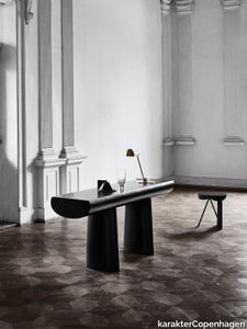
karakterCopenhagen > Console
Tranquil and seductive, Aldo Bakker’s Console Table floats exquisitely between sculpture and furniture. It depicts the simplest concept of a table: two columns and a surface. The legs are an elongation of the line created by the tabletop. The tabletop and the base of the legs have the same width, making them equally important to the design. The distance between the legs is not fixed, but can be changed as preferred, adding to the sculptural quality of this piece.
TriAngle Aldo Bakker, 1996

karakterCopenhagen > Stool
The Dutch designer, Aldo Bakker, is known for his uncompromising approach to design. This is a perfect example of his work. TriAngle consists of 12 triangular elements—cut to fit together like the perfect puzzle. The final puzzle reveals a square stool or side table with a distinguished and very precise look. The sharp corners and visible cuts will become softer and gain patina over time, making tear, wear and decay a very essential part of this design. Aldo Bakkers’ work has a delicate and rare sense of harmony and his ideas are always intended to trigger a response. He wants to challenge us with his design, to make us stop our everyday routines for a minute and ponder over an odd little feature, hopefully making us perform our everyday casual acts with more attention.
Riscio Joe Colombo, 1968
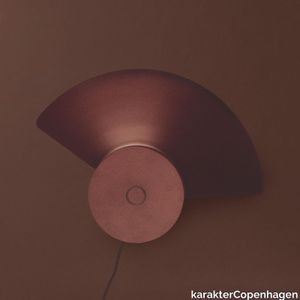
karakterCopenhagen > Table lamp
Prolific Italian architect and designer Joe Colombo, born Cesare Colombo, believed in democratic and functional design, meant to be used in many different ways - all for the benefit of the user. Ahead of his time, Colombo relied on emerging material and the latest technologies to design futuristic “machines for living”, many of which have become icons for a new way of living.
Steel Lab Light Table Anatomy Design, 2010

karakterCopenhagen > Table lamp
Inspired by her parents’ pharmaceutical work and their old lab equipment, Andrea Kleinloog from Anatomy Design designed the Lab Light mixing steel, brass and porcelain. This brought on a desire to make a lamp with a younger feel. Base, lampshade, and rotating arm—all in painted aluminium.
Awkward Light Wall Anatomy Design, 2012
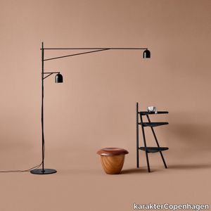
karakterCopenhagen > Wall lamp
Quirky and slightly off, Awkward is a floor lamp with a deliberately peculiar anatomy - its long, slender arms reaching to illuminate two areas in close proximity two sides of a sofa or both an armchair and a desk. Awkward Wall consists of three different parts: an oblong wall mount and a choice of two arms, short or long. You can combine the wall mount with a short arm and a long one or two of the same as you see fit.
Mangiarotti Marbles Angelo Mangiarotti, 1968
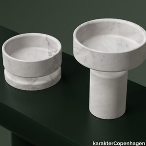
karakterCopenhagen > Styling
Designed in 1968 by Italian architect, sculptor, and designer Angelo Mangiarotti, the Marble collection reimagines bowls and vases as elevated works of art. Taking inspiration from the sensual materiality of stone, the collection balances out its heaviness with rounded, generous curves and sculptural silhouettes. Whether standing alone or grouped together, the pieces can transform any dining table setting or window display into something memorable.
Shuttle Rug Karin Carlander, 2023
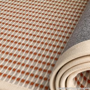
karakterCopenhagen > Carpet
Weaver and textile artist Karin Carlander interprets classic techniques as the backbone of her creative process. Two new designs – a rectangular rug woven from paper yarn and a fringed throw in alpaca wool – showcase this craftsmanship in contemporary pieces for private and public use. For the Shuttle rug, Carlander decided upon paper yarn because of its crisp and delicate expression. Although challenging to work with, the inflexible plant-based material has its own personality and can withstand being dyed in colours. Carlander utilises the paper yarn’s resilience by dying it in hues that bring attention to its unique texture.
Lab Light Floor Anatomy Design, 2010

karakterCopenhagen > Floor lamp
The Lab Light design came about from a genuine fascination with laboratory equipment and with all those fantastic clamps and levers — the perfect place to start designing a multi-functional lamp. The base is porcelain, the stem is painted steel, and the lampshade and rotating arm is brass.
Coffee Table Aldo Bakker, 2015
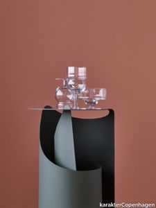
karakterCopenhagen > Coffee table
A single sheet of steel rolled in one smooth motion into a self-supporting construction. Aldo Bakker’s exquisite sense of merging colour, material and form has come into play to create an occasional table with an effortlessly sculptural appeal.
Lari Angelo Mangiarotti, 1978
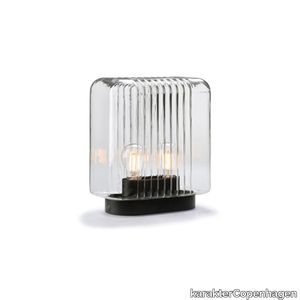
karakterCopenhagen > Table lamp
The Lari Lamp, mouth blown in one single piece, that are held together by the base, which also supports the electrical system evokes, on a small scale, some suggestions of Angelo Mangiarotti’s previous architecture.
Steel Lab Light Floor Anatomy Design, 2010

karakterCopenhagen > Table lamp
Inspired by her parents’ pharmaceutical work and their old lab equipment, Andrea Kleinloog from Anatomy Design designed the Lab Light mixing steel, brass and porcelain. This brought on a desire to make a lamp with a younger feel. Base, lampshade, and rotating arm—all in painted aluminium.
Bon Aldo Bakker, 2017
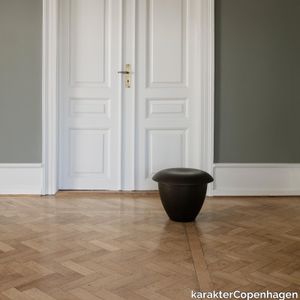
karakterCopenhagen > Stool
A rework of Dutch artist and designer, Aldo Bakker’s wondrous Pink Stool in urushi lacquer from 2015, Bon in stained ash exudes Bakker’s accomplished sense of serene form and materiality. The sculptural stool consists of two contradictive container shapes put together: an upright and deep vertical shape and a flat horizontal shape that defines the seating.
Cache desk organiser Paul McCobb, 1952

karakterCopenhagen > Cabinet
The foundation of the Cache series, part of Paul McCobb’s extensive Planner series, is a beautifully simplistic and easy table with slim and straight steel legs, stripped from any details or ornament, leaving only small drawers that can be mounted individually or grouped on either side of the table for small keepings. If more storage and distinctiveness is needed, add the second piece in the series, the two-drawer organizer that resides on a slender leg construction as the table itself and has the same playful two-finger opening system as the drawers in the desk. The Desk Organiser can be placed on the desk or used as a stand-alone item next to sofas or beds.
Awkward Light Anatomy Design, 2012
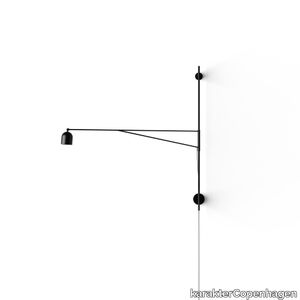
karakterCopenhagen > Floor lamp
Quirky and slightly off, Awkward is a floor lamp with a deliberately peculiar anatomy - its long, slender arms reaching to illuminate two areas in close proximity: two sides of a sofa or both an armchair and a desk.
Sferico Joe Colombo, 1968
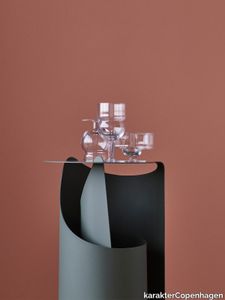
karakterCopenhagen > Styling
Joe Colombo believed in democratic and functional design. In his lifetime he designed a wide range of different drinking glasses. Something that seems very to the point as he was said to love drinking and smoking. Unfortunately this undoubtedly contributed to his young demise, but we’d like to think he would be pleased to see that his creations live on. In 1968 he designed a series of six glasses, all based on geometrical figures. True to his democratic and functional take on design, all the glasses were intended for a wide range of different usage—such as water, long drinks, whisky, wine, beer, juice, champagne, ice cream and so on. Karakter is proud to bring some of the very finest glasses to your table and will introduce the six different Joe Colombo glasses.
Castore dining table Angelo Mangiarotti, 1975
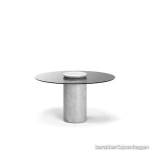
karakterCopenhagen > Table
Castore is a glass and marble table by Italian architect, sculptor and designer Angelo Mangiarotti. Designed in 1975 for Sorgente dei Mobili, the distinct design is now presented by Karakter, available as a 130cm dining table. The round glass top rests on a heavy marble pillar, and visually, Mangiarotti would have it seem that only a small marble bowl on top of the glass plate is holding it in place. The rounded corners on both the pillar and the bowl ads a sense of softness to the otherwise heavy aesthetics of the marble. The marble bowl can be removed and used as an individual element. However, keeping it as an integral part of the design, you can enjoy additional rounded corners, as the bowl reflects in the glass table top.
GB Lounge chair Gijs Bakker, 1972
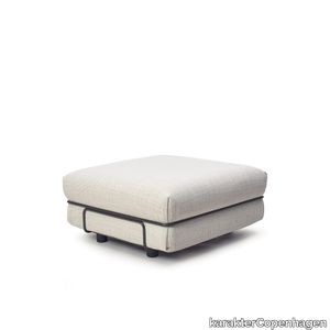
karakterCopenhagen > Chair
Dutch industrial designer Gijs Bakker had already established a reputation for his aluminum jewelry when he decided to turn his attention to designing a chair. Inspired by a competition held by Dunlop, the rubber foam manufacturer, Bakker took a piece of foam, bent it at a 90 degree angle, and fixed it in a metal frame. The result was the GB Lounge, a modular lounge chair whose simple silhouette is enhanced by invitingly overstuffed upholstery. Originally coined “the Levi’s Chair,” Bakker was determined that his design – much like a pair of well-loved jeans – would act as an easygoing antidote to the previous generation’s stiffer tastes. Today, its functionality has been enhanced further with the addition of feet that raise it slightly from the floor for added comfort. Available as a one-seater chair, or with the addition of a pouf, the GB Lounge can be arranged in a variety of ways by connectors that transform it from a solo chair into a multiple seating system.
Pivot Aldo Bakker, 2014

karakterCopenhagen > Styling
Silver with gold on top. A playful and chunky shape with a fine and delicate structure around the lid. All contrasting to the full-blown extravagance of the materials. 100% fine silver, plated with gold. Aldo Bakker, “I question the most common significance of products and thus also their use. In an ideal situation, every object takes on its own character and gains its own legitimacy. My designs are not based on fashion. They are unique pieces, not necessarily understandable at a glance, but meant for a slow, layer by layer exploration.”
Aida Angelo Mangiarotti, 1988
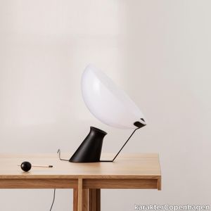
karakterCopenhagen > Table lamp
Esteemed for his researched and controlled approach to materials, Italian architect, sculptor and designer Angelo Mangiarotti created the almost gravity-defying Aida lamp with its visual disconnect between the base and shade and a pleasing ambient light. Referencing principles of his hailed architecture, where slim, elegant pillars support large and heavy ceilings in an almost impossible lift, Mangiarotti conceived Aida’s beautifully poised silhouette.
Pink Stool Aldo Bakker, 2015
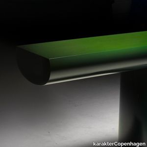
karakterCopenhagen > Stool
The Pink Stool has a calm and self-reliant attitude. It consists of two contradictive container shapes put together: an upright and deep vertical shape and a flat horizontal shape that defines the seating. Everlastingness. Bakker adds ‘everlastingness’ to the product by applying ‘Urushi’. A traditional Japanese lacquer made of tree sap. The varnish is naturally extracted from the Urushi tree. Urushi is applied for 30 or more layers of varnish and each layer must be allowed to dry in a warm, dust-free, humid environment. Lacquer applied too thickly or unevenly, or allowed to dry too quickly or slowly can ruin a piece. Each layer is polished by hand, a process that creates tiny, almost imperceptible variations in shade and colour and gives the surface its sense of depth and life. The natural one-component varnish becomes harder and harder over time. Keeping the core of the product intact for decades. Today there are 9000-year-old objects - still well preserved with Urushi. The technique demands slowness, awareness, time and attention. The Urushi series is Bakker’s peaceful protest against overspending. Conservation versus consumerism.
Glass Carafe Aldo Bakker, 2021
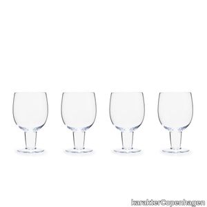
karakterCopenhagen > Styling
Since it was designed in 2000, Glass Carafe has been hiding in Aldo Bakker’s prototype archive. The carafe’s wide bottom that converts into a very slender neck creates a soft and organic shape. The same shape is mirrored in the drinking glass, which doubles as a lid for the carafe itself. Whether the two are placed next to each other or with the glass upside down on top, the shape of the set has a fascinating and eye-catching appeal. Glasses are also sold separately in a set of four.
Cache Dining table Paul McCobb, 1952

karakterCopenhagen > Desk
The foundation of the Cache series, part of Paul McCobb’s extensive Planner series, is a beautifully simplistic and easy table with slim and straight steel legs, stripped from any details or ornament, leaving only small drawers that can be mounted individually or grouped on either side of the table for small keepings. The series is complimented with the matching Desk Organiser with two drawers and a shelf supported by a steel frame. A prominent figure in American mid-century design, Paul McCobb conceived the Planner series in the 1950s, a modular furniture series that brought modern design into middle-class American households. The aesthetic attribute of McCobb’s design is sleek and unadorned and at the same time warm and approachable. With its versatility and purity of form, the Planner series became one of the most successful commercial furniture lines of its era.
Middleweight armchair Michael Anastassiades, 2021

karakterCopenhagen > Chair
The Middleweight sofa captures the best of two worlds, the Italian super lounge sofa on one side and the compact Danish box sofa on the other. Set on a thin, open steel frame, the cushions are firmly held together by zippers and carefully mitered in the corners of the frame, resembling the sharp edges of folded paper. Middleweight is a luxuriously comfortable sofa, available as an arm-chair, 2-seater or 3-seater sofa and pouf. “This was my first sofa design, but actually the biggest surprise didn’t come until the product was finalized – when we stood there, looking at the actual sofa, and it looked exactly like what I had in my head. It is a great satisfaction as a designer. You can’t accelerate the process of design. An idea has to come when the time is right, so you have to stretch the process as long as possible and allow for enough time to get the ideas and experiments across.”
Saffo Angelo Mangiarotti, 1967
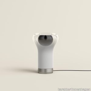
karakterCopenhagen > Table lamp
The spectacular Saffo Lamp was designed in 1966 by Italian architect, sculptor, and designer Angelo Mangiarotti and has since been a coveted vintage object. The remarkable design bares testament to his background as a sculptor and shows his unique approach to combining shapes and materials. Saffo is made of blown glass and spreads a soft light that enhances the many material characteristics of the glass. The white glass in the bottom elegantly hides the light source and as the shape of the mushroom starts to form, the white glass blends into transparent and makes way for the light. The sculptural qualities of the Saffo Lamp make it a spectacular design object whether turned on or off.
Plexi Angelo Mangiarotti, 1962
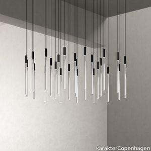
karakterCopenhagen > Ceiling lamp
Italian architect, sculptor, and designer Angelo Mangiarotti designed the Plexi lamp in 1962, but at the time it was only produced in small quantities. Plexi can be used as a single piece or grouped together. The Plexi thrives in grand spaces, preferably grouped together with other Plexi’s as an impressive chandelier, so the size alone makes it a relevant choice for grand halls or high ceilings, and in hotels, restaurants, lobbies, and corporate domiciles. However, even a single Plexi can be transformative as it will cast its elegant style to any room. The Plexiglas conducts the light from one end to the other, not only emanating light throughout each cylinder but also producing a direct light from the lower end. The lower end of each cylinder has been sandblasted to cast a wider light onto the surface beneath the lamp.
Scarpa 925 Afra & Tobia Scarpa, 1966

karakterCopenhagen > Chair
The iconic 925 Scarpa lounge chair is a strikingly elegant lounge chair. Easily recognized by its firm and robust wooden frame and the striking contrast it creates to the lightness of the leather covered seat and backrest. The anatomical design of the leather-covered seat, combined with the natural elasticity of the cantilevered backrest, creates a lounge chair that is equally comfortable and strikingly elegant. The 925 Scarpa lounge chair was designed alongside the charming 121 Scarpa dining chair from 1965. The two chairs are a prime example of Afra and Tobia Scarpa’s work and share the same double trestle structure with characteristic rounded joints. Both designs are now a part of the Karakter collection.
Glass Carafe - 4 glasses Aldo Bakker, 2021
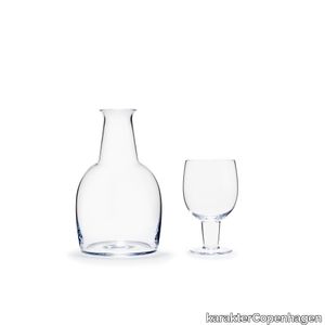
karakterCopenhagen > Styling
Since it was designed in 2000, Glass Carafe has been hiding in Aldo Bakker’s prototype archive. The carafe’s wide bottom that converts into a very slender neck creates a soft and organic shape. The same shape is mirrored in the drinking glass, which doubles as a lid for the carafe itself. Whether the two are placed next to each other or with the glass upside down on top, the shape of the set has a fascinating and eye-catching appeal.
Lari mini Angelo Mangiarotti, 2023
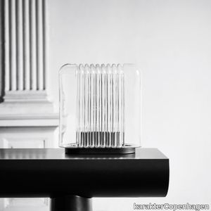
karakterCopenhagen > Table lamp
Lari mini is a portable version of Angelo Mangiarotti’s original Lari lamp from 1978. Just like the original Lari, Lari mini consists of a single mouth-blown piece of glass attached to a powder-coated metal base. The mouth-blown glass has a distinctive rippled structure which creates a beautiful, slightly blurred feel to the ambient light. Lari mini can cast its beautiful light in a wide range of settings – from cosy nooks in private homes and eye-catching reception desks at the office to dim, candlelit dinners at the restaurant. Lari mini charges via a USB-C cable and goes from zero to fully charged in 3,5 to 4 hours. When fully charged, it can provide up to 14 hours of light.
Lab Light Table Anatomy Design, 2010

karakterCopenhagen > Table lamp
The Lab Light design came about from a genuine fascination with laboratory equipment and with all those fantastic clamps and levers — the perfect place to start designing a multi-functional lamp. The base is porcelain, the stem is painted steel, and the lampshade and rotating arm is brass.
Hang Around large Derek McLeod,Joy Charbonneau, 2023

karakterCopenhagen > Styling
Hang Around is an updated version of the classic coat rack. Spacious and sturdy, Derek McLeod and Joy Charbonneau’s Hang Around has a soft, rounded expression that contrasts well to the sturdiness of the design. The dedicated pegs and their respective bars will add a welcoming and distinctive vibe to hallways and bedrooms, waiting areas, hotels, and restaurants. Produced in metal, the Hang Around is available in a large version with seven pegs, and in a small version with four pegs.
Lungangolo Achille Castiglioni, 1991
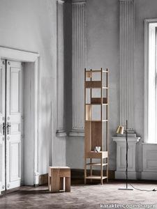
karakterCopenhagen > Styling
Castiglioni is said to ponder a lot on lost space. Empty inches and square meters that could be filled with beautiful design—but for some reason just never were. Due to this thinking he did many designs intended specifically for the corners of the home. Lungangolo is one of those. Lungangolo is a multi-use piece of furniture originally produced by Bernini. The frame is made of four slender pillars with square cross-sec-tions in between to support the square shelves placed in various heights. The structure is strengthened by a drawer and a side piece. The position of the drawer and elimination of part of the support meant it had to be manufactured in two versions—to work for both left and right handed.
Office Desk Bodil Kjær, 1959

karakterCopenhagen > Desk
We are proud to present our first design from a Danish designer. In this case, Danish architect, professor, and designer, Bodil Kjær. The iconic desk, designed in 1959, was the first of its kind with its pure and simplistic design, almost floating mid-air. Bodil Kjærs’ design has been called ‘The most beautiful desk in the world’ – or, the ‘James Bond desk’ as it was featured prominently in three early Bond movies.
Chair 300 Joe Colombo, 1965
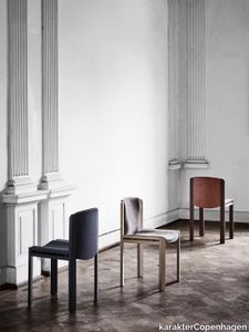
karakterCopenhagen > Chair
Designed by the forward-thinking Italian designer Joe Colombo, Chair 300 is a beautiful example of his functional design sensibility. Upholstered seat and back gently curved inside a modest, clear wooden frame with double horizontal slats give Chair 300 its appealing, comfortable and characteristic look.
Fat One Aldo Bakker, 2015
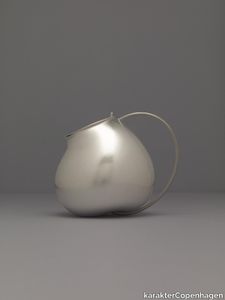
karakterCopenhagen > Styling
“My designs are not based on fashion. They are unique pieces, not necessarily understandable at a glance, but meant for a slow, layer by layer exploration.” Much like all other designs by dutch Aldo Bakker this intriguing shape is designed to surprise. The bottom of Fat One resembles an apple. And where you’ll normally find the stem of the apple, Bakker has connected one end of the handle. The other end is connected to the opening and lid. Fat One is made in silver, bent through electro forming and grown around a perfect model using CNC milling to ensure the precise positioning of the handle. The handle is made in steel, to ensure enough strength to hold the Fat One.
Domo Floor Joe Colombo, 1965
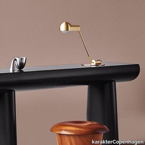
karakterCopenhagen > Floor lamp
The Domo lamp was originally designed by Italian designer Joe Colombo in 1965. Back then he designed three lamps based on the same core shape. Known for his democratic and functional design, his flexible and convertible furniture meant to be used in many different ways – all to the benefit of the user. Joe Colombo experi-mented with new materials and the latest technologies and designed futuristic “machines for living”, many of which have become icons for a new way of living. One of them is Domo. Colombo often rejected sharp corners and straight lines in favour of curvaceous forms.
Rampa Achille Castiglioni,Pier Giacomo Castiglioni, 1965

karakterCopenhagen > Desk
Rampa, a multifunctional station on wheels from 1965, was inspired by the traditional florist’s display stands found on Italian town squares. On one side, the steps serve as a bookshelf with the four steps being covered with tempered glass plates, and a compartment in the lower large step, which is closed with a flap door. At the opposite side of Rampa, there are two visible compartments for storage as well as a larger flap that, when opened, acts as a writing desk, and reveals two more compartments, and six drawers. Thanks to the four castors, two of which has brakes, the object can easily be moved around or fixed.
GB Lounge pouf Gijs Bakker, 1972
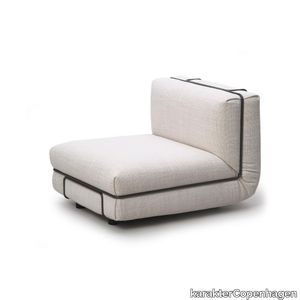
karakterCopenhagen > Chair
Dutch industrial designer Gijs Bakker had already established a reputation for his aluminum jewelry when he decided to turn his attention to designing a chair. Inspired by a competition held by Dunlop, the rubber foam manufacturer, Bakker took a piece of foam, bent it at a 90 degree angle, and fixed it in a metal frame. The result was the GB Lounge, a modular lounge chair whose simple silhouette is enhanced by invitingly overstuffed upholstery. Originally coined “the Levi’s Chair,” Bakker was determined that his design – much like a pair of well-loved jeans – would act as an easygoing antidote to the previous generation’s stiffer tastes. Today, its functionality has been enhanced further with the addition of feet that raise it slightly from the floor for added comfort. Available as a one-seater chair, or with the addition of a pouf, the GB Lounge can be arranged in a variety of ways by connectors that transform it from a solo chair into a multiple seating system.
Side Table No. 2 PlueerSmitt, 2014

karakterCopenhagen > Side table
Striking. Wooden side table consisting of two stripped-down trestles and a table top. The seemingly heavy top contrasts the rigid trestles. The top gives in and provides space for the sharp ends of the trestles to lock the legs and the top together. Intriguing shapes, familiar yet not at all, balancing between art and design. Viewed from different angles the side table varies greatly. A design meant to puzzle our understanding of shape, form and function.
Moby 1 Birgitte Due Madsen,Jonas Trampedach, 2015
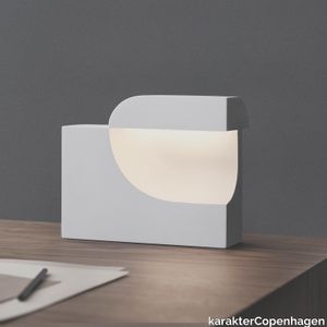
karakterCopenhagen > Table lamp
Moby is an extraordinarily sculptural table lamp. Filled with intriguing contrasts, it balances a soft and comforting light with a striking, futuristic design. The void in the main element creates a small cap in which the light source is enclosed. When Moby is on, the soft light unfolds and illuminates the cavity, immediately drawing the attention to the organic curves. In 2016, Birgitte Due Madsen and Jonas Trampedach received the prestigious Silver Hetsch medal for Moby, the highest recognition available from the Danish Art and Crafts Movement of 1879. The two designers run separate studios in Copenhagen, but their collective fondness of the soft, delicate plaster material, typically used for fine art and prototypes, led to this collaboration and the creation of Moby. The lamp was originally cast in plaster, but has now been translated into a durable matte acrylic material with a similar silky-smooth expression.
Scarpa 121 Afra & Tobia Scarpa, 1965

karakterCopenhagen > Chair
The iconic 121 Scarpa dining chair is a straightforward dining chair with a design that can complement both classical and cutting-edge interiors. The design is characterized by a firm and robust wooden frame that creates a striking contrast to the lightness of the seat and back. The seat and back are anatomically shaped in plywood, covered in fine European leather, and attached by bolts to crosspieces along the center for great comfort. Originally inspired by a sketch made by Tobia’s father, Venetian architect and designer, Carlo Scarpa, the 121 came to life with a distinct touch from Afra and Tobia Scarpa in 1965. The 121 Scarpa dining chair was designed alongside the classic 925 Scarpa lounge chair from 1966. The two chairs are a prime example of Afra and Tobia Scarpa’s work and share the same double trestle structure with characteristic rounded joints. Both designs are now a part of the Karakter collection.
Libreria Pensile Achille Castiglioni,Pier Giacomo Castiglioni, 1957
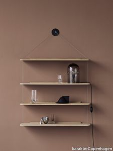
karakterCopenhagen > Cabinet
Originally designed in 1957, perfected over the years, and produced by Bernini in 1966. Seeking to pare down the structure of a bookcase to the absolute minimum, Castiglioni decided to hang the shelves on knots in two cords fixed to a single point on the wall. 50 years after it was launched it is still relevant, elegant, and very Castiglioni.
5-in-1 Joe Colombo, 1970
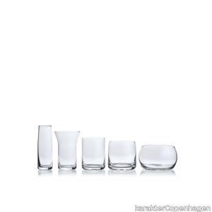
karakterCopenhagen > Styling
Italian industrial designer Joe Colombo pursued a career in painting and sculpture before he transitioned to design in the 1950s. In even the most functional homeware pieces, Colombo’s artistic background shines through in the sculptural silhouettes he creates. Such is the case with 5-in-1, a set of mouth-blown glasses that neatly intertwine. Featuring five pieces – originally intended as a cognac class, a white wine glass, a red wine glass, a grappa glass, and a water glass – each has a markedly different shape and purpose. Using that diversity to his advantage, Colombo’s ingenious design ensures that the glasses can be inserted into each other in order to form one transparent sculpture. As well as its aesthetic appeal, the 5-in-1 is a highly practical design. Once stacked, the glasses reduce storage space, making it an ideal piece for smaller kitchens.
Principal chair Bodil Kjær, 1961
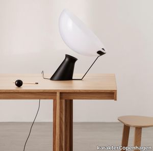
karakterCopenhagen > Chair
One of the last living mid-century Scandinavian design pioneers and a female pioneer in the field of architecture in her time, Bodil Kjær, conceived her Principal series in 1961 as part of an architectural exploration of interior solutions for modern living, called Elements of Architecture. Comprising a dining table and an upholstered dining chair, the Principal series epitomises Kjær’s forward-thinking cosmopolitan outlook and modernistic design language that slips fluidly into contemporary interior. The solid wood dining table boasts a clarified form, repeating a simple angle throughout table legs and ends of the table top, while the dining chair with its circular seat and gently rounded backrest, beautifully upholstered, adds a softness to the clear, unfussed geometry, an invitation to linger.
Comodo Achille Castiglioni, 1988

karakterCopenhagen > Cabinet
Poised on a slim metal stem, Comodo’s wood cabinet is set off-centre with a lidded compartment. Castiglioni and Pozzi’s elegant multi-purpose unit can be used as a bedside table, a tray, a coffee table or simply as a storage box for all your favourites. Supposedly Castiglioni, being a big fan of sweets, used his own Comodo to store candy.
Cross Plex table Bodil Kjær, 1959

karakterCopenhagen > Coffee table
The CrossPlex Low Table was created as part of Kjær’s forward-thinking functional Elements of Architecture furniture program developed between 1955 and 1963. Over the decades this crisp occasional table has retained its timeless appeal, making it a welcome addition to a range of contemporary settings. Constructed of a cruciform acrylic base that supports a square glass top, the inherent transparency of the CrossPlex brings an air of lightness to the room.
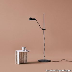
Domo Table Joe Colombo, 1965
karakterCopenhagen > Table lamp
The Domo lamp was originally designed by Italian designer Joe Colombo in 1965. Back then he designed three lamps based on the same core shape. Known for his democratic and functional design, his flexible and convertible furniture meant to be used in many different ways – all to the benefit of the user. Joe Colombo experimented with new materials and the latest technologies and designed futuristic “machines for living”, many of which have become icons for a new way of living. One of them is Domo. Colombo often rejected sharp corners and straight lines in favour of curvaceous forms.
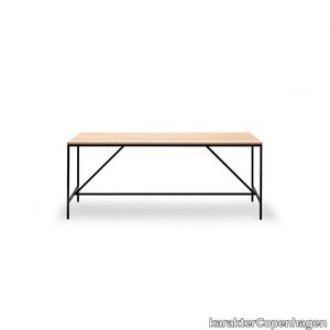
Cache Console Paul McCobb, 1952
karakterCopenhagen > Console
The foundation of the Cache series, part of Paul McCobb’s extensive Planner series, is a beautifully simplistic and easy table with slim and straight steel legs, stripped from any details or ornament, leaving only small drawers that can be mounted individually or grouped on either side of the table for small keepings. The series is complimented with the matching Desk Organiser with two drawers and a shelf supported by a steel frame. A prominent figure in American mid-century design, Paul McCobb conceived the Planner series in the 1950s, a modular furniture series that brought modern design into middle-class American households. The aesthetic attribute of McCobb’s design is sleek and unadorned and at the same time warm and approachable. With its versatility and purity of form, the Planner series became one of the most successful commercial furniture lines of its era.
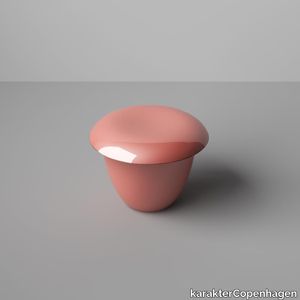
Green Table Aldo Bakker, 2015
karakterCopenhagen > Console
The Green Table depicts the simplest concept of a table: two legs and a surface. The legs are an elongation of the line created by the tabletop. The tabletop and the base of the legs have the same width, making them equally important to the design.Everlastingness. Bakker adds ‘everlastingness’ to the product by applying ‘Urushi’. A traditional Japanese lacquer made of tree sap. The varnish is naturally extracted from the Urushi tree. Urushi is applied for 30 or more layers of varnish and each layer must be allowed to dry in a warm, dust-free, humid environment. Lacquer applied too thickly or unevenly, or allowed to dry too quickly or slowly can ruin a piece. Each layer is polished by hand, a process that creates tiny, almost imperceptible variations in shade and colour and gives the surface its sense of depth and life. The natural one-component varnish becomes harder and harder over time. Keeping the core of the product intact for decades. Today there are 9000-year-old objects - still well preserved with Urushi. The technique demands slowness, awareness, time and attention. The Urushi series is Bakker’s peaceful protest against overspending. Conservation versus consumerism.
Middleweight 3-seater Michael Anastassiades, 2021

karakterCopenhagen > Chair
The Middleweight sofa captures the best of two worlds, the Italian super lounge sofa on one side and the compact Danish box sofa on the other. Set on a thin, open steel frame, the cushions are firmly held together by zippers and carefully mitered in the corners of the frame, resembling the sharp edges of folded paper. Middleweight is a luxuriously comfortable sofa, available as an arm-chair, 2-seater or 3-seater sofa and pouf. “This was my first sofa design, but actually the biggest surprise didn’t come until the product was finalized – when we stood there, looking at the actual sofa, and it looked exactly like what I had in my head. It is a great satisfaction as a designer. You can’t accelerate the process of design. An idea has to come when the time is right, so you have to stretch the process as long as possible and allow for enough time to get the ideas and experiments across.”
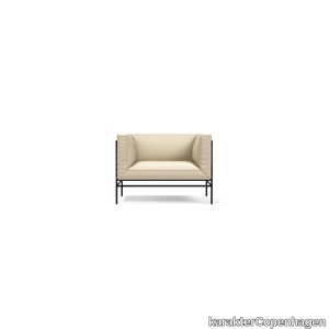
Middleweight Pouf Michael Anastassiades, 2021
karakterCopenhagen > Chair
The Middleweight sofa captures the best of two worlds, the Italian super lounge sofa on one side and the compact Danish box sofa on the other. Set on a thin, open steel frame, the cushions are firmly held together by zippers and carefully mitered in the corners of the frame, resembling the sharp edges of folded paper. Middleweight is a luxuriously comfortable sofa, available as an arm-chair, 2-seater or 3-seater sofa and pouf. “This was my first sofa design, but actually the biggest surprise didn’t come until the product was finalized – when we stood there, looking at the actual sofa, and it looked exactly like what I had in my head. It is a great satisfaction as a designer. You can’t accelerate the process of design. An idea has to come when the time is right, so you have to stretch the process as long as possible and allow for enough time to get the ideas and experiments across.”
- 1
- 2