Sensi Grey Fossil

florim > Floor tile-stone
Lightness, Earth, Sensoriality The Sensi collection also features a <strong>decorative mosaic</strong> made from <strong>recycled glass</strong> made from disused TV and PC screens. This mosaic, manufactured by a <strong>process in which human hands play a role</strong>, has a distinctive surface structure. Due to the nature of the recycled glass and the production cycle, every tiny chip is different from the others, creating a <strong>dynamic surface.</strong> Soft, velvety or structured to the touch, it dialogues with the light and may become shiny or matte. This product also derives its uniqueness from its colour. <strong>Every chip is unique </strong>and has its own shades of the same tone. <p>Developed with close attention to environmental impact, "<em>Sensi</em>" is the perfect synthesis of innovation and sustainability and also a virtuous example of <strong>circular economy</strong>. The collection is made <strong>over 90% natural raw materials</strong> and up to 41%<strong> of recycled materials</strong>. "<em>Sensi</em>" is the result of <strong>up to 100% sustainable production process</strong>, both in terms of water consumption and self-generated electricity.</p>
Sensi Grey Sand

florim > Floor tile-stone
Lightness, Earth, Sensoriality The Sensi collection also features a <strong>decorative mosaic</strong> made from <strong>recycled glass</strong> made from disused TV and PC screens. This mosaic, manufactured by a <strong>process in which human hands play a role</strong>, has a distinctive surface structure. Due to the nature of the recycled glass and the production cycle, every tiny chip is different from the others, creating a <strong>dynamic surface.</strong> Soft, velvety or structured to the touch, it dialogues with the light and may become shiny or matte. This product also derives its uniqueness from its colour. <strong>Every chip is unique </strong>and has its own shades of the same tone. <p>Developed with close attention to environmental impact, "<em>Sensi</em>" is the perfect synthesis of innovation and sustainability and also a virtuous example of <strong>circular economy</strong>. The collection is made <strong>over 90% natural raw materials</strong> and up to 41%<strong> of recycled materials</strong>. "<em>Sensi</em>" is the result of <strong>up to 100% sustainable production process</strong>, both in terms of water consumption and self-generated electricity.</p>
Sensi Grey Dust

florim > Floor tile-stone
Lightness, Earth, Sensoriality The Sensi collection also features a <strong>decorative mosaic</strong> made from <strong>recycled glass</strong> made from disused TV and PC screens. This mosaic, manufactured by a <strong>process in which human hands play a role</strong>, has a distinctive surface structure. Due to the nature of the recycled glass and the production cycle, every tiny chip is different from the others, creating a <strong>dynamic surface.</strong> Soft, velvety or structured to the touch, it dialogues with the light and may become shiny or matte. This product also derives its uniqueness from its colour. <strong>Every chip is unique </strong>and has its own shades of the same tone. <p>Developed with close attention to environmental impact, "<em>Sensi</em>" is the perfect synthesis of innovation and sustainability and also a virtuous example of <strong>circular economy</strong>. The collection is made <strong>over 90% natural raw materials</strong> and up to 41%<strong> of recycled materials</strong>. "<em>Sensi</em>" is the result of <strong>up to 100% sustainable production process</strong>, both in terms of water consumption and self-generated electricity.</p>
Sensi Grey Lithos

florim > Floor tile-stone
Lightness, Earth, Sensoriality The Sensi collection also features a <strong>decorative mosaic</strong> made from <strong>recycled glass</strong> made from disused TV and PC screens. This mosaic, manufactured by a <strong>process in which human hands play a role</strong>, has a distinctive surface structure. Due to the nature of the recycled glass and the production cycle, every tiny chip is different from the others, creating a <strong>dynamic surface.</strong> Soft, velvety or structured to the touch, it dialogues with the light and may become shiny or matte. This product also derives its uniqueness from its colour. <strong>Every chip is unique </strong>and has its own shades of the same tone. <p>Developed with close attention to environmental impact, "<em>Sensi</em>" is the perfect synthesis of innovation and sustainability and also a virtuous example of <strong>circular economy</strong>. The collection is made <strong>over 90% natural raw materials</strong> and up to 41%<strong> of recycled materials</strong>. "<em>Sensi</em>" is the result of <strong>up to 100% sustainable production process</strong>, both in terms of water consumption and self-generated electricity.</p>
Sensi White Fossil

florim > Floor tile-stone
Lightness, Earth, Sensoriality The Sensi collection also features a <strong>decorative mosaic</strong> made from <strong>recycled glass</strong> made from disused TV and PC screens. This mosaic, manufactured by a <strong>process in which human hands play a role</strong>, has a distinctive surface structure. Due to the nature of the recycled glass and the production cycle, every tiny chip is different from the others, creating a <strong>dynamic surface.</strong> Soft, velvety or structured to the touch, it dialogues with the light and may become shiny or matte. This product also derives its uniqueness from its colour. <strong>Every chip is unique </strong>and has its own shades of the same tone. <p>Developed with close attention to environmental impact, "<em>Sensi</em>" is the perfect synthesis of innovation and sustainability and also a virtuous example of <strong>circular economy</strong>. The collection is made <strong>over 90% natural raw materials</strong> and up to 41%<strong> of recycled materials</strong>. "<em>Sensi</em>" is the result of <strong>up to 100% sustainable production process</strong>, both in terms of water consumption and self-generated electricity.</p>
Sensi White Sand

florim > Floor tile-stone
Lightness, Earth, Sensoriality The Sensi collection also features a <strong>decorative mosaic</strong> made from <strong>recycled glass</strong> made from disused TV and PC screens. This mosaic, manufactured by a <strong>process in which human hands play a role</strong>, has a distinctive surface structure. Due to the nature of the recycled glass and the production cycle, every tiny chip is different from the others, creating a <strong>dynamic surface.</strong> Soft, velvety or structured to the touch, it dialogues with the light and may become shiny or matte. This product also derives its uniqueness from its colour. <strong>Every chip is unique </strong>and has its own shades of the same tone. <p>Developed with close attention to environmental impact, "<em>Sensi</em>" is the perfect synthesis of innovation and sustainability and also a virtuous example of <strong>circular economy</strong>. The collection is made <strong>over 90% natural raw materials</strong> and up to 41%<strong> of recycled materials</strong>. "<em>Sensi</em>" is the result of <strong>up to 100% sustainable production process</strong>, both in terms of water consumption and self-generated electricity.</p>
Sensi White Dust

florim > Floor tile-stone
Lightness, Earth, Sensoriality The Sensi collection also features a <strong>decorative mosaic</strong> made from <strong>recycled glass</strong> made from disused TV and PC screens. This mosaic, manufactured by a <strong>process in which human hands play a role</strong>, has a distinctive surface structure. Due to the nature of the recycled glass and the production cycle, every tiny chip is different from the others, creating a <strong>dynamic surface.</strong> Soft, velvety or structured to the touch, it dialogues with the light and may become shiny or matte. This product also derives its uniqueness from its colour. <strong>Every chip is unique </strong>and has its own shades of the same tone. <p>Developed with close attention to environmental impact, "<em>Sensi</em>" is the perfect synthesis of innovation and sustainability and also a virtuous example of <strong>circular economy</strong>. The collection is made <strong>over 90% natural raw materials</strong> and up to 41%<strong> of recycled materials</strong>. "<em>Sensi</em>" is the result of <strong>up to 100% sustainable production process</strong>, both in terms of water consumption and self-generated electricity.</p>
Sensi White Lithos

florim > Floor tile-stone
Lightness, Earth, Sensoriality The Sensi collection also features a <strong>decorative mosaic</strong> made from <strong>recycled glass</strong> made from disused TV and PC screens. This mosaic, manufactured by a <strong>process in which human hands play a role</strong>, has a distinctive surface structure. Due to the nature of the recycled glass and the production cycle, every tiny chip is different from the others, creating a <strong>dynamic surface.</strong> Soft, velvety or structured to the touch, it dialogues with the light and may become shiny or matte. This product also derives its uniqueness from its colour. <strong>Every chip is unique </strong>and has its own shades of the same tone. <p>Developed with close attention to environmental impact, "<em>Sensi</em>" is the perfect synthesis of innovation and sustainability and also a virtuous example of <strong>circular economy</strong>. The collection is made <strong>over 90% natural raw materials</strong> and up to 41%<strong> of recycled materials</strong>. "<em>Sensi</em>" is the result of <strong>up to 100% sustainable production process</strong>, both in terms of water consumption and self-generated electricity.</p>
Stone Life Graphit

florim > Wall tile-stone-brick
<p>The Contemporary Design Stone Life collection encapsulates the essence of a simple lifestyle with an informal touch.</p> <p>There is a distinctively clean-cut and modern look to Florim’s new collection, whose <strong>warm, neutral colours</strong> are ideal for versatile, understated spaces free from superfluous features.</p> <p><br>The colours and textures encourage interplay between different elements inspired by nature and can play a part in countless interior design styles.</p> <p>The collection is born from a sustainable and virtuous approach and is part of <a href="https://www.florim.com/en/company/sustainability/carbonzero-florim/">CarbonZero</a>, Florim's range of Carbon Neutral surfaces.</p>
Stone Life Shell

florim > Wall tile-stone-brick
<p>The Contemporary Design Stone Life collection encapsulates the essence of a simple lifestyle with an informal touch.</p> <p>There is a distinctively clean-cut and modern look to Florim’s new collection, whose <strong>warm, neutral colours</strong> are ideal for versatile, understated spaces free from superfluous features.</p> <p><br>The colours and textures encourage interplay between different elements inspired by nature and can play a part in countless interior design styles.</p> <p>The collection is born from a sustainable and virtuous approach and is part of <a href="https://www.florim.com/en/company/sustainability/carbonzero-florim/">CarbonZero</a>, Florim's range of Carbon Neutral surfaces.</p>
Stone Life Haze

florim > Wall tile-stone-brick
<p>The Contemporary Design Stone Life collection encapsulates the essence of a simple lifestyle with an informal touch.</p> <p>There is a distinctively clean-cut and modern look to Florim’s new collection, whose <strong>warm, neutral colours</strong> are ideal for versatile, understated spaces free from superfluous features.</p> <p><br>The colours and textures encourage interplay between different elements inspired by nature and can play a part in countless interior design styles.</p> <p>The collection is born from a sustainable and virtuous approach and is part of <a href="https://www.florim.com/en/company/sustainability/carbonzero-florim/">CarbonZero</a>, Florim's range of Carbon Neutral surfaces.</p>
Stone Life Cotton

florim > Wall tile-stone-brick
<p>The Contemporary Design Stone Life collection encapsulates the essence of a simple lifestyle with an informal touch.</p> <p>There is a distinctively clean-cut and modern look to Florim’s new collection, whose <strong>warm, neutral colours</strong> are ideal for versatile, understated spaces free from superfluous features.</p> <p><br>The colours and textures encourage interplay between different elements inspired by nature and can play a part in countless interior design styles.</p> <p>The collection is born from a sustainable and virtuous approach and is part of <a href="https://www.florim.com/en/company/sustainability/carbonzero-florim/">CarbonZero</a>, Florim's range of Carbon Neutral surfaces.</p>
Stones & More 2.0 Stone Sahara Noir
florim > Floor tile-stone
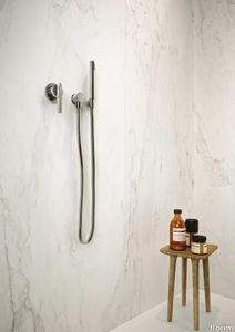
A refined selection of stone and marble breathes life into a new container <p>A harmonious sobriety accompanies the gaze on the discrete and perfect architecture to breathe life into environments permeated with the balanced synthesis of crafting skill and industrial capacity. The play on the contrasts between tradition and modernism creates an atmosphere suspended between memory and future. The structure and full body of the finishes enhance the space with popular details. The eclectic and refined spirit of Stones&More 2.0 is expressed through the harmony of elegant material suggestions, smooth and reflective surfaces, to meet both the visual and tactile needs. Stones&More 2.0 also narrates its refined naturalness in the Florim Magnum Oversize project, where the large size surfaces are an invitation to enter and share the emotion of an even more enchanting dimension.</p> Stones&More 2.0 is recommended for floor and wall applications in residential settings, but also for medium-high traffic applications. Thanks to the available innovative technologies, the development of the available sizes and finishes is offered for each surface available in the catalog, favouring a wide range of solutions.
Stones & More 2.0 Stone Marfil

florim > Floor tile-stone
A refined selection of stone and marble breathes life into a new container <p>A harmonious sobriety accompanies the gaze on the discrete and perfect architecture to breathe life into environments permeated with the balanced synthesis of crafting skill and industrial capacity. The play on the contrasts between tradition and modernism creates an atmosphere suspended between memory and future. The structure and full body of the finishes enhance the space with popular details. The eclectic and refined spirit of Stones&More 2.0 is expressed through the harmony of elegant material suggestions, smooth and reflective surfaces, to meet both the visual and tactile needs. Stones&More 2.0 also narrates its refined naturalness in the Florim Magnum Oversize project, where the large size surfaces are an invitation to enter and share the emotion of an even more enchanting dimension.</p> Stones&More 2.0 is recommended for floor and wall applications in residential settings, but also for medium-high traffic applications. Thanks to the available innovative technologies, the development of the available sizes and finishes is offered for each surface available in the catalog, favouring a wide range of solutions.
Stones & More 2.0 Stone Calacatta Black

florim > Wall tile-stone-brick
A refined selection of stone and marble breathes life into a new container <p>A harmonious sobriety accompanies the gaze on the discrete and perfect architecture to breathe life into environments permeated with the balanced synthesis of crafting skill and industrial capacity. The play on the contrasts between tradition and modernism creates an atmosphere suspended between memory and future. The structure and full body of the finishes enhance the space with popular details. The eclectic and refined spirit of Stones&More 2.0 is expressed through the harmony of elegant material suggestions, smooth and reflective surfaces, to meet both the visual and tactile needs. Stones&More 2.0 also narrates its refined naturalness in the Florim Magnum Oversize project, where the large size surfaces are an invitation to enter and share the emotion of an even more enchanting dimension.</p> Stones&More 2.0 is recommended for floor and wall applications in residential settings, but also for medium-high traffic applications. Thanks to the available innovative technologies, the development of the available sizes and finishes is offered for each surface available in the catalog, favouring a wide range of solutions.
Stones & More 2.0 Amani Bronze

florim > Wall tile-stone-brick
A refined selection of stone and marble breathes life into a new container <p>A harmonious sobriety accompanies the gaze on the discrete and perfect architecture to breathe life into environments permeated with the balanced synthesis of crafting skill and industrial capacity. The play on the contrasts between tradition and modernism creates an atmosphere suspended between memory and future. The structure and full body of the finishes enhance the space with popular details. The eclectic and refined spirit of Stones&More 2.0 is expressed through the harmony of elegant material suggestions, smooth and reflective surfaces, to meet both the visual and tactile needs. Stones&More 2.0 also narrates its refined naturalness in the Florim Magnum Oversize project, where the large size surfaces are an invitation to enter and share the emotion of an even more enchanting dimension.</p> Stones&More 2.0 is recommended for floor and wall applications in residential settings, but also for medium-high traffic applications. Thanks to the available innovative technologies, the development of the available sizes and finishes is offered for each surface available in the catalog, favouring a wide range of solutions.
Stones & More 2.0 Stone Calacatta

florim > Floor tile-stone
A refined selection of stone and marble breathes life into a new container <p>A harmonious sobriety accompanies the gaze on the discrete and perfect architecture to breathe life into environments permeated with the balanced synthesis of crafting skill and industrial capacity. The play on the contrasts between tradition and modernism creates an atmosphere suspended between memory and future. The structure and full body of the finishes enhance the space with popular details. The eclectic and refined spirit of Stones&More 2.0 is expressed through the harmony of elegant material suggestions, smooth and reflective surfaces, to meet both the visual and tactile needs. Stones&More 2.0 also narrates its refined naturalness in the Florim Magnum Oversize project, where the large size surfaces are an invitation to enter and share the emotion of an even more enchanting dimension.</p> Stones&More 2.0 is recommended for floor and wall applications in residential settings, but also for medium-high traffic applications. Thanks to the available innovative technologies, the development of the available sizes and finishes is offered for each surface available in the catalog, favouring a wide range of solutions.
Stontech/4.0 STONE_06

florim > Wall tile-stone-brick
New surfaces, new sizes and three different finishes are the trademarks of a line that is contemporary and attentive to detail. Two marbles with a high-gloss finish bestow fragments of light on the series and the large sizes of the Magnum Oversize family, available in four colors, are suitable for creating unique volumes.
Stontech/4.0 STONE_02

florim > Floor tile-stone
New surfaces, new sizes and three different finishes are the trademarks of a line that is contemporary and attentive to detail. Two marbles with a high-gloss finish bestow fragments of light on the series and the large sizes of the Magnum Oversize family, available in four colors, are suitable for creating unique volumes.
Stontech/4.0 STONE_03

florim > Floor tile-stone
New surfaces, new sizes and three different finishes are the trademarks of a line that is contemporary and attentive to detail. Two marbles with a high-gloss finish bestow fragments of light on the series and the large sizes of the Magnum Oversize family, available in four colors, are suitable for creating unique volumes.
Stontech/4.0 STONE_04

florim > Floor tile-stone
New surfaces, new sizes and three different finishes are the trademarks of a line that is contemporary and attentive to detail. Two marbles with a high-gloss finish bestow fragments of light on the series and the large sizes of the Magnum Oversize family, available in four colors, are suitable for creating unique volumes.
Stontech/4.0 STONE_05

florim > Wall tile-stone-brick
New surfaces, new sizes and three different finishes are the trademarks of a line that is contemporary and attentive to detail. Two marbles with a high-gloss finish bestow fragments of light on the series and the large sizes of the Magnum Oversize family, available in four colors, are suitable for creating unique volumes.
Stontech/4.0 STONE_01

florim > Floor tile-stone
New surfaces, new sizes and three different finishes are the trademarks of a line that is contemporary and attentive to detail. Two marbles with a high-gloss finish bestow fragments of light on the series and the large sizes of the Magnum Oversize family, available in four colors, are suitable for creating unique volumes.
Studios Rubber
florim > Wallcovering
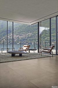
<p>Studios, with its sophisticated but discrete personality, defines the evolutionary path of modern cement-inspired surfaces for interior architecture.</p> <p>The structure of the surfaces, delicately textured, suggests the effect of the manual skill and plasticity of the hand crafted finish. Essential but intense, it is highlighted by meeting natural or artificial light. </p>
Studios Brick

florim > Wallcovering
<p>Studios, with its sophisticated but discrete personality, defines the evolutionary path of modern cement-inspired surfaces for interior architecture.</p> <p>The structure of the surfaces, delicately textured, suggests the effect of the manual skill and plasticity of the hand crafted finish. Essential but intense, it is highlighted by meeting natural or artificial light. </p>
Studios Sand

florim > Synthetic Floor
<p>Studios, with its sophisticated but discrete personality, defines the evolutionary path of modern cement-inspired surfaces for interior architecture.</p> <p>The structure of the surfaces, delicately textured, suggests the effect of the manual skill and plasticity of the hand crafted finish. Essential but intense, it is highlighted by meeting natural or artificial light. </p>
Studios Concreate

florim > Wallcovering
<p>Studios, with its sophisticated but discrete personality, defines the evolutionary path of modern cement-inspired surfaces for interior architecture.</p> <p>The structure of the surfaces, delicately textured, suggests the effect of the manual skill and plasticity of the hand crafted finish. Essential but intense, it is highlighted by meeting natural or artificial light. </p>
Studios Cloud

florim > Synthetic Floor
<p>Studios, with its sophisticated but discrete personality, defines the evolutionary path of modern cement-inspired surfaces for interior architecture.</p> <p>The structure of the surfaces, delicately textured, suggests the effect of the manual skill and plasticity of the hand crafted finish. Essential but intense, it is highlighted by meeting natural or artificial light. </p>
Studios CHALK

florim > Synthetic Floor
<p>Studios, with its sophisticated but discrete personality, defines the evolutionary path of modern cement-inspired surfaces for interior architecture.</p> <p>The structure of the surfaces, delicately textured, suggests the effect of the manual skill and plasticity of the hand crafted finish. Essential but intense, it is highlighted by meeting natural or artificial light. </p>
Tesori Monile grigio

florim > Wallcovering
East and West, a synthesis archieved through Italian taste. «My work often takes me to far-off lands, also remote in terms of their culture and traditions. Even without my being aware of it, I then metabolise these traditions and include them in the designs I subsequently produce.» Matteo Nunziati <p>"It is the architect's task to create a warm, livable space. Carpets are warm and livable. He decides for this reason to spread one carpet on the floor and to hang up four to form the four walls. But you cannot build a house out of carpets. Both the carpet and the floor and the tapestry on the wall required structural frame to hold them in the correct place. To invent this frame is the architect's second task."When Adolf Loos wrote his revolutionary essay on the "principle of cladding" in 1898, architecture was just entering the modern age. Building meant imagining structures capable of putting together different materials, but, Loos affirmed, it must also respect their individual characteristics. "Every material possesses a formal language which belongs to it alone and no material can take on the forms proper to another", the Austrian master therefore maintained. And there is no doubt that the spirit of these words extended throughout most Twentieth Century architecture, regardless of its location or style. When we look at Matteo Nunziati's designs for the CEDIT Tesori collection, we seem to be seeing geometrical purity and attention to detail at the service of a new "truth" of material. Because Matteo Nunziati views ceramics as a form of fabric.<br /> The woven patterns he imagines for the various styles in his collection "“ from Arabian to damask to more geometrical motifs "“ constantly seek to provide the soft, iridescent look of time-worn linen. In them, ceramics are raised from the status of poor relation of marble to become a luxury wall covering in their own right: almost a wallpaper, suitable however for both floors and walls, and an absolutely versatile material. No longer only for beautifying bathrooms, they can create new moods in every room of the house (and elsewhere) starting from the living-room. Naturally, the revolution has been mainly technological. The large slabs produced by CEDIT are more than 3 metres tall, and since they eliminate the serial repetition typical of conventional tiles, they generate a new relationship between the surface and its decoration. However, Nunziati does not use this to create, artist-like, a more eye-catching decorative composition that emphasises the slab's dimensions. Quite the opposite; the patterns he offers us attempt to break down what is left of the boundaries between substrates. In particular, the Arabian and damask styles, in the version with "timeworn" patterning, convey the idea of the ceramic slab as an abstract, almost non-existent material which melts into the decorative motif applied to it, in a kind of pure wall covering.<br /> Through the patient selection of geometrical motifs and tests to verify their suitability for application to ceramic slabs, Nunziati aims to achieve a new material rather than a mere decoration, making this clear by also exploring its tactile dimension, with gouged and relief motifs. His "principle of coverings" therefore relates to ceramics' essence rather than their image: highlighting the versatility which, as we all know, has made ceramics an absolute material, a kind of cement that incorporates structure and finish in a virtually infinite range of applications. This is clearly indicated by the reference to the mashrabiya, a term meaning place where people drink in Arabic, which in Arabian architecture originally referred to the kind of veranda where people used to meet and rest, and over time has come to mean the wooden gratings that screened these places from the sun. Inspired by his trips to the Middle East, for Nunziati the geometric patterns of the mashrabiya become both an outline of his method of work and the form of what in fact becomes the key element in a new idea of space: a real location conceived around a strong, livable surface in which physical substance and decoration overlap to the point where they merge.</p>
Tesori Anelli grigio

florim > Wallcovering
East and West, a synthesis archieved through Italian taste. «My work often takes me to far-off lands, also remote in terms of their culture and traditions. Even without my being aware of it, I then metabolise these traditions and include them in the designs I subsequently produce.» Matteo Nunziati <p>"It is the architect's task to create a warm, livable space. Carpets are warm and livable. He decides for this reason to spread one carpet on the floor and to hang up four to form the four walls. But you cannot build a house out of carpets. Both the carpet and the floor and the tapestry on the wall required structural frame to hold them in the correct place. To invent this frame is the architect's second task."When Adolf Loos wrote his revolutionary essay on the "principle of cladding" in 1898, architecture was just entering the modern age. Building meant imagining structures capable of putting together different materials, but, Loos affirmed, it must also respect their individual characteristics. "Every material possesses a formal language which belongs to it alone and no material can take on the forms proper to another", the Austrian master therefore maintained. And there is no doubt that the spirit of these words extended throughout most Twentieth Century architecture, regardless of its location or style. When we look at Matteo Nunziati's designs for the CEDIT Tesori collection, we seem to be seeing geometrical purity and attention to detail at the service of a new "truth" of material. Because Matteo Nunziati views ceramics as a form of fabric.<br /> The woven patterns he imagines for the various styles in his collection "“ from Arabian to damask to more geometrical motifs "“ constantly seek to provide the soft, iridescent look of time-worn linen. In them, ceramics are raised from the status of poor relation of marble to become a luxury wall covering in their own right: almost a wallpaper, suitable however for both floors and walls, and an absolutely versatile material. No longer only for beautifying bathrooms, they can create new moods in every room of the house (and elsewhere) starting from the living-room. Naturally, the revolution has been mainly technological. The large slabs produced by CEDIT are more than 3 metres tall, and since they eliminate the serial repetition typical of conventional tiles, they generate a new relationship between the surface and its decoration. However, Nunziati does not use this to create, artist-like, a more eye-catching decorative composition that emphasises the slab's dimensions. Quite the opposite; the patterns he offers us attempt to break down what is left of the boundaries between substrates. In particular, the Arabian and damask styles, in the version with "timeworn" patterning, convey the idea of the ceramic slab as an abstract, almost non-existent material which melts into the decorative motif applied to it, in a kind of pure wall covering.<br /> Through the patient selection of geometrical motifs and tests to verify their suitability for application to ceramic slabs, Nunziati aims to achieve a new material rather than a mere decoration, making this clear by also exploring its tactile dimension, with gouged and relief motifs. His "principle of coverings" therefore relates to ceramics' essence rather than their image: highlighting the versatility which, as we all know, has made ceramics an absolute material, a kind of cement that incorporates structure and finish in a virtually infinite range of applications. This is clearly indicated by the reference to the mashrabiya, a term meaning place where people drink in Arabic, which in Arabian architecture originally referred to the kind of veranda where people used to meet and rest, and over time has come to mean the wooden gratings that screened these places from the sun. Inspired by his trips to the Middle East, for Nunziati the geometric patterns of the mashrabiya become both an outline of his method of work and the form of what in fact becomes the key element in a new idea of space: a real location conceived around a strong, livable surface in which physical substance and decoration overlap to the point where they merge.</p>
Tesori Broccato grigio

florim > Wallcovering
East and West, a synthesis archieved through Italian taste. «My work often takes me to far-off lands, also remote in terms of their culture and traditions. Even without my being aware of it, I then metabolise these traditions and include them in the designs I subsequently produce.» Matteo Nunziati <p>"It is the architect's task to create a warm, livable space. Carpets are warm and livable. He decides for this reason to spread one carpet on the floor and to hang up four to form the four walls. But you cannot build a house out of carpets. Both the carpet and the floor and the tapestry on the wall required structural frame to hold them in the correct place. To invent this frame is the architect's second task."When Adolf Loos wrote his revolutionary essay on the "principle of cladding" in 1898, architecture was just entering the modern age. Building meant imagining structures capable of putting together different materials, but, Loos affirmed, it must also respect their individual characteristics. "Every material possesses a formal language which belongs to it alone and no material can take on the forms proper to another", the Austrian master therefore maintained. And there is no doubt that the spirit of these words extended throughout most Twentieth Century architecture, regardless of its location or style. When we look at Matteo Nunziati's designs for the CEDIT Tesori collection, we seem to be seeing geometrical purity and attention to detail at the service of a new "truth" of material. Because Matteo Nunziati views ceramics as a form of fabric.<br /> The woven patterns he imagines for the various styles in his collection "“ from Arabian to damask to more geometrical motifs "“ constantly seek to provide the soft, iridescent look of time-worn linen. In them, ceramics are raised from the status of poor relation of marble to become a luxury wall covering in their own right: almost a wallpaper, suitable however for both floors and walls, and an absolutely versatile material. No longer only for beautifying bathrooms, they can create new moods in every room of the house (and elsewhere) starting from the living-room. Naturally, the revolution has been mainly technological. The large slabs produced by CEDIT are more than 3 metres tall, and since they eliminate the serial repetition typical of conventional tiles, they generate a new relationship between the surface and its decoration. However, Nunziati does not use this to create, artist-like, a more eye-catching decorative composition that emphasises the slab's dimensions. Quite the opposite; the patterns he offers us attempt to break down what is left of the boundaries between substrates. In particular, the Arabian and damask styles, in the version with "timeworn" patterning, convey the idea of the ceramic slab as an abstract, almost non-existent material which melts into the decorative motif applied to it, in a kind of pure wall covering.<br /> Through the patient selection of geometrical motifs and tests to verify their suitability for application to ceramic slabs, Nunziati aims to achieve a new material rather than a mere decoration, making this clear by also exploring its tactile dimension, with gouged and relief motifs. His "principle of coverings" therefore relates to ceramics' essence rather than their image: highlighting the versatility which, as we all know, has made ceramics an absolute material, a kind of cement that incorporates structure and finish in a virtually infinite range of applications. This is clearly indicated by the reference to the mashrabiya, a term meaning place where people drink in Arabic, which in Arabian architecture originally referred to the kind of veranda where people used to meet and rest, and over time has come to mean the wooden gratings that screened these places from the sun. Inspired by his trips to the Middle East, for Nunziati the geometric patterns of the mashrabiya become both an outline of his method of work and the form of what in fact becomes the key element in a new idea of space: a real location conceived around a strong, livable surface in which physical substance and decoration overlap to the point where they merge.</p>
Tesori Lino grigio

florim > Wallcovering
East and West, a synthesis archieved through Italian taste. «My work often takes me to far-off lands, also remote in terms of their culture and traditions. Even without my being aware of it, I then metabolise these traditions and include them in the designs I subsequently produce.» Matteo Nunziati <p>"It is the architect's task to create a warm, livable space. Carpets are warm and livable. He decides for this reason to spread one carpet on the floor and to hang up four to form the four walls. But you cannot build a house out of carpets. Both the carpet and the floor and the tapestry on the wall required structural frame to hold them in the correct place. To invent this frame is the architect's second task."When Adolf Loos wrote his revolutionary essay on the "principle of cladding" in 1898, architecture was just entering the modern age. Building meant imagining structures capable of putting together different materials, but, Loos affirmed, it must also respect their individual characteristics. "Every material possesses a formal language which belongs to it alone and no material can take on the forms proper to another", the Austrian master therefore maintained. And there is no doubt that the spirit of these words extended throughout most Twentieth Century architecture, regardless of its location or style. When we look at Matteo Nunziati's designs for the CEDIT Tesori collection, we seem to be seeing geometrical purity and attention to detail at the service of a new "truth" of material. Because Matteo Nunziati views ceramics as a form of fabric.<br /> The woven patterns he imagines for the various styles in his collection "“ from Arabian to damask to more geometrical motifs "“ constantly seek to provide the soft, iridescent look of time-worn linen. In them, ceramics are raised from the status of poor relation of marble to become a luxury wall covering in their own right: almost a wallpaper, suitable however for both floors and walls, and an absolutely versatile material. No longer only for beautifying bathrooms, they can create new moods in every room of the house (and elsewhere) starting from the living-room. Naturally, the revolution has been mainly technological. The large slabs produced by CEDIT are more than 3 metres tall, and since they eliminate the serial repetition typical of conventional tiles, they generate a new relationship between the surface and its decoration. However, Nunziati does not use this to create, artist-like, a more eye-catching decorative composition that emphasises the slab's dimensions. Quite the opposite; the patterns he offers us attempt to break down what is left of the boundaries between substrates. In particular, the Arabian and damask styles, in the version with "timeworn" patterning, convey the idea of the ceramic slab as an abstract, almost non-existent material which melts into the decorative motif applied to it, in a kind of pure wall covering.<br /> Through the patient selection of geometrical motifs and tests to verify their suitability for application to ceramic slabs, Nunziati aims to achieve a new material rather than a mere decoration, making this clear by also exploring its tactile dimension, with gouged and relief motifs. His "principle of coverings" therefore relates to ceramics' essence rather than their image: highlighting the versatility which, as we all know, has made ceramics an absolute material, a kind of cement that incorporates structure and finish in a virtually infinite range of applications. This is clearly indicated by the reference to the mashrabiya, a term meaning place where people drink in Arabic, which in Arabian architecture originally referred to the kind of veranda where people used to meet and rest, and over time has come to mean the wooden gratings that screened these places from the sun. Inspired by his trips to the Middle East, for Nunziati the geometric patterns of the mashrabiya become both an outline of his method of work and the form of what in fact becomes the key element in a new idea of space: a real location conceived around a strong, livable surface in which physical substance and decoration overlap to the point where they merge.</p>
Tesori Monile bianco

florim > Wallcovering
East and West, a synthesis archieved through Italian taste. «My work often takes me to far-off lands, also remote in terms of their culture and traditions. Even without my being aware of it, I then metabolise these traditions and include them in the designs I subsequently produce.» Matteo Nunziati <p>"It is the architect's task to create a warm, livable space. Carpets are warm and livable. He decides for this reason to spread one carpet on the floor and to hang up four to form the four walls. But you cannot build a house out of carpets. Both the carpet and the floor and the tapestry on the wall required structural frame to hold them in the correct place. To invent this frame is the architect's second task."When Adolf Loos wrote his revolutionary essay on the "principle of cladding" in 1898, architecture was just entering the modern age. Building meant imagining structures capable of putting together different materials, but, Loos affirmed, it must also respect their individual characteristics. "Every material possesses a formal language which belongs to it alone and no material can take on the forms proper to another", the Austrian master therefore maintained. And there is no doubt that the spirit of these words extended throughout most Twentieth Century architecture, regardless of its location or style. When we look at Matteo Nunziati's designs for the CEDIT Tesori collection, we seem to be seeing geometrical purity and attention to detail at the service of a new "truth" of material. Because Matteo Nunziati views ceramics as a form of fabric.<br /> The woven patterns he imagines for the various styles in his collection "“ from Arabian to damask to more geometrical motifs "“ constantly seek to provide the soft, iridescent look of time-worn linen. In them, ceramics are raised from the status of poor relation of marble to become a luxury wall covering in their own right: almost a wallpaper, suitable however for both floors and walls, and an absolutely versatile material. No longer only for beautifying bathrooms, they can create new moods in every room of the house (and elsewhere) starting from the living-room. Naturally, the revolution has been mainly technological. The large slabs produced by CEDIT are more than 3 metres tall, and since they eliminate the serial repetition typical of conventional tiles, they generate a new relationship between the surface and its decoration. However, Nunziati does not use this to create, artist-like, a more eye-catching decorative composition that emphasises the slab's dimensions. Quite the opposite; the patterns he offers us attempt to break down what is left of the boundaries between substrates. In particular, the Arabian and damask styles, in the version with "timeworn" patterning, convey the idea of the ceramic slab as an abstract, almost non-existent material which melts into the decorative motif applied to it, in a kind of pure wall covering.<br /> Through the patient selection of geometrical motifs and tests to verify their suitability for application to ceramic slabs, Nunziati aims to achieve a new material rather than a mere decoration, making this clear by also exploring its tactile dimension, with gouged and relief motifs. His "principle of coverings" therefore relates to ceramics' essence rather than their image: highlighting the versatility which, as we all know, has made ceramics an absolute material, a kind of cement that incorporates structure and finish in a virtually infinite range of applications. This is clearly indicated by the reference to the mashrabiya, a term meaning place where people drink in Arabic, which in Arabian architecture originally referred to the kind of veranda where people used to meet and rest, and over time has come to mean the wooden gratings that screened these places from the sun. Inspired by his trips to the Middle East, for Nunziati the geometric patterns of the mashrabiya become both an outline of his method of work and the form of what in fact becomes the key element in a new idea of space: a real location conceived around a strong, livable surface in which physical substance and decoration overlap to the point where they merge.</p>
Tesori Anelli bianco

florim > Wallcovering
East and West, a synthesis archieved through Italian taste. «My work often takes me to far-off lands, also remote in terms of their culture and traditions. Even without my being aware of it, I then metabolise these traditions and include them in the designs I subsequently produce.» Matteo Nunziati <p>"It is the architect's task to create a warm, livable space. Carpets are warm and livable. He decides for this reason to spread one carpet on the floor and to hang up four to form the four walls. But you cannot build a house out of carpets. Both the carpet and the floor and the tapestry on the wall required structural frame to hold them in the correct place. To invent this frame is the architect's second task."When Adolf Loos wrote his revolutionary essay on the "principle of cladding" in 1898, architecture was just entering the modern age. Building meant imagining structures capable of putting together different materials, but, Loos affirmed, it must also respect their individual characteristics. "Every material possesses a formal language which belongs to it alone and no material can take on the forms proper to another", the Austrian master therefore maintained. And there is no doubt that the spirit of these words extended throughout most Twentieth Century architecture, regardless of its location or style. When we look at Matteo Nunziati's designs for the CEDIT Tesori collection, we seem to be seeing geometrical purity and attention to detail at the service of a new "truth" of material. Because Matteo Nunziati views ceramics as a form of fabric.<br /> The woven patterns he imagines for the various styles in his collection "“ from Arabian to damask to more geometrical motifs "“ constantly seek to provide the soft, iridescent look of time-worn linen. In them, ceramics are raised from the status of poor relation of marble to become a luxury wall covering in their own right: almost a wallpaper, suitable however for both floors and walls, and an absolutely versatile material. No longer only for beautifying bathrooms, they can create new moods in every room of the house (and elsewhere) starting from the living-room. Naturally, the revolution has been mainly technological. The large slabs produced by CEDIT are more than 3 metres tall, and since they eliminate the serial repetition typical of conventional tiles, they generate a new relationship between the surface and its decoration. However, Nunziati does not use this to create, artist-like, a more eye-catching decorative composition that emphasises the slab's dimensions. Quite the opposite; the patterns he offers us attempt to break down what is left of the boundaries between substrates. In particular, the Arabian and damask styles, in the version with "timeworn" patterning, convey the idea of the ceramic slab as an abstract, almost non-existent material which melts into the decorative motif applied to it, in a kind of pure wall covering.<br /> Through the patient selection of geometrical motifs and tests to verify their suitability for application to ceramic slabs, Nunziati aims to achieve a new material rather than a mere decoration, making this clear by also exploring its tactile dimension, with gouged and relief motifs. His "principle of coverings" therefore relates to ceramics' essence rather than their image: highlighting the versatility which, as we all know, has made ceramics an absolute material, a kind of cement that incorporates structure and finish in a virtually infinite range of applications. This is clearly indicated by the reference to the mashrabiya, a term meaning place where people drink in Arabic, which in Arabian architecture originally referred to the kind of veranda where people used to meet and rest, and over time has come to mean the wooden gratings that screened these places from the sun. Inspired by his trips to the Middle East, for Nunziati the geometric patterns of the mashrabiya become both an outline of his method of work and the form of what in fact becomes the key element in a new idea of space: a real location conceived around a strong, livable surface in which physical substance and decoration overlap to the point where they merge.</p>
Tesori Broccato bianco

florim > Wallcovering
East and West, a synthesis archieved through Italian taste. «My work often takes me to far-off lands, also remote in terms of their culture and traditions. Even without my being aware of it, I then metabolise these traditions and include them in the designs I subsequently produce.» Matteo Nunziati <p>"It is the architect's task to create a warm, livable space. Carpets are warm and livable. He decides for this reason to spread one carpet on the floor and to hang up four to form the four walls. But you cannot build a house out of carpets. Both the carpet and the floor and the tapestry on the wall required structural frame to hold them in the correct place. To invent this frame is the architect's second task."When Adolf Loos wrote his revolutionary essay on the "principle of cladding" in 1898, architecture was just entering the modern age. Building meant imagining structures capable of putting together different materials, but, Loos affirmed, it must also respect their individual characteristics. "Every material possesses a formal language which belongs to it alone and no material can take on the forms proper to another", the Austrian master therefore maintained. And there is no doubt that the spirit of these words extended throughout most Twentieth Century architecture, regardless of its location or style. When we look at Matteo Nunziati's designs for the CEDIT Tesori collection, we seem to be seeing geometrical purity and attention to detail at the service of a new "truth" of material. Because Matteo Nunziati views ceramics as a form of fabric.<br /> The woven patterns he imagines for the various styles in his collection "“ from Arabian to damask to more geometrical motifs "“ constantly seek to provide the soft, iridescent look of time-worn linen. In them, ceramics are raised from the status of poor relation of marble to become a luxury wall covering in their own right: almost a wallpaper, suitable however for both floors and walls, and an absolutely versatile material. No longer only for beautifying bathrooms, they can create new moods in every room of the house (and elsewhere) starting from the living-room. Naturally, the revolution has been mainly technological. The large slabs produced by CEDIT are more than 3 metres tall, and since they eliminate the serial repetition typical of conventional tiles, they generate a new relationship between the surface and its decoration. However, Nunziati does not use this to create, artist-like, a more eye-catching decorative composition that emphasises the slab's dimensions. Quite the opposite; the patterns he offers us attempt to break down what is left of the boundaries between substrates. In particular, the Arabian and damask styles, in the version with "timeworn" patterning, convey the idea of the ceramic slab as an abstract, almost non-existent material which melts into the decorative motif applied to it, in a kind of pure wall covering.<br /> Through the patient selection of geometrical motifs and tests to verify their suitability for application to ceramic slabs, Nunziati aims to achieve a new material rather than a mere decoration, making this clear by also exploring its tactile dimension, with gouged and relief motifs. His "principle of coverings" therefore relates to ceramics' essence rather than their image: highlighting the versatility which, as we all know, has made ceramics an absolute material, a kind of cement that incorporates structure and finish in a virtually infinite range of applications. This is clearly indicated by the reference to the mashrabiya, a term meaning place where people drink in Arabic, which in Arabian architecture originally referred to the kind of veranda where people used to meet and rest, and over time has come to mean the wooden gratings that screened these places from the sun. Inspired by his trips to the Middle East, for Nunziati the geometric patterns of the mashrabiya become both an outline of his method of work and the form of what in fact becomes the key element in a new idea of space: a real location conceived around a strong, livable surface in which physical substance and decoration overlap to the point where they merge.</p>
Tesori Lino bianco

florim > Wallcovering
East and West, a synthesis archieved through Italian taste. «My work often takes me to far-off lands, also remote in terms of their culture and traditions. Even without my being aware of it, I then metabolise these traditions and include them in the designs I subsequently produce.» Matteo Nunziati <p>"It is the architect's task to create a warm, livable space. Carpets are warm and livable. He decides for this reason to spread one carpet on the floor and to hang up four to form the four walls. But you cannot build a house out of carpets. Both the carpet and the floor and the tapestry on the wall required structural frame to hold them in the correct place. To invent this frame is the architect's second task."When Adolf Loos wrote his revolutionary essay on the "principle of cladding" in 1898, architecture was just entering the modern age. Building meant imagining structures capable of putting together different materials, but, Loos affirmed, it must also respect their individual characteristics. "Every material possesses a formal language which belongs to it alone and no material can take on the forms proper to another", the Austrian master therefore maintained. And there is no doubt that the spirit of these words extended throughout most Twentieth Century architecture, regardless of its location or style. When we look at Matteo Nunziati's designs for the CEDIT Tesori collection, we seem to be seeing geometrical purity and attention to detail at the service of a new "truth" of material. Because Matteo Nunziati views ceramics as a form of fabric.<br /> The woven patterns he imagines for the various styles in his collection "“ from Arabian to damask to more geometrical motifs "“ constantly seek to provide the soft, iridescent look of time-worn linen. In them, ceramics are raised from the status of poor relation of marble to become a luxury wall covering in their own right: almost a wallpaper, suitable however for both floors and walls, and an absolutely versatile material. No longer only for beautifying bathrooms, they can create new moods in every room of the house (and elsewhere) starting from the living-room. Naturally, the revolution has been mainly technological. The large slabs produced by CEDIT are more than 3 metres tall, and since they eliminate the serial repetition typical of conventional tiles, they generate a new relationship between the surface and its decoration. However, Nunziati does not use this to create, artist-like, a more eye-catching decorative composition that emphasises the slab's dimensions. Quite the opposite; the patterns he offers us attempt to break down what is left of the boundaries between substrates. In particular, the Arabian and damask styles, in the version with "timeworn" patterning, convey the idea of the ceramic slab as an abstract, almost non-existent material which melts into the decorative motif applied to it, in a kind of pure wall covering.<br /> Through the patient selection of geometrical motifs and tests to verify their suitability for application to ceramic slabs, Nunziati aims to achieve a new material rather than a mere decoration, making this clear by also exploring its tactile dimension, with gouged and relief motifs. His "principle of coverings" therefore relates to ceramics' essence rather than their image: highlighting the versatility which, as we all know, has made ceramics an absolute material, a kind of cement that incorporates structure and finish in a virtually infinite range of applications. This is clearly indicated by the reference to the mashrabiya, a term meaning place where people drink in Arabic, which in Arabian architecture originally referred to the kind of veranda where people used to meet and rest, and over time has come to mean the wooden gratings that screened these places from the sun. Inspired by his trips to the Middle East, for Nunziati the geometric patterns of the mashrabiya become both an outline of his method of work and the form of what in fact becomes the key element in a new idea of space: a real location conceived around a strong, livable surface in which physical substance and decoration overlap to the point where they merge.</p>
Timeless Black Deep

florim > Wall tile-stone-brick
The synthesis between purity, modernity and elegance Inspired by attractive marble surfaces, the porcelain stoneware collection brings back a style of immortal beauty that is expressed through eight texture interpretations matched with various thickness options and sizes, even large 80 x 80 and 80 x 240 sizes with 6 mm reduced thickness.
Timeless Marfil

florim > Wall tile-stone-brick
The synthesis between purity, modernity and elegance Inspired by attractive marble surfaces, the porcelain stoneware collection brings back a style of immortal beauty that is expressed through eight texture interpretations matched with various thickness options and sizes, even large 80 x 80 and 80 x 240 sizes with 6 mm reduced thickness.
Timeless Travertino

florim > Wall tile-stone-brick
The synthesis between purity, modernity and elegance Inspired by attractive marble surfaces, the porcelain stoneware collection brings back a style of immortal beauty that is expressed through eight texture interpretations matched with various thickness options and sizes, even large 80 x 80 and 80 x 240 sizes with 6 mm reduced thickness.
Timeless Amani Grey

florim > Wall tile-stone-brick
The synthesis between purity, modernity and elegance Inspired by attractive marble surfaces, the porcelain stoneware collection brings back a style of immortal beauty that is expressed through eight texture interpretations matched with various thickness options and sizes, even large 80 x 80 and 80 x 240 sizes with 6 mm reduced thickness.
Timeless Ceppo di Grè

florim > Wall tile-stone-brick
The synthesis between purity, modernity and elegance Inspired by attractive marble surfaces, the porcelain stoneware collection brings back a style of immortal beauty that is expressed through eight texture interpretations matched with various thickness options and sizes, even large 80 x 80 and 80 x 240 sizes with 6 mm reduced thickness.
Timeless Calacatta

florim > Wall tile-stone-brick
The synthesis between purity, modernity and elegance Inspired by attractive marble surfaces, the porcelain stoneware collection brings back a style of immortal beauty that is expressed through eight texture interpretations matched with various thickness options and sizes, even large 80 x 80 and 80 x 240 sizes with 6 mm reduced thickness.
Urban Style Urban Plomb

florim > Wall tile-stone-brick
Urban Style evokes the value of <strong> </strong>timeless authenticity to bring naturalness, simplicity and comfort into the home. <p>A popular and textured stone effect where attention to detail, the development of the graphics and the color shades fully represent the stylistic value of Creative Design, able to light up any environment with a unique and unmistakeable touch: the light colors illuminate and warm up the atmosphere, whereas the darker ones convey character and elegance.</p>
Urban Style Urban Light

florim > Wall tile-stone-brick
Urban Style evokes the value of <strong> </strong>timeless authenticity to bring naturalness, simplicity and comfort into the home. <p>A popular and textured stone effect where attention to detail, the development of the graphics and the color shades fully represent the stylistic value of Creative Design, able to light up any environment with a unique and unmistakeable touch: the light colors illuminate and warm up the atmosphere, whereas the darker ones convey character and elegance.</p>
Vetro 07 Carbone
florim > Floor tile-stone
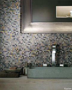
Each tile is unique and extremely precious Vetro allows recognizable and attractive decorations to be created, expressing a timeless design. The Vetro collection is available in seven solid, warm, soft and enchanting colors, in two finishes - matt and lux - and in two sizes or in the metallic variation with varying reflections in a single size. VETRO can be applied as a floor and wall application on any surface in dry or damp areas using special sealants and adhesives.
Vetro 06 Moka

florim > Floor tile-stone
Each tile is unique and extremely precious Vetro allows recognizable and attractive decorations to be created, expressing a timeless design. The Vetro collection is available in seven solid, warm, soft and enchanting colors, in two finishes - matt and lux - and in two sizes or in the metallic variation with varying reflections in a single size. VETRO can be applied as a floor and wall application on any surface in dry or damp areas using special sealants and adhesives.
Vetro Cobalto

florim > Floor tile-stone
Each tile is unique and extremely precious Vetro allows recognizable and attractive decorations to be created, expressing a timeless design. The Vetro collection is available in seven solid, warm, soft and enchanting colors, in two finishes - matt and lux - and in two sizes or in the metallic variation with varying reflections in a single size. VETRO can be applied as a floor and wall application on any surface in dry or damp areas using special sealants and adhesives.
Vetro 04 Tortora

florim > Floor tile-stone
Each tile is unique and extremely precious Vetro allows recognizable and attractive decorations to be created, expressing a timeless design. The Vetro collection is available in seven solid, warm, soft and enchanting colors, in two finishes - matt and lux - and in two sizes or in the metallic variation with varying reflections in a single size. VETRO can be applied as a floor and wall application on any surface in dry or damp areas using special sealants and adhesives.
Vetro Cromo

florim > Floor tile-stone
Each tile is unique and extremely precious Vetro allows recognizable and attractive decorations to be created, expressing a timeless design. The Vetro collection is available in seven solid, warm, soft and enchanting colors, in two finishes - matt and lux - and in two sizes or in the metallic variation with varying reflections in a single size. VETRO can be applied as a floor and wall application on any surface in dry or damp areas using special sealants and adhesives.