Rilievi Terra
florim > Wall Paint
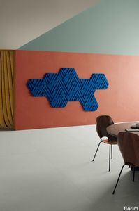
The alternation and symbiosis between concave and convex, recessed and raised. <p>Rilievi is a work of design balanced between different historic periods: while the volumetric relief tile modules are inspired by artistic experiments conducted in Italy during the Sixties and Seventies, the large slabs are the outcome of research into materials and technology that has only come to fruition in very recent times. The shadow effects generated on the surfaces of the slabs by the light striking the projecting parts of the modules create an unusual impression of architectural depth found virtually nowhere else in ceramic coverings, laying the bases for a new decoration interior design language.</p> This project simply embodies perfection - a term which certainly sets the bar high in a description of a new product for launch on the market. But when an enlightened manufacturer is capable of encapsulating a designer's personal research in a product to be added to its range, the outcome is a perfect synthesis. A perfect synthesis between untrammelled creativity and market trends. CEDIT had the insight needed to perceive, identify and rework the immense potential of Practice Practice Practice "“ a self-produced project by Zaven (Enrica Cavarzan and Marco Zavagno "“ and realised that its sophisticated design, originated by pure, pristine input (unadulterated by external factors except the noblest of them all, research) could provide the basis for an innovative, successful collection. I might add, a collection unique of its kind. Zaven is also a name that comes with guarantees; the two partners are good at what they do. Their work always starts from personal curiosity and investigations, the study of other stories (as in this case inspiration was drawn from the output of artist and activist Nino Caruso) and individual interests, which are broken down, developed, optimised and prepared for transformation into something fresh.Enrica Cavarzan and Marco Zavagno have a masterly ability to transform their own wishes and passions into design work of the greatest breadth and, as we see here, the widest, richest application. Their use of ceramics as a material is clearly outstanding and reflects a method precisely founded on the desire to look at things from an unusual viewpoint, under a different light. And to be daring. Zaven have an unconventional approach to convention. In the specific case of the Rilievi collection, the "modules" created for CEDIT seem to explode off the walls; in fact, they are constructed by combining the two-dimensional slab with its three-dimensional decor.Rilievi seems to be seeking space. More space. Even though these modules have actually established a dialogue with the wall from which they are born. At the same time, they hypnotise us with their tight sequence of lines, the pattern that is always different although its root is the same, and the intriguing, unusual colours that add another vital factor to the finished product. Their firm grounding in graphic design (and here we have come back to two-dimensional effects, of the kind most often associated with a wall covering) easily evolves into a facade which seems to have been carved with a chisel - although this is not the case. These modules are conceived to convey an impression of movement, and the three models, in seven colour combinations, create a powerful effect on a surface, which is never passive but rather an organic contributor to the forms and colours involved in the fascinating combinations. The slab is very much present and has the same worth and status as the relief pattern associated to it. In the light of this dichotomy between the linear and the sculpted, expressed through the skilfully balanced visual expedients, the use of repetition adds vigour to the module's intrinsic meaning. As we have seen, a rejection of facile, superficial creative dynamics in favour of an investigation reaching above and beyond has always been a central, clearly recognisable feature of this Venice-based duo, who already have impressive international partnerships to their credit, including the London Design Festival, the Kalmar Konstmuseum, the Paris Designer Days, Ca' Foscari University, the Venice Biennale, the Sandretto Re Rebaudengo Foundation, the Sindika Dokolo Foundation and the V-A-C Foundation, and also won the 2018 Wallpaper Design Award. Graphics, advertising and product design: the pair have always opted for a type of design closely linked to the observation of everyday items, followed by their reinterpretation in a version applied to experimentation with materials. This duality, combined with their energetic yet elegant visual language, forms Enrica and Marco's primary code, experienced in this specific context through serial carvings. On walls.
Patio
minotti > Sofa
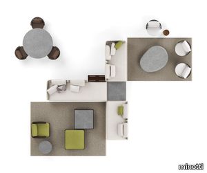
Having explored the use of woods, such as iroko and teak, with Patio, designed by Italian-Danish studio GamFratesi, Minotti proposes an unexpected mix of different materials: aluminium, wood, stone, cord. The outdoor seating system, with its highly versatile modularity, is conceived as a dynamic mosaic, composed of tesserae in simple geometric shapes, which can be pieced together as desired, and reconfigured to suit the available space and the mood to be created. The design of the sofa base structure enables the back elements to be arranged in various set positions all along the perimeter, to design conversation, relaxation, and vis-à-vis areas, spacing out the seats with coffee tables, and complementing them with ottomans and benches. A solution capable of meeting the requirements of both small metropolitan terraces, and extensive outdoor spaces, thanks to the two depths: 83 and 98 cm. The variety of potential compositions becomes even more interesting when the selected materials are masterfully combined: the extruded aluminium base with matt finish in the shades of Ecru and Dark Brown is accompanied by steel backrests, covered in woven polypropylene cord in the same shades, according to a Scandinavian-type geometric design. Some of the seating elements feature a handy tray in Dark Brown stained solid mahogany or in natural teak, with grooves for draining water, attached to the structure. Patio offers an interesting range of furnishing accessories, from coffee tables with top in brushed fine-grain Basaltina stone, benches, and square and rectangular ottomans with extruded aluminium base, in a creative mix of materic textures and sophisticated, natural colours. The system offers a rich variety of sofas in different measurements and configurations, in addition to central and end units, armchairs, loveseat, sunbeds and double daybeds. All the elements share the same feet and the same joints at the back in die-cast aluminium, varnished with a refined polished, anti-touch Bronze finish.
Compatta Pisé Limo
florim > Wall tile-stone-brick
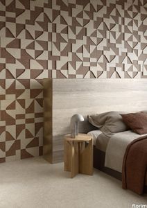
<p>A passion for earth as a natural material and for rammed earth, an ancient construction technique.</p> <p>The combination of these patterns evolves into the concept of Pisé Inserti, more slabs of immense decorative impact, generated by the two-dimensional criss-crossing of exquisite, rounded geometrical forms: the designer combines the natural earthen shades with apparently random curved lines that evoke the uneven trapezia with rounded corners used by Gio Ponti.</p> <p>These are also available in the large 120x280 cm size and 6 mm thickness in three variants: Pisé Inserti A, Pisé Inserti B and Pisé Inserti C. COMPATTA’s potential is further enhanced by three-dimensional subjects of varying shapes, which can be built up into mesh-backed mosaics to create sculptural forms on walls. These extensions to the collection are called Inserti Melange, Inserti Sabbia-Argilla and Inserti Limo-Ghiaia and are produced in 9 mm thickness and 30x30 cm size.</p> <p>The collection is born from a sustainable and virtuous approach and is part of <a href="https://www.florim.com/en/company/sustainability/carbonzero-florim/">CarbonZero</a>, Florim's range of Carbon Neutral surfaces.</p> <p>The COMPATTA collection, designed by Federico Peri, combines a passion for earth as a natural material and an interest in a very ancient construction technique.<br>The primary inspiration derives from close observation of the many strata within the ground and the mixtures of elementary particles of which it consists. The design concept is completed by reference to the age-old rammed earth construction technique, used in northern Jordan since the eighth millennium BCE and widely applied in Yemen in many other desert or rural settings until the mid 19thC.<br>In this method, the raw earth is compacted inside wooden formwork to construct continuous structural walls, bearing walls or partitions inside homes, with a natural decorative effect due to the layering of the different shades of clay used. When creating his project for CEDIT, Peri was also influenced by several design inputs: from rural African homes to the clear, simple geometric forms and curved lines typical of the work of Gio Ponti, the curves central to the modernist gardens of Brazilian landscape artist Roberto Burle Marx, and the three-dimensional mosaics of English sculptor William Mitchell. In his murals in concrete, glass and recycled materials, Mitchell seems to combine some of the typical features of a variety of artistic movements, from Modernism to Brutalism, and also shows awareness of the issues concerning the structure of the landscape and the relationship with nature at the heart of Land Art. COMPATTA thus embodies strong links to the world of art and architecture, while bringing natural impressions with a remote, primitive flavour into modern living-spaces.</p>
Policroma Breccia
florim > Wall tile-stone-brick
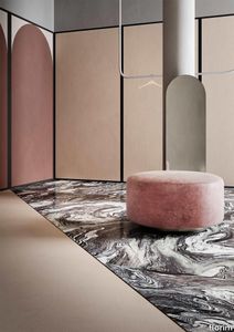
Recurring geometries, combinations of figures. Marble and marmorino plaster: comparison and dialogue. The collection is completed by a linear listello tile with the motif of a sequence of vertical rectangular blocks, which can be combined with the slabs to further enrich compositions involving continuous ceramic surfaces cladding.<br /><br />"Another reference is the use of Italian marbles on the verge of extinction, rare marbles such as Rosa Valtoce, the marble used in Milan Cathedral."<br />Cristina Celestino Cristina Celestino's smartphone contains a folder of images entitled "Milan". Photographs that are more like notes. Photographs of architectural features, materials or details of shapes encountered by chance during a walk, but they cannot be described as merely a vague "source of inspiration". This filing system, created in response to a fleeting instinct, is an integral part of the method of work adopted by the architect and designer, who starts off without preconceptions "“ or "free", as she puts it before drawing inputs from a vast world of references, from Hermès scarves to the works of the great Masters (in the specific case of Policroma). This accumulation, partly spontaneous and party the outcome of in-depth historical knowledge and study, naturally activates a process of synthesis and personal interpretation common to all Cristina Celestino's output.<br /><br /><br />The wall covering collection designed for Cedit was no exception, although in this case the designer was dealing with a project with variable dimensions, reaching up even to the architectural scale. In her own distinctive way, she combined a variety of references. Adolf Loos's passion for coloured types of marble, and Cipollino in particular. Carlo Scarpa's angular metal frames and Marmorino plaster in Venice. The French fashion house's square silk scarves. The entrance halls of Milan palazzos, Gio Ponti, the city's Cathedral. All expressed in the designer's own language: well balanced geometrical forms, subtle colours (shades similar to those of Scarpa himself), an effortless, almost restrained, playful elegance. The mood is that of the homes of the enlightened bourgeoisie who shaped the history of Milan, Celestino's adoptive city and an endless source of inputs. She has worked its interiors, including some of the least expected a 1928 tram, the historic Cucchi confectionery store hybridising her own style with the existing context. An imitative effect which is also the key to the meaning of the new Policroma collection: the marble varieties replicated using the Cedit technology are all from Italian quarries that are virtually "worked out". This revives an increasingly rare material as a "living" presence, in a different form which makes no claim to replace the natural original. Quite the contrary, Celestino immediately states her intention to imitate, by combining marble and Marmorino plaster in some variants with a contrasting frame (a typical feature for her, just as it was for Scarpa), and evoking the centuries-old marble-imitating scagliola plasterwork with a contemporary formula.<br /><br /><br />The types of marble chosen are central to the project's character. Verde Alpi, a favourite with Gio Ponti and often found in Milan entrance halls, features tightly packed patterning. Breccia Capraia, still found in a very few places in Tuscany, has a white background with just a few veins. Cipollino, in the special Ondulato variety in green and red, is patterned with spirals. Rosa Valtoce, on the other hand, was used by the "Veneranda Fabbrica" guild to build Milan Cathedral. It is an iconic stone with dramatic stripes, popular in the past; it is now sourced from one very small quarry in Piedmont which has been virtually abandoned.<br /> The many different elements that make up the Policroma collection all reflect the importance of craftsmanship to Cristina Celestino's design style: the modules can be freely mixed and combined, for example to create a concave or convex semicircle, or for the large-scale replication of small features initially conceived as trims, functional details transformed into a dominant motif.There is a return to the theme of the interior, a large or small protected space, conceived as suspended in space and time yet also reassuring and protective. It is designed through its coverings in a stark yet not minimalist way, with intelligence and with no overreaching artistic ambitions. An understated space and an extremely stylish declaration. In Milan style, of course.
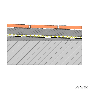
DRAINTEC 8 membrane with double drainage channel
profilitec > Accessories
DRAINTEC 8 membrane with double drainage channel Thanks to its particular shape, the DRAINTEC 8 draining system is able to guarantee load resistance performance combined with the high draining power. Its three-dimensional structure also allows it to withstand the walkway and the transport of the material during laying. It is extremely resistant to compression, traction, impact and punching; it also ensures perfect mechanical protection for waterproofing, with an increase in thickness of only 8 mm. DRAINTEC 8, thanks to the particular design, has a double drainage channel and hydrostatic pressure compensation, both in contact with the screed and in contact with the bituminous membrane. Allowing water, which inevitably penetrates inside the screed, to flow freely outside, is the only solution to prevent common damage to any external installation. The simple laying of the DRAINTEC 8 draining system over the normal insulating sheaths, applied with a suitable slope and the execution of a traditional screed on which to subsequently lay the coating, ensure the free and controlled flow of infiltration water. DRAINTEC 8 can be easily cut with normal shears, folded and shaped to follow the conformation of the surface. Advantages using DRAINTEC 8: • Extends the life of the tiles • Protects traditional waterproofing • It reduces the deterioration of the structures avoiding the efflorescence and the detachment of the coating • Solves the problem of water over-pressures and consequent cracks • Ensures thermo-acoustic insulation by constituting an 8 mm air gap How to install DRAINTEC 8 1) Make sure that the slope of the tile surface is at least 1 ÷ 2%. 2) In the case of existing waterproofing, check that it has been made in the proper way and check the location of the water outflow points once the screed has to be poured over over the DRAINTEC 8 membrane. 3) Build a screed suitable for laying, after having placed the DRAINTEC 8 membrane on the waterproofing, with the colored part in contact with the waterproofing and the filtering part facing upwards. 4) Provide and install, in relation to the tiled surface, a suitable lattice of expansion joints.
Oltremare Panchetta
sabaitalia > Armchair
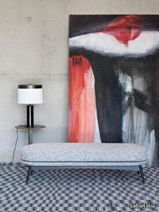
The seating collection “Oltremare” designed by Antonio Marras and produced in collaboration with Saba, stems from a far-away past and place, full of history, recollection, memories overflowing with suggestions and visions. And this is how Antonio Marras presented an object so dear to him that he defines a sacred-idol, that narrates of his land, of his sea, but mostly, of his story. We named it Oltremare, because all things have a soul and every soul has a name. Oltremare encloses within its inlets the classic and the modern. The curve is a line that can be tamed: it forms a wave, a fold, it creates a place but it also offers an escape route. In our utopian world we investigated the relationship between the curved line and the act of seating, asymmetric shapes that become backrests and sink into extremely comfortable seats pushing past the rectangular schemes so dear to the sober lines of designing sofas. The asymmetric curves that enclose it are the inspirations for the Oltremare armchair that completes the collection alongside a padded bench. A comfortable nest suspended on a slim varnished metal base, whose essential lines render, by contract, the armchair’s silhouette even more interesting. Oltremare is a seating system that, even though winks at the past, it communicates a strong contemporary soul and is suitable by nature to various interpretations. Fully removable covers.
Table S.A.M. Bois
vitra > Table
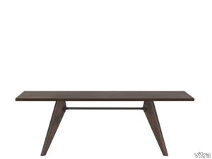
During the years of 1941 and 1942, the Ateliers Jean Prouvé planned and executed a number of interior design projects for a chemical company in France. Numerous pieces of furniture were developed in connection with this commission, including a table made of wood that exemplifies Prouvé’s construction methods: its structural details illustrate the interplay of forces and stresses – similar to the later design of the EM Table, whose metal legs distinguish it from its predecessor. Due to the scarcity of metal during World War II, the “Table Salle à Manger Bois” was designed with wooden legs, leading to the name Table S.A.M. Bois.<br/><br/>Available in natural oak, dark stained oak or American walnut, Table S.A.M. Bois by Jean Prouvé adds a high-quality, inviting touch to cafeterias, meeting rooms or central spaces in open-plan office environments.
Milana
marset > Ceiling lamp
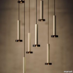
Moving the point of light, that’s the idea behind the new design by Jaume Ramírez. Milana involves a system of modular suspension lamps that combine with one another and can be moved both vertically and horizontally.Paradoxically, this new design starts by deconstructing the archetype of a lamp; by synthesizing it as much as possible, only a cylindrical body remains, suspended with a built-in LED. To this cylinder we can add different conical shades in oyster white and black in several sizes. But most ingenious of all is that each of these lamps can have a simple counterweight such that when they are hung between two points, they can be moved. An almost imperceptible lens covers the LED and distributes the light. If only the cylindrical lamp is used, the downward-directed light is impeccable, and when a shade is added, the light escapes, illuminating the lamp itself. This new lighting system gives the user control of the light, offering a new conceptual proposal. Furthermore, the Milana collection is now also available with a pressed glass accessory, in a smoked finish. A feature that adds volume and nuance to your lighting. This version is 24 V-ready, a technical detail that allows several lamp units to be connected to a single light source. With the pressed glass version of Milana, light sets can be created to illuminate large spaces. Covering and baring lamps, moving them up, down and sideways. Mixing cylindrical shapes or combining them with decorative lamps. Milana lets you create countless compositions, a symphony of light. A cluster accessory is also available for the Milana collection, allowing you to connect several pendant lamps at once to a single point of light. This offers the freedom to build with light, to illuminate large spaces and to create compositions.
Riviera Suspension
castrolighting > Ceiling lamp
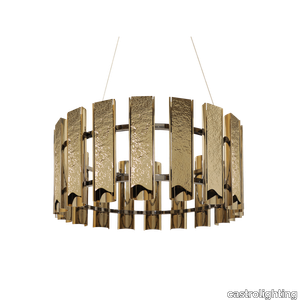
Sparked by contemplating the sea landscape, wave ripples, and the breathtaking Côte d'Azur atmosphere, the graceful and glowing Riviera chandelier was crafted. The aesthetic design inspiration came from the French Riviera – the sun-soaked coastline in the south of France surrounded by the Mediterranean Sea. Known for its beach resorts, panoramic views, and intense blue waters – one of the Earth’s most beautiful paradises. The Riviera gold suspension takes you on a daydream journey of visualizing an amazing French Riviera resort – just the right amount of light to make the ambiance feel exceptional and embracing. Each brass plate is a handmade artwork that was shaped and hammered differently to resemble waves and ripples, in a way to incorporate a modern design touch at its core, balancing refined hammered-gloss finishes. An organic fluid shape casts light on the bottom of the tube but also on the sides, dispersing a smooth light effect through its edges to enhance the gold finish of the tubes. On the back side of the brass tubes, the Riviera chandelier is designed with openings for a one-of-a-kind light spread. The light-diffusing effect of this eye-catching design will make it the central piece for all exquisite interiors and help achieve the desired timeless chic. This luxury handcrafted suspension is the perfect choice for art deco, mid-century modern, or modern classic interior style, being an excellent lighting decorative accessory for spacious living rooms, dining rooms, and hotel entrances. VIEW FULL FAMILY
Grace Console
castrolighting > Console
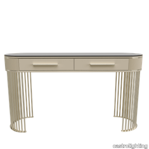
This console carries the same beautiful name and charm that is capable to transform any living space into an outstanding one. The Grace console was designed to be an accent furniture décor to provide a luxurious statement to the interior. The classy decorative piece incorporates bespoke brass elements and a tailor-made poplar root veneer wood top. A sophisticated colour combination is smooth yet delicate – it manifests an effortless elegance that is alluring to decorate with and complete a total home look with balance and harmony. This modern design integrates sleek gold-plated brass lines that are intertwined and create a subtle frame for the upper part of the console table. Create a magical vibe with this versatile lifestyle piece, allowing to beautify a room with various decorative settings and refined home accessories. This handmade furniture design is perfect for a hallway, entryway, living room, dining room, bedroom, or dressing room. Bespoke your dreams with the Grace Console as it can be organically customized and become a central piece for all the lavish houses to help achieve the desired timeless chic.
Heritage Luxe Heritage Cloud
florim > Wall tile-stone-brick
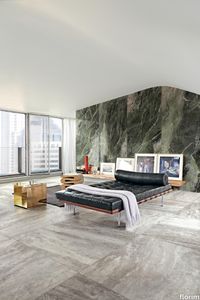
Heritage Luxe can be said to exemplify the magnitude of our inheritance from the past which at the same time is part of our present. In keeping with modern times, the surfaces of the collection have a strong decorative character and bring the heritage of the European tradition up to date by proposing a stylistic concept inspired by the beauty and classic luxury of marble that blends with the dynamism of veining and colors of a contemporary flavor. <p>Memory, the heritage of the past and the most up-to-date taste all unite in a single dimension in which the iconic objects and furnishings of yesteryear coexist with the most contemporary luxury of modern times to transform the atmosphere of the surroundings into something unique and instantly recognizable. The collection features marble surfaces in bold, refined colors that add immense personality and character to the most exclusive of spaces. The richness of colors and graphic details of these products finds its maximum expression in the large sizes, designed to blend in with increasingly voguish large open spaces, or to illuminate more intimate surroundings.</p> <p> </p> <p class="MsoNormal"><strong><span lang="EN-US" style="mso-ansi-language: EN-US;">COLORS AND DECORS</span></strong></p> <p class="MsoNormal"><span lang="EN-US" style="mso-ansi-language: EN-US;">Heritage Azure is distinguished by a pale, refined blue background against which a deep rust-colored vein stands out, making it perfect for pairing with warm-toned colors and materials.</span></p> <p class="MsoNormal"><span lang="EN-US" style="mso-ansi-language: EN-US;">Heritage Cloud is the most versatile surface in the collection. Characterized by different streaks of grey, this graphic can be perfectly matched with both warm and cool colored materials.</span></p> <p class="MsoNormal"><span lang="EN-US" style="mso-ansi-language: EN-US;">The soft, enveloping base of Heritage Brown is reminiscent of Spanish marble, distinguished by subtle and barely noticeable white veins.</span></p> <p class="MsoNormal"><span lang="EN-US" style="mso-ansi-language: EN-US;">Heritage Emerald brings to mind the rolling hills of Ireland. Shades ranging from dark to light green with dashes of brown and white congregate on its surface.</span></p> <p class="MsoNormal"><span lang="EN-US" style="mso-ansi-language: EN-US;">Heritage Aqua is a surprising surface that emerges from the encounter of contrasting shades of teal and white, embellished with sophisticated orange veins.</span></p> <p class="MsoNormal">Lastly, Heritage Flame bears witness to an encounter between delicate shades of brown and dashes of cream.</p> <p class="MsoNormal"><span lang="EN-US" style="mso-ansi-language: EN-US;">The array of backgrounds is accompanied by three 6 mm thick colored-body porcelain stoneware decors that combine the different shapes and graphics of the slabs in the range, thus delineating an enchanting continuity of colors and veining within the space.</span></p> <p class="MsoNormal"><span lang="EN-US" style="mso-ansi-language: EN-US;">The Picket decor juxtaposes the trapezoidal glossy Heritage Emerald and Heritage Cloud slabs to craft a refined composition with clean, contemporary lines.</span></p> <p class="MsoNormal"><span lang="EN-US" style="mso-ansi-language: EN-US;">The Maze decor, composed of a range of small Heritage Emerald, Heritage Brown and Heritage Flame trapezoids, catches the eye with its harmonious concentric motifs.</span></p> <p class="MsoNormal"><span lang="EN-US" style="mso-ansi-language: EN-US;">Finally, the Trinity decor features three sinuously arched, glossy finish strips in the Heritage Azure graphic.</span></p>
Policroma Lichene

florim > Wall Paint
Recurring geometries, combinations of figures. Marble and marmorino plaster: comparison and dialogue. The collection is completed by a linear listello tile with the motif of a sequence of vertical rectangular blocks, which can be combined with the slabs to further enrich compositions involving continuous ceramic surfaces cladding.<br /><br />"Another reference is the use of Italian marbles on the verge of extinction, rare marbles such as Rosa Valtoce, the marble used in Milan Cathedral."<br />Cristina Celestino Cristina Celestino's smartphone contains a folder of images entitled "Milan". Photographs that are more like notes. Photographs of architectural features, materials or details of shapes encountered by chance during a walk, but they cannot be described as merely a vague "source of inspiration". This filing system, created in response to a fleeting instinct, is an integral part of the method of work adopted by the architect and designer, who starts off without preconceptions "“ or "free", as she puts it before drawing inputs from a vast world of references, from Hermès scarves to the works of the great Masters (in the specific case of Policroma). This accumulation, partly spontaneous and party the outcome of in-depth historical knowledge and study, naturally activates a process of synthesis and personal interpretation common to all Cristina Celestino's output.<br /><br /><br />The wall covering collection designed for Cedit was no exception, although in this case the designer was dealing with a project with variable dimensions, reaching up even to the architectural scale. In her own distinctive way, she combined a variety of references. Adolf Loos's passion for coloured types of marble, and Cipollino in particular. Carlo Scarpa's angular metal frames and Marmorino plaster in Venice. The French fashion house's square silk scarves. The entrance halls of Milan palazzos, Gio Ponti, the city's Cathedral. All expressed in the designer's own language: well balanced geometrical forms, subtle colours (shades similar to those of Scarpa himself), an effortless, almost restrained, playful elegance. The mood is that of the homes of the enlightened bourgeoisie who shaped the history of Milan, Celestino's adoptive city and an endless source of inputs. She has worked its interiors, including some of the least expected a 1928 tram, the historic Cucchi confectionery store hybridising her own style with the existing context. An imitative effect which is also the key to the meaning of the new Policroma collection: the marble varieties replicated using the Cedit technology are all from Italian quarries that are virtually "worked out". This revives an increasingly rare material as a "living" presence, in a different form which makes no claim to replace the natural original. Quite the contrary, Celestino immediately states her intention to imitate, by combining marble and Marmorino plaster in some variants with a contrasting frame (a typical feature for her, just as it was for Scarpa), and evoking the centuries-old marble-imitating scagliola plasterwork with a contemporary formula.<br /><br /><br />The types of marble chosen are central to the project's character. Verde Alpi, a favourite with Gio Ponti and often found in Milan entrance halls, features tightly packed patterning. Breccia Capraia, still found in a very few places in Tuscany, has a white background with just a few veins. Cipollino, in the special Ondulato variety in green and red, is patterned with spirals. Rosa Valtoce, on the other hand, was used by the "Veneranda Fabbrica" guild to build Milan Cathedral. It is an iconic stone with dramatic stripes, popular in the past; it is now sourced from one very small quarry in Piedmont which has been virtually abandoned.<br /> The many different elements that make up the Policroma collection all reflect the importance of craftsmanship to Cristina Celestino's design style: the modules can be freely mixed and combined, for example to create a concave or convex semicircle, or for the large-scale replication of small features initially conceived as trims, functional details transformed into a dominant motif.There is a return to the theme of the interior, a large or small protected space, conceived as suspended in space and time yet also reassuring and protective. It is designed through its coverings in a stark yet not minimalist way, with intelligence and with no overreaching artistic ambitions. An understated space and an extremely stylish declaration. In Milan style, of course.
Oltremare
sabaitalia > Sofa
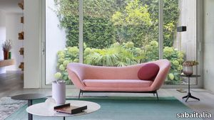
The seating collection “Oltremare” designed by Antonio Marras and produced in collaboration with Saba, stems from a far-away past and place, full of history, recollection, memories overflowing with suggestions and visions. And this is how Antonio Marras presented an object so dear to him that he defines a sacred-idol, that narrates of his land, of his sea, but mostly, of his story. We named it Oltremare, because all things have a soul and every soul has a name. Oltremare encloses within its inlets the classic and the modern. The curve is a line that can be tamed: it forms a wave, a fold, it creates a place but it also offers an escape route. In our utopian world we investigated the relationship between the curved line and the act of seating, asymmetric shapes that become backrests and sink into extremely comfortable seats pushing past the rectangular schemes so dear to the sober lines of designing sofas. The asymmetric curves that enclose it are the inspirations for the Oltremare armchair that completes the collection alongside a padded bench. A comfortable nest suspended on a slim varnished metal base, whose essential lines render, by contract, the armchair’s silhouette even more interesting. Oltremare is a seating system that, even though winks at the past, it communicates a strong contemporary soul and is suitable by nature to various interpretations. Fully removable covers.
Heritage Luxe Heritage Aqua

florim > Floor tile-stone
Heritage Luxe can be said to exemplify the magnitude of our inheritance from the past which at the same time is part of our present. In keeping with modern times, the surfaces of the collection have a strong decorative character and bring the heritage of the European tradition up to date by proposing a stylistic concept inspired by the beauty and classic luxury of marble that blends with the dynamism of veining and colors of a contemporary flavor. <p>Memory, the heritage of the past and the most up-to-date taste all unite in a single dimension in which the iconic objects and furnishings of yesteryear coexist with the most contemporary luxury of modern times to transform the atmosphere of the surroundings into something unique and instantly recognizable. The collection features marble surfaces in bold, refined colors that add immense personality and character to the most exclusive of spaces. The richness of colors and graphic details of these products finds its maximum expression in the large sizes, designed to blend in with increasingly voguish large open spaces, or to illuminate more intimate surroundings.</p> <p> </p> <p class="MsoNormal"><strong><span lang="EN-US" style="mso-ansi-language: EN-US;">COLORS AND DECORS</span></strong></p> <p class="MsoNormal"><span lang="EN-US" style="mso-ansi-language: EN-US;">Heritage Azure is distinguished by a pale, refined blue background against which a deep rust-colored vein stands out, making it perfect for pairing with warm-toned colors and materials.</span></p> <p class="MsoNormal"><span lang="EN-US" style="mso-ansi-language: EN-US;">Heritage Cloud is the most versatile surface in the collection. Characterized by different streaks of grey, this graphic can be perfectly matched with both warm and cool colored materials.</span></p> <p class="MsoNormal"><span lang="EN-US" style="mso-ansi-language: EN-US;">The soft, enveloping base of Heritage Brown is reminiscent of Spanish marble, distinguished by subtle and barely noticeable white veins.</span></p> <p class="MsoNormal"><span lang="EN-US" style="mso-ansi-language: EN-US;">Heritage Emerald brings to mind the rolling hills of Ireland. Shades ranging from dark to light green with dashes of brown and white congregate on its surface.</span></p> <p class="MsoNormal"><span lang="EN-US" style="mso-ansi-language: EN-US;">Heritage Aqua is a surprising surface that emerges from the encounter of contrasting shades of teal and white, embellished with sophisticated orange veins.</span></p> <p class="MsoNormal">Lastly, Heritage Flame bears witness to an encounter between delicate shades of brown and dashes of cream.</p> <p class="MsoNormal"><span lang="EN-US" style="mso-ansi-language: EN-US;">The array of backgrounds is accompanied by three 6 mm thick colored-body porcelain stoneware decors that combine the different shapes and graphics of the slabs in the range, thus delineating an enchanting continuity of colors and veining within the space.</span></p> <p class="MsoNormal"><span lang="EN-US" style="mso-ansi-language: EN-US;">The Picket decor juxtaposes the trapezoidal glossy Heritage Emerald and Heritage Cloud slabs to craft a refined composition with clean, contemporary lines.</span></p> <p class="MsoNormal"><span lang="EN-US" style="mso-ansi-language: EN-US;">The Maze decor, composed of a range of small Heritage Emerald, Heritage Brown and Heritage Flame trapezoids, catches the eye with its harmonious concentric motifs.</span></p> <p class="MsoNormal"><span lang="EN-US" style="mso-ansi-language: EN-US;">Finally, the Trinity decor features three sinuously arched, glossy finish strips in the Heritage Azure graphic.</span></p>
Torii
minotti > Sofa
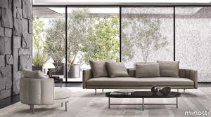
Airy, with constructive details linked to Japanese tradition, the Torii modular seats play with round edged volumes, thin profiles and the apparent formal simplicity of an extremely detailed design. The metal structure of the legs of the seats and tables is Nendo’s nod to the image of the “torii”, the entrance gate to Shinto shrines in Japan. With an interlocking game, the horizontal elements are laid on the vertical supports, ensuring a sophisticated visual lightness that accommodates the padded volume, characterised by couture craftsmanship. The Torii family includes sofas - with high or low backrest and a linear shape, rounded at the arms - inclined sofas with a combination of two different depths, armchairs and lounge and dining little armchairs, ottomans, coffee tables, and a slender, oval-shaped console table, ideal for placing anywhere in the living area. The varied range of products makes it possible to design a flexible layout, in which the individual elements can also be combined to create a strong visual unity. The metal frame found in the components of the Torii family evokes the image of the “Senbon Torii, the wooden colonnade that forms a gallery made up of 1,000 vermilion torii gates”, as Nendo reminds us. The slim backrest features vertical quilting and a piping running along the perimeter of the cushioning, underlining the couture quality of the craftsmanship. The eco-leather and eco-nubuck piping is in a slightly contrasting colour, but in the same shade as the fabric, if combined with a textile covering, whereas the leather versions come in the same shade when combined with leather upholstery. All the upholstered elements of the system can be customised by choosing the covering: 100% fabric or leather, or in fabric with a leather base. The seats can be accessorised with leather magazine caddy, crafted with fine luggage-crafting techniques and enriched with the same metal details as the base. The end of the horizontal metal element of the legs is designed so that it almost holds the backrest and seat, recalling the Kigumi technique, borrowed from the Japanese tradition of wood construction. A small decorative disk with Black-Nickel finish, in the form of a jewel-like button located at the end, adds a precious detail to the ensemble, and creates a series of contrasts with the Bronze colour varnished metal finish of the legs. The armchairs and swivel armchairs in the form of a perfect circle were designed to meet a variety of requirements, both in terms of functionality and ergonomics, available in a range of different types. The seats - in the Bergère, Large, Medium and Small versions - and the Dining, Dining Large and Lounge little armchairs are the result of the in-depth research carried out to find the best way to express the sophisticated simplicity of the craftsmanship. The base is available in leather or fabric. The extension of the base of some elements features a top in Calacatta or Stone Grey marble with a matt polyester lacquer finish, crafted with a careful study of its proportions, thickness and structural details so that it blends seamlessly into the seat, also from an aesthetic point of view. The Small armchair is also available in the Torii Nest version with braided leather backrest and a pattern inspired by Vienna straw, inserted in a solid ash wood frame that sits on a base in the same material. The Torii coffee tables also feature the same structural style details as the seats, reflected in the metal frame with Bronze colour varnished finish and details in Black-Nickel metal. Available in different sizes, ranging up to an impressive diameter of 120 cm, and different heights, they feature a top in Calacatta or Stone Grey marble with matt polyester finish, in Black pâte de verre or in Liquorice colour brushed ash wood, enclosed by a Liquorice colour matt lacquered frame.
Compatta Ghiaia

florim > Wall tile-stone-brick
<p>A passion for earth as a natural material and for rammed earth, an ancient construction technique.</p> <p>The combination of these patterns evolves into the concept of Pisé Inserti, more slabs of immense decorative impact, generated by the two-dimensional criss-crossing of exquisite, rounded geometrical forms: the designer combines the natural earthen shades with apparently random curved lines that evoke the uneven trapezia with rounded corners used by Gio Ponti.</p> <p>These are also available in the large 120x280 cm size and 6 mm thickness in three variants: Pisé Inserti A, Pisé Inserti B and Pisé Inserti C. COMPATTA’s potential is further enhanced by three-dimensional subjects of varying shapes, which can be built up into mesh-backed mosaics to create sculptural forms on walls. These extensions to the collection are called Inserti Melange, Inserti Sabbia-Argilla and Inserti Limo-Ghiaia and are produced in 9 mm thickness and 30x30 cm size.</p> <p>The collection is born from a sustainable and virtuous approach and is part of <a href="https://www.florim.com/en/company/sustainability/carbonzero-florim/">CarbonZero</a>, Florim's range of Carbon Neutral surfaces.</p> <p>The COMPATTA collection, designed by Federico Peri, combines a passion for earth as a natural material and an interest in a very ancient construction technique.<br>The primary inspiration derives from close observation of the many strata within the ground and the mixtures of elementary particles of which it consists. The design concept is completed by reference to the age-old rammed earth construction technique, used in northern Jordan since the eighth millennium BCE and widely applied in Yemen in many other desert or rural settings until the mid 19thC.<br>In this method, the raw earth is compacted inside wooden formwork to construct continuous structural walls, bearing walls or partitions inside homes, with a natural decorative effect due to the layering of the different shades of clay used. When creating his project for CEDIT, Peri was also influenced by several design inputs: from rural African homes to the clear, simple geometric forms and curved lines typical of the work of Gio Ponti, the curves central to the modernist gardens of Brazilian landscape artist Roberto Burle Marx, and the three-dimensional mosaics of English sculptor William Mitchell. In his murals in concrete, glass and recycled materials, Mitchell seems to combine some of the typical features of a variety of artistic movements, from Modernism to Brutalism, and also shows awareness of the issues concerning the structure of the landscape and the relationship with nature at the heart of Land Art. COMPATTA thus embodies strong links to the world of art and architecture, while bringing natural impressions with a remote, primitive flavour into modern living-spaces.</p>
Archeologie Archeologie Grigio
florim > Wall Paint
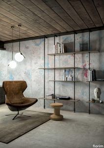
The poetics of the wall. The forgotten wall. «A wall is like a book to be opened, a journey into the interior, revealing the experiences, memories, signs and symbols which this fragment of masonry has absorbed over the centuries.» Franco Guerzoni <p>It is difficult to resist the beauty of Franco Guerzoni's art, created by a rare harmony of feeling and intellect, poetry and mind. The artist expresses this through paintings which, although complex in structure, are joyous and sensual, with bright colours made, like those of the great masters of the past, from choice powdered ingredients. A painter with a technique rich in traditional skills, Guerzoni offers a version of modernity involving an intense fundamental relationship with his images and with space. In fact, the dialectic between painting and space, form and architecture, time and memory seems to be essential to his art. As his works specifically created for CEDIT clearly express, his creations achieve a perfect balance between the spatial dimension and intensely lyrical use of colour, which here becomes a soft, liquid form of matter, wandering across the surface of a dazzling lime-plaster white. White, metaphor for the clear light of day, as it was in the large, complex canvases exhibited in his personal exhibition at the 1990 Venice Biennale, is the background for forms of colour which renew the pleasure to be had from painting and the memory of an image glimpsed on the vast expanse of the surface. In the more recent works, these voluptuous shades are transformed into subtle shadows of colour that delicately caress the surface.</p> <p> </p> <p> All it takes is one wall, the only surviving wall of what was once a house, on which time has recorded its own, unavoidable passing, leaving traces of colour that is still vibrant, although faded in places, to allow the memory of the image to transpire, fragile and uncertain, in the physicality of the surface, to bear tangible witness to the existence of history, a mysterious visual memory, the extension into the present of the life of things. A memory of the past on a contemporary wall. The idea of memory is central to Franco Guerzoni's poetics: private, secret memory and the collective memory of the past. Fragmentary and indecipherable, perceived by the artist with the aid of what is left of the images, the fragment. A relic of a totality which can no longer be reconstructed but only imagined in poetic terms, the fragment, a fraction of an image conserved by time, guides the artist's fantastic archaeological journey in search of the world's memory. However, this journey takes him in the opposite direction to the archaeologist, for whom the fragment - fundamental because it reveals a trace of the past is the starting-point for an attempt to reconstruct history. For Guerzoni, the fragment is the endpoint of his work, the goal for which he strives in his investigation of the surface, as he digs deep down, leafing through the deposits of time and memory.</p> <p> </p> <p>Like the large pages of a book traced with fragile sketches, embryonic forms whose meaning has been lost in time, leaving only fleeting traces, uncertain, ambiguous, mysterious morphologies. It marks the start of a journey into the mind of the artist-archaeologist, an adventurous journey into the inextricable labyrinth of the mind, to unearth what is hidden, shuffling the cards in a perennial contamination of images, memory, signs and traces, in search of a meaning, which no sooner appears than it is lost, merging into time and once again becoming a dream, an imaginary journey into fantasy and wonder. And this is the case in the tryptic created for CEDIT, which placed a new challenge before the artist: to transfer "his" image, the remains and fragments of a forgotten wall onto a new material for him “stunning, large-sized ceramic slabs“ and a real wall, without this tautology betraying the painting's deep meaning, its fertile magic of lines and colours, from which the image is born. And the artist is fully aware of this. Guerzoni describes his art as a "gamble": a gamble that is a critical test, an act of daring, dangerous and risky. This is the challenge he sets himself. It is a challenge he easily overcomes, expressing himself on these large walls with a rediscovered pleasure in painting, no longer restrained and apparently absorbed by the dense, uneven coloured surface but set free and almost luxuriously accentuated. In his large, demanding works for CEDIT, Guerzoni achieves a new, consummate mode of painting, in which the architecture of the surfaces provides a poetic meeting-point between the two founding components of his style, the complex, well thought-out composition and the lyricism of colour.</p>
Cables

gotessons > Styling
Our assortment of cables for electrical accessories with different outlets: VGA, Mini-jack, HDMI, Displayport, USB, USB C, Cat. 6, GST18, Network switch and VGA switch. See more under the tab Properties.VGA: Analogue connection between monitor and CPU. Mini-jack 3,5 mm: Analogue audio connection. For adding audio to presentations or for headset use. HDMI: Audio - visual digital connection between monitor and CPU. An audio-visual connection to the main monitor. Display port: Audio - visual digital connection between monitor and CPU. Commonly used on Mac. USB: To transfer data. Connect memory sticks for office presentations, camera memory, card readers, GPS, printers or synchronized mp3/mobile. USB C: To transfer data or charge. Connect memory sticks for office presentations, camera memory, card readers, GPS or printers. Network: Internet access. GST18: Contact us for other specifications. Can be ordered in different lengths and combinations male/female. Network switch: Splits one incoming network connection into 5 or 16 useable connections. VGA switch: To connect several CPU:s to one projector or main monitor. Switch from one CPU to another via remote control.
Policroma Cipollino

florim > Wall tile-stone-brick
Recurring geometries, combinations of figures. Marble and marmorino plaster: comparison and dialogue. The collection is completed by a linear listello tile with the motif of a sequence of vertical rectangular blocks, which can be combined with the slabs to further enrich compositions involving continuous ceramic surfaces cladding.<br /><br />"Another reference is the use of Italian marbles on the verge of extinction, rare marbles such as Rosa Valtoce, the marble used in Milan Cathedral."<br />Cristina Celestino Cristina Celestino's smartphone contains a folder of images entitled "Milan". Photographs that are more like notes. Photographs of architectural features, materials or details of shapes encountered by chance during a walk, but they cannot be described as merely a vague "source of inspiration". This filing system, created in response to a fleeting instinct, is an integral part of the method of work adopted by the architect and designer, who starts off without preconceptions "“ or "free", as she puts it before drawing inputs from a vast world of references, from Hermès scarves to the works of the great Masters (in the specific case of Policroma). This accumulation, partly spontaneous and party the outcome of in-depth historical knowledge and study, naturally activates a process of synthesis and personal interpretation common to all Cristina Celestino's output.<br /><br /><br />The wall covering collection designed for Cedit was no exception, although in this case the designer was dealing with a project with variable dimensions, reaching up even to the architectural scale. In her own distinctive way, she combined a variety of references. Adolf Loos's passion for coloured types of marble, and Cipollino in particular. Carlo Scarpa's angular metal frames and Marmorino plaster in Venice. The French fashion house's square silk scarves. The entrance halls of Milan palazzos, Gio Ponti, the city's Cathedral. All expressed in the designer's own language: well balanced geometrical forms, subtle colours (shades similar to those of Scarpa himself), an effortless, almost restrained, playful elegance. The mood is that of the homes of the enlightened bourgeoisie who shaped the history of Milan, Celestino's adoptive city and an endless source of inputs. She has worked its interiors, including some of the least expected a 1928 tram, the historic Cucchi confectionery store hybridising her own style with the existing context. An imitative effect which is also the key to the meaning of the new Policroma collection: the marble varieties replicated using the Cedit technology are all from Italian quarries that are virtually "worked out". This revives an increasingly rare material as a "living" presence, in a different form which makes no claim to replace the natural original. Quite the contrary, Celestino immediately states her intention to imitate, by combining marble and Marmorino plaster in some variants with a contrasting frame (a typical feature for her, just as it was for Scarpa), and evoking the centuries-old marble-imitating scagliola plasterwork with a contemporary formula.<br /><br /><br />The types of marble chosen are central to the project's character. Verde Alpi, a favourite with Gio Ponti and often found in Milan entrance halls, features tightly packed patterning. Breccia Capraia, still found in a very few places in Tuscany, has a white background with just a few veins. Cipollino, in the special Ondulato variety in green and red, is patterned with spirals. Rosa Valtoce, on the other hand, was used by the "Veneranda Fabbrica" guild to build Milan Cathedral. It is an iconic stone with dramatic stripes, popular in the past; it is now sourced from one very small quarry in Piedmont which has been virtually abandoned.<br /> The many different elements that make up the Policroma collection all reflect the importance of craftsmanship to Cristina Celestino's design style: the modules can be freely mixed and combined, for example to create a concave or convex semicircle, or for the large-scale replication of small features initially conceived as trims, functional details transformed into a dominant motif.There is a return to the theme of the interior, a large or small protected space, conceived as suspended in space and time yet also reassuring and protective. It is designed through its coverings in a stark yet not minimalist way, with intelligence and with no overreaching artistic ambitions. An understated space and an extremely stylish declaration. In Milan style, of course.
Rilievi Sabbia

florim > Wall Paint
The alternation and symbiosis between concave and convex, recessed and raised. <p>Rilievi is a work of design balanced between different historic periods: while the volumetric relief tile modules are inspired by artistic experiments conducted in Italy during the Sixties and Seventies, the large slabs are the outcome of research into materials and technology that has only come to fruition in very recent times. The shadow effects generated on the surfaces of the slabs by the light striking the projecting parts of the modules create an unusual impression of architectural depth found virtually nowhere else in ceramic coverings, laying the bases for a new decoration interior design language.</p> This project simply embodies perfection - a term which certainly sets the bar high in a description of a new product for launch on the market. But when an enlightened manufacturer is capable of encapsulating a designer's personal research in a product to be added to its range, the outcome is a perfect synthesis. A perfect synthesis between untrammelled creativity and market trends. CEDIT had the insight needed to perceive, identify and rework the immense potential of Practice Practice Practice "“ a self-produced project by Zaven (Enrica Cavarzan and Marco Zavagno "“ and realised that its sophisticated design, originated by pure, pristine input (unadulterated by external factors except the noblest of them all, research) could provide the basis for an innovative, successful collection. I might add, a collection unique of its kind. Zaven is also a name that comes with guarantees; the two partners are good at what they do. Their work always starts from personal curiosity and investigations, the study of other stories (as in this case inspiration was drawn from the output of artist and activist Nino Caruso) and individual interests, which are broken down, developed, optimised and prepared for transformation into something fresh.Enrica Cavarzan and Marco Zavagno have a masterly ability to transform their own wishes and passions into design work of the greatest breadth and, as we see here, the widest, richest application. Their use of ceramics as a material is clearly outstanding and reflects a method precisely founded on the desire to look at things from an unusual viewpoint, under a different light. And to be daring. Zaven have an unconventional approach to convention. In the specific case of the Rilievi collection, the "modules" created for CEDIT seem to explode off the walls; in fact, they are constructed by combining the two-dimensional slab with its three-dimensional decor.Rilievi seems to be seeking space. More space. Even though these modules have actually established a dialogue with the wall from which they are born. At the same time, they hypnotise us with their tight sequence of lines, the pattern that is always different although its root is the same, and the intriguing, unusual colours that add another vital factor to the finished product. Their firm grounding in graphic design (and here we have come back to two-dimensional effects, of the kind most often associated with a wall covering) easily evolves into a facade which seems to have been carved with a chisel - although this is not the case. These modules are conceived to convey an impression of movement, and the three models, in seven colour combinations, create a powerful effect on a surface, which is never passive but rather an organic contributor to the forms and colours involved in the fascinating combinations. The slab is very much present and has the same worth and status as the relief pattern associated to it. In the light of this dichotomy between the linear and the sculpted, expressed through the skilfully balanced visual expedients, the use of repetition adds vigour to the module's intrinsic meaning. As we have seen, a rejection of facile, superficial creative dynamics in favour of an investigation reaching above and beyond has always been a central, clearly recognisable feature of this Venice-based duo, who already have impressive international partnerships to their credit, including the London Design Festival, the Kalmar Konstmuseum, the Paris Designer Days, Ca' Foscari University, the Venice Biennale, the Sandretto Re Rebaudengo Foundation, the Sindika Dokolo Foundation and the V-A-C Foundation, and also won the 2018 Wallpaper Design Award. Graphics, advertising and product design: the pair have always opted for a type of design closely linked to the observation of everyday items, followed by their reinterpretation in a version applied to experimentation with materials. This duality, combined with their energetic yet elegant visual language, forms Enrica and Marco's primary code, experienced in this specific context through serial carvings. On walls.
Juli Soft

cappellini > Chair
The apex of twenty years of creative experimentation by Werner Aisslinger, the Juli Soft armchair stands out for its sophisticated and elegant appearance. Fully upholstered in fabric, the Juli Soft armchair sits on top of a base that comes in following versions: a goblet base with a polished chrome finish, matte white, matte black, or matte mud; with 4 ash legs with a bleached finish, oak stained, wengé stained, or black stained; with 4 or 5 aluminum legs in a polished aluminum version, matte white, matte black, or matte mud; 4 tubular iron legs with a polished chrome, matte white, matte black, or matte mud finish; with a sled base, with versions in polished chrome, matte white, matte black, or a matte mud finish. Thanks to its remarkable stability, the robust injection-molded seat and the fresh, contemporary look, the Juli Soft armchair is the perfect solution for home and Contract settings, such as offices and restaurants.
Patio
minotti > Styling
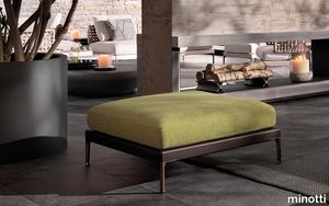
Having explored the use of woods, such as iroko and teak, with Patio, designed by Italian-Danish studio GamFratesi, Minotti proposes an unexpected mix of different materials: aluminium, wood, stone, cord. The outdoor seating system, with its highly versatile modularity, is conceived as a dynamic mosaic, composed of tesserae in simple geometric shapes, which can be pieced together as desired, and reconfigured to suit the available space and the mood to be created. The design of the sofa base structure enables the back elements to be arranged in various set positions all along the perimeter, to design conversation, relaxation, and vis-à-vis areas, spacing out the seats with coffee tables, and complementing them with ottomans and benches. A solution capable of meeting the requirements of both small metropolitan terraces, and extensive outdoor spaces, thanks to the two depths: 83 and 98 cm. The variety of potential compositions becomes even more interesting when the selected materials are masterfully combined: the extruded aluminium base with matt finish in the shades of Ecru and Dark Brown is accompanied by steel backrests, covered in woven polypropylene cord in the same shades, according to a Scandinavian-type geometric design. Some of the seating elements feature a handy tray in Dark Brown stained solid mahogany or in natural teak, with grooves for draining water, attached to the structure. Patio offers an interesting range of furnishing accessories, from coffee tables with top in brushed fine-grain Basaltina stone, benches, and square and rectangular ottomans with extruded aluminium base, in a creative mix of materic textures and sophisticated, natural colours. The system offers a rich variety of sofas in different measurements and configurations, in addition to central and end units, armchairs, loveseat, sunbeds and double daybeds. All the elements share the same feet and the same joints at the back in die-cast aluminium, varnished with a refined polished, anti-touch Bronze finish.
IO
fontanaarte > Wall lamp
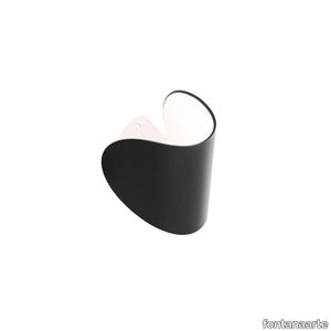
In the shape of a small curved lunar disc, IO is a wall light with dual Led light emission. IO appears almost suspended, very close to the wall but never close enough to touch it; positioned at a distance that allows the light to gently caress the wall with an intimate skimming effect. Elegant and minimalist, it is equipped with a mount with a dual rotating axis. is allows the diffuser to be rotated by 360°, directing it exactly where the light is required. In addition to rotating, the diffuser also moves up and down, opening and closing the light beams to adjust to individual requirements. Designed to provide a source of light that is as personal and adjustable as possible, the ideal use for this light is as a bedside lamp. However, it's versatility also makes it an excellent solution for lighting the walls of offices and corridors, both in residential and contract spaces. The diffuser is made from die-cast aluminium and looks very solid despite its small size. It is available in a matt finish in the following four colours: graphite grey, red, white and blue. The inside is always white in order to reflect as much light as possible.
Rilievi Cielo

florim > Wall Paint
The alternation and symbiosis between concave and convex, recessed and raised. <p>Rilievi is a work of design balanced between different historic periods: while the volumetric relief tile modules are inspired by artistic experiments conducted in Italy during the Sixties and Seventies, the large slabs are the outcome of research into materials and technology that has only come to fruition in very recent times. The shadow effects generated on the surfaces of the slabs by the light striking the projecting parts of the modules create an unusual impression of architectural depth found virtually nowhere else in ceramic coverings, laying the bases for a new decoration interior design language.</p> This project simply embodies perfection - a term which certainly sets the bar high in a description of a new product for launch on the market. But when an enlightened manufacturer is capable of encapsulating a designer's personal research in a product to be added to its range, the outcome is a perfect synthesis. A perfect synthesis between untrammelled creativity and market trends. CEDIT had the insight needed to perceive, identify and rework the immense potential of Practice Practice Practice "“ a self-produced project by Zaven (Enrica Cavarzan and Marco Zavagno "“ and realised that its sophisticated design, originated by pure, pristine input (unadulterated by external factors except the noblest of them all, research) could provide the basis for an innovative, successful collection. I might add, a collection unique of its kind. Zaven is also a name that comes with guarantees; the two partners are good at what they do. Their work always starts from personal curiosity and investigations, the study of other stories (as in this case inspiration was drawn from the output of artist and activist Nino Caruso) and individual interests, which are broken down, developed, optimised and prepared for transformation into something fresh.Enrica Cavarzan and Marco Zavagno have a masterly ability to transform their own wishes and passions into design work of the greatest breadth and, as we see here, the widest, richest application. Their use of ceramics as a material is clearly outstanding and reflects a method precisely founded on the desire to look at things from an unusual viewpoint, under a different light. And to be daring. Zaven have an unconventional approach to convention. In the specific case of the Rilievi collection, the "modules" created for CEDIT seem to explode off the walls; in fact, they are constructed by combining the two-dimensional slab with its three-dimensional decor.Rilievi seems to be seeking space. More space. Even though these modules have actually established a dialogue with the wall from which they are born. At the same time, they hypnotise us with their tight sequence of lines, the pattern that is always different although its root is the same, and the intriguing, unusual colours that add another vital factor to the finished product. Their firm grounding in graphic design (and here we have come back to two-dimensional effects, of the kind most often associated with a wall covering) easily evolves into a facade which seems to have been carved with a chisel - although this is not the case. These modules are conceived to convey an impression of movement, and the three models, in seven colour combinations, create a powerful effect on a surface, which is never passive but rather an organic contributor to the forms and colours involved in the fascinating combinations. The slab is very much present and has the same worth and status as the relief pattern associated to it. In the light of this dichotomy between the linear and the sculpted, expressed through the skilfully balanced visual expedients, the use of repetition adds vigour to the module's intrinsic meaning. As we have seen, a rejection of facile, superficial creative dynamics in favour of an investigation reaching above and beyond has always been a central, clearly recognisable feature of this Venice-based duo, who already have impressive international partnerships to their credit, including the London Design Festival, the Kalmar Konstmuseum, the Paris Designer Days, Ca' Foscari University, the Venice Biennale, the Sandretto Re Rebaudengo Foundation, the Sindika Dokolo Foundation and the V-A-C Foundation, and also won the 2018 Wallpaper Design Award. Graphics, advertising and product design: the pair have always opted for a type of design closely linked to the observation of everyday items, followed by their reinterpretation in a version applied to experimentation with materials. This duality, combined with their energetic yet elegant visual language, forms Enrica and Marco's primary code, experienced in this specific context through serial carvings. On walls.
Fynn
minotti > Styling
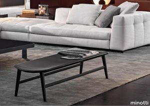
Scandinavian values meet Italian tradition in Fynn, a project created by combining fine cabinet-making in the wooden elements and sophisticated upholstering with fabric or saddle-hide. The signature element of the Fynn seats is the armrest, elongated and slightly curved, rounded and smooth to the touch, 100% handmade. Its precise, well-defined line identifies the whole family of seats, in the two Fynn and Fynn Saddle-Hide versions. Covered with the exclusive fabrics and saddle-hides in the collection, it fully expresses the high level of the elegant sartorial process which has always been Minotti’s distinguishing mark. The family comprises armchairs, lounge and dining little armchairs, benches, footstools and coffee tables. The Fynn armchair and little armchairs feature an ultra-lightweight aesthetic with a simple structure in ash wood with Liquorice colour stained finish. This hosts a padded seat and backrest cushion, designed as a single element. The informal rigour with which Fynn hosts the upholstered element designs a comfortable seat that almost cradles the body, wrapping it in the warmth of the wooden structure. In the Fynn Saddle-Hide version, a single saddle-hide element incorporates both the seat and backrest. The armchair and lounge little armchair have separate padded cushioning, which is optional in the dining little armchair. The saddle-hide covering comes in an extensive colour palette: Burgundy, Ash, Dove Grey, Sage, Mud, Moka, Black, Bulgarian Red, Moss Green, Green, Pewter, Corten, White and Grey. The Fynn conceived for the dining area includes the version with fully padded shell and, alternatively, the Saddle-Hide version with or without cushion. The Fynn family of seats is completed by a footstool and some benches of different sizes, all with a cushion except for the benches in the Saddle-Hide version, which have a structure with a slightly concave top, combined with a saddle-hide covering that envelopes it like exquisite leather. The coffee tables also share the same line as the wooden armrest, which designs a slight curve also found in the structural and side parts. The central part of the coffee table is enhanced by the presence of the top in Calacatta marble, creating a sophisticated combination of materials.
het Heterogeneous Sheet

armstrongflooring > Floor plank
Sophisticated Design Meets Unique, Long-Life Performance and Comfort Heterogeneous sheet delivers a superior combination of sophisticated design and long-lasting performance in a wide array of commercial environments. Offering design flexibility and continuity, our heterogeneous products can be the ideal solution to your next one-of-a-kind design project. A selection of heterogeneous sheet products features our Diamond 10 Technology coating, using cultured diamonds with all the properties of real diamonds, to keep floors looking like new longer with the category leading scratch, stain, and scuff resistance. Reasons to Specify Heterogeneous Sheet Broad palette of coordinated colors and patterns that solve specific space requirements. No-polish option for added ease of maintenance. Diamond 10 Technology resists soil, stains, scratches, scuffs, and abrasions, as well as chemicals and damage from alcohol-based hand sanitizers. Easy to heat weld and flash cove for spaces demanding superior infection control. Helps conserve energy when higher-rated, light-reflective colors are selected. Low VOC emissions and FloorScore certified. Manufactured to Armstrong Flooring’s Diamond Standard of Quality.
Torii "Dining"
minotti > Chair
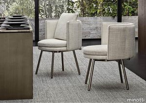
Airy, with constructive details linked to Japanese tradition, the Torii modular seats play with round edged volumes, thin profiles and the apparent formal simplicity of an extremely detailed design. The metal structure of the legs of the seats and tables is Nendo’s nod to the image of the “torii”, the entrance gate to Shinto shrines in Japan. With an interlocking game, the horizontal elements are laid on the vertical supports, ensuring a sophisticated visual lightness that accommodates the padded volume, characterised by couture craftsmanship. The Torii family includes sofas - with high or low backrest and a linear shape, rounded at the arms - inclined sofas with a combination of two different depths, armchairs and lounge and dining little armchairs, ottomans, coffee tables, and a slender, oval-shaped console table, ideal for placing anywhere in the living area. The varied range of products makes it possible to design a flexible layout, in which the individual elements can also be combined to create a strong visual unity. The metal frame found in the components of the Torii family evokes the image of the “Senbon Torii, the wooden colonnade that forms a gallery made up of 1,000 vermilion torii gates”, as Nendo reminds us. The slim backrest features vertical quilting and a piping running along the perimeter of the cushioning, underlining the couture quality of the craftsmanship. The eco-leather and eco-nubuck piping is in a slightly contrasting colour, but in the same shade as the fabric, if combined with a textile covering, whereas the leather versions come in the same shade when combined with leather upholstery. All the upholstered elements of the system can be customised by choosing the covering: 100% fabric or leather, or in fabric with a leather base. The seats can be accessorised with leather magazine caddy, crafted with fine luggage-crafting techniques and enriched with the same metal details as the base. The end of the horizontal metal element of the legs is designed so that it almost holds the backrest and seat, recalling the Kigumi technique, borrowed from the Japanese tradition of wood construction. A small decorative disk with Black-Nickel finish, in the form of a jewel-like button located at the end, adds a precious detail to the ensemble, and creates a series of contrasts with the Bronze colour varnished metal finish of the legs. The armchairs and swivel armchairs in the form of a perfect circle were designed to meet a variety of requirements, both in terms of functionality and ergonomics, available in a range of different types. The seats - in the Bergère, Large, Medium and Small versions - and the Dining, Dining Large and Lounge little armchairs are the result of the in-depth research carried out to find the best way to express the sophisticated simplicity of the craftsmanship. The base is available in leather or fabric. The extension of the base of some elements features a top in Calacatta or Stone Grey marble with a matt polyester lacquer finish, crafted with a careful study of its proportions, thickness and structural details so that it blends seamlessly into the seat, also from an aesthetic point of view. The Small armchair is also available in the Torii Nest version with braided leather backrest and a pattern inspired by Vienna straw, inserted in a solid ash wood frame that sits on a base in the same material. The Torii coffee tables also feature the same structural style details as the seats, reflected in the metal frame with Bronze colour varnished finish and details in Black-Nickel metal. Available in different sizes, ranging up to an impressive diameter of 120 cm, and different heights, they feature a top in Calacatta or Stone Grey marble with matt polyester finish, in Black pâte de verre or in Liquorice colour brushed ash wood, enclosed by a Liquorice colour matt lacquered frame.
IO

fontanaarte > Wall lamp
In the shape of a small curved lunar disc, IO is a wall light with dual Led light emission. IO appears almost suspended, very close to the wall but never close enough to touch it; positioned at a distance that allows the light to gently caress the wall with an intimate skimming effect. Elegant and minimalist, it is equipped with a mount with a dual rotating axis. is allows the diffuser to be rotated by 360°, directing it exactly where the light is required. In addition to rotating, the diffuser also moves up and down, opening and closing the light beams to adjust to individual requirements. Designed to provide a source of light that is as personal and adjustable as possible, the ideal use for this light is as a bedside lamp. However, it's versatility also makes it an excellent solution for lighting the walls of offices and corridors, both in residential and contract spaces. The diffuser is made from die-cast aluminium and looks very solid despite its small size. It is available in a matt finish in the following four colours: graphite grey, red, white and blue. The inside is always white in order to reflect as much light as possible.
Pipistrello 620/MED/DIM/NE
martinelliluce > Table lamp
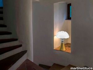
A flight above timeSoaring becomes an icon Wings outstretched, caught in the instant just prior to their complete opening.In this impetus crystallized in time is enclosed the entire emotional, stylistic and value-driven nature of this design icon.A lamp that, through its diffuser and the sinuous and curvy telescopic base epitomizes discontinuity, modernity, humor and grace, elegance and dynamism.It is precisely thanks to the courage of having proposed these different aspetcs, even if conflicting, that Pipistrello stands the test of time with a unique charm. An inimitable lamp with a strong character designed by Gae Aulenti in 1965 for the Olivetti showroom in Paris in the colour dark brown. It has been produced over the years in different colours and sizes: large, medium and mini. The mini version is also available cordless. Now proposed in a pop key in the new signed and numbered yellow colour. The lamp is composed of a white opal methacrylate diffuser, a stainless steel telescope and a glossy yellow painted aluminium structure. The central ring, base and knob for fixing the diffuser are made of metal painted in glossy black. The dimmable LED light source is integrated and the electronic ballast is plug-in.
Compatta Pisé Ghiaia

florim > Wall tile-stone-brick
<p>A passion for earth as a natural material and for rammed earth, an ancient construction technique.</p> <p>The combination of these patterns evolves into the concept of Pisé Inserti, more slabs of immense decorative impact, generated by the two-dimensional criss-crossing of exquisite, rounded geometrical forms: the designer combines the natural earthen shades with apparently random curved lines that evoke the uneven trapezia with rounded corners used by Gio Ponti.</p> <p>These are also available in the large 120x280 cm size and 6 mm thickness in three variants: Pisé Inserti A, Pisé Inserti B and Pisé Inserti C. COMPATTA’s potential is further enhanced by three-dimensional subjects of varying shapes, which can be built up into mesh-backed mosaics to create sculptural forms on walls. These extensions to the collection are called Inserti Melange, Inserti Sabbia-Argilla and Inserti Limo-Ghiaia and are produced in 9 mm thickness and 30x30 cm size.</p> <p>The collection is born from a sustainable and virtuous approach and is part of <a href="https://www.florim.com/en/company/sustainability/carbonzero-florim/">CarbonZero</a>, Florim's range of Carbon Neutral surfaces.</p> <p>The COMPATTA collection, designed by Federico Peri, combines a passion for earth as a natural material and an interest in a very ancient construction technique.<br>The primary inspiration derives from close observation of the many strata within the ground and the mixtures of elementary particles of which it consists. The design concept is completed by reference to the age-old rammed earth construction technique, used in northern Jordan since the eighth millennium BCE and widely applied in Yemen in many other desert or rural settings until the mid 19thC.<br>In this method, the raw earth is compacted inside wooden formwork to construct continuous structural walls, bearing walls or partitions inside homes, with a natural decorative effect due to the layering of the different shades of clay used. When creating his project for CEDIT, Peri was also influenced by several design inputs: from rural African homes to the clear, simple geometric forms and curved lines typical of the work of Gio Ponti, the curves central to the modernist gardens of Brazilian landscape artist Roberto Burle Marx, and the three-dimensional mosaics of English sculptor William Mitchell. In his murals in concrete, glass and recycled materials, Mitchell seems to combine some of the typical features of a variety of artistic movements, from Modernism to Brutalism, and also shows awareness of the issues concerning the structure of the landscape and the relationship with nature at the heart of Land Art. COMPATTA thus embodies strong links to the world of art and architecture, while bringing natural impressions with a remote, primitive flavour into modern living-spaces.</p>
Compatta Pisé Sabbia

florim > Wall tile-stone-brick
<p>A passion for earth as a natural material and for rammed earth, an ancient construction technique.</p> <p>The combination of these patterns evolves into the concept of Pisé Inserti, more slabs of immense decorative impact, generated by the two-dimensional criss-crossing of exquisite, rounded geometrical forms: the designer combines the natural earthen shades with apparently random curved lines that evoke the uneven trapezia with rounded corners used by Gio Ponti.</p> <p>These are also available in the large 120x280 cm size and 6 mm thickness in three variants: Pisé Inserti A, Pisé Inserti B and Pisé Inserti C. COMPATTA’s potential is further enhanced by three-dimensional subjects of varying shapes, which can be built up into mesh-backed mosaics to create sculptural forms on walls. These extensions to the collection are called Inserti Melange, Inserti Sabbia-Argilla and Inserti Limo-Ghiaia and are produced in 9 mm thickness and 30x30 cm size.</p> <p>The collection is born from a sustainable and virtuous approach and is part of <a href="https://www.florim.com/en/company/sustainability/carbonzero-florim/">CarbonZero</a>, Florim's range of Carbon Neutral surfaces.</p> <p>The COMPATTA collection, designed by Federico Peri, combines a passion for earth as a natural material and an interest in a very ancient construction technique.<br>The primary inspiration derives from close observation of the many strata within the ground and the mixtures of elementary particles of which it consists. The design concept is completed by reference to the age-old rammed earth construction technique, used in northern Jordan since the eighth millennium BCE and widely applied in Yemen in many other desert or rural settings until the mid 19thC.<br>In this method, the raw earth is compacted inside wooden formwork to construct continuous structural walls, bearing walls or partitions inside homes, with a natural decorative effect due to the layering of the different shades of clay used. When creating his project for CEDIT, Peri was also influenced by several design inputs: from rural African homes to the clear, simple geometric forms and curved lines typical of the work of Gio Ponti, the curves central to the modernist gardens of Brazilian landscape artist Roberto Burle Marx, and the three-dimensional mosaics of English sculptor William Mitchell. In his murals in concrete, glass and recycled materials, Mitchell seems to combine some of the typical features of a variety of artistic movements, from Modernism to Brutalism, and also shows awareness of the issues concerning the structure of the landscape and the relationship with nature at the heart of Land Art. COMPATTA thus embodies strong links to the world of art and architecture, while bringing natural impressions with a remote, primitive flavour into modern living-spaces.</p>
Compatta Sabbia

florim > Wall tile-stone-brick
<p>A passion for earth as a natural material and for rammed earth, an ancient construction technique.</p> <p>The combination of these patterns evolves into the concept of Pisé Inserti, more slabs of immense decorative impact, generated by the two-dimensional criss-crossing of exquisite, rounded geometrical forms: the designer combines the natural earthen shades with apparently random curved lines that evoke the uneven trapezia with rounded corners used by Gio Ponti.</p> <p>These are also available in the large 120x280 cm size and 6 mm thickness in three variants: Pisé Inserti A, Pisé Inserti B and Pisé Inserti C. COMPATTA’s potential is further enhanced by three-dimensional subjects of varying shapes, which can be built up into mesh-backed mosaics to create sculptural forms on walls. These extensions to the collection are called Inserti Melange, Inserti Sabbia-Argilla and Inserti Limo-Ghiaia and are produced in 9 mm thickness and 30x30 cm size.</p> <p>The collection is born from a sustainable and virtuous approach and is part of <a href="https://www.florim.com/en/company/sustainability/carbonzero-florim/">CarbonZero</a>, Florim's range of Carbon Neutral surfaces.</p> <p>The COMPATTA collection, designed by Federico Peri, combines a passion for earth as a natural material and an interest in a very ancient construction technique.<br>The primary inspiration derives from close observation of the many strata within the ground and the mixtures of elementary particles of which it consists. The design concept is completed by reference to the age-old rammed earth construction technique, used in northern Jordan since the eighth millennium BCE and widely applied in Yemen in many other desert or rural settings until the mid 19thC.<br>In this method, the raw earth is compacted inside wooden formwork to construct continuous structural walls, bearing walls or partitions inside homes, with a natural decorative effect due to the layering of the different shades of clay used. When creating his project for CEDIT, Peri was also influenced by several design inputs: from rural African homes to the clear, simple geometric forms and curved lines typical of the work of Gio Ponti, the curves central to the modernist gardens of Brazilian landscape artist Roberto Burle Marx, and the three-dimensional mosaics of English sculptor William Mitchell. In his murals in concrete, glass and recycled materials, Mitchell seems to combine some of the typical features of a variety of artistic movements, from Modernism to Brutalism, and also shows awareness of the issues concerning the structure of the landscape and the relationship with nature at the heart of Land Art. COMPATTA thus embodies strong links to the world of art and architecture, while bringing natural impressions with a remote, primitive flavour into modern living-spaces.</p>
Euridice Tela
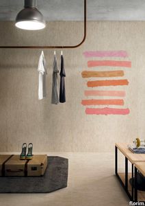
florim > Wallcovering
The mystery and poetry of painting. Art that inhabits space. «In the past, art was expected to transfer the object, or work of art, from the inanimate to the animate world. Now, since we know that the whole world is animate, the task of the artist is to interact with the intelligence of matter.» Giorgio Griffa Born in Turin in 1936, Giorgio Griffa is now ranked as one of Italy's most important abstract painters of the Twentieth Century. He began to paint when he was very young, just 10 years old, and for two decades his work was figurative, fairly traditional in subjects and style. His mature work developed later, in the mid Sixties, in the context of the abstract-expressionist and tachiste movements, which based their language on a concept of painting as a sequence of actions, like a repeated sign or form of writing. Rather than a representation, painting became the direct expression of a mental state, a precise psychic temperature, an internal beat.Historically, his work has been classified as part of this "analytical painting" movement, which concentrated on analysing itself and its internal mechanisms: surface, substrate, colour and sign. However, Giorgio Griffa's work seems to stand apart from that of his fellow artists, and nowadays it is difficult to place it firmly within the historic analytical and conceptual painting movements. His abstract works, consisting of simple signs repeated on the canvas, seem to be not so much an analysis of the act of painting as a homage to painting itself and its history. And this is one of the delightful, central paradox's of Griffa's work: in spite of their conceptual approach, his paintings have <strong>a fascinating lyrical component, a radiant musicality, very different from the cold, unemotional mood of the neo-avantgardes</strong>.<br /> In this sense his works are something of a mystery for the art world, as lovely as they are indefinable, because in them everything seems to be at once both simple and complex. The types of canvas the artist uses (jute, hemp, cotton or linen) are simple. His painted signs are also simple, or even anonymous: a series of vertical or horizontal lines and - only from the Eighties onwards - stylised floral motifs, friezes and spirals. Yet Griffa entrusts this apparent simplicity with the task of saying what is unsayable by its very nature; of plumbing the depths of the mystery of creation and the unknown. Seemingly banal and obvious at first glance, Griffa's work is actually layered with references to the history of art, Stone Age painting, Zen philosophy, music and "“ as we have seen "“ the artistic avantgarde of his own age.All these characteristics are very much to the fore in the artist's works for CEDIT Ceramiche. For this historic brand, Griffa has created five works involving a series of lyrical, minimalist signs, which recall the motifs current in the late Sixties and Seventies. The range of colours in which these signs are presented, with complementary colours and half-tones, seem to be drawn from the Renaissance and the art of Venice and its region in the Sixteenth and Seventeenth Centuries. The other fundamental point of reference is Matisse, the painter who rejoiced in colour and in whose images signs and colours are nicely balanced.<br /> Griffa's collection for CEDIT sets out to use <strong>modular repetition of signs</strong> to build up genuine spatial environments for everyday living. The partnership with a ceramics manufacturer is a particularly fertile one for the Turin-born artist. In fact, his pictorial language "“ based on the concept of an anonymous sign open to potentially infinite repetition "“ seems to be ideally suited to large-scale reproduction and the decoration of entire interiors. The concepts of fragmentation and incompletion can be easily applied to the decoration of living-spaces of varying sizes, as if they were "portions" of a larger whole, an expanding universe. All Griffa's works use a repertoire of timeless signs, actions repeated over the millennia, on a complex trajectory that combines art, craftsmanship and decoration. In the project for CEDIT, this ancient story of experimentation with the potentialities of sign, colour and matter comes to a kind of natural, fascinating fruition.
Heritage Luxe Heritage Emerald

florim > Wall tile-stone-brick
Heritage Luxe can be said to exemplify the magnitude of our inheritance from the past which at the same time is part of our present. In keeping with modern times, the surfaces of the collection have a strong decorative character and bring the heritage of the European tradition up to date by proposing a stylistic concept inspired by the beauty and classic luxury of marble that blends with the dynamism of veining and colors of a contemporary flavor. <p>Memory, the heritage of the past and the most up-to-date taste all unite in a single dimension in which the iconic objects and furnishings of yesteryear coexist with the most contemporary luxury of modern times to transform the atmosphere of the surroundings into something unique and instantly recognizable. The collection features marble surfaces in bold, refined colors that add immense personality and character to the most exclusive of spaces. The richness of colors and graphic details of these products finds its maximum expression in the large sizes, designed to blend in with increasingly voguish large open spaces, or to illuminate more intimate surroundings.</p> <p> </p> <p class="MsoNormal"><strong><span lang="EN-US" style="mso-ansi-language: EN-US;">COLORS AND DECORS</span></strong></p> <p class="MsoNormal"><span lang="EN-US" style="mso-ansi-language: EN-US;">Heritage Azure is distinguished by a pale, refined blue background against which a deep rust-colored vein stands out, making it perfect for pairing with warm-toned colors and materials.</span></p> <p class="MsoNormal"><span lang="EN-US" style="mso-ansi-language: EN-US;">Heritage Cloud is the most versatile surface in the collection. Characterized by different streaks of grey, this graphic can be perfectly matched with both warm and cool colored materials.</span></p> <p class="MsoNormal"><span lang="EN-US" style="mso-ansi-language: EN-US;">The soft, enveloping base of Heritage Brown is reminiscent of Spanish marble, distinguished by subtle and barely noticeable white veins.</span></p> <p class="MsoNormal"><span lang="EN-US" style="mso-ansi-language: EN-US;">Heritage Emerald brings to mind the rolling hills of Ireland. Shades ranging from dark to light green with dashes of brown and white congregate on its surface.</span></p> <p class="MsoNormal"><span lang="EN-US" style="mso-ansi-language: EN-US;">Heritage Aqua is a surprising surface that emerges from the encounter of contrasting shades of teal and white, embellished with sophisticated orange veins.</span></p> <p class="MsoNormal">Lastly, Heritage Flame bears witness to an encounter between delicate shades of brown and dashes of cream.</p> <p class="MsoNormal"><span lang="EN-US" style="mso-ansi-language: EN-US;">The array of backgrounds is accompanied by three 6 mm thick colored-body porcelain stoneware decors that combine the different shapes and graphics of the slabs in the range, thus delineating an enchanting continuity of colors and veining within the space.</span></p> <p class="MsoNormal"><span lang="EN-US" style="mso-ansi-language: EN-US;">The Picket decor juxtaposes the trapezoidal glossy Heritage Emerald and Heritage Cloud slabs to craft a refined composition with clean, contemporary lines.</span></p> <p class="MsoNormal"><span lang="EN-US" style="mso-ansi-language: EN-US;">The Maze decor, composed of a range of small Heritage Emerald, Heritage Brown and Heritage Flame trapezoids, catches the eye with its harmonious concentric motifs.</span></p> <p class="MsoNormal"><span lang="EN-US" style="mso-ansi-language: EN-US;">Finally, the Trinity decor features three sinuously arched, glossy finish strips in the Heritage Azure graphic.</span></p>
Policroma Alpi

florim > Wall tile-stone-brick
Recurring geometries, combinations of figures. Marble and marmorino plaster: comparison and dialogue. The collection is completed by a linear listello tile with the motif of a sequence of vertical rectangular blocks, which can be combined with the slabs to further enrich compositions involving continuous ceramic surfaces cladding.<br /><br />"Another reference is the use of Italian marbles on the verge of extinction, rare marbles such as Rosa Valtoce, the marble used in Milan Cathedral."<br />Cristina Celestino Cristina Celestino's smartphone contains a folder of images entitled "Milan". Photographs that are more like notes. Photographs of architectural features, materials or details of shapes encountered by chance during a walk, but they cannot be described as merely a vague "source of inspiration". This filing system, created in response to a fleeting instinct, is an integral part of the method of work adopted by the architect and designer, who starts off without preconceptions "“ or "free", as she puts it before drawing inputs from a vast world of references, from Hermès scarves to the works of the great Masters (in the specific case of Policroma). This accumulation, partly spontaneous and party the outcome of in-depth historical knowledge and study, naturally activates a process of synthesis and personal interpretation common to all Cristina Celestino's output.<br /><br /><br />The wall covering collection designed for Cedit was no exception, although in this case the designer was dealing with a project with variable dimensions, reaching up even to the architectural scale. In her own distinctive way, she combined a variety of references. Adolf Loos's passion for coloured types of marble, and Cipollino in particular. Carlo Scarpa's angular metal frames and Marmorino plaster in Venice. The French fashion house's square silk scarves. The entrance halls of Milan palazzos, Gio Ponti, the city's Cathedral. All expressed in the designer's own language: well balanced geometrical forms, subtle colours (shades similar to those of Scarpa himself), an effortless, almost restrained, playful elegance. The mood is that of the homes of the enlightened bourgeoisie who shaped the history of Milan, Celestino's adoptive city and an endless source of inputs. She has worked its interiors, including some of the least expected a 1928 tram, the historic Cucchi confectionery store hybridising her own style with the existing context. An imitative effect which is also the key to the meaning of the new Policroma collection: the marble varieties replicated using the Cedit technology are all from Italian quarries that are virtually "worked out". This revives an increasingly rare material as a "living" presence, in a different form which makes no claim to replace the natural original. Quite the contrary, Celestino immediately states her intention to imitate, by combining marble and Marmorino plaster in some variants with a contrasting frame (a typical feature for her, just as it was for Scarpa), and evoking the centuries-old marble-imitating scagliola plasterwork with a contemporary formula.<br /><br /><br />The types of marble chosen are central to the project's character. Verde Alpi, a favourite with Gio Ponti and often found in Milan entrance halls, features tightly packed patterning. Breccia Capraia, still found in a very few places in Tuscany, has a white background with just a few veins. Cipollino, in the special Ondulato variety in green and red, is patterned with spirals. Rosa Valtoce, on the other hand, was used by the "Veneranda Fabbrica" guild to build Milan Cathedral. It is an iconic stone with dramatic stripes, popular in the past; it is now sourced from one very small quarry in Piedmont which has been virtually abandoned.<br /> The many different elements that make up the Policroma collection all reflect the importance of craftsmanship to Cristina Celestino's design style: the modules can be freely mixed and combined, for example to create a concave or convex semicircle, or for the large-scale replication of small features initially conceived as trims, functional details transformed into a dominant motif.There is a return to the theme of the interior, a large or small protected space, conceived as suspended in space and time yet also reassuring and protective. It is designed through its coverings in a stark yet not minimalist way, with intelligence and with no overreaching artistic ambitions. An understated space and an extremely stylish declaration. In Milan style, of course.
Rilievi Salvia

florim > Wall Paint
The alternation and symbiosis between concave and convex, recessed and raised. <p>Rilievi is a work of design balanced between different historic periods: while the volumetric relief tile modules are inspired by artistic experiments conducted in Italy during the Sixties and Seventies, the large slabs are the outcome of research into materials and technology that has only come to fruition in very recent times. The shadow effects generated on the surfaces of the slabs by the light striking the projecting parts of the modules create an unusual impression of architectural depth found virtually nowhere else in ceramic coverings, laying the bases for a new decoration interior design language.</p> This project simply embodies perfection - a term which certainly sets the bar high in a description of a new product for launch on the market. But when an enlightened manufacturer is capable of encapsulating a designer's personal research in a product to be added to its range, the outcome is a perfect synthesis. A perfect synthesis between untrammelled creativity and market trends. CEDIT had the insight needed to perceive, identify and rework the immense potential of Practice Practice Practice "“ a self-produced project by Zaven (Enrica Cavarzan and Marco Zavagno "“ and realised that its sophisticated design, originated by pure, pristine input (unadulterated by external factors except the noblest of them all, research) could provide the basis for an innovative, successful collection. I might add, a collection unique of its kind. Zaven is also a name that comes with guarantees; the two partners are good at what they do. Their work always starts from personal curiosity and investigations, the study of other stories (as in this case inspiration was drawn from the output of artist and activist Nino Caruso) and individual interests, which are broken down, developed, optimised and prepared for transformation into something fresh.Enrica Cavarzan and Marco Zavagno have a masterly ability to transform their own wishes and passions into design work of the greatest breadth and, as we see here, the widest, richest application. Their use of ceramics as a material is clearly outstanding and reflects a method precisely founded on the desire to look at things from an unusual viewpoint, under a different light. And to be daring. Zaven have an unconventional approach to convention. In the specific case of the Rilievi collection, the "modules" created for CEDIT seem to explode off the walls; in fact, they are constructed by combining the two-dimensional slab with its three-dimensional decor.Rilievi seems to be seeking space. More space. Even though these modules have actually established a dialogue with the wall from which they are born. At the same time, they hypnotise us with their tight sequence of lines, the pattern that is always different although its root is the same, and the intriguing, unusual colours that add another vital factor to the finished product. Their firm grounding in graphic design (and here we have come back to two-dimensional effects, of the kind most often associated with a wall covering) easily evolves into a facade which seems to have been carved with a chisel - although this is not the case. These modules are conceived to convey an impression of movement, and the three models, in seven colour combinations, create a powerful effect on a surface, which is never passive but rather an organic contributor to the forms and colours involved in the fascinating combinations. The slab is very much present and has the same worth and status as the relief pattern associated to it. In the light of this dichotomy between the linear and the sculpted, expressed through the skilfully balanced visual expedients, the use of repetition adds vigour to the module's intrinsic meaning. As we have seen, a rejection of facile, superficial creative dynamics in favour of an investigation reaching above and beyond has always been a central, clearly recognisable feature of this Venice-based duo, who already have impressive international partnerships to their credit, including the London Design Festival, the Kalmar Konstmuseum, the Paris Designer Days, Ca' Foscari University, the Venice Biennale, the Sandretto Re Rebaudengo Foundation, the Sindika Dokolo Foundation and the V-A-C Foundation, and also won the 2018 Wallpaper Design Award. Graphics, advertising and product design: the pair have always opted for a type of design closely linked to the observation of everyday items, followed by their reinterpretation in a version applied to experimentation with materials. This duality, combined with their energetic yet elegant visual language, forms Enrica and Marco's primary code, experienced in this specific context through serial carvings. On walls.
Archeologie Archeologie Bianco

florim > Wall Paint
The poetics of the wall. The forgotten wall. «A wall is like a book to be opened, a journey into the interior, revealing the experiences, memories, signs and symbols which this fragment of masonry has absorbed over the centuries.» Franco Guerzoni <p>It is difficult to resist the beauty of Franco Guerzoni's art, created by a rare harmony of feeling and intellect, poetry and mind. The artist expresses this through paintings which, although complex in structure, are joyous and sensual, with bright colours made, like those of the great masters of the past, from choice powdered ingredients. A painter with a technique rich in traditional skills, Guerzoni offers a version of modernity involving an intense fundamental relationship with his images and with space. In fact, the dialectic between painting and space, form and architecture, time and memory seems to be essential to his art. As his works specifically created for CEDIT clearly express, his creations achieve a perfect balance between the spatial dimension and intensely lyrical use of colour, which here becomes a soft, liquid form of matter, wandering across the surface of a dazzling lime-plaster white. White, metaphor for the clear light of day, as it was in the large, complex canvases exhibited in his personal exhibition at the 1990 Venice Biennale, is the background for forms of colour which renew the pleasure to be had from painting and the memory of an image glimpsed on the vast expanse of the surface. In the more recent works, these voluptuous shades are transformed into subtle shadows of colour that delicately caress the surface.</p> <p> </p> <p> All it takes is one wall, the only surviving wall of what was once a house, on which time has recorded its own, unavoidable passing, leaving traces of colour that is still vibrant, although faded in places, to allow the memory of the image to transpire, fragile and uncertain, in the physicality of the surface, to bear tangible witness to the existence of history, a mysterious visual memory, the extension into the present of the life of things. A memory of the past on a contemporary wall. The idea of memory is central to Franco Guerzoni's poetics: private, secret memory and the collective memory of the past. Fragmentary and indecipherable, perceived by the artist with the aid of what is left of the images, the fragment. A relic of a totality which can no longer be reconstructed but only imagined in poetic terms, the fragment, a fraction of an image conserved by time, guides the artist's fantastic archaeological journey in search of the world's memory. However, this journey takes him in the opposite direction to the archaeologist, for whom the fragment - fundamental because it reveals a trace of the past is the starting-point for an attempt to reconstruct history. For Guerzoni, the fragment is the endpoint of his work, the goal for which he strives in his investigation of the surface, as he digs deep down, leafing through the deposits of time and memory.</p> <p> </p> <p>Like the large pages of a book traced with fragile sketches, embryonic forms whose meaning has been lost in time, leaving only fleeting traces, uncertain, ambiguous, mysterious morphologies. It marks the start of a journey into the mind of the artist-archaeologist, an adventurous journey into the inextricable labyrinth of the mind, to unearth what is hidden, shuffling the cards in a perennial contamination of images, memory, signs and traces, in search of a meaning, which no sooner appears than it is lost, merging into time and once again becoming a dream, an imaginary journey into fantasy and wonder. And this is the case in the tryptic created for CEDIT, which placed a new challenge before the artist: to transfer "his" image, the remains and fragments of a forgotten wall onto a new material for him “stunning, large-sized ceramic slabs“ and a real wall, without this tautology betraying the painting's deep meaning, its fertile magic of lines and colours, from which the image is born. And the artist is fully aware of this. Guerzoni describes his art as a "gamble": a gamble that is a critical test, an act of daring, dangerous and risky. This is the challenge he sets himself. It is a challenge he easily overcomes, expressing himself on these large walls with a rediscovered pleasure in painting, no longer restrained and apparently absorbed by the dense, uneven coloured surface but set free and almost luxuriously accentuated. In his large, demanding works for CEDIT, Guerzoni achieves a new, consummate mode of painting, in which the architecture of the surfaces provides a poetic meeting-point between the two founding components of his style, the complex, well thought-out composition and the lyricism of colour.</p>
Rainforest Suspension
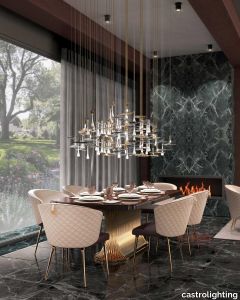
castrolighting > Ceiling lamp
The Rainforest Collection arose from the timeless lighting celebration of nature silhouettes, its elements, and movements. Immerse yourself into the magnificent atmosphere of the sparkling rainforest where the art of brass craftsmanship becomes luxury lighting design. The ultimate fusion between the artistic design, authenticity of traditional Portuguese metal-work techniques, and creative craftsmanship. The Rainforest elegant chandelier is unparalleled in the refinement and grace it represents. The gold-plated brass coupled with clear crystal glass - applied by hand - brings a delicate charisma that resembles nature in full bloom. A broad-leaved masterpiece of modern lighting design along with falling raindrops and butterflies takes you to remote spaces and the open sky. A dreamy lighting fixture creates an exceptional ambiance to the classy interiors. A luxury custom-designed collection was made to be featured in the most sophisticated projects organically. The sizes and distribution of the elements can be naturally customizable. This handmade suspension lamp is perfect for spacious living rooms, dining rooms, or hallways with high ceilings, fitting in a vast variety of decors. The exquisite light dispersion of this gracious lamp will make it the central piece for all luxury houses and help achieve the desired timeless chic. This beautiful suspension lamp is the right choice for a mid-century modern, modern classic, or art deco interior style. #mariecollection VIEW FULL FAMILY
Grace Console
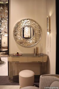
castrolighting > Console
This console carries the same beautiful name and charm that is capable to transform any living space into an outstanding one. The Grace console was designed to be an accent furniture décor to provide a luxurious statement to the interior. The classy decorative piece incorporates bespoke brass elements and a tailor-made poplar root veneer wood top. A sophisticated colour combination is smooth yet delicate – it manifests an effortless elegance that is alluring to decorate with and complete a total home look with balance and harmony. This modern design integrates sleek gold-plated brass lines that are intertwined and create a subtle frame for the upper part of the console table. Create a magical vibe with this versatile lifestyle piece, allowing to beautify a room with various decorative settings and refined home accessories. This handmade furniture design is perfect for a hallway, entryway, living room, dining room, bedroom, or dressing room. Bespoke your dreams with the Grace Console as it can be organically customized and become a central piece for all the lavish houses to help achieve the desired timeless chic. VIEW FULL FAMILY
Chimera Empatia Bianco
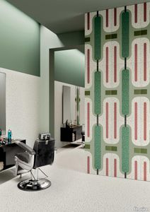
florim > Wall tile-stone-brick
In <em>Chimera,</em> Elena Salmistraro merges rigour with self-expression, in a graphic grammar laden with symbolic meaning. <em>Empatia </em>speaks to the emotions with graphics that interpret, through a highly individual abstract code, the stage make-up of a clown, with the aid of superimposed geometric forms and images. <em>Radici </em>is a tribal statement, a tribute to primitive ritual custom, evoked by the interplay between a sequence of triangles and rectangles and a set of figurative fragments. <em>Ritmo</em> is inspired by fabrics, suggesting the rhythmic alternation of woven yarns through a largely linear pattern. In <em>Colore, </em>the upheaval of a background of small isolated spots generated by a parametric digital program is combined with densely packed repeated forms. "The Chimera collection is rather like a book with four different chapters: I set out to differentiate these graphic motifs to create four totally different stories."<br></br>Elena Salmistraro It all starts with drawing. A <em>passion</em> for drawing. An <em>obsession</em> with drawing. Drawings like spider-webs, obsessively filling spaces, in a kind of manual choreography or gymnastics, a continuous flow. Elena Salmistraro draws all the time. She draws everywhere. Mostly on loose sheets or random surfaces. First and foremost with pen and pencil. Her drawings only acquire colour at a later stage. Often - just like Alessandro Mendini used to do - she draws "monsters": fascinating yet disturbing, subversive forms. The denser, more contorted the shape, the more obvious its underlying truth. For Elena, drawing is an intimate act. It is relaxing. And therapeutic. With an unrivalled communicative strength. Because drawing gives shape to ideas: you both give form to the world and reveal yourself. This passion, combined with natural graphic talent, has guided Elena Salmistraro in her project for Cedit: an experimental series of ceramic slabs produced using a high-definition 3D decorative technique. The explicit aim is to transform surfaces beyond their original flatness so that a new, visual and tactile, three-dimensional personality emerges, sweeping aside the coldness and uniformity that ceramic objects often inevitably convey.Elena Salmistraro has always viewed ceramics as a democratic material, in view of their accessibility, and the infinite potentials for shaping matter that they provide. She began working and experimenting with ceramics very early in her career, just after she graduated from the Milan Politecnico in 2008. She came into contact with small artistic craft firms specialising in smallproduction lots, and cut her teeth on projects that demanded the hand-processing of every detail, and finishes of high artistic value, for the high end of the market. The large corporations and galleries came later, but here again Elena kept faith with her desire to make mass-produced pieces unique, and to combine artistic value with specifically industrial characteristics. The monkey-shaped <em>Primates</em> vases reflect this method and intention, aiming to excite, surprise and charm. Antiminimalist and hyper-figurative, playful, ironic and a rich image-maker, often drawing on anthropology and magic, over the years Salmistraro has built up her own fantastic universe, inhabited by ceramic bestiaries, painted jungles and a cabinet like a one-eyed cyclops , always finding inspiration and inputs in nature and always aiming to reveal the extraordinary in the everyday. Given this background, it was almost inevitable she would work with Cedit: constantly seeking new talents and new approaches, as well as designs that break down the boundaries of ceramics and release them into the realm of art and innovation, the Modena company has recognised Elena Salmistraro as a leading contemporary creative spirit and involved her in a project intended to experiment with fresh ideas in materials and synaesthetics.Salmistraro's collection for Cedit is entitled <em>Chimera</em> and consists of large ceramic slabs, which can be enjoyed not only visually, through their patterns and colours, but also on a tactile level. Like the chimera in the "grotesque" tradition, monstrous in the etymological sense of the word with its merging of hybrid animal and vegetable shapes, the Cedit project attempts to originate a synaesthetic form of ceramics, through a three-dimensional development that exactly reproduces the texture of leathers and fabrics, creating an absolutely new kind of layered effect, with a tactile awareness that recalls the passion of grand master Ettore Sottsass for "surfaces that talk". And the surfaces of the slabs Salmistraro has created really seem to talk: in <em>Empatia </em>clown faces add theatricality to the cold gleam of marbles, interspersed with references to Art Déco graphics; <em>Radici</em> uses the textures of leathers and hide as if to re-establish a link between ceramics and other materials at the origins of human activity and creativity; in <em>Ritmo</em> the texture of cloth dialogues with pottery, almost in homage to the tactile rationalism of warp and weft, of which Bauhaus pioneer Anni Albers was one of the most expressive past interpreters ; finally, <em>Colore</em> has a spotted base generated by computer to underline the contrast between analogue and digital, the graphic sign and the matter into which it is impressed. It is an aesthetic of superimposition and mixing, and especially of synaesthesia: as in her drawings, in the <em>Chimera </em>slabs Elena Salmistraro's art is one of movement and acceleration. A process not of representation but of exploration. Of the world and of oneself. Almost a kind of Zen, for distancing oneself from the world to understand it more fully. In every sense.
Chimera Ritmo Beige

florim > Wallcovering
In <em>Chimera,</em> Elena Salmistraro merges rigour with self-expression, in a graphic grammar laden with symbolic meaning. <em>Empatia </em>speaks to the emotions with graphics that interpret, through a highly individual abstract code, the stage make-up of a clown, with the aid of superimposed geometric forms and images. <em>Radici </em>is a tribal statement, a tribute to primitive ritual custom, evoked by the interplay between a sequence of triangles and rectangles and a set of figurative fragments. <em>Ritmo</em> is inspired by fabrics, suggesting the rhythmic alternation of woven yarns through a largely linear pattern. In <em>Colore, </em>the upheaval of a background of small isolated spots generated by a parametric digital program is combined with densely packed repeated forms. "The Chimera collection is rather like a book with four different chapters: I set out to differentiate these graphic motifs to create four totally different stories."<br></br>Elena Salmistraro It all starts with drawing. A <em>passion</em> for drawing. An <em>obsession</em> with drawing. Drawings like spider-webs, obsessively filling spaces, in a kind of manual choreography or gymnastics, a continuous flow. Elena Salmistraro draws all the time. She draws everywhere. Mostly on loose sheets or random surfaces. First and foremost with pen and pencil. Her drawings only acquire colour at a later stage. Often - just like Alessandro Mendini used to do - she draws "monsters": fascinating yet disturbing, subversive forms. The denser, more contorted the shape, the more obvious its underlying truth. For Elena, drawing is an intimate act. It is relaxing. And therapeutic. With an unrivalled communicative strength. Because drawing gives shape to ideas: you both give form to the world and reveal yourself. This passion, combined with natural graphic talent, has guided Elena Salmistraro in her project for Cedit: an experimental series of ceramic slabs produced using a high-definition 3D decorative technique. The explicit aim is to transform surfaces beyond their original flatness so that a new, visual and tactile, three-dimensional personality emerges, sweeping aside the coldness and uniformity that ceramic objects often inevitably convey.Elena Salmistraro has always viewed ceramics as a democratic material, in view of their accessibility, and the infinite potentials for shaping matter that they provide. She began working and experimenting with ceramics very early in her career, just after she graduated from the Milan Politecnico in 2008. She came into contact with small artistic craft firms specialising in smallproduction lots, and cut her teeth on projects that demanded the hand-processing of every detail, and finishes of high artistic value, for the high end of the market. The large corporations and galleries came later, but here again Elena kept faith with her desire to make mass-produced pieces unique, and to combine artistic value with specifically industrial characteristics. The monkey-shaped <em>Primates</em> vases reflect this method and intention, aiming to excite, surprise and charm. Antiminimalist and hyper-figurative, playful, ironic and a rich image-maker, often drawing on anthropology and magic, over the years Salmistraro has built up her own fantastic universe, inhabited by ceramic bestiaries, painted jungles and a cabinet like a one-eyed cyclops , always finding inspiration and inputs in nature and always aiming to reveal the extraordinary in the everyday. Given this background, it was almost inevitable she would work with Cedit: constantly seeking new talents and new approaches, as well as designs that break down the boundaries of ceramics and release them into the realm of art and innovation, the Modena company has recognised Elena Salmistraro as a leading contemporary creative spirit and involved her in a project intended to experiment with fresh ideas in materials and synaesthetics.Salmistraro's collection for Cedit is entitled <em>Chimera</em> and consists of large ceramic slabs, which can be enjoyed not only visually, through their patterns and colours, but also on a tactile level. Like the chimera in the "grotesque" tradition, monstrous in the etymological sense of the word with its merging of hybrid animal and vegetable shapes, the Cedit project attempts to originate a synaesthetic form of ceramics, through a three-dimensional development that exactly reproduces the texture of leathers and fabrics, creating an absolutely new kind of layered effect, with a tactile awareness that recalls the passion of grand master Ettore Sottsass for "surfaces that talk". And the surfaces of the slabs Salmistraro has created really seem to talk: in <em>Empatia </em>clown faces add theatricality to the cold gleam of marbles, interspersed with references to Art Déco graphics; <em>Radici</em> uses the textures of leathers and hide as if to re-establish a link between ceramics and other materials at the origins of human activity and creativity; in <em>Ritmo</em> the texture of cloth dialogues with pottery, almost in homage to the tactile rationalism of warp and weft, of which Bauhaus pioneer Anni Albers was one of the most expressive past interpreters ; finally, <em>Colore</em> has a spotted base generated by computer to underline the contrast between analogue and digital, the graphic sign and the matter into which it is impressed. It is an aesthetic of superimposition and mixing, and especially of synaesthesia: as in her drawings, in the <em>Chimera </em>slabs Elena Salmistraro's art is one of movement and acceleration. A process not of representation but of exploration. Of the world and of oneself. Almost a kind of Zen, for distancing oneself from the world to understand it more fully. In every sense.
Chimera Radici Grigio

florim > Wallcovering
In <em>Chimera,</em> Elena Salmistraro merges rigour with self-expression, in a graphic grammar laden with symbolic meaning. <em>Empatia </em>speaks to the emotions with graphics that interpret, through a highly individual abstract code, the stage make-up of a clown, with the aid of superimposed geometric forms and images. <em>Radici </em>is a tribal statement, a tribute to primitive ritual custom, evoked by the interplay between a sequence of triangles and rectangles and a set of figurative fragments. <em>Ritmo</em> is inspired by fabrics, suggesting the rhythmic alternation of woven yarns through a largely linear pattern. In <em>Colore, </em>the upheaval of a background of small isolated spots generated by a parametric digital program is combined with densely packed repeated forms. "The Chimera collection is rather like a book with four different chapters: I set out to differentiate these graphic motifs to create four totally different stories."<br></br>Elena Salmistraro It all starts with drawing. A <em>passion</em> for drawing. An <em>obsession</em> with drawing. Drawings like spider-webs, obsessively filling spaces, in a kind of manual choreography or gymnastics, a continuous flow. Elena Salmistraro draws all the time. She draws everywhere. Mostly on loose sheets or random surfaces. First and foremost with pen and pencil. Her drawings only acquire colour at a later stage. Often - just like Alessandro Mendini used to do - she draws "monsters": fascinating yet disturbing, subversive forms. The denser, more contorted the shape, the more obvious its underlying truth. For Elena, drawing is an intimate act. It is relaxing. And therapeutic. With an unrivalled communicative strength. Because drawing gives shape to ideas: you both give form to the world and reveal yourself. This passion, combined with natural graphic talent, has guided Elena Salmistraro in her project for Cedit: an experimental series of ceramic slabs produced using a high-definition 3D decorative technique. The explicit aim is to transform surfaces beyond their original flatness so that a new, visual and tactile, three-dimensional personality emerges, sweeping aside the coldness and uniformity that ceramic objects often inevitably convey.Elena Salmistraro has always viewed ceramics as a democratic material, in view of their accessibility, and the infinite potentials for shaping matter that they provide. She began working and experimenting with ceramics very early in her career, just after she graduated from the Milan Politecnico in 2008. She came into contact with small artistic craft firms specialising in smallproduction lots, and cut her teeth on projects that demanded the hand-processing of every detail, and finishes of high artistic value, for the high end of the market. The large corporations and galleries came later, but here again Elena kept faith with her desire to make mass-produced pieces unique, and to combine artistic value with specifically industrial characteristics. The monkey-shaped <em>Primates</em> vases reflect this method and intention, aiming to excite, surprise and charm. Antiminimalist and hyper-figurative, playful, ironic and a rich image-maker, often drawing on anthropology and magic, over the years Salmistraro has built up her own fantastic universe, inhabited by ceramic bestiaries, painted jungles and a cabinet like a one-eyed cyclops , always finding inspiration and inputs in nature and always aiming to reveal the extraordinary in the everyday. Given this background, it was almost inevitable she would work with Cedit: constantly seeking new talents and new approaches, as well as designs that break down the boundaries of ceramics and release them into the realm of art and innovation, the Modena company has recognised Elena Salmistraro as a leading contemporary creative spirit and involved her in a project intended to experiment with fresh ideas in materials and synaesthetics.Salmistraro's collection for Cedit is entitled <em>Chimera</em> and consists of large ceramic slabs, which can be enjoyed not only visually, through their patterns and colours, but also on a tactile level. Like the chimera in the "grotesque" tradition, monstrous in the etymological sense of the word with its merging of hybrid animal and vegetable shapes, the Cedit project attempts to originate a synaesthetic form of ceramics, through a three-dimensional development that exactly reproduces the texture of leathers and fabrics, creating an absolutely new kind of layered effect, with a tactile awareness that recalls the passion of grand master Ettore Sottsass for "surfaces that talk". And the surfaces of the slabs Salmistraro has created really seem to talk: in <em>Empatia </em>clown faces add theatricality to the cold gleam of marbles, interspersed with references to Art Déco graphics; <em>Radici</em> uses the textures of leathers and hide as if to re-establish a link between ceramics and other materials at the origins of human activity and creativity; in <em>Ritmo</em> the texture of cloth dialogues with pottery, almost in homage to the tactile rationalism of warp and weft, of which Bauhaus pioneer Anni Albers was one of the most expressive past interpreters ; finally, <em>Colore</em> has a spotted base generated by computer to underline the contrast between analogue and digital, the graphic sign and the matter into which it is impressed. It is an aesthetic of superimposition and mixing, and especially of synaesthesia: as in her drawings, in the <em>Chimera </em>slabs Elena Salmistraro's art is one of movement and acceleration. A process not of representation but of exploration. Of the world and of oneself. Almost a kind of Zen, for distancing oneself from the world to understand it more fully. In every sense.
Chimera Radici Beige

florim > Wallcovering
In <em>Chimera,</em> Elena Salmistraro merges rigour with self-expression, in a graphic grammar laden with symbolic meaning. <em>Empatia </em>speaks to the emotions with graphics that interpret, through a highly individual abstract code, the stage make-up of a clown, with the aid of superimposed geometric forms and images. <em>Radici </em>is a tribal statement, a tribute to primitive ritual custom, evoked by the interplay between a sequence of triangles and rectangles and a set of figurative fragments. <em>Ritmo</em> is inspired by fabrics, suggesting the rhythmic alternation of woven yarns through a largely linear pattern. In <em>Colore, </em>the upheaval of a background of small isolated spots generated by a parametric digital program is combined with densely packed repeated forms. "The Chimera collection is rather like a book with four different chapters: I set out to differentiate these graphic motifs to create four totally different stories."<br></br>Elena Salmistraro It all starts with drawing. A <em>passion</em> for drawing. An <em>obsession</em> with drawing. Drawings like spider-webs, obsessively filling spaces, in a kind of manual choreography or gymnastics, a continuous flow. Elena Salmistraro draws all the time. She draws everywhere. Mostly on loose sheets or random surfaces. First and foremost with pen and pencil. Her drawings only acquire colour at a later stage. Often - just like Alessandro Mendini used to do - she draws "monsters": fascinating yet disturbing, subversive forms. The denser, more contorted the shape, the more obvious its underlying truth. For Elena, drawing is an intimate act. It is relaxing. And therapeutic. With an unrivalled communicative strength. Because drawing gives shape to ideas: you both give form to the world and reveal yourself. This passion, combined with natural graphic talent, has guided Elena Salmistraro in her project for Cedit: an experimental series of ceramic slabs produced using a high-definition 3D decorative technique. The explicit aim is to transform surfaces beyond their original flatness so that a new, visual and tactile, three-dimensional personality emerges, sweeping aside the coldness and uniformity that ceramic objects often inevitably convey.Elena Salmistraro has always viewed ceramics as a democratic material, in view of their accessibility, and the infinite potentials for shaping matter that they provide. She began working and experimenting with ceramics very early in her career, just after she graduated from the Milan Politecnico in 2008. She came into contact with small artistic craft firms specialising in smallproduction lots, and cut her teeth on projects that demanded the hand-processing of every detail, and finishes of high artistic value, for the high end of the market. The large corporations and galleries came later, but here again Elena kept faith with her desire to make mass-produced pieces unique, and to combine artistic value with specifically industrial characteristics. The monkey-shaped <em>Primates</em> vases reflect this method and intention, aiming to excite, surprise and charm. Antiminimalist and hyper-figurative, playful, ironic and a rich image-maker, often drawing on anthropology and magic, over the years Salmistraro has built up her own fantastic universe, inhabited by ceramic bestiaries, painted jungles and a cabinet like a one-eyed cyclops , always finding inspiration and inputs in nature and always aiming to reveal the extraordinary in the everyday. Given this background, it was almost inevitable she would work with Cedit: constantly seeking new talents and new approaches, as well as designs that break down the boundaries of ceramics and release them into the realm of art and innovation, the Modena company has recognised Elena Salmistraro as a leading contemporary creative spirit and involved her in a project intended to experiment with fresh ideas in materials and synaesthetics.Salmistraro's collection for Cedit is entitled <em>Chimera</em> and consists of large ceramic slabs, which can be enjoyed not only visually, through their patterns and colours, but also on a tactile level. Like the chimera in the "grotesque" tradition, monstrous in the etymological sense of the word with its merging of hybrid animal and vegetable shapes, the Cedit project attempts to originate a synaesthetic form of ceramics, through a three-dimensional development that exactly reproduces the texture of leathers and fabrics, creating an absolutely new kind of layered effect, with a tactile awareness that recalls the passion of grand master Ettore Sottsass for "surfaces that talk". And the surfaces of the slabs Salmistraro has created really seem to talk: in <em>Empatia </em>clown faces add theatricality to the cold gleam of marbles, interspersed with references to Art Déco graphics; <em>Radici</em> uses the textures of leathers and hide as if to re-establish a link between ceramics and other materials at the origins of human activity and creativity; in <em>Ritmo</em> the texture of cloth dialogues with pottery, almost in homage to the tactile rationalism of warp and weft, of which Bauhaus pioneer Anni Albers was one of the most expressive past interpreters ; finally, <em>Colore</em> has a spotted base generated by computer to underline the contrast between analogue and digital, the graphic sign and the matter into which it is impressed. It is an aesthetic of superimposition and mixing, and especially of synaesthesia: as in her drawings, in the <em>Chimera </em>slabs Elena Salmistraro's art is one of movement and acceleration. A process not of representation but of exploration. Of the world and of oneself. Almost a kind of Zen, for distancing oneself from the world to understand it more fully. In every sense.
Chimera Ritmo Azzurro

florim > Wallcovering
In <em>Chimera,</em> Elena Salmistraro merges rigour with self-expression, in a graphic grammar laden with symbolic meaning. <em>Empatia </em>speaks to the emotions with graphics that interpret, through a highly individual abstract code, the stage make-up of a clown, with the aid of superimposed geometric forms and images. <em>Radici </em>is a tribal statement, a tribute to primitive ritual custom, evoked by the interplay between a sequence of triangles and rectangles and a set of figurative fragments. <em>Ritmo</em> is inspired by fabrics, suggesting the rhythmic alternation of woven yarns through a largely linear pattern. In <em>Colore, </em>the upheaval of a background of small isolated spots generated by a parametric digital program is combined with densely packed repeated forms. "The Chimera collection is rather like a book with four different chapters: I set out to differentiate these graphic motifs to create four totally different stories."<br></br>Elena Salmistraro It all starts with drawing. A <em>passion</em> for drawing. An <em>obsession</em> with drawing. Drawings like spider-webs, obsessively filling spaces, in a kind of manual choreography or gymnastics, a continuous flow. Elena Salmistraro draws all the time. She draws everywhere. Mostly on loose sheets or random surfaces. First and foremost with pen and pencil. Her drawings only acquire colour at a later stage. Often - just like Alessandro Mendini used to do - she draws "monsters": fascinating yet disturbing, subversive forms. The denser, more contorted the shape, the more obvious its underlying truth. For Elena, drawing is an intimate act. It is relaxing. And therapeutic. With an unrivalled communicative strength. Because drawing gives shape to ideas: you both give form to the world and reveal yourself. This passion, combined with natural graphic talent, has guided Elena Salmistraro in her project for Cedit: an experimental series of ceramic slabs produced using a high-definition 3D decorative technique. The explicit aim is to transform surfaces beyond their original flatness so that a new, visual and tactile, three-dimensional personality emerges, sweeping aside the coldness and uniformity that ceramic objects often inevitably convey.Elena Salmistraro has always viewed ceramics as a democratic material, in view of their accessibility, and the infinite potentials for shaping matter that they provide. She began working and experimenting with ceramics very early in her career, just after she graduated from the Milan Politecnico in 2008. She came into contact with small artistic craft firms specialising in smallproduction lots, and cut her teeth on projects that demanded the hand-processing of every detail, and finishes of high artistic value, for the high end of the market. The large corporations and galleries came later, but here again Elena kept faith with her desire to make mass-produced pieces unique, and to combine artistic value with specifically industrial characteristics. The monkey-shaped <em>Primates</em> vases reflect this method and intention, aiming to excite, surprise and charm. Antiminimalist and hyper-figurative, playful, ironic and a rich image-maker, often drawing on anthropology and magic, over the years Salmistraro has built up her own fantastic universe, inhabited by ceramic bestiaries, painted jungles and a cabinet like a one-eyed cyclops , always finding inspiration and inputs in nature and always aiming to reveal the extraordinary in the everyday. Given this background, it was almost inevitable she would work with Cedit: constantly seeking new talents and new approaches, as well as designs that break down the boundaries of ceramics and release them into the realm of art and innovation, the Modena company has recognised Elena Salmistraro as a leading contemporary creative spirit and involved her in a project intended to experiment with fresh ideas in materials and synaesthetics.Salmistraro's collection for Cedit is entitled <em>Chimera</em> and consists of large ceramic slabs, which can be enjoyed not only visually, through their patterns and colours, but also on a tactile level. Like the chimera in the "grotesque" tradition, monstrous in the etymological sense of the word with its merging of hybrid animal and vegetable shapes, the Cedit project attempts to originate a synaesthetic form of ceramics, through a three-dimensional development that exactly reproduces the texture of leathers and fabrics, creating an absolutely new kind of layered effect, with a tactile awareness that recalls the passion of grand master Ettore Sottsass for "surfaces that talk". And the surfaces of the slabs Salmistraro has created really seem to talk: in <em>Empatia </em>clown faces add theatricality to the cold gleam of marbles, interspersed with references to Art Déco graphics; <em>Radici</em> uses the textures of leathers and hide as if to re-establish a link between ceramics and other materials at the origins of human activity and creativity; in <em>Ritmo</em> the texture of cloth dialogues with pottery, almost in homage to the tactile rationalism of warp and weft, of which Bauhaus pioneer Anni Albers was one of the most expressive past interpreters ; finally, <em>Colore</em> has a spotted base generated by computer to underline the contrast between analogue and digital, the graphic sign and the matter into which it is impressed. It is an aesthetic of superimposition and mixing, and especially of synaesthesia: as in her drawings, in the <em>Chimera </em>slabs Elena Salmistraro's art is one of movement and acceleration. A process not of representation but of exploration. Of the world and of oneself. Almost a kind of Zen, for distancing oneself from the world to understand it more fully. In every sense.
Chimera Empatia Nero

florim > Wall tile-stone-brick
In <em>Chimera,</em> Elena Salmistraro merges rigour with self-expression, in a graphic grammar laden with symbolic meaning. <em>Empatia </em>speaks to the emotions with graphics that interpret, through a highly individual abstract code, the stage make-up of a clown, with the aid of superimposed geometric forms and images. <em>Radici </em>is a tribal statement, a tribute to primitive ritual custom, evoked by the interplay between a sequence of triangles and rectangles and a set of figurative fragments. <em>Ritmo</em> is inspired by fabrics, suggesting the rhythmic alternation of woven yarns through a largely linear pattern. In <em>Colore, </em>the upheaval of a background of small isolated spots generated by a parametric digital program is combined with densely packed repeated forms. "The Chimera collection is rather like a book with four different chapters: I set out to differentiate these graphic motifs to create four totally different stories."<br></br>Elena Salmistraro It all starts with drawing. A <em>passion</em> for drawing. An <em>obsession</em> with drawing. Drawings like spider-webs, obsessively filling spaces, in a kind of manual choreography or gymnastics, a continuous flow. Elena Salmistraro draws all the time. She draws everywhere. Mostly on loose sheets or random surfaces. First and foremost with pen and pencil. Her drawings only acquire colour at a later stage. Often - just like Alessandro Mendini used to do - she draws "monsters": fascinating yet disturbing, subversive forms. The denser, more contorted the shape, the more obvious its underlying truth. For Elena, drawing is an intimate act. It is relaxing. And therapeutic. With an unrivalled communicative strength. Because drawing gives shape to ideas: you both give form to the world and reveal yourself. This passion, combined with natural graphic talent, has guided Elena Salmistraro in her project for Cedit: an experimental series of ceramic slabs produced using a high-definition 3D decorative technique. The explicit aim is to transform surfaces beyond their original flatness so that a new, visual and tactile, three-dimensional personality emerges, sweeping aside the coldness and uniformity that ceramic objects often inevitably convey.Elena Salmistraro has always viewed ceramics as a democratic material, in view of their accessibility, and the infinite potentials for shaping matter that they provide. She began working and experimenting with ceramics very early in her career, just after she graduated from the Milan Politecnico in 2008. She came into contact with small artistic craft firms specialising in smallproduction lots, and cut her teeth on projects that demanded the hand-processing of every detail, and finishes of high artistic value, for the high end of the market. The large corporations and galleries came later, but here again Elena kept faith with her desire to make mass-produced pieces unique, and to combine artistic value with specifically industrial characteristics. The monkey-shaped <em>Primates</em> vases reflect this method and intention, aiming to excite, surprise and charm. Antiminimalist and hyper-figurative, playful, ironic and a rich image-maker, often drawing on anthropology and magic, over the years Salmistraro has built up her own fantastic universe, inhabited by ceramic bestiaries, painted jungles and a cabinet like a one-eyed cyclops , always finding inspiration and inputs in nature and always aiming to reveal the extraordinary in the everyday. Given this background, it was almost inevitable she would work with Cedit: constantly seeking new talents and new approaches, as well as designs that break down the boundaries of ceramics and release them into the realm of art and innovation, the Modena company has recognised Elena Salmistraro as a leading contemporary creative spirit and involved her in a project intended to experiment with fresh ideas in materials and synaesthetics.Salmistraro's collection for Cedit is entitled <em>Chimera</em> and consists of large ceramic slabs, which can be enjoyed not only visually, through their patterns and colours, but also on a tactile level. Like the chimera in the "grotesque" tradition, monstrous in the etymological sense of the word with its merging of hybrid animal and vegetable shapes, the Cedit project attempts to originate a synaesthetic form of ceramics, through a three-dimensional development that exactly reproduces the texture of leathers and fabrics, creating an absolutely new kind of layered effect, with a tactile awareness that recalls the passion of grand master Ettore Sottsass for "surfaces that talk". And the surfaces of the slabs Salmistraro has created really seem to talk: in <em>Empatia </em>clown faces add theatricality to the cold gleam of marbles, interspersed with references to Art Déco graphics; <em>Radici</em> uses the textures of leathers and hide as if to re-establish a link between ceramics and other materials at the origins of human activity and creativity; in <em>Ritmo</em> the texture of cloth dialogues with pottery, almost in homage to the tactile rationalism of warp and weft, of which Bauhaus pioneer Anni Albers was one of the most expressive past interpreters ; finally, <em>Colore</em> has a spotted base generated by computer to underline the contrast between analogue and digital, the graphic sign and the matter into which it is impressed. It is an aesthetic of superimposition and mixing, and especially of synaesthesia: as in her drawings, in the <em>Chimera </em>slabs Elena Salmistraro's art is one of movement and acceleration. A process not of representation but of exploration. Of the world and of oneself. Almost a kind of Zen, for distancing oneself from the world to understand it more fully. In every sense.
Chimera Colore Bianco

florim > Wall Paint
In <em>Chimera,</em> Elena Salmistraro merges rigour with self-expression, in a graphic grammar laden with symbolic meaning. <em>Empatia </em>speaks to the emotions with graphics that interpret, through a highly individual abstract code, the stage make-up of a clown, with the aid of superimposed geometric forms and images. <em>Radici </em>is a tribal statement, a tribute to primitive ritual custom, evoked by the interplay between a sequence of triangles and rectangles and a set of figurative fragments. <em>Ritmo</em> is inspired by fabrics, suggesting the rhythmic alternation of woven yarns through a largely linear pattern. In <em>Colore, </em>the upheaval of a background of small isolated spots generated by a parametric digital program is combined with densely packed repeated forms. "The Chimera collection is rather like a book with four different chapters: I set out to differentiate these graphic motifs to create four totally different stories."<br></br>Elena Salmistraro It all starts with drawing. A <em>passion</em> for drawing. An <em>obsession</em> with drawing. Drawings like spider-webs, obsessively filling spaces, in a kind of manual choreography or gymnastics, a continuous flow. Elena Salmistraro draws all the time. She draws everywhere. Mostly on loose sheets or random surfaces. First and foremost with pen and pencil. Her drawings only acquire colour at a later stage. Often - just like Alessandro Mendini used to do - she draws "monsters": fascinating yet disturbing, subversive forms. The denser, more contorted the shape, the more obvious its underlying truth. For Elena, drawing is an intimate act. It is relaxing. And therapeutic. With an unrivalled communicative strength. Because drawing gives shape to ideas: you both give form to the world and reveal yourself. This passion, combined with natural graphic talent, has guided Elena Salmistraro in her project for Cedit: an experimental series of ceramic slabs produced using a high-definition 3D decorative technique. The explicit aim is to transform surfaces beyond their original flatness so that a new, visual and tactile, three-dimensional personality emerges, sweeping aside the coldness and uniformity that ceramic objects often inevitably convey.Elena Salmistraro has always viewed ceramics as a democratic material, in view of their accessibility, and the infinite potentials for shaping matter that they provide. She began working and experimenting with ceramics very early in her career, just after she graduated from the Milan Politecnico in 2008. She came into contact with small artistic craft firms specialising in smallproduction lots, and cut her teeth on projects that demanded the hand-processing of every detail, and finishes of high artistic value, for the high end of the market. The large corporations and galleries came later, but here again Elena kept faith with her desire to make mass-produced pieces unique, and to combine artistic value with specifically industrial characteristics. The monkey-shaped <em>Primates</em> vases reflect this method and intention, aiming to excite, surprise and charm. Antiminimalist and hyper-figurative, playful, ironic and a rich image-maker, often drawing on anthropology and magic, over the years Salmistraro has built up her own fantastic universe, inhabited by ceramic bestiaries, painted jungles and a cabinet like a one-eyed cyclops , always finding inspiration and inputs in nature and always aiming to reveal the extraordinary in the everyday. Given this background, it was almost inevitable she would work with Cedit: constantly seeking new talents and new approaches, as well as designs that break down the boundaries of ceramics and release them into the realm of art and innovation, the Modena company has recognised Elena Salmistraro as a leading contemporary creative spirit and involved her in a project intended to experiment with fresh ideas in materials and synaesthetics.Salmistraro's collection for Cedit is entitled <em>Chimera</em> and consists of large ceramic slabs, which can be enjoyed not only visually, through their patterns and colours, but also on a tactile level. Like the chimera in the "grotesque" tradition, monstrous in the etymological sense of the word with its merging of hybrid animal and vegetable shapes, the Cedit project attempts to originate a synaesthetic form of ceramics, through a three-dimensional development that exactly reproduces the texture of leathers and fabrics, creating an absolutely new kind of layered effect, with a tactile awareness that recalls the passion of grand master Ettore Sottsass for "surfaces that talk". And the surfaces of the slabs Salmistraro has created really seem to talk: in <em>Empatia </em>clown faces add theatricality to the cold gleam of marbles, interspersed with references to Art Déco graphics; <em>Radici</em> uses the textures of leathers and hide as if to re-establish a link between ceramics and other materials at the origins of human activity and creativity; in <em>Ritmo</em> the texture of cloth dialogues with pottery, almost in homage to the tactile rationalism of warp and weft, of which Bauhaus pioneer Anni Albers was one of the most expressive past interpreters ; finally, <em>Colore</em> has a spotted base generated by computer to underline the contrast between analogue and digital, the graphic sign and the matter into which it is impressed. It is an aesthetic of superimposition and mixing, and especially of synaesthesia: as in her drawings, in the <em>Chimera </em>slabs Elena Salmistraro's art is one of movement and acceleration. A process not of representation but of exploration. Of the world and of oneself. Almost a kind of Zen, for distancing oneself from the world to understand it more fully. In every sense.
Chimera Colore Grigio

florim > Wall Paint
In <em>Chimera,</em> Elena Salmistraro merges rigour with self-expression, in a graphic grammar laden with symbolic meaning. <em>Empatia </em>speaks to the emotions with graphics that interpret, through a highly individual abstract code, the stage make-up of a clown, with the aid of superimposed geometric forms and images. <em>Radici </em>is a tribal statement, a tribute to primitive ritual custom, evoked by the interplay between a sequence of triangles and rectangles and a set of figurative fragments. <em>Ritmo</em> is inspired by fabrics, suggesting the rhythmic alternation of woven yarns through a largely linear pattern. In <em>Colore, </em>the upheaval of a background of small isolated spots generated by a parametric digital program is combined with densely packed repeated forms. "The Chimera collection is rather like a book with four different chapters: I set out to differentiate these graphic motifs to create four totally different stories."<br></br>Elena Salmistraro It all starts with drawing. A <em>passion</em> for drawing. An <em>obsession</em> with drawing. Drawings like spider-webs, obsessively filling spaces, in a kind of manual choreography or gymnastics, a continuous flow. Elena Salmistraro draws all the time. She draws everywhere. Mostly on loose sheets or random surfaces. First and foremost with pen and pencil. Her drawings only acquire colour at a later stage. Often - just like Alessandro Mendini used to do - she draws "monsters": fascinating yet disturbing, subversive forms. The denser, more contorted the shape, the more obvious its underlying truth. For Elena, drawing is an intimate act. It is relaxing. And therapeutic. With an unrivalled communicative strength. Because drawing gives shape to ideas: you both give form to the world and reveal yourself. This passion, combined with natural graphic talent, has guided Elena Salmistraro in her project for Cedit: an experimental series of ceramic slabs produced using a high-definition 3D decorative technique. The explicit aim is to transform surfaces beyond their original flatness so that a new, visual and tactile, three-dimensional personality emerges, sweeping aside the coldness and uniformity that ceramic objects often inevitably convey.Elena Salmistraro has always viewed ceramics as a democratic material, in view of their accessibility, and the infinite potentials for shaping matter that they provide. She began working and experimenting with ceramics very early in her career, just after she graduated from the Milan Politecnico in 2008. She came into contact with small artistic craft firms specialising in smallproduction lots, and cut her teeth on projects that demanded the hand-processing of every detail, and finishes of high artistic value, for the high end of the market. The large corporations and galleries came later, but here again Elena kept faith with her desire to make mass-produced pieces unique, and to combine artistic value with specifically industrial characteristics. The monkey-shaped <em>Primates</em> vases reflect this method and intention, aiming to excite, surprise and charm. Antiminimalist and hyper-figurative, playful, ironic and a rich image-maker, often drawing on anthropology and magic, over the years Salmistraro has built up her own fantastic universe, inhabited by ceramic bestiaries, painted jungles and a cabinet like a one-eyed cyclops , always finding inspiration and inputs in nature and always aiming to reveal the extraordinary in the everyday. Given this background, it was almost inevitable she would work with Cedit: constantly seeking new talents and new approaches, as well as designs that break down the boundaries of ceramics and release them into the realm of art and innovation, the Modena company has recognised Elena Salmistraro as a leading contemporary creative spirit and involved her in a project intended to experiment with fresh ideas in materials and synaesthetics.Salmistraro's collection for Cedit is entitled <em>Chimera</em> and consists of large ceramic slabs, which can be enjoyed not only visually, through their patterns and colours, but also on a tactile level. Like the chimera in the "grotesque" tradition, monstrous in the etymological sense of the word with its merging of hybrid animal and vegetable shapes, the Cedit project attempts to originate a synaesthetic form of ceramics, through a three-dimensional development that exactly reproduces the texture of leathers and fabrics, creating an absolutely new kind of layered effect, with a tactile awareness that recalls the passion of grand master Ettore Sottsass for "surfaces that talk". And the surfaces of the slabs Salmistraro has created really seem to talk: in <em>Empatia </em>clown faces add theatricality to the cold gleam of marbles, interspersed with references to Art Déco graphics; <em>Radici</em> uses the textures of leathers and hide as if to re-establish a link between ceramics and other materials at the origins of human activity and creativity; in <em>Ritmo</em> the texture of cloth dialogues with pottery, almost in homage to the tactile rationalism of warp and weft, of which Bauhaus pioneer Anni Albers was one of the most expressive past interpreters ; finally, <em>Colore</em> has a spotted base generated by computer to underline the contrast between analogue and digital, the graphic sign and the matter into which it is impressed. It is an aesthetic of superimposition and mixing, and especially of synaesthesia: as in her drawings, in the <em>Chimera </em>slabs Elena Salmistraro's art is one of movement and acceleration. A process not of representation but of exploration. Of the world and of oneself. Almost a kind of Zen, for distancing oneself from the world to understand it more fully. In every sense.


