SHE LB6 warm grey

egecarpets > Carpet
Following a particular fascination of the preferred techniques of the 1930s’ and 1940s’ artists, all six SHE patterns are made by hand to embrace the unique expression of a line that’s either drawn, cut or put together by physical materials. The designs originate from interpretations of distinctive patterns created by different weaving techniques, experimental expressionistic shapes or, in contrast, simple and graphic paintings. Bringing these imperfect details into carpet design while keeping a simplistic yet organic look adds a sense of naturalness and artistic freedom to each carpet. SHE is part of our uncompromising WOOL100 concept. Crafted in the finest 100% pure new wool, the collection is an extraordinary experience developed to pamper all senses while making a lasting impression.
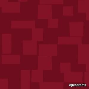
SHE LB6 burgundy
egecarpets > Carpet
Following a particular fascination of the preferred techniques of the 1930s’ and 1940s’ artists, all six SHE patterns are made by hand to embrace the unique expression of a line that’s either drawn, cut or put together by physical materials. The designs originate from interpretations of distinctive patterns created by different weaving techniques, experimental expressionistic shapes or, in contrast, simple and graphic paintings. Bringing these imperfect details into carpet design while keeping a simplistic yet organic look adds a sense of naturalness and artistic freedom to each carpet. SHE is part of our uncompromising WOOL100 concept. Crafted in the finest 100% pure new wool, the collection is an extraordinary experience developed to pamper all senses while making a lasting impression.
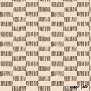
SHE LB4 ivory/dark brown
egecarpets > Carpet
Following a particular fascination of the preferred techniques of the 1930s’ and 1940s’ artists, all six SHE patterns are made by hand to embrace the unique expression of a line that’s either drawn, cut or put together by physical materials. The designs originate from interpretations of distinctive patterns created by different weaving techniques, experimental expressionistic shapes or, in contrast, simple and graphic paintings. Bringing these imperfect details into carpet design while keeping a simplistic yet organic look adds a sense of naturalness and artistic freedom to each carpet. SHE is part of our uncompromising WOOL100 concept. Crafted in the finest 100% pure new wool, the collection is an extraordinary experience developed to pamper all senses while making a lasting impression.
SHE LB3 warm grey

egecarpets > Carpet
Following a particular fascination of the preferred techniques of the 1930s’ and 1940s’ artists, all six SHE patterns are made by hand to embrace the unique expression of a line that’s either drawn, cut or put together by physical materials. The designs originate from interpretations of distinctive patterns created by different weaving techniques, experimental expressionistic shapes or, in contrast, simple and graphic paintings. Bringing these imperfect details into carpet design while keeping a simplistic yet organic look adds a sense of naturalness and artistic freedom to each carpet. SHE is part of our uncompromising WOOL100 concept. Crafted in the finest 100% pure new wool, the collection is an extraordinary experience developed to pamper all senses while making a lasting impression.
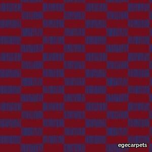
SHE LB4 burgundy/dark blue
egecarpets > Carpet
Following a particular fascination of the preferred techniques of the 1930s’ and 1940s’ artists, all six SHE patterns are made by hand to embrace the unique expression of a line that’s either drawn, cut or put together by physical materials. The designs originate from interpretations of distinctive patterns created by different weaving techniques, experimental expressionistic shapes or, in contrast, simple and graphic paintings. Bringing these imperfect details into carpet design while keeping a simplistic yet organic look adds a sense of naturalness and artistic freedom to each carpet. SHE is part of our uncompromising WOOL100 concept. Crafted in the finest 100% pure new wool, the collection is an extraordinary experience developed to pamper all senses while making a lasting impression.
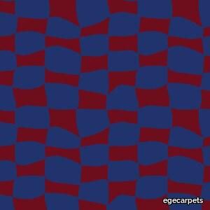
SHE LB5 burgundy/dark blue
egecarpets > Carpet
Following a particular fascination of the preferred techniques of the 1930s’ and 1940s’ artists, all six SHE patterns are made by hand to embrace the unique expression of a line that’s either drawn, cut or put together by physical materials. The designs originate from interpretations of distinctive patterns created by different weaving techniques, experimental expressionistic shapes or, in contrast, simple and graphic paintings. Bringing these imperfect details into carpet design while keeping a simplistic yet organic look adds a sense of naturalness and artistic freedom to each carpet. SHE is part of our uncompromising WOOL100 concept. Crafted in the finest 100% pure new wool, the collection is an extraordinary experience developed to pamper all senses while making a lasting impression.
Piet Lounge chair
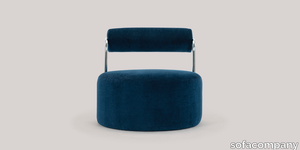
sofacompany > Armchair
Piet is a cool lounge chair inspired by the distinctive Bauhaus style that is wildly on-trend just now. The Bauhaus style is expressed in the geometric shapes and gleaming chrome details. The curved, heavy backrest combined with the slender metal details creates a perfect contrast to the cold metal and the soft, rounded upholstery. It is a chair with genuine WOW factor and will stand alone as a beautiful sculpture in any room.
Oblong Plus

cappellini > Sofa
Almost twenty years after its presentation, the Oblong System by Jasper Morrison has been revised in its architectural system to guarantee an even more flexible and ergonomic structure: this is how Oblong Plus was born, a modular seating system designed to fit any space, be it a contract or a residential one.
Orla

cappellini > Sofa
Classic and contemporary stylistic elements define the Orla sofas and armchairs by Jasper Morrison, a masterpiece of contemporary design that has entered the collection of the Tate Modern, in London. Characterized by soft, sinuous lines, slender shells and generous, comfortable cushions, the Orla series is a tasteful addition to both domestic and contract settings. The collection is composed of two and three-seaters, a rounded sofa (right or left), small or larger armchairs (fixed and swivelling), poufs. As of 2019, the family also includes a small two-seat sofa. For Orla sofas and poufs, the structure is made of rigid composite polyurethane foam, with poplar plywood inserts and elastic belts; the Orla armchairs come with a fixed or swivelling structure made of foam. All versions are padded with multi-density polyurethane foam and fibre. For the armchair and sofas, the cover of the structure is fixed, but removable for the cushions, and is available in the fabrics and leathers of the collection; for the small sofa and small armchair, the cover is fixed for both the structure and the cushions – all of which are also available in the fabrics and leathers in the collection.
San Siro
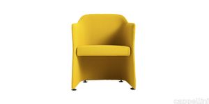
cappellini > Chair
A precise sign, perfect proportions: San Siro armchair by Jasper Morrison is a magnificent expression of the English designer’s pure, minimalist style. A tribute to the famous Milanese neighborhood, this table armchair features a slender bucket seat structure, a characteristic that does not compromise the softness and comfort of the chair in any way. So versatile that it can adapt perfectly to both domestic and contract settings, thanks to its essential look, San Siro armchair is available in two versions: with feet or castors. The upholstery on this design is fixed, from a selection of fabrics and leathers in the collection.
Capo
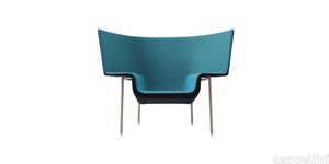
cappellini > Armchair
The form is reminiscent of a hat, with enveloping lines like a shell: Capo armchair, by London studio Doshi Levien, stands strong with a design that is both slender and robust, created to offer an element of style for variety of settings, both private and contract.
Noctambule Suspension 1 Low Cylinder Cone
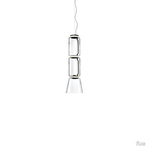
flos > Ceiling lamp
Hanging lamps consisting of interconnecting glass modules reaching a length of 3,2 mt.(126.77") with 4 mt. (157.48") suspended power cable. Cylindrical and semi-spherical transparent blown glass structure, suspended die cast aluminium ring connector, hydroformed steel internal lateral arm and injection moulded optical opal silicone outer ring diffusers. The power supply unit within the ceiling rose can be used as a dimmer to adjust the light intensity by 10% to 100% in either direction by means of the 0-10/1-10V, PUSH, DALI control.
Fynn "Outdoor"
minotti > Coffee table
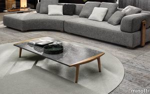
In Fynn, Scandinavian values meet Italian tradition. A contemporary design for outdoor spaces in teak wood, crafted with fine cabinet-making workmanship. With a completely innovative approach, the fine cabinet-making process used for the manufacturing of outdoor wooden furniture is applied to a family of outdoor furnishing pieces in solid teak, combining sophisticated workmanship with an ultra-contemporary design. Characterised by an interwoven frame that hosts soft seat and backrest cushions, Fynn has in the armrest its signature element. Elongated and slightly curved, rounded and smooth to the touch, it is completely handmade: its precise, well-defined line identifies the entire family, composed of armchair, lounge and dining little armchairs, benches, footstools, coffee tables in different sizes and a dining table. The Fynn Outdoor armchair and little armchairs feature a distinctive ultra-lightweight aesthetic with a simple structure in teak. The frame is interwoven with wicker-effect cords in Mud colour, hosting a padded seat and backrest cushion, designed as a single element. The informal rigour with which Fynn Outdoor hosts the padded element designs a comfortable seat. The bench completes the family. Its cushions sit on a frame interwoven with wicker-effect cords in Mud colour. The coffee tables also share the same line as the wooden armrest, which designs a slight curve also found in the rounded sides of the top. The central part of the coffee table is enhanced by the presence of the top in Pietra del Cardoso, creating a sophisticated combination of materials.
Vetra
marset > Floor lamp
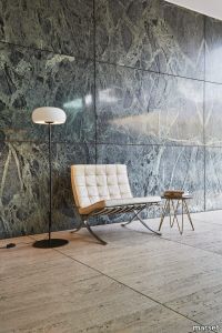
At first glance, Vetra could be no more than a traditional, old-fashioned, blown-glass lamp, but turning it on yields a surprise. Joan Gaspar uses a completely closed glass diffuser as a reflector, and creatively places the light source outside -instead of inside- the shade. The Vetra gives off more light than one would expect, without glare. Much of the light is directed downward, and the rest is filtered toward the inside of the shade, subtly illuminating it. Like an echo multiplying the light, when it’s on, its entire outline is drawn out and seems to come alive.This collection was designed in table, suspension and floor models in different diameters (20, 32 and 43 cm). In the table and floor versions, the stem is divided into two unequal parts, a feature that breaks the symmetry, adds beauty and elegantly provides an outlet for the cable. A new color, amber, has been added to the collection to enhance its relationship with light even more. This new version provides a game of contrasts in which the lamp itself becomes more visible while its light, bathed in color, is made warmer.
Chet-B 2907
martinelliluce > Ceiling lamp
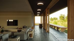
A Chet-B atmosphereWith its distinctive design and lighting, Chet-B, which draws inspiration from the musical genius of Chet Baker, embodies the relaxing and seductive essence of jazz. This lamp creates a calming, cozy atmosphere similar to that of Baker's flowing notes.In addition to reflecting the unique qualities of the jazz musician's signature instrument, the trumpet-shaped metal element acts as a reflector for the built-in LED light source, resulting in a harmonious blend of defined and gentle illumination.Similar to how Baker's compositions can range from delicate, gentle tones to crisp, decisive melodies, Chet-B provides a luminous duality that can be tailored to various moods and lighting requirements. Chet-B, inspired by the musical genius of Chet Baker, captures the relaxing and seductive soul of jazz through its unique design and lighting. Like Baker's flowing notes, the atmosphere created by this lamp is enveloping and relaxing.Direct light streams out of the central cone, downwards, while diffused and indirect light reflects towards the ceiling.
Compatta Limo
florim > Wall tile-stone-brick
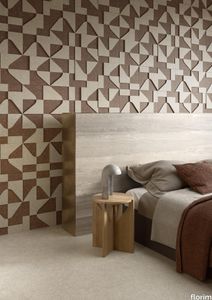
<p>A passion for earth as a natural material and for rammed earth, an ancient construction technique.</p> <p>The combination of these patterns evolves into the concept of Pisé Inserti, more slabs of immense decorative impact, generated by the two-dimensional criss-crossing of exquisite, rounded geometrical forms: the designer combines the natural earthen shades with apparently random curved lines that evoke the uneven trapezia with rounded corners used by Gio Ponti.</p> <p>These are also available in the large 120x280 cm size and 6 mm thickness in three variants: Pisé Inserti A, Pisé Inserti B and Pisé Inserti C. COMPATTA’s potential is further enhanced by three-dimensional subjects of varying shapes, which can be built up into mesh-backed mosaics to create sculptural forms on walls. These extensions to the collection are called Inserti Melange, Inserti Sabbia-Argilla and Inserti Limo-Ghiaia and are produced in 9 mm thickness and 30x30 cm size.</p> <p>The collection is born from a sustainable and virtuous approach and is part of <a href="https://www.florim.com/en/company/sustainability/carbonzero-florim/">CarbonZero</a>, Florim's range of Carbon Neutral surfaces.</p> <p>The COMPATTA collection, designed by Federico Peri, combines a passion for earth as a natural material and an interest in a very ancient construction technique.<br>The primary inspiration derives from close observation of the many strata within the ground and the mixtures of elementary particles of which it consists. The design concept is completed by reference to the age-old rammed earth construction technique, used in northern Jordan since the eighth millennium BCE and widely applied in Yemen in many other desert or rural settings until the mid 19thC.<br>In this method, the raw earth is compacted inside wooden formwork to construct continuous structural walls, bearing walls or partitions inside homes, with a natural decorative effect due to the layering of the different shades of clay used. When creating his project for CEDIT, Peri was also influenced by several design inputs: from rural African homes to the clear, simple geometric forms and curved lines typical of the work of Gio Ponti, the curves central to the modernist gardens of Brazilian landscape artist Roberto Burle Marx, and the three-dimensional mosaics of English sculptor William Mitchell. In his murals in concrete, glass and recycled materials, Mitchell seems to combine some of the typical features of a variety of artistic movements, from Modernism to Brutalism, and also shows awareness of the issues concerning the structure of the landscape and the relationship with nature at the heart of Land Art. COMPATTA thus embodies strong links to the world of art and architecture, while bringing natural impressions with a remote, primitive flavour into modern living-spaces.</p>
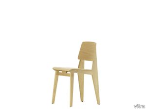
Chaise Tout Bois
vitra > Chair
Chaise Tout Bois is the only chair by the French 'constructeur' and designer Jean Prouvé that is made entirely out of wood. The design is very similar to Prouvé's famous Standard chair, but wood was substituted for the metal base due to the scarcity of metal during the Second World War. The form of the Chaise Tout Bois articulates Prouvé's intention to provide added strength at the transition point between the seat and backrest, where the load weight of the human anatomy is greatest. The profile of the rear frame section – back legs and backrest support – makes reference to this load transfer and is a typical characteristic of Prouvé's designs for both furniture and architecture.<br/><br/>Prouvé created several prototypes of this chair during the war for the purpose of testing its structural strength as well as the joints, leg position and connection between the seat and back. The chosen type of wood depended on what was available at the time. After the war, there was once again a sufficient supply of oak, which due to its hardness and strength was commonly used in France to construct ships and cathedral roofs. As these properties are also ideal for an all-wood chair, the Chaise Tout Bois was ultimately made out of oak and plywood – also offered in dark-stained versions when requested by Jean Prouvé's customers.<br/><br/>In 1947, Prouvé won an award for the Chaise Tout Bois in the 'Meubles de France' competition. The concept of the competition was to find attractive, high-quality, mass-produced furnishings to meet the post-war needs of society – particularly refugees and young married couples. Later the Chaise Tout Bois was replaced by a knock-down version in metal and wood, which was then supplanted by Model No. 305, likewise combining a metal base with a wooden seat and backrest – known today as the Standard chair.<br/><br/>Chaise Tout Bois by Vitra corresponds to one of Jean Prouvé's design variants from 1941, whose construction does not require a single screw. The height and seat geometry are the same as those of the Standard chair and thus meet current norms and requirements. The warm look and feel of wood contrasts appealingly with the practical structural design, which is typical of Prouvé's functional approach. Chaise Tout Bois is available in light oak or dark-stained oak.
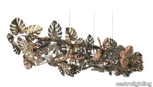
Rainforest Log Suspension
castrolighting > Ceiling lamp
The Rainforest Collection arose from the timeless lighting celebration of nature silhouettes, its elements, and movements. Immerse yourself into the magnificent atmosphere of the sparkling rainforest where the art of brass craftsmanship becomes luxury lighting design. The ultimate fusion between the artistic design, authenticity of traditional Portuguese metal-work techniques, and creative craftsmanship. The Rainforest Log chandelier is outstanding in the refinement and elegance it represents. The framing-colored brass coupled with a gold-plated log design - applied by hand - allows a sheer charisma that resembles nature in full bloom. A broad-leaved masterpiece of modern lighting design that takes you to remote spaces. A dreamy lighting fixture produces an exceptional ambiance to the classy interiors. Displayed in several brass colorful finishes, this handmade lighting fixture can be naturally customizable within sizes and distributing elements to fit your interior design project. This handmade suspension lamp is perfect for spacious living rooms, dining rooms, or hallways with high ceilings, fitting in various decors. The exquisite light dispersion of this gracious lamp will make it the central piece for all luxury houses and help achieve the desired timeless chic. A beautiful suspension lamp that can be suitable for a mid-century modern style, modern classic, or art deco interior décor. VIEW FULL FAMILY
Compatta Pisé Melange

florim > Wall tile-stone-brick
<p>A passion for earth as a natural material and for rammed earth, an ancient construction technique.</p> <p>The combination of these patterns evolves into the concept of Pisé Inserti, more slabs of immense decorative impact, generated by the two-dimensional criss-crossing of exquisite, rounded geometrical forms: the designer combines the natural earthen shades with apparently random curved lines that evoke the uneven trapezia with rounded corners used by Gio Ponti.</p> <p>These are also available in the large 120x280 cm size and 6 mm thickness in three variants: Pisé Inserti A, Pisé Inserti B and Pisé Inserti C. COMPATTA’s potential is further enhanced by three-dimensional subjects of varying shapes, which can be built up into mesh-backed mosaics to create sculptural forms on walls. These extensions to the collection are called Inserti Melange, Inserti Sabbia-Argilla and Inserti Limo-Ghiaia and are produced in 9 mm thickness and 30x30 cm size.</p> <p>The collection is born from a sustainable and virtuous approach and is part of <a href="https://www.florim.com/en/company/sustainability/carbonzero-florim/">CarbonZero</a>, Florim's range of Carbon Neutral surfaces.</p> <p>The COMPATTA collection, designed by Federico Peri, combines a passion for earth as a natural material and an interest in a very ancient construction technique.<br>The primary inspiration derives from close observation of the many strata within the ground and the mixtures of elementary particles of which it consists. The design concept is completed by reference to the age-old rammed earth construction technique, used in northern Jordan since the eighth millennium BCE and widely applied in Yemen in many other desert or rural settings until the mid 19thC.<br>In this method, the raw earth is compacted inside wooden formwork to construct continuous structural walls, bearing walls or partitions inside homes, with a natural decorative effect due to the layering of the different shades of clay used. When creating his project for CEDIT, Peri was also influenced by several design inputs: from rural African homes to the clear, simple geometric forms and curved lines typical of the work of Gio Ponti, the curves central to the modernist gardens of Brazilian landscape artist Roberto Burle Marx, and the three-dimensional mosaics of English sculptor William Mitchell. In his murals in concrete, glass and recycled materials, Mitchell seems to combine some of the typical features of a variety of artistic movements, from Modernism to Brutalism, and also shows awareness of the issues concerning the structure of the landscape and the relationship with nature at the heart of Land Art. COMPATTA thus embodies strong links to the world of art and architecture, while bringing natural impressions with a remote, primitive flavour into modern living-spaces.</p>
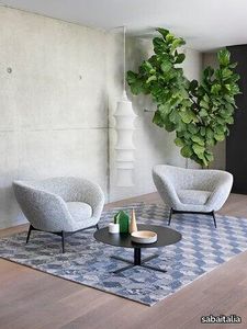
Oltremare Poltrona
sabaitalia > Armchair
The seating collection “Oltremare” designed by Antonio Marras and produced in collaboration with Saba, stems from a far-away past and place, full of history, recollection, memories overflowing with suggestions and visions. And this is how Antonio Marras presented an object so dear to him that he defines a sacred-idol, that narrates of his land, of his sea, but mostly, of his story. We named it Oltremare, because all things have a soul and every soul has a name. Oltremare encloses within its inlets the classic and the modern. The curve is a line that can be tamed: it forms a wave, a fold, it creates a place but it also offers an escape route. In our utopian world we investigated the relationship between the curved line and the act of seating, asymmetric shapes that become backrests and sink into extremely comfortable seats pushing past the rectangular schemes so dear to the sober lines of designing sofas. The asymmetric curves that enclose it are the inspirations for the Oltremare armchair that completes the collection alongside a padded bench. A comfortable nest suspended on a slim varnished metal base, whose essential lines render, by contract, the armchair’s silhouette even more interesting. Oltremare is a seating system that, even though winks at the past, it communicates a strong contemporary soul and is suitable by nature to various interpretations. Fully removable covers.
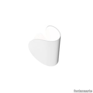
IO
fontanaarte > Wall lamp
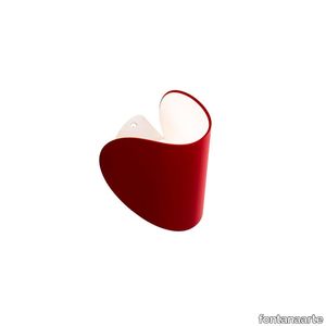
In the shape of a small curved lunar disc, IO is a wall light with dual Led light emission. IO appears almost suspended, very close to the wall but never close enough to touch it; positioned at a distance that allows the light to gently caress the wall with an intimate skimming effect. Elegant and minimalist, it is equipped with a mount with a dual rotating axis. is allows the diffuser to be rotated by 360°, directing it exactly where the light is required. In addition to rotating, the diffuser also moves up and down, opening and closing the light beams to adjust to individual requirements. Designed to provide a source of light that is as personal and adjustable as possible, the ideal use for this light is as a bedside lamp. However, it's versatility also makes it an excellent solution for lighting the walls of offices and corridors, both in residential and contract spaces. The diffuser is made from die-cast aluminium and looks very solid despite its small size. It is available in a matt finish in the following four colours: graphite grey, red, white and blue. The inside is always white in order to reflect as much light as possible.
IO
fontanaarte > Wall lamp
In the shape of a small curved lunar disc, IO is a wall light with dual Led light emission. IO appears almost suspended, very close to the wall but never close enough to touch it; positioned at a distance that allows the light to gently caress the wall with an intimate skimming effect. Elegant and minimalist, it is equipped with a mount with a dual rotating axis. is allows the diffuser to be rotated by 360°, directing it exactly where the light is required. In addition to rotating, the diffuser also moves up and down, opening and closing the light beams to adjust to individual requirements. Designed to provide a source of light that is as personal and adjustable as possible, the ideal use for this light is as a bedside lamp. However, it's versatility also makes it an excellent solution for lighting the walls of offices and corridors, both in residential and contract spaces. The diffuser is made from die-cast aluminium and looks very solid despite its small size. It is available in a matt finish in the following four colours: graphite grey, red, white and blue. The inside is always white in order to reflect as much light as possible.
Fynn "Dining"
minotti > Chair
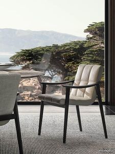
Scandinavian values meet Italian tradition in Fynn, a project created by combining fine cabinet-making in the wooden elements and sophisticated upholstering with fabric or saddle-hide. The signature element of the Fynn seats is the armrest, elongated and slightly curved, rounded and smooth to the touch, 100% handmade. Its precise, well-defined line identifies the whole family of seats, in the two Fynn and Fynn Saddle-Hide versions. Covered with the exclusive fabrics and saddle-hides in the collection, it fully expresses the high level of the elegant sartorial process which has always been Minotti’s distinguishing mark. The family comprises armchairs, lounge and dining little armchairs, benches, footstools and coffee tables. The Fynn armchair and little armchairs feature an ultra-lightweight aesthetic with a simple structure in ash wood with Liquorice colour stained finish. This hosts a padded seat and backrest cushion, designed as a single element. The informal rigour with which Fynn hosts the upholstered element designs a comfortable seat that almost cradles the body, wrapping it in the warmth of the wooden structure. In the Fynn Saddle-Hide version, a single saddle-hide element incorporates both the seat and backrest. The armchair and lounge little armchair have separate padded cushioning, which is optional in the dining little armchair. The saddle-hide covering comes in an extensive colour palette: Burgundy, Ash, Dove Grey, Sage, Mud, Moka, Black, Bulgarian Red, Moss Green, Green, Pewter, Corten, White and Grey. The Fynn conceived for the dining area includes the version with fully padded shell and, alternatively, the Saddle-Hide version with or without cushion. The Fynn family of seats is completed by a footstool and some benches of different sizes, all with a cushion except for the benches in the Saddle-Hide version, which have a structure with a slightly concave top, combined with a saddle-hide covering that envelopes it like exquisite leather. The coffee tables also share the same line as the wooden armrest, which designs a slight curve also found in the structural and side parts. The central part of the coffee table is enhanced by the presence of the top in Calacatta marble, creating a sophisticated combination of materials.
Heritage Luxe Heritage Brown
florim > Wall tile-stone-brick
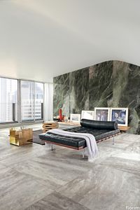
Heritage Luxe can be said to exemplify the magnitude of our inheritance from the past which at the same time is part of our present. In keeping with modern times, the surfaces of the collection have a strong decorative character and bring the heritage of the European tradition up to date by proposing a stylistic concept inspired by the beauty and classic luxury of marble that blends with the dynamism of veining and colors of a contemporary flavor. <p>Memory, the heritage of the past and the most up-to-date taste all unite in a single dimension in which the iconic objects and furnishings of yesteryear coexist with the most contemporary luxury of modern times to transform the atmosphere of the surroundings into something unique and instantly recognizable. The collection features marble surfaces in bold, refined colors that add immense personality and character to the most exclusive of spaces. The richness of colors and graphic details of these products finds its maximum expression in the large sizes, designed to blend in with increasingly voguish large open spaces, or to illuminate more intimate surroundings.</p> <p> </p> <p class="MsoNormal"><strong><span lang="EN-US" style="mso-ansi-language: EN-US;">COLORS AND DECORS</span></strong></p> <p class="MsoNormal"><span lang="EN-US" style="mso-ansi-language: EN-US;">Heritage Azure is distinguished by a pale, refined blue background against which a deep rust-colored vein stands out, making it perfect for pairing with warm-toned colors and materials.</span></p> <p class="MsoNormal"><span lang="EN-US" style="mso-ansi-language: EN-US;">Heritage Cloud is the most versatile surface in the collection. Characterized by different streaks of grey, this graphic can be perfectly matched with both warm and cool colored materials.</span></p> <p class="MsoNormal"><span lang="EN-US" style="mso-ansi-language: EN-US;">The soft, enveloping base of Heritage Brown is reminiscent of Spanish marble, distinguished by subtle and barely noticeable white veins.</span></p> <p class="MsoNormal"><span lang="EN-US" style="mso-ansi-language: EN-US;">Heritage Emerald brings to mind the rolling hills of Ireland. Shades ranging from dark to light green with dashes of brown and white congregate on its surface.</span></p> <p class="MsoNormal"><span lang="EN-US" style="mso-ansi-language: EN-US;">Heritage Aqua is a surprising surface that emerges from the encounter of contrasting shades of teal and white, embellished with sophisticated orange veins.</span></p> <p class="MsoNormal">Lastly, Heritage Flame bears witness to an encounter between delicate shades of brown and dashes of cream.</p> <p class="MsoNormal"><span lang="EN-US" style="mso-ansi-language: EN-US;">The array of backgrounds is accompanied by three 6 mm thick colored-body porcelain stoneware decors that combine the different shapes and graphics of the slabs in the range, thus delineating an enchanting continuity of colors and veining within the space.</span></p> <p class="MsoNormal"><span lang="EN-US" style="mso-ansi-language: EN-US;">The Picket decor juxtaposes the trapezoidal glossy Heritage Emerald and Heritage Cloud slabs to craft a refined composition with clean, contemporary lines.</span></p> <p class="MsoNormal"><span lang="EN-US" style="mso-ansi-language: EN-US;">The Maze decor, composed of a range of small Heritage Emerald, Heritage Brown and Heritage Flame trapezoids, catches the eye with its harmonious concentric motifs.</span></p> <p class="MsoNormal"><span lang="EN-US" style="mso-ansi-language: EN-US;">Finally, the Trinity decor features three sinuously arched, glossy finish strips in the Heritage Azure graphic.</span></p>
Djembé
marset > Functional light
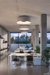
The Djembé collection is designed for repetition, creating musical compositions of light on the ceiling. A bell-shaped ceiling fixture with an exposed interior, Djembé is available in a numerous sizes and bright, airy colors that can be used individually or combined to create a brilliant statement piece.Using a rotomolding technique allowed the designer, Joan Gaspar, to design a fixture with vastly different interiors and exteriors: its outside recalls the texture of a stone, giving off a perception of great weight, emphasized by its volume. In the spacious interior you’ll find a smooth, white space perfect for the reflection of light. Djembé is a lamp designed for use in public spaces that seeks to bring beauty and an unbeatable quality of light. Faced with the challenge of lighting very large spaces, the Djembé collection is growing in every sense of the word, with more sizes and formats. The new ceiling version is over one metre in diameter, but features the same finishes as the rest of the collection. It manages to illuminate using a skylight effect, with its inner white dome boosting the light to yield wonderful lighting. Its lighting performance fits perfectly in contract spaces with a design that is functional and fascinating.
Patio
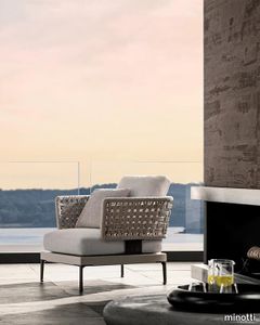
minotti > Armchair
Having explored the use of woods, such as iroko and teak, with Patio, designed by Italian-Danish studio GamFratesi, Minotti proposes an unexpected mix of different materials: aluminium, wood, stone, cord. The outdoor seating system, with its highly versatile modularity, is conceived as a dynamic mosaic, composed of tesserae in simple geometric shapes, which can be pieced together as desired, and reconfigured to suit the available space and the mood to be created. The design of the sofa base structure enables the back elements to be arranged in various set positions all along the perimeter, to design conversation, relaxation, and vis-à-vis areas, spacing out the seats with coffee tables, and complementing them with ottomans and benches. A solution capable of meeting the requirements of both small metropolitan terraces, and extensive outdoor spaces, thanks to the two depths: 83 and 98 cm. The variety of potential compositions becomes even more interesting when the selected materials are masterfully combined: the extruded aluminium base with matt finish in the shades of Ecru and Dark Brown is accompanied by steel backrests, covered in woven polypropylene cord in the same shades, according to a Scandinavian-type geometric design. Some of the seating elements feature a handy tray in Dark Brown stained solid mahogany or in natural teak, with grooves for draining water, attached to the structure. Patio offers an interesting range of furnishing accessories, from coffee tables with top in brushed fine-grain Basaltina stone, benches, and square and rectangular ottomans with extruded aluminium base, in a creative mix of materic textures and sophisticated, natural colours. The system offers a rich variety of sofas in different measurements and configurations, in addition to central and end units, armchairs, loveseat, sunbeds and double daybeds. All the elements share the same feet and the same joints at the back in die-cast aluminium, varnished with a refined polished, anti-touch Bronze finish.
Eames Fiberglass Armchair LAR
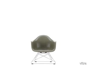
vitra > Chair
The Shell Chairs by Charles and Ray Eames are among the most important designs in the history of furniture. Following their initial presentation at the 'Low Cost Furniture Design' competition organised by the Museum of Modern Art in 1948, the chairs were launched on the market in 1950 in an armchair version (A-shell) and as a simpler side chair (S-shell) – making them the first ever mass-produced chairs made of plastic. <br/><br/>With the debut of this revolutionary design, Charles and Ray Eames introduced a new furniture typology that has since spread around the globe: the multifunctional chair whose shell can be joined with a variety of different bases. Already in 1950, they presented a series of bases that enabled various sitting positions, including the low-slung LAR (Lounge Height Armchair Rod Base) with a geometric steel wire base, which quickly acquired the charming nickname 'Cat's Cradle' in reference to the children's string game. <br/><br/>The LAR seems to have been one of Charles and Ray's favourite designs: it can be spotted in numerous vintage photographs of the legendary Eames House in Pacific Palisades, both indoors and out. This also reveals how lightweight the chair is, and how easily it can be moved around.<br/><br/>Due to the organic shape of this classic armchair, the LAR is a striking solo piece, but it can also be paired with many types of sofas to create an appealing contrast. The LAR is offered as the Plastic Chair LAR with a polypropylene shell, or as the Fiberglass Chair LAR with a fibreglass shell that draws attention to the lively texture so valued by connoisseurs. The fascination of fibreglass lies in its irregular surface, whose clearly visible fibres make it appear almost like a natural material. The Fiberglass Chair LAR is not offered with full upholstery in order to show off the unique characteristics of this material to maximum effect. However, a comfortable seat cushion is optionally available.
Superquadra
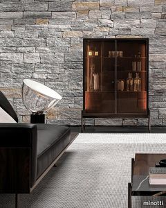
minotti > Cabinet
The storage units in the Superquadra family by Marcio Kogan / studio mk27 are of different sizes and are intended for a variety of uses, yet they all share the same minimal design, the same style - somewhere between classic rationalism and a contemporary vibe - and the same floating aesthetic, which endows them with an airy, suspended appearance. The sideboard is available in several sizes and heights, starting from the dining, living/TV and cabinet versions. In the first two variants, the body of the unit rests on a solid wood base. Sporting volumes of different sizes, it comes equipped with drawers, all with handles in a polished varnished Brandy-coloured finish. The bearing structure of the dining and living/TV storage units is in Dark Brown stained palisander Santos with matt polyester lacquered finish, or in Black lacquered open-pore ash, and sits on feet with a polished Brandy finish. In addition to Dark Brown stained palisander Santos with matt polyester lacquered finish or Black lacquered open-pore ash, the storage elements for the dining and living/TV units are also available with a glossy Moka, Cappuccino or Malachite lacquer. The cabinet, with its pure and geometric shapes, emphasizes the sophisticated combination of materials, creating a refined contrast between wood, varnished aluminium and glass. All these elements host the same materials and proportions inspired by the elegant rationalism, characterising the mood of the Brasilia range, and indeed the overall style of Marcio Kogan / studio mk27. The dining version, available in the size 273,5 cm and in two different heights, offers four drawers, with a cutlery holder in Black saddle-hide in the top one. One important detail is the foot in aluminium with polished Brandy-coloured finish, which juts out from the line of the base. The living/TV unit, available in a single 273,5 cm version, offers a storage space with two drawers and surface made of thin staves in Dark Brown stained Canaletto walnut that lighten the volume and create an original interplay of transparencies. The cabinet, available in one size, 105 cm, is characterised by a frame with doors in stratified glass, coupled with a copper-coloured metallic mesh inside. This combination offers glimpses of the reflections created by the back panels in bronzed glass and by the double light strip, positioned on the sides of the frame. Inside, it houses a set of drawers in Dark Brown stained palisander Santos, with matt polyester lacquered finish. Placing two cabinets together, one next to the other, creates an interesting twist on an effective storage solution.
Rainforest Plafonnier

castrolighting > Ceiling lamp
The Rainforest Collection arose from the timeless lighting celebration of nature silhouettes, its elements, and movements. Immerse yourself into the magnificent atmosphere of the sparkling rainforest where the art of brass craftsmanship becomes luxury lighting design. The ultimate fusion between the artistic design, authenticity of traditional Portuguese metal-work techniques, and creative craftsmanship. The Rainforest Plafonnier is unparalleled in the refinement and grace it represents. The gold-plated brass coupled with combination of leaves - applied by hand - brings a delicate charisma that resembles nature in full bloom. A broad-leaved masterpiece of modern lighting design that takes you to remote spaces and the open sky. A dreamy lighting ceiling fixture creates an exceptional ambiance to the classy interiors. A luxury custom-designed collection was made to be featured in the most sophisticated projects organically. The sizes and distribution of the elements can be naturally customizable. This handmade lamp is perfect for spacious living rooms, dining rooms, or hallways with high ceilings, fitting in a vast variety of decors. The exquisite light dispersion of this gracious lamp will make it the central piece for all luxury houses and help achieve the desired timeless chic. This beautiful suspension lamp is the right choice for a mid-century modern, modern classic, or art deco interior style.
Ambrosia

marset > Ceiling lamp
Ambrosia is essentially a line of light that can be converted into a modular system, capable of extending the illumination it offers to adapt to any space. A design that recovers and revisits the tube light, timeless, and updates it so that its simple structure and diffuse lighting add beauty to any space. This collection expands on its possibilities by proposing a change in the plane of light, from horizontal to vertical.This new style of lamp is available in two versions, both of which are pendant lamps. First there is the Ambrosia V2, a 235-cm-high vertical structure consisting of two tubes of light of different lengths. An interrupted line of light, a detail that brings lightness and character to the lamp. Its design allows you to choose the lighting, either towards the wall for indirect light, or towards the main space for direct light. This aesthetic and functional design also works well in domestic settings. The other vertical version, Ambrosia V3, joins three light tubes placed at different heights, forming a sculptural ensemble. This option can provide a great deal of light and therefore comes with a dimming system for easy lighting control. It is available in two heights of 130 and 175 cm. Both sizes can be electrically connected through the ceiling rosette or the floor plug. The new Ambrosia allows you to create vertical lighting compositions, combining different sizes in repetition to illuminate large spaces. When installed individually, it fills the space with light and warmth. Its slender design sets the perfect scene in any room. A totally new perspective for this flexible lighting system, which achieves maximum light expression with a minimalist structure. The metal structure is available in two finishes – black and matte gold – and the light source in three colour temperatures: 2200 K, 2700 K and 3000 K.
Ledtube
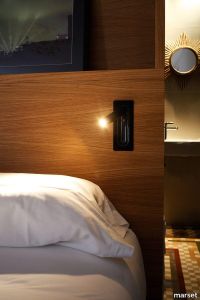
marset > Wall lamp
For more than ten years, the Ledtube has been one of the most iconic products in the Marset collection: a headboard lamp with a powerful, movable beam of light that’s an archetype due to its functionality and ability to blend with any space.Its ergonomic design beckons you to move it in any direction, up to 360º, and its use is very intuitive. When opened, it turns on automatically; when closed, it turns off and hides away in the wall, like camouflage. It’s so versatile it can be installed vertically or horizontally, adapting to the needs of your space. The newest version of Ledtube builds on years of improvements, and features a honeycomb grill that traps peripheral light in all directions, avoiding glare. Available in four finishes – matte black, matte white, aluminium, and bronze – it captures the rigor of a well-designed product that’s highly functional and addresses an unresolved problem in contract projects. An ingenious lamp that has lit up rooms in countless hotels – in several of them as a certified product – to provide company during the best part of the day: when it’s time to relax and read before sleep.
Rainforest Pendant
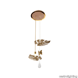
castrolighting > Ceiling lamp
The Rainforest Collection arose from the timeless lighting celebration of nature silhouettes, its elements, and movements. Immerse yourself into the magnificent atmosphere of the sparkling rainforest where the art of brass craftsmanship becomes luxury lighting design. The ultimate fusion between the artistic design, authenticity of traditional Portuguese metal-work techniques, and creative craftsmanship. The Rainforest elegant pendant is unparalleled in the refinement and grace it represents. The gold-plated brass coupled with clear crystal glass - applied by hand - brings a delicate charisma that resembles nature in full bloom. A broad-leaved masterpiece of modern lighting design along with falling raindrops and butterflies takes you to remote spaces and the open sky. A dreamy lighting fixture creates an exceptional ambiance to the classy interiors. A luxury custom-designed collection was made to be featured in the most sophisticated projects organically. The sizes and distribution of the elements can be naturally customizable. This handmade suspension lamp is perfect for spacious living rooms, dining rooms, or hallways with high ceilings, fitting in a vast variety of decors. The exquisite light dispersion of this gracious lamp will make it the central piece for all luxury houses and help achieve the desired timeless chic. This beautiful suspension lamp is the right choice for a mid-century modern, modern classic, or art deco interior style.
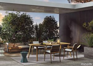
Fynn "Outdoor"
minotti > Outdoor furniture
In Fynn, Scandinavian values meet Italian tradition. A contemporary design for outdoor spaces in teak wood, crafted with fine cabinet-making workmanship. With a completely innovative approach, the fine cabinet-making process used for the manufacturing of outdoor wooden furniture is applied to a family of outdoor furnishing pieces in solid teak, combining sophisticated workmanship with an ultra-contemporary design. Characterised by an interwoven frame that hosts soft seat and backrest cushions, Fynn has in the armrest its signature element. Elongated and slightly curved, rounded and smooth to the touch, it is completely handmade: its precise, well-defined line identifies the entire family, composed of armchair, lounge and dining little armchairs, benches, footstools, coffee tables in different sizes and a dining table. The Fynn Outdoor armchair and little armchairs feature a distinctive ultra-lightweight aesthetic with a simple structure in teak. The frame is interwoven with wicker-effect cords in Mud colour, hosting a padded seat and backrest cushion, designed as a single element. The informal rigour with which Fynn Outdoor hosts the padded element designs a comfortable seat. The bench completes the family. Its cushions sit on a frame interwoven with wicker-effect cords in Mud colour. The coffee tables also share the same line as the wooden armrest, which designs a slight curve also found in the rounded sides of the top. The central part of the coffee table is enhanced by the presence of the top in Pietra del Cardoso, creating a sophisticated combination of materials.
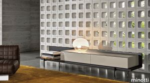
Superquadra
minotti > Cabinet
The storage units in the Superquadra family by Marcio Kogan / studio mk27 are of different sizes and are intended for a variety of uses, yet they all share the same minimal design, the same style - somewhere between classic rationalism and a contemporary vibe - and the same floating aesthetic, which endows them with an airy, suspended appearance. The sideboard is available in several sizes and heights, starting from the dining, living/TV and cabinet versions. In the first two variants, the body of the unit rests on a solid wood base. Sporting volumes of different sizes, it comes equipped with drawers, all with handles in a polished varnished Brandy-coloured finish. The bearing structure of the dining and living/TV storage units is in Dark Brown stained palisander Santos with matt polyester lacquered finish, or in Black lacquered open-pore ash, and sits on feet with a polished Brandy finish. In addition to Dark Brown stained palisander Santos with matt polyester lacquered finish or Black lacquered open-pore ash, the storage elements for the dining and living/TV units are also available with a glossy Moka, Cappuccino or Malachite lacquer. The cabinet, with its pure and geometric shapes, emphasizes the sophisticated combination of materials, creating a refined contrast between wood, varnished aluminium and glass. All these elements host the same materials and proportions inspired by the elegant rationalism, characterising the mood of the Brasilia range, and indeed the overall style of Marcio Kogan / studio mk27. The dining version, available in the size 273,5 cm and in two different heights, offers four drawers, with a cutlery holder in Black saddle-hide in the top one. One important detail is the foot in aluminium with polished Brandy-coloured finish, which juts out from the line of the base. The living/TV unit, available in a single 273,5 cm version, offers a storage space with two drawers and surface made of thin staves in Dark Brown stained Canaletto walnut that lighten the volume and create an original interplay of transparencies. The cabinet, available in one size, 105 cm, is characterised by a frame with doors in stratified glass, coupled with a copper-coloured metallic mesh inside. This combination offers glimpses of the reflections created by the back panels in bronzed glass and by the double light strip, positioned on the sides of the frame. Inside, it houses a set of drawers in Dark Brown stained palisander Santos, with matt polyester lacquered finish. Placing two cabinets together, one next to the other, creates an interesting twist on an effective storage solution.
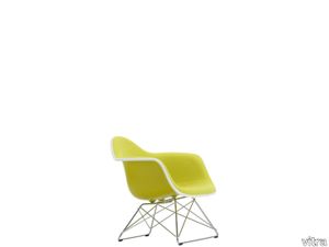
Eames Plastic Armchair LAR
vitra > Chair
The Plastic Chairs by Charles and Ray Eames are among the most important designs in the history of furniture. Following their initial presentation at the 'Low Cost Furniture Design' competition organised by the Museum of Modern Art in 1948, the chairs were launched on the market in 1950 in an armchair version (A-shell) and as a simpler side chair (S-shell) – making them the first ever mass-produced chairs made of plastic. <br/><br/>With the debut of their Plastic Chairs, Charles and Ray Eames introduced a new furniture typology that has since spread around the globe: the multifunctional chair whose shell can be joined with a variety of different bases. Already in 1950, they presented a series of bases that enabled various sitting positions, including the low-slung LAR (Lounge Height Armchair Rod Base). <br/><br/>The LAR seems to have been one of Charles and Ray's favourite designs: it can be spotted in numerous vintage photographs of the legendary Eames House in Pacific Palisades – both indoors and out. This also reveals how lightweight the chair is, and how easily it can be moved around.<br/><br/>Thanks to its compact dimensions, the Plastic Chair LAR can also be used in smaller interiors, and the wide choice of colours for the shell, upholstery fabric, and base can be coordinated with diverse styles and settings. The steel wire base, which achieves maximum stability with minimum materials, acquired a charming nickname within just a short time on the market as a result of its unusual form: 'Cat's Cradle' – in reference to the children's string game.<br/><br/>Due to the organic shape of this classic armchair, the LAR is a striking solo piece, but it can also be paired with many types of sofas to create an appealing contrast. Especially in the version with full upholstery, the LAR offers long-lasting comfort, making this modestly sized armchair an excellent seating option for any living space.
Rilievi Lido
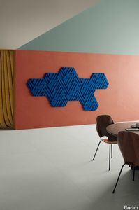
florim > Wall Paint
The alternation and symbiosis between concave and convex, recessed and raised. <p>Rilievi is a work of design balanced between different historic periods: while the volumetric relief tile modules are inspired by artistic experiments conducted in Italy during the Sixties and Seventies, the large slabs are the outcome of research into materials and technology that has only come to fruition in very recent times. The shadow effects generated on the surfaces of the slabs by the light striking the projecting parts of the modules create an unusual impression of architectural depth found virtually nowhere else in ceramic coverings, laying the bases for a new decoration interior design language.</p> This project simply embodies perfection - a term which certainly sets the bar high in a description of a new product for launch on the market. But when an enlightened manufacturer is capable of encapsulating a designer's personal research in a product to be added to its range, the outcome is a perfect synthesis. A perfect synthesis between untrammelled creativity and market trends. CEDIT had the insight needed to perceive, identify and rework the immense potential of Practice Practice Practice "“ a self-produced project by Zaven (Enrica Cavarzan and Marco Zavagno "“ and realised that its sophisticated design, originated by pure, pristine input (unadulterated by external factors except the noblest of them all, research) could provide the basis for an innovative, successful collection. I might add, a collection unique of its kind. Zaven is also a name that comes with guarantees; the two partners are good at what they do. Their work always starts from personal curiosity and investigations, the study of other stories (as in this case inspiration was drawn from the output of artist and activist Nino Caruso) and individual interests, which are broken down, developed, optimised and prepared for transformation into something fresh.Enrica Cavarzan and Marco Zavagno have a masterly ability to transform their own wishes and passions into design work of the greatest breadth and, as we see here, the widest, richest application. Their use of ceramics as a material is clearly outstanding and reflects a method precisely founded on the desire to look at things from an unusual viewpoint, under a different light. And to be daring. Zaven have an unconventional approach to convention. In the specific case of the Rilievi collection, the "modules" created for CEDIT seem to explode off the walls; in fact, they are constructed by combining the two-dimensional slab with its three-dimensional decor.Rilievi seems to be seeking space. More space. Even though these modules have actually established a dialogue with the wall from which they are born. At the same time, they hypnotise us with their tight sequence of lines, the pattern that is always different although its root is the same, and the intriguing, unusual colours that add another vital factor to the finished product. Their firm grounding in graphic design (and here we have come back to two-dimensional effects, of the kind most often associated with a wall covering) easily evolves into a facade which seems to have been carved with a chisel - although this is not the case. These modules are conceived to convey an impression of movement, and the three models, in seven colour combinations, create a powerful effect on a surface, which is never passive but rather an organic contributor to the forms and colours involved in the fascinating combinations. The slab is very much present and has the same worth and status as the relief pattern associated to it. In the light of this dichotomy between the linear and the sculpted, expressed through the skilfully balanced visual expedients, the use of repetition adds vigour to the module's intrinsic meaning. As we have seen, a rejection of facile, superficial creative dynamics in favour of an investigation reaching above and beyond has always been a central, clearly recognisable feature of this Venice-based duo, who already have impressive international partnerships to their credit, including the London Design Festival, the Kalmar Konstmuseum, the Paris Designer Days, Ca' Foscari University, the Venice Biennale, the Sandretto Re Rebaudengo Foundation, the Sindika Dokolo Foundation and the V-A-C Foundation, and also won the 2018 Wallpaper Design Award. Graphics, advertising and product design: the pair have always opted for a type of design closely linked to the observation of everyday items, followed by their reinterpretation in a version applied to experimentation with materials. This duality, combined with their energetic yet elegant visual language, forms Enrica and Marco's primary code, experienced in this specific context through serial carvings. On walls.
Policroma Cipria
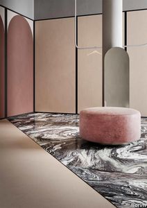
florim > Wall Paint
Recurring geometries, combinations of figures. Marble and marmorino plaster: comparison and dialogue. The collection is completed by a linear listello tile with the motif of a sequence of vertical rectangular blocks, which can be combined with the slabs to further enrich compositions involving continuous ceramic surfaces cladding.<br /><br />"Another reference is the use of Italian marbles on the verge of extinction, rare marbles such as Rosa Valtoce, the marble used in Milan Cathedral."<br />Cristina Celestino Cristina Celestino's smartphone contains a folder of images entitled "Milan". Photographs that are more like notes. Photographs of architectural features, materials or details of shapes encountered by chance during a walk, but they cannot be described as merely a vague "source of inspiration". This filing system, created in response to a fleeting instinct, is an integral part of the method of work adopted by the architect and designer, who starts off without preconceptions "“ or "free", as she puts it before drawing inputs from a vast world of references, from Hermès scarves to the works of the great Masters (in the specific case of Policroma). This accumulation, partly spontaneous and party the outcome of in-depth historical knowledge and study, naturally activates a process of synthesis and personal interpretation common to all Cristina Celestino's output.<br /><br /><br />The wall covering collection designed for Cedit was no exception, although in this case the designer was dealing with a project with variable dimensions, reaching up even to the architectural scale. In her own distinctive way, she combined a variety of references. Adolf Loos's passion for coloured types of marble, and Cipollino in particular. Carlo Scarpa's angular metal frames and Marmorino plaster in Venice. The French fashion house's square silk scarves. The entrance halls of Milan palazzos, Gio Ponti, the city's Cathedral. All expressed in the designer's own language: well balanced geometrical forms, subtle colours (shades similar to those of Scarpa himself), an effortless, almost restrained, playful elegance. The mood is that of the homes of the enlightened bourgeoisie who shaped the history of Milan, Celestino's adoptive city and an endless source of inputs. She has worked its interiors, including some of the least expected a 1928 tram, the historic Cucchi confectionery store hybridising her own style with the existing context. An imitative effect which is also the key to the meaning of the new Policroma collection: the marble varieties replicated using the Cedit technology are all from Italian quarries that are virtually "worked out". This revives an increasingly rare material as a "living" presence, in a different form which makes no claim to replace the natural original. Quite the contrary, Celestino immediately states her intention to imitate, by combining marble and Marmorino plaster in some variants with a contrasting frame (a typical feature for her, just as it was for Scarpa), and evoking the centuries-old marble-imitating scagliola plasterwork with a contemporary formula.<br /><br /><br />The types of marble chosen are central to the project's character. Verde Alpi, a favourite with Gio Ponti and often found in Milan entrance halls, features tightly packed patterning. Breccia Capraia, still found in a very few places in Tuscany, has a white background with just a few veins. Cipollino, in the special Ondulato variety in green and red, is patterned with spirals. Rosa Valtoce, on the other hand, was used by the "Veneranda Fabbrica" guild to build Milan Cathedral. It is an iconic stone with dramatic stripes, popular in the past; it is now sourced from one very small quarry in Piedmont which has been virtually abandoned.<br /> The many different elements that make up the Policroma collection all reflect the importance of craftsmanship to Cristina Celestino's design style: the modules can be freely mixed and combined, for example to create a concave or convex semicircle, or for the large-scale replication of small features initially conceived as trims, functional details transformed into a dominant motif.There is a return to the theme of the interior, a large or small protected space, conceived as suspended in space and time yet also reassuring and protective. It is designed through its coverings in a stark yet not minimalist way, with intelligence and with no overreaching artistic ambitions. An understated space and an extremely stylish declaration. In Milan style, of course.
Compatta Argilla

florim > Wall tile-stone-brick
<p>A passion for earth as a natural material and for rammed earth, an ancient construction technique.</p> <p>The combination of these patterns evolves into the concept of Pisé Inserti, more slabs of immense decorative impact, generated by the two-dimensional criss-crossing of exquisite, rounded geometrical forms: the designer combines the natural earthen shades with apparently random curved lines that evoke the uneven trapezia with rounded corners used by Gio Ponti.</p> <p>These are also available in the large 120x280 cm size and 6 mm thickness in three variants: Pisé Inserti A, Pisé Inserti B and Pisé Inserti C. COMPATTA’s potential is further enhanced by three-dimensional subjects of varying shapes, which can be built up into mesh-backed mosaics to create sculptural forms on walls. These extensions to the collection are called Inserti Melange, Inserti Sabbia-Argilla and Inserti Limo-Ghiaia and are produced in 9 mm thickness and 30x30 cm size.</p> <p>The collection is born from a sustainable and virtuous approach and is part of <a href="https://www.florim.com/en/company/sustainability/carbonzero-florim/">CarbonZero</a>, Florim's range of Carbon Neutral surfaces.</p> <p>The COMPATTA collection, designed by Federico Peri, combines a passion for earth as a natural material and an interest in a very ancient construction technique.<br>The primary inspiration derives from close observation of the many strata within the ground and the mixtures of elementary particles of which it consists. The design concept is completed by reference to the age-old rammed earth construction technique, used in northern Jordan since the eighth millennium BCE and widely applied in Yemen in many other desert or rural settings until the mid 19thC.<br>In this method, the raw earth is compacted inside wooden formwork to construct continuous structural walls, bearing walls or partitions inside homes, with a natural decorative effect due to the layering of the different shades of clay used. When creating his project for CEDIT, Peri was also influenced by several design inputs: from rural African homes to the clear, simple geometric forms and curved lines typical of the work of Gio Ponti, the curves central to the modernist gardens of Brazilian landscape artist Roberto Burle Marx, and the three-dimensional mosaics of English sculptor William Mitchell. In his murals in concrete, glass and recycled materials, Mitchell seems to combine some of the typical features of a variety of artistic movements, from Modernism to Brutalism, and also shows awareness of the issues concerning the structure of the landscape and the relationship with nature at the heart of Land Art. COMPATTA thus embodies strong links to the world of art and architecture, while bringing natural impressions with a remote, primitive flavour into modern living-spaces.</p>
Fynn "Outdoor"
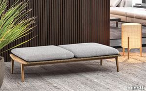
minotti > Outdoor furniture
In Fynn, Scandinavian values meet Italian tradition. A contemporary design for outdoor spaces in teak wood, crafted with fine cabinet-making workmanship. With a completely innovative approach, the fine cabinet-making process used for the manufacturing of outdoor wooden furniture is applied to a family of outdoor furnishing pieces in solid teak, combining sophisticated workmanship with an ultra-contemporary design. Characterised by an interwoven frame that hosts soft seat and backrest cushions, Fynn has in the armrest its signature element. Elongated and slightly curved, rounded and smooth to the touch, it is completely handmade: its precise, well-defined line identifies the entire family, composed of armchair, lounge and dining little armchairs, benches, footstools, coffee tables in different sizes and a dining table. The Fynn Outdoor armchair and little armchairs feature a distinctive ultra-lightweight aesthetic with a simple structure in teak. The frame is interwoven with wicker-effect cords in Mud colour, hosting a padded seat and backrest cushion, designed as a single element. The informal rigour with which Fynn Outdoor hosts the padded element designs a comfortable seat. The bench completes the family. Its cushions sit on a frame interwoven with wicker-effect cords in Mud colour. The coffee tables also share the same line as the wooden armrest, which designs a slight curve also found in the rounded sides of the top. The central part of the coffee table is enhanced by the presence of the top in Pietra del Cardoso, creating a sophisticated combination of materials.
GAS: joint between screed and floor
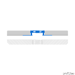
profilitec > Accessories
GAS: joint between screed and floor Profilitec completes its joint range, introducing the GAS structural sliding joint. The GAS joint was conceived to be installed underneath flooring (tile, stone, etc.) and over the floor slab, differently than the GA range, which can only be installed under the slab. It is particularly suitable for commercial structures, airports, parking garages and railway stations with pedestrian and lightweight vehicles passage. The joint may be installed in the interstitial space between two sections of a building or between two building bays, according to technical specifications resulting from a structural evaluation of the building. Technical features joints JOINTEC GAS TECHNICAL CHARACTERISTICS: - The GAS joint has two anchoring flanges to be placed under the flooring. The perforated flange adheres to the tile adhesive and forms a single, solid, resistant anchoring element. - The joint absorbs the movement of the underlying structure through the sliding of central flanges which interlock, allowing compression and expansion of +2.5/-2.5 mm. - The sliding components also prevent dirt and dust buildup. The unique joint interlock between the central flanges and lateral supports also allows for vertical movement, compensating mechanical stresses due to structural movement +5/-5 mm.
Fynn "Outdoor"

minotti > Outdoor furniture
In Fynn, Scandinavian values meet Italian tradition. A contemporary design for outdoor spaces in teak wood, crafted with fine cabinet-making workmanship. With a completely innovative approach, the fine cabinet-making process used for the manufacturing of outdoor wooden furniture is applied to a family of outdoor furnishing pieces in solid teak, combining sophisticated workmanship with an ultra-contemporary design. Characterised by an interwoven frame that hosts soft seat and backrest cushions, Fynn has in the armrest its signature element. Elongated and slightly curved, rounded and smooth to the touch, it is completely handmade: its precise, well-defined line identifies the entire family, composed of armchair, lounge and dining little armchairs, benches, footstools, coffee tables in different sizes and a dining table. The Fynn Outdoor armchair and little armchairs feature a distinctive ultra-lightweight aesthetic with a simple structure in teak. The frame is interwoven with wicker-effect cords in Mud colour, hosting a padded seat and backrest cushion, designed as a single element. The informal rigour with which Fynn Outdoor hosts the padded element designs a comfortable seat. The bench completes the family. Its cushions sit on a frame interwoven with wicker-effect cords in Mud colour. The coffee tables also share the same line as the wooden armrest, which designs a slight curve also found in the rounded sides of the top. The central part of the coffee table is enhanced by the presence of the top in Pietra del Cardoso, creating a sophisticated combination of materials.
Grace Bookshelf
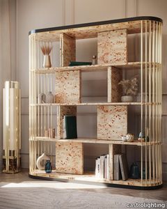
castrolighting > Cabinet
This bookcase carries the same beautiful name and charm that is capable to transform any living space into an outstanding one. The Grace bookshelf was designed to be an accent furniture décor to provide a luxurious statement to the interior. The classy decorative piece incorporates bespoke brass elements and a tailor-made poplar root veneer wood top. A sophisticated colour combination is smooth yet delicate – it manifests an effortless elegance that is alluring to decorate with and complete a total home look with balance and harmony. This modern design integrates sleek gold-plated brass lines that are intertwined and create a subtle frames for the several parts of the bookshelf. Create a magical vibe with this versatile lifestyle piece, allowing to beautify a room with various decorative settings and refined home accessories. This handmade furniture design is perfect for a hallway, entryway, living room, dining room, bedroom, or dressing room. Bespoke your dreams with the Grace Bookshelf as it can be organically customized and become a central piece for all the lavish houses to help achieve the desired timeless chic. VIEW FULL FAMILY
Heritage Luxe Heritage Flame

florim > Wall tile-stone-brick
Heritage Luxe can be said to exemplify the magnitude of our inheritance from the past which at the same time is part of our present. In keeping with modern times, the surfaces of the collection have a strong decorative character and bring the heritage of the European tradition up to date by proposing a stylistic concept inspired by the beauty and classic luxury of marble that blends with the dynamism of veining and colors of a contemporary flavor. <p>Memory, the heritage of the past and the most up-to-date taste all unite in a single dimension in which the iconic objects and furnishings of yesteryear coexist with the most contemporary luxury of modern times to transform the atmosphere of the surroundings into something unique and instantly recognizable. The collection features marble surfaces in bold, refined colors that add immense personality and character to the most exclusive of spaces. The richness of colors and graphic details of these products finds its maximum expression in the large sizes, designed to blend in with increasingly voguish large open spaces, or to illuminate more intimate surroundings.</p> <p> </p> <p class="MsoNormal"><strong><span lang="EN-US" style="mso-ansi-language: EN-US;">COLORS AND DECORS</span></strong></p> <p class="MsoNormal"><span lang="EN-US" style="mso-ansi-language: EN-US;">Heritage Azure is distinguished by a pale, refined blue background against which a deep rust-colored vein stands out, making it perfect for pairing with warm-toned colors and materials.</span></p> <p class="MsoNormal"><span lang="EN-US" style="mso-ansi-language: EN-US;">Heritage Cloud is the most versatile surface in the collection. Characterized by different streaks of grey, this graphic can be perfectly matched with both warm and cool colored materials.</span></p> <p class="MsoNormal"><span lang="EN-US" style="mso-ansi-language: EN-US;">The soft, enveloping base of Heritage Brown is reminiscent of Spanish marble, distinguished by subtle and barely noticeable white veins.</span></p> <p class="MsoNormal"><span lang="EN-US" style="mso-ansi-language: EN-US;">Heritage Emerald brings to mind the rolling hills of Ireland. Shades ranging from dark to light green with dashes of brown and white congregate on its surface.</span></p> <p class="MsoNormal"><span lang="EN-US" style="mso-ansi-language: EN-US;">Heritage Aqua is a surprising surface that emerges from the encounter of contrasting shades of teal and white, embellished with sophisticated orange veins.</span></p> <p class="MsoNormal">Lastly, Heritage Flame bears witness to an encounter between delicate shades of brown and dashes of cream.</p> <p class="MsoNormal"><span lang="EN-US" style="mso-ansi-language: EN-US;">The array of backgrounds is accompanied by three 6 mm thick colored-body porcelain stoneware decors that combine the different shapes and graphics of the slabs in the range, thus delineating an enchanting continuity of colors and veining within the space.</span></p> <p class="MsoNormal"><span lang="EN-US" style="mso-ansi-language: EN-US;">The Picket decor juxtaposes the trapezoidal glossy Heritage Emerald and Heritage Cloud slabs to craft a refined composition with clean, contemporary lines.</span></p> <p class="MsoNormal"><span lang="EN-US" style="mso-ansi-language: EN-US;">The Maze decor, composed of a range of small Heritage Emerald, Heritage Brown and Heritage Flame trapezoids, catches the eye with its harmonious concentric motifs.</span></p> <p class="MsoNormal"><span lang="EN-US" style="mso-ansi-language: EN-US;">Finally, the Trinity decor features three sinuously arched, glossy finish strips in the Heritage Azure graphic.</span></p>
Heritage Luxe Heritage Azure

florim > Floor tile-stone
Heritage Luxe can be said to exemplify the magnitude of our inheritance from the past which at the same time is part of our present. In keeping with modern times, the surfaces of the collection have a strong decorative character and bring the heritage of the European tradition up to date by proposing a stylistic concept inspired by the beauty and classic luxury of marble that blends with the dynamism of veining and colors of a contemporary flavor. <p>Memory, the heritage of the past and the most up-to-date taste all unite in a single dimension in which the iconic objects and furnishings of yesteryear coexist with the most contemporary luxury of modern times to transform the atmosphere of the surroundings into something unique and instantly recognizable. The collection features marble surfaces in bold, refined colors that add immense personality and character to the most exclusive of spaces. The richness of colors and graphic details of these products finds its maximum expression in the large sizes, designed to blend in with increasingly voguish large open spaces, or to illuminate more intimate surroundings.</p> <p> </p> <p class="MsoNormal"><strong><span lang="EN-US" style="mso-ansi-language: EN-US;">COLORS AND DECORS</span></strong></p> <p class="MsoNormal"><span lang="EN-US" style="mso-ansi-language: EN-US;">Heritage Azure is distinguished by a pale, refined blue background against which a deep rust-colored vein stands out, making it perfect for pairing with warm-toned colors and materials.</span></p> <p class="MsoNormal"><span lang="EN-US" style="mso-ansi-language: EN-US;">Heritage Cloud is the most versatile surface in the collection. Characterized by different streaks of grey, this graphic can be perfectly matched with both warm and cool colored materials.</span></p> <p class="MsoNormal"><span lang="EN-US" style="mso-ansi-language: EN-US;">The soft, enveloping base of Heritage Brown is reminiscent of Spanish marble, distinguished by subtle and barely noticeable white veins.</span></p> <p class="MsoNormal"><span lang="EN-US" style="mso-ansi-language: EN-US;">Heritage Emerald brings to mind the rolling hills of Ireland. Shades ranging from dark to light green with dashes of brown and white congregate on its surface.</span></p> <p class="MsoNormal"><span lang="EN-US" style="mso-ansi-language: EN-US;">Heritage Aqua is a surprising surface that emerges from the encounter of contrasting shades of teal and white, embellished with sophisticated orange veins.</span></p> <p class="MsoNormal">Lastly, Heritage Flame bears witness to an encounter between delicate shades of brown and dashes of cream.</p> <p class="MsoNormal"><span lang="EN-US" style="mso-ansi-language: EN-US;">The array of backgrounds is accompanied by three 6 mm thick colored-body porcelain stoneware decors that combine the different shapes and graphics of the slabs in the range, thus delineating an enchanting continuity of colors and veining within the space.</span></p> <p class="MsoNormal"><span lang="EN-US" style="mso-ansi-language: EN-US;">The Picket decor juxtaposes the trapezoidal glossy Heritage Emerald and Heritage Cloud slabs to craft a refined composition with clean, contemporary lines.</span></p> <p class="MsoNormal"><span lang="EN-US" style="mso-ansi-language: EN-US;">The Maze decor, composed of a range of small Heritage Emerald, Heritage Brown and Heritage Flame trapezoids, catches the eye with its harmonious concentric motifs.</span></p> <p class="MsoNormal"><span lang="EN-US" style="mso-ansi-language: EN-US;">Finally, the Trinity decor features three sinuously arched, glossy finish strips in the Heritage Azure graphic.</span></p>
Solid Steel
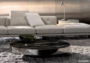
minotti > Coffee table
The Solid Steel family of coffee tables is characterised by its clear 1970s inspiration: glossy and mirrored finishes, rigorous, overlapping and staggered volumes recreate a strong yet minimal architectural geometry, which perfectly complements different styles of living areas. The Solid Steel coffee tables are parallelepipeds with one or two staggered levels; in the two-volume version the finishes of the higher top are glossy lacquered Moka, Cappuccino, Malachite, Chestnut, or Moka open-pore lacquered ash, while the lower volume has the polished stainless steel frame with mirrored top. In the monobloc version, however, the frame is again in polished stainless steel or polished Bronze with four possible finishes for the top: Arabescato Grigio marble, Nero Marquina marble, open-pore Moka colour lacquered ash or mirror. The colour palette is consistent with the imagery of the living space by which they were inspired: mirrored stainless steel combined with coloured lacquers, wood and marble finished with a special smoothing treatment that enhances its matt texture, in stark contrast to the shine of the mirrored steel frame. These details are typical of the style of a brand that knows how to translate simplicity into sophistication, transforming a furnishing accessory into a strong and recognisable feature. The minimalism of their shape makes these coffee tables architectural objects with a big personality, incisive in the overall aesthetics of the space and yet easy to insert into many contexts: in the area in front of the sofa, but also at the side of the living room, as a support element, the ideal finishing touch to any environment. The Solid Steel coffee tables flawlessly follow the evolution of the Minotti range which, in the 2022 Collection, combines Scandinavian style with the striking effects of Japanese Zen: minimalism and in-depth research, simple elegance and maniacal attention to detail, the reduction of excesses and radiating brilliance. Harmonious contrasts in a perpetual balance between domestic life and Hospitality.
Palosanto
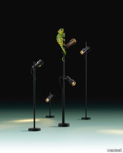
marset > Floor lamp
Subtle without going as far as minimalism, the new Palosanto collection lamp is an extremely flexible, versatile solution for direct illumination outdoors. Available as a wall lamp and also as a bollard in three heights: 30, 60 and 90 cm. The 30- and 60-cm lamps include one spotlight, while the taller version can have one or two. In every version, the spotlight can be placed at the chosen height along the stem. This enables the position of the light to adapt to the growth of surrounding vegetation.As well as providing illumination, each spotlight also gives protection and reflection: a honeycomb grille captures peripheral light and prevents glare, while at the same time part of the light emitted is reflected and released through the back of the lamp, gently illuminating the body of the diffuser. This creates an interplay of lights to form a decorative halo, echoing the warmth of the interior light. In addition, the spotlights on this bollard lamp can be rotated manually by up to 360 degrees, while the cable remains fully visible, an aesthetic detail that provides the freedom to decide on the desired height and direction of the light. The angle of opening of each spotlight is 32 degrees, and the colour temperature is 2700 K. For Christophe Mathieu, the design process consists first and foremost of observing and creating an object with wide-ranging possibilities that will be timeless in its use. That was his thinking behind this new bollard lamp, which can use its light to accentuate the outdoors, reveal architectural details, light a path or spotlight a tree. His new design is compact, flexible, and hard-wearing, even in tough climatic conditions. It is the epitome of simplicity, easy to install, and can be integrated into any landscaping project, whether residential or contract. Palosanto also offers a range of filters to soften the light, dim it towards the shadow, and adjust it to the surroundings. This leads to greater control over the lighting it can provide. What more could you ask for?
Ambrosia
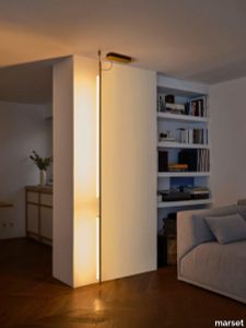
marset > Floor lamp
Ambrosia is essentially a line of light that can be converted into a modular system, capable of extending the illumination it offers to adapt to any space. A design that recovers and revisits the tube light, timeless, and updates it so that its simple structure and diffuse lighting add beauty to any space. This collection expands on its possibilities by proposing a change in the plane of light, from horizontal to vertical.This new style of lamp is available in two versions, both of which are pendant lamps. First there is the Ambrosia V, a 235-cm-high vertical structure consisting of two tubes of light of different lengths. An interrupted line of light, a detail that brings lightness and character to the lamp. Its design allows you to choose the lighting, either towards the wall for indirect light, or towards the main space for direct light. This aesthetic and functional design also works well in domestic settings. The other vertical version, Ambrosia V, joins three light tubes placed at different heights, forming a sculptural ensemble. This option can provide a great deal of light and therefore comes with a dimming system for easy lighting control. It is available in two heights of 130 and 175 cm. Both sizes can be electrically connected through the ceiling rosette or the floor plug. The new Ambrosia allows you to create vertical lighting compositions, combining different sizes in repetition to illuminate large spaces. When installed individually, it fills the space with light and warmth. Its slender design sets the perfect scene in any room. A totally new perspective for this flexible lighting system, which achieves maximum light expression with a minimalist structure. The metal structure is available in two finishes – black and matte gold – and the light source in three colour temperatures: 2200 K, 2700 K and 3000 K.
Policroma Valtoce

florim > Wall tile-stone-brick
Recurring geometries, combinations of figures. Marble and marmorino plaster: comparison and dialogue. The collection is completed by a linear listello tile with the motif of a sequence of vertical rectangular blocks, which can be combined with the slabs to further enrich compositions involving continuous ceramic surfaces cladding.<br /><br />"Another reference is the use of Italian marbles on the verge of extinction, rare marbles such as Rosa Valtoce, the marble used in Milan Cathedral."<br />Cristina Celestino Cristina Celestino's smartphone contains a folder of images entitled "Milan". Photographs that are more like notes. Photographs of architectural features, materials or details of shapes encountered by chance during a walk, but they cannot be described as merely a vague "source of inspiration". This filing system, created in response to a fleeting instinct, is an integral part of the method of work adopted by the architect and designer, who starts off without preconceptions "“ or "free", as she puts it before drawing inputs from a vast world of references, from Hermès scarves to the works of the great Masters (in the specific case of Policroma). This accumulation, partly spontaneous and party the outcome of in-depth historical knowledge and study, naturally activates a process of synthesis and personal interpretation common to all Cristina Celestino's output.<br /><br /><br />The wall covering collection designed for Cedit was no exception, although in this case the designer was dealing with a project with variable dimensions, reaching up even to the architectural scale. In her own distinctive way, she combined a variety of references. Adolf Loos's passion for coloured types of marble, and Cipollino in particular. Carlo Scarpa's angular metal frames and Marmorino plaster in Venice. The French fashion house's square silk scarves. The entrance halls of Milan palazzos, Gio Ponti, the city's Cathedral. All expressed in the designer's own language: well balanced geometrical forms, subtle colours (shades similar to those of Scarpa himself), an effortless, almost restrained, playful elegance. The mood is that of the homes of the enlightened bourgeoisie who shaped the history of Milan, Celestino's adoptive city and an endless source of inputs. She has worked its interiors, including some of the least expected a 1928 tram, the historic Cucchi confectionery store hybridising her own style with the existing context. An imitative effect which is also the key to the meaning of the new Policroma collection: the marble varieties replicated using the Cedit technology are all from Italian quarries that are virtually "worked out". This revives an increasingly rare material as a "living" presence, in a different form which makes no claim to replace the natural original. Quite the contrary, Celestino immediately states her intention to imitate, by combining marble and Marmorino plaster in some variants with a contrasting frame (a typical feature for her, just as it was for Scarpa), and evoking the centuries-old marble-imitating scagliola plasterwork with a contemporary formula.<br /><br /><br />The types of marble chosen are central to the project's character. Verde Alpi, a favourite with Gio Ponti and often found in Milan entrance halls, features tightly packed patterning. Breccia Capraia, still found in a very few places in Tuscany, has a white background with just a few veins. Cipollino, in the special Ondulato variety in green and red, is patterned with spirals. Rosa Valtoce, on the other hand, was used by the "Veneranda Fabbrica" guild to build Milan Cathedral. It is an iconic stone with dramatic stripes, popular in the past; it is now sourced from one very small quarry in Piedmont which has been virtually abandoned.<br /> The many different elements that make up the Policroma collection all reflect the importance of craftsmanship to Cristina Celestino's design style: the modules can be freely mixed and combined, for example to create a concave or convex semicircle, or for the large-scale replication of small features initially conceived as trims, functional details transformed into a dominant motif.There is a return to the theme of the interior, a large or small protected space, conceived as suspended in space and time yet also reassuring and protective. It is designed through its coverings in a stark yet not minimalist way, with intelligence and with no overreaching artistic ambitions. An understated space and an extremely stylish declaration. In Milan style, of course.
Rilievi Nebbia

florim > Wall Paint
The alternation and symbiosis between concave and convex, recessed and raised. <p>Rilievi is a work of design balanced between different historic periods: while the volumetric relief tile modules are inspired by artistic experiments conducted in Italy during the Sixties and Seventies, the large slabs are the outcome of research into materials and technology that has only come to fruition in very recent times. The shadow effects generated on the surfaces of the slabs by the light striking the projecting parts of the modules create an unusual impression of architectural depth found virtually nowhere else in ceramic coverings, laying the bases for a new decoration interior design language.</p> This project simply embodies perfection - a term which certainly sets the bar high in a description of a new product for launch on the market. But when an enlightened manufacturer is capable of encapsulating a designer's personal research in a product to be added to its range, the outcome is a perfect synthesis. A perfect synthesis between untrammelled creativity and market trends. CEDIT had the insight needed to perceive, identify and rework the immense potential of Practice Practice Practice "“ a self-produced project by Zaven (Enrica Cavarzan and Marco Zavagno "“ and realised that its sophisticated design, originated by pure, pristine input (unadulterated by external factors except the noblest of them all, research) could provide the basis for an innovative, successful collection. I might add, a collection unique of its kind. Zaven is also a name that comes with guarantees; the two partners are good at what they do. Their work always starts from personal curiosity and investigations, the study of other stories (as in this case inspiration was drawn from the output of artist and activist Nino Caruso) and individual interests, which are broken down, developed, optimised and prepared for transformation into something fresh.Enrica Cavarzan and Marco Zavagno have a masterly ability to transform their own wishes and passions into design work of the greatest breadth and, as we see here, the widest, richest application. Their use of ceramics as a material is clearly outstanding and reflects a method precisely founded on the desire to look at things from an unusual viewpoint, under a different light. And to be daring. Zaven have an unconventional approach to convention. In the specific case of the Rilievi collection, the "modules" created for CEDIT seem to explode off the walls; in fact, they are constructed by combining the two-dimensional slab with its three-dimensional decor.Rilievi seems to be seeking space. More space. Even though these modules have actually established a dialogue with the wall from which they are born. At the same time, they hypnotise us with their tight sequence of lines, the pattern that is always different although its root is the same, and the intriguing, unusual colours that add another vital factor to the finished product. Their firm grounding in graphic design (and here we have come back to two-dimensional effects, of the kind most often associated with a wall covering) easily evolves into a facade which seems to have been carved with a chisel - although this is not the case. These modules are conceived to convey an impression of movement, and the three models, in seven colour combinations, create a powerful effect on a surface, which is never passive but rather an organic contributor to the forms and colours involved in the fascinating combinations. The slab is very much present and has the same worth and status as the relief pattern associated to it. In the light of this dichotomy between the linear and the sculpted, expressed through the skilfully balanced visual expedients, the use of repetition adds vigour to the module's intrinsic meaning. As we have seen, a rejection of facile, superficial creative dynamics in favour of an investigation reaching above and beyond has always been a central, clearly recognisable feature of this Venice-based duo, who already have impressive international partnerships to their credit, including the London Design Festival, the Kalmar Konstmuseum, the Paris Designer Days, Ca' Foscari University, the Venice Biennale, the Sandretto Re Rebaudengo Foundation, the Sindika Dokolo Foundation and the V-A-C Foundation, and also won the 2018 Wallpaper Design Award. Graphics, advertising and product design: the pair have always opted for a type of design closely linked to the observation of everyday items, followed by their reinterpretation in a version applied to experimentation with materials. This duality, combined with their energetic yet elegant visual language, forms Enrica and Marco's primary code, experienced in this specific context through serial carvings. On walls.
Palosanto
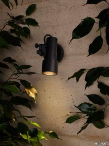
marset > Wall lamp
Subtle without going as far as minimalism, the new Palosanto collection lamp is an extremely flexible, versatile solution for direct illumination outdoors. Available as a wall lamp and also as a bollard in three heights: 30, 60 and 90 cm. The 30- and 60-cm lamps include one spotlight, while the taller version can have one or two. In every version, the spotlight can be placed at the chosen height along the stem. This enables the position of the light to adapt to the growth of surrounding vegetation.As well as providing illumination, each spotlight also gives protection and reflection: a honeycomb grille captures peripheral light and prevents glare, while at the same time part of the light emitted is reflected and released through the back of the lamp, gently illuminating the body of the diffuser. This creates an interplay of lights to form a decorative halo, echoing the warmth of the interior light. In addition, the spotlight of this wall fixture can be rotated manually by up to 360 degrees, while the cable remains fully visible, an aesthetic detail that provides the freedom to decide direction of the light. The angle of opening of each spotlight is 32 degrees, and the colour temperature is 2700 K. For Christophe Mathieu, the design process consists first and foremost of observing and creating an object with wide-ranging possibilities that will be timeless in its use. That was his thinking behind this new collection, which can use its light to accentuate the outdoors, reveal architectural details, light a path or spotlight a tree. His new design is compact, flexible, and hard-wearing, even in tough climatic conditions. It is the epitome of simplicity, easy to install, and can be integrated into any landscaping project, whether residential or contract. Palosanto also offers a range of filters to soften the light, dim it towards the shadow, and adjust it to the surroundings. This leads to greater control over the lighting it can provide. What more could you ask for?