ALLURE - CALACATTA - Laminated stoneware wall/floor tiles with marble effect _ COTTO D'ESTE
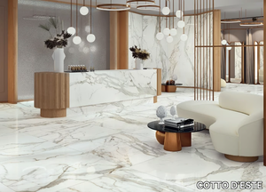
COTTO D'ESTE > Wall tile-stone-brick
ENGINEERED WOOD PLANKS FLOOR CA' POLO - Oak flooring _ FOGLIE D'ORO
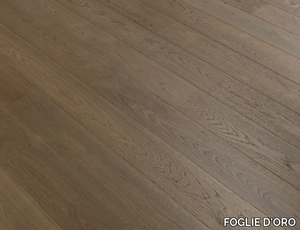
FOGLIE D'ORO > Wall tile-stone-brick
BRYSTONE IVORY - Porcelain stoneware wall/floor tiles _ CERAMICHE KEOPE
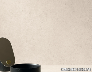
CERAMICHE KEOPE > Wall tile-stone-brick
Cromatica Gradiente bianco-rosa
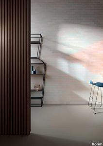
florim > Wall Paint
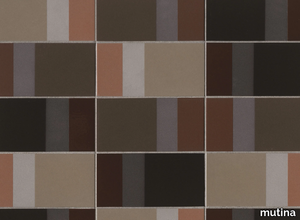
A lexicon of colour shades for mixing. A large size and its submultiples. «This work represents a reflection on colour, and above all a proposal on how to transfer the multiplicity of shades typical of a hand-crafted piece into a project produced on a large scale.» Andrea Trimarchi & Simone Farresin Studio Formafantasma base their work in the design world on a strong vocation for research. Simone Farresin and Andrea Trimarchi view every project as an opportunity for study and the acquisition of new knowledge, and their love of speculation establishes a dialectic rapport with the situations offered by each new client. Whether it involves a material, a type or a production method, the first phase of their design process is the mapping of what the specific case places at their disposal. With Cedit, an analysis of the company's past and present was central to the inputs. Inevitably, since "Looking back to look forward" has been the design duo's mission statement for years. In this case, in particular, the company's history was a real treasure trove, a fine blend of memory and technology: on the one hand, the excellence of production technologies now extended with the added potential arising from the engineering of large-sized ceramic tiles, and on the other a wealth of experience build up with great designers of the past, from Zanuso to Noorda, through to <strong>Ettore Sottsass</strong>. Andrea and Simone decided to focus on Sottsass - who started designing for Cedit back in the late Seventies - and made an in-depth study of one of the colour charts he developed towards the end of the Nineties. A spread of colours which gave its name to the "41 Colors" collection, included in the catalogue of the period as a real alphabet for what has proved to be a lasting design language. Colour was much more than just a compulsory step in the dialogue between designer and producer, since Sottsass had already discovered the power of the mystery intrinsic to this universe of invention.<br /><br />With Cedit the master-designer, a long-established lover of ceramics and their crafted unpredictability, found a way of transferring his personal feeling for colour to a wide audience, through industrial mass production. And this assumption is another factor Formafantasma have inherited, interpreting it today with new, even more efficient technical resources just as capable of expressing the secrets of colour. «The concept of colour "in isolation" - Sottsass explained in a 1992 text - classified colour, Pantone, as they call it now, "scientific" colour, is something I still refuse to accept. (...) Colours, the idea of colour, are always intangible, they slip slowly away like words, that run through your fingers, like poetry, which you can never keep hold of, like a good story.» And Formafantasma seem to have chosen that distinction between colour "in isolation" and "intangible" yet ever-present colour as the basis of their work. However, their approach draws on their unique vocation for research and the technical resources of the third millennium. «This work - they explain to us - is a reflection on colour, and above all on <strong>how to bring the multiplicity of shades typical of a hand-crafted piece into a large-scale project</strong>.» The designers look at large, monochrome slabs and turn to the engineers for details of their secrets, their processing stages, the phases in their production. They appreciate that the colour of ceramic material, its ineffable secret, can still be present in the series and large tile sizes in which Cedit leads the way. They understand that this is, in itself, an expressive power which does not need channelling into forms, motifs and signs. But above all, they treat the surface as a large canvas on which they spread pure colour, which tends to be uniform but in fact is never really a "scientific", totally monochrome hue: it is not a Pantone. And this is the source of the fundamental insight, which only children of the transition from the analogue to the digital era could achieve, the reward for those who draw on the past to look to the future.<br /><br />The designers cut the slab into lots of regular pieces, not necessarily of the same size. They restore its identity as a "tile", a familiar name with something ancient about it, but which stands for a module, a unit of measurement, a building block. There is nothing nostalgic about this - on the contrary, the vision is completely new, and the portions of slab created can be reassembled with no restrictions, breaking down the unity of the whole and reviving its essence starting from its structure. As the cards in the pack are shuffled, what emerges is not a figure or motif but the representation of colour itself and its physical nature. It is live matter, born from the meeting of vibrating forces, the mixing of ever-varying percentages of the basic ingredients. And Formafantasma present us with the corpuscular, fragmented essence of these small frames of space and crystallised time, which reveal the code and formula of their composition. So Cromatica is a collection made up of six colours which actually have an infinite number of declinations and compositional possibilities. It is a "discrete" combination in the mathematical sense of the term, capable of generating multiple, variable subsets. At the same time, each slab can be used in its entirety, leaving the impression of analogue continuity unchanged. But what really amazes is the comparison and dialogue between the two approaches: a stroke of genius, laying clear the mysterious appeal the artificial reproduction of colour has always held for mankind. Because, as Sottsass said, «colours are language, a powerful, magical, intangible, flexible, continuous material, in which existence is made manifest, the existence that lives in time and space».
CLY - Technopolymer wall lamp / ceiling lamp _ PERFORMANCE iN LIGHTING
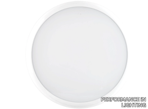
PERFORMANCE iN LIGHTING > Wall lamp
METAL PEARL - Full-body porcelain stoneware wall tiles / flooring _ LA FABBRICA AVA
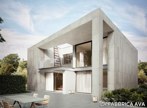
LA FABBRICA AVA > Wall tile-stone-brick
SANDSTONE - Porcelain stoneware wall tiles with stone effect _ Aleluia Cerâmicas
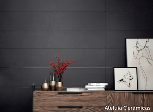
Aleluia Cerâmicas > Wall tile-stone-brick
ARCOBALENO A2 - Wall light with Swarovski® crystals _ Euroluce Lampadari
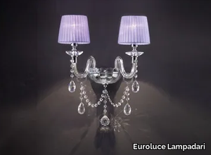
Euroluce Lampadari > Wall lamp
ILIOS - Indoor/outdoor porcelain stoneware wall/floor tiles with wood effect _ Panaria Ceramica
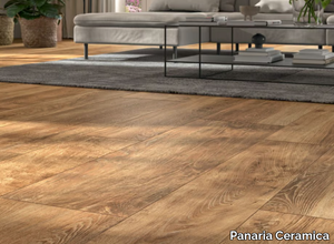
Panaria Ceramica > Wall tile-stone-brick
BALANCE - DARK GREY - Porcelain stoneware wall/floor slabs with resin effect _ ARIOSTEA
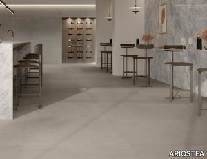
ARIOSTEA > Wall tile-stone-brick
GREY FJORD - Porcelain stoneware wall/floor tiles with stone effect _ Fiandre Architectural Surfaces
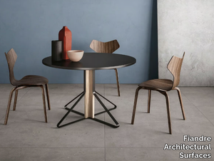
Fiandre Architectural Surfaces > Wall tile-stone-brick
BLEND STONE - CLEAR - Laminated stoneware wall/floor tiles with stone effect _ COTTO D'ESTE
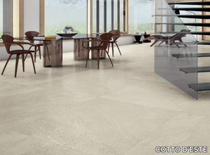
COTTO D'ESTE > Wall tile-stone-brick
LOGICO CEMENT - Porcelain stoneware wall tiles / flooring with cement effect _ CERAMICA SANT'AGOSTINO
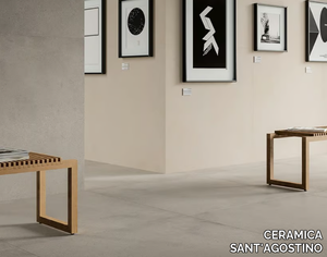
CERAMICA SANT'AGOSTINO > Wall tile-stone-brick
