Earthtech FOG_GROUND
florim > Wallcovering
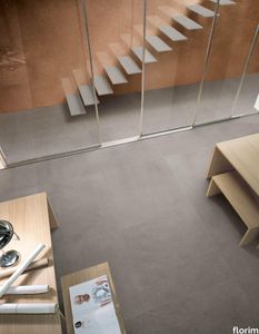
From an ancient past to a responsible future <p>The collection injects new life into the earth through a sustainable production process, with a strong focus on green management, to offer the architect an exceptional technical and aesthetic performance in compliance with the socio-environmental context and the latest eco-friendly building needs. With EARTHTECH earth becomes “technical earth” with a highly innovative content, offering new solutions to green architecture and fulfilling the new frontiers of circular economy in construction, guaranteeing a sustainable future. <br />EARTHTECH offers a choice of organic textures to observe and touch, thanks to the wide range of finishes (Comfort, Glossy-Bright and structured) which add a tactile and unexpected perceptive dimension for use in all types of application. <br /><a class="btn arrow" href="https://www.florim.com/en/surfaces/the-new-comfort-surface/"> Discover the new Comfort surface </a></p> <p>EARTHTECH/ is also a return to the origins of the Florim brand through a full body technical product that blends surface and thickness and derives from the spontaneous mixing of carefully pre-selected fragments and pigments of different shades which give the material a unique, one-of-a-kind visual effect in each slab, mimicking the amazing variety of colours and elements in nature. The result is a composite product with a textured design, in which the flakes and aggregate grains create an original mélange effect that is vitrified during firing, producing a robust, high-quality and exceptionally strong and wear-resistant product; one which can be used in any type of building setting and weather conditions, even the harshest.</p>
High Performance Vinyl Wallpaper by Vescom | fraser - 2109.04

vescom > Wallpaper
Enhance your interiors with Vescom Fraser, a premium wallcovering featuring a striking 3-dimensional architectural weave in opaque, softly reflective shades. Made from high-performance polyethylene tape yarn, this versatile design is available with an acrylic backing or as an unbacked option, offering exceptional durability, elegance, and eco-conscious features. Bullet Points: 1️⃣ 🌿 Sustainable and Eco-Friendly Vescom Fraser is PFAS-free, low in VOC emissions (CAL 01350 certified), and compliant with the Living Building Challenge Red List. A perfect choice for those prioritizing sustainable and healthy interior solutions. 🌎 2️⃣ 🖌️ Stunning 3D Architectural Weave The dimensional weave design and softly reflective tones create an elegant and modern aesthetic, adding depth and texture to any space. Ideal for both residential and commercial interiors. 🎨 3️⃣ 📏 Flexible Material Options Available in widths of ±137 cm (±54 inches), Fraser comes with options for acrylic backing (2109.XXB) or unbacked (2109.XXU), ensuring adaptability to your specific project requirements. 📐 4️⃣ 🔥 Safety and Durability Guaranteed Certified flame retardant (EN 13501, B, s1 - d0), this wallcovering provides reliable safety and peace of mind. Its high lightfastness (ISO 105-B02, rating 8) ensures long-lasting vibrancy even in well-lit spaces. 🛡️ 5️⃣ 💧 Enhanced Breathability and Lightweight With water vapor permeability (<0.5 m SD value) and a weight range of ±242-293 gr/m² (±11-13 oz/yd²), Vescom Fraser is lightweight, breathable, and easy to install, making it a practical yet luxurious wall solution. 💪 Tags: Polyethylene Wallcovering, 3D Architectural Weave, Low VOC Wall Decor, PFAS-Free Wallcovering, Sustainable Interior Wall Design, Flame Retardant Wallcovering, Lightfast Wall Material, Water Vapor Permeable Wallcovering, Vescom Fraser Collection, Acrylic Backing Wallcovering
Project Wallpaper by Vescom | linosa - 2106.03
vescom > Wallpaper
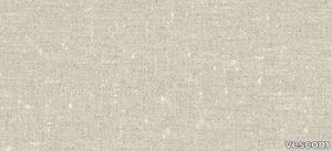
Bring natural elegance to your interiors with Vescom Linosa, a bio-based wallcovering crafted entirely from linen. Available in coarse and fine weaves of varying scales, its neutral tones provide a timeless aesthetic, combining texture, sustainability, and durability for a versatile and sophisticated wall solution. Bullet Points: 1️⃣ 🌿 100% Natural Linen Composition Made from bio-based linen on a paper backing, Vescom Linosa prioritizes sustainability and eco-conscious design while offering a high-quality, natural aesthetic. 🌱 2️⃣ 🖌️ Versatile Textures and Neutral Tones Choose from coarse or fine weaves in varying scales, each presented in neutral tones that complement a wide range of interior styles, from modern to traditional. 🎨 3️⃣ 📏 Wide Dimensions for Seamless Application With a width of ±137 cm (±54 inches) and a substantial weight of ±500 gr/m² (±22 oz/yd²), Linosa wallcovering ensures excellent coverage and durability for both residential and commercial spaces. 📐 4️⃣ 🔥 Certified Safety and Lightfastness Meeting EN 13501 (B, s1 - d0) and ASTM E84 (Pass, A) standards for flame retardancy, Vescom Linosa is safe and reliable. Exceptional colorfastness (ISO 105-B02 rating 7–8) guarantees long-lasting vibrancy. 🛡️ 5️⃣ 💧 Breathable and Resilient Design Featuring water vapor permeability (<0.5 m SD value), Linosa is designed for breathability and longevity, making it a practical yet elegant choice for your walls. 💪 Tags: Bio-Based Linen Wallcovering, Neutral Tone Wall Design, Coarse Weave Wall Texture, Fine Weave Wallcovering, Sustainable Interior Solution, Flame Retardant Linen Wallcovering, Durable Wall Material, Vescom Linosa Collection, Natural Linen Wall Decor, Breathable Wallcovering
SPACE+ 1401A - Fabric linear module with high backrest _ Et al.
Et al. > Armchair
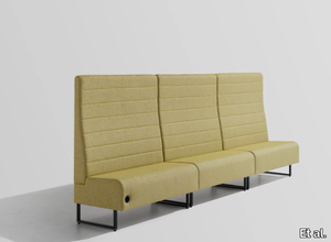
Space Plus 1400A High-Back Seating Module: Privacy Meets Modern Design The Space Plus 1400A High-Back Seating Module, part of the Space Plus collection by Et al., is a thoughtfully designed piece that balances aesthetic appeal with functionality. Its tall backrest provides added privacy and acoustic insulation, making it an excellent choice for creating secluded seating in public, corporate, or hospitality settings. Design and Dimensions This seating module features a clean, minimalist design with a focus on comfort and space efficiency. Its high backrest is particularly suited for settings requiring a sense of privacy. The dimensions are: Height: 140 cm Width: 75 cm Depth: 61.5 cm Seat Height: 47 cm Seat Depth: 46 cm Its proportions make it versatile for standalone use or as part of a larger modular seating arrangement. Materials and Finishes The Space Plus 1400A offers a range of premium materials and finishes for customisation: Frame: Crafted from durable metal for enhanced stability and longevity. Upholstery: Available in a wide selection of fabrics, including stain-resistant and easy-to-maintain options. Colour choices range from neutral tones like grey and beige to vibrant hues like teal and mustard, allowing for seamless integration into any design scheme. Base Finish: The metal base is available in various finishes, including matte black, metallic tones, and crisp white, to complement diverse interiors. Features High Backrest: Provides additional privacy and acoustic benefits, ideal for open-plan environments. Compact Design: Maximises seating efficiency while maintaining comfort. Modular Compatibility: Can be paired with other Space Plus modules for cohesive seating configurations. Applications The Space Plus 1400A is well-suited for a variety of environments: Hospitality: Enhances hotel lobbies, VIP lounges, or intimate waiting areas with a touch of sophistication. Corporate Offices: Ideal for creating private breakout zones or stylish reception seating. Public Areas: Suitable for malls, airports, and healthcare facilities, offering privacy in busy spaces. Restaurants and Cafés: Functions as booth seating, providing both comfort and privacy. Customisation Options Et al. offers several enhancements to tailor the Space Plus 1400A to specific needs: Integrated USB or Power Outlets: Adds functionality for tech-friendly environments. Attachable Tables: Provides added utility for workspace or dining purposes. Privacy Extensions: Additional panels can be added to further enhance privacy. Sustainability and Durability The Space Plus 1400A is manufactured using eco-friendly materials and processes. Many upholstery options include recycled or sustainable fabrics, ensuring it is both stylish and environmentally conscious. Complementary Products To build cohesive and functional seating arrangements, the Space Plus 1400A pairs seamlessly with other modules from the collection: Space Plus Linear and Corner Modules: For flexible configurations like L-shaped or U-shaped layouts. Ottomans and Poufs: To provide additional seating options. Matching Tables: Complements the setup with functional surfaces. Key Features High backrest for privacy and acoustic insulation. Durable and eco-friendly construction for heavy use. Modular design for endless configuration possibilities. Customisable finishes and fabrics to suit any project.
Spillo 1i - Recessed LED brass wall lamp with swing arm _ ICONE
ICONE > Wall lamp
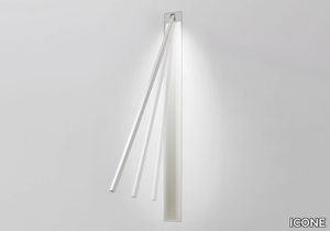
Spillo 1i – Sleek Built-in Flush Wall & Ceiling Lamp with Adjustable Brass Rod Minimalist Architectural Lighting with Precision & Flexibility The Spillo 1i is an elegant built-in flush wall or ceiling lamp, designed by Marco Pagnoncelli. Featuring a single adjustable drawn brass rod with a slim 7×7 mm section, this fixture offers sleek aesthetics and functional versatility. With its high-efficiency LED lighting and minimalist design, Spillo 1i is an excellent choice for modern residential, hospitality, and commercial spaces. Sleek Design with Adjustable Functionality Spillo 1i is designed for seamless wall or ceiling integration, creating a discreet and refined look. The adjustable brass rod allows users to direct the light precisely, making it ideal for accent lighting, task lighting, or directional illumination. Its flush installation keeps the design uncluttered and modern, making it perfect for architectural lighting solutions. With its registered design, Spillo 1i is a statement in minimalism, offering both subtlety and impact in lighting design. Premium Materials & Elegant Finishes Crafted from high-quality drawn brass, Spillo 1i is built for durability and refined aesthetics. The fixture is available in four sophisticated finishes, allowing designers to coordinate with various interior styles: White – A fresh and neutral tone, perfect for contemporary spaces. Black – A bold and striking option that adds modern contrast. Chrome – A polished finish that brings elegance and reflection. Brushed Gold – A luxurious finish that adds warmth and a premium touch. High-Performance LED Illumination Spillo 1i is powered by a high-luminous efficiency LED micro-strip, ensuring bright and energy-efficient lighting with a warm white 3000K color temperature. This fixture requires a power supply unit and wall housing (not included), ensuring a clean, built-in look with no visible wiring. Size & Power Options for Customization Spillo 1i is available in seven different sizes, each offering a different level of brightness to suit various project needs: Model Power (W) Voltage (V) Lumen Output Color Temperature (K) A (cm) B (cm) C (cm) D (cm) Recessed Hole (cm) LED Type Spillo 1i.12 1.32W 12V 110 lm 3000K 11.5 3 12.6 3.3 8.2 x 13.2 12V CRI90 Spillo 1i.22 2.64W 12V 220 lm 3000K 21.5 3 22.6 3.3 8.2 x 23.2 12V CRI90 Spillo 1i.32 3.96W 12V 330 lm 3000K 31.5 3 32.6 3.3 8.2 x 33.2 12V CRI90 Spillo 1i.42 4.80W 12V 440 lm 3000K 41.5 3 42.6 3.3 8.2 x 43.2 12V CRI90 Spillo 1i.52 6.60W 12V 550 lm 3000K 51.5 3 52.6 3.3 8.2 x 53.2 12V CRI90 Spillo 1i.62 7.92W 12V 660 lm 3000K 61.5 3 62.6 3.3 8.2 x 63.2 12V CRI90 Spillo 1i.82 10.56W 12V 880 lm 3000K 81.5 3 82.6 3.3 8.2 x 83.2 12V CRI90 These varied sizes allow for precision lighting design, making Spillo 1i adaptable to both small and large-scale projects. Where to Use Spillo 1i – Perfect for Various Interior Applications Residential Interiors Spillo 1i provides elegant and functional lighting for modern homes. It works perfectly in hallways, bedrooms, living rooms, and kitchens, where subtle, directional lighting enhances the ambiance. Its adjustable brass rod is great for reading nooks, workspaces, or highlighting artworks. Hospitality & Retail Spaces Hotels, restaurants, and boutique stores can benefit from Spillo 1i’s minimalist aesthetic and precise lighting capabilities. Whether used to illuminate corridors, highlight displays, or create intimate seating areas, this fixture elevates the ambiance while ensuring a seamless, recessed finish. Office & Workspaces Modern offices and co-working spaces can use Spillo 1i to improve lighting efficiency and aesthetics. It serves as an excellent task lighting solution for workstations, providing soft yet effective illumination without causing glare. Art Galleries & Museums The directional, adjustable nature of Spillo 1i makes it ideal for galleries and museums, where artworks or exhibits need focused yet subtle illumination. Its high CRI90 rating ensures that colors remain accurate and vibrant under its light. Energy Efficiency & Performance With an energy rating of A++, A+, A, Spillo 1i provides sustainable and low-energy lighting without sacrificing performance. The CRI90 rating ensures natural and precise color rendering, making it an ideal choice for detailed visual applications.
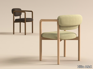
JOLI - Upholstered fabric chair with armrests _ Zilio A&C
Zilio A&C > Chair
Joli Chair by Zilio A&C – A Soft, Inviting Dining Chair for Hospitality & Residential Spaces A Dining Chair Designed with Visual Elegance in Mind Designed by Note Design Studio for Zilio A&C, the Joli Chair is a refined yet playful seating solution that prioritizes comfort, silhouette, and versatility. With a focus on how a chair is perceived from behind—often the first view when placed around a table—Joli features a soft, voluminous backrest that creates an inviting and welcoming expression from every angle. Its combination of solid beech wood construction and plush upholstery makes Joli a perfect choice for dining settings, hospitality projects, and elegant residential spaces. Versatility for Hospitality & Residential Interiors Joli seamlessly adapts to a variety of interiors, from modern restaurants and boutique cafés to stylish hotel dining areas and home dining rooms. The chair’s curved backrest and upholstered seat ensure both comfort and visual softness, making it an ideal choice for: Restaurants & Cafés – A stylish, comfortable seating option for extended dining experiences. Hotels & Hospitality Spaces – Perfect for breakfast lounges, private dining rooms, and guest areas. Residential Dining Rooms – Brings warmth and elegance to Scandinavian, contemporary, and Japandi interiors. Workspaces & Meeting Areas – Adds a soft, approachable touch to modern office settings. Materiality: A Balance of Craftsmanship & Comfort The Joli Chair is built with a solid beech wood frame, ensuring durability and longevity, while the fully upholstered seat and backrest provide exceptional comfort. The voluminous backrest not only enhances the seating experience but also contributes to Joli’s charming and friendly personality. The available upholstery options allow for customization to fit different aesthetics, from neutral and natural tones for a minimalist look to vibrant fabrics for a playful, contemporary feel. Why Choose the Joli Chair? ✔ Designed for visual impact – A dining chair that looks good from every angle. ✔ Perfect balance of structure and softness – Solid beech frame with plush upholstery. ✔ Versatile for hospitality & residential spaces – Ideal for restaurants, hotels, and dining rooms. ✔ Welcoming aesthetic – A gentle, voluminous form that enhances comfort and style. ✔ Crafted for durability – Built with high-quality materials for long-term use. An Elegant Addition to Hospitality & Dining Spaces Joli is more than just a chair—it’s a seating experience designed to enhance the atmosphere of any dining setting. Whether used in a stylish restaurant, an upscale hotel, or a contemporary home, Joli’s balance of craftsmanship, comfort, and aesthetic appeal makes it a standout choice for designers and architects. Joli Chair 3D file available for download for easy specification in projects. 🔗 Discover more at Zilio A&C.
Project Wallpaper by Vescom | linosa - 2106.04

vescom > Wallpaper
Bring natural elegance to your interiors with Vescom Linosa, a bio-based wallcovering crafted entirely from linen. Available in coarse and fine weaves of varying scales, its neutral tones provide a timeless aesthetic, combining texture, sustainability, and durability for a versatile and sophisticated wall solution. Bullet Points: 1️⃣ 🌿 100% Natural Linen Composition Made from bio-based linen on a paper backing, Vescom Linosa prioritizes sustainability and eco-conscious design while offering a high-quality, natural aesthetic. 🌱 2️⃣ 🖌️ Versatile Textures and Neutral Tones Choose from coarse or fine weaves in varying scales, each presented in neutral tones that complement a wide range of interior styles, from modern to traditional. 🎨 3️⃣ 📏 Wide Dimensions for Seamless Application With a width of ±137 cm (±54 inches) and a substantial weight of ±500 gr/m² (±22 oz/yd²), Linosa wallcovering ensures excellent coverage and durability for both residential and commercial spaces. 📐 4️⃣ 🔥 Certified Safety and Lightfastness Meeting EN 13501 (B, s1 - d0) and ASTM E84 (Pass, A) standards for flame retardancy, Vescom Linosa is safe and reliable. Exceptional colorfastness (ISO 105-B02 rating 7–8) guarantees long-lasting vibrancy. 🛡️ 5️⃣ 💧 Breathable and Resilient Design Featuring water vapor permeability (<0.5 m SD value), Linosa is designed for breathability and longevity, making it a practical yet elegant choice for your walls. 💪 Tags: Bio-Based Linen Wallcovering, Neutral Tone Wall Design, Coarse Weave Wall Texture, Fine Weave Wallcovering, Sustainable Interior Solution, Flame Retardant Linen Wallcovering, Durable Wall Material, Vescom Linosa Collection, Natural Linen Wall Decor, Breathable Wallcovering
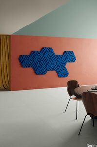
Rilievi Nebbia
florim > Wall Paint
The alternation and symbiosis between concave and convex, recessed and raised. <p>Rilievi is a work of design balanced between different historic periods: while the volumetric relief tile modules are inspired by artistic experiments conducted in Italy during the Sixties and Seventies, the large slabs are the outcome of research into materials and technology that has only come to fruition in very recent times. The shadow effects generated on the surfaces of the slabs by the light striking the projecting parts of the modules create an unusual impression of architectural depth found virtually nowhere else in ceramic coverings, laying the bases for a new decoration interior design language.</p> This project simply embodies perfection - a term which certainly sets the bar high in a description of a new product for launch on the market. But when an enlightened manufacturer is capable of encapsulating a designer's personal research in a product to be added to its range, the outcome is a perfect synthesis. A perfect synthesis between untrammelled creativity and market trends. CEDIT had the insight needed to perceive, identify and rework the immense potential of Practice Practice Practice "“ a self-produced project by Zaven (Enrica Cavarzan and Marco Zavagno "“ and realised that its sophisticated design, originated by pure, pristine input (unadulterated by external factors except the noblest of them all, research) could provide the basis for an innovative, successful collection. I might add, a collection unique of its kind. Zaven is also a name that comes with guarantees; the two partners are good at what they do. Their work always starts from personal curiosity and investigations, the study of other stories (as in this case inspiration was drawn from the output of artist and activist Nino Caruso) and individual interests, which are broken down, developed, optimised and prepared for transformation into something fresh.Enrica Cavarzan and Marco Zavagno have a masterly ability to transform their own wishes and passions into design work of the greatest breadth and, as we see here, the widest, richest application. Their use of ceramics as a material is clearly outstanding and reflects a method precisely founded on the desire to look at things from an unusual viewpoint, under a different light. And to be daring. Zaven have an unconventional approach to convention. In the specific case of the Rilievi collection, the "modules" created for CEDIT seem to explode off the walls; in fact, they are constructed by combining the two-dimensional slab with its three-dimensional decor.Rilievi seems to be seeking space. More space. Even though these modules have actually established a dialogue with the wall from which they are born. At the same time, they hypnotise us with their tight sequence of lines, the pattern that is always different although its root is the same, and the intriguing, unusual colours that add another vital factor to the finished product. Their firm grounding in graphic design (and here we have come back to two-dimensional effects, of the kind most often associated with a wall covering) easily evolves into a facade which seems to have been carved with a chisel - although this is not the case. These modules are conceived to convey an impression of movement, and the three models, in seven colour combinations, create a powerful effect on a surface, which is never passive but rather an organic contributor to the forms and colours involved in the fascinating combinations. The slab is very much present and has the same worth and status as the relief pattern associated to it. In the light of this dichotomy between the linear and the sculpted, expressed through the skilfully balanced visual expedients, the use of repetition adds vigour to the module's intrinsic meaning. As we have seen, a rejection of facile, superficial creative dynamics in favour of an investigation reaching above and beyond has always been a central, clearly recognisable feature of this Venice-based duo, who already have impressive international partnerships to their credit, including the London Design Festival, the Kalmar Konstmuseum, the Paris Designer Days, Ca' Foscari University, the Venice Biennale, the Sandretto Re Rebaudengo Foundation, the Sindika Dokolo Foundation and the V-A-C Foundation, and also won the 2018 Wallpaper Design Award. Graphics, advertising and product design: the pair have always opted for a type of design closely linked to the observation of everyday items, followed by their reinterpretation in a version applied to experimentation with materials. This duality, combined with their energetic yet elegant visual language, forms Enrica and Marco's primary code, experienced in this specific context through serial carvings. On walls.
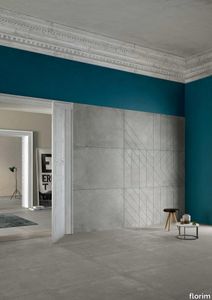
Matrice Essenza
florim > Wallcovering
An atlas of modular signs to be combined in a wide variety of layouts. «We love concrete as a material, its versatility and its plain, austere look. We have completed our carefully designed surfaces with graphic patterning inspired by the human actions of weaving and embroidering.» Barbara Brondi & Marco Rainò To appreciate the profundity of the design project undertaken by Barbara Brondi and Marco Rainò for Cedit, it is both necessary and explanatory to start from the title the collection bears. In modern usage the term Matrice, in Italian, refers to a die or mould used to reproduce an object, but its origins are much more remote, with a meaning closer to the English “matrix”, meaning the underlying basis of something. The root of the word is related to Mater or mother: the name Matrice thus relates to the origin or cause of something. This dichotomy is expressed in several levels within the work of these architects, who study the world from a sophisticated conceptual approach and then transform it into a design. Starting from the idea of ceramic coverings, which have always been a tool not so much of architecture as of interior design, the artists work back to the origin of the surface and its decoration within their own discipline: they look at what we used to call the modern age, where modernity has also brought an uncompromising brutality, and where the use of bare concrete became the statement of an attitude to life with no time to spare for manners. Concrete is originally a liquid material, intended for shaping, which can therefore absorb and retain any type of mark created by the material and mould used to form it. Architects midway between rationalism and brutalism have used the rough-and-ready language of concrete combined with a last, elegant, anthropic decorative motif impressed on the material, that makes the concept of covering superfluous, because its place, in its older meaning of decoration rather than functional cladding, is taken by the regular patterning created in the material itself. There are therefore various grounds for believing that, in this collection, the artists are once again working in architectural terms. Firstly, with a simplicity typical of BRH+, they reduce the initial concepts to their minimal terms. So although this is a collection of coverings for walls, indoor floors, outdoor pavings and curtain walls, a great deal of time was spent on destructuring the idea of the ceramic covering itself. Unfortunately, nowadays there is no space in the contemporary construction sector for the radical approach of the past, so the cladding designed for the building actually lays bare the interior, using the choice of material – accurately interpreted (with shade variation) on the basis of an assortment of various types – to restore visual elegance and a fundamental severity. Attention to scale is another architectural feature: Matrice offers modules with architectural dimensions and different sizes through the development of “large slabs”, eliminating the visual regular grid effect. Thanks to this visual reset, geographic forms are perceived to emerge from dense, grey concrete surfaces decorated as in bygone days by special processes and by weathering during drying. The various types of slab, each an atlas of subtle, vibrant signs on the surfaces, comprise finishes that reproduce the visual effect of reinforced concrete – with the aggregates in the cement more clearly visible, of formwork – with the signs impressed on the concrete by the timber used, of a structured surface resembling bare cement plaster, of ridged and streaked surfaces – with patterning resembling some kinds of linear surface finishing processes – and finally a smooth, or basic version, over which Matrice exercises the dichotomy referred to earlier. It is on these surfaces that Brondi and Rainò have imagined additional design reverberations, a figurative code that rejects the concept of the grid, previously inseparable from that of the module: by means of a vocabulary of graphic marks cut into the slabs with a depth of 3 mm (the width of the gap left between modules during installation), they provide a framework for infinite combinations of possible dialogues. Just as in embroidery, which is based on grids of stitches and geometric repetitions, and where every stitch is at right-angles to another one to construct forms and decorations. Also taken from embroidery is the idea of introducing a degree of “softness” to reduce the stiffness of intentionally deaf surfaces. There is the impression of patterns that can continue for infinity, as in textile weaving, and a scale that, unlike the surface being worked on, is imagined as suspended and lightweight. They may not admit it, but BRH+ know a lot about music, including electronic music, and it appears to me that this organised tangle of infinite signs – unidentifiable without an overview – is rather like the representations of synthesized sounds. Sounds that are produced by machines, and thus “woven” by sampling and overlapping sounds of the most unlikely origins, combined to form jingles which, once heard, are imprinted indelibly on the brain. This may be why I am so interested in the space between this “melodic film” and its deaf, damp substrate. The eyes can navigate this suspended reality without fear of disturbance. So we are faced with different surfaces, different sizes and different graphic signs. But only one colour (surprise!) to prevent a cacophony not just of signs but also of possible interpretations: the artists retain their radical principles (and their generosity), and as curators, a role in which they are skilled, they leave the players (architects and installers) to add their own interpretations. In their hands this colour, expressed in Matrice, will produce motifs on surfaces in living spaces for someone else. This stylish covering and its workmanship will be left to the hands of someone who will probably never read this, but will be on a building site, with the radio playing on a stereo system, concentrating on installing the very pieces we describe. So a radical, apparently silent, design project like this has repercussions for the real world we live in. Matrice has no form of its own but merely acquires the ornamentation drawn on its surfaces by a second group of artists. And here this routine action, standardised by the form approved for production and workmanlike efficiency, is the origin and cause of change, generating a variability of choices and interpretations, on that dusty building site where music plays and mortar flows.
Rilievi Terra

florim > Wall Paint
The alternation and symbiosis between concave and convex, recessed and raised. <p>Rilievi is a work of design balanced between different historic periods: while the volumetric relief tile modules are inspired by artistic experiments conducted in Italy during the Sixties and Seventies, the large slabs are the outcome of research into materials and technology that has only come to fruition in very recent times. The shadow effects generated on the surfaces of the slabs by the light striking the projecting parts of the modules create an unusual impression of architectural depth found virtually nowhere else in ceramic coverings, laying the bases for a new decoration interior design language.</p> This project simply embodies perfection - a term which certainly sets the bar high in a description of a new product for launch on the market. But when an enlightened manufacturer is capable of encapsulating a designer's personal research in a product to be added to its range, the outcome is a perfect synthesis. A perfect synthesis between untrammelled creativity and market trends. CEDIT had the insight needed to perceive, identify and rework the immense potential of Practice Practice Practice "“ a self-produced project by Zaven (Enrica Cavarzan and Marco Zavagno "“ and realised that its sophisticated design, originated by pure, pristine input (unadulterated by external factors except the noblest of them all, research) could provide the basis for an innovative, successful collection. I might add, a collection unique of its kind. Zaven is also a name that comes with guarantees; the two partners are good at what they do. Their work always starts from personal curiosity and investigations, the study of other stories (as in this case inspiration was drawn from the output of artist and activist Nino Caruso) and individual interests, which are broken down, developed, optimised and prepared for transformation into something fresh.Enrica Cavarzan and Marco Zavagno have a masterly ability to transform their own wishes and passions into design work of the greatest breadth and, as we see here, the widest, richest application. Their use of ceramics as a material is clearly outstanding and reflects a method precisely founded on the desire to look at things from an unusual viewpoint, under a different light. And to be daring. Zaven have an unconventional approach to convention. In the specific case of the Rilievi collection, the "modules" created for CEDIT seem to explode off the walls; in fact, they are constructed by combining the two-dimensional slab with its three-dimensional decor.Rilievi seems to be seeking space. More space. Even though these modules have actually established a dialogue with the wall from which they are born. At the same time, they hypnotise us with their tight sequence of lines, the pattern that is always different although its root is the same, and the intriguing, unusual colours that add another vital factor to the finished product. Their firm grounding in graphic design (and here we have come back to two-dimensional effects, of the kind most often associated with a wall covering) easily evolves into a facade which seems to have been carved with a chisel - although this is not the case. These modules are conceived to convey an impression of movement, and the three models, in seven colour combinations, create a powerful effect on a surface, which is never passive but rather an organic contributor to the forms and colours involved in the fascinating combinations. The slab is very much present and has the same worth and status as the relief pattern associated to it. In the light of this dichotomy between the linear and the sculpted, expressed through the skilfully balanced visual expedients, the use of repetition adds vigour to the module's intrinsic meaning. As we have seen, a rejection of facile, superficial creative dynamics in favour of an investigation reaching above and beyond has always been a central, clearly recognisable feature of this Venice-based duo, who already have impressive international partnerships to their credit, including the London Design Festival, the Kalmar Konstmuseum, the Paris Designer Days, Ca' Foscari University, the Venice Biennale, the Sandretto Re Rebaudengo Foundation, the Sindika Dokolo Foundation and the V-A-C Foundation, and also won the 2018 Wallpaper Design Award. Graphics, advertising and product design: the pair have always opted for a type of design closely linked to the observation of everyday items, followed by their reinterpretation in a version applied to experimentation with materials. This duality, combined with their energetic yet elegant visual language, forms Enrica and Marco's primary code, experienced in this specific context through serial carvings. On walls.
Project Wallpaper by Vescom | linosa - 2106.07

vescom > Wallpaper
Bring natural elegance to your interiors with Vescom Linosa, a bio-based wallcovering crafted entirely from linen. Available in coarse and fine weaves of varying scales, its neutral tones provide a timeless aesthetic, combining texture, sustainability, and durability for a versatile and sophisticated wall solution. Bullet Points: 1️⃣ 🌿 100% Natural Linen Composition Made from bio-based linen on a paper backing, Vescom Linosa prioritizes sustainability and eco-conscious design while offering a high-quality, natural aesthetic. 🌱 2️⃣ 🖌️ Versatile Textures and Neutral Tones Choose from coarse or fine weaves in varying scales, each presented in neutral tones that complement a wide range of interior styles, from modern to traditional. 🎨 3️⃣ 📏 Wide Dimensions for Seamless Application With a width of ±137 cm (±54 inches) and a substantial weight of ±500 gr/m² (±22 oz/yd²), Linosa wallcovering ensures excellent coverage and durability for both residential and commercial spaces. 📐 4️⃣ 🔥 Certified Safety and Lightfastness Meeting EN 13501 (B, s1 - d0) and ASTM E84 (Pass, A) standards for flame retardancy, Vescom Linosa is safe and reliable. Exceptional colorfastness (ISO 105-B02 rating 7–8) guarantees long-lasting vibrancy. 🛡️ 5️⃣ 💧 Breathable and Resilient Design Featuring water vapor permeability (<0.5 m SD value), Linosa is designed for breathability and longevity, making it a practical yet elegant choice for your walls. 💪 Tags: Bio-Based Linen Wallcovering, Neutral Tone Wall Design, Coarse Weave Wall Texture, Fine Weave Wallcovering, Sustainable Interior Solution, Flame Retardant Linen Wallcovering, Durable Wall Material, Vescom Linosa Collection, Natural Linen Wall Decor, Breathable Wallcovering
Matrice Struttura

florim > Wallcovering
An atlas of modular signs to be combined in a wide variety of layouts. «We love concrete as a material, its versatility and its plain, austere look. We have completed our carefully designed surfaces with graphic patterning inspired by the human actions of weaving and embroidering.» Barbara Brondi & Marco Rainò To appreciate the profundity of the design project undertaken by Barbara Brondi and Marco Rainò for Cedit, it is both necessary and explanatory to start from the title the collection bears. In modern usage the term Matrice, in Italian, refers to a die or mould used to reproduce an object, but its origins are much more remote, with a meaning closer to the English “matrix”, meaning the underlying basis of something. The root of the word is related to Mater or mother: the name Matrice thus relates to the origin or cause of something. This dichotomy is expressed in several levels within the work of these architects, who study the world from a sophisticated conceptual approach and then transform it into a design. Starting from the idea of ceramic coverings, which have always been a tool not so much of architecture as of interior design, the artists work back to the origin of the surface and its decoration within their own discipline: they look at what we used to call the modern age, where modernity has also brought an uncompromising brutality, and where the use of bare concrete became the statement of an attitude to life with no time to spare for manners. Concrete is originally a liquid material, intended for shaping, which can therefore absorb and retain any type of mark created by the material and mould used to form it. Architects midway between rationalism and brutalism have used the rough-and-ready language of concrete combined with a last, elegant, anthropic decorative motif impressed on the material, that makes the concept of covering superfluous, because its place, in its older meaning of decoration rather than functional cladding, is taken by the regular patterning created in the material itself. There are therefore various grounds for believing that, in this collection, the artists are once again working in architectural terms. Firstly, with a simplicity typical of BRH+, they reduce the initial concepts to their minimal terms. So although this is a collection of coverings for walls, indoor floors, outdoor pavings and curtain walls, a great deal of time was spent on destructuring the idea of the ceramic covering itself. Unfortunately, nowadays there is no space in the contemporary construction sector for the radical approach of the past, so the cladding designed for the building actually lays bare the interior, using the choice of material – accurately interpreted (with shade variation) on the basis of an assortment of various types – to restore visual elegance and a fundamental severity. Attention to scale is another architectural feature: Matrice offers modules with architectural dimensions and different sizes through the development of “large slabs”, eliminating the visual regular grid effect. Thanks to this visual reset, geographic forms are perceived to emerge from dense, grey concrete surfaces decorated as in bygone days by special processes and by weathering during drying. The various types of slab, each an atlas of subtle, vibrant signs on the surfaces, comprise finishes that reproduce the visual effect of reinforced concrete – with the aggregates in the cement more clearly visible, of formwork – with the signs impressed on the concrete by the timber used, of a structured surface resembling bare cement plaster, of ridged and streaked surfaces – with patterning resembling some kinds of linear surface finishing processes – and finally a smooth, or basic version, over which Matrice exercises the dichotomy referred to earlier. It is on these surfaces that Brondi and Rainò have imagined additional design reverberations, a figurative code that rejects the concept of the grid, previously inseparable from that of the module: by means of a vocabulary of graphic marks cut into the slabs with a depth of 3 mm (the width of the gap left between modules during installation), they provide a framework for infinite combinations of possible dialogues. Just as in embroidery, which is based on grids of stitches and geometric repetitions, and where every stitch is at right-angles to another one to construct forms and decorations. Also taken from embroidery is the idea of introducing a degree of “softness” to reduce the stiffness of intentionally deaf surfaces. There is the impression of patterns that can continue for infinity, as in textile weaving, and a scale that, unlike the surface being worked on, is imagined as suspended and lightweight. They may not admit it, but BRH+ know a lot about music, including electronic music, and it appears to me that this organised tangle of infinite signs – unidentifiable without an overview – is rather like the representations of synthesized sounds. Sounds that are produced by machines, and thus “woven” by sampling and overlapping sounds of the most unlikely origins, combined to form jingles which, once heard, are imprinted indelibly on the brain. This may be why I am so interested in the space between this “melodic film” and its deaf, damp substrate. The eyes can navigate this suspended reality without fear of disturbance. So we are faced with different surfaces, different sizes and different graphic signs. But only one colour (surprise!) to prevent a cacophony not just of signs but also of possible interpretations: the artists retain their radical principles (and their generosity), and as curators, a role in which they are skilled, they leave the players (architects and installers) to add their own interpretations. In their hands this colour, expressed in Matrice, will produce motifs on surfaces in living spaces for someone else. This stylish covering and its workmanship will be left to the hands of someone who will probably never read this, but will be on a building site, with the radio playing on a stereo system, concentrating on installing the very pieces we describe. So a radical, apparently silent, design project like this has repercussions for the real world we live in. Matrice has no form of its own but merely acquires the ornamentation drawn on its surfaces by a second group of artists. And here this routine action, standardised by the form approved for production and workmanlike efficiency, is the origin and cause of change, generating a variability of choices and interpretations, on that dusty building site where music plays and mortar flows.
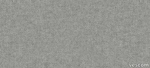
High Performance Vinyl Wallpaper by Vescom | dale - 2108.05
vescom > Wallpaper
Embrace sustainability and elegance with Vescom Dale, a natural wallcovering made with 70% post-consumer recycled wool. Offered in seven soft mélange tones, this high-quality wallcovering combines warmth, texture, and eco-conscious design to elevate your interiors with a touch of timeless sophistication. 1️⃣ 🌿 Sustainable Craftsmanship Vescom Dale features 70% post-consumer recycled wool, supported by a blend of polyester and polyamide on a non-woven backing. It's a luxurious and eco-friendly choice for environmentally mindful interior designs. 🌎 2️⃣ 🖌️ Elegant Mélange Tones Available in seven soft mélange hues, this wallcovering adds subtle sophistication and warmth to any room. The natural wool texture enhances both modern and traditional aesthetics. 🎨 3️⃣ 📏 Wide Coverage for Seamless Installation Measuring ±134 cm (±53 inches) in width, Dale wallcovering offers generous coverage and a flawless finish for large-scale applications. 📐 4️⃣ 🔥 Certified Safety and Durability This flame-retardant wallcovering meets EN 13501 (C, s1 - d0) and ASTM E84 standards, providing reliable safety for residential and commercial spaces. Superior lightfastness (ISO 105-B02 rating 8) ensures vibrant, long-lasting appeal. 🛡️ 5️⃣ 💧 Breathable and Lightweight Design With water vapor permeability (<0.5 m SD value) and a weight of ±310 gr/m² (±14 oz/yd²), Vescom Dale is not only lightweight but also breathable, enhancing the comfort and durability of your interiors. 💪 Tags: Recycled Wool Wallcovering, Mélange Tone Wall Design, Sustainable Wall Material, Natural Interior Design, Flame Retardant Wool Wallcovering, Lightweight Breathable Wallcovering, Vescom Dale Collection, Eco-Friendly Wall Solution, Textured Wall Decor, Non-Woven Backing Wallcovering
LAB MEETING ZXLB - Height-adjustable fabric office chair with armrests with 5-Spoke base _ Inno
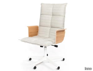
Inno > Chair
Lab Meeting L ZXLB – A Sleek and Functional Meeting Chair for Modern Workspaces Ergonomic Comfort Meets Contemporary Aesthetics The Lab Meeting L ZXLB is a modern, high-quality meeting chair designed to bring comfort, elegance, and flexibility to professional environments. As part of a versatile office seating collection, it blends contemporary design with ergonomic functionality, making it an excellent choice for conference rooms, co-working spaces, hospitality lounges, and private offices. With a refined yet approachable look, it elevates workplace interiors without compromising on comfort. Minimalist Design with a Professional Appeal The clean lines and balanced proportions of the Lab Meeting L ZXLB make it a seamless fit for both corporate and creative spaces. Its modern silhouette exudes sophistication, while the quilted seat upholstery adds an extra layer of elegance. The chair’s design strikes the perfect balance between professional formality and relaxed comfort, making it suitable for both formal meetings and informal collaborative sessions. With a fully upholstered seat and backrest, the chair provides excellent cushioning and support, ensuring that users stay comfortable even during extended meetings. The high-quality stitching and soft contours contribute to its inviting aesthetic, making meeting spaces feel warm and approachable rather than overly rigid or sterile. Durable Materials and Custom Finishes The chair is available in a range of high-quality fabric and leather upholstery options, allowing for complete customisation based on aesthetic preferences and functional needs. From subtle neutral tones to bold accent colours, the upholstery choices make it adaptable to different workplace environments and branding schemes. The frame and base come in various metal finishes, including matte black, metallic grey, silver aluminium, and white variants, providing flexibility in design coordination. Whether integrating into a monochrome minimalist office or a vibrant creative workspace, the chair’s customisation options ensure a perfect fit. Ergonomic Features for Comfort and Productivity The Lab Meeting L ZXLB is designed with ergonomic principles in mind, ensuring maximum comfort and support throughout the workday. The soft, padded seat is contoured to promote good posture, reducing strain on the back and shoulders. The gently curved backrest provides adequate lumbar support, making long hours of sitting more comfortable. A height-adjustable mechanism allows users to modify the seating position to match different table heights, making it adaptable to various workspace configurations. The swivel function ensures easy mobility, while the five-star base with smooth-rolling castors provides effortless movement across different floor types. This combination of features makes it an ideal chair for dynamic work environments, where users need flexibility and ease of movement. Versatile Applications Across Different Work Environments The Lab Meeting L ZXLB is a multi-purpose chair suitable for a wide range of professional settings, including: Corporate Offices and Conference Rooms For executive boardrooms, team meeting areas, and private offices, this chair adds a touch of sophistication while maintaining a comfortable and functional seating experience. Its polished design ensures that meeting spaces feel both professional and inviting. Co-Working Spaces and Startups In fast-paced, open-plan work environments, flexibility is key. The chair’s mobile base and ergonomic design make it a practical choice for co-working spaces, where users may need to switch between workstations, collaboration zones, and lounge areas. Hospitality and Public Spaces Beyond traditional office settings, this chair works well in hotel business lounges, client meeting rooms, and reception areas. Its sleek yet comfortable design allows guests to relax while maintaining an upright posture, making it perfect for areas that require both style and functionality. Educational and Training Facilities In universities, training centres, and seminar rooms, this chair’s adjustable height and swivel base ensure adaptability for different table setups, fostering a collaborative learning environment. A Part of a Thoughtfully Designed Seating Collection The Lab Meeting L ZXLB is part of a larger family of seating solutions, designed for cohesive office layouts. Various configurations, including models with different bases and armrest options, allow for a unified yet varied seating arrangement throughout a workspace. For designers looking to create aesthetic consistency across multiple areas, combining different variations of the Lab series ensures a harmonious look while addressing different functional needs. Sustainability and Longevity Beyond aesthetics and comfort, the Lab Meeting L ZXLB is built with durability and sustainability in mind. The materials used in its construction are chosen for their longevity, ensuring that the chair maintains its quality and performance over time. The metal frame and base are sturdy and wear-resistant, while the upholstery fabrics are designed to withstand daily use. Investing in high-quality office seating means fewer replacements and reduced waste, contributing to a more sustainable workplace.
High Performance Vinyl Wallpaper by Vescom | dale - 2108.01
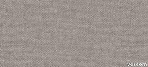
vescom > Wallpaper
Embrace sustainability and elegance with Vescom Dale, a natural wallcovering made with 70% post-consumer recycled wool. Offered in seven soft mélange tones, this high-quality wallcovering combines warmth, texture, and eco-conscious design to elevate your interiors with a touch of timeless sophistication. 1️⃣ 🌿 Sustainable Craftsmanship Vescom Dale features 70% post-consumer recycled wool, supported by a blend of polyester and polyamide on a non-woven backing. It's a luxurious and eco-friendly choice for environmentally mindful interior designs. 🌎 2️⃣ 🖌️ Elegant Mélange Tones Available in seven soft mélange hues, this wallcovering adds subtle sophistication and warmth to any room. The natural wool texture enhances both modern and traditional aesthetics. 🎨 3️⃣ 📏 Wide Coverage for Seamless Installation Measuring ±134 cm (±53 inches) in width, Dale wallcovering offers generous coverage and a flawless finish for large-scale applications. 📐 4️⃣ 🔥 Certified Safety and Durability This flame-retardant wallcovering meets EN 13501 (C, s1 - d0) and ASTM E84 standards, providing reliable safety for residential and commercial spaces. Superior lightfastness (ISO 105-B02 rating 8) ensures vibrant, long-lasting appeal. 🛡️ 5️⃣ 💧 Breathable and Lightweight Design With water vapor permeability (<0.5 m SD value) and a weight of ±310 gr/m² (±14 oz/yd²), Vescom Dale is not only lightweight but also breathable, enhancing the comfort and durability of your interiors. 💪 Tags: Recycled Wool Wallcovering, Mélange Tone Wall Design, Sustainable Wall Material, Natural Interior Design, Flame Retardant Wool Wallcovering, Lightweight Breathable Wallcovering, Vescom Dale Collection, Eco-Friendly Wall Solution, Textured Wall Decor, Non-Woven Backing Wallcovering
RENÉ - Wall-mounted ash Bicycle storage _ Zilio A&C

Zilio A&C > Accessories
René Collection by Zilio A&C The René Collection by Zilio A&C, designed by Tomoko Azumi, offers an innovative solution for bicycle storage that seamlessly integrates functionality with minimalist design. This wall-mounted unit not only accommodates bicycles but also serves as a versatile piece of furniture suitable for various interior settings. Design and Aesthetic René features a sleek, sledge-like structure achieved through steam-bent ash wood, showcasing the brand's commitment to traditional craftsmanship and modern design. Its clean lines and organic form make it a stylish addition to contemporary and classic interiors alike. The minimalist design ensures that René complements existing decor without overwhelming the space. Materials and Finishes Crafted from high-quality ash wood, René is available in a natural finish that highlights the wood's inherent beauty and grain patterns. The unit is furnished with a fabric sling, offered in four distinct colors—blue, yellow, orange, and green—allowing customization to match various interior color schemes. The combination of natural wood and vibrant fabric options adds a touch of elegance and personalization to any space. Dimensions and Specifications Width: 310 mm Depth: 340 mm Height: 280 mm These compact dimensions make René an ideal choice for small apartments, studios, or commercial spaces where efficient use of space is essential. Versatility and Applications Beyond its primary function as a bicycle holder, René offers additional utility: Helmet and Jacket Storage: The design includes space to hang helmets and jackets, providing a centralized location for cycling gear. Luggage Hold and Coat Hanger: When not used for bicycle storage, René transforms into a practical luggage hold or coat hanger, making it a versatile addition to entryways, offices, or commercial establishments. This multifunctionality makes René suitable for various environments: Residential Spaces: Ideal for urban dwellers seeking stylish and space-saving bicycle storage solutions. Commercial Settings: Perfect for offices, cafes, or retail spaces aiming to provide convenient bike storage for employees or customers. Alternative Options For those interested in exploring other innovative storage solutions, Zilio A&C offers a range of products: Leek Clothes Hanger: Designed by Studio Mentsen, this elegant clothes hanger features three identical ash elements combined by two connectors, creating a versatile and timeless piece. Dove Waste Paper Basket: Also by Tomoko Azumi, Dove combines traditional Japanese washi art with Scandinavian materials, resulting in a refined and functional waste paper basket. Woodstock Coat Racks: Designed by David Dolcini, these playful and practical coat racks offer versatility and charm, with a simple geometry that allows for various combinations.
High Performance Vinyl Wallpaper by Vescom | fraser - 2109.05

vescom > Wallpaper
Enhance your interiors with Vescom Fraser, a premium wallcovering featuring a striking 3-dimensional architectural weave in opaque, softly reflective shades. Made from high-performance polyethylene tape yarn, this versatile design is available with an acrylic backing or as an unbacked option, offering exceptional durability, elegance, and eco-conscious features. Bullet Points: 1️⃣ 🌿 Sustainable and Eco-Friendly Vescom Fraser is PFAS-free, low in VOC emissions (CAL 01350 certified), and compliant with the Living Building Challenge Red List. A perfect choice for those prioritizing sustainable and healthy interior solutions. 🌎 2️⃣ 🖌️ Stunning 3D Architectural Weave The dimensional weave design and softly reflective tones create an elegant and modern aesthetic, adding depth and texture to any space. Ideal for both residential and commercial interiors. 🎨 3️⃣ 📏 Flexible Material Options Available in widths of ±137 cm (±54 inches), Fraser comes with options for acrylic backing (2109.XXB) or unbacked (2109.XXU), ensuring adaptability to your specific project requirements. 📐 4️⃣ 🔥 Safety and Durability Guaranteed Certified flame retardant (EN 13501, B, s1 - d0), this wallcovering provides reliable safety and peace of mind. Its high lightfastness (ISO 105-B02, rating 8) ensures long-lasting vibrancy even in well-lit spaces. 🛡️ 5️⃣ 💧 Enhanced Breathability and Lightweight With water vapor permeability (<0.5 m SD value) and a weight range of ±242-293 gr/m² (±11-13 oz/yd²), Vescom Fraser is lightweight, breathable, and easy to install, making it a practical yet luxurious wall solution. 💪 Tags: Polyethylene Wallcovering, 3D Architectural Weave, Low VOC Wall Decor, PFAS-Free Wallcovering, Sustainable Interior Wall Design, Flame Retardant Wallcovering, Lightfast Wall Material, Water Vapor Permeable Wallcovering, Vescom Fraser Collection, Acrylic Backing Wallcovering
SPACE+ 1402A - Fabric linear module with high backrest _ Et al.
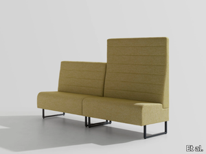
Et al. > Sofa
Space Plus 1400A High-Back Seating Module: Privacy Meets Modern Design The Space Plus 1400A High-Back Seating Module, part of the Space Plus collection by Et al., is a thoughtfully designed piece that balances aesthetic appeal with functionality. Its tall backrest provides added privacy and acoustic insulation, making it an excellent choice for creating secluded seating in public, corporate, or hospitality settings. Design and Dimensions This seating module features a clean, minimalist design with a focus on comfort and space efficiency. Its high backrest is particularly suited for settings requiring a sense of privacy. The dimensions are: Height: 140 cm Width: 75 cm Depth: 61.5 cm Seat Height: 47 cm Seat Depth: 46 cm Its proportions make it versatile for standalone use or as part of a larger modular seating arrangement. Materials and Finishes The Space Plus 1400A offers a range of premium materials and finishes for customisation: Frame: Crafted from durable metal for enhanced stability and longevity. Upholstery: Available in a wide selection of fabrics, including stain-resistant and easy-to-maintain options. Colour choices range from neutral tones like grey and beige to vibrant hues like teal and mustard, allowing for seamless integration into any design scheme. Base Finish: The metal base is available in various finishes, including matte black, metallic tones, and crisp white, to complement diverse interiors. Features High Backrest: Provides additional privacy and acoustic benefits, ideal for open-plan environments. Compact Design: Maximises seating efficiency while maintaining comfort. Modular Compatibility: Can be paired with other Space Plus modules for cohesive seating configurations. Applications The Space Plus 1400A is well-suited for a variety of environments: Hospitality: Enhances hotel lobbies, VIP lounges, or intimate waiting areas with a touch of sophistication. Corporate Offices: Ideal for creating private breakout zones or stylish reception seating. Public Areas: Suitable for malls, airports, and healthcare facilities, offering privacy in busy spaces. Restaurants and Cafés: Functions as booth seating, providing both comfort and privacy. Customisation Options Et al. offers several enhancements to tailor the Space Plus 1400A to specific needs: Integrated USB or Power Outlets: Adds functionality for tech-friendly environments. Attachable Tables: Provides added utility for workspace or dining purposes. Privacy Extensions: Additional panels can be added to further enhance privacy. Sustainability and Durability The Space Plus 1400A is manufactured using eco-friendly materials and processes. Many upholstery options include recycled or sustainable fabrics, ensuring it is both stylish and environmentally conscious. Complementary Products To build cohesive and functional seating arrangements, the Space Plus 1400A pairs seamlessly with other modules from the collection: Space Plus Linear and Corner Modules: For flexible configurations like L-shaped or U-shaped layouts. Ottomans and Poufs: To provide additional seating options. Matching Tables: Complements the setup with functional surfaces. Key Features High backrest for privacy and acoustic insulation. Durable and eco-friendly construction for heavy use. Modular design for endless configuration possibilities. Customisable finishes and fabrics to suit any project.
Earthtech SAVANNAH_FLAKES

florim > Wall tile-stone-brick
From an ancient past to a responsible future <p>The collection injects new life into the earth through a sustainable production process, with a strong focus on green management, to offer the architect an exceptional technical and aesthetic performance in compliance with the socio-environmental context and the latest eco-friendly building needs. With EARTHTECH earth becomes “technical earth” with a highly innovative content, offering new solutions to green architecture and fulfilling the new frontiers of circular economy in construction, guaranteeing a sustainable future. <br />EARTHTECH offers a choice of organic textures to observe and touch, thanks to the wide range of finishes (Comfort, Glossy-Bright and structured) which add a tactile and unexpected perceptive dimension for use in all types of application. <br /><a class="btn arrow" href="https://www.florim.com/en/surfaces/the-new-comfort-surface/"> Discover the new Comfort surface </a></p> <p>EARTHTECH/ is also a return to the origins of the Florim brand through a full body technical product that blends surface and thickness and derives from the spontaneous mixing of carefully pre-selected fragments and pigments of different shades which give the material a unique, one-of-a-kind visual effect in each slab, mimicking the amazing variety of colours and elements in nature. The result is a composite product with a textured design, in which the flakes and aggregate grains create an original mélange effect that is vitrified during firing, producing a robust, high-quality and exceptionally strong and wear-resistant product; one which can be used in any type of building setting and weather conditions, even the harshest.</p>
COSMO 1520 - Fabric garden armchair with armrests _ Et al.
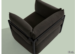
Et al. > Armchair
COSMO 1520 Armchair: A Modern and Versatile Seating Solution The COSMO 1520 armchair, part of the COSMO collection designed by Philippe Tabet for Et al., is a versatile and elegant seating solution. With its minimalist design and exceptional comfort, this armchair is a perfect fit for residential, hospitality, and commercial spaces. Its contemporary style and functional features ensure it integrates seamlessly into a variety of interior designs. Dimensions and Specifications The COSMO 1520 armchair is designed to provide optimal comfort while maintaining a compact and stylish profile: Width: 111 cm Depth: 88 cm Height: 80 cm Seat Height: 44 cm These proportions make it suitable for both spacious environments and smaller, more intimate settings, offering a comfortable and practical seating option. Materials and Finishes The COSMO 1520 is crafted with premium materials to ensure durability and style: Frame: Constructed from tubular steel, which provides strength and a sleek aesthetic. Upholstery Options: Available in a wide range of high-quality fabrics, including: Velvet for a luxurious look. Synthetic blends for durability and easy maintenance. Wool and leather for added warmth and sophistication. Colours: The upholstery comes in a palette ranging from soft neutrals like beige, taupe, and grey to bold, vibrant shades like teal, mustard, and terracotta. Frame Finishes: Customisable frame finishes include options such as matte black, white, metallic tones, and bright colours like coral red and olive green. Design and Style The COSMO 1520 features a clean, modern silhouette with a distinctive tubular steel base that gives it a floating effect. The gently rounded backrest and well-padded seat create a balance between form and function. This armchair embodies a minimalist aesthetic that pairs effortlessly with Scandinavian, Japandi, and contemporary interiors. The absence of armrests enhances its versatility and ensures it fits comfortably into various spaces. Applications and Uses The COSMO 1520 is a versatile seating solution suitable for a range of environments: Residential Spaces: Adds a modern touch to living rooms, bedrooms, or reading corners. Hospitality Settings: Ideal for hotel lounges, guest rooms, and lobbies, offering guests comfort and style. Commercial and Public Areas: Suitable for waiting areas, galleries, or office break rooms. Collaborative Workspaces: Perfect for coworking spaces and creative hubs, blending aesthetics with functionality. Accessories The COSMO 1520 can be enhanced with optional accessories to increase its functionality: Lumbar Cushion: Adds extra support for extended sitting. USB and Schuko Sockets: Convenient for charging devices in modern office or hospitality environments. Integrated Reading Lamp: Perfect for creating cosy, focused lighting in lounges or personal spaces. Complementary Products To create a cohesive seating arrangement, pair the COSMO 1520 with other items from the COSMO collection: COSMO 1502 Sofa: A spacious two- or three-seater with matching aesthetics. COSMO 1510 Pouf: A versatile footrest or additional seating option. COSMO 1513 Coffee Table: Completes the setup with a functional and stylish surface. Key Features Minimalist Design: A clean and modern aesthetic that fits seamlessly into various styles. Customisation Options: Upholstery, colours, and frame finishes tailored to suit specific needs. Compact and Functional: Ideal for both large spaces and more intimate environments. Durable Construction: High-quality materials ensure longevity. 2D and 3D Files Available: Designers can easily download these files for seamless integration into project plans.
Earthtech PUMICE_FLAKES

florim > Wall tile-stone-brick
From an ancient past to a responsible future <p>The collection injects new life into the earth through a sustainable production process, with a strong focus on green management, to offer the architect an exceptional technical and aesthetic performance in compliance with the socio-environmental context and the latest eco-friendly building needs. With EARTHTECH earth becomes “technical earth” with a highly innovative content, offering new solutions to green architecture and fulfilling the new frontiers of circular economy in construction, guaranteeing a sustainable future. <br />EARTHTECH offers a choice of organic textures to observe and touch, thanks to the wide range of finishes (Comfort, Glossy-Bright and structured) which add a tactile and unexpected perceptive dimension for use in all types of application. <br /><a class="btn arrow" href="https://www.florim.com/en/surfaces/the-new-comfort-surface/"> Discover the new Comfort surface </a></p> <p>EARTHTECH/ is also a return to the origins of the Florim brand through a full body technical product that blends surface and thickness and derives from the spontaneous mixing of carefully pre-selected fragments and pigments of different shades which give the material a unique, one-of-a-kind visual effect in each slab, mimicking the amazing variety of colours and elements in nature. The result is a composite product with a textured design, in which the flakes and aggregate grains create an original mélange effect that is vitrified during firing, producing a robust, high-quality and exceptionally strong and wear-resistant product; one which can be used in any type of building setting and weather conditions, even the harshest.</p>
Earthtech DESERT_GROUND

florim > Wallcovering
From an ancient past to a responsible future <p>The collection injects new life into the earth through a sustainable production process, with a strong focus on green management, to offer the architect an exceptional technical and aesthetic performance in compliance with the socio-environmental context and the latest eco-friendly building needs. With EARTHTECH earth becomes “technical earth” with a highly innovative content, offering new solutions to green architecture and fulfilling the new frontiers of circular economy in construction, guaranteeing a sustainable future. <br />EARTHTECH offers a choice of organic textures to observe and touch, thanks to the wide range of finishes (Comfort, Glossy-Bright and structured) which add a tactile and unexpected perceptive dimension for use in all types of application. <br /><a class="btn arrow" href="https://www.florim.com/en/surfaces/the-new-comfort-surface/"> Discover the new Comfort surface </a></p> <p>EARTHTECH/ is also a return to the origins of the Florim brand through a full body technical product that blends surface and thickness and derives from the spontaneous mixing of carefully pre-selected fragments and pigments of different shades which give the material a unique, one-of-a-kind visual effect in each slab, mimicking the amazing variety of colours and elements in nature. The result is a composite product with a textured design, in which the flakes and aggregate grains create an original mélange effect that is vitrified during firing, producing a robust, high-quality and exceptionally strong and wear-resistant product; one which can be used in any type of building setting and weather conditions, even the harshest.</p>
DIAMOND - White-paste and glass 3D Wall Tile _ gruppo bardelli

gruppo bardelli > Wall tile-stone-brick
Dimon Black by Ceramica Bardelli: Vintage Charm Meets Modern Design The Dimon Black tile from the Diamond collection by Ceramica Bardelli offers a versatile and timeless solution for interior cladding. Featuring a glossy finish and a striking diamond-cut surface, Dimon Black seamlessly blends retro aesthetics with contemporary design sensibilities, making it a perfect choice for both modern and classic interiors. Design and Features Dimon Black is part of a three-dimensional ceramic tile series crafted from high-quality white paste monoporous material. The 10x40 cm (4"x16") format lends itself to modular installations, offering endless design possibilities. Its glossy black finish exudes elegance and sophistication, making it a standout feature in any interior setting. The iconic diamond-cut design evokes vintage charm, reminiscent of retro styles, while its sleek execution ensures it complements contemporary spaces. This duality makes Dimon Black a versatile choice for those seeking to create interiors with personality and depth. Colour Range and Customisation While the Dimon Black tile showcases a bold, glossy black, the full Diamond collection is available in a variety of rich colours, including white, orange, mustard, and red. This diverse palette allows for customisable designs that cater to a range of aesthetics, from monochromatic chic to vibrant, playful compositions. Applications Designed exclusively for interior cladding, Dimon Black is perfect for walls in residential, commercial, and hospitality spaces. Whether used as a feature wall in a kitchen or bathroom, or as an accent in retail and public spaces, the tile adds texture, shine, and a touch of retro elegance to any design scheme. Its durability and ease of maintenance further enhance its appeal, making it a practical and stylish choice. About Ceramica Bardelli Ceramica Bardelli is part of the prestigious Gruppo Bardelli, a leader in Italian ceramic design. With production facilities in Cerrione and Oderzo, the Group is renowned for its commitment to innovation, craftsmanship, and excellence. Its collections, including the Diamond series, embody the finest traditions of Italian ceramics while embracing contemporary trends. The Dimon Black tile exemplifies this approach, offering designers and architects a high-quality product that merges vintage inspiration with modern functionality. For seamless project integration, downloadable 3D files are available, ensuring that the Dimon Black tile is as practical as it is beautiful. With its bold design and impeccable finish, Dimon Black is the ideal choice for creating striking, sophisticated interiors.
Archeologie Archeologie Grigio
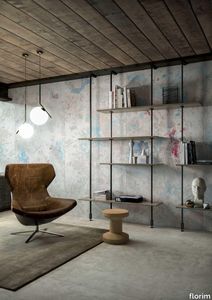
florim > Wall Paint
The poetics of the wall. The forgotten wall. «A wall is like a book to be opened, a journey into the interior, revealing the experiences, memories, signs and symbols which this fragment of masonry has absorbed over the centuries.» Franco Guerzoni <p>It is difficult to resist the beauty of Franco Guerzoni's art, created by a rare harmony of feeling and intellect, poetry and mind. The artist expresses this through paintings which, although complex in structure, are joyous and sensual, with bright colours made, like those of the great masters of the past, from choice powdered ingredients. A painter with a technique rich in traditional skills, Guerzoni offers a version of modernity involving an intense fundamental relationship with his images and with space. In fact, the dialectic between painting and space, form and architecture, time and memory seems to be essential to his art. As his works specifically created for CEDIT clearly express, his creations achieve a perfect balance between the spatial dimension and intensely lyrical use of colour, which here becomes a soft, liquid form of matter, wandering across the surface of a dazzling lime-plaster white. White, metaphor for the clear light of day, as it was in the large, complex canvases exhibited in his personal exhibition at the 1990 Venice Biennale, is the background for forms of colour which renew the pleasure to be had from painting and the memory of an image glimpsed on the vast expanse of the surface. In the more recent works, these voluptuous shades are transformed into subtle shadows of colour that delicately caress the surface.</p> <p> </p> <p> All it takes is one wall, the only surviving wall of what was once a house, on which time has recorded its own, unavoidable passing, leaving traces of colour that is still vibrant, although faded in places, to allow the memory of the image to transpire, fragile and uncertain, in the physicality of the surface, to bear tangible witness to the existence of history, a mysterious visual memory, the extension into the present of the life of things. A memory of the past on a contemporary wall. The idea of memory is central to Franco Guerzoni's poetics: private, secret memory and the collective memory of the past. Fragmentary and indecipherable, perceived by the artist with the aid of what is left of the images, the fragment. A relic of a totality which can no longer be reconstructed but only imagined in poetic terms, the fragment, a fraction of an image conserved by time, guides the artist's fantastic archaeological journey in search of the world's memory. However, this journey takes him in the opposite direction to the archaeologist, for whom the fragment - fundamental because it reveals a trace of the past is the starting-point for an attempt to reconstruct history. For Guerzoni, the fragment is the endpoint of his work, the goal for which he strives in his investigation of the surface, as he digs deep down, leafing through the deposits of time and memory.</p> <p> </p> <p>Like the large pages of a book traced with fragile sketches, embryonic forms whose meaning has been lost in time, leaving only fleeting traces, uncertain, ambiguous, mysterious morphologies. It marks the start of a journey into the mind of the artist-archaeologist, an adventurous journey into the inextricable labyrinth of the mind, to unearth what is hidden, shuffling the cards in a perennial contamination of images, memory, signs and traces, in search of a meaning, which no sooner appears than it is lost, merging into time and once again becoming a dream, an imaginary journey into fantasy and wonder. And this is the case in the tryptic created for CEDIT, which placed a new challenge before the artist: to transfer "his" image, the remains and fragments of a forgotten wall onto a new material for him “stunning, large-sized ceramic slabs“ and a real wall, without this tautology betraying the painting's deep meaning, its fertile magic of lines and colours, from which the image is born. And the artist is fully aware of this. Guerzoni describes his art as a "gamble": a gamble that is a critical test, an act of daring, dangerous and risky. This is the challenge he sets himself. It is a challenge he easily overcomes, expressing himself on these large walls with a rediscovered pleasure in painting, no longer restrained and apparently absorbed by the dense, uneven coloured surface but set free and almost luxuriously accentuated. In his large, demanding works for CEDIT, Guerzoni achieves a new, consummate mode of painting, in which the architecture of the surfaces provides a poetic meeting-point between the two founding components of his style, the complex, well thought-out composition and the lyricism of colour.</p>
SPACE+ 1400 - Fabric linear module _ Et al.
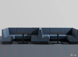
Et al. > Armchair
Space Plus Modular Seating System: Customisable Elegance for Public and Commercial Spaces The Space Plus Modular Seating System, part of Et al.'s extensive collection, is designed to offer unparalleled flexibility and modern aesthetics. Ideal for various public and commercial environments, it combines functionality, style, and durability, making it perfect for creating bespoke seating solutions. Design and Dimensions The Space Plus Modular System features clean lines and a robust construction, making it suitable for high-traffic areas. This particular module has the following dimensions: Height: 100 cm Width: 75 cm Depth: 61.5 cm Seat Height: 47 cm Seat Width: 46 cm These compact yet spacious proportions make it an excellent choice for lobbies, waiting rooms, and collaborative spaces. Materials and Finishes Crafted with precision, the Space Plus collection ensures durability and customisation: Frame: Made from sturdy metal, guaranteeing stability and long-lasting use. Upholstery: Available in a wide range of high-performance fabrics, including stain-resistant and easy-to-clean options. Designers can choose from a palette of neutral tones like grey and beige or opt for bold, vibrant colours like teal or mustard to match specific branding or design schemes. Base Finish: The metal base is finished in various shades, including metallic tones, matte black, and white, to ensure compatibility with diverse interiors. Features Modular Design: The modular nature of the Space Plus system allows designers to configure seating arrangements that suit the unique requirements of a space. Straight, corner, and connecting modules are available to create cohesive designs. Comfortable Seating: The well-padded seat and backrest ensure maximum comfort, even for extended periods. Space Efficiency: Its compact design maximises seating capacity while maintaining user comfort. Applications The Space Plus system is highly versatile and suitable for numerous environments: Hospitality: Ideal for hotel lobbies, bars, and lounges, offering both style and durability. Corporate Spaces: Perfect for office receptions and collaborative meeting zones. Retail and Public Spaces: Well-suited for waiting areas in malls, airports, or hospitals. Restaurants and Cafés: A chic choice for booth seating or dining areas. Customisation Options To further personalise the Space Plus seating system, Et al. offers additional accessories and customisation: Add-On Tables: Small, integrated side tables for added convenience. USB Charging Ports: For functionality in modern workspaces or waiting areas. Divider Panels: Create privacy for users in open-plan settings. Sustainability and Durability The Space Plus collection is crafted with environmentally friendly materials and processes, ensuring sustainability without compromising quality. The upholstery options include recycled and eco-friendly fabrics. Complementary Products The Space Plus system pairs well with other pieces from Et al.'s collections, such as: Space Plus Bench Modules: Ideal for larger seating configurations. Coffee Tables: To complement the seating arrangement with functionality and style. Key Features Customisable modular system for bespoke designs. Compact, elegant dimensions suitable for diverse applications. Durable materials for high-traffic environments. Extensive range of upholstery and finish options.
Earthtech CARBON_GROUND

florim > Wallcovering
From an ancient past to a responsible future <p>The collection injects new life into the earth through a sustainable production process, with a strong focus on green management, to offer the architect an exceptional technical and aesthetic performance in compliance with the socio-environmental context and the latest eco-friendly building needs. With EARTHTECH earth becomes “technical earth” with a highly innovative content, offering new solutions to green architecture and fulfilling the new frontiers of circular economy in construction, guaranteeing a sustainable future. <br />EARTHTECH offers a choice of organic textures to observe and touch, thanks to the wide range of finishes (Comfort, Glossy-Bright and structured) which add a tactile and unexpected perceptive dimension for use in all types of application. <br /><a class="btn arrow" href="https://www.florim.com/en/surfaces/the-new-comfort-surface/"> Discover the new Comfort surface </a></p> <p>EARTHTECH/ is also a return to the origins of the Florim brand through a full body technical product that blends surface and thickness and derives from the spontaneous mixing of carefully pre-selected fragments and pigments of different shades which give the material a unique, one-of-a-kind visual effect in each slab, mimicking the amazing variety of colours and elements in nature. The result is a composite product with a textured design, in which the flakes and aggregate grains create an original mélange effect that is vitrified during firing, producing a robust, high-quality and exceptionally strong and wear-resistant product; one which can be used in any type of building setting and weather conditions, even the harshest.</p>
SPARK - Acoustic recycled plastic pendant lamp _ IMPACT ACOUSTIC®
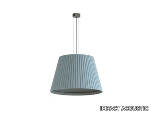
IMPACT ACOUSTIC > Ceiling lamp
Spark Acoustic Lighting – A Perfect Blend of Light and Sound Absorption Elegant and Functional Acoustic Lighting for Modern Interiors The Spark acoustic pendant light is a sophisticated lighting solution that merges aesthetic appeal with functional acoustic properties. Designed to complement contemporary interiors, it brings a warm yet modern touch while improving the acoustics of a space. With a classic silhouette, subtle playful character, and high-quality sustainable materials, Spark is an excellent choice for residential, hospitality, office, and commercial environments. Timeless Design with a Contemporary Twist At first glance, Spark presents itself as a traditional pendant lamp, but upon closer inspection, it reveals soft, sculptural details that add depth and personality. The clean lines and well-balanced proportions make it suitable for a wide range of interiors, from minimalist and Scandinavian-inspired spaces to bold, modern contract environments. The design of Spark is all about creating harmony between light and sound, making it perfect for open-plan offices, hotel lobbies, restaurants, and co-working spaces. By reducing ambient noise and improving speech clarity, it enhances comfort while maintaining a stylish and cohesive look. Available Sizes for Versatile Applications To suit different project requirements, Spark comes in five sizes, allowing for a dynamic mix-and-match installation. Designers can create a clustered arrangement for a statement feature or opt for a single pendant in smaller spaces to maintain an airy and uncluttered aesthetic. The variety of sizes ensures that Spark can be used in both expansive high-ceiling spaces and intimate residential settings. Premium Acoustic Material with a Sustainable Edge Sustainability is at the heart of Spark’s design. Made from ARCHISONIC® Felt, a high-performance acoustic absorber crafted from recycled PET bottles, it delivers both sound absorption and environmental responsibility. Each square meter of this felt contains approximately 88 upcycled plastic bottles, reinforcing the brand’s commitment to reducing waste. This eco-conscious material is not only effective in dampening excess noise but also adds a soft, tactile quality to the lighting fixture. Unlike conventional pendant lights that focus solely on illumination, Spark is designed to enhance the overall sensory experience in a space. A Palette of 36 Colours for Customisation Interior designers and architects can fully customise Spark to align with their projects, thanks to a diverse selection of 36 colours. Whether blending seamlessly with neutral tones for a calming ambiance or making a bold statement with vibrant hues, Spark allows for creative flexibility. This extensive range of colours makes it adaptable for corporate offices, contemporary restaurants, luxury hotel lounges, and even residential settings. Perfect for a Wide Range of Applications Hospitality and Restaurants In restaurants, cafés, and hotels, Spark enhances the ambiance by reducing reverberation and creating a more intimate dining or lounging experience. Its soft, diffused lighting adds warmth, while its acoustic properties help in controlling background noise, allowing guests to enjoy conversations without distractions. Workspaces and Offices Open-plan offices often struggle with noise control, making Spark an ideal choice for work environments. Whether installed over meeting tables, workstations, or lounge areas, it helps improve focus and productivity by minimising sound disturbances. The combination of good lighting and acoustic comfort makes it a valuable addition to modern workspaces. Residential Interiors For homeowners seeking a stylish yet functional lighting solution, Spark fits effortlessly into dining areas, home offices, and living rooms. Its ability to create a calm and acoustically balanced environment enhances daily life while adding an artistic touch to interiors. Public and Commercial Spaces Museums, libraries, and commercial buildings can greatly benefit from Spark’s dual-function design, where aesthetics and sound management are equally important. The adaptability in size, colour, and hanging configurations makes it a practical and stylish choice for public interiors. A Collaboration Between Light and Sound Innovation Spark is the result of a collaboration between leading acoustic experts and lighting designers, ensuring that both sound absorption and illumination are of the highest quality. The built-in LED light source provides efficient and long-lasting illumination, making it energy-efficient and low-maintenance. Additionally, it is UL certified, ensuring compliance with strict safety and quality standards. Designed for professionals who value performance, sustainability, and design, Spark is a lighting solution that stands out in both form and function. Seamless Integration with Other Acoustic Solutions For designers looking to curate a cohesive interior, Spark pairs well with other acoustic lighting fixtures. Combining it with elements like acoustic ceiling panels, wall treatments, or partition screens creates a holistic approach to sound management in busy interiors. The ability to coordinate with other acoustic solutions makes it a versatile and smart choice for large-scale projects. Conclusion – A Thoughtful Approach to Lighting and Acoustics The Spark acoustic pendant light is more than just a lighting fixture—it’s a design statement that enhances both visual appeal and acoustic comfort. With a timeless shape, customisable colour options, sustainable materials, and high-performance acoustic properties, it is a must-have for modern interiors. Whether installed in a boutique hotel, a bustling co-working space, a contemporary home, or a stylish restaurant, Spark ensures that spaces are both beautifully lit and acoustically balanced. Its commitment to sustainability, flexibility in design, and superior functionality make it an excellent choice for forward-thinking interior designers who value both form and function.
Project Wallpaper by Vescom | linosa - 2106.08

vescom > Wallpaper
Bring natural elegance to your interiors with Vescom Linosa, a bio-based wallcovering crafted entirely from linen. Available in coarse and fine weaves of varying scales, its neutral tones provide a timeless aesthetic, combining texture, sustainability, and durability for a versatile and sophisticated wall solution. Bullet Points: 1️⃣ 🌿 100% Natural Linen Composition Made from bio-based linen on a paper backing, Vescom Linosa prioritizes sustainability and eco-conscious design while offering a high-quality, natural aesthetic. 🌱 2️⃣ 🖌️ Versatile Textures and Neutral Tones Choose from coarse or fine weaves in varying scales, each presented in neutral tones that complement a wide range of interior styles, from modern to traditional. 🎨 3️⃣ 📏 Wide Dimensions for Seamless Application With a width of ±137 cm (±54 inches) and a substantial weight of ±500 gr/m² (±22 oz/yd²), Linosa wallcovering ensures excellent coverage and durability for both residential and commercial spaces. 📐 4️⃣ 🔥 Certified Safety and Lightfastness Meeting EN 13501 (B, s1 - d0) and ASTM E84 (Pass, A) standards for flame retardancy, Vescom Linosa is safe and reliable. Exceptional colorfastness (ISO 105-B02 rating 7–8) guarantees long-lasting vibrancy. 🛡️ 5️⃣ 💧 Breathable and Resilient Design Featuring water vapor permeability (<0.5 m SD value), Linosa is designed for breathability and longevity, making it a practical yet elegant choice for your walls. 💪 Tags: Bio-Based Linen Wallcovering, Neutral Tone Wall Design, Coarse Weave Wall Texture, Fine Weave Wallcovering, Sustainable Interior Solution, Flame Retardant Linen Wallcovering, Durable Wall Material, Vescom Linosa Collection, Natural Linen Wall Decor, Breathable Wallcovering
Rilievi Sabbia

florim > Wall Paint
The alternation and symbiosis between concave and convex, recessed and raised. <p>Rilievi is a work of design balanced between different historic periods: while the volumetric relief tile modules are inspired by artistic experiments conducted in Italy during the Sixties and Seventies, the large slabs are the outcome of research into materials and technology that has only come to fruition in very recent times. The shadow effects generated on the surfaces of the slabs by the light striking the projecting parts of the modules create an unusual impression of architectural depth found virtually nowhere else in ceramic coverings, laying the bases for a new decoration interior design language.</p> This project simply embodies perfection - a term which certainly sets the bar high in a description of a new product for launch on the market. But when an enlightened manufacturer is capable of encapsulating a designer's personal research in a product to be added to its range, the outcome is a perfect synthesis. A perfect synthesis between untrammelled creativity and market trends. CEDIT had the insight needed to perceive, identify and rework the immense potential of Practice Practice Practice "“ a self-produced project by Zaven (Enrica Cavarzan and Marco Zavagno "“ and realised that its sophisticated design, originated by pure, pristine input (unadulterated by external factors except the noblest of them all, research) could provide the basis for an innovative, successful collection. I might add, a collection unique of its kind. Zaven is also a name that comes with guarantees; the two partners are good at what they do. Their work always starts from personal curiosity and investigations, the study of other stories (as in this case inspiration was drawn from the output of artist and activist Nino Caruso) and individual interests, which are broken down, developed, optimised and prepared for transformation into something fresh.Enrica Cavarzan and Marco Zavagno have a masterly ability to transform their own wishes and passions into design work of the greatest breadth and, as we see here, the widest, richest application. Their use of ceramics as a material is clearly outstanding and reflects a method precisely founded on the desire to look at things from an unusual viewpoint, under a different light. And to be daring. Zaven have an unconventional approach to convention. In the specific case of the Rilievi collection, the "modules" created for CEDIT seem to explode off the walls; in fact, they are constructed by combining the two-dimensional slab with its three-dimensional decor.Rilievi seems to be seeking space. More space. Even though these modules have actually established a dialogue with the wall from which they are born. At the same time, they hypnotise us with their tight sequence of lines, the pattern that is always different although its root is the same, and the intriguing, unusual colours that add another vital factor to the finished product. Their firm grounding in graphic design (and here we have come back to two-dimensional effects, of the kind most often associated with a wall covering) easily evolves into a facade which seems to have been carved with a chisel - although this is not the case. These modules are conceived to convey an impression of movement, and the three models, in seven colour combinations, create a powerful effect on a surface, which is never passive but rather an organic contributor to the forms and colours involved in the fascinating combinations. The slab is very much present and has the same worth and status as the relief pattern associated to it. In the light of this dichotomy between the linear and the sculpted, expressed through the skilfully balanced visual expedients, the use of repetition adds vigour to the module's intrinsic meaning. As we have seen, a rejection of facile, superficial creative dynamics in favour of an investigation reaching above and beyond has always been a central, clearly recognisable feature of this Venice-based duo, who already have impressive international partnerships to their credit, including the London Design Festival, the Kalmar Konstmuseum, the Paris Designer Days, Ca' Foscari University, the Venice Biennale, the Sandretto Re Rebaudengo Foundation, the Sindika Dokolo Foundation and the V-A-C Foundation, and also won the 2018 Wallpaper Design Award. Graphics, advertising and product design: the pair have always opted for a type of design closely linked to the observation of everyday items, followed by their reinterpretation in a version applied to experimentation with materials. This duality, combined with their energetic yet elegant visual language, forms Enrica and Marco's primary code, experienced in this specific context through serial carvings. On walls.
Project Wallpaper by Vescom | linosa - 2106.06

vescom > Wallpaper
Bring natural elegance to your interiors with Vescom Linosa, a bio-based wallcovering crafted entirely from linen. Available in coarse and fine weaves of varying scales, its neutral tones provide a timeless aesthetic, combining texture, sustainability, and durability for a versatile and sophisticated wall solution. Bullet Points: 1️⃣ 🌿 100% Natural Linen Composition Made from bio-based linen on a paper backing, Vescom Linosa prioritizes sustainability and eco-conscious design while offering a high-quality, natural aesthetic. 🌱 2️⃣ 🖌️ Versatile Textures and Neutral Tones Choose from coarse or fine weaves in varying scales, each presented in neutral tones that complement a wide range of interior styles, from modern to traditional. 🎨 3️⃣ 📏 Wide Dimensions for Seamless Application With a width of ±137 cm (±54 inches) and a substantial weight of ±500 gr/m² (±22 oz/yd²), Linosa wallcovering ensures excellent coverage and durability for both residential and commercial spaces. 📐 4️⃣ 🔥 Certified Safety and Lightfastness Meeting EN 13501 (B, s1 - d0) and ASTM E84 (Pass, A) standards for flame retardancy, Vescom Linosa is safe and reliable. Exceptional colorfastness (ISO 105-B02 rating 7–8) guarantees long-lasting vibrancy. 🛡️ 5️⃣ 💧 Breathable and Resilient Design Featuring water vapor permeability (<0.5 m SD value), Linosa is designed for breathability and longevity, making it a practical yet elegant choice for your walls. 💪 Tags: Bio-Based Linen Wallcovering, Neutral Tone Wall Design, Coarse Weave Wall Texture, Fine Weave Wallcovering, Sustainable Interior Solution, Flame Retardant Linen Wallcovering, Durable Wall Material, Vescom Linosa Collection, Natural Linen Wall Decor, Breathable Wallcovering
Connery
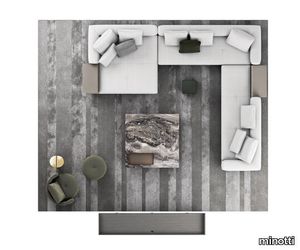
minotti > Sofa
Contemporary, with a strong architectural appeal and pure lines reminiscent of the Mid-Century American spirit, the Connery seating system sports an exquisite aesthetic and design that instantly catch the eye. The clever combination of fine materials and sophisticated details adds a hint of couture to its design. An extremely versatile seating system, in terms of both composition and combination of materials, Connery has a distinctive personality also expressed in the pairing of original square and round chaise-longues. With its geometric rigour, the base creates an original contrast with the softness of the seat, conceived as a single cushion punctuated by light stitching defining the width of the seat - 83 or 68 cm - and with the structure of the backrest and armrest, covered in channelled goose down padding. The backrest and armrest form a single volume, with a 45° split in the corner. As well as the fabric covering, the padded structural base can also feature a covering with strips of leather, crafted with the same technique used in fine leather luggage-crafting. References to the concept of high-end leather goods are also found in the headrests and the elegant “C”-shaped Flap surfaces, which seamlessly blend into the seating elements, animating the compositions with a vibrant rhythm. The structural base is raised from the ground on thin blades in extruded aluminium in a Brandy polished varnished finish, positioned at the front, giving the sofa an appealing and airy look, and recalling the metal parts of trunks and suitcases. The Flap shelves reiterate the strip design of the structural base and make the system functional, offering stylish, surfaces on which to place objects. Covered in leather or Moka ash veneer, they dialogue harmoniously with the textures of the covering. The leather bands of the structural base, sewn together with straps and marked out by stitching that add rhythm to the design, are made with the same technique used in fine leather luggage-crafting. The same concept of high-end leather goods also inspires the freely adjustable headrests. The well-structured, customisable range, offering many different compositional options, in addition to longer square chaise-longues, also includes circular elements, which can be positioned near the sofa as atolls.
Earthtech DESERT_FLAKES

florim > Wall tile-stone-brick
From an ancient past to a responsible future <p>The collection injects new life into the earth through a sustainable production process, with a strong focus on green management, to offer the architect an exceptional technical and aesthetic performance in compliance with the socio-environmental context and the latest eco-friendly building needs. With EARTHTECH earth becomes “technical earth” with a highly innovative content, offering new solutions to green architecture and fulfilling the new frontiers of circular economy in construction, guaranteeing a sustainable future. <br />EARTHTECH offers a choice of organic textures to observe and touch, thanks to the wide range of finishes (Comfort, Glossy-Bright and structured) which add a tactile and unexpected perceptive dimension for use in all types of application. <br /><a class="btn arrow" href="https://www.florim.com/en/surfaces/the-new-comfort-surface/"> Discover the new Comfort surface </a></p> <p>EARTHTECH/ is also a return to the origins of the Florim brand through a full body technical product that blends surface and thickness and derives from the spontaneous mixing of carefully pre-selected fragments and pigments of different shades which give the material a unique, one-of-a-kind visual effect in each slab, mimicking the amazing variety of colours and elements in nature. The result is a composite product with a textured design, in which the flakes and aggregate grains create an original mélange effect that is vitrified during firing, producing a robust, high-quality and exceptionally strong and wear-resistant product; one which can be used in any type of building setting and weather conditions, even the harshest.</p>
Project Wallpaper by Vescom | linosa - 2106.09
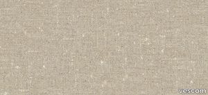
vescom > Wallpaper
Bring natural elegance to your interiors with Vescom Linosa, a bio-based wallcovering crafted entirely from linen. Available in coarse and fine weaves of varying scales, its neutral tones provide a timeless aesthetic, combining texture, sustainability, and durability for a versatile and sophisticated wall solution. Bullet Points: 1️⃣ 🌿 100% Natural Linen Composition Made from bio-based linen on a paper backing, Vescom Linosa prioritizes sustainability and eco-conscious design while offering a high-quality, natural aesthetic. 🌱 2️⃣ 🖌️ Versatile Textures and Neutral Tones Choose from coarse or fine weaves in varying scales, each presented in neutral tones that complement a wide range of interior styles, from modern to traditional. 🎨 3️⃣ 📏 Wide Dimensions for Seamless Application With a width of ±137 cm (±54 inches) and a substantial weight of ±500 gr/m² (±22 oz/yd²), Linosa wallcovering ensures excellent coverage and durability for both residential and commercial spaces. 📐 4️⃣ 🔥 Certified Safety and Lightfastness Meeting EN 13501 (B, s1 - d0) and ASTM E84 (Pass, A) standards for flame retardancy, Vescom Linosa is safe and reliable. Exceptional colorfastness (ISO 105-B02 rating 7–8) guarantees long-lasting vibrancy. 🛡️ 5️⃣ 💧 Breathable and Resilient Design Featuring water vapor permeability (<0.5 m SD value), Linosa is designed for breathability and longevity, making it a practical yet elegant choice for your walls. 💪 Tags: Bio-Based Linen Wallcovering, Neutral Tone Wall Design, Coarse Weave Wall Texture, Fine Weave Wallcovering, Sustainable Interior Solution, Flame Retardant Linen Wallcovering, Durable Wall Material, Vescom Linosa Collection, Natural Linen Wall Decor, Breathable Wallcovering
Rilievi Cielo

florim > Wall Paint
The alternation and symbiosis between concave and convex, recessed and raised. <p>Rilievi is a work of design balanced between different historic periods: while the volumetric relief tile modules are inspired by artistic experiments conducted in Italy during the Sixties and Seventies, the large slabs are the outcome of research into materials and technology that has only come to fruition in very recent times. The shadow effects generated on the surfaces of the slabs by the light striking the projecting parts of the modules create an unusual impression of architectural depth found virtually nowhere else in ceramic coverings, laying the bases for a new decoration interior design language.</p> This project simply embodies perfection - a term which certainly sets the bar high in a description of a new product for launch on the market. But when an enlightened manufacturer is capable of encapsulating a designer's personal research in a product to be added to its range, the outcome is a perfect synthesis. A perfect synthesis between untrammelled creativity and market trends. CEDIT had the insight needed to perceive, identify and rework the immense potential of Practice Practice Practice "“ a self-produced project by Zaven (Enrica Cavarzan and Marco Zavagno "“ and realised that its sophisticated design, originated by pure, pristine input (unadulterated by external factors except the noblest of them all, research) could provide the basis for an innovative, successful collection. I might add, a collection unique of its kind. Zaven is also a name that comes with guarantees; the two partners are good at what they do. Their work always starts from personal curiosity and investigations, the study of other stories (as in this case inspiration was drawn from the output of artist and activist Nino Caruso) and individual interests, which are broken down, developed, optimised and prepared for transformation into something fresh.Enrica Cavarzan and Marco Zavagno have a masterly ability to transform their own wishes and passions into design work of the greatest breadth and, as we see here, the widest, richest application. Their use of ceramics as a material is clearly outstanding and reflects a method precisely founded on the desire to look at things from an unusual viewpoint, under a different light. And to be daring. Zaven have an unconventional approach to convention. In the specific case of the Rilievi collection, the "modules" created for CEDIT seem to explode off the walls; in fact, they are constructed by combining the two-dimensional slab with its three-dimensional decor.Rilievi seems to be seeking space. More space. Even though these modules have actually established a dialogue with the wall from which they are born. At the same time, they hypnotise us with their tight sequence of lines, the pattern that is always different although its root is the same, and the intriguing, unusual colours that add another vital factor to the finished product. Their firm grounding in graphic design (and here we have come back to two-dimensional effects, of the kind most often associated with a wall covering) easily evolves into a facade which seems to have been carved with a chisel - although this is not the case. These modules are conceived to convey an impression of movement, and the three models, in seven colour combinations, create a powerful effect on a surface, which is never passive but rather an organic contributor to the forms and colours involved in the fascinating combinations. The slab is very much present and has the same worth and status as the relief pattern associated to it. In the light of this dichotomy between the linear and the sculpted, expressed through the skilfully balanced visual expedients, the use of repetition adds vigour to the module's intrinsic meaning. As we have seen, a rejection of facile, superficial creative dynamics in favour of an investigation reaching above and beyond has always been a central, clearly recognisable feature of this Venice-based duo, who already have impressive international partnerships to their credit, including the London Design Festival, the Kalmar Konstmuseum, the Paris Designer Days, Ca' Foscari University, the Venice Biennale, the Sandretto Re Rebaudengo Foundation, the Sindika Dokolo Foundation and the V-A-C Foundation, and also won the 2018 Wallpaper Design Award. Graphics, advertising and product design: the pair have always opted for a type of design closely linked to the observation of everyday items, followed by their reinterpretation in a version applied to experimentation with materials. This duality, combined with their energetic yet elegant visual language, forms Enrica and Marco's primary code, experienced in this specific context through serial carvings. On walls.
High Performance Vinyl Wallpaper by Vescom | fraser - 2109.08
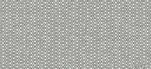
vescom > Wallpaper
Enhance your interiors with Vescom Fraser, a premium wallcovering featuring a striking 3-dimensional architectural weave in opaque, softly reflective shades. Made from high-performance polyethylene tape yarn, this versatile design is available with an acrylic backing or as an unbacked option, offering exceptional durability, elegance, and eco-conscious features. Bullet Points: 1️⃣ 🌿 Sustainable and Eco-Friendly Vescom Fraser is PFAS-free, low in VOC emissions (CAL 01350 certified), and compliant with the Living Building Challenge Red List. A perfect choice for those prioritizing sustainable and healthy interior solutions. 🌎 2️⃣ 🖌️ Stunning 3D Architectural Weave The dimensional weave design and softly reflective tones create an elegant and modern aesthetic, adding depth and texture to any space. Ideal for both residential and commercial interiors. 🎨 3️⃣ 📏 Flexible Material Options Available in widths of ±137 cm (±54 inches), Fraser comes with options for acrylic backing (2109.XXB) or unbacked (2109.XXU), ensuring adaptability to your specific project requirements. 📐 4️⃣ 🔥 Safety and Durability Guaranteed Certified flame retardant (EN 13501, B, s1 - d0), this wallcovering provides reliable safety and peace of mind. Its high lightfastness (ISO 105-B02, rating 8) ensures long-lasting vibrancy even in well-lit spaces. 🛡️ 5️⃣ 💧 Enhanced Breathability and Lightweight With water vapor permeability (<0.5 m SD value) and a weight range of ±242-293 gr/m² (±11-13 oz/yd²), Vescom Fraser is lightweight, breathable, and easy to install, making it a practical yet luxurious wall solution. 💪 Tags: Polyethylene Wallcovering, 3D Architectural Weave, Low VOC Wall Decor, PFAS-Free Wallcovering, Sustainable Interior Wall Design, Flame Retardant Wallcovering, Lightfast Wall Material, Water Vapor Permeable Wallcovering, Vescom Fraser Collection, Acrylic Backing Wallcovering
High Performance Vinyl Wallpaper by Vescom | fraser - 2109.07
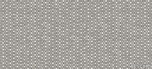
vescom > Wallpaper
Enhance your interiors with Vescom Fraser, a premium wallcovering featuring a striking 3-dimensional architectural weave in opaque, softly reflective shades. Made from high-performance polyethylene tape yarn, this versatile design is available with an acrylic backing or as an unbacked option, offering exceptional durability, elegance, and eco-conscious features. Bullet Points: 1️⃣ 🌿 Sustainable and Eco-Friendly Vescom Fraser is PFAS-free, low in VOC emissions (CAL 01350 certified), and compliant with the Living Building Challenge Red List. A perfect choice for those prioritizing sustainable and healthy interior solutions. 🌎 2️⃣ 🖌️ Stunning 3D Architectural Weave The dimensional weave design and softly reflective tones create an elegant and modern aesthetic, adding depth and texture to any space. Ideal for both residential and commercial interiors. 🎨 3️⃣ 📏 Flexible Material Options Available in widths of ±137 cm (±54 inches), Fraser comes with options for acrylic backing (2109.XXB) or unbacked (2109.XXU), ensuring adaptability to your specific project requirements. 📐 4️⃣ 🔥 Safety and Durability Guaranteed Certified flame retardant (EN 13501, B, s1 - d0), this wallcovering provides reliable safety and peace of mind. Its high lightfastness (ISO 105-B02, rating 8) ensures long-lasting vibrancy even in well-lit spaces. 🛡️ 5️⃣ 💧 Enhanced Breathability and Lightweight With water vapor permeability (<0.5 m SD value) and a weight range of ±242-293 gr/m² (±11-13 oz/yd²), Vescom Fraser is lightweight, breathable, and easy to install, making it a practical yet luxurious wall solution. 💪 Tags: Polyethylene Wallcovering, 3D Architectural Weave, Low VOC Wall Decor, PFAS-Free Wallcovering, Sustainable Interior Wall Design, Flame Retardant Wallcovering, Lightfast Wall Material, Water Vapor Permeable Wallcovering, Vescom Fraser Collection, Acrylic Backing Wallcovering
High Performance Vinyl Wallpaper by Vescom | dale - 2108.06
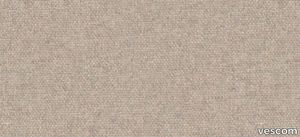
vescom > Wallpaper
Embrace sustainability and elegance with Vescom Dale, a natural wallcovering made with 70% post-consumer recycled wool. Offered in seven soft mélange tones, this high-quality wallcovering combines warmth, texture, and eco-conscious design to elevate your interiors with a touch of timeless sophistication. 1️⃣ 🌿 Sustainable Craftsmanship Vescom Dale features 70% post-consumer recycled wool, supported by a blend of polyester and polyamide on a non-woven backing. It's a luxurious and eco-friendly choice for environmentally mindful interior designs. 🌎 2️⃣ 🖌️ Elegant Mélange Tones Available in seven soft mélange hues, this wallcovering adds subtle sophistication and warmth to any room. The natural wool texture enhances both modern and traditional aesthetics. 🎨 3️⃣ 📏 Wide Coverage for Seamless Installation Measuring ±134 cm (±53 inches) in width, Dale wallcovering offers generous coverage and a flawless finish for large-scale applications. 📐 4️⃣ 🔥 Certified Safety and Durability This flame-retardant wallcovering meets EN 13501 (C, s1 - d0) and ASTM E84 standards, providing reliable safety for residential and commercial spaces. Superior lightfastness (ISO 105-B02 rating 8) ensures vibrant, long-lasting appeal. 🛡️ 5️⃣ 💧 Breathable and Lightweight Design With water vapor permeability (<0.5 m SD value) and a weight of ±310 gr/m² (±14 oz/yd²), Vescom Dale is not only lightweight but also breathable, enhancing the comfort and durability of your interiors. 💪 Tags: Recycled Wool Wallcovering, Mélange Tone Wall Design, Sustainable Wall Material, Natural Interior Design, Flame Retardant Wool Wallcovering, Lightweight Breathable Wallcovering, Vescom Dale Collection, Eco-Friendly Wall Solution, Textured Wall Decor, Non-Woven Backing Wallcovering
Earthtech FOG_FLAKES

florim > Wall tile-stone-brick
From an ancient past to a responsible future <p>The collection injects new life into the earth through a sustainable production process, with a strong focus on green management, to offer the architect an exceptional technical and aesthetic performance in compliance with the socio-environmental context and the latest eco-friendly building needs. With EARTHTECH earth becomes “technical earth” with a highly innovative content, offering new solutions to green architecture and fulfilling the new frontiers of circular economy in construction, guaranteeing a sustainable future. <br />EARTHTECH offers a choice of organic textures to observe and touch, thanks to the wide range of finishes (Comfort, Glossy-Bright and structured) which add a tactile and unexpected perceptive dimension for use in all types of application. <br /><a class="btn arrow" href="https://www.florim.com/en/surfaces/the-new-comfort-surface/"> Discover the new Comfort surface </a></p> <p>EARTHTECH/ is also a return to the origins of the Florim brand through a full body technical product that blends surface and thickness and derives from the spontaneous mixing of carefully pre-selected fragments and pigments of different shades which give the material a unique, one-of-a-kind visual effect in each slab, mimicking the amazing variety of colours and elements in nature. The result is a composite product with a textured design, in which the flakes and aggregate grains create an original mélange effect that is vitrified during firing, producing a robust, high-quality and exceptionally strong and wear-resistant product; one which can be used in any type of building setting and weather conditions, even the harshest.</p>
Rilievi Salvia

florim > Wall Paint
The alternation and symbiosis between concave and convex, recessed and raised. <p>Rilievi is a work of design balanced between different historic periods: while the volumetric relief tile modules are inspired by artistic experiments conducted in Italy during the Sixties and Seventies, the large slabs are the outcome of research into materials and technology that has only come to fruition in very recent times. The shadow effects generated on the surfaces of the slabs by the light striking the projecting parts of the modules create an unusual impression of architectural depth found virtually nowhere else in ceramic coverings, laying the bases for a new decoration interior design language.</p> This project simply embodies perfection - a term which certainly sets the bar high in a description of a new product for launch on the market. But when an enlightened manufacturer is capable of encapsulating a designer's personal research in a product to be added to its range, the outcome is a perfect synthesis. A perfect synthesis between untrammelled creativity and market trends. CEDIT had the insight needed to perceive, identify and rework the immense potential of Practice Practice Practice "“ a self-produced project by Zaven (Enrica Cavarzan and Marco Zavagno "“ and realised that its sophisticated design, originated by pure, pristine input (unadulterated by external factors except the noblest of them all, research) could provide the basis for an innovative, successful collection. I might add, a collection unique of its kind. Zaven is also a name that comes with guarantees; the two partners are good at what they do. Their work always starts from personal curiosity and investigations, the study of other stories (as in this case inspiration was drawn from the output of artist and activist Nino Caruso) and individual interests, which are broken down, developed, optimised and prepared for transformation into something fresh.Enrica Cavarzan and Marco Zavagno have a masterly ability to transform their own wishes and passions into design work of the greatest breadth and, as we see here, the widest, richest application. Their use of ceramics as a material is clearly outstanding and reflects a method precisely founded on the desire to look at things from an unusual viewpoint, under a different light. And to be daring. Zaven have an unconventional approach to convention. In the specific case of the Rilievi collection, the "modules" created for CEDIT seem to explode off the walls; in fact, they are constructed by combining the two-dimensional slab with its three-dimensional decor.Rilievi seems to be seeking space. More space. Even though these modules have actually established a dialogue with the wall from which they are born. At the same time, they hypnotise us with their tight sequence of lines, the pattern that is always different although its root is the same, and the intriguing, unusual colours that add another vital factor to the finished product. Their firm grounding in graphic design (and here we have come back to two-dimensional effects, of the kind most often associated with a wall covering) easily evolves into a facade which seems to have been carved with a chisel - although this is not the case. These modules are conceived to convey an impression of movement, and the three models, in seven colour combinations, create a powerful effect on a surface, which is never passive but rather an organic contributor to the forms and colours involved in the fascinating combinations. The slab is very much present and has the same worth and status as the relief pattern associated to it. In the light of this dichotomy between the linear and the sculpted, expressed through the skilfully balanced visual expedients, the use of repetition adds vigour to the module's intrinsic meaning. As we have seen, a rejection of facile, superficial creative dynamics in favour of an investigation reaching above and beyond has always been a central, clearly recognisable feature of this Venice-based duo, who already have impressive international partnerships to their credit, including the London Design Festival, the Kalmar Konstmuseum, the Paris Designer Days, Ca' Foscari University, the Venice Biennale, the Sandretto Re Rebaudengo Foundation, the Sindika Dokolo Foundation and the V-A-C Foundation, and also won the 2018 Wallpaper Design Award. Graphics, advertising and product design: the pair have always opted for a type of design closely linked to the observation of everyday items, followed by their reinterpretation in a version applied to experimentation with materials. This duality, combined with their energetic yet elegant visual language, forms Enrica and Marco's primary code, experienced in this specific context through serial carvings. On walls.
Archeologie Archeologie Bianco

florim > Wall Paint
The poetics of the wall. The forgotten wall. «A wall is like a book to be opened, a journey into the interior, revealing the experiences, memories, signs and symbols which this fragment of masonry has absorbed over the centuries.» Franco Guerzoni <p>It is difficult to resist the beauty of Franco Guerzoni's art, created by a rare harmony of feeling and intellect, poetry and mind. The artist expresses this through paintings which, although complex in structure, are joyous and sensual, with bright colours made, like those of the great masters of the past, from choice powdered ingredients. A painter with a technique rich in traditional skills, Guerzoni offers a version of modernity involving an intense fundamental relationship with his images and with space. In fact, the dialectic between painting and space, form and architecture, time and memory seems to be essential to his art. As his works specifically created for CEDIT clearly express, his creations achieve a perfect balance between the spatial dimension and intensely lyrical use of colour, which here becomes a soft, liquid form of matter, wandering across the surface of a dazzling lime-plaster white. White, metaphor for the clear light of day, as it was in the large, complex canvases exhibited in his personal exhibition at the 1990 Venice Biennale, is the background for forms of colour which renew the pleasure to be had from painting and the memory of an image glimpsed on the vast expanse of the surface. In the more recent works, these voluptuous shades are transformed into subtle shadows of colour that delicately caress the surface.</p> <p> </p> <p> All it takes is one wall, the only surviving wall of what was once a house, on which time has recorded its own, unavoidable passing, leaving traces of colour that is still vibrant, although faded in places, to allow the memory of the image to transpire, fragile and uncertain, in the physicality of the surface, to bear tangible witness to the existence of history, a mysterious visual memory, the extension into the present of the life of things. A memory of the past on a contemporary wall. The idea of memory is central to Franco Guerzoni's poetics: private, secret memory and the collective memory of the past. Fragmentary and indecipherable, perceived by the artist with the aid of what is left of the images, the fragment. A relic of a totality which can no longer be reconstructed but only imagined in poetic terms, the fragment, a fraction of an image conserved by time, guides the artist's fantastic archaeological journey in search of the world's memory. However, this journey takes him in the opposite direction to the archaeologist, for whom the fragment - fundamental because it reveals a trace of the past is the starting-point for an attempt to reconstruct history. For Guerzoni, the fragment is the endpoint of his work, the goal for which he strives in his investigation of the surface, as he digs deep down, leafing through the deposits of time and memory.</p> <p> </p> <p>Like the large pages of a book traced with fragile sketches, embryonic forms whose meaning has been lost in time, leaving only fleeting traces, uncertain, ambiguous, mysterious morphologies. It marks the start of a journey into the mind of the artist-archaeologist, an adventurous journey into the inextricable labyrinth of the mind, to unearth what is hidden, shuffling the cards in a perennial contamination of images, memory, signs and traces, in search of a meaning, which no sooner appears than it is lost, merging into time and once again becoming a dream, an imaginary journey into fantasy and wonder. And this is the case in the tryptic created for CEDIT, which placed a new challenge before the artist: to transfer "his" image, the remains and fragments of a forgotten wall onto a new material for him “stunning, large-sized ceramic slabs“ and a real wall, without this tautology betraying the painting's deep meaning, its fertile magic of lines and colours, from which the image is born. And the artist is fully aware of this. Guerzoni describes his art as a "gamble": a gamble that is a critical test, an act of daring, dangerous and risky. This is the challenge he sets himself. It is a challenge he easily overcomes, expressing himself on these large walls with a rediscovered pleasure in painting, no longer restrained and apparently absorbed by the dense, uneven coloured surface but set free and almost luxuriously accentuated. In his large, demanding works for CEDIT, Guerzoni achieves a new, consummate mode of painting, in which the architecture of the surfaces provides a poetic meeting-point between the two founding components of his style, the complex, well thought-out composition and the lyricism of colour.</p>
LAB MEETING ZXLA - Height-adjustable fabric office chair _ Inno
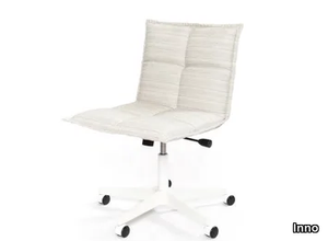
Inno > Chair
Lab Meeting L ZXLA: An Ergonomic and Versatile Meeting Chair for Modern Workspaces Introduction The Lab Meeting L ZXLA is a meticulously designed meeting chair that combines ergonomic comfort with modern aesthetics, making it an ideal choice for contemporary work environments. Part of the renowned Lab product family by Inno, this chair is crafted to enhance comfort and functionality in meeting rooms, conference spaces, and multi-functional work areas. inno.fi Design and Aesthetics The Lab Meeting L ZXLA features a sleek and minimalist design characterized by clean lines and a refined silhouette. Its modern appearance is complemented by a soft quilted seat, adding a touch of sophistication while ensuring maximum comfort during extended meetings or work sessions. The chair's understated elegance allows it to integrate seamlessly into various interior design styles, from minimalist to industrial chic. Materials and Finishes Inno offers a diverse selection of materials and finishes for the Lab Meeting L ZXLA, enabling customization to suit specific aesthetic preferences and functional requirements. The upholstery options include high-quality fabrics such as Gabriel Step Melange, Fame, Crisp, and Europost 2, each available in a wide array of colors. These fabrics are known for their durability, soft texture, and vibrant hues, allowing designers to create a cohesive look that aligns with the overall interior theme. The chair's frame is available in several finishes, including: Crystal Aluminium: Offers a sleek, metallic appearance that complements modern interiors. Silver Aluminium: Provides a subtle sheen, adding a touch of elegance without overpowering the space. Metallic Grey: Introduces a contemporary and industrial feel, suitable for cutting-edge office designs. Effect White: Creates a clean and crisp look, ideal for minimalist environments. Matte White: Delivers a soft and understated finish, blending seamlessly with neutral palettes. Matte Black: Adds a bold and sophisticated touch, perfect for creating contrast in lighter settings. Effect Black: Features a textured finish that adds depth and interest to the chair's design. These finish options provide flexibility in achieving the desired aesthetic for any professional setting. Dimensions and Ergonomic Features While specific dimensions are not provided in the available information, the Lab Meeting L ZXLA is designed with ergonomics in mind. It features a 5-star cross base equipped with castors, facilitating smooth mobility across various floor surfaces. The chair also includes a height adjustment mechanism, allowing users to customize the seating position for optimal comfort and posture support during meetings or collaborative sessions. Suitable Environments The versatility and thoughtful design of the Lab Meeting L ZXLA make it suitable for a wide range of applications: Corporate Offices: Ideal for conference rooms, boardrooms, and executive offices where comfort and professionalism are paramount. Educational Institutions: Suitable for seminar rooms, lecture halls, and administrative offices, providing ergonomic support for extended periods. Hospitality Settings: Enhances guest experiences in hotel business centers, meeting rooms, and collaborative lounges. Co-Working Spaces: Fits seamlessly into modern co-working environments, offering flexibility and comfort to diverse users. Lab Product Family and Recognition The Lab Meeting L ZXLA is part of Inno's broader Lab product family, which includes a wide range of chairs, tables, and sofas designed to bring comfort and coziness into everyday working environments. This collection emphasizes versatility and cohesive design, allowing for the creation of harmonious interior landscapes. Notably, the Lab product family has been honored with the internationally recognized GOOD DESIGN™ 2015 Award, presented by The Chicago Athenaeum: Museum of Architecture and Design in collaboration with the European Centre for Architecture, Art, Design, and Urban Studies. This accolade underscores the collection's excellence in design, innovation, and functionality. Alternatives For those seeking alternative options within the Lab product family, Inno offers various configurations to suit different needs: Lab Meeting L ZXL: Similar to the L ZXLA model but without armrests, offering a more streamlined appearance. Lab Meeting L ZXC: Features a cantilever base, providing a different aesthetic and seating experience. Lab Lounge: A lower seating option with a more relaxed posture, suitable for lounge areas and informal meeting spaces. These alternatives allow for cohesive design across various areas within a workspace, maintaining a unified aesthetic while catering to different functional requirements. Conclusion The Lab Meeting L ZXLA by Inno exemplifies the fusion of modern design, ergonomic functionality, and customizable aesthetics. Its adaptability to various professional environments, coupled with the recognition from prestigious design awards, makes it a standout choice for those seeking to enhance their interiors with stylish and comfortable seating solutions.
Araldica Base Corallo
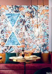
florim > Wall Paint
The miscellany of bright, contrasting, pure colours. The manifest extroversion of decor. The solutions provided to complete the range are in a different tone: reflecting the desire to "stage" a clear contrast with the multicolour ceramic wall coverings, these slabs are in completely neutral shades, in the grey frequencies of concrete.<br /><br />«The collection is intended to create a struggle, a fight. Between something very stiff, which sees itself as governed by clear rules, and a variable, marbled paper, which aims to be completely free.»<br />Federico Pepe "Once upon a time, there was a Roman emperor who lived on a huge splinter in space, a spaceship of multi-coloured marble, where techno music played incessantly. That day he left his spaceship to go to dinner at the Sun King's home, riding his sinuous golden dragon with blood-red eyes."If there were a book with these opening words, Federico Pepe would have designed its cover. And if the book were made into a film, he would definitely be its writer and director. Federico is not an author, director or screenwriter, but this does not prevent him from drawing on his natural ability to create stories through flashes of imagination.Federico Pepe's career started in advertising, a family tradition, which he gradually transformed and built into many other things, in a constant, inevitable investigation of creativity in all its possible forms. He very soon understood that commission work was not enough for him, and he began to explore further afield. The first of these other fields was art, but the consolidated mechanisms on which galleries and gallery owners operate soon became a new limit from which he had to break free: this apparently expanding horizon turned out to be a restrictive cage, more a defining label than an infinite learning opportunity. And definitions are one of the things which least describe Federico: anyone trying to distil his work into two words would find its essence disappearing before their own eyes. He has occupied many roles and engaged in many professions to give shape to his ideas, and in all of them he has excelled, created and led teams, and won awards. Adman, creative director, graphic designer, printer, gallery owner, publisher, curator, performer, painter, designer, director: Pepe does, rather than is, all these.<br /> He works, builds and makes things happen because he is not led by instinct alone and does not succumb to idle whim; he does not rush aimlessly around and does not simply await the inspiration or idea of the century. Quite the opposite. His work comes about and produces results only thanks to strict self-discipline, a design method made up of constant verification, the precise sharing of tasks and roles, the compulsive exploration of unknown contexts, daily physical exercise, the carefully measured use of social media, and occasional spells of isolation in the mountains he loves. It is no coincidence that he created Le Dictateur, a dual-faced entity which may be both his child and his spiritual guide, both friend and boss, part madness and part dictator. Le Dictateur is not Federico's alter ego: it is his superpower. It is not a mask, since in it he actually transforms himself into an artistic project.Le Dictateur is both result and origin of Federico Pepe's work. "I think ideas are born from predisposition," Federico explained to me in 2014. "Not in the sense that "˜we are born predisposed,' but for daily preparation. In this domain I believe that discipline is pivotal. The real talents today are very rigorous people, those who work hard, exchange a lot, think a lot, and know how to apply and balance many different things." An approach which has made him the best-kept secret on the Italian creative scene, a fact well known not only to Pierpaolo Ferrari, Maurizio Cattelan, Nico Vascellari, Jacopo Benassi and Patricia Urquiola, but also to the companies, both large and small, which have turned to him over the years. He has worked and continues to work with them all, designing by laying the foundations of designs naturally expressed in episodes, in a serial pattern which not only gradually builds up Federico's own creative story, but also offers his clients designs so special that they would be virtually impossible without him.<br /> This self-discipline generates heat and energy in such quantities that "“ if it were not imprisoned within the geometrical grids of graphic design "“ it might generate a thermonuclear reaction. The blood running through the veins of his images is black as ink, red as sealing-wax, white as plaster and golden as lava. But there is more, too. His crystal-clear visions are able to break down the slender membrane which separates analogue from digital. He sees matter as absolutely central, but he makes it vibrate with an unusual two-dimensional quality. This can be seen in the way he carves marble with coloured squiggles, recollections of faces briefly sketched as vectors. It is discovered in the skill with which he invades plates and bowls of the finest, monitor-shiny porcelain with geometrical patterns. It becomes tangible in the love with which he brings to life the paper of his publishing projects, peopled with highly elegant, powerfully symmetrical, often kaleidoscopic graphics. It can be admired in the precision with which a metallic factory flooring becomes fabric on an ancient loom, after its resolution is decreased from 300 dpi to 8 bits. It is enjoyed in the hyperbolic repetition of faces and hands in acrylic on canvas in his painting studio, in which every work conserves copy and paste reminders of its predecessor. It amazes in the doors of exquisite metal sideboards, profane glass panels, hand-made but born through the glass of a screen.<br /> A career which has led almost naturally to an encounter with CEDIT, with whom he has created an aesthetically courageous collection, part punk and part aristocratic austerity. The Araldica project's very name evokes strength and nobility, and it is grounded in a past whose weight does not drag it backwards but rather catapults it forwards into the future. Here, Federico's digital geometries become the most solid of materials, taking shape in a graphic object, condensing stories and images into three or two dimensions. In Pepe's and CEDIT's space, Euclidean geometrical forms encounter the marble of Phidias, the intricate patterns of the floor of Milan Cathedral merge into the Baroque images of the marbles found in Roman art galleries, and private space opens out to the infinite space of a thousand possible universal histories.
Araldica Base Blu

florim > Wall Paint
The miscellany of bright, contrasting, pure colours. The manifest extroversion of decor. The solutions provided to complete the range are in a different tone: reflecting the desire to "stage" a clear contrast with the multicolour ceramic wall coverings, these slabs are in completely neutral shades, in the grey frequencies of concrete.<br /><br />«The collection is intended to create a struggle, a fight. Between something very stiff, which sees itself as governed by clear rules, and a variable, marbled paper, which aims to be completely free.»<br />Federico Pepe "Once upon a time, there was a Roman emperor who lived on a huge splinter in space, a spaceship of multi-coloured marble, where techno music played incessantly. That day he left his spaceship to go to dinner at the Sun King's home, riding his sinuous golden dragon with blood-red eyes."If there were a book with these opening words, Federico Pepe would have designed its cover. And if the book were made into a film, he would definitely be its writer and director. Federico is not an author, director or screenwriter, but this does not prevent him from drawing on his natural ability to create stories through flashes of imagination.Federico Pepe's career started in advertising, a family tradition, which he gradually transformed and built into many other things, in a constant, inevitable investigation of creativity in all its possible forms. He very soon understood that commission work was not enough for him, and he began to explore further afield. The first of these other fields was art, but the consolidated mechanisms on which galleries and gallery owners operate soon became a new limit from which he had to break free: this apparently expanding horizon turned out to be a restrictive cage, more a defining label than an infinite learning opportunity. And definitions are one of the things which least describe Federico: anyone trying to distil his work into two words would find its essence disappearing before their own eyes. He has occupied many roles and engaged in many professions to give shape to his ideas, and in all of them he has excelled, created and led teams, and won awards. Adman, creative director, graphic designer, printer, gallery owner, publisher, curator, performer, painter, designer, director: Pepe does, rather than is, all these.<br /> He works, builds and makes things happen because he is not led by instinct alone and does not succumb to idle whim; he does not rush aimlessly around and does not simply await the inspiration or idea of the century. Quite the opposite. His work comes about and produces results only thanks to strict self-discipline, a design method made up of constant verification, the precise sharing of tasks and roles, the compulsive exploration of unknown contexts, daily physical exercise, the carefully measured use of social media, and occasional spells of isolation in the mountains he loves. It is no coincidence that he created Le Dictateur, a dual-faced entity which may be both his child and his spiritual guide, both friend and boss, part madness and part dictator. Le Dictateur is not Federico's alter ego: it is his superpower. It is not a mask, since in it he actually transforms himself into an artistic project.Le Dictateur is both result and origin of Federico Pepe's work. "I think ideas are born from predisposition," Federico explained to me in 2014. "Not in the sense that "˜we are born predisposed,' but for daily preparation. In this domain I believe that discipline is pivotal. The real talents today are very rigorous people, those who work hard, exchange a lot, think a lot, and know how to apply and balance many different things." An approach which has made him the best-kept secret on the Italian creative scene, a fact well known not only to Pierpaolo Ferrari, Maurizio Cattelan, Nico Vascellari, Jacopo Benassi and Patricia Urquiola, but also to the companies, both large and small, which have turned to him over the years. He has worked and continues to work with them all, designing by laying the foundations of designs naturally expressed in episodes, in a serial pattern which not only gradually builds up Federico's own creative story, but also offers his clients designs so special that they would be virtually impossible without him.<br /> This self-discipline generates heat and energy in such quantities that "“ if it were not imprisoned within the geometrical grids of graphic design "“ it might generate a thermonuclear reaction. The blood running through the veins of his images is black as ink, red as sealing-wax, white as plaster and golden as lava. But there is more, too. His crystal-clear visions are able to break down the slender membrane which separates analogue from digital. He sees matter as absolutely central, but he makes it vibrate with an unusual two-dimensional quality. This can be seen in the way he carves marble with coloured squiggles, recollections of faces briefly sketched as vectors. It is discovered in the skill with which he invades plates and bowls of the finest, monitor-shiny porcelain with geometrical patterns. It becomes tangible in the love with which he brings to life the paper of his publishing projects, peopled with highly elegant, powerfully symmetrical, often kaleidoscopic graphics. It can be admired in the precision with which a metallic factory flooring becomes fabric on an ancient loom, after its resolution is decreased from 300 dpi to 8 bits. It is enjoyed in the hyperbolic repetition of faces and hands in acrylic on canvas in his painting studio, in which every work conserves copy and paste reminders of its predecessor. It amazes in the doors of exquisite metal sideboards, profane glass panels, hand-made but born through the glass of a screen.<br /> A career which has led almost naturally to an encounter with CEDIT, with whom he has created an aesthetically courageous collection, part punk and part aristocratic austerity. The Araldica project's very name evokes strength and nobility, and it is grounded in a past whose weight does not drag it backwards but rather catapults it forwards into the future. Here, Federico's digital geometries become the most solid of materials, taking shape in a graphic object, condensing stories and images into three or two dimensions. In Pepe's and CEDIT's space, Euclidean geometrical forms encounter the marble of Phidias, the intricate patterns of the floor of Milan Cathedral merge into the Baroque images of the marbles found in Roman art galleries, and private space opens out to the infinite space of a thousand possible universal histories.
Cromatica Gradiente bianco-rosa
florim > Wall Paint
A lexicon of colour shades for mixing. A large size and its submultiples. «This work represents a reflection on colour, and above all a proposal on how to transfer the multiplicity of shades typical of a hand-crafted piece into a project produced on a large scale.» Andrea Trimarchi & Simone Farresin Studio Formafantasma base their work in the design world on a strong vocation for research. Simone Farresin and Andrea Trimarchi view every project as an opportunity for study and the acquisition of new knowledge, and their love of speculation establishes a dialectic rapport with the situations offered by each new client. Whether it involves a material, a type or a production method, the first phase of their design process is the mapping of what the specific case places at their disposal. With Cedit, an analysis of the company's past and present was central to the inputs. Inevitably, since "Looking back to look forward" has been the design duo's mission statement for years. In this case, in particular, the company's history was a real treasure trove, a fine blend of memory and technology: on the one hand, the excellence of production technologies now extended with the added potential arising from the engineering of large-sized ceramic tiles, and on the other a wealth of experience build up with great designers of the past, from Zanuso to Noorda, through to <strong>Ettore Sottsass</strong>. Andrea and Simone decided to focus on Sottsass - who started designing for Cedit back in the late Seventies - and made an in-depth study of one of the colour charts he developed towards the end of the Nineties. A spread of colours which gave its name to the "41 Colors" collection, included in the catalogue of the period as a real alphabet for what has proved to be a lasting design language. Colour was much more than just a compulsory step in the dialogue between designer and producer, since Sottsass had already discovered the power of the mystery intrinsic to this universe of invention.<br /><br />With Cedit the master-designer, a long-established lover of ceramics and their crafted unpredictability, found a way of transferring his personal feeling for colour to a wide audience, through industrial mass production. And this assumption is another factor Formafantasma have inherited, interpreting it today with new, even more efficient technical resources just as capable of expressing the secrets of colour. «The concept of colour "in isolation" - Sottsass explained in a 1992 text - classified colour, Pantone, as they call it now, "scientific" colour, is something I still refuse to accept. (...) Colours, the idea of colour, are always intangible, they slip slowly away like words, that run through your fingers, like poetry, which you can never keep hold of, like a good story.» And Formafantasma seem to have chosen that distinction between colour "in isolation" and "intangible" yet ever-present colour as the basis of their work. However, their approach draws on their unique vocation for research and the technical resources of the third millennium. «This work - they explain to us - is a reflection on colour, and above all on <strong>how to bring the multiplicity of shades typical of a hand-crafted piece into a large-scale project</strong>.» The designers look at large, monochrome slabs and turn to the engineers for details of their secrets, their processing stages, the phases in their production. They appreciate that the colour of ceramic material, its ineffable secret, can still be present in the series and large tile sizes in which Cedit leads the way. They understand that this is, in itself, an expressive power which does not need channelling into forms, motifs and signs. But above all, they treat the surface as a large canvas on which they spread pure colour, which tends to be uniform but in fact is never really a "scientific", totally monochrome hue: it is not a Pantone. And this is the source of the fundamental insight, which only children of the transition from the analogue to the digital era could achieve, the reward for those who draw on the past to look to the future.<br /><br />The designers cut the slab into lots of regular pieces, not necessarily of the same size. They restore its identity as a "tile", a familiar name with something ancient about it, but which stands for a module, a unit of measurement, a building block. There is nothing nostalgic about this - on the contrary, the vision is completely new, and the portions of slab created can be reassembled with no restrictions, breaking down the unity of the whole and reviving its essence starting from its structure. As the cards in the pack are shuffled, what emerges is not a figure or motif but the representation of colour itself and its physical nature. It is live matter, born from the meeting of vibrating forces, the mixing of ever-varying percentages of the basic ingredients. And Formafantasma present us with the corpuscular, fragmented essence of these small frames of space and crystallised time, which reveal the code and formula of their composition. So Cromatica is a collection made up of six colours which actually have an infinite number of declinations and compositional possibilities. It is a "discrete" combination in the mathematical sense of the term, capable of generating multiple, variable subsets. At the same time, each slab can be used in its entirety, leaving the impression of analogue continuity unchanged. But what really amazes is the comparison and dialogue between the two approaches: a stroke of genius, laying clear the mysterious appeal the artificial reproduction of colour has always held for mankind. Because, as Sottsass said, «colours are language, a powerful, magical, intangible, flexible, continuous material, in which existence is made manifest, the existence that lives in time and space».
Cromatica Grigio

florim > Wall Paint
A lexicon of colour shades for mixing. A large size and its submultiples. «This work represents a reflection on colour, and above all a proposal on how to transfer the multiplicity of shades typical of a hand-crafted piece into a project produced on a large scale.» Andrea Trimarchi & Simone Farresin Studio Formafantasma base their work in the design world on a strong vocation for research. Simone Farresin and Andrea Trimarchi view every project as an opportunity for study and the acquisition of new knowledge, and their love of speculation establishes a dialectic rapport with the situations offered by each new client. Whether it involves a material, a type or a production method, the first phase of their design process is the mapping of what the specific case places at their disposal. With Cedit, an analysis of the company's past and present was central to the inputs. Inevitably, since "Looking back to look forward" has been the design duo's mission statement for years. In this case, in particular, the company's history was a real treasure trove, a fine blend of memory and technology: on the one hand, the excellence of production technologies now extended with the added potential arising from the engineering of large-sized ceramic tiles, and on the other a wealth of experience build up with great designers of the past, from Zanuso to Noorda, through to <strong>Ettore Sottsass</strong>. Andrea and Simone decided to focus on Sottsass - who started designing for Cedit back in the late Seventies - and made an in-depth study of one of the colour charts he developed towards the end of the Nineties. A spread of colours which gave its name to the "41 Colors" collection, included in the catalogue of the period as a real alphabet for what has proved to be a lasting design language. Colour was much more than just a compulsory step in the dialogue between designer and producer, since Sottsass had already discovered the power of the mystery intrinsic to this universe of invention.<br /><br />With Cedit the master-designer, a long-established lover of ceramics and their crafted unpredictability, found a way of transferring his personal feeling for colour to a wide audience, through industrial mass production. And this assumption is another factor Formafantasma have inherited, interpreting it today with new, even more efficient technical resources just as capable of expressing the secrets of colour. «The concept of colour "in isolation" - Sottsass explained in a 1992 text - classified colour, Pantone, as they call it now, "scientific" colour, is something I still refuse to accept. (...) Colours, the idea of colour, are always intangible, they slip slowly away like words, that run through your fingers, like poetry, which you can never keep hold of, like a good story.» And Formafantasma seem to have chosen that distinction between colour "in isolation" and "intangible" yet ever-present colour as the basis of their work. However, their approach draws on their unique vocation for research and the technical resources of the third millennium. «This work - they explain to us - is a reflection on colour, and above all on <strong>how to bring the multiplicity of shades typical of a hand-crafted piece into a large-scale project</strong>.» The designers look at large, monochrome slabs and turn to the engineers for details of their secrets, their processing stages, the phases in their production. They appreciate that the colour of ceramic material, its ineffable secret, can still be present in the series and large tile sizes in which Cedit leads the way. They understand that this is, in itself, an expressive power which does not need channelling into forms, motifs and signs. But above all, they treat the surface as a large canvas on which they spread pure colour, which tends to be uniform but in fact is never really a "scientific", totally monochrome hue: it is not a Pantone. And this is the source of the fundamental insight, which only children of the transition from the analogue to the digital era could achieve, the reward for those who draw on the past to look to the future.<br /><br />The designers cut the slab into lots of regular pieces, not necessarily of the same size. They restore its identity as a "tile", a familiar name with something ancient about it, but which stands for a module, a unit of measurement, a building block. There is nothing nostalgic about this - on the contrary, the vision is completely new, and the portions of slab created can be reassembled with no restrictions, breaking down the unity of the whole and reviving its essence starting from its structure. As the cards in the pack are shuffled, what emerges is not a figure or motif but the representation of colour itself and its physical nature. It is live matter, born from the meeting of vibrating forces, the mixing of ever-varying percentages of the basic ingredients. And Formafantasma present us with the corpuscular, fragmented essence of these small frames of space and crystallised time, which reveal the code and formula of their composition. So Cromatica is a collection made up of six colours which actually have an infinite number of declinations and compositional possibilities. It is a "discrete" combination in the mathematical sense of the term, capable of generating multiple, variable subsets. At the same time, each slab can be used in its entirety, leaving the impression of analogue continuity unchanged. But what really amazes is the comparison and dialogue between the two approaches: a stroke of genius, laying clear the mysterious appeal the artificial reproduction of colour has always held for mankind. Because, as Sottsass said, «colours are language, a powerful, magical, intangible, flexible, continuous material, in which existence is made manifest, the existence that lives in time and space».
Araldica Base Grigio

florim > Wall Paint
The miscellany of bright, contrasting, pure colours. The manifest extroversion of decor. The solutions provided to complete the range are in a different tone: reflecting the desire to "stage" a clear contrast with the multicolour ceramic wall coverings, these slabs are in completely neutral shades, in the grey frequencies of concrete.<br /><br />«The collection is intended to create a struggle, a fight. Between something very stiff, which sees itself as governed by clear rules, and a variable, marbled paper, which aims to be completely free.»<br />Federico Pepe "Once upon a time, there was a Roman emperor who lived on a huge splinter in space, a spaceship of multi-coloured marble, where techno music played incessantly. That day he left his spaceship to go to dinner at the Sun King's home, riding his sinuous golden dragon with blood-red eyes."If there were a book with these opening words, Federico Pepe would have designed its cover. And if the book were made into a film, he would definitely be its writer and director. Federico is not an author, director or screenwriter, but this does not prevent him from drawing on his natural ability to create stories through flashes of imagination.Federico Pepe's career started in advertising, a family tradition, which he gradually transformed and built into many other things, in a constant, inevitable investigation of creativity in all its possible forms. He very soon understood that commission work was not enough for him, and he began to explore further afield. The first of these other fields was art, but the consolidated mechanisms on which galleries and gallery owners operate soon became a new limit from which he had to break free: this apparently expanding horizon turned out to be a restrictive cage, more a defining label than an infinite learning opportunity. And definitions are one of the things which least describe Federico: anyone trying to distil his work into two words would find its essence disappearing before their own eyes. He has occupied many roles and engaged in many professions to give shape to his ideas, and in all of them he has excelled, created and led teams, and won awards. Adman, creative director, graphic designer, printer, gallery owner, publisher, curator, performer, painter, designer, director: Pepe does, rather than is, all these.<br /> He works, builds and makes things happen because he is not led by instinct alone and does not succumb to idle whim; he does not rush aimlessly around and does not simply await the inspiration or idea of the century. Quite the opposite. His work comes about and produces results only thanks to strict self-discipline, a design method made up of constant verification, the precise sharing of tasks and roles, the compulsive exploration of unknown contexts, daily physical exercise, the carefully measured use of social media, and occasional spells of isolation in the mountains he loves. It is no coincidence that he created Le Dictateur, a dual-faced entity which may be both his child and his spiritual guide, both friend and boss, part madness and part dictator. Le Dictateur is not Federico's alter ego: it is his superpower. It is not a mask, since in it he actually transforms himself into an artistic project.Le Dictateur is both result and origin of Federico Pepe's work. "I think ideas are born from predisposition," Federico explained to me in 2014. "Not in the sense that "˜we are born predisposed,' but for daily preparation. In this domain I believe that discipline is pivotal. The real talents today are very rigorous people, those who work hard, exchange a lot, think a lot, and know how to apply and balance many different things." An approach which has made him the best-kept secret on the Italian creative scene, a fact well known not only to Pierpaolo Ferrari, Maurizio Cattelan, Nico Vascellari, Jacopo Benassi and Patricia Urquiola, but also to the companies, both large and small, which have turned to him over the years. He has worked and continues to work with them all, designing by laying the foundations of designs naturally expressed in episodes, in a serial pattern which not only gradually builds up Federico's own creative story, but also offers his clients designs so special that they would be virtually impossible without him.<br /> This self-discipline generates heat and energy in such quantities that "“ if it were not imprisoned within the geometrical grids of graphic design "“ it might generate a thermonuclear reaction. The blood running through the veins of his images is black as ink, red as sealing-wax, white as plaster and golden as lava. But there is more, too. His crystal-clear visions are able to break down the slender membrane which separates analogue from digital. He sees matter as absolutely central, but he makes it vibrate with an unusual two-dimensional quality. This can be seen in the way he carves marble with coloured squiggles, recollections of faces briefly sketched as vectors. It is discovered in the skill with which he invades plates and bowls of the finest, monitor-shiny porcelain with geometrical patterns. It becomes tangible in the love with which he brings to life the paper of his publishing projects, peopled with highly elegant, powerfully symmetrical, often kaleidoscopic graphics. It can be admired in the precision with which a metallic factory flooring becomes fabric on an ancient loom, after its resolution is decreased from 300 dpi to 8 bits. It is enjoyed in the hyperbolic repetition of faces and hands in acrylic on canvas in his painting studio, in which every work conserves copy and paste reminders of its predecessor. It amazes in the doors of exquisite metal sideboards, profane glass panels, hand-made but born through the glass of a screen.<br /> A career which has led almost naturally to an encounter with CEDIT, with whom he has created an aesthetically courageous collection, part punk and part aristocratic austerity. The Araldica project's very name evokes strength and nobility, and it is grounded in a past whose weight does not drag it backwards but rather catapults it forwards into the future. Here, Federico's digital geometries become the most solid of materials, taking shape in a graphic object, condensing stories and images into three or two dimensions. In Pepe's and CEDIT's space, Euclidean geometrical forms encounter the marble of Phidias, the intricate patterns of the floor of Milan Cathedral merge into the Baroque images of the marbles found in Roman art galleries, and private space opens out to the infinite space of a thousand possible universal histories.
Araldica Base Azzurro

florim > Wall Paint
The miscellany of bright, contrasting, pure colours. The manifest extroversion of decor. The solutions provided to complete the range are in a different tone: reflecting the desire to "stage" a clear contrast with the multicolour ceramic wall coverings, these slabs are in completely neutral shades, in the grey frequencies of concrete.<br /><br />«The collection is intended to create a struggle, a fight. Between something very stiff, which sees itself as governed by clear rules, and a variable, marbled paper, which aims to be completely free.»<br />Federico Pepe "Once upon a time, there was a Roman emperor who lived on a huge splinter in space, a spaceship of multi-coloured marble, where techno music played incessantly. That day he left his spaceship to go to dinner at the Sun King's home, riding his sinuous golden dragon with blood-red eyes."If there were a book with these opening words, Federico Pepe would have designed its cover. And if the book were made into a film, he would definitely be its writer and director. Federico is not an author, director or screenwriter, but this does not prevent him from drawing on his natural ability to create stories through flashes of imagination.Federico Pepe's career started in advertising, a family tradition, which he gradually transformed and built into many other things, in a constant, inevitable investigation of creativity in all its possible forms. He very soon understood that commission work was not enough for him, and he began to explore further afield. The first of these other fields was art, but the consolidated mechanisms on which galleries and gallery owners operate soon became a new limit from which he had to break free: this apparently expanding horizon turned out to be a restrictive cage, more a defining label than an infinite learning opportunity. And definitions are one of the things which least describe Federico: anyone trying to distil his work into two words would find its essence disappearing before their own eyes. He has occupied many roles and engaged in many professions to give shape to his ideas, and in all of them he has excelled, created and led teams, and won awards. Adman, creative director, graphic designer, printer, gallery owner, publisher, curator, performer, painter, designer, director: Pepe does, rather than is, all these.<br /> He works, builds and makes things happen because he is not led by instinct alone and does not succumb to idle whim; he does not rush aimlessly around and does not simply await the inspiration or idea of the century. Quite the opposite. His work comes about and produces results only thanks to strict self-discipline, a design method made up of constant verification, the precise sharing of tasks and roles, the compulsive exploration of unknown contexts, daily physical exercise, the carefully measured use of social media, and occasional spells of isolation in the mountains he loves. It is no coincidence that he created Le Dictateur, a dual-faced entity which may be both his child and his spiritual guide, both friend and boss, part madness and part dictator. Le Dictateur is not Federico's alter ego: it is his superpower. It is not a mask, since in it he actually transforms himself into an artistic project.Le Dictateur is both result and origin of Federico Pepe's work. "I think ideas are born from predisposition," Federico explained to me in 2014. "Not in the sense that "˜we are born predisposed,' but for daily preparation. In this domain I believe that discipline is pivotal. The real talents today are very rigorous people, those who work hard, exchange a lot, think a lot, and know how to apply and balance many different things." An approach which has made him the best-kept secret on the Italian creative scene, a fact well known not only to Pierpaolo Ferrari, Maurizio Cattelan, Nico Vascellari, Jacopo Benassi and Patricia Urquiola, but also to the companies, both large and small, which have turned to him over the years. He has worked and continues to work with them all, designing by laying the foundations of designs naturally expressed in episodes, in a serial pattern which not only gradually builds up Federico's own creative story, but also offers his clients designs so special that they would be virtually impossible without him.<br /> This self-discipline generates heat and energy in such quantities that "“ if it were not imprisoned within the geometrical grids of graphic design "“ it might generate a thermonuclear reaction. The blood running through the veins of his images is black as ink, red as sealing-wax, white as plaster and golden as lava. But there is more, too. His crystal-clear visions are able to break down the slender membrane which separates analogue from digital. He sees matter as absolutely central, but he makes it vibrate with an unusual two-dimensional quality. This can be seen in the way he carves marble with coloured squiggles, recollections of faces briefly sketched as vectors. It is discovered in the skill with which he invades plates and bowls of the finest, monitor-shiny porcelain with geometrical patterns. It becomes tangible in the love with which he brings to life the paper of his publishing projects, peopled with highly elegant, powerfully symmetrical, often kaleidoscopic graphics. It can be admired in the precision with which a metallic factory flooring becomes fabric on an ancient loom, after its resolution is decreased from 300 dpi to 8 bits. It is enjoyed in the hyperbolic repetition of faces and hands in acrylic on canvas in his painting studio, in which every work conserves copy and paste reminders of its predecessor. It amazes in the doors of exquisite metal sideboards, profane glass panels, hand-made but born through the glass of a screen.<br /> A career which has led almost naturally to an encounter with CEDIT, with whom he has created an aesthetically courageous collection, part punk and part aristocratic austerity. The Araldica project's very name evokes strength and nobility, and it is grounded in a past whose weight does not drag it backwards but rather catapults it forwards into the future. Here, Federico's digital geometries become the most solid of materials, taking shape in a graphic object, condensing stories and images into three or two dimensions. In Pepe's and CEDIT's space, Euclidean geometrical forms encounter the marble of Phidias, the intricate patterns of the floor of Milan Cathedral merge into the Baroque images of the marbles found in Roman art galleries, and private space opens out to the infinite space of a thousand possible universal histories.
Cromatica Cobalto

florim > Wall Paint
A lexicon of colour shades for mixing. A large size and its submultiples. «This work represents a reflection on colour, and above all a proposal on how to transfer the multiplicity of shades typical of a hand-crafted piece into a project produced on a large scale.» Andrea Trimarchi & Simone Farresin Studio Formafantasma base their work in the design world on a strong vocation for research. Simone Farresin and Andrea Trimarchi view every project as an opportunity for study and the acquisition of new knowledge, and their love of speculation establishes a dialectic rapport with the situations offered by each new client. Whether it involves a material, a type or a production method, the first phase of their design process is the mapping of what the specific case places at their disposal. With Cedit, an analysis of the company's past and present was central to the inputs. Inevitably, since "Looking back to look forward" has been the design duo's mission statement for years. In this case, in particular, the company's history was a real treasure trove, a fine blend of memory and technology: on the one hand, the excellence of production technologies now extended with the added potential arising from the engineering of large-sized ceramic tiles, and on the other a wealth of experience build up with great designers of the past, from Zanuso to Noorda, through to <strong>Ettore Sottsass</strong>. Andrea and Simone decided to focus on Sottsass - who started designing for Cedit back in the late Seventies - and made an in-depth study of one of the colour charts he developed towards the end of the Nineties. A spread of colours which gave its name to the "41 Colors" collection, included in the catalogue of the period as a real alphabet for what has proved to be a lasting design language. Colour was much more than just a compulsory step in the dialogue between designer and producer, since Sottsass had already discovered the power of the mystery intrinsic to this universe of invention.<br /><br />With Cedit the master-designer, a long-established lover of ceramics and their crafted unpredictability, found a way of transferring his personal feeling for colour to a wide audience, through industrial mass production. And this assumption is another factor Formafantasma have inherited, interpreting it today with new, even more efficient technical resources just as capable of expressing the secrets of colour. «The concept of colour "in isolation" - Sottsass explained in a 1992 text - classified colour, Pantone, as they call it now, "scientific" colour, is something I still refuse to accept. (...) Colours, the idea of colour, are always intangible, they slip slowly away like words, that run through your fingers, like poetry, which you can never keep hold of, like a good story.» And Formafantasma seem to have chosen that distinction between colour "in isolation" and "intangible" yet ever-present colour as the basis of their work. However, their approach draws on their unique vocation for research and the technical resources of the third millennium. «This work - they explain to us - is a reflection on colour, and above all on <strong>how to bring the multiplicity of shades typical of a hand-crafted piece into a large-scale project</strong>.» The designers look at large, monochrome slabs and turn to the engineers for details of their secrets, their processing stages, the phases in their production. They appreciate that the colour of ceramic material, its ineffable secret, can still be present in the series and large tile sizes in which Cedit leads the way. They understand that this is, in itself, an expressive power which does not need channelling into forms, motifs and signs. But above all, they treat the surface as a large canvas on which they spread pure colour, which tends to be uniform but in fact is never really a "scientific", totally monochrome hue: it is not a Pantone. And this is the source of the fundamental insight, which only children of the transition from the analogue to the digital era could achieve, the reward for those who draw on the past to look to the future.<br /><br />The designers cut the slab into lots of regular pieces, not necessarily of the same size. They restore its identity as a "tile", a familiar name with something ancient about it, but which stands for a module, a unit of measurement, a building block. There is nothing nostalgic about this - on the contrary, the vision is completely new, and the portions of slab created can be reassembled with no restrictions, breaking down the unity of the whole and reviving its essence starting from its structure. As the cards in the pack are shuffled, what emerges is not a figure or motif but the representation of colour itself and its physical nature. It is live matter, born from the meeting of vibrating forces, the mixing of ever-varying percentages of the basic ingredients. And Formafantasma present us with the corpuscular, fragmented essence of these small frames of space and crystallised time, which reveal the code and formula of their composition. So Cromatica is a collection made up of six colours which actually have an infinite number of declinations and compositional possibilities. It is a "discrete" combination in the mathematical sense of the term, capable of generating multiple, variable subsets. At the same time, each slab can be used in its entirety, leaving the impression of analogue continuity unchanged. But what really amazes is the comparison and dialogue between the two approaches: a stroke of genius, laying clear the mysterious appeal the artificial reproduction of colour has always held for mankind. Because, as Sottsass said, «colours are language, a powerful, magical, intangible, flexible, continuous material, in which existence is made manifest, the existence that lives in time and space».
COSMO 1505 Armchair: A Modern Seating Solution
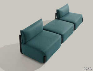
Et al. > Armchair
COSMO 1505 Armchair: A Modern Seating Solution The COSMO 1505 armchair, designed by Philippe Tabet for Et al., combines sleek modern design with functional versatility. Its clean lines and understated elegance make it an excellent choice for residential, hospitality, and office spaces. Dimensions and Design The updated dimensions of the COSMO 1505 are: Width: 111 cm Depth: 88 cm Height: 80 cm Seat Height: 44 cm This armchair features a compact footprint while still providing exceptional comfort. The absence of armrests enhances its minimalist aesthetic and makes it easy to incorporate into diverse interiors. The slightly curved backrest and plush seat ensure optimal support and relaxation. Materials and Finishes The COSMO 1505 offers a wide range of customisation options to suit any interior design scheme: Frame Material: Durable steel tubing that ensures stability while maintaining a lightweight look. Upholstery Options: Available in premium fabrics such as wool, velvet, and leather, alongside a variety of synthetic and natural blends. Each upholstery option comes in a broad spectrum of colours, from neutral tones like grey and beige to bold hues like teal and mustard. Frame Finishes: Choose from a palette of classic and contemporary finishes, including matt black, white, and metallic shades, as well as brighter colour options to make a statement. Accessories For added functionality and comfort, the COSMO 1505 can be accessorised with: A lumbar cushion for additional support. Integrated USB and Schuko sockets, making it suitable for modern office or hospitality settings. A reading lamp for cosy corners and personal reading spaces. Applications and Versatility The COSMO 1505’s adaptability makes it ideal for a variety of spaces: Residential: A stylish and comfortable choice for living rooms, bedrooms, or reading corners. Hospitality: Perfect for hotel rooms, lounges, or lobby areas, offering a sleek yet welcoming vibe. Office Spaces: Enhances reception areas or breakout zones, blending aesthetics with practical features. Public and Commercial Areas: Its robust construction and elegant design make it a reliable and attractive choice for waiting areas, retail spaces, and more. Complementary Options To create a cohesive seating arrangement, pair the COSMO 1505 armchair with other pieces from the COSMO collection, such as the COSMO 1502 sofa or COSMO 1500 armchair with armrests. These options share the same design language and ensure a seamless look throughout your space. Key Features Compact yet spacious dimensions, perfect for various settings. Customisable upholstery and frame finishes to suit different styles. Accessory options for added functionality. Designed for comfort with a plush seat and ergonomic backrest. Durable steel frame for long-lasting use. 2D and 3D files are available for designers to incorporate into their projects. The COSMO 1505 armchair is a perfect balance of simplicity, elegance, and functionality. Whether you're looking to furnish a residential space or a commercial environment, this armchair delivers timeless style and adaptability. You said: last time you were more complete ChatGPT said: ChatGPT Thank you for pointing that out! Let me refine and expand the description to make it as complete and detailed as possible. COSMO 1505 Armchair: A Contemporary Icon of Design and Comfort The COSMO 1505 armchair, designed by Philippe Tabet for Et al., is a masterpiece of modern minimalism and versatility. Its sleek and understated design is perfectly suited for residential living rooms, hotel lounges, office receptions, and hospitality spaces. Combining elegant curves with robust functionality, this armchair is as practical as it is visually appealing. Dimensions and Design Details The COSMO 1505 has carefully considered dimensions to offer a balance of comfort and adaptability: Width: 111 cm Depth: 88 cm Height: 80 cm Seat Height: 44 cm These dimensions make it compact enough for smaller spaces yet spacious enough to provide exceptional seating comfort. The armchair’s distinctive feature is its armless design, which enhances its minimalist aesthetic while allowing for a freer range of motion. The gently curved backrest and plush seat ensure maximum comfort, while the raised tubular metal frame adds a touch of lightness to its overall profile. Materials and Finishes The COSMO 1505 is crafted with meticulous attention to quality and detail. It is available with several customisation options to suit any interior style: Frame Material: Made from high-strength tubular steel, the base is both durable and lightweight, ensuring longevity and ease of placement. Upholstery: Choose from a wide selection of high-quality fabrics, including: Velvet: For a luxurious, soft texture that exudes sophistication. Wool Blends: Durable and warm, perfect for creating cosy spaces. Synthetic Fabrics: High-performance, easy to clean, and ideal for high-traffic areas. Premium Leather: Adds timeless elegance and a touch of luxury. Colours: A rich palette is available, from understated neutrals such as beige, grey, and taupe to bold, vibrant hues like teal, mustard, and terracotta. Frame Finishes: The tubular metal frame can be customised in a variety of finishes, including matte black, white, metallic bronze, and even bright pops of colour like coral red and curry yellow, making the COSMO 1505 adaptable to modern or playful interior styles. Functional Accessories The COSMO 1505 is designed not just for aesthetics but also for enhanced functionality. Optional accessories include: Lumbar Cushion: For extra support and comfort, particularly in lounges and waiting areas. Integrated USB Socket: A modern convenience, perfect for offices, hospitality, or waiting rooms where charging devices is a priority. Reading Lamp: A sleek, built-in light for focused tasks or to add ambient lighting to the space. Schuko Socket: An additional power source, ideal for hospitality or office applications. Style and Versatility The COSMO 1505’s sleek silhouette and refined proportions make it a versatile addition to a variety of interiors. Its clean lines and minimalist design make it a perfect fit for contemporary, Scandinavian, and Japandi interiors, while its subtle industrial flair allows it to integrate seamlessly into urban loft-style spaces. The curved metal base not only enhances its modern aesthetic but also adds a sense of visual lightness to the armchair, making it ideal for both large and compact rooms. Applications and Ideal Settings The COSMO 1505’s versatility and durability make it suitable for a wide range of uses: Residential Spaces: Perfect for living rooms, bedrooms, or reading nooks, offering a stylish yet comfortable seating option. Hospitality Projects: A sophisticated choice for hotel lounges, lobbies, and guest rooms, creating a welcoming atmosphere for guests. Commercial and Public Spaces: Durable enough for high-traffic areas such as offices, galleries, and retail stores. Office Settings: Ideal for reception areas, breakout spaces, and private offices, blending comfort and functionality. Complementary Products The COSMO collection by Philippe Tabet offers a range of matching furniture pieces to create a cohesive design scheme. Pair the COSMO 1505 armchair with: COSMO 1502 Sofa: A three-seater option that shares the same sleek design language. COSMO 1500 Armchair with Armrests: For spaces that require varied seating options while maintaining a cohesive look. COSMO 1520 Modular Seating System: Ideal for creating larger, flexible configurations in public or commercial spaces. Key Features and Benefits Elegant Aesthetic: Minimalist design with modern and industrial influences. Customisation Options: Wide range of upholstery fabrics, colours, and frame finishes to suit any interior style. Functional Enhancements: Optional USB sockets, reading lamps, and power outlets add practicality. Compact and Comfortable: Dimensions ensure it fits seamlessly into both large and small spaces. 2D and 3D Files Available: Designers can easily download the files for seamless integration into their projects. Why Choose the COSMO 1505? The COSMO 1505 is more than just an armchair—it’s a statement of modern design. Its sleek lines, customisation options, and practical features make it a top choice for architects and designers seeking a balance of style and functionality. Whether it’s enhancing the comfort of a hotel lobby, adding a touch of luxury to a living room, or elevating the look of an office reception area, the COSMO 1505 delivers unparalleled quality and versatility.
Cromatica Cenere

florim > Synthetic Floor
A lexicon of colour shades for mixing. A large size and its submultiples. «This work represents a reflection on colour, and above all a proposal on how to transfer the multiplicity of shades typical of a hand-crafted piece into a project produced on a large scale.» Andrea Trimarchi & Simone Farresin Studio Formafantasma base their work in the design world on a strong vocation for research. Simone Farresin and Andrea Trimarchi view every project as an opportunity for study and the acquisition of new knowledge, and their love of speculation establishes a dialectic rapport with the situations offered by each new client. Whether it involves a material, a type or a production method, the first phase of their design process is the mapping of what the specific case places at their disposal. With Cedit, an analysis of the company's past and present was central to the inputs. Inevitably, since "Looking back to look forward" has been the design duo's mission statement for years. In this case, in particular, the company's history was a real treasure trove, a fine blend of memory and technology: on the one hand, the excellence of production technologies now extended with the added potential arising from the engineering of large-sized ceramic tiles, and on the other a wealth of experience build up with great designers of the past, from Zanuso to Noorda, through to <strong>Ettore Sottsass</strong>. Andrea and Simone decided to focus on Sottsass - who started designing for Cedit back in the late Seventies - and made an in-depth study of one of the colour charts he developed towards the end of the Nineties. A spread of colours which gave its name to the "41 Colors" collection, included in the catalogue of the period as a real alphabet for what has proved to be a lasting design language. Colour was much more than just a compulsory step in the dialogue between designer and producer, since Sottsass had already discovered the power of the mystery intrinsic to this universe of invention.<br /><br />With Cedit the master-designer, a long-established lover of ceramics and their crafted unpredictability, found a way of transferring his personal feeling for colour to a wide audience, through industrial mass production. And this assumption is another factor Formafantasma have inherited, interpreting it today with new, even more efficient technical resources just as capable of expressing the secrets of colour. «The concept of colour "in isolation" - Sottsass explained in a 1992 text - classified colour, Pantone, as they call it now, "scientific" colour, is something I still refuse to accept. (...) Colours, the idea of colour, are always intangible, they slip slowly away like words, that run through your fingers, like poetry, which you can never keep hold of, like a good story.» And Formafantasma seem to have chosen that distinction between colour "in isolation" and "intangible" yet ever-present colour as the basis of their work. However, their approach draws on their unique vocation for research and the technical resources of the third millennium. «This work - they explain to us - is a reflection on colour, and above all on <strong>how to bring the multiplicity of shades typical of a hand-crafted piece into a large-scale project</strong>.» The designers look at large, monochrome slabs and turn to the engineers for details of their secrets, their processing stages, the phases in their production. They appreciate that the colour of ceramic material, its ineffable secret, can still be present in the series and large tile sizes in which Cedit leads the way. They understand that this is, in itself, an expressive power which does not need channelling into forms, motifs and signs. But above all, they treat the surface as a large canvas on which they spread pure colour, which tends to be uniform but in fact is never really a "scientific", totally monochrome hue: it is not a Pantone. And this is the source of the fundamental insight, which only children of the transition from the analogue to the digital era could achieve, the reward for those who draw on the past to look to the future.<br /><br />The designers cut the slab into lots of regular pieces, not necessarily of the same size. They restore its identity as a "tile", a familiar name with something ancient about it, but which stands for a module, a unit of measurement, a building block. There is nothing nostalgic about this - on the contrary, the vision is completely new, and the portions of slab created can be reassembled with no restrictions, breaking down the unity of the whole and reviving its essence starting from its structure. As the cards in the pack are shuffled, what emerges is not a figure or motif but the representation of colour itself and its physical nature. It is live matter, born from the meeting of vibrating forces, the mixing of ever-varying percentages of the basic ingredients. And Formafantasma present us with the corpuscular, fragmented essence of these small frames of space and crystallised time, which reveal the code and formula of their composition. So Cromatica is a collection made up of six colours which actually have an infinite number of declinations and compositional possibilities. It is a "discrete" combination in the mathematical sense of the term, capable of generating multiple, variable subsets. At the same time, each slab can be used in its entirety, leaving the impression of analogue continuity unchanged. But what really amazes is the comparison and dialogue between the two approaches: a stroke of genius, laying clear the mysterious appeal the artificial reproduction of colour has always held for mankind. Because, as Sottsass said, «colours are language, a powerful, magical, intangible, flexible, continuous material, in which existence is made manifest, the existence that lives in time and space».