Mews by Barber & Osgerby

mutina > Floor tile-stone
Mews, a term referring to the narrow alleys in London's historic centre with their unique and picturesque aesthetic, is inspired by urban landscape, history, and textures of the English capital. These details merge, creating pleasantly vibrant geometric compositions. The collection is the result of a long experimentation on colour, which led to the creation of a palette of nine shades: Chalk, Fog, Pigeon, Lead, Ink, Soot, Green, Light Blue and Pink, each of which is further divided into over 15 different tones, imparting a sense of depth and movement to the surfaces.
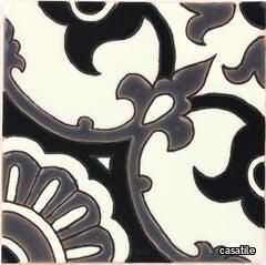
Santa Barbara Ceramic Decorative Tile: Avidan Black & Gray 1 Gloss
casatile > Floor tile-stone
Santa Barbara ceramic tile collection evokes the California landscape, with a combination of vivid and subtle colors offset by neutrals and matte finishes. It is this combination of mattes and gloss finishes in a vast array of colors that our Santa Barbara ceramic tile becomes rich, vibrantly alive, and harmonious.Our ceramic tile is handcrafted and decorated by hand using an ancient method called Cuerda Seca that literally translates to dry cord. This technique has been used for centuries in Spain and other Mediterranean countries. The depth and richness of the colors are obtained by painstakingly applying every single drop of glaze by hand onto a delineated design.
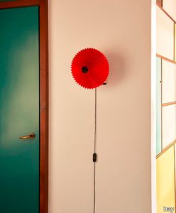
Matin Wall Lamp
hay > Wall lamp
Designed by Inga Semp the Matin Wall Lamp offers a contemporary yet poetic design with a construction that combines visual delicacy with physical robustness. The head of the lamp can be angled approximately 45 degrees both upwards and downwards to create an ambient uplight as well as directional downlight. The wall-mounted design consists of a steel wire bent frame finished in polished brass with matte black hardware and is paired with a pleated cotton shade in two sizes with a variety of vibrant colours. The light source is an integrated LED offering a diffused light which is accompanied by a digital in-line dimmer control to adjust the output of light if required.
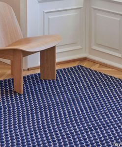
Channel Rug
hay > Carpet
Designed for HAY by Clara Von Zweigbergk Channel Rug uses different coloured yarns woven together to create a visual and textural diagonal pattern. Hand-woven in India from a blend of New Zealand wool and cotton the tactile interplay of thicknesses and colours creates a graphic three-dimensional effect. The rugs natural warmth comfort and vibrance can be used to elevate most interior spaces. OEKO-TEX STANDARD 100 cert. No 22.HIN.10331.
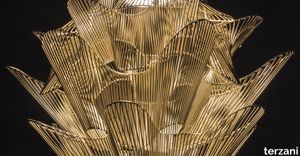
Moiré movementwith pattern.
terzani > Ceiling lamp
A French term derived from silk with a rippled or “watered” appearance, moiré is an optical effect that results in the illusion of waves or the movement of water. This effect is achieved by having an opaque, ruled pattern overlaid over another. Designer Christian Lava’s studies of this effect have led to his latest design aptly titled, Moiré. Using overlapping grids of metal, this LED pendant light dynamically changes shape following the viewer’s gaze, practically coming to life with a vibrating energy. Moiré is a mesmerizing addition to any room. Available in gold plated and nickel finish. Design Christian Lava. Made in Italy.
Gaia earthmother.
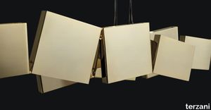
terzani > Ceiling lamp
In Greek mythology, Gaia is the personification of the Earth and the mother of all life. Looking to capture the mythical and natural beauty of this Earth goddess, designer Jean-François Crochet has created the Gaia pendant light. Consisting of geometric frames of brass or raw metal reminiscent of the mountains Gaia created, the pendant uses led light to push light through the “cracks” formed. The resulting light creates a magical feeling, as if the lights peaking through were alive themselves. Also available in gold, nickel and wood finish and in custom configurations, Gaia adds a vibrancy and sacred light to any space. Design Jean-François Crochet. Made in Italy
TRAMETES
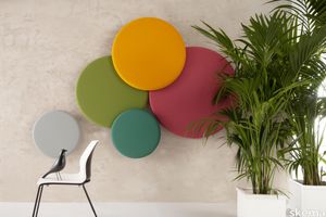
skema > Wallcovering
TRAMETES, is THE acoustic balancer of technological beauty. This acoustic balancing system is the best performing product on the market today in terms of sound absorption, the only one capable of exploiting all known acoustic absorption technologies and systems: absorption by porosity, by vibration, by diffraction and by exploiting the principle of Helmoltz resonators, all of which have been condensed into a single product: TRAMETES. Its different shapes, CIRCLE and SQUARE, in its various sizes and installations, and multiple combinations guarantee absorption in all speech frequencies with Class A performance. Trametes can be wall-mounted, ceiling-mounted or come in Freestanding and Treestanding configurations, in the iconic shape reminiscent of trees. It can also be customised in upholstery fabric and colour, matching the ever-changing moodboards of interior design.
Santa Barbara Ceramic Solid Tile: Charcoal Green Matte
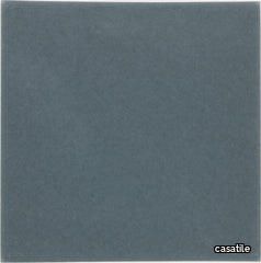
casatile > Floor tile-stone
Santa Barbara ceramic tile collection evokes the California landscape, with a combination of vivid and subtle colors offset by neutrals and matte finishes. It is this combination of mattes and gloss finishes in a vast array of colors that our Santa Barbara ceramic tile becomes rich, vibrantly alive, and harmonious.Our ceramic tile is handcrafted and decorated by hand using an ancient method called Cuerda Seca that literally translates to dry cord. This technique has been used for centuries in Spain and other Mediterranean countries. The depth and richness of the colors are obtained by painstakingly applying every single drop of glaze by hand onto a delineated design.
Santa Barbara Ceramic Solid Tile: Jade Gloss
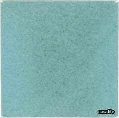
casatile > Floor tile-stone
Santa Barbara ceramic tile collection evokes the California landscape, with a combination of vivid and subtle colors offset by neutrals and matte finishes. It is this combination of mattes and gloss finishes in a vast array of colors that our Santa Barbara ceramic tile becomes rich, vibrantly alive, and harmonious.Our ceramic tile is handcrafted and decorated by hand using an ancient method called Cuerda Seca that literally translates to dry cord. This technique has been used for centuries in Spain and other Mediterranean countries. The depth and richness of the colors are obtained by painstakingly applying every single drop of glaze by hand onto a delineated design.
Santa Barbara Ceramic Solid Tile: Toasted Chestnut Matte
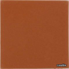
casatile > Floor tile-stone
Santa Barbara ceramic tile collection evokes the California landscape, with a combination of vivid and subtle colors offset by neutrals and matte finishes. It is this combination of mattes and gloss finishes in a vast array of colors that our Santa Barbara ceramic tile becomes rich, vibrantly alive, and harmonious.Our ceramic tile is handcrafted and decorated by hand using an ancient method called Cuerda Seca that literally translates to dry cord. This technique has been used for centuries in Spain and other Mediterranean countries. The depth and richness of the colors are obtained by painstakingly applying every single drop of glaze by hand onto a delineated design.
Santa Barbara Ceramic Decorative Tile: Alba 2
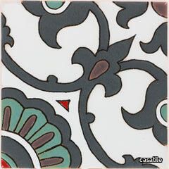
casatile > Floor tile-stone
Santa Barbara ceramic tile collection evokes the California landscape, with a combination of vivid and subtle colors offset by neutrals and matte finishes. It is this combination of mattes and gloss finishes in a vast array of colors that our Santa Barbara ceramic tile becomes rich, vibrantly alive, and harmonious.Our ceramic tile is handcrafted and decorated by hand using an ancient method called Cuerda Seca that literally translates to dry cord. This technique has been used for centuries in Spain and other Mediterranean countries. The depth and richness of the colors are obtained by painstakingly applying every single drop of glaze by hand onto a delineated design.
Santa Barbara Ceramic Decorative Tile: Cordova
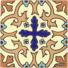
casatile > Floor tile-stone
Santa Barbara ceramic tile collection evokes the California landscape, with a combination of vivid and subtle colors offset by neutrals and matte finishes. It is this combination of mattes and gloss finishes in a vast array of colors that our Santa Barbara ceramic tile becomes rich, vibrantly alive, and harmonious.Our ceramic tile is handcrafted and decorated by hand using an ancient method called Cuerda Seca that literally translates to dry cord. This technique has been used for centuries in Spain and other Mediterranean countries. The depth and richness of the colors are obtained by painstakingly applying every single drop of glaze by hand onto a delineated design.
Santa Barbara Ceramic Decorative Tile: Point Loma
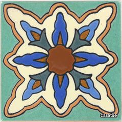
casatile > Floor tile-stone
Santa Barbara ceramic tile collection evokes the California landscape, with a combination of vivid and subtle colors offset by neutrals and matte finishes. It is this combination of mattes and gloss finishes in a vast array of colors that our Santa Barbara ceramic tile becomes rich, vibrantly alive, and harmonious.Our ceramic tile is handcrafted and decorated by hand using an ancient method called Cuerda Seca that literally translates to dry cord. This technique has been used for centuries in Spain and other Mediterranean countries. The depth and richness of the colors are obtained by painstakingly applying every single drop of glaze by hand onto a delineated design.
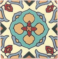
Santa Barbara Ceramic Decorative Tile: Santa Monica
casatile > Floor tile-stone
Santa Barbara ceramic tile collection evokes the California landscape, with a combination of vivid and subtle colors offset by neutrals and matte finishes. It is this combination of mattes and gloss finishes in a vast array of colors that our Santa Barbara ceramic tile becomes rich, vibrantly alive, and harmonious.Our ceramic tile is handcrafted and decorated by hand using an ancient method called Cuerda Seca that literally translates to dry cord. This technique has been used for centuries in Spain and other Mediterranean countries. The depth and richness of the colors are obtained by painstakingly applying every single drop of glaze by hand onto a delineated design.
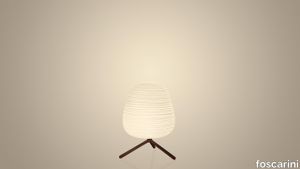
Rituals 3
foscarini > Table lamp
The Rituals lamps speak the language of beauty and poetry. They are made with hand-blown glass marked by thin engravings which recall the art of grinding resulting from skilled craft-based workmanship. Rituals 3 is distinguished by a small volume that makes its use more versatile, with the creased surface that diffuses a warm, vibrant light.
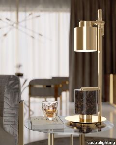
Chantel Table Lamp
castrolighting > Table lamp
Chantel is a smooth symphony of shapes and geometry, paired with precious materials and a sharp-lined structure. Having a duality idea in its design, this contemporary table lamp reflects its top and base like a reflected image, granting a special magnetism to this piece. Chantel’s structure is made of glitzy brass, paired with a cylindrical estremoz white marble. The exceptionally elegant and creative table lamp makes it easy to uplift the interior design with a new aesthetic in decorative lighting. The charismatic and geometrical silhouette of this handmade table lamp will complement a contemporary or transitional interior design style. It is a modern statement that will be a great addition to any room. VIEW FULL FAMILY TWO MAIN VERSIONS #vibranthome
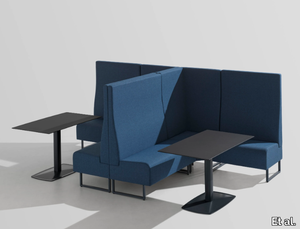
SPACE+ 1405A - Corner fabric armchair high-back _ Et al.
Et al. > Armchair
Space Plus 1405 Corner Seating Module: A Modular Solution for Flexible Layouts The Space Plus 1405 Corner Seating Module from Et al.'s Space Plus collection is designed to enhance modular seating arrangements with a functional and stylish corner piece. Its compact dimensions and clean lines make it ideal for creating versatile configurations in public, corporate, and hospitality spaces. Design and Dimensions The Space Plus 1405 Corner Module is crafted to fit seamlessly into modular layouts, connecting other seating units in a cohesive arrangement. Its dimensions are: Height: 100 cm Width: 70 cm Depth: 70 cm Seat Height: 47 cm Seat Depth: 61.5 cm Its square profile and ergonomic design ensure comfort and practicality while maintaining a sleek aesthetic. Materials and Finishes The module is built with high-quality materials and offers a range of customisation options to fit various design needs: Frame: Made from robust metal for durability and stability. Upholstery: Choose from a wide selection of high-performance fabrics, including stain-resistant and easy-to-maintain options. Colours range from neutral tones to bold, vibrant shades to suit any space. Base Finish: Available in finishes such as matte black, metallic tones, or white to complement your design scheme. Features Corner Functionality: Designed to connect and integrate seamlessly with other Space Plus modules for flexible layouts. Compact Design: Optimises space while providing ample comfort. Modular Compatibility: Can be paired with linear and high-back modules for diverse configurations. Comfortable Seating: Padded seat and backrest offer ergonomic support for long periods of use. Applications The Space Plus 1405 Corner Module is ideal for various settings: Hospitality: Create sophisticated lounge areas, hotel lobbies, or VIP seating zones. Corporate Offices: Use in reception areas, breakout spaces, or collaborative work environments. Public Spaces: Perfect for shopping malls, airports, or healthcare waiting areas. Dining Settings: Adds versatility to booth or communal seating arrangements in restaurants and cafés. Customisation Options To suit specific project requirements, Et al. offers several enhancements for the Space Plus 1405: Privacy Panels: Add-ons to create secluded seating zones. Integrated USB Ports: Functional upgrades for tech-friendly spaces. Attachable Tables: Practical for workspace or dining purposes. Sustainability and Durability The Space Plus 1405 module is manufactured using environmentally friendly materials and processes. Upholstery options include recycled fabrics, making it a sustainable choice for modern interiors. Complementary Products This corner module pairs seamlessly with other items in the Space Plus collection: Linear Seating Modules: For straight or multi-directional layouts. Ottomans and Poufs: Add flexibility and functionality to the arrangement. Matching Coffee Tables: Provide additional utility and cohesion in design. Key Features Corner module design for modular seating flexibility. Durable construction for high-traffic environments. Customisable finishes and fabrics to suit diverse interiors. Compact and ergonomic for efficient space utilisation.
Constellation White Out Marble Waterjet Mosaic
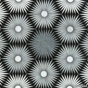
artistictile > Floor tile-stone
The silent pulse of stars in the night sky inspires Constellation, our visually stunning new pattern. Radiant stars in contrasting stone repeat across the surface, their delicate rays beaming through a smooth natural stone background. The night sky has inspired us for millennia. Constellation brings that fascination indoors, in a pattern vibrant as the stars.
Constellation Blackout Marble Waterjet Mosaic

artistictile > Floor tile-stone
The silent pulse of stars in the night sky inspires Constellation, our visually stunning new pattern. Radiant stars in contrasting stone repeat across the surface, their delicate rays beaming through a smooth natural stone background. The night sky has inspired us for millennia. Constellation brings that fascination indoors, in a pattern vibrant as the stars.
Proust Geometrica

cappellini > Armchair
A further evolution of the icon created by Alessandro Mendini in 1978 for the Palazzo dei Diamanti in Ferrara, the Proust Geometrica armchair incorporates the heritage of the original in this revised technicolour version. A cult object in the design world, the Proust armchair has been reinterpreted here with a fixed cover made of bright multi-coloured fabric designed by Mendini himself. Hand-crafted as always, Proust Geometrica is an armchair that catches the eye with its vibrant colour blocks and uncompromising comfort: a piece that exemplifies the ideal fusion between functionality, formal attention to details and aesthetic research.
Impression valais 244
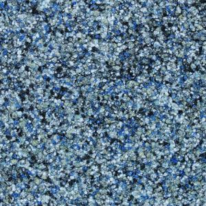
Fabromont > Synthetic Floor
Impression® Rajasthan 244 – Desert Ochre for Textured, Global Interiors Inspired by the desert sands and palace tones of Rajasthan, Impression® Rajasthan 244 delivers an earthy ochre shade that adds exotic flair to interiors. Ideal for hospitality suites, galleries, or cultural spaces, it’s a grounding yet vibrant base for eclectic or travel-inspired design themes.
Resista Cosmic tornado 636
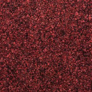
Fabromont > Synthetic Floor
Resista® Cosmic Tornado 636 – Spirited Red-Grey for High-Energy Zones Tornado 636 infuses a grey base with a swirl of muted red, mimicking the unpredictable beauty of a tornado. This lively yet controlled colour is ideal for event venues, breakout areas, or design-forward public spaces where vibrancy is welcome. Use it to accent branding, create energy, or zone specific areas in open-plan interiors.
Angie "Dining"
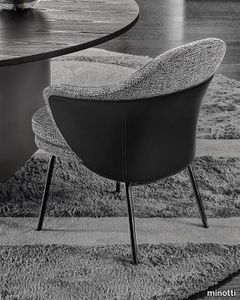
minotti > Chair
A saddle-hide or leather element designs a wing that embraces the armchair, sustaining the frame like a sculptural bustier, characterised inside by the inviting softness of the seat and backrest. Behind the apparent simplicity of the design lies an advanced technological process used to make both the padding with different textures of foam and the saddle hide or leather bustier, made using two different Baydur® moulds, which perfectly follows the curved line of the armchair. The GamFratesi studio, signing the design, worked on the idea of contrast, emphasising it and juxtaposing the stiff frame of the saddle hide or leather element with the softness of the upholstered part, which can also be seen on the back, so setting the scene for interesting colour combinations of saddle hide and fabric. The legs are in Pewter-coloured die-cast aluminium and a unique bow-shaped frame connects the feet at the rear, emphasising the curve of the saddle hide or leather body. The family of products includes an armchair, accompanied by a footstool, and a dining little armchair, both with the same features and in different sizes, now joined by the Angie Cover version upholstered entirely in fabric or leather. The presence of saddle hide is not only a distinctive feature of the GamFratesi studio’s involvement in the creative team of Minotti, but also breathes new vibrancy into a piece with classic forms, offering a palette of different shades.
SPACE+ 1401 - Fabric linear module _ Et al.
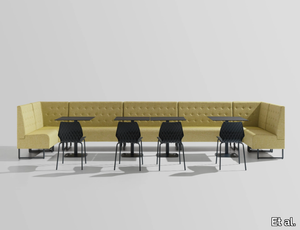
Et al. > Armchair
Space Plus 1401 Modular Seating: Modern Simplicity for Versatile Spaces The Space Plus 1401 Modular Seating, part of Et al.'s Space Plus collection, is a premium solution for creating adaptable seating arrangements in various environments. With its clean lines, durable construction, and functional dimensions, this module is ideal for high-traffic public, hospitality, and office spaces. Design and Dimensions The Space Plus 1401 module is designed with ergonomics and versatility in mind. Its simple yet elegant design integrates seamlessly into modern interiors. The dimensions are as follows: Height: 100 cm Width: 90 cm Depth: 61.5 cm Seat Height: 47 cm Seat Depth: 46 cm These proportions ensure maximum comfort while maintaining a compact footprint, suitable for diverse applications. Materials and Finishes The Space Plus 1401 modular seating offers a variety of high-quality materials and finishes, enabling customization for different design schemes: Frame: Built with robust metal for long-lasting durability. Upholstery: Choose from a wide array of high-performance fabrics, including stain-resistant and easy-to-clean options, in a palette ranging from neutral tones to vibrant colors. Base Finish: The metal base is available in finishes like matte black, metallic tones, and clean white, ensuring compatibility with any interior aesthetic. Features Modular Design: This seating module is part of a modular system that allows for creating custom seating layouts tailored to specific needs, whether for straight rows, corners, or curved arrangements. Comfortable Seating: High-density foam padding ensures comfort for extended periods. Compact Footprint: Maximizes seating capacity without overwhelming the space. Applications The Space Plus 1401 is versatile and ideal for the following settings: Hospitality: Enhances the sophistication of hotel lobbies, lounge areas, and bars. Corporate Spaces: Perfect for office reception areas and collaborative zones. Retail and Public Spaces: Suitable for shopping mall lounges, airport waiting areas, and hospital reception zones. Dining Areas: Can be used in restaurants and cafés for comfortable booth seating. Customization Options The Space Plus collection provides several add-ons and customization possibilities: Privacy Panels: For creating individual zones within open spaces. Integrated Charging Ports: USB or standard plug sockets for convenience in tech-friendly spaces. Side Tables: Attachable small tables to enhance functionality. Sustainability and Durability The Space Plus 1401 is manufactured using sustainable materials and processes, ensuring eco-friendly credentials without compromising on quality. The upholstery options include recycled and environmentally friendly fabrics. Complementary Products To complete your design, pair the Space Plus 1401 with other modules from the Space Plus collection, including: Corner Modules: For creating L-shaped or U-shaped seating arrangements. Ottomans and Benches: For added versatility and style. Matching Tables: To complement the seating with functional surfaces. Key Features Modular system for endless configuration possibilities. Durable, premium materials designed for heavy use. Compact dimensions suitable for various applications. Customizable finishes and accessories to match unique design needs.
Matrice Traccia
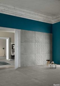
florim > Wallcovering
An atlas of modular signs to be combined in a wide variety of layouts. «We love concrete as a material, its versatility and its plain, austere look. We have completed our carefully designed surfaces with graphic patterning inspired by the human actions of weaving and embroidering.» Barbara Brondi & Marco Rainò To appreciate the profundity of the design project undertaken by Barbara Brondi and Marco Rainò for Cedit, it is both necessary and explanatory to start from the title the collection bears. In modern usage the term Matrice, in Italian, refers to a die or mould used to reproduce an object, but its origins are much more remote, with a meaning closer to the English “matrix”, meaning the underlying basis of something. The root of the word is related to Mater or mother: the name Matrice thus relates to the origin or cause of something. This dichotomy is expressed in several levels within the work of these architects, who study the world from a sophisticated conceptual approach and then transform it into a design. Starting from the idea of ceramic coverings, which have always been a tool not so much of architecture as of interior design, the artists work back to the origin of the surface and its decoration within their own discipline: they look at what we used to call the modern age, where modernity has also brought an uncompromising brutality, and where the use of bare concrete became the statement of an attitude to life with no time to spare for manners. Concrete is originally a liquid material, intended for shaping, which can therefore absorb and retain any type of mark created by the material and mould used to form it. Architects midway between rationalism and brutalism have used the rough-and-ready language of concrete combined with a last, elegant, anthropic decorative motif impressed on the material, that makes the concept of covering superfluous, because its place, in its older meaning of decoration rather than functional cladding, is taken by the regular patterning created in the material itself. There are therefore various grounds for believing that, in this collection, the artists are once again working in architectural terms. Firstly, with a simplicity typical of BRH+, they reduce the initial concepts to their minimal terms. So although this is a collection of coverings for walls, indoor floors, outdoor pavings and curtain walls, a great deal of time was spent on destructuring the idea of the ceramic covering itself. Unfortunately, nowadays there is no space in the contemporary construction sector for the radical approach of the past, so the cladding designed for the building actually lays bare the interior, using the choice of material – accurately interpreted (with shade variation) on the basis of an assortment of various types – to restore visual elegance and a fundamental severity. Attention to scale is another architectural feature: Matrice offers modules with architectural dimensions and different sizes through the development of “large slabs”, eliminating the visual regular grid effect. Thanks to this visual reset, geographic forms are perceived to emerge from dense, grey concrete surfaces decorated as in bygone days by special processes and by weathering during drying. The various types of slab, each an atlas of subtle, vibrant signs on the surfaces, comprise finishes that reproduce the visual effect of reinforced concrete – with the aggregates in the cement more clearly visible, of formwork – with the signs impressed on the concrete by the timber used, of a structured surface resembling bare cement plaster, of ridged and streaked surfaces – with patterning resembling some kinds of linear surface finishing processes – and finally a smooth, or basic version, over which Matrice exercises the dichotomy referred to earlier. It is on these surfaces that Brondi and Rainò have imagined additional design reverberations, a figurative code that rejects the concept of the grid, previously inseparable from that of the module: by means of a vocabulary of graphic marks cut into the slabs with a depth of 3 mm (the width of the gap left between modules during installation), they provide a framework for infinite combinations of possible dialogues. Just as in embroidery, which is based on grids of stitches and geometric repetitions, and where every stitch is at right-angles to another one to construct forms and decorations. Also taken from embroidery is the idea of introducing a degree of “softness” to reduce the stiffness of intentionally deaf surfaces. There is the impression of patterns that can continue for infinity, as in textile weaving, and a scale that, unlike the surface being worked on, is imagined as suspended and lightweight. They may not admit it, but BRH+ know a lot about music, including electronic music, and it appears to me that this organised tangle of infinite signs – unidentifiable without an overview – is rather like the representations of synthesized sounds. Sounds that are produced by machines, and thus “woven” by sampling and overlapping sounds of the most unlikely origins, combined to form jingles which, once heard, are imprinted indelibly on the brain. This may be why I am so interested in the space between this “melodic film” and its deaf, damp substrate. The eyes can navigate this suspended reality without fear of disturbance. So we are faced with different surfaces, different sizes and different graphic signs. But only one colour (surprise!) to prevent a cacophony not just of signs but also of possible interpretations: the artists retain their radical principles (and their generosity), and as curators, a role in which they are skilled, they leave the players (architects and installers) to add their own interpretations. In their hands this colour, expressed in Matrice, will produce motifs on surfaces in living spaces for someone else. This stylish covering and its workmanship will be left to the hands of someone who will probably never read this, but will be on a building site, with the radio playing on a stereo system, concentrating on installing the very pieces we describe. So a radical, apparently silent, design project like this has repercussions for the real world we live in. Matrice has no form of its own but merely acquires the ornamentation drawn on its surfaces by a second group of artists. And here this routine action, standardised by the form approved for production and workmanlike efficiency, is the origin and cause of change, generating a variability of choices and interpretations, on that dusty building site where music plays and mortar flows.
Earthtech OUTBACK_FLAKES
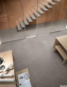
florim > Wall tile-stone-brick
From an ancient past to a responsible future <p>The collection injects new life into the earth through a sustainable production process, with a strong focus on green management, to offer the architect an exceptional technical and aesthetic performance in compliance with the socio-environmental context and the latest eco-friendly building needs. With EARTHTECH earth becomes “technical earth” with a highly innovative content, offering new solutions to green architecture and fulfilling the new frontiers of circular economy in construction, guaranteeing a sustainable future. <br />EARTHTECH offers a choice of organic textures to observe and touch, thanks to the wide range of finishes (Comfort, Glossy-Bright and structured) which add a tactile and unexpected perceptive dimension for use in all types of application. <br /><a class="btn arrow" href="https://www.florim.com/en/surfaces/the-new-comfort-surface/"> Discover the new Comfort surface </a></p> <p>EARTHTECH/ is also a return to the origins of the Florim brand through a full body technical product that blends surface and thickness and derives from the spontaneous mixing of carefully pre-selected fragments and pigments of different shades which give the material a unique, one-of-a-kind visual effect in each slab, mimicking the amazing variety of colours and elements in nature. The result is a composite product with a textured design, in which the flakes and aggregate grains create an original mélange effect that is vitrified during firing, producing a robust, high-quality and exceptionally strong and wear-resistant product; one which can be used in any type of building setting and weather conditions, even the harshest.</p>
High Performance Vinyl Wallpaper by Vescom | dale - 2108.07
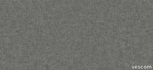
vescom > Wallpaper
Embrace sustainability and elegance with Vescom Dale, a natural wallcovering made with 70% post-consumer recycled wool. Offered in seven soft mélange tones, this high-quality wallcovering combines warmth, texture, and eco-conscious design to elevate your interiors with a touch of timeless sophistication. 1️⃣ 🌿 Sustainable Craftsmanship Vescom Dale features 70% post-consumer recycled wool, supported by a blend of polyester and polyamide on a non-woven backing. It's a luxurious and eco-friendly choice for environmentally mindful interior designs. 🌎 2️⃣ 🖌️ Elegant Mélange Tones Available in seven soft mélange hues, this wallcovering adds subtle sophistication and warmth to any room. The natural wool texture enhances both modern and traditional aesthetics. 🎨 3️⃣ 📏 Wide Coverage for Seamless Installation Measuring ±134 cm (±53 inches) in width, Dale wallcovering offers generous coverage and a flawless finish for large-scale applications. 📐 4️⃣ 🔥 Certified Safety and Durability This flame-retardant wallcovering meets EN 13501 (C, s1 - d0) and ASTM E84 standards, providing reliable safety for residential and commercial spaces. Superior lightfastness (ISO 105-B02 rating 8) ensures vibrant, long-lasting appeal. 🛡️ 5️⃣ 💧 Breathable and Lightweight Design With water vapor permeability (<0.5 m SD value) and a weight of ±310 gr/m² (±14 oz/yd²), Vescom Dale is not only lightweight but also breathable, enhancing the comfort and durability of your interiors. 💪 Tags: Recycled Wool Wallcovering, Mélange Tone Wall Design, Sustainable Wall Material, Natural Interior Design, Flame Retardant Wool Wallcovering, Lightweight Breathable Wallcovering, Vescom Dale Collection, Eco-Friendly Wall Solution, Textured Wall Decor, Non-Woven Backing Wallcovering
High Performance Vinyl Wallpaper by Vescom | fraser - 2109.09

vescom > Wallpaper
Enhance your interiors with Vescom Fraser, a premium wallcovering featuring a striking 3-dimensional architectural weave in opaque, softly reflective shades. Made from high-performance polyethylene tape yarn, this versatile design is available with an acrylic backing or as an unbacked option, offering exceptional durability, elegance, and eco-conscious features. Bullet Points: 1️⃣ 🌿 Sustainable and Eco-Friendly Vescom Fraser is PFAS-free, low in VOC emissions (CAL 01350 certified), and compliant with the Living Building Challenge Red List. A perfect choice for those prioritizing sustainable and healthy interior solutions. 🌎 2️⃣ 🖌️ Stunning 3D Architectural Weave The dimensional weave design and softly reflective tones create an elegant and modern aesthetic, adding depth and texture to any space. Ideal for both residential and commercial interiors. 🎨 3️⃣ 📏 Flexible Material Options Available in widths of ±137 cm (±54 inches), Fraser comes with options for acrylic backing (2109.XXB) or unbacked (2109.XXU), ensuring adaptability to your specific project requirements. 📐 4️⃣ 🔥 Safety and Durability Guaranteed Certified flame retardant (EN 13501, B, s1 - d0), this wallcovering provides reliable safety and peace of mind. Its high lightfastness (ISO 105-B02, rating 8) ensures long-lasting vibrancy even in well-lit spaces. 🛡️ 5️⃣ 💧 Enhanced Breathability and Lightweight With water vapor permeability (<0.5 m SD value) and a weight range of ±242-293 gr/m² (±11-13 oz/yd²), Vescom Fraser is lightweight, breathable, and easy to install, making it a practical yet luxurious wall solution. 💪 Tags: Polyethylene Wallcovering, 3D Architectural Weave, Low VOC Wall Decor, PFAS-Free Wallcovering, Sustainable Interior Wall Design, Flame Retardant Wallcovering, Lightfast Wall Material, Water Vapor Permeable Wallcovering, Vescom Fraser Collection, Acrylic Backing Wallcovering
Earthtech SAVANNAH_GROUND

florim > Wallcovering
From an ancient past to a responsible future <p>The collection injects new life into the earth through a sustainable production process, with a strong focus on green management, to offer the architect an exceptional technical and aesthetic performance in compliance with the socio-environmental context and the latest eco-friendly building needs. With EARTHTECH earth becomes “technical earth” with a highly innovative content, offering new solutions to green architecture and fulfilling the new frontiers of circular economy in construction, guaranteeing a sustainable future. <br />EARTHTECH offers a choice of organic textures to observe and touch, thanks to the wide range of finishes (Comfort, Glossy-Bright and structured) which add a tactile and unexpected perceptive dimension for use in all types of application. <br /><a class="btn arrow" href="https://www.florim.com/en/surfaces/the-new-comfort-surface/"> Discover the new Comfort surface </a></p> <p>EARTHTECH/ is also a return to the origins of the Florim brand through a full body technical product that blends surface and thickness and derives from the spontaneous mixing of carefully pre-selected fragments and pigments of different shades which give the material a unique, one-of-a-kind visual effect in each slab, mimicking the amazing variety of colours and elements in nature. The result is a composite product with a textured design, in which the flakes and aggregate grains create an original mélange effect that is vitrified during firing, producing a robust, high-quality and exceptionally strong and wear-resistant product; one which can be used in any type of building setting and weather conditions, even the harshest.</p>
SODA - Porcelain stoneware wall/floor tiles _ gruppo bardelli
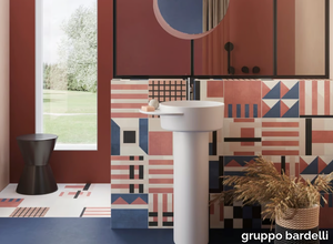
gruppo bardelli > Wall tile-stone-brick
Soda by Ceramica Bardelli: A Contemporary Take on Classic Cement Tiles The Soda collection by Ceramica Bardelli brings the timeless charm of traditional cement tiles into modern interiors and exteriors. Crafted from high-quality rectified porcelain stoneware, Soda tiles combine durability with sophisticated design, offering endless opportunities for creative expression in residential and non-residential spaces alike. Design and Features Soda is available in a versatile 25x25 cm (10"x10") square format, with a robust thickness of 1 cm (25/64"). The tiles feature a matte finish with a slightly antiqued look, reminiscent of vintage cement tiles but with the added performance of porcelain stoneware. The collection includes: 16 unique decorative tiles, supplied randomly assorted and designed for the patchwork technique. 3 solid colours (ivory, light grey, and dove grey) that perfectly match the decorative tiles, enabling seamless transitions between patterns and solids. This combination of geometric designs and neutral tones provides a harmonious blend of tradition and modernity, ideal for creating spaces with a strong expressive character. Colour Variants and Versatility The collection is available in three distinct colour palettes—Soda1, Soda2, and Soda3—each offering its unique mix of tones and patterns. This variety allows designers to personalise spaces with combinations that reflect their vision, from vibrant patchwork designs to more subdued and elegant compositions using matching solid colours. The tiles are suitable for both flooring and wall cladding, and their R10-rated anti-slip properties make them an excellent choice for indoor and outdoor applications, including kitchens, bathrooms, patios, and commercial spaces. Creative Freedom with Patchwork The patchwork technique offers infinite possibilities for customisation, enabling the creation of truly unique designs. By combining the 16 decorative patterns with the solid backgrounds, designers can experiment with layouts that range from eclectic and dynamic to minimalistic and structured, making Soda adaptable to a variety of architectural styles. Applications and Aesthetic Soda’s versatility makes it perfect for a range of settings, from contemporary homes to hospitality and commercial spaces. Its slightly aged finish adds warmth and character, while its geometric motifs and neutral tones ensure it complements both modern and classic interiors. About Ceramica Bardelli Ceramica Bardelli, part of the esteemed Gruppo Bardelli, is a leader in Italian ceramic innovation. With production facilities in Cerrione and Oderzo, the Group is renowned for combining craftsmanship with cutting-edge technology to create tiles that inspire and elevate design. The Soda collection exemplifies this ethos, offering a refined yet practical solution for designers seeking to create expressive and functional spaces. For seamless design integration, downloadable 3D files are available, ensuring precision in project visualisation and execution. With its blend of tradition, innovation, and artistic freedom, Soda transforms floors and walls into works of art.
High Performance Vinyl Wallpaper by Vescom | fraser - 2109.01

vescom > Wallpaper
Enhance your interiors with Vescom Fraser, a premium wallcovering featuring a striking 3-dimensional architectural weave in opaque, softly reflective shades. Made from high-performance polyethylene tape yarn, this versatile design is available with an acrylic backing or as an unbacked option, offering exceptional durability, elegance, and eco-conscious features. Bullet Points: 1️⃣ 🌿 Sustainable and Eco-Friendly Vescom Fraser is PFAS-free, low in VOC emissions (CAL 01350 certified), and compliant with the Living Building Challenge Red List. A perfect choice for those prioritizing sustainable and healthy interior solutions. 🌎 2️⃣ 🖌️ Stunning 3D Architectural Weave The dimensional weave design and softly reflective tones create an elegant and modern aesthetic, adding depth and texture to any space. Ideal for both residential and commercial interiors. 🎨 3️⃣ 📏 Flexible Material Options Available in widths of ±137 cm (±54 inches), Fraser comes with options for acrylic backing (2109.XXB) or unbacked (2109.XXU), ensuring adaptability to your specific project requirements. 📐 4️⃣ 🔥 Safety and Durability Guaranteed Certified flame retardant (EN 13501, B, s1 - d0), this wallcovering provides reliable safety and peace of mind. Its high lightfastness (ISO 105-B02, rating 8) ensures long-lasting vibrancy even in well-lit spaces. 🛡️ 5️⃣ 💧 Enhanced Breathability and Lightweight With water vapor permeability (<0.5 m SD value) and a weight range of ±242-293 gr/m² (±11-13 oz/yd²), Vescom Fraser is lightweight, breathable, and easy to install, making it a practical yet luxurious wall solution. 💪 Tags: Polyethylene Wallcovering, 3D Architectural Weave, Low VOC Wall Decor, PFAS-Free Wallcovering, Sustainable Interior Wall Design, Flame Retardant Wallcovering, Lightfast Wall Material, Water Vapor Permeable Wallcovering, Vescom Fraser Collection, Acrylic Backing Wallcovering
High Performance Vinyl Wallpaper by Vescom | fraser - 2109.02

vescom > Wallpaper
Enhance your interiors with Vescom Fraser, a premium wallcovering featuring a striking 3-dimensional architectural weave in opaque, softly reflective shades. Made from high-performance polyethylene tape yarn, this versatile design is available with an acrylic backing or as an unbacked option, offering exceptional durability, elegance, and eco-conscious features. Bullet Points: 1️⃣ 🌿 Sustainable and Eco-Friendly Vescom Fraser is PFAS-free, low in VOC emissions (CAL 01350 certified), and compliant with the Living Building Challenge Red List. A perfect choice for those prioritizing sustainable and healthy interior solutions. 🌎 2️⃣ 🖌️ Stunning 3D Architectural Weave The dimensional weave design and softly reflective tones create an elegant and modern aesthetic, adding depth and texture to any space. Ideal for both residential and commercial interiors. 🎨 3️⃣ 📏 Flexible Material Options Available in widths of ±137 cm (±54 inches), Fraser comes with options for acrylic backing (2109.XXB) or unbacked (2109.XXU), ensuring adaptability to your specific project requirements. 📐 4️⃣ 🔥 Safety and Durability Guaranteed Certified flame retardant (EN 13501, B, s1 - d0), this wallcovering provides reliable safety and peace of mind. Its high lightfastness (ISO 105-B02, rating 8) ensures long-lasting vibrancy even in well-lit spaces. 🛡️ 5️⃣ 💧 Enhanced Breathability and Lightweight With water vapor permeability (<0.5 m SD value) and a weight range of ±242-293 gr/m² (±11-13 oz/yd²), Vescom Fraser is lightweight, breathable, and easy to install, making it a practical yet luxurious wall solution. 💪 Tags: Polyethylene Wallcovering, 3D Architectural Weave, Low VOC Wall Decor, PFAS-Free Wallcovering, Sustainable Interior Wall Design, Flame Retardant Wallcovering, Lightfast Wall Material, Water Vapor Permeable Wallcovering, Vescom Fraser Collection, Acrylic Backing Wallcovering
High Performance Vinyl Wallpaper by Vescom | fraser - 2109.06
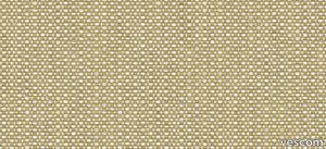
vescom > Wallpaper
Enhance your interiors with Vescom Fraser, a premium wallcovering featuring a striking 3-dimensional architectural weave in opaque, softly reflective shades. Made from high-performance polyethylene tape yarn, this versatile design is available with an acrylic backing or as an unbacked option, offering exceptional durability, elegance, and eco-conscious features. Bullet Points: 1️⃣ 🌿 Sustainable and Eco-Friendly Vescom Fraser is PFAS-free, low in VOC emissions (CAL 01350 certified), and compliant with the Living Building Challenge Red List. A perfect choice for those prioritizing sustainable and healthy interior solutions. 🌎 2️⃣ 🖌️ Stunning 3D Architectural Weave The dimensional weave design and softly reflective tones create an elegant and modern aesthetic, adding depth and texture to any space. Ideal for both residential and commercial interiors. 🎨 3️⃣ 📏 Flexible Material Options Available in widths of ±137 cm (±54 inches), Fraser comes with options for acrylic backing (2109.XXB) or unbacked (2109.XXU), ensuring adaptability to your specific project requirements. 📐 4️⃣ 🔥 Safety and Durability Guaranteed Certified flame retardant (EN 13501, B, s1 - d0), this wallcovering provides reliable safety and peace of mind. Its high lightfastness (ISO 105-B02, rating 8) ensures long-lasting vibrancy even in well-lit spaces. 🛡️ 5️⃣ 💧 Enhanced Breathability and Lightweight With water vapor permeability (<0.5 m SD value) and a weight range of ±242-293 gr/m² (±11-13 oz/yd²), Vescom Fraser is lightweight, breathable, and easy to install, making it a practical yet luxurious wall solution. 💪 Tags: Polyethylene Wallcovering, 3D Architectural Weave, Low VOC Wall Decor, PFAS-Free Wallcovering, Sustainable Interior Wall Design, Flame Retardant Wallcovering, Lightfast Wall Material, Water Vapor Permeable Wallcovering, Vescom Fraser Collection, Acrylic Backing Wallcovering
High Performance Vinyl Wallpaper by Vescom | dale - 2108.03
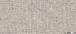
vescom > Wallpaper
Embrace sustainability and elegance with Vescom Dale, a natural wallcovering made with 70% post-consumer recycled wool. Offered in seven soft mélange tones, this high-quality wallcovering combines warmth, texture, and eco-conscious design to elevate your interiors with a touch of timeless sophistication. 1️⃣ 🌿 Sustainable Craftsmanship Vescom Dale features 70% post-consumer recycled wool, supported by a blend of polyester and polyamide on a non-woven backing. It's a luxurious and eco-friendly choice for environmentally mindful interior designs. 🌎 2️⃣ 🖌️ Elegant Mélange Tones Available in seven soft mélange hues, this wallcovering adds subtle sophistication and warmth to any room. The natural wool texture enhances both modern and traditional aesthetics. 🎨 3️⃣ 📏 Wide Coverage for Seamless Installation Measuring ±134 cm (±53 inches) in width, Dale wallcovering offers generous coverage and a flawless finish for large-scale applications. 📐 4️⃣ 🔥 Certified Safety and Durability This flame-retardant wallcovering meets EN 13501 (C, s1 - d0) and ASTM E84 standards, providing reliable safety for residential and commercial spaces. Superior lightfastness (ISO 105-B02 rating 8) ensures vibrant, long-lasting appeal. 🛡️ 5️⃣ 💧 Breathable and Lightweight Design With water vapor permeability (<0.5 m SD value) and a weight of ±310 gr/m² (±14 oz/yd²), Vescom Dale is not only lightweight but also breathable, enhancing the comfort and durability of your interiors. 💪 Tags: Recycled Wool Wallcovering, Mélange Tone Wall Design, Sustainable Wall Material, Natural Interior Design, Flame Retardant Wool Wallcovering, Lightweight Breathable Wallcovering, Vescom Dale Collection, Eco-Friendly Wall Solution, Textured Wall Decor, Non-Woven Backing Wallcovering
Matrice Forma

florim > Wallcovering
An atlas of modular signs to be combined in a wide variety of layouts. «We love concrete as a material, its versatility and its plain, austere look. We have completed our carefully designed surfaces with graphic patterning inspired by the human actions of weaving and embroidering.» Barbara Brondi & Marco Rainò To appreciate the profundity of the design project undertaken by Barbara Brondi and Marco Rainò for Cedit, it is both necessary and explanatory to start from the title the collection bears. In modern usage the term Matrice, in Italian, refers to a die or mould used to reproduce an object, but its origins are much more remote, with a meaning closer to the English “matrix”, meaning the underlying basis of something. The root of the word is related to Mater or mother: the name Matrice thus relates to the origin or cause of something. This dichotomy is expressed in several levels within the work of these architects, who study the world from a sophisticated conceptual approach and then transform it into a design. Starting from the idea of ceramic coverings, which have always been a tool not so much of architecture as of interior design, the artists work back to the origin of the surface and its decoration within their own discipline: they look at what we used to call the modern age, where modernity has also brought an uncompromising brutality, and where the use of bare concrete became the statement of an attitude to life with no time to spare for manners. Concrete is originally a liquid material, intended for shaping, which can therefore absorb and retain any type of mark created by the material and mould used to form it. Architects midway between rationalism and brutalism have used the rough-and-ready language of concrete combined with a last, elegant, anthropic decorative motif impressed on the material, that makes the concept of covering superfluous, because its place, in its older meaning of decoration rather than functional cladding, is taken by the regular patterning created in the material itself. There are therefore various grounds for believing that, in this collection, the artists are once again working in architectural terms. Firstly, with a simplicity typical of BRH+, they reduce the initial concepts to their minimal terms. So although this is a collection of coverings for walls, indoor floors, outdoor pavings and curtain walls, a great deal of time was spent on destructuring the idea of the ceramic covering itself. Unfortunately, nowadays there is no space in the contemporary construction sector for the radical approach of the past, so the cladding designed for the building actually lays bare the interior, using the choice of material – accurately interpreted (with shade variation) on the basis of an assortment of various types – to restore visual elegance and a fundamental severity. Attention to scale is another architectural feature: Matrice offers modules with architectural dimensions and different sizes through the development of “large slabs”, eliminating the visual regular grid effect. Thanks to this visual reset, geographic forms are perceived to emerge from dense, grey concrete surfaces decorated as in bygone days by special processes and by weathering during drying. The various types of slab, each an atlas of subtle, vibrant signs on the surfaces, comprise finishes that reproduce the visual effect of reinforced concrete – with the aggregates in the cement more clearly visible, of formwork – with the signs impressed on the concrete by the timber used, of a structured surface resembling bare cement plaster, of ridged and streaked surfaces – with patterning resembling some kinds of linear surface finishing processes – and finally a smooth, or basic version, over which Matrice exercises the dichotomy referred to earlier. It is on these surfaces that Brondi and Rainò have imagined additional design reverberations, a figurative code that rejects the concept of the grid, previously inseparable from that of the module: by means of a vocabulary of graphic marks cut into the slabs with a depth of 3 mm (the width of the gap left between modules during installation), they provide a framework for infinite combinations of possible dialogues. Just as in embroidery, which is based on grids of stitches and geometric repetitions, and where every stitch is at right-angles to another one to construct forms and decorations. Also taken from embroidery is the idea of introducing a degree of “softness” to reduce the stiffness of intentionally deaf surfaces. There is the impression of patterns that can continue for infinity, as in textile weaving, and a scale that, unlike the surface being worked on, is imagined as suspended and lightweight. They may not admit it, but BRH+ know a lot about music, including electronic music, and it appears to me that this organised tangle of infinite signs – unidentifiable without an overview – is rather like the representations of synthesized sounds. Sounds that are produced by machines, and thus “woven” by sampling and overlapping sounds of the most unlikely origins, combined to form jingles which, once heard, are imprinted indelibly on the brain. This may be why I am so interested in the space between this “melodic film” and its deaf, damp substrate. The eyes can navigate this suspended reality without fear of disturbance. So we are faced with different surfaces, different sizes and different graphic signs. But only one colour (surprise!) to prevent a cacophony not just of signs but also of possible interpretations: the artists retain their radical principles (and their generosity), and as curators, a role in which they are skilled, they leave the players (architects and installers) to add their own interpretations. In their hands this colour, expressed in Matrice, will produce motifs on surfaces in living spaces for someone else. This stylish covering and its workmanship will be left to the hands of someone who will probably never read this, but will be on a building site, with the radio playing on a stereo system, concentrating on installing the very pieces we describe. So a radical, apparently silent, design project like this has repercussions for the real world we live in. Matrice has no form of its own but merely acquires the ornamentation drawn on its surfaces by a second group of artists. And here this routine action, standardised by the form approved for production and workmanlike efficiency, is the origin and cause of change, generating a variability of choices and interpretations, on that dusty building site where music plays and mortar flows.
Matrice Rilievo

florim > Wallcovering
An atlas of modular signs to be combined in a wide variety of layouts. «We love concrete as a material, its versatility and its plain, austere look. We have completed our carefully designed surfaces with graphic patterning inspired by the human actions of weaving and embroidering.» Barbara Brondi & Marco Rainò To appreciate the profundity of the design project undertaken by Barbara Brondi and Marco Rainò for Cedit, it is both necessary and explanatory to start from the title the collection bears. In modern usage the term Matrice, in Italian, refers to a die or mould used to reproduce an object, but its origins are much more remote, with a meaning closer to the English “matrix”, meaning the underlying basis of something. The root of the word is related to Mater or mother: the name Matrice thus relates to the origin or cause of something. This dichotomy is expressed in several levels within the work of these architects, who study the world from a sophisticated conceptual approach and then transform it into a design. Starting from the idea of ceramic coverings, which have always been a tool not so much of architecture as of interior design, the artists work back to the origin of the surface and its decoration within their own discipline: they look at what we used to call the modern age, where modernity has also brought an uncompromising brutality, and where the use of bare concrete became the statement of an attitude to life with no time to spare for manners. Concrete is originally a liquid material, intended for shaping, which can therefore absorb and retain any type of mark created by the material and mould used to form it. Architects midway between rationalism and brutalism have used the rough-and-ready language of concrete combined with a last, elegant, anthropic decorative motif impressed on the material, that makes the concept of covering superfluous, because its place, in its older meaning of decoration rather than functional cladding, is taken by the regular patterning created in the material itself. There are therefore various grounds for believing that, in this collection, the artists are once again working in architectural terms. Firstly, with a simplicity typical of BRH+, they reduce the initial concepts to their minimal terms. So although this is a collection of coverings for walls, indoor floors, outdoor pavings and curtain walls, a great deal of time was spent on destructuring the idea of the ceramic covering itself. Unfortunately, nowadays there is no space in the contemporary construction sector for the radical approach of the past, so the cladding designed for the building actually lays bare the interior, using the choice of material – accurately interpreted (with shade variation) on the basis of an assortment of various types – to restore visual elegance and a fundamental severity. Attention to scale is another architectural feature: Matrice offers modules with architectural dimensions and different sizes through the development of “large slabs”, eliminating the visual regular grid effect. Thanks to this visual reset, geographic forms are perceived to emerge from dense, grey concrete surfaces decorated as in bygone days by special processes and by weathering during drying. The various types of slab, each an atlas of subtle, vibrant signs on the surfaces, comprise finishes that reproduce the visual effect of reinforced concrete – with the aggregates in the cement more clearly visible, of formwork – with the signs impressed on the concrete by the timber used, of a structured surface resembling bare cement plaster, of ridged and streaked surfaces – with patterning resembling some kinds of linear surface finishing processes – and finally a smooth, or basic version, over which Matrice exercises the dichotomy referred to earlier. It is on these surfaces that Brondi and Rainò have imagined additional design reverberations, a figurative code that rejects the concept of the grid, previously inseparable from that of the module: by means of a vocabulary of graphic marks cut into the slabs with a depth of 3 mm (the width of the gap left between modules during installation), they provide a framework for infinite combinations of possible dialogues. Just as in embroidery, which is based on grids of stitches and geometric repetitions, and where every stitch is at right-angles to another one to construct forms and decorations. Also taken from embroidery is the idea of introducing a degree of “softness” to reduce the stiffness of intentionally deaf surfaces. There is the impression of patterns that can continue for infinity, as in textile weaving, and a scale that, unlike the surface being worked on, is imagined as suspended and lightweight. They may not admit it, but BRH+ know a lot about music, including electronic music, and it appears to me that this organised tangle of infinite signs – unidentifiable without an overview – is rather like the representations of synthesized sounds. Sounds that are produced by machines, and thus “woven” by sampling and overlapping sounds of the most unlikely origins, combined to form jingles which, once heard, are imprinted indelibly on the brain. This may be why I am so interested in the space between this “melodic film” and its deaf, damp substrate. The eyes can navigate this suspended reality without fear of disturbance. So we are faced with different surfaces, different sizes and different graphic signs. But only one colour (surprise!) to prevent a cacophony not just of signs but also of possible interpretations: the artists retain their radical principles (and their generosity), and as curators, a role in which they are skilled, they leave the players (architects and installers) to add their own interpretations. In their hands this colour, expressed in Matrice, will produce motifs on surfaces in living spaces for someone else. This stylish covering and its workmanship will be left to the hands of someone who will probably never read this, but will be on a building site, with the radio playing on a stereo system, concentrating on installing the very pieces we describe. So a radical, apparently silent, design project like this has repercussions for the real world we live in. Matrice has no form of its own but merely acquires the ornamentation drawn on its surfaces by a second group of artists. And here this routine action, standardised by the form approved for production and workmanlike efficiency, is the origin and cause of change, generating a variability of choices and interpretations, on that dusty building site where music plays and mortar flows.
Earthtech CARBON_FLAKES

florim > Wall tile-stone-brick
From an ancient past to a responsible future <p>The collection injects new life into the earth through a sustainable production process, with a strong focus on green management, to offer the architect an exceptional technical and aesthetic performance in compliance with the socio-environmental context and the latest eco-friendly building needs. With EARTHTECH earth becomes “technical earth” with a highly innovative content, offering new solutions to green architecture and fulfilling the new frontiers of circular economy in construction, guaranteeing a sustainable future. <br />EARTHTECH offers a choice of organic textures to observe and touch, thanks to the wide range of finishes (Comfort, Glossy-Bright and structured) which add a tactile and unexpected perceptive dimension for use in all types of application. <br /><a class="btn arrow" href="https://www.florim.com/en/surfaces/the-new-comfort-surface/"> Discover the new Comfort surface </a></p> <p>EARTHTECH/ is also a return to the origins of the Florim brand through a full body technical product that blends surface and thickness and derives from the spontaneous mixing of carefully pre-selected fragments and pigments of different shades which give the material a unique, one-of-a-kind visual effect in each slab, mimicking the amazing variety of colours and elements in nature. The result is a composite product with a textured design, in which the flakes and aggregate grains create an original mélange effect that is vitrified during firing, producing a robust, high-quality and exceptionally strong and wear-resistant product; one which can be used in any type of building setting and weather conditions, even the harshest.</p>
Earthtech PUMICE_GROUND

florim > Wallcovering
From an ancient past to a responsible future <p>The collection injects new life into the earth through a sustainable production process, with a strong focus on green management, to offer the architect an exceptional technical and aesthetic performance in compliance with the socio-environmental context and the latest eco-friendly building needs. With EARTHTECH earth becomes “technical earth” with a highly innovative content, offering new solutions to green architecture and fulfilling the new frontiers of circular economy in construction, guaranteeing a sustainable future. <br />EARTHTECH offers a choice of organic textures to observe and touch, thanks to the wide range of finishes (Comfort, Glossy-Bright and structured) which add a tactile and unexpected perceptive dimension for use in all types of application. <br /><a class="btn arrow" href="https://www.florim.com/en/surfaces/the-new-comfort-surface/"> Discover the new Comfort surface </a></p> <p>EARTHTECH/ is also a return to the origins of the Florim brand through a full body technical product that blends surface and thickness and derives from the spontaneous mixing of carefully pre-selected fragments and pigments of different shades which give the material a unique, one-of-a-kind visual effect in each slab, mimicking the amazing variety of colours and elements in nature. The result is a composite product with a textured design, in which the flakes and aggregate grains create an original mélange effect that is vitrified during firing, producing a robust, high-quality and exceptionally strong and wear-resistant product; one which can be used in any type of building setting and weather conditions, even the harshest.</p>
Matrice Sostanza

florim > Wallcovering
An atlas of modular signs to be combined in a wide variety of layouts. «We love concrete as a material, its versatility and its plain, austere look. We have completed our carefully designed surfaces with graphic patterning inspired by the human actions of weaving and embroidering.» Barbara Brondi & Marco Rainò To appreciate the profundity of the design project undertaken by Barbara Brondi and Marco Rainò for Cedit, it is both necessary and explanatory to start from the title the collection bears. In modern usage the term Matrice, in Italian, refers to a die or mould used to reproduce an object, but its origins are much more remote, with a meaning closer to the English “matrix”, meaning the underlying basis of something. The root of the word is related to Mater or mother: the name Matrice thus relates to the origin or cause of something. This dichotomy is expressed in several levels within the work of these architects, who study the world from a sophisticated conceptual approach and then transform it into a design. Starting from the idea of ceramic coverings, which have always been a tool not so much of architecture as of interior design, the artists work back to the origin of the surface and its decoration within their own discipline: they look at what we used to call the modern age, where modernity has also brought an uncompromising brutality, and where the use of bare concrete became the statement of an attitude to life with no time to spare for manners. Concrete is originally a liquid material, intended for shaping, which can therefore absorb and retain any type of mark created by the material and mould used to form it. Architects midway between rationalism and brutalism have used the rough-and-ready language of concrete combined with a last, elegant, anthropic decorative motif impressed on the material, that makes the concept of covering superfluous, because its place, in its older meaning of decoration rather than functional cladding, is taken by the regular patterning created in the material itself. There are therefore various grounds for believing that, in this collection, the artists are once again working in architectural terms. Firstly, with a simplicity typical of BRH+, they reduce the initial concepts to their minimal terms. So although this is a collection of coverings for walls, indoor floors, outdoor pavings and curtain walls, a great deal of time was spent on destructuring the idea of the ceramic covering itself. Unfortunately, nowadays there is no space in the contemporary construction sector for the radical approach of the past, so the cladding designed for the building actually lays bare the interior, using the choice of material – accurately interpreted (with shade variation) on the basis of an assortment of various types – to restore visual elegance and a fundamental severity. Attention to scale is another architectural feature: Matrice offers modules with architectural dimensions and different sizes through the development of “large slabs”, eliminating the visual regular grid effect. Thanks to this visual reset, geographic forms are perceived to emerge from dense, grey concrete surfaces decorated as in bygone days by special processes and by weathering during drying. The various types of slab, each an atlas of subtle, vibrant signs on the surfaces, comprise finishes that reproduce the visual effect of reinforced concrete – with the aggregates in the cement more clearly visible, of formwork – with the signs impressed on the concrete by the timber used, of a structured surface resembling bare cement plaster, of ridged and streaked surfaces – with patterning resembling some kinds of linear surface finishing processes – and finally a smooth, or basic version, over which Matrice exercises the dichotomy referred to earlier. It is on these surfaces that Brondi and Rainò have imagined additional design reverberations, a figurative code that rejects the concept of the grid, previously inseparable from that of the module: by means of a vocabulary of graphic marks cut into the slabs with a depth of 3 mm (the width of the gap left between modules during installation), they provide a framework for infinite combinations of possible dialogues. Just as in embroidery, which is based on grids of stitches and geometric repetitions, and where every stitch is at right-angles to another one to construct forms and decorations. Also taken from embroidery is the idea of introducing a degree of “softness” to reduce the stiffness of intentionally deaf surfaces. There is the impression of patterns that can continue for infinity, as in textile weaving, and a scale that, unlike the surface being worked on, is imagined as suspended and lightweight. They may not admit it, but BRH+ know a lot about music, including electronic music, and it appears to me that this organised tangle of infinite signs – unidentifiable without an overview – is rather like the representations of synthesized sounds. Sounds that are produced by machines, and thus “woven” by sampling and overlapping sounds of the most unlikely origins, combined to form jingles which, once heard, are imprinted indelibly on the brain. This may be why I am so interested in the space between this “melodic film” and its deaf, damp substrate. The eyes can navigate this suspended reality without fear of disturbance. So we are faced with different surfaces, different sizes and different graphic signs. But only one colour (surprise!) to prevent a cacophony not just of signs but also of possible interpretations: the artists retain their radical principles (and their generosity), and as curators, a role in which they are skilled, they leave the players (architects and installers) to add their own interpretations. In their hands this colour, expressed in Matrice, will produce motifs on surfaces in living spaces for someone else. This stylish covering and its workmanship will be left to the hands of someone who will probably never read this, but will be on a building site, with the radio playing on a stereo system, concentrating on installing the very pieces we describe. So a radical, apparently silent, design project like this has repercussions for the real world we live in. Matrice has no form of its own but merely acquires the ornamentation drawn on its surfaces by a second group of artists. And here this routine action, standardised by the form approved for production and workmanlike efficiency, is the origin and cause of change, generating a variability of choices and interpretations, on that dusty building site where music plays and mortar flows.
COSMO 1502 - 3 Seater: Contemporary Design with Ultimate Comfort
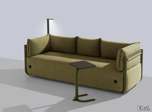
Et al. > Sofa
COSMO 1502 - 3 Seater: Contemporary Design with Ultimate Comfort The COSMO 1502 - 3 Seater sofa is a stylish and functional piece designed to elevate any interior. With its modern aesthetic and exceptional comfort, this sofa is perfect for a wide range of environments, including residential living rooms, hotel lounges, office waiting areas, and hospitality projects. Its clean lines, curved edges, and sleek metal base create a minimalist yet inviting appeal. Dimensions and Design The COSMO 1502 is designed with precision and practicality, featuring the following dimensions: Length: 237 cm Width: 88 cm Height: 80 cm Seat Height: 44 cm These dimensions make it spacious enough to seat three comfortably while maintaining a compact footprint that suits both large and smaller spaces. Its slightly inclined backrest and plush seating cushions offer the perfect balance of support and relaxation, making it an excellent choice for extended use. The tubular metal base, which raises the sofa slightly off the ground, adds an industrial touch to its modern aesthetic and creates a "floating" effect that enhances its lightweight look. Materials and Finishes The COSMO 1502 is crafted using premium materials that guarantee durability and style: Frame: Sturdy tubular metal, ensuring long-lasting stability while maintaining a sleek, contemporary profile. Upholstery: Choose from a variety of high-quality fabrics, including soft velvets, luxurious leathers, durable synthetic blends, and wools. These materials offer both tactile appeal and robust performance. Colour Options: Neutral tones like grey, cream, and taupe are ideal for minimalist and Scandinavian interiors. For bolder statements, vibrant colours like teal, mustard, or terracotta are available. The sofa's upholstery is expertly tailored, with removable covers that ensure easy maintenance and adaptability over time. Style and Versatility The COSMO 1502 seamlessly fits into various interior styles, such as contemporary, Scandinavian, and Japandi. Its rounded armrests, clean lines, and balanced proportions exude a refined elegance suitable for both casual and formal settings. The design is versatile enough to be the focal point of a living room or to complement other furniture in a larger lounge or lobby setup. Its lightweight yet durable construction also makes it an excellent choice for commercial spaces where heavy use is expected. The raised base allows for easy cleaning underneath, making it ideal for high-traffic areas. Applications and Uses The COSMO 1502 excels in a variety of environments: Residential Settings: Ideal for living rooms or family spaces, offering comfort and a contemporary design focus. Hospitality Projects: A standout piece for hotel lobbies, suites, and lounge areas. Office Spaces: Enhances reception areas and break-out zones with a sophisticated yet approachable aesthetic. Public Spaces: Durable enough for high-traffic areas such as libraries, art galleries, and healthcare facilities. Alternatives and Complements For smaller spaces, the COSMO collection includes a 2-seater option that retains the same elegant design but with more compact dimensions. Matching armchairs and ottomans from the COSMO range can also be added to create a cohesive and versatile seating arrangement. Key Features and Benefits A modern, minimalist design that integrates seamlessly into various interior styles. Customisation options in upholstery materials and colours to match specific design requirements. Tubular metal frame for a sleek, industrial look and lasting durability. 2D and 3D files are available for designers, making it easy to incorporate into design projects. Removable upholstery covers for hassle-free maintenance.
Earthtech OUTBACK_GROUND

florim > Wallcovering
From an ancient past to a responsible future <p>The collection injects new life into the earth through a sustainable production process, with a strong focus on green management, to offer the architect an exceptional technical and aesthetic performance in compliance with the socio-environmental context and the latest eco-friendly building needs. With EARTHTECH earth becomes “technical earth” with a highly innovative content, offering new solutions to green architecture and fulfilling the new frontiers of circular economy in construction, guaranteeing a sustainable future. <br />EARTHTECH offers a choice of organic textures to observe and touch, thanks to the wide range of finishes (Comfort, Glossy-Bright and structured) which add a tactile and unexpected perceptive dimension for use in all types of application. <br /><a class="btn arrow" href="https://www.florim.com/en/surfaces/the-new-comfort-surface/"> Discover the new Comfort surface </a></p> <p>EARTHTECH/ is also a return to the origins of the Florim brand through a full body technical product that blends surface and thickness and derives from the spontaneous mixing of carefully pre-selected fragments and pigments of different shades which give the material a unique, one-of-a-kind visual effect in each slab, mimicking the amazing variety of colours and elements in nature. The result is a composite product with a textured design, in which the flakes and aggregate grains create an original mélange effect that is vitrified during firing, producing a robust, high-quality and exceptionally strong and wear-resistant product; one which can be used in any type of building setting and weather conditions, even the harshest.</p>
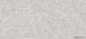
High Performance Vinyl Wallpaper by Vescom | dale - 2108.04
vescom > Wallpaper
Embrace sustainability and elegance with Vescom Dale, a natural wallcovering made with 70% post-consumer recycled wool. Offered in seven soft mélange tones, this high-quality wallcovering combines warmth, texture, and eco-conscious design to elevate your interiors with a touch of timeless sophistication. 1️⃣ 🌿 Sustainable Craftsmanship Vescom Dale features 70% post-consumer recycled wool, supported by a blend of polyester and polyamide on a non-woven backing. It's a luxurious and eco-friendly choice for environmentally mindful interior designs. 🌎 2️⃣ 🖌️ Elegant Mélange Tones Available in seven soft mélange hues, this wallcovering adds subtle sophistication and warmth to any room. The natural wool texture enhances both modern and traditional aesthetics. 🎨 3️⃣ 📏 Wide Coverage for Seamless Installation Measuring ±134 cm (±53 inches) in width, Dale wallcovering offers generous coverage and a flawless finish for large-scale applications. 📐 4️⃣ 🔥 Certified Safety and Durability This flame-retardant wallcovering meets EN 13501 (C, s1 - d0) and ASTM E84 standards, providing reliable safety for residential and commercial spaces. Superior lightfastness (ISO 105-B02 rating 8) ensures vibrant, long-lasting appeal. 🛡️ 5️⃣ 💧 Breathable and Lightweight Design With water vapor permeability (<0.5 m SD value) and a weight of ±310 gr/m² (±14 oz/yd²), Vescom Dale is not only lightweight but also breathable, enhancing the comfort and durability of your interiors. 💪 Tags: Recycled Wool Wallcovering, Mélange Tone Wall Design, Sustainable Wall Material, Natural Interior Design, Flame Retardant Wool Wallcovering, Lightweight Breathable Wallcovering, Vescom Dale Collection, Eco-Friendly Wall Solution, Textured Wall Decor, Non-Woven Backing Wallcovering
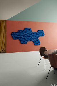
Rilievi Lido
florim > Wall Paint
The alternation and symbiosis between concave and convex, recessed and raised. <p>Rilievi is a work of design balanced between different historic periods: while the volumetric relief tile modules are inspired by artistic experiments conducted in Italy during the Sixties and Seventies, the large slabs are the outcome of research into materials and technology that has only come to fruition in very recent times. The shadow effects generated on the surfaces of the slabs by the light striking the projecting parts of the modules create an unusual impression of architectural depth found virtually nowhere else in ceramic coverings, laying the bases for a new decoration interior design language.</p> This project simply embodies perfection - a term which certainly sets the bar high in a description of a new product for launch on the market. But when an enlightened manufacturer is capable of encapsulating a designer's personal research in a product to be added to its range, the outcome is a perfect synthesis. A perfect synthesis between untrammelled creativity and market trends. CEDIT had the insight needed to perceive, identify and rework the immense potential of Practice Practice Practice "“ a self-produced project by Zaven (Enrica Cavarzan and Marco Zavagno "“ and realised that its sophisticated design, originated by pure, pristine input (unadulterated by external factors except the noblest of them all, research) could provide the basis for an innovative, successful collection. I might add, a collection unique of its kind. Zaven is also a name that comes with guarantees; the two partners are good at what they do. Their work always starts from personal curiosity and investigations, the study of other stories (as in this case inspiration was drawn from the output of artist and activist Nino Caruso) and individual interests, which are broken down, developed, optimised and prepared for transformation into something fresh.Enrica Cavarzan and Marco Zavagno have a masterly ability to transform their own wishes and passions into design work of the greatest breadth and, as we see here, the widest, richest application. Their use of ceramics as a material is clearly outstanding and reflects a method precisely founded on the desire to look at things from an unusual viewpoint, under a different light. And to be daring. Zaven have an unconventional approach to convention. In the specific case of the Rilievi collection, the "modules" created for CEDIT seem to explode off the walls; in fact, they are constructed by combining the two-dimensional slab with its three-dimensional decor.Rilievi seems to be seeking space. More space. Even though these modules have actually established a dialogue with the wall from which they are born. At the same time, they hypnotise us with their tight sequence of lines, the pattern that is always different although its root is the same, and the intriguing, unusual colours that add another vital factor to the finished product. Their firm grounding in graphic design (and here we have come back to two-dimensional effects, of the kind most often associated with a wall covering) easily evolves into a facade which seems to have been carved with a chisel - although this is not the case. These modules are conceived to convey an impression of movement, and the three models, in seven colour combinations, create a powerful effect on a surface, which is never passive but rather an organic contributor to the forms and colours involved in the fascinating combinations. The slab is very much present and has the same worth and status as the relief pattern associated to it. In the light of this dichotomy between the linear and the sculpted, expressed through the skilfully balanced visual expedients, the use of repetition adds vigour to the module's intrinsic meaning. As we have seen, a rejection of facile, superficial creative dynamics in favour of an investigation reaching above and beyond has always been a central, clearly recognisable feature of this Venice-based duo, who already have impressive international partnerships to their credit, including the London Design Festival, the Kalmar Konstmuseum, the Paris Designer Days, Ca' Foscari University, the Venice Biennale, the Sandretto Re Rebaudengo Foundation, the Sindika Dokolo Foundation and the V-A-C Foundation, and also won the 2018 Wallpaper Design Award. Graphics, advertising and product design: the pair have always opted for a type of design closely linked to the observation of everyday items, followed by their reinterpretation in a version applied to experimentation with materials. This duality, combined with their energetic yet elegant visual language, forms Enrica and Marco's primary code, experienced in this specific context through serial carvings. On walls.
ARKAD - Modular fabric pouf _ Zilio A&C
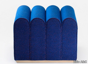
Zilio A&C > Pouf
Arkad S by Zilio A&C – A Playful and Modular Pouffe for Contemporary Spaces A Soft Interpretation of Architectural Forms Designed by Note Design Studio for Zilio A&C, the Arkad S pouffe draws inspiration from the classic portico, transforming architectural geometry into a playful yet elegant seating solution. With its soft, rounded form and compact dimensions, Arkad S works as a standalone graphic accent or as part of a modular seating system when combined with other pieces from the Arkad collection. Versatility for Residential & Commercial Interiors The Arkad collection is designed to bring flexibility and personality to modern interiors, making it an excellent choice for: Hotel Lobbies & Lounge Areas – A stylish, informal seating option that enhances social and relaxation zones. Co-Working & Office Spaces – Adds a soft and inviting element to collaborative work environments. Retail & Exhibition Spaces – Functions as a display piece or interactive seating in creative settings. Residential Interiors – Works as an accent stool, ottoman, or occasional seating in living rooms and bedrooms. Thanks to its sculptural yet minimal design, Arkad S seamlessly integrates into Scandinavian, contemporary, Japandi, and eclectic interiors. Compact, Comfortable & Fully Upholstered With a fully upholstered body, Arkad S offers both aesthetic appeal and seating comfort. Its soft, rounded edges create a welcoming look, while its compact size makes it easy to move and rearrange. The available fabric finishes allow for customization to suit different interior styles—ranging from neutral, understated tones for modern minimalism to bold, vibrant hues for playful contract settings. Dimensions & Modularity Arkad S is compact yet impactful, making it ideal for small and large spaces alike: Width: 550 mm Depth: 550 mm Height: 450 mm Designed as part of the Arkad series, it can be used alone or combined with other Arkad pieces, such as longer seating units and corner elements, to create unique configurations. Why Choose the Arkad S Pouffe? ✔ Architectural inspiration – A modern take on the classical portico. ✔ Flexible use – Perfect as a standalone accent piece or part of a modular seating system. ✔ Fully upholstered – Provides both comfort and aesthetic appeal. ✔ Compact yet functional – Ideal for residential, hospitality, and commercial spaces. ✔ Customizable fabric options – Suitable for a wide range of interior design schemes. A Modular Statement Piece for Dynamic Interiors Whether used individually or combined into a larger composition, Arkad S is a versatile, stylish, and engaging seating solution that enhances modern interiors with playfulness and sophistication. 📥 2D & 3D files available for download for easy specification in interior projects. 🔗 Discover more at Zilio A&C.
Matrice Aura

florim > Wallcovering
An atlas of modular signs to be combined in a wide variety of layouts. «We love concrete as a material, its versatility and its plain, austere look. We have completed our carefully designed surfaces with graphic patterning inspired by the human actions of weaving and embroidering.» Barbara Brondi & Marco Rainò To appreciate the profundity of the design project undertaken by Barbara Brondi and Marco Rainò for Cedit, it is both necessary and explanatory to start from the title the collection bears. In modern usage the term Matrice, in Italian, refers to a die or mould used to reproduce an object, but its origins are much more remote, with a meaning closer to the English “matrix”, meaning the underlying basis of something. The root of the word is related to Mater or mother: the name Matrice thus relates to the origin or cause of something. This dichotomy is expressed in several levels within the work of these architects, who study the world from a sophisticated conceptual approach and then transform it into a design. Starting from the idea of ceramic coverings, which have always been a tool not so much of architecture as of interior design, the artists work back to the origin of the surface and its decoration within their own discipline: they look at what we used to call the modern age, where modernity has also brought an uncompromising brutality, and where the use of bare concrete became the statement of an attitude to life with no time to spare for manners. Concrete is originally a liquid material, intended for shaping, which can therefore absorb and retain any type of mark created by the material and mould used to form it. Architects midway between rationalism and brutalism have used the rough-and-ready language of concrete combined with a last, elegant, anthropic decorative motif impressed on the material, that makes the concept of covering superfluous, because its place, in its older meaning of decoration rather than functional cladding, is taken by the regular patterning created in the material itself. There are therefore various grounds for believing that, in this collection, the artists are once again working in architectural terms. Firstly, with a simplicity typical of BRH+, they reduce the initial concepts to their minimal terms. So although this is a collection of coverings for walls, indoor floors, outdoor pavings and curtain walls, a great deal of time was spent on destructuring the idea of the ceramic covering itself. Unfortunately, nowadays there is no space in the contemporary construction sector for the radical approach of the past, so the cladding designed for the building actually lays bare the interior, using the choice of material – accurately interpreted (with shade variation) on the basis of an assortment of various types – to restore visual elegance and a fundamental severity. Attention to scale is another architectural feature: Matrice offers modules with architectural dimensions and different sizes through the development of “large slabs”, eliminating the visual regular grid effect. Thanks to this visual reset, geographic forms are perceived to emerge from dense, grey concrete surfaces decorated as in bygone days by special processes and by weathering during drying. The various types of slab, each an atlas of subtle, vibrant signs on the surfaces, comprise finishes that reproduce the visual effect of reinforced concrete – with the aggregates in the cement more clearly visible, of formwork – with the signs impressed on the concrete by the timber used, of a structured surface resembling bare cement plaster, of ridged and streaked surfaces – with patterning resembling some kinds of linear surface finishing processes – and finally a smooth, or basic version, over which Matrice exercises the dichotomy referred to earlier. It is on these surfaces that Brondi and Rainò have imagined additional design reverberations, a figurative code that rejects the concept of the grid, previously inseparable from that of the module: by means of a vocabulary of graphic marks cut into the slabs with a depth of 3 mm (the width of the gap left between modules during installation), they provide a framework for infinite combinations of possible dialogues. Just as in embroidery, which is based on grids of stitches and geometric repetitions, and where every stitch is at right-angles to another one to construct forms and decorations. Also taken from embroidery is the idea of introducing a degree of “softness” to reduce the stiffness of intentionally deaf surfaces. There is the impression of patterns that can continue for infinity, as in textile weaving, and a scale that, unlike the surface being worked on, is imagined as suspended and lightweight. They may not admit it, but BRH+ know a lot about music, including electronic music, and it appears to me that this organised tangle of infinite signs – unidentifiable without an overview – is rather like the representations of synthesized sounds. Sounds that are produced by machines, and thus “woven” by sampling and overlapping sounds of the most unlikely origins, combined to form jingles which, once heard, are imprinted indelibly on the brain. This may be why I am so interested in the space between this “melodic film” and its deaf, damp substrate. The eyes can navigate this suspended reality without fear of disturbance. So we are faced with different surfaces, different sizes and different graphic signs. But only one colour (surprise!) to prevent a cacophony not just of signs but also of possible interpretations: the artists retain their radical principles (and their generosity), and as curators, a role in which they are skilled, they leave the players (architects and installers) to add their own interpretations. In their hands this colour, expressed in Matrice, will produce motifs on surfaces in living spaces for someone else. This stylish covering and its workmanship will be left to the hands of someone who will probably never read this, but will be on a building site, with the radio playing on a stereo system, concentrating on installing the very pieces we describe. So a radical, apparently silent, design project like this has repercussions for the real world we live in. Matrice has no form of its own but merely acquires the ornamentation drawn on its surfaces by a second group of artists. And here this routine action, standardised by the form approved for production and workmanlike efficiency, is the origin and cause of change, generating a variability of choices and interpretations, on that dusty building site where music plays and mortar flows.
High Performance Vinyl Wallpaper by Vescom | fraser - 2109.03

vescom > Wallpaper
Enhance your interiors with Vescom Fraser, a premium wallcovering featuring a striking 3-dimensional architectural weave in opaque, softly reflective shades. Made from high-performance polyethylene tape yarn, this versatile design is available with an acrylic backing or as an unbacked option, offering exceptional durability, elegance, and eco-conscious features. Bullet Points: 1️⃣ 🌿 Sustainable and Eco-Friendly Vescom Fraser is PFAS-free, low in VOC emissions (CAL 01350 certified), and compliant with the Living Building Challenge Red List. A perfect choice for those prioritizing sustainable and healthy interior solutions. 🌎 2️⃣ 🖌️ Stunning 3D Architectural Weave The dimensional weave design and softly reflective tones create an elegant and modern aesthetic, adding depth and texture to any space. Ideal for both residential and commercial interiors. 🎨 3️⃣ 📏 Flexible Material Options Available in widths of ±137 cm (±54 inches), Fraser comes with options for acrylic backing (2109.XXB) or unbacked (2109.XXU), ensuring adaptability to your specific project requirements. 📐 4️⃣ 🔥 Safety and Durability Guaranteed Certified flame retardant (EN 13501, B, s1 - d0), this wallcovering provides reliable safety and peace of mind. Its high lightfastness (ISO 105-B02, rating 8) ensures long-lasting vibrancy even in well-lit spaces. 🛡️ 5️⃣ 💧 Enhanced Breathability and Lightweight With water vapor permeability (<0.5 m SD value) and a weight range of ±242-293 gr/m² (±11-13 oz/yd²), Vescom Fraser is lightweight, breathable, and easy to install, making it a practical yet luxurious wall solution. 💪 Tags: Polyethylene Wallcovering, 3D Architectural Weave, Low VOC Wall Decor, PFAS-Free Wallcovering, Sustainable Interior Wall Design, Flame Retardant Wallcovering, Lightfast Wall Material, Water Vapor Permeable Wallcovering, Vescom Fraser Collection, Acrylic Backing Wallcoveringv
Project Wallpaper by Vescom | linosa - 2106.05
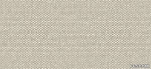
vescom > Wallpaper
Bring natural elegance to your interiors with Vescom Linosa, a bio-based wallcovering crafted entirely from linen. Available in coarse and fine weaves of varying scales, its neutral tones provide a timeless aesthetic, combining texture, sustainability, and durability for a versatile and sophisticated wall solution. Bullet Points: 1️⃣ 🌿 100% Natural Linen Composition Made from bio-based linen on a paper backing, Vescom Linosa prioritizes sustainability and eco-conscious design while offering a high-quality, natural aesthetic. 🌱 2️⃣ 🖌️ Versatile Textures and Neutral Tones Choose from coarse or fine weaves in varying scales, each presented in neutral tones that complement a wide range of interior styles, from modern to traditional. 🎨 3️⃣ 📏 Wide Dimensions for Seamless Application With a width of ±137 cm (±54 inches) and a substantial weight of ±500 gr/m² (±22 oz/yd²), Linosa wallcovering ensures excellent coverage and durability for both residential and commercial spaces. 📐 4️⃣ 🔥 Certified Safety and Lightfastness Meeting EN 13501 (B, s1 - d0) and ASTM E84 (Pass, A) standards for flame retardancy, Vescom Linosa is safe and reliable. Exceptional colorfastness (ISO 105-B02 rating 7–8) guarantees long-lasting vibrancy. 🛡️ 5️⃣ 💧 Breathable and Resilient Design Featuring water vapor permeability (<0.5 m SD value), Linosa is designed for breathability and longevity, making it a practical yet elegant choice for your walls. 💪 Tags: Bio-Based Linen Wallcovering, Neutral Tone Wall Design, Coarse Weave Wall Texture, Fine Weave Wallcovering, Sustainable Interior Solution, Flame Retardant Linen Wallcovering, Durable Wall Material, Vescom Linosa Collection, Natural Linen Wall Decor, Breathable Wallcovering
Rainforest Floor Lamp
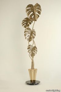
castrolighting > Floor lamp
The Rainforest Collection arose from the timeless lighting celebration of nature silhouettes, their elements, and movements. Immerse yourself into the magnificent atmosphere of the sparkling rainforest where the art of brass craftsmanship becomes luxury lighting design. The ultimate fusion between the artistic design, authenticity of traditional Portuguese metal-work techniques, and creative craftsmanship. The Rainforest floor lamp is unparalleled in the refinement and grace it represents. The gold-plated brass coupled with clear Marquina marble - applied by hand - brings a delicate charisma that resembles nature in full bloom. Broad-leaves masterpiece convening through this modern lighting design taking you to remote spaces and the open sky. A contemporary floor lamp that creates an exceptional ambiance to the classy interiors. Resembling a floor plant, this piece rises from a gold-plated vessel from which the light travels up between the leaves creating a sense of surrealist nature, sharping the perfect wild flora aesthetic for any scenario. A luxury custom-designed collection was made to be featured in the most sophisticated projects organically. The sizes and distribution of the elements can be naturally customizable. This handmade floor light is perfect for vibrant living rooms, dining rooms, or hallways, fitting in a vast variety of decors. This beautiful floor lamp is the right choice for a mid-century modern, modern classic, or art deco interior style. #graceofnature VIEW FULL FAMILY
Cosmo Easy Chair by Et al. – A Versatile Seating Solution for Modern Spaces
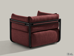
Et al. > Armchair
Cosmo Easy Chair by Et al. – A Versatile Seating Solution for Modern Spaces The Cosmo Easy Chair by Et al., available at FM Design Elements, is a contemporary and highly adaptable seating option, blending functionality and aesthetic appeal. Designed for both indoor and outdoor use, this chair offers a versatile solution for residential, hospitality, commercial, and workspace projects. Material and Finishes Crafted with a durable polypropylene body reinforced with fibreglass, the Cosmo Easy Chair is built to withstand heavy use in high-traffic areas. This sturdy material ensures longevity while maintaining a lightweight structure. The polypropylene shell is UV-resistant, making it ideal for outdoor settings without worrying about colour fading or structural deterioration. The chair is available in a variety of modern matte finishes, including neutral tones such as black, white, and grey, as well as more vibrant hues like mustard and terracotta. These colour options make it easy to incorporate the chair into diverse design schemes, from minimalist to eclectic interiors. Style and Design The Cosmo Easy Chair showcases a modern and minimalist aesthetic. Its curved shell design and clean lines create a sophisticated yet understated look, suitable for Scandinavian and contemporary interiors. The slightly inclined backrest and armrests provide ergonomic support, ensuring comfort for extended seating periods. Its versatility makes it an excellent choice for diverse applications: Residential spaces: Perfect for a balcony, patio, or living room corner. Hospitality settings: A stylish seating solution for cafes, restaurants, and hotel lounges. Commercial projects: Durable enough for offices and co-working spaces. Public areas: An ideal fit for lobbies, waiting rooms, or event venues. Dimensions The Cosmo Easy Chair strikes the right balance between compactness and comfort: Width: 111 cm Depth: 88 cm Height: 80 cm Seat Height: 44 cm These proportions make it a comfortable yet space-saving option for environments where both aesthetics and practicality are crucial. Upholstery Options For added comfort, the chair can be paired with optional upholstered cushions. These cushions come in a variety of fabric types and colours, allowing designers to customise the chair to match specific design needs. Choose from classic textiles or waterproof and stain-resistant fabrics for outdoor use. Accessories and Alternatives The Cosmo Easy Chair can be complemented with matching pieces from Et al.’s collection, such as dining chairs or stools, for a cohesive look. For larger spaces, consider pairing it with lounge furniture or coffee tables that share its contemporary aesthetic. If you're looking for alternatives, stackable polypropylene chairs or metal-framed lounge chairs are other options to consider within the same price range and style category. 2D and 3D Files Available To simplify the design process, downloadable 2D and 3D files of the Cosmo Easy Chair are available. These resources make it easier for architects and designers to incorporate the chair seamlessly into their projects. Why Choose the Cosmo Easy Chair? Durable and lightweight: Fibreglass-reinforced polypropylene ensures longevity without sacrificing portability. Indoor and outdoor versatility: UV resistance and weatherproof materials make it a practical choice for any environment. Ergonomic comfort: A thoughtfully designed shell with proper support for extended seating. Aesthetic adaptability: Its minimalist design and range of colours complement various styles, including Scandinavian, contemporary, and Japandi. Eco-friendly production: Crafted with sustainability in mind, the chair is recyclable and made using eco-conscious processes.
SPACE+ 1405 - Corner fabric armchair _ Et al.
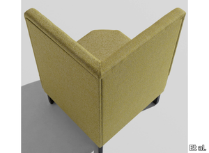
Et al. > Armchair
Space Plus 1405 Modular Corner Unit: The Perfect Corner Solution for Modern Spaces The Space Plus 1405 Modular Corner Unit, part of Et al.'s versatile Space Plus collection, is designed to enhance modular seating arrangements with elegant functionality. This corner module is ideal for creating L-shaped or U-shaped seating configurations, making it an excellent choice for hospitality, office, and public environments. Design and Dimensions The Space Plus 1405 module is carefully crafted to provide a seamless corner connection for modular setups. Its compact yet functional design allows for efficient use of space while maintaining a comfortable seating experience. Dimensions include: Height: 100 cm Width: 70 cm Depth: 70 cm Seat Height: 47 cm Seat Depth: 61.5 cm The square profile ensures that it fits perfectly within modular layouts, serving as a connecting or standalone piece. Materials and Finishes The Space Plus 1405 is customisable to suit a variety of design preferences and environments: Frame: Durable metal structure for long-term use and stability. Upholstery: Available in a wide range of high-performance fabrics, including easy-to-clean and stain-resistant materials. Choose from neutral tones for a timeless look or vibrant colours for a bold statement. Base Finish: Offered in finishes like matte black, metallic tones, or white, allowing seamless integration with your chosen aesthetic. Features Corner Design: Specifically created to connect other modules in the Space Plus collection for cohesive seating arrangements. Comfortable Seating: Ergonomic padding ensures user comfort, even for extended periods. Compact and Functional: Efficient dimensions make it suitable for tight or open spaces alike. Applications The Space Plus 1405 is versatile and ideal for the following settings: Hospitality: Perfect for hotel lounges, lobbies, or VIP areas. Corporate Spaces: Enhances office reception areas or breakout zones. Retail and Public Areas: Suitable for waiting areas in malls, airports, and hospitals. Dining Settings: Adds a functional corner solution for restaurant booth seating. Customisation Options To enhance its versatility, the Space Plus collection offers additional customisation options for the 1405 corner unit: Privacy Panels: Create secluded spaces within open environments. Integrated USB Charging Ports: Ideal for tech-savvy users in modern settings. Add-On Tables: Practical and convenient for workspace or dining applications. Sustainability and Durability Et al. ensures the Space Plus 1405 module is manufactured using eco-friendly processes and materials. Sustainable and recycled fabric options are available to meet environmental standards. Complementary Products The Space Plus 1405 corner unit integrates seamlessly with other modules in the collection, including: Space Plus 1401 and 1402 Linear Modules: For straight or multi-directional layouts. Space Plus Ottomans: Add extra seating flexibility to your arrangement. Matching Coffee Tables: To complement the setup with additional functionality. Key Features Modular corner design for versatile layouts. Durable materials for high-traffic environments. Customisable finishes and upholstery to match specific design needs. Compact dimensions maximise usable space.