SPACE+ 1410 - Fabric linear module _ Et al.
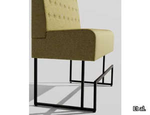
Et al. > Armchair
Space Plus 1410 High-Back Seating Module Dimensions: Height: 128 cm Width: 75 cm Depth: 61.5 cm Seat Height: 47 cm Backrest Height: 75 cm This module has a slightly shorter backrest and a narrower footprint, making it suitable for compact spaces while still providing a sense of enclosure. Materials and Finishes Both modules are crafted with premium materials and offer a range of customisation options: Frame: Sturdy metal construction for stability and durability. Upholstery: Available in a wide range of high-performance fabrics, including stain-resistant and easy-to-maintain options, in both neutral and vibrant colour palettes. Base Finish: Choose from matte black, metallic tones, or white finishes for seamless integration with your design scheme. Features High Backrest: Provides privacy and acoustic benefits, making these modules ideal for open-plan layouts. Compact Design: Maximises seating capacity without overwhelming the space. Modular System: Easily integrates with other Space Plus modules for customised configurations. Comfortable Seating: Cushioned seats ensure ergonomic support for extended use. Applications These seating modules are perfect for a variety of settings: Hospitality: Enhance hotel lobbies, lounge areas, and VIP waiting zones. Corporate Spaces: Create collaborative zones or reception seating with added privacy. Public Areas: Ideal for airports, malls, or healthcare waiting areas where privacy is a priority. Dining Settings: Serve as booth seating in cafés or restaurants. Customisation Options To suit specific needs, these modules offer several enhancements: Privacy Panels: Add-on extensions to further enhance privacy. Integrated Charging Ports: USB or power outlets for tech-friendly environments. Attachable Tables: Practical surfaces for work or dining purposes. Sustainability and Durability Manufactured using eco-friendly processes, the Space Plus 1401A and 1410 modules feature sustainable fabric options, making them an environmentally conscious choice for modern interiors. Complementary Products Pair these modules with other elements from the Space Plus collection: Corner Units: To create L-shaped or U-shaped layouts. Ottomans and Poufs: Provide flexible seating options. Matching Tables: Enhance functionality and cohesion in seating arrangements. Key Features Modular and adaptable to diverse configurations. High backrests for privacy and acoustic benefits. Customisable materials and finishes to match various aesthetics. Durable and eco-friendly construction for long-lasting use.
Alison Rose Sfera Verde Aurora Waterjet Mosaic
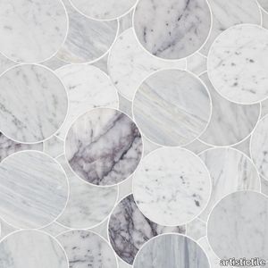
artistictile > Floor tile-stone
Sfera by Alison Rose posits circles upon circles - spheres that seem to bounce across the surface of the tile to create an “infinite” mosaic, with multiple stones placed randomly within the design. The combination of colors and circles is strikingly sophisticated in three timeless colorways. Verde combines Verde Aurora, a vibrant green polished quartzite with polished and honed Nero Marble. Lilac includes honed Lilac marble, polished Statuary, honed Calacatta Bluette, and honed Bianco Carrara. Grafite adds bittersweet chocolate Grafite marble into a blend with polished and honed Nero marble and honed Vanilla Onyx. Sfera is also available in a variety of other custom colorways via Artistic Tile’s “Tailored To” program.
Channel Rug
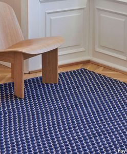
hay > Carpet
Designed for HAY by Clara Von Zweigbergk Channel Rug uses different coloured yarns woven together to create a visual and textural diagonal pattern. Hand-woven in India from a blend of New Zealand wool and cotton the tactile interplay of thicknesses and colours creates a graphic three-dimensional effect. The rugs natural warmth comfort and vibrance can be used to elevate most interior spaces. OEKO-TEX STANDARD 100 cert. No 22.HIN.10331.
TXL 2019
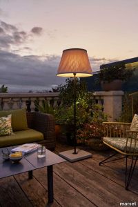
marset > Floor lamp
Light up the outdoors with the same warmth as in indoor lamp. That is the purpose of the TXL, and it does so thanks to its textilene shade. An apparently malleable material, it is highly resistant, not only to water but also to adverse weather conditions.The TXL wants to fill space with a light of its own; stunning thanks to its size and its textile shade that filters the light and appears to vibrate. With a concrete base that lends a distinct outline, it appears to be a one-piece construction. Solid and colossal, the TXL projects the warm light of an indoor space outside.
Streamline Suspension

castrolighting > Ceiling lamp
Inspired by the Streamline Moderne that emerged in the 30s and became an influence on design and architecture, the Streamline Suspension emphasizes forms and long lines combined to create a stylish ambiance. This piece was conceived to be distinctive and stand out for its design, becoming the perfect fit for curated interiors that combine a diversity of styles. This elegant suspension features long gold plated brass tubes that give the design a whole exclusive and deluxe look, setting another level by its distinctive appearance. This recipe of rich materials and sleek lines inspired by art-deco architecture make the Streamline suspension desirable. VIEW FULL FAMILY This product page features ambiences designed by João Graphic Designer #vibranthome
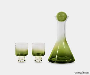
Tank Wine Gift Set Green
tomdixon > Styling
Tank is a series of drinking vessels constructed using the simplest geometric language of spheres cones and cylinders. Their pared back aesthetic combined with the solid counterweight of thick and solid glass as a stem or pedestal gives them an instantly recognisable minimal silhouette. This year we see them burst into colour, albeit, in a particularly sophisticated and restrained emerald green. Our choice of green seems timely given that the colour is associated with all things positive, from health and growth, to calming and anxiety-reducing, vitality and nature. Green also falls in the middle of the visible light spectrum, giving it the quality of equilibrium and making TANK the perfect tableware partner in any setting. More Information Tank is made from mouth-blown clear glass and defined by simple shapes inspired by the rigour of science laboratory equipment. The giftset includes a wine decanter and two low ball glasses. Their pared back aesthetic combined with the solid counterweight of thick and solid glass as a stem or pedestal gives them an instantly recognisable minimal silhouette. This year, the Tank collection features a burst of colour, albeit, in a particularly sophisticated and restrained emerald green.
Smoke Chandelier
moooi > Ceiling lamp
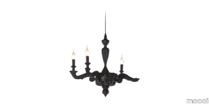
Furniture finished with fire. The beauty and character of burned wood is now captured in a long lasting material. By creating the strange sensation of a burnt chandelier Maarten Baas interpreted his fascination for the element fire with a groundbreaking approach. Capturing the burning flames into the solidity of wood. Each Chandelier is unique due to this exceptional production process. Just like the Phoenix the Smoke objects are reborn from their ashes gaining new vitality and beauty in a very unusual way.
Andaluz Santa Barbara Andaluz: Ambar Matte
casatile > Floor tile-stone
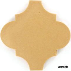
Santa Barbara ceramic tile collection evokes the California landscape, with a combination of vivid and subtle colors offset by neutrals and matte finishes. It is this combination of mattes and gloss finishes in a vast array of colors that our Santa Barbara ceramic tile becomes rich, vibrantly alive, and harmonious.Our ceramic tile is handcrafted and decorated by hand using an ancient method called Cuerda Seca that literally translates to dry cord. This technique has been used for centuries in Spain and other Mediterranean countries. The depth and richness of the colors are obtained by painstakingly applying every single drop of glaze by hand onto a delineated design.
Tank Gift Set Whiskey Glasses x 4 Green
tomdixon > Styling
Tank is a series of drinking vessels constructed using the simplest geometric language of spheres cones and cylinders. Their pared back aesthetic combined with the solid counterweight of thick and solid glass as a stem or pedestal gives them an instantly recognisable minimal silhouette. This year we see them burst into colour, albeit, in a particularly sophisticated and restrained emerald green. Our choice of green seems timely given that the colour is associated with all things positive, from health and growth, to calming and anxiety-reducing, vitality and nature. More Information Made in Poland from mouthblown glass, Tank Whiskey takes its sculptural cue from the functional shapes and volumes of scientific glassware. The giftset includes four whiskey glasses. This year, the Tank collection features a burst of colour, albeit, in a particularly sophisticated and restrained emerald green.
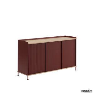
Enfold Sideboard
muuto > Cabinet
The Enfold Sideboard combines industrial materiality with residential references for a new perspective on modern storage. Made from a lacquered steel that gently enfolds its top and bottom in solid oak, the Enfold Sideboard fuses cold and warm materials for a unique expression, paired with the vibrantly modern expression of its ridged steel doors. The flexible design is available in four sizes, which all have adjustable shelves and discreet cable outlets. This offers the opportunity to find just the right fit for your space, function and needs — be it a media console, in the hallway or a tall sideboard for storage.
Komo chair

gautierFurniture > Chair
Looking for a simple, timeless chair? Go for the KOMO chair. Its high-quality, wraparound backrest and generously padded seat provide you with maximum comfort. Its very Seventies retro design is accentuated by the rounded seat and backrest as well as its small size. But the sharp, contemporary lines of the rest of its structure and legs strike the perfect balance for this highly decorative chair, making it the epitome of contemporary carpentry. Our tip: choose a vibrant colour to brighten up your home!
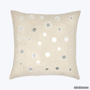
Mirror Pillow
abchome > Accessories
The Mirror Pillow is a one-of-a-kind find with decorative mirror accents. A simple pleasure, it also features an unbleached natural cotton linen material that will pair with everything else in your living room or bedroom sanctuary. Featuring a distinct balance of bold and bright from old-world traditions and new-world style, John Robshaw displays an updated spin on traditional, handmade textiles with a vibrant mix of sophistication and romantic allure. Dying, printing, and experimenting alongside the artisans to create these unique fabrics, John Robshaw helps preserve traditional block printing, hand-stitching, hand-painting, and hand-quilting textiles in India.
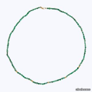
Beaded Emerald Crystal Necklace
abchome > Accessories
A lovely strand of uncut, polished emerald crystals in gradually shifting shades of green are strung together with a five, handmade 22k beads in this stunning necklace. Strand measures approximately 26 inches and is finished with 14k gold lobster clasp. Matte finish.Ananda Khalsa draws inspiration from natural forms and the vibrant luminosity of natural gemstones. She strives to capture the precious quality found in ancient jewelry while creating pieces with a modern sensibility. All of the gems used in her unique jewelry are hand-picked for their unique and exceptional characteristics.
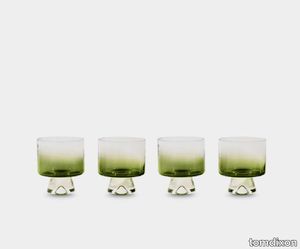
Tank Gift Set Low Ball Glasses x 4 Green
tomdixon > Styling
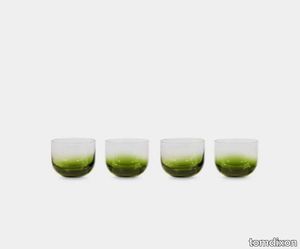
Tank is a series of drinking vessels constructed using the simplest geometric language of spheres cones and cylinders. Their pared back aesthetic combined with the solid counterweight of thick and solid glass as a stem or pedestal gives them an instantly recognisable minimal silhouette. This year we see them burst into colour, albeit, in a particularly sophisticated and restrained emerald green. Our choice of green seems timely given that the colour is associated with all things positive, from health and growth, to calming and anxiety-reducing, vitality and nature. More Information Tank is made from mouth-blown clear glass and defined by simple shapes inspired by the rigour of science laboratory equipment. The giftset includes four low ball glasses. This year, the Tank collection features a burst of colour, albeit, in a particularly sophisticated and restrained emerald green.
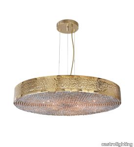
Maeve Suspension
castrolighting > Ceiling lamp
Like the strong-willed, ambitious and warrior-queen Maeve of Ireland, whose passion led warriors to fight for her beliefs, the Maeve Suspension uses the same name and magnificence it offers. Conceived to incorporate traditional techniques and modern design influences, this lighting fixture has an enormous value due to its bespoke quality. The gold-plated brass structure is hammered by the hands of experienced lighting design artisans, delicate Crystals are also individually assembled by hand at the bottom of the lighting suspension. These characteristics make this luxurious suspension the perfect fit for any luxurious hospitality or residential project as it creates a prestigious ambience wherever it is placed. VIEW FULL FAMILY #vibranthome
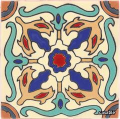
Santa Barbara Ceramic Decorative Tile: Venice
casatile > Floor tile-stone
Santa Barbara ceramic tile collection evokes the California landscape, with a combination of vivid and subtle colors offset by neutrals and matte finishes. It is this combination of mattes and gloss finishes in a vast array of colors that our Santa Barbara ceramic tile becomes rich, vibrantly alive, and harmonious.Our ceramic tile is handcrafted and decorated by hand using an ancient method called Cuerda Seca that literally translates to dry cord. This technique has been used for centuries in Spain and other Mediterranean countries. The depth and richness of the colors are obtained by painstakingly applying every single drop of glaze by hand onto a delineated design.
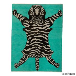
Teal Tiger Modern Turkish Wool Rug
abchome > Carpet
<!--td {border: 1px solid #cccccc;}br {mso-data-placement:same-cell;}--> This Teal Tiger Modern Turkish Wool Rug - 5'5" x 7'2" is a stunning addition to any space. Hand-knotted in Turkey out of high quality wool, it features a black and beige tiger design against a vibrant teal background. This statement piece will add art and color to any room.
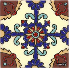
Santa Barbara Ceramic Decorative Tile: Rosario
casatile > Floor tile-stone
Santa Barbara ceramic tile collection evokes the California landscape, with a combination of vivid and subtle colors offset by neutrals and matte finishes. It is this combination of mattes and gloss finishes in a vast array of colors that our Santa Barbara ceramic tile becomes rich, vibrantly alive, and harmonious.Our ceramic tile is handcrafted and decorated by hand using an ancient method called Cuerda Seca that literally translates to dry cord. This technique has been used for centuries in Spain and other Mediterranean countries. The depth and richness of the colors are obtained by painstakingly applying every single drop of glaze by hand onto a delineated design.
Santa Barbara Ceramic Solid Tile: Yellow Quartz Matte
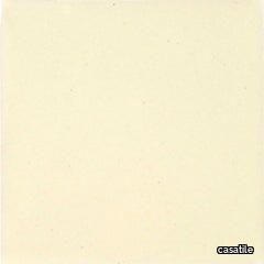
casatile > Floor tile-stone
Santa Barbara ceramic tile collection evokes the California landscape, with a combination of vivid and subtle colors offset by neutrals and matte finishes. It is this combination of mattes and gloss finishes in a vast array of colors that our Santa Barbara ceramic tile becomes rich, vibrantly alive, and harmonious.Our ceramic tile is handcrafted and decorated by hand using an ancient method called Cuerda Seca that literally translates to dry cord. This technique has been used for centuries in Spain and other Mediterranean countries. The depth and richness of the colors are obtained by painstakingly applying every single drop of glaze by hand onto a delineated design.
Kaia Pillow
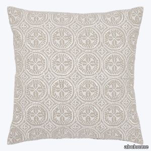
abchome > Accessories
This Kaia Pillow features an exquisitely simple block print that is printed by hand and enhanced with embroidery on cotton linen. Created using traditional block printing methods of hand-carved blocks from teak tree trunks, hand-mixing dye to create the perfect colors, and block printing with extreme precision to perfectly align all the unique motifs within this textile. Featuring a distinct balance of bold and bright from old-world traditions and new-world style, John Robshaw displays an updated spin on traditional, handmade textiles with a vibrant mix of sophistication and romantic allure. Dying, printing, and experimenting alongside the artisans to create these unique fabrics, John Robshaw helps preserve traditional block printing, hand-stitching, hand-painting, and hand-quilting textiles in India.
Tank Whiskey Gift Set Green
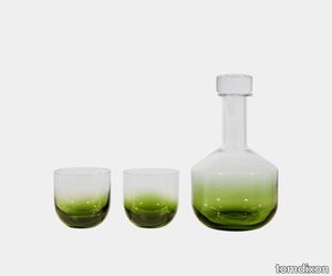
tomdixon > Styling
Tank is a series of drinking vessels constructed using the simplest geometric language of spheres cones and cylinders. Their pared back aesthetic combined with the solid counterweight of thick and solid glass as a stem or pedestal gives them an instantly recognisable minimal silhouette. This year we see them burst into colour, albeit, in a particularly sophisticated and restrained emerald green. Our choice of green seems timely given that the colour is associated with all things positive, from health and growth, to calming and anxiety-reducing, vitality and nature. Green also falls in the middle of the visible light spectrum, giving it the quality of equilibrium and making TANK the perfect tableware partner in any setting. More Information Made in Poland from mouthblown glass, Tank Whiskey Giftset takes its sculptural cue from the functional shapes and volumes of scientific glassware. The giftset includes a whiskey decanter and two glasses. This year, the Tank collection features a burst of colour, albeit, in a particularly sophisticated and restrained emerald green.
Mattonelle Margherita by Nathalie Du Pasquier
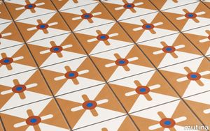
mutina > Floor tile-stone
With Mattonelle Margherita, Mutina has worked with colour, along with the artist Nathalie Du Pasquier, creating a complex project featuring a blend of different aesthetic and formal means of expression. The collection is characterised by a dual concept: on the one hand, a simple, minimalist style and, on the other, a courageous, creative approach. The elements are created in glazed porcelain stoneware, deepening into a careful research about the glazes, in order to identify the most reactive, so as to give a bright, vibrant finish to the satin-effect surface.
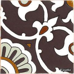
Santa Barbara Ceramic Decorative Tile: Avidan
casatile > Floor tile-stone
Santa Barbara ceramic tile collection evokes the California landscape, with a combination of vivid and subtle colors offset by neutrals and matte finishes. It is this combination of mattes and gloss finishes in a vast array of colors that our Santa Barbara ceramic tile becomes rich, vibrantly alive, and harmonious.Our ceramic tile is handcrafted and decorated by hand using an ancient method called Cuerda Seca that literally translates to dry cord. This technique has been used for centuries in Spain and other Mediterranean countries. The depth and richness of the colors are obtained by painstakingly applying every single drop of glaze by hand onto a delineated design.
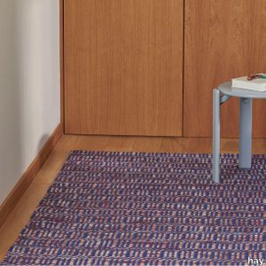
Radio Rug
hay > Carpet
Designed for HAY by Clara Von Zweigbergk Radio Rug uses multiple coloured yarns woven together to create an intriguing contrast in patterns and textures. Hand-woven in India from a blend of New Zealand wool and cotton the weaving technique creates a graphic three-dimensional effect. The rugs natural warmth comfort and vibrance can be used to elevate most interior spaces. OEKO-TEX STANDARD 100 cert. No 22.HIN.10331.
Alison Rose Sfera Lilac Waterjet Mosaic

artistictile > Floor tile-stone
Sfera by Alison Rose posits circles upon circles - spheres that seem to bounce across the surface of the tile to create an “infinite” mosaic, with multiple stones placed randomly within the design. The combination of colors and circles is strikingly sophisticated in three timeless colorways. Verde combines Verde Aurora, a vibrant green polished quartzite with polished and honed Nero Marble. Lilac includes honed Lilac marble, polished Statuary, honed Calacatta Bluette, and honed Bianco Carrara. Grafite adds bittersweet chocolate Grafite marble into a blend with polished and honed Nero marble and honed Vanilla Onyx. Sfera is also available in a variety of other custom colorways via Artistic Tile’s “Tailored To” program.
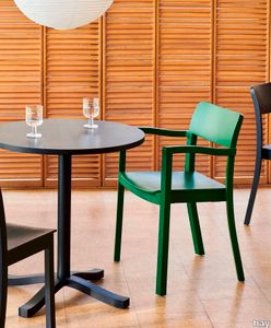
Pastis Armchair
hay > Chair
Designed for HAY by French designer Julien Renault Pastis Armchair is a wooden chair built on authenticity strength and high-quality craftsmanship with the intention of creating a timeless chair that would last for decades. Balancing a sturdy construction with elegant aesthetics Pastis offers a versatile armchair that emanates personality for enjoying life dining socialising and bringing a sense of warmth and vitality to its surroundings. Available in a variety of lacquered wood types and colours Pastiss durability and comfort makes it suited to many indoor spaces from dining rooms and kitchens in private homes to cafs and other public environments.
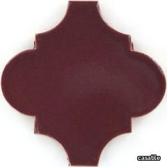
Andaluz Santa Barbara Andaluz: Merlot Gloss
casatile > Floor tile-stone
Santa Barbara ceramic tile collection evokes the California landscape, with a combination of vivid and subtle colors offset by neutrals and matte finishes. It is this combination of mattes and gloss finishes in a vast array of colors that our Santa Barbara ceramic tile becomes rich, vibrantly alive, and harmonious.Our ceramic tile is handcrafted and decorated by hand using an ancient method called Cuerda Seca that literally translates to dry cord. This technique has been used for centuries in Spain and other Mediterranean countries. The depth and richness of the colors are obtained by painstakingly applying every single drop of glaze by hand onto a delineated design.
Rituals 2
foscarini > Ceiling lamp
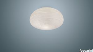
The Rituals ceiling lamps translate the luminous magic of Oriental rice paper lanterns into items of contemporary design, made of blown glass with a special processing on the surface. The Rituals 2 ceiling lamp has an imposing presence, casting a warm, vibrant glow.
Maija
santacole > Floor lamp
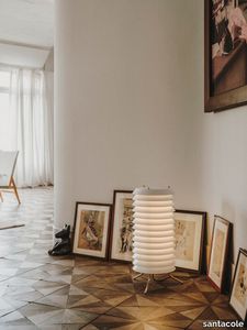
Maija conveys the feeling of light typical of Baltic cities, where the streets are barely illuminated, apart from the light that streams from the windows of homes and shops; from the inside outwards. A tower composed of stacked metal discs through which its inner light filters, vibrant and inviting conversation.
SPACE+ 1402 - Fabric linear module _ Et al.
Et al. > Sofa
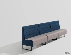
Space Plus 1402 Modular Seating: Versatile and Sleek Design for Public Spaces The Space Plus 1402 Modular Seating, part of Et al.'s Space Plus collection, is a two-seater modular solution offering functional elegance and flexibility. Designed for high-traffic environments, it combines modern aesthetics with durability, making it a perfect choice for hospitality, office, and commercial spaces. Design and Dimensions The Space Plus 1402 module is thoughtfully crafted to accommodate two people comfortably while maintaining a streamlined and compact profile. Its dimensions are as follows: Height: 100 cm Width: 120 cm Depth: 61.5 cm Seat Height: 47 cm Seat Depth: 46 cm This modular unit is ideal for maximizing seating arrangements without compromising on comfort or space efficiency. Materials and Finishes The Space Plus 1402 is customizable with high-quality materials and finishes, ensuring seamless integration into any design concept: Frame: Built with a sturdy metal structure that guarantees long-lasting performance. Upholstery: Offered in a wide range of fabric options, including stain-resistant and easy-to-clean materials, in both neutral and vibrant colour palettes. Base Finish: Metal bases are available in finishes such as matte black, metallic tones, and white, catering to diverse aesthetic preferences. Features Modular Flexibility: Easily combines with other modules in the Space Plus collection to create versatile seating layouts. Durability: Engineered for heavy use in commercial and public settings. Compact Profile: Provides ample seating capacity while conserving space. Comfortable Seating: Cushioned seat and backrest offer ergonomic support for prolonged use. Applications The Space Plus 1402 modular seating unit is suitable for various settings: Hospitality: Enhances the ambience of hotel lobbies, lounges, and bars. Corporate Spaces: A sleek addition to office reception areas and collaborative zones. Retail and Public Areas: Perfect for waiting lounges in shopping malls, airports, and hospitals. Dining Areas: Functions as a booth seat for restaurants and cafés. Customization Options Et al. offers several enhancements to personalize the Space Plus 1402 modular seating system: Add-On Tables: Integrated side tables to enhance functionality. Privacy Panels: Creates partitions for privacy in open-plan spaces. Integrated USB or Charging Ports: Adds convenience for tech-friendly environments. Sustainability and Longevity The Space Plus 1402 is crafted using eco-friendly processes and materials. Many upholstery options include recycled or sustainable textiles, ensuring minimal environmental impact. Complementary Products To build a cohesive seating arrangement, the Space Plus 1402 pairs perfectly with other elements from the Space Plus collection, such as: Corner Modules: Ideal for L-shaped or U-shaped layouts. Ottomans and Poufs: Additional seating options for versatile setups. Matching Tables: Complements seating areas with practical surfaces. Key Features Modular design enables endless configuration possibilities. Premium materials ensure durability and easy maintenance. Compact and elegant design for maximum versatility. Available in a variety of finishes to suit specific project requirements.
ARNE
Rapsel > Bathtub
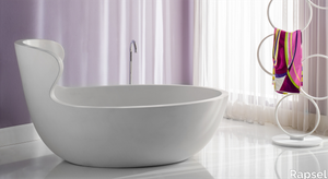
With its vintage aesthetic and modern functionality, the Arne bathtub is a unique piece of furniture that adds a touch of style to your bathroom. A timeless relaxation experience that combines the charm of the past with the comfort of the present. Crafted from strong, ergonomic Titan resin, the bathtub's form seamlessly molds to your body, offering an unparalleled experience of relaxation. The backrest of the Arne bathtub is inspired by the iconic chairs of the 60s, a decade of creativity and innovation. Chairs from that era, designed by masters like Arne Jacobsen, were characterized by sinuous lines, enveloping curves, and vibrant colors.
Smoke Armchair
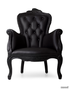
moooi > Armchair
Furniture finished with fire. The beauty and character of burned wood is now captured in a long lasting material creating the strange sensation of sitting on burnt furniture Maarten Baas interpreted his fascination for the element fire with a groundbreaking approach. Capturing the burning flames into the solidity of wood. Each chair is unique due to this exceptional production process. Just like the Phoenix the Smoke objects are reborn from their ashes gaining new vitality and beauty in a very unusual way.
Feluca Organic
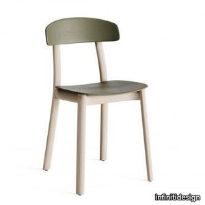
infinitidesign > Chair
The Feluca family expands and welcomes the new Organic version. The chair’s silhouette remains the same as its predecessors, with an elegantly elliptical frame on which the seat and backrest rest delicately, without visible hooks. In this new version, however, the frame is made of solid natural or black-stained ash, while the seat and backrest are made of coloured polypropylene in vivid nuances. A paradigm shift that adds wonder and amazement: the material warmth of the wood, which dresses a chair with gentle, human-sized forms, further enhances the vibrant colour of the polypropylene, for a play of contrasts and harmony that surprises and intrigues.
Lawrence "Clan"
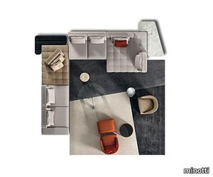
minotti > Sofa
With their well-defined shapes, the "Clan" elements lend themselves to compositions that express a more dynamic and informal interpretation of the living room. The one-piece seats feature stitching in graphic, modern square-shaped designs. This refined tailoring detail epitomizes the company’s skill in drawing upon tradition to bring new vitality to an ancient technique like embroidery, through an unhesitatingly contemporary interpretation of style.
Radio Rug

hay > Carpet
Designed for HAY by Clara Von Zweigbergk Radio Rug uses multiple coloured yarns woven together to create an intriguing contrast in patterns and textures. Hand-woven in India from a blend of New Zealand wool and cotton the weaving technique creates a graphic three-dimensional effect. The rugs natural warmth comfort and vibrance can be used to elevate most interior spaces. OEKO-TEX STANDARD 100 cert. No 22.HIN.10331.
Roma Mirror
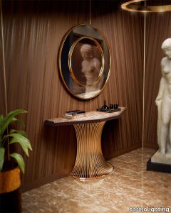
castrolighting > Styling
Roma Mirror is the elegant symbol of confidence and boldness. With an ambitious focus on simplicity, cleanlines, and raw materials, it celebrates a sleek modern design. Being embodied in the form of conceptually, visually, and artistically completed circle, this furniture feature suggests a fresh take on contemporary elegance. A well-balanced flowing shape of the rim highlights the essence of refinement taken to new heights. This aesthetic lifestyle decorative piece is handcrafted from rich materials and finished with polished brass. It is modelled to reflect a vibrant gleam and serenity in the interior space. This wall mirror is a leading-edge statement of simple charm yet a lasting legacy, displaying the finest design quality with luxurious accents. An excellent fit for entrances, hallways, living and dining rooms, as well as any other area your interior décor imagination allows. This is a pure minimalist twist reflected indouble rings of this design. Find a stylish solution for the exquisite space with Roma Mirror, granting any interior project a modern and sophisticated touch.
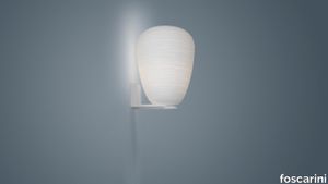
Rituals 1
foscarini > Wall lamp
The Rituals lamps are distinguished by special processing on the blown glass, with irregular lines engraved on its surface. The volume of Rituals 1 will not go unnoticed, since it features slight creases that create a warm, vibrant light. Like the pedestal of a work of art, the L-shaped support of the wall lamp version allows multiple solutions to be created: with the glass directed up or down, or in the version fitted with two diffusers.
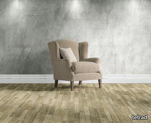
https:Kandinsky Wing Chair
tetrad > Armchair
Compact and comfortable, the Kandinsky wing chair has a minimalist look which will complement any room. The sprung seat and back and feather filled cushions means you can relax in comfort for hours. The loose fabric cover is easily removable so the fresh and vibrant look can be maintained all year round. Perfect for: Contemporary living A busy lifestyle Creating a corner to relax in
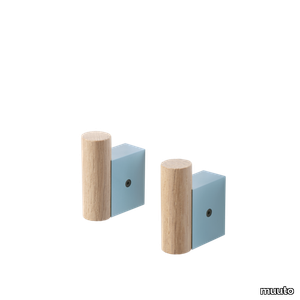
Attach Coat Hook Set of 2
muuto > Styling
The Attach Coat Hook combines industrial and Scandinavian materialities for a playful yet refined take on the simple, modern coat hook, joined by its contrasting round and square forms. Use the design in linear formations for a simple, refined expression or in more vibrant layouts with various colors of the design.
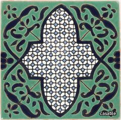
Santa Barbara Ceramic Decorative Tile: Giralda Gloss
casatile > Floor tile-stone
Santa Barbara ceramic tile collection evokes the California landscape, with a combination of vivid and subtle colors offset by neutrals and matte finishes. It is this combination of mattes and gloss finishes in a vast array of colors that our Santa Barbara ceramic tile becomes rich, vibrantly alive, and harmonious.Our ceramic tile is handcrafted and decorated by hand using an ancient method called Cuerda Seca that literally translates to dry cord. This technique has been used for centuries in Spain and other Mediterranean countries. The depth and richness of the colors are obtained by painstakingly applying every single drop of glaze by hand onto a delineated design.
Miro Euro Pillow
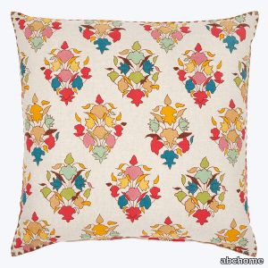
abchome > Accessories
John simplified the design on this Miro Euro Pillow to let the colors shine. Hand printed. Hidden zipper closure. Printed on both sides. Created using traditional block printing methods of hand-carved blocks from teak tree trunks, hand-mixing dye to create the perfect colors, and block printing with extreme precision to perfectly align all the unique motifs within this textile. Featuring a distinct balance of bold and bright from old-world traditions and new-world style, John Robshaw displays an updated spin on traditional, handmade textiles with a vibrant mix of sophistication and romantic allure. Dying, printing, and experimenting alongside the artisans to create these unique fabrics, John Robshaw helps preserve traditional block printing, hand-stitching, hand-painting, and hand-quilting textiles in India.
Alison Rose Sfera Grafite Waterjet Mosaic

artistictile > Floor tile-stone
Sfera by Alison Rose posits circles upon circles - spheres that seem to bounce across the surface of the tile to create an “infinite” mosaic, with multiple stones placed randomly within the design. The combination of colors and circles is strikingly sophisticated in three timeless colorways. Verde combines Verde Aurora, a vibrant green polished quartzite with polished and honed Nero Marble. Lilac includes honed Lilac marble, polished Statuary, honed Calacatta Bluette, and honed Bianco Carrara. Grafite adds bittersweet chocolate Grafite marble into a blend with polished and honed Nero marble and honed Vanilla Onyx. Sfera is also available in a variety of other custom colorways via Artistic Tile’s “Tailored To” program.
Pastis Chair
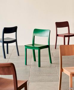
hay > Chair
Designed for HAY by French designer Julien Renault Pastis Chair is built on authenticity strength and high-quality craftsmanship with the intention of creating a timeless chair that would last for decades. Balancing a sturdy construction with elegant aesthetics Pastis offers a versatile chair that emanates personality for enjoying life dining socialising and bringing a sense of warmth and vitality to its surroundings. Available in a variety of lacquered wood types and colours Pastiss durability and comfort makes it suited to many indoor spaces from dining rooms and kitchens in private homes to cafs and other public environments.
Santa Barbara Ceramic Decorative Tile: Santa Barbara
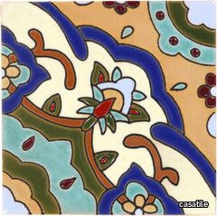
casatile > Floor tile-stone
Santa Barbara ceramic tile collection evokes the California landscape, with a combination of vivid and subtle colors offset by neutrals and matte finishes. It is this combination of mattes and gloss finishes in a vast array of colors that our Santa Barbara ceramic tile becomes rich, vibrantly alive, and harmonious.Our ceramic tile is handcrafted and decorated by hand using an ancient method called Cuerda Seca that literally translates to dry cord. This technique has been used for centuries in Spain and other Mediterranean countries. The depth and richness of the colors are obtained by painstakingly applying every single drop of glaze by hand onto a delineated design.
Santa Barbara Ceramic Decorative Tile: Salamanca
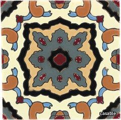
casatile > Floor tile-stone
Santa Barbara ceramic tile collection evokes the California landscape, with a combination of vivid and subtle colors offset by neutrals and matte finishes. It is this combination of mattes and gloss finishes in a vast array of colors that our Santa Barbara ceramic tile becomes rich, vibrantly alive, and harmonious.Our ceramic tile is handcrafted and decorated by hand using an ancient method called Cuerda Seca that literally translates to dry cord. This technique has been used for centuries in Spain and other Mediterranean countries. The depth and richness of the colors are obtained by painstakingly applying every single drop of glaze by hand onto a delineated design.
Pastis Coffee Table
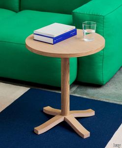
hay > Coffee table
Designed for HAY by French designer Julien Renault Pastis Coffee Table is a wooden table built on authenticity strength and high-quality craftsmanship with the intention of creating a timeless coffee table that would last for decades. Featuring a round tabletop and four low legs the table balances a sturdy construction with elegant aesthetics offering a versatile coffee table that emanates personality for enjoying life dining socialising and bringing a sense of warmth and vitality to its surroundings. Available in a variety of wood types and colours with tabletop in veneer Pastiss compact size and durability makes it suited to many indoor spaces from private homes to cafs and other public environments.
Frammento
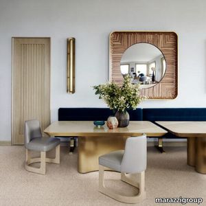
marazzi group > Floor tile-stone
Venetian terrazzo in porcelain stoneware, 2 sizes of chips: Micro and Macro Frammento is the new Marazzi porcelain stoneware collection that reinterprets Venetian Seminato for contemporary taste, drawing on artificial intelligence to create colours and finishes not found in the original, traditional product. For the first time, this product’s patterning was developed using the patented DDGAN technology, which analyses the inspiration material, interprets its distinctive characteristics and employs artificial intelligence to generate completely new, totally reworked images for the products, while still maintaining the aesthetic of the original. The range comprises three colours and three chip dimensions, Micro and Macro inset into neutral backgrounds and in tones modulated to suit each shade. The result is an aesthetically vibrant material with excellent technical performance, perfect for use in both residential and commercial contexts.
Absolute White

marazzi group > Wall tile-stone-brick
3D Structure White Wall Tiles With Absolute White, the use of white in wall coverings gains unprecedented expressive potential. Three 3D structures: Twist and Cube, in the gloss and satin versions, and Fiber, matt only, model the light, enhance colours and generate dynamic vibrations with design schemes.
Gaia earthmother.
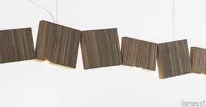
terzani > Ceiling lamp
In Greek mythology, Gaia is the personification of the Earth and the mother of all life. Looking to capture the mythical and natural beauty of this Earth goddess, designer Jean-François Crochet has created the Gaia pendant light. Consisting of geometric frames of brass or raw metal reminiscent of the mountains Gaia created, the pendant uses led light to push light through the “cracks” formed. The resulting light creates a magical feeling, as if the lights peaking through were alive themselves. Also available in gold, nickel and wood finish and in custom configurations, Gaia adds a vibrancy and sacred light to any space. Design Jean-François Crochet. Made in Italy
Doris Chair 31007 InStock Brussels Powder Blue / Wood Base 32204 Custom Grade F / Wood Base 32205 Custom Grade I / Wood Base 32206 Custom Grade K / Wood Base 32207 Custom Grade L / Wood Base 32208 Custom Grade O / Wood Base 32209 Custom Grade S / Wood Bas
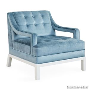
jonathanadler > Armchair
<p><b>Posh Perch.</b></p><p>Inspired by '40s Chinoiserie with a nod to Park Avenue, our Doris Chair is the primary punch that refreshes any room. The open arm detail and Ming-inspired base adds sculptural flair, but it's still a comfy perch for reading. Upholstered in bold blue velvet with a patterned trim or a fresh and vibrant shade, both with a bright white lacquer base for added impact.</p><p>Pop a pair in your parlor or add a chic seat to the corner of your boudoir.</p><p>See More About This Style for more customization options.</p><p><b>*Our shipping ETAs may be longer than usual, but safely delivering the looks you love is always our priority.</b></p>