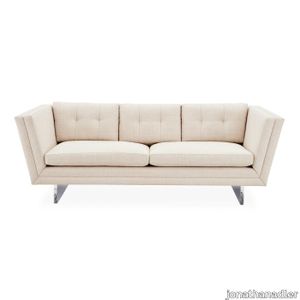
Sebastian Sofa 32002 Custom GRD 3 / Acrylic Sleigh Leg 32003 Custom GRD 5* / Acrylic Sleigh Leg 32004 Custom GRD 5 / Acrylic Sleigh Leg 32005 Custom GRD 7 / Acrylic Sleigh Leg 32006 Custom GRD 10 / Acrylic Sleigh Leg
jonathanadler > Sofa
<p><b>Future Forward.</b></p><p>Floating on luxe clear acrylic sleigh legs, Sebastian is our ultra modernist spin on the iconic Knole sofa. Luxuriously deep and cozy with its high, tuxedo back, flared arms, and inviting button-tufted back cushions. Our Sebastian sofa will feel fabulously futuristic in your Malibu manse or give your Kensington townhouse minimalist edge.</p><p>Also available as an apartment sofa.</p>
sarlon grey canyon

forbo > Synthetic Floor
Forbo Flooring Systems is a specialist in acoustic vinyl floor coverings. With over 30 years’ experience, we have the industry knowledge needed to deliver best-in-class acoustic floors for bus and coach applications.
sarlon red doodle
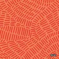
forbo > Synthetic Floor
Forbo Flooring Systems is a specialist in acoustic vinyl floor coverings. With over 30 years’ experience, we have the industry knowledge needed to deliver best-in-class acoustic floors for bus and coach applications.
sarlon brown rustic oak
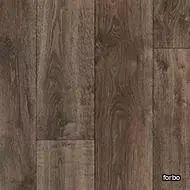
forbo > Synthetic Floor
Forbo Flooring Systems is a specialist in acoustic vinyl floor coverings. With over 30 years’ experience, we have the industry knowledge needed to deliver best-in-class acoustic floors for bus and coach applications.
sarlon soft peach stardust

forbo > Synthetic Floor
Forbo Flooring Systems is a specialist in acoustic vinyl floor coverings. With over 30 years’ experience, we have the industry knowledge needed to deliver best-in-class acoustic floors for bus and coach applications.
aura
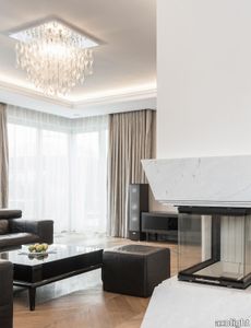
axolight > Ceiling lamp
Waves of light, dynamic reflections, uniqueness. The knowledge and craftsmanship of a master glassmaker express themselves in the shape of small glasses that together compose a fluid and aquatic image with a diffused glow.
sarlon vanilla stardust

forbo > Synthetic Floor
Forbo Flooring Systems is a specialist in acoustic vinyl floor coverings. With over 30 years’ experience, we have the industry knowledge needed to deliver best-in-class acoustic floors for bus and coach applications.
sarlon natural oak

forbo > Synthetic Floor
Forbo Flooring Systems is a specialist in acoustic vinyl floor coverings. With over 30 years’ experience, we have the industry knowledge needed to deliver best-in-class acoustic floors for bus and coach applications.
sarlon lime green canyon

forbo > Synthetic Floor
Forbo Flooring Systems is a specialist in acoustic vinyl floor coverings. With over 30 years’ experience, we have the industry knowledge needed to deliver best-in-class acoustic floors for bus and coach applications.
sarlon lime topography
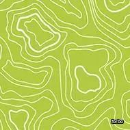
forbo > Synthetic Floor
Forbo Flooring Systems is a specialist in acoustic vinyl floor coverings. With over 30 years’ experience, we have the industry knowledge needed to deliver best-in-class acoustic floors for bus and coach applications.
PRODUCTSMADE TO ORDER
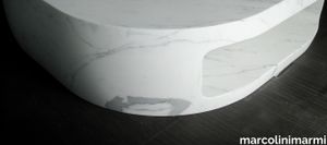
marcolinimarmi > Floor tile-stone
Our technical design section takes care of planning, developing, and carrying out large projects: in this department, knowledge of the rough materials, skilled handwork, and experience combine with a complete command of technically sophisticated, advanced, latest-generation machines.
Sebastian Apartment Sofa 32007 Custom GRD 3 / Acrylic Sleigh Leg 32008 Custom GRD 5* / Acrylic Sleigh Leg 32009 Custom GRD 5 / Acrylic Sleigh Leg 32010 Custom GRD 7 / Acrylic Sleigh Leg 32011 Custom GRD 10 / Acrylic Sleigh Leg
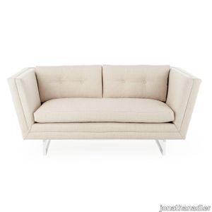
jonathanadler > Sofa
<p><b>Future Forward.</b></p><p>Floating on luxe clear acrylic sleigh legs, Sebastian is our ultra modernist spin on the iconic Knole sofa. Luxuriously deep and cozy with its high, tuxedo back, flared arms, and inviting button-tufted back cushions. Sized for smaller spaces, our Sebastian apartment sofa will feel fabulously futuristic in your Malibu pad, or give that cozy room in your Kensington townhouse minimalist edge. Polished in Deluxe Linen or surprisingly neutral in Brussels Citron upholstery.</p><p>Also available as a standard size <a href="https://jonathanadler.com/products/sebastian-sofa?variant_id=40066307096610">sofa</a>.</p>
sarlon Scandinavian oak

forbo > Synthetic Floor
Forbo Flooring Systems is a specialist in acoustic vinyl floor coverings. With over 30 years’ experience, we have the industry knowledge needed to deliver best-in-class acoustic floors for bus and coach applications.
sarlon polar oak

forbo > Synthetic Floor
Forbo Flooring Systems is a specialist in acoustic vinyl floor coverings. With over 30 years’ experience, we have the industry knowledge needed to deliver best-in-class acoustic floors for bus and coach applications.
sarlon clay oak

forbo > Synthetic Floor
Forbo Flooring Systems is a specialist in acoustic vinyl floor coverings. With over 30 years’ experience, we have the industry knowledge needed to deliver best-in-class acoustic floors for bus and coach applications.
sarlon grey linea

forbo > Synthetic Floor
Forbo Flooring Systems is a specialist in acoustic vinyl floor coverings. With over 30 years’ experience, we have the industry knowledge needed to deliver best-in-class acoustic floors for bus and coach applications.
sarlon clay cement

forbo > Synthetic Floor
Forbo Flooring Systems is a specialist in acoustic vinyl floor coverings. With over 30 years’ experience, we have the industry knowledge needed to deliver best-in-class acoustic floors for bus and coach applications.
sarlon grey & white doodle
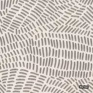
forbo > Synthetic Floor
Forbo Flooring Systems is a specialist in acoustic vinyl floor coverings. With over 30 years’ experience, we have the industry knowledge needed to deliver best-in-class acoustic floors for bus and coach applications.
sarlon black & white doodle
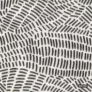
forbo > Synthetic Floor
Forbo Flooring Systems is a specialist in acoustic vinyl floor coverings. With over 30 years’ experience, we have the industry knowledge needed to deliver best-in-class acoustic floors for bus and coach applications.
sarlon deep blue stardust

forbo > Synthetic Floor
Forbo Flooring Systems is a specialist in acoustic vinyl floor coverings. With over 30 years’ experience, we have the industry knowledge needed to deliver best-in-class acoustic floors for bus and coach applications.
Nature Mood RIVERBED
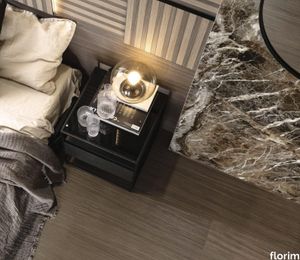
florim > Floor tile-stone
Marble and wood blend in a refined creative mood board. In line with the latest trends in housing evolution, Nature Mood conceives of Nature not only as a model, but also as a true mentor and gauge of human endeavor, something from which to acquire knowledge and with which to give life to increasingly environmentally friendly designs. <p>In this collection, Nature becomes an active component of design, mixing a palette of surfaces with warm hues that take their inspiration from the world of marbles and the material of wood, with clean, minimalist veining and an array of colors. The upshot is the attainment of elegant spaces that flow between interior and exterior, enhancing the presence of light so as to bestow a sensation of immersion in the natural environment at all times. The marble surfaces in the collection bring a new perspective to some of the most enchanting landscapes and natural binomials to be found on earth.</p> <p> </p> <p class="MsoNormal"><strong>COLORS AND DECORS</strong></p> <p class="MsoNormal"><span lang="EN-US" style="mso-ansi-language: EN-US;">The verdant backdrop of Rainforest is redolent of the vegetation of tropical woods, with thin brown veins that evoke the bark of a tree.</span></p> <p class="MsoNormal"><span lang="EN-US" style="mso-ansi-language: EN-US;">Glacier conjures up the whiteness of glaciers with delicate crests of light and dark gray.</span></p> <p class="MsoNormal"><span lang="EN-US" style="mso-ansi-language: EN-US;">Mountain Peak is inspired by the varied appearance and warm colors of mountain ranges in the summertime.</span></p> <p class="MsoNormal"><span lang="EN-US" style="mso-ansi-language: EN-US;">Tundra recalls the alternation of earth, shrubbery and snowfall that characterizes the homonymous Arctic polar environmental system.</span></p> <p class="MsoNormal"><span lang="EN-US" style="mso-ansi-language: EN-US;">And lastly, Riverbed is reminiscent of a gravelly river bottom with its multiplicity of stones smoothed by the flowing water.</span></p> <p class="MsoNormal"><span lang="EN-US" style="mso-ansi-language: EN-US;">The Planks 01, 02, 03, 04, 05 and 06 surfaces are the most combinable elements in the collection. Conceived as a color palette of woods with a clean, minimalist style, the Planks can generate different mood boards depending on the marble-effect surfaces with which they are juxtaposed, taking up the nuances of the veneers and affording the designer the option of personalizing both the interior spaces and the exterior shells of the buildings in accordance with his or her own creative taste.</span></p> <p class="MsoNormal"><span lang="EN-US" style="mso-ansi-language: EN-US;">The range of backgrounds is enriched by five 6 mm thick fine porcelain stoneware decors that combine the colors of different wood-inspired surfaces.</span></p> <p class="MsoNormal"><span lang="EN-US" style="mso-ansi-language: EN-US;">Hexagon offers a combination of 3 six-sided polygons, each of which in turn is divided into two different shades of wood. The composition is designed in two versions, the first combining the warm hues of Planks 01, 02 and 03, the second blending the cooler colors of Planks 04, 05 and 06.</span></p> <p class="MsoNormal"><span lang="EN-US" style="mso-ansi-language: EN-US;">French Herringbone immediately recalls the classic laying pattern for parquet flooring, in this case reformulated as an embellishment that alternates small slats in two colorings. The composition is available in two versions, one of which combines the amber shades of Planks 01 and 02, the other of which unites the gray tones of Planks 05 and 06.</span></p> <p class="MsoNormal"><span lang="EN-US" style="mso-ansi-language: EN-US;">Stripes offers an alternation of small strips in two colors. In this case, too, the range grants the designer the option of choosing between two variants, one that juxtaposes Planks 01 and 02, and one that combines Planks 05 and 06.</span></p> <p class="MsoNormal"><span lang="EN-US" style="mso-ansi-language: EN-US;">Strip consists of a plank with thin and elongated lines available in all the colors in the collection.</span></p> <p class="MsoNormal"><span lang="EN-US" style="mso-ansi-language: EN-US;">Finally, Chevron recalls the homonymous pattern of timeless charm. Here again the decor is offered in all 6 wood-effect colors of the collection.</span></p>
Cromatica Gradiente bianco-rosa
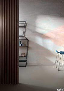
florim > Wall Paint
A lexicon of colour shades for mixing. A large size and its submultiples. «This work represents a reflection on colour, and above all a proposal on how to transfer the multiplicity of shades typical of a hand-crafted piece into a project produced on a large scale.» Andrea Trimarchi & Simone Farresin Studio Formafantasma base their work in the design world on a strong vocation for research. Simone Farresin and Andrea Trimarchi view every project as an opportunity for study and the acquisition of new knowledge, and their love of speculation establishes a dialectic rapport with the situations offered by each new client. Whether it involves a material, a type or a production method, the first phase of their design process is the mapping of what the specific case places at their disposal. With Cedit, an analysis of the company's past and present was central to the inputs. Inevitably, since "Looking back to look forward" has been the design duo's mission statement for years. In this case, in particular, the company's history was a real treasure trove, a fine blend of memory and technology: on the one hand, the excellence of production technologies now extended with the added potential arising from the engineering of large-sized ceramic tiles, and on the other a wealth of experience build up with great designers of the past, from Zanuso to Noorda, through to <strong>Ettore Sottsass</strong>. Andrea and Simone decided to focus on Sottsass - who started designing for Cedit back in the late Seventies - and made an in-depth study of one of the colour charts he developed towards the end of the Nineties. A spread of colours which gave its name to the "41 Colors" collection, included in the catalogue of the period as a real alphabet for what has proved to be a lasting design language. Colour was much more than just a compulsory step in the dialogue between designer and producer, since Sottsass had already discovered the power of the mystery intrinsic to this universe of invention.<br /><br />With Cedit the master-designer, a long-established lover of ceramics and their crafted unpredictability, found a way of transferring his personal feeling for colour to a wide audience, through industrial mass production. And this assumption is another factor Formafantasma have inherited, interpreting it today with new, even more efficient technical resources just as capable of expressing the secrets of colour. «The concept of colour "in isolation" - Sottsass explained in a 1992 text - classified colour, Pantone, as they call it now, "scientific" colour, is something I still refuse to accept. (...) Colours, the idea of colour, are always intangible, they slip slowly away like words, that run through your fingers, like poetry, which you can never keep hold of, like a good story.» And Formafantasma seem to have chosen that distinction between colour "in isolation" and "intangible" yet ever-present colour as the basis of their work. However, their approach draws on their unique vocation for research and the technical resources of the third millennium. «This work - they explain to us - is a reflection on colour, and above all on <strong>how to bring the multiplicity of shades typical of a hand-crafted piece into a large-scale project</strong>.» The designers look at large, monochrome slabs and turn to the engineers for details of their secrets, their processing stages, the phases in their production. They appreciate that the colour of ceramic material, its ineffable secret, can still be present in the series and large tile sizes in which Cedit leads the way. They understand that this is, in itself, an expressive power which does not need channelling into forms, motifs and signs. But above all, they treat the surface as a large canvas on which they spread pure colour, which tends to be uniform but in fact is never really a "scientific", totally monochrome hue: it is not a Pantone. And this is the source of the fundamental insight, which only children of the transition from the analogue to the digital era could achieve, the reward for those who draw on the past to look to the future.<br /><br />The designers cut the slab into lots of regular pieces, not necessarily of the same size. They restore its identity as a "tile", a familiar name with something ancient about it, but which stands for a module, a unit of measurement, a building block. There is nothing nostalgic about this - on the contrary, the vision is completely new, and the portions of slab created can be reassembled with no restrictions, breaking down the unity of the whole and reviving its essence starting from its structure. As the cards in the pack are shuffled, what emerges is not a figure or motif but the representation of colour itself and its physical nature. It is live matter, born from the meeting of vibrating forces, the mixing of ever-varying percentages of the basic ingredients. And Formafantasma present us with the corpuscular, fragmented essence of these small frames of space and crystallised time, which reveal the code and formula of their composition. So Cromatica is a collection made up of six colours which actually have an infinite number of declinations and compositional possibilities. It is a "discrete" combination in the mathematical sense of the term, capable of generating multiple, variable subsets. At the same time, each slab can be used in its entirety, leaving the impression of analogue continuity unchanged. But what really amazes is the comparison and dialogue between the two approaches: a stroke of genius, laying clear the mysterious appeal the artificial reproduction of colour has always held for mankind. Because, as Sottsass said, «colours are language, a powerful, magical, intangible, flexible, continuous material, in which existence is made manifest, the existence that lives in time and space».
Cromatica Grigio

florim > Wall Paint
A lexicon of colour shades for mixing. A large size and its submultiples. «This work represents a reflection on colour, and above all a proposal on how to transfer the multiplicity of shades typical of a hand-crafted piece into a project produced on a large scale.» Andrea Trimarchi & Simone Farresin Studio Formafantasma base their work in the design world on a strong vocation for research. Simone Farresin and Andrea Trimarchi view every project as an opportunity for study and the acquisition of new knowledge, and their love of speculation establishes a dialectic rapport with the situations offered by each new client. Whether it involves a material, a type or a production method, the first phase of their design process is the mapping of what the specific case places at their disposal. With Cedit, an analysis of the company's past and present was central to the inputs. Inevitably, since "Looking back to look forward" has been the design duo's mission statement for years. In this case, in particular, the company's history was a real treasure trove, a fine blend of memory and technology: on the one hand, the excellence of production technologies now extended with the added potential arising from the engineering of large-sized ceramic tiles, and on the other a wealth of experience build up with great designers of the past, from Zanuso to Noorda, through to <strong>Ettore Sottsass</strong>. Andrea and Simone decided to focus on Sottsass - who started designing for Cedit back in the late Seventies - and made an in-depth study of one of the colour charts he developed towards the end of the Nineties. A spread of colours which gave its name to the "41 Colors" collection, included in the catalogue of the period as a real alphabet for what has proved to be a lasting design language. Colour was much more than just a compulsory step in the dialogue between designer and producer, since Sottsass had already discovered the power of the mystery intrinsic to this universe of invention.<br /><br />With Cedit the master-designer, a long-established lover of ceramics and their crafted unpredictability, found a way of transferring his personal feeling for colour to a wide audience, through industrial mass production. And this assumption is another factor Formafantasma have inherited, interpreting it today with new, even more efficient technical resources just as capable of expressing the secrets of colour. «The concept of colour "in isolation" - Sottsass explained in a 1992 text - classified colour, Pantone, as they call it now, "scientific" colour, is something I still refuse to accept. (...) Colours, the idea of colour, are always intangible, they slip slowly away like words, that run through your fingers, like poetry, which you can never keep hold of, like a good story.» And Formafantasma seem to have chosen that distinction between colour "in isolation" and "intangible" yet ever-present colour as the basis of their work. However, their approach draws on their unique vocation for research and the technical resources of the third millennium. «This work - they explain to us - is a reflection on colour, and above all on <strong>how to bring the multiplicity of shades typical of a hand-crafted piece into a large-scale project</strong>.» The designers look at large, monochrome slabs and turn to the engineers for details of their secrets, their processing stages, the phases in their production. They appreciate that the colour of ceramic material, its ineffable secret, can still be present in the series and large tile sizes in which Cedit leads the way. They understand that this is, in itself, an expressive power which does not need channelling into forms, motifs and signs. But above all, they treat the surface as a large canvas on which they spread pure colour, which tends to be uniform but in fact is never really a "scientific", totally monochrome hue: it is not a Pantone. And this is the source of the fundamental insight, which only children of the transition from the analogue to the digital era could achieve, the reward for those who draw on the past to look to the future.<br /><br />The designers cut the slab into lots of regular pieces, not necessarily of the same size. They restore its identity as a "tile", a familiar name with something ancient about it, but which stands for a module, a unit of measurement, a building block. There is nothing nostalgic about this - on the contrary, the vision is completely new, and the portions of slab created can be reassembled with no restrictions, breaking down the unity of the whole and reviving its essence starting from its structure. As the cards in the pack are shuffled, what emerges is not a figure or motif but the representation of colour itself and its physical nature. It is live matter, born from the meeting of vibrating forces, the mixing of ever-varying percentages of the basic ingredients. And Formafantasma present us with the corpuscular, fragmented essence of these small frames of space and crystallised time, which reveal the code and formula of their composition. So Cromatica is a collection made up of six colours which actually have an infinite number of declinations and compositional possibilities. It is a "discrete" combination in the mathematical sense of the term, capable of generating multiple, variable subsets. At the same time, each slab can be used in its entirety, leaving the impression of analogue continuity unchanged. But what really amazes is the comparison and dialogue between the two approaches: a stroke of genius, laying clear the mysterious appeal the artificial reproduction of colour has always held for mankind. Because, as Sottsass said, «colours are language, a powerful, magical, intangible, flexible, continuous material, in which existence is made manifest, the existence that lives in time and space».
Aeron Onyx/Polished Office Chair
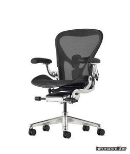
hermanmiller > Office Chair
Description The Aeron office chair revolutionised office seating with its defining design qualities: the pioneering Pellicle suspension material and its patented PostureFit SL back support, which affords the ideal sit — chest open, shoulders back, pelvis tilted slightly forward. Combining a deep knowledge of human-centered design with cutting-edge technology, the classic Aeron chair is engineered with state-of-the-art adjustability, from the arms, seat height, depth and recline, to help you maintain the optimal seating posture so you can focus on the task at hand. And it comes available in three chair sizes, offering the most comfort to the largest range of users. Features Available in Three Sizes (A, B and C) Available in Three Colours (Onyx, Graphite and Mineral) Harmonic™ 2 Tilt Fixed or Adjustable PostureFit® Multi-surface Castors Fixed, Height Adjustable or Fully Adjustable Arms Standard or Leather Arm Pads Overall Dimensions (mm) Size A - 953 (H) x 635 (W) x 567 mm (D)Size B - 1090 (H) x 658 (W) x 598 mm (D)Size C - 1128 (H) x 695 (W) x 664 mm (D) Max Capacity (kg) Size A - 136 kgSize B - 159 kgSize C - 159 kg Product Weight (kg) Size A - 18.1 kgSize B - 18.6 kgSize C - 19.5 kg Assembly Comes fully assembled Warranty 12 Years
Aeron Mineral/Satin Office Chair
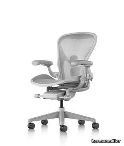
hermanmiller > Office Chair
Description The Aeron office chair revolutionised office seating with its defining design qualities: the pioneering Pellicle suspension material and its patented PostureFit SL back support, which affords the ideal sit — chest open, shoulders back, pelvis tilted slightly forward. Combining a deep knowledge of human-centered design with cutting-edge technology, the classic Aeron chair is engineered with state-of-the-art adjustability, from the arms, seat height, depth and recline, to help you maintain the optimal seating posture so you can focus on the task at hand. And it comes available in three chair sizes, offering the most comfort to the largest range of users. Features Available in Three Sizes (A, B and C) Available in Three Colours (Onyx, Graphite and Mineral) Harmonic™ 2 Tilt Fixed or Adjustable PostureFit® Multi-surface Castors Fixed, Height Adjustable or Fully Adjustable Arms Standard or Leather Arm Pads Overall Dimensions (mm) Size A - 953 (H) x 635 (W) x 567 mm (D)Size B - 1090 (H) x 658 (W) x 598 mm (D)Size C - 1128 (H) x 695 (W) x 664 mm (D) Max Capacity (kg) Size A - 136 kgSize B - 159 kgSize C - 159 kg Product Weight (kg) Size A - 18.1 kgSize B - 18.6 kgSize C - 19.5 kg Assembly Comes fully assembled Warranty 12 Years
Nature Mood PLANK 01

florim > Floor tile-stone
Marble and wood blend in a refined creative mood board. In line with the latest trends in housing evolution, Nature Mood conceives of Nature not only as a model, but also as a true mentor and gauge of human endeavor, something from which to acquire knowledge and with which to give life to increasingly environmentally friendly designs. <p>In this collection, Nature becomes an active component of design, mixing a palette of surfaces with warm hues that take their inspiration from the world of marbles and the material of wood, with clean, minimalist veining and an array of colors. The upshot is the attainment of elegant spaces that flow between interior and exterior, enhancing the presence of light so as to bestow a sensation of immersion in the natural environment at all times. The marble surfaces in the collection bring a new perspective to some of the most enchanting landscapes and natural binomials to be found on earth.</p> <p> </p> <p class="MsoNormal"><strong>COLORS AND DECORS</strong></p> <p class="MsoNormal"><span lang="EN-US" style="mso-ansi-language: EN-US;">The verdant backdrop of Rainforest is redolent of the vegetation of tropical woods, with thin brown veins that evoke the bark of a tree.</span></p> <p class="MsoNormal"><span lang="EN-US" style="mso-ansi-language: EN-US;">Glacier conjures up the whiteness of glaciers with delicate crests of light and dark gray.</span></p> <p class="MsoNormal"><span lang="EN-US" style="mso-ansi-language: EN-US;">Mountain Peak is inspired by the varied appearance and warm colors of mountain ranges in the summertime.</span></p> <p class="MsoNormal"><span lang="EN-US" style="mso-ansi-language: EN-US;">Tundra recalls the alternation of earth, shrubbery and snowfall that characterizes the homonymous Arctic polar environmental system.</span></p> <p class="MsoNormal"><span lang="EN-US" style="mso-ansi-language: EN-US;">And lastly, Riverbed is reminiscent of a gravelly river bottom with its multiplicity of stones smoothed by the flowing water.</span></p> <p class="MsoNormal"><span lang="EN-US" style="mso-ansi-language: EN-US;">The Planks 01, 02, 03, 04, 05 and 06 surfaces are the most combinable elements in the collection. Conceived as a color palette of woods with a clean, minimalist style, the Planks can generate different mood boards depending on the marble-effect surfaces with which they are juxtaposed, taking up the nuances of the veneers and affording the designer the option of personalizing both the interior spaces and the exterior shells of the buildings in accordance with his or her own creative taste.</span></p> <p class="MsoNormal"><span lang="EN-US" style="mso-ansi-language: EN-US;">The range of backgrounds is enriched by five 6 mm thick fine porcelain stoneware decors that combine the colors of different wood-inspired surfaces.</span></p> <p class="MsoNormal"><span lang="EN-US" style="mso-ansi-language: EN-US;">Hexagon offers a combination of 3 six-sided polygons, each of which in turn is divided into two different shades of wood. The composition is designed in two versions, the first combining the warm hues of Planks 01, 02 and 03, the second blending the cooler colors of Planks 04, 05 and 06.</span></p> <p class="MsoNormal"><span lang="EN-US" style="mso-ansi-language: EN-US;">French Herringbone immediately recalls the classic laying pattern for parquet flooring, in this case reformulated as an embellishment that alternates small slats in two colorings. The composition is available in two versions, one of which combines the amber shades of Planks 01 and 02, the other of which unites the gray tones of Planks 05 and 06.</span></p> <p class="MsoNormal"><span lang="EN-US" style="mso-ansi-language: EN-US;">Stripes offers an alternation of small strips in two colors. In this case, too, the range grants the designer the option of choosing between two variants, one that juxtaposes Planks 01 and 02, and one that combines Planks 05 and 06.</span></p> <p class="MsoNormal"><span lang="EN-US" style="mso-ansi-language: EN-US;">Strip consists of a plank with thin and elongated lines available in all the colors in the collection.</span></p> <p class="MsoNormal"><span lang="EN-US" style="mso-ansi-language: EN-US;">Finally, Chevron recalls the homonymous pattern of timeless charm. Here again the decor is offered in all 6 wood-effect colors of the collection.</span></p>
Aeron Graphite/Graphite Office Chair
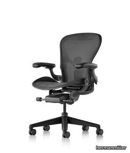
hermanmiller > Office Chair
Description The Aeron office chair revolutionised office seating with its defining design qualities: the pioneering Pellicle suspension material and its patented PostureFit SL back support, which affords the ideal sit — chest open, shoulders back, pelvis tilted slightly forward. Combining a deep knowledge of human-centered design with cutting-edge technology, the classic Aeron chair is engineered with state-of-the-art adjustability, from the arms, seat height, depth and recline, to help you maintain the optimal seating posture so you can focus on the task at hand. And it comes available in three chair sizes, offering the most comfort to the largest range of users. Features Available in Three Sizes (A, B and C) Available in Three Colours (Onyx, Graphite and Mineral) Harmonic™ 2 Tilt Fixed or Adjustable PostureFit® Multi-surface Castors Fixed, Height Adjustable or Fully Adjustable Arms Standard or Leather Arm Pads Overall Dimensions (mm) Size A - 953 (H) x 635 (W) x 567 mm (D)Size B - 1090 (H) x 658 (W) x 598 mm (D)Size C - 1128 (H) x 695 (W) x 664 mm (D) Max Capacity (kg) Size A - 136 kgSize B - 159 kgSize C - 159 kg Product Weight (kg) Size A - 18.1 kgSize B - 18.6 kgSize C - 19.5 kg Assembly Comes fully assembled Warranty 12 Years
Nature Mood RAINFOREST

florim > Wall tile-stone-brick
Marble and wood blend in a refined creative mood board. In line with the latest trends in housing evolution, Nature Mood conceives of Nature not only as a model, but also as a true mentor and gauge of human endeavor, something from which to acquire knowledge and with which to give life to increasingly environmentally friendly designs. <p>In this collection, Nature becomes an active component of design, mixing a palette of surfaces with warm hues that take their inspiration from the world of marbles and the material of wood, with clean, minimalist veining and an array of colors. The upshot is the attainment of elegant spaces that flow between interior and exterior, enhancing the presence of light so as to bestow a sensation of immersion in the natural environment at all times. The marble surfaces in the collection bring a new perspective to some of the most enchanting landscapes and natural binomials to be found on earth.</p> <p> </p> <p class="MsoNormal"><strong>COLORS AND DECORS</strong></p> <p class="MsoNormal"><span lang="EN-US" style="mso-ansi-language: EN-US;">The verdant backdrop of Rainforest is redolent of the vegetation of tropical woods, with thin brown veins that evoke the bark of a tree.</span></p> <p class="MsoNormal"><span lang="EN-US" style="mso-ansi-language: EN-US;">Glacier conjures up the whiteness of glaciers with delicate crests of light and dark gray.</span></p> <p class="MsoNormal"><span lang="EN-US" style="mso-ansi-language: EN-US;">Mountain Peak is inspired by the varied appearance and warm colors of mountain ranges in the summertime.</span></p> <p class="MsoNormal"><span lang="EN-US" style="mso-ansi-language: EN-US;">Tundra recalls the alternation of earth, shrubbery and snowfall that characterizes the homonymous Arctic polar environmental system.</span></p> <p class="MsoNormal"><span lang="EN-US" style="mso-ansi-language: EN-US;">And lastly, Riverbed is reminiscent of a gravelly river bottom with its multiplicity of stones smoothed by the flowing water.</span></p> <p class="MsoNormal"><span lang="EN-US" style="mso-ansi-language: EN-US;">The Planks 01, 02, 03, 04, 05 and 06 surfaces are the most combinable elements in the collection. Conceived as a color palette of woods with a clean, minimalist style, the Planks can generate different mood boards depending on the marble-effect surfaces with which they are juxtaposed, taking up the nuances of the veneers and affording the designer the option of personalizing both the interior spaces and the exterior shells of the buildings in accordance with his or her own creative taste.</span></p> <p class="MsoNormal"><span lang="EN-US" style="mso-ansi-language: EN-US;">The range of backgrounds is enriched by five 6 mm thick fine porcelain stoneware decors that combine the colors of different wood-inspired surfaces.</span></p> <p class="MsoNormal"><span lang="EN-US" style="mso-ansi-language: EN-US;">Hexagon offers a combination of 3 six-sided polygons, each of which in turn is divided into two different shades of wood. The composition is designed in two versions, the first combining the warm hues of Planks 01, 02 and 03, the second blending the cooler colors of Planks 04, 05 and 06.</span></p> <p class="MsoNormal"><span lang="EN-US" style="mso-ansi-language: EN-US;">French Herringbone immediately recalls the classic laying pattern for parquet flooring, in this case reformulated as an embellishment that alternates small slats in two colorings. The composition is available in two versions, one of which combines the amber shades of Planks 01 and 02, the other of which unites the gray tones of Planks 05 and 06.</span></p> <p class="MsoNormal"><span lang="EN-US" style="mso-ansi-language: EN-US;">Stripes offers an alternation of small strips in two colors. In this case, too, the range grants the designer the option of choosing between two variants, one that juxtaposes Planks 01 and 02, and one that combines Planks 05 and 06.</span></p> <p class="MsoNormal"><span lang="EN-US" style="mso-ansi-language: EN-US;">Strip consists of a plank with thin and elongated lines available in all the colors in the collection.</span></p> <p class="MsoNormal"><span lang="EN-US" style="mso-ansi-language: EN-US;">Finally, Chevron recalls the homonymous pattern of timeless charm. Here again the decor is offered in all 6 wood-effect colors of the collection.</span></p>
Nature Mood PLANK 06

florim > Floor plank
Marble and wood blend in a refined creative mood board. In line with the latest trends in housing evolution, Nature Mood conceives of Nature not only as a model, but also as a true mentor and gauge of human endeavor, something from which to acquire knowledge and with which to give life to increasingly environmentally friendly designs. <p>In this collection, Nature becomes an active component of design, mixing a palette of surfaces with warm hues that take their inspiration from the world of marbles and the material of wood, with clean, minimalist veining and an array of colors. The upshot is the attainment of elegant spaces that flow between interior and exterior, enhancing the presence of light so as to bestow a sensation of immersion in the natural environment at all times. The marble surfaces in the collection bring a new perspective to some of the most enchanting landscapes and natural binomials to be found on earth.</p> <p> </p> <p class="MsoNormal"><strong>COLORS AND DECORS</strong></p> <p class="MsoNormal"><span lang="EN-US" style="mso-ansi-language: EN-US;">The verdant backdrop of Rainforest is redolent of the vegetation of tropical woods, with thin brown veins that evoke the bark of a tree.</span></p> <p class="MsoNormal"><span lang="EN-US" style="mso-ansi-language: EN-US;">Glacier conjures up the whiteness of glaciers with delicate crests of light and dark gray.</span></p> <p class="MsoNormal"><span lang="EN-US" style="mso-ansi-language: EN-US;">Mountain Peak is inspired by the varied appearance and warm colors of mountain ranges in the summertime.</span></p> <p class="MsoNormal"><span lang="EN-US" style="mso-ansi-language: EN-US;">Tundra recalls the alternation of earth, shrubbery and snowfall that characterizes the homonymous Arctic polar environmental system.</span></p> <p class="MsoNormal"><span lang="EN-US" style="mso-ansi-language: EN-US;">And lastly, Riverbed is reminiscent of a gravelly river bottom with its multiplicity of stones smoothed by the flowing water.</span></p> <p class="MsoNormal"><span lang="EN-US" style="mso-ansi-language: EN-US;">The Planks 01, 02, 03, 04, 05 and 06 surfaces are the most combinable elements in the collection. Conceived as a color palette of woods with a clean, minimalist style, the Planks can generate different mood boards depending on the marble-effect surfaces with which they are juxtaposed, taking up the nuances of the veneers and affording the designer the option of personalizing both the interior spaces and the exterior shells of the buildings in accordance with his or her own creative taste.</span></p> <p class="MsoNormal"><span lang="EN-US" style="mso-ansi-language: EN-US;">The range of backgrounds is enriched by five 6 mm thick fine porcelain stoneware decors that combine the colors of different wood-inspired surfaces.</span></p> <p class="MsoNormal"><span lang="EN-US" style="mso-ansi-language: EN-US;">Hexagon offers a combination of 3 six-sided polygons, each of which in turn is divided into two different shades of wood. The composition is designed in two versions, the first combining the warm hues of Planks 01, 02 and 03, the second blending the cooler colors of Planks 04, 05 and 06.</span></p> <p class="MsoNormal"><span lang="EN-US" style="mso-ansi-language: EN-US;">French Herringbone immediately recalls the classic laying pattern for parquet flooring, in this case reformulated as an embellishment that alternates small slats in two colorings. The composition is available in two versions, one of which combines the amber shades of Planks 01 and 02, the other of which unites the gray tones of Planks 05 and 06.</span></p> <p class="MsoNormal"><span lang="EN-US" style="mso-ansi-language: EN-US;">Stripes offers an alternation of small strips in two colors. In this case, too, the range grants the designer the option of choosing between two variants, one that juxtaposes Planks 01 and 02, and one that combines Planks 05 and 06.</span></p> <p class="MsoNormal"><span lang="EN-US" style="mso-ansi-language: EN-US;">Strip consists of a plank with thin and elongated lines available in all the colors in the collection.</span></p> <p class="MsoNormal"><span lang="EN-US" style="mso-ansi-language: EN-US;">Finally, Chevron recalls the homonymous pattern of timeless charm. Here again the decor is offered in all 6 wood-effect colors of the collection.</span></p>
Aeron Office Chair

hermanmiller > Office Chair
Description The Aeron office chair revolutionised office seating with its defining design qualities: the pioneering Pellicle suspension material and its patented PostureFit SL back support, which affords the ideal sit — chest open, shoulders back, pelvis tilted slightly forward. Combining a deep knowledge of human-centered design with cutting-edge technology, the classic Aeron chair is engineered with state-of-the-art adjustability, from the arms, seat height, depth and recline, to help you maintain the optimal seating posture so you can focus on the task at hand. And it comes available in three chair sizes, offering the most comfort to the largest range of users. Features Available in Three Sizes (A, B and C) Available in Three Colours (Onyx, Graphite and Mineral) Harmonic™ 2 Tilt Fixed or Adjustable PostureFit® Multi-surface Castors Fixed, Height Adjustable or Fully Adjustable Arms Standard or Leather Arm Pads Overall Dimensions (mm) Size A - 953 (H) x 635 (W) x 567 mm (D)Size B - 1090 (H) x 658 (W) x 598 mm (D)Size C - 1128 (H) x 695 (W) x 664 mm (D) Max Capacity (kg) Size A - 136 kgSize B - 159 kgSize C - 159 kg Product Weight (kg) Size A - 18.1 kgSize B - 18.6 kgSize C - 19.5 kg Assembly Comes fully assembled Warranty 12 Years
Aeron Graphite/Polished Office Chair

hermanmiller > Office Chair
Description The Aeron office chair revolutionised office seating with its defining design qualities: the pioneering Pellicle suspension material and its patented PostureFit SL back support, which affords the ideal sit — chest open, shoulders back, pelvis tilted slightly forward. Combining a deep knowledge of human-centered design with cutting-edge technology, the classic Aeron chair is engineered with state-of-the-art adjustability, from the arms, seat height, depth and recline, to help you maintain the optimal seating posture so you can focus on the task at hand. And it comes available in three chair sizes, offering the most comfort to the largest range of users. Features Available in Three Sizes (A, B and C) Available in Three Colours (Onyx, Graphite and Mineral) Harmonic™ 2 Tilt Fixed or Adjustable PostureFit® Multi-surface Castors Fixed, Height Adjustable or Fully Adjustable Arms Standard or Leather Arm Pads Overall Dimensions (mm) Size A - 953 (H) x 635 (W) x 567 mm (D)Size B - 1090 (H) x 658 (W) x 598 mm (D)Size C - 1128 (H) x 695 (W) x 664 mm (D) Max Capacity (kg) Size A - 136 kgSize B - 159 kgSize C - 159 kg Product Weight (kg) Size A - 18.1 kgSize B - 18.6 kgSize C - 19.5 kg Assembly Comes fully assembled Warranty 12 Years
Nature Mood PLANK 04

florim > Floor tile-stone
Marble and wood blend in a refined creative mood board. In line with the latest trends in housing evolution, Nature Mood conceives of Nature not only as a model, but also as a true mentor and gauge of human endeavor, something from which to acquire knowledge and with which to give life to increasingly environmentally friendly designs. <p>In this collection, Nature becomes an active component of design, mixing a palette of surfaces with warm hues that take their inspiration from the world of marbles and the material of wood, with clean, minimalist veining and an array of colors. The upshot is the attainment of elegant spaces that flow between interior and exterior, enhancing the presence of light so as to bestow a sensation of immersion in the natural environment at all times. The marble surfaces in the collection bring a new perspective to some of the most enchanting landscapes and natural binomials to be found on earth.</p> <p> </p> <p class="MsoNormal"><strong>COLORS AND DECORS</strong></p> <p class="MsoNormal"><span lang="EN-US" style="mso-ansi-language: EN-US;">The verdant backdrop of Rainforest is redolent of the vegetation of tropical woods, with thin brown veins that evoke the bark of a tree.</span></p> <p class="MsoNormal"><span lang="EN-US" style="mso-ansi-language: EN-US;">Glacier conjures up the whiteness of glaciers with delicate crests of light and dark gray.</span></p> <p class="MsoNormal"><span lang="EN-US" style="mso-ansi-language: EN-US;">Mountain Peak is inspired by the varied appearance and warm colors of mountain ranges in the summertime.</span></p> <p class="MsoNormal"><span lang="EN-US" style="mso-ansi-language: EN-US;">Tundra recalls the alternation of earth, shrubbery and snowfall that characterizes the homonymous Arctic polar environmental system.</span></p> <p class="MsoNormal"><span lang="EN-US" style="mso-ansi-language: EN-US;">And lastly, Riverbed is reminiscent of a gravelly river bottom with its multiplicity of stones smoothed by the flowing water.</span></p> <p class="MsoNormal"><span lang="EN-US" style="mso-ansi-language: EN-US;">The Planks 01, 02, 03, 04, 05 and 06 surfaces are the most combinable elements in the collection. Conceived as a color palette of woods with a clean, minimalist style, the Planks can generate different mood boards depending on the marble-effect surfaces with which they are juxtaposed, taking up the nuances of the veneers and affording the designer the option of personalizing both the interior spaces and the exterior shells of the buildings in accordance with his or her own creative taste.</span></p> <p class="MsoNormal"><span lang="EN-US" style="mso-ansi-language: EN-US;">The range of backgrounds is enriched by five 6 mm thick fine porcelain stoneware decors that combine the colors of different wood-inspired surfaces.</span></p> <p class="MsoNormal"><span lang="EN-US" style="mso-ansi-language: EN-US;">Hexagon offers a combination of 3 six-sided polygons, each of which in turn is divided into two different shades of wood. The composition is designed in two versions, the first combining the warm hues of Planks 01, 02 and 03, the second blending the cooler colors of Planks 04, 05 and 06.</span></p> <p class="MsoNormal"><span lang="EN-US" style="mso-ansi-language: EN-US;">French Herringbone immediately recalls the classic laying pattern for parquet flooring, in this case reformulated as an embellishment that alternates small slats in two colorings. The composition is available in two versions, one of which combines the amber shades of Planks 01 and 02, the other of which unites the gray tones of Planks 05 and 06.</span></p> <p class="MsoNormal"><span lang="EN-US" style="mso-ansi-language: EN-US;">Stripes offers an alternation of small strips in two colors. In this case, too, the range grants the designer the option of choosing between two variants, one that juxtaposes Planks 01 and 02, and one that combines Planks 05 and 06.</span></p> <p class="MsoNormal"><span lang="EN-US" style="mso-ansi-language: EN-US;">Strip consists of a plank with thin and elongated lines available in all the colors in the collection.</span></p> <p class="MsoNormal"><span lang="EN-US" style="mso-ansi-language: EN-US;">Finally, Chevron recalls the homonymous pattern of timeless charm. Here again the decor is offered in all 6 wood-effect colors of the collection.</span></p>
Cromatica Cobalto

florim > Wall Paint
A lexicon of colour shades for mixing. A large size and its submultiples. «This work represents a reflection on colour, and above all a proposal on how to transfer the multiplicity of shades typical of a hand-crafted piece into a project produced on a large scale.» Andrea Trimarchi & Simone Farresin Studio Formafantasma base their work in the design world on a strong vocation for research. Simone Farresin and Andrea Trimarchi view every project as an opportunity for study and the acquisition of new knowledge, and their love of speculation establishes a dialectic rapport with the situations offered by each new client. Whether it involves a material, a type or a production method, the first phase of their design process is the mapping of what the specific case places at their disposal. With Cedit, an analysis of the company's past and present was central to the inputs. Inevitably, since "Looking back to look forward" has been the design duo's mission statement for years. In this case, in particular, the company's history was a real treasure trove, a fine blend of memory and technology: on the one hand, the excellence of production technologies now extended with the added potential arising from the engineering of large-sized ceramic tiles, and on the other a wealth of experience build up with great designers of the past, from Zanuso to Noorda, through to <strong>Ettore Sottsass</strong>. Andrea and Simone decided to focus on Sottsass - who started designing for Cedit back in the late Seventies - and made an in-depth study of one of the colour charts he developed towards the end of the Nineties. A spread of colours which gave its name to the "41 Colors" collection, included in the catalogue of the period as a real alphabet for what has proved to be a lasting design language. Colour was much more than just a compulsory step in the dialogue between designer and producer, since Sottsass had already discovered the power of the mystery intrinsic to this universe of invention.<br /><br />With Cedit the master-designer, a long-established lover of ceramics and their crafted unpredictability, found a way of transferring his personal feeling for colour to a wide audience, through industrial mass production. And this assumption is another factor Formafantasma have inherited, interpreting it today with new, even more efficient technical resources just as capable of expressing the secrets of colour. «The concept of colour "in isolation" - Sottsass explained in a 1992 text - classified colour, Pantone, as they call it now, "scientific" colour, is something I still refuse to accept. (...) Colours, the idea of colour, are always intangible, they slip slowly away like words, that run through your fingers, like poetry, which you can never keep hold of, like a good story.» And Formafantasma seem to have chosen that distinction between colour "in isolation" and "intangible" yet ever-present colour as the basis of their work. However, their approach draws on their unique vocation for research and the technical resources of the third millennium. «This work - they explain to us - is a reflection on colour, and above all on <strong>how to bring the multiplicity of shades typical of a hand-crafted piece into a large-scale project</strong>.» The designers look at large, monochrome slabs and turn to the engineers for details of their secrets, their processing stages, the phases in their production. They appreciate that the colour of ceramic material, its ineffable secret, can still be present in the series and large tile sizes in which Cedit leads the way. They understand that this is, in itself, an expressive power which does not need channelling into forms, motifs and signs. But above all, they treat the surface as a large canvas on which they spread pure colour, which tends to be uniform but in fact is never really a "scientific", totally monochrome hue: it is not a Pantone. And this is the source of the fundamental insight, which only children of the transition from the analogue to the digital era could achieve, the reward for those who draw on the past to look to the future.<br /><br />The designers cut the slab into lots of regular pieces, not necessarily of the same size. They restore its identity as a "tile", a familiar name with something ancient about it, but which stands for a module, a unit of measurement, a building block. There is nothing nostalgic about this - on the contrary, the vision is completely new, and the portions of slab created can be reassembled with no restrictions, breaking down the unity of the whole and reviving its essence starting from its structure. As the cards in the pack are shuffled, what emerges is not a figure or motif but the representation of colour itself and its physical nature. It is live matter, born from the meeting of vibrating forces, the mixing of ever-varying percentages of the basic ingredients. And Formafantasma present us with the corpuscular, fragmented essence of these small frames of space and crystallised time, which reveal the code and formula of their composition. So Cromatica is a collection made up of six colours which actually have an infinite number of declinations and compositional possibilities. It is a "discrete" combination in the mathematical sense of the term, capable of generating multiple, variable subsets. At the same time, each slab can be used in its entirety, leaving the impression of analogue continuity unchanged. But what really amazes is the comparison and dialogue between the two approaches: a stroke of genius, laying clear the mysterious appeal the artificial reproduction of colour has always held for mankind. Because, as Sottsass said, «colours are language, a powerful, magical, intangible, flexible, continuous material, in which existence is made manifest, the existence that lives in time and space».
Ikon Shelf | Oak
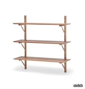
stolab > Cabinet
In the Ikon shelf you can see the craftmanship even in the smallest details. Stefan’s design process for this shelf started with ideas based around Windsor chairs, with turned details and rational manufacturing. With the turned console parts as the bearing component, the Ikon shelf is very much a representative piece for Stolab’s knowledge of well-crafted solid wood furniture.
Nature Mood GLACIER

florim > Wall tile-stone-brick
Marble and wood blend in a refined creative mood board. In line with the latest trends in housing evolution, Nature Mood conceives of Nature not only as a model, but also as a true mentor and gauge of human endeavor, something from which to acquire knowledge and with which to give life to increasingly environmentally friendly designs. <p>In this collection, Nature becomes an active component of design, mixing a palette of surfaces with warm hues that take their inspiration from the world of marbles and the material of wood, with clean, minimalist veining and an array of colors. The upshot is the attainment of elegant spaces that flow between interior and exterior, enhancing the presence of light so as to bestow a sensation of immersion in the natural environment at all times. The marble surfaces in the collection bring a new perspective to some of the most enchanting landscapes and natural binomials to be found on earth.</p> <p> </p> <p class="MsoNormal"><strong>COLORS AND DECORS</strong></p> <p class="MsoNormal"><span lang="EN-US" style="mso-ansi-language: EN-US;">The verdant backdrop of Rainforest is redolent of the vegetation of tropical woods, with thin brown veins that evoke the bark of a tree.</span></p> <p class="MsoNormal"><span lang="EN-US" style="mso-ansi-language: EN-US;">Glacier conjures up the whiteness of glaciers with delicate crests of light and dark gray.</span></p> <p class="MsoNormal"><span lang="EN-US" style="mso-ansi-language: EN-US;">Mountain Peak is inspired by the varied appearance and warm colors of mountain ranges in the summertime.</span></p> <p class="MsoNormal"><span lang="EN-US" style="mso-ansi-language: EN-US;">Tundra recalls the alternation of earth, shrubbery and snowfall that characterizes the homonymous Arctic polar environmental system.</span></p> <p class="MsoNormal"><span lang="EN-US" style="mso-ansi-language: EN-US;">And lastly, Riverbed is reminiscent of a gravelly river bottom with its multiplicity of stones smoothed by the flowing water.</span></p> <p class="MsoNormal"><span lang="EN-US" style="mso-ansi-language: EN-US;">The Planks 01, 02, 03, 04, 05 and 06 surfaces are the most combinable elements in the collection. Conceived as a color palette of woods with a clean, minimalist style, the Planks can generate different mood boards depending on the marble-effect surfaces with which they are juxtaposed, taking up the nuances of the veneers and affording the designer the option of personalizing both the interior spaces and the exterior shells of the buildings in accordance with his or her own creative taste.</span></p> <p class="MsoNormal"><span lang="EN-US" style="mso-ansi-language: EN-US;">The range of backgrounds is enriched by five 6 mm thick fine porcelain stoneware decors that combine the colors of different wood-inspired surfaces.</span></p> <p class="MsoNormal"><span lang="EN-US" style="mso-ansi-language: EN-US;">Hexagon offers a combination of 3 six-sided polygons, each of which in turn is divided into two different shades of wood. The composition is designed in two versions, the first combining the warm hues of Planks 01, 02 and 03, the second blending the cooler colors of Planks 04, 05 and 06.</span></p> <p class="MsoNormal"><span lang="EN-US" style="mso-ansi-language: EN-US;">French Herringbone immediately recalls the classic laying pattern for parquet flooring, in this case reformulated as an embellishment that alternates small slats in two colorings. The composition is available in two versions, one of which combines the amber shades of Planks 01 and 02, the other of which unites the gray tones of Planks 05 and 06.</span></p> <p class="MsoNormal"><span lang="EN-US" style="mso-ansi-language: EN-US;">Stripes offers an alternation of small strips in two colors. In this case, too, the range grants the designer the option of choosing between two variants, one that juxtaposes Planks 01 and 02, and one that combines Planks 05 and 06.</span></p> <p class="MsoNormal"><span lang="EN-US" style="mso-ansi-language: EN-US;">Strip consists of a plank with thin and elongated lines available in all the colors in the collection.</span></p> <p class="MsoNormal"><span lang="EN-US" style="mso-ansi-language: EN-US;">Finally, Chevron recalls the homonymous pattern of timeless charm. Here again the decor is offered in all 6 wood-effect colors of the collection.</span></p>
Aeron Onyx/Onyx Office Chair
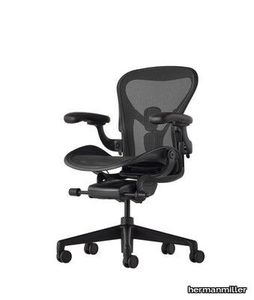
hermanmiller > Office Chair
Description The Aeron office chair revolutionised office seating with its defining design qualities: the pioneering Pellicle suspension material and its patented PostureFit SL back support, which affords the ideal sit — chest open, shoulders back, pelvis tilted slightly forward. Combining a deep knowledge of human-centered design with cutting-edge technology, the classic Aeron chair is engineered with state-of-the-art adjustability, from the arms, seat height, depth and recline, to help you maintain the optimal seating posture so you can focus on the task at hand. And it comes available in three chair sizes, offering the most comfort to the largest range of users. Features Available in Three Sizes (A, B and C) Available in Three Colours (Onyx, Graphite and Mineral) Harmonic™ 2 Tilt Fixed or Adjustable PostureFit® Multi-surface Castors Fixed, Height Adjustable or Fully Adjustable Arms Standard or Leather Arm Pads Overall Dimensions (mm) Size A - 953 (H) x 635 (W) x 567 mm (D)Size B - 1090 (H) x 658 (W) x 598 mm (D)Size C - 1128 (H) x 695 (W) x 664 mm (D) Max Capacity (kg) Size A - 136 kgSize B - 159 kgSize C - 159 kg Product Weight (kg) Size A - 18.1 kgSize B - 18.6 kgSize C - 19.5 kg Assembly Comes fully assembled Warranty 12 Years
Nature Mood PLANK 02

florim > Floor tile-stone
Marble and wood blend in a refined creative mood board. In line with the latest trends in housing evolution, Nature Mood conceives of Nature not only as a model, but also as a true mentor and gauge of human endeavor, something from which to acquire knowledge and with which to give life to increasingly environmentally friendly designs. <p>In this collection, Nature becomes an active component of design, mixing a palette of surfaces with warm hues that take their inspiration from the world of marbles and the material of wood, with clean, minimalist veining and an array of colors. The upshot is the attainment of elegant spaces that flow between interior and exterior, enhancing the presence of light so as to bestow a sensation of immersion in the natural environment at all times. The marble surfaces in the collection bring a new perspective to some of the most enchanting landscapes and natural binomials to be found on earth.</p> <p> </p> <p class="MsoNormal"><strong>COLORS AND DECORS</strong></p> <p class="MsoNormal"><span lang="EN-US" style="mso-ansi-language: EN-US;">The verdant backdrop of Rainforest is redolent of the vegetation of tropical woods, with thin brown veins that evoke the bark of a tree.</span></p> <p class="MsoNormal"><span lang="EN-US" style="mso-ansi-language: EN-US;">Glacier conjures up the whiteness of glaciers with delicate crests of light and dark gray.</span></p> <p class="MsoNormal"><span lang="EN-US" style="mso-ansi-language: EN-US;">Mountain Peak is inspired by the varied appearance and warm colors of mountain ranges in the summertime.</span></p> <p class="MsoNormal"><span lang="EN-US" style="mso-ansi-language: EN-US;">Tundra recalls the alternation of earth, shrubbery and snowfall that characterizes the homonymous Arctic polar environmental system.</span></p> <p class="MsoNormal"><span lang="EN-US" style="mso-ansi-language: EN-US;">And lastly, Riverbed is reminiscent of a gravelly river bottom with its multiplicity of stones smoothed by the flowing water.</span></p> <p class="MsoNormal"><span lang="EN-US" style="mso-ansi-language: EN-US;">The Planks 01, 02, 03, 04, 05 and 06 surfaces are the most combinable elements in the collection. Conceived as a color palette of woods with a clean, minimalist style, the Planks can generate different mood boards depending on the marble-effect surfaces with which they are juxtaposed, taking up the nuances of the veneers and affording the designer the option of personalizing both the interior spaces and the exterior shells of the buildings in accordance with his or her own creative taste.</span></p> <p class="MsoNormal"><span lang="EN-US" style="mso-ansi-language: EN-US;">The range of backgrounds is enriched by five 6 mm thick fine porcelain stoneware decors that combine the colors of different wood-inspired surfaces.</span></p> <p class="MsoNormal"><span lang="EN-US" style="mso-ansi-language: EN-US;">Hexagon offers a combination of 3 six-sided polygons, each of which in turn is divided into two different shades of wood. The composition is designed in two versions, the first combining the warm hues of Planks 01, 02 and 03, the second blending the cooler colors of Planks 04, 05 and 06.</span></p> <p class="MsoNormal"><span lang="EN-US" style="mso-ansi-language: EN-US;">French Herringbone immediately recalls the classic laying pattern for parquet flooring, in this case reformulated as an embellishment that alternates small slats in two colorings. The composition is available in two versions, one of which combines the amber shades of Planks 01 and 02, the other of which unites the gray tones of Planks 05 and 06.</span></p> <p class="MsoNormal"><span lang="EN-US" style="mso-ansi-language: EN-US;">Stripes offers an alternation of small strips in two colors. In this case, too, the range grants the designer the option of choosing between two variants, one that juxtaposes Planks 01 and 02, and one that combines Planks 05 and 06.</span></p> <p class="MsoNormal"><span lang="EN-US" style="mso-ansi-language: EN-US;">Strip consists of a plank with thin and elongated lines available in all the colors in the collection.</span></p> <p class="MsoNormal"><span lang="EN-US" style="mso-ansi-language: EN-US;">Finally, Chevron recalls the homonymous pattern of timeless charm. Here again the decor is offered in all 6 wood-effect colors of the collection.</span></p>
Ikon Shelf | Birch
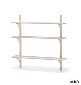
stolab > Cabinet
In the Ikon shelf you can see the craftmanship even in the smallest details. Stefan’s design process for this shelf started with ideas based around Windsor chairs, with turned details and rational manufacturing. With the turned console parts as the bearing component, the Ikon shelf is very much a representative piece for Stolab’s knowledge of well-crafted solid wood furniture.
Nature Mood Tundra

florim > Floor tile-stone
Marble and wood blend in a refined creative mood board. In line with the latest trends in housing evolution, Nature Mood conceives of Nature not only as a model, but also as a true mentor and gauge of human endeavor, something from which to acquire knowledge and with which to give life to increasingly environmentally friendly designs. <p>In this collection, Nature becomes an active component of design, mixing a palette of surfaces with warm hues that take their inspiration from the world of marbles and the material of wood, with clean, minimalist veining and an array of colors. The upshot is the attainment of elegant spaces that flow between interior and exterior, enhancing the presence of light so as to bestow a sensation of immersion in the natural environment at all times. The marble surfaces in the collection bring a new perspective to some of the most enchanting landscapes and natural binomials to be found on earth.</p> <p> </p> <p class="MsoNormal"><strong>COLORS AND DECORS</strong></p> <p class="MsoNormal"><span lang="EN-US" style="mso-ansi-language: EN-US;">The verdant backdrop of Rainforest is redolent of the vegetation of tropical woods, with thin brown veins that evoke the bark of a tree.</span></p> <p class="MsoNormal"><span lang="EN-US" style="mso-ansi-language: EN-US;">Glacier conjures up the whiteness of glaciers with delicate crests of light and dark gray.</span></p> <p class="MsoNormal"><span lang="EN-US" style="mso-ansi-language: EN-US;">Mountain Peak is inspired by the varied appearance and warm colors of mountain ranges in the summertime.</span></p> <p class="MsoNormal"><span lang="EN-US" style="mso-ansi-language: EN-US;">Tundra recalls the alternation of earth, shrubbery and snowfall that characterizes the homonymous Arctic polar environmental system.</span></p> <p class="MsoNormal"><span lang="EN-US" style="mso-ansi-language: EN-US;">And lastly, Riverbed is reminiscent of a gravelly river bottom with its multiplicity of stones smoothed by the flowing water.</span></p> <p class="MsoNormal"><span lang="EN-US" style="mso-ansi-language: EN-US;">The Planks 01, 02, 03, 04, 05 and 06 surfaces are the most combinable elements in the collection. Conceived as a color palette of woods with a clean, minimalist style, the Planks can generate different mood boards depending on the marble-effect surfaces with which they are juxtaposed, taking up the nuances of the veneers and affording the designer the option of personalizing both the interior spaces and the exterior shells of the buildings in accordance with his or her own creative taste.</span></p> <p class="MsoNormal"><span lang="EN-US" style="mso-ansi-language: EN-US;">The range of backgrounds is enriched by five 6 mm thick fine porcelain stoneware decors that combine the colors of different wood-inspired surfaces.</span></p> <p class="MsoNormal"><span lang="EN-US" style="mso-ansi-language: EN-US;">Hexagon offers a combination of 3 six-sided polygons, each of which in turn is divided into two different shades of wood. The composition is designed in two versions, the first combining the warm hues of Planks 01, 02 and 03, the second blending the cooler colors of Planks 04, 05 and 06.</span></p> <p class="MsoNormal"><span lang="EN-US" style="mso-ansi-language: EN-US;">French Herringbone immediately recalls the classic laying pattern for parquet flooring, in this case reformulated as an embellishment that alternates small slats in two colorings. The composition is available in two versions, one of which combines the amber shades of Planks 01 and 02, the other of which unites the gray tones of Planks 05 and 06.</span></p> <p class="MsoNormal"><span lang="EN-US" style="mso-ansi-language: EN-US;">Stripes offers an alternation of small strips in two colors. In this case, too, the range grants the designer the option of choosing between two variants, one that juxtaposes Planks 01 and 02, and one that combines Planks 05 and 06.</span></p> <p class="MsoNormal"><span lang="EN-US" style="mso-ansi-language: EN-US;">Strip consists of a plank with thin and elongated lines available in all the colors in the collection.</span></p> <p class="MsoNormal"><span lang="EN-US" style="mso-ansi-language: EN-US;">Finally, Chevron recalls the homonymous pattern of timeless charm. Here again the decor is offered in all 6 wood-effect colors of the collection.</span></p>
Cromatica Cenere

florim > Synthetic Floor
A lexicon of colour shades for mixing. A large size and its submultiples. «This work represents a reflection on colour, and above all a proposal on how to transfer the multiplicity of shades typical of a hand-crafted piece into a project produced on a large scale.» Andrea Trimarchi & Simone Farresin Studio Formafantasma base their work in the design world on a strong vocation for research. Simone Farresin and Andrea Trimarchi view every project as an opportunity for study and the acquisition of new knowledge, and their love of speculation establishes a dialectic rapport with the situations offered by each new client. Whether it involves a material, a type or a production method, the first phase of their design process is the mapping of what the specific case places at their disposal. With Cedit, an analysis of the company's past and present was central to the inputs. Inevitably, since "Looking back to look forward" has been the design duo's mission statement for years. In this case, in particular, the company's history was a real treasure trove, a fine blend of memory and technology: on the one hand, the excellence of production technologies now extended with the added potential arising from the engineering of large-sized ceramic tiles, and on the other a wealth of experience build up with great designers of the past, from Zanuso to Noorda, through to <strong>Ettore Sottsass</strong>. Andrea and Simone decided to focus on Sottsass - who started designing for Cedit back in the late Seventies - and made an in-depth study of one of the colour charts he developed towards the end of the Nineties. A spread of colours which gave its name to the "41 Colors" collection, included in the catalogue of the period as a real alphabet for what has proved to be a lasting design language. Colour was much more than just a compulsory step in the dialogue between designer and producer, since Sottsass had already discovered the power of the mystery intrinsic to this universe of invention.<br /><br />With Cedit the master-designer, a long-established lover of ceramics and their crafted unpredictability, found a way of transferring his personal feeling for colour to a wide audience, through industrial mass production. And this assumption is another factor Formafantasma have inherited, interpreting it today with new, even more efficient technical resources just as capable of expressing the secrets of colour. «The concept of colour "in isolation" - Sottsass explained in a 1992 text - classified colour, Pantone, as they call it now, "scientific" colour, is something I still refuse to accept. (...) Colours, the idea of colour, are always intangible, they slip slowly away like words, that run through your fingers, like poetry, which you can never keep hold of, like a good story.» And Formafantasma seem to have chosen that distinction between colour "in isolation" and "intangible" yet ever-present colour as the basis of their work. However, their approach draws on their unique vocation for research and the technical resources of the third millennium. «This work - they explain to us - is a reflection on colour, and above all on <strong>how to bring the multiplicity of shades typical of a hand-crafted piece into a large-scale project</strong>.» The designers look at large, monochrome slabs and turn to the engineers for details of their secrets, their processing stages, the phases in their production. They appreciate that the colour of ceramic material, its ineffable secret, can still be present in the series and large tile sizes in which Cedit leads the way. They understand that this is, in itself, an expressive power which does not need channelling into forms, motifs and signs. But above all, they treat the surface as a large canvas on which they spread pure colour, which tends to be uniform but in fact is never really a "scientific", totally monochrome hue: it is not a Pantone. And this is the source of the fundamental insight, which only children of the transition from the analogue to the digital era could achieve, the reward for those who draw on the past to look to the future.<br /><br />The designers cut the slab into lots of regular pieces, not necessarily of the same size. They restore its identity as a "tile", a familiar name with something ancient about it, but which stands for a module, a unit of measurement, a building block. There is nothing nostalgic about this - on the contrary, the vision is completely new, and the portions of slab created can be reassembled with no restrictions, breaking down the unity of the whole and reviving its essence starting from its structure. As the cards in the pack are shuffled, what emerges is not a figure or motif but the representation of colour itself and its physical nature. It is live matter, born from the meeting of vibrating forces, the mixing of ever-varying percentages of the basic ingredients. And Formafantasma present us with the corpuscular, fragmented essence of these small frames of space and crystallised time, which reveal the code and formula of their composition. So Cromatica is a collection made up of six colours which actually have an infinite number of declinations and compositional possibilities. It is a "discrete" combination in the mathematical sense of the term, capable of generating multiple, variable subsets. At the same time, each slab can be used in its entirety, leaving the impression of analogue continuity unchanged. But what really amazes is the comparison and dialogue between the two approaches: a stroke of genius, laying clear the mysterious appeal the artificial reproduction of colour has always held for mankind. Because, as Sottsass said, «colours are language, a powerful, magical, intangible, flexible, continuous material, in which existence is made manifest, the existence that lives in time and space».
Nature Mood MOUNTAIN PEAK

florim > Floor tile-stone
Marble and wood blend in a refined creative mood board. In line with the latest trends in housing evolution, Nature Mood conceives of Nature not only as a model, but also as a true mentor and gauge of human endeavor, something from which to acquire knowledge and with which to give life to increasingly environmentally friendly designs. <p>In this collection, Nature becomes an active component of design, mixing a palette of surfaces with warm hues that take their inspiration from the world of marbles and the material of wood, with clean, minimalist veining and an array of colors. The upshot is the attainment of elegant spaces that flow between interior and exterior, enhancing the presence of light so as to bestow a sensation of immersion in the natural environment at all times. The marble surfaces in the collection bring a new perspective to some of the most enchanting landscapes and natural binomials to be found on earth.</p> <p> </p> <p class="MsoNormal"><strong>COLORS AND DECORS</strong></p> <p class="MsoNormal"><span lang="EN-US" style="mso-ansi-language: EN-US;">The verdant backdrop of Rainforest is redolent of the vegetation of tropical woods, with thin brown veins that evoke the bark of a tree.</span></p> <p class="MsoNormal"><span lang="EN-US" style="mso-ansi-language: EN-US;">Glacier conjures up the whiteness of glaciers with delicate crests of light and dark gray.</span></p> <p class="MsoNormal"><span lang="EN-US" style="mso-ansi-language: EN-US;">Mountain Peak is inspired by the varied appearance and warm colors of mountain ranges in the summertime.</span></p> <p class="MsoNormal"><span lang="EN-US" style="mso-ansi-language: EN-US;">Tundra recalls the alternation of earth, shrubbery and snowfall that characterizes the homonymous Arctic polar environmental system.</span></p> <p class="MsoNormal"><span lang="EN-US" style="mso-ansi-language: EN-US;">And lastly, Riverbed is reminiscent of a gravelly river bottom with its multiplicity of stones smoothed by the flowing water.</span></p> <p class="MsoNormal"><span lang="EN-US" style="mso-ansi-language: EN-US;">The Planks 01, 02, 03, 04, 05 and 06 surfaces are the most combinable elements in the collection. Conceived as a color palette of woods with a clean, minimalist style, the Planks can generate different mood boards depending on the marble-effect surfaces with which they are juxtaposed, taking up the nuances of the veneers and affording the designer the option of personalizing both the interior spaces and the exterior shells of the buildings in accordance with his or her own creative taste.</span></p> <p class="MsoNormal"><span lang="EN-US" style="mso-ansi-language: EN-US;">The range of backgrounds is enriched by five 6 mm thick fine porcelain stoneware decors that combine the colors of different wood-inspired surfaces.</span></p> <p class="MsoNormal"><span lang="EN-US" style="mso-ansi-language: EN-US;">Hexagon offers a combination of 3 six-sided polygons, each of which in turn is divided into two different shades of wood. The composition is designed in two versions, the first combining the warm hues of Planks 01, 02 and 03, the second blending the cooler colors of Planks 04, 05 and 06.</span></p> <p class="MsoNormal"><span lang="EN-US" style="mso-ansi-language: EN-US;">French Herringbone immediately recalls the classic laying pattern for parquet flooring, in this case reformulated as an embellishment that alternates small slats in two colorings. The composition is available in two versions, one of which combines the amber shades of Planks 01 and 02, the other of which unites the gray tones of Planks 05 and 06.</span></p> <p class="MsoNormal"><span lang="EN-US" style="mso-ansi-language: EN-US;">Stripes offers an alternation of small strips in two colors. In this case, too, the range grants the designer the option of choosing between two variants, one that juxtaposes Planks 01 and 02, and one that combines Planks 05 and 06.</span></p> <p class="MsoNormal"><span lang="EN-US" style="mso-ansi-language: EN-US;">Strip consists of a plank with thin and elongated lines available in all the colors in the collection.</span></p> <p class="MsoNormal"><span lang="EN-US" style="mso-ansi-language: EN-US;">Finally, Chevron recalls the homonymous pattern of timeless charm. Here again the decor is offered in all 6 wood-effect colors of the collection.</span></p>
Cromatica Verde

florim > Wall Paint
A lexicon of colour shades for mixing. A large size and its submultiples. «This work represents a reflection on colour, and above all a proposal on how to transfer the multiplicity of shades typical of a hand-crafted piece into a project produced on a large scale.» Andrea Trimarchi & Simone Farresin Studio Formafantasma base their work in the design world on a strong vocation for research. Simone Farresin and Andrea Trimarchi view every project as an opportunity for study and the acquisition of new knowledge, and their love of speculation establishes a dialectic rapport with the situations offered by each new client. Whether it involves a material, a type or a production method, the first phase of their design process is the mapping of what the specific case places at their disposal. With Cedit, an analysis of the company's past and present was central to the inputs. Inevitably, since "Looking back to look forward" has been the design duo's mission statement for years. In this case, in particular, the company's history was a real treasure trove, a fine blend of memory and technology: on the one hand, the excellence of production technologies now extended with the added potential arising from the engineering of large-sized ceramic tiles, and on the other a wealth of experience build up with great designers of the past, from Zanuso to Noorda, through to <strong>Ettore Sottsass</strong>. Andrea and Simone decided to focus on Sottsass - who started designing for Cedit back in the late Seventies - and made an in-depth study of one of the colour charts he developed towards the end of the Nineties. A spread of colours which gave its name to the "41 Colors" collection, included in the catalogue of the period as a real alphabet for what has proved to be a lasting design language. Colour was much more than just a compulsory step in the dialogue between designer and producer, since Sottsass had already discovered the power of the mystery intrinsic to this universe of invention.<br /><br />With Cedit the master-designer, a long-established lover of ceramics and their crafted unpredictability, found a way of transferring his personal feeling for colour to a wide audience, through industrial mass production. And this assumption is another factor Formafantasma have inherited, interpreting it today with new, even more efficient technical resources just as capable of expressing the secrets of colour. «The concept of colour "in isolation" - Sottsass explained in a 1992 text - classified colour, Pantone, as they call it now, "scientific" colour, is something I still refuse to accept. (...) Colours, the idea of colour, are always intangible, they slip slowly away like words, that run through your fingers, like poetry, which you can never keep hold of, like a good story.» And Formafantasma seem to have chosen that distinction between colour "in isolation" and "intangible" yet ever-present colour as the basis of their work. However, their approach draws on their unique vocation for research and the technical resources of the third millennium. «This work - they explain to us - is a reflection on colour, and above all on <strong>how to bring the multiplicity of shades typical of a hand-crafted piece into a large-scale project</strong>.» The designers look at large, monochrome slabs and turn to the engineers for details of their secrets, their processing stages, the phases in their production. They appreciate that the colour of ceramic material, its ineffable secret, can still be present in the series and large tile sizes in which Cedit leads the way. They understand that this is, in itself, an expressive power which does not need channelling into forms, motifs and signs. But above all, they treat the surface as a large canvas on which they spread pure colour, which tends to be uniform but in fact is never really a "scientific", totally monochrome hue: it is not a Pantone. And this is the source of the fundamental insight, which only children of the transition from the analogue to the digital era could achieve, the reward for those who draw on the past to look to the future.<br /><br />The designers cut the slab into lots of regular pieces, not necessarily of the same size. They restore its identity as a "tile", a familiar name with something ancient about it, but which stands for a module, a unit of measurement, a building block. There is nothing nostalgic about this - on the contrary, the vision is completely new, and the portions of slab created can be reassembled with no restrictions, breaking down the unity of the whole and reviving its essence starting from its structure. As the cards in the pack are shuffled, what emerges is not a figure or motif but the representation of colour itself and its physical nature. It is live matter, born from the meeting of vibrating forces, the mixing of ever-varying percentages of the basic ingredients. And Formafantasma present us with the corpuscular, fragmented essence of these small frames of space and crystallised time, which reveal the code and formula of their composition. So Cromatica is a collection made up of six colours which actually have an infinite number of declinations and compositional possibilities. It is a "discrete" combination in the mathematical sense of the term, capable of generating multiple, variable subsets. At the same time, each slab can be used in its entirety, leaving the impression of analogue continuity unchanged. But what really amazes is the comparison and dialogue between the two approaches: a stroke of genius, laying clear the mysterious appeal the artificial reproduction of colour has always held for mankind. Because, as Sottsass said, «colours are language, a powerful, magical, intangible, flexible, continuous material, in which existence is made manifest, the existence that lives in time and space».
Cromatica Opale

florim > Wall Paint
A lexicon of colour shades for mixing. A large size and its submultiples. «This work represents a reflection on colour, and above all a proposal on how to transfer the multiplicity of shades typical of a hand-crafted piece into a project produced on a large scale.» Andrea Trimarchi & Simone Farresin Studio Formafantasma base their work in the design world on a strong vocation for research. Simone Farresin and Andrea Trimarchi view every project as an opportunity for study and the acquisition of new knowledge, and their love of speculation establishes a dialectic rapport with the situations offered by each new client. Whether it involves a material, a type or a production method, the first phase of their design process is the mapping of what the specific case places at their disposal. With Cedit, an analysis of the company's past and present was central to the inputs. Inevitably, since "Looking back to look forward" has been the design duo's mission statement for years. In this case, in particular, the company's history was a real treasure trove, a fine blend of memory and technology: on the one hand, the excellence of production technologies now extended with the added potential arising from the engineering of large-sized ceramic tiles, and on the other a wealth of experience build up with great designers of the past, from Zanuso to Noorda, through to <strong>Ettore Sottsass</strong>. Andrea and Simone decided to focus on Sottsass - who started designing for Cedit back in the late Seventies - and made an in-depth study of one of the colour charts he developed towards the end of the Nineties. A spread of colours which gave its name to the "41 Colors" collection, included in the catalogue of the period as a real alphabet for what has proved to be a lasting design language. Colour was much more than just a compulsory step in the dialogue between designer and producer, since Sottsass had already discovered the power of the mystery intrinsic to this universe of invention.<br /><br />With Cedit the master-designer, a long-established lover of ceramics and their crafted unpredictability, found a way of transferring his personal feeling for colour to a wide audience, through industrial mass production. And this assumption is another factor Formafantasma have inherited, interpreting it today with new, even more efficient technical resources just as capable of expressing the secrets of colour. «The concept of colour "in isolation" - Sottsass explained in a 1992 text - classified colour, Pantone, as they call it now, "scientific" colour, is something I still refuse to accept. (...) Colours, the idea of colour, are always intangible, they slip slowly away like words, that run through your fingers, like poetry, which you can never keep hold of, like a good story.» And Formafantasma seem to have chosen that distinction between colour "in isolation" and "intangible" yet ever-present colour as the basis of their work. However, their approach draws on their unique vocation for research and the technical resources of the third millennium. «This work - they explain to us - is a reflection on colour, and above all on <strong>how to bring the multiplicity of shades typical of a hand-crafted piece into a large-scale project</strong>.» The designers look at large, monochrome slabs and turn to the engineers for details of their secrets, their processing stages, the phases in their production. They appreciate that the colour of ceramic material, its ineffable secret, can still be present in the series and large tile sizes in which Cedit leads the way. They understand that this is, in itself, an expressive power which does not need channelling into forms, motifs and signs. But above all, they treat the surface as a large canvas on which they spread pure colour, which tends to be uniform but in fact is never really a "scientific", totally monochrome hue: it is not a Pantone. And this is the source of the fundamental insight, which only children of the transition from the analogue to the digital era could achieve, the reward for those who draw on the past to look to the future.<br /><br />The designers cut the slab into lots of regular pieces, not necessarily of the same size. They restore its identity as a "tile", a familiar name with something ancient about it, but which stands for a module, a unit of measurement, a building block. There is nothing nostalgic about this - on the contrary, the vision is completely new, and the portions of slab created can be reassembled with no restrictions, breaking down the unity of the whole and reviving its essence starting from its structure. As the cards in the pack are shuffled, what emerges is not a figure or motif but the representation of colour itself and its physical nature. It is live matter, born from the meeting of vibrating forces, the mixing of ever-varying percentages of the basic ingredients. And Formafantasma present us with the corpuscular, fragmented essence of these small frames of space and crystallised time, which reveal the code and formula of their composition. So Cromatica is a collection made up of six colours which actually have an infinite number of declinations and compositional possibilities. It is a "discrete" combination in the mathematical sense of the term, capable of generating multiple, variable subsets. At the same time, each slab can be used in its entirety, leaving the impression of analogue continuity unchanged. But what really amazes is the comparison and dialogue between the two approaches: a stroke of genius, laying clear the mysterious appeal the artificial reproduction of colour has always held for mankind. Because, as Sottsass said, «colours are language, a powerful, magical, intangible, flexible, continuous material, in which existence is made manifest, the existence that lives in time and space».
Cromatica Bianco

florim > Wall Paint
A lexicon of colour shades for mixing. A large size and its submultiples. «This work represents a reflection on colour, and above all a proposal on how to transfer the multiplicity of shades typical of a hand-crafted piece into a project produced on a large scale.» Andrea Trimarchi & Simone Farresin Studio Formafantasma base their work in the design world on a strong vocation for research. Simone Farresin and Andrea Trimarchi view every project as an opportunity for study and the acquisition of new knowledge, and their love of speculation establishes a dialectic rapport with the situations offered by each new client. Whether it involves a material, a type or a production method, the first phase of their design process is the mapping of what the specific case places at their disposal. With Cedit, an analysis of the company's past and present was central to the inputs. Inevitably, since "Looking back to look forward" has been the design duo's mission statement for years. In this case, in particular, the company's history was a real treasure trove, a fine blend of memory and technology: on the one hand, the excellence of production technologies now extended with the added potential arising from the engineering of large-sized ceramic tiles, and on the other a wealth of experience build up with great designers of the past, from Zanuso to Noorda, through to <strong>Ettore Sottsass</strong>. Andrea and Simone decided to focus on Sottsass - who started designing for Cedit back in the late Seventies - and made an in-depth study of one of the colour charts he developed towards the end of the Nineties. A spread of colours which gave its name to the "41 Colors" collection, included in the catalogue of the period as a real alphabet for what has proved to be a lasting design language. Colour was much more than just a compulsory step in the dialogue between designer and producer, since Sottsass had already discovered the power of the mystery intrinsic to this universe of invention.<br /><br />With Cedit the master-designer, a long-established lover of ceramics and their crafted unpredictability, found a way of transferring his personal feeling for colour to a wide audience, through industrial mass production. And this assumption is another factor Formafantasma have inherited, interpreting it today with new, even more efficient technical resources just as capable of expressing the secrets of colour. «The concept of colour "in isolation" - Sottsass explained in a 1992 text - classified colour, Pantone, as they call it now, "scientific" colour, is something I still refuse to accept. (...) Colours, the idea of colour, are always intangible, they slip slowly away like words, that run through your fingers, like poetry, which you can never keep hold of, like a good story.» And Formafantasma seem to have chosen that distinction between colour "in isolation" and "intangible" yet ever-present colour as the basis of their work. However, their approach draws on their unique vocation for research and the technical resources of the third millennium. «This work - they explain to us - is a reflection on colour, and above all on <strong>how to bring the multiplicity of shades typical of a hand-crafted piece into a large-scale project</strong>.» The designers look at large, monochrome slabs and turn to the engineers for details of their secrets, their processing stages, the phases in their production. They appreciate that the colour of ceramic material, its ineffable secret, can still be present in the series and large tile sizes in which Cedit leads the way. They understand that this is, in itself, an expressive power which does not need channelling into forms, motifs and signs. But above all, they treat the surface as a large canvas on which they spread pure colour, which tends to be uniform but in fact is never really a "scientific", totally monochrome hue: it is not a Pantone. And this is the source of the fundamental insight, which only children of the transition from the analogue to the digital era could achieve, the reward for those who draw on the past to look to the future.<br /><br />The designers cut the slab into lots of regular pieces, not necessarily of the same size. They restore its identity as a "tile", a familiar name with something ancient about it, but which stands for a module, a unit of measurement, a building block. There is nothing nostalgic about this - on the contrary, the vision is completely new, and the portions of slab created can be reassembled with no restrictions, breaking down the unity of the whole and reviving its essence starting from its structure. As the cards in the pack are shuffled, what emerges is not a figure or motif but the representation of colour itself and its physical nature. It is live matter, born from the meeting of vibrating forces, the mixing of ever-varying percentages of the basic ingredients. And Formafantasma present us with the corpuscular, fragmented essence of these small frames of space and crystallised time, which reveal the code and formula of their composition. So Cromatica is a collection made up of six colours which actually have an infinite number of declinations and compositional possibilities. It is a "discrete" combination in the mathematical sense of the term, capable of generating multiple, variable subsets. At the same time, each slab can be used in its entirety, leaving the impression of analogue continuity unchanged. But what really amazes is the comparison and dialogue between the two approaches: a stroke of genius, laying clear the mysterious appeal the artificial reproduction of colour has always held for mankind. Because, as Sottsass said, «colours are language, a powerful, magical, intangible, flexible, continuous material, in which existence is made manifest, the existence that lives in time and space».
Aeron Mineral/Polished Office Chair

hermanmiller > Office Chair
Description The Aeron office chair revolutionised office seating with its defining design qualities: the pioneering Pellicle suspension material and its patented PostureFit SL back support, which affords the ideal sit — chest open, shoulders back, pelvis tilted slightly forward. Combining a deep knowledge of human-centered design with cutting-edge technology, the classic Aeron chair is engineered with state-of-the-art adjustability, from the arms, seat height, depth and recline, to help you maintain the optimal seating posture so you can focus on the task at hand. And it comes available in three chair sizes, offering the most comfort to the largest range of users. Features Available in Three Sizes (A, B and C) Available in Three Colours (Onyx, Graphite and Mineral) Harmonic™ 2 Tilt Fixed or Adjustable PostureFit® Multi-surface Castors Fixed, Height Adjustable or Fully Adjustable Arms Standard or Leather Arm Pads Overall Dimensions (mm) Size A - 953 (H) x 635 (W) x 567 mm (D)Size B - 1090 (H) x 658 (W) x 598 mm (D)Size C - 1128 (H) x 695 (W) x 664 mm (D) Max Capacity (kg) Size A - 136 kgSize B - 159 kgSize C - 159 kg Product Weight (kg) Size A - 18.1 kgSize B - 18.6 kgSize C - 19.5 kg Assembly Comes fully assembled Warranty 12 Years
Nature Mood PLANK 05

florim > Floor tile-stone
Marble and wood blend in a refined creative mood board. In line with the latest trends in housing evolution, Nature Mood conceives of Nature not only as a model, but also as a true mentor and gauge of human endeavor, something from which to acquire knowledge and with which to give life to increasingly environmentally friendly designs. <p>In this collection, Nature becomes an active component of design, mixing a palette of surfaces with warm hues that take their inspiration from the world of marbles and the material of wood, with clean, minimalist veining and an array of colors. The upshot is the attainment of elegant spaces that flow between interior and exterior, enhancing the presence of light so as to bestow a sensation of immersion in the natural environment at all times. The marble surfaces in the collection bring a new perspective to some of the most enchanting landscapes and natural binomials to be found on earth.</p> <p> </p> <p class="MsoNormal"><strong>COLORS AND DECORS</strong></p> <p class="MsoNormal"><span lang="EN-US" style="mso-ansi-language: EN-US;">The verdant backdrop of Rainforest is redolent of the vegetation of tropical woods, with thin brown veins that evoke the bark of a tree.</span></p> <p class="MsoNormal"><span lang="EN-US" style="mso-ansi-language: EN-US;">Glacier conjures up the whiteness of glaciers with delicate crests of light and dark gray.</span></p> <p class="MsoNormal"><span lang="EN-US" style="mso-ansi-language: EN-US;">Mountain Peak is inspired by the varied appearance and warm colors of mountain ranges in the summertime.</span></p> <p class="MsoNormal"><span lang="EN-US" style="mso-ansi-language: EN-US;">Tundra recalls the alternation of earth, shrubbery and snowfall that characterizes the homonymous Arctic polar environmental system.</span></p> <p class="MsoNormal"><span lang="EN-US" style="mso-ansi-language: EN-US;">And lastly, Riverbed is reminiscent of a gravelly river bottom with its multiplicity of stones smoothed by the flowing water.</span></p> <p class="MsoNormal"><span lang="EN-US" style="mso-ansi-language: EN-US;">The Planks 01, 02, 03, 04, 05 and 06 surfaces are the most combinable elements in the collection. Conceived as a color palette of woods with a clean, minimalist style, the Planks can generate different mood boards depending on the marble-effect surfaces with which they are juxtaposed, taking up the nuances of the veneers and affording the designer the option of personalizing both the interior spaces and the exterior shells of the buildings in accordance with his or her own creative taste.</span></p> <p class="MsoNormal"><span lang="EN-US" style="mso-ansi-language: EN-US;">The range of backgrounds is enriched by five 6 mm thick fine porcelain stoneware decors that combine the colors of different wood-inspired surfaces.</span></p> <p class="MsoNormal"><span lang="EN-US" style="mso-ansi-language: EN-US;">Hexagon offers a combination of 3 six-sided polygons, each of which in turn is divided into two different shades of wood. The composition is designed in two versions, the first combining the warm hues of Planks 01, 02 and 03, the second blending the cooler colors of Planks 04, 05 and 06.</span></p> <p class="MsoNormal"><span lang="EN-US" style="mso-ansi-language: EN-US;">French Herringbone immediately recalls the classic laying pattern for parquet flooring, in this case reformulated as an embellishment that alternates small slats in two colorings. The composition is available in two versions, one of which combines the amber shades of Planks 01 and 02, the other of which unites the gray tones of Planks 05 and 06.</span></p> <p class="MsoNormal"><span lang="EN-US" style="mso-ansi-language: EN-US;">Stripes offers an alternation of small strips in two colors. In this case, too, the range grants the designer the option of choosing between two variants, one that juxtaposes Planks 01 and 02, and one that combines Planks 05 and 06.</span></p> <p class="MsoNormal"><span lang="EN-US" style="mso-ansi-language: EN-US;">Strip consists of a plank with thin and elongated lines available in all the colors in the collection.</span></p> <p class="MsoNormal"><span lang="EN-US" style="mso-ansi-language: EN-US;">Finally, Chevron recalls the homonymous pattern of timeless charm. Here again the decor is offered in all 6 wood-effect colors of the collection.</span></p>
Luggage
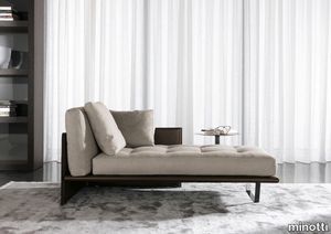
minotti > Bed frame
Light lines and the most sophisticat-ed technology interplay in this design enhanced by the use of a timeless, appealing material like saddle-hide, for added value that goes beyond time and fashion. The Luggage chaise-longue is an impeccable marriage of comfort and elegance. A product of nature, skillfully shaped by human knowledge into soft shapes and tamed to become the fabric of objects meant to last.
Miniatures Antony
vitra > Styling
The architect, engineer and designer Jean Prouvé was intent both in his architectural and design work on employing highly-advanced metal working techniques to create innovative constructions and shapes. He played an influential role in developing a construction method for architecture based on lightweight prefabricated sections, and drew amongst other things on this knowledge of aircraft and car construction. In 1947, he set up his own company Ateliers Jean Prouvé, which not only produced these lightweight elements, but also his own furniture designs.<br/><br/>In 1955, Prouvé took part with the support of the French designer group Union des Artistes Modernes, in a competition for the furnishing of a student residence in Antony near Paris. Collaborating with Charlotte Perriand, he produced an exemplary furniture series for the leisure area, the cafeterias and a series of rooms in the student residence. His series included the chair shown here, which Prouvé had designed a similar version of for Strasbourg university as early as 1950.<br/>
Nature Mood PLANK 03

florim > Floor tile-stone
Marble and wood blend in a refined creative mood board. In line with the latest trends in housing evolution, Nature Mood conceives of Nature not only as a model, but also as a true mentor and gauge of human endeavor, something from which to acquire knowledge and with which to give life to increasingly environmentally friendly designs. <p>In this collection, Nature becomes an active component of design, mixing a palette of surfaces with warm hues that take their inspiration from the world of marbles and the material of wood, with clean, minimalist veining and an array of colors. The upshot is the attainment of elegant spaces that flow between interior and exterior, enhancing the presence of light so as to bestow a sensation of immersion in the natural environment at all times. The marble surfaces in the collection bring a new perspective to some of the most enchanting landscapes and natural binomials to be found on earth.</p> <p> </p> <p class="MsoNormal"><strong>COLORS AND DECORS</strong></p> <p class="MsoNormal"><span lang="EN-US" style="mso-ansi-language: EN-US;">The verdant backdrop of Rainforest is redolent of the vegetation of tropical woods, with thin brown veins that evoke the bark of a tree.</span></p> <p class="MsoNormal"><span lang="EN-US" style="mso-ansi-language: EN-US;">Glacier conjures up the whiteness of glaciers with delicate crests of light and dark gray.</span></p> <p class="MsoNormal"><span lang="EN-US" style="mso-ansi-language: EN-US;">Mountain Peak is inspired by the varied appearance and warm colors of mountain ranges in the summertime.</span></p> <p class="MsoNormal"><span lang="EN-US" style="mso-ansi-language: EN-US;">Tundra recalls the alternation of earth, shrubbery and snowfall that characterizes the homonymous Arctic polar environmental system.</span></p> <p class="MsoNormal"><span lang="EN-US" style="mso-ansi-language: EN-US;">And lastly, Riverbed is reminiscent of a gravelly river bottom with its multiplicity of stones smoothed by the flowing water.</span></p> <p class="MsoNormal"><span lang="EN-US" style="mso-ansi-language: EN-US;">The Planks 01, 02, 03, 04, 05 and 06 surfaces are the most combinable elements in the collection. Conceived as a color palette of woods with a clean, minimalist style, the Planks can generate different mood boards depending on the marble-effect surfaces with which they are juxtaposed, taking up the nuances of the veneers and affording the designer the option of personalizing both the interior spaces and the exterior shells of the buildings in accordance with his or her own creative taste.</span></p> <p class="MsoNormal"><span lang="EN-US" style="mso-ansi-language: EN-US;">The range of backgrounds is enriched by five 6 mm thick fine porcelain stoneware decors that combine the colors of different wood-inspired surfaces.</span></p> <p class="MsoNormal"><span lang="EN-US" style="mso-ansi-language: EN-US;">Hexagon offers a combination of 3 six-sided polygons, each of which in turn is divided into two different shades of wood. The composition is designed in two versions, the first combining the warm hues of Planks 01, 02 and 03, the second blending the cooler colors of Planks 04, 05 and 06.</span></p> <p class="MsoNormal"><span lang="EN-US" style="mso-ansi-language: EN-US;">French Herringbone immediately recalls the classic laying pattern for parquet flooring, in this case reformulated as an embellishment that alternates small slats in two colorings. The composition is available in two versions, one of which combines the amber shades of Planks 01 and 02, the other of which unites the gray tones of Planks 05 and 06.</span></p> <p class="MsoNormal"><span lang="EN-US" style="mso-ansi-language: EN-US;">Stripes offers an alternation of small strips in two colors. In this case, too, the range grants the designer the option of choosing between two variants, one that juxtaposes Planks 01 and 02, and one that combines Planks 05 and 06.</span></p> <p class="MsoNormal"><span lang="EN-US" style="mso-ansi-language: EN-US;">Strip consists of a plank with thin and elongated lines available in all the colors in the collection.</span></p> <p class="MsoNormal"><span lang="EN-US" style="mso-ansi-language: EN-US;">Finally, Chevron recalls the homonymous pattern of timeless charm. Here again the decor is offered in all 6 wood-effect colors of the collection.</span></p>
Cromatica Gradiente grigio-verde

florim > Wall Paint
A lexicon of colour shades for mixing. A large size and its submultiples. «This work represents a reflection on colour, and above all a proposal on how to transfer the multiplicity of shades typical of a hand-crafted piece into a project produced on a large scale.» Andrea Trimarchi & Simone Farresin Studio Formafantasma base their work in the design world on a strong vocation for research. Simone Farresin and Andrea Trimarchi view every project as an opportunity for study and the acquisition of new knowledge, and their love of speculation establishes a dialectic rapport with the situations offered by each new client. Whether it involves a material, a type or a production method, the first phase of their design process is the mapping of what the specific case places at their disposal. With Cedit, an analysis of the company's past and present was central to the inputs. Inevitably, since "Looking back to look forward" has been the design duo's mission statement for years. In this case, in particular, the company's history was a real treasure trove, a fine blend of memory and technology: on the one hand, the excellence of production technologies now extended with the added potential arising from the engineering of large-sized ceramic tiles, and on the other a wealth of experience build up with great designers of the past, from Zanuso to Noorda, through to <strong>Ettore Sottsass</strong>. Andrea and Simone decided to focus on Sottsass - who started designing for Cedit back in the late Seventies - and made an in-depth study of one of the colour charts he developed towards the end of the Nineties. A spread of colours which gave its name to the "41 Colors" collection, included in the catalogue of the period as a real alphabet for what has proved to be a lasting design language. Colour was much more than just a compulsory step in the dialogue between designer and producer, since Sottsass had already discovered the power of the mystery intrinsic to this universe of invention.<br /><br />With Cedit the master-designer, a long-established lover of ceramics and their crafted unpredictability, found a way of transferring his personal feeling for colour to a wide audience, through industrial mass production. And this assumption is another factor Formafantasma have inherited, interpreting it today with new, even more efficient technical resources just as capable of expressing the secrets of colour. «The concept of colour "in isolation" - Sottsass explained in a 1992 text - classified colour, Pantone, as they call it now, "scientific" colour, is something I still refuse to accept. (...) Colours, the idea of colour, are always intangible, they slip slowly away like words, that run through your fingers, like poetry, which you can never keep hold of, like a good story.» And Formafantasma seem to have chosen that distinction between colour "in isolation" and "intangible" yet ever-present colour as the basis of their work. However, their approach draws on their unique vocation for research and the technical resources of the third millennium. «This work - they explain to us - is a reflection on colour, and above all on <strong>how to bring the multiplicity of shades typical of a hand-crafted piece into a large-scale project</strong>.» The designers look at large, monochrome slabs and turn to the engineers for details of their secrets, their processing stages, the phases in their production. They appreciate that the colour of ceramic material, its ineffable secret, can still be present in the series and large tile sizes in which Cedit leads the way. They understand that this is, in itself, an expressive power which does not need channelling into forms, motifs and signs. But above all, they treat the surface as a large canvas on which they spread pure colour, which tends to be uniform but in fact is never really a "scientific", totally monochrome hue: it is not a Pantone. And this is the source of the fundamental insight, which only children of the transition from the analogue to the digital era could achieve, the reward for those who draw on the past to look to the future.<br /><br />The designers cut the slab into lots of regular pieces, not necessarily of the same size. They restore its identity as a "tile", a familiar name with something ancient about it, but which stands for a module, a unit of measurement, a building block. There is nothing nostalgic about this - on the contrary, the vision is completely new, and the portions of slab created can be reassembled with no restrictions, breaking down the unity of the whole and reviving its essence starting from its structure. As the cards in the pack are shuffled, what emerges is not a figure or motif but the representation of colour itself and its physical nature. It is live matter, born from the meeting of vibrating forces, the mixing of ever-varying percentages of the basic ingredients. And Formafantasma present us with the corpuscular, fragmented essence of these small frames of space and crystallised time, which reveal the code and formula of their composition. So Cromatica is a collection made up of six colours which actually have an infinite number of declinations and compositional possibilities. It is a "discrete" combination in the mathematical sense of the term, capable of generating multiple, variable subsets. At the same time, each slab can be used in its entirety, leaving the impression of analogue continuity unchanged. But what really amazes is the comparison and dialogue between the two approaches: a stroke of genius, laying clear the mysterious appeal the artificial reproduction of colour has always held for mankind. Because, as Sottsass said, «colours are language, a powerful, magical, intangible, flexible, continuous material, in which existence is made manifest, the existence that lives in time and space».