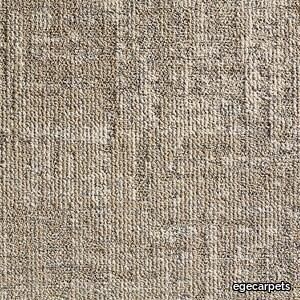
ReForm Memory light ochre
egecarpets > Carpet
Available in 48x48 cm, 96x96 cm and 24x96 cm. The marriage of a complex structured multi-level loop and digital colouration gives the Memory Ecotrust collection a unique expression. Memory Ecotrust comprises three designs, each in 9 architectural colours. The colour palette is structured around light, medium and dark tones, which can be used in combination to reflect the social aspect of the office space. Play with tonal range and accent colour to create neighborhoods, way-finding etc. Designed by Carol Appleton. The carpet tiles consist of Ecotrust felt backings and tile faces. The Ecotrust felt backings are produced from recycled water bottles. An innovative production technique turns bottles into a soft yet strong PET felt material that is long lasting and has great acoustic performance. At Ege Carpets we use regenerated and regenerable yarns produced from used fishing nets. Once the fishing nets are collected and cleaned, they are physically and chemically broken down and reborn as strong and hardwearing yarns for carpets.
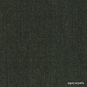
ReForm Flux dark grass
egecarpets > Carpet
Flux is produced from regenerated materials that allows you to implement sustainable and modern design in the office environment. The colour palette reminds of the transformation from dry to wet. Concrete, stone, sand and asphalt all change when a rain shower or a wave touch them. The sun and the wind bring them back to their original colour and in between these two extremes lie a countless amount of tones and shades. Flux is produced from regenerated and regenerable yarn regenerated from among others used fishing nets that are reborn as a strong and hardwearing textile flooring.
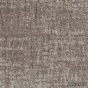
reForm Memory light brown
egecarpets > Carpet
Available in 48x48 cm, 96x96 cm and 24x96 cm. The marriage of a complex structured multi-level loop and digital colouration gives the Memory Ecotrust collection a unique expression. Memory Ecotrust comprises three designs, each in 9 architectural colours. The colour palette is structured around light, medium and dark tones, which can be used in combination to reflect the social aspect of the office space. Play with tonal range and accent colour to create neighborhoods, way-finding etc. Designed by Carol Appleton. The carpet tiles consist of Ecotrust felt backings and tile faces. The Ecotrust felt backings are produced from recycled water bottles. An innovative production technique turns bottles into a soft yet strong PET felt material that is long lasting and has great acoustic performance. At Ege Carpets we use regenerated and regenerable yarns produced from used fishing nets. Once the fishing nets are collected and cleaned, they are physically and chemically broken down and reborn as strong and hardwearing yarns for carpets.
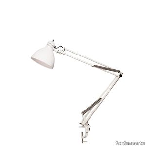
NASKA LARGE
fontanaarte > Table lamp
The Naska family of lamps is a classic from 1933. Simple and functional, with a revolving, adjustable arm, it is available in three different versions – table, floor and wall. More than any other lamp, Naska expresses an unmistakable identity through its archetypal form. It is the desk lamp par excellence, the original ancestor of every lamp with a spring-balanced arm. A timeless object, suitable for both domestic spaces and those dedicated to work.
Miniatures Well Tempered Chair
vitra > Styling
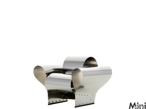
Ron Arad is one of the liveliest and most productive figures in contemporary designs. He contrasts polished, stylish commercial design with highly poetic objects with an archaic feel to them.<br/><br/>In the framework of the »Vitra Edition« he created the »Well Tempered Chair«. Its form is not the product of artificially shaping the sheet steel but is instead generated by screwing the tensile sheets into arches. Given its flexibility, the spring steel always bounces back into its original shape. The armchair is therefore not just a brilliant formal idea but also conveys a completely new feel for sitting.
Bricklane Umber

refin-ceramic > Floor tile-stone
Urban renaissanceBricklane is a metropolitan area in the East End of London that over the years has evolved into a symbol of the rebirth of the outskirts of the city, which have taken on a vibrant new multi-ethnic role, becoming a hotbed of new artistic and cultural trends. Refin has focused on the areas that used to be home to brickworks, characterised by industrial archaeologies made from materials with a strong personality, worn by time, and has given them a brand-new, fashionable style twist. The result is a collection composed of innovative surfaces that maintain elements of continuity with the past, able to adapt to both modern and classic settings and respond to a wide range of design requirements.
stitch beige
egecarpets > Carpet
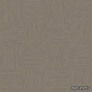
Available in 48x48 cm, 96x96 cm and 24x96 cm. Composed of the 3 design themes Minimal, Reflex and Heritage, Rawline Scala Ecotrust pays a tribute to universal fashion textures and details: The basic and linear look of denim, the classic stitch of a gentleman’s suit, folded and pleated fabrics reflecting light and dark. Featuring these elements in three different scales from small to medium and large, the tiles collection brings the flat woven design expression to a new level. Rawline Scala Ecotrust urges to explore space with subtle and artistic patterns that can be mixed and matched but also stand beautifully alone. Rawline Scala Ecotrust is made from regenerated and regenerable yarns consisting of abandoned fishing nets and other waste materials. Comes with Ege Carpets' patented and Cradle to Cradle Certified® Ecotrust backing based on used water bottles that are transformed to a soft yet strong PET felt with excellent acoustic advantages.
Bricklane Grey
refin-ceramic > Floor tile-stone
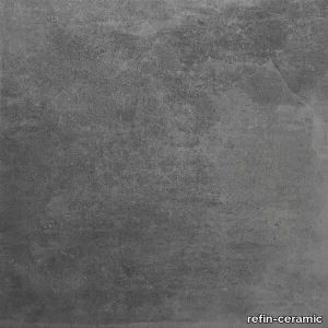
Urban renaissanceBricklane is a metropolitan area in the East End of London that over the years has evolved into a symbol of the rebirth of the outskirts of the city, which have taken on a vibrant new multi-ethnic role, becoming a hotbed of new artistic and cultural trends. Refin has focused on the areas that used to be home to brickworks, characterised by industrial archaeologies made from materials with a strong personality, worn by time, and has given them a brand-new, fashionable style twist. The result is a collection composed of innovative surfaces that maintain elements of continuity with the past, able to adapt to both modern and classic settings and respond to a wide range of design requirements.
ReForm Flux grey
egecarpets > Carpet
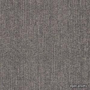
Flux is produced from regenerated materials that allows you to implement sustainable and modern design in the office environment. The colour palette reminds of the transformation from dry to wet. Concrete, stone, sand and asphalt all change when a rain shower or a wave touch them. The sun and the wind bring them back to their original colour and in between these two extremes lie a countless amount of tones and shades. Flux is produced from regenerated and regenerable yarn regenerated from among others used fishing nets that are reborn as a strong and hardwearing textile flooring.
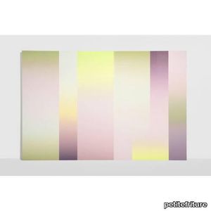
Panorama Carole Baijings - Midday / Part 1
petitefriture > Wallpaper
Carole Baijings reinvents the French stripe with transforming colors, creating a dynamic landscape in her wallpapers and panoramics. Within her range of wallpaper and panoramic designs, each vertical stripe embodies a color that morphs, while viewed collectively, the stripes unveil a moving landscape. The vivid hues of the panoramic design evoke nature, offering a striking depth. As Carole Baijings explains, "similar to a painting, the perspective shifts with distance." The fluorescent accents, her distinctive hallmark, captivate the gaze and surprise, reminiscent of the freshness of spring flowers or the brightness of sunbeams. Wallpaper Panorama Midday - Part 2 Wallpaper Panorama Midday - Part 3
ReForm Flux bordeaux
egecarpets > Carpet
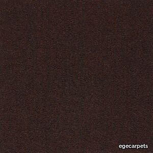
Flux is produced from regenerated materials that allows you to implement sustainable and modern design in the office environment. The colour palette reminds of the transformation from dry to wet. Concrete, stone, sand and asphalt all change when a rain shower or a wave touch them. The sun and the wind bring them back to their original colour and in between these two extremes lie a countless amount of tones and shades. Flux is produced from regenerated and regenerable yarn regenerated from among others used fishing nets that are reborn as a strong and hardwearing textile flooring.
Dipping Light
marset > Ceiling lamp
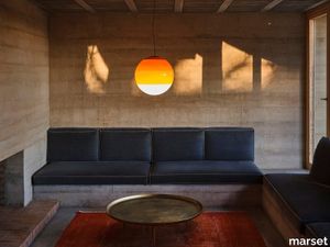
The Dipping Light is more than just a lamp; it inspires emotions. On, it is mesmerizing: its different shades of paint filter the light creating a magical ambience. Off, it transforms into a multi-coloured glass sphere, with a strong aesthetic impact.The Dipping Light started out as an experiment – dipping a switched-on light bulb in paint several times – but it became a lamp. The result is layers of colour painted in concentric circles which trap the light, attenuating its intensity. The paint acts as a shade, colouring the light and giving it texture. This artisanal process involved makes each lamp unique and exclusive. The pendant version of the Dipping Light sheds all unnecessary elements and retains only what is essential: colour takes centre stage. When using several lamps to make a composition, the visual effect is mesmerising. It is available in four different diameters: 12 cm, 20 cm, 30 cm and a new diameter of 40 cm. When this bigger bulb is switched on, it simply demands attention: colour is the message. Its size exudes so much strength and visual aesthetic that it can fill any space, bathing the room in colour. A cluster accessory is also available for the 12-, 20- and 30-cm pendant Dipping Light, allowing you to connect several pendant lamps at once to a single point of light. This offers the freedom to build with light, to illuminate large spaces and to create compositions.
Weekday Bench duo
hay > Bench
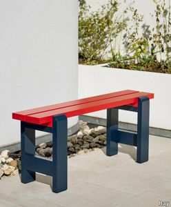
Hannes & Fritzs Weekday Bench was inspired by their impromptu solution to a lack of seating at a dinner party. Retaining the original idea of bringing people together the Weekday Bench combines a solid robust presence with softly rounded joints conveying a sense of warmth and familiarity that invites shared dining and a social atmosphere. Featuring the same simple construction as the classic picnic bench it is made in strong durable pine planks that will patinate beautifully and last for many years to come. The Weekday Benchs strong yet universally appealing character combined with its water-based weather-resistant surface treatment makes it suitable for outside use in a wide range of settings from cafs and public parks to private or shared gardens. Available in different sizes in solid pine in a variety of finishes and colours. The benches can also be supplemented with seat cushions in selected textiles for extra comfort.
Bacheca Shelf
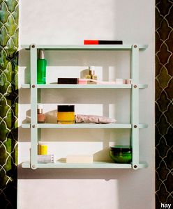
hay > Cabinet
Designed for HAY by Cristian Loddo Bacheca Shelf is a compact multi-purpose shelf that combines decorative and functional properties. Featuring a foldable flat-packed construction that is easy to mount and use it provides a convenient storage and display solution with an open intuitive design. Made in powder coated steel and available in several different colours Bacheca is ideal for using in most rooms in the house from storing herbs and spices in the kitchen to organising body care products in the bathroom and displaying ornaments in the living room.
Weekday Table
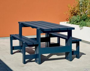
hay > Side table
Hannes & Fritzs Weekday Table was inspired by the idea of bringing people together and communal dining experiences. Combining a solid robust presence with softly rounded joints the Weekday Table conveys a sense of warmth and familiarity that invites shared mealtimes and a social atmosphere. Featuring the same simple construction as the classic picnic table it is made in strong durable pine planks that will patinate beautifully and last for many years to come. The Weekday Tables strong yet universally appealing character combined with its water-based weather-resistant surface treatment makes it suitable for outside use in a wide range of settings from cafs and public parks to private or shared gardens. Available in different sizes in solid pine in various finishes and colours.
Sobremesa Stripe Vase
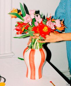
hay > Styling
Part of a design collaboration between HAY and artist Laila Gohar that celebrates the joy of meeting family and friends over a good meal the Sobremesa Stripe Vase is a decorative vase designed to add ambiance to any table setting. Hand-painted in stoneware with a colourful striped pattern that gives each jug a unique quality it can be used for bunches of flowers blossoming branches or storing kitchen utensils. Available in different sizes and designs.
Halo Cotton

refin-ceramic > Floor tile-stone
A way back to colorSize 6×24 cm (23/8″×97/16″), glossy finish, intense colours: eclectic and super-contemporary attitude for the Halo wall tiling, which alternates light and dark halos, including pinholes, has irregularities especially near the edges. Surface variability, a glazed effect, and bold tones help define a dynamic proposal that reflects light, creating compositions with a strong decorative impact. The collection is versatile in emphasising architectural volumes and furnishing elements, designing scenic backdrops that enrich different residential environments and give personality to retail and Ho.Re.Ca. premises.
Halo Basil
refin-ceramic > Floor tile-stone
A way back to colorSize 6×24 cm (23/8″×97/16″), glossy finish, intense colours: eclectic and super-contemporary attitude for the Halo wall tiling, which alternates light and dark halos, including pinholes, has irregularities especially near the edges. Surface variability, a glazed effect, and bold tones help define a dynamic proposal that reflects light, creating compositions with a strong decorative impact. The collection is versatile in emphasising architectural volumes and furnishing elements, designing scenic backdrops that enrich different residential environments and give personality to retail and Ho.Re.Ca. premises.
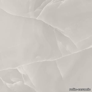
Prestigio Onyx Grey
refin-ceramic > Floor tile-stone
Precious IntensityPrestige and glossy sheen are the characteristics that identify Prestigio Onyx, a collection that reinterprets onyx, the most luxurious of natural stones, in a contemporary style. The material is updated through a harmonious language that speaks of sophisticated textures and contemporary shades. The intense link with light and the refined graphics creates environments with a strong aesthetic impact, that at the same time retain an elegant visual lightness. Prestigio Onyx describes all the expressive power of the material and loads it with precious, new styling.
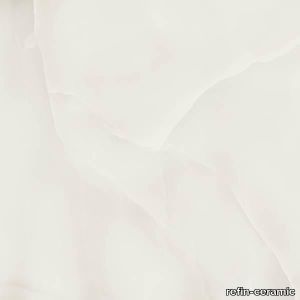
Prestigio Onyx White
refin-ceramic > Floor tile-stone
Precious IntensityPrestige and glossy sheen are the characteristics that identify Prestigio Onyx, a collection that reinterprets onyx, the most luxurious of natural stones, in a contemporary style. The material is updated through a harmonious language that speaks of sophisticated textures and contemporary shades. The intense link with light and the refined graphics creates environments with a strong aesthetic impact, that at the same time retain an elegant visual lightness. Prestigio Onyx describes all the expressive power of the material and loads it with precious, new styling.
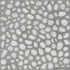
Risseu Chiaro
refin-ceramic > Floor tile-stone
Open-air experienceRisseu is a collection of porcelain stoneware tiles inspired by traditional cobbled paving in courtyards and urban gardens of the city of Genoa (Italy). The three-dimensionality – already evident as a graphic effect – is further accentuated by perfect combination with the slight relief that recreates the real effect of a cobbled surface. The collection is offered in the OUT2.0 outdoor version with a strong visual impact and also in an unexpected indoor version, a solution that allows you to create original cobblestone effects even in indoor environments.
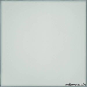
Vetri Naturale
refin-ceramic > Floor tile-stone
Glossy VibeGlass is a material that offers intrinsic clarity and harmony, distinguished by its very own duplicity: transparent and matt, fragile and at the same time sturdy. A study of this material led to the creation of the Vetri ceramic tile collection. Backed by the most sophisticated manufacturing technologies, Ceramiche Refin has developed its own research which is expressed in the creation of original surfaces with a notable innovative personality. Vetri is a collection with a strong identity: the delicate colour variations that mark the edges create a surface with an unprecedented depth and an elegant geometrical mesh. The glossy finishing reflects and emphasises light, lending its surroundings a brightness with evergreen charm. U.S. Patent No. D895,851
Vetri Acqua
refin-ceramic > Floor tile-stone
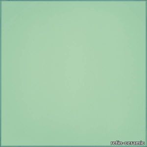
Glossy VibeGlass is a material that offers intrinsic clarity and harmony, distinguished by its very own duplicity: transparent and matt, fragile and at the same time sturdy. A study of this material led to the creation of the Vetri ceramic tile collection. Backed by the most sophisticated manufacturing technologies, Ceramiche Refin has developed its own research which is expressed in the creation of original surfaces with a notable innovative personality. Vetri is a collection with a strong identity: the delicate colour variations that mark the edges create a surface with an unprecedented depth and an elegant geometrical mesh. The glossy finishing reflects and emphasises light, lending its surroundings a brightness with evergreen charm. U.S. Patent No. D895,851
Stardust Nebula
refin-ceramic > Floor tile-stone
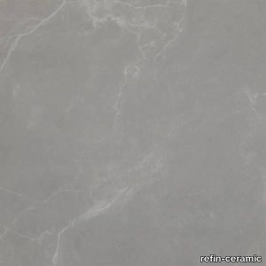
Sparkling atmosphereThe contrasts and brightness of a starlit sky become the inspiring concept of a surface that welcomes and gently reflects light: the ton-sur-ton vein patterns and metal-flake reflections emphasise the elegance of an unprecedented and trendy material. Thanks to the charm created by the change in tone and by the iridescent shades, Stardust distinguishes modern settings with a strong personality. See also: white bathroom tiles
Blazer
minotti > Sofa
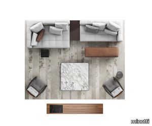
A virtuous combination of its design appeal, visible in the rigorous geometry of its volumes, and the haute couture approach exemplified by its precise, meticulous sartorial craftsmanship, Blazer is one of the creations that best expresses the most authentic artisanal attitude of Minotti. All the surfaces of the elements feature stitching, designing evenly-spaced bands on the covering of the base, cushions, armrests and backrest, and creating a quilting effect that identifies its look and instantly provides a sensation of comfort. The system includes seats with a depth of 108 cm and chaise-longue elements with a depth of 143 cm - with high and low backrests and armrests. The system is complemented by a series of cushions in different sizes and headrests, which can be freely positioned, decorating the seats and offering maximum comfort. The wide range, comprising sofas with strong character as well as modular elements, allows for the creation of original configurations, freely customisable thanks to the extensive choice of elements and exclusive coverings available. The compositions can be mixed and matched with the complements of the 2020 Collection - coffee tables, console tables, benches and armchairs - that pleasantly interrupt the symmetry and contribute to designing living areas with a bold personality. Blazer expresses a brand new style, mixing the high sartorial matelassé effect crafting technique, which qualifies it as an exclusive, sophisticated product, distinguishable due its exceptional quality, with a contemporary look characterised by clean, minimal lines. The key feature of the design is the backrest with rounded internal corners, which creates a comfortable, enveloping niche, transforming the chaise-longue element with high backrest and armrest into a particularly welcoming alcove.
Lawson
minotti > Sofa
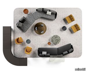
With the fluid line of its shapes and the equilibrium of its soft volumes, the Lawson seating system explores different types of chairs, offering innovative solutions that push out the traditional style boundaries, ranging from small lounge armchairs to the larger easy chair, and even sofas. The design features a look based on the juxtaposition of materials: on one side there is leather, which follows the curve of the enveloping backrest, in turn becoming an armrest and on the other side there is the fabric of the cushions, with its haute couture feel. The many different layouts of the system, with its interesting range of alternating depths, mean it is perfect for creating both small, intimate spaces, as well as arrangements featuring several elements, all fit to occupy larger spaces with grace. With its natural elegance, Lawson is ideal for residential interiors, but also reveals a strong vocation for the hospitality sector, thanks to its versatile modularity. Sofas and armchairs sit on metal feet with a chrome or polished Pewter finish, a jewel-detail that adds a touch of sophistication to the piece. The wide variety of elements in the Lawson family also includes an armchair with legs in Moka-coloured ash wood or covered in leather, a detail that also characterises the lounge armchair and dining chair. Each piece can be used in a wide range of potential combinations of materials and colours. And while the impression made by Lawson oozes with Seventies style if the arrangement includes pieces with black leather, structured fabric upholstering and feet with a chrome finish, instead, a more decorative spirit shines through if the option chosen features velvet and chenille.
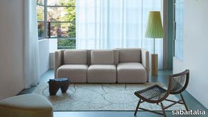
Gala
sabaitalia > Sofa
Cristina Celestino designs for Saba the new Gala seating system, thus establishing a collaboration with the company. The project responds to the desire of investigating the sofa as a place and not only as a mere functional product, to the aspiration of dematerializing the very concept of traditional living and to create a sofa with a strong iconographic design component. The “sofa” is a place of exchange, it generates new experiences and it shapes interior spaces. With a subtle reference to the retro-future atmosphere of sofas that inhabited the ‘70s, the new collection explores the flexibility of the upholstered object with a no gender, sculptural and sophisticated volume, which lends itself to interpreting different visions of interiors, from residential to hospitality contexts. The central backbone is a vertical element that draws pleated curves ready to accommodate, both on the front as well as on the back, a seat-pouf element of different depths. The many possible configurations give life to a “hybrid” and flexible sofa with which one can interact. In a collective utopian imagination, the name Gala is associated to the concept of elegance and sophistication, but Gala is also an ornament, a decoration that is created with a rippled textile band and in our case, Gala becomes the structure of the upholstery itself. Gala is also one of the planets in Star Wars and an indirect tribute to the world of stars, to the optimism and the avant-garde that characterized that era.
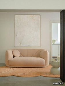
Vela
sabaitalia > Sofa
The sails, fixed to the boat mast, unfold urged by the breeze and then swell majestically, creating sophisticated lines that unravel the murmur of the winds. Since always, sails have represented a symbol of compromise between man and nature, as the dialogue between these two worlds. This concept is translated into Vela, Italian for “sail”, a sofa whose silhouette and precious details recall the elegance of this object. The fabric upholstery subtly alludes to the mainsail and the jib, tracing stylistically defined imaginary trajectories. The quilting is a strong reference to the unfurled sail and the diagonals that cross it represent its distinctive element. Exclusively designed fabric collection, fully removable covers.
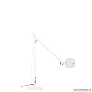
VOLÉE MEDIUM
fontanaarte > Table lamp
Volée is a Led luminaire of the latest generation, in which the formal research is combined with technological innovation. Featured by an essential design, Volée switches on with an almost tennis-style gesture: a simple wave of the hand under the head of this lamp activates an electronic device that switches the light on or off without any contact. A touch sensor over the head allows the flow of light to be regulated to four different levels of intensity (40%, 60%, 100%, 0%). A Time Out system automatically switches the lamp off after it has been on for 5 hours. The tension for the hidden-spring balancing mechanisms is provided by steel wires that allow to orientate the light emission with a fluid movement. Volée is suitable for every kind of environment, both modern and traditional.
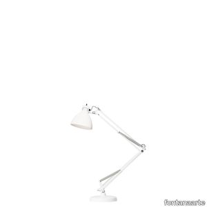
NASKA SMALL
fontanaarte > Table lamp
The Naska family of lamps is a classic from 1933. Simple and functional, with a revolving, adjustable arm, it is available in three different versions – table, floor and wall. More than any other lamp, Naska expresses an unmistakable identity through its archetypal form. It is the desk lamp par excellence, the original ancestor of every lamp with a spring-balanced arm. A timeless object, suitable for both domestic spaces and those dedicated to work.
NASKA LARGE
fontanaarte > Table lamp
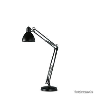
The Naska family of lamps is a classic from 1933. Simple and functional, with a revolving, adjustable arm, it is available in three different versions – table, floor and wall. More than any other lamp, Naska expresses an unmistakable identity through its archetypal form. It is the desk lamp par excellence, the original ancestor of every lamp with a spring-balanced arm. A timeless object, suitable for both domestic spaces and those dedicated to work.
Racconti
marazzigroup > Wall tile-stone-brick
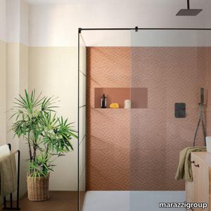
Matt surface with solid colour effect There is an eclectic touch in the new Racconti collection by Marazzi, in 30x90 size, which fills walls with colour. The matt surface, in 5 natural shades, is enhanced by tiny tone-on-tone specks and generates fascinating interplays of light and shadow, amplified by the tactile 3D Segmenti structure, available in all shades. Featuring an alternation of forms that create a minimalist geometrical pattern, three botanically inspired decors and one geometrical decor, produced using the Inkjet Touch technology, provide the scope for creating panels, walls and boiseries with a strong interior design impact.
Liquid Layers Carpet
moooi > Carpet
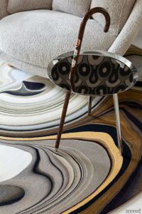
Step into a unique coloured pattern world. Inspired by minerals birds flowers and the whole spectrum of beauty created by nature. The Liquid Layers carpets by Claire Vos are inspired by objects of nature morphed and liquified into new patterns. The carpets are available in four colourways and two shapes Agate a powerful luck stone that comprises bygone crystals Pebble smooth-out pebbles in timeless greys and earth-tones Tulip an array of colours found in the typical Dutch landscapes in spring and Marl different natural-coloured layers of stone.
Floating Forest

michaelanastassiades > Styling
‘A few years ago I saw an acorn vase by Estrid Ericson, produced by Svenskt Tenn. I loved the simple poetry of an object of that nature, growing a single acorn. It was the hope for early spring, especially coming from a country with such heavy and dark winters. I became obsessed with the simple idea of suspending a seed on the surface of the water, submerged. Just the right level for it to germinate, with the possibility of it supporting itself in the absence of soil, allowing it to stand upright; exposed, all in clear view.’The series consists of seven different models to be positioned over a drinking glass of your choice, each designed to suit a specific seed or stone.
Setis Smart XL table
gautierFurniture > Table
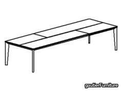
Love hosting big dinner parties? Now you can seat everyone round a table that's as generous and sociable as you are. The SMART XL has a very large top meaning you can seat 10 to 16 guests. With its contemporary lines, this table looks its best when placed in your dining room. Its rustic appearance gives it a very natural style. The immaculate finishes and high quality materials give it a subtle yet strong look. Despite its impressive size, it is also extremely refined and stylish.
The Hess Mikal Harrsen, 2023
karakterCopenhagen > Table
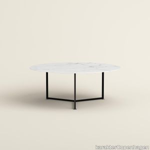
Inspired by a drum kit, The Hess melds form and function in one carefully considered design. Award-winning architect and industrial designer Mikal Harrsen came up with the design for The Hess after a conversation with a drummer friend who wanted a dining table for his new home. As a result, the large circular table boasts a mechanical steel structure intended to resemble a drum. Trained as a carpenter, Harrsen sought to move away from his wood-making background. Nonetheless, his expertise is apparent in the precise structural design of The Hess table, which features three steels legs that intersect to support a stone tabletop. Each adjustment mechanism – such as the screws on the table’s feet – were exaggerated and emphasized as Harrsen deliberately integrated them into the overall design. “The Hess has a very open expression,” explains Harrsen. “It’s a nice, strong structure that you can fit in a big room to encourage people to sit around and enjoy conversation.”
Heller Rectangular Dining Table
lexington > Table
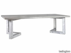
Our original design combines Scagliola stone panels hand-poured in a random pattern to imitate clouds, formed over an iron interior structure and offset by applied polished aluminum. The top is a thick Mahogany slab in a complex wire brushed finish based on Swedish antiques. Scagliola stone dates to the Italian Renaissance and was orignially developed as a structural substitute for large architectural forms typically built in marble. It combines selenite and a variety of marble and stone dusts to form a strong, beautiful surface. Each top is created by hand by skilled artisans and will vary in appearance from piece to piece.
Pipistrello 620/MED/DIM/NE
martinelliluce > Table lamp
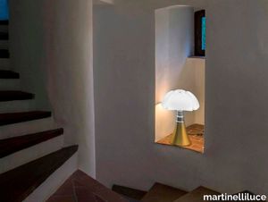
A flight above timeSoaring becomes an icon Wings outstretched, caught in the instant just prior to their complete opening.In this impetus crystallized in time is enclosed the entire emotional, stylistic and value-driven nature of this design icon.A lamp that, through its diffuser and the sinuous and curvy telescopic base epitomizes discontinuity, modernity, humor and grace, elegance and dynamism.It is precisely thanks to the courage of having proposed these different aspetcs, even if conflicting, that Pipistrello stands the test of time with a unique charm. An inimitable lamp with a strong character designed by Gae Aulenti in 1965 for the Olivetti showroom in Paris in the colour dark brown. It has been produced over the years in different colours and sizes: large, medium and mini. The mini version is also available cordless. Now proposed in a pop key in the new signed and numbered yellow colour. The lamp is composed of a white opal methacrylate diffuser, a stainless steel telescope and a glossy yellow painted aluminium structure. The central ring, base and knob for fixing the diffuser are made of metal painted in glossy black. The dimmable LED light source is integrated and the electronic ballast is plug-in.
Ardoise Ecrù
florim > Floor tile-stone
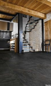
A timeless material whose authenticity, sensual and elegant, is implemented in modern environments, where precious and recovered elements coexist in perfect harmony. <p>A precise chromatic choice selected 6 neutral and modern shades that cater to the vivid texture, the absolute protagonist of the collection. The delicacy of the colors chosen give the space a strong sense of light that contrasts with the hardness of the stone. The experience of Florim manages to join three dimensional texture and graphic movements in a play of optical effects to make a timeless material modern, giving it new life.</p>
Cromatica Gradiente grigio-verde
florim > Wall Paint
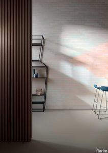
A lexicon of colour shades for mixing. A large size and its submultiples. «This work represents a reflection on colour, and above all a proposal on how to transfer the multiplicity of shades typical of a hand-crafted piece into a project produced on a large scale.» Andrea Trimarchi & Simone Farresin Studio Formafantasma base their work in the design world on a strong vocation for research. Simone Farresin and Andrea Trimarchi view every project as an opportunity for study and the acquisition of new knowledge, and their love of speculation establishes a dialectic rapport with the situations offered by each new client. Whether it involves a material, a type or a production method, the first phase of their design process is the mapping of what the specific case places at their disposal. With Cedit, an analysis of the company's past and present was central to the inputs. Inevitably, since "Looking back to look forward" has been the design duo's mission statement for years. In this case, in particular, the company's history was a real treasure trove, a fine blend of memory and technology: on the one hand, the excellence of production technologies now extended with the added potential arising from the engineering of large-sized ceramic tiles, and on the other a wealth of experience build up with great designers of the past, from Zanuso to Noorda, through to <strong>Ettore Sottsass</strong>. Andrea and Simone decided to focus on Sottsass - who started designing for Cedit back in the late Seventies - and made an in-depth study of one of the colour charts he developed towards the end of the Nineties. A spread of colours which gave its name to the "41 Colors" collection, included in the catalogue of the period as a real alphabet for what has proved to be a lasting design language. Colour was much more than just a compulsory step in the dialogue between designer and producer, since Sottsass had already discovered the power of the mystery intrinsic to this universe of invention.<br /><br />With Cedit the master-designer, a long-established lover of ceramics and their crafted unpredictability, found a way of transferring his personal feeling for colour to a wide audience, through industrial mass production. And this assumption is another factor Formafantasma have inherited, interpreting it today with new, even more efficient technical resources just as capable of expressing the secrets of colour. «The concept of colour "in isolation" - Sottsass explained in a 1992 text - classified colour, Pantone, as they call it now, "scientific" colour, is something I still refuse to accept. (...) Colours, the idea of colour, are always intangible, they slip slowly away like words, that run through your fingers, like poetry, which you can never keep hold of, like a good story.» And Formafantasma seem to have chosen that distinction between colour "in isolation" and "intangible" yet ever-present colour as the basis of their work. However, their approach draws on their unique vocation for research and the technical resources of the third millennium. «This work - they explain to us - is a reflection on colour, and above all on <strong>how to bring the multiplicity of shades typical of a hand-crafted piece into a large-scale project</strong>.» The designers look at large, monochrome slabs and turn to the engineers for details of their secrets, their processing stages, the phases in their production. They appreciate that the colour of ceramic material, its ineffable secret, can still be present in the series and large tile sizes in which Cedit leads the way. They understand that this is, in itself, an expressive power which does not need channelling into forms, motifs and signs. But above all, they treat the surface as a large canvas on which they spread pure colour, which tends to be uniform but in fact is never really a "scientific", totally monochrome hue: it is not a Pantone. And this is the source of the fundamental insight, which only children of the transition from the analogue to the digital era could achieve, the reward for those who draw on the past to look to the future.<br /><br />The designers cut the slab into lots of regular pieces, not necessarily of the same size. They restore its identity as a "tile", a familiar name with something ancient about it, but which stands for a module, a unit of measurement, a building block. There is nothing nostalgic about this - on the contrary, the vision is completely new, and the portions of slab created can be reassembled with no restrictions, breaking down the unity of the whole and reviving its essence starting from its structure. As the cards in the pack are shuffled, what emerges is not a figure or motif but the representation of colour itself and its physical nature. It is live matter, born from the meeting of vibrating forces, the mixing of ever-varying percentages of the basic ingredients. And Formafantasma present us with the corpuscular, fragmented essence of these small frames of space and crystallised time, which reveal the code and formula of their composition. So Cromatica is a collection made up of six colours which actually have an infinite number of declinations and compositional possibilities. It is a "discrete" combination in the mathematical sense of the term, capable of generating multiple, variable subsets. At the same time, each slab can be used in its entirety, leaving the impression of analogue continuity unchanged. But what really amazes is the comparison and dialogue between the two approaches: a stroke of genius, laying clear the mysterious appeal the artificial reproduction of colour has always held for mankind. Because, as Sottsass said, «colours are language, a powerful, magical, intangible, flexible, continuous material, in which existence is made manifest, the existence that lives in time and space».
Cromatica Rosa

florim > Wall Paint
A lexicon of colour shades for mixing. A large size and its submultiples. «This work represents a reflection on colour, and above all a proposal on how to transfer the multiplicity of shades typical of a hand-crafted piece into a project produced on a large scale.» Andrea Trimarchi & Simone Farresin Studio Formafantasma base their work in the design world on a strong vocation for research. Simone Farresin and Andrea Trimarchi view every project as an opportunity for study and the acquisition of new knowledge, and their love of speculation establishes a dialectic rapport with the situations offered by each new client. Whether it involves a material, a type or a production method, the first phase of their design process is the mapping of what the specific case places at their disposal. With Cedit, an analysis of the company's past and present was central to the inputs. Inevitably, since "Looking back to look forward" has been the design duo's mission statement for years. In this case, in particular, the company's history was a real treasure trove, a fine blend of memory and technology: on the one hand, the excellence of production technologies now extended with the added potential arising from the engineering of large-sized ceramic tiles, and on the other a wealth of experience build up with great designers of the past, from Zanuso to Noorda, through to <strong>Ettore Sottsass</strong>. Andrea and Simone decided to focus on Sottsass - who started designing for Cedit back in the late Seventies - and made an in-depth study of one of the colour charts he developed towards the end of the Nineties. A spread of colours which gave its name to the "41 Colors" collection, included in the catalogue of the period as a real alphabet for what has proved to be a lasting design language. Colour was much more than just a compulsory step in the dialogue between designer and producer, since Sottsass had already discovered the power of the mystery intrinsic to this universe of invention.<br /><br />With Cedit the master-designer, a long-established lover of ceramics and their crafted unpredictability, found a way of transferring his personal feeling for colour to a wide audience, through industrial mass production. And this assumption is another factor Formafantasma have inherited, interpreting it today with new, even more efficient technical resources just as capable of expressing the secrets of colour. «The concept of colour "in isolation" - Sottsass explained in a 1992 text - classified colour, Pantone, as they call it now, "scientific" colour, is something I still refuse to accept. (...) Colours, the idea of colour, are always intangible, they slip slowly away like words, that run through your fingers, like poetry, which you can never keep hold of, like a good story.» And Formafantasma seem to have chosen that distinction between colour "in isolation" and "intangible" yet ever-present colour as the basis of their work. However, their approach draws on their unique vocation for research and the technical resources of the third millennium. «This work - they explain to us - is a reflection on colour, and above all on <strong>how to bring the multiplicity of shades typical of a hand-crafted piece into a large-scale project</strong>.» The designers look at large, monochrome slabs and turn to the engineers for details of their secrets, their processing stages, the phases in their production. They appreciate that the colour of ceramic material, its ineffable secret, can still be present in the series and large tile sizes in which Cedit leads the way. They understand that this is, in itself, an expressive power which does not need channelling into forms, motifs and signs. But above all, they treat the surface as a large canvas on which they spread pure colour, which tends to be uniform but in fact is never really a "scientific", totally monochrome hue: it is not a Pantone. And this is the source of the fundamental insight, which only children of the transition from the analogue to the digital era could achieve, the reward for those who draw on the past to look to the future.<br /><br />The designers cut the slab into lots of regular pieces, not necessarily of the same size. They restore its identity as a "tile", a familiar name with something ancient about it, but which stands for a module, a unit of measurement, a building block. There is nothing nostalgic about this - on the contrary, the vision is completely new, and the portions of slab created can be reassembled with no restrictions, breaking down the unity of the whole and reviving its essence starting from its structure. As the cards in the pack are shuffled, what emerges is not a figure or motif but the representation of colour itself and its physical nature. It is live matter, born from the meeting of vibrating forces, the mixing of ever-varying percentages of the basic ingredients. And Formafantasma present us with the corpuscular, fragmented essence of these small frames of space and crystallised time, which reveal the code and formula of their composition. So Cromatica is a collection made up of six colours which actually have an infinite number of declinations and compositional possibilities. It is a "discrete" combination in the mathematical sense of the term, capable of generating multiple, variable subsets. At the same time, each slab can be used in its entirety, leaving the impression of analogue continuity unchanged. But what really amazes is the comparison and dialogue between the two approaches: a stroke of genius, laying clear the mysterious appeal the artificial reproduction of colour has always held for mankind. Because, as Sottsass said, «colours are language, a powerful, magical, intangible, flexible, continuous material, in which existence is made manifest, the existence that lives in time and space».
Labics Suspension
castrolighting > Ceiling lamp
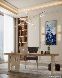
Encouraged by the powerful Labics Structures that are well-known as an installation consisting of 50 architectural models realized by the studio Labics between 2014 and 2015. This Collection takes inspiration from the abstracted architectural installations of models, which were constructed from an abstract matrix. The Labics Collection allows to express yourself through the lighting aesthetics and decorate boldly. Dynamic lines create an organic movement of subtle brass tubes as straight as arrows, completing the handmade suspension with glass. Assembled over several brass tubes, they have a daring angularity that’s tempered by their masculine matt finish coupled with glass. As the encouragement came from the architecture of buildings, the iconic collection recreated graphic pattern’s ideas on the chandelier. The Collection's highlight? For the determined and adventurous customers, as it gives an impression of brave, strong and unique motives of geometrical silhouettes in the space. These futuristic lighting fixtures symbolically portray the development of modern design and city architecture. The outstanding lighting design can be applied to any interior from modern classic style to contemporary, or mid-century modern. Feel the dynamism of this suspension as the simple geometry of the brass elements complements the refinement of the interior and permits to explore a new kind of energy and charisma. VIEW FULL FAMILY
Liberty Wall Light
castrolighting > Wall lamp
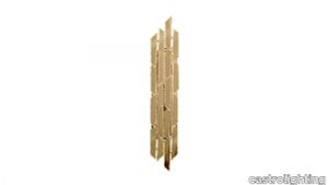
Inspired by the permanent ice figures in Cave of Liberty in Slovakia, Liberty collection recreates the perfection of Nature with a delicate handcrafted gold plated brass structure. The asymmetric distribution of the geometric forms creates an unexpected visual effect as the Liberty wall light creates a surprising light outcome on the walls. The use of the standard finish of gold plated brass with the unusual geometric form it has makes this a fundamental decorative piece. Combining the most luxurious lighting design with exquisite handmade materials, Liberty wall sconce is presented as a solution for bold decoration projects that aim to fill the spaces with strong and irreverent lighting pieces. The luxury accents of the modern design combined with the traditional techniques reveal details executed with the utmost care. This piece will transform contemporary interior designs in exclusive and stunning scenarios. VIEW FULL FAMILY
Calabash™
fritzhansen > Ceiling lamp
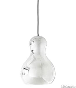
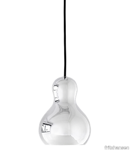
Calabash™ pendants are inspired by the simple and harmonious form of the calabash pumpkin. Made of aluminium and finished with chrome or textured coating, Calabash pendants are an example of authentic craftsmanship. Turned on or left off, its distinct design has strong presence by combining convex and concave shapes – mirroring the room or manifesting that reflection with sculptural quality.
Calabash™
fritzhansen > Ceiling lamp
Calabash™ pendants are inspired by the simple and harmonious form of the calabash pumpkin. Made of aluminium and finished with chrome or textured coating, Calabash pendants are an example of authentic craftsmanship. Turned on or left off, its distinct design has strong presence by combining convex and concave shapes – mirroring the room or manifesting that reflection with sculptural quality.
Noa Balanced oak With solid headboard and legs and table
auping > Bed frame
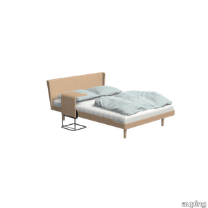
The Noa bed is a true Scandinavian design with its simple shape, clever details and natural materials. This variation in Balanced oak with a solid headboard, 1 motor electric adjustable bed base and table is a real eye-catcher of the bedroom. The clean finish and natural materials exude tranquillity. The Auping Noa stands for peace, comfort and security. Thanks to the use of natural materials and the classic look of the bed, it fits any bedroom. The Auping Noa bed was designed by Danish designer Eva Harlou. The bed exudes tranquillity through its classic Scandanavian design, which easily fits into any bedroom. Thanks to the use of extremely strong beech wood, the bed will also last a long time. Want to discover more about the Noa? Take a look at the look book page View the Noa The Noa is available with all our mattresses, change your choice in the configurator. Need help making a choice? In the configurator, go to the mattress advisor for advice. Our collection consists of 5 beds that you can put together entirely as you wish. Choose your own colours, materials and accessories. In total, there are 2.8 billion possibilities in our online configurator. Looking for inspiration for your own bedroom or want to know more about our beds? Then take a look at the online lookbooks.
Wallpaper Carole Baijings - Large Stripes / Morning

petitefriture > Wallpaper
Infinitely more sophisticated than a simple two-tone creation, Carole Baijings has entirely reinvented the Iconic French stripes with a shifting colour palette. Through her range of wallpaper and panorama prints, each vertical stripe is a line of changing colours that create a moving landscape when viewed as a whole. As in nature, the colour palette is alive and incandescent imbuing the panoramic view with an unusual sense of depth: "As with a painting, you don't see the same thing if you look at it up close or from afar." Carole Baijings' iconic signature, the flurries of fluorescent hues waken, excite, and catch one's gaze, like a flower in spring or a ray of light. Read more
Panorama Carole Baijings - Afternoon / Part 1
petitefriture > Wallpaper
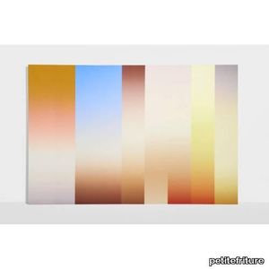
Carole Baijings reinvents the French stripe with transforming colors, creating a dynamic landscape in her wallpapers and panoramics. Within her range of wallpaper and panoramic designs, each vertical stripe embodies a color that morphs, while viewed collectively, the stripes unveil a moving landscape. The vivid hues of the panoramic design evoke nature, offering a striking depth. As Carole Baijings explains, "similar to a painting, the perspective shifts with distance." The fluorescent accents, her distinctive hallmark, captivate the gaze and surprise, reminiscent of the freshness of spring flowers or the brightness of sunbeams. Wallpaper Panorama Afternoon - Part 2 Wallpaper Panorama Afternoon - Part 3 Read more
Bello Reclaimed Oak Mirror
abchome > Styling
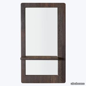
Add a touch of elegance and functionality to your space with the Bello Mirror. This tall mirror comes with a built-in shelf, making it perfect for vanity purposes and providing a convenient space to place your daily essentials. Crafted from reclaimed wine-infused oak, this mirror is sustainably designed and features natural stains from red and white wine, adding a unique touch to any space. Whether placed in a hallway, bedroom, bathroom, or elsewhere, the Bello Mirror is sure to look timeless while providing a convenient place for storing essential items.
Outline Studio Chair
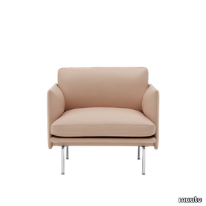
muuto > Armchair
The Outline Studio Series adds new perspectives to the classic Scandinavian design sofas of the 1960's, designed in slimmed-down proportions for smaller spaces such as apartments, hotel rooms, workplaces and more. With the design taking its name from its strong outline of a sofa, the Outline Series is clean and elegant on the outside with a deep seat and soft cushioning on its inside. The Outline Series has an expression that is at once elegant yet timeless, elevated by its lines referencing architectural shapes alongside its curved armrests, giving the design a distinct appearance across various sizes and variants.