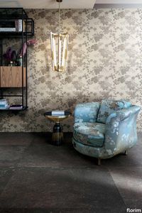
Extra Light Mink
florim > Floor tile-stone
All around décor between light play and color. The Extra Light pallet is made up of a range of colors in 4.3 millimeter thickness that, thanks to the vast range of available colors, constitutes a transversal decorative element for all the brand's collections. Extra Light is therefore synonymous with surfaces that communicate, stimulate the senses and nourish the gaze, for boundless pleasure.
Rilievi Lido
florim > Wall Paint
The alternation and symbiosis between concave and convex, recessed and raised. <p>Rilievi is a work of design balanced between different historic periods: while the volumetric relief tile modules are inspired by artistic experiments conducted in Italy during the Sixties and Seventies, the large slabs are the outcome of research into materials and technology that has only come to fruition in very recent times. The shadow effects generated on the surfaces of the slabs by the light striking the projecting parts of the modules create an unusual impression of architectural depth found virtually nowhere else in ceramic coverings, laying the bases for a new decoration interior design language.</p> This project simply embodies perfection - a term which certainly sets the bar high in a description of a new product for launch on the market. But when an enlightened manufacturer is capable of encapsulating a designer's personal research in a product to be added to its range, the outcome is a perfect synthesis. A perfect synthesis between untrammelled creativity and market trends. CEDIT had the insight needed to perceive, identify and rework the immense potential of Practice Practice Practice "“ a self-produced project by Zaven (Enrica Cavarzan and Marco Zavagno "“ and realised that its sophisticated design, originated by pure, pristine input (unadulterated by external factors except the noblest of them all, research) could provide the basis for an innovative, successful collection. I might add, a collection unique of its kind. Zaven is also a name that comes with guarantees; the two partners are good at what they do. Their work always starts from personal curiosity and investigations, the study of other stories (as in this case inspiration was drawn from the output of artist and activist Nino Caruso) and individual interests, which are broken down, developed, optimised and prepared for transformation into something fresh.Enrica Cavarzan and Marco Zavagno have a masterly ability to transform their own wishes and passions into design work of the greatest breadth and, as we see here, the widest, richest application. Their use of ceramics as a material is clearly outstanding and reflects a method precisely founded on the desire to look at things from an unusual viewpoint, under a different light. And to be daring. Zaven have an unconventional approach to convention. In the specific case of the Rilievi collection, the "modules" created for CEDIT seem to explode off the walls; in fact, they are constructed by combining the two-dimensional slab with its three-dimensional decor.Rilievi seems to be seeking space. More space. Even though these modules have actually established a dialogue with the wall from which they are born. At the same time, they hypnotise us with their tight sequence of lines, the pattern that is always different although its root is the same, and the intriguing, unusual colours that add another vital factor to the finished product. Their firm grounding in graphic design (and here we have come back to two-dimensional effects, of the kind most often associated with a wall covering) easily evolves into a facade which seems to have been carved with a chisel - although this is not the case. These modules are conceived to convey an impression of movement, and the three models, in seven colour combinations, create a powerful effect on a surface, which is never passive but rather an organic contributor to the forms and colours involved in the fascinating combinations. The slab is very much present and has the same worth and status as the relief pattern associated to it. In the light of this dichotomy between the linear and the sculpted, expressed through the skilfully balanced visual expedients, the use of repetition adds vigour to the module's intrinsic meaning. As we have seen, a rejection of facile, superficial creative dynamics in favour of an investigation reaching above and beyond has always been a central, clearly recognisable feature of this Venice-based duo, who already have impressive international partnerships to their credit, including the London Design Festival, the Kalmar Konstmuseum, the Paris Designer Days, Ca' Foscari University, the Venice Biennale, the Sandretto Re Rebaudengo Foundation, the Sindika Dokolo Foundation and the V-A-C Foundation, and also won the 2018 Wallpaper Design Award. Graphics, advertising and product design: the pair have always opted for a type of design closely linked to the observation of everyday items, followed by their reinterpretation in a version applied to experimentation with materials. This duality, combined with their energetic yet elegant visual language, forms Enrica and Marco's primary code, experienced in this specific context through serial carvings. On walls.
Les Bijoux Sodalite Bleu
florim > Wall tile-stone-brick
<p>The artistic allure of jewel surfaces </p> <p>The collection's true inspiration is found in different sources of artistic outlook, interpreted according to a wider meaning: noble minerals such as onyx, red jasper and sodalite skillfully worked to create refined, artisanal jewels, magnificent marbles used in the creation of important architecture and sculptures, even paintings by renowned artists.</p>
Matrice Aura
florim > Wallcovering
An atlas of modular signs to be combined in a wide variety of layouts. «We love concrete as a material, its versatility and its plain, austere look. We have completed our carefully designed surfaces with graphic patterning inspired by the human actions of weaving and embroidering.» Barbara Brondi & Marco Rainò To appreciate the profundity of the design project undertaken by Barbara Brondi and Marco Rainò for Cedit, it is both necessary and explanatory to start from the title the collection bears. In modern usage the term Matrice, in Italian, refers to a die or mould used to reproduce an object, but its origins are much more remote, with a meaning closer to the English “matrix”, meaning the underlying basis of something. The root of the word is related to Mater or mother: the name Matrice thus relates to the origin or cause of something. This dichotomy is expressed in several levels within the work of these architects, who study the world from a sophisticated conceptual approach and then transform it into a design. Starting from the idea of ceramic coverings, which have always been a tool not so much of architecture as of interior design, the artists work back to the origin of the surface and its decoration within their own discipline: they look at what we used to call the modern age, where modernity has also brought an uncompromising brutality, and where the use of bare concrete became the statement of an attitude to life with no time to spare for manners. Concrete is originally a liquid material, intended for shaping, which can therefore absorb and retain any type of mark created by the material and mould used to form it. Architects midway between rationalism and brutalism have used the rough-and-ready language of concrete combined with a last, elegant, anthropic decorative motif impressed on the material, that makes the concept of covering superfluous, because its place, in its older meaning of decoration rather than functional cladding, is taken by the regular patterning created in the material itself. There are therefore various grounds for believing that, in this collection, the artists are once again working in architectural terms. Firstly, with a simplicity typical of BRH+, they reduce the initial concepts to their minimal terms. So although this is a collection of coverings for walls, indoor floors, outdoor pavings and curtain walls, a great deal of time was spent on destructuring the idea of the ceramic covering itself. Unfortunately, nowadays there is no space in the contemporary construction sector for the radical approach of the past, so the cladding designed for the building actually lays bare the interior, using the choice of material – accurately interpreted (with shade variation) on the basis of an assortment of various types – to restore visual elegance and a fundamental severity. Attention to scale is another architectural feature: Matrice offers modules with architectural dimensions and different sizes through the development of “large slabs”, eliminating the visual regular grid effect. Thanks to this visual reset, geographic forms are perceived to emerge from dense, grey concrete surfaces decorated as in bygone days by special processes and by weathering during drying. The various types of slab, each an atlas of subtle, vibrant signs on the surfaces, comprise finishes that reproduce the visual effect of reinforced concrete – with the aggregates in the cement more clearly visible, of formwork – with the signs impressed on the concrete by the timber used, of a structured surface resembling bare cement plaster, of ridged and streaked surfaces – with patterning resembling some kinds of linear surface finishing processes – and finally a smooth, or basic version, over which Matrice exercises the dichotomy referred to earlier. It is on these surfaces that Brondi and Rainò have imagined additional design reverberations, a figurative code that rejects the concept of the grid, previously inseparable from that of the module: by means of a vocabulary of graphic marks cut into the slabs with a depth of 3 mm (the width of the gap left between modules during installation), they provide a framework for infinite combinations of possible dialogues. Just as in embroidery, which is based on grids of stitches and geometric repetitions, and where every stitch is at right-angles to another one to construct forms and decorations. Also taken from embroidery is the idea of introducing a degree of “softness” to reduce the stiffness of intentionally deaf surfaces. There is the impression of patterns that can continue for infinity, as in textile weaving, and a scale that, unlike the surface being worked on, is imagined as suspended and lightweight. They may not admit it, but BRH+ know a lot about music, including electronic music, and it appears to me that this organised tangle of infinite signs – unidentifiable without an overview – is rather like the representations of synthesized sounds. Sounds that are produced by machines, and thus “woven” by sampling and overlapping sounds of the most unlikely origins, combined to form jingles which, once heard, are imprinted indelibly on the brain. This may be why I am so interested in the space between this “melodic film” and its deaf, damp substrate. The eyes can navigate this suspended reality without fear of disturbance. So we are faced with different surfaces, different sizes and different graphic signs. But only one colour (surprise!) to prevent a cacophony not just of signs but also of possible interpretations: the artists retain their radical principles (and their generosity), and as curators, a role in which they are skilled, they leave the players (architects and installers) to add their own interpretations. In their hands this colour, expressed in Matrice, will produce motifs on surfaces in living spaces for someone else. This stylish covering and its workmanship will be left to the hands of someone who will probably never read this, but will be on a building site, with the radio playing on a stereo system, concentrating on installing the very pieces we describe. So a radical, apparently silent, design project like this has repercussions for the real world we live in. Matrice has no form of its own but merely acquires the ornamentation drawn on its surfaces by a second group of artists. And here this routine action, standardised by the form approved for production and workmanlike efficiency, is the origin and cause of change, generating a variability of choices and interpretations, on that dusty building site where music plays and mortar flows.
Artifact Worn_Sand
florim > Synthetic Floor
Artifact of Cerim refers to the simplicity of spatulated cement crafted by skilled hands, whose uniqueness becomes a distinctive feature, an identifying factor that reveals the taste of those who select it for their daily lives. <p> The collection is available in a thickness of 9 mm and offers two sizes (60x120 cm and 80x80 cm) with the relative modular sub-sizes (the 30x60 cm is also available in the <em>grip</em> outdoor finish). The graphic shade variations of the cement are declined in 6 different neutral shades ranging from white to coal through gray and beige.</p>
Onyx Cloud
florim > Wall tile-stone-brick
Onyx stone in all its voluptuous and precious shades Its elegance is also highlighted by the large formats that allow you to create evocative and fascinating environments.
Policroma Cipria
florim > Wall Paint
Recurring geometries, combinations of figures. Marble and marmorino plaster: comparison and dialogue. The collection is completed by a linear listello tile with the motif of a sequence of vertical rectangular blocks, which can be combined with the slabs to further enrich compositions involving continuous ceramic surfaces cladding.<br /><br />"Another reference is the use of Italian marbles on the verge of extinction, rare marbles such as Rosa Valtoce, the marble used in Milan Cathedral."<br />Cristina Celestino Cristina Celestino's smartphone contains a folder of images entitled "Milan". Photographs that are more like notes. Photographs of architectural features, materials or details of shapes encountered by chance during a walk, but they cannot be described as merely a vague "source of inspiration". This filing system, created in response to a fleeting instinct, is an integral part of the method of work adopted by the architect and designer, who starts off without preconceptions "“ or "free", as she puts it before drawing inputs from a vast world of references, from Hermès scarves to the works of the great Masters (in the specific case of Policroma). This accumulation, partly spontaneous and party the outcome of in-depth historical knowledge and study, naturally activates a process of synthesis and personal interpretation common to all Cristina Celestino's output.<br /><br /><br />The wall covering collection designed for Cedit was no exception, although in this case the designer was dealing with a project with variable dimensions, reaching up even to the architectural scale. In her own distinctive way, she combined a variety of references. Adolf Loos's passion for coloured types of marble, and Cipollino in particular. Carlo Scarpa's angular metal frames and Marmorino plaster in Venice. The French fashion house's square silk scarves. The entrance halls of Milan palazzos, Gio Ponti, the city's Cathedral. All expressed in the designer's own language: well balanced geometrical forms, subtle colours (shades similar to those of Scarpa himself), an effortless, almost restrained, playful elegance. The mood is that of the homes of the enlightened bourgeoisie who shaped the history of Milan, Celestino's adoptive city and an endless source of inputs. She has worked its interiors, including some of the least expected a 1928 tram, the historic Cucchi confectionery store hybridising her own style with the existing context. An imitative effect which is also the key to the meaning of the new Policroma collection: the marble varieties replicated using the Cedit technology are all from Italian quarries that are virtually "worked out". This revives an increasingly rare material as a "living" presence, in a different form which makes no claim to replace the natural original. Quite the contrary, Celestino immediately states her intention to imitate, by combining marble and Marmorino plaster in some variants with a contrasting frame (a typical feature for her, just as it was for Scarpa), and evoking the centuries-old marble-imitating scagliola plasterwork with a contemporary formula.<br /><br /><br />The types of marble chosen are central to the project's character. Verde Alpi, a favourite with Gio Ponti and often found in Milan entrance halls, features tightly packed patterning. Breccia Capraia, still found in a very few places in Tuscany, has a white background with just a few veins. Cipollino, in the special Ondulato variety in green and red, is patterned with spirals. Rosa Valtoce, on the other hand, was used by the "Veneranda Fabbrica" guild to build Milan Cathedral. It is an iconic stone with dramatic stripes, popular in the past; it is now sourced from one very small quarry in Piedmont which has been virtually abandoned.<br /> The many different elements that make up the Policroma collection all reflect the importance of craftsmanship to Cristina Celestino's design style: the modules can be freely mixed and combined, for example to create a concave or convex semicircle, or for the large-scale replication of small features initially conceived as trims, functional details transformed into a dominant motif.There is a return to the theme of the interior, a large or small protected space, conceived as suspended in space and time yet also reassuring and protective. It is designed through its coverings in a stark yet not minimalist way, with intelligence and with no overreaching artistic ambitions. An understated space and an extremely stylish declaration. In Milan style, of course.
Eccentric Luxe Sage
florim > Wall tile-stone-brick
<p>The enchanting appeal of onyx is encapsulated by Florim’s Eccentric Luxe collection, which celebrates the exceptional beauty of this rare and breathtaking stone.</p> <p>Ideal for interior design schemes, residential architecture and the hospitality industry, Eccentric Luxe is a new addition to the Luxury Design selection of sophisticated stones.</p> <p><br>Fresh research and development investments in new glazes and innovative digital decoration technologies have made it possible to propose vivid colours, <strong>impeccable graphic definition</strong> and rich aesthetic depth, while striving to ensure that the processes are <strong>sustainable</strong>.</p> <p>The collection is born from a sustainable and virtuous approach and is part of <a href="https://www.florim.com/en/company/sustainability/carbonzero-florim/">CarbonZero</a>, Florim's range of Carbon Neutral surfaces.</p>
B&W_Marble Flow
florim > Wall tile-stone-brick
Nature's sheer strength comes to life, white and black find new forms of expression Inspired by the different morphologies formed by the visceral movement of the earth, the collection's large slabs embrace and explore the concept of light-absence of light by presenting a chromatic gradient based on white and black in a multi-faceted graphic proposal that joins the two monochromatic surfaces, White and Black. Soft, sinuous shapes contrast with those more rigid and geometric, coming to life from the different proportions with which the white and black combine on the surface.
Compatta Argilla
florim > Wall tile-stone-brick
<p>A passion for earth as a natural material and for rammed earth, an ancient construction technique.</p> <p>The combination of these patterns evolves into the concept of Pisé Inserti, more slabs of immense decorative impact, generated by the two-dimensional criss-crossing of exquisite, rounded geometrical forms: the designer combines the natural earthen shades with apparently random curved lines that evoke the uneven trapezia with rounded corners used by Gio Ponti.</p> <p>These are also available in the large 120x280 cm size and 6 mm thickness in three variants: Pisé Inserti A, Pisé Inserti B and Pisé Inserti C. COMPATTA’s potential is further enhanced by three-dimensional subjects of varying shapes, which can be built up into mesh-backed mosaics to create sculptural forms on walls. These extensions to the collection are called Inserti Melange, Inserti Sabbia-Argilla and Inserti Limo-Ghiaia and are produced in 9 mm thickness and 30x30 cm size.</p> <p>The collection is born from a sustainable and virtuous approach and is part of <a href="https://www.florim.com/en/company/sustainability/carbonzero-florim/">CarbonZero</a>, Florim's range of Carbon Neutral surfaces.</p> <p>The COMPATTA collection, designed by Federico Peri, combines a passion for earth as a natural material and an interest in a very ancient construction technique.<br>The primary inspiration derives from close observation of the many strata within the ground and the mixtures of elementary particles of which it consists. The design concept is completed by reference to the age-old rammed earth construction technique, used in northern Jordan since the eighth millennium BCE and widely applied in Yemen in many other desert or rural settings until the mid 19thC.<br>In this method, the raw earth is compacted inside wooden formwork to construct continuous structural walls, bearing walls or partitions inside homes, with a natural decorative effect due to the layering of the different shades of clay used. When creating his project for CEDIT, Peri was also influenced by several design inputs: from rural African homes to the clear, simple geometric forms and curved lines typical of the work of Gio Ponti, the curves central to the modernist gardens of Brazilian landscape artist Roberto Burle Marx, and the three-dimensional mosaics of English sculptor William Mitchell. In his murals in concrete, glass and recycled materials, Mitchell seems to combine some of the typical features of a variety of artistic movements, from Modernism to Brutalism, and also shows awareness of the issues concerning the structure of the landscape and the relationship with nature at the heart of Land Art. COMPATTA thus embodies strong links to the world of art and architecture, while bringing natural impressions with a remote, primitive flavour into modern living-spaces.</p>
Sensi Ivory Fossil
florim > Floor tile-stone
Lightness, Earth, Sensoriality The Sensi collection also features a <strong>decorative mosaic</strong> made from <strong>recycled glass</strong> made from disused TV and PC screens. This mosaic, manufactured by a <strong>process in which human hands play a role</strong>, has a distinctive surface structure. Due to the nature of the recycled glass and the production cycle, every tiny chip is different from the others, creating a <strong>dynamic surface.</strong> Soft, velvety or structured to the touch, it dialogues with the light and may become shiny or matte. This product also derives its uniqueness from its colour. <strong>Every chip is unique </strong>and has its own shades of the same tone. <p>Developed with close attention to environmental impact, "<em>Sensi</em>" is the perfect synthesis of innovation and sustainability and also a virtuous example of <strong>circular economy</strong>. The collection is made <strong>over 90% natural raw materials</strong> and up to 41%<strong> of recycled materials</strong>. "<em>Sensi</em>" is the result of <strong>up to 100% sustainable production process</strong>, both in terms of water consumption and self-generated electricity.</p>
Match-Up Coffee Mix
florim > Wall tile-stone-brick
The union of two different materials has resulted in a contemporary, trendy project that mixes surfaces, colours and languages to offer original combinations. <p>There are two basic surfaces that can be used to create multiple combinations in line with fashions and lifestyle trends: a concrete effect with an urban and industrial aesthetic and an original marble agglomerate effect that blends tone-on- tone tactile elements with irregular shapes and varying sizes. Two seemingly very different materials – the first a symbol of modernity and innovation, the second of authenticity and tradition – coexist in a unique project that promotes and encourages combinations not only between the surfaces and colour shades in the range, but also with all the other elements that contribute to defining the space: colours, paints, fabrics, furnishings and various materials. <br />The collection offers 3 finishes - Comfort, Glossy and Grip. <br /><a class="btn arrow" href="https://www.florim.com/en/surfaces/the-new-comfort-surface/"> Discover the new Comfort surface </a></p>
Neutra 6.0 14 arancio
florim > Synthetic Floor
After a decade of success, the Neutra collection becomes a container of colors and increasingly advanced materials and transforms into Neutra 6.0. The surfaces thereby create scenery for pure sensory pleasure, where nothing is left to chance, but everything is always skillfully calibrated to the search for a new bon ton where the body and mind can be rejuvenated. The perfect integration between man and the space in which he lives is expressed through a simple architecture where you can spread your artistic sign on the surfaces, in the colors and in the furnishing for an unrepeatable result from which your own creative identity emerges.
Earthtech FOG_GROUND
florim > Wallcovering
From an ancient past to a responsible future <p>The collection injects new life into the earth through a sustainable production process, with a strong focus on green management, to offer the architect an exceptional technical and aesthetic performance in compliance with the socio-environmental context and the latest eco-friendly building needs. With EARTHTECH earth becomes “technical earth” with a highly innovative content, offering new solutions to green architecture and fulfilling the new frontiers of circular economy in construction, guaranteeing a sustainable future. <br />EARTHTECH offers a choice of organic textures to observe and touch, thanks to the wide range of finishes (Comfort, Glossy-Bright and structured) which add a tactile and unexpected perceptive dimension for use in all types of application. <br /><a class="btn arrow" href="https://www.florim.com/en/surfaces/the-new-comfort-surface/"> Discover the new Comfort surface </a></p> <p>EARTHTECH/ is also a return to the origins of the Florim brand through a full body technical product that blends surface and thickness and derives from the spontaneous mixing of carefully pre-selected fragments and pigments of different shades which give the material a unique, one-of-a-kind visual effect in each slab, mimicking the amazing variety of colours and elements in nature. The result is a composite product with a textured design, in which the flakes and aggregate grains create an original mélange effect that is vitrified during firing, producing a robust, high-quality and exceptionally strong and wear-resistant product; one which can be used in any type of building setting and weather conditions, even the harshest.</p>
Storie Cascina
florim > Wall Paint
The faded wall fresco, damp stains in plaster. «Technological innovation enables us to reproduce on large-sized ceramic materials all the effects of wear and stratification that normally only time is able to create.» Giorgia Zanellato & Daniele Bortotto Children stare at the walls of a farmhouse, wondering what the cracks are, and whether every mark is a path and every path is a story. They think that miniature beings live in the air pockets that have formed, and the detaching plaster is like an avalanche cascading from a glacier. They don't ask why the colours are as they are, because they just had to be like that. And every square centimetre becomes the first page of an adventure that restarts at every break in the pattern. Could this be why we say that both textures and plots have twists, and stories are woven? As even children know, walls are tales. Not only do they contain adventures, emotions, moments, loves and hates and record them on their surfaces; their uneven, active surfaces generate new imaginary worlds, in which one can literally get lost. The "Storie" collection by Giorgia Zanellato and Daniele Bortotto brings this metaphor to three-dimensional life by expressing the moods, loves and hates and moments that the walls and floors of old Italian homes conserve, and capturing them in a frozen instant. The theme of time and the changes wrought in matter by the passing seasons, weather and human action have always been a strong source of inspiration for architects: some have tried to freeze it, while others have used sleight of hand to embrace it while resisting its effects, and yet others have accelerated, anticipated, directed and re-created it.<br /> Zanellato and Bortotto do all these things at once, engaging in a duel with History with a capital H, in which it is never clear who is winning: design or object, man or nature, culture or time. And it is probably this unresolved tension which makes the "Storie" designs so universal and meaningful, so intimate and yet familiar. The floor is the only thing we can be certain that everyone entering our home will touch, and at the same time it is the most intimate part, the most steeped in private happenings. They talk about having your "feet firmly on the ground". This image stands for common sense, but also a recognition of how things are, how things work. The wall is a synecdoche, too: it is the part of the home that expresses an idea of solidity, the layering of time, the passage of lives. "Storie" gives form to this metaphor by drawing a line that links the most classical of taste to a sophisticated modernity of taste and style. The two designers did a great deal of background work for this project: old Italian homes, country villas, noble palazzos, farmhouses and old factors, which become an unlimited source of motifs, colours, textures and materials. But, perhaps unconsciously, literature also re-emerges from this survey of locations, with its blend of aestheticism and decadence, with echoes of Wilde and D'Annunzio, Ruskin and Huysmans. "Storie" would be the ideal backdrop for Des Esseintes, the dandy in "A Rebours". And in fact the collection clearly has strong theatrical connections, arising partly from its storytelling connotations but also from its scene-setting potential.<br /> It represents life, which we are, have been and wish to continue to be. And it is thrilling to realise that this vision comes from the youngest designers in CEDIT's new era, who have successfully taken a confident, cultured, astute, sidelong approach to the most ancient of topics, with a persuasive effect which appears, at least, to be not at all intimidated by the many stories, the type of product they are dealing with, the catalogue in which they are included, the designers who have gone before them or, naturally, the adventures that lie concealed in the historic dwellings they reproduce. The reference to Italy, on the other hand, is in perfect harmony with the work of the brand and its past and present designers: it is intrinsic to the perfection of the production process that underlies the collection, the relationship with the brand's tradition and its local roots, and the intelligent, strategic use of its innovations in the treatment of this complex material.Child's play? Yes, but with the integrity and ability to enchant unique to specific designs, capable of an immediacy of vision and feeling that makes them little novels written in cement.
Nature Mood GLACIER
florim > Wall tile-stone-brick
Marble and wood blend in a refined creative mood board. In line with the latest trends in housing evolution, Nature Mood conceives of Nature not only as a model, but also as a true mentor and gauge of human endeavor, something from which to acquire knowledge and with which to give life to increasingly environmentally friendly designs. <p>In this collection, Nature becomes an active component of design, mixing a palette of surfaces with warm hues that take their inspiration from the world of marbles and the material of wood, with clean, minimalist veining and an array of colors. The upshot is the attainment of elegant spaces that flow between interior and exterior, enhancing the presence of light so as to bestow a sensation of immersion in the natural environment at all times. The marble surfaces in the collection bring a new perspective to some of the most enchanting landscapes and natural binomials to be found on earth.</p> <p> </p> <p class="MsoNormal"><strong>COLORS AND DECORS</strong></p> <p class="MsoNormal"><span lang="EN-US" style="mso-ansi-language: EN-US;">The verdant backdrop of Rainforest is redolent of the vegetation of tropical woods, with thin brown veins that evoke the bark of a tree.</span></p> <p class="MsoNormal"><span lang="EN-US" style="mso-ansi-language: EN-US;">Glacier conjures up the whiteness of glaciers with delicate crests of light and dark gray.</span></p> <p class="MsoNormal"><span lang="EN-US" style="mso-ansi-language: EN-US;">Mountain Peak is inspired by the varied appearance and warm colors of mountain ranges in the summertime.</span></p> <p class="MsoNormal"><span lang="EN-US" style="mso-ansi-language: EN-US;">Tundra recalls the alternation of earth, shrubbery and snowfall that characterizes the homonymous Arctic polar environmental system.</span></p> <p class="MsoNormal"><span lang="EN-US" style="mso-ansi-language: EN-US;">And lastly, Riverbed is reminiscent of a gravelly river bottom with its multiplicity of stones smoothed by the flowing water.</span></p> <p class="MsoNormal"><span lang="EN-US" style="mso-ansi-language: EN-US;">The Planks 01, 02, 03, 04, 05 and 06 surfaces are the most combinable elements in the collection. Conceived as a color palette of woods with a clean, minimalist style, the Planks can generate different mood boards depending on the marble-effect surfaces with which they are juxtaposed, taking up the nuances of the veneers and affording the designer the option of personalizing both the interior spaces and the exterior shells of the buildings in accordance with his or her own creative taste.</span></p> <p class="MsoNormal"><span lang="EN-US" style="mso-ansi-language: EN-US;">The range of backgrounds is enriched by five 6 mm thick fine porcelain stoneware decors that combine the colors of different wood-inspired surfaces.</span></p> <p class="MsoNormal"><span lang="EN-US" style="mso-ansi-language: EN-US;">Hexagon offers a combination of 3 six-sided polygons, each of which in turn is divided into two different shades of wood. The composition is designed in two versions, the first combining the warm hues of Planks 01, 02 and 03, the second blending the cooler colors of Planks 04, 05 and 06.</span></p> <p class="MsoNormal"><span lang="EN-US" style="mso-ansi-language: EN-US;">French Herringbone immediately recalls the classic laying pattern for parquet flooring, in this case reformulated as an embellishment that alternates small slats in two colorings. The composition is available in two versions, one of which combines the amber shades of Planks 01 and 02, the other of which unites the gray tones of Planks 05 and 06.</span></p> <p class="MsoNormal"><span lang="EN-US" style="mso-ansi-language: EN-US;">Stripes offers an alternation of small strips in two colors. In this case, too, the range grants the designer the option of choosing between two variants, one that juxtaposes Planks 01 and 02, and one that combines Planks 05 and 06.</span></p> <p class="MsoNormal"><span lang="EN-US" style="mso-ansi-language: EN-US;">Strip consists of a plank with thin and elongated lines available in all the colors in the collection.</span></p> <p class="MsoNormal"><span lang="EN-US" style="mso-ansi-language: EN-US;">Finally, Chevron recalls the homonymous pattern of timeless charm. Here again the decor is offered in all 6 wood-effect colors of the collection.</span></p>
Buildtech/2.0 Build Mud CE
florim > Wallcovering
Buildtech/2.0 assures the realization of ever-current projects To the four colors, White, Bone, Mud and Coal in Tinta Unita, Granigliata and Cemento, 10 solid bold colors are being added, only intensifying the "brutality".<br />
Essential Mood Cool Powder 01
florim > Wall Paint
<p>A sense of essentiality emerges from the visual and tactile sensations fused in this Creative Design collection.</p> <p>The distinguishing features of the Essential Mood design are fluid surfaces, material qualities and full bodies that extend without boundaries, promoting a harmonious flow between spaces and constant interplay between environments and the people in them. It makes places into cosy, reassuring refuges where they can take centre stage.</p> <p><br>Produced for interior design schemes, housing and commercial premises, the collection espouses warm, timeless atmospheres where people can recharge their batteries and get onto the same wavelength as the world around them.<br>Spaces with neutral, comforting colours and natural features come together in a design that underlines the need for everyone to look after themselves and seek revitalizing experiences, now and in the future.</p> <p>The collection is born from a sustainable and virtuous approach and is part of <a href="https://www.florim.com/en/company/sustainability/carbonzero-florim/">CarbonZero</a>, Florim's range of Carbon Neutral surfaces.</p>
I Filati Lady Hamilton Amaranto
florim > Carpet
From the art of fabric, to enveloping spaces From lampas and jacquard, all the way to the simplest silk fabrics, from rich, baroque motifs to more optical, geometric patterns, all of these fabrics share an extremely natural look. The collection's nine surfaces are inspired by Rubelli's signature precious fabrics that, in turn, are born from the contemporary reworking of several decorative motifs coming from the noble Venetian heritage of weaving.<br />
Artifact Worked_Charcoal
florim > Wallcovering
Artifact of Cerim refers to the simplicity of spatulated cement crafted by skilled hands, whose uniqueness becomes a distinctive feature, an identifying factor that reveals the taste of those who select it for their daily lives. <p> The collection is available in a thickness of 9 mm and offers two sizes (60x120 cm and 80x80 cm) with the relative modular sub-sizes (the 30x60 cm is also available in the <em>grip</em> outdoor finish). The graphic shade variations of the cement are declined in 6 different neutral shades ranging from white to coal through gray and beige.</p>
Plimatech Plimabeige/03
florim > Floor tile-stone
<p>The inspiration for Florim's Plimatech Architectural design comes from high up in the Martell Valley of the Alto Adige region.</p> <p>The aesthetic heterogeneity characteristic of natural stone is captured in the collection through three graphic variants. 01, the most minimalist is softly veined and, especially in the large format, is particularly appropriate to confer character on architecture of more essential taste. 02 has a more variegated appearance, with slight shading tending towards white, designed to add a rough, textural touch to spaces. Finally, 03 is characterized by a high number of crystalline formations that give it a wavier line, ideal for design contexts that, between interior and exterior spaces, pursue a dialogue with the surrounding natural environment.</p> <p> </p> <p>In addition to this, the range of decorations is completed with the 30x60 wall module and 30x60 3D wall module, both proposed for the graphic variant 02 in all colors.</p>
Étoile étoile illusion
florim > Wall tile-stone-brick
A selection of new and rare marbles, with a strong decorative impact, that come from extremely distant geographical areas. <p>Étoile is a magical balance between signs and colors that stimulate the senses by inviting the viewer to feel its sophisticated chromatic intensity. A perfect blend of elegance that derives from the surprising variety of nature and cutting-edge production technology. Redefining the material while maintaining its original feel is the greatest objective of this brand, always attentive to evolutions in style.<br /><br />The series offers <strong>seven colors</strong> that may be used for floors and walls, either singly or combined. Four graphics decorate both the traditional sizes and the design of the Florim Magnum Oversize large size tiles, the other three (étolie brown river, étoile illusion, étoile symphonie) only have modular Magnum sizes (60x120 cm, 120x120 cm, 120x240 cm).<br /><br /></p>
Les Bijoux Calacatta Altissimo Blanc
florim > Wall tile-stone-brick
<p>The artistic allure of jewel surfaces </p> <p>The collection's true inspiration is found in different sources of artistic outlook, interpreted according to a wider meaning: noble minerals such as onyx, red jasper and sodalite skillfully worked to create refined, artisanal jewels, magnificent marbles used in the creation of important architecture and sculptures, even paintings by renowned artists.</p>
Stontech/4.0 STONE_02
florim > Floor tile-stone
New surfaces, new sizes and three different finishes are the trademarks of a line that is contemporary and attentive to detail. Two marbles with a high-gloss finish bestow fragments of light on the series and the large sizes of the Magnum Oversize family, available in four colors, are suitable for creating unique volumes.
Wooden Tile wooden Brown
florim > Floor tile-stone
Neutral colors with a delicate, Nordic inspired design, but also reclaimed wood with strong chromatic contrasts Each location transforms into a refined space capable of recounting stories and emotions. The lightest shades favor timeless styles, providing soft light, whereas the darker shade finishes come out to impress a bold style, playing between combinations of simple geometric lines and new color schemes.
Planches Noisette
florim > Floor tile-stone
Large linear strips and precious décor are the defining elements of Planches de Rex <p>The natural element is thoroughly respected to return incredible realism and stylistic research enhances its essence. Planche represents a new reference model in furnishing surfaces that find their creative inspiration in wood, setting new standards of perfection. A warm colour composition creates euphonious play with materials and trendy nuances in modern interior design.</p>
B&W_Marble Breach
florim > Wall tile-stone-brick
Nature's sheer strength comes to life, white and black find new forms of expression Inspired by the different morphologies formed by the visceral movement of the earth, the collection's large slabs embrace and explore the concept of light-absence of light by presenting a chromatic gradient based on white and black in a multi-faceted graphic proposal that joins the two monochromatic surfaces, White and Black. Soft, sinuous shapes contrast with those more rigid and geometric, coming to life from the different proportions with which the white and black combine on the surface.
Vetro Melange Scuro
florim > Floor tile-stone
Each tile is unique and extremely precious Vetro allows recognizable and attractive decorations to be created, expressing a timeless design. The Vetro collection is available in seven solid, warm, soft and enchanting colors, in two finishes - matt and lux - and in two sizes or in the metallic variation with varying reflections in a single size. VETRO can be applied as a floor and wall application on any surface in dry or damp areas using special sealants and adhesives.
Heritage Luxe Heritage Flame
florim > Wall tile-stone-brick
Heritage Luxe can be said to exemplify the magnitude of our inheritance from the past which at the same time is part of our present. In keeping with modern times, the surfaces of the collection have a strong decorative character and bring the heritage of the European tradition up to date by proposing a stylistic concept inspired by the beauty and classic luxury of marble that blends with the dynamism of veining and colors of a contemporary flavor. <p>Memory, the heritage of the past and the most up-to-date taste all unite in a single dimension in which the iconic objects and furnishings of yesteryear coexist with the most contemporary luxury of modern times to transform the atmosphere of the surroundings into something unique and instantly recognizable. The collection features marble surfaces in bold, refined colors that add immense personality and character to the most exclusive of spaces. The richness of colors and graphic details of these products finds its maximum expression in the large sizes, designed to blend in with increasingly voguish large open spaces, or to illuminate more intimate surroundings.</p> <p> </p> <p class="MsoNormal"><strong><span lang="EN-US" style="mso-ansi-language: EN-US;">COLORS AND DECORS</span></strong></p> <p class="MsoNormal"><span lang="EN-US" style="mso-ansi-language: EN-US;">Heritage Azure is distinguished by a pale, refined blue background against which a deep rust-colored vein stands out, making it perfect for pairing with warm-toned colors and materials.</span></p> <p class="MsoNormal"><span lang="EN-US" style="mso-ansi-language: EN-US;">Heritage Cloud is the most versatile surface in the collection. Characterized by different streaks of grey, this graphic can be perfectly matched with both warm and cool colored materials.</span></p> <p class="MsoNormal"><span lang="EN-US" style="mso-ansi-language: EN-US;">The soft, enveloping base of Heritage Brown is reminiscent of Spanish marble, distinguished by subtle and barely noticeable white veins.</span></p> <p class="MsoNormal"><span lang="EN-US" style="mso-ansi-language: EN-US;">Heritage Emerald brings to mind the rolling hills of Ireland. Shades ranging from dark to light green with dashes of brown and white congregate on its surface.</span></p> <p class="MsoNormal"><span lang="EN-US" style="mso-ansi-language: EN-US;">Heritage Aqua is a surprising surface that emerges from the encounter of contrasting shades of teal and white, embellished with sophisticated orange veins.</span></p> <p class="MsoNormal">Lastly, Heritage Flame bears witness to an encounter between delicate shades of brown and dashes of cream.</p> <p class="MsoNormal"><span lang="EN-US" style="mso-ansi-language: EN-US;">The array of backgrounds is accompanied by three 6 mm thick colored-body porcelain stoneware decors that combine the different shapes and graphics of the slabs in the range, thus delineating an enchanting continuity of colors and veining within the space.</span></p> <p class="MsoNormal"><span lang="EN-US" style="mso-ansi-language: EN-US;">The Picket decor juxtaposes the trapezoidal glossy Heritage Emerald and Heritage Cloud slabs to craft a refined composition with clean, contemporary lines.</span></p> <p class="MsoNormal"><span lang="EN-US" style="mso-ansi-language: EN-US;">The Maze decor, composed of a range of small Heritage Emerald, Heritage Brown and Heritage Flame trapezoids, catches the eye with its harmonious concentric motifs.</span></p> <p class="MsoNormal"><span lang="EN-US" style="mso-ansi-language: EN-US;">Finally, the Trinity decor features three sinuously arched, glossy finish strips in the Heritage Azure graphic.</span></p>
I Filati Goldfinger Rugiada
florim > Carpet
From the art of fabric, to enveloping spaces From lampas and jacquard, all the way to the simplest silk fabrics, from rich, baroque motifs to more optical, geometric patterns, all of these fabrics share an extremely natural look. The collection's nine surfaces are inspired by Rubelli's signature precious fabrics that, in turn, are born from the contemporary reworking of several decorative motifs coming from the noble Venetian heritage of weaving.<br />
Heritage Luxe Heritage Azure
florim > Floor tile-stone
Heritage Luxe can be said to exemplify the magnitude of our inheritance from the past which at the same time is part of our present. In keeping with modern times, the surfaces of the collection have a strong decorative character and bring the heritage of the European tradition up to date by proposing a stylistic concept inspired by the beauty and classic luxury of marble that blends with the dynamism of veining and colors of a contemporary flavor. <p>Memory, the heritage of the past and the most up-to-date taste all unite in a single dimension in which the iconic objects and furnishings of yesteryear coexist with the most contemporary luxury of modern times to transform the atmosphere of the surroundings into something unique and instantly recognizable. The collection features marble surfaces in bold, refined colors that add immense personality and character to the most exclusive of spaces. The richness of colors and graphic details of these products finds its maximum expression in the large sizes, designed to blend in with increasingly voguish large open spaces, or to illuminate more intimate surroundings.</p> <p> </p> <p class="MsoNormal"><strong><span lang="EN-US" style="mso-ansi-language: EN-US;">COLORS AND DECORS</span></strong></p> <p class="MsoNormal"><span lang="EN-US" style="mso-ansi-language: EN-US;">Heritage Azure is distinguished by a pale, refined blue background against which a deep rust-colored vein stands out, making it perfect for pairing with warm-toned colors and materials.</span></p> <p class="MsoNormal"><span lang="EN-US" style="mso-ansi-language: EN-US;">Heritage Cloud is the most versatile surface in the collection. Characterized by different streaks of grey, this graphic can be perfectly matched with both warm and cool colored materials.</span></p> <p class="MsoNormal"><span lang="EN-US" style="mso-ansi-language: EN-US;">The soft, enveloping base of Heritage Brown is reminiscent of Spanish marble, distinguished by subtle and barely noticeable white veins.</span></p> <p class="MsoNormal"><span lang="EN-US" style="mso-ansi-language: EN-US;">Heritage Emerald brings to mind the rolling hills of Ireland. Shades ranging from dark to light green with dashes of brown and white congregate on its surface.</span></p> <p class="MsoNormal"><span lang="EN-US" style="mso-ansi-language: EN-US;">Heritage Aqua is a surprising surface that emerges from the encounter of contrasting shades of teal and white, embellished with sophisticated orange veins.</span></p> <p class="MsoNormal">Lastly, Heritage Flame bears witness to an encounter between delicate shades of brown and dashes of cream.</p> <p class="MsoNormal"><span lang="EN-US" style="mso-ansi-language: EN-US;">The array of backgrounds is accompanied by three 6 mm thick colored-body porcelain stoneware decors that combine the different shapes and graphics of the slabs in the range, thus delineating an enchanting continuity of colors and veining within the space.</span></p> <p class="MsoNormal"><span lang="EN-US" style="mso-ansi-language: EN-US;">The Picket decor juxtaposes the trapezoidal glossy Heritage Emerald and Heritage Cloud slabs to craft a refined composition with clean, contemporary lines.</span></p> <p class="MsoNormal"><span lang="EN-US" style="mso-ansi-language: EN-US;">The Maze decor, composed of a range of small Heritage Emerald, Heritage Brown and Heritage Flame trapezoids, catches the eye with its harmonious concentric motifs.</span></p> <p class="MsoNormal"><span lang="EN-US" style="mso-ansi-language: EN-US;">Finally, the Trinity decor features three sinuously arched, glossy finish strips in the Heritage Azure graphic.</span></p>
Les Origines Origines Or
florim > Wall tile-stone-brick
The splendour of our origins becomes a contemporary lifestyle <p> Les Origines explores the candour and eternal beauty of this pristine material with new aesthetic solutions that interpret the many facets of contemporary lifestyles. The results of this exceptional research work can be seen in four sophisticated varieties of white marble. Thin but notable vein patterns and new shapes are exalted by the nuances of old gold, ivory, pearl grey and graphite, embellishing its fine surfaces.</p>
EXALT Silver Light
florim > Wall tile-stone-brick
<p><br />Exalt is the new collection, inspired by marble, which completes the research project undertaken by Contemporary Design. </p> <p>The series offers six types of marble effect with veining and delicate graphics for a versatile and modern look, particularly suited to residential applications. There are two available thicknesses - 9 mm and 6 mm - with glossy and natural finishes.</p>
Wooden Tile wooden White
florim > Floor tile-stone
Neutral colors with a delicate, Nordic inspired design, but also reclaimed wood with strong chromatic contrasts Each location transforms into a refined space capable of recounting stories and emotions. The lightest shades favor timeless styles, providing soft light, whereas the darker shade finishes come out to impress a bold style, playing between combinations of simple geometric lines and new color schemes.
Vetro 03 Silver
florim > Floor tile-stone
Each tile is unique and extremely precious Vetro allows recognizable and attractive decorations to be created, expressing a timeless design. The Vetro collection is available in seven solid, warm, soft and enchanting colors, in two finishes - matt and lux - and in two sizes or in the metallic variation with varying reflections in a single size. VETRO can be applied as a floor and wall application on any surface in dry or damp areas using special sealants and adhesives.
Buildtech/2.0 Build Bone TU
florim > Wallcovering
Buildtech/2.0 assures the realization of ever-current projects To the four colors, White, Bone, Mud and Coal in Tinta Unita, Granigliata and Cemento, 10 solid bold colors are being added, only intensifying the "brutality".<br />
Hi-Wood Grey oak
florim > Floor tile-stone
A new luster fills the home with the natural elegance of a timeless material. <p>From almond to gray and warm hues of walnut, Hi-Wood offers a deliberately limited range - two sizes and a single thickness - to emphasize the clean lines of the collection, perfectly suited to simple and minimal rooms. The range, which is extremely functional, will be available in five colors, two finishes (natural and glossy), two sizes and only one thickness of 9 mm.Hi-Wood is an understated, essential series whose uniqueness lies in the presence of a unique light variant, to date the only polished wood in the range.</p>
Timeless Ceppo di Grè
florim > Wall tile-stone-brick
The synthesis between purity, modernity and elegance Inspired by attractive marble surfaces, the porcelain stoneware collection brings back a style of immortal beauty that is expressed through eight texture interpretations matched with various thickness options and sizes, even large 80 x 80 and 80 x 240 sizes with 6 mm reduced thickness.
Nature Mood PLANK 02
florim > Floor tile-stone
Marble and wood blend in a refined creative mood board. In line with the latest trends in housing evolution, Nature Mood conceives of Nature not only as a model, but also as a true mentor and gauge of human endeavor, something from which to acquire knowledge and with which to give life to increasingly environmentally friendly designs. <p>In this collection, Nature becomes an active component of design, mixing a palette of surfaces with warm hues that take their inspiration from the world of marbles and the material of wood, with clean, minimalist veining and an array of colors. The upshot is the attainment of elegant spaces that flow between interior and exterior, enhancing the presence of light so as to bestow a sensation of immersion in the natural environment at all times. The marble surfaces in the collection bring a new perspective to some of the most enchanting landscapes and natural binomials to be found on earth.</p> <p> </p> <p class="MsoNormal"><strong>COLORS AND DECORS</strong></p> <p class="MsoNormal"><span lang="EN-US" style="mso-ansi-language: EN-US;">The verdant backdrop of Rainforest is redolent of the vegetation of tropical woods, with thin brown veins that evoke the bark of a tree.</span></p> <p class="MsoNormal"><span lang="EN-US" style="mso-ansi-language: EN-US;">Glacier conjures up the whiteness of glaciers with delicate crests of light and dark gray.</span></p> <p class="MsoNormal"><span lang="EN-US" style="mso-ansi-language: EN-US;">Mountain Peak is inspired by the varied appearance and warm colors of mountain ranges in the summertime.</span></p> <p class="MsoNormal"><span lang="EN-US" style="mso-ansi-language: EN-US;">Tundra recalls the alternation of earth, shrubbery and snowfall that characterizes the homonymous Arctic polar environmental system.</span></p> <p class="MsoNormal"><span lang="EN-US" style="mso-ansi-language: EN-US;">And lastly, Riverbed is reminiscent of a gravelly river bottom with its multiplicity of stones smoothed by the flowing water.</span></p> <p class="MsoNormal"><span lang="EN-US" style="mso-ansi-language: EN-US;">The Planks 01, 02, 03, 04, 05 and 06 surfaces are the most combinable elements in the collection. Conceived as a color palette of woods with a clean, minimalist style, the Planks can generate different mood boards depending on the marble-effect surfaces with which they are juxtaposed, taking up the nuances of the veneers and affording the designer the option of personalizing both the interior spaces and the exterior shells of the buildings in accordance with his or her own creative taste.</span></p> <p class="MsoNormal"><span lang="EN-US" style="mso-ansi-language: EN-US;">The range of backgrounds is enriched by five 6 mm thick fine porcelain stoneware decors that combine the colors of different wood-inspired surfaces.</span></p> <p class="MsoNormal"><span lang="EN-US" style="mso-ansi-language: EN-US;">Hexagon offers a combination of 3 six-sided polygons, each of which in turn is divided into two different shades of wood. The composition is designed in two versions, the first combining the warm hues of Planks 01, 02 and 03, the second blending the cooler colors of Planks 04, 05 and 06.</span></p> <p class="MsoNormal"><span lang="EN-US" style="mso-ansi-language: EN-US;">French Herringbone immediately recalls the classic laying pattern for parquet flooring, in this case reformulated as an embellishment that alternates small slats in two colorings. The composition is available in two versions, one of which combines the amber shades of Planks 01 and 02, the other of which unites the gray tones of Planks 05 and 06.</span></p> <p class="MsoNormal"><span lang="EN-US" style="mso-ansi-language: EN-US;">Stripes offers an alternation of small strips in two colors. In this case, too, the range grants the designer the option of choosing between two variants, one that juxtaposes Planks 01 and 02, and one that combines Planks 05 and 06.</span></p> <p class="MsoNormal"><span lang="EN-US" style="mso-ansi-language: EN-US;">Strip consists of a plank with thin and elongated lines available in all the colors in the collection.</span></p> <p class="MsoNormal"><span lang="EN-US" style="mso-ansi-language: EN-US;">Finally, Chevron recalls the homonymous pattern of timeless charm. Here again the decor is offered in all 6 wood-effect colors of the collection.</span></p>
Pietre/3 limestone white
florim > Wall tile-stone-brick
A cultured and refined style distinguishes the choice of the natural shades The interpreter of a family and essential style, Pietre/3 is the fine porcelain stoneware collection that expresses itself through a wide range of decorative solutions for interior architecture, where a sophisticated combination of surfaces takes on new expressiveness. There is a wide range of sizes and finishes that continue an innovative journey aimed at highlighting the continuity between the interior and exterior environment, providing a simple and immediate class to the environment. All the surfaces are available in the sizes indicated in the catalog and are suitable for interior and exterior floor and wall application. Multiple shapes of mosaics and decorative strips allow the construction of the project to be varied without changing its inspiring essence.
Les Bijoux Brèche Capraia
florim > Wall tile-stone-brick
<p>The artistic allure of jewel surfaces </p> <p>The collection's true inspiration is found in different sources of artistic outlook, interpreted according to a wider meaning: noble minerals such as onyx, red jasper and sodalite skillfully worked to create refined, artisanal jewels, magnificent marbles used in the creation of important architecture and sculptures, even paintings by renowned artists.</p>
Floortech FLOOR 3.0
florim > Wall tile-stone-brick
A modern evolution of space <p>The stone effects for floor and wall applications proposed within this collection are intended to continue the research path of Architectural Design in a dynamic of constant challenge and experimentation, returning a strong and personal design that gives life to forms of dwelling.</p>
Hi-Wood Smoke grey
florim > Floor tile-stone
A new luster fills the home with the natural elegance of a timeless material. <p>From almond to gray and warm hues of walnut, Hi-Wood offers a deliberately limited range - two sizes and a single thickness - to emphasize the clean lines of the collection, perfectly suited to simple and minimal rooms. The range, which is extremely functional, will be available in five colors, two finishes (natural and glossy), two sizes and only one thickness of 9 mm.Hi-Wood is an understated, essential series whose uniqueness lies in the presence of a unique light variant, to date the only polished wood in the range.</p>
Timeless Travertino
florim > Wall tile-stone-brick
The synthesis between purity, modernity and elegance Inspired by attractive marble surfaces, the porcelain stoneware collection brings back a style of immortal beauty that is expressed through eight texture interpretations matched with various thickness options and sizes, even large 80 x 80 and 80 x 240 sizes with 6 mm reduced thickness.
Plimatech Plimabeige/01
florim > Wall tile-stone-brick
<p>The inspiration for Florim's Plimatech Architectural design comes from high up in the Martell Valley of the Alto Adige region.</p> <p>The aesthetic heterogeneity characteristic of natural stone is captured in the collection through three graphic variants. 01, the most minimalist is softly veined and, especially in the large format, is particularly appropriate to confer character on architecture of more essential taste. 02 has a more variegated appearance, with slight shading tending towards white, designed to add a rough, textural touch to spaces. Finally, 03 is characterized by a high number of crystalline formations that give it a wavier line, ideal for design contexts that, between interior and exterior spaces, pursue a dialogue with the surrounding natural environment.</p> <p> </p> <p>In addition to this, the range of decorations is completed with the 30x60 wall module and 30x60 3D wall module, both proposed for the graphic variant 02 in all colors.</p>
EXALT Oyster Shade
florim > Wall tile-stone-brick
<p><br />Exalt is the new collection, inspired by marble, which completes the research project undertaken by Contemporary Design. </p> <p>The series offers six types of marble effect with veining and delicate graphics for a versatile and modern look, particularly suited to residential applications. There are two available thicknesses - 9 mm and 6 mm - with glossy and natural finishes.</p>
Airtech New York_Light Grey
florim > Wall tile-stone-brick
Airtech/ is a collection designed to create spaces that interact with each other in a uniform and discreet manner. <p>The collection offers six stones available in shades of gray, the quintessential metropolitan color. The 60x120 cm size with a high-gloss finish gives a bright and appealing nuance to this very austere project. There are two available thicknesses, 9 mm and 20 mm.</p>
Eccentric Luxe Smoky Black
florim > Wall tile-stone-brick
<p>The enchanting appeal of onyx is encapsulated by Florim’s Eccentric Luxe collection, which celebrates the exceptional beauty of this rare and breathtaking stone.</p> <p>Ideal for interior design schemes, residential architecture and the hospitality industry, Eccentric Luxe is a new addition to the Luxury Design selection of sophisticated stones.</p> <p><br>Fresh research and development investments in new glazes and innovative digital decoration technologies have made it possible to propose vivid colours, <strong>impeccable graphic definition</strong> and rich aesthetic depth, while striving to ensure that the processes are <strong>sustainable</strong>.</p> <p>The collection is born from a sustainable and virtuous approach and is part of <a href="https://www.florim.com/en/company/sustainability/carbonzero-florim/">CarbonZero</a>, Florim's range of Carbon Neutral surfaces.</p>
Airtech London_Black
florim > Wall tile-stone-brick
Airtech/ is a collection designed to create spaces that interact with each other in a uniform and discreet manner. <p>The collection offers six stones available in shades of gray, the quintessential metropolitan color. The 60x120 cm size with a high-gloss finish gives a bright and appealing nuance to this very austere project. There are two available thicknesses, 9 mm and 20 mm.</p>
Match-Up Sugar
florim > Wallcovering
The union of two different materials has resulted in a contemporary, trendy project that mixes surfaces, colours and languages to offer original combinations. <p>There are two basic surfaces that can be used to create multiple combinations in line with fashions and lifestyle trends: a concrete effect with an urban and industrial aesthetic and an original marble agglomerate effect that blends tone-on- tone tactile elements with irregular shapes and varying sizes. Two seemingly very different materials – the first a symbol of modernity and innovation, the second of authenticity and tradition – coexist in a unique project that promotes and encourages combinations not only between the surfaces and colour shades in the range, but also with all the other elements that contribute to defining the space: colours, paints, fabrics, furnishings and various materials. <br />The collection offers 3 finishes - Comfort, Glossy and Grip. <br /><a class="btn arrow" href="https://www.florim.com/en/surfaces/the-new-comfort-surface/"> Discover the new Comfort surface </a></p>