marmoleum 2.0 Barbados

forbo > Synthetic Floor
Marmoleum 2.0 mm is an attractive and durable flooring solution. Whenever material usage reduction is needed or a 2.0 mm thickness linoleum floor is sufficient, our Marmoleum 2.0 collection is the perfect flooring solution. It presents 32 colors from the Fresco, Real and Concrete ranges and features the same durable and sustainable characteristics as our other linoleum floor coverings.
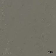
marmoleum 2.0 nebula
forbo > Synthetic Floor
Marmoleum 2.0 mm is an attractive and durable flooring solution. Whenever material usage reduction is needed or a 2.0 mm thickness linoleum floor is sufficient, our Marmoleum 2.0 collection is the perfect flooring solution. It presents 32 colors from the Fresco, Real and Concrete ranges and features the same durable and sustainable characteristics as our other linoleum floor coverings.
marmoleum 2.0 green wellness

forbo > Synthetic Floor
Marmoleum 2.0 mm is an attractive and durable flooring solution. Whenever material usage reduction is needed or a 2.0 mm thickness linoleum floor is sufficient, our Marmoleum 2.0 collection is the perfect flooring solution. It presents 32 colors from the Fresco, Real and Concrete ranges and features the same durable and sustainable characteristics as our other linoleum floor coverings.
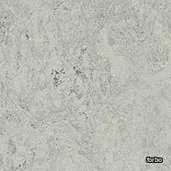
marmoleum 2.0 mist grey
forbo > Synthetic Floor
Marmoleum 2.0 mm is an attractive and durable flooring solution. Whenever material usage reduction is needed or a 2.0 mm thickness linoleum floor is sufficient, our Marmoleum 2.0 collection is the perfect flooring solution. It presents 32 colors from the Fresco, Real and Concrete ranges and features the same durable and sustainable characteristics as our other linoleum floor coverings.
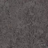
marmoleum 2.0 lava
forbo > Synthetic Floor
Marmoleum 2.0 mm is an attractive and durable flooring solution. Whenever material usage reduction is needed or a 2.0 mm thickness linoleum floor is sufficient, our Marmoleum 2.0 collection is the perfect flooring solution. It presents 32 colors from the Fresco, Real and Concrete ranges and features the same durable and sustainable characteristics as our other linoleum floor coverings.
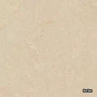
marmoleum 2.0 Arabian pearl
forbo > Synthetic Floor
Marmoleum 2.0 mm is an attractive and durable flooring solution. Whenever material usage reduction is needed or a 2.0 mm thickness linoleum floor is sufficient, our Marmoleum 2.0 collection is the perfect flooring solution. It presents 32 colors from the Fresco, Real and Concrete ranges and features the same durable and sustainable characteristics as our other linoleum floor coverings.
marmoleum 2.0 blue
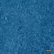
forbo > Synthetic Floor
Marmoleum 2.0 mm is an attractive and durable flooring solution. Whenever material usage reduction is needed or a 2.0 mm thickness linoleum floor is sufficient, our Marmoleum 2.0 collection is the perfect flooring solution. It presents 32 colors from the Fresco, Real and Concrete ranges and features the same durable and sustainable characteristics as our other linoleum floor coverings.
marmoleum 2.0 lemon zest

forbo > Synthetic Floor
Marmoleum 2.0 mm is an attractive and durable flooring solution. Whenever material usage reduction is needed or a 2.0 mm thickness linoleum floor is sufficient, our Marmoleum 2.0 collection is the perfect flooring solution. It presents 32 colors from the Fresco, Real and Concrete ranges and features the same durable and sustainable characteristics as our other linoleum floor coverings.
Lotus Round Bar
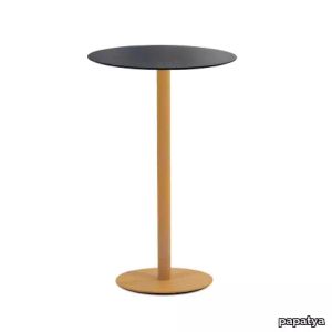
papatya > Coffee table
The shapes vary and so do the sizes. Lotus range tables appears to have all the harmony and dynamisim of a rigid body, with a decidedly perfect finish that is strengthened with cataphoresis application for outdoor usages. The various combinations of the base finishes with table tops affords a host of differant possibilites to choose from.
Lotus Square
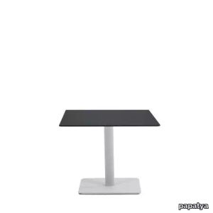
papatya > Coffee table
The shapes vary and so do the sizes. Lotus range tables appears to have all the harmony and dynamisim of a rigid body, with a decidedly perfect finish that is strengthened with cataphoresis application for outdoor usages.The various combinations of the base finishes with table tops affords a host of differant possibilites to choose from.
Lotus Round
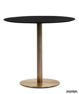
papatya > Coffee table
The shapes vary and so do the sizes. Lotus range tables appears to have all the harmony and dynamisim of a rigid body, with a decidedly perfect finish that is strengthened with cataphoresis application for outdoor usages. The various combinations of the base finishes with table tops affords a host of differant possibilites to choose from.
Edito metal chair
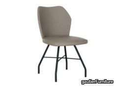
gautierFurniture > Chair
Looking for the best way to work comfortably in your office? This EDITO chair with metal legs is perfect for furnishing a workspace. With its simple lines and legs that stand up to everyday usage, it's ideal for hours and hours at your desk. Its wraparound backrest and padded seat make it really comfortable. The choice of colours mean you can bring a warm or neutral feel to your office; it all depends on the atmosphere you need to stimulate your creativity and promote concentration.
Hanger 90 cm
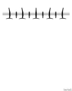
kartell > Styling
The Hanger clothes stand collection adeptly combines elegance and functionality. It is available both in pole-mounted version and on bar. It is equipped with mobile clothes hooks which allow for even more practical usage.
Hanger
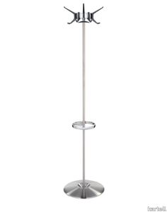
kartell > Styling
The Hanger clothes stand collection adeptly combines elegance and functionality. It is available both in pole-mounted version and on bar. It is equipped with mobile clothes hooks which allow for even more practical usage.
GRANITE
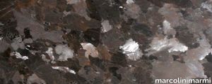
marcolinimarmi > Floor tile-stone
Fire and its unbridled energy have shaped it, giving it specific physical, chemical and mechanic properties. Its crystals and rich colours confer a precious aura to this stone, which boasts a high resistance to usage, pressure, and weather agents.
Opal-M Pro
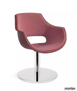
papatya > Chair
Stylish armchair fully upholstered shell with steel tube structure.Suitable for Indoor. Perfect both for the home and for contract usage.
Hanger (4 pieces)
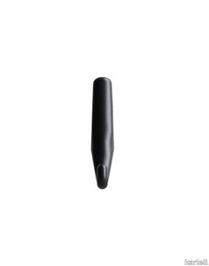
kartell > Styling
The Hanger clothes stand collection adeptly combines elegance and functionality. It is available both in pole-mounted version and on bar. It is equipped with mobile clothes hooks which allow for even more practical usage.
Opal Chief D
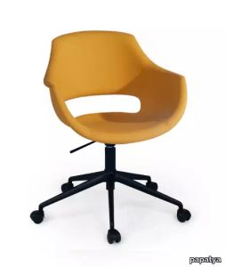
papatya > Chair
Stylish armchair fully upholstered shell with steel tube structure.Suitable for Indoor. Perfect both for the home and for contract usage.
Tiara
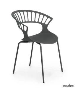
papatya > Chair
Tiara armchair, stackable with stylish design. Impressive solid colours. Shell is made of glassfibre reinforced polypropylene and base in steel tube structure. Suitable for indoor and outdoor usage with many frame colour alternatives. Anti UV stabilized.
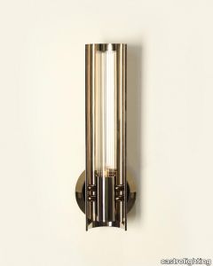
Baccara Wall Light
castrolighting > Wall lamp
Inspired by the futuristic interior designer Marcello Gandini, Baccara Wall Light is a refined lamp that honours one of the most prestigious cars in history. The usage of corrugated glass creates a cosy ambiance, providing pleasant and ideal lighting for a classy atmosphere. Around the glass, there’s a brass half-cylinder that elegantly helps to project the light from this opulent wall sconce, making it ideal for wide, luxury modern hallways, entrances, living rooms, bedrooms, or dining rooms. Having a unique design, this wall light will bring refinement, luxury, and comfort to any space with its warm but soft light. #villafoyer
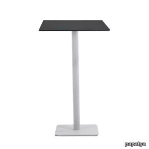
Lotus Square Bar
papatya > Coffee table
The shapes vary and so do the sizes. Lotus range tables appears to have all the harmony and dynamisim of a rigid body, with a decidedly perfect finish that is strengthened with cataphoresis application for outdoor usages.The various combinations of the base finishes with table tops affords a host of differant possibilites to choose from.
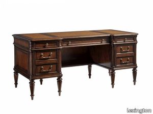
Wesley Desk
lexington > Desk
The mid-size desk provides ideal storage options in this cloud based environment with three storage drawers and two deep drawers for letter or legal files. The center drawer is a drop-front for keyboard or laptop use and all the drawers are full-extension for maximum usage. The traditional designed Cherry veneer is a warm chestnut brown with an aged brass finished hardware. Also notable is the faux leather surface with decorative tooling.
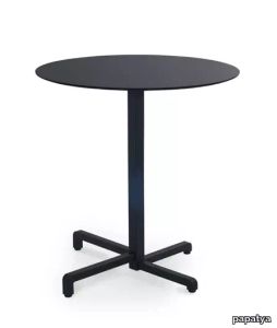
Step 321 / 322
papatya > Coffee table
A trend-setting collection in dynamic form that adapts to the future. With its new generation folding mechanism, Step, with its versatile stance, will be an appropriate point shooting choice in professional usage areas. It is energetic and stylish thanks to its angular form. Stackable, resistant to seasonal conditions and maintenance-free.
Opal-MD

papatya > Chair
Stylish armchair fully upholstered shell with steel tube structure.Suitable for Indoor. Perfect both for the home and for contract usage.
Opal Swivel D
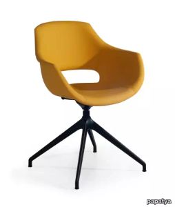
papatya > Chair
Stylish armchair fully upholstered shell with steel tube structure.Suitable for Indoor. Perfect both for the home and for contract usage.
Hanger (4 pieces)
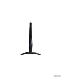
kartell > Styling
The Hanger clothes stand collection adeptly combines elegance and functionality. It is available both in pole-mounted version and on bar. It is equipped with mobile clothes hooks which allow for even more practical usage.
Edit
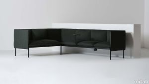
mitab > Chair
SOFAS EDIT “The starting point for any project is ‘why?’ For Edit it was a question on usage and patterns of behaviour, how our expectations for both public and work spaces are evolving and the requirements for seating needs to adapt to this.” – John Astbury REFRESH & RENEW Designed and built with heavy contract use in mind, with Mitab’s Refresh & Renew initiative you can repair and reinvigorate tired chairs simply and conveniently with clear pricing. From the point of view of sustainability selecting furniture with the longest in-service life is the most effective way of reducing CO2 emissions due to purchasing and user behaviours. SUSTAINABILITY Modular sofa system with easychair, 1-seater, 2-seater, 3-seater, corner and armrest. Frame in tubular steel in standard RAL (black, white or silver), Selected RAL or Anycolour RAL. Seat with wood base and cold foam upholstered in standard fabrics or c.o.m. Edit is also available with electrical outlets as optional. Connectable.
Lotus Round
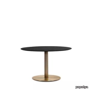
papatya > Coffee table
The shapes vary and so do the sizes. Lotus range tables appears to have all the harmony and dynamisim of a rigid body, with a decidedly perfect finish that is strengthened with cataphoresis application for outdoor usages. The various combinations of the base finishes with table tops affords a host of differant possibilites to choose from.
Step 323
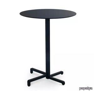
papatya > Coffee table
A trend-setting collection in dynamic form that adapts to the future. With its new generation folding mechanism, Step, with its versatile stance, will be an appropriate point shooting choice in professional usage areas. It is energetic and stylish thanks to its angular form. Stackable, resistant to seasonal conditions and maintenance-free.
Hanger 60 cm
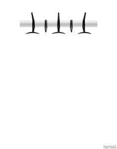
kartell > Styling
The Hanger clothes stand collection adeptly combines elegance and functionality. It is available both in pole-mounted version and on bar. It is equipped with mobile clothes hooks which allow for even more practical usage.
Opal Chief Pro
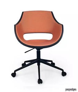
papatya > Chair
Stylish armchair fully upholstered shell with steel tube structure.Suitable for Indoor. Perfect both for the home and for contract usage.
Opal Swivel Pro
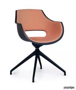
papatya > Chair
Stylish armchair fully upholstered shell with steel tube structure.Suitable for Indoor. Perfect both for the home and for contract usage.
Lotus Square
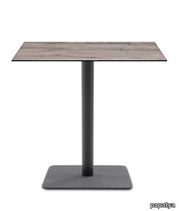
papatya > Coffee table
The shapes vary and so do the sizes. Lotus range tables appears to have all the harmony and dynamisim of a rigid body, with a decidedly perfect finish that is strengthened with cataphoresis application for outdoor usages.The various combinations of the base finishes with table tops affords a host of differant possibilites to choose from.
Lotus Square
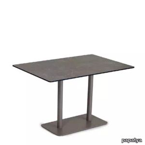
papatya > Coffee table
The shapes vary and so do the sizes. Lotus range tables appears to have all the harmony and dynamisim of a rigid body, with a decidedly perfect finish that is strengthened with cataphoresis application for outdoor usages. The various combinations of the base finishes with table tops affords a host of differant possibilites to choose from.
Lotus Square Bar
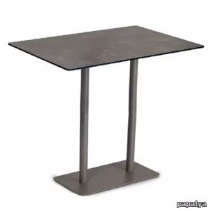
papatya > Coffee table
The shapes vary and so do the sizes. Lotus range tables appears to have all the harmony and dynamisim of a rigid body, with a decidedly perfect finish that is strengthened with cataphoresis application for outdoor usages.The various combinations of the base finishes with table tops affords a host of differant possibilites to choose from.
Matrice Traccia
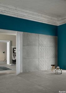
florim > Wallcovering
An atlas of modular signs to be combined in a wide variety of layouts. «We love concrete as a material, its versatility and its plain, austere look. We have completed our carefully designed surfaces with graphic patterning inspired by the human actions of weaving and embroidering.» Barbara Brondi & Marco Rainò To appreciate the profundity of the design project undertaken by Barbara Brondi and Marco Rainò for Cedit, it is both necessary and explanatory to start from the title the collection bears. In modern usage the term Matrice, in Italian, refers to a die or mould used to reproduce an object, but its origins are much more remote, with a meaning closer to the English “matrix”, meaning the underlying basis of something. The root of the word is related to Mater or mother: the name Matrice thus relates to the origin or cause of something. This dichotomy is expressed in several levels within the work of these architects, who study the world from a sophisticated conceptual approach and then transform it into a design. Starting from the idea of ceramic coverings, which have always been a tool not so much of architecture as of interior design, the artists work back to the origin of the surface and its decoration within their own discipline: they look at what we used to call the modern age, where modernity has also brought an uncompromising brutality, and where the use of bare concrete became the statement of an attitude to life with no time to spare for manners. Concrete is originally a liquid material, intended for shaping, which can therefore absorb and retain any type of mark created by the material and mould used to form it. Architects midway between rationalism and brutalism have used the rough-and-ready language of concrete combined with a last, elegant, anthropic decorative motif impressed on the material, that makes the concept of covering superfluous, because its place, in its older meaning of decoration rather than functional cladding, is taken by the regular patterning created in the material itself. There are therefore various grounds for believing that, in this collection, the artists are once again working in architectural terms. Firstly, with a simplicity typical of BRH+, they reduce the initial concepts to their minimal terms. So although this is a collection of coverings for walls, indoor floors, outdoor pavings and curtain walls, a great deal of time was spent on destructuring the idea of the ceramic covering itself. Unfortunately, nowadays there is no space in the contemporary construction sector for the radical approach of the past, so the cladding designed for the building actually lays bare the interior, using the choice of material – accurately interpreted (with shade variation) on the basis of an assortment of various types – to restore visual elegance and a fundamental severity. Attention to scale is another architectural feature: Matrice offers modules with architectural dimensions and different sizes through the development of “large slabs”, eliminating the visual regular grid effect. Thanks to this visual reset, geographic forms are perceived to emerge from dense, grey concrete surfaces decorated as in bygone days by special processes and by weathering during drying. The various types of slab, each an atlas of subtle, vibrant signs on the surfaces, comprise finishes that reproduce the visual effect of reinforced concrete – with the aggregates in the cement more clearly visible, of formwork – with the signs impressed on the concrete by the timber used, of a structured surface resembling bare cement plaster, of ridged and streaked surfaces – with patterning resembling some kinds of linear surface finishing processes – and finally a smooth, or basic version, over which Matrice exercises the dichotomy referred to earlier. It is on these surfaces that Brondi and Rainò have imagined additional design reverberations, a figurative code that rejects the concept of the grid, previously inseparable from that of the module: by means of a vocabulary of graphic marks cut into the slabs with a depth of 3 mm (the width of the gap left between modules during installation), they provide a framework for infinite combinations of possible dialogues. Just as in embroidery, which is based on grids of stitches and geometric repetitions, and where every stitch is at right-angles to another one to construct forms and decorations. Also taken from embroidery is the idea of introducing a degree of “softness” to reduce the stiffness of intentionally deaf surfaces. There is the impression of patterns that can continue for infinity, as in textile weaving, and a scale that, unlike the surface being worked on, is imagined as suspended and lightweight. They may not admit it, but BRH+ know a lot about music, including electronic music, and it appears to me that this organised tangle of infinite signs – unidentifiable without an overview – is rather like the representations of synthesized sounds. Sounds that are produced by machines, and thus “woven” by sampling and overlapping sounds of the most unlikely origins, combined to form jingles which, once heard, are imprinted indelibly on the brain. This may be why I am so interested in the space between this “melodic film” and its deaf, damp substrate. The eyes can navigate this suspended reality without fear of disturbance. So we are faced with different surfaces, different sizes and different graphic signs. But only one colour (surprise!) to prevent a cacophony not just of signs but also of possible interpretations: the artists retain their radical principles (and their generosity), and as curators, a role in which they are skilled, they leave the players (architects and installers) to add their own interpretations. In their hands this colour, expressed in Matrice, will produce motifs on surfaces in living spaces for someone else. This stylish covering and its workmanship will be left to the hands of someone who will probably never read this, but will be on a building site, with the radio playing on a stereo system, concentrating on installing the very pieces we describe. So a radical, apparently silent, design project like this has repercussions for the real world we live in. Matrice has no form of its own but merely acquires the ornamentation drawn on its surfaces by a second group of artists. And here this routine action, standardised by the form approved for production and workmanlike efficiency, is the origin and cause of change, generating a variability of choices and interpretations, on that dusty building site where music plays and mortar flows.
O'pera-S Soft

papatya > Chair
O'pera chair with base in glassfibre reinforced polypropylene and the back in polycarbonate. This traditional chair turns into a contemporary looking chair with combination of the two material and with its fashionable colours make it easily adaptable to every dynamic design environments. Anti UV stabilized. Suitable for indoor and outdoor use. O'pera-S also available with rich selection of cushion models. It enriches the chair and gives a distinct character for the interior usages.
Opal-M Pro
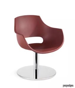
papatya > Chair
Opal-M armchair, stylish armchair made of polypropylene shell in with self positioning swivel central-pedestal steel base. Anti UV stabilized. Opal armchair is also available in fully upholstered shell version. It enriches the chair and gives a distinct character for the interior usages.
X-Treme B Pro
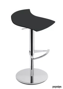
papatya > Stool
A new member of X-Treme range ! Natural, warm, contemporary. The organic softness of the glassfibre polypropylene shell in mat colours offers a new way of looking and feeling. It’s a pleasant range where you can relax in perfect harmony. Available in all version of the frames from X-Treme Collection. Anti UV stabilized. Designed with public spaces in mind and suitable both for home and contract usages.
Hera-K
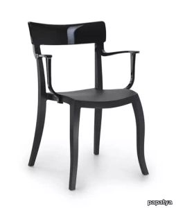
papatya > Chair
Hera stackable armchair with base in glassfibre reinforced polypropylene and the back in polycarbonate. This traditional armchair turns into a contemporary looking chair with combination of the two material and with its fashionable colours make it easily adaptable to every dynamic design environments. Anti UV stabilized. Suitable for indoor and outdoor use. Hera-K also available with rich selection of cushion models. It enriches the chair and gives a distinct character for the interior usages.
Opal Wox
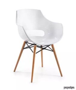
papatya > Chair
Opal Wox armchair, very attractive is the opposition between the roundy wooden frame and the shiny, modern seat. Wox version of Opal is a modern and innovative chair, thanks to the transparent or coloured polycarbonate shell, perfect for kitchens , dining rooms and can meet all furnishing needs thanks to the natural beech frame and suiting wide variety of shell colours. Suitable for Indoor. Perfect both for the home and for contract usage.
X-treme S Wox
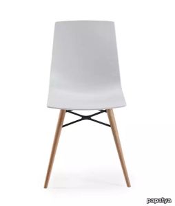
papatya > Chair
X-Treme S Wox chair, very attractive is the opposition between the roundy wooden frame and the shiny, modern seat. Wox version of X-Treme-S is a modern and innovative chair, thanks to the transparent or coloured polycarbonate shell, perfect for kitchens , dining rooms and can meet all furnishing needs thanks to the natural beech frame and suiting wide variety of shell colours. Suitable for Indoor. Perfect both for the home and for contract usage.
X-treme S Chief Pro
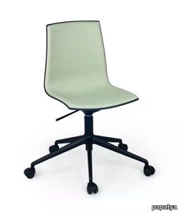
papatya > Chair
Soft chair, a new member of X-Treme range ! More natural, warm and contemporary. Polypropylene shell with fix cushion offers a new way of looking and feeling. It’s a pleasant range where you can relax in perfect harmony. Available in all version of the frames from X-Treme Collection. Designed with public spaces in mind and suitable both for home and contract usages.
Matrice Forma

florim > Wallcovering
An atlas of modular signs to be combined in a wide variety of layouts. «We love concrete as a material, its versatility and its plain, austere look. We have completed our carefully designed surfaces with graphic patterning inspired by the human actions of weaving and embroidering.» Barbara Brondi & Marco Rainò To appreciate the profundity of the design project undertaken by Barbara Brondi and Marco Rainò for Cedit, it is both necessary and explanatory to start from the title the collection bears. In modern usage the term Matrice, in Italian, refers to a die or mould used to reproduce an object, but its origins are much more remote, with a meaning closer to the English “matrix”, meaning the underlying basis of something. The root of the word is related to Mater or mother: the name Matrice thus relates to the origin or cause of something. This dichotomy is expressed in several levels within the work of these architects, who study the world from a sophisticated conceptual approach and then transform it into a design. Starting from the idea of ceramic coverings, which have always been a tool not so much of architecture as of interior design, the artists work back to the origin of the surface and its decoration within their own discipline: they look at what we used to call the modern age, where modernity has also brought an uncompromising brutality, and where the use of bare concrete became the statement of an attitude to life with no time to spare for manners. Concrete is originally a liquid material, intended for shaping, which can therefore absorb and retain any type of mark created by the material and mould used to form it. Architects midway between rationalism and brutalism have used the rough-and-ready language of concrete combined with a last, elegant, anthropic decorative motif impressed on the material, that makes the concept of covering superfluous, because its place, in its older meaning of decoration rather than functional cladding, is taken by the regular patterning created in the material itself. There are therefore various grounds for believing that, in this collection, the artists are once again working in architectural terms. Firstly, with a simplicity typical of BRH+, they reduce the initial concepts to their minimal terms. So although this is a collection of coverings for walls, indoor floors, outdoor pavings and curtain walls, a great deal of time was spent on destructuring the idea of the ceramic covering itself. Unfortunately, nowadays there is no space in the contemporary construction sector for the radical approach of the past, so the cladding designed for the building actually lays bare the interior, using the choice of material – accurately interpreted (with shade variation) on the basis of an assortment of various types – to restore visual elegance and a fundamental severity. Attention to scale is another architectural feature: Matrice offers modules with architectural dimensions and different sizes through the development of “large slabs”, eliminating the visual regular grid effect. Thanks to this visual reset, geographic forms are perceived to emerge from dense, grey concrete surfaces decorated as in bygone days by special processes and by weathering during drying. The various types of slab, each an atlas of subtle, vibrant signs on the surfaces, comprise finishes that reproduce the visual effect of reinforced concrete – with the aggregates in the cement more clearly visible, of formwork – with the signs impressed on the concrete by the timber used, of a structured surface resembling bare cement plaster, of ridged and streaked surfaces – with patterning resembling some kinds of linear surface finishing processes – and finally a smooth, or basic version, over which Matrice exercises the dichotomy referred to earlier. It is on these surfaces that Brondi and Rainò have imagined additional design reverberations, a figurative code that rejects the concept of the grid, previously inseparable from that of the module: by means of a vocabulary of graphic marks cut into the slabs with a depth of 3 mm (the width of the gap left between modules during installation), they provide a framework for infinite combinations of possible dialogues. Just as in embroidery, which is based on grids of stitches and geometric repetitions, and where every stitch is at right-angles to another one to construct forms and decorations. Also taken from embroidery is the idea of introducing a degree of “softness” to reduce the stiffness of intentionally deaf surfaces. There is the impression of patterns that can continue for infinity, as in textile weaving, and a scale that, unlike the surface being worked on, is imagined as suspended and lightweight. They may not admit it, but BRH+ know a lot about music, including electronic music, and it appears to me that this organised tangle of infinite signs – unidentifiable without an overview – is rather like the representations of synthesized sounds. Sounds that are produced by machines, and thus “woven” by sampling and overlapping sounds of the most unlikely origins, combined to form jingles which, once heard, are imprinted indelibly on the brain. This may be why I am so interested in the space between this “melodic film” and its deaf, damp substrate. The eyes can navigate this suspended reality without fear of disturbance. So we are faced with different surfaces, different sizes and different graphic signs. But only one colour (surprise!) to prevent a cacophony not just of signs but also of possible interpretations: the artists retain their radical principles (and their generosity), and as curators, a role in which they are skilled, they leave the players (architects and installers) to add their own interpretations. In their hands this colour, expressed in Matrice, will produce motifs on surfaces in living spaces for someone else. This stylish covering and its workmanship will be left to the hands of someone who will probably never read this, but will be on a building site, with the radio playing on a stereo system, concentrating on installing the very pieces we describe. So a radical, apparently silent, design project like this has repercussions for the real world we live in. Matrice has no form of its own but merely acquires the ornamentation drawn on its surfaces by a second group of artists. And here this routine action, standardised by the form approved for production and workmanlike efficiency, is the origin and cause of change, generating a variability of choices and interpretations, on that dusty building site where music plays and mortar flows.
Globe-K Bar
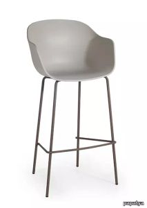
papatya > Stool
Spectacular characteristic design involves variety of solutions for home, work and hospitality settings. Its curved shape makes the design more attractive as a complement of trendy architectures. Globe Collection is inspired by our planet. Suitable for outdoor usage.
Globe-S Bar Soft
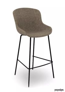
papatya > Stool
Spectacular characteristic design involves variety of solutions for home, work and hospitality settings. Its curved shape makes the design more attractive as a complement of trendy architectures. Globe Collection is inspired by our planet. Suitable for outdoor usage.
Matrice Rilievo

florim > Wallcovering
An atlas of modular signs to be combined in a wide variety of layouts. «We love concrete as a material, its versatility and its plain, austere look. We have completed our carefully designed surfaces with graphic patterning inspired by the human actions of weaving and embroidering.» Barbara Brondi & Marco Rainò To appreciate the profundity of the design project undertaken by Barbara Brondi and Marco Rainò for Cedit, it is both necessary and explanatory to start from the title the collection bears. In modern usage the term Matrice, in Italian, refers to a die or mould used to reproduce an object, but its origins are much more remote, with a meaning closer to the English “matrix”, meaning the underlying basis of something. The root of the word is related to Mater or mother: the name Matrice thus relates to the origin or cause of something. This dichotomy is expressed in several levels within the work of these architects, who study the world from a sophisticated conceptual approach and then transform it into a design. Starting from the idea of ceramic coverings, which have always been a tool not so much of architecture as of interior design, the artists work back to the origin of the surface and its decoration within their own discipline: they look at what we used to call the modern age, where modernity has also brought an uncompromising brutality, and where the use of bare concrete became the statement of an attitude to life with no time to spare for manners. Concrete is originally a liquid material, intended for shaping, which can therefore absorb and retain any type of mark created by the material and mould used to form it. Architects midway between rationalism and brutalism have used the rough-and-ready language of concrete combined with a last, elegant, anthropic decorative motif impressed on the material, that makes the concept of covering superfluous, because its place, in its older meaning of decoration rather than functional cladding, is taken by the regular patterning created in the material itself. There are therefore various grounds for believing that, in this collection, the artists are once again working in architectural terms. Firstly, with a simplicity typical of BRH+, they reduce the initial concepts to their minimal terms. So although this is a collection of coverings for walls, indoor floors, outdoor pavings and curtain walls, a great deal of time was spent on destructuring the idea of the ceramic covering itself. Unfortunately, nowadays there is no space in the contemporary construction sector for the radical approach of the past, so the cladding designed for the building actually lays bare the interior, using the choice of material – accurately interpreted (with shade variation) on the basis of an assortment of various types – to restore visual elegance and a fundamental severity. Attention to scale is another architectural feature: Matrice offers modules with architectural dimensions and different sizes through the development of “large slabs”, eliminating the visual regular grid effect. Thanks to this visual reset, geographic forms are perceived to emerge from dense, grey concrete surfaces decorated as in bygone days by special processes and by weathering during drying. The various types of slab, each an atlas of subtle, vibrant signs on the surfaces, comprise finishes that reproduce the visual effect of reinforced concrete – with the aggregates in the cement more clearly visible, of formwork – with the signs impressed on the concrete by the timber used, of a structured surface resembling bare cement plaster, of ridged and streaked surfaces – with patterning resembling some kinds of linear surface finishing processes – and finally a smooth, or basic version, over which Matrice exercises the dichotomy referred to earlier. It is on these surfaces that Brondi and Rainò have imagined additional design reverberations, a figurative code that rejects the concept of the grid, previously inseparable from that of the module: by means of a vocabulary of graphic marks cut into the slabs with a depth of 3 mm (the width of the gap left between modules during installation), they provide a framework for infinite combinations of possible dialogues. Just as in embroidery, which is based on grids of stitches and geometric repetitions, and where every stitch is at right-angles to another one to construct forms and decorations. Also taken from embroidery is the idea of introducing a degree of “softness” to reduce the stiffness of intentionally deaf surfaces. There is the impression of patterns that can continue for infinity, as in textile weaving, and a scale that, unlike the surface being worked on, is imagined as suspended and lightweight. They may not admit it, but BRH+ know a lot about music, including electronic music, and it appears to me that this organised tangle of infinite signs – unidentifiable without an overview – is rather like the representations of synthesized sounds. Sounds that are produced by machines, and thus “woven” by sampling and overlapping sounds of the most unlikely origins, combined to form jingles which, once heard, are imprinted indelibly on the brain. This may be why I am so interested in the space between this “melodic film” and its deaf, damp substrate. The eyes can navigate this suspended reality without fear of disturbance. So we are faced with different surfaces, different sizes and different graphic signs. But only one colour (surprise!) to prevent a cacophony not just of signs but also of possible interpretations: the artists retain their radical principles (and their generosity), and as curators, a role in which they are skilled, they leave the players (architects and installers) to add their own interpretations. In their hands this colour, expressed in Matrice, will produce motifs on surfaces in living spaces for someone else. This stylish covering and its workmanship will be left to the hands of someone who will probably never read this, but will be on a building site, with the radio playing on a stereo system, concentrating on installing the very pieces we describe. So a radical, apparently silent, design project like this has repercussions for the real world we live in. Matrice has no form of its own but merely acquires the ornamentation drawn on its surfaces by a second group of artists. And here this routine action, standardised by the form approved for production and workmanlike efficiency, is the origin and cause of change, generating a variability of choices and interpretations, on that dusty building site where music plays and mortar flows.
X-Treme BSS Pro
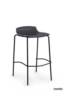
papatya > Stool
A new member of X-Treme range ! Natural, warm, contemporary. The organic softness of the glassfibre polypropylene shell in mat colours offers a new way of looking and feeling. It’s a pleasant range where you can relax in perfect harmony. Available in all version of the frames from X-Treme Collection. Anti UV stabilized. Designed with public spaces in mind and suitable both for home and contract usages.
Sferico Joe Colombo, 1968
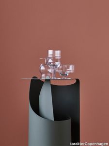
karakterCopenhagen > Styling
Joe Colombo believed in democratic and functional design. In his lifetime he designed a wide range of different drinking glasses. Something that seems very to the point as he was said to love drinking and smoking. Unfortunately this undoubtedly contributed to his young demise, but we’d like to think he would be pleased to see that his creations live on. In 1968 he designed a series of six glasses, all based on geometrical figures. True to his democratic and functional take on design, all the glasses were intended for a wide range of different usage—such as water, long drinks, whisky, wine, beer, juice, champagne, ice cream and so on. Karakter is proud to bring some of the very finest glasses to your table and will introduce the six different Joe Colombo glasses.
Opal Wox Pro
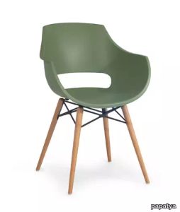
papatya > Chair
Opal Wox Pro armchair, a new member of Opal range ! Natural, warm, contemporary. The organic softness of the glassfibre polypropylene shell in mat colours offers a new way of looking and feeling. It’s a pleasant range where you can relax in perfect harmony. Available in all version of the frames from Opal Collection. Offers warm combinations especially in wood frame Opal WOX range. Anti UV stabilized. Designed with public spaces in mind and suitable both for home and contract usages.