Noboru Step Ladder
fritzhansen > Stool
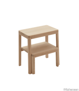
Taking its name from the Japanese word ‘to climb,’ the minimalist and multifunctional Noboru Step Ladder works wonderfully as a seat, ladder or a side table. Crafted in solid FSC™-certified oak, it channels the perfect balance of Japanese and Scandinavian sensibilities. Designed by the Canadian Design Studio MSDS. The Edge Series in terracotta is inspired by an ancient Greek-Egyptian tradition for craftsmanship which is reflected in the amphora-inspired foot. Designed in collaboration with Danish ceramic duo Stilleben.
Cromatica Cenere
florim > Synthetic Floor
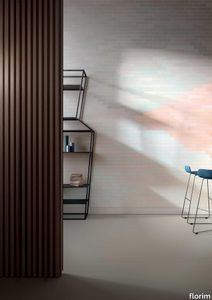
A lexicon of colour shades for mixing. A large size and its submultiples. «This work represents a reflection on colour, and above all a proposal on how to transfer the multiplicity of shades typical of a hand-crafted piece into a project produced on a large scale.» Andrea Trimarchi & Simone Farresin Studio Formafantasma base their work in the design world on a strong vocation for research. Simone Farresin and Andrea Trimarchi view every project as an opportunity for study and the acquisition of new knowledge, and their love of speculation establishes a dialectic rapport with the situations offered by each new client. Whether it involves a material, a type or a production method, the first phase of their design process is the mapping of what the specific case places at their disposal. With Cedit, an analysis of the company's past and present was central to the inputs. Inevitably, since "Looking back to look forward" has been the design duo's mission statement for years. In this case, in particular, the company's history was a real treasure trove, a fine blend of memory and technology: on the one hand, the excellence of production technologies now extended with the added potential arising from the engineering of large-sized ceramic tiles, and on the other a wealth of experience build up with great designers of the past, from Zanuso to Noorda, through to <strong>Ettore Sottsass</strong>. Andrea and Simone decided to focus on Sottsass - who started designing for Cedit back in the late Seventies - and made an in-depth study of one of the colour charts he developed towards the end of the Nineties. A spread of colours which gave its name to the "41 Colors" collection, included in the catalogue of the period as a real alphabet for what has proved to be a lasting design language. Colour was much more than just a compulsory step in the dialogue between designer and producer, since Sottsass had already discovered the power of the mystery intrinsic to this universe of invention.<br /><br />With Cedit the master-designer, a long-established lover of ceramics and their crafted unpredictability, found a way of transferring his personal feeling for colour to a wide audience, through industrial mass production. And this assumption is another factor Formafantasma have inherited, interpreting it today with new, even more efficient technical resources just as capable of expressing the secrets of colour. «The concept of colour "in isolation" - Sottsass explained in a 1992 text - classified colour, Pantone, as they call it now, "scientific" colour, is something I still refuse to accept. (...) Colours, the idea of colour, are always intangible, they slip slowly away like words, that run through your fingers, like poetry, which you can never keep hold of, like a good story.» And Formafantasma seem to have chosen that distinction between colour "in isolation" and "intangible" yet ever-present colour as the basis of their work. However, their approach draws on their unique vocation for research and the technical resources of the third millennium. «This work - they explain to us - is a reflection on colour, and above all on <strong>how to bring the multiplicity of shades typical of a hand-crafted piece into a large-scale project</strong>.» The designers look at large, monochrome slabs and turn to the engineers for details of their secrets, their processing stages, the phases in their production. They appreciate that the colour of ceramic material, its ineffable secret, can still be present in the series and large tile sizes in which Cedit leads the way. They understand that this is, in itself, an expressive power which does not need channelling into forms, motifs and signs. But above all, they treat the surface as a large canvas on which they spread pure colour, which tends to be uniform but in fact is never really a "scientific", totally monochrome hue: it is not a Pantone. And this is the source of the fundamental insight, which only children of the transition from the analogue to the digital era could achieve, the reward for those who draw on the past to look to the future.<br /><br />The designers cut the slab into lots of regular pieces, not necessarily of the same size. They restore its identity as a "tile", a familiar name with something ancient about it, but which stands for a module, a unit of measurement, a building block. There is nothing nostalgic about this - on the contrary, the vision is completely new, and the portions of slab created can be reassembled with no restrictions, breaking down the unity of the whole and reviving its essence starting from its structure. As the cards in the pack are shuffled, what emerges is not a figure or motif but the representation of colour itself and its physical nature. It is live matter, born from the meeting of vibrating forces, the mixing of ever-varying percentages of the basic ingredients. And Formafantasma present us with the corpuscular, fragmented essence of these small frames of space and crystallised time, which reveal the code and formula of their composition. So Cromatica is a collection made up of six colours which actually have an infinite number of declinations and compositional possibilities. It is a "discrete" combination in the mathematical sense of the term, capable of generating multiple, variable subsets. At the same time, each slab can be used in its entirety, leaving the impression of analogue continuity unchanged. But what really amazes is the comparison and dialogue between the two approaches: a stroke of genius, laying clear the mysterious appeal the artificial reproduction of colour has always held for mankind. Because, as Sottsass said, «colours are language, a powerful, magical, intangible, flexible, continuous material, in which existence is made manifest, the existence that lives in time and space».
Heracleum III The Big O
moooi > Ceiling lamp
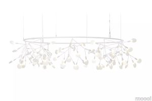
In the Heracleum III The Big O by Bertjan Pot the flowering leaves are shaped in a blossoming crown. In the old days a circular crown was a symbol of power eternity and glory. The Heracleum III The Big O adds the beauty of nature and prosperity to that row. Available in two sizes and four colours this suspended lighting design is suitable for any space and crowns any interior. Like the other designs in the Heracleum family the lean branches are powered by Electrosandwich by Marcel Wanders studio. Compatible with our Wireless Wall Switch for quick and easy dimming that gives you full control over the light output. 
Qatego Washbasin

duravit > Washbasin
Rectangular, Number of washing areas: 1 Middle, Tap hole platform: Yes, Overflow: Yes, Underside glazed, Back side glazed: No, 500 mm Design by Studio F. A. Porsche
Pelagus Chair
fritzhansen > Chair
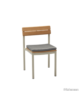
Pelagus has a graceful contemporary expression that sits lightly in nature and holds its own in urban environments. The collection is high on comfort and versatility. It is furniture that suits a lifestyle as diverse as that lived in urban cosmopolitans or far from the city and grounded in nature. Designed in collaboration with Stockholm-based Note Design Studio. Tailormade for the Pelagus chair, the Pelagus Chair Cushion provides extra softness and comfort on the seat. Covered in a weatherproof and durable textile, the cushion is weatherproof and durable. The textile colours add a fresh contrast to the teak, warm when new and silvery grey when patinated. The cushion is made of a quick-dry outdoor foam with an open-cell structure that allows water to pass through while holding its shape and remaining firm year after year. Please note that a different version is available to meet the fire regulations in the UK market. These cushions are upholstered with FR cold foam, which is not weather resistant.
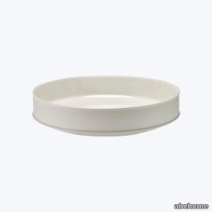
Dune Serving Bowl
abchome > Styling
The Dune Tableware Collection by leading American designer Kelly Wearstler is an elegant nod to ancient pottery. Wearstler accentuated the sculptural shapes of the porcelain plates and serving dishes by combining two finishes, matte and glossy, using balanced detailing to create striking volumes and harmonious compositions. Complete your collection with bowls, trays, plates, and serving dishes of same finish or mix and match the earthy porcelain pieces to create your own unique dinnerware set.Kelly Wearstler, founder and principal of Kelly Wearstler design studio, is an American designer creating multi-layered, stimulating sensory experiences for the home. Through an exploration of materiality, color, forms and an intuitive juxtaposition of contemporary and vintage, architectural and organic, graphic and instinctual, she curates a wealth of experiences into every space. Wearstler believes that honoring history, location and architecture is imperative to pushing the boundaries and challenging the rules.
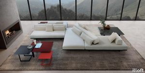
Cubi
illoft > Coffee table
Vertical over horizontal and horizontal over vertical. Geometric lines evolve through space, creating different colour combinations. With their precision design, these modern low tables are one of a kind. Designed by Arch. Giuseppe Viganò - Studio Viganò
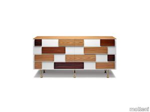
D.655.1_2 Chest of drawers
molteni > drawer
Marked by hand-painted white drawer fronts with applied handles in various wood kinds (elm Italian walnut mahogany and rosewood). Chest of drawers designed in several versions in the period from 1952 to 1955. The new version was produced using original drawings kept in the Gio Ponti Archives and the art direction for the Gio Ponti Collection came from Studio Cerri & Associati.The elmwood frame rests on satin brass feet.
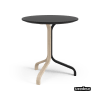
Lamino Duality table height 49 cm
swedese > Coffee table
Lamino is Swedeses most famous easy chair, designed by Yngve Ekström in 1956. A typical example of timeless design where nature's own materials and meticulous craftsmanship have resulted in a piece of furniture that is as attractive today as it is for future generations. Duality Edition is a interpretation made by design studio WINGÅRDH & WINGÅRDH. The table is made of oak and one leg and the table top is lacquered with a super matte lazur finish and the other parts are lacquered with white pigmented lacquer. The table is available in a black or white edition.
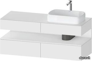
Qatego Console vanity unit wall-mounted
duravit > Washbasin cabinet
Number of pull-out compartments: 2, Number of drawers: 2, Number of open compartments: 1, Incl. console: Yes, Tap hole drillings possible, Without handle, Siphon cut-out: Yes, Siphon cover: Yes, Soft self-closing automatic with damping, Tip-on fitting, Niche lighting Optional, Lay-in compartment Optional Design by Studio F. A. Porsche
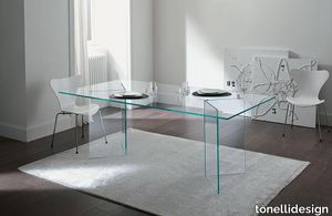
Home office Bacco
tonellidesign > Desk
The glass table Bacco is composed of a top available in transparent, extra clear or smoked glass and of a base made of two mirroring glass supports that rest on the floor. Its clean lines are particularly suited for minimalistic decors because they do not burden the environment. The transparency makes the room brighter and creates a broader effect. Perfect for luxury studios and offices, dining rooms and lounges, the glass table Bacco can be ordered in different sizes according to needs. The glass of this designer table is resistant and tempered, which makes it also suitable for working areas and dining rooms.
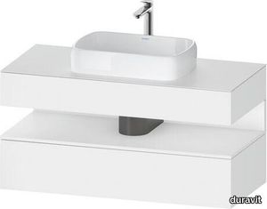
Qatego Console vanity unit wall-mounted
duravit > Washbasin cabinet
Number of pull-out compartments: 1, Number of drawers: 1, Number of open compartments: 1, Incl. console: Yes, Tap hole drillings possible, Without handle, Siphon cut-out: Yes, Siphon cover: Yes, Soft self-closing automatic with damping, Tip-on fitting, Niche lighting Optional, Lay-in compartment Optional Design by Studio F. A. Porsche
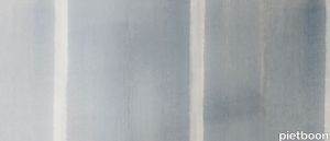
WASHI wallpaper by NLXL
pietboon > Wallcovering
Washi, meaning Japanese paper, is traditional handmade paper of which its rich history dates back to 610 AD. Though the paper nowadays enjoys a contemporary following used for different purposes, it still holds the same characteristics of strength, durability, lightness, warmth and flexibility as the traditional version. Impressed by the paper’ characteristics, versatility and beauty, Studio Piet Boon used it as an inspiration for this wallpaper design: a modern interpretation of Japanese washi paper.
Cromatica Verde

florim > Wall Paint
A lexicon of colour shades for mixing. A large size and its submultiples. «This work represents a reflection on colour, and above all a proposal on how to transfer the multiplicity of shades typical of a hand-crafted piece into a project produced on a large scale.» Andrea Trimarchi & Simone Farresin Studio Formafantasma base their work in the design world on a strong vocation for research. Simone Farresin and Andrea Trimarchi view every project as an opportunity for study and the acquisition of new knowledge, and their love of speculation establishes a dialectic rapport with the situations offered by each new client. Whether it involves a material, a type or a production method, the first phase of their design process is the mapping of what the specific case places at their disposal. With Cedit, an analysis of the company's past and present was central to the inputs. Inevitably, since "Looking back to look forward" has been the design duo's mission statement for years. In this case, in particular, the company's history was a real treasure trove, a fine blend of memory and technology: on the one hand, the excellence of production technologies now extended with the added potential arising from the engineering of large-sized ceramic tiles, and on the other a wealth of experience build up with great designers of the past, from Zanuso to Noorda, through to <strong>Ettore Sottsass</strong>. Andrea and Simone decided to focus on Sottsass - who started designing for Cedit back in the late Seventies - and made an in-depth study of one of the colour charts he developed towards the end of the Nineties. A spread of colours which gave its name to the "41 Colors" collection, included in the catalogue of the period as a real alphabet for what has proved to be a lasting design language. Colour was much more than just a compulsory step in the dialogue between designer and producer, since Sottsass had already discovered the power of the mystery intrinsic to this universe of invention.<br /><br />With Cedit the master-designer, a long-established lover of ceramics and their crafted unpredictability, found a way of transferring his personal feeling for colour to a wide audience, through industrial mass production. And this assumption is another factor Formafantasma have inherited, interpreting it today with new, even more efficient technical resources just as capable of expressing the secrets of colour. «The concept of colour "in isolation" - Sottsass explained in a 1992 text - classified colour, Pantone, as they call it now, "scientific" colour, is something I still refuse to accept. (...) Colours, the idea of colour, are always intangible, they slip slowly away like words, that run through your fingers, like poetry, which you can never keep hold of, like a good story.» And Formafantasma seem to have chosen that distinction between colour "in isolation" and "intangible" yet ever-present colour as the basis of their work. However, their approach draws on their unique vocation for research and the technical resources of the third millennium. «This work - they explain to us - is a reflection on colour, and above all on <strong>how to bring the multiplicity of shades typical of a hand-crafted piece into a large-scale project</strong>.» The designers look at large, monochrome slabs and turn to the engineers for details of their secrets, their processing stages, the phases in their production. They appreciate that the colour of ceramic material, its ineffable secret, can still be present in the series and large tile sizes in which Cedit leads the way. They understand that this is, in itself, an expressive power which does not need channelling into forms, motifs and signs. But above all, they treat the surface as a large canvas on which they spread pure colour, which tends to be uniform but in fact is never really a "scientific", totally monochrome hue: it is not a Pantone. And this is the source of the fundamental insight, which only children of the transition from the analogue to the digital era could achieve, the reward for those who draw on the past to look to the future.<br /><br />The designers cut the slab into lots of regular pieces, not necessarily of the same size. They restore its identity as a "tile", a familiar name with something ancient about it, but which stands for a module, a unit of measurement, a building block. There is nothing nostalgic about this - on the contrary, the vision is completely new, and the portions of slab created can be reassembled with no restrictions, breaking down the unity of the whole and reviving its essence starting from its structure. As the cards in the pack are shuffled, what emerges is not a figure or motif but the representation of colour itself and its physical nature. It is live matter, born from the meeting of vibrating forces, the mixing of ever-varying percentages of the basic ingredients. And Formafantasma present us with the corpuscular, fragmented essence of these small frames of space and crystallised time, which reveal the code and formula of their composition. So Cromatica is a collection made up of six colours which actually have an infinite number of declinations and compositional possibilities. It is a "discrete" combination in the mathematical sense of the term, capable of generating multiple, variable subsets. At the same time, each slab can be used in its entirety, leaving the impression of analogue continuity unchanged. But what really amazes is the comparison and dialogue between the two approaches: a stroke of genius, laying clear the mysterious appeal the artificial reproduction of colour has always held for mankind. Because, as Sottsass said, «colours are language, a powerful, magical, intangible, flexible, continuous material, in which existence is made manifest, the existence that lives in time and space».
.04
vitra > Chair
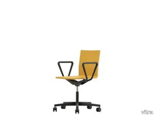
The .04 office chair is distinctly different in appearance from typical task chairs used in institutional office settings. Thanks to its ergonomic features, however, it remains comfortable even over long periods of sitting, and the unobtrusive design makes it a perfect choice for studios and informal office spaces.
White "Saddle-Hide"
minotti > Sofa
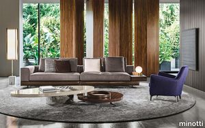
Structure and proportions usher in a new architecture of the sofa. White seems to be a composite of perfectly balanced shapes. The repetitive overlapping of horizontal lines forms a highly distinctive aesthetic pattern that is further emphasized by the use of several different materials. The sofa base can be upholstered in fabric, leather or saddle-hide upon which the seat backs, cushions and tray tops are placed to create a captivating interplay of shapes and alternating positive and negative spaces. The sofa sits on die-cast aluminum Pewter-colored feet, an exclusive design by Minotti Studio, that are set at a 45° angle to the sofa corners, lending added flair, even to larger-sized compositions. To make the White sofa even more welcoming, the padding in the cushions was enhanced with a deeper layer of goose down, making them luxuriously soft and creating a pleasant contrast to the sleek formality of the sofa base.
Bul-Bo

axolight > Table lamp
In 2019, the architects Fabrizio Pellegrino and Lodovico Gabetti, together with Giuseppe Scaturro and Magdalena Kirova, respectively CEO and art director of Axolight, created a maieutic laboratory (realistically based on the Socratic method of reaching a truth in an authentic way) with the aim of reconstructing the thought of Studio Gabetti and Isola, linked to the original design idea of the Bul-Bo lamp. Among the foundations of this path, the direct stories of the architects Aimaro Isola and Guido Drocco (co-authors of Bul-Bo in 1971), the notes and original drawings of the studio, the memories of Lodovico Gabetti (son and pupil of Roberto Gabetti ) and Fabrizio Pellegrino (student of the Gabetti and Isola studio).
Side table Opalina sgabello
tonellidesign > Side table
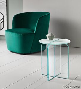
The side table Opalina sgabello results very versatile because thanks to the possibility to add an appropriate pillow in beige leather it can easily become a small stool. The glass the entire structure is made of can be extra clear, smoked or extra clear frosted, this last one is able to enhance the brightness and improve the light transmission. The side table Opalina sgaebello, designed by Cristina Celestino, because of its chameleonic gift, is suited for the furnishing of living rooms and studios, put next to armchairs and sofas.
Silver Woven Pear Drop Earrings
abchome > Accessories
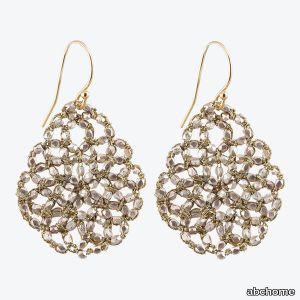
Beads of silver are woven together with gold cord lace to create a set of earrings that is reminiscent of floating bubbles beneath the sea.Danielle Welmond weaves fine threads and precious metals with mesmerizing gems in a style of jewelry that is all her own. Mastering the art of lacemaking and the lost wax process, Danielle creates each piece in her Southern California studio with love and delicacy.
Qatego Vanity unit wall-mounted
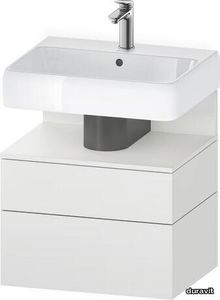
duravit > Washbasin cabinet
Number of pull-out compartments: 1, Number of drawers: 1, Number of open compartments: 1, Without handle, Soft self-closing automatic with damping, Tip-on fitting, Niche lighting Optional, Lay-in compartment Optional, Necessary articles: Washbasin Qatego # 238260 Design by Studio F. A. Porsche
Pink & Blue Sapphire Etched Square Stud Earrings
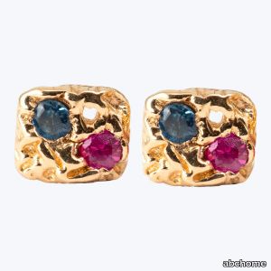
abchome > Accessories
Handmade of 14k gold, these earrings feature tiny, ethically sourced sapphires in gradient hues of pink and blue. Each sapphire is a wellspring of resilience and wisdom.Danielle Welmond weaves fine threads and precious metals with mesmerizing gems in a style of jewelry that is all her own. Mastering the art of lacemaking and the lost wax process, Danielle creates each piece in her Southern California studio with love and delicacy.
Cromatica Opale

florim > Wall Paint
A lexicon of colour shades for mixing. A large size and its submultiples. «This work represents a reflection on colour, and above all a proposal on how to transfer the multiplicity of shades typical of a hand-crafted piece into a project produced on a large scale.» Andrea Trimarchi & Simone Farresin Studio Formafantasma base their work in the design world on a strong vocation for research. Simone Farresin and Andrea Trimarchi view every project as an opportunity for study and the acquisition of new knowledge, and their love of speculation establishes a dialectic rapport with the situations offered by each new client. Whether it involves a material, a type or a production method, the first phase of their design process is the mapping of what the specific case places at their disposal. With Cedit, an analysis of the company's past and present was central to the inputs. Inevitably, since "Looking back to look forward" has been the design duo's mission statement for years. In this case, in particular, the company's history was a real treasure trove, a fine blend of memory and technology: on the one hand, the excellence of production technologies now extended with the added potential arising from the engineering of large-sized ceramic tiles, and on the other a wealth of experience build up with great designers of the past, from Zanuso to Noorda, through to <strong>Ettore Sottsass</strong>. Andrea and Simone decided to focus on Sottsass - who started designing for Cedit back in the late Seventies - and made an in-depth study of one of the colour charts he developed towards the end of the Nineties. A spread of colours which gave its name to the "41 Colors" collection, included in the catalogue of the period as a real alphabet for what has proved to be a lasting design language. Colour was much more than just a compulsory step in the dialogue between designer and producer, since Sottsass had already discovered the power of the mystery intrinsic to this universe of invention.<br /><br />With Cedit the master-designer, a long-established lover of ceramics and their crafted unpredictability, found a way of transferring his personal feeling for colour to a wide audience, through industrial mass production. And this assumption is another factor Formafantasma have inherited, interpreting it today with new, even more efficient technical resources just as capable of expressing the secrets of colour. «The concept of colour "in isolation" - Sottsass explained in a 1992 text - classified colour, Pantone, as they call it now, "scientific" colour, is something I still refuse to accept. (...) Colours, the idea of colour, are always intangible, they slip slowly away like words, that run through your fingers, like poetry, which you can never keep hold of, like a good story.» And Formafantasma seem to have chosen that distinction between colour "in isolation" and "intangible" yet ever-present colour as the basis of their work. However, their approach draws on their unique vocation for research and the technical resources of the third millennium. «This work - they explain to us - is a reflection on colour, and above all on <strong>how to bring the multiplicity of shades typical of a hand-crafted piece into a large-scale project</strong>.» The designers look at large, monochrome slabs and turn to the engineers for details of their secrets, their processing stages, the phases in their production. They appreciate that the colour of ceramic material, its ineffable secret, can still be present in the series and large tile sizes in which Cedit leads the way. They understand that this is, in itself, an expressive power which does not need channelling into forms, motifs and signs. But above all, they treat the surface as a large canvas on which they spread pure colour, which tends to be uniform but in fact is never really a "scientific", totally monochrome hue: it is not a Pantone. And this is the source of the fundamental insight, which only children of the transition from the analogue to the digital era could achieve, the reward for those who draw on the past to look to the future.<br /><br />The designers cut the slab into lots of regular pieces, not necessarily of the same size. They restore its identity as a "tile", a familiar name with something ancient about it, but which stands for a module, a unit of measurement, a building block. There is nothing nostalgic about this - on the contrary, the vision is completely new, and the portions of slab created can be reassembled with no restrictions, breaking down the unity of the whole and reviving its essence starting from its structure. As the cards in the pack are shuffled, what emerges is not a figure or motif but the representation of colour itself and its physical nature. It is live matter, born from the meeting of vibrating forces, the mixing of ever-varying percentages of the basic ingredients. And Formafantasma present us with the corpuscular, fragmented essence of these small frames of space and crystallised time, which reveal the code and formula of their composition. So Cromatica is a collection made up of six colours which actually have an infinite number of declinations and compositional possibilities. It is a "discrete" combination in the mathematical sense of the term, capable of generating multiple, variable subsets. At the same time, each slab can be used in its entirety, leaving the impression of analogue continuity unchanged. But what really amazes is the comparison and dialogue between the two approaches: a stroke of genius, laying clear the mysterious appeal the artificial reproduction of colour has always held for mankind. Because, as Sottsass said, «colours are language, a powerful, magical, intangible, flexible, continuous material, in which existence is made manifest, the existence that lives in time and space».
Qatego Bathtub

duravit > Bathtub
Rectangular, Type of installation: Installation, Sanitary acrylic, Number of backrests: 1 Variable, Overflow: Yes, Waste outlet position: Foot end, Overflow position: Foot end, Capacity: 225 l, Internal depth: 460 mm Design by Studio F. A. Porsche
Lamino Duality footstool
swedese > Stool
Lamino is Swedeses most famous easy chair, designed by Yngve Ekström in 1956. A typical example of timeless design where nature's own materials and meticulous craftsmanship have resulted in a piece of furniture that is as attractive today as it is for future generations. Duality Edition is a interpretation made by design studio WINGÅRDH & WINGÅRDH. The footstool is made of laminated oak veneer and is upholstered with saddle leather. The leg stand is lacquered with a super matte lazur finish and the other parts are lacquered with white pigmented lacquer. The footstool is available in a black or white edition.
Mixing Pixels Carpet
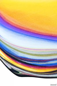
moooi > Carpet
Mixing Pixels is a collection of carpets by Ruben de Haas. The collection results from his playful curiosity for colours and discovering new techniques. Each design is a recreation of existing carpets in the Moooi collection but mixed into another shape and composition. De Haas chose carpets made by designers he admires Studio Job Front Kit Miles Emma Larsson Jae Yong Kim Sjoerd Vroonland Moooi and Claire Vos. The collection comprises 12 designs in lively colours and abstract shapes.
Pendula Cloud
amacoustics > Styling
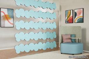
PENDULA CLOUD is an efficient sound absorber manufactured by EcoSUND consisting of recycled PET. The absorbent is often used to create space in the room or as baffles in the ceiling to prevent sound propagation. PENDULA Vertical Absorbent is mounted piece by piece and does not interfere with existing installations such as ventilation and lamps, which makes it even more affordable as craftsmen do not have to move already mounted products. Suspension is added. Designed by o4i Design Studio.
Cromatica Bianco

florim > Wall Paint
A lexicon of colour shades for mixing. A large size and its submultiples. «This work represents a reflection on colour, and above all a proposal on how to transfer the multiplicity of shades typical of a hand-crafted piece into a project produced on a large scale.» Andrea Trimarchi & Simone Farresin Studio Formafantasma base their work in the design world on a strong vocation for research. Simone Farresin and Andrea Trimarchi view every project as an opportunity for study and the acquisition of new knowledge, and their love of speculation establishes a dialectic rapport with the situations offered by each new client. Whether it involves a material, a type or a production method, the first phase of their design process is the mapping of what the specific case places at their disposal. With Cedit, an analysis of the company's past and present was central to the inputs. Inevitably, since "Looking back to look forward" has been the design duo's mission statement for years. In this case, in particular, the company's history was a real treasure trove, a fine blend of memory and technology: on the one hand, the excellence of production technologies now extended with the added potential arising from the engineering of large-sized ceramic tiles, and on the other a wealth of experience build up with great designers of the past, from Zanuso to Noorda, through to <strong>Ettore Sottsass</strong>. Andrea and Simone decided to focus on Sottsass - who started designing for Cedit back in the late Seventies - and made an in-depth study of one of the colour charts he developed towards the end of the Nineties. A spread of colours which gave its name to the "41 Colors" collection, included in the catalogue of the period as a real alphabet for what has proved to be a lasting design language. Colour was much more than just a compulsory step in the dialogue between designer and producer, since Sottsass had already discovered the power of the mystery intrinsic to this universe of invention.<br /><br />With Cedit the master-designer, a long-established lover of ceramics and their crafted unpredictability, found a way of transferring his personal feeling for colour to a wide audience, through industrial mass production. And this assumption is another factor Formafantasma have inherited, interpreting it today with new, even more efficient technical resources just as capable of expressing the secrets of colour. «The concept of colour "in isolation" - Sottsass explained in a 1992 text - classified colour, Pantone, as they call it now, "scientific" colour, is something I still refuse to accept. (...) Colours, the idea of colour, are always intangible, they slip slowly away like words, that run through your fingers, like poetry, which you can never keep hold of, like a good story.» And Formafantasma seem to have chosen that distinction between colour "in isolation" and "intangible" yet ever-present colour as the basis of their work. However, their approach draws on their unique vocation for research and the technical resources of the third millennium. «This work - they explain to us - is a reflection on colour, and above all on <strong>how to bring the multiplicity of shades typical of a hand-crafted piece into a large-scale project</strong>.» The designers look at large, monochrome slabs and turn to the engineers for details of their secrets, their processing stages, the phases in their production. They appreciate that the colour of ceramic material, its ineffable secret, can still be present in the series and large tile sizes in which Cedit leads the way. They understand that this is, in itself, an expressive power which does not need channelling into forms, motifs and signs. But above all, they treat the surface as a large canvas on which they spread pure colour, which tends to be uniform but in fact is never really a "scientific", totally monochrome hue: it is not a Pantone. And this is the source of the fundamental insight, which only children of the transition from the analogue to the digital era could achieve, the reward for those who draw on the past to look to the future.<br /><br />The designers cut the slab into lots of regular pieces, not necessarily of the same size. They restore its identity as a "tile", a familiar name with something ancient about it, but which stands for a module, a unit of measurement, a building block. There is nothing nostalgic about this - on the contrary, the vision is completely new, and the portions of slab created can be reassembled with no restrictions, breaking down the unity of the whole and reviving its essence starting from its structure. As the cards in the pack are shuffled, what emerges is not a figure or motif but the representation of colour itself and its physical nature. It is live matter, born from the meeting of vibrating forces, the mixing of ever-varying percentages of the basic ingredients. And Formafantasma present us with the corpuscular, fragmented essence of these small frames of space and crystallised time, which reveal the code and formula of their composition. So Cromatica is a collection made up of six colours which actually have an infinite number of declinations and compositional possibilities. It is a "discrete" combination in the mathematical sense of the term, capable of generating multiple, variable subsets. At the same time, each slab can be used in its entirety, leaving the impression of analogue continuity unchanged. But what really amazes is the comparison and dialogue between the two approaches: a stroke of genius, laying clear the mysterious appeal the artificial reproduction of colour has always held for mankind. Because, as Sottsass said, «colours are language, a powerful, magical, intangible, flexible, continuous material, in which existence is made manifest, the existence that lives in time and space».
Pelagus Sunbed
fritzhansen > Bed frame
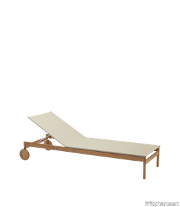
Pelagus has a graceful contemporary expression that sits lightly in nature and holds its own in urban environments. The collection is high on comfort and versatility. It is furniture that suits a lifestyle as diverse as that lived in urban cosmopolitans or far from the city and grounded in nature. Designed in collaboration with Stockholm-based Note Design Studio. Pelagus Sunbed is made for total relaxation and aesthetic pleasure derived from its distinctive yet understated design language. Supremely comfortable and flexible, the sunbed can be set into five positions for lying down, reclining or sitting. The well-crafted 100% FSC-certified teak frame is expressive yet simple, its archetypal wooden wheels making it easy to move and follow the sun. The weatherproof Sling textile seat brings a modern edge with its lightness and transparency. For extra comfort, add up to two armrests in 100% FSC-certified teak.
Flag
illoft > Styling
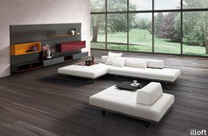
Flag is a modular system for furnishing different spaces in the home with a precise, geometric design that can stretch across an entire wall. The idea behind this project was inspired by the characteristic flared shape of the backboards into which the modules are locked, accessories are attached, and the lighting is positioned for the tops of the individual panels to create an evocative interplay of contrasts between light and shadow. The shape combined with quality finishes makes this modular system absolutely unique. Designed by Arch. Giuseppe Viganò - Studio Viganò
Low table Kat

tonellidesign > Coffee table
Designed by designer and architect Karim Rashid for Tonelli Design, the cocktail table Kat is made of three panels that optically seem to cross each other, creating an optical illusion of volume. This low table is made with three different kinds of glass: smoked, frosted and transparent. Kat is a cocktail table of top design, it has a glass crossing base with rounded edges that adapts perfectly to the more luxurious environments, to living rooms and living areas, but also studios of high profile.
Wall Panels - PlantPanel
amacoustics > Styling
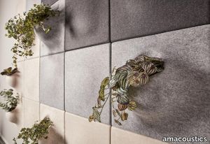
PlantPanel vertical hanging panels for wall. Mounted on wall with strip, suspension included. Pot included. Available in several colours. Delivered individually. Designed by o4i Design Studio.
Table Bacco

tonellidesign > Table
The glass table Bacco is composed of a top available in transparent, extra clear or smoked glass and of a base made of two mirroring glass supports that rest on the floor. Its clean lines are particularly suited for minimalistic decors because they do not burden the environment. The transparency makes the room brighter and creates a broader effect. Perfect for luxury studios and offices, dining rooms and lounges, the glass table Bacco can be ordered in different sizes according to needs. The glass of this designer table is resistant and tempered, which makes it also suitable for working areas and dining rooms.
Qatego Vanity unit wall-mounted
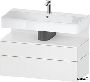
duravit > Washbasin cabinet
Number of pull-out compartments: 1, Number of drawers: 1, Number of open compartments: 1, Without handle, Soft self-closing automatic with damping, Tip-on fitting, Niche lighting Optional, Lay-in compartment Optional, Necessary articles: Washbasin Qatego # 238210 Design by Studio F. A. Porsche
Qatego Wall-mounted toilet
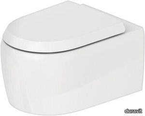
duravit > Toilet seat
Flush water quantity: 4,5/3 l, Washdown model, Flushing rim: Rimless, Flush principle: Displacement, Outlet drain horizontal, Incl. invisible fixation, UWL-class: 1 Design by Studio F. A. Porsche
Cupboard Shoji Cabinet
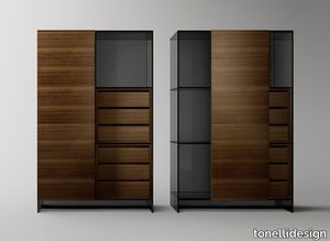
tonellidesign > Cabinet
Designed by Isao Hosoe and Lorenzo De Barolomeis, the Shoji cabinet is a glass cupboard in two heights. The structure of the storage furniture in extra clear or smoked glass has a sliding door with several finishes of mirror, wood or ceramic, that make it a very sophisticated element. The modern Shoji Cabinet can be placed in several environments, from the living room to the sleeping area, from hallways to studios. Depending on its use it can be accessorized with wooden drawer unit or hanging rod. Because of the sliding door it saves space and can store objects in the transparent parts, therefore at sight, or hidden behind the closed door.
Pelagus Lounge Chair
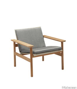
fritzhansen > Chair
Pelagus has a graceful contemporary expression that sits lightly in nature and holds its own in urban environments. The collection is high on comfort and versatility. It is furniture that suits a lifestyle as diverse as that lived in urban cosmopolitans or far from the city and grounded in nature. Designed in collaboration with Stockholm-based Note Design Studio. Add extra softness and comfort on the Pelagus Lounge Chair, with the Pelagus Lounge Chair Cushion. Covered in a weatherproof and durable fabric, the cushion is filled with a resilient quick-dry outdoor foam filling that provides firm and comfortable support that remains the same year after year. Please note that a different version is available to meet the fire regulations in the UK market. These cushions are upholstered with FR cold foam, which is not weather resistant.
MVV

marset > Ceiling lamp
The MVV story begins in the 1970s. This new suspension lamp is a first, and was designed by Manuel Valls Vergés, one of Spain’s most notable architects at the time and partner of Jose Antonio Coderch for 15 years, alongside whom he undertook such prominent projects as the Ugalde house, near Barcelona. The MVV name reflects Vergés’ initials, as a way of displaying his authorship of this unique lamp. That was the desire of his grandson, also an architect, and of his partners in the Two-bo studio. Pablo, María and Alberto rescued this lamp 45 years later.Marset, acting as a bridge in time, took the original design —an octagon with overlapping sheets— and updated it by giving it a dual skin: cherry wood on the outside of the sheets and a white colour inside to enhance the light quality. The measurements are the same as the original’s —45 cm— and the interior structure, which was originally made of iron, is now polycarbonate, which makes it lighter. Through the use of wood, the MVV yields an exceptionally warm light. An understated, rational and eminently geometric lamp —the MVV is like a construction site, in which the direct, down-facing light is complemented by indirect light that filters through the sheets. A design that, though timeless, reflects the constructive logic of that period and evokes a great many memories.
Bolita
marset > Table lamp
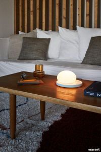
In such a digital era as today’s, when you can buy anything with just a click and read by swiping a finger, we sometimes miss something as human as a touch, and everything that entails. The Bolita lamp beckons you to touch it to adjust it.Its structure is as simple as it is magical: a rounded surface that houses an LED located on a central axis, and an overlapping glass sphere that when moved, creates an eclipse effect. Moving the Bolita dims or boosts the light, an interplay that captivates with its beautiful visual effect. Bolita seeks out that user interaction. The idea of Florian and Sebastian at the kaschkasch studio was to design a lamp in which the dimming process was mechanical and not electronic. A technologically innovative design that brings back the sense of touch.
Elixir
illoft > Coffee table
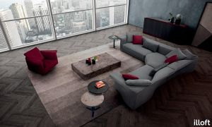
Low tables featuring many different facets and uses; the essentiality of the lines is complemented by the sophistication of the materials. Outer simple volumes and clean shapes unleash inner sinuous waves. Two seemingly different worlds come together as one through a fusion of different materials to add a touch of elegance. Metal sled feet add momentum and lightness. Designed by Arch. Giuseppe Viganò - Studio Viganò
Sky Dune
amacoustics > Panels
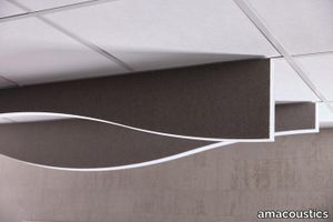
Sky effectively absorbs sound waves that spread in a room, as well as creating a furnished feeling in the room. Through its design, you can create nice patterns and the absorbents can be added to endlessly. Sky is available in 4-pack. Suspension is added. Note that selection of attachment type must be specified. Designed by o4i Design Studio.
Table Metropolis

tonellidesign > Table
Created by architect and designer Giuseppe Maurizio Scutellà, the designer table in glass Metropolis is part of a collection of furniture featuring a base in extra clear or smoked glass. The top resting on the base, instead, is available in ceramic+glass finish Pietra di Savoia anthracite bocciardato, Noir Desir polished or matt, Emperador polished or matt, Calacatta oro venato polished, Pietra grey polished or matt, Sahara Noir polished or bocciardato. This table thought for settings such as studios, dining rooms and living areas, is also available with glass top in different sizes. Perfect to make a setting minimalistic and give a classy touch to the style.
Airstrike
illoft > Chair
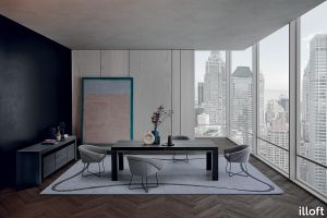
AIRSTRIKE is inspired by a symbol taking shape, like a knot in a ribbon. A well-rounded collection: an oval-shaped armrest forms the genesis for the backrest. The soft, eye-catching lines are welcoming and comfortable with an incredibly cosy yet creative look. The grandeur of the padding is a perfect match for the lightness of the metal base that embellishes the entire project. The collection includes a sofa, pouffe, chair, stool, and an armchair designed with a swivel or fixed base. Designed by Arch. Giuseppe Viganò - Studio Viganò
Octopus Side Table Olive
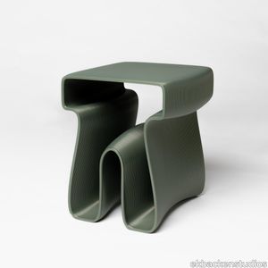
ekbackenstudios > Side table
The Octopus side table has a playful organic silhouette that makes a fun addition to any room. The delightfully distinct multi-purpose piece of furniture acts as a side table, storage, seat, and stand for flowers and green plants. Despite the playful silhouette, the table gives a sophisticated impression thanks to the material. The table is constructed by 3d-printing in Penylon, a unique material developed by Peniche Ocean Watch in collaboration with Ekbacken Studios. Penylon is made of recycled fishing nets mixed with stone particles.
Qatego Built-in basin with console vanity unit
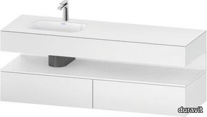
duravit > Washbasin cabinet
Number of pull-out compartments: 2, Without handle, Tip-on fitting, Niche lighting Optional, Incl. vanity basin, Overflow: Yes, Tap hole platform: No, Incl. faucets: No Design by Studio F. A. Porsche
Nightside
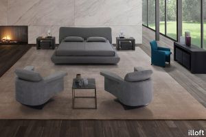
illoft > Bed frame
A cool, young bed that breaks with convention and strict design rules. The flared shape of the bed base gives the bed an original look as does the uneven shape of the headboard, which adds a sense of movement and immense feeling of comfort. Designed by Arch. Giuseppe Viganò - Studio Viganò
Leather Accessories by Giobagnara
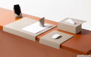
pietboon > Styling
We established a new collaboration with GIOBAGNARA. This collaboration resulted in a wide range of carefully designed products for the office that seamlessly complement each other. Refinement, functionality and timelessness characterize the authentic and distinctive design philosophy of our collection. The interplay of these designs underline the Studio Piet Boon and Giobagnara experience as a whole and add an exclusive signature to each space. Accessories like our picture frames add a touch of class and provide an appealing atmosphere.
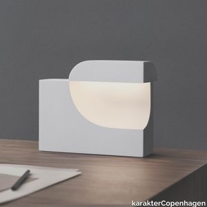
Moby 1 Birgitte Due Madsen,Jonas Trampedach, 2015
karakterCopenhagen > Table lamp
Moby is an extraordinarily sculptural table lamp. Filled with intriguing contrasts, it balances a soft and comforting light with a striking, futuristic design. The void in the main element creates a small cap in which the light source is enclosed. When Moby is on, the soft light unfolds and illuminates the cavity, immediately drawing the attention to the organic curves. In 2016, Birgitte Due Madsen and Jonas Trampedach received the prestigious Silver Hetsch medal for Moby, the highest recognition available from the Danish Art and Crafts Movement of 1879. The two designers run separate studios in Copenhagen, but their collective fondness of the soft, delicate plaster material, typically used for fine art and prototypes, led to this collaboration and the creation of Moby. The lamp was originally cast in plaster, but has now been translated into a durable matte acrylic material with a similar silky-smooth expression.
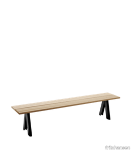
Overlap Bench
fritzhansen > Bench
Overlap series stands strong on its overlapping steel legs. Thanks to the rustic wooden planks and the powder-coated steel, the collection has a modern edge and contemporary appeal. Perfect for both indoor and outdoor use. Overlap is designed in collaboration with Swedish architecture studio, TAF. Overlap Bench is a simple high-quality bench characterised by its distinctive overlapping steel legs and Western Red Cedar seat. Sturdy and durable with contemporary elegance, Overlap is a wonderful choice for both outdoor and indoor use. The lightness of Western Red Cedar makes it easy to move around in the garden or terrace.
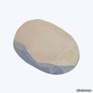
Jardin Oval Platter
abchome > Styling
Exclusively at abc, this new collection from Jan Burtz is inspired by spring gardens filled with soft hues of green, lavender, and sand. Reminiscent of lily pads, fresh florals, and natural elements, each piece of this summer-inspired dinnerware is made by hand from creamy porcelain and a homemade glaze. This artisanal dinnerware set features irregular, organic forms that bring us back to the basics, accentuating the fluidity and grace of hand-formed wares. Made in Jan Burtz's Connecticut studio, no two pieces are alike, though all are food, dishwasher, and microwave-safe.
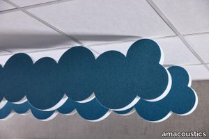
Sky Cloud
amacoustics > Panels
Sky effectively absorbs sound waves that spread in a room, as well as creating a furnished feeling in the room. Through its design, you can create nice patterns and the absorbents can be added to endlessly. SHORELINE is available in 4-pack. Suspension is added. Note that selection of attachment type must be specified. Designed by o4i Design Studio.