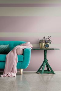
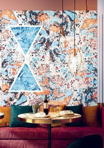
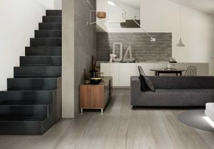
Plimatech Plimagray/02
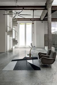
florim > Wall tile-stone-brick
<p>The inspiration for Florim's Plimatech Architectural design comes from high up in the Martell Valley of the Alto Adige region.</p> <p>The aesthetic heterogeneity characteristic of natural stone is captured in the collection through three graphic variants. 01, the most minimalist is softly veined and, especially in the large format, is particularly appropriate to confer character on architecture of more essential taste. 02 has a more variegated appearance, with slight shading tending towards white, designed to add a rough, textural touch to spaces. Finally, 03 is characterized by a high number of crystalline formations that give it a wavier line, ideal for design contexts that, between interior and exterior spaces, pursue a dialogue with the surrounding natural environment.</p> <p> </p> <p>In addition to this, the range of decorations is completed with the 30x60 wall module and 30x60 3D wall module, both proposed for the graphic variant 02 in all colors.</p>
Antique Marble Pantheon Marble_06

florim > Wall tile-stone-brick
Six essences inspired by the beauty of marble become stylistic shades to create modern and functional environments The collection is available in various finishes and sizes suitable for private spaces and the light commercial world with shades that go from white to beige, from grey to desaturated black.
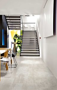
Floortech FLOOR 2.0
florim > Wall tile-stone-brick
A modern evolution of space <p>The stone effects for floor and wall applications proposed within this collection are intended to continue the research path of Architectural Design in a dynamic of constant challenge and experimentation, returning a strong and personal design that gives life to forms of dwelling.</p>
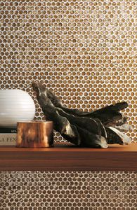
Gold Gold

florim > Floor tile-stone
<p>A precious ingredient enhances the surfaces. It is the gold sheet taken from the past as an ancient form of decoration.</p> <p>Used at the service of plasters and valuable furniture, Gold allows you to adorn the environments, providing even more precious prestige and becoming a decorative furnishing itself, transversely integrating with Florim collections. Emotion, light and seductive wealth describe the essence of Gold, an expression of beauty with strong bonds between tradition and modernism.</p>
Neutra 6.0 09 oliva
florim > Wall Paint
After a decade of success, the Neutra collection becomes a container of colors and increasingly advanced materials and transforms into Neutra 6.0. The surfaces thereby create scenery for pure sensory pleasure, where nothing is left to chance, but everything is always skillfully calibrated to the search for a new bon ton where the body and mind can be rejuvenated. The perfect integration between man and the space in which he lives is expressed through a simple architecture where you can spread your artistic sign on the surfaces, in the colors and in the furnishing for an unrepeatable result from which your own creative identity emerges.
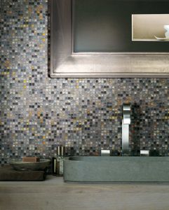
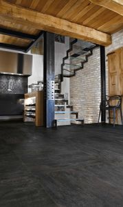
Rock Salt Danish Smoke

florim > Floor tile-stone
<p>With Rock Salt, it's possible to create comfortable spaces where you can find peace away from the frenzy of daily life </p> <p>The range offers 5 different chromatic variations enriched with desaturated, deep, and defined veining. Fresh shades, like that of the white, gray, and sage colors, are accompanied by warmer tones, like the dove gray and red, returning the allure of the luster or tactile materiality of natural crystals, depending on their finish.</p>
I Filati San Marco Ambra
florim > Carpet
From the art of fabric, to enveloping spaces From lampas and jacquard, all the way to the simplest silk fabrics, from rich, baroque motifs to more optical, geometric patterns, all of these fabrics share an extremely natural look. The collection's nine surfaces are inspired by Rubelli's signature precious fabrics that, in turn, are born from the contemporary reworking of several decorative motifs coming from the noble Venetian heritage of weaving.<br />
I Classici Statuario

florim > Floor tile-stone
<p>"I Classici" is born as a developing container, ready to welcome new inspirations.</p> <p>A bold proposal comes from the ever attentive observance of those who watch the latest trends. <em>I Classici</em> provides great personalization to the space, a play of strong contrasts to create an uncompromising design. The rigid purity of the marble blends with the varnished effect of a modern wood.</p>
Crayons Milk
florim > Synthetic Floor
<p>Color and design through Contemporary Design's characteristic fresh and functional approach.</p> Eight pastel shades, designed to create both lively and balanced compositions, harmonize with each other and with the context. It moves from the dusty 1950s-inspired hues of dove-gray, hazelnut, pink, faded yellow and sky blue to the more decisive shades of dusty gray and moss green, all perfect for creating spaces with both retro style and contemporary character.
Nature Mood RAINFOREST
florim > Wall tile-stone-brick
Marble and wood blend in a refined creative mood board. In line with the latest trends in housing evolution, Nature Mood conceives of Nature not only as a model, but also as a true mentor and gauge of human endeavor, something from which to acquire knowledge and with which to give life to increasingly environmentally friendly designs. <p>In this collection, Nature becomes an active component of design, mixing a palette of surfaces with warm hues that take their inspiration from the world of marbles and the material of wood, with clean, minimalist veining and an array of colors. The upshot is the attainment of elegant spaces that flow between interior and exterior, enhancing the presence of light so as to bestow a sensation of immersion in the natural environment at all times. The marble surfaces in the collection bring a new perspective to some of the most enchanting landscapes and natural binomials to be found on earth.</p> <p> </p> <p class="MsoNormal"><strong>COLORS AND DECORS</strong></p> <p class="MsoNormal"><span lang="EN-US" style="mso-ansi-language: EN-US;">The verdant backdrop of Rainforest is redolent of the vegetation of tropical woods, with thin brown veins that evoke the bark of a tree.</span></p> <p class="MsoNormal"><span lang="EN-US" style="mso-ansi-language: EN-US;">Glacier conjures up the whiteness of glaciers with delicate crests of light and dark gray.</span></p> <p class="MsoNormal"><span lang="EN-US" style="mso-ansi-language: EN-US;">Mountain Peak is inspired by the varied appearance and warm colors of mountain ranges in the summertime.</span></p> <p class="MsoNormal"><span lang="EN-US" style="mso-ansi-language: EN-US;">Tundra recalls the alternation of earth, shrubbery and snowfall that characterizes the homonymous Arctic polar environmental system.</span></p> <p class="MsoNormal"><span lang="EN-US" style="mso-ansi-language: EN-US;">And lastly, Riverbed is reminiscent of a gravelly river bottom with its multiplicity of stones smoothed by the flowing water.</span></p> <p class="MsoNormal"><span lang="EN-US" style="mso-ansi-language: EN-US;">The Planks 01, 02, 03, 04, 05 and 06 surfaces are the most combinable elements in the collection. Conceived as a color palette of woods with a clean, minimalist style, the Planks can generate different mood boards depending on the marble-effect surfaces with which they are juxtaposed, taking up the nuances of the veneers and affording the designer the option of personalizing both the interior spaces and the exterior shells of the buildings in accordance with his or her own creative taste.</span></p> <p class="MsoNormal"><span lang="EN-US" style="mso-ansi-language: EN-US;">The range of backgrounds is enriched by five 6 mm thick fine porcelain stoneware decors that combine the colors of different wood-inspired surfaces.</span></p> <p class="MsoNormal"><span lang="EN-US" style="mso-ansi-language: EN-US;">Hexagon offers a combination of 3 six-sided polygons, each of which in turn is divided into two different shades of wood. The composition is designed in two versions, the first combining the warm hues of Planks 01, 02 and 03, the second blending the cooler colors of Planks 04, 05 and 06.</span></p> <p class="MsoNormal"><span lang="EN-US" style="mso-ansi-language: EN-US;">French Herringbone immediately recalls the classic laying pattern for parquet flooring, in this case reformulated as an embellishment that alternates small slats in two colorings. The composition is available in two versions, one of which combines the amber shades of Planks 01 and 02, the other of which unites the gray tones of Planks 05 and 06.</span></p> <p class="MsoNormal"><span lang="EN-US" style="mso-ansi-language: EN-US;">Stripes offers an alternation of small strips in two colors. In this case, too, the range grants the designer the option of choosing between two variants, one that juxtaposes Planks 01 and 02, and one that combines Planks 05 and 06.</span></p> <p class="MsoNormal"><span lang="EN-US" style="mso-ansi-language: EN-US;">Strip consists of a plank with thin and elongated lines available in all the colors in the collection.</span></p> <p class="MsoNormal"><span lang="EN-US" style="mso-ansi-language: EN-US;">Finally, Chevron recalls the homonymous pattern of timeless charm. Here again the decor is offered in all 6 wood-effect colors of the collection.</span></p>
Nature Mood PLANK 06
florim > Floor plank
Marble and wood blend in a refined creative mood board. In line with the latest trends in housing evolution, Nature Mood conceives of Nature not only as a model, but also as a true mentor and gauge of human endeavor, something from which to acquire knowledge and with which to give life to increasingly environmentally friendly designs. <p>In this collection, Nature becomes an active component of design, mixing a palette of surfaces with warm hues that take their inspiration from the world of marbles and the material of wood, with clean, minimalist veining and an array of colors. The upshot is the attainment of elegant spaces that flow between interior and exterior, enhancing the presence of light so as to bestow a sensation of immersion in the natural environment at all times. The marble surfaces in the collection bring a new perspective to some of the most enchanting landscapes and natural binomials to be found on earth.</p> <p> </p> <p class="MsoNormal"><strong>COLORS AND DECORS</strong></p> <p class="MsoNormal"><span lang="EN-US" style="mso-ansi-language: EN-US;">The verdant backdrop of Rainforest is redolent of the vegetation of tropical woods, with thin brown veins that evoke the bark of a tree.</span></p> <p class="MsoNormal"><span lang="EN-US" style="mso-ansi-language: EN-US;">Glacier conjures up the whiteness of glaciers with delicate crests of light and dark gray.</span></p> <p class="MsoNormal"><span lang="EN-US" style="mso-ansi-language: EN-US;">Mountain Peak is inspired by the varied appearance and warm colors of mountain ranges in the summertime.</span></p> <p class="MsoNormal"><span lang="EN-US" style="mso-ansi-language: EN-US;">Tundra recalls the alternation of earth, shrubbery and snowfall that characterizes the homonymous Arctic polar environmental system.</span></p> <p class="MsoNormal"><span lang="EN-US" style="mso-ansi-language: EN-US;">And lastly, Riverbed is reminiscent of a gravelly river bottom with its multiplicity of stones smoothed by the flowing water.</span></p> <p class="MsoNormal"><span lang="EN-US" style="mso-ansi-language: EN-US;">The Planks 01, 02, 03, 04, 05 and 06 surfaces are the most combinable elements in the collection. Conceived as a color palette of woods with a clean, minimalist style, the Planks can generate different mood boards depending on the marble-effect surfaces with which they are juxtaposed, taking up the nuances of the veneers and affording the designer the option of personalizing both the interior spaces and the exterior shells of the buildings in accordance with his or her own creative taste.</span></p> <p class="MsoNormal"><span lang="EN-US" style="mso-ansi-language: EN-US;">The range of backgrounds is enriched by five 6 mm thick fine porcelain stoneware decors that combine the colors of different wood-inspired surfaces.</span></p> <p class="MsoNormal"><span lang="EN-US" style="mso-ansi-language: EN-US;">Hexagon offers a combination of 3 six-sided polygons, each of which in turn is divided into two different shades of wood. The composition is designed in two versions, the first combining the warm hues of Planks 01, 02 and 03, the second blending the cooler colors of Planks 04, 05 and 06.</span></p> <p class="MsoNormal"><span lang="EN-US" style="mso-ansi-language: EN-US;">French Herringbone immediately recalls the classic laying pattern for parquet flooring, in this case reformulated as an embellishment that alternates small slats in two colorings. The composition is available in two versions, one of which combines the amber shades of Planks 01 and 02, the other of which unites the gray tones of Planks 05 and 06.</span></p> <p class="MsoNormal"><span lang="EN-US" style="mso-ansi-language: EN-US;">Stripes offers an alternation of small strips in two colors. In this case, too, the range grants the designer the option of choosing between two variants, one that juxtaposes Planks 01 and 02, and one that combines Planks 05 and 06.</span></p> <p class="MsoNormal"><span lang="EN-US" style="mso-ansi-language: EN-US;">Strip consists of a plank with thin and elongated lines available in all the colors in the collection.</span></p> <p class="MsoNormal"><span lang="EN-US" style="mso-ansi-language: EN-US;">Finally, Chevron recalls the homonymous pattern of timeless charm. Here again the decor is offered in all 6 wood-effect colors of the collection.</span></p>
Matières Gris

florim > Floor tile-stone
A perfect balance of elegance and craftsmanship finds room in a collection with vast stylistic versatility <p>A perfect balance of elegance and craftsmanship finds room in a collection with vast stylistic versatility Matières is a perfect surface for modern and trendy environments, conserving all the class to adorn even the oldest and most memory-rich spaces.</p> </strong>The colour selection offers six modern shades which, combined with one another, suggest interesting decorative compositions. A wide range of large sizes extends the collection's range of applications both in traditional uses and in furnishing complements. A specific range for outdoor spaces provides two brand new sizes to allow decorative continuity between the indoor and outdoor spaces. A return to the small size with a rustic style and crafted edges returns the sense refinement and detail that is so characteristic of the ceramic tradition, modernising it in new uses such as, squares, public spaces and driveways.
Prexious Pearl Attraction

florim > Wall tile-stone-brick
Six stone essences, rare, precious and extraordinarily elegant make their substance available to become icons of exclusivity. The harmonious development of the design that is unveiled by placing the large surface sheets alongside one another is another distinguishing factor, as are the precious surface finishes, glossy and bright or delicately satin-finished.
I Filati Goldfinger Granata
florim > Carpet
From the art of fabric, to enveloping spaces From lampas and jacquard, all the way to the simplest silk fabrics, from rich, baroque motifs to more optical, geometric patterns, all of these fabrics share an extremely natural look. The collection's nine surfaces are inspired by Rubelli's signature precious fabrics that, in turn, are born from the contemporary reworking of several decorative motifs coming from the noble Venetian heritage of weaving.<br />
Neutra 6.0 13 corallo
florim > Synthetic Floor
After a decade of success, the Neutra collection becomes a container of colors and increasingly advanced materials and transforms into Neutra 6.0. The surfaces thereby create scenery for pure sensory pleasure, where nothing is left to chance, but everything is always skillfully calibrated to the search for a new bon ton where the body and mind can be rejuvenated. The perfect integration between man and the space in which he lives is expressed through a simple architecture where you can spread your artistic sign on the surfaces, in the colors and in the furnishing for an unrepeatable result from which your own creative identity emerges.
Matrice Rilievo
florim > Wallcovering
An atlas of modular signs to be combined in a wide variety of layouts. «We love concrete as a material, its versatility and its plain, austere look. We have completed our carefully designed surfaces with graphic patterning inspired by the human actions of weaving and embroidering.» Barbara Brondi & Marco Rainò To appreciate the profundity of the design project undertaken by Barbara Brondi and Marco Rainò for Cedit, it is both necessary and explanatory to start from the title the collection bears. In modern usage the term Matrice, in Italian, refers to a die or mould used to reproduce an object, but its origins are much more remote, with a meaning closer to the English “matrix”, meaning the underlying basis of something. The root of the word is related to Mater or mother: the name Matrice thus relates to the origin or cause of something. This dichotomy is expressed in several levels within the work of these architects, who study the world from a sophisticated conceptual approach and then transform it into a design. Starting from the idea of ceramic coverings, which have always been a tool not so much of architecture as of interior design, the artists work back to the origin of the surface and its decoration within their own discipline: they look at what we used to call the modern age, where modernity has also brought an uncompromising brutality, and where the use of bare concrete became the statement of an attitude to life with no time to spare for manners. Concrete is originally a liquid material, intended for shaping, which can therefore absorb and retain any type of mark created by the material and mould used to form it. Architects midway between rationalism and brutalism have used the rough-and-ready language of concrete combined with a last, elegant, anthropic decorative motif impressed on the material, that makes the concept of covering superfluous, because its place, in its older meaning of decoration rather than functional cladding, is taken by the regular patterning created in the material itself. There are therefore various grounds for believing that, in this collection, the artists are once again working in architectural terms. Firstly, with a simplicity typical of BRH+, they reduce the initial concepts to their minimal terms. So although this is a collection of coverings for walls, indoor floors, outdoor pavings and curtain walls, a great deal of time was spent on destructuring the idea of the ceramic covering itself. Unfortunately, nowadays there is no space in the contemporary construction sector for the radical approach of the past, so the cladding designed for the building actually lays bare the interior, using the choice of material – accurately interpreted (with shade variation) on the basis of an assortment of various types – to restore visual elegance and a fundamental severity. Attention to scale is another architectural feature: Matrice offers modules with architectural dimensions and different sizes through the development of “large slabs”, eliminating the visual regular grid effect. Thanks to this visual reset, geographic forms are perceived to emerge from dense, grey concrete surfaces decorated as in bygone days by special processes and by weathering during drying. The various types of slab, each an atlas of subtle, vibrant signs on the surfaces, comprise finishes that reproduce the visual effect of reinforced concrete – with the aggregates in the cement more clearly visible, of formwork – with the signs impressed on the concrete by the timber used, of a structured surface resembling bare cement plaster, of ridged and streaked surfaces – with patterning resembling some kinds of linear surface finishing processes – and finally a smooth, or basic version, over which Matrice exercises the dichotomy referred to earlier. It is on these surfaces that Brondi and Rainò have imagined additional design reverberations, a figurative code that rejects the concept of the grid, previously inseparable from that of the module: by means of a vocabulary of graphic marks cut into the slabs with a depth of 3 mm (the width of the gap left between modules during installation), they provide a framework for infinite combinations of possible dialogues. Just as in embroidery, which is based on grids of stitches and geometric repetitions, and where every stitch is at right-angles to another one to construct forms and decorations. Also taken from embroidery is the idea of introducing a degree of “softness” to reduce the stiffness of intentionally deaf surfaces. There is the impression of patterns that can continue for infinity, as in textile weaving, and a scale that, unlike the surface being worked on, is imagined as suspended and lightweight. They may not admit it, but BRH+ know a lot about music, including electronic music, and it appears to me that this organised tangle of infinite signs – unidentifiable without an overview – is rather like the representations of synthesized sounds. Sounds that are produced by machines, and thus “woven” by sampling and overlapping sounds of the most unlikely origins, combined to form jingles which, once heard, are imprinted indelibly on the brain. This may be why I am so interested in the space between this “melodic film” and its deaf, damp substrate. The eyes can navigate this suspended reality without fear of disturbance. So we are faced with different surfaces, different sizes and different graphic signs. But only one colour (surprise!) to prevent a cacophony not just of signs but also of possible interpretations: the artists retain their radical principles (and their generosity), and as curators, a role in which they are skilled, they leave the players (architects and installers) to add their own interpretations. In their hands this colour, expressed in Matrice, will produce motifs on surfaces in living spaces for someone else. This stylish covering and its workmanship will be left to the hands of someone who will probably never read this, but will be on a building site, with the radio playing on a stereo system, concentrating on installing the very pieces we describe. So a radical, apparently silent, design project like this has repercussions for the real world we live in. Matrice has no form of its own but merely acquires the ornamentation drawn on its surfaces by a second group of artists. And here this routine action, standardised by the form approved for production and workmanlike efficiency, is the origin and cause of change, generating a variability of choices and interpretations, on that dusty building site where music plays and mortar flows.
Earthtech CARBON_FLAKES
florim > Wall tile-stone-brick
From an ancient past to a responsible future <p>The collection injects new life into the earth through a sustainable production process, with a strong focus on green management, to offer the architect an exceptional technical and aesthetic performance in compliance with the socio-environmental context and the latest eco-friendly building needs. With EARTHTECH earth becomes “technical earth” with a highly innovative content, offering new solutions to green architecture and fulfilling the new frontiers of circular economy in construction, guaranteeing a sustainable future. <br />EARTHTECH offers a choice of organic textures to observe and touch, thanks to the wide range of finishes (Comfort, Glossy-Bright and structured) which add a tactile and unexpected perceptive dimension for use in all types of application. <br /><a class="btn arrow" href="https://www.florim.com/en/surfaces/the-new-comfort-surface/"> Discover the new Comfort surface </a></p> <p>EARTHTECH/ is also a return to the origins of the Florim brand through a full body technical product that blends surface and thickness and derives from the spontaneous mixing of carefully pre-selected fragments and pigments of different shades which give the material a unique, one-of-a-kind visual effect in each slab, mimicking the amazing variety of colours and elements in nature. The result is a composite product with a textured design, in which the flakes and aggregate grains create an original mélange effect that is vitrified during firing, producing a robust, high-quality and exceptionally strong and wear-resistant product; one which can be used in any type of building setting and weather conditions, even the harshest.</p>
Earthtech PUMICE_GROUND
florim > Wallcovering
From an ancient past to a responsible future <p>The collection injects new life into the earth through a sustainable production process, with a strong focus on green management, to offer the architect an exceptional technical and aesthetic performance in compliance with the socio-environmental context and the latest eco-friendly building needs. With EARTHTECH earth becomes “technical earth” with a highly innovative content, offering new solutions to green architecture and fulfilling the new frontiers of circular economy in construction, guaranteeing a sustainable future. <br />EARTHTECH offers a choice of organic textures to observe and touch, thanks to the wide range of finishes (Comfort, Glossy-Bright and structured) which add a tactile and unexpected perceptive dimension for use in all types of application. <br /><a class="btn arrow" href="https://www.florim.com/en/surfaces/the-new-comfort-surface/"> Discover the new Comfort surface </a></p> <p>EARTHTECH/ is also a return to the origins of the Florim brand through a full body technical product that blends surface and thickness and derives from the spontaneous mixing of carefully pre-selected fragments and pigments of different shades which give the material a unique, one-of-a-kind visual effect in each slab, mimicking the amazing variety of colours and elements in nature. The result is a composite product with a textured design, in which the flakes and aggregate grains create an original mélange effect that is vitrified during firing, producing a robust, high-quality and exceptionally strong and wear-resistant product; one which can be used in any type of building setting and weather conditions, even the harshest.</p>
Tesori Lino bianco

florim > Wallcovering
East and West, a synthesis archieved through Italian taste. «My work often takes me to far-off lands, also remote in terms of their culture and traditions. Even without my being aware of it, I then metabolise these traditions and include them in the designs I subsequently produce.» Matteo Nunziati <p>"It is the architect's task to create a warm, livable space. Carpets are warm and livable. He decides for this reason to spread one carpet on the floor and to hang up four to form the four walls. But you cannot build a house out of carpets. Both the carpet and the floor and the tapestry on the wall required structural frame to hold them in the correct place. To invent this frame is the architect's second task."When Adolf Loos wrote his revolutionary essay on the "principle of cladding" in 1898, architecture was just entering the modern age. Building meant imagining structures capable of putting together different materials, but, Loos affirmed, it must also respect their individual characteristics. "Every material possesses a formal language which belongs to it alone and no material can take on the forms proper to another", the Austrian master therefore maintained. And there is no doubt that the spirit of these words extended throughout most Twentieth Century architecture, regardless of its location or style. When we look at Matteo Nunziati's designs for the CEDIT Tesori collection, we seem to be seeing geometrical purity and attention to detail at the service of a new "truth" of material. Because Matteo Nunziati views ceramics as a form of fabric.<br /> The woven patterns he imagines for the various styles in his collection "“ from Arabian to damask to more geometrical motifs "“ constantly seek to provide the soft, iridescent look of time-worn linen. In them, ceramics are raised from the status of poor relation of marble to become a luxury wall covering in their own right: almost a wallpaper, suitable however for both floors and walls, and an absolutely versatile material. No longer only for beautifying bathrooms, they can create new moods in every room of the house (and elsewhere) starting from the living-room. Naturally, the revolution has been mainly technological. The large slabs produced by CEDIT are more than 3 metres tall, and since they eliminate the serial repetition typical of conventional tiles, they generate a new relationship between the surface and its decoration. However, Nunziati does not use this to create, artist-like, a more eye-catching decorative composition that emphasises the slab's dimensions. Quite the opposite; the patterns he offers us attempt to break down what is left of the boundaries between substrates. In particular, the Arabian and damask styles, in the version with "timeworn" patterning, convey the idea of the ceramic slab as an abstract, almost non-existent material which melts into the decorative motif applied to it, in a kind of pure wall covering.<br /> Through the patient selection of geometrical motifs and tests to verify their suitability for application to ceramic slabs, Nunziati aims to achieve a new material rather than a mere decoration, making this clear by also exploring its tactile dimension, with gouged and relief motifs. His "principle of coverings" therefore relates to ceramics' essence rather than their image: highlighting the versatility which, as we all know, has made ceramics an absolute material, a kind of cement that incorporates structure and finish in a virtually infinite range of applications. This is clearly indicated by the reference to the mashrabiya, a term meaning place where people drink in Arabic, which in Arabian architecture originally referred to the kind of veranda where people used to meet and rest, and over time has come to mean the wooden gratings that screened these places from the sun. Inspired by his trips to the Middle East, for Nunziati the geometric patterns of the mashrabiya become both an outline of his method of work and the form of what in fact becomes the key element in a new idea of space: a real location conceived around a strong, livable surface in which physical substance and decoration overlap to the point where they merge.</p>
Araldica Base Grigio
florim > Wall Paint
The miscellany of bright, contrasting, pure colours. The manifest extroversion of decor. The solutions provided to complete the range are in a different tone: reflecting the desire to "stage" a clear contrast with the multicolour ceramic wall coverings, these slabs are in completely neutral shades, in the grey frequencies of concrete.<br /><br />«The collection is intended to create a struggle, a fight. Between something very stiff, which sees itself as governed by clear rules, and a variable, marbled paper, which aims to be completely free.»<br />Federico Pepe "Once upon a time, there was a Roman emperor who lived on a huge splinter in space, a spaceship of multi-coloured marble, where techno music played incessantly. That day he left his spaceship to go to dinner at the Sun King's home, riding his sinuous golden dragon with blood-red eyes."If there were a book with these opening words, Federico Pepe would have designed its cover. And if the book were made into a film, he would definitely be its writer and director. Federico is not an author, director or screenwriter, but this does not prevent him from drawing on his natural ability to create stories through flashes of imagination.Federico Pepe's career started in advertising, a family tradition, which he gradually transformed and built into many other things, in a constant, inevitable investigation of creativity in all its possible forms. He very soon understood that commission work was not enough for him, and he began to explore further afield. The first of these other fields was art, but the consolidated mechanisms on which galleries and gallery owners operate soon became a new limit from which he had to break free: this apparently expanding horizon turned out to be a restrictive cage, more a defining label than an infinite learning opportunity. And definitions are one of the things which least describe Federico: anyone trying to distil his work into two words would find its essence disappearing before their own eyes. He has occupied many roles and engaged in many professions to give shape to his ideas, and in all of them he has excelled, created and led teams, and won awards. Adman, creative director, graphic designer, printer, gallery owner, publisher, curator, performer, painter, designer, director: Pepe does, rather than is, all these.<br /> He works, builds and makes things happen because he is not led by instinct alone and does not succumb to idle whim; he does not rush aimlessly around and does not simply await the inspiration or idea of the century. Quite the opposite. His work comes about and produces results only thanks to strict self-discipline, a design method made up of constant verification, the precise sharing of tasks and roles, the compulsive exploration of unknown contexts, daily physical exercise, the carefully measured use of social media, and occasional spells of isolation in the mountains he loves. It is no coincidence that he created Le Dictateur, a dual-faced entity which may be both his child and his spiritual guide, both friend and boss, part madness and part dictator. Le Dictateur is not Federico's alter ego: it is his superpower. It is not a mask, since in it he actually transforms himself into an artistic project.Le Dictateur is both result and origin of Federico Pepe's work. "I think ideas are born from predisposition," Federico explained to me in 2014. "Not in the sense that "˜we are born predisposed,' but for daily preparation. In this domain I believe that discipline is pivotal. The real talents today are very rigorous people, those who work hard, exchange a lot, think a lot, and know how to apply and balance many different things." An approach which has made him the best-kept secret on the Italian creative scene, a fact well known not only to Pierpaolo Ferrari, Maurizio Cattelan, Nico Vascellari, Jacopo Benassi and Patricia Urquiola, but also to the companies, both large and small, which have turned to him over the years. He has worked and continues to work with them all, designing by laying the foundations of designs naturally expressed in episodes, in a serial pattern which not only gradually builds up Federico's own creative story, but also offers his clients designs so special that they would be virtually impossible without him.<br /> This self-discipline generates heat and energy in such quantities that "“ if it were not imprisoned within the geometrical grids of graphic design "“ it might generate a thermonuclear reaction. The blood running through the veins of his images is black as ink, red as sealing-wax, white as plaster and golden as lava. But there is more, too. His crystal-clear visions are able to break down the slender membrane which separates analogue from digital. He sees matter as absolutely central, but he makes it vibrate with an unusual two-dimensional quality. This can be seen in the way he carves marble with coloured squiggles, recollections of faces briefly sketched as vectors. It is discovered in the skill with which he invades plates and bowls of the finest, monitor-shiny porcelain with geometrical patterns. It becomes tangible in the love with which he brings to life the paper of his publishing projects, peopled with highly elegant, powerfully symmetrical, often kaleidoscopic graphics. It can be admired in the precision with which a metallic factory flooring becomes fabric on an ancient loom, after its resolution is decreased from 300 dpi to 8 bits. It is enjoyed in the hyperbolic repetition of faces and hands in acrylic on canvas in his painting studio, in which every work conserves copy and paste reminders of its predecessor. It amazes in the doors of exquisite metal sideboards, profane glass panels, hand-made but born through the glass of a screen.<br /> A career which has led almost naturally to an encounter with CEDIT, with whom he has created an aesthetically courageous collection, part punk and part aristocratic austerity. The Araldica project's very name evokes strength and nobility, and it is grounded in a past whose weight does not drag it backwards but rather catapults it forwards into the future. Here, Federico's digital geometries become the most solid of materials, taking shape in a graphic object, condensing stories and images into three or two dimensions. In Pepe's and CEDIT's space, Euclidean geometrical forms encounter the marble of Phidias, the intricate patterns of the floor of Milan Cathedral merge into the Baroque images of the marbles found in Roman art galleries, and private space opens out to the infinite space of a thousand possible universal histories.
Vetro Iridescente
florim > Floor tile-stone
Each tile is unique and extremely precious Vetro allows recognizable and attractive decorations to be created, expressing a timeless design. The Vetro collection is available in seven solid, warm, soft and enchanting colors, in two finishes - matt and lux - and in two sizes or in the metallic variation with varying reflections in a single size. VETRO can be applied as a floor and wall application on any surface in dry or damp areas using special sealants and adhesives.
Tesori Broccato bianco
florim > Wallcovering
East and West, a synthesis archieved through Italian taste. «My work often takes me to far-off lands, also remote in terms of their culture and traditions. Even without my being aware of it, I then metabolise these traditions and include them in the designs I subsequently produce.» Matteo Nunziati <p>"It is the architect's task to create a warm, livable space. Carpets are warm and livable. He decides for this reason to spread one carpet on the floor and to hang up four to form the four walls. But you cannot build a house out of carpets. Both the carpet and the floor and the tapestry on the wall required structural frame to hold them in the correct place. To invent this frame is the architect's second task."When Adolf Loos wrote his revolutionary essay on the "principle of cladding" in 1898, architecture was just entering the modern age. Building meant imagining structures capable of putting together different materials, but, Loos affirmed, it must also respect their individual characteristics. "Every material possesses a formal language which belongs to it alone and no material can take on the forms proper to another", the Austrian master therefore maintained. And there is no doubt that the spirit of these words extended throughout most Twentieth Century architecture, regardless of its location or style. When we look at Matteo Nunziati's designs for the CEDIT Tesori collection, we seem to be seeing geometrical purity and attention to detail at the service of a new "truth" of material. Because Matteo Nunziati views ceramics as a form of fabric.<br /> The woven patterns he imagines for the various styles in his collection "“ from Arabian to damask to more geometrical motifs "“ constantly seek to provide the soft, iridescent look of time-worn linen. In them, ceramics are raised from the status of poor relation of marble to become a luxury wall covering in their own right: almost a wallpaper, suitable however for both floors and walls, and an absolutely versatile material. No longer only for beautifying bathrooms, they can create new moods in every room of the house (and elsewhere) starting from the living-room. Naturally, the revolution has been mainly technological. The large slabs produced by CEDIT are more than 3 metres tall, and since they eliminate the serial repetition typical of conventional tiles, they generate a new relationship between the surface and its decoration. However, Nunziati does not use this to create, artist-like, a more eye-catching decorative composition that emphasises the slab's dimensions. Quite the opposite; the patterns he offers us attempt to break down what is left of the boundaries between substrates. In particular, the Arabian and damask styles, in the version with "timeworn" patterning, convey the idea of the ceramic slab as an abstract, almost non-existent material which melts into the decorative motif applied to it, in a kind of pure wall covering.<br /> Through the patient selection of geometrical motifs and tests to verify their suitability for application to ceramic slabs, Nunziati aims to achieve a new material rather than a mere decoration, making this clear by also exploring its tactile dimension, with gouged and relief motifs. His "principle of coverings" therefore relates to ceramics' essence rather than their image: highlighting the versatility which, as we all know, has made ceramics an absolute material, a kind of cement that incorporates structure and finish in a virtually infinite range of applications. This is clearly indicated by the reference to the mashrabiya, a term meaning place where people drink in Arabic, which in Arabian architecture originally referred to the kind of veranda where people used to meet and rest, and over time has come to mean the wooden gratings that screened these places from the sun. Inspired by his trips to the Middle East, for Nunziati the geometric patterns of the mashrabiya become both an outline of his method of work and the form of what in fact becomes the key element in a new idea of space: a real location conceived around a strong, livable surface in which physical substance and decoration overlap to the point where they merge.</p>
Essential Mood Warm Powder 02
florim > Wall Paint
<p>A sense of essentiality emerges from the visual and tactile sensations fused in this Creative Design collection.</p> <p>The distinguishing features of the Essential Mood design are fluid surfaces, material qualities and full bodies that extend without boundaries, promoting a harmonious flow between spaces and constant interplay between environments and the people in them. It makes places into cosy, reassuring refuges where they can take centre stage.</p> <p><br>Produced for interior design schemes, housing and commercial premises, the collection espouses warm, timeless atmospheres where people can recharge their batteries and get onto the same wavelength as the world around them.<br>Spaces with neutral, comforting colours and natural features come together in a design that underlines the need for everyone to look after themselves and seek revitalizing experiences, now and in the future.</p> <p>The collection is born from a sustainable and virtuous approach and is part of <a href="https://www.florim.com/en/company/sustainability/carbonzero-florim/">CarbonZero</a>, Florim's range of Carbon Neutral surfaces.</p>

Industrial Moka

florim > Wallcovering
A cementitious material in its purest and most rigorous form The proposed decorative system defines balanced compositions of eye-catching organic shapes where the fragmentation of the material becomes an element of creative expression.
Neutra 6.0 10 acquamarina
florim > Wall Paint
After a decade of success, the Neutra collection becomes a container of colors and increasingly advanced materials and transforms into Neutra 6.0. The surfaces thereby create scenery for pure sensory pleasure, where nothing is left to chance, but everything is always skillfully calibrated to the search for a new bon ton where the body and mind can be rejuvenated. The perfect integration between man and the space in which he lives is expressed through a simple architecture where you can spread your artistic sign on the surfaces, in the colors and in the furnishing for an unrepeatable result from which your own creative identity emerges.
Buildtech/2.0 Scarlet
florim > Synthetic Floor
Buildtech/2.0 assures the realization of ever-current projects To the four colors, White, Bone, Mud and Coal in Tinta Unita, Granigliata and Cemento, 10 solid bold colors are being added, only intensifying the "brutality".<br />
Onyx&More Silver Porphyry

florim > Floor tile-stone
Chromatic blends and harmonious contrasts that only nature can bestow <p>Onyx&More explores the unexpected elegance of onyx: refined, luminous, and poetic, naturally embellished with porphyry, an unobtrusive and informal stone material. From nature, mysterious and unpredictable, is born a collection surging with expression that plays with the harmonious contrasts and the chromatic blend that only nature can create. </p>
Wooden Tile wooden Walnut
florim > Floor tile-stone
Neutral colors with a delicate, Nordic inspired design, but also reclaimed wood with strong chromatic contrasts Each location transforms into a refined space capable of recounting stories and emotions. The lightest shades favor timeless styles, providing soft light, whereas the darker shade finishes come out to impress a bold style, playing between combinations of simple geometric lines and new color schemes.
Rawtech Raw-Dust
florim > Synthetic Floor
Where imperfection becomes a distinguishing sign and an essential prerequisite Rawtech is the worn cement effect fine porcelain stoneware where imperfection becomes the distinguishing character of a product with markedly industrial traits. The range of modern colors develops over modular sizes and surfaces that are resistant to the stress of the most complex building applications, meeting the needs of the most sophisticated dwellings with modern style and taste.
Tesori Lino grigio
florim > Wallcovering
East and West, a synthesis archieved through Italian taste. «My work often takes me to far-off lands, also remote in terms of their culture and traditions. Even without my being aware of it, I then metabolise these traditions and include them in the designs I subsequently produce.» Matteo Nunziati <p>"It is the architect's task to create a warm, livable space. Carpets are warm and livable. He decides for this reason to spread one carpet on the floor and to hang up four to form the four walls. But you cannot build a house out of carpets. Both the carpet and the floor and the tapestry on the wall required structural frame to hold them in the correct place. To invent this frame is the architect's second task."When Adolf Loos wrote his revolutionary essay on the "principle of cladding" in 1898, architecture was just entering the modern age. Building meant imagining structures capable of putting together different materials, but, Loos affirmed, it must also respect their individual characteristics. "Every material possesses a formal language which belongs to it alone and no material can take on the forms proper to another", the Austrian master therefore maintained. And there is no doubt that the spirit of these words extended throughout most Twentieth Century architecture, regardless of its location or style. When we look at Matteo Nunziati's designs for the CEDIT Tesori collection, we seem to be seeing geometrical purity and attention to detail at the service of a new "truth" of material. Because Matteo Nunziati views ceramics as a form of fabric.<br /> The woven patterns he imagines for the various styles in his collection "“ from Arabian to damask to more geometrical motifs "“ constantly seek to provide the soft, iridescent look of time-worn linen. In them, ceramics are raised from the status of poor relation of marble to become a luxury wall covering in their own right: almost a wallpaper, suitable however for both floors and walls, and an absolutely versatile material. No longer only for beautifying bathrooms, they can create new moods in every room of the house (and elsewhere) starting from the living-room. Naturally, the revolution has been mainly technological. The large slabs produced by CEDIT are more than 3 metres tall, and since they eliminate the serial repetition typical of conventional tiles, they generate a new relationship between the surface and its decoration. However, Nunziati does not use this to create, artist-like, a more eye-catching decorative composition that emphasises the slab's dimensions. Quite the opposite; the patterns he offers us attempt to break down what is left of the boundaries between substrates. In particular, the Arabian and damask styles, in the version with "timeworn" patterning, convey the idea of the ceramic slab as an abstract, almost non-existent material which melts into the decorative motif applied to it, in a kind of pure wall covering.<br /> Through the patient selection of geometrical motifs and tests to verify their suitability for application to ceramic slabs, Nunziati aims to achieve a new material rather than a mere decoration, making this clear by also exploring its tactile dimension, with gouged and relief motifs. His "principle of coverings" therefore relates to ceramics' essence rather than their image: highlighting the versatility which, as we all know, has made ceramics an absolute material, a kind of cement that incorporates structure and finish in a virtually infinite range of applications. This is clearly indicated by the reference to the mashrabiya, a term meaning place where people drink in Arabic, which in Arabian architecture originally referred to the kind of veranda where people used to meet and rest, and over time has come to mean the wooden gratings that screened these places from the sun. Inspired by his trips to the Middle East, for Nunziati the geometric patterns of the mashrabiya become both an outline of his method of work and the form of what in fact becomes the key element in a new idea of space: a real location conceived around a strong, livable surface in which physical substance and decoration overlap to the point where they merge.</p>
Vetro 04 Tortora
florim > Floor tile-stone
Each tile is unique and extremely precious Vetro allows recognizable and attractive decorations to be created, expressing a timeless design. The Vetro collection is available in seven solid, warm, soft and enchanting colors, in two finishes - matt and lux - and in two sizes or in the metallic variation with varying reflections in a single size. VETRO can be applied as a floor and wall application on any surface in dry or damp areas using special sealants and adhesives.
Matrice Sostanza
florim > Wallcovering
An atlas of modular signs to be combined in a wide variety of layouts. «We love concrete as a material, its versatility and its plain, austere look. We have completed our carefully designed surfaces with graphic patterning inspired by the human actions of weaving and embroidering.» Barbara Brondi & Marco Rainò To appreciate the profundity of the design project undertaken by Barbara Brondi and Marco Rainò for Cedit, it is both necessary and explanatory to start from the title the collection bears. In modern usage the term Matrice, in Italian, refers to a die or mould used to reproduce an object, but its origins are much more remote, with a meaning closer to the English “matrix”, meaning the underlying basis of something. The root of the word is related to Mater or mother: the name Matrice thus relates to the origin or cause of something. This dichotomy is expressed in several levels within the work of these architects, who study the world from a sophisticated conceptual approach and then transform it into a design. Starting from the idea of ceramic coverings, which have always been a tool not so much of architecture as of interior design, the artists work back to the origin of the surface and its decoration within their own discipline: they look at what we used to call the modern age, where modernity has also brought an uncompromising brutality, and where the use of bare concrete became the statement of an attitude to life with no time to spare for manners. Concrete is originally a liquid material, intended for shaping, which can therefore absorb and retain any type of mark created by the material and mould used to form it. Architects midway between rationalism and brutalism have used the rough-and-ready language of concrete combined with a last, elegant, anthropic decorative motif impressed on the material, that makes the concept of covering superfluous, because its place, in its older meaning of decoration rather than functional cladding, is taken by the regular patterning created in the material itself. There are therefore various grounds for believing that, in this collection, the artists are once again working in architectural terms. Firstly, with a simplicity typical of BRH+, they reduce the initial concepts to their minimal terms. So although this is a collection of coverings for walls, indoor floors, outdoor pavings and curtain walls, a great deal of time was spent on destructuring the idea of the ceramic covering itself. Unfortunately, nowadays there is no space in the contemporary construction sector for the radical approach of the past, so the cladding designed for the building actually lays bare the interior, using the choice of material – accurately interpreted (with shade variation) on the basis of an assortment of various types – to restore visual elegance and a fundamental severity. Attention to scale is another architectural feature: Matrice offers modules with architectural dimensions and different sizes through the development of “large slabs”, eliminating the visual regular grid effect. Thanks to this visual reset, geographic forms are perceived to emerge from dense, grey concrete surfaces decorated as in bygone days by special processes and by weathering during drying. The various types of slab, each an atlas of subtle, vibrant signs on the surfaces, comprise finishes that reproduce the visual effect of reinforced concrete – with the aggregates in the cement more clearly visible, of formwork – with the signs impressed on the concrete by the timber used, of a structured surface resembling bare cement plaster, of ridged and streaked surfaces – with patterning resembling some kinds of linear surface finishing processes – and finally a smooth, or basic version, over which Matrice exercises the dichotomy referred to earlier. It is on these surfaces that Brondi and Rainò have imagined additional design reverberations, a figurative code that rejects the concept of the grid, previously inseparable from that of the module: by means of a vocabulary of graphic marks cut into the slabs with a depth of 3 mm (the width of the gap left between modules during installation), they provide a framework for infinite combinations of possible dialogues. Just as in embroidery, which is based on grids of stitches and geometric repetitions, and where every stitch is at right-angles to another one to construct forms and decorations. Also taken from embroidery is the idea of introducing a degree of “softness” to reduce the stiffness of intentionally deaf surfaces. There is the impression of patterns that can continue for infinity, as in textile weaving, and a scale that, unlike the surface being worked on, is imagined as suspended and lightweight. They may not admit it, but BRH+ know a lot about music, including electronic music, and it appears to me that this organised tangle of infinite signs – unidentifiable without an overview – is rather like the representations of synthesized sounds. Sounds that are produced by machines, and thus “woven” by sampling and overlapping sounds of the most unlikely origins, combined to form jingles which, once heard, are imprinted indelibly on the brain. This may be why I am so interested in the space between this “melodic film” and its deaf, damp substrate. The eyes can navigate this suspended reality without fear of disturbance. So we are faced with different surfaces, different sizes and different graphic signs. But only one colour (surprise!) to prevent a cacophony not just of signs but also of possible interpretations: the artists retain their radical principles (and their generosity), and as curators, a role in which they are skilled, they leave the players (architects and installers) to add their own interpretations. In their hands this colour, expressed in Matrice, will produce motifs on surfaces in living spaces for someone else. This stylish covering and its workmanship will be left to the hands of someone who will probably never read this, but will be on a building site, with the radio playing on a stereo system, concentrating on installing the very pieces we describe. So a radical, apparently silent, design project like this has repercussions for the real world we live in. Matrice has no form of its own but merely acquires the ornamentation drawn on its surfaces by a second group of artists. And here this routine action, standardised by the form approved for production and workmanlike efficiency, is the origin and cause of change, generating a variability of choices and interpretations, on that dusty building site where music plays and mortar flows.
Nature Mood PLANK 04
florim > Floor tile-stone
Marble and wood blend in a refined creative mood board. In line with the latest trends in housing evolution, Nature Mood conceives of Nature not only as a model, but also as a true mentor and gauge of human endeavor, something from which to acquire knowledge and with which to give life to increasingly environmentally friendly designs. <p>In this collection, Nature becomes an active component of design, mixing a palette of surfaces with warm hues that take their inspiration from the world of marbles and the material of wood, with clean, minimalist veining and an array of colors. The upshot is the attainment of elegant spaces that flow between interior and exterior, enhancing the presence of light so as to bestow a sensation of immersion in the natural environment at all times. The marble surfaces in the collection bring a new perspective to some of the most enchanting landscapes and natural binomials to be found on earth.</p> <p> </p> <p class="MsoNormal"><strong>COLORS AND DECORS</strong></p> <p class="MsoNormal"><span lang="EN-US" style="mso-ansi-language: EN-US;">The verdant backdrop of Rainforest is redolent of the vegetation of tropical woods, with thin brown veins that evoke the bark of a tree.</span></p> <p class="MsoNormal"><span lang="EN-US" style="mso-ansi-language: EN-US;">Glacier conjures up the whiteness of glaciers with delicate crests of light and dark gray.</span></p> <p class="MsoNormal"><span lang="EN-US" style="mso-ansi-language: EN-US;">Mountain Peak is inspired by the varied appearance and warm colors of mountain ranges in the summertime.</span></p> <p class="MsoNormal"><span lang="EN-US" style="mso-ansi-language: EN-US;">Tundra recalls the alternation of earth, shrubbery and snowfall that characterizes the homonymous Arctic polar environmental system.</span></p> <p class="MsoNormal"><span lang="EN-US" style="mso-ansi-language: EN-US;">And lastly, Riverbed is reminiscent of a gravelly river bottom with its multiplicity of stones smoothed by the flowing water.</span></p> <p class="MsoNormal"><span lang="EN-US" style="mso-ansi-language: EN-US;">The Planks 01, 02, 03, 04, 05 and 06 surfaces are the most combinable elements in the collection. Conceived as a color palette of woods with a clean, minimalist style, the Planks can generate different mood boards depending on the marble-effect surfaces with which they are juxtaposed, taking up the nuances of the veneers and affording the designer the option of personalizing both the interior spaces and the exterior shells of the buildings in accordance with his or her own creative taste.</span></p> <p class="MsoNormal"><span lang="EN-US" style="mso-ansi-language: EN-US;">The range of backgrounds is enriched by five 6 mm thick fine porcelain stoneware decors that combine the colors of different wood-inspired surfaces.</span></p> <p class="MsoNormal"><span lang="EN-US" style="mso-ansi-language: EN-US;">Hexagon offers a combination of 3 six-sided polygons, each of which in turn is divided into two different shades of wood. The composition is designed in two versions, the first combining the warm hues of Planks 01, 02 and 03, the second blending the cooler colors of Planks 04, 05 and 06.</span></p> <p class="MsoNormal"><span lang="EN-US" style="mso-ansi-language: EN-US;">French Herringbone immediately recalls the classic laying pattern for parquet flooring, in this case reformulated as an embellishment that alternates small slats in two colorings. The composition is available in two versions, one of which combines the amber shades of Planks 01 and 02, the other of which unites the gray tones of Planks 05 and 06.</span></p> <p class="MsoNormal"><span lang="EN-US" style="mso-ansi-language: EN-US;">Stripes offers an alternation of small strips in two colors. In this case, too, the range grants the designer the option of choosing between two variants, one that juxtaposes Planks 01 and 02, and one that combines Planks 05 and 06.</span></p> <p class="MsoNormal"><span lang="EN-US" style="mso-ansi-language: EN-US;">Strip consists of a plank with thin and elongated lines available in all the colors in the collection.</span></p> <p class="MsoNormal"><span lang="EN-US" style="mso-ansi-language: EN-US;">Finally, Chevron recalls the homonymous pattern of timeless charm. Here again the decor is offered in all 6 wood-effect colors of the collection.</span></p>
I Classici Decò Wood Pearl
florim > Floor tile-stone
<p>"I Classici" is born as a developing container, ready to welcome new inspirations.</p> <p>A bold proposal comes from the ever attentive observance of those who watch the latest trends. <em>I Classici</em> provides great personalization to the space, a play of strong contrasts to create an uncompromising design. The rigid purity of the marble blends with the varnished effect of a modern wood.</p>
Extra Light Zinc
florim > Floor tile-stone
All around décor between light play and color. The Extra Light pallet is made up of a range of colors in 4.3 millimeter thickness that, thanks to the vast range of available colors, constitutes a transversal decorative element for all the brand's collections. Extra Light is therefore synonymous with surfaces that communicate, stimulate the senses and nourish the gaze, for boundless pleasure.
Araldica Base Azzurro
florim > Wall Paint
The miscellany of bright, contrasting, pure colours. The manifest extroversion of decor. The solutions provided to complete the range are in a different tone: reflecting the desire to "stage" a clear contrast with the multicolour ceramic wall coverings, these slabs are in completely neutral shades, in the grey frequencies of concrete.<br /><br />«The collection is intended to create a struggle, a fight. Between something very stiff, which sees itself as governed by clear rules, and a variable, marbled paper, which aims to be completely free.»<br />Federico Pepe "Once upon a time, there was a Roman emperor who lived on a huge splinter in space, a spaceship of multi-coloured marble, where techno music played incessantly. That day he left his spaceship to go to dinner at the Sun King's home, riding his sinuous golden dragon with blood-red eyes."If there were a book with these opening words, Federico Pepe would have designed its cover. And if the book were made into a film, he would definitely be its writer and director. Federico is not an author, director or screenwriter, but this does not prevent him from drawing on his natural ability to create stories through flashes of imagination.Federico Pepe's career started in advertising, a family tradition, which he gradually transformed and built into many other things, in a constant, inevitable investigation of creativity in all its possible forms. He very soon understood that commission work was not enough for him, and he began to explore further afield. The first of these other fields was art, but the consolidated mechanisms on which galleries and gallery owners operate soon became a new limit from which he had to break free: this apparently expanding horizon turned out to be a restrictive cage, more a defining label than an infinite learning opportunity. And definitions are one of the things which least describe Federico: anyone trying to distil his work into two words would find its essence disappearing before their own eyes. He has occupied many roles and engaged in many professions to give shape to his ideas, and in all of them he has excelled, created and led teams, and won awards. Adman, creative director, graphic designer, printer, gallery owner, publisher, curator, performer, painter, designer, director: Pepe does, rather than is, all these.<br /> He works, builds and makes things happen because he is not led by instinct alone and does not succumb to idle whim; he does not rush aimlessly around and does not simply await the inspiration or idea of the century. Quite the opposite. His work comes about and produces results only thanks to strict self-discipline, a design method made up of constant verification, the precise sharing of tasks and roles, the compulsive exploration of unknown contexts, daily physical exercise, the carefully measured use of social media, and occasional spells of isolation in the mountains he loves. It is no coincidence that he created Le Dictateur, a dual-faced entity which may be both his child and his spiritual guide, both friend and boss, part madness and part dictator. Le Dictateur is not Federico's alter ego: it is his superpower. It is not a mask, since in it he actually transforms himself into an artistic project.Le Dictateur is both result and origin of Federico Pepe's work. "I think ideas are born from predisposition," Federico explained to me in 2014. "Not in the sense that "˜we are born predisposed,' but for daily preparation. In this domain I believe that discipline is pivotal. The real talents today are very rigorous people, those who work hard, exchange a lot, think a lot, and know how to apply and balance many different things." An approach which has made him the best-kept secret on the Italian creative scene, a fact well known not only to Pierpaolo Ferrari, Maurizio Cattelan, Nico Vascellari, Jacopo Benassi and Patricia Urquiola, but also to the companies, both large and small, which have turned to him over the years. He has worked and continues to work with them all, designing by laying the foundations of designs naturally expressed in episodes, in a serial pattern which not only gradually builds up Federico's own creative story, but also offers his clients designs so special that they would be virtually impossible without him.<br /> This self-discipline generates heat and energy in such quantities that "“ if it were not imprisoned within the geometrical grids of graphic design "“ it might generate a thermonuclear reaction. The blood running through the veins of his images is black as ink, red as sealing-wax, white as plaster and golden as lava. But there is more, too. His crystal-clear visions are able to break down the slender membrane which separates analogue from digital. He sees matter as absolutely central, but he makes it vibrate with an unusual two-dimensional quality. This can be seen in the way he carves marble with coloured squiggles, recollections of faces briefly sketched as vectors. It is discovered in the skill with which he invades plates and bowls of the finest, monitor-shiny porcelain with geometrical patterns. It becomes tangible in the love with which he brings to life the paper of his publishing projects, peopled with highly elegant, powerfully symmetrical, often kaleidoscopic graphics. It can be admired in the precision with which a metallic factory flooring becomes fabric on an ancient loom, after its resolution is decreased from 300 dpi to 8 bits. It is enjoyed in the hyperbolic repetition of faces and hands in acrylic on canvas in his painting studio, in which every work conserves copy and paste reminders of its predecessor. It amazes in the doors of exquisite metal sideboards, profane glass panels, hand-made but born through the glass of a screen.<br /> A career which has led almost naturally to an encounter with CEDIT, with whom he has created an aesthetically courageous collection, part punk and part aristocratic austerity. The Araldica project's very name evokes strength and nobility, and it is grounded in a past whose weight does not drag it backwards but rather catapults it forwards into the future. Here, Federico's digital geometries become the most solid of materials, taking shape in a graphic object, condensing stories and images into three or two dimensions. In Pepe's and CEDIT's space, Euclidean geometrical forms encounter the marble of Phidias, the intricate patterns of the floor of Milan Cathedral merge into the Baroque images of the marbles found in Roman art galleries, and private space opens out to the infinite space of a thousand possible universal histories.
Selection Oak White Oak

florim > Floor tile-stone
Multiple suggestions capable of dialoging with the charm of nature. The imperfection of nature becomes the perfect harmony of different nuances and shades that interpret the space in a modern key.
Coretech Flame Light

florim > Wall tile-stone-brick
<p>Florim’s Coretech collection takes Piasentina stone quarried in the foothills of the Julian Alps and enhances its performance to cater to the needs of contemporary architecture.</p> <p>Piasentina stone is ideally suited to the creation of relief textures and finishes using traditional methods and age-old techniques.<br>Different types of processing give different colours and feels to this natural stone, thus making it possible to put together numerous combinations using the same material. </p> <p>Piasentina stone’s name means “pleasing stone” in Friulian. It has been known since ancient Roman times and it is now highly sought after in architecture in Italy and internationally due to the shades of colour and versatility it can offer indoors and outdoors, on both urban floors and walls.</p> <p><br>It stands out not only due to its distinctive feel but also thanks to its refined <strong>grey tones </strong>with slender white veins and little brownish tinges.</p> <p><br>It is a stone that can conjure up all sorts of emotional responses, making it a popular choice among interior designers and architects across the globe. It has played a central role in numerous constructions over the centuries, including churches, palaces, villas, rural buildings and flooring. It was used by figures such as the Renaissance master Andrea Palladio and Raimondo D’Aronco in the Art Nouveau period and it continues to be employed in 21st century architecture and design.</p>
Ardoise Ivoire
florim > Wall tile-stone-brick
A timeless material whose authenticity, sensual and elegant, is implemented in modern environments, where precious and recovered elements coexist in perfect harmony. <p>A precise chromatic choice selected 6 neutral and modern shades that cater to the vivid texture, the absolute protagonist of the collection. The delicacy of the colors chosen give the space a strong sense of light that contrasts with the hardness of the stone. The experience of Florim manages to join three dimensional texture and graphic movements in a play of optical effects to make a timeless material modern, giving it new life.</p>
Essential Mood Color Powder 03
florim > Wall Paint
<p>A sense of essentiality emerges from the visual and tactile sensations fused in this Creative Design collection.</p> <p>The distinguishing features of the Essential Mood design are fluid surfaces, material qualities and full bodies that extend without boundaries, promoting a harmonious flow between spaces and constant interplay between environments and the people in them. It makes places into cosy, reassuring refuges where they can take centre stage.</p> <p><br>Produced for interior design schemes, housing and commercial premises, the collection espouses warm, timeless atmospheres where people can recharge their batteries and get onto the same wavelength as the world around them.<br>Spaces with neutral, comforting colours and natural features come together in a design that underlines the need for everyone to look after themselves and seek revitalizing experiences, now and in the future.</p> <p>The collection is born from a sustainable and virtuous approach and is part of <a href="https://www.florim.com/en/company/sustainability/carbonzero-florim/">CarbonZero</a>, Florim's range of Carbon Neutral surfaces.</p>
Cromatica Cobalto

florim > Wall Paint
A lexicon of colour shades for mixing. A large size and its submultiples. «This work represents a reflection on colour, and above all a proposal on how to transfer the multiplicity of shades typical of a hand-crafted piece into a project produced on a large scale.» Andrea Trimarchi & Simone Farresin Studio Formafantasma base their work in the design world on a strong vocation for research. Simone Farresin and Andrea Trimarchi view every project as an opportunity for study and the acquisition of new knowledge, and their love of speculation establishes a dialectic rapport with the situations offered by each new client. Whether it involves a material, a type or a production method, the first phase of their design process is the mapping of what the specific case places at their disposal. With Cedit, an analysis of the company's past and present was central to the inputs. Inevitably, since "Looking back to look forward" has been the design duo's mission statement for years. In this case, in particular, the company's history was a real treasure trove, a fine blend of memory and technology: on the one hand, the excellence of production technologies now extended with the added potential arising from the engineering of large-sized ceramic tiles, and on the other a wealth of experience build up with great designers of the past, from Zanuso to Noorda, through to <strong>Ettore Sottsass</strong>. Andrea and Simone decided to focus on Sottsass - who started designing for Cedit back in the late Seventies - and made an in-depth study of one of the colour charts he developed towards the end of the Nineties. A spread of colours which gave its name to the "41 Colors" collection, included in the catalogue of the period as a real alphabet for what has proved to be a lasting design language. Colour was much more than just a compulsory step in the dialogue between designer and producer, since Sottsass had already discovered the power of the mystery intrinsic to this universe of invention.<br /><br />With Cedit the master-designer, a long-established lover of ceramics and their crafted unpredictability, found a way of transferring his personal feeling for colour to a wide audience, through industrial mass production. And this assumption is another factor Formafantasma have inherited, interpreting it today with new, even more efficient technical resources just as capable of expressing the secrets of colour. «The concept of colour "in isolation" - Sottsass explained in a 1992 text - classified colour, Pantone, as they call it now, "scientific" colour, is something I still refuse to accept. (...) Colours, the idea of colour, are always intangible, they slip slowly away like words, that run through your fingers, like poetry, which you can never keep hold of, like a good story.» And Formafantasma seem to have chosen that distinction between colour "in isolation" and "intangible" yet ever-present colour as the basis of their work. However, their approach draws on their unique vocation for research and the technical resources of the third millennium. «This work - they explain to us - is a reflection on colour, and above all on <strong>how to bring the multiplicity of shades typical of a hand-crafted piece into a large-scale project</strong>.» The designers look at large, monochrome slabs and turn to the engineers for details of their secrets, their processing stages, the phases in their production. They appreciate that the colour of ceramic material, its ineffable secret, can still be present in the series and large tile sizes in which Cedit leads the way. They understand that this is, in itself, an expressive power which does not need channelling into forms, motifs and signs. But above all, they treat the surface as a large canvas on which they spread pure colour, which tends to be uniform but in fact is never really a "scientific", totally monochrome hue: it is not a Pantone. And this is the source of the fundamental insight, which only children of the transition from the analogue to the digital era could achieve, the reward for those who draw on the past to look to the future.<br /><br />The designers cut the slab into lots of regular pieces, not necessarily of the same size. They restore its identity as a "tile", a familiar name with something ancient about it, but which stands for a module, a unit of measurement, a building block. There is nothing nostalgic about this - on the contrary, the vision is completely new, and the portions of slab created can be reassembled with no restrictions, breaking down the unity of the whole and reviving its essence starting from its structure. As the cards in the pack are shuffled, what emerges is not a figure or motif but the representation of colour itself and its physical nature. It is live matter, born from the meeting of vibrating forces, the mixing of ever-varying percentages of the basic ingredients. And Formafantasma present us with the corpuscular, fragmented essence of these small frames of space and crystallised time, which reveal the code and formula of their composition. So Cromatica is a collection made up of six colours which actually have an infinite number of declinations and compositional possibilities. It is a "discrete" combination in the mathematical sense of the term, capable of generating multiple, variable subsets. At the same time, each slab can be used in its entirety, leaving the impression of analogue continuity unchanged. But what really amazes is the comparison and dialogue between the two approaches: a stroke of genius, laying clear the mysterious appeal the artificial reproduction of colour has always held for mankind. Because, as Sottsass said, «colours are language, a powerful, magical, intangible, flexible, continuous material, in which existence is made manifest, the existence that lives in time and space».
Buildtech/2.0 Build Mud TU
florim > Wallcovering
Buildtech/2.0 assures the realization of ever-current projects To the four colors, White, Bone, Mud and Coal in Tinta Unita, Granigliata and Cemento, 10 solid bold colors are being added, only intensifying the "brutality".<br />
Earthtech OUTBACK_GROUND
florim > Wallcovering
From an ancient past to a responsible future <p>The collection injects new life into the earth through a sustainable production process, with a strong focus on green management, to offer the architect an exceptional technical and aesthetic performance in compliance with the socio-environmental context and the latest eco-friendly building needs. With EARTHTECH earth becomes “technical earth” with a highly innovative content, offering new solutions to green architecture and fulfilling the new frontiers of circular economy in construction, guaranteeing a sustainable future. <br />EARTHTECH offers a choice of organic textures to observe and touch, thanks to the wide range of finishes (Comfort, Glossy-Bright and structured) which add a tactile and unexpected perceptive dimension for use in all types of application. <br /><a class="btn arrow" href="https://www.florim.com/en/surfaces/the-new-comfort-surface/"> Discover the new Comfort surface </a></p> <p>EARTHTECH/ is also a return to the origins of the Florim brand through a full body technical product that blends surface and thickness and derives from the spontaneous mixing of carefully pre-selected fragments and pigments of different shades which give the material a unique, one-of-a-kind visual effect in each slab, mimicking the amazing variety of colours and elements in nature. The result is a composite product with a textured design, in which the flakes and aggregate grains create an original mélange effect that is vitrified during firing, producing a robust, high-quality and exceptionally strong and wear-resistant product; one which can be used in any type of building setting and weather conditions, even the harshest.</p>
Matières Nuage
florim > Floor tile-stone
A perfect balance of elegance and craftsmanship finds room in a collection with vast stylistic versatility <p>A perfect balance of elegance and craftsmanship finds room in a collection with vast stylistic versatility Matières is a perfect surface for modern and trendy environments, conserving all the class to adorn even the oldest and most memory-rich spaces.</p> </strong>The colour selection offers six modern shades which, combined with one another, suggest interesting decorative compositions. A wide range of large sizes extends the collection's range of applications both in traditional uses and in furnishing complements. A specific range for outdoor spaces provides two brand new sizes to allow decorative continuity between the indoor and outdoor spaces. A return to the small size with a rustic style and crafted edges returns the sense refinement and detail that is so characteristic of the ceramic tradition, modernising it in new uses such as, squares, public spaces and driveways.
Eccentric Luxe Mint
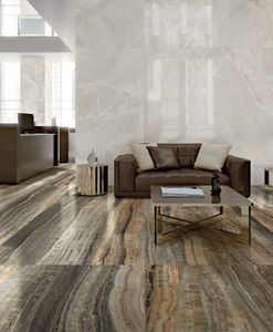
florim > Wall tile-stone-brick
<p>The enchanting appeal of onyx is encapsulated by Florim’s Eccentric Luxe collection, which celebrates the exceptional beauty of this rare and breathtaking stone.</p> <p>Ideal for interior design schemes, residential architecture and the hospitality industry, Eccentric Luxe is a new addition to the Luxury Design selection of sophisticated stones.</p> <p><br>Fresh research and development investments in new glazes and innovative digital decoration technologies have made it possible to propose vivid colours, <strong>impeccable graphic definition</strong> and rich aesthetic depth, while striving to ensure that the processes are <strong>sustainable</strong>.</p> <p>The collection is born from a sustainable and virtuous approach and is part of <a href="https://www.florim.com/en/company/sustainability/carbonzero-florim/">CarbonZero</a>, Florim's range of Carbon Neutral surfaces.</p>
Elemental Stone Cream Sandstone

florim > Wall tile-stone-brick
Essential, informal, versatile <p>Elemental Stone offers surfaces, in three shades, inspired by sedimentary rocks with their simple, polyhedral aesthetic, composed of granules and calcareous elements of different textures.</p> The minimalist appearance of the surfaces, depending on the finish and combination with furnishings, can bring life to different styles of space, meeting a classical taste or a trendier aesthetic, adapting perfectly to any personal preference.<br /> <br></br><a class="btn arrow" href="https://www.florim.com/en/new-tile-ranges/" target="_blank" rel="noopener">Discover all the new collections</a>
Walks/1.0 BLACK

florim > Wall tile-stone-brick
<p>Walks/1.0 represents a non-conventional simplicity</p> The natural aspect of the surface and the texture of the hewn effect combine perfectly with the enhancement of graphics, colors and structures to interpret interior architectures and exterior spaces in harmony with one another and with the surrounding landscape.
Rock Salt White Gold
florim > Wall tile-stone-brick
<p>With Rock Salt, it's possible to create comfortable spaces where you can find peace away from the frenzy of daily life </p> <p>The range offers 5 different chromatic variations enriched with desaturated, deep, and defined veining. Fresh shades, like that of the white, gray, and sage colors, are accompanied by warmer tones, like the dove gray and red, returning the allure of the luster or tactile materiality of natural crystals, depending on their finish.</p>
I Filati Dorian Gray Glicine
florim > Carpet
From the art of fabric, to enveloping spaces From lampas and jacquard, all the way to the simplest silk fabrics, from rich, baroque motifs to more optical, geometric patterns, all of these fabrics share an extremely natural look. The collection's nine surfaces are inspired by Rubelli's signature precious fabrics that, in turn, are born from the contemporary reworking of several decorative motifs coming from the noble Venetian heritage of weaving.<br />