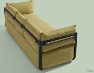
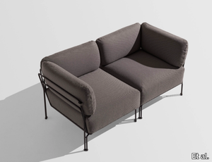
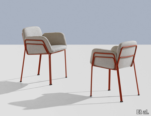
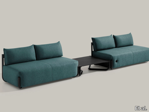
COSMO 1522 - 3 seater fabric garden sofa _ Et al.
Et al. > Sofa
COSMO 1522 Sofa: Contemporary Elegance for Outdoor Living The COSMO 1522 sofa, designed by Philippe Tabet for Et al., is a three-seater masterpiece that seamlessly blends modern aesthetics with outdoor functionality. Its sleek design and durable construction make it an ideal choice for various settings, including residential patios, hotel terraces, and commercial outdoor lounges. Design and Dimensions The COSMO 1522 features a minimalist silhouette with clean lines and a robust steel frame, ensuring both style and stability. Its dimensions are: Width: 220 cm Depth: 88 cm Height: 80 cm Seat Height: 44 cm These proportions provide ample seating space while maintaining a streamlined profile suitable for various outdoor environments. Materials and Finishes Crafted with high-quality materials, the COSMO 1522 is designed to withstand outdoor conditions: Frame: Constructed from durable steel tubing, treated to resist corrosion and finished in a variety of colors to complement different design schemes. Upholstery: The seat, back, and armrests are upholstered with weather-resistant fabrics, ensuring comfort and longevity. Available frame finishes include: White Aluminium (NCS S4000-N VR) Jet Black (NCS S9000-N VR) Coral Red (NCS S3060-Y80R) Matt Jet Black (NCS S9000-N VR) Rough Metallic Bronze (VR) Curry (NCS S3060-Y) Olive Green (NCS S7020-G50Y) Water Blue (NCS S4050-B40G) Capri Blue (NCS S6030-B) Brown (NCS S8005-Y20R) Traffic White (NCS S0502-B VR) Marsala (NCS S4040-R) Pewter (VR) Pure White (NCS S0500-N VR) Anthracite Grey (NCS S7502-B VR) These options allow for customization to match specific aesthetic preferences. Applications and Versatility The COSMO 1522's design makes it suitable for a variety of outdoor settings: Residential Spaces: Enhances patios, gardens, and terraces with its modern appeal. Hospitality Environments: Ideal for hotel lounges, poolside areas, and outdoor dining spaces, offering guests a comfortable seating option. Commercial Areas: Suitable for outdoor cafes, restaurants, and rooftop bars, providing durable and stylish seating for patrons. Complementary Products The COSMO collection offers a range of pieces that can be paired with the 1522 sofa to create cohesive outdoor living spaces. Consider the COSMO 1520 armchair or the COSMO 1530 pouf to complete the ensemble. Key Features Modern Design: Clean lines and a minimalist aesthetic enhance contemporary outdoor settings. Durable Construction: Weather-resistant materials ensure longevity in various climates. Customizable Finishes: A wide selection of frame colors allows for personalized design. Comfortable Seating: Upholstered cushions provide comfort for extended outdoor relaxation.
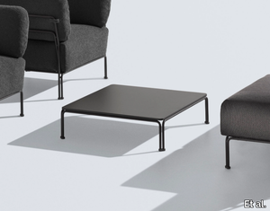
COSMO 1533 - Rectangular steel coffee table _ Et al.
Et al. > Side table
COSMO 1533 Coffee Table: Sleek Minimalism for Modern Spaces The COSMO 1533 coffee table, designed by Philippe Tabet for Et al., embodies minimalist elegance and functionality. Its streamlined design and durable construction make it an ideal addition to various environments, including residential living rooms, hotel lounges, office waiting areas, and outdoor settings. Design and Dimensions The COSMO 1533 features a low-profile silhouette with a steel tube frame and a high-pressure laminate (HPL) top, offering both style and stability. Its dimensions are: Width: 111 cm Depth: 88 cm Height: 29 cm These proportions provide ample surface area while maintaining a compact and unobtrusive presence, suitable for various interior and exterior layouts. Materials and Finishes Crafted with high-quality materials, the COSMO 1533 is designed to withstand both indoor and outdoor conditions: Frame: Constructed from durable steel tubing, treated to resist corrosion and finished in a variety of colors to complement different design schemes. Top: Made from HPL laminate, known for its durability and ease of maintenance, suitable for high-traffic areas. Available frame finishes include: White Aluminium (NCS S4000-N VR) Jet Black (NCS S9000-N VR) Coral Red (NCS S3060-Y80R) Matt Jet Black (NCS S9000-N VR) Rough Metallic Bronze (VR) Curry (NCS S3060-Y) Olive Green (NCS S7020-G50Y) Water Blue (NCS S4050-B40G) Capri Blue (NCS S6030-B) Brown (NCS S8005-Y20R) Traffic White (NCS S0502-B VR) Marsala (NCS S4040-R) Pewter (VR) Pure White (NCS S0500-N VR) Anthracite Grey (NCS S7502-B VR) These options allow for customization to match specific aesthetic preferences. Applications and Versatility The COSMO 1533's design makes it suitable for a variety of settings: Residential Spaces: Enhances living rooms, patios, and terraces with its modern appeal. Hospitality Environments: Ideal for hotel lounges, lobbies, and outdoor seating areas, offering guests a functional and stylish surface. Commercial Areas: Suitable for office waiting rooms, cafes, and retail spaces, providing a durable and elegant table solution. Complementary Products The COSMO collection offers a range of pieces that can be paired with the 1533 coffee table to create cohesive living spaces. Consider the COSMO 1505 armchair or the COSMO 1527 sofa to complete the ensemble. Key Features Modern Design: Clean lines and a minimalist aesthetic enhance contemporary settings. Durable Construction: Weather-resistant materials ensure longevity in various climates. Customizable Finishes: A wide selection of frame colors allows for personalized design. Functional Surface: The HPL laminate top provides a practical and easy-to-maintain surface for everyday use.
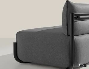
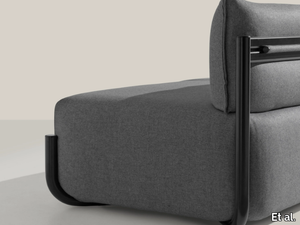
COSMO 1525 - Fabric garden armchair _ Et al.
Et al. > Armchair
COSMO 1525 Armchair: Sleek Minimalism for Modern Interiors The COSMO 1525 armchair, designed by Philippe Tabet for Et al., embodies minimalist elegance and versatility. This one-seater armless chair is crafted to seamlessly integrate into various environments, including residential living rooms, hotel lounges, office waiting areas, and outdoor settings. Design and Dimensions The COSMO 1525 features a streamlined design with upholstered seat and backrest, supported by a durable steel frame. Its dimensions are thoughtfully crafted to provide comfort while maintaining a compact footprint: Width: 65 cm Depth: 88 cm Height: 80 cm Seat Height: 44 cm These proportions make it an ideal choice for both spacious and limited areas, offering comfortable seating without overwhelming the space. Materials and Finishes Crafted with precision, the COSMO 1525 offers a range of customization options to suit various design aesthetics: Frame: Constructed from durable steel tubing, ensuring stability and longevity. Upholstery: Available in a diverse selection of high-quality fabrics, including options like Panarea, Reviva Hero, Reviva Iris, Reviva Amelia, and Fabthirty, each offering multiple color choices to complement different interior styles. Frame Finishes: The steel frame can be customized in various finishes, such as White Aluminium (NCS S4000-N VR), Jet Black (NCS S9000-N VR), Coral Red (NCS S3060-Y80R), Matt Jet Black (NCS S9000-N VR), Rough Metallic Bronze (VR), Curry (NCS S3060-Y), Olive Green (NCS S7020-G50Y), Water Blue (NCS S4050-B40G), Capri Blue (NCS S6030-B), Brown (NCS S8005-Y20R), Traffic White (NCS S0502-B VR), Marsala (NCS S4040-R), Pewter (VR), Pure White (NCS S0500-N VR), and Anthracite Grey (NCS S7502-B VR), allowing for seamless integration into any interior color scheme. Functional Accessories To enhance its functionality, the COSMO 1525 can be equipped with optional accessories: Kidney Cushion: Provides additional lumbar support for increased comfort. These accessories make the armchair a practical choice for both relaxation and productivity. Applications and Versatility The COSMO 1525's adaptable design makes it suitable for a variety of settings: Residential Spaces: Ideal for living rooms or bedrooms, adding a touch of modern elegance. Hospitality Environments: Perfect for hotel lobbies, guest rooms, or lounge areas, offering comfort and style to guests. Office and Waiting Areas: Enhances reception spaces or private offices with its sleek design and optional functional accessories. Outdoor Settings: Designed to withstand outdoor conditions, making it suitable for patios, terraces, and garden areas. Complementary Products The COSMO collection includes various seating solutions that can be paired with the 1525 armchair to create cohesive interior designs. Options include the COSMO 1505 armchair, the COSMO 1502 three-seater sofa, and modular systems like the COSMO 1520, allowing for flexible configurations to suit different spaces and requirements. Key Features Modern Aesthetic: Clean lines and minimalist design contribute to a contemporary look. Customizable Finishes: Wide range of upholstery fabrics and frame finishes to match specific design requirements. Optional Accessories: Functional add-ons like kidney cushions enhance usability. Compact Dimensions: Suitable for both large and small spaces without compromising on comfort. High-Quality Construction: Durable materials ensure longevity and sustained aesthetic appeal.
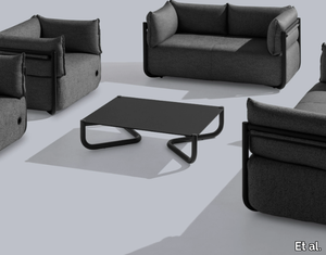
ARI 1310 - Linear module _ Et al.
Et al. > Armchair
Ari 1310 Armchair: Modular Elegance for Versatile Spaces The Ari 1310 armchair, designed by Philippe Nigro for Et al., is a testament to minimalist design and modular functionality. As a linear module within the Ari collection, it offers flexibility and style, making it suitable for various environments, including residential living rooms, hotel lounges, office waiting areas, and outdoor settings. Design and Dimensions The Ari 1310 features a sleek silhouette with upholstered seat and backrest, supported by a durable steel frame. Its modular nature allows it to be used independently or combined with other modules to create customized seating arrangements. While specific dimensions are not provided in the available information, the design emphasizes comfort and adaptability, fitting seamlessly into diverse spatial configurations. Materials and Finishes Crafted with precision, the Ari 1310 offers a range of customization options to suit various design aesthetics: Frame: Constructed from durable steel tubing, ensuring stability and longevity. Upholstery: Available in a diverse selection of high-quality fabrics, including options like Melva, Fortis, Inca, Amsterdam, Medley Gabriel, Chili Gabriel, Mirage, Convert, Fenice, Mood Gabriel, Valencia, Fabthirty Rubelli, Ocean Mastrotto, and Remix 3 Kvadrat, each offering multiple color choices to complement different interior styles. Frame Finishes: The steel frame can be customized in various finishes, such as White Aluminium (NCS S4000-N VR), Jet Black (NCS S9000-N VR), Coral Red (NCS S3060-Y80R), Matt Jet Black (NCS S9000-N VR), Rough Metallic Bronze (VR), Curry (NCS S3060-Y), Olive Green (NCS S7020-G50Y), Water Blue (NCS S4050-B40G), Capri Blue (NCS S6030-B), Brown (NCS S8005-Y20R), Traffic White (NCS S0502-B VR), Marsala (NCS S4040-R), Pewter (VR), Pure White (NCS S0500-N VR), and Anthracite Grey (NCS S7502-B VR), allowing for seamless integration into any interior color scheme. Applications and Versatility The Ari 1310's modular design makes it suitable for a variety of settings: Residential Spaces: Ideal for living rooms or bedrooms, adding a touch of modern elegance. Hospitality Environments: Perfect for hotel lobbies, guest rooms, or lounge areas, offering comfort and style to guests. Office and Waiting Areas: Enhances reception spaces or private offices with its sleek design and modular flexibility. Outdoor Settings: Designed to withstand outdoor conditions, making it suitable for patios, terraces, and garden areas. Complementary Products The Ari collection includes various modules that can be paired with the 1310 armchair to create cohesive seating arrangements. Options include the Ari 1300 modular system, the Ari 1311 corner module, and the Ari 1313 pouf, allowing for flexible configurations to suit different spaces and requirements. Key Features Modular Design: Allows for customizable seating arrangements to fit various spaces. Modern Aesthetic: Clean lines and minimalist design contribute to a contemporary look. Customizable Finishes: Wide range of upholstery fabrics and frame finishes to match specific design requirements.
ARI 1311 - Corner armchair _ Et al.
Et al. > Armchair
Ari 1301 Modular Seating System: Versatile Elegance for Diverse Environments The Ari 1301 modular seating system, designed by Philippe Nigro for Et al., epitomizes flexibility and contemporary design. As a terminal corner module within the Ari collection, it seamlessly integrates into various settings, including residential living rooms, hotel lounges, office waiting areas, and outdoor spaces. Design and Dimensions The Ari 1301 features a sleek steel frame supporting upholstered seats, backrests, and armrests, offering both comfort and durability. Its modular nature allows it to function independently or as part of a larger seating arrangement. The specific dimensions are: Weight: 18.3 kg Packaging Volume: 0.57 m³ Pieces per Box: 1 These specifications ensure ease of placement and adaptability in various spatial configurations. Materials and Finishes Crafted with precision, the Ari 1301 offers a range of customization options to suit diverse design aesthetics: Frame: Constructed from durable steel tubing, ensuring stability and longevity. Upholstery: Available in a selection of high-quality outdoor fabrics, including Panarea, 3D Cover, Reviva Hero, Reviva Iris, Reviva Amelia, and Fabthirty, each offering multiple color choices to complement different styles. Frame Finishes: The steel frame can be customized in various finishes, such as White Aluminium (NCS S4000-N VR), Jet Black (NCS S9000-N VR), Coral Red (NCS S3060-Y80R), Matt Jet Black (NCS S9000-N VR), Rough Metallic Bronze (VR), Curry (NCS S3060-Y), Olive Green (NCS S7020-G50Y), Water Blue (NCS S4050-B40G), Capri Blue (NCS S6030-B), Brown (NCS S8005-Y20R), Traffic White (NCS S0502-B VR), Marsala (NCS S4040-R), Pewter (VR), Pure White (NCS S0500-N VR), and Anthracite Grey (NCS S7502-B VR), allowing for seamless integration into any interior or exterior color scheme. Applications and Versatility The Ari 1301's modular design makes it suitable for a variety of settings: Residential Spaces: Ideal for living rooms or patios, adding a touch of modern elegance. Hospitality Environments: Perfect for hotel lobbies, guest rooms, or lounge areas, offering comfort and style to guests. Office and Waiting Areas: Enhances reception spaces or private offices with its sleek design and modular flexibility. Outdoor Settings: Designed to withstand outdoor conditions, making it suitable for terraces and garden areas. Complementary Products The Ari collection includes various modules that can be paired with the 1301 corner module to create cohesive seating arrangements. Options include the Ari 1300 linear module, the Ari 1311 corner module, and the Ari 1313 pouf, allowing for flexible configurations to suit different spaces and requirements. Key Features Modular Design: Allows for customizable seating arrangements to fit various spaces. Modern Aesthetic: Clean lines and minimalist design contribute to a contemporary look. Customizable Finishes: Wide range of upholstery fabrics and frame finishes to match specific design requirements. High-Quality Construction: Durable materials ensure longevity and sustained aesthetic appeal.
Plain Iron
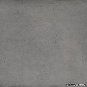
refin-ceramic > Floor tile-stone
Solid SurfaceConcrete is versatile; it comes to life without any shape and because of it provides for countless formal options, from smooth finishes to rough surfaces, with a very diverse aesthetic. A careful research of the many characteristics of this material is the fil rouge to our three solutions, Block, Mold and Plain; these three collections feature different characteristics brought together in the Master Plan.Used by the greatest masters of contemporary architecture, concrete is taking a new role, moving from being a construction material to being a surface finish for architectural projects. Plain stems from analysing concrete in this latter, newer function. The collection stands out for slight clouding and more or less marked patterns, light micro-cracks, that usually form when the concrete volume shrinks by effect of thermal excursion and small holes (pitting) formed by air bubbles trapped between the cast and the formwork. The surface is rich with detailed marks and shades; from a distance it appears as a solid, consistent and compact space.
ARI 1313 - Square pouf _ Et al.
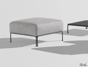
Et al. > Pouf
Ari 1313 Pouf: Versatile Elegance for Modern Interiors The Ari 1313 pouf, designed by Philippe Nigro for Et al., embodies minimalist design and modular functionality. As a key component of the Ari modular seating system, it seamlessly integrates into various environments, including residential living rooms, hotel lounges, office waiting areas, and outdoor settings. Design and Dimensions The Ari 1313 features a sleek silhouette with an upholstered seat supported by a durable steel frame. Its modular nature allows it to be used independently as a standalone piece or combined with other modules to create customized seating arrangements. While specific dimensions are not provided in the available information, the design emphasizes comfort and adaptability, fitting seamlessly into diverse spatial configurations. Materials and Finishes Crafted with precision, the Ari 1313 offers a range of customization options to suit various design aesthetics: Frame: Constructed from durable steel tubing, ensuring stability and longevity. Upholstery: Available in a diverse selection of high-quality fabrics, including options like Melva, Fortis, Inca, Amsterdam, Medley Gabriel, Chili Gabriel, Mirage, Convert, Fenice, Mood Gabriel, Valencia, Fabthirty Rubelli, Ocean Mastrotto, and Remix 3 Kvadrat, each offering multiple color choices to complement different interior styles. Frame Finishes: The steel frame can be customized in various finishes, such as White Aluminium (NCS S4000-N VR), Jet Black (NCS S9000-N VR), Coral Red (NCS S3060-Y80R), Matt Jet Black (NCS S9000-N VR), Rough Metallic Bronze (VR), Curry (NCS S3060-Y), Olive Green (NCS S7020-G50Y), Water Blue (NCS S4050-B40G), Capri Blue (NCS S6030-B), Brown (NCS S8005-Y20R), Traffic White (NCS S0502-B VR), Marsala (NCS S4040-R), Pewter (VR), Pure White (NCS S0500-N VR), and Anthracite Grey (NCS S7502-B VR), allowing for seamless integration into any interior color scheme. Applications and Versatility The Ari 1313's modular design makes it suitable for a variety of settings: Residential Spaces: Ideal for living rooms or bedrooms, adding a touch of modern elegance. Hospitality Environments: Perfect for hotel lobbies, guest rooms, or lounge areas, offering comfort and style to guests. Office and Waiting Areas: Enhances reception spaces or private offices with its sleek design and modular flexibility. Outdoor Settings: Designed to withstand outdoor conditions, making it suitable for patios, terraces, and garden areas. Complementary Products The Ari collection includes various modules that can be paired with the 1313 pouf to create cohesive seating arrangements. Options include the Ari 1300 linear module, the Ari 1311 corner module, and the Ari 1312 armchair, allowing for flexible configurations to suit different spaces and requirements. Key Features Modular Design: Allows for customizable seating arrangements to fit various spaces. Modern Aesthetic: Clean lines and minimalist design contribute to a contemporary look. Customizable Finishes: Wide range of upholstery fabrics and frame finishes to match specific design requirements.
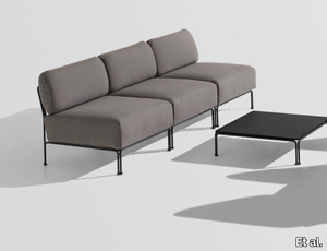
COSMO 1507 - 3 seater fabric sofa _ Et al.
Et al. > Sofa
COSMO 1507 Sofa: A Contemporary Three-Seater Masterpiece The COSMO 1507 sofa, designed by Philippe Tabet for Et al., epitomizes modern elegance and versatility. This armless three-seater sofa seamlessly integrates into various interior settings, including residential living rooms, hotel lounges, office waiting areas, and upscale retail spaces. Design and Dimensions The COSMO 1507 boasts a sleek and minimalist design, characterized by its armless structure and plush upholstery. Its dimensions are thoughtfully crafted to provide comfort while maintaining a compact footprint: Width: 237 cm Depth: 88 cm Height: 80 cm Seat Height: 44 cm These proportions make it an ideal choice for both spacious and limited areas, offering ample seating without overwhelming the space. Materials and Finishes Crafted with precision, the COSMO 1507 features: Frame: Constructed from durable steel tubing, ensuring stability and longevity. Upholstery: Available in a diverse range of high-quality fabrics, including options like Melva, Fortis, Inca, Medley Gabriel, Chili Gabriel, Mirage, Convert, Fenice, Mood Gabriel, Valencia, Fabthirthy Rubelli, Ocean Mastrotto, and Remix 3 Kvadrat, each offering multiple color choices to suit various design aesthetics. Frame Finishes: The steel frame can be customized in various finishes, such as White Aluminium (NCS S4000-N VR), Jet Black (NCS S9000-N VR), Coral Red (NCS S3060-Y80R), Matt Jet Black (NCS S9000-N VR), Rough Metallic Bronze (VR), Curry (NCS S3060-Y), Olive Green (NCS S7020-G50Y), Water Blue (NCS S4050-B40G), Capri Blue (NCS S6030-B), Brown (NCS S8005-Y20R), Traffic White (NCS S0502-B VR), Marsala (NCS S4040-R), Pewter (VR), Pure White (NCS S0500-N VR), and Anthracite Grey (NCS S7502-B VR), allowing for seamless integration into any interior color scheme. Functional Accessories To enhance its functionality, the COSMO 1507 can be equipped with optional accessories: Kidney Cushion: Provides additional lumbar support for increased comfort. Reading Lamp: An integrated light source suitable for reading or creating ambient lighting. USB Socket: Convenient for charging electronic devices, making it suitable for modern living and working environments. Schuko Socket: Offers an additional power outlet for various needs. These accessories make the sofa a practical choice for both relaxation and productivity. Applications and Versatility The COSMO 1507's adaptable design makes it suitable for a variety of settings: Residential Spaces: Ideal for living rooms or bedrooms, adding a touch of modern elegance. Hospitality Environments: Perfect for hotel lobbies, guest rooms, or lounge areas, offering comfort and style to guests. Office and Waiting Areas: Enhances reception spaces or private offices with its sleek design and optional functional accessories. Retail Spaces: Complements boutique stores or showrooms, providing a comfortable seating option for customers. Complementary Products The COSMO collection includes various seating solutions that can be paired with the 1507 sofa to create cohesive interior designs. Options include the COSMO 1505 armchair, the COSMO 1502 three-seater sofa, and modular systems like the COSMO 1520, allowing for flexible configurations to suit different spaces and requirements. Key Features Modern Aesthetic: Clean lines and armless design contribute to a minimalist and contemporary look. Customizable Finishes: Wide range of upholstery fabrics and frame finishes to match specific design requirements. Optional Accessories: Functional add-ons like reading lamps and USB sockets enhance usability. Compact Dimensions: Suitable for both large and small spaces without compromising on comfort. High-Quality Construction: Durable materials ensure longevity and sustained aesthetic appeal.
ARI 1320 - Upholstered fabric chair with armrests _ Et al.
Et al. > Chair
Ari 1320 Armchair: Outdoor Elegance with Modular Flexibility The Ari 1320 armchair, designed by Philippe Nigro for Et al., exemplifies minimalist design and modular functionality. As a standout piece in the Ari outdoor collection, it seamlessly integrates into various environments, including residential patios, hotel terraces, restaurant courtyards, and office outdoor lounges. Design and Dimensions The Ari 1320 features a sleek steel frame supporting upholstered seat, back, and armrests, offering both comfort and durability. Its modular nature allows it to function independently or as part of a larger seating arrangement. While specific dimensions are not provided in the available information, the design emphasizes comfort and adaptability, fitting seamlessly into diverse spatial configurations. Materials and Finishes Crafted with precision, the Ari 1320 offers a range of customization options to suit various design aesthetics: Frame: Constructed from durable steel tubing, ensuring stability and longevity. Upholstery: Available in a selection of high-quality outdoor fabrics, including Panarea (+4 colors), Reviva Hero (+5 colors), Reviva Iris (+7 colors), Reviva Amelia (+5 colors), and Fabthirty (+6 colors), each offering multiple color choices to complement different styles. Frame Finishes: The steel frame can be customized in various finishes, such as White Aluminium (NCS S4000-N VR), Jet Black (NCS S9000-N VR), Coral Red (NCS S3060-Y80R), Matt Jet Black (NCS S9000-N VR), Rough Metallic Bronze (VR), Curry (NCS S3060-Y), Olive Green (NCS S7020-G50Y), Water Blue (NCS S4050-B40G), Capri Blue (NCS S6030-B), Brown (NCS S8005-Y20R), Traffic White (NCS S0502-B VR), Marsala (NCS S4040-R), and Anthracite Grey (NCS S7502-B VR), allowing for seamless integration into any outdoor color scheme. Applications and Versatility The Ari 1320's design makes it suitable for a variety of outdoor settings: Residential Spaces: Ideal for patios, gardens, and terraces, adding a touch of modern elegance. Hospitality Environments: Perfect for hotel courtyards, poolside areas, and outdoor lounges, offering comfort and style to guests. Restaurants and Cafés: Enhances outdoor dining areas with its sleek design and durability. Office Outdoor Areas: Suitable for creating comfortable outdoor break spaces for employees. Complementary Products The Ari collection includes various modules that can be paired with the 1320 armchair to create cohesive seating arrangements. Options include the Ari 1300 linear module, the Ari 1311 corner module, and the Ari 1313 pouf, allowing for flexible configurations to suit different spaces and requirements. Key Features Outdoor Durability: Designed to withstand outdoor conditions, ensuring longevity and sustained aesthetic appeal. Modular Design: Allows for customizable seating arrangements to fit various spaces. Modern Aesthetic: Clean lines and minimalist design contribute to a contemporary look. Customizable Finishes: Wide range of upholstery fabrics and frame finishes to match specific design requirements.
COSMO 1526 - 2 seater fabric garden sofa _ Et al.
Et al. > Sofa
COSMO 1526 Sofa: Contemporary Elegance for Versatile Spaces The COSMO 1526 sofa, designed by Philippe Tabet for Et al., epitomizes modern design and adaptability. This two-seater sofa, without armrests, is crafted to seamlessly integrate into various environments, including residential living rooms, hotel lounges, office waiting areas, and outdoor settings. Design and Dimensions The COSMO 1526 features a sleek and minimalist design, characterized by its upholstered seat and backrest, all supported by a durable steel frame. Its dimensions are thoughtfully crafted to provide comfort while maintaining a compact footprint: Width: 111 cm Depth: 88 cm Height: 80 cm Seat Height: 44 cm These proportions make it an ideal choice for both spacious and limited areas, offering ample seating without overwhelming the space. Materials and Finishes Crafted with precision, the COSMO 1526 offers a range of customization options to suit various design aesthetics: Frame: Constructed from durable steel tubing, ensuring stability and longevity. Upholstery: Available in a diverse selection of high-quality fabrics, including options like Panarea, Reviva Hero, Reviva Iris, Reviva Amelia, and Fabthirty, each offering multiple color choices to complement different interior styles. Frame Finishes: The steel frame can be customized in various finishes, such as White Aluminium (NCS S4000-N VR), Jet Black (NCS S9000-N VR), Coral Red (NCS S3060-Y80R), Matt Jet Black (NCS S9000-N VR), Rough Metallic Bronze (VR), Curry (NCS S3060-Y), Olive Green (NCS S7020-G50Y), Water Blue (NCS S4050-B40G), Capri Blue (NCS S6030-B), Brown (NCS S8005-Y20R), Traffic White (NCS S0502-B VR), Marsala (NCS S4040-R), Pewter (VR), Pure White (NCS S0500-N VR), and Anthracite Grey (NCS S7502-B VR), allowing for seamless integration into any interior color scheme. Functional Accessories To enhance its functionality, the COSMO 1526 can be equipped with optional accessories: Kidney Cushion: Provides additional lumbar support for increased comfort. These accessories make the sofa a practical choice for both relaxation and productivity. Applications and Versatility The COSMO 1526's adaptable design makes it suitable for a variety of settings: Residential Spaces: Ideal for living rooms or bedrooms, adding a touch of modern elegance. Hospitality Environments: Perfect for hotel lobbies, guest rooms, or lounge areas, offering comfort and style to guests. Office and Waiting Areas: Enhances reception spaces or private offices with its sleek design and optional functional accessories. Outdoor Settings: Designed to withstand outdoor conditions, making it suitable for patios, terraces, and garden areas. Complementary Products The COSMO collection includes various seating solutions that can be paired with the 1526 sofa to create cohesive interior designs. Options include the COSMO 1505 armchair, the COSMO 1502 three-seater sofa, and modular systems like the COSMO 1520, allowing for flexible configurations to suit different spaces and requirements. Key Features Modern Aesthetic: Clean lines and minimalist design contribute to a contemporary look. Customizable Finishes: Wide range of upholstery fabrics and frame finishes to match specific design requirements. Optional Accessories: Functional add-ons like kidney cushions enhance usability. Compact Dimensions: Suitable for both large and small spaces without compromising on comfort. High-Quality Construction: Durable materials ensure longevity and sustained aesthetic appeal. Conclusion
Archeologie Archeologie Grigio
florim > Wall Paint
The poetics of the wall. The forgotten wall. «A wall is like a book to be opened, a journey into the interior, revealing the experiences, memories, signs and symbols which this fragment of masonry has absorbed over the centuries.» Franco Guerzoni <p>It is difficult to resist the beauty of Franco Guerzoni's art, created by a rare harmony of feeling and intellect, poetry and mind. The artist expresses this through paintings which, although complex in structure, are joyous and sensual, with bright colours made, like those of the great masters of the past, from choice powdered ingredients. A painter with a technique rich in traditional skills, Guerzoni offers a version of modernity involving an intense fundamental relationship with his images and with space. In fact, the dialectic between painting and space, form and architecture, time and memory seems to be essential to his art. As his works specifically created for CEDIT clearly express, his creations achieve a perfect balance between the spatial dimension and intensely lyrical use of colour, which here becomes a soft, liquid form of matter, wandering across the surface of a dazzling lime-plaster white. White, metaphor for the clear light of day, as it was in the large, complex canvases exhibited in his personal exhibition at the 1990 Venice Biennale, is the background for forms of colour which renew the pleasure to be had from painting and the memory of an image glimpsed on the vast expanse of the surface. In the more recent works, these voluptuous shades are transformed into subtle shadows of colour that delicately caress the surface.</p> <p> </p> <p> All it takes is one wall, the only surviving wall of what was once a house, on which time has recorded its own, unavoidable passing, leaving traces of colour that is still vibrant, although faded in places, to allow the memory of the image to transpire, fragile and uncertain, in the physicality of the surface, to bear tangible witness to the existence of history, a mysterious visual memory, the extension into the present of the life of things. A memory of the past on a contemporary wall. The idea of memory is central to Franco Guerzoni's poetics: private, secret memory and the collective memory of the past. Fragmentary and indecipherable, perceived by the artist with the aid of what is left of the images, the fragment. A relic of a totality which can no longer be reconstructed but only imagined in poetic terms, the fragment, a fraction of an image conserved by time, guides the artist's fantastic archaeological journey in search of the world's memory. However, this journey takes him in the opposite direction to the archaeologist, for whom the fragment - fundamental because it reveals a trace of the past is the starting-point for an attempt to reconstruct history. For Guerzoni, the fragment is the endpoint of his work, the goal for which he strives in his investigation of the surface, as he digs deep down, leafing through the deposits of time and memory.</p> <p> </p> <p>Like the large pages of a book traced with fragile sketches, embryonic forms whose meaning has been lost in time, leaving only fleeting traces, uncertain, ambiguous, mysterious morphologies. It marks the start of a journey into the mind of the artist-archaeologist, an adventurous journey into the inextricable labyrinth of the mind, to unearth what is hidden, shuffling the cards in a perennial contamination of images, memory, signs and traces, in search of a meaning, which no sooner appears than it is lost, merging into time and once again becoming a dream, an imaginary journey into fantasy and wonder. And this is the case in the tryptic created for CEDIT, which placed a new challenge before the artist: to transfer "his" image, the remains and fragments of a forgotten wall onto a new material for him “stunning, large-sized ceramic slabs“ and a real wall, without this tautology betraying the painting's deep meaning, its fertile magic of lines and colours, from which the image is born. And the artist is fully aware of this. Guerzoni describes his art as a "gamble": a gamble that is a critical test, an act of daring, dangerous and risky. This is the challenge he sets himself. It is a challenge he easily overcomes, expressing himself on these large walls with a rediscovered pleasure in painting, no longer restrained and apparently absorbed by the dense, uneven coloured surface but set free and almost luxuriously accentuated. In his large, demanding works for CEDIT, Guerzoni achieves a new, consummate mode of painting, in which the architecture of the surfaces provides a poetic meeting-point between the two founding components of his style, the complex, well thought-out composition and the lyricism of colour.</p>
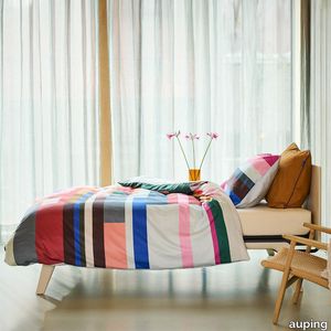
Bright bliss Pillowcases
auping > Accessories
The Bright bliss pillowcases are made of 100% cotton satin. The coloured stripes on the front of the pillowcases blend into the duvet cover. The back of the pillowcases are plain blue like the colour in the sea. Pillowcase with double hotel closureThe Auping pillowcases from the seasonal collection have what is known as a double hotel closure. A hotel closure is a folded opening on the shortest side of the pillowcase. With a double hotel closure, it doesn't matter which side of your pillow you use, it always looks neat. Sizes of our pillowcasesThe pillowcases from the basic collection and seasonal collection are also available as a loose set in sizes:60 x 70 cm40 x 60 cmSustainability At Auping, we dream of a rested world. Of sleeping under wonderful bedding made in an environmentally friendly way and under good working conditions. That's why all our duvet covers in the basic collection have the internationally recognised GOTS certificate. This is the very highest international standard for organic textiles. It not only guarantees top quality but also gives us the assurance that the entire chain complies with strict social and environmental requirements. The covers in the seasonal collection carry the BCI label, which also guarantees sustainably and socially responsible produced bed textiles.Quality labelsNot only sustainability but also the quality of our products is very important to us. We pay a lot of attention to this and work with the following quality marks and institutes to guarantee our quality. All Auping duvet covers are checked annually by TÜV Rheinland Netherlands for size, shrinkage, colour fastness and strength properties.All Auping duvet covers have the Oeko-Tex Standard 100 certificate. This quality mark is issued by the Oeko-Tex institute which guarantees that the tested and certified textiles are free of harmful substances in relation to human health and environmental impact. It is thus a safety seal for textiles.
Dynamic colours Pillowcases
auping > Accessories
The Dynamic colours pillowcases are made of 100% cotton satin. The coloured stripes on the front of the pillowcases blend into the duvet cover. The back of the pillowcases are plain brown. Pillowcase with double hotel closureThe Auping pillowcases from the seasonal collection have what is known as a double hotel closure. A hotel closure is a folded opening on the shortest side of the pillowcase. With a double hotel closure, it doesn't matter which side of your pillow you use, it always looks neat.Sizes of our pillowcasesThe pillowcases from the basic collection and seasonal collection are also available as a loose set in sizes:60 x 70 cm40 x 60 cmSustainabilityAt Auping, we dream of a rested world. Of sleeping under wonderful bedding made in an environmentally friendly way and under good working conditions. That's why all our duvet covers in the basic collection have the internationally recognised GOTS certificate. This is the very highest international standard for organic textiles. It not only guarantees top quality but also gives us the assurance that the entire chain complies with strict social and environmental requirements. The covers in the seasonal collection carry the BCI label, which also guarantees sustainably and socially responsible produced bed textiles.Quality labelsNot only sustainability but also the quality of our products is very important to us. We pay a lot of attention to this and work with the following quality marks and institutes to guarantee our quality. All Auping duvet covers are checked annually by TÜV Rheinland Netherlands for size, shrinkage, colour fastness and strength properties.All Auping duvet covers have the Oeko-Tex Standard 100 certificate. This quality mark is issued by the Oeko-Tex institute which guarantees that the tested and certified textiles are free of harmful substances in relation to human health and environmental impact. It is thus a safety seal for textiles.
Vibrant apricot Duvet Cover
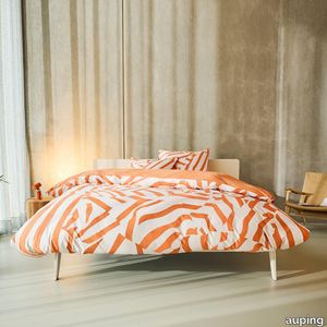
auping > Accessories
This cotton satin cover features playful stripes in the on-trend colour of apricot. The background is a light beige print that almost looks woven. Both the back of the cover and the pillowcases are a solid orange colour. Want to give your bed an extra dose of style? Add a few pillowcases in Brilliant... Handy: tuck-in strip, hotel closure and button down systemAll Auping duvet covers have an extra long tuck-in strip. This makes it easy to tuck the duvet cover in under your mattress. Cold feet are a thing of the past. You can recognise the extra long tuck-in strip by the length: 200/220The Auping pillowcases of the seasonal collection have a so-called double hotel closure. A hotel closure is a folded opening on the shortest side of the pillowcase. With a double hotel closure, it doesn't matter which side of your pillow you use, it always looks neat.Auping duvet covers and duvets feature the button down system. These are handy buttons and loops that you use to fasten the duvet and cover together, preventing it from shifting. The term button down comes from fashion. It literally means 'buttoned down' and often refers to the buttons on the collar of a shirt that you use to neatly fasten the collar to the shirt. Auping duvet covers have loops on the inside of the cover. Our duvets have buttons in the same places. The loops from the duvet cover can be put around these buttons to prevent the duvet from sliding around in the cover. These buttons and loops also make it easier to make your bed neatly. Sizes of our duvet coversThe sizes of our duvet covers are coordinated with the Auping duvet and pillow range to ensure a perfect match. In addition, the duvet covers and pillowcases are also suitable for most common other duvets and pillows.The Auping duvet covers are available in both single and double sizes:- 140 x 200/220 cm incl. 1 60 x 70 cm pillowcase.- 200 x 200/220 cm incl. 2 pillowcases of 60 x 70 cm.- 240 x 200/220 cm incl. 2 pillowcases of 60 x 70 cm.- 260 x 200/220 cm incl. 2 pillowcases of 60 x 70 cm.Sustainability At Auping, we dream of a rested world. Of sleeping under wonderful bedding made in an environmentally friendly way and under good working conditions. That's why all our duvet covers in the basic collection have the internationally recognised GOTS certificate. This is the very highest international standard for organic textiles. It not only guarantees top quality but also gives us the assurance that the entire chain complies with strict social and environmental requirements. The covers in the seasonal collection carry the BCI label, which also guarantees sustainably and socially responsible bed textile production. Quality labelsNot only sustainability but also the quality of our products is very important to us. We pay a lot of attention to this and work with the following quality marks and institutes to guarantee our quality. All Auping duvet covers are checked annually by TÜV Rheinland Netherlands for size, shrinkage, colour fastness and strength properties.All Auping duvet covers have the Oeko-Tex Standard 100 certificate. This quality mark is issued by the Oeko-Tex institute which guarantees that the tested and certified textiles are free of harmful substances in relation to human health and environmental impact. It is thus a safety seal for textiles.
COSMO 1515 Side Table: A Modern Laptop Table
Et al. > Coffee table
COSMO 1515 Side Table: A Modern Accent for Contemporary Spaces The COSMO 1515 side table, designed by Philippe Tabet for Et al., embodies minimalist elegance and functionality, making it a versatile addition to various interior settings, including residential living rooms, hotel lounges, office waiting areas, and educational environments. Design and Dimensions The COSMO 1515 features a sleek steel frame paired with a durable HPL (High-Pressure Laminate) tabletop, offering a modern aesthetic that complements a wide range of interior styles. Its compact dimensions are: Width: 50 cm Depth: 50 cm Height: 50 cm These proportions make it an ideal choice for both spacious and limited areas, providing a functional surface without overwhelming the space. Materials and Finishes Crafted with precision, the COSMO 1515 comprises: Frame: Constructed from durable steel tubing, ensuring stability and longevity. Tabletop: Made from high-pressure laminate (HPL), known for its durability and resistance to scratches and stains, making it ideal for high-traffic areas. The steel frame is available in a variety of finishes, allowing for customization to match specific design aesthetics. Options include: White Aluminium (NCS S4000-N VR) Jet Black (NCS S9000-N VR) Coral Red (NCS S3060-Y80R) Matt Jet Black (NCS S9000-N VR) Rough Metallic Bronze (VR) Curry (NCS S3060-Y) Olive Green (NCS S7020-G50Y) Water Blue (NCS S4050-B40G) Capri Blue (NCS S6030-B) Brown (NCS S8005-Y20R) Traffic White (NCS S0502-B VR) Marsala (NCS S4040-R) Pewter (VR) Pure White (NCS S0500-N VR) Anthracite Grey (NCS S7502-B VR) These finish options enable the COSMO 1515 to seamlessly integrate into diverse interior color schemes and styles. Applications and Versatility The COSMO 1515's adaptable design makes it suitable for a variety of settings: Residential Spaces: Serves as a stylish accent table in living rooms, bedrooms, or reading nooks, complementing sofas and seating arrangements. Hospitality Environments: Ideal for hotel lobbies, lounges, and guest rooms, providing a functional surface for guests. Office and Waiting Areas: Enhances reception spaces and meeting rooms with its sleek design and practical surface area. Educational Settings: Suitable for libraries, study areas, or common rooms, offering a durable and functional surface for various activities. Complementary Products The COSMO collection includes various seating solutions that can be paired with the 1515 side table to create cohesive interior designs. Options include the COSMO 1505 armchair, the COSMO 1502 three-seater sofa, and modular systems like the COSMO 1520, allowing for flexible configurations to suit different spaces and requirements. Key Features Modern Aesthetic: Clean lines and minimalist design contribute to a contemporary look. Customizable Finishes: Wide range of frame finishes to match specific design requirements. Durable Materials: High-quality steel frame and HPL tabletop ensure longevity and resistance to wear. Compact Dimensions: Suitable for both large and small spaces without compromising on functionality. High-Quality Construction: Durable materials ensure longevity and sustained aesthetic appeal.
Archeologie Archeologie Bianco
florim > Wall Paint
The poetics of the wall. The forgotten wall. «A wall is like a book to be opened, a journey into the interior, revealing the experiences, memories, signs and symbols which this fragment of masonry has absorbed over the centuries.» Franco Guerzoni <p>It is difficult to resist the beauty of Franco Guerzoni's art, created by a rare harmony of feeling and intellect, poetry and mind. The artist expresses this through paintings which, although complex in structure, are joyous and sensual, with bright colours made, like those of the great masters of the past, from choice powdered ingredients. A painter with a technique rich in traditional skills, Guerzoni offers a version of modernity involving an intense fundamental relationship with his images and with space. In fact, the dialectic between painting and space, form and architecture, time and memory seems to be essential to his art. As his works specifically created for CEDIT clearly express, his creations achieve a perfect balance between the spatial dimension and intensely lyrical use of colour, which here becomes a soft, liquid form of matter, wandering across the surface of a dazzling lime-plaster white. White, metaphor for the clear light of day, as it was in the large, complex canvases exhibited in his personal exhibition at the 1990 Venice Biennale, is the background for forms of colour which renew the pleasure to be had from painting and the memory of an image glimpsed on the vast expanse of the surface. In the more recent works, these voluptuous shades are transformed into subtle shadows of colour that delicately caress the surface.</p> <p> </p> <p> All it takes is one wall, the only surviving wall of what was once a house, on which time has recorded its own, unavoidable passing, leaving traces of colour that is still vibrant, although faded in places, to allow the memory of the image to transpire, fragile and uncertain, in the physicality of the surface, to bear tangible witness to the existence of history, a mysterious visual memory, the extension into the present of the life of things. A memory of the past on a contemporary wall. The idea of memory is central to Franco Guerzoni's poetics: private, secret memory and the collective memory of the past. Fragmentary and indecipherable, perceived by the artist with the aid of what is left of the images, the fragment. A relic of a totality which can no longer be reconstructed but only imagined in poetic terms, the fragment, a fraction of an image conserved by time, guides the artist's fantastic archaeological journey in search of the world's memory. However, this journey takes him in the opposite direction to the archaeologist, for whom the fragment - fundamental because it reveals a trace of the past is the starting-point for an attempt to reconstruct history. For Guerzoni, the fragment is the endpoint of his work, the goal for which he strives in his investigation of the surface, as he digs deep down, leafing through the deposits of time and memory.</p> <p> </p> <p>Like the large pages of a book traced with fragile sketches, embryonic forms whose meaning has been lost in time, leaving only fleeting traces, uncertain, ambiguous, mysterious morphologies. It marks the start of a journey into the mind of the artist-archaeologist, an adventurous journey into the inextricable labyrinth of the mind, to unearth what is hidden, shuffling the cards in a perennial contamination of images, memory, signs and traces, in search of a meaning, which no sooner appears than it is lost, merging into time and once again becoming a dream, an imaginary journey into fantasy and wonder. And this is the case in the tryptic created for CEDIT, which placed a new challenge before the artist: to transfer "his" image, the remains and fragments of a forgotten wall onto a new material for him “stunning, large-sized ceramic slabs“ and a real wall, without this tautology betraying the painting's deep meaning, its fertile magic of lines and colours, from which the image is born. And the artist is fully aware of this. Guerzoni describes his art as a "gamble": a gamble that is a critical test, an act of daring, dangerous and risky. This is the challenge he sets himself. It is a challenge he easily overcomes, expressing himself on these large walls with a rediscovered pleasure in painting, no longer restrained and apparently absorbed by the dense, uneven coloured surface but set free and almost luxuriously accentuated. In his large, demanding works for CEDIT, Guerzoni achieves a new, consummate mode of painting, in which the architecture of the surfaces provides a poetic meeting-point between the two founding components of his style, the complex, well thought-out composition and the lyricism of colour.</p>
Lively lucid Pillowcases
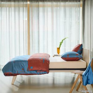
auping > Accessories
The Lively lucid pillowcases are made of 100% cotton satin. With this cotton satin pillowcase, you can give your bedroom two different looks. Will you go for the blue side with dark details, or give your bedroom a warmer look by choosing the brown side? Pillowcase with double hotel closureThe Auping pillowcases from the seasonal collection have what is known as a double hotel closure. A hotel closure is a folded opening on the shortest side of the pillowcase. With a double hotel closure, it doesn't matter which side of your pillow you use, it always looks neat.Sizes of our pillowcasesThe pillowcases from the basic collection and seasonal collection are also available as a loose set in sizes:60 x 70 cm40 x 60 cmSustainability At Auping, we dream of a rested world. Of sleeping under wonderful bedding made in an environmentally friendly way and under good working conditions. That's why all our duvet covers in the basic collection have the internationally recognised GOTS certificate. This is the very highest international standard for organic textiles. It not only guarantees top quality but also gives us the assurance that the entire chain complies with strict social and environmental requirements. The covers in the seasonal collection carry the BCI label, which also guarantees sustainably and socially responsible produced bed textiles.Quality labelsNot only sustainability but also the quality of our products is very important to us. We pay a lot of attention to this and work with the following quality marks and institutes to guarantee our quality. All Auping duvet covers are checked annually by TÜV Rheinland Netherlands for size, shrinkage, colour fastness and strength properties.All Auping duvet covers have the Oeko-Tex Standard 100 certificate. This quality mark is issued by the Oeko-Tex institute which guarantees that the tested and certified textiles are free of harmful substances in relation to human health and environmental impact. It is thus a safety seal for textiles.
COSMO 1506 Sofa: A Modern Two-Seater Masterpiece
Et al. > Sofa
COSMO 1506 Sofa: A Modern Two-Seater Masterpiece The COSMO 1506 sofa, designed by Philippe Tabet for Et al., epitomizes contemporary elegance and versatility. This two-seater sofa, devoid of armrests, seamlessly integrates into various interior settings, including residential living rooms, hotel lounges, office waiting areas, and upscale retail spaces. Design and Dimensions The COSMO 1506 boasts a sleek and minimalist design, characterized by its armless structure and plush upholstery. Its dimensions are thoughtfully crafted to provide comfort while maintaining a compact footprint: Width: 150 cm Depth: 88 cm Height: 80 cm Seat Height: 44 cm These proportions make it an ideal choice for both spacious and limited areas, offering ample seating without overwhelming the space. Materials and Finishes Crafted with precision, the COSMO 1506 features: Frame: Constructed from durable steel tubing, ensuring stability and longevity. Upholstery: Available in a diverse range of high-quality fabrics, including options like Melva, Fortis, Inca, Medley Gabriel, Chili Gabriel, Mirage, Convert, Fenice, Mood Gabriel, Valencia, Fabthirthy Rubelli, Ocean Mastrotto, and Remix 3 Kvadrat, each offering multiple color choices to suit various design aesthetics. Frame Finishes: The steel frame can be customized in various finishes, such as White Aluminium (NCS S4000-N VR), Jet Black (NCS S9000-N VR), Coral Red (NCS S3060-Y80R), Matt Jet Black (NCS S9000-N VR), Rough Metallic Bronze (VR), Curry (NCS S3060-Y), Olive Green (NCS S7020-G50Y), Water Blue (NCS S4050-B40G), Capri Blue (NCS S6030-B), Brown (NCS S8005-Y20R), Traffic White (NCS S0502-B VR), Marsala (NCS S4040-R), Pewter (VR), Pure White (NCS S0500-N VR), and Anthracite Grey (NCS S7502-B VR), allowing for seamless integration into any interior color scheme. Functional Accessories To enhance its functionality, the COSMO 1506 can be equipped with optional accessories: Kidney Cushion: Provides additional lumbar support for increased comfort. Reading Lamp: An integrated light source suitable for reading or creating ambient lighting. USB Socket: Convenient for charging electronic devices, making it suitable for modern living and working environments. Schuko Socket: Offers an additional power outlet for various needs. These accessories make the sofa a practical choice for both relaxation and productivity. Applications and Versatility The COSMO 1506's adaptable design makes it suitable for a variety of settings: Residential Spaces: Ideal for living rooms or bedrooms, adding a touch of modern elegance. Hospitality Environments: Perfect for hotel lobbies, guest rooms, or lounge areas, offering comfort and style to guests. Office and Waiting Areas: Enhances reception spaces or private offices with its sleek design and optional functional accessories. Retail Spaces: Complements boutique stores or showrooms, providing a comfortable seating option for customers. Complementary Products The COSMO collection includes various seating solutions that can be paired with the 1506 sofa to create cohesive interior designs. Options include the COSMO 1505 armchair, the COSMO 1502 three-seater sofa, and modular systems like the COSMO 1520, allowing for flexible configurations to suit different spaces and requirements. Key Features Modern Aesthetic: Clean lines and armless design contribute to a minimalist and contemporary look. Customizable Finishes: Wide range of upholstery fabrics and frame finishes to match specific design requirements. Optional Accessories: Functional add-ons like reading lamps and USB sockets enhance usability. Compact Dimensions: Suitable for both large and small spaces without compromising on comfort. High-Quality Construction: Durable materials ensure longevity and sustained aesthetic appeal.
ARI 1314 - Square steel coffee table _ Et al.
Et al. > Side table
Ari 1314 Coffee Table Module: Seamless Integration for Modern Spaces The Ari 1314 coffee table module, designed by Philippe Nigro for Et al., is a versatile addition to the Ari modular seating system. Its minimalist design and functional dimensions make it suitable for various environments, including residential living rooms, hotel lounges, office waiting areas, and outdoor settings. Design and Dimensions The Ari 1314 features a sleek steel frame supporting a 70x70 cm high-pressure laminate (HPL) top, offering both durability and elegance. Its height of 19 cm ensures a low-profile presence that complements the seating modules within the Ari collection. ET AL. Materials and Finishes Crafted with precision, the Ari 1314 offers a range of customization options to suit various design aesthetics: Frame: Constructed from durable steel tubing, ensuring stability and longevity. Top: Made from high-quality HPL laminate, known for its resistance to wear and ease of maintenance. Frame Finishes: The steel frame can be customized in various finishes, such as White Aluminium (NCS S4000-N VR), Jet Black (NCS S9000-N VR), Coral Red (NCS S3060-Y80R), Matt Jet Black (NCS S9000-N VR), Rough Metallic Bronze (VR), Curry (NCS S3060-Y), Olive Green (NCS S7020-G50Y), Water Blue (NCS S4050-B40G), Capri Blue (NCS S6030-B), Brown (NCS S8005-Y20R), Traffic White (NCS S0502-B VR), Marsala (NCS S4040-R), Pewter (VR), Pure White (NCS S0500-N VR), and Anthracite Grey (NCS S7502-B VR), allowing for seamless integration into any interior or exterior color scheme. ET AL. Applications and Versatility The Ari 1314's design makes it suitable for a variety of settings: Residential Spaces: Ideal for living rooms or patios, adding a touch of modern elegance. Hospitality Environments: Perfect for hotel lobbies, guest rooms, or lounge areas, offering functionality and style to guests. Office and Waiting Areas: Enhances reception spaces or private offices with its sleek design and compatibility with other Ari modules. Outdoor Settings: Designed to withstand outdoor conditions, making it suitable for terraces and garden areas. Complementary Products The Ari collection includes various modules that can be paired with the 1314 coffee table to create cohesive seating arrangements. Options include the Ari 1300 linear module, the Ari 1311 corner module, and the Ari 1313 pouf, allowing for flexible configurations to suit different spaces and requirements. Key Features Modular Design: Allows for customizable arrangements to fit various spaces. Modern Aesthetic: Clean lines and minimalist design contribute to a contemporary look. Customizable Finishes: Wide range of frame finishes to match specific design requirements. High-Quality Construction: Durable materials ensure longevity and sustained aesthetic appeal.
Matrice Traccia
florim > Wallcovering
An atlas of modular signs to be combined in a wide variety of layouts. «We love concrete as a material, its versatility and its plain, austere look. We have completed our carefully designed surfaces with graphic patterning inspired by the human actions of weaving and embroidering.» Barbara Brondi & Marco Rainò To appreciate the profundity of the design project undertaken by Barbara Brondi and Marco Rainò for Cedit, it is both necessary and explanatory to start from the title the collection bears. In modern usage the term Matrice, in Italian, refers to a die or mould used to reproduce an object, but its origins are much more remote, with a meaning closer to the English “matrix”, meaning the underlying basis of something. The root of the word is related to Mater or mother: the name Matrice thus relates to the origin or cause of something. This dichotomy is expressed in several levels within the work of these architects, who study the world from a sophisticated conceptual approach and then transform it into a design. Starting from the idea of ceramic coverings, which have always been a tool not so much of architecture as of interior design, the artists work back to the origin of the surface and its decoration within their own discipline: they look at what we used to call the modern age, where modernity has also brought an uncompromising brutality, and where the use of bare concrete became the statement of an attitude to life with no time to spare for manners. Concrete is originally a liquid material, intended for shaping, which can therefore absorb and retain any type of mark created by the material and mould used to form it. Architects midway between rationalism and brutalism have used the rough-and-ready language of concrete combined with a last, elegant, anthropic decorative motif impressed on the material, that makes the concept of covering superfluous, because its place, in its older meaning of decoration rather than functional cladding, is taken by the regular patterning created in the material itself. There are therefore various grounds for believing that, in this collection, the artists are once again working in architectural terms. Firstly, with a simplicity typical of BRH+, they reduce the initial concepts to their minimal terms. So although this is a collection of coverings for walls, indoor floors, outdoor pavings and curtain walls, a great deal of time was spent on destructuring the idea of the ceramic covering itself. Unfortunately, nowadays there is no space in the contemporary construction sector for the radical approach of the past, so the cladding designed for the building actually lays bare the interior, using the choice of material – accurately interpreted (with shade variation) on the basis of an assortment of various types – to restore visual elegance and a fundamental severity. Attention to scale is another architectural feature: Matrice offers modules with architectural dimensions and different sizes through the development of “large slabs”, eliminating the visual regular grid effect. Thanks to this visual reset, geographic forms are perceived to emerge from dense, grey concrete surfaces decorated as in bygone days by special processes and by weathering during drying. The various types of slab, each an atlas of subtle, vibrant signs on the surfaces, comprise finishes that reproduce the visual effect of reinforced concrete – with the aggregates in the cement more clearly visible, of formwork – with the signs impressed on the concrete by the timber used, of a structured surface resembling bare cement plaster, of ridged and streaked surfaces – with patterning resembling some kinds of linear surface finishing processes – and finally a smooth, or basic version, over which Matrice exercises the dichotomy referred to earlier. It is on these surfaces that Brondi and Rainò have imagined additional design reverberations, a figurative code that rejects the concept of the grid, previously inseparable from that of the module: by means of a vocabulary of graphic marks cut into the slabs with a depth of 3 mm (the width of the gap left between modules during installation), they provide a framework for infinite combinations of possible dialogues. Just as in embroidery, which is based on grids of stitches and geometric repetitions, and where every stitch is at right-angles to another one to construct forms and decorations. Also taken from embroidery is the idea of introducing a degree of “softness” to reduce the stiffness of intentionally deaf surfaces. There is the impression of patterns that can continue for infinity, as in textile weaving, and a scale that, unlike the surface being worked on, is imagined as suspended and lightweight. They may not admit it, but BRH+ know a lot about music, including electronic music, and it appears to me that this organised tangle of infinite signs – unidentifiable without an overview – is rather like the representations of synthesized sounds. Sounds that are produced by machines, and thus “woven” by sampling and overlapping sounds of the most unlikely origins, combined to form jingles which, once heard, are imprinted indelibly on the brain. This may be why I am so interested in the space between this “melodic film” and its deaf, damp substrate. The eyes can navigate this suspended reality without fear of disturbance. So we are faced with different surfaces, different sizes and different graphic signs. But only one colour (surprise!) to prevent a cacophony not just of signs but also of possible interpretations: the artists retain their radical principles (and their generosity), and as curators, a role in which they are skilled, they leave the players (architects and installers) to add their own interpretations. In their hands this colour, expressed in Matrice, will produce motifs on surfaces in living spaces for someone else. This stylish covering and its workmanship will be left to the hands of someone who will probably never read this, but will be on a building site, with the radio playing on a stereo system, concentrating on installing the very pieces we describe. So a radical, apparently silent, design project like this has repercussions for the real world we live in. Matrice has no form of its own but merely acquires the ornamentation drawn on its surfaces by a second group of artists. And here this routine action, standardised by the form approved for production and workmanlike efficiency, is the origin and cause of change, generating a variability of choices and interpretations, on that dusty building site where music plays and mortar flows.
Matrice Forma
florim > Wallcovering
An atlas of modular signs to be combined in a wide variety of layouts. «We love concrete as a material, its versatility and its plain, austere look. We have completed our carefully designed surfaces with graphic patterning inspired by the human actions of weaving and embroidering.» Barbara Brondi & Marco Rainò To appreciate the profundity of the design project undertaken by Barbara Brondi and Marco Rainò for Cedit, it is both necessary and explanatory to start from the title the collection bears. In modern usage the term Matrice, in Italian, refers to a die or mould used to reproduce an object, but its origins are much more remote, with a meaning closer to the English “matrix”, meaning the underlying basis of something. The root of the word is related to Mater or mother: the name Matrice thus relates to the origin or cause of something. This dichotomy is expressed in several levels within the work of these architects, who study the world from a sophisticated conceptual approach and then transform it into a design. Starting from the idea of ceramic coverings, which have always been a tool not so much of architecture as of interior design, the artists work back to the origin of the surface and its decoration within their own discipline: they look at what we used to call the modern age, where modernity has also brought an uncompromising brutality, and where the use of bare concrete became the statement of an attitude to life with no time to spare for manners. Concrete is originally a liquid material, intended for shaping, which can therefore absorb and retain any type of mark created by the material and mould used to form it. Architects midway between rationalism and brutalism have used the rough-and-ready language of concrete combined with a last, elegant, anthropic decorative motif impressed on the material, that makes the concept of covering superfluous, because its place, in its older meaning of decoration rather than functional cladding, is taken by the regular patterning created in the material itself. There are therefore various grounds for believing that, in this collection, the artists are once again working in architectural terms. Firstly, with a simplicity typical of BRH+, they reduce the initial concepts to their minimal terms. So although this is a collection of coverings for walls, indoor floors, outdoor pavings and curtain walls, a great deal of time was spent on destructuring the idea of the ceramic covering itself. Unfortunately, nowadays there is no space in the contemporary construction sector for the radical approach of the past, so the cladding designed for the building actually lays bare the interior, using the choice of material – accurately interpreted (with shade variation) on the basis of an assortment of various types – to restore visual elegance and a fundamental severity. Attention to scale is another architectural feature: Matrice offers modules with architectural dimensions and different sizes through the development of “large slabs”, eliminating the visual regular grid effect. Thanks to this visual reset, geographic forms are perceived to emerge from dense, grey concrete surfaces decorated as in bygone days by special processes and by weathering during drying. The various types of slab, each an atlas of subtle, vibrant signs on the surfaces, comprise finishes that reproduce the visual effect of reinforced concrete – with the aggregates in the cement more clearly visible, of formwork – with the signs impressed on the concrete by the timber used, of a structured surface resembling bare cement plaster, of ridged and streaked surfaces – with patterning resembling some kinds of linear surface finishing processes – and finally a smooth, or basic version, over which Matrice exercises the dichotomy referred to earlier. It is on these surfaces that Brondi and Rainò have imagined additional design reverberations, a figurative code that rejects the concept of the grid, previously inseparable from that of the module: by means of a vocabulary of graphic marks cut into the slabs with a depth of 3 mm (the width of the gap left between modules during installation), they provide a framework for infinite combinations of possible dialogues. Just as in embroidery, which is based on grids of stitches and geometric repetitions, and where every stitch is at right-angles to another one to construct forms and decorations. Also taken from embroidery is the idea of introducing a degree of “softness” to reduce the stiffness of intentionally deaf surfaces. There is the impression of patterns that can continue for infinity, as in textile weaving, and a scale that, unlike the surface being worked on, is imagined as suspended and lightweight. They may not admit it, but BRH+ know a lot about music, including electronic music, and it appears to me that this organised tangle of infinite signs – unidentifiable without an overview – is rather like the representations of synthesized sounds. Sounds that are produced by machines, and thus “woven” by sampling and overlapping sounds of the most unlikely origins, combined to form jingles which, once heard, are imprinted indelibly on the brain. This may be why I am so interested in the space between this “melodic film” and its deaf, damp substrate. The eyes can navigate this suspended reality without fear of disturbance. So we are faced with different surfaces, different sizes and different graphic signs. But only one colour (surprise!) to prevent a cacophony not just of signs but also of possible interpretations: the artists retain their radical principles (and their generosity), and as curators, a role in which they are skilled, they leave the players (architects and installers) to add their own interpretations. In their hands this colour, expressed in Matrice, will produce motifs on surfaces in living spaces for someone else. This stylish covering and its workmanship will be left to the hands of someone who will probably never read this, but will be on a building site, with the radio playing on a stereo system, concentrating on installing the very pieces we describe. So a radical, apparently silent, design project like this has repercussions for the real world we live in. Matrice has no form of its own but merely acquires the ornamentation drawn on its surfaces by a second group of artists. And here this routine action, standardised by the form approved for production and workmanlike efficiency, is the origin and cause of change, generating a variability of choices and interpretations, on that dusty building site where music plays and mortar flows.
Matrice Rilievo
florim > Wallcovering
An atlas of modular signs to be combined in a wide variety of layouts. «We love concrete as a material, its versatility and its plain, austere look. We have completed our carefully designed surfaces with graphic patterning inspired by the human actions of weaving and embroidering.» Barbara Brondi & Marco Rainò To appreciate the profundity of the design project undertaken by Barbara Brondi and Marco Rainò for Cedit, it is both necessary and explanatory to start from the title the collection bears. In modern usage the term Matrice, in Italian, refers to a die or mould used to reproduce an object, but its origins are much more remote, with a meaning closer to the English “matrix”, meaning the underlying basis of something. The root of the word is related to Mater or mother: the name Matrice thus relates to the origin or cause of something. This dichotomy is expressed in several levels within the work of these architects, who study the world from a sophisticated conceptual approach and then transform it into a design. Starting from the idea of ceramic coverings, which have always been a tool not so much of architecture as of interior design, the artists work back to the origin of the surface and its decoration within their own discipline: they look at what we used to call the modern age, where modernity has also brought an uncompromising brutality, and where the use of bare concrete became the statement of an attitude to life with no time to spare for manners. Concrete is originally a liquid material, intended for shaping, which can therefore absorb and retain any type of mark created by the material and mould used to form it. Architects midway between rationalism and brutalism have used the rough-and-ready language of concrete combined with a last, elegant, anthropic decorative motif impressed on the material, that makes the concept of covering superfluous, because its place, in its older meaning of decoration rather than functional cladding, is taken by the regular patterning created in the material itself. There are therefore various grounds for believing that, in this collection, the artists are once again working in architectural terms. Firstly, with a simplicity typical of BRH+, they reduce the initial concepts to their minimal terms. So although this is a collection of coverings for walls, indoor floors, outdoor pavings and curtain walls, a great deal of time was spent on destructuring the idea of the ceramic covering itself. Unfortunately, nowadays there is no space in the contemporary construction sector for the radical approach of the past, so the cladding designed for the building actually lays bare the interior, using the choice of material – accurately interpreted (with shade variation) on the basis of an assortment of various types – to restore visual elegance and a fundamental severity. Attention to scale is another architectural feature: Matrice offers modules with architectural dimensions and different sizes through the development of “large slabs”, eliminating the visual regular grid effect. Thanks to this visual reset, geographic forms are perceived to emerge from dense, grey concrete surfaces decorated as in bygone days by special processes and by weathering during drying. The various types of slab, each an atlas of subtle, vibrant signs on the surfaces, comprise finishes that reproduce the visual effect of reinforced concrete – with the aggregates in the cement more clearly visible, of formwork – with the signs impressed on the concrete by the timber used, of a structured surface resembling bare cement plaster, of ridged and streaked surfaces – with patterning resembling some kinds of linear surface finishing processes – and finally a smooth, or basic version, over which Matrice exercises the dichotomy referred to earlier. It is on these surfaces that Brondi and Rainò have imagined additional design reverberations, a figurative code that rejects the concept of the grid, previously inseparable from that of the module: by means of a vocabulary of graphic marks cut into the slabs with a depth of 3 mm (the width of the gap left between modules during installation), they provide a framework for infinite combinations of possible dialogues. Just as in embroidery, which is based on grids of stitches and geometric repetitions, and where every stitch is at right-angles to another one to construct forms and decorations. Also taken from embroidery is the idea of introducing a degree of “softness” to reduce the stiffness of intentionally deaf surfaces. There is the impression of patterns that can continue for infinity, as in textile weaving, and a scale that, unlike the surface being worked on, is imagined as suspended and lightweight. They may not admit it, but BRH+ know a lot about music, including electronic music, and it appears to me that this organised tangle of infinite signs – unidentifiable without an overview – is rather like the representations of synthesized sounds. Sounds that are produced by machines, and thus “woven” by sampling and overlapping sounds of the most unlikely origins, combined to form jingles which, once heard, are imprinted indelibly on the brain. This may be why I am so interested in the space between this “melodic film” and its deaf, damp substrate. The eyes can navigate this suspended reality without fear of disturbance. So we are faced with different surfaces, different sizes and different graphic signs. But only one colour (surprise!) to prevent a cacophony not just of signs but also of possible interpretations: the artists retain their radical principles (and their generosity), and as curators, a role in which they are skilled, they leave the players (architects and installers) to add their own interpretations. In their hands this colour, expressed in Matrice, will produce motifs on surfaces in living spaces for someone else. This stylish covering and its workmanship will be left to the hands of someone who will probably never read this, but will be on a building site, with the radio playing on a stereo system, concentrating on installing the very pieces we describe. So a radical, apparently silent, design project like this has repercussions for the real world we live in. Matrice has no form of its own but merely acquires the ornamentation drawn on its surfaces by a second group of artists. And here this routine action, standardised by the form approved for production and workmanlike efficiency, is the origin and cause of change, generating a variability of choices and interpretations, on that dusty building site where music plays and mortar flows.
Matrice Sostanza
florim > Wallcovering
An atlas of modular signs to be combined in a wide variety of layouts. «We love concrete as a material, its versatility and its plain, austere look. We have completed our carefully designed surfaces with graphic patterning inspired by the human actions of weaving and embroidering.» Barbara Brondi & Marco Rainò To appreciate the profundity of the design project undertaken by Barbara Brondi and Marco Rainò for Cedit, it is both necessary and explanatory to start from the title the collection bears. In modern usage the term Matrice, in Italian, refers to a die or mould used to reproduce an object, but its origins are much more remote, with a meaning closer to the English “matrix”, meaning the underlying basis of something. The root of the word is related to Mater or mother: the name Matrice thus relates to the origin or cause of something. This dichotomy is expressed in several levels within the work of these architects, who study the world from a sophisticated conceptual approach and then transform it into a design. Starting from the idea of ceramic coverings, which have always been a tool not so much of architecture as of interior design, the artists work back to the origin of the surface and its decoration within their own discipline: they look at what we used to call the modern age, where modernity has also brought an uncompromising brutality, and where the use of bare concrete became the statement of an attitude to life with no time to spare for manners. Concrete is originally a liquid material, intended for shaping, which can therefore absorb and retain any type of mark created by the material and mould used to form it. Architects midway between rationalism and brutalism have used the rough-and-ready language of concrete combined with a last, elegant, anthropic decorative motif impressed on the material, that makes the concept of covering superfluous, because its place, in its older meaning of decoration rather than functional cladding, is taken by the regular patterning created in the material itself. There are therefore various grounds for believing that, in this collection, the artists are once again working in architectural terms. Firstly, with a simplicity typical of BRH+, they reduce the initial concepts to their minimal terms. So although this is a collection of coverings for walls, indoor floors, outdoor pavings and curtain walls, a great deal of time was spent on destructuring the idea of the ceramic covering itself. Unfortunately, nowadays there is no space in the contemporary construction sector for the radical approach of the past, so the cladding designed for the building actually lays bare the interior, using the choice of material – accurately interpreted (with shade variation) on the basis of an assortment of various types – to restore visual elegance and a fundamental severity. Attention to scale is another architectural feature: Matrice offers modules with architectural dimensions and different sizes through the development of “large slabs”, eliminating the visual regular grid effect. Thanks to this visual reset, geographic forms are perceived to emerge from dense, grey concrete surfaces decorated as in bygone days by special processes and by weathering during drying. The various types of slab, each an atlas of subtle, vibrant signs on the surfaces, comprise finishes that reproduce the visual effect of reinforced concrete – with the aggregates in the cement more clearly visible, of formwork – with the signs impressed on the concrete by the timber used, of a structured surface resembling bare cement plaster, of ridged and streaked surfaces – with patterning resembling some kinds of linear surface finishing processes – and finally a smooth, or basic version, over which Matrice exercises the dichotomy referred to earlier. It is on these surfaces that Brondi and Rainò have imagined additional design reverberations, a figurative code that rejects the concept of the grid, previously inseparable from that of the module: by means of a vocabulary of graphic marks cut into the slabs with a depth of 3 mm (the width of the gap left between modules during installation), they provide a framework for infinite combinations of possible dialogues. Just as in embroidery, which is based on grids of stitches and geometric repetitions, and where every stitch is at right-angles to another one to construct forms and decorations. Also taken from embroidery is the idea of introducing a degree of “softness” to reduce the stiffness of intentionally deaf surfaces. There is the impression of patterns that can continue for infinity, as in textile weaving, and a scale that, unlike the surface being worked on, is imagined as suspended and lightweight. They may not admit it, but BRH+ know a lot about music, including electronic music, and it appears to me that this organised tangle of infinite signs – unidentifiable without an overview – is rather like the representations of synthesized sounds. Sounds that are produced by machines, and thus “woven” by sampling and overlapping sounds of the most unlikely origins, combined to form jingles which, once heard, are imprinted indelibly on the brain. This may be why I am so interested in the space between this “melodic film” and its deaf, damp substrate. The eyes can navigate this suspended reality without fear of disturbance. So we are faced with different surfaces, different sizes and different graphic signs. But only one colour (surprise!) to prevent a cacophony not just of signs but also of possible interpretations: the artists retain their radical principles (and their generosity), and as curators, a role in which they are skilled, they leave the players (architects and installers) to add their own interpretations. In their hands this colour, expressed in Matrice, will produce motifs on surfaces in living spaces for someone else. This stylish covering and its workmanship will be left to the hands of someone who will probably never read this, but will be on a building site, with the radio playing on a stereo system, concentrating on installing the very pieces we describe. So a radical, apparently silent, design project like this has repercussions for the real world we live in. Matrice has no form of its own but merely acquires the ornamentation drawn on its surfaces by a second group of artists. And here this routine action, standardised by the form approved for production and workmanlike efficiency, is the origin and cause of change, generating a variability of choices and interpretations, on that dusty building site where music plays and mortar flows.
Matrice Aura
florim > Wallcovering
An atlas of modular signs to be combined in a wide variety of layouts. «We love concrete as a material, its versatility and its plain, austere look. We have completed our carefully designed surfaces with graphic patterning inspired by the human actions of weaving and embroidering.» Barbara Brondi & Marco Rainò To appreciate the profundity of the design project undertaken by Barbara Brondi and Marco Rainò for Cedit, it is both necessary and explanatory to start from the title the collection bears. In modern usage the term Matrice, in Italian, refers to a die or mould used to reproduce an object, but its origins are much more remote, with a meaning closer to the English “matrix”, meaning the underlying basis of something. The root of the word is related to Mater or mother: the name Matrice thus relates to the origin or cause of something. This dichotomy is expressed in several levels within the work of these architects, who study the world from a sophisticated conceptual approach and then transform it into a design. Starting from the idea of ceramic coverings, which have always been a tool not so much of architecture as of interior design, the artists work back to the origin of the surface and its decoration within their own discipline: they look at what we used to call the modern age, where modernity has also brought an uncompromising brutality, and where the use of bare concrete became the statement of an attitude to life with no time to spare for manners. Concrete is originally a liquid material, intended for shaping, which can therefore absorb and retain any type of mark created by the material and mould used to form it. Architects midway between rationalism and brutalism have used the rough-and-ready language of concrete combined with a last, elegant, anthropic decorative motif impressed on the material, that makes the concept of covering superfluous, because its place, in its older meaning of decoration rather than functional cladding, is taken by the regular patterning created in the material itself. There are therefore various grounds for believing that, in this collection, the artists are once again working in architectural terms. Firstly, with a simplicity typical of BRH+, they reduce the initial concepts to their minimal terms. So although this is a collection of coverings for walls, indoor floors, outdoor pavings and curtain walls, a great deal of time was spent on destructuring the idea of the ceramic covering itself. Unfortunately, nowadays there is no space in the contemporary construction sector for the radical approach of the past, so the cladding designed for the building actually lays bare the interior, using the choice of material – accurately interpreted (with shade variation) on the basis of an assortment of various types – to restore visual elegance and a fundamental severity. Attention to scale is another architectural feature: Matrice offers modules with architectural dimensions and different sizes through the development of “large slabs”, eliminating the visual regular grid effect. Thanks to this visual reset, geographic forms are perceived to emerge from dense, grey concrete surfaces decorated as in bygone days by special processes and by weathering during drying. The various types of slab, each an atlas of subtle, vibrant signs on the surfaces, comprise finishes that reproduce the visual effect of reinforced concrete – with the aggregates in the cement more clearly visible, of formwork – with the signs impressed on the concrete by the timber used, of a structured surface resembling bare cement plaster, of ridged and streaked surfaces – with patterning resembling some kinds of linear surface finishing processes – and finally a smooth, or basic version, over which Matrice exercises the dichotomy referred to earlier. It is on these surfaces that Brondi and Rainò have imagined additional design reverberations, a figurative code that rejects the concept of the grid, previously inseparable from that of the module: by means of a vocabulary of graphic marks cut into the slabs with a depth of 3 mm (the width of the gap left between modules during installation), they provide a framework for infinite combinations of possible dialogues. Just as in embroidery, which is based on grids of stitches and geometric repetitions, and where every stitch is at right-angles to another one to construct forms and decorations. Also taken from embroidery is the idea of introducing a degree of “softness” to reduce the stiffness of intentionally deaf surfaces. There is the impression of patterns that can continue for infinity, as in textile weaving, and a scale that, unlike the surface being worked on, is imagined as suspended and lightweight. They may not admit it, but BRH+ know a lot about music, including electronic music, and it appears to me that this organised tangle of infinite signs – unidentifiable without an overview – is rather like the representations of synthesized sounds. Sounds that are produced by machines, and thus “woven” by sampling and overlapping sounds of the most unlikely origins, combined to form jingles which, once heard, are imprinted indelibly on the brain. This may be why I am so interested in the space between this “melodic film” and its deaf, damp substrate. The eyes can navigate this suspended reality without fear of disturbance. So we are faced with different surfaces, different sizes and different graphic signs. But only one colour (surprise!) to prevent a cacophony not just of signs but also of possible interpretations: the artists retain their radical principles (and their generosity), and as curators, a role in which they are skilled, they leave the players (architects and installers) to add their own interpretations. In their hands this colour, expressed in Matrice, will produce motifs on surfaces in living spaces for someone else. This stylish covering and its workmanship will be left to the hands of someone who will probably never read this, but will be on a building site, with the radio playing on a stereo system, concentrating on installing the very pieces we describe. So a radical, apparently silent, design project like this has repercussions for the real world we live in. Matrice has no form of its own but merely acquires the ornamentation drawn on its surfaces by a second group of artists. And here this routine action, standardised by the form approved for production and workmanlike efficiency, is the origin and cause of change, generating a variability of choices and interpretations, on that dusty building site where music plays and mortar flows.
Matrice Essenza
florim > Wallcovering
An atlas of modular signs to be combined in a wide variety of layouts. «We love concrete as a material, its versatility and its plain, austere look. We have completed our carefully designed surfaces with graphic patterning inspired by the human actions of weaving and embroidering.» Barbara Brondi & Marco Rainò To appreciate the profundity of the design project undertaken by Barbara Brondi and Marco Rainò for Cedit, it is both necessary and explanatory to start from the title the collection bears. In modern usage the term Matrice, in Italian, refers to a die or mould used to reproduce an object, but its origins are much more remote, with a meaning closer to the English “matrix”, meaning the underlying basis of something. The root of the word is related to Mater or mother: the name Matrice thus relates to the origin or cause of something. This dichotomy is expressed in several levels within the work of these architects, who study the world from a sophisticated conceptual approach and then transform it into a design. Starting from the idea of ceramic coverings, which have always been a tool not so much of architecture as of interior design, the artists work back to the origin of the surface and its decoration within their own discipline: they look at what we used to call the modern age, where modernity has also brought an uncompromising brutality, and where the use of bare concrete became the statement of an attitude to life with no time to spare for manners. Concrete is originally a liquid material, intended for shaping, which can therefore absorb and retain any type of mark created by the material and mould used to form it. Architects midway between rationalism and brutalism have used the rough-and-ready language of concrete combined with a last, elegant, anthropic decorative motif impressed on the material, that makes the concept of covering superfluous, because its place, in its older meaning of decoration rather than functional cladding, is taken by the regular patterning created in the material itself. There are therefore various grounds for believing that, in this collection, the artists are once again working in architectural terms. Firstly, with a simplicity typical of BRH+, they reduce the initial concepts to their minimal terms. So although this is a collection of coverings for walls, indoor floors, outdoor pavings and curtain walls, a great deal of time was spent on destructuring the idea of the ceramic covering itself. Unfortunately, nowadays there is no space in the contemporary construction sector for the radical approach of the past, so the cladding designed for the building actually lays bare the interior, using the choice of material – accurately interpreted (with shade variation) on the basis of an assortment of various types – to restore visual elegance and a fundamental severity. Attention to scale is another architectural feature: Matrice offers modules with architectural dimensions and different sizes through the development of “large slabs”, eliminating the visual regular grid effect. Thanks to this visual reset, geographic forms are perceived to emerge from dense, grey concrete surfaces decorated as in bygone days by special processes and by weathering during drying. The various types of slab, each an atlas of subtle, vibrant signs on the surfaces, comprise finishes that reproduce the visual effect of reinforced concrete – with the aggregates in the cement more clearly visible, of formwork – with the signs impressed on the concrete by the timber used, of a structured surface resembling bare cement plaster, of ridged and streaked surfaces – with patterning resembling some kinds of linear surface finishing processes – and finally a smooth, or basic version, over which Matrice exercises the dichotomy referred to earlier. It is on these surfaces that Brondi and Rainò have imagined additional design reverberations, a figurative code that rejects the concept of the grid, previously inseparable from that of the module: by means of a vocabulary of graphic marks cut into the slabs with a depth of 3 mm (the width of the gap left between modules during installation), they provide a framework for infinite combinations of possible dialogues. Just as in embroidery, which is based on grids of stitches and geometric repetitions, and where every stitch is at right-angles to another one to construct forms and decorations. Also taken from embroidery is the idea of introducing a degree of “softness” to reduce the stiffness of intentionally deaf surfaces. There is the impression of patterns that can continue for infinity, as in textile weaving, and a scale that, unlike the surface being worked on, is imagined as suspended and lightweight. They may not admit it, but BRH+ know a lot about music, including electronic music, and it appears to me that this organised tangle of infinite signs – unidentifiable without an overview – is rather like the representations of synthesized sounds. Sounds that are produced by machines, and thus “woven” by sampling and overlapping sounds of the most unlikely origins, combined to form jingles which, once heard, are imprinted indelibly on the brain. This may be why I am so interested in the space between this “melodic film” and its deaf, damp substrate. The eyes can navigate this suspended reality without fear of disturbance. So we are faced with different surfaces, different sizes and different graphic signs. But only one colour (surprise!) to prevent a cacophony not just of signs but also of possible interpretations: the artists retain their radical principles (and their generosity), and as curators, a role in which they are skilled, they leave the players (architects and installers) to add their own interpretations. In their hands this colour, expressed in Matrice, will produce motifs on surfaces in living spaces for someone else. This stylish covering and its workmanship will be left to the hands of someone who will probably never read this, but will be on a building site, with the radio playing on a stereo system, concentrating on installing the very pieces we describe. So a radical, apparently silent, design project like this has repercussions for the real world we live in. Matrice has no form of its own but merely acquires the ornamentation drawn on its surfaces by a second group of artists. And here this routine action, standardised by the form approved for production and workmanlike efficiency, is the origin and cause of change, generating a variability of choices and interpretations, on that dusty building site where music plays and mortar flows.
Matrice Struttura
florim > Wallcovering
An atlas of modular signs to be combined in a wide variety of layouts. «We love concrete as a material, its versatility and its plain, austere look. We have completed our carefully designed surfaces with graphic patterning inspired by the human actions of weaving and embroidering.» Barbara Brondi & Marco Rainò To appreciate the profundity of the design project undertaken by Barbara Brondi and Marco Rainò for Cedit, it is both necessary and explanatory to start from the title the collection bears. In modern usage the term Matrice, in Italian, refers to a die or mould used to reproduce an object, but its origins are much more remote, with a meaning closer to the English “matrix”, meaning the underlying basis of something. The root of the word is related to Mater or mother: the name Matrice thus relates to the origin or cause of something. This dichotomy is expressed in several levels within the work of these architects, who study the world from a sophisticated conceptual approach and then transform it into a design. Starting from the idea of ceramic coverings, which have always been a tool not so much of architecture as of interior design, the artists work back to the origin of the surface and its decoration within their own discipline: they look at what we used to call the modern age, where modernity has also brought an uncompromising brutality, and where the use of bare concrete became the statement of an attitude to life with no time to spare for manners. Concrete is originally a liquid material, intended for shaping, which can therefore absorb and retain any type of mark created by the material and mould used to form it. Architects midway between rationalism and brutalism have used the rough-and-ready language of concrete combined with a last, elegant, anthropic decorative motif impressed on the material, that makes the concept of covering superfluous, because its place, in its older meaning of decoration rather than functional cladding, is taken by the regular patterning created in the material itself. There are therefore various grounds for believing that, in this collection, the artists are once again working in architectural terms. Firstly, with a simplicity typical of BRH+, they reduce the initial concepts to their minimal terms. So although this is a collection of coverings for walls, indoor floors, outdoor pavings and curtain walls, a great deal of time was spent on destructuring the idea of the ceramic covering itself. Unfortunately, nowadays there is no space in the contemporary construction sector for the radical approach of the past, so the cladding designed for the building actually lays bare the interior, using the choice of material – accurately interpreted (with shade variation) on the basis of an assortment of various types – to restore visual elegance and a fundamental severity. Attention to scale is another architectural feature: Matrice offers modules with architectural dimensions and different sizes through the development of “large slabs”, eliminating the visual regular grid effect. Thanks to this visual reset, geographic forms are perceived to emerge from dense, grey concrete surfaces decorated as in bygone days by special processes and by weathering during drying. The various types of slab, each an atlas of subtle, vibrant signs on the surfaces, comprise finishes that reproduce the visual effect of reinforced concrete – with the aggregates in the cement more clearly visible, of formwork – with the signs impressed on the concrete by the timber used, of a structured surface resembling bare cement plaster, of ridged and streaked surfaces – with patterning resembling some kinds of linear surface finishing processes – and finally a smooth, or basic version, over which Matrice exercises the dichotomy referred to earlier. It is on these surfaces that Brondi and Rainò have imagined additional design reverberations, a figurative code that rejects the concept of the grid, previously inseparable from that of the module: by means of a vocabulary of graphic marks cut into the slabs with a depth of 3 mm (the width of the gap left between modules during installation), they provide a framework for infinite combinations of possible dialogues. Just as in embroidery, which is based on grids of stitches and geometric repetitions, and where every stitch is at right-angles to another one to construct forms and decorations. Also taken from embroidery is the idea of introducing a degree of “softness” to reduce the stiffness of intentionally deaf surfaces. There is the impression of patterns that can continue for infinity, as in textile weaving, and a scale that, unlike the surface being worked on, is imagined as suspended and lightweight. They may not admit it, but BRH+ know a lot about music, including electronic music, and it appears to me that this organised tangle of infinite signs – unidentifiable without an overview – is rather like the representations of synthesized sounds. Sounds that are produced by machines, and thus “woven” by sampling and overlapping sounds of the most unlikely origins, combined to form jingles which, once heard, are imprinted indelibly on the brain. This may be why I am so interested in the space between this “melodic film” and its deaf, damp substrate. The eyes can navigate this suspended reality without fear of disturbance. So we are faced with different surfaces, different sizes and different graphic signs. But only one colour (surprise!) to prevent a cacophony not just of signs but also of possible interpretations: the artists retain their radical principles (and their generosity), and as curators, a role in which they are skilled, they leave the players (architects and installers) to add their own interpretations. In their hands this colour, expressed in Matrice, will produce motifs on surfaces in living spaces for someone else. This stylish covering and its workmanship will be left to the hands of someone who will probably never read this, but will be on a building site, with the radio playing on a stereo system, concentrating on installing the very pieces we describe. So a radical, apparently silent, design project like this has repercussions for the real world we live in. Matrice has no form of its own but merely acquires the ornamentation drawn on its surfaces by a second group of artists. And here this routine action, standardised by the form approved for production and workmanlike efficiency, is the origin and cause of change, generating a variability of choices and interpretations, on that dusty building site where music plays and mortar flows.