ELEMENTS 1 - Indoor/outdoor porcelain stoneware wall/floor tiles _ gruppo bardelli

gruppo bardelli > Wall tile-stone-brick
Elements1 by Ceramica Bardelli: Embracing Nature Indoors The Elements1 collection by Ceramica Bardelli transforms interior spaces into serene, nature-inspired environments. This series draws inspiration from the natural elements of water and clouds, using cutting-edge design techniques to bring the ethereal beauty of the outdoors into your home or commercial spaces. Clouds Design and Features At the heart of the collection is the Clouds tile, featuring soft, sky-like visuals that evoke a sense of tranquillity and openness. Each tile measures 60x120 cm (24"x48") and has a matte finish, creating a subtle yet impactful aesthetic. The large format allows for seamless, immersive designs, whether used for interior flooring or wall cladding. Crafted from high-quality porcelain stoneware, the tiles are designed to be both visually stunning and highly durable. They feature an abrasion coefficient (PEI) of 2, making them ideal for moderate-traffic interior areas. The tiles are also R10-rated for slip resistance and meet DCOF standards, ensuring safety without compromising style. Innovative Craftsmanship The Elements1 series exemplifies the best of modern ceramic technology. The tiles are created using advanced third firing digital printing techniques, which add depth and texture to the patterns. The collection includes A+B pattern options, enabling designers to create continuous, flowing designs that mimic the vastness of the sky or the serene movement of water. Transformative Interior Design With the Clouds design, spaces are transformed into immersive environments that defy traditional perceptions of interior design. Imagine walking on a soft blue sky dotted with clouds or being surrounded by the serene clarity of crystalline waters—these tiles invite the beauty of nature to take centre stage in any space, creating a calming and transformative atmosphere. Applications and Versatility The Elements1 collection is ideal for a variety of settings, including residential spaces, hospitality projects, and commercial interiors. Whether used to cover floors or walls, these tiles provide a cohesive and luxurious aesthetic that feels both modern and timeless. About Ceramica Bardelli Ceramica Bardelli is a renowned brand within the Gruppo Bardelli, a leader in Italian ceramic excellence. Combining artistic innovation with technical mastery, the Group’s collections are synonymous with the finest Italian craftsmanship. With production facilities in Cerrione and Oderzo, the brand is at the forefront of high-end ceramic design. Elements1 reflects this legacy, offering a visionary approach to interior design. For seamless project integration, designers can also download 3D files of the collection, ensuring precise visualisation and implementation. With Elements1, Ceramica Bardelli brings the magic of nature indoors, creating spaces that inspire and captivate.
Chimera Radici Grigio
florim > Wallcovering
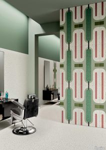
In <em>Chimera,</em> Elena Salmistraro merges rigour with self-expression, in a graphic grammar laden with symbolic meaning. <em>Empatia </em>speaks to the emotions with graphics that interpret, through a highly individual abstract code, the stage make-up of a clown, with the aid of superimposed geometric forms and images. <em>Radici </em>is a tribal statement, a tribute to primitive ritual custom, evoked by the interplay between a sequence of triangles and rectangles and a set of figurative fragments. <em>Ritmo</em> is inspired by fabrics, suggesting the rhythmic alternation of woven yarns through a largely linear pattern. In <em>Colore, </em>the upheaval of a background of small isolated spots generated by a parametric digital program is combined with densely packed repeated forms. "The Chimera collection is rather like a book with four different chapters: I set out to differentiate these graphic motifs to create four totally different stories."<br></br>Elena Salmistraro It all starts with drawing. A <em>passion</em> for drawing. An <em>obsession</em> with drawing. Drawings like spider-webs, obsessively filling spaces, in a kind of manual choreography or gymnastics, a continuous flow. Elena Salmistraro draws all the time. She draws everywhere. Mostly on loose sheets or random surfaces. First and foremost with pen and pencil. Her drawings only acquire colour at a later stage. Often - just like Alessandro Mendini used to do - she draws "monsters": fascinating yet disturbing, subversive forms. The denser, more contorted the shape, the more obvious its underlying truth. For Elena, drawing is an intimate act. It is relaxing. And therapeutic. With an unrivalled communicative strength. Because drawing gives shape to ideas: you both give form to the world and reveal yourself. This passion, combined with natural graphic talent, has guided Elena Salmistraro in her project for Cedit: an experimental series of ceramic slabs produced using a high-definition 3D decorative technique. The explicit aim is to transform surfaces beyond their original flatness so that a new, visual and tactile, three-dimensional personality emerges, sweeping aside the coldness and uniformity that ceramic objects often inevitably convey.Elena Salmistraro has always viewed ceramics as a democratic material, in view of their accessibility, and the infinite potentials for shaping matter that they provide. She began working and experimenting with ceramics very early in her career, just after she graduated from the Milan Politecnico in 2008. She came into contact with small artistic craft firms specialising in smallproduction lots, and cut her teeth on projects that demanded the hand-processing of every detail, and finishes of high artistic value, for the high end of the market. The large corporations and galleries came later, but here again Elena kept faith with her desire to make mass-produced pieces unique, and to combine artistic value with specifically industrial characteristics. The monkey-shaped <em>Primates</em> vases reflect this method and intention, aiming to excite, surprise and charm. Antiminimalist and hyper-figurative, playful, ironic and a rich image-maker, often drawing on anthropology and magic, over the years Salmistraro has built up her own fantastic universe, inhabited by ceramic bestiaries, painted jungles and a cabinet like a one-eyed cyclops , always finding inspiration and inputs in nature and always aiming to reveal the extraordinary in the everyday. Given this background, it was almost inevitable she would work with Cedit: constantly seeking new talents and new approaches, as well as designs that break down the boundaries of ceramics and release them into the realm of art and innovation, the Modena company has recognised Elena Salmistraro as a leading contemporary creative spirit and involved her in a project intended to experiment with fresh ideas in materials and synaesthetics.Salmistraro's collection for Cedit is entitled <em>Chimera</em> and consists of large ceramic slabs, which can be enjoyed not only visually, through their patterns and colours, but also on a tactile level. Like the chimera in the "grotesque" tradition, monstrous in the etymological sense of the word with its merging of hybrid animal and vegetable shapes, the Cedit project attempts to originate a synaesthetic form of ceramics, through a three-dimensional development that exactly reproduces the texture of leathers and fabrics, creating an absolutely new kind of layered effect, with a tactile awareness that recalls the passion of grand master Ettore Sottsass for "surfaces that talk". And the surfaces of the slabs Salmistraro has created really seem to talk: in <em>Empatia </em>clown faces add theatricality to the cold gleam of marbles, interspersed with references to Art Déco graphics; <em>Radici</em> uses the textures of leathers and hide as if to re-establish a link between ceramics and other materials at the origins of human activity and creativity; in <em>Ritmo</em> the texture of cloth dialogues with pottery, almost in homage to the tactile rationalism of warp and weft, of which Bauhaus pioneer Anni Albers was one of the most expressive past interpreters ; finally, <em>Colore</em> has a spotted base generated by computer to underline the contrast between analogue and digital, the graphic sign and the matter into which it is impressed. It is an aesthetic of superimposition and mixing, and especially of synaesthesia: as in her drawings, in the <em>Chimera </em>slabs Elena Salmistraro's art is one of movement and acceleration. A process not of representation but of exploration. Of the world and of oneself. Almost a kind of Zen, for distancing oneself from the world to understand it more fully. In every sense.
Chimera Radici Beige

florim > Wallcovering
In <em>Chimera,</em> Elena Salmistraro merges rigour with self-expression, in a graphic grammar laden with symbolic meaning. <em>Empatia </em>speaks to the emotions with graphics that interpret, through a highly individual abstract code, the stage make-up of a clown, with the aid of superimposed geometric forms and images. <em>Radici </em>is a tribal statement, a tribute to primitive ritual custom, evoked by the interplay between a sequence of triangles and rectangles and a set of figurative fragments. <em>Ritmo</em> is inspired by fabrics, suggesting the rhythmic alternation of woven yarns through a largely linear pattern. In <em>Colore, </em>the upheaval of a background of small isolated spots generated by a parametric digital program is combined with densely packed repeated forms. "The Chimera collection is rather like a book with four different chapters: I set out to differentiate these graphic motifs to create four totally different stories."<br></br>Elena Salmistraro It all starts with drawing. A <em>passion</em> for drawing. An <em>obsession</em> with drawing. Drawings like spider-webs, obsessively filling spaces, in a kind of manual choreography or gymnastics, a continuous flow. Elena Salmistraro draws all the time. She draws everywhere. Mostly on loose sheets or random surfaces. First and foremost with pen and pencil. Her drawings only acquire colour at a later stage. Often - just like Alessandro Mendini used to do - she draws "monsters": fascinating yet disturbing, subversive forms. The denser, more contorted the shape, the more obvious its underlying truth. For Elena, drawing is an intimate act. It is relaxing. And therapeutic. With an unrivalled communicative strength. Because drawing gives shape to ideas: you both give form to the world and reveal yourself. This passion, combined with natural graphic talent, has guided Elena Salmistraro in her project for Cedit: an experimental series of ceramic slabs produced using a high-definition 3D decorative technique. The explicit aim is to transform surfaces beyond their original flatness so that a new, visual and tactile, three-dimensional personality emerges, sweeping aside the coldness and uniformity that ceramic objects often inevitably convey.Elena Salmistraro has always viewed ceramics as a democratic material, in view of their accessibility, and the infinite potentials for shaping matter that they provide. She began working and experimenting with ceramics very early in her career, just after she graduated from the Milan Politecnico in 2008. She came into contact with small artistic craft firms specialising in smallproduction lots, and cut her teeth on projects that demanded the hand-processing of every detail, and finishes of high artistic value, for the high end of the market. The large corporations and galleries came later, but here again Elena kept faith with her desire to make mass-produced pieces unique, and to combine artistic value with specifically industrial characteristics. The monkey-shaped <em>Primates</em> vases reflect this method and intention, aiming to excite, surprise and charm. Antiminimalist and hyper-figurative, playful, ironic and a rich image-maker, often drawing on anthropology and magic, over the years Salmistraro has built up her own fantastic universe, inhabited by ceramic bestiaries, painted jungles and a cabinet like a one-eyed cyclops , always finding inspiration and inputs in nature and always aiming to reveal the extraordinary in the everyday. Given this background, it was almost inevitable she would work with Cedit: constantly seeking new talents and new approaches, as well as designs that break down the boundaries of ceramics and release them into the realm of art and innovation, the Modena company has recognised Elena Salmistraro as a leading contemporary creative spirit and involved her in a project intended to experiment with fresh ideas in materials and synaesthetics.Salmistraro's collection for Cedit is entitled <em>Chimera</em> and consists of large ceramic slabs, which can be enjoyed not only visually, through their patterns and colours, but also on a tactile level. Like the chimera in the "grotesque" tradition, monstrous in the etymological sense of the word with its merging of hybrid animal and vegetable shapes, the Cedit project attempts to originate a synaesthetic form of ceramics, through a three-dimensional development that exactly reproduces the texture of leathers and fabrics, creating an absolutely new kind of layered effect, with a tactile awareness that recalls the passion of grand master Ettore Sottsass for "surfaces that talk". And the surfaces of the slabs Salmistraro has created really seem to talk: in <em>Empatia </em>clown faces add theatricality to the cold gleam of marbles, interspersed with references to Art Déco graphics; <em>Radici</em> uses the textures of leathers and hide as if to re-establish a link between ceramics and other materials at the origins of human activity and creativity; in <em>Ritmo</em> the texture of cloth dialogues with pottery, almost in homage to the tactile rationalism of warp and weft, of which Bauhaus pioneer Anni Albers was one of the most expressive past interpreters ; finally, <em>Colore</em> has a spotted base generated by computer to underline the contrast between analogue and digital, the graphic sign and the matter into which it is impressed. It is an aesthetic of superimposition and mixing, and especially of synaesthesia: as in her drawings, in the <em>Chimera </em>slabs Elena Salmistraro's art is one of movement and acceleration. A process not of representation but of exploration. Of the world and of oneself. Almost a kind of Zen, for distancing oneself from the world to understand it more fully. In every sense.
Chimera Ritmo Azzurro

florim > Wallcovering
In <em>Chimera,</em> Elena Salmistraro merges rigour with self-expression, in a graphic grammar laden with symbolic meaning. <em>Empatia </em>speaks to the emotions with graphics that interpret, through a highly individual abstract code, the stage make-up of a clown, with the aid of superimposed geometric forms and images. <em>Radici </em>is a tribal statement, a tribute to primitive ritual custom, evoked by the interplay between a sequence of triangles and rectangles and a set of figurative fragments. <em>Ritmo</em> is inspired by fabrics, suggesting the rhythmic alternation of woven yarns through a largely linear pattern. In <em>Colore, </em>the upheaval of a background of small isolated spots generated by a parametric digital program is combined with densely packed repeated forms. "The Chimera collection is rather like a book with four different chapters: I set out to differentiate these graphic motifs to create four totally different stories."<br></br>Elena Salmistraro It all starts with drawing. A <em>passion</em> for drawing. An <em>obsession</em> with drawing. Drawings like spider-webs, obsessively filling spaces, in a kind of manual choreography or gymnastics, a continuous flow. Elena Salmistraro draws all the time. She draws everywhere. Mostly on loose sheets or random surfaces. First and foremost with pen and pencil. Her drawings only acquire colour at a later stage. Often - just like Alessandro Mendini used to do - she draws "monsters": fascinating yet disturbing, subversive forms. The denser, more contorted the shape, the more obvious its underlying truth. For Elena, drawing is an intimate act. It is relaxing. And therapeutic. With an unrivalled communicative strength. Because drawing gives shape to ideas: you both give form to the world and reveal yourself. This passion, combined with natural graphic talent, has guided Elena Salmistraro in her project for Cedit: an experimental series of ceramic slabs produced using a high-definition 3D decorative technique. The explicit aim is to transform surfaces beyond their original flatness so that a new, visual and tactile, three-dimensional personality emerges, sweeping aside the coldness and uniformity that ceramic objects often inevitably convey.Elena Salmistraro has always viewed ceramics as a democratic material, in view of their accessibility, and the infinite potentials for shaping matter that they provide. She began working and experimenting with ceramics very early in her career, just after she graduated from the Milan Politecnico in 2008. She came into contact with small artistic craft firms specialising in smallproduction lots, and cut her teeth on projects that demanded the hand-processing of every detail, and finishes of high artistic value, for the high end of the market. The large corporations and galleries came later, but here again Elena kept faith with her desire to make mass-produced pieces unique, and to combine artistic value with specifically industrial characteristics. The monkey-shaped <em>Primates</em> vases reflect this method and intention, aiming to excite, surprise and charm. Antiminimalist and hyper-figurative, playful, ironic and a rich image-maker, often drawing on anthropology and magic, over the years Salmistraro has built up her own fantastic universe, inhabited by ceramic bestiaries, painted jungles and a cabinet like a one-eyed cyclops , always finding inspiration and inputs in nature and always aiming to reveal the extraordinary in the everyday. Given this background, it was almost inevitable she would work with Cedit: constantly seeking new talents and new approaches, as well as designs that break down the boundaries of ceramics and release them into the realm of art and innovation, the Modena company has recognised Elena Salmistraro as a leading contemporary creative spirit and involved her in a project intended to experiment with fresh ideas in materials and synaesthetics.Salmistraro's collection for Cedit is entitled <em>Chimera</em> and consists of large ceramic slabs, which can be enjoyed not only visually, through their patterns and colours, but also on a tactile level. Like the chimera in the "grotesque" tradition, monstrous in the etymological sense of the word with its merging of hybrid animal and vegetable shapes, the Cedit project attempts to originate a synaesthetic form of ceramics, through a three-dimensional development that exactly reproduces the texture of leathers and fabrics, creating an absolutely new kind of layered effect, with a tactile awareness that recalls the passion of grand master Ettore Sottsass for "surfaces that talk". And the surfaces of the slabs Salmistraro has created really seem to talk: in <em>Empatia </em>clown faces add theatricality to the cold gleam of marbles, interspersed with references to Art Déco graphics; <em>Radici</em> uses the textures of leathers and hide as if to re-establish a link between ceramics and other materials at the origins of human activity and creativity; in <em>Ritmo</em> the texture of cloth dialogues with pottery, almost in homage to the tactile rationalism of warp and weft, of which Bauhaus pioneer Anni Albers was one of the most expressive past interpreters ; finally, <em>Colore</em> has a spotted base generated by computer to underline the contrast between analogue and digital, the graphic sign and the matter into which it is impressed. It is an aesthetic of superimposition and mixing, and especially of synaesthesia: as in her drawings, in the <em>Chimera </em>slabs Elena Salmistraro's art is one of movement and acceleration. A process not of representation but of exploration. Of the world and of oneself. Almost a kind of Zen, for distancing oneself from the world to understand it more fully. In every sense.
Chimera Empatia Nero

florim > Wall tile-stone-brick
In <em>Chimera,</em> Elena Salmistraro merges rigour with self-expression, in a graphic grammar laden with symbolic meaning. <em>Empatia </em>speaks to the emotions with graphics that interpret, through a highly individual abstract code, the stage make-up of a clown, with the aid of superimposed geometric forms and images. <em>Radici </em>is a tribal statement, a tribute to primitive ritual custom, evoked by the interplay between a sequence of triangles and rectangles and a set of figurative fragments. <em>Ritmo</em> is inspired by fabrics, suggesting the rhythmic alternation of woven yarns through a largely linear pattern. In <em>Colore, </em>the upheaval of a background of small isolated spots generated by a parametric digital program is combined with densely packed repeated forms. "The Chimera collection is rather like a book with four different chapters: I set out to differentiate these graphic motifs to create four totally different stories."<br></br>Elena Salmistraro It all starts with drawing. A <em>passion</em> for drawing. An <em>obsession</em> with drawing. Drawings like spider-webs, obsessively filling spaces, in a kind of manual choreography or gymnastics, a continuous flow. Elena Salmistraro draws all the time. She draws everywhere. Mostly on loose sheets or random surfaces. First and foremost with pen and pencil. Her drawings only acquire colour at a later stage. Often - just like Alessandro Mendini used to do - she draws "monsters": fascinating yet disturbing, subversive forms. The denser, more contorted the shape, the more obvious its underlying truth. For Elena, drawing is an intimate act. It is relaxing. And therapeutic. With an unrivalled communicative strength. Because drawing gives shape to ideas: you both give form to the world and reveal yourself. This passion, combined with natural graphic talent, has guided Elena Salmistraro in her project for Cedit: an experimental series of ceramic slabs produced using a high-definition 3D decorative technique. The explicit aim is to transform surfaces beyond their original flatness so that a new, visual and tactile, three-dimensional personality emerges, sweeping aside the coldness and uniformity that ceramic objects often inevitably convey.Elena Salmistraro has always viewed ceramics as a democratic material, in view of their accessibility, and the infinite potentials for shaping matter that they provide. She began working and experimenting with ceramics very early in her career, just after she graduated from the Milan Politecnico in 2008. She came into contact with small artistic craft firms specialising in smallproduction lots, and cut her teeth on projects that demanded the hand-processing of every detail, and finishes of high artistic value, for the high end of the market. The large corporations and galleries came later, but here again Elena kept faith with her desire to make mass-produced pieces unique, and to combine artistic value with specifically industrial characteristics. The monkey-shaped <em>Primates</em> vases reflect this method and intention, aiming to excite, surprise and charm. Antiminimalist and hyper-figurative, playful, ironic and a rich image-maker, often drawing on anthropology and magic, over the years Salmistraro has built up her own fantastic universe, inhabited by ceramic bestiaries, painted jungles and a cabinet like a one-eyed cyclops , always finding inspiration and inputs in nature and always aiming to reveal the extraordinary in the everyday. Given this background, it was almost inevitable she would work with Cedit: constantly seeking new talents and new approaches, as well as designs that break down the boundaries of ceramics and release them into the realm of art and innovation, the Modena company has recognised Elena Salmistraro as a leading contemporary creative spirit and involved her in a project intended to experiment with fresh ideas in materials and synaesthetics.Salmistraro's collection for Cedit is entitled <em>Chimera</em> and consists of large ceramic slabs, which can be enjoyed not only visually, through their patterns and colours, but also on a tactile level. Like the chimera in the "grotesque" tradition, monstrous in the etymological sense of the word with its merging of hybrid animal and vegetable shapes, the Cedit project attempts to originate a synaesthetic form of ceramics, through a three-dimensional development that exactly reproduces the texture of leathers and fabrics, creating an absolutely new kind of layered effect, with a tactile awareness that recalls the passion of grand master Ettore Sottsass for "surfaces that talk". And the surfaces of the slabs Salmistraro has created really seem to talk: in <em>Empatia </em>clown faces add theatricality to the cold gleam of marbles, interspersed with references to Art Déco graphics; <em>Radici</em> uses the textures of leathers and hide as if to re-establish a link between ceramics and other materials at the origins of human activity and creativity; in <em>Ritmo</em> the texture of cloth dialogues with pottery, almost in homage to the tactile rationalism of warp and weft, of which Bauhaus pioneer Anni Albers was one of the most expressive past interpreters ; finally, <em>Colore</em> has a spotted base generated by computer to underline the contrast between analogue and digital, the graphic sign and the matter into which it is impressed. It is an aesthetic of superimposition and mixing, and especially of synaesthesia: as in her drawings, in the <em>Chimera </em>slabs Elena Salmistraro's art is one of movement and acceleration. A process not of representation but of exploration. Of the world and of oneself. Almost a kind of Zen, for distancing oneself from the world to understand it more fully. In every sense.
Chimera Colore Bianco

florim > Wall Paint
In <em>Chimera,</em> Elena Salmistraro merges rigour with self-expression, in a graphic grammar laden with symbolic meaning. <em>Empatia </em>speaks to the emotions with graphics that interpret, through a highly individual abstract code, the stage make-up of a clown, with the aid of superimposed geometric forms and images. <em>Radici </em>is a tribal statement, a tribute to primitive ritual custom, evoked by the interplay between a sequence of triangles and rectangles and a set of figurative fragments. <em>Ritmo</em> is inspired by fabrics, suggesting the rhythmic alternation of woven yarns through a largely linear pattern. In <em>Colore, </em>the upheaval of a background of small isolated spots generated by a parametric digital program is combined with densely packed repeated forms. "The Chimera collection is rather like a book with four different chapters: I set out to differentiate these graphic motifs to create four totally different stories."<br></br>Elena Salmistraro It all starts with drawing. A <em>passion</em> for drawing. An <em>obsession</em> with drawing. Drawings like spider-webs, obsessively filling spaces, in a kind of manual choreography or gymnastics, a continuous flow. Elena Salmistraro draws all the time. She draws everywhere. Mostly on loose sheets or random surfaces. First and foremost with pen and pencil. Her drawings only acquire colour at a later stage. Often - just like Alessandro Mendini used to do - she draws "monsters": fascinating yet disturbing, subversive forms. The denser, more contorted the shape, the more obvious its underlying truth. For Elena, drawing is an intimate act. It is relaxing. And therapeutic. With an unrivalled communicative strength. Because drawing gives shape to ideas: you both give form to the world and reveal yourself. This passion, combined with natural graphic talent, has guided Elena Salmistraro in her project for Cedit: an experimental series of ceramic slabs produced using a high-definition 3D decorative technique. The explicit aim is to transform surfaces beyond their original flatness so that a new, visual and tactile, three-dimensional personality emerges, sweeping aside the coldness and uniformity that ceramic objects often inevitably convey.Elena Salmistraro has always viewed ceramics as a democratic material, in view of their accessibility, and the infinite potentials for shaping matter that they provide. She began working and experimenting with ceramics very early in her career, just after she graduated from the Milan Politecnico in 2008. She came into contact with small artistic craft firms specialising in smallproduction lots, and cut her teeth on projects that demanded the hand-processing of every detail, and finishes of high artistic value, for the high end of the market. The large corporations and galleries came later, but here again Elena kept faith with her desire to make mass-produced pieces unique, and to combine artistic value with specifically industrial characteristics. The monkey-shaped <em>Primates</em> vases reflect this method and intention, aiming to excite, surprise and charm. Antiminimalist and hyper-figurative, playful, ironic and a rich image-maker, often drawing on anthropology and magic, over the years Salmistraro has built up her own fantastic universe, inhabited by ceramic bestiaries, painted jungles and a cabinet like a one-eyed cyclops , always finding inspiration and inputs in nature and always aiming to reveal the extraordinary in the everyday. Given this background, it was almost inevitable she would work with Cedit: constantly seeking new talents and new approaches, as well as designs that break down the boundaries of ceramics and release them into the realm of art and innovation, the Modena company has recognised Elena Salmistraro as a leading contemporary creative spirit and involved her in a project intended to experiment with fresh ideas in materials and synaesthetics.Salmistraro's collection for Cedit is entitled <em>Chimera</em> and consists of large ceramic slabs, which can be enjoyed not only visually, through their patterns and colours, but also on a tactile level. Like the chimera in the "grotesque" tradition, monstrous in the etymological sense of the word with its merging of hybrid animal and vegetable shapes, the Cedit project attempts to originate a synaesthetic form of ceramics, through a three-dimensional development that exactly reproduces the texture of leathers and fabrics, creating an absolutely new kind of layered effect, with a tactile awareness that recalls the passion of grand master Ettore Sottsass for "surfaces that talk". And the surfaces of the slabs Salmistraro has created really seem to talk: in <em>Empatia </em>clown faces add theatricality to the cold gleam of marbles, interspersed with references to Art Déco graphics; <em>Radici</em> uses the textures of leathers and hide as if to re-establish a link between ceramics and other materials at the origins of human activity and creativity; in <em>Ritmo</em> the texture of cloth dialogues with pottery, almost in homage to the tactile rationalism of warp and weft, of which Bauhaus pioneer Anni Albers was one of the most expressive past interpreters ; finally, <em>Colore</em> has a spotted base generated by computer to underline the contrast between analogue and digital, the graphic sign and the matter into which it is impressed. It is an aesthetic of superimposition and mixing, and especially of synaesthesia: as in her drawings, in the <em>Chimera </em>slabs Elena Salmistraro's art is one of movement and acceleration. A process not of representation but of exploration. Of the world and of oneself. Almost a kind of Zen, for distancing oneself from the world to understand it more fully. In every sense.
Pink Vintage Wool Cotton Blend Rug
abchome > Carpet
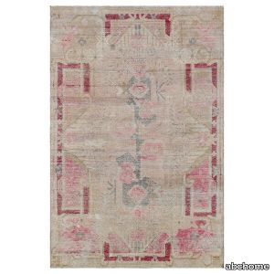
Sourced from the ancient Silk Road to bring a genuine one-of-a-kind rug to your home, this Pink Vintage Wool Cotton Blend Rug - 4'6" x 6'3" features a soft color palette, distressed finish, and intricate pattern which allows this pink vintage rug to be added to a variety of interiors. Only the finest wool and cotton fibers were used in the creation of this Samarkand rug leaving your bedroom, dining room, or living room with a durable and dense foundation for many years to come. The art of Uzbek carpet weaving originated in ancient times due to Khotan's proximity to the Silk Road making the Samarkand rugs' colors and designs rich with cross-cultural influence from Persia, France, Turkey, India, and China. Antique and vintage Samarkand rugs are exquisite treasures that bear witness to centuries of craftsmanship and cultural heritage.Handcrafted by master artisans dedicated to the artisanal methods of rug making, this vintage rug features patterns passed from mother to daughter with magic symbols including intricate floral motifs, balanced geometrics, and delicate detailing that are designed to protect its owner and bring good luck and prosperity into the home.
Chimera Colore Grigio

florim > Wall Paint
In <em>Chimera,</em> Elena Salmistraro merges rigour with self-expression, in a graphic grammar laden with symbolic meaning. <em>Empatia </em>speaks to the emotions with graphics that interpret, through a highly individual abstract code, the stage make-up of a clown, with the aid of superimposed geometric forms and images. <em>Radici </em>is a tribal statement, a tribute to primitive ritual custom, evoked by the interplay between a sequence of triangles and rectangles and a set of figurative fragments. <em>Ritmo</em> is inspired by fabrics, suggesting the rhythmic alternation of woven yarns through a largely linear pattern. In <em>Colore, </em>the upheaval of a background of small isolated spots generated by a parametric digital program is combined with densely packed repeated forms. "The Chimera collection is rather like a book with four different chapters: I set out to differentiate these graphic motifs to create four totally different stories."<br></br>Elena Salmistraro It all starts with drawing. A <em>passion</em> for drawing. An <em>obsession</em> with drawing. Drawings like spider-webs, obsessively filling spaces, in a kind of manual choreography or gymnastics, a continuous flow. Elena Salmistraro draws all the time. She draws everywhere. Mostly on loose sheets or random surfaces. First and foremost with pen and pencil. Her drawings only acquire colour at a later stage. Often - just like Alessandro Mendini used to do - she draws "monsters": fascinating yet disturbing, subversive forms. The denser, more contorted the shape, the more obvious its underlying truth. For Elena, drawing is an intimate act. It is relaxing. And therapeutic. With an unrivalled communicative strength. Because drawing gives shape to ideas: you both give form to the world and reveal yourself. This passion, combined with natural graphic talent, has guided Elena Salmistraro in her project for Cedit: an experimental series of ceramic slabs produced using a high-definition 3D decorative technique. The explicit aim is to transform surfaces beyond their original flatness so that a new, visual and tactile, three-dimensional personality emerges, sweeping aside the coldness and uniformity that ceramic objects often inevitably convey.Elena Salmistraro has always viewed ceramics as a democratic material, in view of their accessibility, and the infinite potentials for shaping matter that they provide. She began working and experimenting with ceramics very early in her career, just after she graduated from the Milan Politecnico in 2008. She came into contact with small artistic craft firms specialising in smallproduction lots, and cut her teeth on projects that demanded the hand-processing of every detail, and finishes of high artistic value, for the high end of the market. The large corporations and galleries came later, but here again Elena kept faith with her desire to make mass-produced pieces unique, and to combine artistic value with specifically industrial characteristics. The monkey-shaped <em>Primates</em> vases reflect this method and intention, aiming to excite, surprise and charm. Antiminimalist and hyper-figurative, playful, ironic and a rich image-maker, often drawing on anthropology and magic, over the years Salmistraro has built up her own fantastic universe, inhabited by ceramic bestiaries, painted jungles and a cabinet like a one-eyed cyclops , always finding inspiration and inputs in nature and always aiming to reveal the extraordinary in the everyday. Given this background, it was almost inevitable she would work with Cedit: constantly seeking new talents and new approaches, as well as designs that break down the boundaries of ceramics and release them into the realm of art and innovation, the Modena company has recognised Elena Salmistraro as a leading contemporary creative spirit and involved her in a project intended to experiment with fresh ideas in materials and synaesthetics.Salmistraro's collection for Cedit is entitled <em>Chimera</em> and consists of large ceramic slabs, which can be enjoyed not only visually, through their patterns and colours, but also on a tactile level. Like the chimera in the "grotesque" tradition, monstrous in the etymological sense of the word with its merging of hybrid animal and vegetable shapes, the Cedit project attempts to originate a synaesthetic form of ceramics, through a three-dimensional development that exactly reproduces the texture of leathers and fabrics, creating an absolutely new kind of layered effect, with a tactile awareness that recalls the passion of grand master Ettore Sottsass for "surfaces that talk". And the surfaces of the slabs Salmistraro has created really seem to talk: in <em>Empatia </em>clown faces add theatricality to the cold gleam of marbles, interspersed with references to Art Déco graphics; <em>Radici</em> uses the textures of leathers and hide as if to re-establish a link between ceramics and other materials at the origins of human activity and creativity; in <em>Ritmo</em> the texture of cloth dialogues with pottery, almost in homage to the tactile rationalism of warp and weft, of which Bauhaus pioneer Anni Albers was one of the most expressive past interpreters ; finally, <em>Colore</em> has a spotted base generated by computer to underline the contrast between analogue and digital, the graphic sign and the matter into which it is impressed. It is an aesthetic of superimposition and mixing, and especially of synaesthesia: as in her drawings, in the <em>Chimera </em>slabs Elena Salmistraro's art is one of movement and acceleration. A process not of representation but of exploration. Of the world and of oneself. Almost a kind of Zen, for distancing oneself from the world to understand it more fully. In every sense.
Euridice Tela
florim > Wallcovering
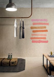
The mystery and poetry of painting. Art that inhabits space. «In the past, art was expected to transfer the object, or work of art, from the inanimate to the animate world. Now, since we know that the whole world is animate, the task of the artist is to interact with the intelligence of matter.» Giorgio Griffa Born in Turin in 1936, Giorgio Griffa is now ranked as one of Italy's most important abstract painters of the Twentieth Century. He began to paint when he was very young, just 10 years old, and for two decades his work was figurative, fairly traditional in subjects and style. His mature work developed later, in the mid Sixties, in the context of the abstract-expressionist and tachiste movements, which based their language on a concept of painting as a sequence of actions, like a repeated sign or form of writing. Rather than a representation, painting became the direct expression of a mental state, a precise psychic temperature, an internal beat.Historically, his work has been classified as part of this "analytical painting" movement, which concentrated on analysing itself and its internal mechanisms: surface, substrate, colour and sign. However, Giorgio Griffa's work seems to stand apart from that of his fellow artists, and nowadays it is difficult to place it firmly within the historic analytical and conceptual painting movements. His abstract works, consisting of simple signs repeated on the canvas, seem to be not so much an analysis of the act of painting as a homage to painting itself and its history. And this is one of the delightful, central paradox's of Griffa's work: in spite of their conceptual approach, his paintings have <strong>a fascinating lyrical component, a radiant musicality, very different from the cold, unemotional mood of the neo-avantgardes</strong>.<br /> In this sense his works are something of a mystery for the art world, as lovely as they are indefinable, because in them everything seems to be at once both simple and complex. The types of canvas the artist uses (jute, hemp, cotton or linen) are simple. His painted signs are also simple, or even anonymous: a series of vertical or horizontal lines and - only from the Eighties onwards - stylised floral motifs, friezes and spirals. Yet Griffa entrusts this apparent simplicity with the task of saying what is unsayable by its very nature; of plumbing the depths of the mystery of creation and the unknown. Seemingly banal and obvious at first glance, Griffa's work is actually layered with references to the history of art, Stone Age painting, Zen philosophy, music and "“ as we have seen "“ the artistic avantgarde of his own age.All these characteristics are very much to the fore in the artist's works for CEDIT Ceramiche. For this historic brand, Griffa has created five works involving a series of lyrical, minimalist signs, which recall the motifs current in the late Sixties and Seventies. The range of colours in which these signs are presented, with complementary colours and half-tones, seem to be drawn from the Renaissance and the art of Venice and its region in the Sixteenth and Seventeenth Centuries. The other fundamental point of reference is Matisse, the painter who rejoiced in colour and in whose images signs and colours are nicely balanced.<br /> Griffa's collection for CEDIT sets out to use <strong>modular repetition of signs</strong> to build up genuine spatial environments for everyday living. The partnership with a ceramics manufacturer is a particularly fertile one for the Turin-born artist. In fact, his pictorial language "“ based on the concept of an anonymous sign open to potentially infinite repetition "“ seems to be ideally suited to large-scale reproduction and the decoration of entire interiors. The concepts of fragmentation and incompletion can be easily applied to the decoration of living-spaces of varying sizes, as if they were "portions" of a larger whole, an expanding universe. All Griffa's works use a repertoire of timeless signs, actions repeated over the millennia, on a complex trajectory that combines art, craftsmanship and decoration. In the project for CEDIT, this ancient story of experimentation with the potentialities of sign, colour and matter comes to a kind of natural, fascinating fruition.
Cromatica Gradiente bianco-rosa
florim > Wall Paint
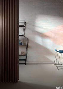
A lexicon of colour shades for mixing. A large size and its submultiples. «This work represents a reflection on colour, and above all a proposal on how to transfer the multiplicity of shades typical of a hand-crafted piece into a project produced on a large scale.» Andrea Trimarchi & Simone Farresin Studio Formafantasma base their work in the design world on a strong vocation for research. Simone Farresin and Andrea Trimarchi view every project as an opportunity for study and the acquisition of new knowledge, and their love of speculation establishes a dialectic rapport with the situations offered by each new client. Whether it involves a material, a type or a production method, the first phase of their design process is the mapping of what the specific case places at their disposal. With Cedit, an analysis of the company's past and present was central to the inputs. Inevitably, since "Looking back to look forward" has been the design duo's mission statement for years. In this case, in particular, the company's history was a real treasure trove, a fine blend of memory and technology: on the one hand, the excellence of production technologies now extended with the added potential arising from the engineering of large-sized ceramic tiles, and on the other a wealth of experience build up with great designers of the past, from Zanuso to Noorda, through to <strong>Ettore Sottsass</strong>. Andrea and Simone decided to focus on Sottsass - who started designing for Cedit back in the late Seventies - and made an in-depth study of one of the colour charts he developed towards the end of the Nineties. A spread of colours which gave its name to the "41 Colors" collection, included in the catalogue of the period as a real alphabet for what has proved to be a lasting design language. Colour was much more than just a compulsory step in the dialogue between designer and producer, since Sottsass had already discovered the power of the mystery intrinsic to this universe of invention.<br /><br />With Cedit the master-designer, a long-established lover of ceramics and their crafted unpredictability, found a way of transferring his personal feeling for colour to a wide audience, through industrial mass production. And this assumption is another factor Formafantasma have inherited, interpreting it today with new, even more efficient technical resources just as capable of expressing the secrets of colour. «The concept of colour "in isolation" - Sottsass explained in a 1992 text - classified colour, Pantone, as they call it now, "scientific" colour, is something I still refuse to accept. (...) Colours, the idea of colour, are always intangible, they slip slowly away like words, that run through your fingers, like poetry, which you can never keep hold of, like a good story.» And Formafantasma seem to have chosen that distinction between colour "in isolation" and "intangible" yet ever-present colour as the basis of their work. However, their approach draws on their unique vocation for research and the technical resources of the third millennium. «This work - they explain to us - is a reflection on colour, and above all on <strong>how to bring the multiplicity of shades typical of a hand-crafted piece into a large-scale project</strong>.» The designers look at large, monochrome slabs and turn to the engineers for details of their secrets, their processing stages, the phases in their production. They appreciate that the colour of ceramic material, its ineffable secret, can still be present in the series and large tile sizes in which Cedit leads the way. They understand that this is, in itself, an expressive power which does not need channelling into forms, motifs and signs. But above all, they treat the surface as a large canvas on which they spread pure colour, which tends to be uniform but in fact is never really a "scientific", totally monochrome hue: it is not a Pantone. And this is the source of the fundamental insight, which only children of the transition from the analogue to the digital era could achieve, the reward for those who draw on the past to look to the future.<br /><br />The designers cut the slab into lots of regular pieces, not necessarily of the same size. They restore its identity as a "tile", a familiar name with something ancient about it, but which stands for a module, a unit of measurement, a building block. There is nothing nostalgic about this - on the contrary, the vision is completely new, and the portions of slab created can be reassembled with no restrictions, breaking down the unity of the whole and reviving its essence starting from its structure. As the cards in the pack are shuffled, what emerges is not a figure or motif but the representation of colour itself and its physical nature. It is live matter, born from the meeting of vibrating forces, the mixing of ever-varying percentages of the basic ingredients. And Formafantasma present us with the corpuscular, fragmented essence of these small frames of space and crystallised time, which reveal the code and formula of their composition. So Cromatica is a collection made up of six colours which actually have an infinite number of declinations and compositional possibilities. It is a "discrete" combination in the mathematical sense of the term, capable of generating multiple, variable subsets. At the same time, each slab can be used in its entirety, leaving the impression of analogue continuity unchanged. But what really amazes is the comparison and dialogue between the two approaches: a stroke of genius, laying clear the mysterious appeal the artificial reproduction of colour has always held for mankind. Because, as Sottsass said, «colours are language, a powerful, magical, intangible, flexible, continuous material, in which existence is made manifest, the existence that lives in time and space».
Cromatica Grigio

florim > Wall Paint
A lexicon of colour shades for mixing. A large size and its submultiples. «This work represents a reflection on colour, and above all a proposal on how to transfer the multiplicity of shades typical of a hand-crafted piece into a project produced on a large scale.» Andrea Trimarchi & Simone Farresin Studio Formafantasma base their work in the design world on a strong vocation for research. Simone Farresin and Andrea Trimarchi view every project as an opportunity for study and the acquisition of new knowledge, and their love of speculation establishes a dialectic rapport with the situations offered by each new client. Whether it involves a material, a type or a production method, the first phase of their design process is the mapping of what the specific case places at their disposal. With Cedit, an analysis of the company's past and present was central to the inputs. Inevitably, since "Looking back to look forward" has been the design duo's mission statement for years. In this case, in particular, the company's history was a real treasure trove, a fine blend of memory and technology: on the one hand, the excellence of production technologies now extended with the added potential arising from the engineering of large-sized ceramic tiles, and on the other a wealth of experience build up with great designers of the past, from Zanuso to Noorda, through to <strong>Ettore Sottsass</strong>. Andrea and Simone decided to focus on Sottsass - who started designing for Cedit back in the late Seventies - and made an in-depth study of one of the colour charts he developed towards the end of the Nineties. A spread of colours which gave its name to the "41 Colors" collection, included in the catalogue of the period as a real alphabet for what has proved to be a lasting design language. Colour was much more than just a compulsory step in the dialogue between designer and producer, since Sottsass had already discovered the power of the mystery intrinsic to this universe of invention.<br /><br />With Cedit the master-designer, a long-established lover of ceramics and their crafted unpredictability, found a way of transferring his personal feeling for colour to a wide audience, through industrial mass production. And this assumption is another factor Formafantasma have inherited, interpreting it today with new, even more efficient technical resources just as capable of expressing the secrets of colour. «The concept of colour "in isolation" - Sottsass explained in a 1992 text - classified colour, Pantone, as they call it now, "scientific" colour, is something I still refuse to accept. (...) Colours, the idea of colour, are always intangible, they slip slowly away like words, that run through your fingers, like poetry, which you can never keep hold of, like a good story.» And Formafantasma seem to have chosen that distinction between colour "in isolation" and "intangible" yet ever-present colour as the basis of their work. However, their approach draws on their unique vocation for research and the technical resources of the third millennium. «This work - they explain to us - is a reflection on colour, and above all on <strong>how to bring the multiplicity of shades typical of a hand-crafted piece into a large-scale project</strong>.» The designers look at large, monochrome slabs and turn to the engineers for details of their secrets, their processing stages, the phases in their production. They appreciate that the colour of ceramic material, its ineffable secret, can still be present in the series and large tile sizes in which Cedit leads the way. They understand that this is, in itself, an expressive power which does not need channelling into forms, motifs and signs. But above all, they treat the surface as a large canvas on which they spread pure colour, which tends to be uniform but in fact is never really a "scientific", totally monochrome hue: it is not a Pantone. And this is the source of the fundamental insight, which only children of the transition from the analogue to the digital era could achieve, the reward for those who draw on the past to look to the future.<br /><br />The designers cut the slab into lots of regular pieces, not necessarily of the same size. They restore its identity as a "tile", a familiar name with something ancient about it, but which stands for a module, a unit of measurement, a building block. There is nothing nostalgic about this - on the contrary, the vision is completely new, and the portions of slab created can be reassembled with no restrictions, breaking down the unity of the whole and reviving its essence starting from its structure. As the cards in the pack are shuffled, what emerges is not a figure or motif but the representation of colour itself and its physical nature. It is live matter, born from the meeting of vibrating forces, the mixing of ever-varying percentages of the basic ingredients. And Formafantasma present us with the corpuscular, fragmented essence of these small frames of space and crystallised time, which reveal the code and formula of their composition. So Cromatica is a collection made up of six colours which actually have an infinite number of declinations and compositional possibilities. It is a "discrete" combination in the mathematical sense of the term, capable of generating multiple, variable subsets. At the same time, each slab can be used in its entirety, leaving the impression of analogue continuity unchanged. But what really amazes is the comparison and dialogue between the two approaches: a stroke of genius, laying clear the mysterious appeal the artificial reproduction of colour has always held for mankind. Because, as Sottsass said, «colours are language, a powerful, magical, intangible, flexible, continuous material, in which existence is made manifest, the existence that lives in time and space».
Cromatica Cobalto

florim > Wall Paint
A lexicon of colour shades for mixing. A large size and its submultiples. «This work represents a reflection on colour, and above all a proposal on how to transfer the multiplicity of shades typical of a hand-crafted piece into a project produced on a large scale.» Andrea Trimarchi & Simone Farresin Studio Formafantasma base their work in the design world on a strong vocation for research. Simone Farresin and Andrea Trimarchi view every project as an opportunity for study and the acquisition of new knowledge, and their love of speculation establishes a dialectic rapport with the situations offered by each new client. Whether it involves a material, a type or a production method, the first phase of their design process is the mapping of what the specific case places at their disposal. With Cedit, an analysis of the company's past and present was central to the inputs. Inevitably, since "Looking back to look forward" has been the design duo's mission statement for years. In this case, in particular, the company's history was a real treasure trove, a fine blend of memory and technology: on the one hand, the excellence of production technologies now extended with the added potential arising from the engineering of large-sized ceramic tiles, and on the other a wealth of experience build up with great designers of the past, from Zanuso to Noorda, through to <strong>Ettore Sottsass</strong>. Andrea and Simone decided to focus on Sottsass - who started designing for Cedit back in the late Seventies - and made an in-depth study of one of the colour charts he developed towards the end of the Nineties. A spread of colours which gave its name to the "41 Colors" collection, included in the catalogue of the period as a real alphabet for what has proved to be a lasting design language. Colour was much more than just a compulsory step in the dialogue between designer and producer, since Sottsass had already discovered the power of the mystery intrinsic to this universe of invention.<br /><br />With Cedit the master-designer, a long-established lover of ceramics and their crafted unpredictability, found a way of transferring his personal feeling for colour to a wide audience, through industrial mass production. And this assumption is another factor Formafantasma have inherited, interpreting it today with new, even more efficient technical resources just as capable of expressing the secrets of colour. «The concept of colour "in isolation" - Sottsass explained in a 1992 text - classified colour, Pantone, as they call it now, "scientific" colour, is something I still refuse to accept. (...) Colours, the idea of colour, are always intangible, they slip slowly away like words, that run through your fingers, like poetry, which you can never keep hold of, like a good story.» And Formafantasma seem to have chosen that distinction between colour "in isolation" and "intangible" yet ever-present colour as the basis of their work. However, their approach draws on their unique vocation for research and the technical resources of the third millennium. «This work - they explain to us - is a reflection on colour, and above all on <strong>how to bring the multiplicity of shades typical of a hand-crafted piece into a large-scale project</strong>.» The designers look at large, monochrome slabs and turn to the engineers for details of their secrets, their processing stages, the phases in their production. They appreciate that the colour of ceramic material, its ineffable secret, can still be present in the series and large tile sizes in which Cedit leads the way. They understand that this is, in itself, an expressive power which does not need channelling into forms, motifs and signs. But above all, they treat the surface as a large canvas on which they spread pure colour, which tends to be uniform but in fact is never really a "scientific", totally monochrome hue: it is not a Pantone. And this is the source of the fundamental insight, which only children of the transition from the analogue to the digital era could achieve, the reward for those who draw on the past to look to the future.<br /><br />The designers cut the slab into lots of regular pieces, not necessarily of the same size. They restore its identity as a "tile", a familiar name with something ancient about it, but which stands for a module, a unit of measurement, a building block. There is nothing nostalgic about this - on the contrary, the vision is completely new, and the portions of slab created can be reassembled with no restrictions, breaking down the unity of the whole and reviving its essence starting from its structure. As the cards in the pack are shuffled, what emerges is not a figure or motif but the representation of colour itself and its physical nature. It is live matter, born from the meeting of vibrating forces, the mixing of ever-varying percentages of the basic ingredients. And Formafantasma present us with the corpuscular, fragmented essence of these small frames of space and crystallised time, which reveal the code and formula of their composition. So Cromatica is a collection made up of six colours which actually have an infinite number of declinations and compositional possibilities. It is a "discrete" combination in the mathematical sense of the term, capable of generating multiple, variable subsets. At the same time, each slab can be used in its entirety, leaving the impression of analogue continuity unchanged. But what really amazes is the comparison and dialogue between the two approaches: a stroke of genius, laying clear the mysterious appeal the artificial reproduction of colour has always held for mankind. Because, as Sottsass said, «colours are language, a powerful, magical, intangible, flexible, continuous material, in which existence is made manifest, the existence that lives in time and space».
Cromatica Cenere

florim > Synthetic Floor
A lexicon of colour shades for mixing. A large size and its submultiples. «This work represents a reflection on colour, and above all a proposal on how to transfer the multiplicity of shades typical of a hand-crafted piece into a project produced on a large scale.» Andrea Trimarchi & Simone Farresin Studio Formafantasma base their work in the design world on a strong vocation for research. Simone Farresin and Andrea Trimarchi view every project as an opportunity for study and the acquisition of new knowledge, and their love of speculation establishes a dialectic rapport with the situations offered by each new client. Whether it involves a material, a type or a production method, the first phase of their design process is the mapping of what the specific case places at their disposal. With Cedit, an analysis of the company's past and present was central to the inputs. Inevitably, since "Looking back to look forward" has been the design duo's mission statement for years. In this case, in particular, the company's history was a real treasure trove, a fine blend of memory and technology: on the one hand, the excellence of production technologies now extended with the added potential arising from the engineering of large-sized ceramic tiles, and on the other a wealth of experience build up with great designers of the past, from Zanuso to Noorda, through to <strong>Ettore Sottsass</strong>. Andrea and Simone decided to focus on Sottsass - who started designing for Cedit back in the late Seventies - and made an in-depth study of one of the colour charts he developed towards the end of the Nineties. A spread of colours which gave its name to the "41 Colors" collection, included in the catalogue of the period as a real alphabet for what has proved to be a lasting design language. Colour was much more than just a compulsory step in the dialogue between designer and producer, since Sottsass had already discovered the power of the mystery intrinsic to this universe of invention.<br /><br />With Cedit the master-designer, a long-established lover of ceramics and their crafted unpredictability, found a way of transferring his personal feeling for colour to a wide audience, through industrial mass production. And this assumption is another factor Formafantasma have inherited, interpreting it today with new, even more efficient technical resources just as capable of expressing the secrets of colour. «The concept of colour "in isolation" - Sottsass explained in a 1992 text - classified colour, Pantone, as they call it now, "scientific" colour, is something I still refuse to accept. (...) Colours, the idea of colour, are always intangible, they slip slowly away like words, that run through your fingers, like poetry, which you can never keep hold of, like a good story.» And Formafantasma seem to have chosen that distinction between colour "in isolation" and "intangible" yet ever-present colour as the basis of their work. However, their approach draws on their unique vocation for research and the technical resources of the third millennium. «This work - they explain to us - is a reflection on colour, and above all on <strong>how to bring the multiplicity of shades typical of a hand-crafted piece into a large-scale project</strong>.» The designers look at large, monochrome slabs and turn to the engineers for details of their secrets, their processing stages, the phases in their production. They appreciate that the colour of ceramic material, its ineffable secret, can still be present in the series and large tile sizes in which Cedit leads the way. They understand that this is, in itself, an expressive power which does not need channelling into forms, motifs and signs. But above all, they treat the surface as a large canvas on which they spread pure colour, which tends to be uniform but in fact is never really a "scientific", totally monochrome hue: it is not a Pantone. And this is the source of the fundamental insight, which only children of the transition from the analogue to the digital era could achieve, the reward for those who draw on the past to look to the future.<br /><br />The designers cut the slab into lots of regular pieces, not necessarily of the same size. They restore its identity as a "tile", a familiar name with something ancient about it, but which stands for a module, a unit of measurement, a building block. There is nothing nostalgic about this - on the contrary, the vision is completely new, and the portions of slab created can be reassembled with no restrictions, breaking down the unity of the whole and reviving its essence starting from its structure. As the cards in the pack are shuffled, what emerges is not a figure or motif but the representation of colour itself and its physical nature. It is live matter, born from the meeting of vibrating forces, the mixing of ever-varying percentages of the basic ingredients. And Formafantasma present us with the corpuscular, fragmented essence of these small frames of space and crystallised time, which reveal the code and formula of their composition. So Cromatica is a collection made up of six colours which actually have an infinite number of declinations and compositional possibilities. It is a "discrete" combination in the mathematical sense of the term, capable of generating multiple, variable subsets. At the same time, each slab can be used in its entirety, leaving the impression of analogue continuity unchanged. But what really amazes is the comparison and dialogue between the two approaches: a stroke of genius, laying clear the mysterious appeal the artificial reproduction of colour has always held for mankind. Because, as Sottsass said, «colours are language, a powerful, magical, intangible, flexible, continuous material, in which existence is made manifest, the existence that lives in time and space».
Cromatica Verde

florim > Wall Paint
A lexicon of colour shades for mixing. A large size and its submultiples. «This work represents a reflection on colour, and above all a proposal on how to transfer the multiplicity of shades typical of a hand-crafted piece into a project produced on a large scale.» Andrea Trimarchi & Simone Farresin Studio Formafantasma base their work in the design world on a strong vocation for research. Simone Farresin and Andrea Trimarchi view every project as an opportunity for study and the acquisition of new knowledge, and their love of speculation establishes a dialectic rapport with the situations offered by each new client. Whether it involves a material, a type or a production method, the first phase of their design process is the mapping of what the specific case places at their disposal. With Cedit, an analysis of the company's past and present was central to the inputs. Inevitably, since "Looking back to look forward" has been the design duo's mission statement for years. In this case, in particular, the company's history was a real treasure trove, a fine blend of memory and technology: on the one hand, the excellence of production technologies now extended with the added potential arising from the engineering of large-sized ceramic tiles, and on the other a wealth of experience build up with great designers of the past, from Zanuso to Noorda, through to <strong>Ettore Sottsass</strong>. Andrea and Simone decided to focus on Sottsass - who started designing for Cedit back in the late Seventies - and made an in-depth study of one of the colour charts he developed towards the end of the Nineties. A spread of colours which gave its name to the "41 Colors" collection, included in the catalogue of the period as a real alphabet for what has proved to be a lasting design language. Colour was much more than just a compulsory step in the dialogue between designer and producer, since Sottsass had already discovered the power of the mystery intrinsic to this universe of invention.<br /><br />With Cedit the master-designer, a long-established lover of ceramics and their crafted unpredictability, found a way of transferring his personal feeling for colour to a wide audience, through industrial mass production. And this assumption is another factor Formafantasma have inherited, interpreting it today with new, even more efficient technical resources just as capable of expressing the secrets of colour. «The concept of colour "in isolation" - Sottsass explained in a 1992 text - classified colour, Pantone, as they call it now, "scientific" colour, is something I still refuse to accept. (...) Colours, the idea of colour, are always intangible, they slip slowly away like words, that run through your fingers, like poetry, which you can never keep hold of, like a good story.» And Formafantasma seem to have chosen that distinction between colour "in isolation" and "intangible" yet ever-present colour as the basis of their work. However, their approach draws on their unique vocation for research and the technical resources of the third millennium. «This work - they explain to us - is a reflection on colour, and above all on <strong>how to bring the multiplicity of shades typical of a hand-crafted piece into a large-scale project</strong>.» The designers look at large, monochrome slabs and turn to the engineers for details of their secrets, their processing stages, the phases in their production. They appreciate that the colour of ceramic material, its ineffable secret, can still be present in the series and large tile sizes in which Cedit leads the way. They understand that this is, in itself, an expressive power which does not need channelling into forms, motifs and signs. But above all, they treat the surface as a large canvas on which they spread pure colour, which tends to be uniform but in fact is never really a "scientific", totally monochrome hue: it is not a Pantone. And this is the source of the fundamental insight, which only children of the transition from the analogue to the digital era could achieve, the reward for those who draw on the past to look to the future.<br /><br />The designers cut the slab into lots of regular pieces, not necessarily of the same size. They restore its identity as a "tile", a familiar name with something ancient about it, but which stands for a module, a unit of measurement, a building block. There is nothing nostalgic about this - on the contrary, the vision is completely new, and the portions of slab created can be reassembled with no restrictions, breaking down the unity of the whole and reviving its essence starting from its structure. As the cards in the pack are shuffled, what emerges is not a figure or motif but the representation of colour itself and its physical nature. It is live matter, born from the meeting of vibrating forces, the mixing of ever-varying percentages of the basic ingredients. And Formafantasma present us with the corpuscular, fragmented essence of these small frames of space and crystallised time, which reveal the code and formula of their composition. So Cromatica is a collection made up of six colours which actually have an infinite number of declinations and compositional possibilities. It is a "discrete" combination in the mathematical sense of the term, capable of generating multiple, variable subsets. At the same time, each slab can be used in its entirety, leaving the impression of analogue continuity unchanged. But what really amazes is the comparison and dialogue between the two approaches: a stroke of genius, laying clear the mysterious appeal the artificial reproduction of colour has always held for mankind. Because, as Sottsass said, «colours are language, a powerful, magical, intangible, flexible, continuous material, in which existence is made manifest, the existence that lives in time and space».
Cromatica Opale

florim > Wall Paint
A lexicon of colour shades for mixing. A large size and its submultiples. «This work represents a reflection on colour, and above all a proposal on how to transfer the multiplicity of shades typical of a hand-crafted piece into a project produced on a large scale.» Andrea Trimarchi & Simone Farresin Studio Formafantasma base their work in the design world on a strong vocation for research. Simone Farresin and Andrea Trimarchi view every project as an opportunity for study and the acquisition of new knowledge, and their love of speculation establishes a dialectic rapport with the situations offered by each new client. Whether it involves a material, a type or a production method, the first phase of their design process is the mapping of what the specific case places at their disposal. With Cedit, an analysis of the company's past and present was central to the inputs. Inevitably, since "Looking back to look forward" has been the design duo's mission statement for years. In this case, in particular, the company's history was a real treasure trove, a fine blend of memory and technology: on the one hand, the excellence of production technologies now extended with the added potential arising from the engineering of large-sized ceramic tiles, and on the other a wealth of experience build up with great designers of the past, from Zanuso to Noorda, through to <strong>Ettore Sottsass</strong>. Andrea and Simone decided to focus on Sottsass - who started designing for Cedit back in the late Seventies - and made an in-depth study of one of the colour charts he developed towards the end of the Nineties. A spread of colours which gave its name to the "41 Colors" collection, included in the catalogue of the period as a real alphabet for what has proved to be a lasting design language. Colour was much more than just a compulsory step in the dialogue between designer and producer, since Sottsass had already discovered the power of the mystery intrinsic to this universe of invention.<br /><br />With Cedit the master-designer, a long-established lover of ceramics and their crafted unpredictability, found a way of transferring his personal feeling for colour to a wide audience, through industrial mass production. And this assumption is another factor Formafantasma have inherited, interpreting it today with new, even more efficient technical resources just as capable of expressing the secrets of colour. «The concept of colour "in isolation" - Sottsass explained in a 1992 text - classified colour, Pantone, as they call it now, "scientific" colour, is something I still refuse to accept. (...) Colours, the idea of colour, are always intangible, they slip slowly away like words, that run through your fingers, like poetry, which you can never keep hold of, like a good story.» And Formafantasma seem to have chosen that distinction between colour "in isolation" and "intangible" yet ever-present colour as the basis of their work. However, their approach draws on their unique vocation for research and the technical resources of the third millennium. «This work - they explain to us - is a reflection on colour, and above all on <strong>how to bring the multiplicity of shades typical of a hand-crafted piece into a large-scale project</strong>.» The designers look at large, monochrome slabs and turn to the engineers for details of their secrets, their processing stages, the phases in their production. They appreciate that the colour of ceramic material, its ineffable secret, can still be present in the series and large tile sizes in which Cedit leads the way. They understand that this is, in itself, an expressive power which does not need channelling into forms, motifs and signs. But above all, they treat the surface as a large canvas on which they spread pure colour, which tends to be uniform but in fact is never really a "scientific", totally monochrome hue: it is not a Pantone. And this is the source of the fundamental insight, which only children of the transition from the analogue to the digital era could achieve, the reward for those who draw on the past to look to the future.<br /><br />The designers cut the slab into lots of regular pieces, not necessarily of the same size. They restore its identity as a "tile", a familiar name with something ancient about it, but which stands for a module, a unit of measurement, a building block. There is nothing nostalgic about this - on the contrary, the vision is completely new, and the portions of slab created can be reassembled with no restrictions, breaking down the unity of the whole and reviving its essence starting from its structure. As the cards in the pack are shuffled, what emerges is not a figure or motif but the representation of colour itself and its physical nature. It is live matter, born from the meeting of vibrating forces, the mixing of ever-varying percentages of the basic ingredients. And Formafantasma present us with the corpuscular, fragmented essence of these small frames of space and crystallised time, which reveal the code and formula of their composition. So Cromatica is a collection made up of six colours which actually have an infinite number of declinations and compositional possibilities. It is a "discrete" combination in the mathematical sense of the term, capable of generating multiple, variable subsets. At the same time, each slab can be used in its entirety, leaving the impression of analogue continuity unchanged. But what really amazes is the comparison and dialogue between the two approaches: a stroke of genius, laying clear the mysterious appeal the artificial reproduction of colour has always held for mankind. Because, as Sottsass said, «colours are language, a powerful, magical, intangible, flexible, continuous material, in which existence is made manifest, the existence that lives in time and space».
Cromatica Bianco

florim > Wall Paint
A lexicon of colour shades for mixing. A large size and its submultiples. «This work represents a reflection on colour, and above all a proposal on how to transfer the multiplicity of shades typical of a hand-crafted piece into a project produced on a large scale.» Andrea Trimarchi & Simone Farresin Studio Formafantasma base their work in the design world on a strong vocation for research. Simone Farresin and Andrea Trimarchi view every project as an opportunity for study and the acquisition of new knowledge, and their love of speculation establishes a dialectic rapport with the situations offered by each new client. Whether it involves a material, a type or a production method, the first phase of their design process is the mapping of what the specific case places at their disposal. With Cedit, an analysis of the company's past and present was central to the inputs. Inevitably, since "Looking back to look forward" has been the design duo's mission statement for years. In this case, in particular, the company's history was a real treasure trove, a fine blend of memory and technology: on the one hand, the excellence of production technologies now extended with the added potential arising from the engineering of large-sized ceramic tiles, and on the other a wealth of experience build up with great designers of the past, from Zanuso to Noorda, through to <strong>Ettore Sottsass</strong>. Andrea and Simone decided to focus on Sottsass - who started designing for Cedit back in the late Seventies - and made an in-depth study of one of the colour charts he developed towards the end of the Nineties. A spread of colours which gave its name to the "41 Colors" collection, included in the catalogue of the period as a real alphabet for what has proved to be a lasting design language. Colour was much more than just a compulsory step in the dialogue between designer and producer, since Sottsass had already discovered the power of the mystery intrinsic to this universe of invention.<br /><br />With Cedit the master-designer, a long-established lover of ceramics and their crafted unpredictability, found a way of transferring his personal feeling for colour to a wide audience, through industrial mass production. And this assumption is another factor Formafantasma have inherited, interpreting it today with new, even more efficient technical resources just as capable of expressing the secrets of colour. «The concept of colour "in isolation" - Sottsass explained in a 1992 text - classified colour, Pantone, as they call it now, "scientific" colour, is something I still refuse to accept. (...) Colours, the idea of colour, are always intangible, they slip slowly away like words, that run through your fingers, like poetry, which you can never keep hold of, like a good story.» And Formafantasma seem to have chosen that distinction between colour "in isolation" and "intangible" yet ever-present colour as the basis of their work. However, their approach draws on their unique vocation for research and the technical resources of the third millennium. «This work - they explain to us - is a reflection on colour, and above all on <strong>how to bring the multiplicity of shades typical of a hand-crafted piece into a large-scale project</strong>.» The designers look at large, monochrome slabs and turn to the engineers for details of their secrets, their processing stages, the phases in their production. They appreciate that the colour of ceramic material, its ineffable secret, can still be present in the series and large tile sizes in which Cedit leads the way. They understand that this is, in itself, an expressive power which does not need channelling into forms, motifs and signs. But above all, they treat the surface as a large canvas on which they spread pure colour, which tends to be uniform but in fact is never really a "scientific", totally monochrome hue: it is not a Pantone. And this is the source of the fundamental insight, which only children of the transition from the analogue to the digital era could achieve, the reward for those who draw on the past to look to the future.<br /><br />The designers cut the slab into lots of regular pieces, not necessarily of the same size. They restore its identity as a "tile", a familiar name with something ancient about it, but which stands for a module, a unit of measurement, a building block. There is nothing nostalgic about this - on the contrary, the vision is completely new, and the portions of slab created can be reassembled with no restrictions, breaking down the unity of the whole and reviving its essence starting from its structure. As the cards in the pack are shuffled, what emerges is not a figure or motif but the representation of colour itself and its physical nature. It is live matter, born from the meeting of vibrating forces, the mixing of ever-varying percentages of the basic ingredients. And Formafantasma present us with the corpuscular, fragmented essence of these small frames of space and crystallised time, which reveal the code and formula of their composition. So Cromatica is a collection made up of six colours which actually have an infinite number of declinations and compositional possibilities. It is a "discrete" combination in the mathematical sense of the term, capable of generating multiple, variable subsets. At the same time, each slab can be used in its entirety, leaving the impression of analogue continuity unchanged. But what really amazes is the comparison and dialogue between the two approaches: a stroke of genius, laying clear the mysterious appeal the artificial reproduction of colour has always held for mankind. Because, as Sottsass said, «colours are language, a powerful, magical, intangible, flexible, continuous material, in which existence is made manifest, the existence that lives in time and space».
Archeologie Archeologie Grigio
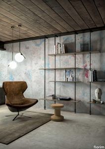
florim > Wall Paint
The poetics of the wall. The forgotten wall. «A wall is like a book to be opened, a journey into the interior, revealing the experiences, memories, signs and symbols which this fragment of masonry has absorbed over the centuries.» Franco Guerzoni <p>It is difficult to resist the beauty of Franco Guerzoni's art, created by a rare harmony of feeling and intellect, poetry and mind. The artist expresses this through paintings which, although complex in structure, are joyous and sensual, with bright colours made, like those of the great masters of the past, from choice powdered ingredients. A painter with a technique rich in traditional skills, Guerzoni offers a version of modernity involving an intense fundamental relationship with his images and with space. In fact, the dialectic between painting and space, form and architecture, time and memory seems to be essential to his art. As his works specifically created for CEDIT clearly express, his creations achieve a perfect balance between the spatial dimension and intensely lyrical use of colour, which here becomes a soft, liquid form of matter, wandering across the surface of a dazzling lime-plaster white. White, metaphor for the clear light of day, as it was in the large, complex canvases exhibited in his personal exhibition at the 1990 Venice Biennale, is the background for forms of colour which renew the pleasure to be had from painting and the memory of an image glimpsed on the vast expanse of the surface. In the more recent works, these voluptuous shades are transformed into subtle shadows of colour that delicately caress the surface.</p> <p> </p> <p> All it takes is one wall, the only surviving wall of what was once a house, on which time has recorded its own, unavoidable passing, leaving traces of colour that is still vibrant, although faded in places, to allow the memory of the image to transpire, fragile and uncertain, in the physicality of the surface, to bear tangible witness to the existence of history, a mysterious visual memory, the extension into the present of the life of things. A memory of the past on a contemporary wall. The idea of memory is central to Franco Guerzoni's poetics: private, secret memory and the collective memory of the past. Fragmentary and indecipherable, perceived by the artist with the aid of what is left of the images, the fragment. A relic of a totality which can no longer be reconstructed but only imagined in poetic terms, the fragment, a fraction of an image conserved by time, guides the artist's fantastic archaeological journey in search of the world's memory. However, this journey takes him in the opposite direction to the archaeologist, for whom the fragment - fundamental because it reveals a trace of the past is the starting-point for an attempt to reconstruct history. For Guerzoni, the fragment is the endpoint of his work, the goal for which he strives in his investigation of the surface, as he digs deep down, leafing through the deposits of time and memory.</p> <p> </p> <p>Like the large pages of a book traced with fragile sketches, embryonic forms whose meaning has been lost in time, leaving only fleeting traces, uncertain, ambiguous, mysterious morphologies. It marks the start of a journey into the mind of the artist-archaeologist, an adventurous journey into the inextricable labyrinth of the mind, to unearth what is hidden, shuffling the cards in a perennial contamination of images, memory, signs and traces, in search of a meaning, which no sooner appears than it is lost, merging into time and once again becoming a dream, an imaginary journey into fantasy and wonder. And this is the case in the tryptic created for CEDIT, which placed a new challenge before the artist: to transfer "his" image, the remains and fragments of a forgotten wall onto a new material for him “stunning, large-sized ceramic slabs“ and a real wall, without this tautology betraying the painting's deep meaning, its fertile magic of lines and colours, from which the image is born. And the artist is fully aware of this. Guerzoni describes his art as a "gamble": a gamble that is a critical test, an act of daring, dangerous and risky. This is the challenge he sets himself. It is a challenge he easily overcomes, expressing himself on these large walls with a rediscovered pleasure in painting, no longer restrained and apparently absorbed by the dense, uneven coloured surface but set free and almost luxuriously accentuated. In his large, demanding works for CEDIT, Guerzoni achieves a new, consummate mode of painting, in which the architecture of the surfaces provides a poetic meeting-point between the two founding components of his style, the complex, well thought-out composition and the lyricism of colour.</p>
Archeologie Archeologie Bianco

florim > Wall Paint
The poetics of the wall. The forgotten wall. «A wall is like a book to be opened, a journey into the interior, revealing the experiences, memories, signs and symbols which this fragment of masonry has absorbed over the centuries.» Franco Guerzoni <p>It is difficult to resist the beauty of Franco Guerzoni's art, created by a rare harmony of feeling and intellect, poetry and mind. The artist expresses this through paintings which, although complex in structure, are joyous and sensual, with bright colours made, like those of the great masters of the past, from choice powdered ingredients. A painter with a technique rich in traditional skills, Guerzoni offers a version of modernity involving an intense fundamental relationship with his images and with space. In fact, the dialectic between painting and space, form and architecture, time and memory seems to be essential to his art. As his works specifically created for CEDIT clearly express, his creations achieve a perfect balance between the spatial dimension and intensely lyrical use of colour, which here becomes a soft, liquid form of matter, wandering across the surface of a dazzling lime-plaster white. White, metaphor for the clear light of day, as it was in the large, complex canvases exhibited in his personal exhibition at the 1990 Venice Biennale, is the background for forms of colour which renew the pleasure to be had from painting and the memory of an image glimpsed on the vast expanse of the surface. In the more recent works, these voluptuous shades are transformed into subtle shadows of colour that delicately caress the surface.</p> <p> </p> <p> All it takes is one wall, the only surviving wall of what was once a house, on which time has recorded its own, unavoidable passing, leaving traces of colour that is still vibrant, although faded in places, to allow the memory of the image to transpire, fragile and uncertain, in the physicality of the surface, to bear tangible witness to the existence of history, a mysterious visual memory, the extension into the present of the life of things. A memory of the past on a contemporary wall. The idea of memory is central to Franco Guerzoni's poetics: private, secret memory and the collective memory of the past. Fragmentary and indecipherable, perceived by the artist with the aid of what is left of the images, the fragment. A relic of a totality which can no longer be reconstructed but only imagined in poetic terms, the fragment, a fraction of an image conserved by time, guides the artist's fantastic archaeological journey in search of the world's memory. However, this journey takes him in the opposite direction to the archaeologist, for whom the fragment - fundamental because it reveals a trace of the past is the starting-point for an attempt to reconstruct history. For Guerzoni, the fragment is the endpoint of his work, the goal for which he strives in his investigation of the surface, as he digs deep down, leafing through the deposits of time and memory.</p> <p> </p> <p>Like the large pages of a book traced with fragile sketches, embryonic forms whose meaning has been lost in time, leaving only fleeting traces, uncertain, ambiguous, mysterious morphologies. It marks the start of a journey into the mind of the artist-archaeologist, an adventurous journey into the inextricable labyrinth of the mind, to unearth what is hidden, shuffling the cards in a perennial contamination of images, memory, signs and traces, in search of a meaning, which no sooner appears than it is lost, merging into time and once again becoming a dream, an imaginary journey into fantasy and wonder. And this is the case in the tryptic created for CEDIT, which placed a new challenge before the artist: to transfer "his" image, the remains and fragments of a forgotten wall onto a new material for him “stunning, large-sized ceramic slabs“ and a real wall, without this tautology betraying the painting's deep meaning, its fertile magic of lines and colours, from which the image is born. And the artist is fully aware of this. Guerzoni describes his art as a "gamble": a gamble that is a critical test, an act of daring, dangerous and risky. This is the challenge he sets himself. It is a challenge he easily overcomes, expressing himself on these large walls with a rediscovered pleasure in painting, no longer restrained and apparently absorbed by the dense, uneven coloured surface but set free and almost luxuriously accentuated. In his large, demanding works for CEDIT, Guerzoni achieves a new, consummate mode of painting, in which the architecture of the surfaces provides a poetic meeting-point between the two founding components of his style, the complex, well thought-out composition and the lyricism of colour.</p>
Cromatica Gradiente grigio-verde

florim > Wall Paint
A lexicon of colour shades for mixing. A large size and its submultiples. «This work represents a reflection on colour, and above all a proposal on how to transfer the multiplicity of shades typical of a hand-crafted piece into a project produced on a large scale.» Andrea Trimarchi & Simone Farresin Studio Formafantasma base their work in the design world on a strong vocation for research. Simone Farresin and Andrea Trimarchi view every project as an opportunity for study and the acquisition of new knowledge, and their love of speculation establishes a dialectic rapport with the situations offered by each new client. Whether it involves a material, a type or a production method, the first phase of their design process is the mapping of what the specific case places at their disposal. With Cedit, an analysis of the company's past and present was central to the inputs. Inevitably, since "Looking back to look forward" has been the design duo's mission statement for years. In this case, in particular, the company's history was a real treasure trove, a fine blend of memory and technology: on the one hand, the excellence of production technologies now extended with the added potential arising from the engineering of large-sized ceramic tiles, and on the other a wealth of experience build up with great designers of the past, from Zanuso to Noorda, through to <strong>Ettore Sottsass</strong>. Andrea and Simone decided to focus on Sottsass - who started designing for Cedit back in the late Seventies - and made an in-depth study of one of the colour charts he developed towards the end of the Nineties. A spread of colours which gave its name to the "41 Colors" collection, included in the catalogue of the period as a real alphabet for what has proved to be a lasting design language. Colour was much more than just a compulsory step in the dialogue between designer and producer, since Sottsass had already discovered the power of the mystery intrinsic to this universe of invention.<br /><br />With Cedit the master-designer, a long-established lover of ceramics and their crafted unpredictability, found a way of transferring his personal feeling for colour to a wide audience, through industrial mass production. And this assumption is another factor Formafantasma have inherited, interpreting it today with new, even more efficient technical resources just as capable of expressing the secrets of colour. «The concept of colour "in isolation" - Sottsass explained in a 1992 text - classified colour, Pantone, as they call it now, "scientific" colour, is something I still refuse to accept. (...) Colours, the idea of colour, are always intangible, they slip slowly away like words, that run through your fingers, like poetry, which you can never keep hold of, like a good story.» And Formafantasma seem to have chosen that distinction between colour "in isolation" and "intangible" yet ever-present colour as the basis of their work. However, their approach draws on their unique vocation for research and the technical resources of the third millennium. «This work - they explain to us - is a reflection on colour, and above all on <strong>how to bring the multiplicity of shades typical of a hand-crafted piece into a large-scale project</strong>.» The designers look at large, monochrome slabs and turn to the engineers for details of their secrets, their processing stages, the phases in their production. They appreciate that the colour of ceramic material, its ineffable secret, can still be present in the series and large tile sizes in which Cedit leads the way. They understand that this is, in itself, an expressive power which does not need channelling into forms, motifs and signs. But above all, they treat the surface as a large canvas on which they spread pure colour, which tends to be uniform but in fact is never really a "scientific", totally monochrome hue: it is not a Pantone. And this is the source of the fundamental insight, which only children of the transition from the analogue to the digital era could achieve, the reward for those who draw on the past to look to the future.<br /><br />The designers cut the slab into lots of regular pieces, not necessarily of the same size. They restore its identity as a "tile", a familiar name with something ancient about it, but which stands for a module, a unit of measurement, a building block. There is nothing nostalgic about this - on the contrary, the vision is completely new, and the portions of slab created can be reassembled with no restrictions, breaking down the unity of the whole and reviving its essence starting from its structure. As the cards in the pack are shuffled, what emerges is not a figure or motif but the representation of colour itself and its physical nature. It is live matter, born from the meeting of vibrating forces, the mixing of ever-varying percentages of the basic ingredients. And Formafantasma present us with the corpuscular, fragmented essence of these small frames of space and crystallised time, which reveal the code and formula of their composition. So Cromatica is a collection made up of six colours which actually have an infinite number of declinations and compositional possibilities. It is a "discrete" combination in the mathematical sense of the term, capable of generating multiple, variable subsets. At the same time, each slab can be used in its entirety, leaving the impression of analogue continuity unchanged. But what really amazes is the comparison and dialogue between the two approaches: a stroke of genius, laying clear the mysterious appeal the artificial reproduction of colour has always held for mankind. Because, as Sottsass said, «colours are language, a powerful, magical, intangible, flexible, continuous material, in which existence is made manifest, the existence that lives in time and space».
Cromatica Rosa

florim > Wall Paint
A lexicon of colour shades for mixing. A large size and its submultiples. «This work represents a reflection on colour, and above all a proposal on how to transfer the multiplicity of shades typical of a hand-crafted piece into a project produced on a large scale.» Andrea Trimarchi & Simone Farresin Studio Formafantasma base their work in the design world on a strong vocation for research. Simone Farresin and Andrea Trimarchi view every project as an opportunity for study and the acquisition of new knowledge, and their love of speculation establishes a dialectic rapport with the situations offered by each new client. Whether it involves a material, a type or a production method, the first phase of their design process is the mapping of what the specific case places at their disposal. With Cedit, an analysis of the company's past and present was central to the inputs. Inevitably, since "Looking back to look forward" has been the design duo's mission statement for years. In this case, in particular, the company's history was a real treasure trove, a fine blend of memory and technology: on the one hand, the excellence of production technologies now extended with the added potential arising from the engineering of large-sized ceramic tiles, and on the other a wealth of experience build up with great designers of the past, from Zanuso to Noorda, through to <strong>Ettore Sottsass</strong>. Andrea and Simone decided to focus on Sottsass - who started designing for Cedit back in the late Seventies - and made an in-depth study of one of the colour charts he developed towards the end of the Nineties. A spread of colours which gave its name to the "41 Colors" collection, included in the catalogue of the period as a real alphabet for what has proved to be a lasting design language. Colour was much more than just a compulsory step in the dialogue between designer and producer, since Sottsass had already discovered the power of the mystery intrinsic to this universe of invention.<br /><br />With Cedit the master-designer, a long-established lover of ceramics and their crafted unpredictability, found a way of transferring his personal feeling for colour to a wide audience, through industrial mass production. And this assumption is another factor Formafantasma have inherited, interpreting it today with new, even more efficient technical resources just as capable of expressing the secrets of colour. «The concept of colour "in isolation" - Sottsass explained in a 1992 text - classified colour, Pantone, as they call it now, "scientific" colour, is something I still refuse to accept. (...) Colours, the idea of colour, are always intangible, they slip slowly away like words, that run through your fingers, like poetry, which you can never keep hold of, like a good story.» And Formafantasma seem to have chosen that distinction between colour "in isolation" and "intangible" yet ever-present colour as the basis of their work. However, their approach draws on their unique vocation for research and the technical resources of the third millennium. «This work - they explain to us - is a reflection on colour, and above all on <strong>how to bring the multiplicity of shades typical of a hand-crafted piece into a large-scale project</strong>.» The designers look at large, monochrome slabs and turn to the engineers for details of their secrets, their processing stages, the phases in their production. They appreciate that the colour of ceramic material, its ineffable secret, can still be present in the series and large tile sizes in which Cedit leads the way. They understand that this is, in itself, an expressive power which does not need channelling into forms, motifs and signs. But above all, they treat the surface as a large canvas on which they spread pure colour, which tends to be uniform but in fact is never really a "scientific", totally monochrome hue: it is not a Pantone. And this is the source of the fundamental insight, which only children of the transition from the analogue to the digital era could achieve, the reward for those who draw on the past to look to the future.<br /><br />The designers cut the slab into lots of regular pieces, not necessarily of the same size. They restore its identity as a "tile", a familiar name with something ancient about it, but which stands for a module, a unit of measurement, a building block. There is nothing nostalgic about this - on the contrary, the vision is completely new, and the portions of slab created can be reassembled with no restrictions, breaking down the unity of the whole and reviving its essence starting from its structure. As the cards in the pack are shuffled, what emerges is not a figure or motif but the representation of colour itself and its physical nature. It is live matter, born from the meeting of vibrating forces, the mixing of ever-varying percentages of the basic ingredients. And Formafantasma present us with the corpuscular, fragmented essence of these small frames of space and crystallised time, which reveal the code and formula of their composition. So Cromatica is a collection made up of six colours which actually have an infinite number of declinations and compositional possibilities. It is a "discrete" combination in the mathematical sense of the term, capable of generating multiple, variable subsets. At the same time, each slab can be used in its entirety, leaving the impression of analogue continuity unchanged. But what really amazes is the comparison and dialogue between the two approaches: a stroke of genius, laying clear the mysterious appeal the artificial reproduction of colour has always held for mankind. Because, as Sottsass said, «colours are language, a powerful, magical, intangible, flexible, continuous material, in which existence is made manifest, the existence that lives in time and space».