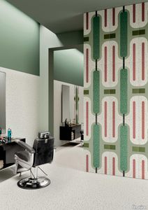
Chimera Ritmo Beige
florim > Wallcovering
In <em>Chimera,</em> Elena Salmistraro merges rigour with self-expression, in a graphic grammar laden with symbolic meaning. <em>Empatia </em>speaks to the emotions with graphics that interpret, through a highly individual abstract code, the stage make-up of a clown, with the aid of superimposed geometric forms and images. <em>Radici </em>is a tribal statement, a tribute to primitive ritual custom, evoked by the interplay between a sequence of triangles and rectangles and a set of figurative fragments. <em>Ritmo</em> is inspired by fabrics, suggesting the rhythmic alternation of woven yarns through a largely linear pattern. In <em>Colore, </em>the upheaval of a background of small isolated spots generated by a parametric digital program is combined with densely packed repeated forms. "The Chimera collection is rather like a book with four different chapters: I set out to differentiate these graphic motifs to create four totally different stories."<br></br>Elena Salmistraro It all starts with drawing. A <em>passion</em> for drawing. An <em>obsession</em> with drawing. Drawings like spider-webs, obsessively filling spaces, in a kind of manual choreography or gymnastics, a continuous flow. Elena Salmistraro draws all the time. She draws everywhere. Mostly on loose sheets or random surfaces. First and foremost with pen and pencil. Her drawings only acquire colour at a later stage. Often - just like Alessandro Mendini used to do - she draws "monsters": fascinating yet disturbing, subversive forms. The denser, more contorted the shape, the more obvious its underlying truth. For Elena, drawing is an intimate act. It is relaxing. And therapeutic. With an unrivalled communicative strength. Because drawing gives shape to ideas: you both give form to the world and reveal yourself. This passion, combined with natural graphic talent, has guided Elena Salmistraro in her project for Cedit: an experimental series of ceramic slabs produced using a high-definition 3D decorative technique. The explicit aim is to transform surfaces beyond their original flatness so that a new, visual and tactile, three-dimensional personality emerges, sweeping aside the coldness and uniformity that ceramic objects often inevitably convey.Elena Salmistraro has always viewed ceramics as a democratic material, in view of their accessibility, and the infinite potentials for shaping matter that they provide. She began working and experimenting with ceramics very early in her career, just after she graduated from the Milan Politecnico in 2008. She came into contact with small artistic craft firms specialising in smallproduction lots, and cut her teeth on projects that demanded the hand-processing of every detail, and finishes of high artistic value, for the high end of the market. The large corporations and galleries came later, but here again Elena kept faith with her desire to make mass-produced pieces unique, and to combine artistic value with specifically industrial characteristics. The monkey-shaped <em>Primates</em> vases reflect this method and intention, aiming to excite, surprise and charm. Antiminimalist and hyper-figurative, playful, ironic and a rich image-maker, often drawing on anthropology and magic, over the years Salmistraro has built up her own fantastic universe, inhabited by ceramic bestiaries, painted jungles and a cabinet like a one-eyed cyclops , always finding inspiration and inputs in nature and always aiming to reveal the extraordinary in the everyday. Given this background, it was almost inevitable she would work with Cedit: constantly seeking new talents and new approaches, as well as designs that break down the boundaries of ceramics and release them into the realm of art and innovation, the Modena company has recognised Elena Salmistraro as a leading contemporary creative spirit and involved her in a project intended to experiment with fresh ideas in materials and synaesthetics.Salmistraro's collection for Cedit is entitled <em>Chimera</em> and consists of large ceramic slabs, which can be enjoyed not only visually, through their patterns and colours, but also on a tactile level. Like the chimera in the "grotesque" tradition, monstrous in the etymological sense of the word with its merging of hybrid animal and vegetable shapes, the Cedit project attempts to originate a synaesthetic form of ceramics, through a three-dimensional development that exactly reproduces the texture of leathers and fabrics, creating an absolutely new kind of layered effect, with a tactile awareness that recalls the passion of grand master Ettore Sottsass for "surfaces that talk". And the surfaces of the slabs Salmistraro has created really seem to talk: in <em>Empatia </em>clown faces add theatricality to the cold gleam of marbles, interspersed with references to Art Déco graphics; <em>Radici</em> uses the textures of leathers and hide as if to re-establish a link between ceramics and other materials at the origins of human activity and creativity; in <em>Ritmo</em> the texture of cloth dialogues with pottery, almost in homage to the tactile rationalism of warp and weft, of which Bauhaus pioneer Anni Albers was one of the most expressive past interpreters ; finally, <em>Colore</em> has a spotted base generated by computer to underline the contrast between analogue and digital, the graphic sign and the matter into which it is impressed. It is an aesthetic of superimposition and mixing, and especially of synaesthesia: as in her drawings, in the <em>Chimera </em>slabs Elena Salmistraro's art is one of movement and acceleration. A process not of representation but of exploration. Of the world and of oneself. Almost a kind of Zen, for distancing oneself from the world to understand it more fully. In every sense.
BIANCA LARGE
fontanaarte > Floor lamp
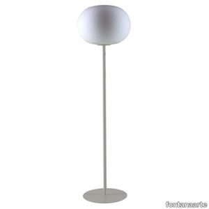
Bianca is a family of luminaires with the decoration on the diffuser surface features an orderly series of shallow delicate grooves etched into the white glass, yielding an effect resembling small footprints on fresh snow. Mouth blown, belt sanded and dipped in acid to obtain the distinctive 'silk effect' typical of fine glassware, Bianca diffusers are available in three different diameters to complete all thirteen types of luminaires belonging to the family. The largest diffuser has a 50 cm diameter and, owing to its dimensions and the amount of glass involved, continues to pose a considerable challenge even for the ablest of glassbbottoms trained in the fixed-mould blowing technique, which – according to the traditional Venetian production process – is performed without any external aids for turning and shaping the glass blob inside the mould, but relies solely on the glassbbottom's skill and lung capacity. Bianca is available in the following versions: table-top without stem, floor-standing with base and stem, pendant, wall-mounted and ceiling-mounted. The matt white coating applied to the various metal supports evokes the name and colour of the diffuser. Bianca produces a very warm, diffused and enveloping light emission in the surrounding environment.
BIANCA SMALL
fontanaarte > Wall lamp
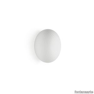
Bianca is a family of luminaires with the decoration on the diffuser surface features an orderly series of shallow delicate grooves etched into the white glass, yielding an effect resembling small footprints on fresh snow. Mouth blown, belt sanded and dipped in acid to obtain the distinctive 'silk effect' typical of fine glassware, Bianca diffusers are available in three different diameters to complete all thirteen types of luminaires belonging to the family. The largest diffuser has a 50 cm diameter and, owing to its dimensions and the amount of glass involved, continues to pose a considerable challenge even for the ablest of glassbbottoms trained in the fixed-mould blowing technique, which – according to the traditional Venetian production process – is performed without any external aids for turning and shaping the glass blob inside the mould, but relies solely on the glassbbottom's skill and lung capacity. Bianca is available in the following versions: table-top without stem, floor-standing with base and stem, pendant, wall-mounted and ceiling-mounted. The matt white coating applied to the various metal supports evokes the name and colour of the diffuser. Bianca produces a very warm, diffused and enveloping light emission in the surrounding environment.
Marvin
minotti > Table
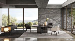
With its bold, sculptural-shaped base, which draws a series of quarter circles, illuminated by the glints of the metal, and interspersed with a black insert, the Marvin table makes an impressive impact and is characterised by great versatility. It is part of a wide variety of dining tables with a clearly architectural inspiration, featuring bases in satin finish stainless steel or in Pewter-coloured varnished metal. The design is enriched by the precious materials chosen for the top: Bianconero marble, with an interplay of nuances that imposes a strong, ultra-modern feel, and Marron Damasco marble. Alternatively, it comes with the top in striped brushed solid ash, sporting a Black open-pore lacquered finish. Designed by Rodolfo Dordoni, it is available with the round top in three different diameters (160, 180 and 200 cm) and a top in the shape of an elegant rectangle, with softer lines and rounded corners, in three sizes. The design is conceived to be customised with tailor-made solutions, thanks to the combination and interpretation of the design of the bases, depending on the shape and size of the top, up to very important proposals. Marvin covers a variety of different design areas, also entering Hospitality environments as the true protagonist of the most sophisticated meeting rooms.
BIANCA SMALL

fontanaarte > Wall lamp
Bianca is a family of luminaires with the decoration on the diffuser surface features an orderly series of shallow delicate grooves etched into the white glass, yielding an effect resembling small footprints on fresh snow. Mouth blown, belt sanded and dipped in acid to obtain the distinctive 'silk effect' typical of fine glassware, Bianca diffusers are available in three different diameters to complete all thirteen types of luminaires belonging to the family. The largest diffuser has a 50 cm diameter and, owing to its dimensions and the amount of glass involved, continues to pose a considerable challenge even for the ablest of glassbbottoms trained in the fixed-mould blowing technique, which – according to the traditional Venetian production process – is performed without any external aids for turning and shaping the glass blob inside the mould, but relies solely on the glassbbottom's skill and lung capacity. Bianca is available in the following versions: table-top without stem, floor-standing with base and stem, pendant, wall-mounted and ceiling-mounted. The matt white coating applied to the various metal supports evokes the name and colour of the diffuser. Bianca produces a very warm, diffused and enveloping light emission in the surrounding environment.
Chimera Radici Grigio

florim > Wallcovering
In <em>Chimera,</em> Elena Salmistraro merges rigour with self-expression, in a graphic grammar laden with symbolic meaning. <em>Empatia </em>speaks to the emotions with graphics that interpret, through a highly individual abstract code, the stage make-up of a clown, with the aid of superimposed geometric forms and images. <em>Radici </em>is a tribal statement, a tribute to primitive ritual custom, evoked by the interplay between a sequence of triangles and rectangles and a set of figurative fragments. <em>Ritmo</em> is inspired by fabrics, suggesting the rhythmic alternation of woven yarns through a largely linear pattern. In <em>Colore, </em>the upheaval of a background of small isolated spots generated by a parametric digital program is combined with densely packed repeated forms. "The Chimera collection is rather like a book with four different chapters: I set out to differentiate these graphic motifs to create four totally different stories."<br></br>Elena Salmistraro It all starts with drawing. A <em>passion</em> for drawing. An <em>obsession</em> with drawing. Drawings like spider-webs, obsessively filling spaces, in a kind of manual choreography or gymnastics, a continuous flow. Elena Salmistraro draws all the time. She draws everywhere. Mostly on loose sheets or random surfaces. First and foremost with pen and pencil. Her drawings only acquire colour at a later stage. Often - just like Alessandro Mendini used to do - she draws "monsters": fascinating yet disturbing, subversive forms. The denser, more contorted the shape, the more obvious its underlying truth. For Elena, drawing is an intimate act. It is relaxing. And therapeutic. With an unrivalled communicative strength. Because drawing gives shape to ideas: you both give form to the world and reveal yourself. This passion, combined with natural graphic talent, has guided Elena Salmistraro in her project for Cedit: an experimental series of ceramic slabs produced using a high-definition 3D decorative technique. The explicit aim is to transform surfaces beyond their original flatness so that a new, visual and tactile, three-dimensional personality emerges, sweeping aside the coldness and uniformity that ceramic objects often inevitably convey.Elena Salmistraro has always viewed ceramics as a democratic material, in view of their accessibility, and the infinite potentials for shaping matter that they provide. She began working and experimenting with ceramics very early in her career, just after she graduated from the Milan Politecnico in 2008. She came into contact with small artistic craft firms specialising in smallproduction lots, and cut her teeth on projects that demanded the hand-processing of every detail, and finishes of high artistic value, for the high end of the market. The large corporations and galleries came later, but here again Elena kept faith with her desire to make mass-produced pieces unique, and to combine artistic value with specifically industrial characteristics. The monkey-shaped <em>Primates</em> vases reflect this method and intention, aiming to excite, surprise and charm. Antiminimalist and hyper-figurative, playful, ironic and a rich image-maker, often drawing on anthropology and magic, over the years Salmistraro has built up her own fantastic universe, inhabited by ceramic bestiaries, painted jungles and a cabinet like a one-eyed cyclops , always finding inspiration and inputs in nature and always aiming to reveal the extraordinary in the everyday. Given this background, it was almost inevitable she would work with Cedit: constantly seeking new talents and new approaches, as well as designs that break down the boundaries of ceramics and release them into the realm of art and innovation, the Modena company has recognised Elena Salmistraro as a leading contemporary creative spirit and involved her in a project intended to experiment with fresh ideas in materials and synaesthetics.Salmistraro's collection for Cedit is entitled <em>Chimera</em> and consists of large ceramic slabs, which can be enjoyed not only visually, through their patterns and colours, but also on a tactile level. Like the chimera in the "grotesque" tradition, monstrous in the etymological sense of the word with its merging of hybrid animal and vegetable shapes, the Cedit project attempts to originate a synaesthetic form of ceramics, through a three-dimensional development that exactly reproduces the texture of leathers and fabrics, creating an absolutely new kind of layered effect, with a tactile awareness that recalls the passion of grand master Ettore Sottsass for "surfaces that talk". And the surfaces of the slabs Salmistraro has created really seem to talk: in <em>Empatia </em>clown faces add theatricality to the cold gleam of marbles, interspersed with references to Art Déco graphics; <em>Radici</em> uses the textures of leathers and hide as if to re-establish a link between ceramics and other materials at the origins of human activity and creativity; in <em>Ritmo</em> the texture of cloth dialogues with pottery, almost in homage to the tactile rationalism of warp and weft, of which Bauhaus pioneer Anni Albers was one of the most expressive past interpreters ; finally, <em>Colore</em> has a spotted base generated by computer to underline the contrast between analogue and digital, the graphic sign and the matter into which it is impressed. It is an aesthetic of superimposition and mixing, and especially of synaesthesia: as in her drawings, in the <em>Chimera </em>slabs Elena Salmistraro's art is one of movement and acceleration. A process not of representation but of exploration. Of the world and of oneself. Almost a kind of Zen, for distancing oneself from the world to understand it more fully. In every sense.
Chimera Radici Beige

florim > Wallcovering
In <em>Chimera,</em> Elena Salmistraro merges rigour with self-expression, in a graphic grammar laden with symbolic meaning. <em>Empatia </em>speaks to the emotions with graphics that interpret, through a highly individual abstract code, the stage make-up of a clown, with the aid of superimposed geometric forms and images. <em>Radici </em>is a tribal statement, a tribute to primitive ritual custom, evoked by the interplay between a sequence of triangles and rectangles and a set of figurative fragments. <em>Ritmo</em> is inspired by fabrics, suggesting the rhythmic alternation of woven yarns through a largely linear pattern. In <em>Colore, </em>the upheaval of a background of small isolated spots generated by a parametric digital program is combined with densely packed repeated forms. "The Chimera collection is rather like a book with four different chapters: I set out to differentiate these graphic motifs to create four totally different stories."<br></br>Elena Salmistraro It all starts with drawing. A <em>passion</em> for drawing. An <em>obsession</em> with drawing. Drawings like spider-webs, obsessively filling spaces, in a kind of manual choreography or gymnastics, a continuous flow. Elena Salmistraro draws all the time. She draws everywhere. Mostly on loose sheets or random surfaces. First and foremost with pen and pencil. Her drawings only acquire colour at a later stage. Often - just like Alessandro Mendini used to do - she draws "monsters": fascinating yet disturbing, subversive forms. The denser, more contorted the shape, the more obvious its underlying truth. For Elena, drawing is an intimate act. It is relaxing. And therapeutic. With an unrivalled communicative strength. Because drawing gives shape to ideas: you both give form to the world and reveal yourself. This passion, combined with natural graphic talent, has guided Elena Salmistraro in her project for Cedit: an experimental series of ceramic slabs produced using a high-definition 3D decorative technique. The explicit aim is to transform surfaces beyond their original flatness so that a new, visual and tactile, three-dimensional personality emerges, sweeping aside the coldness and uniformity that ceramic objects often inevitably convey.Elena Salmistraro has always viewed ceramics as a democratic material, in view of their accessibility, and the infinite potentials for shaping matter that they provide. She began working and experimenting with ceramics very early in her career, just after she graduated from the Milan Politecnico in 2008. She came into contact with small artistic craft firms specialising in smallproduction lots, and cut her teeth on projects that demanded the hand-processing of every detail, and finishes of high artistic value, for the high end of the market. The large corporations and galleries came later, but here again Elena kept faith with her desire to make mass-produced pieces unique, and to combine artistic value with specifically industrial characteristics. The monkey-shaped <em>Primates</em> vases reflect this method and intention, aiming to excite, surprise and charm. Antiminimalist and hyper-figurative, playful, ironic and a rich image-maker, often drawing on anthropology and magic, over the years Salmistraro has built up her own fantastic universe, inhabited by ceramic bestiaries, painted jungles and a cabinet like a one-eyed cyclops , always finding inspiration and inputs in nature and always aiming to reveal the extraordinary in the everyday. Given this background, it was almost inevitable she would work with Cedit: constantly seeking new talents and new approaches, as well as designs that break down the boundaries of ceramics and release them into the realm of art and innovation, the Modena company has recognised Elena Salmistraro as a leading contemporary creative spirit and involved her in a project intended to experiment with fresh ideas in materials and synaesthetics.Salmistraro's collection for Cedit is entitled <em>Chimera</em> and consists of large ceramic slabs, which can be enjoyed not only visually, through their patterns and colours, but also on a tactile level. Like the chimera in the "grotesque" tradition, monstrous in the etymological sense of the word with its merging of hybrid animal and vegetable shapes, the Cedit project attempts to originate a synaesthetic form of ceramics, through a three-dimensional development that exactly reproduces the texture of leathers and fabrics, creating an absolutely new kind of layered effect, with a tactile awareness that recalls the passion of grand master Ettore Sottsass for "surfaces that talk". And the surfaces of the slabs Salmistraro has created really seem to talk: in <em>Empatia </em>clown faces add theatricality to the cold gleam of marbles, interspersed with references to Art Déco graphics; <em>Radici</em> uses the textures of leathers and hide as if to re-establish a link between ceramics and other materials at the origins of human activity and creativity; in <em>Ritmo</em> the texture of cloth dialogues with pottery, almost in homage to the tactile rationalism of warp and weft, of which Bauhaus pioneer Anni Albers was one of the most expressive past interpreters ; finally, <em>Colore</em> has a spotted base generated by computer to underline the contrast between analogue and digital, the graphic sign and the matter into which it is impressed. It is an aesthetic of superimposition and mixing, and especially of synaesthesia: as in her drawings, in the <em>Chimera </em>slabs Elena Salmistraro's art is one of movement and acceleration. A process not of representation but of exploration. Of the world and of oneself. Almost a kind of Zen, for distancing oneself from the world to understand it more fully. In every sense.
Fris
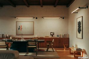
marset > Wall lamp
Drawing thin beams of light in a space with each one of them pointing in any direction. This is why we have created Fris, a multi-purpose lighting system, available in a wall/ceiling or pendant version, which allows you to combine several units in different sizes and positions, each one aiming its own beam of light.Its design consists of a glass tube that encases the light. What makes it unique is that the glass not only protects the light, but also provides a mechanical function, suspending the whole system and allowing the lamp to rotate and the light to be steered in a certain direction. As a result, the glass is both material and function. Through the transparent glass we see the lamp’s interior, which consists of two profiles: one includes the light source and the other acts as a parabola, projecting a crisp, intense light. This system makes it possible to compose light structures and to join a set of lamps by means of different assembly and hanging accessories. They can also function separately as an individual lamp. The other version can be fixed to the ceiling or wall. The pendant version is available in three lengths of 80, 155 cm and 215 cm and the version for ceiling or wall comes in another three lenghts 80, 155 and 215 cm. There is also a more technical version where the light is distributed in cells with independent lenses, achieving a UGR of under 19. Fris offers a very versatile and functional design for precise lighting of any type of project. An ingenious system that boldly tackles a previously unresolved issue: to have a set of lamps where each one directs the light individually.
Elegant fibres Pillowcases
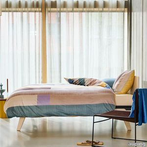
auping > Accessories
The Elegant fibres pillowcases are made of 100% cotton satin. The print contains a line pattern, making it look like textile threads lying next to each other like in a weave. The back of the pillowcases are fresh yellow, adding an extra sunny feel to your bedroom. Pillowcase with double hotel closure The Auping pillowcases from the seasonal collection have what is known as a double hotel closure. A hotel closure is a folded opening on the shortest side of the pillowcase. With a double hotel closure, it doesn't matter which side of your pillow you use, it always looks neat. Sizes of our pillowcases The pillowcases from the basic collection and seasonal collection are also available as a loose set in sizes: 60 x 70 cm 40 x 60 cm Sustainability At Auping, we dream of a rested world. Of sleeping under wonderful bedding made in an environmentally friendly way and under good working conditions. That's why all our duvet covers in the basic collection have the internationally recognised GOTS certificate. This is the very highest international standard for organic textiles. It not only guarantees top quality but also gives us the assurance that the entire chain complies with strict social and environmental requirements. The covers in the seasonal collection carry the BCI label, which also guarantees sustainably and socially responsible produced bed textiles. Quality labels Not only sustainability but also the quality of our products is very important to us. We pay a lot of attention to this and work with the following quality marks and institutes to guarantee our quality. All Auping duvet covers are checked annually by TÜV Rheinland Netherlands for size, shrinkage, colour fastness and strength properties. All Auping duvet covers have the Oeko-Tex Standard 100 certificate. This quality mark is issued by the Oeko-Tex institute which guarantees that the tested and certified textiles are free of harmful substances in relation to human health and environmental impact. It is thus a safety seal for textiles.
BIANCA SMALL
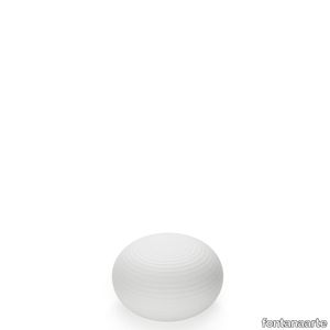
fontanaarte > Table lamp
Bianca is a family of luminaires with the decoration on the diffuser surface features an orderly series of shallow delicate grooves etched into the white glass, yielding an effect resembling small footprints on fresh snow. Mouth blown, belt sanded and dipped in acid to obtain the distinctive 'silk effect' typical of fine glassware, Bianca diffusers are available in three different diameters to complete all thirteen types of luminaires belonging to the family. The largest diffuser has a 50 cm diameter and, owing to its dimensions and the amount of glass involved, continues to pose a considerable challenge even for the ablest of glassbbottoms trained in the fixed-mould blowing technique, which – according to the traditional Venetian production process – is performed without any external aids for turning and shaping the glass blob inside the mould, but relies solely on the glassbbottom's skill and lung capacity. Bianca is available in the following versions: table-top without stem, floor-standing with base and stem, pendant, wall-mounted and ceiling-mounted. The matt white coating applied to the various metal supports evokes the name and colour of the diffuser. Bianca produces a very warm, diffused and enveloping light emission in the surrounding environment.
BIANCA MEDIUM
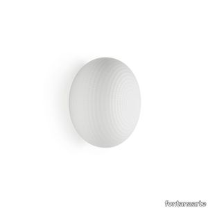
fontanaarte > Wall lamp
Bianca is a family of luminaires with the decoration on the diffuser surface features an orderly series of shallow delicate grooves etched into the white glass, yielding an effect resembling small footprints on fresh snow. Mouth blown, belt sanded and dipped in acid to obtain the distinctive 'silk effect' typical of fine glassware, Bianca diffusers are available in three different diameters to complete all thirteen types of luminaires belonging to the family. The largest diffuser has a 50 cm diameter and, owing to its dimensions and the amount of glass involved, continues to pose a considerable challenge even for the ablest of glassbbottoms trained in the fixed-mould blowing technique, which – according to the traditional Venetian production process – is performed without any external aids for turning and shaping the glass blob inside the mould, but relies solely on the glassbbottom's skill and lung capacity. Bianca is available in the following versions: table-top without stem, floor-standing with base and stem, pendant, wall-mounted and ceiling-mounted. The matt white coating applied to the various metal supports evokes the name and colour of the diffuser. Bianca produces a very warm, diffused and enveloping light emission in the surrounding environment.
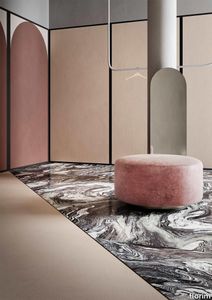
Policroma Cipria
florim > Wall Paint
Recurring geometries, combinations of figures. Marble and marmorino plaster: comparison and dialogue. The collection is completed by a linear listello tile with the motif of a sequence of vertical rectangular blocks, which can be combined with the slabs to further enrich compositions involving continuous ceramic surfaces cladding.<br /><br />"Another reference is the use of Italian marbles on the verge of extinction, rare marbles such as Rosa Valtoce, the marble used in Milan Cathedral."<br />Cristina Celestino Cristina Celestino's smartphone contains a folder of images entitled "Milan". Photographs that are more like notes. Photographs of architectural features, materials or details of shapes encountered by chance during a walk, but they cannot be described as merely a vague "source of inspiration". This filing system, created in response to a fleeting instinct, is an integral part of the method of work adopted by the architect and designer, who starts off without preconceptions "“ or "free", as she puts it before drawing inputs from a vast world of references, from Hermès scarves to the works of the great Masters (in the specific case of Policroma). This accumulation, partly spontaneous and party the outcome of in-depth historical knowledge and study, naturally activates a process of synthesis and personal interpretation common to all Cristina Celestino's output.<br /><br /><br />The wall covering collection designed for Cedit was no exception, although in this case the designer was dealing with a project with variable dimensions, reaching up even to the architectural scale. In her own distinctive way, she combined a variety of references. Adolf Loos's passion for coloured types of marble, and Cipollino in particular. Carlo Scarpa's angular metal frames and Marmorino plaster in Venice. The French fashion house's square silk scarves. The entrance halls of Milan palazzos, Gio Ponti, the city's Cathedral. All expressed in the designer's own language: well balanced geometrical forms, subtle colours (shades similar to those of Scarpa himself), an effortless, almost restrained, playful elegance. The mood is that of the homes of the enlightened bourgeoisie who shaped the history of Milan, Celestino's adoptive city and an endless source of inputs. She has worked its interiors, including some of the least expected a 1928 tram, the historic Cucchi confectionery store hybridising her own style with the existing context. An imitative effect which is also the key to the meaning of the new Policroma collection: the marble varieties replicated using the Cedit technology are all from Italian quarries that are virtually "worked out". This revives an increasingly rare material as a "living" presence, in a different form which makes no claim to replace the natural original. Quite the contrary, Celestino immediately states her intention to imitate, by combining marble and Marmorino plaster in some variants with a contrasting frame (a typical feature for her, just as it was for Scarpa), and evoking the centuries-old marble-imitating scagliola plasterwork with a contemporary formula.<br /><br /><br />The types of marble chosen are central to the project's character. Verde Alpi, a favourite with Gio Ponti and often found in Milan entrance halls, features tightly packed patterning. Breccia Capraia, still found in a very few places in Tuscany, has a white background with just a few veins. Cipollino, in the special Ondulato variety in green and red, is patterned with spirals. Rosa Valtoce, on the other hand, was used by the "Veneranda Fabbrica" guild to build Milan Cathedral. It is an iconic stone with dramatic stripes, popular in the past; it is now sourced from one very small quarry in Piedmont which has been virtually abandoned.<br /> The many different elements that make up the Policroma collection all reflect the importance of craftsmanship to Cristina Celestino's design style: the modules can be freely mixed and combined, for example to create a concave or convex semicircle, or for the large-scale replication of small features initially conceived as trims, functional details transformed into a dominant motif.There is a return to the theme of the interior, a large or small protected space, conceived as suspended in space and time yet also reassuring and protective. It is designed through its coverings in a stark yet not minimalist way, with intelligence and with no overreaching artistic ambitions. An understated space and an extremely stylish declaration. In Milan style, of course.
BIANCA SMALL

fontanaarte > Wall lamp
Bianca is a family of luminaires with the decoration on the diffuser surface features an orderly series of shallow delicate grooves etched into the white glass, yielding an effect resembling small footprints on fresh snow. Mouth blown, belt sanded and dipped in acid to obtain the distinctive 'silk effect' typical of fine glassware, Bianca diffusers are available in three different diameters to complete all thirteen types of luminaires belonging to the family. The largest diffuser has a 50 cm diameter and, owing to its dimensions and the amount of glass involved, continues to pose a considerable challenge even for the ablest of glassbbottoms trained in the fixed-mould blowing technique, which – according to the traditional Venetian production process – is performed without any external aids for turning and shaping the glass blob inside the mould, but relies solely on the glassbbottom's skill and lung capacity. Bianca is available in the following versions: table-top without stem, floor-standing with base and stem, pendant, wall-mounted and ceiling-mounted. The matt white coating applied to the various metal supports evokes the name and colour of the diffuser. Bianca produces a very warm, diffused and enveloping light emission in the surrounding environment.
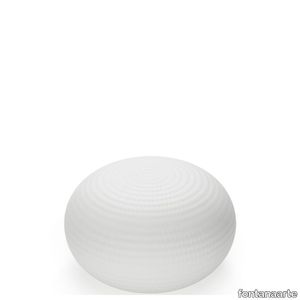
BIANCA LARGE
fontanaarte > Table lamp
Bianca is a family of luminaires with the decoration on the diffuser surface features an orderly series of shallow delicate grooves etched into the white glass, yielding an effect resembling small footprints on fresh snow. Mouth blown, belt sanded and dipped in acid to obtain the distinctive 'silk effect' typical of fine glassware, Bianca diffusers are available in three different diameters to complete all thirteen types of luminaires belonging to the family. The largest diffuser has a 50 cm diameter and, owing to its dimensions and the amount of glass involved, continues to pose a considerable challenge even for the ablest of glassbbottoms trained in the fixed-mould blowing technique, which – according to the traditional Venetian production process – is performed without any external aids for turning and shaping the glass blob inside the mould, but relies solely on the glassbbottom's skill and lung capacity. Bianca is available in the following versions: table-top without stem, floor-standing with base and stem, pendant, wall-mounted and ceiling-mounted. The matt white coating applied to the various metal supports evokes the name and colour of the diffuser. Bianca produces a very warm, diffused and enveloping light emission in the surrounding environment.
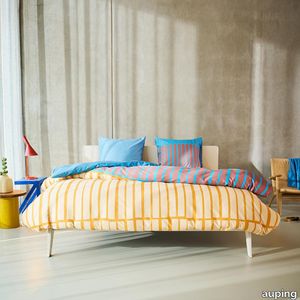
Bright bliss Duvet Cover
auping > Accessories
The playful stripes in bright colours give a tropical touch to this cover made from 100% satin cotton. The yellow brings to mind the beach, while the blue is inspired by the sea. Bright bliss brings the summer straight into your bedroom! The back of the cover and the pillowcases are solid blue.Combines... Handy: tuck-in strip, hotel closure and button down systemAll Auping duvet covers have an extra long tuck-in strip. This makes it easy to tuck the duvet cover in under your mattress. Cold feet are a thing of the past. You can recognise the extra long tuck-in strip by the length: 200/220The Auping pillowcases of the seasonal collection have a so-called double hotel closure. A hotel closure is a folded opening on the shortest side of the pillowcase. With a double hotel closure, it doesn't matter which side of your pillow you use, it always looks neat.Auping duvet covers and duvets feature the button down system. These are handy buttons and loops that you use to fasten the duvet and cover together, preventing it from shifting. The term button down comes from fashion. It literally means 'buttoned down' and often refers to the buttons on the collar of a shirt that you use to neatly fasten the collar to the shirt. Auping duvet covers have loops on the inside of the cover. Our duvets have buttons in the same places. The loops from the duvet cover can be put around these buttons to prevent the duvet from sliding around in the cover. These buttons and loops also make it easier to make your bed neatly. Sizes of our duvet coversThe sizes of our duvet covers are coordinated with the Auping duvet and pillow range to ensure a perfect match. In addition, the duvet covers and pillowcases are also suitable for most common other duvets and pillows.The Auping duvet covers are available in both single and double sizes:- 140 x 200/220 cm incl. 1 60 x 70 cm pillowcase.- 200 x 200/220 cm incl. 2 pillowcases of 60 x 70 cm.- 240 x 200/220 cm incl. 2 pillowcases of 60 x 70 cm.- 260 x 200/220 cm incl. 2 pillowcases of 60 x 70 cm.Sustainability At Auping, we dream of a rested world. Of sleeping under wonderful bedding made in an environmentally friendly way and under good working conditions. That's why all our duvet covers in the basic collection have the internationally recognised GOTS certificate. This is the very highest international standard for organic textiles. It not only guarantees top quality but also gives us the assurance that the entire chain complies with strict social and environmental requirements. The covers in the seasonal collection carry the BCI label, which also guarantees sustainably and socially responsible bed textile production.Quality labelsNot only sustainability but also the quality of our products is very important to us. We pay a lot of attention to this and work with the following quality marks and institutes to guarantee our quality. All Auping duvet covers are checked annually by TÜV Rheinland Netherlands for size, shrinkage, colour fastness and strength properties.All Auping duvet covers have the Oeko-Tex Standard 100 certificate. This quality mark is issued by the Oeko-Tex institute which guarantees that the tested and certified textiles are free of harmful substances in relation to human health and environmental impact. It is thus a safety seal for textiles.
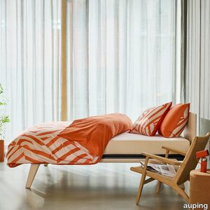
Vibrant apricot Pillowcases
auping > Accessories
The Vibrant apricot pillowcases are made of 100% cotton satin. These pillowcases feature playful stripes in apricot, the trending colour of today. The background features a light beige print, which almost seems woven. The back of the pillowcases are plain orange. Pillowcase with double hotel closureThe Auping pillowcases from the seasonal collection have what is known as a double hotel closure. A hotel closure is a folded opening on the shortest side of the pillowcase. With a double hotel closure, it doesn't matter which side of your pillow you use, it always looks neat. Sizes of our pillowcasesThe pillowcases from the basic collection and seasonal collection are also available as a loose set in sizes:60 x 70 cm40 x 60 cmSustainability At Auping, we dream of a rested world. Of sleeping under wonderful bedding made in an environmentally friendly way and under good working conditions. That's why all our duvet covers in the basic collection have the internationally recognised GOTS certificate. This is the very highest international standard for organic textiles. It not only guarantees top quality but also gives us the assurance that the entire chain complies with strict social and environmental requirements. The covers in the seasonal collection carry the BCI label, which also guarantees sustainably and socially responsible produced bed textiles. Quality labelsNot only sustainability but also the quality of our products is very important to us. We pay a lot of attention to this and work with the following quality marks and institutes to guarantee our quality. All Auping duvet covers are checked annually by TÜV Rheinland Netherlands for size, shrinkage, colour fastness and strength properties.All Auping duvet covers have the Oeko-Tex Standard 100 certificate. This quality mark is issued by the Oeko-Tex institute which guarantees that the tested and certified textiles are free of harmful substances in relation to human health and environmental impact. It is thus a safety seal for textiles.
BIANCA MEDIUM

fontanaarte > Wall lamp
Bianca is a family of luminaires with the decoration on the diffuser surface features an orderly series of shallow delicate grooves etched into the white glass, yielding an effect resembling small footprints on fresh snow. Mouth blown, belt sanded and dipped in acid to obtain the distinctive 'silk effect' typical of fine glassware, Bianca diffusers are available in three different diameters to complete all thirteen types of luminaires belonging to the family. The largest diffuser has a 50 cm diameter and, owing to its dimensions and the amount of glass involved, continues to pose a considerable challenge even for the ablest of glassbbottoms trained in the fixed-mould blowing technique, which – according to the traditional Venetian production process – is performed without any external aids for turning and shaping the glass blob inside the mould, but relies solely on the glassbbottom's skill and lung capacity. Bianca is available in the following versions: table-top without stem, floor-standing with base and stem, pendant, wall-mounted and ceiling-mounted. The matt white coating applied to the various metal supports evokes the name and colour of the diffuser. Bianca produces a very warm, diffused and enveloping light emission in the surrounding environment.
Dazzling dreams Duvet Cover
auping > Accessories
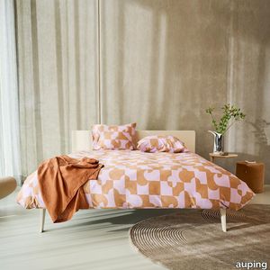
Dazzling dreams is a cover made from sustainable cotton satin that is perfect for dreaming away the night in comfort. Graphic shapes in delicate purple and shades of taupe make this cover utterly contemporary. The print continues on the back of the cover and pillowcases. This cover looks fabulous on... Handy: tuck-in strip, hotel closure and button down systemAll Auping duvet covers have an extra long tuck-in strip. This makes it easy to tuck the duvet cover in under your mattress. Cold feet are a thing of the past. You can recognise the extra long tuck-in strip by the length: 200/220The Auping pillowcases of the seasonal collection have a so-called double hotel closure. A hotel closure is a folded opening on the shortest side of the pillowcase. With a double hotel closure, it doesn't matter which side of your pillow you use, it always looks neat.Auping duvet covers and duvets feature the button down system. These are handy buttons and loops that you use to fasten the duvet and cover together, preventing it from shifting. The term button down comes from fashion. It literally means 'buttoned down' and often refers to the buttons on the collar of a shirt that you use to neatly fasten the collar to the shirt. Auping duvet covers have loops on the inside of the cover. Our duvets have buttons in the same places. The loops from the duvet cover can be put around these buttons to prevent the duvet from sliding around in the cover. These buttons and loops also make it easier to make your bed neatly. Sizes of our duvet coversThe sizes of our duvet covers are coordinated with the Auping duvet and pillow range to ensure a perfect match. In addition, the duvet covers and pillowcases are also suitable for most common other duvets and pillows.The Auping duvet covers are available in both single and double sizes:- 140 x 200/220 cm incl. 1 60 x 70 cm pillowcase.- 200 x 200/220 cm incl. 2 pillowcases of 60 x 70 cm.- 240 x 200/220 cm incl. 2 pillowcases of 60 x 70 cm.- 260 x 200/220 cm incl. 2 pillowcases of 60 x 70 cm.Sustainability At Auping, we dream of a rested world. Of sleeping under wonderful bedding made in an environmentally friendly way and under good working conditions. That's why all our duvet covers in the basic collection have the internationally recognised GOTS certificate. This is the very highest international standard for organic textiles. It not only guarantees top quality but also gives us the assurance that the entire chain complies with strict social and environmental requirements. The covers in the seasonal collection carry the BCI label, which also guarantees sustainably and socially responsible bed textile production. Quality labelsNot only sustainability but also the quality of our products is very important to us. We pay a lot of attention to this and work with the following quality marks and institutes to guarantee our quality. All Auping duvet covers are checked annually by TÜV Rheinland Netherlands for size, shrinkage, colour fastness and strength properties.All Auping duvet covers have the Oeko-Tex Standard 100 certificate. This quality mark is issued by the Oeko-Tex institute which guarantees that the tested and certified textiles are free of harmful substances in relation to human health and environmental impact. It is thus a safety seal for textiles.
BIANCA SMALL

fontanaarte > Ceiling lamp
Bianca is a family of luminaires with the decoration on the diffuser surface features an orderly series of shallow delicate grooves etched into the white glass, yielding an effect resembling small footprints on fresh snow. Mouth blown, belt sanded and dipped in acid to obtain the distinctive 'silk effect' typical of fine glassware, Bianca diffusers are available in three different diameters to complete all thirteen types of luminaires belonging to the family. The largest diffuser has a 50 cm diameter and, owing to its dimensions and the amount of glass involved, continues to pose a considerable challenge even for the ablest of glassbbottoms trained in the fixed-mould blowing technique, which – according to the traditional Venetian production process – is performed without any external aids for turning and shaping the glass blob inside the mould, but relies solely on the glassbbottom's skill and lung capacity. Bianca is available in the following versions: table-top without stem, floor-standing with base and stem, pendant, wall-mounted and ceiling-mounted. The matt white coating applied to the various metal supports evokes the name and colour of the diffuser. Bianca produces a very warm, diffused and enveloping light emission in the surrounding environment.
BIANCA LARGE
fontanaarte > Wall lamp
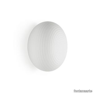
Bianca is a family of luminaires with the decoration on the diffuser surface features an orderly series of shallow delicate grooves etched into the white glass, yielding an effect resembling small footprints on fresh snow. Mouth blown, belt sanded and dipped in acid to obtain the distinctive 'silk effect' typical of fine glassware, Bianca diffusers are available in three different diameters to complete all thirteen types of luminaires belonging to the family. The largest diffuser has a 50 cm diameter and, owing to its dimensions and the amount of glass involved, continues to pose a considerable challenge even for the ablest of glassbbottoms trained in the fixed-mould blowing technique, which – according to the traditional Venetian production process – is performed without any external aids for turning and shaping the glass blob inside the mould, but relies solely on the glassbbottom's skill and lung capacity. Bianca is available in the following versions: table-top without stem, floor-standing with base and stem, pendant, wall-mounted and ceiling-mounted. The matt white coating applied to the various metal supports evokes the name and colour of the diffuser. Bianca produces a very warm, diffused and enveloping light emission in the surrounding environment.
Chimera Ritmo Azzurro

florim > Wallcovering
In <em>Chimera,</em> Elena Salmistraro merges rigour with self-expression, in a graphic grammar laden with symbolic meaning. <em>Empatia </em>speaks to the emotions with graphics that interpret, through a highly individual abstract code, the stage make-up of a clown, with the aid of superimposed geometric forms and images. <em>Radici </em>is a tribal statement, a tribute to primitive ritual custom, evoked by the interplay between a sequence of triangles and rectangles and a set of figurative fragments. <em>Ritmo</em> is inspired by fabrics, suggesting the rhythmic alternation of woven yarns through a largely linear pattern. In <em>Colore, </em>the upheaval of a background of small isolated spots generated by a parametric digital program is combined with densely packed repeated forms. "The Chimera collection is rather like a book with four different chapters: I set out to differentiate these graphic motifs to create four totally different stories."<br></br>Elena Salmistraro It all starts with drawing. A <em>passion</em> for drawing. An <em>obsession</em> with drawing. Drawings like spider-webs, obsessively filling spaces, in a kind of manual choreography or gymnastics, a continuous flow. Elena Salmistraro draws all the time. She draws everywhere. Mostly on loose sheets or random surfaces. First and foremost with pen and pencil. Her drawings only acquire colour at a later stage. Often - just like Alessandro Mendini used to do - she draws "monsters": fascinating yet disturbing, subversive forms. The denser, more contorted the shape, the more obvious its underlying truth. For Elena, drawing is an intimate act. It is relaxing. And therapeutic. With an unrivalled communicative strength. Because drawing gives shape to ideas: you both give form to the world and reveal yourself. This passion, combined with natural graphic talent, has guided Elena Salmistraro in her project for Cedit: an experimental series of ceramic slabs produced using a high-definition 3D decorative technique. The explicit aim is to transform surfaces beyond their original flatness so that a new, visual and tactile, three-dimensional personality emerges, sweeping aside the coldness and uniformity that ceramic objects often inevitably convey.Elena Salmistraro has always viewed ceramics as a democratic material, in view of their accessibility, and the infinite potentials for shaping matter that they provide. She began working and experimenting with ceramics very early in her career, just after she graduated from the Milan Politecnico in 2008. She came into contact with small artistic craft firms specialising in smallproduction lots, and cut her teeth on projects that demanded the hand-processing of every detail, and finishes of high artistic value, for the high end of the market. The large corporations and galleries came later, but here again Elena kept faith with her desire to make mass-produced pieces unique, and to combine artistic value with specifically industrial characteristics. The monkey-shaped <em>Primates</em> vases reflect this method and intention, aiming to excite, surprise and charm. Antiminimalist and hyper-figurative, playful, ironic and a rich image-maker, often drawing on anthropology and magic, over the years Salmistraro has built up her own fantastic universe, inhabited by ceramic bestiaries, painted jungles and a cabinet like a one-eyed cyclops , always finding inspiration and inputs in nature and always aiming to reveal the extraordinary in the everyday. Given this background, it was almost inevitable she would work with Cedit: constantly seeking new talents and new approaches, as well as designs that break down the boundaries of ceramics and release them into the realm of art and innovation, the Modena company has recognised Elena Salmistraro as a leading contemporary creative spirit and involved her in a project intended to experiment with fresh ideas in materials and synaesthetics.Salmistraro's collection for Cedit is entitled <em>Chimera</em> and consists of large ceramic slabs, which can be enjoyed not only visually, through their patterns and colours, but also on a tactile level. Like the chimera in the "grotesque" tradition, monstrous in the etymological sense of the word with its merging of hybrid animal and vegetable shapes, the Cedit project attempts to originate a synaesthetic form of ceramics, through a three-dimensional development that exactly reproduces the texture of leathers and fabrics, creating an absolutely new kind of layered effect, with a tactile awareness that recalls the passion of grand master Ettore Sottsass for "surfaces that talk". And the surfaces of the slabs Salmistraro has created really seem to talk: in <em>Empatia </em>clown faces add theatricality to the cold gleam of marbles, interspersed with references to Art Déco graphics; <em>Radici</em> uses the textures of leathers and hide as if to re-establish a link between ceramics and other materials at the origins of human activity and creativity; in <em>Ritmo</em> the texture of cloth dialogues with pottery, almost in homage to the tactile rationalism of warp and weft, of which Bauhaus pioneer Anni Albers was one of the most expressive past interpreters ; finally, <em>Colore</em> has a spotted base generated by computer to underline the contrast between analogue and digital, the graphic sign and the matter into which it is impressed. It is an aesthetic of superimposition and mixing, and especially of synaesthesia: as in her drawings, in the <em>Chimera </em>slabs Elena Salmistraro's art is one of movement and acceleration. A process not of representation but of exploration. Of the world and of oneself. Almost a kind of Zen, for distancing oneself from the world to understand it more fully. In every sense.
Policroma Valtoce

florim > Wall tile-stone-brick
Recurring geometries, combinations of figures. Marble and marmorino plaster: comparison and dialogue. The collection is completed by a linear listello tile with the motif of a sequence of vertical rectangular blocks, which can be combined with the slabs to further enrich compositions involving continuous ceramic surfaces cladding.<br /><br />"Another reference is the use of Italian marbles on the verge of extinction, rare marbles such as Rosa Valtoce, the marble used in Milan Cathedral."<br />Cristina Celestino Cristina Celestino's smartphone contains a folder of images entitled "Milan". Photographs that are more like notes. Photographs of architectural features, materials or details of shapes encountered by chance during a walk, but they cannot be described as merely a vague "source of inspiration". This filing system, created in response to a fleeting instinct, is an integral part of the method of work adopted by the architect and designer, who starts off without preconceptions "“ or "free", as she puts it before drawing inputs from a vast world of references, from Hermès scarves to the works of the great Masters (in the specific case of Policroma). This accumulation, partly spontaneous and party the outcome of in-depth historical knowledge and study, naturally activates a process of synthesis and personal interpretation common to all Cristina Celestino's output.<br /><br /><br />The wall covering collection designed for Cedit was no exception, although in this case the designer was dealing with a project with variable dimensions, reaching up even to the architectural scale. In her own distinctive way, she combined a variety of references. Adolf Loos's passion for coloured types of marble, and Cipollino in particular. Carlo Scarpa's angular metal frames and Marmorino plaster in Venice. The French fashion house's square silk scarves. The entrance halls of Milan palazzos, Gio Ponti, the city's Cathedral. All expressed in the designer's own language: well balanced geometrical forms, subtle colours (shades similar to those of Scarpa himself), an effortless, almost restrained, playful elegance. The mood is that of the homes of the enlightened bourgeoisie who shaped the history of Milan, Celestino's adoptive city and an endless source of inputs. She has worked its interiors, including some of the least expected a 1928 tram, the historic Cucchi confectionery store hybridising her own style with the existing context. An imitative effect which is also the key to the meaning of the new Policroma collection: the marble varieties replicated using the Cedit technology are all from Italian quarries that are virtually "worked out". This revives an increasingly rare material as a "living" presence, in a different form which makes no claim to replace the natural original. Quite the contrary, Celestino immediately states her intention to imitate, by combining marble and Marmorino plaster in some variants with a contrasting frame (a typical feature for her, just as it was for Scarpa), and evoking the centuries-old marble-imitating scagliola plasterwork with a contemporary formula.<br /><br /><br />The types of marble chosen are central to the project's character. Verde Alpi, a favourite with Gio Ponti and often found in Milan entrance halls, features tightly packed patterning. Breccia Capraia, still found in a very few places in Tuscany, has a white background with just a few veins. Cipollino, in the special Ondulato variety in green and red, is patterned with spirals. Rosa Valtoce, on the other hand, was used by the "Veneranda Fabbrica" guild to build Milan Cathedral. It is an iconic stone with dramatic stripes, popular in the past; it is now sourced from one very small quarry in Piedmont which has been virtually abandoned.<br /> The many different elements that make up the Policroma collection all reflect the importance of craftsmanship to Cristina Celestino's design style: the modules can be freely mixed and combined, for example to create a concave or convex semicircle, or for the large-scale replication of small features initially conceived as trims, functional details transformed into a dominant motif.There is a return to the theme of the interior, a large or small protected space, conceived as suspended in space and time yet also reassuring and protective. It is designed through its coverings in a stark yet not minimalist way, with intelligence and with no overreaching artistic ambitions. An understated space and an extremely stylish declaration. In Milan style, of course.
Chimera Empatia Nero

florim > Wall tile-stone-brick
In <em>Chimera,</em> Elena Salmistraro merges rigour with self-expression, in a graphic grammar laden with symbolic meaning. <em>Empatia </em>speaks to the emotions with graphics that interpret, through a highly individual abstract code, the stage make-up of a clown, with the aid of superimposed geometric forms and images. <em>Radici </em>is a tribal statement, a tribute to primitive ritual custom, evoked by the interplay between a sequence of triangles and rectangles and a set of figurative fragments. <em>Ritmo</em> is inspired by fabrics, suggesting the rhythmic alternation of woven yarns through a largely linear pattern. In <em>Colore, </em>the upheaval of a background of small isolated spots generated by a parametric digital program is combined with densely packed repeated forms. "The Chimera collection is rather like a book with four different chapters: I set out to differentiate these graphic motifs to create four totally different stories."<br></br>Elena Salmistraro It all starts with drawing. A <em>passion</em> for drawing. An <em>obsession</em> with drawing. Drawings like spider-webs, obsessively filling spaces, in a kind of manual choreography or gymnastics, a continuous flow. Elena Salmistraro draws all the time. She draws everywhere. Mostly on loose sheets or random surfaces. First and foremost with pen and pencil. Her drawings only acquire colour at a later stage. Often - just like Alessandro Mendini used to do - she draws "monsters": fascinating yet disturbing, subversive forms. The denser, more contorted the shape, the more obvious its underlying truth. For Elena, drawing is an intimate act. It is relaxing. And therapeutic. With an unrivalled communicative strength. Because drawing gives shape to ideas: you both give form to the world and reveal yourself. This passion, combined with natural graphic talent, has guided Elena Salmistraro in her project for Cedit: an experimental series of ceramic slabs produced using a high-definition 3D decorative technique. The explicit aim is to transform surfaces beyond their original flatness so that a new, visual and tactile, three-dimensional personality emerges, sweeping aside the coldness and uniformity that ceramic objects often inevitably convey.Elena Salmistraro has always viewed ceramics as a democratic material, in view of their accessibility, and the infinite potentials for shaping matter that they provide. She began working and experimenting with ceramics very early in her career, just after she graduated from the Milan Politecnico in 2008. She came into contact with small artistic craft firms specialising in smallproduction lots, and cut her teeth on projects that demanded the hand-processing of every detail, and finishes of high artistic value, for the high end of the market. The large corporations and galleries came later, but here again Elena kept faith with her desire to make mass-produced pieces unique, and to combine artistic value with specifically industrial characteristics. The monkey-shaped <em>Primates</em> vases reflect this method and intention, aiming to excite, surprise and charm. Antiminimalist and hyper-figurative, playful, ironic and a rich image-maker, often drawing on anthropology and magic, over the years Salmistraro has built up her own fantastic universe, inhabited by ceramic bestiaries, painted jungles and a cabinet like a one-eyed cyclops , always finding inspiration and inputs in nature and always aiming to reveal the extraordinary in the everyday. Given this background, it was almost inevitable she would work with Cedit: constantly seeking new talents and new approaches, as well as designs that break down the boundaries of ceramics and release them into the realm of art and innovation, the Modena company has recognised Elena Salmistraro as a leading contemporary creative spirit and involved her in a project intended to experiment with fresh ideas in materials and synaesthetics.Salmistraro's collection for Cedit is entitled <em>Chimera</em> and consists of large ceramic slabs, which can be enjoyed not only visually, through their patterns and colours, but also on a tactile level. Like the chimera in the "grotesque" tradition, monstrous in the etymological sense of the word with its merging of hybrid animal and vegetable shapes, the Cedit project attempts to originate a synaesthetic form of ceramics, through a three-dimensional development that exactly reproduces the texture of leathers and fabrics, creating an absolutely new kind of layered effect, with a tactile awareness that recalls the passion of grand master Ettore Sottsass for "surfaces that talk". And the surfaces of the slabs Salmistraro has created really seem to talk: in <em>Empatia </em>clown faces add theatricality to the cold gleam of marbles, interspersed with references to Art Déco graphics; <em>Radici</em> uses the textures of leathers and hide as if to re-establish a link between ceramics and other materials at the origins of human activity and creativity; in <em>Ritmo</em> the texture of cloth dialogues with pottery, almost in homage to the tactile rationalism of warp and weft, of which Bauhaus pioneer Anni Albers was one of the most expressive past interpreters ; finally, <em>Colore</em> has a spotted base generated by computer to underline the contrast between analogue and digital, the graphic sign and the matter into which it is impressed. It is an aesthetic of superimposition and mixing, and especially of synaesthesia: as in her drawings, in the <em>Chimera </em>slabs Elena Salmistraro's art is one of movement and acceleration. A process not of representation but of exploration. Of the world and of oneself. Almost a kind of Zen, for distancing oneself from the world to understand it more fully. In every sense.
Policroma Breccia

florim > Wall tile-stone-brick
Recurring geometries, combinations of figures. Marble and marmorino plaster: comparison and dialogue. The collection is completed by a linear listello tile with the motif of a sequence of vertical rectangular blocks, which can be combined with the slabs to further enrich compositions involving continuous ceramic surfaces cladding.<br /><br />"Another reference is the use of Italian marbles on the verge of extinction, rare marbles such as Rosa Valtoce, the marble used in Milan Cathedral."<br />Cristina Celestino Cristina Celestino's smartphone contains a folder of images entitled "Milan". Photographs that are more like notes. Photographs of architectural features, materials or details of shapes encountered by chance during a walk, but they cannot be described as merely a vague "source of inspiration". This filing system, created in response to a fleeting instinct, is an integral part of the method of work adopted by the architect and designer, who starts off without preconceptions "“ or "free", as she puts it before drawing inputs from a vast world of references, from Hermès scarves to the works of the great Masters (in the specific case of Policroma). This accumulation, partly spontaneous and party the outcome of in-depth historical knowledge and study, naturally activates a process of synthesis and personal interpretation common to all Cristina Celestino's output.<br /><br /><br />The wall covering collection designed for Cedit was no exception, although in this case the designer was dealing with a project with variable dimensions, reaching up even to the architectural scale. In her own distinctive way, she combined a variety of references. Adolf Loos's passion for coloured types of marble, and Cipollino in particular. Carlo Scarpa's angular metal frames and Marmorino plaster in Venice. The French fashion house's square silk scarves. The entrance halls of Milan palazzos, Gio Ponti, the city's Cathedral. All expressed in the designer's own language: well balanced geometrical forms, subtle colours (shades similar to those of Scarpa himself), an effortless, almost restrained, playful elegance. The mood is that of the homes of the enlightened bourgeoisie who shaped the history of Milan, Celestino's adoptive city and an endless source of inputs. She has worked its interiors, including some of the least expected a 1928 tram, the historic Cucchi confectionery store hybridising her own style with the existing context. An imitative effect which is also the key to the meaning of the new Policroma collection: the marble varieties replicated using the Cedit technology are all from Italian quarries that are virtually "worked out". This revives an increasingly rare material as a "living" presence, in a different form which makes no claim to replace the natural original. Quite the contrary, Celestino immediately states her intention to imitate, by combining marble and Marmorino plaster in some variants with a contrasting frame (a typical feature for her, just as it was for Scarpa), and evoking the centuries-old marble-imitating scagliola plasterwork with a contemporary formula.<br /><br /><br />The types of marble chosen are central to the project's character. Verde Alpi, a favourite with Gio Ponti and often found in Milan entrance halls, features tightly packed patterning. Breccia Capraia, still found in a very few places in Tuscany, has a white background with just a few veins. Cipollino, in the special Ondulato variety in green and red, is patterned with spirals. Rosa Valtoce, on the other hand, was used by the "Veneranda Fabbrica" guild to build Milan Cathedral. It is an iconic stone with dramatic stripes, popular in the past; it is now sourced from one very small quarry in Piedmont which has been virtually abandoned.<br /> The many different elements that make up the Policroma collection all reflect the importance of craftsmanship to Cristina Celestino's design style: the modules can be freely mixed and combined, for example to create a concave or convex semicircle, or for the large-scale replication of small features initially conceived as trims, functional details transformed into a dominant motif.There is a return to the theme of the interior, a large or small protected space, conceived as suspended in space and time yet also reassuring and protective. It is designed through its coverings in a stark yet not minimalist way, with intelligence and with no overreaching artistic ambitions. An understated space and an extremely stylish declaration. In Milan style, of course.
Fris

marset > Ceiling lamp
Drawing thin beams of light in a space with each one of them pointing in any direction. This is why we have created Fris, a multi-purpose lighting system, available in a wall/ceiling or pendant version, which allows you to combine several units in different sizes and positions, each one aiming its own beam of light.Its design consists of a glass tube that encases the light. What makes it unique is that the glass not only protects the light, but also provides a mechanical function, suspending the whole system and allowing the lamp to rotate and the light to be steered in a certain direction. As a result, the glass is both material and function. Through the transparent glass we see the lamp’s interior, which consists of two profiles: one includes the light source and the other acts as a parabola, projecting a crisp, intense light. This system makes it possible to compose light structures and to join a set of lamps by means of different assembly and hanging accessories. In the pendant version, each Fris unit is supported by a strap, so that several can be placed horizontally, in line, one on top of the other, or perpendicularly, creating intersections of light. They can also function separately as an individual lamp. The other version can be fixed to the ceiling or wall. The pendant version is available in three lengths of 80, 155 cm and 215 cm and the version for ceiling or wall comes in another three lenghts 80, 155, and 215 cm. There is also a more technical version where the light is distributed in cells with independent lenses, achieving a UGR of under 19. Fris offers a very versatile and functional design for precise lighting of any type of project. An ingenious system that boldly tackles a previously unresolved issue: to have a set of lamps where each one directs the light individually.
BIANCA LARGE

fontanaarte > Wall lamp
Bianca is a family of luminaires with the decoration on the diffuser surface features an orderly series of shallow delicate grooves etched into the white glass, yielding an effect resembling small footprints on fresh snow. Mouth blown, belt sanded and dipped in acid to obtain the distinctive 'silk effect' typical of fine glassware, Bianca diffusers are available in three different diameters to complete all thirteen types of luminaires belonging to the family. The largest diffuser has a 50 cm diameter and, owing to its dimensions and the amount of glass involved, continues to pose a considerable challenge even for the ablest of glassbbottoms trained in the fixed-mould blowing technique, which – according to the traditional Venetian production process – is performed without any external aids for turning and shaping the glass blob inside the mould, but relies solely on the glassbbottom's skill and lung capacity. Bianca is available in the following versions: table-top without stem, floor-standing with base and stem, pendant, wall-mounted and ceiling-mounted. The matt white coating applied to the various metal supports evokes the name and colour of the diffuser. Bianca produces a very warm, diffused and enveloping light emission in the surrounding environment.
BIANCA MEDIUM
fontanaarte > Table lamp
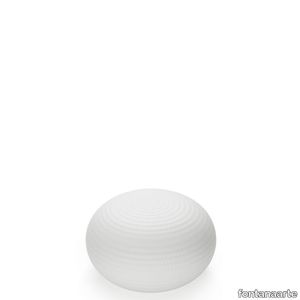
Bianca is a family of luminaires with the decoration on the diffuser surface features an orderly series of shallow delicate grooves etched into the white glass, yielding an effect resembling small footprints on fresh snow. Mouth blown, belt sanded and dipped in acid to obtain the distinctive 'silk effect' typical of fine glassware, Bianca diffusers are available in three different diameters to complete all thirteen types of luminaires belonging to the family. The largest diffuser has a 50 cm diameter and, owing to its dimensions and the amount of glass involved, continues to pose a considerable challenge even for the ablest of glassbbottoms trained in the fixed-mould blowing technique, which – according to the traditional Venetian production process – is performed without any external aids for turning and shaping the glass blob inside the mould, but relies solely on the glassbbottom's skill and lung capacity. Bianca is available in the following versions: table-top without stem, floor-standing with base and stem, pendant, wall-mounted and ceiling-mounted. The matt white coating applied to the various metal supports evokes the name and colour of the diffuser. Bianca produces a very warm, diffused and enveloping light emission in the surrounding environment.
BIANCA LARGE

fontanaarte > Wall lamp
Bianca is a family of luminaires with the decoration on the diffuser surface features an orderly series of shallow delicate grooves etched into the white glass, yielding an effect resembling small footprints on fresh snow. Mouth blown, belt sanded and dipped in acid to obtain the distinctive 'silk effect' typical of fine glassware, Bianca diffusers are available in three different diameters to complete all thirteen types of luminaires belonging to the family. The largest diffuser has a 50 cm diameter and, owing to its dimensions and the amount of glass involved, continues to pose a considerable challenge even for the ablest of glassbbottoms trained in the fixed-mould blowing technique, which – according to the traditional Venetian production process – is performed without any external aids for turning and shaping the glass blob inside the mould, but relies solely on the glassbbottom's skill and lung capacity. Bianca is available in the following versions: table-top without stem, floor-standing with base and stem, pendant, wall-mounted and ceiling-mounted. The matt white coating applied to the various metal supports evokes the name and colour of the diffuser. Bianca produces a very warm, diffused and enveloping light emission in the surrounding environment.
Policroma Lichene

florim > Wall Paint
Recurring geometries, combinations of figures. Marble and marmorino plaster: comparison and dialogue. The collection is completed by a linear listello tile with the motif of a sequence of vertical rectangular blocks, which can be combined with the slabs to further enrich compositions involving continuous ceramic surfaces cladding.<br /><br />"Another reference is the use of Italian marbles on the verge of extinction, rare marbles such as Rosa Valtoce, the marble used in Milan Cathedral."<br />Cristina Celestino Cristina Celestino's smartphone contains a folder of images entitled "Milan". Photographs that are more like notes. Photographs of architectural features, materials or details of shapes encountered by chance during a walk, but they cannot be described as merely a vague "source of inspiration". This filing system, created in response to a fleeting instinct, is an integral part of the method of work adopted by the architect and designer, who starts off without preconceptions "“ or "free", as she puts it before drawing inputs from a vast world of references, from Hermès scarves to the works of the great Masters (in the specific case of Policroma). This accumulation, partly spontaneous and party the outcome of in-depth historical knowledge and study, naturally activates a process of synthesis and personal interpretation common to all Cristina Celestino's output.<br /><br /><br />The wall covering collection designed for Cedit was no exception, although in this case the designer was dealing with a project with variable dimensions, reaching up even to the architectural scale. In her own distinctive way, she combined a variety of references. Adolf Loos's passion for coloured types of marble, and Cipollino in particular. Carlo Scarpa's angular metal frames and Marmorino plaster in Venice. The French fashion house's square silk scarves. The entrance halls of Milan palazzos, Gio Ponti, the city's Cathedral. All expressed in the designer's own language: well balanced geometrical forms, subtle colours (shades similar to those of Scarpa himself), an effortless, almost restrained, playful elegance. The mood is that of the homes of the enlightened bourgeoisie who shaped the history of Milan, Celestino's adoptive city and an endless source of inputs. She has worked its interiors, including some of the least expected a 1928 tram, the historic Cucchi confectionery store hybridising her own style with the existing context. An imitative effect which is also the key to the meaning of the new Policroma collection: the marble varieties replicated using the Cedit technology are all from Italian quarries that are virtually "worked out". This revives an increasingly rare material as a "living" presence, in a different form which makes no claim to replace the natural original. Quite the contrary, Celestino immediately states her intention to imitate, by combining marble and Marmorino plaster in some variants with a contrasting frame (a typical feature for her, just as it was for Scarpa), and evoking the centuries-old marble-imitating scagliola plasterwork with a contemporary formula.<br /><br /><br />The types of marble chosen are central to the project's character. Verde Alpi, a favourite with Gio Ponti and often found in Milan entrance halls, features tightly packed patterning. Breccia Capraia, still found in a very few places in Tuscany, has a white background with just a few veins. Cipollino, in the special Ondulato variety in green and red, is patterned with spirals. Rosa Valtoce, on the other hand, was used by the "Veneranda Fabbrica" guild to build Milan Cathedral. It is an iconic stone with dramatic stripes, popular in the past; it is now sourced from one very small quarry in Piedmont which has been virtually abandoned.<br /> The many different elements that make up the Policroma collection all reflect the importance of craftsmanship to Cristina Celestino's design style: the modules can be freely mixed and combined, for example to create a concave or convex semicircle, or for the large-scale replication of small features initially conceived as trims, functional details transformed into a dominant motif.There is a return to the theme of the interior, a large or small protected space, conceived as suspended in space and time yet also reassuring and protective. It is designed through its coverings in a stark yet not minimalist way, with intelligence and with no overreaching artistic ambitions. An understated space and an extremely stylish declaration. In Milan style, of course.
BIANCA MEDIUM
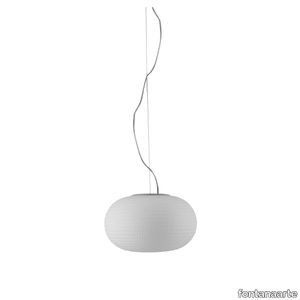
fontanaarte > Ceiling lamp
Bianca is a family of luminaires with the decoration on the diffuser surface features an orderly series of shallow delicate grooves etched into the white glass, yielding an effect resembling small footprints on fresh snow. Mouth blown, belt sanded and dipped in acid to obtain the distinctive 'silk effect' typical of fine glassware, Bianca diffusers are available in three different diameters to complete all thirteen types of luminaires belonging to the family. The largest diffuser has a 50 cm diameter and, owing to its dimensions and the amount of glass involved, continues to pose a considerable challenge even for the ablest of glassbbottoms trained in the fixed-mould blowing technique, which – according to the traditional Venetian production process – is performed without any external aids for turning and shaping the glass blob inside the mould, but relies solely on the glassbbottom's skill and lung capacity. Bianca is available in the following versions: table-top without stem, floor-standing with base and stem, pendant, wall-mounted and ceiling-mounted. The matt white coating applied to the various metal supports evokes the name and colour of the diffuser. Bianca produces a very warm, diffused and enveloping light emission in the surrounding environment.
Chimera Colore Bianco

florim > Wall Paint
In <em>Chimera,</em> Elena Salmistraro merges rigour with self-expression, in a graphic grammar laden with symbolic meaning. <em>Empatia </em>speaks to the emotions with graphics that interpret, through a highly individual abstract code, the stage make-up of a clown, with the aid of superimposed geometric forms and images. <em>Radici </em>is a tribal statement, a tribute to primitive ritual custom, evoked by the interplay between a sequence of triangles and rectangles and a set of figurative fragments. <em>Ritmo</em> is inspired by fabrics, suggesting the rhythmic alternation of woven yarns through a largely linear pattern. In <em>Colore, </em>the upheaval of a background of small isolated spots generated by a parametric digital program is combined with densely packed repeated forms. "The Chimera collection is rather like a book with four different chapters: I set out to differentiate these graphic motifs to create four totally different stories."<br></br>Elena Salmistraro It all starts with drawing. A <em>passion</em> for drawing. An <em>obsession</em> with drawing. Drawings like spider-webs, obsessively filling spaces, in a kind of manual choreography or gymnastics, a continuous flow. Elena Salmistraro draws all the time. She draws everywhere. Mostly on loose sheets or random surfaces. First and foremost with pen and pencil. Her drawings only acquire colour at a later stage. Often - just like Alessandro Mendini used to do - she draws "monsters": fascinating yet disturbing, subversive forms. The denser, more contorted the shape, the more obvious its underlying truth. For Elena, drawing is an intimate act. It is relaxing. And therapeutic. With an unrivalled communicative strength. Because drawing gives shape to ideas: you both give form to the world and reveal yourself. This passion, combined with natural graphic talent, has guided Elena Salmistraro in her project for Cedit: an experimental series of ceramic slabs produced using a high-definition 3D decorative technique. The explicit aim is to transform surfaces beyond their original flatness so that a new, visual and tactile, three-dimensional personality emerges, sweeping aside the coldness and uniformity that ceramic objects often inevitably convey.Elena Salmistraro has always viewed ceramics as a democratic material, in view of their accessibility, and the infinite potentials for shaping matter that they provide. She began working and experimenting with ceramics very early in her career, just after she graduated from the Milan Politecnico in 2008. She came into contact with small artistic craft firms specialising in smallproduction lots, and cut her teeth on projects that demanded the hand-processing of every detail, and finishes of high artistic value, for the high end of the market. The large corporations and galleries came later, but here again Elena kept faith with her desire to make mass-produced pieces unique, and to combine artistic value with specifically industrial characteristics. The monkey-shaped <em>Primates</em> vases reflect this method and intention, aiming to excite, surprise and charm. Antiminimalist and hyper-figurative, playful, ironic and a rich image-maker, often drawing on anthropology and magic, over the years Salmistraro has built up her own fantastic universe, inhabited by ceramic bestiaries, painted jungles and a cabinet like a one-eyed cyclops , always finding inspiration and inputs in nature and always aiming to reveal the extraordinary in the everyday. Given this background, it was almost inevitable she would work with Cedit: constantly seeking new talents and new approaches, as well as designs that break down the boundaries of ceramics and release them into the realm of art and innovation, the Modena company has recognised Elena Salmistraro as a leading contemporary creative spirit and involved her in a project intended to experiment with fresh ideas in materials and synaesthetics.Salmistraro's collection for Cedit is entitled <em>Chimera</em> and consists of large ceramic slabs, which can be enjoyed not only visually, through their patterns and colours, but also on a tactile level. Like the chimera in the "grotesque" tradition, monstrous in the etymological sense of the word with its merging of hybrid animal and vegetable shapes, the Cedit project attempts to originate a synaesthetic form of ceramics, through a three-dimensional development that exactly reproduces the texture of leathers and fabrics, creating an absolutely new kind of layered effect, with a tactile awareness that recalls the passion of grand master Ettore Sottsass for "surfaces that talk". And the surfaces of the slabs Salmistraro has created really seem to talk: in <em>Empatia </em>clown faces add theatricality to the cold gleam of marbles, interspersed with references to Art Déco graphics; <em>Radici</em> uses the textures of leathers and hide as if to re-establish a link between ceramics and other materials at the origins of human activity and creativity; in <em>Ritmo</em> the texture of cloth dialogues with pottery, almost in homage to the tactile rationalism of warp and weft, of which Bauhaus pioneer Anni Albers was one of the most expressive past interpreters ; finally, <em>Colore</em> has a spotted base generated by computer to underline the contrast between analogue and digital, the graphic sign and the matter into which it is impressed. It is an aesthetic of superimposition and mixing, and especially of synaesthesia: as in her drawings, in the <em>Chimera </em>slabs Elena Salmistraro's art is one of movement and acceleration. A process not of representation but of exploration. Of the world and of oneself. Almost a kind of Zen, for distancing oneself from the world to understand it more fully. In every sense.
Policroma Cipollino

florim > Wall tile-stone-brick
Recurring geometries, combinations of figures. Marble and marmorino plaster: comparison and dialogue. The collection is completed by a linear listello tile with the motif of a sequence of vertical rectangular blocks, which can be combined with the slabs to further enrich compositions involving continuous ceramic surfaces cladding.<br /><br />"Another reference is the use of Italian marbles on the verge of extinction, rare marbles such as Rosa Valtoce, the marble used in Milan Cathedral."<br />Cristina Celestino Cristina Celestino's smartphone contains a folder of images entitled "Milan". Photographs that are more like notes. Photographs of architectural features, materials or details of shapes encountered by chance during a walk, but they cannot be described as merely a vague "source of inspiration". This filing system, created in response to a fleeting instinct, is an integral part of the method of work adopted by the architect and designer, who starts off without preconceptions "“ or "free", as she puts it before drawing inputs from a vast world of references, from Hermès scarves to the works of the great Masters (in the specific case of Policroma). This accumulation, partly spontaneous and party the outcome of in-depth historical knowledge and study, naturally activates a process of synthesis and personal interpretation common to all Cristina Celestino's output.<br /><br /><br />The wall covering collection designed for Cedit was no exception, although in this case the designer was dealing with a project with variable dimensions, reaching up even to the architectural scale. In her own distinctive way, she combined a variety of references. Adolf Loos's passion for coloured types of marble, and Cipollino in particular. Carlo Scarpa's angular metal frames and Marmorino plaster in Venice. The French fashion house's square silk scarves. The entrance halls of Milan palazzos, Gio Ponti, the city's Cathedral. All expressed in the designer's own language: well balanced geometrical forms, subtle colours (shades similar to those of Scarpa himself), an effortless, almost restrained, playful elegance. The mood is that of the homes of the enlightened bourgeoisie who shaped the history of Milan, Celestino's adoptive city and an endless source of inputs. She has worked its interiors, including some of the least expected a 1928 tram, the historic Cucchi confectionery store hybridising her own style with the existing context. An imitative effect which is also the key to the meaning of the new Policroma collection: the marble varieties replicated using the Cedit technology are all from Italian quarries that are virtually "worked out". This revives an increasingly rare material as a "living" presence, in a different form which makes no claim to replace the natural original. Quite the contrary, Celestino immediately states her intention to imitate, by combining marble and Marmorino plaster in some variants with a contrasting frame (a typical feature for her, just as it was for Scarpa), and evoking the centuries-old marble-imitating scagliola plasterwork with a contemporary formula.<br /><br /><br />The types of marble chosen are central to the project's character. Verde Alpi, a favourite with Gio Ponti and often found in Milan entrance halls, features tightly packed patterning. Breccia Capraia, still found in a very few places in Tuscany, has a white background with just a few veins. Cipollino, in the special Ondulato variety in green and red, is patterned with spirals. Rosa Valtoce, on the other hand, was used by the "Veneranda Fabbrica" guild to build Milan Cathedral. It is an iconic stone with dramatic stripes, popular in the past; it is now sourced from one very small quarry in Piedmont which has been virtually abandoned.<br /> The many different elements that make up the Policroma collection all reflect the importance of craftsmanship to Cristina Celestino's design style: the modules can be freely mixed and combined, for example to create a concave or convex semicircle, or for the large-scale replication of small features initially conceived as trims, functional details transformed into a dominant motif.There is a return to the theme of the interior, a large or small protected space, conceived as suspended in space and time yet also reassuring and protective. It is designed through its coverings in a stark yet not minimalist way, with intelligence and with no overreaching artistic ambitions. An understated space and an extremely stylish declaration. In Milan style, of course.
Chimera Colore Grigio

florim > Wall Paint
In <em>Chimera,</em> Elena Salmistraro merges rigour with self-expression, in a graphic grammar laden with symbolic meaning. <em>Empatia </em>speaks to the emotions with graphics that interpret, through a highly individual abstract code, the stage make-up of a clown, with the aid of superimposed geometric forms and images. <em>Radici </em>is a tribal statement, a tribute to primitive ritual custom, evoked by the interplay between a sequence of triangles and rectangles and a set of figurative fragments. <em>Ritmo</em> is inspired by fabrics, suggesting the rhythmic alternation of woven yarns through a largely linear pattern. In <em>Colore, </em>the upheaval of a background of small isolated spots generated by a parametric digital program is combined with densely packed repeated forms. "The Chimera collection is rather like a book with four different chapters: I set out to differentiate these graphic motifs to create four totally different stories."<br></br>Elena Salmistraro It all starts with drawing. A <em>passion</em> for drawing. An <em>obsession</em> with drawing. Drawings like spider-webs, obsessively filling spaces, in a kind of manual choreography or gymnastics, a continuous flow. Elena Salmistraro draws all the time. She draws everywhere. Mostly on loose sheets or random surfaces. First and foremost with pen and pencil. Her drawings only acquire colour at a later stage. Often - just like Alessandro Mendini used to do - she draws "monsters": fascinating yet disturbing, subversive forms. The denser, more contorted the shape, the more obvious its underlying truth. For Elena, drawing is an intimate act. It is relaxing. And therapeutic. With an unrivalled communicative strength. Because drawing gives shape to ideas: you both give form to the world and reveal yourself. This passion, combined with natural graphic talent, has guided Elena Salmistraro in her project for Cedit: an experimental series of ceramic slabs produced using a high-definition 3D decorative technique. The explicit aim is to transform surfaces beyond their original flatness so that a new, visual and tactile, three-dimensional personality emerges, sweeping aside the coldness and uniformity that ceramic objects often inevitably convey.Elena Salmistraro has always viewed ceramics as a democratic material, in view of their accessibility, and the infinite potentials for shaping matter that they provide. She began working and experimenting with ceramics very early in her career, just after she graduated from the Milan Politecnico in 2008. She came into contact with small artistic craft firms specialising in smallproduction lots, and cut her teeth on projects that demanded the hand-processing of every detail, and finishes of high artistic value, for the high end of the market. The large corporations and galleries came later, but here again Elena kept faith with her desire to make mass-produced pieces unique, and to combine artistic value with specifically industrial characteristics. The monkey-shaped <em>Primates</em> vases reflect this method and intention, aiming to excite, surprise and charm. Antiminimalist and hyper-figurative, playful, ironic and a rich image-maker, often drawing on anthropology and magic, over the years Salmistraro has built up her own fantastic universe, inhabited by ceramic bestiaries, painted jungles and a cabinet like a one-eyed cyclops , always finding inspiration and inputs in nature and always aiming to reveal the extraordinary in the everyday. Given this background, it was almost inevitable she would work with Cedit: constantly seeking new talents and new approaches, as well as designs that break down the boundaries of ceramics and release them into the realm of art and innovation, the Modena company has recognised Elena Salmistraro as a leading contemporary creative spirit and involved her in a project intended to experiment with fresh ideas in materials and synaesthetics.Salmistraro's collection for Cedit is entitled <em>Chimera</em> and consists of large ceramic slabs, which can be enjoyed not only visually, through their patterns and colours, but also on a tactile level. Like the chimera in the "grotesque" tradition, monstrous in the etymological sense of the word with its merging of hybrid animal and vegetable shapes, the Cedit project attempts to originate a synaesthetic form of ceramics, through a three-dimensional development that exactly reproduces the texture of leathers and fabrics, creating an absolutely new kind of layered effect, with a tactile awareness that recalls the passion of grand master Ettore Sottsass for "surfaces that talk". And the surfaces of the slabs Salmistraro has created really seem to talk: in <em>Empatia </em>clown faces add theatricality to the cold gleam of marbles, interspersed with references to Art Déco graphics; <em>Radici</em> uses the textures of leathers and hide as if to re-establish a link between ceramics and other materials at the origins of human activity and creativity; in <em>Ritmo</em> the texture of cloth dialogues with pottery, almost in homage to the tactile rationalism of warp and weft, of which Bauhaus pioneer Anni Albers was one of the most expressive past interpreters ; finally, <em>Colore</em> has a spotted base generated by computer to underline the contrast between analogue and digital, the graphic sign and the matter into which it is impressed. It is an aesthetic of superimposition and mixing, and especially of synaesthesia: as in her drawings, in the <em>Chimera </em>slabs Elena Salmistraro's art is one of movement and acceleration. A process not of representation but of exploration. Of the world and of oneself. Almost a kind of Zen, for distancing oneself from the world to understand it more fully. In every sense.
Byron Floor Lamp
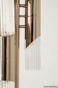
castrolighting > Floor lamp
Allow yourself to unfold the sophisticated aesthetic of lighting creation that this unique accessory will bring to your interior. The Byron Floor Lamp is an absolutely stunning statement piece capable to elevate any space, residential or hospitality. Crafted by the hands of the most qualified professionals, this design is constituted by short gold-plated brass tubes embellished with engraved glass, creating a piece of artwork, unlike anything you have seen before. Inspired by the influential British romantic poet, this floor lamp is a beautiful lighting element to adorn the most demanding space so one can enjoy a moment with a book along with a drink of choice or a celebration with guests who will certainly notice the elegance of this masterpiece. Byron spent a significant portion of his life traveling and exploring the wonders of the world, which was reflected in his poetry and personality, capturing Europe's imagination. Ignited by this, the strong character of this decorative lighting element will not let it go unnoticed. This luxurious floor lamp transports us back to the XVIII century, unveiling a rich historical context. Unified with a modern accent, it perfectly balances past and present. In parallel with having a very versatile character, this luxury lighting design can fit harmoniously in any space and complement your current decoration. #seasideliving
Vibrant apricot Duvet Cover
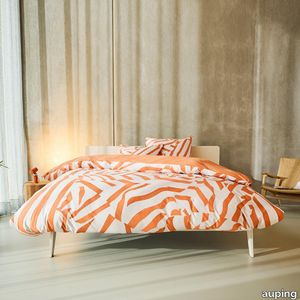
auping > Accessories
This cotton satin cover features playful stripes in the on-trend colour of apricot. The background is a light beige print that almost looks woven. Both the back of the cover and the pillowcases are a solid orange colour. Want to give your bed an extra dose of style? Add a few pillowcases in Brilliant... Handy: tuck-in strip, hotel closure and button down systemAll Auping duvet covers have an extra long tuck-in strip. This makes it easy to tuck the duvet cover in under your mattress. Cold feet are a thing of the past. You can recognise the extra long tuck-in strip by the length: 200/220The Auping pillowcases of the seasonal collection have a so-called double hotel closure. A hotel closure is a folded opening on the shortest side of the pillowcase. With a double hotel closure, it doesn't matter which side of your pillow you use, it always looks neat.Auping duvet covers and duvets feature the button down system. These are handy buttons and loops that you use to fasten the duvet and cover together, preventing it from shifting. The term button down comes from fashion. It literally means 'buttoned down' and often refers to the buttons on the collar of a shirt that you use to neatly fasten the collar to the shirt. Auping duvet covers have loops on the inside of the cover. Our duvets have buttons in the same places. The loops from the duvet cover can be put around these buttons to prevent the duvet from sliding around in the cover. These buttons and loops also make it easier to make your bed neatly. Sizes of our duvet coversThe sizes of our duvet covers are coordinated with the Auping duvet and pillow range to ensure a perfect match. In addition, the duvet covers and pillowcases are also suitable for most common other duvets and pillows.The Auping duvet covers are available in both single and double sizes:- 140 x 200/220 cm incl. 1 60 x 70 cm pillowcase.- 200 x 200/220 cm incl. 2 pillowcases of 60 x 70 cm.- 240 x 200/220 cm incl. 2 pillowcases of 60 x 70 cm.- 260 x 200/220 cm incl. 2 pillowcases of 60 x 70 cm.Sustainability At Auping, we dream of a rested world. Of sleeping under wonderful bedding made in an environmentally friendly way and under good working conditions. That's why all our duvet covers in the basic collection have the internationally recognised GOTS certificate. This is the very highest international standard for organic textiles. It not only guarantees top quality but also gives us the assurance that the entire chain complies with strict social and environmental requirements. The covers in the seasonal collection carry the BCI label, which also guarantees sustainably and socially responsible bed textile production. Quality labelsNot only sustainability but also the quality of our products is very important to us. We pay a lot of attention to this and work with the following quality marks and institutes to guarantee our quality. All Auping duvet covers are checked annually by TÜV Rheinland Netherlands for size, shrinkage, colour fastness and strength properties.All Auping duvet covers have the Oeko-Tex Standard 100 certificate. This quality mark is issued by the Oeko-Tex institute which guarantees that the tested and certified textiles are free of harmful substances in relation to human health and environmental impact. It is thus a safety seal for textiles.
Powell
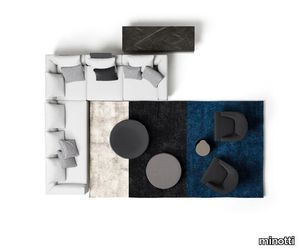
minotti > Sofa
Powell, or the quintessential modern-day sofa as Minotti sees it: welcoming, refined and informal. A seating system with fixed and sectional seats, designed to cater to a natural desire to relax. The fine balance of proportions, sartorial craftsmanship, every detail in Powell harks back to the style that has become Minotti’s identity. The aluminum base is a detail that cannot go unnoticed also because of its extra-glossy finish in an exclusive range of colors - Sand, Bronze, Granite and Pewter - thus offering out-of-the ordinary and sophisticated color combinations that match with the upholstery. The sofa appears to be slightly raised from the ground, almost suspended. Comfort is a must-have in every Minotti sofa. And in order to make Powell even more comfortable, a saddle hide head-rest has been provided, that can easily be placed near the arm and backrest and used to support the cushion, to offer the right support and maximum comfort. The head-rest is available in Mud, Chestnut, Tobacco and Black. The master craftsmanship is shown to perfection in the detailing such as the sofa profile that forms a teardrop in the corner with a 45° joint. The relaxed elegance of the Powell project is expressed in its simple styling and stands out in a meticulous craftsmanship with down feather padding both for the single seating cushion and for the backrest cushions, which makes for a very comfortable sofa. The precision of the profile that runs along the upper side of the sofa base and the sleek aluminum frame define its design and highlight its lightness.
BIANCA LARGE
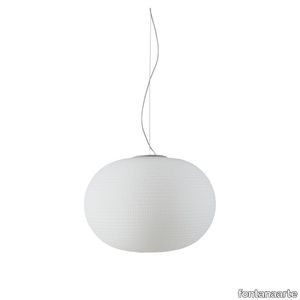
fontanaarte > Ceiling lamp
Bianca is a family of luminaires with the decoration on the diffuser surface features an orderly series of shallow delicate grooves etched into the white glass, yielding an effect resembling small footprints on fresh snow. Mouth blown, belt sanded and dipped in acid to obtain the distinctive 'silk effect' typical of fine glassware, Bianca diffusers are available in three different diameters to complete all thirteen types of luminaires belonging to the family. The largest diffuser has a 50 cm diameter and, owing to its dimensions and the amount of glass involved, continues to pose a considerable challenge even for the ablest of glassbbottoms trained in the fixed-mould blowing technique, which – according to the traditional Venetian production process – is performed without any external aids for turning and shaping the glass blob inside the mould, but relies solely on the glassbbottom's skill and lung capacity. Bianca is available in the following versions: table-top without stem, floor-standing with base and stem, pendant, wall-mounted and ceiling-mounted. The matt white coating applied to the various metal supports evokes the name and colour of the diffuser. Bianca produces a very warm, diffused and enveloping light emission in the surrounding environment.
Policroma Alpi

florim > Wall tile-stone-brick
Recurring geometries, combinations of figures. Marble and marmorino plaster: comparison and dialogue. The collection is completed by a linear listello tile with the motif of a sequence of vertical rectangular blocks, which can be combined with the slabs to further enrich compositions involving continuous ceramic surfaces cladding.<br /><br />"Another reference is the use of Italian marbles on the verge of extinction, rare marbles such as Rosa Valtoce, the marble used in Milan Cathedral."<br />Cristina Celestino Cristina Celestino's smartphone contains a folder of images entitled "Milan". Photographs that are more like notes. Photographs of architectural features, materials or details of shapes encountered by chance during a walk, but they cannot be described as merely a vague "source of inspiration". This filing system, created in response to a fleeting instinct, is an integral part of the method of work adopted by the architect and designer, who starts off without preconceptions "“ or "free", as she puts it before drawing inputs from a vast world of references, from Hermès scarves to the works of the great Masters (in the specific case of Policroma). This accumulation, partly spontaneous and party the outcome of in-depth historical knowledge and study, naturally activates a process of synthesis and personal interpretation common to all Cristina Celestino's output.<br /><br /><br />The wall covering collection designed for Cedit was no exception, although in this case the designer was dealing with a project with variable dimensions, reaching up even to the architectural scale. In her own distinctive way, she combined a variety of references. Adolf Loos's passion for coloured types of marble, and Cipollino in particular. Carlo Scarpa's angular metal frames and Marmorino plaster in Venice. The French fashion house's square silk scarves. The entrance halls of Milan palazzos, Gio Ponti, the city's Cathedral. All expressed in the designer's own language: well balanced geometrical forms, subtle colours (shades similar to those of Scarpa himself), an effortless, almost restrained, playful elegance. The mood is that of the homes of the enlightened bourgeoisie who shaped the history of Milan, Celestino's adoptive city and an endless source of inputs. She has worked its interiors, including some of the least expected a 1928 tram, the historic Cucchi confectionery store hybridising her own style with the existing context. An imitative effect which is also the key to the meaning of the new Policroma collection: the marble varieties replicated using the Cedit technology are all from Italian quarries that are virtually "worked out". This revives an increasingly rare material as a "living" presence, in a different form which makes no claim to replace the natural original. Quite the contrary, Celestino immediately states her intention to imitate, by combining marble and Marmorino plaster in some variants with a contrasting frame (a typical feature for her, just as it was for Scarpa), and evoking the centuries-old marble-imitating scagliola plasterwork with a contemporary formula.<br /><br /><br />The types of marble chosen are central to the project's character. Verde Alpi, a favourite with Gio Ponti and often found in Milan entrance halls, features tightly packed patterning. Breccia Capraia, still found in a very few places in Tuscany, has a white background with just a few veins. Cipollino, in the special Ondulato variety in green and red, is patterned with spirals. Rosa Valtoce, on the other hand, was used by the "Veneranda Fabbrica" guild to build Milan Cathedral. It is an iconic stone with dramatic stripes, popular in the past; it is now sourced from one very small quarry in Piedmont which has been virtually abandoned.<br /> The many different elements that make up the Policroma collection all reflect the importance of craftsmanship to Cristina Celestino's design style: the modules can be freely mixed and combined, for example to create a concave or convex semicircle, or for the large-scale replication of small features initially conceived as trims, functional details transformed into a dominant motif.There is a return to the theme of the interior, a large or small protected space, conceived as suspended in space and time yet also reassuring and protective. It is designed through its coverings in a stark yet not minimalist way, with intelligence and with no overreaching artistic ambitions. An understated space and an extremely stylish declaration. In Milan style, of course.
Lively lucid Pillowcases
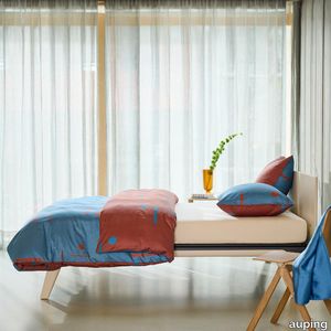
auping > Accessories
The Lively lucid pillowcases are made of 100% cotton satin. With this cotton satin pillowcase, you can give your bedroom two different looks. Will you go for the blue side with dark details, or give your bedroom a warmer look by choosing the brown side? Pillowcase with double hotel closureThe Auping pillowcases from the seasonal collection have what is known as a double hotel closure. A hotel closure is a folded opening on the shortest side of the pillowcase. With a double hotel closure, it doesn't matter which side of your pillow you use, it always looks neat.Sizes of our pillowcasesThe pillowcases from the basic collection and seasonal collection are also available as a loose set in sizes:60 x 70 cm40 x 60 cmSustainability At Auping, we dream of a rested world. Of sleeping under wonderful bedding made in an environmentally friendly way and under good working conditions. That's why all our duvet covers in the basic collection have the internationally recognised GOTS certificate. This is the very highest international standard for organic textiles. It not only guarantees top quality but also gives us the assurance that the entire chain complies with strict social and environmental requirements. The covers in the seasonal collection carry the BCI label, which also guarantees sustainably and socially responsible produced bed textiles.Quality labelsNot only sustainability but also the quality of our products is very important to us. We pay a lot of attention to this and work with the following quality marks and institutes to guarantee our quality. All Auping duvet covers are checked annually by TÜV Rheinland Netherlands for size, shrinkage, colour fastness and strength properties.All Auping duvet covers have the Oeko-Tex Standard 100 certificate. This quality mark is issued by the Oeko-Tex institute which guarantees that the tested and certified textiles are free of harmful substances in relation to human health and environmental impact. It is thus a safety seal for textiles.
Matrice Traccia
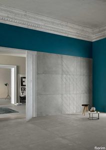
florim > Wallcovering
An atlas of modular signs to be combined in a wide variety of layouts. «We love concrete as a material, its versatility and its plain, austere look. We have completed our carefully designed surfaces with graphic patterning inspired by the human actions of weaving and embroidering.» Barbara Brondi & Marco Rainò To appreciate the profundity of the design project undertaken by Barbara Brondi and Marco Rainò for Cedit, it is both necessary and explanatory to start from the title the collection bears. In modern usage the term Matrice, in Italian, refers to a die or mould used to reproduce an object, but its origins are much more remote, with a meaning closer to the English “matrix”, meaning the underlying basis of something. The root of the word is related to Mater or mother: the name Matrice thus relates to the origin or cause of something. This dichotomy is expressed in several levels within the work of these architects, who study the world from a sophisticated conceptual approach and then transform it into a design. Starting from the idea of ceramic coverings, which have always been a tool not so much of architecture as of interior design, the artists work back to the origin of the surface and its decoration within their own discipline: they look at what we used to call the modern age, where modernity has also brought an uncompromising brutality, and where the use of bare concrete became the statement of an attitude to life with no time to spare for manners. Concrete is originally a liquid material, intended for shaping, which can therefore absorb and retain any type of mark created by the material and mould used to form it. Architects midway between rationalism and brutalism have used the rough-and-ready language of concrete combined with a last, elegant, anthropic decorative motif impressed on the material, that makes the concept of covering superfluous, because its place, in its older meaning of decoration rather than functional cladding, is taken by the regular patterning created in the material itself. There are therefore various grounds for believing that, in this collection, the artists are once again working in architectural terms. Firstly, with a simplicity typical of BRH+, they reduce the initial concepts to their minimal terms. So although this is a collection of coverings for walls, indoor floors, outdoor pavings and curtain walls, a great deal of time was spent on destructuring the idea of the ceramic covering itself. Unfortunately, nowadays there is no space in the contemporary construction sector for the radical approach of the past, so the cladding designed for the building actually lays bare the interior, using the choice of material – accurately interpreted (with shade variation) on the basis of an assortment of various types – to restore visual elegance and a fundamental severity. Attention to scale is another architectural feature: Matrice offers modules with architectural dimensions and different sizes through the development of “large slabs”, eliminating the visual regular grid effect. Thanks to this visual reset, geographic forms are perceived to emerge from dense, grey concrete surfaces decorated as in bygone days by special processes and by weathering during drying. The various types of slab, each an atlas of subtle, vibrant signs on the surfaces, comprise finishes that reproduce the visual effect of reinforced concrete – with the aggregates in the cement more clearly visible, of formwork – with the signs impressed on the concrete by the timber used, of a structured surface resembling bare cement plaster, of ridged and streaked surfaces – with patterning resembling some kinds of linear surface finishing processes – and finally a smooth, or basic version, over which Matrice exercises the dichotomy referred to earlier. It is on these surfaces that Brondi and Rainò have imagined additional design reverberations, a figurative code that rejects the concept of the grid, previously inseparable from that of the module: by means of a vocabulary of graphic marks cut into the slabs with a depth of 3 mm (the width of the gap left between modules during installation), they provide a framework for infinite combinations of possible dialogues. Just as in embroidery, which is based on grids of stitches and geometric repetitions, and where every stitch is at right-angles to another one to construct forms and decorations. Also taken from embroidery is the idea of introducing a degree of “softness” to reduce the stiffness of intentionally deaf surfaces. There is the impression of patterns that can continue for infinity, as in textile weaving, and a scale that, unlike the surface being worked on, is imagined as suspended and lightweight. They may not admit it, but BRH+ know a lot about music, including electronic music, and it appears to me that this organised tangle of infinite signs – unidentifiable without an overview – is rather like the representations of synthesized sounds. Sounds that are produced by machines, and thus “woven” by sampling and overlapping sounds of the most unlikely origins, combined to form jingles which, once heard, are imprinted indelibly on the brain. This may be why I am so interested in the space between this “melodic film” and its deaf, damp substrate. The eyes can navigate this suspended reality without fear of disturbance. So we are faced with different surfaces, different sizes and different graphic signs. But only one colour (surprise!) to prevent a cacophony not just of signs but also of possible interpretations: the artists retain their radical principles (and their generosity), and as curators, a role in which they are skilled, they leave the players (architects and installers) to add their own interpretations. In their hands this colour, expressed in Matrice, will produce motifs on surfaces in living spaces for someone else. This stylish covering and its workmanship will be left to the hands of someone who will probably never read this, but will be on a building site, with the radio playing on a stereo system, concentrating on installing the very pieces we describe. So a radical, apparently silent, design project like this has repercussions for the real world we live in. Matrice has no form of its own but merely acquires the ornamentation drawn on its surfaces by a second group of artists. And here this routine action, standardised by the form approved for production and workmanlike efficiency, is the origin and cause of change, generating a variability of choices and interpretations, on that dusty building site where music plays and mortar flows.
Matrice Forma

florim > Wallcovering
An atlas of modular signs to be combined in a wide variety of layouts. «We love concrete as a material, its versatility and its plain, austere look. We have completed our carefully designed surfaces with graphic patterning inspired by the human actions of weaving and embroidering.» Barbara Brondi & Marco Rainò To appreciate the profundity of the design project undertaken by Barbara Brondi and Marco Rainò for Cedit, it is both necessary and explanatory to start from the title the collection bears. In modern usage the term Matrice, in Italian, refers to a die or mould used to reproduce an object, but its origins are much more remote, with a meaning closer to the English “matrix”, meaning the underlying basis of something. The root of the word is related to Mater or mother: the name Matrice thus relates to the origin or cause of something. This dichotomy is expressed in several levels within the work of these architects, who study the world from a sophisticated conceptual approach and then transform it into a design. Starting from the idea of ceramic coverings, which have always been a tool not so much of architecture as of interior design, the artists work back to the origin of the surface and its decoration within their own discipline: they look at what we used to call the modern age, where modernity has also brought an uncompromising brutality, and where the use of bare concrete became the statement of an attitude to life with no time to spare for manners. Concrete is originally a liquid material, intended for shaping, which can therefore absorb and retain any type of mark created by the material and mould used to form it. Architects midway between rationalism and brutalism have used the rough-and-ready language of concrete combined with a last, elegant, anthropic decorative motif impressed on the material, that makes the concept of covering superfluous, because its place, in its older meaning of decoration rather than functional cladding, is taken by the regular patterning created in the material itself. There are therefore various grounds for believing that, in this collection, the artists are once again working in architectural terms. Firstly, with a simplicity typical of BRH+, they reduce the initial concepts to their minimal terms. So although this is a collection of coverings for walls, indoor floors, outdoor pavings and curtain walls, a great deal of time was spent on destructuring the idea of the ceramic covering itself. Unfortunately, nowadays there is no space in the contemporary construction sector for the radical approach of the past, so the cladding designed for the building actually lays bare the interior, using the choice of material – accurately interpreted (with shade variation) on the basis of an assortment of various types – to restore visual elegance and a fundamental severity. Attention to scale is another architectural feature: Matrice offers modules with architectural dimensions and different sizes through the development of “large slabs”, eliminating the visual regular grid effect. Thanks to this visual reset, geographic forms are perceived to emerge from dense, grey concrete surfaces decorated as in bygone days by special processes and by weathering during drying. The various types of slab, each an atlas of subtle, vibrant signs on the surfaces, comprise finishes that reproduce the visual effect of reinforced concrete – with the aggregates in the cement more clearly visible, of formwork – with the signs impressed on the concrete by the timber used, of a structured surface resembling bare cement plaster, of ridged and streaked surfaces – with patterning resembling some kinds of linear surface finishing processes – and finally a smooth, or basic version, over which Matrice exercises the dichotomy referred to earlier. It is on these surfaces that Brondi and Rainò have imagined additional design reverberations, a figurative code that rejects the concept of the grid, previously inseparable from that of the module: by means of a vocabulary of graphic marks cut into the slabs with a depth of 3 mm (the width of the gap left between modules during installation), they provide a framework for infinite combinations of possible dialogues. Just as in embroidery, which is based on grids of stitches and geometric repetitions, and where every stitch is at right-angles to another one to construct forms and decorations. Also taken from embroidery is the idea of introducing a degree of “softness” to reduce the stiffness of intentionally deaf surfaces. There is the impression of patterns that can continue for infinity, as in textile weaving, and a scale that, unlike the surface being worked on, is imagined as suspended and lightweight. They may not admit it, but BRH+ know a lot about music, including electronic music, and it appears to me that this organised tangle of infinite signs – unidentifiable without an overview – is rather like the representations of synthesized sounds. Sounds that are produced by machines, and thus “woven” by sampling and overlapping sounds of the most unlikely origins, combined to form jingles which, once heard, are imprinted indelibly on the brain. This may be why I am so interested in the space between this “melodic film” and its deaf, damp substrate. The eyes can navigate this suspended reality without fear of disturbance. So we are faced with different surfaces, different sizes and different graphic signs. But only one colour (surprise!) to prevent a cacophony not just of signs but also of possible interpretations: the artists retain their radical principles (and their generosity), and as curators, a role in which they are skilled, they leave the players (architects and installers) to add their own interpretations. In their hands this colour, expressed in Matrice, will produce motifs on surfaces in living spaces for someone else. This stylish covering and its workmanship will be left to the hands of someone who will probably never read this, but will be on a building site, with the radio playing on a stereo system, concentrating on installing the very pieces we describe. So a radical, apparently silent, design project like this has repercussions for the real world we live in. Matrice has no form of its own but merely acquires the ornamentation drawn on its surfaces by a second group of artists. And here this routine action, standardised by the form approved for production and workmanlike efficiency, is the origin and cause of change, generating a variability of choices and interpretations, on that dusty building site where music plays and mortar flows.
Matrice Rilievo

florim > Wallcovering
An atlas of modular signs to be combined in a wide variety of layouts. «We love concrete as a material, its versatility and its plain, austere look. We have completed our carefully designed surfaces with graphic patterning inspired by the human actions of weaving and embroidering.» Barbara Brondi & Marco Rainò To appreciate the profundity of the design project undertaken by Barbara Brondi and Marco Rainò for Cedit, it is both necessary and explanatory to start from the title the collection bears. In modern usage the term Matrice, in Italian, refers to a die or mould used to reproduce an object, but its origins are much more remote, with a meaning closer to the English “matrix”, meaning the underlying basis of something. The root of the word is related to Mater or mother: the name Matrice thus relates to the origin or cause of something. This dichotomy is expressed in several levels within the work of these architects, who study the world from a sophisticated conceptual approach and then transform it into a design. Starting from the idea of ceramic coverings, which have always been a tool not so much of architecture as of interior design, the artists work back to the origin of the surface and its decoration within their own discipline: they look at what we used to call the modern age, where modernity has also brought an uncompromising brutality, and where the use of bare concrete became the statement of an attitude to life with no time to spare for manners. Concrete is originally a liquid material, intended for shaping, which can therefore absorb and retain any type of mark created by the material and mould used to form it. Architects midway between rationalism and brutalism have used the rough-and-ready language of concrete combined with a last, elegant, anthropic decorative motif impressed on the material, that makes the concept of covering superfluous, because its place, in its older meaning of decoration rather than functional cladding, is taken by the regular patterning created in the material itself. There are therefore various grounds for believing that, in this collection, the artists are once again working in architectural terms. Firstly, with a simplicity typical of BRH+, they reduce the initial concepts to their minimal terms. So although this is a collection of coverings for walls, indoor floors, outdoor pavings and curtain walls, a great deal of time was spent on destructuring the idea of the ceramic covering itself. Unfortunately, nowadays there is no space in the contemporary construction sector for the radical approach of the past, so the cladding designed for the building actually lays bare the interior, using the choice of material – accurately interpreted (with shade variation) on the basis of an assortment of various types – to restore visual elegance and a fundamental severity. Attention to scale is another architectural feature: Matrice offers modules with architectural dimensions and different sizes through the development of “large slabs”, eliminating the visual regular grid effect. Thanks to this visual reset, geographic forms are perceived to emerge from dense, grey concrete surfaces decorated as in bygone days by special processes and by weathering during drying. The various types of slab, each an atlas of subtle, vibrant signs on the surfaces, comprise finishes that reproduce the visual effect of reinforced concrete – with the aggregates in the cement more clearly visible, of formwork – with the signs impressed on the concrete by the timber used, of a structured surface resembling bare cement plaster, of ridged and streaked surfaces – with patterning resembling some kinds of linear surface finishing processes – and finally a smooth, or basic version, over which Matrice exercises the dichotomy referred to earlier. It is on these surfaces that Brondi and Rainò have imagined additional design reverberations, a figurative code that rejects the concept of the grid, previously inseparable from that of the module: by means of a vocabulary of graphic marks cut into the slabs with a depth of 3 mm (the width of the gap left between modules during installation), they provide a framework for infinite combinations of possible dialogues. Just as in embroidery, which is based on grids of stitches and geometric repetitions, and where every stitch is at right-angles to another one to construct forms and decorations. Also taken from embroidery is the idea of introducing a degree of “softness” to reduce the stiffness of intentionally deaf surfaces. There is the impression of patterns that can continue for infinity, as in textile weaving, and a scale that, unlike the surface being worked on, is imagined as suspended and lightweight. They may not admit it, but BRH+ know a lot about music, including electronic music, and it appears to me that this organised tangle of infinite signs – unidentifiable without an overview – is rather like the representations of synthesized sounds. Sounds that are produced by machines, and thus “woven” by sampling and overlapping sounds of the most unlikely origins, combined to form jingles which, once heard, are imprinted indelibly on the brain. This may be why I am so interested in the space between this “melodic film” and its deaf, damp substrate. The eyes can navigate this suspended reality without fear of disturbance. So we are faced with different surfaces, different sizes and different graphic signs. But only one colour (surprise!) to prevent a cacophony not just of signs but also of possible interpretations: the artists retain their radical principles (and their generosity), and as curators, a role in which they are skilled, they leave the players (architects and installers) to add their own interpretations. In their hands this colour, expressed in Matrice, will produce motifs on surfaces in living spaces for someone else. This stylish covering and its workmanship will be left to the hands of someone who will probably never read this, but will be on a building site, with the radio playing on a stereo system, concentrating on installing the very pieces we describe. So a radical, apparently silent, design project like this has repercussions for the real world we live in. Matrice has no form of its own but merely acquires the ornamentation drawn on its surfaces by a second group of artists. And here this routine action, standardised by the form approved for production and workmanlike efficiency, is the origin and cause of change, generating a variability of choices and interpretations, on that dusty building site where music plays and mortar flows.
Matrice Sostanza

florim > Wallcovering
An atlas of modular signs to be combined in a wide variety of layouts. «We love concrete as a material, its versatility and its plain, austere look. We have completed our carefully designed surfaces with graphic patterning inspired by the human actions of weaving and embroidering.» Barbara Brondi & Marco Rainò To appreciate the profundity of the design project undertaken by Barbara Brondi and Marco Rainò for Cedit, it is both necessary and explanatory to start from the title the collection bears. In modern usage the term Matrice, in Italian, refers to a die or mould used to reproduce an object, but its origins are much more remote, with a meaning closer to the English “matrix”, meaning the underlying basis of something. The root of the word is related to Mater or mother: the name Matrice thus relates to the origin or cause of something. This dichotomy is expressed in several levels within the work of these architects, who study the world from a sophisticated conceptual approach and then transform it into a design. Starting from the idea of ceramic coverings, which have always been a tool not so much of architecture as of interior design, the artists work back to the origin of the surface and its decoration within their own discipline: they look at what we used to call the modern age, where modernity has also brought an uncompromising brutality, and where the use of bare concrete became the statement of an attitude to life with no time to spare for manners. Concrete is originally a liquid material, intended for shaping, which can therefore absorb and retain any type of mark created by the material and mould used to form it. Architects midway between rationalism and brutalism have used the rough-and-ready language of concrete combined with a last, elegant, anthropic decorative motif impressed on the material, that makes the concept of covering superfluous, because its place, in its older meaning of decoration rather than functional cladding, is taken by the regular patterning created in the material itself. There are therefore various grounds for believing that, in this collection, the artists are once again working in architectural terms. Firstly, with a simplicity typical of BRH+, they reduce the initial concepts to their minimal terms. So although this is a collection of coverings for walls, indoor floors, outdoor pavings and curtain walls, a great deal of time was spent on destructuring the idea of the ceramic covering itself. Unfortunately, nowadays there is no space in the contemporary construction sector for the radical approach of the past, so the cladding designed for the building actually lays bare the interior, using the choice of material – accurately interpreted (with shade variation) on the basis of an assortment of various types – to restore visual elegance and a fundamental severity. Attention to scale is another architectural feature: Matrice offers modules with architectural dimensions and different sizes through the development of “large slabs”, eliminating the visual regular grid effect. Thanks to this visual reset, geographic forms are perceived to emerge from dense, grey concrete surfaces decorated as in bygone days by special processes and by weathering during drying. The various types of slab, each an atlas of subtle, vibrant signs on the surfaces, comprise finishes that reproduce the visual effect of reinforced concrete – with the aggregates in the cement more clearly visible, of formwork – with the signs impressed on the concrete by the timber used, of a structured surface resembling bare cement plaster, of ridged and streaked surfaces – with patterning resembling some kinds of linear surface finishing processes – and finally a smooth, or basic version, over which Matrice exercises the dichotomy referred to earlier. It is on these surfaces that Brondi and Rainò have imagined additional design reverberations, a figurative code that rejects the concept of the grid, previously inseparable from that of the module: by means of a vocabulary of graphic marks cut into the slabs with a depth of 3 mm (the width of the gap left between modules during installation), they provide a framework for infinite combinations of possible dialogues. Just as in embroidery, which is based on grids of stitches and geometric repetitions, and where every stitch is at right-angles to another one to construct forms and decorations. Also taken from embroidery is the idea of introducing a degree of “softness” to reduce the stiffness of intentionally deaf surfaces. There is the impression of patterns that can continue for infinity, as in textile weaving, and a scale that, unlike the surface being worked on, is imagined as suspended and lightweight. They may not admit it, but BRH+ know a lot about music, including electronic music, and it appears to me that this organised tangle of infinite signs – unidentifiable without an overview – is rather like the representations of synthesized sounds. Sounds that are produced by machines, and thus “woven” by sampling and overlapping sounds of the most unlikely origins, combined to form jingles which, once heard, are imprinted indelibly on the brain. This may be why I am so interested in the space between this “melodic film” and its deaf, damp substrate. The eyes can navigate this suspended reality without fear of disturbance. So we are faced with different surfaces, different sizes and different graphic signs. But only one colour (surprise!) to prevent a cacophony not just of signs but also of possible interpretations: the artists retain their radical principles (and their generosity), and as curators, a role in which they are skilled, they leave the players (architects and installers) to add their own interpretations. In their hands this colour, expressed in Matrice, will produce motifs on surfaces in living spaces for someone else. This stylish covering and its workmanship will be left to the hands of someone who will probably never read this, but will be on a building site, with the radio playing on a stereo system, concentrating on installing the very pieces we describe. So a radical, apparently silent, design project like this has repercussions for the real world we live in. Matrice has no form of its own but merely acquires the ornamentation drawn on its surfaces by a second group of artists. And here this routine action, standardised by the form approved for production and workmanlike efficiency, is the origin and cause of change, generating a variability of choices and interpretations, on that dusty building site where music plays and mortar flows.
Matrice Aura

florim > Wallcovering
An atlas of modular signs to be combined in a wide variety of layouts. «We love concrete as a material, its versatility and its plain, austere look. We have completed our carefully designed surfaces with graphic patterning inspired by the human actions of weaving and embroidering.» Barbara Brondi & Marco Rainò To appreciate the profundity of the design project undertaken by Barbara Brondi and Marco Rainò for Cedit, it is both necessary and explanatory to start from the title the collection bears. In modern usage the term Matrice, in Italian, refers to a die or mould used to reproduce an object, but its origins are much more remote, with a meaning closer to the English “matrix”, meaning the underlying basis of something. The root of the word is related to Mater or mother: the name Matrice thus relates to the origin or cause of something. This dichotomy is expressed in several levels within the work of these architects, who study the world from a sophisticated conceptual approach and then transform it into a design. Starting from the idea of ceramic coverings, which have always been a tool not so much of architecture as of interior design, the artists work back to the origin of the surface and its decoration within their own discipline: they look at what we used to call the modern age, where modernity has also brought an uncompromising brutality, and where the use of bare concrete became the statement of an attitude to life with no time to spare for manners. Concrete is originally a liquid material, intended for shaping, which can therefore absorb and retain any type of mark created by the material and mould used to form it. Architects midway between rationalism and brutalism have used the rough-and-ready language of concrete combined with a last, elegant, anthropic decorative motif impressed on the material, that makes the concept of covering superfluous, because its place, in its older meaning of decoration rather than functional cladding, is taken by the regular patterning created in the material itself. There are therefore various grounds for believing that, in this collection, the artists are once again working in architectural terms. Firstly, with a simplicity typical of BRH+, they reduce the initial concepts to their minimal terms. So although this is a collection of coverings for walls, indoor floors, outdoor pavings and curtain walls, a great deal of time was spent on destructuring the idea of the ceramic covering itself. Unfortunately, nowadays there is no space in the contemporary construction sector for the radical approach of the past, so the cladding designed for the building actually lays bare the interior, using the choice of material – accurately interpreted (with shade variation) on the basis of an assortment of various types – to restore visual elegance and a fundamental severity. Attention to scale is another architectural feature: Matrice offers modules with architectural dimensions and different sizes through the development of “large slabs”, eliminating the visual regular grid effect. Thanks to this visual reset, geographic forms are perceived to emerge from dense, grey concrete surfaces decorated as in bygone days by special processes and by weathering during drying. The various types of slab, each an atlas of subtle, vibrant signs on the surfaces, comprise finishes that reproduce the visual effect of reinforced concrete – with the aggregates in the cement more clearly visible, of formwork – with the signs impressed on the concrete by the timber used, of a structured surface resembling bare cement plaster, of ridged and streaked surfaces – with patterning resembling some kinds of linear surface finishing processes – and finally a smooth, or basic version, over which Matrice exercises the dichotomy referred to earlier. It is on these surfaces that Brondi and Rainò have imagined additional design reverberations, a figurative code that rejects the concept of the grid, previously inseparable from that of the module: by means of a vocabulary of graphic marks cut into the slabs with a depth of 3 mm (the width of the gap left between modules during installation), they provide a framework for infinite combinations of possible dialogues. Just as in embroidery, which is based on grids of stitches and geometric repetitions, and where every stitch is at right-angles to another one to construct forms and decorations. Also taken from embroidery is the idea of introducing a degree of “softness” to reduce the stiffness of intentionally deaf surfaces. There is the impression of patterns that can continue for infinity, as in textile weaving, and a scale that, unlike the surface being worked on, is imagined as suspended and lightweight. They may not admit it, but BRH+ know a lot about music, including electronic music, and it appears to me that this organised tangle of infinite signs – unidentifiable without an overview – is rather like the representations of synthesized sounds. Sounds that are produced by machines, and thus “woven” by sampling and overlapping sounds of the most unlikely origins, combined to form jingles which, once heard, are imprinted indelibly on the brain. This may be why I am so interested in the space between this “melodic film” and its deaf, damp substrate. The eyes can navigate this suspended reality without fear of disturbance. So we are faced with different surfaces, different sizes and different graphic signs. But only one colour (surprise!) to prevent a cacophony not just of signs but also of possible interpretations: the artists retain their radical principles (and their generosity), and as curators, a role in which they are skilled, they leave the players (architects and installers) to add their own interpretations. In their hands this colour, expressed in Matrice, will produce motifs on surfaces in living spaces for someone else. This stylish covering and its workmanship will be left to the hands of someone who will probably never read this, but will be on a building site, with the radio playing on a stereo system, concentrating on installing the very pieces we describe. So a radical, apparently silent, design project like this has repercussions for the real world we live in. Matrice has no form of its own but merely acquires the ornamentation drawn on its surfaces by a second group of artists. And here this routine action, standardised by the form approved for production and workmanlike efficiency, is the origin and cause of change, generating a variability of choices and interpretations, on that dusty building site where music plays and mortar flows.
Matrice Essenza

florim > Wallcovering
An atlas of modular signs to be combined in a wide variety of layouts. «We love concrete as a material, its versatility and its plain, austere look. We have completed our carefully designed surfaces with graphic patterning inspired by the human actions of weaving and embroidering.» Barbara Brondi & Marco Rainò To appreciate the profundity of the design project undertaken by Barbara Brondi and Marco Rainò for Cedit, it is both necessary and explanatory to start from the title the collection bears. In modern usage the term Matrice, in Italian, refers to a die or mould used to reproduce an object, but its origins are much more remote, with a meaning closer to the English “matrix”, meaning the underlying basis of something. The root of the word is related to Mater or mother: the name Matrice thus relates to the origin or cause of something. This dichotomy is expressed in several levels within the work of these architects, who study the world from a sophisticated conceptual approach and then transform it into a design. Starting from the idea of ceramic coverings, which have always been a tool not so much of architecture as of interior design, the artists work back to the origin of the surface and its decoration within their own discipline: they look at what we used to call the modern age, where modernity has also brought an uncompromising brutality, and where the use of bare concrete became the statement of an attitude to life with no time to spare for manners. Concrete is originally a liquid material, intended for shaping, which can therefore absorb and retain any type of mark created by the material and mould used to form it. Architects midway between rationalism and brutalism have used the rough-and-ready language of concrete combined with a last, elegant, anthropic decorative motif impressed on the material, that makes the concept of covering superfluous, because its place, in its older meaning of decoration rather than functional cladding, is taken by the regular patterning created in the material itself. There are therefore various grounds for believing that, in this collection, the artists are once again working in architectural terms. Firstly, with a simplicity typical of BRH+, they reduce the initial concepts to their minimal terms. So although this is a collection of coverings for walls, indoor floors, outdoor pavings and curtain walls, a great deal of time was spent on destructuring the idea of the ceramic covering itself. Unfortunately, nowadays there is no space in the contemporary construction sector for the radical approach of the past, so the cladding designed for the building actually lays bare the interior, using the choice of material – accurately interpreted (with shade variation) on the basis of an assortment of various types – to restore visual elegance and a fundamental severity. Attention to scale is another architectural feature: Matrice offers modules with architectural dimensions and different sizes through the development of “large slabs”, eliminating the visual regular grid effect. Thanks to this visual reset, geographic forms are perceived to emerge from dense, grey concrete surfaces decorated as in bygone days by special processes and by weathering during drying. The various types of slab, each an atlas of subtle, vibrant signs on the surfaces, comprise finishes that reproduce the visual effect of reinforced concrete – with the aggregates in the cement more clearly visible, of formwork – with the signs impressed on the concrete by the timber used, of a structured surface resembling bare cement plaster, of ridged and streaked surfaces – with patterning resembling some kinds of linear surface finishing processes – and finally a smooth, or basic version, over which Matrice exercises the dichotomy referred to earlier. It is on these surfaces that Brondi and Rainò have imagined additional design reverberations, a figurative code that rejects the concept of the grid, previously inseparable from that of the module: by means of a vocabulary of graphic marks cut into the slabs with a depth of 3 mm (the width of the gap left between modules during installation), they provide a framework for infinite combinations of possible dialogues. Just as in embroidery, which is based on grids of stitches and geometric repetitions, and where every stitch is at right-angles to another one to construct forms and decorations. Also taken from embroidery is the idea of introducing a degree of “softness” to reduce the stiffness of intentionally deaf surfaces. There is the impression of patterns that can continue for infinity, as in textile weaving, and a scale that, unlike the surface being worked on, is imagined as suspended and lightweight. They may not admit it, but BRH+ know a lot about music, including electronic music, and it appears to me that this organised tangle of infinite signs – unidentifiable without an overview – is rather like the representations of synthesized sounds. Sounds that are produced by machines, and thus “woven” by sampling and overlapping sounds of the most unlikely origins, combined to form jingles which, once heard, are imprinted indelibly on the brain. This may be why I am so interested in the space between this “melodic film” and its deaf, damp substrate. The eyes can navigate this suspended reality without fear of disturbance. So we are faced with different surfaces, different sizes and different graphic signs. But only one colour (surprise!) to prevent a cacophony not just of signs but also of possible interpretations: the artists retain their radical principles (and their generosity), and as curators, a role in which they are skilled, they leave the players (architects and installers) to add their own interpretations. In their hands this colour, expressed in Matrice, will produce motifs on surfaces in living spaces for someone else. This stylish covering and its workmanship will be left to the hands of someone who will probably never read this, but will be on a building site, with the radio playing on a stereo system, concentrating on installing the very pieces we describe. So a radical, apparently silent, design project like this has repercussions for the real world we live in. Matrice has no form of its own but merely acquires the ornamentation drawn on its surfaces by a second group of artists. And here this routine action, standardised by the form approved for production and workmanlike efficiency, is the origin and cause of change, generating a variability of choices and interpretations, on that dusty building site where music plays and mortar flows.
Matrice Struttura

florim > Wallcovering
An atlas of modular signs to be combined in a wide variety of layouts. «We love concrete as a material, its versatility and its plain, austere look. We have completed our carefully designed surfaces with graphic patterning inspired by the human actions of weaving and embroidering.» Barbara Brondi & Marco Rainò To appreciate the profundity of the design project undertaken by Barbara Brondi and Marco Rainò for Cedit, it is both necessary and explanatory to start from the title the collection bears. In modern usage the term Matrice, in Italian, refers to a die or mould used to reproduce an object, but its origins are much more remote, with a meaning closer to the English “matrix”, meaning the underlying basis of something. The root of the word is related to Mater or mother: the name Matrice thus relates to the origin or cause of something. This dichotomy is expressed in several levels within the work of these architects, who study the world from a sophisticated conceptual approach and then transform it into a design. Starting from the idea of ceramic coverings, which have always been a tool not so much of architecture as of interior design, the artists work back to the origin of the surface and its decoration within their own discipline: they look at what we used to call the modern age, where modernity has also brought an uncompromising brutality, and where the use of bare concrete became the statement of an attitude to life with no time to spare for manners. Concrete is originally a liquid material, intended for shaping, which can therefore absorb and retain any type of mark created by the material and mould used to form it. Architects midway between rationalism and brutalism have used the rough-and-ready language of concrete combined with a last, elegant, anthropic decorative motif impressed on the material, that makes the concept of covering superfluous, because its place, in its older meaning of decoration rather than functional cladding, is taken by the regular patterning created in the material itself. There are therefore various grounds for believing that, in this collection, the artists are once again working in architectural terms. Firstly, with a simplicity typical of BRH+, they reduce the initial concepts to their minimal terms. So although this is a collection of coverings for walls, indoor floors, outdoor pavings and curtain walls, a great deal of time was spent on destructuring the idea of the ceramic covering itself. Unfortunately, nowadays there is no space in the contemporary construction sector for the radical approach of the past, so the cladding designed for the building actually lays bare the interior, using the choice of material – accurately interpreted (with shade variation) on the basis of an assortment of various types – to restore visual elegance and a fundamental severity. Attention to scale is another architectural feature: Matrice offers modules with architectural dimensions and different sizes through the development of “large slabs”, eliminating the visual regular grid effect. Thanks to this visual reset, geographic forms are perceived to emerge from dense, grey concrete surfaces decorated as in bygone days by special processes and by weathering during drying. The various types of slab, each an atlas of subtle, vibrant signs on the surfaces, comprise finishes that reproduce the visual effect of reinforced concrete – with the aggregates in the cement more clearly visible, of formwork – with the signs impressed on the concrete by the timber used, of a structured surface resembling bare cement plaster, of ridged and streaked surfaces – with patterning resembling some kinds of linear surface finishing processes – and finally a smooth, or basic version, over which Matrice exercises the dichotomy referred to earlier. It is on these surfaces that Brondi and Rainò have imagined additional design reverberations, a figurative code that rejects the concept of the grid, previously inseparable from that of the module: by means of a vocabulary of graphic marks cut into the slabs with a depth of 3 mm (the width of the gap left between modules during installation), they provide a framework for infinite combinations of possible dialogues. Just as in embroidery, which is based on grids of stitches and geometric repetitions, and where every stitch is at right-angles to another one to construct forms and decorations. Also taken from embroidery is the idea of introducing a degree of “softness” to reduce the stiffness of intentionally deaf surfaces. There is the impression of patterns that can continue for infinity, as in textile weaving, and a scale that, unlike the surface being worked on, is imagined as suspended and lightweight. They may not admit it, but BRH+ know a lot about music, including electronic music, and it appears to me that this organised tangle of infinite signs – unidentifiable without an overview – is rather like the representations of synthesized sounds. Sounds that are produced by machines, and thus “woven” by sampling and overlapping sounds of the most unlikely origins, combined to form jingles which, once heard, are imprinted indelibly on the brain. This may be why I am so interested in the space between this “melodic film” and its deaf, damp substrate. The eyes can navigate this suspended reality without fear of disturbance. So we are faced with different surfaces, different sizes and different graphic signs. But only one colour (surprise!) to prevent a cacophony not just of signs but also of possible interpretations: the artists retain their radical principles (and their generosity), and as curators, a role in which they are skilled, they leave the players (architects and installers) to add their own interpretations. In their hands this colour, expressed in Matrice, will produce motifs on surfaces in living spaces for someone else. This stylish covering and its workmanship will be left to the hands of someone who will probably never read this, but will be on a building site, with the radio playing on a stereo system, concentrating on installing the very pieces we describe. So a radical, apparently silent, design project like this has repercussions for the real world we live in. Matrice has no form of its own but merely acquires the ornamentation drawn on its surfaces by a second group of artists. And here this routine action, standardised by the form approved for production and workmanlike efficiency, is the origin and cause of change, generating a variability of choices and interpretations, on that dusty building site where music plays and mortar flows.

