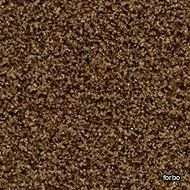
coral tiles masala brown
forbo > Carpet
Coral tiles provide the flexibility that comes with 50 x 50 cm tile formats. Using Coral tiles can reduce cut off waste and also allows for quicker installation. This is particularly relevant when downtime or if a retail store opening times are at stake. In addition the increased flexibility of fitting a modular format also allows easier storage and handling.Coral tiles are available in all colours from the Coral Classic, Brush and Bright collection. The colours can be mixed for a functional, though very attractive entrance. The tiles can be laid broadloom or tessellated.Coral tiles offer the same product features as the regular Coral Classic, Brush and Bright entrance flooring.
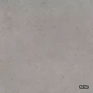
sarlon 19 db material mercury slabstone
forbo > Synthetic Floor
The Sarlon Material collection presents a range of modern designs based on popular flooring materials like cement, concrete, stones and textiles. Cement and concrete designs are widely appreciated and used and the range now also includes subtle metallic Slabstone, natural lively stone Stromboli and hybrid Dissolved Stone concrete/stone effects. Nairobi and Canvas are textile weave effects with different scale and sophistication levels, both very suitable for shading combinations where low contrast is required.
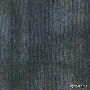
ReForm Shadowplay Obscura blue
egecarpets > Carpet
Our attention is caught by the light but shadows have more to say. Since classical times, artists have understood their value. They’re mysterious, feed the imagination and add drama. Shadows are complex and tell stories about objects out of view. They can reveal the invisible. In this Shadowplay collection, the multi-level loop construction creates a sculptural texture influenced by the distorted shade and light. Two co-ordinating patterns, Umbra and Obscura, can be used alone or together to compose layered shadows which dance across the floor. Tone on tone neutrals are complimented by haloes of colour which trace abstract shape and fade quietly away The collection is a great visual toolbox where you can achieve very different looks depending on the sizes and shapes you choose. Shadowplay comes in a wide palette of contemporary colours from subtle tone-on-tone shades to more rich tones carefully coordinated for perfect combinations. It allows different spatial options that help define areas such as meeting points and quiet or communal zones, as well as catering to social distancing requirements and wayfinding.
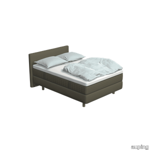
Kiruna Warm grey
auping > Box spring
The Kiruna box spring is the most luxurious box spring. This is distinguished by the rich appearance and the use of natural materials. As soon as you lie down, you experience it for yourself. This 1-person Kiruna box spring Warm grey with Unik mattress and Unik headboard in Maze / Taupe gives a luxurious look to your bedroom. The luxurious Kiruna box spring has a refined design with attention to every detail and very high-quality finish. There are two headboards for the Kiruna: the slender and stylish Sami and the classic Unik. Or combine with one of the headboards of our Original box spring. To subtly add colour to the Kiruna box spring and your bedroom, you can choose one of the ten Auping colours for the legs. Discover the Kiruna box spring The unique Kiruna mattresses have no less than 7 zones so that your body is perfectly supported and you lie comfortably. The Sami mattress has a sleek finish, while the Unik mattress has an extra rich look due to graceful handles, a piping all around and refined side stitching. Our collection consists of 4 box springs that you can put together completely according to your wishes. Choose your own colours, materials and accessories. In total, there are 2.8 billion possibilities in our online configurator. Looking for inspiration for your own bedroom or do you want to know more about our Box springs? Then take a look at the online lookbooks.
Crystaline Suspension
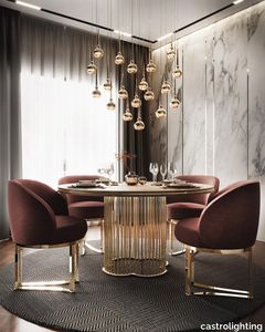
castrolighting > Ceiling lamp
The Crystaline handmade suspension is transparent but graceful. This modern suspension lighting cherishes modesty, just as Modern design itself cultivates a sense of simplicity in every element, avoiding clutter or accessories involved. Having this concept in mind, the Crystaline lighting fixture was created. Round brass forms with very clean sophisticated lines are the base of this suspension lamp. Hanging crystals added to the bottom of the pieces, turn them into elite luxurious statement, and bring that desirable pure feeling. The Crystaline design has falling raindrops effect made with delicate crystals that shape the round “bell-flower”, slightly flattened structure. With a delicate though divine look, Crystaline is the ideal decorative lighting statement that, because of the outstanding sparkle of the crystals, is so exceptional, mystical and timeless. It can be the perfect feature to any type of modern interior décor. VIEW FULL FAMILY
Dit Table Brown Blue Diamond
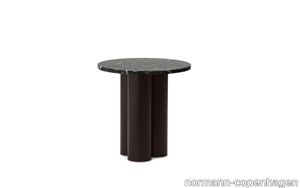
normann-copenhagen > Side table
Dit Table is an expressive design with a simple construction. A stone tabletop rests on three chubby, powder coated steel legs. Dit Table can be customized to any taste or space, as implied by its name, Dit, the Danish word for "your". Choose between six different base colors and ten different stone tabletops, a total of 60 possible combinations, to create your very own table.
Texture 2000 starlight

egecarpets > Carpet
Texture 2000 are luxury carpets specially designed for hotel rooms and lounges. The Texture 2000 collection is available in a wide colour range. This carpet collection is made in 2000 g polyamide and certified in accordance with European quality standard EN 1307. Class 33 certified and therefore ideal for very heavy use.
Red Antique Kashan Persian Rug
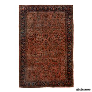
abchome > Carpet
Creating a world of gardens inside your home, this Red Antique Kashan Persian Rug - 10'10" x 16'1" features densely woven motifs originating from a central medallion and flowing outward in vines, scrolls, leaves, and blooms. Antique Persian Kashan Rugs are among the very finest Persian carpets in the world and are guaranteed to fill your home with heirloom quality style for years to come with its traditional red, blue, and peach color palette.
Dit Table Bright Red Nero Marquina
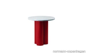
normann-copenhagen > Side table
Dit Table is an expressive design with a simple construction. A stone tabletop rests on three chubby, powder coated steel legs. Dit Table can be customized to any taste or space, as implied by its name, Dit, the Danish word for "your". Choose between six different base colors and ten different stone tabletops, a total of 60 possible combinations, to create your very own table.
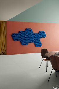
Rilievi Cielo
florim > Wall Paint
The alternation and symbiosis between concave and convex, recessed and raised. <p>Rilievi is a work of design balanced between different historic periods: while the volumetric relief tile modules are inspired by artistic experiments conducted in Italy during the Sixties and Seventies, the large slabs are the outcome of research into materials and technology that has only come to fruition in very recent times. The shadow effects generated on the surfaces of the slabs by the light striking the projecting parts of the modules create an unusual impression of architectural depth found virtually nowhere else in ceramic coverings, laying the bases for a new decoration interior design language.</p> This project simply embodies perfection - a term which certainly sets the bar high in a description of a new product for launch on the market. But when an enlightened manufacturer is capable of encapsulating a designer's personal research in a product to be added to its range, the outcome is a perfect synthesis. A perfect synthesis between untrammelled creativity and market trends. CEDIT had the insight needed to perceive, identify and rework the immense potential of Practice Practice Practice "“ a self-produced project by Zaven (Enrica Cavarzan and Marco Zavagno "“ and realised that its sophisticated design, originated by pure, pristine input (unadulterated by external factors except the noblest of them all, research) could provide the basis for an innovative, successful collection. I might add, a collection unique of its kind. Zaven is also a name that comes with guarantees; the two partners are good at what they do. Their work always starts from personal curiosity and investigations, the study of other stories (as in this case inspiration was drawn from the output of artist and activist Nino Caruso) and individual interests, which are broken down, developed, optimised and prepared for transformation into something fresh.Enrica Cavarzan and Marco Zavagno have a masterly ability to transform their own wishes and passions into design work of the greatest breadth and, as we see here, the widest, richest application. Their use of ceramics as a material is clearly outstanding and reflects a method precisely founded on the desire to look at things from an unusual viewpoint, under a different light. And to be daring. Zaven have an unconventional approach to convention. In the specific case of the Rilievi collection, the "modules" created for CEDIT seem to explode off the walls; in fact, they are constructed by combining the two-dimensional slab with its three-dimensional decor.Rilievi seems to be seeking space. More space. Even though these modules have actually established a dialogue with the wall from which they are born. At the same time, they hypnotise us with their tight sequence of lines, the pattern that is always different although its root is the same, and the intriguing, unusual colours that add another vital factor to the finished product. Their firm grounding in graphic design (and here we have come back to two-dimensional effects, of the kind most often associated with a wall covering) easily evolves into a facade which seems to have been carved with a chisel - although this is not the case. These modules are conceived to convey an impression of movement, and the three models, in seven colour combinations, create a powerful effect on a surface, which is never passive but rather an organic contributor to the forms and colours involved in the fascinating combinations. The slab is very much present and has the same worth and status as the relief pattern associated to it. In the light of this dichotomy between the linear and the sculpted, expressed through the skilfully balanced visual expedients, the use of repetition adds vigour to the module's intrinsic meaning. As we have seen, a rejection of facile, superficial creative dynamics in favour of an investigation reaching above and beyond has always been a central, clearly recognisable feature of this Venice-based duo, who already have impressive international partnerships to their credit, including the London Design Festival, the Kalmar Konstmuseum, the Paris Designer Days, Ca' Foscari University, the Venice Biennale, the Sandretto Re Rebaudengo Foundation, the Sindika Dokolo Foundation and the V-A-C Foundation, and also won the 2018 Wallpaper Design Award. Graphics, advertising and product design: the pair have always opted for a type of design closely linked to the observation of everyday items, followed by their reinterpretation in a version applied to experimentation with materials. This duality, combined with their energetic yet elegant visual language, forms Enrica and Marco's primary code, experienced in this specific context through serial carvings. On walls.
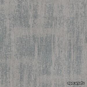
ReForm Shadowplay Umbra silver
egecarpets > Carpet
Our attention is caught by the light but shadows have more to say. Since classical times, artists have understood their value. They’re mysterious, feed the imagination and add drama. Shadows are complex and tell stories about objects out of view. They can reveal the invisible. In this Shadowplay collection, the multi-level loop construction creates a sculptural texture influenced by the distorted shade and light. Two co-ordinating patterns, Umbra and Obscura, can be used alone or together to compose layered shadows which dance across the floor. Tone on tone neutrals are complimented by haloes of colour which trace abstract shape and fade quietly away The collection is a great visual toolbox where you can achieve very different looks depending on the sizes and shapes you choose. Shadowplay comes in a wide palette of contemporary colours from subtle tone-on-tone shades to more rich tones carefully coordinated for perfect combinations. It allows different spatial options that help define areas such as meeting points and quiet or communal zones, as well as catering to social distancing requirements and wayfinding.
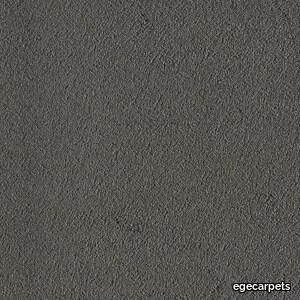
Texture 2000 steel
egecarpets > Carpet
Texture 2000 are luxury carpets specially designed for hotel rooms and lounges. The Texture 2000 collection is available in a wide colour range. This carpet collection is made in 2000 g polyamide and certified in accordance with European quality standard EN 1307. Class 33 certified and therefore ideal for very heavy use.
Dit Table Brown Travertine Light

normann-copenhagen > Side table
Dit Table is an expressive design with a simple construction. A stone tabletop rests on three chubby, powder coated steel legs. Dit Table can be customized to any taste or space, as implied by its name, Dit, the Danish word for "your". Choose between six different base colors and ten different stone tabletops, a total of 60 possible combinations, to create your very own table.
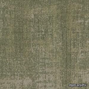
ReForm Shadowplay Obscura moss
egecarpets > Carpet
Our attention is caught by the light but shadows have more to say. Since classical times, artists have understood their value. They’re mysterious, feed the imagination and add drama. Shadows are complex and tell stories about objects out of view. They can reveal the invisible. In this Shadowplay collection, the multi-level loop construction creates a sculptural texture influenced by the distorted shade and light. Two co-ordinating patterns, Umbra and Obscura, can be used alone or together to compose layered shadows which dance across the floor. Tone on tone neutrals are complimented by haloes of colour which trace abstract shape and fade quietly away The collection is a great visual toolbox where you can achieve very different looks depending on the sizes and shapes you choose. Shadowplay comes in a wide palette of contemporary colours from subtle tone-on-tone shades to more rich tones carefully coordinated for perfect combinations. It allows different spatial options that help define areas such as meeting points and quiet or communal zones, as well as catering to social distancing requirements and wayfinding.
ReForm Shadowplay Umbra sage
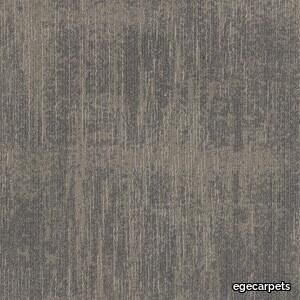
egecarpets > Carpet
Our attention is caught by the light but shadows have more to say. Since classical times, artists have understood their value. They’re mysterious, feed the imagination and add drama. Shadows are complex and tell stories about objects out of view. They can reveal the invisible. In this Shadowplay collection, the multi-level loop construction creates a sculptural texture influenced by the distorted shade and light. Two co-ordinating patterns, Umbra and Obscura, can be used alone or together to compose layered shadows which dance across the floor. Tone on tone neutrals are complimented by haloes of colour which trace abstract shape and fade quietly away The collection is a great visual toolbox where you can achieve very different looks depending on the sizes and shapes you choose. Shadowplay comes in a wide palette of contemporary colours from subtle tone-on-tone shades to more rich tones carefully coordinated for perfect combinations. It allows different spatial options that help define areas such as meeting points and quiet or communal zones, as well as catering to social distancing requirements and wayfinding.
coral tiles asphalt grey
forbo > Carpet
Coral tiles provide the flexibility that comes with 50 x 50 cm tile formats. Using Coral tiles can reduce cut off waste and also allows for quicker installation. This is particularly relevant when downtime or if a retail store opening times are at stake. In addition the increased flexibility of fitting a modular format also allows easier storage and handling.Coral tiles are available in all colours from the Coral Classic, Brush and Bright collection. The colours can be mixed for a functional, though very attractive entrance. The tiles can be laid broadloom or tessellated.Coral tiles offer the same product features as the regular Coral Classic, Brush and Bright entrance flooring.
Texture 2000 forest green
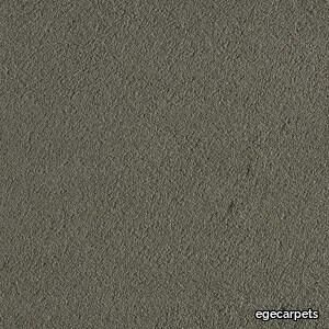
egecarpets > Carpet
Texture 2000 are luxury carpets specially designed for hotel rooms and lounges. The Texture 2000 collection is available in a wide colour range. This carpet collection is made in 2000 g polyamide and certified in accordance with European quality standard EN 1307. Class 33 certified and therefore ideal for very heavy use.
Kiruna Night blue
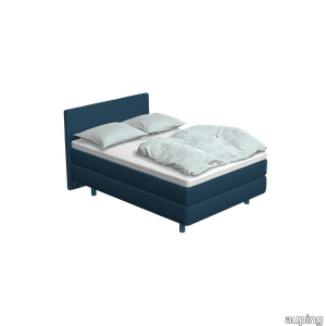
auping > Box spring
The Kiruna box spring is the most luxurious box spring. This is distinguished by the rich appearance and the use of natural materials. As soon as you lie down, you experience it for yourself. This adjustable 2-person Kiruna box spring 1M Night blue with Sami mattress and Sami headboard in Remix / Royal blue gives a luxurious look to your bedroom. For the Kiruna box spring you can choose from 95 different fabrics. They each differ in colour and structure. In our stores you can see, feel and give you advice on which one fits best on the box spring of your choice. There are five fabric groups. The luxurious Kiruna box spring has a refined design with attention to every detail and very high-quality finish. There are two headboards for the Kiruna: the slender and stylish Sami and the classic Unik. Or combine with one of the headboards of our Original box spring. To subtly add colour to the Kiruna box spring and your bedroom, you can choose 1 of the ten Auping colours for the legs. Discover the Kiruna box spring The unique Kiruna mattresses have no less than 7 zones so that your body is perfectly supported and you lie comfortably. The Sami mattress has a sleek finish, while the Unik mattress has an extra rich look due to graceful handles, a piping all around and refined side stitching. Our collection consists of 5 beds and 4 box springs that you can put together completely according to your wishes. Choose your own colours, materials and accessories. In total, there are 2.8 billion possibilities in our online configurator. Looking for inspiration for your own bedroom or do you want to know more about our Box springs? Then take a look at the online lookbooks.
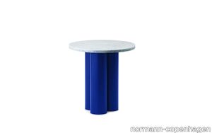
Dit Table Bright Blue Travertine Silver
normann-copenhagen > Side table
Dit Table is an expressive design with a simple construction. A stone tabletop rests on three chubby, powder coated steel legs. Dit Table can be customized to any taste or space, as implied by its name, Dit, the Danish word for "your". Choose between six different base colors and ten different stone tabletops, a total of 60 possible combinations, to create your very own table.
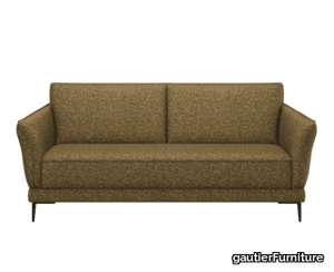
Modulo 200 fixed sofa with 20 cm armrests.
gautierFurniture > Sofa
Thanks to its generous curves designed to offer you optimal comfort, the Modulo convertible straight sofa will be the privileged witness of all your moments of relaxation and conviviality. Its finishes and numerous options will allow you to offer your loved ones a high-quality sleeping experience: thick and cozy mattress, slatted base for unparalleled support, very smooth mechanical opening for easy opening, integrated storage space, compact armrests, independent headrest for assured relaxation... the Modulo sofa will satisfy you in the long term.
allura decibel 0.8 material stormy sky (100x20 cm)

forbo > Floor plank
Allura Decibel is Forbo’s acoustic LVT flooring solution. The luxury vinyl tiles offer a combination of 19 dB acoustic performance and the highest technical specifications. Allura Decibel 0.8 floors are designed as a solution for high-traffic areas in many applications such as retail, offices and education.The 26 Material floor designs offer a balanced mix of traditional concretes, contemporary designs and colours that combine very well with each other and with the collection’s basic items. Allura Decibel Material meets all the aesthetic requirements of luxury vinyl tiles, including beveling and a perfect match between each individual pattern and the different tile and plank shapes.
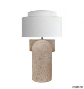
Figoll Table lamp Nature
calixter > Table lamp
The Figoll table lamp nature, crafted by Tyra Matsdotter under By Calixter brand, combines elegance and functionality. Constructed with a ceramic base paired together with a variety of lampshade sizes, Figoll achieves a visually striking multi-level effect. This stylish table lamp is offered in five distinct colors within a neutral and earthy palette, each adorned with a textured finish that adds character and dimension to the piece. Figoll's ceramic base is handmade in Portugal and the associated lampshades are also Swedish-made in Borås. The table lamp is therefore locally produced, which we at Calixter are very proud of.
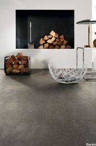
Match-Up Earl Grey
florim > Wallcovering
The union of two different materials has resulted in a contemporary, trendy project that mixes surfaces, colours and languages to offer original combinations. <p>There are two basic surfaces that can be used to create multiple combinations in line with fashions and lifestyle trends: a concrete effect with an urban and industrial aesthetic and an original marble agglomerate effect that blends tone-on- tone tactile elements with irregular shapes and varying sizes. Two seemingly very different materials – the first a symbol of modernity and innovation, the second of authenticity and tradition – coexist in a unique project that promotes and encourages combinations not only between the surfaces and colour shades in the range, but also with all the other elements that contribute to defining the space: colours, paints, fabrics, furnishings and various materials. <br />The collection offers 3 finishes - Comfort, Glossy and Grip. <br /><a class="btn arrow" href="https://www.florim.com/en/surfaces/the-new-comfort-surface/"> Discover the new Comfort surface </a></p>
Prop Light Floor
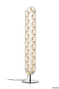
moooi > Floor lamp
We have round lights we have straight lights. We have them with lights on one side we have them with lights on two sides. You can hang them high low horizontally vertically or even hang them in an angle. Put them on the floor hang them on your wall or down from the ceiling. We find it very hard to imagine an interior where this prop is not in place - Bertjan Pot
Showertec Linear TRAY-R, pre-slope shower tray with riser
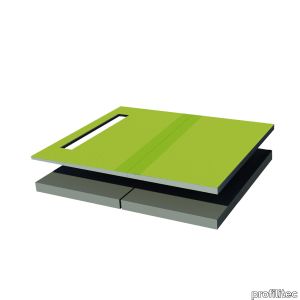
profilitec > Accessories
Showertec Linear TRAY-R, pre-slope shower tray with riser Showertec STL - TRAY-R are a family of pre-sloped shower trays with riser, compatible with Showertec Linear STL BS and Showertec Linear STL BV and STL BC combined with a riser (height from 68 to 90 mm). They are made of waterproof material and thanks to the reinforcement grid and the honeycomb surface finish they are very resistant and allow a solid bond between the cement glue and the tile. Available in 91/112 cm and 132/112 cm versions, they can be combined with extensions 91/56 cm and 132/56 cm.
Varsovia Floor Lamp
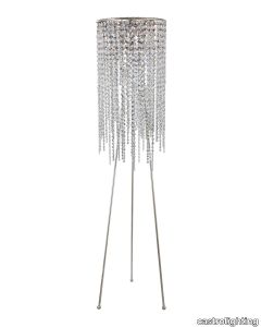
castrolighting > Floor lamp
Once described as Paris of the East, Warsaw was believed to be one of the most beautiful cities in the world. Inspired by the splendor and beautiful heritage of the Warsaw city, Varsóvia floor lamp possesses ravishing crystals that impose a mandatory and epic design. Despite its singular design, this piece is extremely versatile, being perfect for practically any luxury house that may include art deco, modern art, mid-century modern or contemporary art. This floor lampis very rich and complete, being ideal for any space as it offers the right lighting solutions. VIEW FULL FAMILY
Dit Table Bright Blue Rosso Levanto

normann-copenhagen > Side table
Dit Table is an expressive design with a simple construction. A stone tabletop rests on three chubby, powder coated steel legs. Dit Table can be customized to any taste or space, as implied by its name, Dit, the Danish word for "your". Choose between six different base colors and ten different stone tabletops, a total of 60 possible combinations, to create your very own table.
Dit Table Bright Blue Honey Onyx

normann-copenhagen > Side table
Dit Table is an expressive design with a simple construction. A stone tabletop rests on three chubby, powder coated steel legs. Dit Table can be customized to any taste or space, as implied by its name, Dit, the Danish word for "your". Choose between six different base colors and ten different stone tabletops, a total of 60 possible combinations, to create your very own table.
Dit Table Bright Blue Emerald Onyx

normann-copenhagen > Side table
Dit Table is an expressive design with a simple construction. A stone tabletop rests on three chubby, powder coated steel legs. Dit Table can be customized to any taste or space, as implied by its name, Dit, the Danish word for "your". Choose between six different base colors and ten different stone tabletops, a total of 60 possible combinations, to create your very own table.
Dit Table Brown Honey Onyx

normann-copenhagen > Side table
Dit Table is an expressive design with a simple construction. A stone tabletop rests on three chubby, powder coated steel legs. Dit Table can be customized to any taste or space, as implied by its name, Dit, the Danish word for "your". Choose between six different base colors and ten different stone tabletops, a total of 60 possible combinations, to create your very own table.
Dit Table Grey Verde Marina
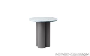
normann-copenhagen > Side table
Dit Table is an expressive design with a simple construction. A stone tabletop rests on three chubby, powder coated steel legs. Dit Table can be customized to any taste or space, as implied by its name, Dit, the Danish word for "your". Choose between six different base colors and ten different stone tabletops, a total of 60 possible combinations, to create your very own table.
Dit Table Sand Blue Diamond
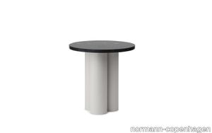
normann-copenhagen > Side table
Dit Table is an expressive design with a simple construction. A stone tabletop rests on three chubby, powder coated steel legs. Dit Table can be customized to any taste or space, as implied by its name, Dit, the Danish word for "your". Choose between six different base colors and ten different stone tabletops, a total of 60 possible combinations, to create your very own table.
Dit Table Sand Rosso Levanto

normann-copenhagen > Side table
Dit Table is an expressive design with a simple construction. A stone tabletop rests on three chubby, powder coated steel legs. Dit Table can be customized to any taste or space, as implied by its name, Dit, the Danish word for "your". Choose between six different base colors and ten different stone tabletops, a total of 60 possible combinations, to create your very own table.
Home Office Chair ZINN Smart NPR
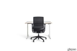
gispen > Office Chair
If you work from home on a regular basis, you should consider a proper, ergonomic office chair. Especially because you often spend more time on this chair than you would realise. The ZINN Smart NPR home office chair helps you adopt an ergonomic seating posture and is very comfortable. This chair is ideally suited for people with a slim body type, supported by the 4D armrests which have a width adjustment of 36 to 51 cm. Every other component will easily adjust to your preferences. A relaxed seating position is guaranteed. Naturally, ZINN Smart NPR complies with all current occupational health and safety standards.
Miniatures Tom Vac Chair
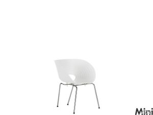
vitra > Styling
The Tom Vac Chair was first realized as one element in a sculpture consisting of 70 stacking chairs named »Totem«. Commissioned by the magazine Domus, it was set up in the centre of Milan during the Salone del Mobile in 1997.<br/><br/>The seat shell with the characteristic wave profile is based on earlier versions Ron Arad sketched for the dining room of a house in Tel Aviv. The first small series for »Totem« was created in just four months. Though it is a complicated metal to manufacture, vacuum-formed aluminium proved to be a suitable material.<br/><br/>In collaboration with furniture maker Vitra, for whom he had already produced the Well Tempered Chair back in 1986, Ron Arad developed, within a very short time, a version of the Tom Vac Chair suitable for mass production. Seen within the context of Arad's complete work, which is largely characterized by »one offs«, the chair is something of an innovation by virtue of its industrial and by extension inexpensive production. While the design of the Tom Vac Chair only deviates minimally from the first plan, the flexible seat shell of polypropylene offers a high degree of comfort.
Eve dining chair - sand frame - Grace Beige - 11
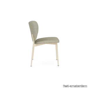
fest-amsterdam > Chair
Dining with a plate on the sofa because thats more comfortable than your dining room chairs Wont happen with the Eve series. High medium or low this chair is simply great. The generous backrest gives you the support many office chairs cant even live up to. And you wont have to compromise on style. Curvy slim and very comfortable Eve in a nutshell.
Lilla Åland Chair | Oak
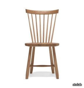
stolab > Chair
Lilla Åland is a true classic in the Stolab range and a favourite that has represented excellent Swedish 20th century design on many occasions. Carl Malmsten was inspired by a visit to the Finnström Church on Åland in 1938, which contained a number of stick-back chairs lined up. He drew them and after a few of his own adjustments and additions, typical of his own style, serial production at Stolab began. Today, the classic Windsor style chair is represented at the Röhsska Design Museum in Gothenburg. Lilla Åland stick blends beautifully into many different types of interior design styles and is very comfortable with its softly holed seat
Manta Suspension
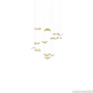
paolocastelli > Ceiling lamp
Manta Suspension is a scenographic suspension lamp whose ethereal lightness recalls the iconic Mobile sculpture by Alexander Calder. Amber coloured glass leave, hand-forged in Murano, encapsulated in a cylindrical satin brass structure which contains the LED light source. It has a delicate and sinuous shape and seems to be flying in the air, hanging from very thin electrified suspension cables. On request any pendant can be provided with metal rosette holding local driver suitable for celing installation.
Gala
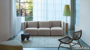
sabaitalia > Sofa
Cristina Celestino designs for Saba the new Gala seating system, thus establishing a collaboration with the company. The project responds to the desire of investigating the sofa as a place and not only as a mere functional product, to the aspiration of dematerializing the very concept of traditional living and to create a sofa with a strong iconographic design component. The “sofa” is a place of exchange, it generates new experiences and it shapes interior spaces. With a subtle reference to the retro-future atmosphere of sofas that inhabited the ‘70s, the new collection explores the flexibility of the upholstered object with a no gender, sculptural and sophisticated volume, which lends itself to interpreting different visions of interiors, from residential to hospitality contexts. The central backbone is a vertical element that draws pleated curves ready to accommodate, both on the front as well as on the back, a seat-pouf element of different depths. The many possible configurations give life to a “hybrid” and flexible sofa with which one can interact. In a collective utopian imagination, the name Gala is associated to the concept of elegance and sophistication, but Gala is also an ornament, a decoration that is created with a rippled textile band and in our case, Gala becomes the structure of the upholstery itself. Gala is also one of the planets in Star Wars and an indirect tribute to the world of stars, to the optimism and the avant-garde that characterized that era.
Hewn Linear 48 – Direct/Indirect – Dual Circuit
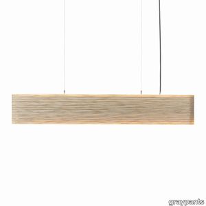
graypants > Ceiling lamp
Hewn is a linear shape that is as beautiful as it is hardworking, adding a tactile and creative addition to a mundane field of task lighting. Hewn is created using a cutting process where layers of the shade are cut parallel to the flutes of the cardboard versus the perpendicular cut lines of our other Scraplights shapes – this cutting process was intentional allowing us to build something beautiful and textural while also being fully opaque. As a task light, Hewn delivers a broad footprint of illumination and the shape is very suitable over a desk, dining table or kitchen island.
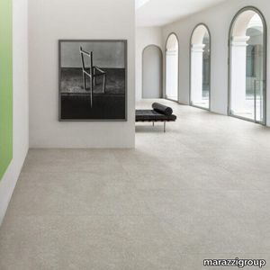
Mystone Berici
marazzigroup > Wall tile-stone-brick
Porcelain stoneware inspired by stone, neutral tones, and exclusive decorations The wide range of sizes, from the most traditional variants to the slab size, enables many different installation solutions, thanks also to the availability of surfaces with R9, R10 and R11 anti-slip coefficients and the 20 mm version in the 60x120 size. The Mystone Berici range comprises 4 colours with a very natural, neutral look – Bianco, Beige, Cenere and Grigio – produced in all sizes. The collection’s potentials are enhanced by the Righe 3D structure in 60x120 size with a light relief pattern on a background rich in elements inspired by the calcareous rock, the Flora decor in 60x120 size featuring chiaroscuro and material effects that mitigate the severity of the original stone, and the Strip mosaic in 60x180 size, only for use on walls, offering 3 modules with titanium-colour metallic inserts. The resulting collection is ideal for defining the personality of design schemes with different looks, both classical and contemporary.
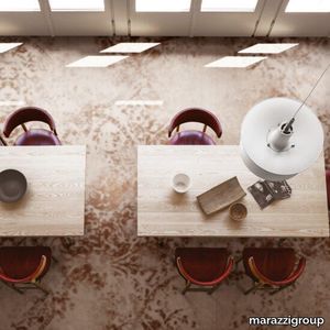
Grand Carpet
marazzigroup > Floor tile-stone
Project by Antonio Citterio Patricia Viel The Grand Carpet project, produced in 6 different modules of 120x240 cm in 6 mm thickness, represents an original approach to large slabs and to porcelain stoneware itself. Grand Carpet is intended for covering horizontal and vertical surfaces, indoors and outdoors, in both residential and contract locations. The line is offered in two extremely sophisticated colour variants: the warm version, Sand, is directly derived from the Salone del Mobile project, while Smoke offers a cooler, very versatile combination of shades.
Setis Smart M table

gautierFurniture > Table
If you need a table that's spacious without being too imposing, the SMART M table is made for you. Designed to seat 6 to 8 people, its design is simple and effective. It has distinctive steel legs and a bevelled top for a stylish look. The timeless appearance of this table makes it a very contemporary and trendy piece. Its mix of materials and simple lines make it a timeless classic that blends naturally into your home.
Setis Y-leg table with extension

gautierFurniture > Table
Love designer furniture? Check out this really unusual table with its remarkable Y-shaped leg. Its highly decorative design makes it stylish as well as practical, two crucial criteria! Its ingenious extensions mean you can expand your guest list, even at the very last minute! Decidedly modern, the subtle blend of materials make it simply stunning. Its bold styling is impossible to miss, highlighting its oh-so-French style. Its unusual structure is sure to add character to your lounge or dining room. What's more, the ceramic version is resistant to heat as well as scratches.
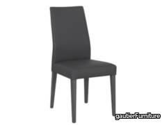
Cosy chair with charcoal grey legs
gautierFurniture > Chair
Does your interior decoration reflect your personality, so you are looking for a chair that matches your sense of style? If so, the COSY chair is sure to give your lounge a classy look with its slightly curved backrest. As an added bonus that's invisible to the naked eye, this chair has a webbed seat to provide maximum comfort that will be very much appreciated during long dinner parties with friends, for example. This chair looks its best in rooms with a warm, refined feel. Positioned around a well-dressed table, it enhances the atmosphere in your room for a peaceful, relaxed feel. Its comes in a range of very natural colours to complement the cosy feel you are striving to achieve in your home.
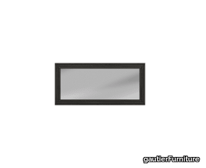
Addict XL rectangular herringbone frame mirror
gautierFurniture > Styling
Looking for a showpiece mirror for your hallway, bedroom or lounge? The refined effect of this herringbone style frame mirror and its rectangular XL size mean you can enhance your home with an iconic, decorative piece. The intricate carpentry work on this mirror makes the frame elegant and inviting with its modern texture and very contemporary style. Its large size means that it reflects the light to create an even more welcoming atmosphere.
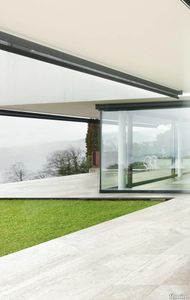
Airtech Berlin_Red
florim > Wall tile-stone-brick
Airtech/ is a collection designed to create spaces that interact with each other in a uniform and discreet manner. <p>The collection offers six stones available in shades of gray, the quintessential metropolitan color. The 60x120 cm size with a high-gloss finish gives a bright and appealing nuance to this very austere project. There are two available thicknesses, 9 mm and 20 mm.</p>
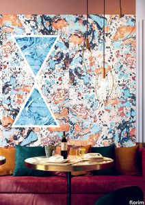
Araldica Cemento
florim > Wallcovering
The miscellany of bright, contrasting, pure colours. The manifest extroversion of decor. The solutions provided to complete the range are in a different tone: reflecting the desire to "stage" a clear contrast with the multicolour ceramic wall coverings, these slabs are in completely neutral shades, in the grey frequencies of concrete.<br /><br />«The collection is intended to create a struggle, a fight. Between something very stiff, which sees itself as governed by clear rules, and a variable, marbled paper, which aims to be completely free.»<br />Federico Pepe "Once upon a time, there was a Roman emperor who lived on a huge splinter in space, a spaceship of multi-coloured marble, where techno music played incessantly. That day he left his spaceship to go to dinner at the Sun King's home, riding his sinuous golden dragon with blood-red eyes."If there were a book with these opening words, Federico Pepe would have designed its cover. And if the book were made into a film, he would definitely be its writer and director. Federico is not an author, director or screenwriter, but this does not prevent him from drawing on his natural ability to create stories through flashes of imagination.Federico Pepe's career started in advertising, a family tradition, which he gradually transformed and built into many other things, in a constant, inevitable investigation of creativity in all its possible forms. He very soon understood that commission work was not enough for him, and he began to explore further afield. The first of these other fields was art, but the consolidated mechanisms on which galleries and gallery owners operate soon became a new limit from which he had to break free: this apparently expanding horizon turned out to be a restrictive cage, more a defining label than an infinite learning opportunity. And definitions are one of the things which least describe Federico: anyone trying to distil his work into two words would find its essence disappearing before their own eyes. He has occupied many roles and engaged in many professions to give shape to his ideas, and in all of them he has excelled, created and led teams, and won awards. Adman, creative director, graphic designer, printer, gallery owner, publisher, curator, performer, painter, designer, director: Pepe does, rather than is, all these.<br /> He works, builds and makes things happen because he is not led by instinct alone and does not succumb to idle whim; he does not rush aimlessly around and does not simply await the inspiration or idea of the century. Quite the opposite. His work comes about and produces results only thanks to strict self-discipline, a design method made up of constant verification, the precise sharing of tasks and roles, the compulsive exploration of unknown contexts, daily physical exercise, the carefully measured use of social media, and occasional spells of isolation in the mountains he loves. It is no coincidence that he created Le Dictateur, a dual-faced entity which may be both his child and his spiritual guide, both friend and boss, part madness and part dictator. Le Dictateur is not Federico's alter ego: it is his superpower. It is not a mask, since in it he actually transforms himself into an artistic project.Le Dictateur is both result and origin of Federico Pepe's work. "I think ideas are born from predisposition," Federico explained to me in 2014. "Not in the sense that "˜we are born predisposed,' but for daily preparation. In this domain I believe that discipline is pivotal. The real talents today are very rigorous people, those who work hard, exchange a lot, think a lot, and know how to apply and balance many different things." An approach which has made him the best-kept secret on the Italian creative scene, a fact well known not only to Pierpaolo Ferrari, Maurizio Cattelan, Nico Vascellari, Jacopo Benassi and Patricia Urquiola, but also to the companies, both large and small, which have turned to him over the years. He has worked and continues to work with them all, designing by laying the foundations of designs naturally expressed in episodes, in a serial pattern which not only gradually builds up Federico's own creative story, but also offers his clients designs so special that they would be virtually impossible without him.<br /> This self-discipline generates heat and energy in such quantities that "“ if it were not imprisoned within the geometrical grids of graphic design "“ it might generate a thermonuclear reaction. The blood running through the veins of his images is black as ink, red as sealing-wax, white as plaster and golden as lava. But there is more, too. His crystal-clear visions are able to break down the slender membrane which separates analogue from digital. He sees matter as absolutely central, but he makes it vibrate with an unusual two-dimensional quality. This can be seen in the way he carves marble with coloured squiggles, recollections of faces briefly sketched as vectors. It is discovered in the skill with which he invades plates and bowls of the finest, monitor-shiny porcelain with geometrical patterns. It becomes tangible in the love with which he brings to life the paper of his publishing projects, peopled with highly elegant, powerfully symmetrical, often kaleidoscopic graphics. It can be admired in the precision with which a metallic factory flooring becomes fabric on an ancient loom, after its resolution is decreased from 300 dpi to 8 bits. It is enjoyed in the hyperbolic repetition of faces and hands in acrylic on canvas in his painting studio, in which every work conserves copy and paste reminders of its predecessor. It amazes in the doors of exquisite metal sideboards, profane glass panels, hand-made but born through the glass of a screen.<br /> A career which has led almost naturally to an encounter with CEDIT, with whom he has created an aesthetically courageous collection, part punk and part aristocratic austerity. The Araldica project's very name evokes strength and nobility, and it is grounded in a past whose weight does not drag it backwards but rather catapults it forwards into the future. Here, Federico's digital geometries become the most solid of materials, taking shape in a graphic object, condensing stories and images into three or two dimensions. In Pepe's and CEDIT's space, Euclidean geometrical forms encounter the marble of Phidias, the intricate patterns of the floor of Milan Cathedral merge into the Baroque images of the marbles found in Roman art galleries, and private space opens out to the infinite space of a thousand possible universal histories.
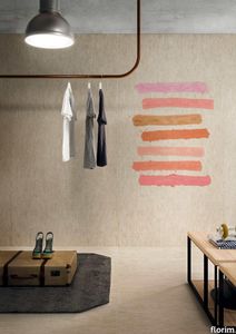
Euridice Tela
florim > Wallcovering
The mystery and poetry of painting. Art that inhabits space. «In the past, art was expected to transfer the object, or work of art, from the inanimate to the animate world. Now, since we know that the whole world is animate, the task of the artist is to interact with the intelligence of matter.» Giorgio Griffa Born in Turin in 1936, Giorgio Griffa is now ranked as one of Italy's most important abstract painters of the Twentieth Century. He began to paint when he was very young, just 10 years old, and for two decades his work was figurative, fairly traditional in subjects and style. His mature work developed later, in the mid Sixties, in the context of the abstract-expressionist and tachiste movements, which based their language on a concept of painting as a sequence of actions, like a repeated sign or form of writing. Rather than a representation, painting became the direct expression of a mental state, a precise psychic temperature, an internal beat.Historically, his work has been classified as part of this "analytical painting" movement, which concentrated on analysing itself and its internal mechanisms: surface, substrate, colour and sign. However, Giorgio Griffa's work seems to stand apart from that of his fellow artists, and nowadays it is difficult to place it firmly within the historic analytical and conceptual painting movements. His abstract works, consisting of simple signs repeated on the canvas, seem to be not so much an analysis of the act of painting as a homage to painting itself and its history. And this is one of the delightful, central paradox's of Griffa's work: in spite of their conceptual approach, his paintings have <strong>a fascinating lyrical component, a radiant musicality, very different from the cold, unemotional mood of the neo-avantgardes</strong>.<br /> In this sense his works are something of a mystery for the art world, as lovely as they are indefinable, because in them everything seems to be at once both simple and complex. The types of canvas the artist uses (jute, hemp, cotton or linen) are simple. His painted signs are also simple, or even anonymous: a series of vertical or horizontal lines and - only from the Eighties onwards - stylised floral motifs, friezes and spirals. Yet Griffa entrusts this apparent simplicity with the task of saying what is unsayable by its very nature; of plumbing the depths of the mystery of creation and the unknown. Seemingly banal and obvious at first glance, Griffa's work is actually layered with references to the history of art, Stone Age painting, Zen philosophy, music and "“ as we have seen "“ the artistic avantgarde of his own age.All these characteristics are very much to the fore in the artist's works for CEDIT Ceramiche. For this historic brand, Griffa has created five works involving a series of lyrical, minimalist signs, which recall the motifs current in the late Sixties and Seventies. The range of colours in which these signs are presented, with complementary colours and half-tones, seem to be drawn from the Renaissance and the art of Venice and its region in the Sixteenth and Seventeenth Centuries. The other fundamental point of reference is Matisse, the painter who rejoiced in colour and in whose images signs and colours are nicely balanced.<br /> Griffa's collection for CEDIT sets out to use <strong>modular repetition of signs</strong> to build up genuine spatial environments for everyday living. The partnership with a ceramics manufacturer is a particularly fertile one for the Turin-born artist. In fact, his pictorial language "“ based on the concept of an anonymous sign open to potentially infinite repetition "“ seems to be ideally suited to large-scale reproduction and the decoration of entire interiors. The concepts of fragmentation and incompletion can be easily applied to the decoration of living-spaces of varying sizes, as if they were "portions" of a larger whole, an expanding universe. All Griffa's works use a repertoire of timeless signs, actions repeated over the millennia, on a complex trajectory that combines art, craftsmanship and decoration. In the project for CEDIT, this ancient story of experimentation with the potentialities of sign, colour and matter comes to a kind of natural, fascinating fruition.
Match-Up Liquorice Mix

florim > Wall tile-stone-brick
The union of two different materials has resulted in a contemporary, trendy project that mixes surfaces, colours and languages to offer original combinations. <p>There are two basic surfaces that can be used to create multiple combinations in line with fashions and lifestyle trends: a concrete effect with an urban and industrial aesthetic and an original marble agglomerate effect that blends tone-on- tone tactile elements with irregular shapes and varying sizes. Two seemingly very different materials – the first a symbol of modernity and innovation, the second of authenticity and tradition – coexist in a unique project that promotes and encourages combinations not only between the surfaces and colour shades in the range, but also with all the other elements that contribute to defining the space: colours, paints, fabrics, furnishings and various materials. <br />The collection offers 3 finishes - Comfort, Glossy and Grip. <br /><a class="btn arrow" href="https://www.florim.com/en/surfaces/the-new-comfort-surface/"> Discover the new Comfort surface </a></p>