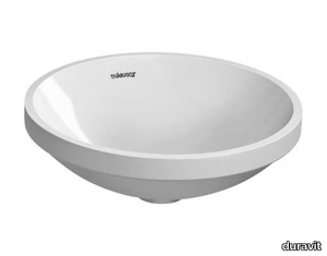
D.355.1 Suspended Bookcase
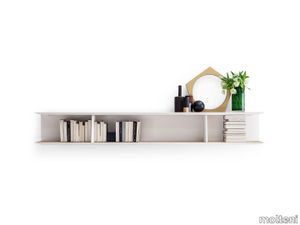
molteni > Styling
This year the Molteni&C Collection designed by Gio Ponti is enriched with the D.355.1-D.355.2 hanging bookcase an object that the great Milanese architect was to re-design several times over the years re-fashioned in the version for his Via Dezza house in Milan with an elmwood finish hand-painted white 240 or 195 cm long with two partitions that recall the bookcase in the 2013 Molteni&C catalogue.
Jazz Max Brüel, 1961

karakterCopenhagen > Styling
Elegant and with a hint of whimsy, the modular candleholder Jazz was conceived in 1961 by Danish architect, ceramist and jazz musician Max Brüel. A slender, graceful silhouette in three heights, Jazz is an elegant addition to the home – by itself or in groups. A Jazz candleholder comes with a top, a base and three interchangeable stems in different heights to fit any occasion.
The Hess Mikal Harrsen, 2023
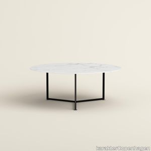
karakterCopenhagen > Table
Inspired by a drum kit, The Hess melds form and function in one carefully considered design. Award-winning architect and industrial designer Mikal Harrsen came up with the design for The Hess after a conversation with a drummer friend who wanted a dining table for his new home. As a result, the large circular table boasts a mechanical steel structure intended to resemble a drum. Trained as a carpenter, Harrsen sought to move away from his wood-making background. Nonetheless, his expertise is apparent in the precise structural design of The Hess table, which features three steels legs that intersect to support a stone tabletop. Each adjustment mechanism – such as the screws on the table’s feet – were exaggerated and emphasized as Harrsen deliberately integrated them into the overall design. “The Hess has a very open expression,” explains Harrsen. “It’s a nice, strong structure that you can fit in a big room to encourage people to sit around and enjoy conversation.”
Earthtech FOG_FLAKES
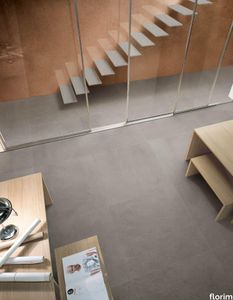
florim > Wall tile-stone-brick
From an ancient past to a responsible future <p>The collection injects new life into the earth through a sustainable production process, with a strong focus on green management, to offer the architect an exceptional technical and aesthetic performance in compliance with the socio-environmental context and the latest eco-friendly building needs. With EARTHTECH earth becomes “technical earth” with a highly innovative content, offering new solutions to green architecture and fulfilling the new frontiers of circular economy in construction, guaranteeing a sustainable future. <br />EARTHTECH offers a choice of organic textures to observe and touch, thanks to the wide range of finishes (Comfort, Glossy-Bright and structured) which add a tactile and unexpected perceptive dimension for use in all types of application. <br /><a class="btn arrow" href="https://www.florim.com/en/surfaces/the-new-comfort-surface/"> Discover the new Comfort surface </a></p> <p>EARTHTECH/ is also a return to the origins of the Florim brand through a full body technical product that blends surface and thickness and derives from the spontaneous mixing of carefully pre-selected fragments and pigments of different shades which give the material a unique, one-of-a-kind visual effect in each slab, mimicking the amazing variety of colours and elements in nature. The result is a composite product with a textured design, in which the flakes and aggregate grains create an original mélange effect that is vitrified during firing, producing a robust, high-quality and exceptionally strong and wear-resistant product; one which can be used in any type of building setting and weather conditions, even the harshest.</p>
Savoye Table Lamp
castrolighting > Table lamp
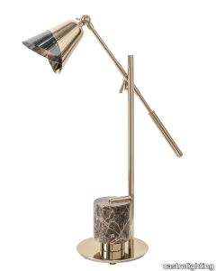
This gracious design bears the authentic name of the famous Villa Savoye, one of the greatest icons of modern architecture in the twentieth century, designed by French-Swiss architect Charles-Edouard Jeanneret-Gris. Savoye luxurious table lamp is unparalleled in the elegance and tenderness it displays. The layered brass in combination with two different finishes – gold and black nickel – applied by hand - bring a delicate charisma that resembles a blossoming lotus flower. The base of the handmade lighting design is detailed with an emperador brown marble base, designed in a cylindrical shape, ending with a solid gold-plated tray. A combination of roughness, delicate detailings and refined design. This gold and marble table lamp will greatly match interiors of different concepts: either mid-century modern or art deco. Pair the collection set in glorious combinations for extra sophistication. Bring some joy to your home and feel authentic and special. VIEW FULL FAMILY
Tesori Broccato grigio
florim > Wallcovering
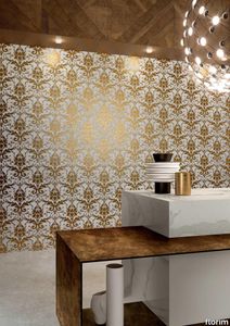
East and West, a synthesis archieved through Italian taste. «My work often takes me to far-off lands, also remote in terms of their culture and traditions. Even without my being aware of it, I then metabolise these traditions and include them in the designs I subsequently produce.» Matteo Nunziati <p>"It is the architect's task to create a warm, livable space. Carpets are warm and livable. He decides for this reason to spread one carpet on the floor and to hang up four to form the four walls. But you cannot build a house out of carpets. Both the carpet and the floor and the tapestry on the wall required structural frame to hold them in the correct place. To invent this frame is the architect's second task."When Adolf Loos wrote his revolutionary essay on the "principle of cladding" in 1898, architecture was just entering the modern age. Building meant imagining structures capable of putting together different materials, but, Loos affirmed, it must also respect their individual characteristics. "Every material possesses a formal language which belongs to it alone and no material can take on the forms proper to another", the Austrian master therefore maintained. And there is no doubt that the spirit of these words extended throughout most Twentieth Century architecture, regardless of its location or style. When we look at Matteo Nunziati's designs for the CEDIT Tesori collection, we seem to be seeing geometrical purity and attention to detail at the service of a new "truth" of material. Because Matteo Nunziati views ceramics as a form of fabric.<br /> The woven patterns he imagines for the various styles in his collection "“ from Arabian to damask to more geometrical motifs "“ constantly seek to provide the soft, iridescent look of time-worn linen. In them, ceramics are raised from the status of poor relation of marble to become a luxury wall covering in their own right: almost a wallpaper, suitable however for both floors and walls, and an absolutely versatile material. No longer only for beautifying bathrooms, they can create new moods in every room of the house (and elsewhere) starting from the living-room. Naturally, the revolution has been mainly technological. The large slabs produced by CEDIT are more than 3 metres tall, and since they eliminate the serial repetition typical of conventional tiles, they generate a new relationship between the surface and its decoration. However, Nunziati does not use this to create, artist-like, a more eye-catching decorative composition that emphasises the slab's dimensions. Quite the opposite; the patterns he offers us attempt to break down what is left of the boundaries between substrates. In particular, the Arabian and damask styles, in the version with "timeworn" patterning, convey the idea of the ceramic slab as an abstract, almost non-existent material which melts into the decorative motif applied to it, in a kind of pure wall covering.<br /> Through the patient selection of geometrical motifs and tests to verify their suitability for application to ceramic slabs, Nunziati aims to achieve a new material rather than a mere decoration, making this clear by also exploring its tactile dimension, with gouged and relief motifs. His "principle of coverings" therefore relates to ceramics' essence rather than their image: highlighting the versatility which, as we all know, has made ceramics an absolute material, a kind of cement that incorporates structure and finish in a virtually infinite range of applications. This is clearly indicated by the reference to the mashrabiya, a term meaning place where people drink in Arabic, which in Arabian architecture originally referred to the kind of veranda where people used to meet and rest, and over time has come to mean the wooden gratings that screened these places from the sun. Inspired by his trips to the Middle East, for Nunziati the geometric patterns of the mashrabiya become both an outline of his method of work and the form of what in fact becomes the key element in a new idea of space: a real location conceived around a strong, livable surface in which physical substance and decoration overlap to the point where they merge.</p>
CV Model H
objekto > Chair
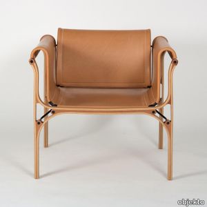
Recognizable by their singular style and admirable by the perfection of their realization, the furniture of the Cristian Valdés collection has become references and cult objects highly sought after by connoisseurs and lovers of design. 3rd creation of this collection, the H armchair naturally complements the first two chairs. More generous in size, it uses the construction method common to the entire range but changes its configuration to position the wooden parts in front and behind and not on the sides. Its soft curves make it a very comfortable and elegant seat, the natural leather of which will take on a magnificent patina over time. A truly magnificent piece. Alongside his main activity, the Chilean architect Cristian Valdés dabbled in furniture design. For him, the only fundamental difference between design and architecture is a question of scale. The collection of furniture he creates is the concrete result of the intersection of these two worlds. The idea came to him after analyzing the structure and construction of a Dunlop tennis racket similar to the one John McEnroe played with at the time. He develops a constructive system which is the functional and structural translation. This system will be used for all the furniture in the collection. 3rd creation of this collection, the H armchair naturally complements the first two chairs. More generous in size, it uses the construction method common to the entire range but changes its configuration to position the wooden parts in front and behind and not on the sides. Its soft curves make it a very comfortable and elegant seat, the natural leather of which will take on a magnificent patina over time. A truly magnificent piece. Like the A and B chairs, the H armchair quickly became a design icon in its country. He is appreciated and recognized for his unusual style. Handcrafted in small series, Cristian Valdés furniture is today unique, rare and sought after objects.
Tesori Lino bianco

florim > Wallcovering
East and West, a synthesis archieved through Italian taste. «My work often takes me to far-off lands, also remote in terms of their culture and traditions. Even without my being aware of it, I then metabolise these traditions and include them in the designs I subsequently produce.» Matteo Nunziati <p>"It is the architect's task to create a warm, livable space. Carpets are warm and livable. He decides for this reason to spread one carpet on the floor and to hang up four to form the four walls. But you cannot build a house out of carpets. Both the carpet and the floor and the tapestry on the wall required structural frame to hold them in the correct place. To invent this frame is the architect's second task."When Adolf Loos wrote his revolutionary essay on the "principle of cladding" in 1898, architecture was just entering the modern age. Building meant imagining structures capable of putting together different materials, but, Loos affirmed, it must also respect their individual characteristics. "Every material possesses a formal language which belongs to it alone and no material can take on the forms proper to another", the Austrian master therefore maintained. And there is no doubt that the spirit of these words extended throughout most Twentieth Century architecture, regardless of its location or style. When we look at Matteo Nunziati's designs for the CEDIT Tesori collection, we seem to be seeing geometrical purity and attention to detail at the service of a new "truth" of material. Because Matteo Nunziati views ceramics as a form of fabric.<br /> The woven patterns he imagines for the various styles in his collection "“ from Arabian to damask to more geometrical motifs "“ constantly seek to provide the soft, iridescent look of time-worn linen. In them, ceramics are raised from the status of poor relation of marble to become a luxury wall covering in their own right: almost a wallpaper, suitable however for both floors and walls, and an absolutely versatile material. No longer only for beautifying bathrooms, they can create new moods in every room of the house (and elsewhere) starting from the living-room. Naturally, the revolution has been mainly technological. The large slabs produced by CEDIT are more than 3 metres tall, and since they eliminate the serial repetition typical of conventional tiles, they generate a new relationship between the surface and its decoration. However, Nunziati does not use this to create, artist-like, a more eye-catching decorative composition that emphasises the slab's dimensions. Quite the opposite; the patterns he offers us attempt to break down what is left of the boundaries between substrates. In particular, the Arabian and damask styles, in the version with "timeworn" patterning, convey the idea of the ceramic slab as an abstract, almost non-existent material which melts into the decorative motif applied to it, in a kind of pure wall covering.<br /> Through the patient selection of geometrical motifs and tests to verify their suitability for application to ceramic slabs, Nunziati aims to achieve a new material rather than a mere decoration, making this clear by also exploring its tactile dimension, with gouged and relief motifs. His "principle of coverings" therefore relates to ceramics' essence rather than their image: highlighting the versatility which, as we all know, has made ceramics an absolute material, a kind of cement that incorporates structure and finish in a virtually infinite range of applications. This is clearly indicated by the reference to the mashrabiya, a term meaning place where people drink in Arabic, which in Arabian architecture originally referred to the kind of veranda where people used to meet and rest, and over time has come to mean the wooden gratings that screened these places from the sun. Inspired by his trips to the Middle East, for Nunziati the geometric patterns of the mashrabiya become both an outline of his method of work and the form of what in fact becomes the key element in a new idea of space: a real location conceived around a strong, livable surface in which physical substance and decoration overlap to the point where they merge.</p>
Tesori Broccato bianco

florim > Wallcovering
East and West, a synthesis archieved through Italian taste. «My work often takes me to far-off lands, also remote in terms of their culture and traditions. Even without my being aware of it, I then metabolise these traditions and include them in the designs I subsequently produce.» Matteo Nunziati <p>"It is the architect's task to create a warm, livable space. Carpets are warm and livable. He decides for this reason to spread one carpet on the floor and to hang up four to form the four walls. But you cannot build a house out of carpets. Both the carpet and the floor and the tapestry on the wall required structural frame to hold them in the correct place. To invent this frame is the architect's second task."When Adolf Loos wrote his revolutionary essay on the "principle of cladding" in 1898, architecture was just entering the modern age. Building meant imagining structures capable of putting together different materials, but, Loos affirmed, it must also respect their individual characteristics. "Every material possesses a formal language which belongs to it alone and no material can take on the forms proper to another", the Austrian master therefore maintained. And there is no doubt that the spirit of these words extended throughout most Twentieth Century architecture, regardless of its location or style. When we look at Matteo Nunziati's designs for the CEDIT Tesori collection, we seem to be seeing geometrical purity and attention to detail at the service of a new "truth" of material. Because Matteo Nunziati views ceramics as a form of fabric.<br /> The woven patterns he imagines for the various styles in his collection "“ from Arabian to damask to more geometrical motifs "“ constantly seek to provide the soft, iridescent look of time-worn linen. In them, ceramics are raised from the status of poor relation of marble to become a luxury wall covering in their own right: almost a wallpaper, suitable however for both floors and walls, and an absolutely versatile material. No longer only for beautifying bathrooms, they can create new moods in every room of the house (and elsewhere) starting from the living-room. Naturally, the revolution has been mainly technological. The large slabs produced by CEDIT are more than 3 metres tall, and since they eliminate the serial repetition typical of conventional tiles, they generate a new relationship between the surface and its decoration. However, Nunziati does not use this to create, artist-like, a more eye-catching decorative composition that emphasises the slab's dimensions. Quite the opposite; the patterns he offers us attempt to break down what is left of the boundaries between substrates. In particular, the Arabian and damask styles, in the version with "timeworn" patterning, convey the idea of the ceramic slab as an abstract, almost non-existent material which melts into the decorative motif applied to it, in a kind of pure wall covering.<br /> Through the patient selection of geometrical motifs and tests to verify their suitability for application to ceramic slabs, Nunziati aims to achieve a new material rather than a mere decoration, making this clear by also exploring its tactile dimension, with gouged and relief motifs. His "principle of coverings" therefore relates to ceramics' essence rather than their image: highlighting the versatility which, as we all know, has made ceramics an absolute material, a kind of cement that incorporates structure and finish in a virtually infinite range of applications. This is clearly indicated by the reference to the mashrabiya, a term meaning place where people drink in Arabic, which in Arabian architecture originally referred to the kind of veranda where people used to meet and rest, and over time has come to mean the wooden gratings that screened these places from the sun. Inspired by his trips to the Middle East, for Nunziati the geometric patterns of the mashrabiya become both an outline of his method of work and the form of what in fact becomes the key element in a new idea of space: a real location conceived around a strong, livable surface in which physical substance and decoration overlap to the point where they merge.</p>
Tesori Lino grigio

florim > Wallcovering
East and West, a synthesis archieved through Italian taste. «My work often takes me to far-off lands, also remote in terms of their culture and traditions. Even without my being aware of it, I then metabolise these traditions and include them in the designs I subsequently produce.» Matteo Nunziati <p>"It is the architect's task to create a warm, livable space. Carpets are warm and livable. He decides for this reason to spread one carpet on the floor and to hang up four to form the four walls. But you cannot build a house out of carpets. Both the carpet and the floor and the tapestry on the wall required structural frame to hold them in the correct place. To invent this frame is the architect's second task."When Adolf Loos wrote his revolutionary essay on the "principle of cladding" in 1898, architecture was just entering the modern age. Building meant imagining structures capable of putting together different materials, but, Loos affirmed, it must also respect their individual characteristics. "Every material possesses a formal language which belongs to it alone and no material can take on the forms proper to another", the Austrian master therefore maintained. And there is no doubt that the spirit of these words extended throughout most Twentieth Century architecture, regardless of its location or style. When we look at Matteo Nunziati's designs for the CEDIT Tesori collection, we seem to be seeing geometrical purity and attention to detail at the service of a new "truth" of material. Because Matteo Nunziati views ceramics as a form of fabric.<br /> The woven patterns he imagines for the various styles in his collection "“ from Arabian to damask to more geometrical motifs "“ constantly seek to provide the soft, iridescent look of time-worn linen. In them, ceramics are raised from the status of poor relation of marble to become a luxury wall covering in their own right: almost a wallpaper, suitable however for both floors and walls, and an absolutely versatile material. No longer only for beautifying bathrooms, they can create new moods in every room of the house (and elsewhere) starting from the living-room. Naturally, the revolution has been mainly technological. The large slabs produced by CEDIT are more than 3 metres tall, and since they eliminate the serial repetition typical of conventional tiles, they generate a new relationship between the surface and its decoration. However, Nunziati does not use this to create, artist-like, a more eye-catching decorative composition that emphasises the slab's dimensions. Quite the opposite; the patterns he offers us attempt to break down what is left of the boundaries between substrates. In particular, the Arabian and damask styles, in the version with "timeworn" patterning, convey the idea of the ceramic slab as an abstract, almost non-existent material which melts into the decorative motif applied to it, in a kind of pure wall covering.<br /> Through the patient selection of geometrical motifs and tests to verify their suitability for application to ceramic slabs, Nunziati aims to achieve a new material rather than a mere decoration, making this clear by also exploring its tactile dimension, with gouged and relief motifs. His "principle of coverings" therefore relates to ceramics' essence rather than their image: highlighting the versatility which, as we all know, has made ceramics an absolute material, a kind of cement that incorporates structure and finish in a virtually infinite range of applications. This is clearly indicated by the reference to the mashrabiya, a term meaning place where people drink in Arabic, which in Arabian architecture originally referred to the kind of veranda where people used to meet and rest, and over time has come to mean the wooden gratings that screened these places from the sun. Inspired by his trips to the Middle East, for Nunziati the geometric patterns of the mashrabiya become both an outline of his method of work and the form of what in fact becomes the key element in a new idea of space: a real location conceived around a strong, livable surface in which physical substance and decoration overlap to the point where they merge.</p>
Savoye Bar Table
castrolighting > Table
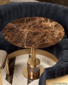
This gracious Collection bears the authentic name of a noble Italian family that ruled over the duchy of Savoy and became the royal house of Italy from 1861 to 1946. The oldest reigning dynasty in Europe before the collapse of the Italian monarchy. Today, the name gained more recognition with the famous Savoye villa in France. The residence designed by French-Swiss architect Charles-Edouard Jeanneret-Gris in 1928, granted as one of the greatest icons of modern architecture in the twentieth century. Savoye table is considered unparalleled in the elegance and tenderness it displays. Savoye’s lifestyle design philosophy reveals timeless grace coupled with a romantic play of marble and brass. The combination of the delicate Emperador marble top along with base designed in classic style of cylindrical shape with a solid-gold tray and the gold-plated brass structure gives immaculate perfection to this piece. Each artistic feature is handcrafted from the finest selected materials by our professional artisans. Elegant and ethereal details of this design create a sophisticated luxury environment to any interior décor. This bespoke furniture piece is an indispensable décor solution for art luxury admirers as it introduces a new vision in furniture design – a mixture of present-day smart elegance with a classical approach. Pair the Collection set in glorious combinations for extra sophistication. Bring some joy to your home in order to feel authentic and special. VIEW FULL FAMILY
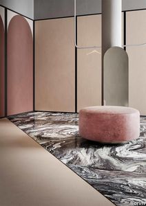
Policroma Cipria
florim > Wall Paint
Recurring geometries, combinations of figures. Marble and marmorino plaster: comparison and dialogue. The collection is completed by a linear listello tile with the motif of a sequence of vertical rectangular blocks, which can be combined with the slabs to further enrich compositions involving continuous ceramic surfaces cladding.<br /><br />"Another reference is the use of Italian marbles on the verge of extinction, rare marbles such as Rosa Valtoce, the marble used in Milan Cathedral."<br />Cristina Celestino Cristina Celestino's smartphone contains a folder of images entitled "Milan". Photographs that are more like notes. Photographs of architectural features, materials or details of shapes encountered by chance during a walk, but they cannot be described as merely a vague "source of inspiration". This filing system, created in response to a fleeting instinct, is an integral part of the method of work adopted by the architect and designer, who starts off without preconceptions "“ or "free", as she puts it before drawing inputs from a vast world of references, from Hermès scarves to the works of the great Masters (in the specific case of Policroma). This accumulation, partly spontaneous and party the outcome of in-depth historical knowledge and study, naturally activates a process of synthesis and personal interpretation common to all Cristina Celestino's output.<br /><br /><br />The wall covering collection designed for Cedit was no exception, although in this case the designer was dealing with a project with variable dimensions, reaching up even to the architectural scale. In her own distinctive way, she combined a variety of references. Adolf Loos's passion for coloured types of marble, and Cipollino in particular. Carlo Scarpa's angular metal frames and Marmorino plaster in Venice. The French fashion house's square silk scarves. The entrance halls of Milan palazzos, Gio Ponti, the city's Cathedral. All expressed in the designer's own language: well balanced geometrical forms, subtle colours (shades similar to those of Scarpa himself), an effortless, almost restrained, playful elegance. The mood is that of the homes of the enlightened bourgeoisie who shaped the history of Milan, Celestino's adoptive city and an endless source of inputs. She has worked its interiors, including some of the least expected a 1928 tram, the historic Cucchi confectionery store hybridising her own style with the existing context. An imitative effect which is also the key to the meaning of the new Policroma collection: the marble varieties replicated using the Cedit technology are all from Italian quarries that are virtually "worked out". This revives an increasingly rare material as a "living" presence, in a different form which makes no claim to replace the natural original. Quite the contrary, Celestino immediately states her intention to imitate, by combining marble and Marmorino plaster in some variants with a contrasting frame (a typical feature for her, just as it was for Scarpa), and evoking the centuries-old marble-imitating scagliola plasterwork with a contemporary formula.<br /><br /><br />The types of marble chosen are central to the project's character. Verde Alpi, a favourite with Gio Ponti and often found in Milan entrance halls, features tightly packed patterning. Breccia Capraia, still found in a very few places in Tuscany, has a white background with just a few veins. Cipollino, in the special Ondulato variety in green and red, is patterned with spirals. Rosa Valtoce, on the other hand, was used by the "Veneranda Fabbrica" guild to build Milan Cathedral. It is an iconic stone with dramatic stripes, popular in the past; it is now sourced from one very small quarry in Piedmont which has been virtually abandoned.<br /> The many different elements that make up the Policroma collection all reflect the importance of craftsmanship to Cristina Celestino's design style: the modules can be freely mixed and combined, for example to create a concave or convex semicircle, or for the large-scale replication of small features initially conceived as trims, functional details transformed into a dominant motif.There is a return to the theme of the interior, a large or small protected space, conceived as suspended in space and time yet also reassuring and protective. It is designed through its coverings in a stark yet not minimalist way, with intelligence and with no overreaching artistic ambitions. An understated space and an extremely stylish declaration. In Milan style, of course.
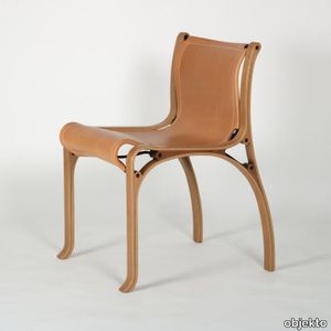
CV Model A
objekto > Chair
Recognizable by their singular style and admirable by the perfection of their realization, the furniture of the Cristian Valdés collection has become references and cult objects highly sought after by connoisseurs and lovers of design. The first of his creations, the Valdés chair is remarkable for its construction method which will serve as the basis for the entire collection. Its soft curves make it a very comfortable and elegant seat, the natural leather of which will take on a magnificent patina over time. Alongside his main activity, the Chilean architect Cristian Valdés dabbled in furniture design. For him, the only fundamental difference between design and architecture is a question of scale. The collection of furniture that he then created is the concrete result of the intersection of these two worlds. In 1977, he gave birth to the Valdés Model A. The idea came to him after analyzing the structure and construction method of a Dunlop tennis racquet similar to the one John McEnroe played with at the time. This chair is the functional and structural translation. It is remarkable for its constructive mode and its soft curves which make it a very comfortable and elegant seat whose natural leather will take on a magnificent patina over time. The Valdés chair quickly became a design icon in its country. She is appreciated and recognized for her unusual style. Handcrafted in small series, Cristian Valdés furniture is today unique, rare and sought after objects.
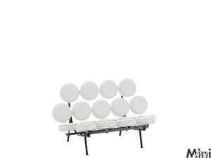
Miniatures Marshmallow Sofa
vitra > Styling
George Nelson is one of the most influential personalities in U.S. design after 1945. As of 1946 he was for many years head of the Design Department at the Herman Miller company, on whose behalf he engaged designers hardly known at the time, such as Charles Eames , Isamu Noguchi, and Alexander Girard. And he was also inspired by other areas of culture: along with his work as an architect, he concerned himself with ongoing sociological and artistic themes.<br/><br/>Nelson's ”Marshmallow”-sofa must be considered one of the earliest "Pop Art" furniture designs: the transformation of a traditional sofa into a threedimensional structure made of soft, colored cushioning. The seat and back are supported by a steel construction and the unit has the shape of an axially symmetrical folded-out waffle.
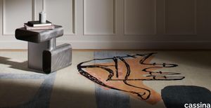
Tapis La Main Ouverte
cassina > Styling
The collage depicts an open hand, symbol of the Indian city of Chandigarh, designed by Le Corbusier himself in the 1950s, and a key image in the maestro’s philosophy, symbolic of what is offered and received, utilised by the great architect as a metaphor for generosity and sharing in a universally meaningful gesture.
Duality plaid
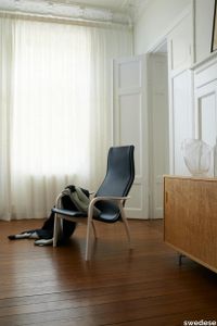
swedese > Styling
Duality - a contrast between two aspects, a dualism. A meeting between father and son Wingårdh in a new context. What happens when a maximalist meets a minimalist? When macro design meets micro design? When an architect and a fashion designer meet outside their usual area of expertise. The plaid is an extension of Gert and Rasmus Wingårdh's interpretation of the design classic Lamino. Its graphic pattern is a flirt with the lamino's iconic seat curve where the contrasting black and light gray field creates an effective dynamic. The plaid is a decorative accent in the home and is made of 100% organic wool. The dimensions are 130x180 cm.
Policroma Valtoce

florim > Wall tile-stone-brick
Recurring geometries, combinations of figures. Marble and marmorino plaster: comparison and dialogue. The collection is completed by a linear listello tile with the motif of a sequence of vertical rectangular blocks, which can be combined with the slabs to further enrich compositions involving continuous ceramic surfaces cladding.<br /><br />"Another reference is the use of Italian marbles on the verge of extinction, rare marbles such as Rosa Valtoce, the marble used in Milan Cathedral."<br />Cristina Celestino Cristina Celestino's smartphone contains a folder of images entitled "Milan". Photographs that are more like notes. Photographs of architectural features, materials or details of shapes encountered by chance during a walk, but they cannot be described as merely a vague "source of inspiration". This filing system, created in response to a fleeting instinct, is an integral part of the method of work adopted by the architect and designer, who starts off without preconceptions "“ or "free", as she puts it before drawing inputs from a vast world of references, from Hermès scarves to the works of the great Masters (in the specific case of Policroma). This accumulation, partly spontaneous and party the outcome of in-depth historical knowledge and study, naturally activates a process of synthesis and personal interpretation common to all Cristina Celestino's output.<br /><br /><br />The wall covering collection designed for Cedit was no exception, although in this case the designer was dealing with a project with variable dimensions, reaching up even to the architectural scale. In her own distinctive way, she combined a variety of references. Adolf Loos's passion for coloured types of marble, and Cipollino in particular. Carlo Scarpa's angular metal frames and Marmorino plaster in Venice. The French fashion house's square silk scarves. The entrance halls of Milan palazzos, Gio Ponti, the city's Cathedral. All expressed in the designer's own language: well balanced geometrical forms, subtle colours (shades similar to those of Scarpa himself), an effortless, almost restrained, playful elegance. The mood is that of the homes of the enlightened bourgeoisie who shaped the history of Milan, Celestino's adoptive city and an endless source of inputs. She has worked its interiors, including some of the least expected a 1928 tram, the historic Cucchi confectionery store hybridising her own style with the existing context. An imitative effect which is also the key to the meaning of the new Policroma collection: the marble varieties replicated using the Cedit technology are all from Italian quarries that are virtually "worked out". This revives an increasingly rare material as a "living" presence, in a different form which makes no claim to replace the natural original. Quite the contrary, Celestino immediately states her intention to imitate, by combining marble and Marmorino plaster in some variants with a contrasting frame (a typical feature for her, just as it was for Scarpa), and evoking the centuries-old marble-imitating scagliola plasterwork with a contemporary formula.<br /><br /><br />The types of marble chosen are central to the project's character. Verde Alpi, a favourite with Gio Ponti and often found in Milan entrance halls, features tightly packed patterning. Breccia Capraia, still found in a very few places in Tuscany, has a white background with just a few veins. Cipollino, in the special Ondulato variety in green and red, is patterned with spirals. Rosa Valtoce, on the other hand, was used by the "Veneranda Fabbrica" guild to build Milan Cathedral. It is an iconic stone with dramatic stripes, popular in the past; it is now sourced from one very small quarry in Piedmont which has been virtually abandoned.<br /> The many different elements that make up the Policroma collection all reflect the importance of craftsmanship to Cristina Celestino's design style: the modules can be freely mixed and combined, for example to create a concave or convex semicircle, or for the large-scale replication of small features initially conceived as trims, functional details transformed into a dominant motif.There is a return to the theme of the interior, a large or small protected space, conceived as suspended in space and time yet also reassuring and protective. It is designed through its coverings in a stark yet not minimalist way, with intelligence and with no overreaching artistic ambitions. An understated space and an extremely stylish declaration. In Milan style, of course.
Policroma Breccia

florim > Wall tile-stone-brick
Recurring geometries, combinations of figures. Marble and marmorino plaster: comparison and dialogue. The collection is completed by a linear listello tile with the motif of a sequence of vertical rectangular blocks, which can be combined with the slabs to further enrich compositions involving continuous ceramic surfaces cladding.<br /><br />"Another reference is the use of Italian marbles on the verge of extinction, rare marbles such as Rosa Valtoce, the marble used in Milan Cathedral."<br />Cristina Celestino Cristina Celestino's smartphone contains a folder of images entitled "Milan". Photographs that are more like notes. Photographs of architectural features, materials or details of shapes encountered by chance during a walk, but they cannot be described as merely a vague "source of inspiration". This filing system, created in response to a fleeting instinct, is an integral part of the method of work adopted by the architect and designer, who starts off without preconceptions "“ or "free", as she puts it before drawing inputs from a vast world of references, from Hermès scarves to the works of the great Masters (in the specific case of Policroma). This accumulation, partly spontaneous and party the outcome of in-depth historical knowledge and study, naturally activates a process of synthesis and personal interpretation common to all Cristina Celestino's output.<br /><br /><br />The wall covering collection designed for Cedit was no exception, although in this case the designer was dealing with a project with variable dimensions, reaching up even to the architectural scale. In her own distinctive way, she combined a variety of references. Adolf Loos's passion for coloured types of marble, and Cipollino in particular. Carlo Scarpa's angular metal frames and Marmorino plaster in Venice. The French fashion house's square silk scarves. The entrance halls of Milan palazzos, Gio Ponti, the city's Cathedral. All expressed in the designer's own language: well balanced geometrical forms, subtle colours (shades similar to those of Scarpa himself), an effortless, almost restrained, playful elegance. The mood is that of the homes of the enlightened bourgeoisie who shaped the history of Milan, Celestino's adoptive city and an endless source of inputs. She has worked its interiors, including some of the least expected a 1928 tram, the historic Cucchi confectionery store hybridising her own style with the existing context. An imitative effect which is also the key to the meaning of the new Policroma collection: the marble varieties replicated using the Cedit technology are all from Italian quarries that are virtually "worked out". This revives an increasingly rare material as a "living" presence, in a different form which makes no claim to replace the natural original. Quite the contrary, Celestino immediately states her intention to imitate, by combining marble and Marmorino plaster in some variants with a contrasting frame (a typical feature for her, just as it was for Scarpa), and evoking the centuries-old marble-imitating scagliola plasterwork with a contemporary formula.<br /><br /><br />The types of marble chosen are central to the project's character. Verde Alpi, a favourite with Gio Ponti and often found in Milan entrance halls, features tightly packed patterning. Breccia Capraia, still found in a very few places in Tuscany, has a white background with just a few veins. Cipollino, in the special Ondulato variety in green and red, is patterned with spirals. Rosa Valtoce, on the other hand, was used by the "Veneranda Fabbrica" guild to build Milan Cathedral. It is an iconic stone with dramatic stripes, popular in the past; it is now sourced from one very small quarry in Piedmont which has been virtually abandoned.<br /> The many different elements that make up the Policroma collection all reflect the importance of craftsmanship to Cristina Celestino's design style: the modules can be freely mixed and combined, for example to create a concave or convex semicircle, or for the large-scale replication of small features initially conceived as trims, functional details transformed into a dominant motif.There is a return to the theme of the interior, a large or small protected space, conceived as suspended in space and time yet also reassuring and protective. It is designed through its coverings in a stark yet not minimalist way, with intelligence and with no overreaching artistic ambitions. An understated space and an extremely stylish declaration. In Milan style, of course.
CV Model B

objekto > Chair
Recognizable by their singular style and admirable by the perfection of their realization, Cristian Valdés furniture has become references and cult objects highly sought after by connoisseurs and lovers of design. This chair with armrests is the natural variation of the original chair. Like her, she adopts the same construction method common to the entire collection. Its soft curves make it a very comfortable and elegant seat, the natural leather of which will take on a magnificent patina over time. Alongside his main activity, the Chilean architect Cristian Valdés dabbled in furniture design. For him, the only fundamental difference between design and architecture is a question of scale. The collection of furniture he creates is the concrete result of the intersection of these two worlds. The idea came to him after analyzing the structure and construction of a Dunlop tennis racket similar to the one John McEnroe played with at the time. He develops a constructive system which is the functional and structural translation. This system will be used for all the furniture in the collection. This chair with armrests is the natural variation of the original chair. Its soft curves make it a very comfortable and elegant seat, the natural leather of which will take on a magnificent patina over time. Like the original chair, this model quickly became a design icon in its country. He is appreciated and recognized for his unusual style. Handcrafted in small series, Cristian Valdés furniture is today unique, rare and sought after objects.
Lamino Duality easy chair

swedese > Armchair
Lamino is Swedese's most well-known easy chair, signed Yngve Ekström in 1956. Duality is an interpretation of Yngve's classic piece made by father and son, Gert & Rasmus Wingårdh, studio Wingårdh & Wingårdh. Duality - a contrast between two aspects, a dualism. What happens when a maximalist meets a minimalist? When macro design meets micro design? When an architect and a fashion designer meet outside their usual area of expertise. Duality is a tribute to the shapes of Lamino. Where Gert and Rasmus chose to highlight the already existing. With a light and a dark color setting, a contrast and a dynamic is created. The armchair is made of oak where the legs and outer frame of the seat are emphasized through contrasting colors in black and white. The seat is upholstered in saddle leather and the back with a natural colored linen fabric. The easy chair is available in a white and a black version. The Duality collection also includes tables and a blanket.
Tesori Anelli grigio

florim > Wallcovering
East and West, a synthesis archieved through Italian taste. «My work often takes me to far-off lands, also remote in terms of their culture and traditions. Even without my being aware of it, I then metabolise these traditions and include them in the designs I subsequently produce.» Matteo Nunziati <p>"It is the architect's task to create a warm, livable space. Carpets are warm and livable. He decides for this reason to spread one carpet on the floor and to hang up four to form the four walls. But you cannot build a house out of carpets. Both the carpet and the floor and the tapestry on the wall required structural frame to hold them in the correct place. To invent this frame is the architect's second task."When Adolf Loos wrote his revolutionary essay on the "principle of cladding" in 1898, architecture was just entering the modern age. Building meant imagining structures capable of putting together different materials, but, Loos affirmed, it must also respect their individual characteristics. "Every material possesses a formal language which belongs to it alone and no material can take on the forms proper to another", the Austrian master therefore maintained. And there is no doubt that the spirit of these words extended throughout most Twentieth Century architecture, regardless of its location or style. When we look at Matteo Nunziati's designs for the CEDIT Tesori collection, we seem to be seeing geometrical purity and attention to detail at the service of a new "truth" of material. Because Matteo Nunziati views ceramics as a form of fabric.<br /> The woven patterns he imagines for the various styles in his collection "“ from Arabian to damask to more geometrical motifs "“ constantly seek to provide the soft, iridescent look of time-worn linen. In them, ceramics are raised from the status of poor relation of marble to become a luxury wall covering in their own right: almost a wallpaper, suitable however for both floors and walls, and an absolutely versatile material. No longer only for beautifying bathrooms, they can create new moods in every room of the house (and elsewhere) starting from the living-room. Naturally, the revolution has been mainly technological. The large slabs produced by CEDIT are more than 3 metres tall, and since they eliminate the serial repetition typical of conventional tiles, they generate a new relationship between the surface and its decoration. However, Nunziati does not use this to create, artist-like, a more eye-catching decorative composition that emphasises the slab's dimensions. Quite the opposite; the patterns he offers us attempt to break down what is left of the boundaries between substrates. In particular, the Arabian and damask styles, in the version with "timeworn" patterning, convey the idea of the ceramic slab as an abstract, almost non-existent material which melts into the decorative motif applied to it, in a kind of pure wall covering.<br /> Through the patient selection of geometrical motifs and tests to verify their suitability for application to ceramic slabs, Nunziati aims to achieve a new material rather than a mere decoration, making this clear by also exploring its tactile dimension, with gouged and relief motifs. His "principle of coverings" therefore relates to ceramics' essence rather than their image: highlighting the versatility which, as we all know, has made ceramics an absolute material, a kind of cement that incorporates structure and finish in a virtually infinite range of applications. This is clearly indicated by the reference to the mashrabiya, a term meaning place where people drink in Arabic, which in Arabian architecture originally referred to the kind of veranda where people used to meet and rest, and over time has come to mean the wooden gratings that screened these places from the sun. Inspired by his trips to the Middle East, for Nunziati the geometric patterns of the mashrabiya become both an outline of his method of work and the form of what in fact becomes the key element in a new idea of space: a real location conceived around a strong, livable surface in which physical substance and decoration overlap to the point where they merge.</p>
Tesori Anelli bianco

florim > Wallcovering
East and West, a synthesis archieved through Italian taste. «My work often takes me to far-off lands, also remote in terms of their culture and traditions. Even without my being aware of it, I then metabolise these traditions and include them in the designs I subsequently produce.» Matteo Nunziati <p>"It is the architect's task to create a warm, livable space. Carpets are warm and livable. He decides for this reason to spread one carpet on the floor and to hang up four to form the four walls. But you cannot build a house out of carpets. Both the carpet and the floor and the tapestry on the wall required structural frame to hold them in the correct place. To invent this frame is the architect's second task."When Adolf Loos wrote his revolutionary essay on the "principle of cladding" in 1898, architecture was just entering the modern age. Building meant imagining structures capable of putting together different materials, but, Loos affirmed, it must also respect their individual characteristics. "Every material possesses a formal language which belongs to it alone and no material can take on the forms proper to another", the Austrian master therefore maintained. And there is no doubt that the spirit of these words extended throughout most Twentieth Century architecture, regardless of its location or style. When we look at Matteo Nunziati's designs for the CEDIT Tesori collection, we seem to be seeing geometrical purity and attention to detail at the service of a new "truth" of material. Because Matteo Nunziati views ceramics as a form of fabric.<br /> The woven patterns he imagines for the various styles in his collection "“ from Arabian to damask to more geometrical motifs "“ constantly seek to provide the soft, iridescent look of time-worn linen. In them, ceramics are raised from the status of poor relation of marble to become a luxury wall covering in their own right: almost a wallpaper, suitable however for both floors and walls, and an absolutely versatile material. No longer only for beautifying bathrooms, they can create new moods in every room of the house (and elsewhere) starting from the living-room. Naturally, the revolution has been mainly technological. The large slabs produced by CEDIT are more than 3 metres tall, and since they eliminate the serial repetition typical of conventional tiles, they generate a new relationship between the surface and its decoration. However, Nunziati does not use this to create, artist-like, a more eye-catching decorative composition that emphasises the slab's dimensions. Quite the opposite; the patterns he offers us attempt to break down what is left of the boundaries between substrates. In particular, the Arabian and damask styles, in the version with "timeworn" patterning, convey the idea of the ceramic slab as an abstract, almost non-existent material which melts into the decorative motif applied to it, in a kind of pure wall covering.<br /> Through the patient selection of geometrical motifs and tests to verify their suitability for application to ceramic slabs, Nunziati aims to achieve a new material rather than a mere decoration, making this clear by also exploring its tactile dimension, with gouged and relief motifs. His "principle of coverings" therefore relates to ceramics' essence rather than their image: highlighting the versatility which, as we all know, has made ceramics an absolute material, a kind of cement that incorporates structure and finish in a virtually infinite range of applications. This is clearly indicated by the reference to the mashrabiya, a term meaning place where people drink in Arabic, which in Arabian architecture originally referred to the kind of veranda where people used to meet and rest, and over time has come to mean the wooden gratings that screened these places from the sun. Inspired by his trips to the Middle East, for Nunziati the geometric patterns of the mashrabiya become both an outline of his method of work and the form of what in fact becomes the key element in a new idea of space: a real location conceived around a strong, livable surface in which physical substance and decoration overlap to the point where they merge.</p>
Coffee Table Book
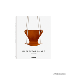
fritzhansen > Styling
We have gathered the most amazing photos and the most interesting stories in the history of Fritz Hansen in one book. "In Perfect Shape" is the tale of how a Danish sawmill became the manufacturer of some the most iconic designs ever produced. Dive into the exiting life of Arne Jacobsen, the Danish architect and designer who took the design world by storm with the Egg™, the Swan™ and many more iconic pieces. Browse through a visual adventure of our biggest corporate projects as well stunning home settings and discover the unique craftsmanship that has defines Fritz Hansen since 1872. Editor: Mette Egeskov Published by teNeues Publishing Group 226 pages Year: 2017/2021
Policroma Lichene

florim > Wall Paint
Recurring geometries, combinations of figures. Marble and marmorino plaster: comparison and dialogue. The collection is completed by a linear listello tile with the motif of a sequence of vertical rectangular blocks, which can be combined with the slabs to further enrich compositions involving continuous ceramic surfaces cladding.<br /><br />"Another reference is the use of Italian marbles on the verge of extinction, rare marbles such as Rosa Valtoce, the marble used in Milan Cathedral."<br />Cristina Celestino Cristina Celestino's smartphone contains a folder of images entitled "Milan". Photographs that are more like notes. Photographs of architectural features, materials or details of shapes encountered by chance during a walk, but they cannot be described as merely a vague "source of inspiration". This filing system, created in response to a fleeting instinct, is an integral part of the method of work adopted by the architect and designer, who starts off without preconceptions "“ or "free", as she puts it before drawing inputs from a vast world of references, from Hermès scarves to the works of the great Masters (in the specific case of Policroma). This accumulation, partly spontaneous and party the outcome of in-depth historical knowledge and study, naturally activates a process of synthesis and personal interpretation common to all Cristina Celestino's output.<br /><br /><br />The wall covering collection designed for Cedit was no exception, although in this case the designer was dealing with a project with variable dimensions, reaching up even to the architectural scale. In her own distinctive way, she combined a variety of references. Adolf Loos's passion for coloured types of marble, and Cipollino in particular. Carlo Scarpa's angular metal frames and Marmorino plaster in Venice. The French fashion house's square silk scarves. The entrance halls of Milan palazzos, Gio Ponti, the city's Cathedral. All expressed in the designer's own language: well balanced geometrical forms, subtle colours (shades similar to those of Scarpa himself), an effortless, almost restrained, playful elegance. The mood is that of the homes of the enlightened bourgeoisie who shaped the history of Milan, Celestino's adoptive city and an endless source of inputs. She has worked its interiors, including some of the least expected a 1928 tram, the historic Cucchi confectionery store hybridising her own style with the existing context. An imitative effect which is also the key to the meaning of the new Policroma collection: the marble varieties replicated using the Cedit technology are all from Italian quarries that are virtually "worked out". This revives an increasingly rare material as a "living" presence, in a different form which makes no claim to replace the natural original. Quite the contrary, Celestino immediately states her intention to imitate, by combining marble and Marmorino plaster in some variants with a contrasting frame (a typical feature for her, just as it was for Scarpa), and evoking the centuries-old marble-imitating scagliola plasterwork with a contemporary formula.<br /><br /><br />The types of marble chosen are central to the project's character. Verde Alpi, a favourite with Gio Ponti and often found in Milan entrance halls, features tightly packed patterning. Breccia Capraia, still found in a very few places in Tuscany, has a white background with just a few veins. Cipollino, in the special Ondulato variety in green and red, is patterned with spirals. Rosa Valtoce, on the other hand, was used by the "Veneranda Fabbrica" guild to build Milan Cathedral. It is an iconic stone with dramatic stripes, popular in the past; it is now sourced from one very small quarry in Piedmont which has been virtually abandoned.<br /> The many different elements that make up the Policroma collection all reflect the importance of craftsmanship to Cristina Celestino's design style: the modules can be freely mixed and combined, for example to create a concave or convex semicircle, or for the large-scale replication of small features initially conceived as trims, functional details transformed into a dominant motif.There is a return to the theme of the interior, a large or small protected space, conceived as suspended in space and time yet also reassuring and protective. It is designed through its coverings in a stark yet not minimalist way, with intelligence and with no overreaching artistic ambitions. An understated space and an extremely stylish declaration. In Milan style, of course.
Scarpa 121 Afra & Tobia Scarpa, 1965

karakterCopenhagen > Chair
The iconic 121 Scarpa dining chair is a straightforward dining chair with a design that can complement both classical and cutting-edge interiors. The design is characterized by a firm and robust wooden frame that creates a striking contrast to the lightness of the seat and back. The seat and back are anatomically shaped in plywood, covered in fine European leather, and attached by bolts to crosspieces along the center for great comfort. Originally inspired by a sketch made by Tobia’s father, Venetian architect and designer, Carlo Scarpa, the 121 came to life with a distinct touch from Afra and Tobia Scarpa in 1965. The 121 Scarpa dining chair was designed alongside the classic 925 Scarpa lounge chair from 1966. The two chairs are a prime example of Afra and Tobia Scarpa’s work and share the same double trestle structure with characteristic rounded joints. Both designs are now a part of the Karakter collection.
Policroma Cipollino

florim > Wall tile-stone-brick
Recurring geometries, combinations of figures. Marble and marmorino plaster: comparison and dialogue. The collection is completed by a linear listello tile with the motif of a sequence of vertical rectangular blocks, which can be combined with the slabs to further enrich compositions involving continuous ceramic surfaces cladding.<br /><br />"Another reference is the use of Italian marbles on the verge of extinction, rare marbles such as Rosa Valtoce, the marble used in Milan Cathedral."<br />Cristina Celestino Cristina Celestino's smartphone contains a folder of images entitled "Milan". Photographs that are more like notes. Photographs of architectural features, materials or details of shapes encountered by chance during a walk, but they cannot be described as merely a vague "source of inspiration". This filing system, created in response to a fleeting instinct, is an integral part of the method of work adopted by the architect and designer, who starts off without preconceptions "“ or "free", as she puts it before drawing inputs from a vast world of references, from Hermès scarves to the works of the great Masters (in the specific case of Policroma). This accumulation, partly spontaneous and party the outcome of in-depth historical knowledge and study, naturally activates a process of synthesis and personal interpretation common to all Cristina Celestino's output.<br /><br /><br />The wall covering collection designed for Cedit was no exception, although in this case the designer was dealing with a project with variable dimensions, reaching up even to the architectural scale. In her own distinctive way, she combined a variety of references. Adolf Loos's passion for coloured types of marble, and Cipollino in particular. Carlo Scarpa's angular metal frames and Marmorino plaster in Venice. The French fashion house's square silk scarves. The entrance halls of Milan palazzos, Gio Ponti, the city's Cathedral. All expressed in the designer's own language: well balanced geometrical forms, subtle colours (shades similar to those of Scarpa himself), an effortless, almost restrained, playful elegance. The mood is that of the homes of the enlightened bourgeoisie who shaped the history of Milan, Celestino's adoptive city and an endless source of inputs. She has worked its interiors, including some of the least expected a 1928 tram, the historic Cucchi confectionery store hybridising her own style with the existing context. An imitative effect which is also the key to the meaning of the new Policroma collection: the marble varieties replicated using the Cedit technology are all from Italian quarries that are virtually "worked out". This revives an increasingly rare material as a "living" presence, in a different form which makes no claim to replace the natural original. Quite the contrary, Celestino immediately states her intention to imitate, by combining marble and Marmorino plaster in some variants with a contrasting frame (a typical feature for her, just as it was for Scarpa), and evoking the centuries-old marble-imitating scagliola plasterwork with a contemporary formula.<br /><br /><br />The types of marble chosen are central to the project's character. Verde Alpi, a favourite with Gio Ponti and often found in Milan entrance halls, features tightly packed patterning. Breccia Capraia, still found in a very few places in Tuscany, has a white background with just a few veins. Cipollino, in the special Ondulato variety in green and red, is patterned with spirals. Rosa Valtoce, on the other hand, was used by the "Veneranda Fabbrica" guild to build Milan Cathedral. It is an iconic stone with dramatic stripes, popular in the past; it is now sourced from one very small quarry in Piedmont which has been virtually abandoned.<br /> The many different elements that make up the Policroma collection all reflect the importance of craftsmanship to Cristina Celestino's design style: the modules can be freely mixed and combined, for example to create a concave or convex semicircle, or for the large-scale replication of small features initially conceived as trims, functional details transformed into a dominant motif.There is a return to the theme of the interior, a large or small protected space, conceived as suspended in space and time yet also reassuring and protective. It is designed through its coverings in a stark yet not minimalist way, with intelligence and with no overreaching artistic ambitions. An understated space and an extremely stylish declaration. In Milan style, of course.
Utzon Special Edition JU1
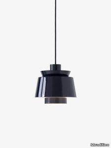
&tradition > Ceiling lamp
Offering a new take on the classic Danish design, &Tradition welcomes the Utzon Special Edition lamp in Steel Blue to its collection. Commemorating the 50th anniversary of the completion of the UNESCO World Heritage Site, Sydney Opera House, by architect and designer Jørn Utzon, this bold new shade brings a striking new character to the pendant.
Tesori Monile bianco

florim > Wallcovering
East and West, a synthesis archieved through Italian taste. «My work often takes me to far-off lands, also remote in terms of their culture and traditions. Even without my being aware of it, I then metabolise these traditions and include them in the designs I subsequently produce.» Matteo Nunziati <p>"It is the architect's task to create a warm, livable space. Carpets are warm and livable. He decides for this reason to spread one carpet on the floor and to hang up four to form the four walls. But you cannot build a house out of carpets. Both the carpet and the floor and the tapestry on the wall required structural frame to hold them in the correct place. To invent this frame is the architect's second task."When Adolf Loos wrote his revolutionary essay on the "principle of cladding" in 1898, architecture was just entering the modern age. Building meant imagining structures capable of putting together different materials, but, Loos affirmed, it must also respect their individual characteristics. "Every material possesses a formal language which belongs to it alone and no material can take on the forms proper to another", the Austrian master therefore maintained. And there is no doubt that the spirit of these words extended throughout most Twentieth Century architecture, regardless of its location or style. When we look at Matteo Nunziati's designs for the CEDIT Tesori collection, we seem to be seeing geometrical purity and attention to detail at the service of a new "truth" of material. Because Matteo Nunziati views ceramics as a form of fabric.<br /> The woven patterns he imagines for the various styles in his collection "“ from Arabian to damask to more geometrical motifs "“ constantly seek to provide the soft, iridescent look of time-worn linen. In them, ceramics are raised from the status of poor relation of marble to become a luxury wall covering in their own right: almost a wallpaper, suitable however for both floors and walls, and an absolutely versatile material. No longer only for beautifying bathrooms, they can create new moods in every room of the house (and elsewhere) starting from the living-room. Naturally, the revolution has been mainly technological. The large slabs produced by CEDIT are more than 3 metres tall, and since they eliminate the serial repetition typical of conventional tiles, they generate a new relationship between the surface and its decoration. However, Nunziati does not use this to create, artist-like, a more eye-catching decorative composition that emphasises the slab's dimensions. Quite the opposite; the patterns he offers us attempt to break down what is left of the boundaries between substrates. In particular, the Arabian and damask styles, in the version with "timeworn" patterning, convey the idea of the ceramic slab as an abstract, almost non-existent material which melts into the decorative motif applied to it, in a kind of pure wall covering.<br /> Through the patient selection of geometrical motifs and tests to verify their suitability for application to ceramic slabs, Nunziati aims to achieve a new material rather than a mere decoration, making this clear by also exploring its tactile dimension, with gouged and relief motifs. His "principle of coverings" therefore relates to ceramics' essence rather than their image: highlighting the versatility which, as we all know, has made ceramics an absolute material, a kind of cement that incorporates structure and finish in a virtually infinite range of applications. This is clearly indicated by the reference to the mashrabiya, a term meaning place where people drink in Arabic, which in Arabian architecture originally referred to the kind of veranda where people used to meet and rest, and over time has come to mean the wooden gratings that screened these places from the sun. Inspired by his trips to the Middle East, for Nunziati the geometric patterns of the mashrabiya become both an outline of his method of work and the form of what in fact becomes the key element in a new idea of space: a real location conceived around a strong, livable surface in which physical substance and decoration overlap to the point where they merge.</p>
Stereo
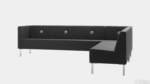
mitab > Chair
Joel Karlsson Stereo is a functional and clean sofa and bench with a tight design. The buttons in the back can make Stereo a bit playful and with a strong character. Stereos straight, upholstered back side makes it possible to use as a room divider. The seat height fits well into interiors such as restaurants and waiting areas. During the development process interior achitects have been involved to meet the highest standards on comfort and cleaning possibilities for public interiors.Stereo is a system with different elements bringing great flexibility for any customer. Seating in different widths and armrests makes Stereo possible to create endless seating solutions. Modular sofa system with easychair, 1-seater, 2-seater, 3-seater, corner and armrest. Frame in tubular steel in standard RAL (black, white or silver), Selected RAL or Anycolour RAL. Seat with wood base and cold foam upholstered in standard fabrics or c.o.m. As option multiple fabric configuration, solid oak legs and swivel base for easychair and 1-seater with armrests. Stereo is also available with electrical outlets as optional. Connectable.
Policroma Alpi

florim > Wall tile-stone-brick
Recurring geometries, combinations of figures. Marble and marmorino plaster: comparison and dialogue. The collection is completed by a linear listello tile with the motif of a sequence of vertical rectangular blocks, which can be combined with the slabs to further enrich compositions involving continuous ceramic surfaces cladding.<br /><br />"Another reference is the use of Italian marbles on the verge of extinction, rare marbles such as Rosa Valtoce, the marble used in Milan Cathedral."<br />Cristina Celestino Cristina Celestino's smartphone contains a folder of images entitled "Milan". Photographs that are more like notes. Photographs of architectural features, materials or details of shapes encountered by chance during a walk, but they cannot be described as merely a vague "source of inspiration". This filing system, created in response to a fleeting instinct, is an integral part of the method of work adopted by the architect and designer, who starts off without preconceptions "“ or "free", as she puts it before drawing inputs from a vast world of references, from Hermès scarves to the works of the great Masters (in the specific case of Policroma). This accumulation, partly spontaneous and party the outcome of in-depth historical knowledge and study, naturally activates a process of synthesis and personal interpretation common to all Cristina Celestino's output.<br /><br /><br />The wall covering collection designed for Cedit was no exception, although in this case the designer was dealing with a project with variable dimensions, reaching up even to the architectural scale. In her own distinctive way, she combined a variety of references. Adolf Loos's passion for coloured types of marble, and Cipollino in particular. Carlo Scarpa's angular metal frames and Marmorino plaster in Venice. The French fashion house's square silk scarves. The entrance halls of Milan palazzos, Gio Ponti, the city's Cathedral. All expressed in the designer's own language: well balanced geometrical forms, subtle colours (shades similar to those of Scarpa himself), an effortless, almost restrained, playful elegance. The mood is that of the homes of the enlightened bourgeoisie who shaped the history of Milan, Celestino's adoptive city and an endless source of inputs. She has worked its interiors, including some of the least expected a 1928 tram, the historic Cucchi confectionery store hybridising her own style with the existing context. An imitative effect which is also the key to the meaning of the new Policroma collection: the marble varieties replicated using the Cedit technology are all from Italian quarries that are virtually "worked out". This revives an increasingly rare material as a "living" presence, in a different form which makes no claim to replace the natural original. Quite the contrary, Celestino immediately states her intention to imitate, by combining marble and Marmorino plaster in some variants with a contrasting frame (a typical feature for her, just as it was for Scarpa), and evoking the centuries-old marble-imitating scagliola plasterwork with a contemporary formula.<br /><br /><br />The types of marble chosen are central to the project's character. Verde Alpi, a favourite with Gio Ponti and often found in Milan entrance halls, features tightly packed patterning. Breccia Capraia, still found in a very few places in Tuscany, has a white background with just a few veins. Cipollino, in the special Ondulato variety in green and red, is patterned with spirals. Rosa Valtoce, on the other hand, was used by the "Veneranda Fabbrica" guild to build Milan Cathedral. It is an iconic stone with dramatic stripes, popular in the past; it is now sourced from one very small quarry in Piedmont which has been virtually abandoned.<br /> The many different elements that make up the Policroma collection all reflect the importance of craftsmanship to Cristina Celestino's design style: the modules can be freely mixed and combined, for example to create a concave or convex semicircle, or for the large-scale replication of small features initially conceived as trims, functional details transformed into a dominant motif.There is a return to the theme of the interior, a large or small protected space, conceived as suspended in space and time yet also reassuring and protective. It is designed through its coverings in a stark yet not minimalist way, with intelligence and with no overreaching artistic ambitions. An understated space and an extremely stylish declaration. In Milan style, of course.
Tesori Monile grigio

florim > Wallcovering
East and West, a synthesis archieved through Italian taste. «My work often takes me to far-off lands, also remote in terms of their culture and traditions. Even without my being aware of it, I then metabolise these traditions and include them in the designs I subsequently produce.» Matteo Nunziati <p>"It is the architect's task to create a warm, livable space. Carpets are warm and livable. He decides for this reason to spread one carpet on the floor and to hang up four to form the four walls. But you cannot build a house out of carpets. Both the carpet and the floor and the tapestry on the wall required structural frame to hold them in the correct place. To invent this frame is the architect's second task."When Adolf Loos wrote his revolutionary essay on the "principle of cladding" in 1898, architecture was just entering the modern age. Building meant imagining structures capable of putting together different materials, but, Loos affirmed, it must also respect their individual characteristics. "Every material possesses a formal language which belongs to it alone and no material can take on the forms proper to another", the Austrian master therefore maintained. And there is no doubt that the spirit of these words extended throughout most Twentieth Century architecture, regardless of its location or style. When we look at Matteo Nunziati's designs for the CEDIT Tesori collection, we seem to be seeing geometrical purity and attention to detail at the service of a new "truth" of material. Because Matteo Nunziati views ceramics as a form of fabric.<br /> The woven patterns he imagines for the various styles in his collection "“ from Arabian to damask to more geometrical motifs "“ constantly seek to provide the soft, iridescent look of time-worn linen. In them, ceramics are raised from the status of poor relation of marble to become a luxury wall covering in their own right: almost a wallpaper, suitable however for both floors and walls, and an absolutely versatile material. No longer only for beautifying bathrooms, they can create new moods in every room of the house (and elsewhere) starting from the living-room. Naturally, the revolution has been mainly technological. The large slabs produced by CEDIT are more than 3 metres tall, and since they eliminate the serial repetition typical of conventional tiles, they generate a new relationship between the surface and its decoration. However, Nunziati does not use this to create, artist-like, a more eye-catching decorative composition that emphasises the slab's dimensions. Quite the opposite; the patterns he offers us attempt to break down what is left of the boundaries between substrates. In particular, the Arabian and damask styles, in the version with "timeworn" patterning, convey the idea of the ceramic slab as an abstract, almost non-existent material which melts into the decorative motif applied to it, in a kind of pure wall covering.<br /> Through the patient selection of geometrical motifs and tests to verify their suitability for application to ceramic slabs, Nunziati aims to achieve a new material rather than a mere decoration, making this clear by also exploring its tactile dimension, with gouged and relief motifs. His "principle of coverings" therefore relates to ceramics' essence rather than their image: highlighting the versatility which, as we all know, has made ceramics an absolute material, a kind of cement that incorporates structure and finish in a virtually infinite range of applications. This is clearly indicated by the reference to the mashrabiya, a term meaning place where people drink in Arabic, which in Arabian architecture originally referred to the kind of veranda where people used to meet and rest, and over time has come to mean the wooden gratings that screened these places from the sun. Inspired by his trips to the Middle East, for Nunziati the geometric patterns of the mashrabiya become both an outline of his method of work and the form of what in fact becomes the key element in a new idea of space: a real location conceived around a strong, livable surface in which physical substance and decoration overlap to the point where they merge.</p>
Ihana
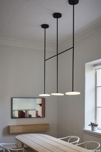
marset > Ceiling lamp
The serene shapes of the Ihana trace out a silhouette of light. This lighting system consists of several opal blown glass diffusers that are pleasing to the eye, appear ductile and contrast with the firmness of the metal structure that determines its shape and fastens it to the ceiling.In an effort to offer ambient light for any classic or contemporary interior design project, this collection can be used to create light compositions. This is made possible by its structure, which can be extended to include 14 diffusers, connected to a single point of light. It is available in different sizes to illuminate spaces with high ceilings as well. In addition, the Ihana features dim to warm technology, which allows not only regulating the intensity of the light, but also its colour temperature, which can vary from a warm white (3000K) to an ultra warm white, simulating candle light (1800K). Often, a design is born of necessity. Ihana, which means “exquisite” in Finnish, is one of them. Its creator, the architect Joanna Laajisto, moved her studio to a 19th century building in Helsinki and couldn’t find any lamps that fit in with her new office. In search of the beauty of light, she created a sculptural lamp defined by its pure, almost graphic forms, and by the balance between rigidity and fragility. Ihana is a synthesis of contrasts that combines contrasting colours, the black metallic structure and white diffusers, and nuances of old and new. A contemporary and timeless design made by its creator to endure over time and become part of those stories in which no one remembers what year it was designed.
Brace
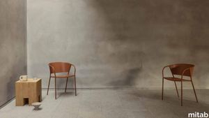
mitab > Chair
CHAIRS BRACE EXTENSIVE COMFORT As Peter Opsvik, the father of ergonomic furniture design, said “the best posture is the next posture”. Brace’s generously sized, curved back rest provides comfort in a variety of seating positions, for users of all shapes and sizes, and remains comfortable as you change positions throughout the day. HONEST CRAFTMANSHIP Brace’s frame is made from the most recycled material in the world – mild steel – and contains over 30% recycled content. The seat and back rest is made of plywood allowing them to be gently curved and are veneered with real Ash timber, providing a high quality and durable finish even suitable for high traffic environments. RENEW AND REPAIR Why buy new when you can re-new? At Mitab we don’t just sell new furniture. Customers can also return to us to have their pieces refreshed, renewed and repaired. Mitab products are designed and made to last decades but furniture that lives that long also require a little TLC every now and then to keep it looking its best! Maybe after a couple of hard years in a café (or a few equally hard years in a house with ketchup loving children!) your chair is in need of recovering. Or perhaps a hue that looked on trend ten years ago now looks a little dated. Mitab offers to re-new your furniture as easily as it is to buy a new piece.By offering straightforward options with standard pricing for re-lacquering or reupholstering your Mitab products we make it easy for you to extend their life and help out the environment at the same time. FUNCTIONAL SIMPLICITY Brace’s armrests have been carefully designed with ergonomics and practicality in mind, supporting users as they work yet still comfortably sliding under most table tops. A gradual bend allows users to to sit a little closer while working or eating while still being able to perch their arms. COLOUR COORDINATED A wide range of contemporary colour options are available through MItab’s various colour systems – Standard, Selected and Anycolour. For a small additional fee all metal components and wooden parts can be colour-matched to your chosen specification. DESIGNER JONAS WAGELL Swedish architect and designer Jonas Wagell is widely revered for his modern product and furniture design comprising soft, minimalist shapes with a welcoming expression. His Stockholm-based studio, JWDA, was founded in 2008 and boasts collaborative relations that stretch from Scandinavia and Europe to China and North America. An alumnus of the prestigious schools Konstfack in Stockholm and Parsons in New York City, Jonas Wagell’s award-winning work combines graphic simplicity and playfulness to create pieces that typify modern-day life. Materials: Steel frame, compression moulded veneer.
Architec Toilet set wall-mounted
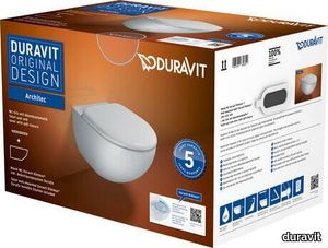
duravit > Toilet seat
Wall-mounted toilet: 2572090000, colour White High Gloss, Washdown model, Flushing rim: Rimless, Outlet drain horizontal, Concealed fixation, Flush water quantity: 4,5 l, Toilet seat: 0069690000, Lid colour: White High Gloss, Removable Seat, Automatic close Design by Prof. Frank Huster
Architec Built-in basin
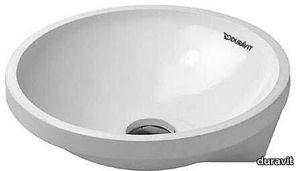
duravit > Washbasin
Installation, 430x430 mm, Tap hole platform: No, Overflow: No, Type of mounting: undercounter, Incl. fixings for installation in wooden consoles Design by Prof. Frank Huster
Architec Built-in basin

duravit > Washbasin
Installation, 320x320 mm, Tap hole platform: No, Overflow: Yes, Type of mounting: undercounter, Incl. fixings for installation in wooden consoles, Underside glazed Design by Prof. Frank Huster
Architec Vanity basin
duravit > Washbasin
undercounter basin, with overflow, without tap platform, underneath glazed, fixings for installation in wooden consoles included, Ø 400 mm Additional information Additional information Measurements of undercounter models represent interior measurements Design by Prof. Frank Huster
Architec Built-in basin
duravit > Washbasin
Installation, 445x445 mm, Tap hole platform: No, Overflow: No, Type of mounting: undercounter, Incl. fixings for installation in wooden consoles, Underside glazed Design by Prof. Frank Huster
Architec Built-in basin
duravit > Washbasin
Installation, 450x450 mm, Tap hole platform: No, Overflow: No, Type of mounting: counter top, Underside glazed Design by Prof. Frank Huster
Architec Wall-mounted bidet

duravit > Urinal
Tap hole platform: Yes, Overflow: Yes, Incl. invisible fixation, Incl. mounting material Design by Prof. Frank Huster
Architec Corner Basin
duravit > Washbasin
Quarter circle, Tap hole platform: Yes, Number of faucet holes per wash area: 1, Overflow: No, Underside glazed, Back side glazed: No, 635 mm Design by Prof. Frank Huster

