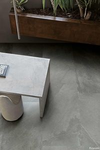
Compatta Pisé Melange
florim > Wall tile-stone-brick
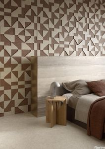
<p>A passion for earth as a natural material and for rammed earth, an ancient construction technique.</p> <p>The combination of these patterns evolves into the concept of Pisé Inserti, more slabs of immense decorative impact, generated by the two-dimensional criss-crossing of exquisite, rounded geometrical forms: the designer combines the natural earthen shades with apparently random curved lines that evoke the uneven trapezia with rounded corners used by Gio Ponti.</p> <p>These are also available in the large 120x280 cm size and 6 mm thickness in three variants: Pisé Inserti A, Pisé Inserti B and Pisé Inserti C. COMPATTA’s potential is further enhanced by three-dimensional subjects of varying shapes, which can be built up into mesh-backed mosaics to create sculptural forms on walls. These extensions to the collection are called Inserti Melange, Inserti Sabbia-Argilla and Inserti Limo-Ghiaia and are produced in 9 mm thickness and 30x30 cm size.</p> <p>The collection is born from a sustainable and virtuous approach and is part of <a href="https://www.florim.com/en/company/sustainability/carbonzero-florim/">CarbonZero</a>, Florim's range of Carbon Neutral surfaces.</p> <p>The COMPATTA collection, designed by Federico Peri, combines a passion for earth as a natural material and an interest in a very ancient construction technique.<br>The primary inspiration derives from close observation of the many strata within the ground and the mixtures of elementary particles of which it consists. The design concept is completed by reference to the age-old rammed earth construction technique, used in northern Jordan since the eighth millennium BCE and widely applied in Yemen in many other desert or rural settings until the mid 19thC.<br>In this method, the raw earth is compacted inside wooden formwork to construct continuous structural walls, bearing walls or partitions inside homes, with a natural decorative effect due to the layering of the different shades of clay used. When creating his project for CEDIT, Peri was also influenced by several design inputs: from rural African homes to the clear, simple geometric forms and curved lines typical of the work of Gio Ponti, the curves central to the modernist gardens of Brazilian landscape artist Roberto Burle Marx, and the three-dimensional mosaics of English sculptor William Mitchell. In his murals in concrete, glass and recycled materials, Mitchell seems to combine some of the typical features of a variety of artistic movements, from Modernism to Brutalism, and also shows awareness of the issues concerning the structure of the landscape and the relationship with nature at the heart of Land Art. COMPATTA thus embodies strong links to the world of art and architecture, while bringing natural impressions with a remote, primitive flavour into modern living-spaces.</p>
I Filati Dorian Gray Fiordaliso
florim > Carpet
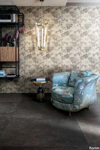
From the art of fabric, to enveloping spaces From lampas and jacquard, all the way to the simplest silk fabrics, from rich, baroque motifs to more optical, geometric patterns, all of these fabrics share an extremely natural look. The collection's nine surfaces are inspired by Rubelli's signature precious fabrics that, in turn, are born from the contemporary reworking of several decorative motifs coming from the noble Venetian heritage of weaving.<br />
Earthtech SAVANNAH_GROUND
florim > Wallcovering
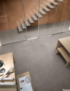
From an ancient past to a responsible future <p>The collection injects new life into the earth through a sustainable production process, with a strong focus on green management, to offer the architect an exceptional technical and aesthetic performance in compliance with the socio-environmental context and the latest eco-friendly building needs. With EARTHTECH earth becomes “technical earth” with a highly innovative content, offering new solutions to green architecture and fulfilling the new frontiers of circular economy in construction, guaranteeing a sustainable future. <br />EARTHTECH offers a choice of organic textures to observe and touch, thanks to the wide range of finishes (Comfort, Glossy-Bright and structured) which add a tactile and unexpected perceptive dimension for use in all types of application. <br /><a class="btn arrow" href="https://www.florim.com/en/surfaces/the-new-comfort-surface/"> Discover the new Comfort surface </a></p> <p>EARTHTECH/ is also a return to the origins of the Florim brand through a full body technical product that blends surface and thickness and derives from the spontaneous mixing of carefully pre-selected fragments and pigments of different shades which give the material a unique, one-of-a-kind visual effect in each slab, mimicking the amazing variety of colours and elements in nature. The result is a composite product with a textured design, in which the flakes and aggregate grains create an original mélange effect that is vitrified during firing, producing a robust, high-quality and exceptionally strong and wear-resistant product; one which can be used in any type of building setting and weather conditions, even the harshest.</p>
Sensi Ivory Sand
florim > Floor tile-stone
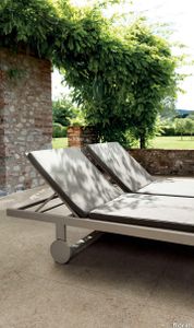
Lightness, Earth, Sensoriality The Sensi collection also features a <strong>decorative mosaic</strong> made from <strong>recycled glass</strong> made from disused TV and PC screens. This mosaic, manufactured by a <strong>process in which human hands play a role</strong>, has a distinctive surface structure. Due to the nature of the recycled glass and the production cycle, every tiny chip is different from the others, creating a <strong>dynamic surface.</strong> Soft, velvety or structured to the touch, it dialogues with the light and may become shiny or matte. This product also derives its uniqueness from its colour. <strong>Every chip is unique </strong>and has its own shades of the same tone. <p>Developed with close attention to environmental impact, "<em>Sensi</em>" is the perfect synthesis of innovation and sustainability and also a virtuous example of <strong>circular economy</strong>. The collection is made <strong>over 90% natural raw materials</strong> and up to 41%<strong> of recycled materials</strong>. "<em>Sensi</em>" is the result of <strong>up to 100% sustainable production process</strong>, both in terms of water consumption and self-generated electricity.</p>
Hi-Wood Dark oak
florim > Floor tile-stone
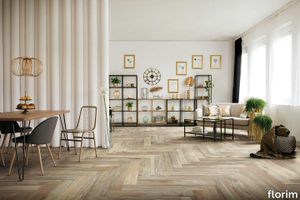
A new luster fills the home with the natural elegance of a timeless material. <p>From almond to gray and warm hues of walnut, Hi-Wood offers a deliberately limited range - two sizes and a single thickness - to emphasize the clean lines of the collection, perfectly suited to simple and minimal rooms. The range, which is extremely functional, will be available in five colors, two finishes (natural and glossy), two sizes and only one thickness of 9 mm.Hi-Wood is an understated, essential series whose uniqueness lies in the presence of a unique light variant, to date the only polished wood in the range.</p>
Chimera Empatia Bianco
florim > Wall tile-stone-brick
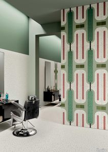
In <em>Chimera,</em> Elena Salmistraro merges rigour with self-expression, in a graphic grammar laden with symbolic meaning. <em>Empatia </em>speaks to the emotions with graphics that interpret, through a highly individual abstract code, the stage make-up of a clown, with the aid of superimposed geometric forms and images. <em>Radici </em>is a tribal statement, a tribute to primitive ritual custom, evoked by the interplay between a sequence of triangles and rectangles and a set of figurative fragments. <em>Ritmo</em> is inspired by fabrics, suggesting the rhythmic alternation of woven yarns through a largely linear pattern. In <em>Colore, </em>the upheaval of a background of small isolated spots generated by a parametric digital program is combined with densely packed repeated forms. "The Chimera collection is rather like a book with four different chapters: I set out to differentiate these graphic motifs to create four totally different stories."<br></br>Elena Salmistraro It all starts with drawing. A <em>passion</em> for drawing. An <em>obsession</em> with drawing. Drawings like spider-webs, obsessively filling spaces, in a kind of manual choreography or gymnastics, a continuous flow. Elena Salmistraro draws all the time. She draws everywhere. Mostly on loose sheets or random surfaces. First and foremost with pen and pencil. Her drawings only acquire colour at a later stage. Often - just like Alessandro Mendini used to do - she draws "monsters": fascinating yet disturbing, subversive forms. The denser, more contorted the shape, the more obvious its underlying truth. For Elena, drawing is an intimate act. It is relaxing. And therapeutic. With an unrivalled communicative strength. Because drawing gives shape to ideas: you both give form to the world and reveal yourself. This passion, combined with natural graphic talent, has guided Elena Salmistraro in her project for Cedit: an experimental series of ceramic slabs produced using a high-definition 3D decorative technique. The explicit aim is to transform surfaces beyond their original flatness so that a new, visual and tactile, three-dimensional personality emerges, sweeping aside the coldness and uniformity that ceramic objects often inevitably convey.Elena Salmistraro has always viewed ceramics as a democratic material, in view of their accessibility, and the infinite potentials for shaping matter that they provide. She began working and experimenting with ceramics very early in her career, just after she graduated from the Milan Politecnico in 2008. She came into contact with small artistic craft firms specialising in smallproduction lots, and cut her teeth on projects that demanded the hand-processing of every detail, and finishes of high artistic value, for the high end of the market. The large corporations and galleries came later, but here again Elena kept faith with her desire to make mass-produced pieces unique, and to combine artistic value with specifically industrial characteristics. The monkey-shaped <em>Primates</em> vases reflect this method and intention, aiming to excite, surprise and charm. Antiminimalist and hyper-figurative, playful, ironic and a rich image-maker, often drawing on anthropology and magic, over the years Salmistraro has built up her own fantastic universe, inhabited by ceramic bestiaries, painted jungles and a cabinet like a one-eyed cyclops , always finding inspiration and inputs in nature and always aiming to reveal the extraordinary in the everyday. Given this background, it was almost inevitable she would work with Cedit: constantly seeking new talents and new approaches, as well as designs that break down the boundaries of ceramics and release them into the realm of art and innovation, the Modena company has recognised Elena Salmistraro as a leading contemporary creative spirit and involved her in a project intended to experiment with fresh ideas in materials and synaesthetics.Salmistraro's collection for Cedit is entitled <em>Chimera</em> and consists of large ceramic slabs, which can be enjoyed not only visually, through their patterns and colours, but also on a tactile level. Like the chimera in the "grotesque" tradition, monstrous in the etymological sense of the word with its merging of hybrid animal and vegetable shapes, the Cedit project attempts to originate a synaesthetic form of ceramics, through a three-dimensional development that exactly reproduces the texture of leathers and fabrics, creating an absolutely new kind of layered effect, with a tactile awareness that recalls the passion of grand master Ettore Sottsass for "surfaces that talk". And the surfaces of the slabs Salmistraro has created really seem to talk: in <em>Empatia </em>clown faces add theatricality to the cold gleam of marbles, interspersed with references to Art Déco graphics; <em>Radici</em> uses the textures of leathers and hide as if to re-establish a link between ceramics and other materials at the origins of human activity and creativity; in <em>Ritmo</em> the texture of cloth dialogues with pottery, almost in homage to the tactile rationalism of warp and weft, of which Bauhaus pioneer Anni Albers was one of the most expressive past interpreters ; finally, <em>Colore</em> has a spotted base generated by computer to underline the contrast between analogue and digital, the graphic sign and the matter into which it is impressed. It is an aesthetic of superimposition and mixing, and especially of synaesthesia: as in her drawings, in the <em>Chimera </em>slabs Elena Salmistraro's art is one of movement and acceleration. A process not of representation but of exploration. Of the world and of oneself. Almost a kind of Zen, for distancing oneself from the world to understand it more fully. In every sense.
Artifact Aged_White

florim > Wallcovering
Artifact of Cerim refers to the simplicity of spatulated cement crafted by skilled hands, whose uniqueness becomes a distinctive feature, an identifying factor that reveals the taste of those who select it for their daily lives. <p> The collection is available in a thickness of 9 mm and offers two sizes (60x120 cm and 80x80 cm) with the relative modular sub-sizes (the 30x60 cm is also available in the <em>grip</em> outdoor finish). The graphic shade variations of the cement are declined in 6 different neutral shades ranging from white to coal through gray and beige.</p>
Timeless Amani Grey
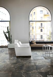
florim > Wall tile-stone-brick
The synthesis between purity, modernity and elegance Inspired by attractive marble surfaces, the porcelain stoneware collection brings back a style of immortal beauty that is expressed through eight texture interpretations matched with various thickness options and sizes, even large 80 x 80 and 80 x 240 sizes with 6 mm reduced thickness.
Industrial TAUPE
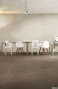
florim > Wallcovering
A cementitious material in its purest and most rigorous form The proposed decorative system defines balanced compositions of eye-catching organic shapes where the fragmentation of the material becomes an element of creative expression.
Sensi Ivory Dust

florim > Floor tile-stone
Lightness, Earth, Sensoriality The Sensi collection also features a <strong>decorative mosaic</strong> made from <strong>recycled glass</strong> made from disused TV and PC screens. This mosaic, manufactured by a <strong>process in which human hands play a role</strong>, has a distinctive surface structure. Due to the nature of the recycled glass and the production cycle, every tiny chip is different from the others, creating a <strong>dynamic surface.</strong> Soft, velvety or structured to the touch, it dialogues with the light and may become shiny or matte. This product also derives its uniqueness from its colour. <strong>Every chip is unique </strong>and has its own shades of the same tone. <p>Developed with close attention to environmental impact, "<em>Sensi</em>" is the perfect synthesis of innovation and sustainability and also a virtuous example of <strong>circular economy</strong>. The collection is made <strong>over 90% natural raw materials</strong> and up to 41%<strong> of recycled materials</strong>. "<em>Sensi</em>" is the result of <strong>up to 100% sustainable production process</strong>, both in terms of water consumption and self-generated electricity.</p>
Biotech Serizzo Stone
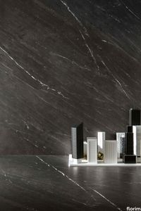
florim > Wall tile-stone-brick
<p>The Biotech collection by Florim embraces the principles of sustainable architecture. </p> <p>The collection is born from a sustainable and virtuous approach and is part of <a href="https://www.florim.com/en/company/sustainability/carbonzero-florim/">CarbonZero</a>, Florim's range of Carbon Neutral surfaces.</p> <p><br>Florim provides the scope to contribute to sustainable architecture projects with <strong>green design methods</strong>, proposing materials that are made with a particular focus on the energy efficiency of processes, removing pollutants, and selecting suppliers and stakeholders that can comply with the established quality parameters.</p> <p>Sustainable architecture could be described as <strong>contemporary organic architecture</strong>.<br>It means designing and constructing green, eco-friendly buildings, with the aim of protecting the environment and human well-being by taking an ethical stance towards ecosystems.<br>A systematic approach, the broadest possible interdisciplinarity and parsimonious use of resources all play a key part in the design process.<br>Sustainable architecture seeks to establish a balanced relationship between the natural environment and the built environment, satisfying the needs of the people of today without compromising future generations through indiscriminate use of resources.</p>
Nature Mood PLANK 01
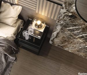
florim > Floor tile-stone
Marble and wood blend in a refined creative mood board. In line with the latest trends in housing evolution, Nature Mood conceives of Nature not only as a model, but also as a true mentor and gauge of human endeavor, something from which to acquire knowledge and with which to give life to increasingly environmentally friendly designs. <p>In this collection, Nature becomes an active component of design, mixing a palette of surfaces with warm hues that take their inspiration from the world of marbles and the material of wood, with clean, minimalist veining and an array of colors. The upshot is the attainment of elegant spaces that flow between interior and exterior, enhancing the presence of light so as to bestow a sensation of immersion in the natural environment at all times. The marble surfaces in the collection bring a new perspective to some of the most enchanting landscapes and natural binomials to be found on earth.</p> <p> </p> <p class="MsoNormal"><strong>COLORS AND DECORS</strong></p> <p class="MsoNormal"><span lang="EN-US" style="mso-ansi-language: EN-US;">The verdant backdrop of Rainforest is redolent of the vegetation of tropical woods, with thin brown veins that evoke the bark of a tree.</span></p> <p class="MsoNormal"><span lang="EN-US" style="mso-ansi-language: EN-US;">Glacier conjures up the whiteness of glaciers with delicate crests of light and dark gray.</span></p> <p class="MsoNormal"><span lang="EN-US" style="mso-ansi-language: EN-US;">Mountain Peak is inspired by the varied appearance and warm colors of mountain ranges in the summertime.</span></p> <p class="MsoNormal"><span lang="EN-US" style="mso-ansi-language: EN-US;">Tundra recalls the alternation of earth, shrubbery and snowfall that characterizes the homonymous Arctic polar environmental system.</span></p> <p class="MsoNormal"><span lang="EN-US" style="mso-ansi-language: EN-US;">And lastly, Riverbed is reminiscent of a gravelly river bottom with its multiplicity of stones smoothed by the flowing water.</span></p> <p class="MsoNormal"><span lang="EN-US" style="mso-ansi-language: EN-US;">The Planks 01, 02, 03, 04, 05 and 06 surfaces are the most combinable elements in the collection. Conceived as a color palette of woods with a clean, minimalist style, the Planks can generate different mood boards depending on the marble-effect surfaces with which they are juxtaposed, taking up the nuances of the veneers and affording the designer the option of personalizing both the interior spaces and the exterior shells of the buildings in accordance with his or her own creative taste.</span></p> <p class="MsoNormal"><span lang="EN-US" style="mso-ansi-language: EN-US;">The range of backgrounds is enriched by five 6 mm thick fine porcelain stoneware decors that combine the colors of different wood-inspired surfaces.</span></p> <p class="MsoNormal"><span lang="EN-US" style="mso-ansi-language: EN-US;">Hexagon offers a combination of 3 six-sided polygons, each of which in turn is divided into two different shades of wood. The composition is designed in two versions, the first combining the warm hues of Planks 01, 02 and 03, the second blending the cooler colors of Planks 04, 05 and 06.</span></p> <p class="MsoNormal"><span lang="EN-US" style="mso-ansi-language: EN-US;">French Herringbone immediately recalls the classic laying pattern for parquet flooring, in this case reformulated as an embellishment that alternates small slats in two colorings. The composition is available in two versions, one of which combines the amber shades of Planks 01 and 02, the other of which unites the gray tones of Planks 05 and 06.</span></p> <p class="MsoNormal"><span lang="EN-US" style="mso-ansi-language: EN-US;">Stripes offers an alternation of small strips in two colors. In this case, too, the range grants the designer the option of choosing between two variants, one that juxtaposes Planks 01 and 02, and one that combines Planks 05 and 06.</span></p> <p class="MsoNormal"><span lang="EN-US" style="mso-ansi-language: EN-US;">Strip consists of a plank with thin and elongated lines available in all the colors in the collection.</span></p> <p class="MsoNormal"><span lang="EN-US" style="mso-ansi-language: EN-US;">Finally, Chevron recalls the homonymous pattern of timeless charm. Here again the decor is offered in all 6 wood-effect colors of the collection.</span></p>
Onyx&More White Blend
florim > Wall tile-stone-brick
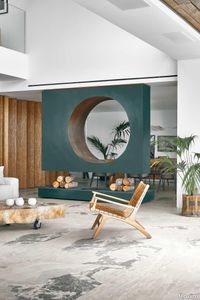
Chromatic blends and harmonious contrasts that only nature can bestow <p>Onyx&More explores the unexpected elegance of onyx: refined, luminous, and poetic, naturally embellished with porphyry, an unobtrusive and informal stone material. From nature, mysterious and unpredictable, is born a collection surging with expression that plays with the harmonious contrasts and the chromatic blend that only nature can create. </p>
Elemental Stone Grey Dolomia
florim > Wall tile-stone-brick
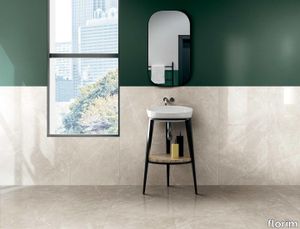
Essential, informal, versatile <p>Elemental Stone offers surfaces, in three shades, inspired by sedimentary rocks with their simple, polyhedral aesthetic, composed of granules and calcareous elements of different textures.</p> The minimalist appearance of the surfaces, depending on the finish and combination with furnishings, can bring life to different styles of space, meeting a classical taste or a trendier aesthetic, adapting perfectly to any personal preference.<br /> <br></br><a class="btn arrow" href="https://www.florim.com/en/new-tile-ranges/" target="_blank" rel="noopener">Discover all the new collections</a>
Atmosphères Harmonie
florim > Wall tile-stone-brick
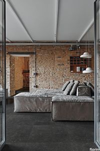
A collection of profound and mesmerising energy which conveys all the informal elegance of luxurious contemporary spaces Lightness and solidity, combined with a sophisticated colour scheme, evoke the sense of craftsmanship associated with this wonderful stone whose stratified fossils, trapped in the slender sediments formed over the centuries, embody its time-honoured yet contemporary beauty. Tradition and innovation therefore come together in a unique project, creating an attractive surface that respects the culture of places and the history of time.
I Filati Happy Hour Vaniglia

florim > Carpet
From the art of fabric, to enveloping spaces From lampas and jacquard, all the way to the simplest silk fabrics, from rich, baroque motifs to more optical, geometric patterns, all of these fabrics share an extremely natural look. The collection's nine surfaces are inspired by Rubelli's signature precious fabrics that, in turn, are born from the contemporary reworking of several decorative motifs coming from the noble Venetian heritage of weaving.<br />
Chimera Ritmo Beige

florim > Wallcovering
In <em>Chimera,</em> Elena Salmistraro merges rigour with self-expression, in a graphic grammar laden with symbolic meaning. <em>Empatia </em>speaks to the emotions with graphics that interpret, through a highly individual abstract code, the stage make-up of a clown, with the aid of superimposed geometric forms and images. <em>Radici </em>is a tribal statement, a tribute to primitive ritual custom, evoked by the interplay between a sequence of triangles and rectangles and a set of figurative fragments. <em>Ritmo</em> is inspired by fabrics, suggesting the rhythmic alternation of woven yarns through a largely linear pattern. In <em>Colore, </em>the upheaval of a background of small isolated spots generated by a parametric digital program is combined with densely packed repeated forms. "The Chimera collection is rather like a book with four different chapters: I set out to differentiate these graphic motifs to create four totally different stories."<br></br>Elena Salmistraro It all starts with drawing. A <em>passion</em> for drawing. An <em>obsession</em> with drawing. Drawings like spider-webs, obsessively filling spaces, in a kind of manual choreography or gymnastics, a continuous flow. Elena Salmistraro draws all the time. She draws everywhere. Mostly on loose sheets or random surfaces. First and foremost with pen and pencil. Her drawings only acquire colour at a later stage. Often - just like Alessandro Mendini used to do - she draws "monsters": fascinating yet disturbing, subversive forms. The denser, more contorted the shape, the more obvious its underlying truth. For Elena, drawing is an intimate act. It is relaxing. And therapeutic. With an unrivalled communicative strength. Because drawing gives shape to ideas: you both give form to the world and reveal yourself. This passion, combined with natural graphic talent, has guided Elena Salmistraro in her project for Cedit: an experimental series of ceramic slabs produced using a high-definition 3D decorative technique. The explicit aim is to transform surfaces beyond their original flatness so that a new, visual and tactile, three-dimensional personality emerges, sweeping aside the coldness and uniformity that ceramic objects often inevitably convey.Elena Salmistraro has always viewed ceramics as a democratic material, in view of their accessibility, and the infinite potentials for shaping matter that they provide. She began working and experimenting with ceramics very early in her career, just after she graduated from the Milan Politecnico in 2008. She came into contact with small artistic craft firms specialising in smallproduction lots, and cut her teeth on projects that demanded the hand-processing of every detail, and finishes of high artistic value, for the high end of the market. The large corporations and galleries came later, but here again Elena kept faith with her desire to make mass-produced pieces unique, and to combine artistic value with specifically industrial characteristics. The monkey-shaped <em>Primates</em> vases reflect this method and intention, aiming to excite, surprise and charm. Antiminimalist and hyper-figurative, playful, ironic and a rich image-maker, often drawing on anthropology and magic, over the years Salmistraro has built up her own fantastic universe, inhabited by ceramic bestiaries, painted jungles and a cabinet like a one-eyed cyclops , always finding inspiration and inputs in nature and always aiming to reveal the extraordinary in the everyday. Given this background, it was almost inevitable she would work with Cedit: constantly seeking new talents and new approaches, as well as designs that break down the boundaries of ceramics and release them into the realm of art and innovation, the Modena company has recognised Elena Salmistraro as a leading contemporary creative spirit and involved her in a project intended to experiment with fresh ideas in materials and synaesthetics.Salmistraro's collection for Cedit is entitled <em>Chimera</em> and consists of large ceramic slabs, which can be enjoyed not only visually, through their patterns and colours, but also on a tactile level. Like the chimera in the "grotesque" tradition, monstrous in the etymological sense of the word with its merging of hybrid animal and vegetable shapes, the Cedit project attempts to originate a synaesthetic form of ceramics, through a three-dimensional development that exactly reproduces the texture of leathers and fabrics, creating an absolutely new kind of layered effect, with a tactile awareness that recalls the passion of grand master Ettore Sottsass for "surfaces that talk". And the surfaces of the slabs Salmistraro has created really seem to talk: in <em>Empatia </em>clown faces add theatricality to the cold gleam of marbles, interspersed with references to Art Déco graphics; <em>Radici</em> uses the textures of leathers and hide as if to re-establish a link between ceramics and other materials at the origins of human activity and creativity; in <em>Ritmo</em> the texture of cloth dialogues with pottery, almost in homage to the tactile rationalism of warp and weft, of which Bauhaus pioneer Anni Albers was one of the most expressive past interpreters ; finally, <em>Colore</em> has a spotted base generated by computer to underline the contrast between analogue and digital, the graphic sign and the matter into which it is impressed. It is an aesthetic of superimposition and mixing, and especially of synaesthesia: as in her drawings, in the <em>Chimera </em>slabs Elena Salmistraro's art is one of movement and acceleration. A process not of representation but of exploration. Of the world and of oneself. Almost a kind of Zen, for distancing oneself from the world to understand it more fully. In every sense.
Extra Light Jade
florim > Floor tile-stone
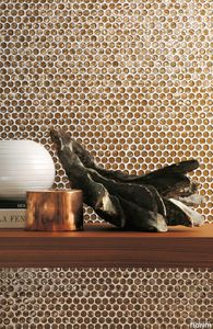
All around décor between light play and color. The Extra Light pallet is made up of a range of colors in 4.3 millimeter thickness that, thanks to the vast range of available colors, constitutes a transversal decorative element for all the brand's collections. Extra Light is therefore synonymous with surfaces that communicate, stimulate the senses and nourish the gaze, for boundless pleasure.
Crayons Primrose
florim > Synthetic Floor
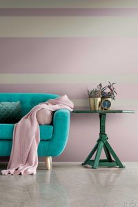
<p>Color and design through Contemporary Design's characteristic fresh and functional approach.</p> Eight pastel shades, designed to create both lively and balanced compositions, harmonize with each other and with the context. It moves from the dusty 1950s-inspired hues of dove-gray, hazelnut, pink, faded yellow and sky blue to the more decisive shades of dusty gray and moss green, all perfect for creating spaces with both retro style and contemporary character.
Industrial Plomb

florim > Wallcovering
A cementitious material in its purest and most rigorous form The proposed decorative system defines balanced compositions of eye-catching organic shapes where the fragmentation of the material becomes an element of creative expression.
Buildtech/2.0 Mustard
florim > Synthetic Floor
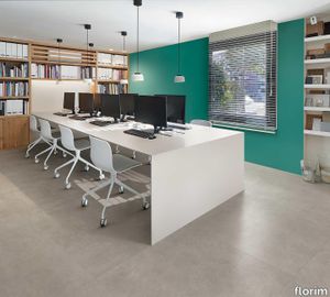
Buildtech/2.0 assures the realization of ever-current projects To the four colors, White, Bone, Mud and Coal in Tinta Unita, Granigliata and Cemento, 10 solid bold colors are being added, only intensifying the "brutality".<br />
Sensi Taupe Dust

florim > Floor tile-stone
Lightness, Earth, Sensoriality The Sensi collection also features a <strong>decorative mosaic</strong> made from <strong>recycled glass</strong> made from disused TV and PC screens. This mosaic, manufactured by a <strong>process in which human hands play a role</strong>, has a distinctive surface structure. Due to the nature of the recycled glass and the production cycle, every tiny chip is different from the others, creating a <strong>dynamic surface.</strong> Soft, velvety or structured to the touch, it dialogues with the light and may become shiny or matte. This product also derives its uniqueness from its colour. <strong>Every chip is unique </strong>and has its own shades of the same tone. <p>Developed with close attention to environmental impact, "<em>Sensi</em>" is the perfect synthesis of innovation and sustainability and also a virtuous example of <strong>circular economy</strong>. The collection is made <strong>over 90% natural raw materials</strong> and up to 41%<strong> of recycled materials</strong>. "<em>Sensi</em>" is the result of <strong>up to 100% sustainable production process</strong>, both in terms of water consumption and self-generated electricity.</p>
Heritage Luxe Heritage Brown
florim > Wall tile-stone-brick
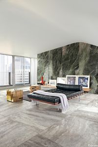
Heritage Luxe can be said to exemplify the magnitude of our inheritance from the past which at the same time is part of our present. In keeping with modern times, the surfaces of the collection have a strong decorative character and bring the heritage of the European tradition up to date by proposing a stylistic concept inspired by the beauty and classic luxury of marble that blends with the dynamism of veining and colors of a contemporary flavor. <p>Memory, the heritage of the past and the most up-to-date taste all unite in a single dimension in which the iconic objects and furnishings of yesteryear coexist with the most contemporary luxury of modern times to transform the atmosphere of the surroundings into something unique and instantly recognizable. The collection features marble surfaces in bold, refined colors that add immense personality and character to the most exclusive of spaces. The richness of colors and graphic details of these products finds its maximum expression in the large sizes, designed to blend in with increasingly voguish large open spaces, or to illuminate more intimate surroundings.</p> <p> </p> <p class="MsoNormal"><strong><span lang="EN-US" style="mso-ansi-language: EN-US;">COLORS AND DECORS</span></strong></p> <p class="MsoNormal"><span lang="EN-US" style="mso-ansi-language: EN-US;">Heritage Azure is distinguished by a pale, refined blue background against which a deep rust-colored vein stands out, making it perfect for pairing with warm-toned colors and materials.</span></p> <p class="MsoNormal"><span lang="EN-US" style="mso-ansi-language: EN-US;">Heritage Cloud is the most versatile surface in the collection. Characterized by different streaks of grey, this graphic can be perfectly matched with both warm and cool colored materials.</span></p> <p class="MsoNormal"><span lang="EN-US" style="mso-ansi-language: EN-US;">The soft, enveloping base of Heritage Brown is reminiscent of Spanish marble, distinguished by subtle and barely noticeable white veins.</span></p> <p class="MsoNormal"><span lang="EN-US" style="mso-ansi-language: EN-US;">Heritage Emerald brings to mind the rolling hills of Ireland. Shades ranging from dark to light green with dashes of brown and white congregate on its surface.</span></p> <p class="MsoNormal"><span lang="EN-US" style="mso-ansi-language: EN-US;">Heritage Aqua is a surprising surface that emerges from the encounter of contrasting shades of teal and white, embellished with sophisticated orange veins.</span></p> <p class="MsoNormal">Lastly, Heritage Flame bears witness to an encounter between delicate shades of brown and dashes of cream.</p> <p class="MsoNormal"><span lang="EN-US" style="mso-ansi-language: EN-US;">The array of backgrounds is accompanied by three 6 mm thick colored-body porcelain stoneware decors that combine the different shapes and graphics of the slabs in the range, thus delineating an enchanting continuity of colors and veining within the space.</span></p> <p class="MsoNormal"><span lang="EN-US" style="mso-ansi-language: EN-US;">The Picket decor juxtaposes the trapezoidal glossy Heritage Emerald and Heritage Cloud slabs to craft a refined composition with clean, contemporary lines.</span></p> <p class="MsoNormal"><span lang="EN-US" style="mso-ansi-language: EN-US;">The Maze decor, composed of a range of small Heritage Emerald, Heritage Brown and Heritage Flame trapezoids, catches the eye with its harmonious concentric motifs.</span></p> <p class="MsoNormal"><span lang="EN-US" style="mso-ansi-language: EN-US;">Finally, the Trinity decor features three sinuously arched, glossy finish strips in the Heritage Azure graphic.</span></p>
Atmosphères Ombre

florim > Wall tile-stone-brick
A collection of profound and mesmerising energy which conveys all the informal elegance of luxurious contemporary spaces Lightness and solidity, combined with a sophisticated colour scheme, evoke the sense of craftsmanship associated with this wonderful stone whose stratified fossils, trapped in the slender sediments formed over the centuries, embody its time-honoured yet contemporary beauty. Tradition and innovation therefore come together in a unique project, creating an attractive surface that respects the culture of places and the history of time.
Les Origines Origines Blanc
florim > Wall tile-stone-brick
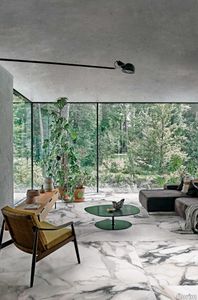
The splendour of our origins becomes a contemporary lifestyle <p> Les Origines explores the candour and eternal beauty of this pristine material with new aesthetic solutions that interpret the many facets of contemporary lifestyles. The results of this exceptional research work can be seen in four sophisticated varieties of white marble. Thin but notable vein patterns and new shapes are exalted by the nuances of old gold, ivory, pearl grey and graphite, embellishing its fine surfaces.</p>
Extra Light Mou

florim > Floor tile-stone
All around décor between light play and color. The Extra Light pallet is made up of a range of colors in 4.3 millimeter thickness that, thanks to the vast range of available colors, constitutes a transversal decorative element for all the brand's collections. Extra Light is therefore synonymous with surfaces that communicate, stimulate the senses and nourish the gaze, for boundless pleasure.
Coretech Satin Dark
florim > Wall tile-stone-brick
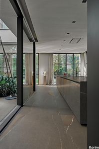
<p>Florim’s Coretech collection takes Piasentina stone quarried in the foothills of the Julian Alps and enhances its performance to cater to the needs of contemporary architecture.</p> <p>Piasentina stone is ideally suited to the creation of relief textures and finishes using traditional methods and age-old techniques.<br>Different types of processing give different colours and feels to this natural stone, thus making it possible to put together numerous combinations using the same material. </p> <p>Piasentina stone’s name means “pleasing stone” in Friulian. It has been known since ancient Roman times and it is now highly sought after in architecture in Italy and internationally due to the shades of colour and versatility it can offer indoors and outdoors, on both urban floors and walls.</p> <p><br>It stands out not only due to its distinctive feel but also thanks to its refined <strong>grey tones </strong>with slender white veins and little brownish tinges.</p> <p><br>It is a stone that can conjure up all sorts of emotional responses, making it a popular choice among interior designers and architects across the globe. It has played a central role in numerous constructions over the centuries, including churches, palaces, villas, rural buildings and flooring. It was used by figures such as the Renaissance master Andrea Palladio and Raimondo D’Aronco in the Art Nouveau period and it continues to be employed in 21st century architecture and design.</p>
Crayons Skyline

florim > Synthetic Floor
<p>Color and design through Contemporary Design's characteristic fresh and functional approach.</p> Eight pastel shades, designed to create both lively and balanced compositions, harmonize with each other and with the context. It moves from the dusty 1950s-inspired hues of dove-gray, hazelnut, pink, faded yellow and sky blue to the more decisive shades of dusty gray and moss green, all perfect for creating spaces with both retro style and contemporary character.
Buildtech/2.0 Burgundy

florim > Synthetic Floor
Buildtech/2.0 assures the realization of ever-current projects To the four colors, White, Bone, Mud and Coal in Tinta Unita, Granigliata and Cemento, 10 solid bold colors are being added, only intensifying the "brutality".<br />
Buildtech/2.0 Build White TU

florim > Wallcovering
Buildtech/2.0 assures the realization of ever-current projects To the four colors, White, Bone, Mud and Coal in Tinta Unita, Granigliata and Cemento, 10 solid bold colors are being added, only intensifying the "brutality".<br />
Sensi Taupe Sand

florim > Floor tile-stone
Lightness, Earth, Sensoriality The Sensi collection also features a <strong>decorative mosaic</strong> made from <strong>recycled glass</strong> made from disused TV and PC screens. This mosaic, manufactured by a <strong>process in which human hands play a role</strong>, has a distinctive surface structure. Due to the nature of the recycled glass and the production cycle, every tiny chip is different from the others, creating a <strong>dynamic surface.</strong> Soft, velvety or structured to the touch, it dialogues with the light and may become shiny or matte. This product also derives its uniqueness from its colour. <strong>Every chip is unique </strong>and has its own shades of the same tone. <p>Developed with close attention to environmental impact, "<em>Sensi</em>" is the perfect synthesis of innovation and sustainability and also a virtuous example of <strong>circular economy</strong>. The collection is made <strong>over 90% natural raw materials</strong> and up to 41%<strong> of recycled materials</strong>. "<em>Sensi</em>" is the result of <strong>up to 100% sustainable production process</strong>, both in terms of water consumption and self-generated electricity.</p>
Antique Marble Imperial Marble_04
florim > Wall tile-stone-brick
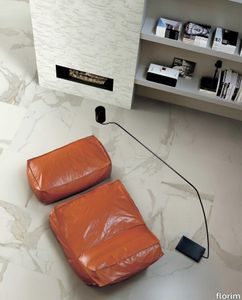
Six essences inspired by the beauty of marble become stylistic shades to create modern and functional environments The collection is available in various finishes and sizes suitable for private spaces and the light commercial world with shades that go from white to beige, from grey to desaturated black.
Tesori Broccato grigio
florim > Wallcovering
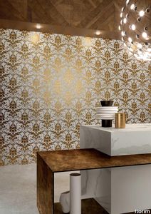
East and West, a synthesis archieved through Italian taste. «My work often takes me to far-off lands, also remote in terms of their culture and traditions. Even without my being aware of it, I then metabolise these traditions and include them in the designs I subsequently produce.» Matteo Nunziati <p>"It is the architect's task to create a warm, livable space. Carpets are warm and livable. He decides for this reason to spread one carpet on the floor and to hang up four to form the four walls. But you cannot build a house out of carpets. Both the carpet and the floor and the tapestry on the wall required structural frame to hold them in the correct place. To invent this frame is the architect's second task."When Adolf Loos wrote his revolutionary essay on the "principle of cladding" in 1898, architecture was just entering the modern age. Building meant imagining structures capable of putting together different materials, but, Loos affirmed, it must also respect their individual characteristics. "Every material possesses a formal language which belongs to it alone and no material can take on the forms proper to another", the Austrian master therefore maintained. And there is no doubt that the spirit of these words extended throughout most Twentieth Century architecture, regardless of its location or style. When we look at Matteo Nunziati's designs for the CEDIT Tesori collection, we seem to be seeing geometrical purity and attention to detail at the service of a new "truth" of material. Because Matteo Nunziati views ceramics as a form of fabric.<br /> The woven patterns he imagines for the various styles in his collection "“ from Arabian to damask to more geometrical motifs "“ constantly seek to provide the soft, iridescent look of time-worn linen. In them, ceramics are raised from the status of poor relation of marble to become a luxury wall covering in their own right: almost a wallpaper, suitable however for both floors and walls, and an absolutely versatile material. No longer only for beautifying bathrooms, they can create new moods in every room of the house (and elsewhere) starting from the living-room. Naturally, the revolution has been mainly technological. The large slabs produced by CEDIT are more than 3 metres tall, and since they eliminate the serial repetition typical of conventional tiles, they generate a new relationship between the surface and its decoration. However, Nunziati does not use this to create, artist-like, a more eye-catching decorative composition that emphasises the slab's dimensions. Quite the opposite; the patterns he offers us attempt to break down what is left of the boundaries between substrates. In particular, the Arabian and damask styles, in the version with "timeworn" patterning, convey the idea of the ceramic slab as an abstract, almost non-existent material which melts into the decorative motif applied to it, in a kind of pure wall covering.<br /> Through the patient selection of geometrical motifs and tests to verify their suitability for application to ceramic slabs, Nunziati aims to achieve a new material rather than a mere decoration, making this clear by also exploring its tactile dimension, with gouged and relief motifs. His "principle of coverings" therefore relates to ceramics' essence rather than their image: highlighting the versatility which, as we all know, has made ceramics an absolute material, a kind of cement that incorporates structure and finish in a virtually infinite range of applications. This is clearly indicated by the reference to the mashrabiya, a term meaning place where people drink in Arabic, which in Arabian architecture originally referred to the kind of veranda where people used to meet and rest, and over time has come to mean the wooden gratings that screened these places from the sun. Inspired by his trips to the Middle East, for Nunziati the geometric patterns of the mashrabiya become both an outline of his method of work and the form of what in fact becomes the key element in a new idea of space: a real location conceived around a strong, livable surface in which physical substance and decoration overlap to the point where they merge.</p>
Sensi White Dust

florim > Floor tile-stone
Lightness, Earth, Sensoriality The Sensi collection also features a <strong>decorative mosaic</strong> made from <strong>recycled glass</strong> made from disused TV and PC screens. This mosaic, manufactured by a <strong>process in which human hands play a role</strong>, has a distinctive surface structure. Due to the nature of the recycled glass and the production cycle, every tiny chip is different from the others, creating a <strong>dynamic surface.</strong> Soft, velvety or structured to the touch, it dialogues with the light and may become shiny or matte. This product also derives its uniqueness from its colour. <strong>Every chip is unique </strong>and has its own shades of the same tone. <p>Developed with close attention to environmental impact, "<em>Sensi</em>" is the perfect synthesis of innovation and sustainability and also a virtuous example of <strong>circular economy</strong>. The collection is made <strong>over 90% natural raw materials</strong> and up to 41%<strong> of recycled materials</strong>. "<em>Sensi</em>" is the result of <strong>up to 100% sustainable production process</strong>, both in terms of water consumption and self-generated electricity.</p>
Onyx&More Golden Blend

florim > Wall tile-stone-brick
Chromatic blends and harmonious contrasts that only nature can bestow <p>Onyx&More explores the unexpected elegance of onyx: refined, luminous, and poetic, naturally embellished with porphyry, an unobtrusive and informal stone material. From nature, mysterious and unpredictable, is born a collection surging with expression that plays with the harmonious contrasts and the chromatic blend that only nature can create. </p>
Essential Mood Cool Powder 02
florim > Wall Paint
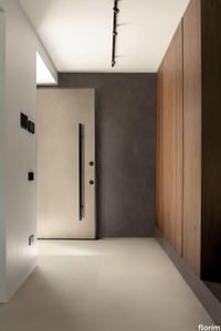
<p>A sense of essentiality emerges from the visual and tactile sensations fused in this Creative Design collection.</p> <p>The distinguishing features of the Essential Mood design are fluid surfaces, material qualities and full bodies that extend without boundaries, promoting a harmonious flow between spaces and constant interplay between environments and the people in them. It makes places into cosy, reassuring refuges where they can take centre stage.</p> <p><br>Produced for interior design schemes, housing and commercial premises, the collection espouses warm, timeless atmospheres where people can recharge their batteries and get onto the same wavelength as the world around them.<br>Spaces with neutral, comforting colours and natural features come together in a design that underlines the need for everyone to look after themselves and seek revitalizing experiences, now and in the future.</p> <p>The collection is born from a sustainable and virtuous approach and is part of <a href="https://www.florim.com/en/company/sustainability/carbonzero-florim/">CarbonZero</a>, Florim's range of Carbon Neutral surfaces.</p>
Rock Salt Maui Green
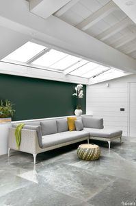
florim > Wall tile-stone-brick
<p>With Rock Salt, it's possible to create comfortable spaces where you can find peace away from the frenzy of daily life </p> <p>The range offers 5 different chromatic variations enriched with desaturated, deep, and defined veining. Fresh shades, like that of the white, gray, and sage colors, are accompanied by warmer tones, like the dove gray and red, returning the allure of the luster or tactile materiality of natural crystals, depending on their finish.</p>
Stontech/4.0 STONE_05
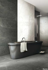
florim > Wall tile-stone-brick
New surfaces, new sizes and three different finishes are the trademarks of a line that is contemporary and attentive to detail. Two marbles with a high-gloss finish bestow fragments of light on the series and the large sizes of the Magnum Oversize family, available in four colors, are suitable for creating unique volumes.
Matrice Forma
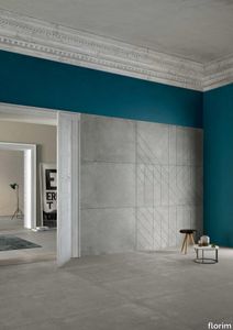
florim > Wallcovering
An atlas of modular signs to be combined in a wide variety of layouts. «We love concrete as a material, its versatility and its plain, austere look. We have completed our carefully designed surfaces with graphic patterning inspired by the human actions of weaving and embroidering.» Barbara Brondi & Marco Rainò To appreciate the profundity of the design project undertaken by Barbara Brondi and Marco Rainò for Cedit, it is both necessary and explanatory to start from the title the collection bears. In modern usage the term Matrice, in Italian, refers to a die or mould used to reproduce an object, but its origins are much more remote, with a meaning closer to the English “matrix”, meaning the underlying basis of something. The root of the word is related to Mater or mother: the name Matrice thus relates to the origin or cause of something. This dichotomy is expressed in several levels within the work of these architects, who study the world from a sophisticated conceptual approach and then transform it into a design. Starting from the idea of ceramic coverings, which have always been a tool not so much of architecture as of interior design, the artists work back to the origin of the surface and its decoration within their own discipline: they look at what we used to call the modern age, where modernity has also brought an uncompromising brutality, and where the use of bare concrete became the statement of an attitude to life with no time to spare for manners. Concrete is originally a liquid material, intended for shaping, which can therefore absorb and retain any type of mark created by the material and mould used to form it. Architects midway between rationalism and brutalism have used the rough-and-ready language of concrete combined with a last, elegant, anthropic decorative motif impressed on the material, that makes the concept of covering superfluous, because its place, in its older meaning of decoration rather than functional cladding, is taken by the regular patterning created in the material itself. There are therefore various grounds for believing that, in this collection, the artists are once again working in architectural terms. Firstly, with a simplicity typical of BRH+, they reduce the initial concepts to their minimal terms. So although this is a collection of coverings for walls, indoor floors, outdoor pavings and curtain walls, a great deal of time was spent on destructuring the idea of the ceramic covering itself. Unfortunately, nowadays there is no space in the contemporary construction sector for the radical approach of the past, so the cladding designed for the building actually lays bare the interior, using the choice of material – accurately interpreted (with shade variation) on the basis of an assortment of various types – to restore visual elegance and a fundamental severity. Attention to scale is another architectural feature: Matrice offers modules with architectural dimensions and different sizes through the development of “large slabs”, eliminating the visual regular grid effect. Thanks to this visual reset, geographic forms are perceived to emerge from dense, grey concrete surfaces decorated as in bygone days by special processes and by weathering during drying. The various types of slab, each an atlas of subtle, vibrant signs on the surfaces, comprise finishes that reproduce the visual effect of reinforced concrete – with the aggregates in the cement more clearly visible, of formwork – with the signs impressed on the concrete by the timber used, of a structured surface resembling bare cement plaster, of ridged and streaked surfaces – with patterning resembling some kinds of linear surface finishing processes – and finally a smooth, or basic version, over which Matrice exercises the dichotomy referred to earlier. It is on these surfaces that Brondi and Rainò have imagined additional design reverberations, a figurative code that rejects the concept of the grid, previously inseparable from that of the module: by means of a vocabulary of graphic marks cut into the slabs with a depth of 3 mm (the width of the gap left between modules during installation), they provide a framework for infinite combinations of possible dialogues. Just as in embroidery, which is based on grids of stitches and geometric repetitions, and where every stitch is at right-angles to another one to construct forms and decorations. Also taken from embroidery is the idea of introducing a degree of “softness” to reduce the stiffness of intentionally deaf surfaces. There is the impression of patterns that can continue for infinity, as in textile weaving, and a scale that, unlike the surface being worked on, is imagined as suspended and lightweight. They may not admit it, but BRH+ know a lot about music, including electronic music, and it appears to me that this organised tangle of infinite signs – unidentifiable without an overview – is rather like the representations of synthesized sounds. Sounds that are produced by machines, and thus “woven” by sampling and overlapping sounds of the most unlikely origins, combined to form jingles which, once heard, are imprinted indelibly on the brain. This may be why I am so interested in the space between this “melodic film” and its deaf, damp substrate. The eyes can navigate this suspended reality without fear of disturbance. So we are faced with different surfaces, different sizes and different graphic signs. But only one colour (surprise!) to prevent a cacophony not just of signs but also of possible interpretations: the artists retain their radical principles (and their generosity), and as curators, a role in which they are skilled, they leave the players (architects and installers) to add their own interpretations. In their hands this colour, expressed in Matrice, will produce motifs on surfaces in living spaces for someone else. This stylish covering and its workmanship will be left to the hands of someone who will probably never read this, but will be on a building site, with the radio playing on a stereo system, concentrating on installing the very pieces we describe. So a radical, apparently silent, design project like this has repercussions for the real world we live in. Matrice has no form of its own but merely acquires the ornamentation drawn on its surfaces by a second group of artists. And here this routine action, standardised by the form approved for production and workmanlike efficiency, is the origin and cause of change, generating a variability of choices and interpretations, on that dusty building site where music plays and mortar flows.
Chimera Radici Grigio

florim > Wallcovering
In <em>Chimera,</em> Elena Salmistraro merges rigour with self-expression, in a graphic grammar laden with symbolic meaning. <em>Empatia </em>speaks to the emotions with graphics that interpret, through a highly individual abstract code, the stage make-up of a clown, with the aid of superimposed geometric forms and images. <em>Radici </em>is a tribal statement, a tribute to primitive ritual custom, evoked by the interplay between a sequence of triangles and rectangles and a set of figurative fragments. <em>Ritmo</em> is inspired by fabrics, suggesting the rhythmic alternation of woven yarns through a largely linear pattern. In <em>Colore, </em>the upheaval of a background of small isolated spots generated by a parametric digital program is combined with densely packed repeated forms. "The Chimera collection is rather like a book with four different chapters: I set out to differentiate these graphic motifs to create four totally different stories."<br></br>Elena Salmistraro It all starts with drawing. A <em>passion</em> for drawing. An <em>obsession</em> with drawing. Drawings like spider-webs, obsessively filling spaces, in a kind of manual choreography or gymnastics, a continuous flow. Elena Salmistraro draws all the time. She draws everywhere. Mostly on loose sheets or random surfaces. First and foremost with pen and pencil. Her drawings only acquire colour at a later stage. Often - just like Alessandro Mendini used to do - she draws "monsters": fascinating yet disturbing, subversive forms. The denser, more contorted the shape, the more obvious its underlying truth. For Elena, drawing is an intimate act. It is relaxing. And therapeutic. With an unrivalled communicative strength. Because drawing gives shape to ideas: you both give form to the world and reveal yourself. This passion, combined with natural graphic talent, has guided Elena Salmistraro in her project for Cedit: an experimental series of ceramic slabs produced using a high-definition 3D decorative technique. The explicit aim is to transform surfaces beyond their original flatness so that a new, visual and tactile, three-dimensional personality emerges, sweeping aside the coldness and uniformity that ceramic objects often inevitably convey.Elena Salmistraro has always viewed ceramics as a democratic material, in view of their accessibility, and the infinite potentials for shaping matter that they provide. She began working and experimenting with ceramics very early in her career, just after she graduated from the Milan Politecnico in 2008. She came into contact with small artistic craft firms specialising in smallproduction lots, and cut her teeth on projects that demanded the hand-processing of every detail, and finishes of high artistic value, for the high end of the market. The large corporations and galleries came later, but here again Elena kept faith with her desire to make mass-produced pieces unique, and to combine artistic value with specifically industrial characteristics. The monkey-shaped <em>Primates</em> vases reflect this method and intention, aiming to excite, surprise and charm. Antiminimalist and hyper-figurative, playful, ironic and a rich image-maker, often drawing on anthropology and magic, over the years Salmistraro has built up her own fantastic universe, inhabited by ceramic bestiaries, painted jungles and a cabinet like a one-eyed cyclops , always finding inspiration and inputs in nature and always aiming to reveal the extraordinary in the everyday. Given this background, it was almost inevitable she would work with Cedit: constantly seeking new talents and new approaches, as well as designs that break down the boundaries of ceramics and release them into the realm of art and innovation, the Modena company has recognised Elena Salmistraro as a leading contemporary creative spirit and involved her in a project intended to experiment with fresh ideas in materials and synaesthetics.Salmistraro's collection for Cedit is entitled <em>Chimera</em> and consists of large ceramic slabs, which can be enjoyed not only visually, through their patterns and colours, but also on a tactile level. Like the chimera in the "grotesque" tradition, monstrous in the etymological sense of the word with its merging of hybrid animal and vegetable shapes, the Cedit project attempts to originate a synaesthetic form of ceramics, through a three-dimensional development that exactly reproduces the texture of leathers and fabrics, creating an absolutely new kind of layered effect, with a tactile awareness that recalls the passion of grand master Ettore Sottsass for "surfaces that talk". And the surfaces of the slabs Salmistraro has created really seem to talk: in <em>Empatia </em>clown faces add theatricality to the cold gleam of marbles, interspersed with references to Art Déco graphics; <em>Radici</em> uses the textures of leathers and hide as if to re-establish a link between ceramics and other materials at the origins of human activity and creativity; in <em>Ritmo</em> the texture of cloth dialogues with pottery, almost in homage to the tactile rationalism of warp and weft, of which Bauhaus pioneer Anni Albers was one of the most expressive past interpreters ; finally, <em>Colore</em> has a spotted base generated by computer to underline the contrast between analogue and digital, the graphic sign and the matter into which it is impressed. It is an aesthetic of superimposition and mixing, and especially of synaesthesia: as in her drawings, in the <em>Chimera </em>slabs Elena Salmistraro's art is one of movement and acceleration. A process not of representation but of exploration. Of the world and of oneself. Almost a kind of Zen, for distancing oneself from the world to understand it more fully. In every sense.
Chimera Radici Beige

florim > Wallcovering
In <em>Chimera,</em> Elena Salmistraro merges rigour with self-expression, in a graphic grammar laden with symbolic meaning. <em>Empatia </em>speaks to the emotions with graphics that interpret, through a highly individual abstract code, the stage make-up of a clown, with the aid of superimposed geometric forms and images. <em>Radici </em>is a tribal statement, a tribute to primitive ritual custom, evoked by the interplay between a sequence of triangles and rectangles and a set of figurative fragments. <em>Ritmo</em> is inspired by fabrics, suggesting the rhythmic alternation of woven yarns through a largely linear pattern. In <em>Colore, </em>the upheaval of a background of small isolated spots generated by a parametric digital program is combined with densely packed repeated forms. "The Chimera collection is rather like a book with four different chapters: I set out to differentiate these graphic motifs to create four totally different stories."<br></br>Elena Salmistraro It all starts with drawing. A <em>passion</em> for drawing. An <em>obsession</em> with drawing. Drawings like spider-webs, obsessively filling spaces, in a kind of manual choreography or gymnastics, a continuous flow. Elena Salmistraro draws all the time. She draws everywhere. Mostly on loose sheets or random surfaces. First and foremost with pen and pencil. Her drawings only acquire colour at a later stage. Often - just like Alessandro Mendini used to do - she draws "monsters": fascinating yet disturbing, subversive forms. The denser, more contorted the shape, the more obvious its underlying truth. For Elena, drawing is an intimate act. It is relaxing. And therapeutic. With an unrivalled communicative strength. Because drawing gives shape to ideas: you both give form to the world and reveal yourself. This passion, combined with natural graphic talent, has guided Elena Salmistraro in her project for Cedit: an experimental series of ceramic slabs produced using a high-definition 3D decorative technique. The explicit aim is to transform surfaces beyond their original flatness so that a new, visual and tactile, three-dimensional personality emerges, sweeping aside the coldness and uniformity that ceramic objects often inevitably convey.Elena Salmistraro has always viewed ceramics as a democratic material, in view of their accessibility, and the infinite potentials for shaping matter that they provide. She began working and experimenting with ceramics very early in her career, just after she graduated from the Milan Politecnico in 2008. She came into contact with small artistic craft firms specialising in smallproduction lots, and cut her teeth on projects that demanded the hand-processing of every detail, and finishes of high artistic value, for the high end of the market. The large corporations and galleries came later, but here again Elena kept faith with her desire to make mass-produced pieces unique, and to combine artistic value with specifically industrial characteristics. The monkey-shaped <em>Primates</em> vases reflect this method and intention, aiming to excite, surprise and charm. Antiminimalist and hyper-figurative, playful, ironic and a rich image-maker, often drawing on anthropology and magic, over the years Salmistraro has built up her own fantastic universe, inhabited by ceramic bestiaries, painted jungles and a cabinet like a one-eyed cyclops , always finding inspiration and inputs in nature and always aiming to reveal the extraordinary in the everyday. Given this background, it was almost inevitable she would work with Cedit: constantly seeking new talents and new approaches, as well as designs that break down the boundaries of ceramics and release them into the realm of art and innovation, the Modena company has recognised Elena Salmistraro as a leading contemporary creative spirit and involved her in a project intended to experiment with fresh ideas in materials and synaesthetics.Salmistraro's collection for Cedit is entitled <em>Chimera</em> and consists of large ceramic slabs, which can be enjoyed not only visually, through their patterns and colours, but also on a tactile level. Like the chimera in the "grotesque" tradition, monstrous in the etymological sense of the word with its merging of hybrid animal and vegetable shapes, the Cedit project attempts to originate a synaesthetic form of ceramics, through a three-dimensional development that exactly reproduces the texture of leathers and fabrics, creating an absolutely new kind of layered effect, with a tactile awareness that recalls the passion of grand master Ettore Sottsass for "surfaces that talk". And the surfaces of the slabs Salmistraro has created really seem to talk: in <em>Empatia </em>clown faces add theatricality to the cold gleam of marbles, interspersed with references to Art Déco graphics; <em>Radici</em> uses the textures of leathers and hide as if to re-establish a link between ceramics and other materials at the origins of human activity and creativity; in <em>Ritmo</em> the texture of cloth dialogues with pottery, almost in homage to the tactile rationalism of warp and weft, of which Bauhaus pioneer Anni Albers was one of the most expressive past interpreters ; finally, <em>Colore</em> has a spotted base generated by computer to underline the contrast between analogue and digital, the graphic sign and the matter into which it is impressed. It is an aesthetic of superimposition and mixing, and especially of synaesthesia: as in her drawings, in the <em>Chimera </em>slabs Elena Salmistraro's art is one of movement and acceleration. A process not of representation but of exploration. Of the world and of oneself. Almost a kind of Zen, for distancing oneself from the world to understand it more fully. In every sense.
Les Bijoux Jaspe Rouge
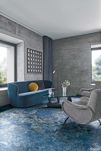
florim > Wall tile-stone-brick
<p>The artistic allure of jewel surfaces </p> <p>The collection's true inspiration is found in different sources of artistic outlook, interpreted according to a wider meaning: noble minerals such as onyx, red jasper and sodalite skillfully worked to create refined, artisanal jewels, magnificent marbles used in the creation of important architecture and sculptures, even paintings by renowned artists.</p>
Crayons MIST

florim > Synthetic Floor
<p>Color and design through Contemporary Design's characteristic fresh and functional approach.</p> Eight pastel shades, designed to create both lively and balanced compositions, harmonize with each other and with the context. It moves from the dusty 1950s-inspired hues of dove-gray, hazelnut, pink, faded yellow and sky blue to the more decisive shades of dusty gray and moss green, all perfect for creating spaces with both retro style and contemporary character.
Vetro Cobalto
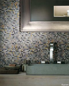
florim > Floor tile-stone
Each tile is unique and extremely precious Vetro allows recognizable and attractive decorations to be created, expressing a timeless design. The Vetro collection is available in seven solid, warm, soft and enchanting colors, in two finishes - matt and lux - and in two sizes or in the metallic variation with varying reflections in a single size. VETRO can be applied as a floor and wall application on any surface in dry or damp areas using special sealants and adhesives.
Studios Rubber
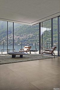
florim > Wallcovering
<p>Studios, with its sophisticated but discrete personality, defines the evolutionary path of modern cement-inspired surfaces for interior architecture.</p> <p>The structure of the surfaces, delicately textured, suggests the effect of the manual skill and plasticity of the hand crafted finish. Essential but intense, it is highlighted by meeting natural or artificial light. </p>
Buildtech/2.0 Sky

florim > Synthetic Floor
Buildtech/2.0 assures the realization of ever-current projects To the four colors, White, Bone, Mud and Coal in Tinta Unita, Granigliata and Cemento, 10 solid bold colors are being added, only intensifying the "brutality".<br />
Match-Up Earl Grey Mix
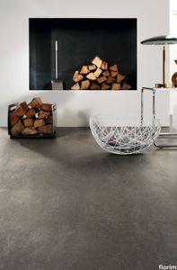
florim > Wall tile-stone-brick
The union of two different materials has resulted in a contemporary, trendy project that mixes surfaces, colours and languages to offer original combinations. <p>There are two basic surfaces that can be used to create multiple combinations in line with fashions and lifestyle trends: a concrete effect with an urban and industrial aesthetic and an original marble agglomerate effect that blends tone-on- tone tactile elements with irregular shapes and varying sizes. Two seemingly very different materials – the first a symbol of modernity and innovation, the second of authenticity and tradition – coexist in a unique project that promotes and encourages combinations not only between the surfaces and colour shades in the range, but also with all the other elements that contribute to defining the space: colours, paints, fabrics, furnishings and various materials. <br />The collection offers 3 finishes - Comfort, Glossy and Grip. <br /><a class="btn arrow" href="https://www.florim.com/en/surfaces/the-new-comfort-surface/"> Discover the new Comfort surface </a></p>
Woodslate Life NUTMEG
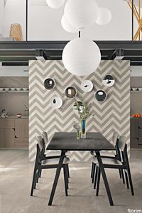
florim > Floor tile-stone
<p>A rustic look combined with a clean, modern sensibility. </p> <p>The collection toys with the native materials of slate and oak wood, interpreted on a versatile and appealing color scale, from gray to hazelnut, allowing different natural inspirations to be combined with ease. The clean simplicity of wood-effect planks can thus become the perfect backdrop against which to enhance the material texture of slate-effect surfaces, or become a distinctive element of the space thanks to the herringbone decorations. The delicate grain of the slate and the gentle knots of the wood then fit easily into the interior, blending with different furniture styles, from the most modern and minimalist lacquered surfaces to elements with a rough, industrial feel in painted metal or stainless steel. Whether used in a cozy retail space or in a modern domestic context, the surfaces of the Woodslate Life collection will add an authentic and, at the same time, contemporary touch to any environment, without disregarding the functionality of Made in Florim porcelain stoneware products.</p>
