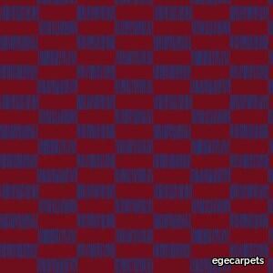
SHE LB4 burgundy/dark blue
egecarpets > Carpet
Following a particular fascination of the preferred techniques of the 1930s’ and 1940s’ artists, all six SHE patterns are made by hand to embrace the unique expression of a line that’s either drawn, cut or put together by physical materials. The designs originate from interpretations of distinctive patterns created by different weaving techniques, experimental expressionistic shapes or, in contrast, simple and graphic paintings. Bringing these imperfect details into carpet design while keeping a simplistic yet organic look adds a sense of naturalness and artistic freedom to each carpet. SHE is part of our uncompromising WOOL100 concept. Crafted in the finest 100% pure new wool, the collection is an extraordinary experience developed to pamper all senses while making a lasting impression.
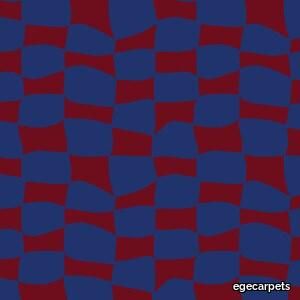
SHE LB5 burgundy/dark blue
egecarpets > Carpet
Following a particular fascination of the preferred techniques of the 1930s’ and 1940s’ artists, all six SHE patterns are made by hand to embrace the unique expression of a line that’s either drawn, cut or put together by physical materials. The designs originate from interpretations of distinctive patterns created by different weaving techniques, experimental expressionistic shapes or, in contrast, simple and graphic paintings. Bringing these imperfect details into carpet design while keeping a simplistic yet organic look adds a sense of naturalness and artistic freedom to each carpet. SHE is part of our uncompromising WOOL100 concept. Crafted in the finest 100% pure new wool, the collection is an extraordinary experience developed to pamper all senses while making a lasting impression.
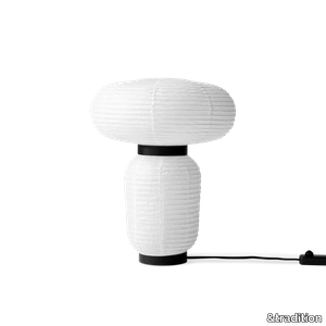
Formakami JH18
&tradition > Table lamp
East meets West in Jaime Hayon’s playful tweak of a traditional Asian lantern in contemporary expression. Dating back centuries, paper lanterns have featured in Asia amongst the privileged and the poor, where different colours, shapes and sizes connote different meanings. Here Hayon has dispensed with cultural formalities to create a series of lamps all in white. Hand crafted with rice paper merging various sizes and shapes together. The series is comprised of three different lantern versions and a table lamp in ivory white paper with black stained oak accents.
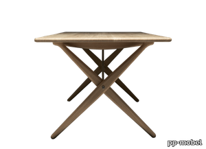
pp85
pp-mobel > Table
The Cross Legged Table is an attestation to Wegner’s ability to utilise very few means while still creating optimal designs. In fact, this table could hardly be simpler. And yet, Wegner combines the total sum of the individual components and manages to create an aesthetic experience out of the ordinary.
Knotted Chair
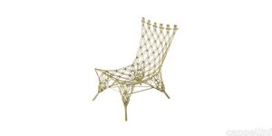
cappellini > Chair
The iconic Knotted Chair is a brilliant adult interpretation of the tiny chairs used to decorate a doll’s house, a visionary creation by designer Marcel Wanders. This project has been officially consecrated by earning a place in the permanent collections of the MoMA in New York, the V&A Museum in London and the Stedelijk Museum in Amsterdam. By eliminating the distinction between artisanship and industrial production, Wanders has turned this chair into work of art to be cherished in the home and integrated into our daily lives. The macramé technique that inspired the design of the Knotted Chair has been revisited in a surprising structure made of carbon covered with aramide fibre cord and then coated with epoxy resin. Thus, an innovative object was born, with an intrinsically romantic allure: a collector’s piece, utterly unique in the history of international design.
Matrice Traccia
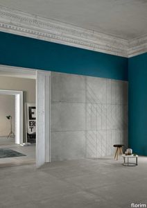
florim > Wallcovering
An atlas of modular signs to be combined in a wide variety of layouts. «We love concrete as a material, its versatility and its plain, austere look. We have completed our carefully designed surfaces with graphic patterning inspired by the human actions of weaving and embroidering.» Barbara Brondi & Marco Rainò To appreciate the profundity of the design project undertaken by Barbara Brondi and Marco Rainò for Cedit, it is both necessary and explanatory to start from the title the collection bears. In modern usage the term Matrice, in Italian, refers to a die or mould used to reproduce an object, but its origins are much more remote, with a meaning closer to the English “matrix”, meaning the underlying basis of something. The root of the word is related to Mater or mother: the name Matrice thus relates to the origin or cause of something. This dichotomy is expressed in several levels within the work of these architects, who study the world from a sophisticated conceptual approach and then transform it into a design. Starting from the idea of ceramic coverings, which have always been a tool not so much of architecture as of interior design, the artists work back to the origin of the surface and its decoration within their own discipline: they look at what we used to call the modern age, where modernity has also brought an uncompromising brutality, and where the use of bare concrete became the statement of an attitude to life with no time to spare for manners. Concrete is originally a liquid material, intended for shaping, which can therefore absorb and retain any type of mark created by the material and mould used to form it. Architects midway between rationalism and brutalism have used the rough-and-ready language of concrete combined with a last, elegant, anthropic decorative motif impressed on the material, that makes the concept of covering superfluous, because its place, in its older meaning of decoration rather than functional cladding, is taken by the regular patterning created in the material itself. There are therefore various grounds for believing that, in this collection, the artists are once again working in architectural terms. Firstly, with a simplicity typical of BRH+, they reduce the initial concepts to their minimal terms. So although this is a collection of coverings for walls, indoor floors, outdoor pavings and curtain walls, a great deal of time was spent on destructuring the idea of the ceramic covering itself. Unfortunately, nowadays there is no space in the contemporary construction sector for the radical approach of the past, so the cladding designed for the building actually lays bare the interior, using the choice of material – accurately interpreted (with shade variation) on the basis of an assortment of various types – to restore visual elegance and a fundamental severity. Attention to scale is another architectural feature: Matrice offers modules with architectural dimensions and different sizes through the development of “large slabs”, eliminating the visual regular grid effect. Thanks to this visual reset, geographic forms are perceived to emerge from dense, grey concrete surfaces decorated as in bygone days by special processes and by weathering during drying. The various types of slab, each an atlas of subtle, vibrant signs on the surfaces, comprise finishes that reproduce the visual effect of reinforced concrete – with the aggregates in the cement more clearly visible, of formwork – with the signs impressed on the concrete by the timber used, of a structured surface resembling bare cement plaster, of ridged and streaked surfaces – with patterning resembling some kinds of linear surface finishing processes – and finally a smooth, or basic version, over which Matrice exercises the dichotomy referred to earlier. It is on these surfaces that Brondi and Rainò have imagined additional design reverberations, a figurative code that rejects the concept of the grid, previously inseparable from that of the module: by means of a vocabulary of graphic marks cut into the slabs with a depth of 3 mm (the width of the gap left between modules during installation), they provide a framework for infinite combinations of possible dialogues. Just as in embroidery, which is based on grids of stitches and geometric repetitions, and where every stitch is at right-angles to another one to construct forms and decorations. Also taken from embroidery is the idea of introducing a degree of “softness” to reduce the stiffness of intentionally deaf surfaces. There is the impression of patterns that can continue for infinity, as in textile weaving, and a scale that, unlike the surface being worked on, is imagined as suspended and lightweight. They may not admit it, but BRH+ know a lot about music, including electronic music, and it appears to me that this organised tangle of infinite signs – unidentifiable without an overview – is rather like the representations of synthesized sounds. Sounds that are produced by machines, and thus “woven” by sampling and overlapping sounds of the most unlikely origins, combined to form jingles which, once heard, are imprinted indelibly on the brain. This may be why I am so interested in the space between this “melodic film” and its deaf, damp substrate. The eyes can navigate this suspended reality without fear of disturbance. So we are faced with different surfaces, different sizes and different graphic signs. But only one colour (surprise!) to prevent a cacophony not just of signs but also of possible interpretations: the artists retain their radical principles (and their generosity), and as curators, a role in which they are skilled, they leave the players (architects and installers) to add their own interpretations. In their hands this colour, expressed in Matrice, will produce motifs on surfaces in living spaces for someone else. This stylish covering and its workmanship will be left to the hands of someone who will probably never read this, but will be on a building site, with the radio playing on a stereo system, concentrating on installing the very pieces we describe. So a radical, apparently silent, design project like this has repercussions for the real world we live in. Matrice has no form of its own but merely acquires the ornamentation drawn on its surfaces by a second group of artists. And here this routine action, standardised by the form approved for production and workmanlike efficiency, is the origin and cause of change, generating a variability of choices and interpretations, on that dusty building site where music plays and mortar flows.
Earthtech OUTBACK_FLAKES
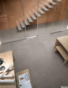
florim > Wall tile-stone-brick
From an ancient past to a responsible future <p>The collection injects new life into the earth through a sustainable production process, with a strong focus on green management, to offer the architect an exceptional technical and aesthetic performance in compliance with the socio-environmental context and the latest eco-friendly building needs. With EARTHTECH earth becomes “technical earth” with a highly innovative content, offering new solutions to green architecture and fulfilling the new frontiers of circular economy in construction, guaranteeing a sustainable future. <br />EARTHTECH offers a choice of organic textures to observe and touch, thanks to the wide range of finishes (Comfort, Glossy-Bright and structured) which add a tactile and unexpected perceptive dimension for use in all types of application. <br /><a class="btn arrow" href="https://www.florim.com/en/surfaces/the-new-comfort-surface/"> Discover the new Comfort surface </a></p> <p>EARTHTECH/ is also a return to the origins of the Florim brand through a full body technical product that blends surface and thickness and derives from the spontaneous mixing of carefully pre-selected fragments and pigments of different shades which give the material a unique, one-of-a-kind visual effect in each slab, mimicking the amazing variety of colours and elements in nature. The result is a composite product with a textured design, in which the flakes and aggregate grains create an original mélange effect that is vitrified during firing, producing a robust, high-quality and exceptionally strong and wear-resistant product; one which can be used in any type of building setting and weather conditions, even the harshest.</p>
ReForm Shadowplay Umbra olive
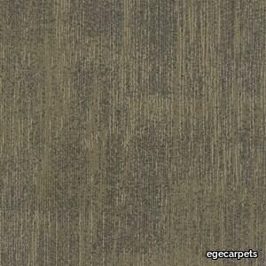
egecarpets > Carpet
Our attention is caught by the light but shadows have more to say. Since classical times, artists have understood their value. They’re mysterious, feed the imagination and add drama. Shadows are complex and tell stories about objects out of view. They can reveal the invisible. In this Shadowplay collection, the multi-level loop construction creates a sculptural texture influenced by the distorted shade and light. Two co-ordinating patterns, Umbra and Obscura, can be used alone or together to compose layered shadows which dance across the floor. Tone on tone neutrals are complimented by haloes of colour which trace abstract shape and fade quietly away The collection is a great visual toolbox where you can achieve very different looks depending on the sizes and shapes you choose. Shadowplay comes in a wide palette of contemporary colours from subtle tone-on-tone shades to more rich tones carefully coordinated for perfect combinations. It allows different spatial options that help define areas such as meeting points and quiet or communal zones, as well as catering to social distancing requirements and wayfinding.
Ahoy
mitab > Chair
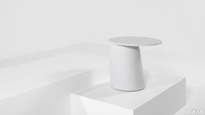
TABLES AHOY Ahoy is characterful side table whose inspiration comes from the ship bollards used to secure a boats mooring line. Developed by Daniel Enoksson as an alternative to the classic pedestal table, Ahoy is a counterweight design made deceptively simple. Ahoy can be placed to overlap a sofa or armchair to provide an informal work surface or suitable for use as a standalone table or in groups of two, three or more. ENDLESS COLOUR OPTIONS At Mitab, we keenly understand the power of colour within the environments and spaces we inhabit as individuals. Ahoy is therefor available in a wide range of contemporary colour options are available through Mitab’s various colour systems – Standard, Selected and Anycolour offering over 200 possible colours. HONEST CRAFTMANSHIP The pedestal and tabletop are made of plywood produced from sustainably managed sources and faced with a durable, high-quality ash veneer. A timber stain protects and reveals the beautifully figured surface. The steel counterweight within the base gives excellent stability, contains at least 30% recycled content and is indefinitely recyclable. FLEXIBLE Ahoy is a characteristic table suitable for different types of environments in the office, the table can be used alone as a solitaire or in a small group. The slightly oval top almost seems to be tipping over, but the angle of the base and the weight inside it works as counterbalance. The table may seem simple but there are some serious calculations and development issues to get an uneven veneer pipe to sit just right. RENEW AND REPAIR Why buy new when you can re-new? At Mitab we don’t just sell new Ahoy tables. Customers can also return to us to have their pieces refreshed, renewed and repaired. Mitab products are designed and made to last decades but furniture that lives that long also require a little TLC every now and then to keep it looking its best! Maybe after a couple of hard years in a café your table is in need of recovering. Or perhaps a hue that looked on trend ten years ago now looks a little dated. Mitab offers to re-new your furniture as easily as it is to buy a new piece. By offering straightforward options with standard pricing for re-lacquering your Ahoy table we make it easy for you to extend its life and help out the environment at the same time. DESIGNER DESIGNER DANIEL ENOKSSON As a designer I want to create products that facilitates the working environment for the user, regardless if it´s a funtional or aesthetical soloution to a problem. My ambition is to constantly develop myself and my work to make sure I stay open-minded to new solutions all the time. One of the great things with Mitab is that they dare to support young designers and their ideas and help the develop these into strong finished products. Mitab is a family owned business with pride and legacy. Mitab have transformed in the past years and become more distinct as a brand. Table with pillar in compression moulded plywood. Table top in ash veneer. Transparent lacquered or stained in standard NCS (black or white), Selected NCS or Anycolour NCS. Solid bottom metal plate for stability.
Bastille
mitab > Table
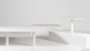
TABLES BASTILLE The Bastille series of large tables is defined by its strong pedestal base and slim, minimal aesthetic, unconventional for tables of this scale. The stained, ash-veneered table top has a tapered edge, meaning it is warm and comfortable to work on yet sharp and slim in appearance. The top also features recessed electrical ports, concealed by a cap matching the table surface. STANDARD OR CUSTOMIZED REFRESH AND RENEW Sustainability is the core of everything we do. Our latest initiative as part of these efforts is the introduction of standardized pricing for the refurbishment of your loved Mitab pieces in need of updating or refreshing, making it as easy to re-new your well loved furniture as it is to buy new pieces. By offering straightforward options for re-lacquering or reupholstering your Mitab products you can extend their life in service and help out the environment at the same time. Mitab supports you in your efforts to buy sustainably manufactured new furniture and also make the active choice to minimise your environmental impact by reinvigorating your existing furniture for new interiors or trends. DESIGNER JONAS WAGELL Materials: Stained, ash-veneered plywood top. Powder coated steel pillar and base.Both the top and base are available in Mitab’s Standard, Selected and Anycolour colour ways.
Earthtech SAVANNAH_GROUND

florim > Wallcovering
From an ancient past to a responsible future <p>The collection injects new life into the earth through a sustainable production process, with a strong focus on green management, to offer the architect an exceptional technical and aesthetic performance in compliance with the socio-environmental context and the latest eco-friendly building needs. With EARTHTECH earth becomes “technical earth” with a highly innovative content, offering new solutions to green architecture and fulfilling the new frontiers of circular economy in construction, guaranteeing a sustainable future. <br />EARTHTECH offers a choice of organic textures to observe and touch, thanks to the wide range of finishes (Comfort, Glossy-Bright and structured) which add a tactile and unexpected perceptive dimension for use in all types of application. <br /><a class="btn arrow" href="https://www.florim.com/en/surfaces/the-new-comfort-surface/"> Discover the new Comfort surface </a></p> <p>EARTHTECH/ is also a return to the origins of the Florim brand through a full body technical product that blends surface and thickness and derives from the spontaneous mixing of carefully pre-selected fragments and pigments of different shades which give the material a unique, one-of-a-kind visual effect in each slab, mimicking the amazing variety of colours and elements in nature. The result is a composite product with a textured design, in which the flakes and aggregate grains create an original mélange effect that is vitrified during firing, producing a robust, high-quality and exceptionally strong and wear-resistant product; one which can be used in any type of building setting and weather conditions, even the harshest.</p>
Dylan
minotti > Sofa
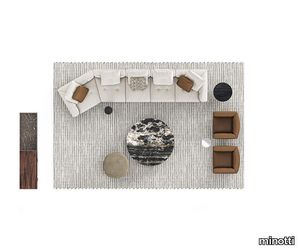
The instinct for the continuity of shapes, and lines, and for consistency of language and style typical of Minotti’s modus operandi, is embodied in the Dylan modular seating system. A multifaceted and versatile lexicon in which the rigour of forms is combined with their ability to accommodate. Refined and articulated volumes come together to bring to life a system expressed in three variants capable of meeting different areas of taste and as many ways of experiencing the domestic and Hospitality spaces. Dylan, in the version with a suspended base raised 13,5 cm from the ground by thin extruded aluminium blades in Bronze or Pewter colour, has a particularly airy and modern feel, matching a more contemporary style, at the same time shining a spotlight on its couturier details. A project that offers a perfect balance between design essentiality and density of details combining light aesthetics with high quality comfort. The Dylan Small version takes up the same aesthetic, but with a more compact depth, specifically designed to bring the same taste of high tailoring into smaller domestic environments or more calibrated Hospitality spaces. Dylan Low, finally, sits only 7,5 cm off the ground and expresses a more classic and traditional personality, in line with a formal aesthetic taste. The fil rouge linking the three different types is represented by the seat and backrest cushions, punctuated by soft, couture-inspired stitching, which make this system a timeless classic, albeit with novel and contemporary flexibility and modularity. The rigorous shapes of the Dylan modular seating system, however, go beyond the stitching of the cushions, turning into volumes in which the geometries become sinuous and enveloping, thanks to the soft curves of the backrest and armrest that create a fulfilling sense of cosiness. The complex and sophisticated manufacturing construction also animates the suspended base of Dylan, which uses the same tailoring technique developed for the Connery modular seating system: the leather or fabric strips are sewn together by means of webbing and punctuated by stitching that gives rhythm to the seat cushioning and adds a further couture note to the design of the project. Every detail of Dylan combines the tailoring of the upholstery with the multifaceted vision of a rational architecture that passes from the space to the furniture, balancing and perfectly integrating it with the contemporary way of interpreting and experiencing living spaces.
Solid "Console"

minotti > Console
Developed starting from a simple square volume, the Solid family of complements reveals great versatility through its clean and simple shapes. The Solid family hosts elements with different shapes and functions. With their square forms and cubist style, their bold personality adds a distinctive touch of flair to residential and Hospitality interiors. They range from the parallelepiped volume, which is tall enough to be set alongside a dining table as an additional seat, to coffee tables for holding or storing objects, and nightstand for the sleeping area. The rich ensemble is completed by the console table, which sits on metal blade-like legs with a Black-Nickel finish. Some Solid coffee tables are equipped with drawers, featuring an open Moka oak and a push & pull opening system. Coffee tables that offer useful storage solutions, featuring drawers with a perfect aesthetic that almost makes them imperceptible. The Solid coffee tables, in all sizes, are available both in the glossy lacquered version in the colours Corten, Muschio, Petrolio and Moka and in the open-pore ash finish in Moka colour. Some of them are useful storage elements thanks to drawers, with interior in Moka-coloured ash and push & pull opening, almost imperceptible by the eye thanks to their perfect aesthetics. In the version with dimensions cm 35x35 H45, Solid becomes an eclectic furnishing piece, ideal for a use in any interior location, characterising the space in which it is positioned with its clean and simple sculptural presence. This version also comes in saddle-hide, crafted with the same technique used in fine leather luggage-crafting, where every side is trimmed with precise stitching along the edges that enhance the preciousness of the furnishing element as a whole.
Matrice Forma

florim > Wallcovering
An atlas of modular signs to be combined in a wide variety of layouts. «We love concrete as a material, its versatility and its plain, austere look. We have completed our carefully designed surfaces with graphic patterning inspired by the human actions of weaving and embroidering.» Barbara Brondi & Marco Rainò To appreciate the profundity of the design project undertaken by Barbara Brondi and Marco Rainò for Cedit, it is both necessary and explanatory to start from the title the collection bears. In modern usage the term Matrice, in Italian, refers to a die or mould used to reproduce an object, but its origins are much more remote, with a meaning closer to the English “matrix”, meaning the underlying basis of something. The root of the word is related to Mater or mother: the name Matrice thus relates to the origin or cause of something. This dichotomy is expressed in several levels within the work of these architects, who study the world from a sophisticated conceptual approach and then transform it into a design. Starting from the idea of ceramic coverings, which have always been a tool not so much of architecture as of interior design, the artists work back to the origin of the surface and its decoration within their own discipline: they look at what we used to call the modern age, where modernity has also brought an uncompromising brutality, and where the use of bare concrete became the statement of an attitude to life with no time to spare for manners. Concrete is originally a liquid material, intended for shaping, which can therefore absorb and retain any type of mark created by the material and mould used to form it. Architects midway between rationalism and brutalism have used the rough-and-ready language of concrete combined with a last, elegant, anthropic decorative motif impressed on the material, that makes the concept of covering superfluous, because its place, in its older meaning of decoration rather than functional cladding, is taken by the regular patterning created in the material itself. There are therefore various grounds for believing that, in this collection, the artists are once again working in architectural terms. Firstly, with a simplicity typical of BRH+, they reduce the initial concepts to their minimal terms. So although this is a collection of coverings for walls, indoor floors, outdoor pavings and curtain walls, a great deal of time was spent on destructuring the idea of the ceramic covering itself. Unfortunately, nowadays there is no space in the contemporary construction sector for the radical approach of the past, so the cladding designed for the building actually lays bare the interior, using the choice of material – accurately interpreted (with shade variation) on the basis of an assortment of various types – to restore visual elegance and a fundamental severity. Attention to scale is another architectural feature: Matrice offers modules with architectural dimensions and different sizes through the development of “large slabs”, eliminating the visual regular grid effect. Thanks to this visual reset, geographic forms are perceived to emerge from dense, grey concrete surfaces decorated as in bygone days by special processes and by weathering during drying. The various types of slab, each an atlas of subtle, vibrant signs on the surfaces, comprise finishes that reproduce the visual effect of reinforced concrete – with the aggregates in the cement more clearly visible, of formwork – with the signs impressed on the concrete by the timber used, of a structured surface resembling bare cement plaster, of ridged and streaked surfaces – with patterning resembling some kinds of linear surface finishing processes – and finally a smooth, or basic version, over which Matrice exercises the dichotomy referred to earlier. It is on these surfaces that Brondi and Rainò have imagined additional design reverberations, a figurative code that rejects the concept of the grid, previously inseparable from that of the module: by means of a vocabulary of graphic marks cut into the slabs with a depth of 3 mm (the width of the gap left between modules during installation), they provide a framework for infinite combinations of possible dialogues. Just as in embroidery, which is based on grids of stitches and geometric repetitions, and where every stitch is at right-angles to another one to construct forms and decorations. Also taken from embroidery is the idea of introducing a degree of “softness” to reduce the stiffness of intentionally deaf surfaces. There is the impression of patterns that can continue for infinity, as in textile weaving, and a scale that, unlike the surface being worked on, is imagined as suspended and lightweight. They may not admit it, but BRH+ know a lot about music, including electronic music, and it appears to me that this organised tangle of infinite signs – unidentifiable without an overview – is rather like the representations of synthesized sounds. Sounds that are produced by machines, and thus “woven” by sampling and overlapping sounds of the most unlikely origins, combined to form jingles which, once heard, are imprinted indelibly on the brain. This may be why I am so interested in the space between this “melodic film” and its deaf, damp substrate. The eyes can navigate this suspended reality without fear of disturbance. So we are faced with different surfaces, different sizes and different graphic signs. But only one colour (surprise!) to prevent a cacophony not just of signs but also of possible interpretations: the artists retain their radical principles (and their generosity), and as curators, a role in which they are skilled, they leave the players (architects and installers) to add their own interpretations. In their hands this colour, expressed in Matrice, will produce motifs on surfaces in living spaces for someone else. This stylish covering and its workmanship will be left to the hands of someone who will probably never read this, but will be on a building site, with the radio playing on a stereo system, concentrating on installing the very pieces we describe. So a radical, apparently silent, design project like this has repercussions for the real world we live in. Matrice has no form of its own but merely acquires the ornamentation drawn on its surfaces by a second group of artists. And here this routine action, standardised by the form approved for production and workmanlike efficiency, is the origin and cause of change, generating a variability of choices and interpretations, on that dusty building site where music plays and mortar flows.
Superquadra
minotti > Cabinet
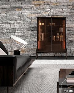
The storage units in the Superquadra family by Marcio Kogan / studio mk27 are of different sizes and are intended for a variety of uses, yet they all share the same minimal design, the same style - somewhere between classic rationalism and a contemporary vibe - and the same floating aesthetic, which endows them with an airy, suspended appearance. The sideboard is available in several sizes and heights, starting from the dining, living/TV and cabinet versions. In the first two variants, the body of the unit rests on a solid wood base. Sporting volumes of different sizes, it comes equipped with drawers, all with handles in a polished varnished Brandy-coloured finish. The bearing structure of the dining and living/TV storage units is in Dark Brown stained palisander Santos with matt polyester lacquered finish, or in Black lacquered open-pore ash, and sits on feet with a polished Brandy finish. In addition to Dark Brown stained palisander Santos with matt polyester lacquered finish or Black lacquered open-pore ash, the storage elements for the dining and living/TV units are also available with a glossy Moka, Cappuccino or Malachite lacquer. The cabinet, with its pure and geometric shapes, emphasizes the sophisticated combination of materials, creating a refined contrast between wood, varnished aluminium and glass. All these elements host the same materials and proportions inspired by the elegant rationalism, characterising the mood of the Brasilia range, and indeed the overall style of Marcio Kogan / studio mk27. The dining version, available in the size 273,5 cm and in two different heights, offers four drawers, with a cutlery holder in Black saddle-hide in the top one. One important detail is the foot in aluminium with polished Brandy-coloured finish, which juts out from the line of the base. The living/TV unit, available in a single 273,5 cm version, offers a storage space with two drawers and surface made of thin staves in Dark Brown stained Canaletto walnut that lighten the volume and create an original interplay of transparencies. The cabinet, available in one size, 105 cm, is characterised by a frame with doors in stratified glass, coupled with a copper-coloured metallic mesh inside. This combination offers glimpses of the reflections created by the back panels in bronzed glass and by the double light strip, positioned on the sides of the frame. Inside, it houses a set of drawers in Dark Brown stained palisander Santos, with matt polyester lacquered finish. Placing two cabinets together, one next to the other, creates an interesting twist on an effective storage solution.
ReForm Shadowplay Umbra sand
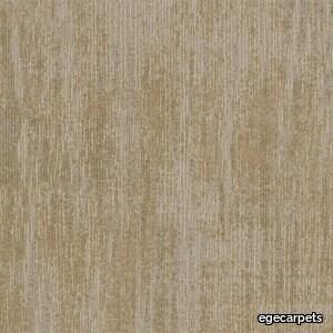
egecarpets > Carpet
Our attention is caught by the light but shadows have more to say. Since classical times, artists have understood their value. They’re mysterious, feed the imagination and add drama. Shadows are complex and tell stories about objects out of view. They can reveal the invisible. In this Shadowplay collection, the multi-level loop construction creates a sculptural texture influenced by the distorted shade and light. Two co-ordinating patterns, Umbra and Obscura, can be used alone or together to compose layered shadows which dance across the floor. Tone on tone neutrals are complimented by haloes of colour which trace abstract shape and fade quietly away The collection is a great visual toolbox where you can achieve very different looks depending on the sizes and shapes you choose. Shadowplay comes in a wide palette of contemporary colours from subtle tone-on-tone shades to more rich tones carefully coordinated for perfect combinations. It allows different spatial options that help define areas such as meeting points and quiet or communal zones, as well as catering to social distancing requirements and wayfinding.
Ambrosia

marset > Ceiling lamp
Ambrosia is essentially a line of light that can be converted into a modular system, capable of extending the illumination it offers to adapt to any space. A design that recovers and revisits the tube light, timeless, and updates it so that its simple structure and diffuse lighting add beauty to any space. This collection expands on its possibilities by proposing a change in the plane of light, from horizontal to vertical.This new style of lamp is available in two versions, both of which are pendant lamps. First there is the Ambrosia V2, a 235-cm-high vertical structure consisting of two tubes of light of different lengths. An interrupted line of light, a detail that brings lightness and character to the lamp. Its design allows you to choose the lighting, either towards the wall for indirect light, or towards the main space for direct light. This aesthetic and functional design also works well in domestic settings. The other vertical version, Ambrosia V3, joins three light tubes placed at different heights, forming a sculptural ensemble. This option can provide a great deal of light and therefore comes with a dimming system for easy lighting control. It is available in two heights of 130 and 175 cm. Both sizes can be electrically connected through the ceiling rosette or the floor plug. The new Ambrosia allows you to create vertical lighting compositions, combining different sizes in repetition to illuminate large spaces. When installed individually, it fills the space with light and warmth. Its slender design sets the perfect scene in any room. A totally new perspective for this flexible lighting system, which achieves maximum light expression with a minimalist structure. The metal structure is available in two finishes – black and matte gold – and the light source in three colour temperatures: 2200 K, 2700 K and 3000 K.
Matrice Rilievo

florim > Wallcovering
An atlas of modular signs to be combined in a wide variety of layouts. «We love concrete as a material, its versatility and its plain, austere look. We have completed our carefully designed surfaces with graphic patterning inspired by the human actions of weaving and embroidering.» Barbara Brondi & Marco Rainò To appreciate the profundity of the design project undertaken by Barbara Brondi and Marco Rainò for Cedit, it is both necessary and explanatory to start from the title the collection bears. In modern usage the term Matrice, in Italian, refers to a die or mould used to reproduce an object, but its origins are much more remote, with a meaning closer to the English “matrix”, meaning the underlying basis of something. The root of the word is related to Mater or mother: the name Matrice thus relates to the origin or cause of something. This dichotomy is expressed in several levels within the work of these architects, who study the world from a sophisticated conceptual approach and then transform it into a design. Starting from the idea of ceramic coverings, which have always been a tool not so much of architecture as of interior design, the artists work back to the origin of the surface and its decoration within their own discipline: they look at what we used to call the modern age, where modernity has also brought an uncompromising brutality, and where the use of bare concrete became the statement of an attitude to life with no time to spare for manners. Concrete is originally a liquid material, intended for shaping, which can therefore absorb and retain any type of mark created by the material and mould used to form it. Architects midway between rationalism and brutalism have used the rough-and-ready language of concrete combined with a last, elegant, anthropic decorative motif impressed on the material, that makes the concept of covering superfluous, because its place, in its older meaning of decoration rather than functional cladding, is taken by the regular patterning created in the material itself. There are therefore various grounds for believing that, in this collection, the artists are once again working in architectural terms. Firstly, with a simplicity typical of BRH+, they reduce the initial concepts to their minimal terms. So although this is a collection of coverings for walls, indoor floors, outdoor pavings and curtain walls, a great deal of time was spent on destructuring the idea of the ceramic covering itself. Unfortunately, nowadays there is no space in the contemporary construction sector for the radical approach of the past, so the cladding designed for the building actually lays bare the interior, using the choice of material – accurately interpreted (with shade variation) on the basis of an assortment of various types – to restore visual elegance and a fundamental severity. Attention to scale is another architectural feature: Matrice offers modules with architectural dimensions and different sizes through the development of “large slabs”, eliminating the visual regular grid effect. Thanks to this visual reset, geographic forms are perceived to emerge from dense, grey concrete surfaces decorated as in bygone days by special processes and by weathering during drying. The various types of slab, each an atlas of subtle, vibrant signs on the surfaces, comprise finishes that reproduce the visual effect of reinforced concrete – with the aggregates in the cement more clearly visible, of formwork – with the signs impressed on the concrete by the timber used, of a structured surface resembling bare cement plaster, of ridged and streaked surfaces – with patterning resembling some kinds of linear surface finishing processes – and finally a smooth, or basic version, over which Matrice exercises the dichotomy referred to earlier. It is on these surfaces that Brondi and Rainò have imagined additional design reverberations, a figurative code that rejects the concept of the grid, previously inseparable from that of the module: by means of a vocabulary of graphic marks cut into the slabs with a depth of 3 mm (the width of the gap left between modules during installation), they provide a framework for infinite combinations of possible dialogues. Just as in embroidery, which is based on grids of stitches and geometric repetitions, and where every stitch is at right-angles to another one to construct forms and decorations. Also taken from embroidery is the idea of introducing a degree of “softness” to reduce the stiffness of intentionally deaf surfaces. There is the impression of patterns that can continue for infinity, as in textile weaving, and a scale that, unlike the surface being worked on, is imagined as suspended and lightweight. They may not admit it, but BRH+ know a lot about music, including electronic music, and it appears to me that this organised tangle of infinite signs – unidentifiable without an overview – is rather like the representations of synthesized sounds. Sounds that are produced by machines, and thus “woven” by sampling and overlapping sounds of the most unlikely origins, combined to form jingles which, once heard, are imprinted indelibly on the brain. This may be why I am so interested in the space between this “melodic film” and its deaf, damp substrate. The eyes can navigate this suspended reality without fear of disturbance. So we are faced with different surfaces, different sizes and different graphic signs. But only one colour (surprise!) to prevent a cacophony not just of signs but also of possible interpretations: the artists retain their radical principles (and their generosity), and as curators, a role in which they are skilled, they leave the players (architects and installers) to add their own interpretations. In their hands this colour, expressed in Matrice, will produce motifs on surfaces in living spaces for someone else. This stylish covering and its workmanship will be left to the hands of someone who will probably never read this, but will be on a building site, with the radio playing on a stereo system, concentrating on installing the very pieces we describe. So a radical, apparently silent, design project like this has repercussions for the real world we live in. Matrice has no form of its own but merely acquires the ornamentation drawn on its surfaces by a second group of artists. And here this routine action, standardised by the form approved for production and workmanlike efficiency, is the origin and cause of change, generating a variability of choices and interpretations, on that dusty building site where music plays and mortar flows.
Earthtech CARBON_FLAKES

florim > Wall tile-stone-brick
From an ancient past to a responsible future <p>The collection injects new life into the earth through a sustainable production process, with a strong focus on green management, to offer the architect an exceptional technical and aesthetic performance in compliance with the socio-environmental context and the latest eco-friendly building needs. With EARTHTECH earth becomes “technical earth” with a highly innovative content, offering new solutions to green architecture and fulfilling the new frontiers of circular economy in construction, guaranteeing a sustainable future. <br />EARTHTECH offers a choice of organic textures to observe and touch, thanks to the wide range of finishes (Comfort, Glossy-Bright and structured) which add a tactile and unexpected perceptive dimension for use in all types of application. <br /><a class="btn arrow" href="https://www.florim.com/en/surfaces/the-new-comfort-surface/"> Discover the new Comfort surface </a></p> <p>EARTHTECH/ is also a return to the origins of the Florim brand through a full body technical product that blends surface and thickness and derives from the spontaneous mixing of carefully pre-selected fragments and pigments of different shades which give the material a unique, one-of-a-kind visual effect in each slab, mimicking the amazing variety of colours and elements in nature. The result is a composite product with a textured design, in which the flakes and aggregate grains create an original mélange effect that is vitrified during firing, producing a robust, high-quality and exceptionally strong and wear-resistant product; one which can be used in any type of building setting and weather conditions, even the harshest.</p>
Earthtech PUMICE_GROUND

florim > Wallcovering
From an ancient past to a responsible future <p>The collection injects new life into the earth through a sustainable production process, with a strong focus on green management, to offer the architect an exceptional technical and aesthetic performance in compliance with the socio-environmental context and the latest eco-friendly building needs. With EARTHTECH earth becomes “technical earth” with a highly innovative content, offering new solutions to green architecture and fulfilling the new frontiers of circular economy in construction, guaranteeing a sustainable future. <br />EARTHTECH offers a choice of organic textures to observe and touch, thanks to the wide range of finishes (Comfort, Glossy-Bright and structured) which add a tactile and unexpected perceptive dimension for use in all types of application. <br /><a class="btn arrow" href="https://www.florim.com/en/surfaces/the-new-comfort-surface/"> Discover the new Comfort surface </a></p> <p>EARTHTECH/ is also a return to the origins of the Florim brand through a full body technical product that blends surface and thickness and derives from the spontaneous mixing of carefully pre-selected fragments and pigments of different shades which give the material a unique, one-of-a-kind visual effect in each slab, mimicking the amazing variety of colours and elements in nature. The result is a composite product with a textured design, in which the flakes and aggregate grains create an original mélange effect that is vitrified during firing, producing a robust, high-quality and exceptionally strong and wear-resistant product; one which can be used in any type of building setting and weather conditions, even the harshest.</p>
Superquadra
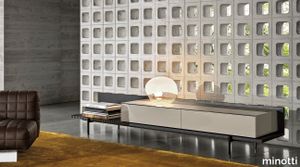
minotti > Cabinet
The storage units in the Superquadra family by Marcio Kogan / studio mk27 are of different sizes and are intended for a variety of uses, yet they all share the same minimal design, the same style - somewhere between classic rationalism and a contemporary vibe - and the same floating aesthetic, which endows them with an airy, suspended appearance. The sideboard is available in several sizes and heights, starting from the dining, living/TV and cabinet versions. In the first two variants, the body of the unit rests on a solid wood base. Sporting volumes of different sizes, it comes equipped with drawers, all with handles in a polished varnished Brandy-coloured finish. The bearing structure of the dining and living/TV storage units is in Dark Brown stained palisander Santos with matt polyester lacquered finish, or in Black lacquered open-pore ash, and sits on feet with a polished Brandy finish. In addition to Dark Brown stained palisander Santos with matt polyester lacquered finish or Black lacquered open-pore ash, the storage elements for the dining and living/TV units are also available with a glossy Moka, Cappuccino or Malachite lacquer. The cabinet, with its pure and geometric shapes, emphasizes the sophisticated combination of materials, creating a refined contrast between wood, varnished aluminium and glass. All these elements host the same materials and proportions inspired by the elegant rationalism, characterising the mood of the Brasilia range, and indeed the overall style of Marcio Kogan / studio mk27. The dining version, available in the size 273,5 cm and in two different heights, offers four drawers, with a cutlery holder in Black saddle-hide in the top one. One important detail is the foot in aluminium with polished Brandy-coloured finish, which juts out from the line of the base. The living/TV unit, available in a single 273,5 cm version, offers a storage space with two drawers and surface made of thin staves in Dark Brown stained Canaletto walnut that lighten the volume and create an original interplay of transparencies. The cabinet, available in one size, 105 cm, is characterised by a frame with doors in stratified glass, coupled with a copper-coloured metallic mesh inside. This combination offers glimpses of the reflections created by the back panels in bronzed glass and by the double light strip, positioned on the sides of the frame. Inside, it houses a set of drawers in Dark Brown stained palisander Santos, with matt polyester lacquered finish. Placing two cabinets together, one next to the other, creates an interesting twist on an effective storage solution.
Miniatures Little Beaver
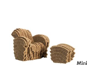
vitra > Styling
Cardboard furniture as an inexpensive and light alternative to traditional furniture already appears as early as the 1960s. Most designs aimed at lending the cardboard the necessary stability through insert and folding techniques. <br/><br/>Gehry chose a different method, which gave birth to sturdy cardboard furniture like carboard sculptures: »One day I look in my office at a pile of corrugated cardboard, the material I normally used to make architecture models, and I began to experiment with it, to stick it together and to cut it into shape with a hand saw and a penknife«. Following his »Easy Edges« from 1972, a series of extraordinarily sturdy cardboard furniture with a smooth surface, from the end of the 1970s onwards Gehry once again devoted his attention to the use of corrugated cardboard as a material for making furniture.<br/><br/>»Experimental Edges« was the name given to unusually expansive armchairs and easy chairs with a rough, ragged- looking surface. Strips of thick cardboard usually used as the filling for door leafs were sawn or cut vertically to the corrugation lines and fashioned into solid volumes of varying shapes. Using this method, single items or small series of furniture were created, which were both furniture sculptures and surprisingly comfortable chairs and sofas.
ReForm Shadowplay Umbra blue
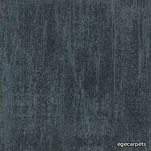
egecarpets > Carpet
Our attention is caught by the light but shadows have more to say. Since classical times, artists have understood their value. They’re mysterious, feed the imagination and add drama. Shadows are complex and tell stories about objects out of view. They can reveal the invisible. In this Shadowplay collection, the multi-level loop construction creates a sculptural texture influenced by the distorted shade and light. Two co-ordinating patterns, Umbra and Obscura, can be used alone or together to compose layered shadows which dance across the floor. Tone on tone neutrals are complimented by haloes of colour which trace abstract shape and fade quietly away The collection is a great visual toolbox where you can achieve very different looks depending on the sizes and shapes you choose. Shadowplay comes in a wide palette of contemporary colours from subtle tone-on-tone shades to more rich tones carefully coordinated for perfect combinations. It allows different spatial options that help define areas such as meeting points and quiet or communal zones, as well as catering to social distancing requirements and wayfinding.
Matrice Sostanza

florim > Wallcovering
An atlas of modular signs to be combined in a wide variety of layouts. «We love concrete as a material, its versatility and its plain, austere look. We have completed our carefully designed surfaces with graphic patterning inspired by the human actions of weaving and embroidering.» Barbara Brondi & Marco Rainò To appreciate the profundity of the design project undertaken by Barbara Brondi and Marco Rainò for Cedit, it is both necessary and explanatory to start from the title the collection bears. In modern usage the term Matrice, in Italian, refers to a die or mould used to reproduce an object, but its origins are much more remote, with a meaning closer to the English “matrix”, meaning the underlying basis of something. The root of the word is related to Mater or mother: the name Matrice thus relates to the origin or cause of something. This dichotomy is expressed in several levels within the work of these architects, who study the world from a sophisticated conceptual approach and then transform it into a design. Starting from the idea of ceramic coverings, which have always been a tool not so much of architecture as of interior design, the artists work back to the origin of the surface and its decoration within their own discipline: they look at what we used to call the modern age, where modernity has also brought an uncompromising brutality, and where the use of bare concrete became the statement of an attitude to life with no time to spare for manners. Concrete is originally a liquid material, intended for shaping, which can therefore absorb and retain any type of mark created by the material and mould used to form it. Architects midway between rationalism and brutalism have used the rough-and-ready language of concrete combined with a last, elegant, anthropic decorative motif impressed on the material, that makes the concept of covering superfluous, because its place, in its older meaning of decoration rather than functional cladding, is taken by the regular patterning created in the material itself. There are therefore various grounds for believing that, in this collection, the artists are once again working in architectural terms. Firstly, with a simplicity typical of BRH+, they reduce the initial concepts to their minimal terms. So although this is a collection of coverings for walls, indoor floors, outdoor pavings and curtain walls, a great deal of time was spent on destructuring the idea of the ceramic covering itself. Unfortunately, nowadays there is no space in the contemporary construction sector for the radical approach of the past, so the cladding designed for the building actually lays bare the interior, using the choice of material – accurately interpreted (with shade variation) on the basis of an assortment of various types – to restore visual elegance and a fundamental severity. Attention to scale is another architectural feature: Matrice offers modules with architectural dimensions and different sizes through the development of “large slabs”, eliminating the visual regular grid effect. Thanks to this visual reset, geographic forms are perceived to emerge from dense, grey concrete surfaces decorated as in bygone days by special processes and by weathering during drying. The various types of slab, each an atlas of subtle, vibrant signs on the surfaces, comprise finishes that reproduce the visual effect of reinforced concrete – with the aggregates in the cement more clearly visible, of formwork – with the signs impressed on the concrete by the timber used, of a structured surface resembling bare cement plaster, of ridged and streaked surfaces – with patterning resembling some kinds of linear surface finishing processes – and finally a smooth, or basic version, over which Matrice exercises the dichotomy referred to earlier. It is on these surfaces that Brondi and Rainò have imagined additional design reverberations, a figurative code that rejects the concept of the grid, previously inseparable from that of the module: by means of a vocabulary of graphic marks cut into the slabs with a depth of 3 mm (the width of the gap left between modules during installation), they provide a framework for infinite combinations of possible dialogues. Just as in embroidery, which is based on grids of stitches and geometric repetitions, and where every stitch is at right-angles to another one to construct forms and decorations. Also taken from embroidery is the idea of introducing a degree of “softness” to reduce the stiffness of intentionally deaf surfaces. There is the impression of patterns that can continue for infinity, as in textile weaving, and a scale that, unlike the surface being worked on, is imagined as suspended and lightweight. They may not admit it, but BRH+ know a lot about music, including electronic music, and it appears to me that this organised tangle of infinite signs – unidentifiable without an overview – is rather like the representations of synthesized sounds. Sounds that are produced by machines, and thus “woven” by sampling and overlapping sounds of the most unlikely origins, combined to form jingles which, once heard, are imprinted indelibly on the brain. This may be why I am so interested in the space between this “melodic film” and its deaf, damp substrate. The eyes can navigate this suspended reality without fear of disturbance. So we are faced with different surfaces, different sizes and different graphic signs. But only one colour (surprise!) to prevent a cacophony not just of signs but also of possible interpretations: the artists retain their radical principles (and their generosity), and as curators, a role in which they are skilled, they leave the players (architects and installers) to add their own interpretations. In their hands this colour, expressed in Matrice, will produce motifs on surfaces in living spaces for someone else. This stylish covering and its workmanship will be left to the hands of someone who will probably never read this, but will be on a building site, with the radio playing on a stereo system, concentrating on installing the very pieces we describe. So a radical, apparently silent, design project like this has repercussions for the real world we live in. Matrice has no form of its own but merely acquires the ornamentation drawn on its surfaces by a second group of artists. And here this routine action, standardised by the form approved for production and workmanlike efficiency, is the origin and cause of change, generating a variability of choices and interpretations, on that dusty building site where music plays and mortar flows.
Earthtech OUTBACK_GROUND

florim > Wallcovering
From an ancient past to a responsible future <p>The collection injects new life into the earth through a sustainable production process, with a strong focus on green management, to offer the architect an exceptional technical and aesthetic performance in compliance with the socio-environmental context and the latest eco-friendly building needs. With EARTHTECH earth becomes “technical earth” with a highly innovative content, offering new solutions to green architecture and fulfilling the new frontiers of circular economy in construction, guaranteeing a sustainable future. <br />EARTHTECH offers a choice of organic textures to observe and touch, thanks to the wide range of finishes (Comfort, Glossy-Bright and structured) which add a tactile and unexpected perceptive dimension for use in all types of application. <br /><a class="btn arrow" href="https://www.florim.com/en/surfaces/the-new-comfort-surface/"> Discover the new Comfort surface </a></p> <p>EARTHTECH/ is also a return to the origins of the Florim brand through a full body technical product that blends surface and thickness and derives from the spontaneous mixing of carefully pre-selected fragments and pigments of different shades which give the material a unique, one-of-a-kind visual effect in each slab, mimicking the amazing variety of colours and elements in nature. The result is a composite product with a textured design, in which the flakes and aggregate grains create an original mélange effect that is vitrified during firing, producing a robust, high-quality and exceptionally strong and wear-resistant product; one which can be used in any type of building setting and weather conditions, even the harshest.</p>
Matrice Aura

florim > Wallcovering
An atlas of modular signs to be combined in a wide variety of layouts. «We love concrete as a material, its versatility and its plain, austere look. We have completed our carefully designed surfaces with graphic patterning inspired by the human actions of weaving and embroidering.» Barbara Brondi & Marco Rainò To appreciate the profundity of the design project undertaken by Barbara Brondi and Marco Rainò for Cedit, it is both necessary and explanatory to start from the title the collection bears. In modern usage the term Matrice, in Italian, refers to a die or mould used to reproduce an object, but its origins are much more remote, with a meaning closer to the English “matrix”, meaning the underlying basis of something. The root of the word is related to Mater or mother: the name Matrice thus relates to the origin or cause of something. This dichotomy is expressed in several levels within the work of these architects, who study the world from a sophisticated conceptual approach and then transform it into a design. Starting from the idea of ceramic coverings, which have always been a tool not so much of architecture as of interior design, the artists work back to the origin of the surface and its decoration within their own discipline: they look at what we used to call the modern age, where modernity has also brought an uncompromising brutality, and where the use of bare concrete became the statement of an attitude to life with no time to spare for manners. Concrete is originally a liquid material, intended for shaping, which can therefore absorb and retain any type of mark created by the material and mould used to form it. Architects midway between rationalism and brutalism have used the rough-and-ready language of concrete combined with a last, elegant, anthropic decorative motif impressed on the material, that makes the concept of covering superfluous, because its place, in its older meaning of decoration rather than functional cladding, is taken by the regular patterning created in the material itself. There are therefore various grounds for believing that, in this collection, the artists are once again working in architectural terms. Firstly, with a simplicity typical of BRH+, they reduce the initial concepts to their minimal terms. So although this is a collection of coverings for walls, indoor floors, outdoor pavings and curtain walls, a great deal of time was spent on destructuring the idea of the ceramic covering itself. Unfortunately, nowadays there is no space in the contemporary construction sector for the radical approach of the past, so the cladding designed for the building actually lays bare the interior, using the choice of material – accurately interpreted (with shade variation) on the basis of an assortment of various types – to restore visual elegance and a fundamental severity. Attention to scale is another architectural feature: Matrice offers modules with architectural dimensions and different sizes through the development of “large slabs”, eliminating the visual regular grid effect. Thanks to this visual reset, geographic forms are perceived to emerge from dense, grey concrete surfaces decorated as in bygone days by special processes and by weathering during drying. The various types of slab, each an atlas of subtle, vibrant signs on the surfaces, comprise finishes that reproduce the visual effect of reinforced concrete – with the aggregates in the cement more clearly visible, of formwork – with the signs impressed on the concrete by the timber used, of a structured surface resembling bare cement plaster, of ridged and streaked surfaces – with patterning resembling some kinds of linear surface finishing processes – and finally a smooth, or basic version, over which Matrice exercises the dichotomy referred to earlier. It is on these surfaces that Brondi and Rainò have imagined additional design reverberations, a figurative code that rejects the concept of the grid, previously inseparable from that of the module: by means of a vocabulary of graphic marks cut into the slabs with a depth of 3 mm (the width of the gap left between modules during installation), they provide a framework for infinite combinations of possible dialogues. Just as in embroidery, which is based on grids of stitches and geometric repetitions, and where every stitch is at right-angles to another one to construct forms and decorations. Also taken from embroidery is the idea of introducing a degree of “softness” to reduce the stiffness of intentionally deaf surfaces. There is the impression of patterns that can continue for infinity, as in textile weaving, and a scale that, unlike the surface being worked on, is imagined as suspended and lightweight. They may not admit it, but BRH+ know a lot about music, including electronic music, and it appears to me that this organised tangle of infinite signs – unidentifiable without an overview – is rather like the representations of synthesized sounds. Sounds that are produced by machines, and thus “woven” by sampling and overlapping sounds of the most unlikely origins, combined to form jingles which, once heard, are imprinted indelibly on the brain. This may be why I am so interested in the space between this “melodic film” and its deaf, damp substrate. The eyes can navigate this suspended reality without fear of disturbance. So we are faced with different surfaces, different sizes and different graphic signs. But only one colour (surprise!) to prevent a cacophony not just of signs but also of possible interpretations: the artists retain their radical principles (and their generosity), and as curators, a role in which they are skilled, they leave the players (architects and installers) to add their own interpretations. In their hands this colour, expressed in Matrice, will produce motifs on surfaces in living spaces for someone else. This stylish covering and its workmanship will be left to the hands of someone who will probably never read this, but will be on a building site, with the radio playing on a stereo system, concentrating on installing the very pieces we describe. So a radical, apparently silent, design project like this has repercussions for the real world we live in. Matrice has no form of its own but merely acquires the ornamentation drawn on its surfaces by a second group of artists. And here this routine action, standardised by the form approved for production and workmanlike efficiency, is the origin and cause of change, generating a variability of choices and interpretations, on that dusty building site where music plays and mortar flows.
Takumi side chair
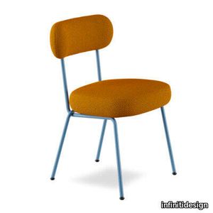
infinitidesign > Chair
Two kanji characters, “taku” meaning “skillful” and “mi” meaning “to see”, give rise to the ancient Japanese name Takumi, meaning one who has “talent in the field of craftsmanship and technology”. And it is from this encounter between the industrial world and the creativity of craftsmanship that ‘Takumi’ was born, a collection of upholstered chairs where the circular design combined with the minimalism that hark back to bygone eras. The development of this new line, designed by Studio Dessì, is based on the perfect balance between aesthetics and comfort; the steel tubes of the structure seem to interconnect in a way similar to Escher’s optical illusions as they accommodate soft upholstered elements that can be disassembled and restyled. Available with or without armrests, Takumi is an armchair designed for use in the HoReCa industry, but can also be used in more intimate settings. The wide range of fabrics and the steel frame, which can be painted in different colours, work well together to create refined or pop versions depending on taste or the interior.
Earthtech FOG_GROUND

florim > Wallcovering
From an ancient past to a responsible future <p>The collection injects new life into the earth through a sustainable production process, with a strong focus on green management, to offer the architect an exceptional technical and aesthetic performance in compliance with the socio-environmental context and the latest eco-friendly building needs. With EARTHTECH earth becomes “technical earth” with a highly innovative content, offering new solutions to green architecture and fulfilling the new frontiers of circular economy in construction, guaranteeing a sustainable future. <br />EARTHTECH offers a choice of organic textures to observe and touch, thanks to the wide range of finishes (Comfort, Glossy-Bright and structured) which add a tactile and unexpected perceptive dimension for use in all types of application. <br /><a class="btn arrow" href="https://www.florim.com/en/surfaces/the-new-comfort-surface/"> Discover the new Comfort surface </a></p> <p>EARTHTECH/ is also a return to the origins of the Florim brand through a full body technical product that blends surface and thickness and derives from the spontaneous mixing of carefully pre-selected fragments and pigments of different shades which give the material a unique, one-of-a-kind visual effect in each slab, mimicking the amazing variety of colours and elements in nature. The result is a composite product with a textured design, in which the flakes and aggregate grains create an original mélange effect that is vitrified during firing, producing a robust, high-quality and exceptionally strong and wear-resistant product; one which can be used in any type of building setting and weather conditions, even the harshest.</p>
Cielo Wall Light
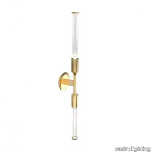
castrolighting > Wall lamp
Reveal the power of nature's majesty by inviting it inside your home with the Cielo Collection which has been inspired by nature's magnificence and its wonders - the fusion of pure elements. The Cielo Collection visualizes the concept of natural forces and their mysterious power. The fusion of pure elements – fire, ocean waves, sky, and stones – is the greatest source of inspiration. Fire creates delicacy, wave shapes stones, the sky elevates magic, and stone brings textures. Therefore, nature shapes lighting design. The Cielo Collection is a dynamic way of conceiving the world and the joy of discovery and wonder. The luxury oasis is waiting, imagine the calcite forms decorations that hang from the ceiling – stalactites with multi-coloured lighting that splits through rocks to glow in the dark. This time, Castro Lighting carries its manufacturing traditions transforming them into contemporary interior aesthetics – a minimal yet artistic expression of the modern lighting design within natural wonders. Brass finishes, textures, and glass curves – the customization options are limitless. The Cielo Wall Light proudly bears the name which in Italian is related to sky or heaven. This handmade lighting fixture is made of gold-plated brass, the strong lines create an organic movement of subtle brass tubes complementing the luxury chandelier with clear glass. If you look closely enough, the extended tubes remind dangling stalactite and stalagmite shapes. Hammered by the hands of experienced craftsmen, it is capable of transforming the living space into grand adventurous scenery. This finest lighting design is a beautiful addition to enhance modern living rooms, contemporary hallways, and luxurious hotel corridors. The Cielo handcrafted gold pendant is the perfect choice for the interiors with modern classic style, and contemporary vibes, as well as the art-deco touch. Feel the powerful energy of this pendant which brass elements complement the refinement of the interior and permitted to reveal a new meaning of beauty. Simplicity, smooth texture, and clean glass lines help define this contemporary lighting design as the signature collection fitting to the most exquisite decors.
Melt Burst Chandelier Gold LED
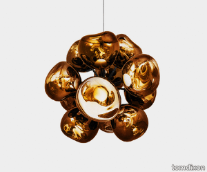
tomdixon > Ceiling lamp
Melt is a beautifully distorted pendant in a modern Gold finish and matching ceiling rose. Featuring our intergrated LED module, this ceiling light creates a mesmirizing melting hot-blown glass effect when on and a mirror-finish effect when off. Made in Germany using a high tech manufacturing technique to achieve the perfect melted orb. More Information The range is blow moulded and vacuum metallised - techniques that have been developed over several years, working with German engineering and manufacturing experts. The LED module offers three key benefits - longer life expectancy, energy efficiency and improved performance including dimmability and light control. Our integrated LED module is fully serviceable and replacement components and individual drivers are available if needed. Melt also comes as a chandelier, table, floor and surface light. Available in a contemporary Chrome Dimensions & Specifications Information SKU MEC03GO-CEUM4 Warranty 3 years Family Melt Cable Finish Black Braided Product Label New Depth 136.5 cm Width 153 cm Height 164 cm Box Depth 0 Box Width 0 Box Height 0 Delivery & Returns If you are unhappy with your purchase, under Distant Selling Regulations you can return the items to us within 14 days of receipt of your goods for a full refund (excluding postal charges). Items should be unused, returned in their original packaging and in a fully resalable condition. If the item is damaged please send an email to [email protected] stating your order reference number and including photographs as evidence of the damage. The Melt Family Obsessed with the idea of creating an imperfect, organic and naturalistic lighting object, Melt was created in collaboration with FRONT – a Swedish design collective. Melt is evocative of molten glass, the interior of a melting glacier, or images of deep space. Melt is available in a series of Pendants, Chandeliers, Surface, Floor and Table lights. Gallery We also recommend product https://www.tomdixon.net/eu/melt-burst-chandelier-gold-led.html 8882 Melt Burst Chandelier Gold LED https://cdn.tomdixon.net/media/catalog/product/m/e/mec03go-cusm4_melt_burst-chandelier_gold_led_fronton_on_noshadow.jpg 18432 18432 EUR InStock /Shop/Lighting/Ceiling Lights/Chandeliers /Shop/Families/Melt /Shop/Our Products <div class="product attribute overview"> <div class="value"> <p>Melt is a beautifully distorted pendant in a modern Gold finish and matching ceiling rose. Featuring our intergrated LED module, this ceiling light creates a mesmirizing melting hot-blown glass effect when on and a mirror-finish effect when off. Made in Germany using a high tech manufacturing technique to achieve the perfect melted orb.</p> </div> </div> <div class="product-addto-links" data-role="add-to-links"> </div> 0 0 https://cdn.tomdixon.net/media/catalog/product/m/e/mec03go-cusm4_melt_burst-chandelier_gold_led_fronton_off_noshadow.jpg add-to-cart 3 years Melt N/A N/A N/A N/A Black Braided 136.5 153 164 0 0 0
ReForm Shadowplay Umbra slate
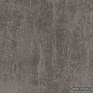
egecarpets > Carpet
Our attention is caught by the light but shadows have more to say. Since classical times, artists have understood their value. They’re mysterious, feed the imagination and add drama. Shadows are complex and tell stories about objects out of view. They can reveal the invisible. In this Shadowplay collection, the multi-level loop construction creates a sculptural texture influenced by the distorted shade and light. Two co-ordinating patterns, Umbra and Obscura, can be used alone or together to compose layered shadows which dance across the floor. Tone on tone neutrals are complimented by haloes of colour which trace abstract shape and fade quietly away The collection is a great visual toolbox where you can achieve very different looks depending on the sizes and shapes you choose. Shadowplay comes in a wide palette of contemporary colours from subtle tone-on-tone shades to more rich tones carefully coordinated for perfect combinations. It allows different spatial options that help define areas such as meeting points and quiet or communal zones, as well as catering to social distancing requirements and wayfinding.
ReForm Shadowplay Obscura silver
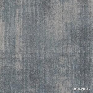
egecarpets > Carpet
Our attention is caught by the light but shadows have more to say. Since classical times, artists have understood their value. They’re mysterious, feed the imagination and add drama. Shadows are complex and tell stories about objects out of view. They can reveal the invisible. In this Shadowplay collection, the multi-level loop construction creates a sculptural texture influenced by the distorted shade and light. Two co-ordinating patterns, Umbra and Obscura, can be used alone or together to compose layered shadows which dance across the floor. Tone on tone neutrals are complimented by haloes of colour which trace abstract shape and fade quietly away The collection is a great visual toolbox where you can achieve very different looks depending on the sizes and shapes you choose. Shadowplay comes in a wide palette of contemporary colours from subtle tone-on-tone shades to more rich tones carefully coordinated for perfect combinations. It allows different spatial options that help define areas such as meeting points and quiet or communal zones, as well as catering to social distancing requirements and wayfinding.
Ambrosia
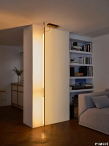
marset > Floor lamp
Ambrosia is essentially a line of light that can be converted into a modular system, capable of extending the illumination it offers to adapt to any space. A design that recovers and revisits the tube light, timeless, and updates it so that its simple structure and diffuse lighting add beauty to any space. This collection expands on its possibilities by proposing a change in the plane of light, from horizontal to vertical.This new style of lamp is available in two versions, both of which are pendant lamps. First there is the Ambrosia V, a 235-cm-high vertical structure consisting of two tubes of light of different lengths. An interrupted line of light, a detail that brings lightness and character to the lamp. Its design allows you to choose the lighting, either towards the wall for indirect light, or towards the main space for direct light. This aesthetic and functional design also works well in domestic settings. The other vertical version, Ambrosia V, joins three light tubes placed at different heights, forming a sculptural ensemble. This option can provide a great deal of light and therefore comes with a dimming system for easy lighting control. It is available in two heights of 130 and 175 cm. Both sizes can be electrically connected through the ceiling rosette or the floor plug. The new Ambrosia allows you to create vertical lighting compositions, combining different sizes in repetition to illuminate large spaces. When installed individually, it fills the space with light and warmth. Its slender design sets the perfect scene in any room. A totally new perspective for this flexible lighting system, which achieves maximum light expression with a minimalist structure. The metal structure is available in two finishes – black and matte gold – and the light source in three colour temperatures: 2200 K, 2700 K and 3000 K.
Courage

mitab > Table
SOFA COURAGE Courage is a modular based system with seating elements and backrests that can be endlessly combined. The graphic simplicity comes from the design brief asking for an archetypal product based on the golden ratio. The different elements have 2 sections of fabric, creating a “bottom line” which is intended to bond the different parts together, yet allowing for the upper part to be selected in different colours or fabrics creating a varied interior. Courage have a base frame of metal, different parts for different elements. There is no visible fittings or damage when Courage is built together. ADD ELECTRICS To support connected users on the move Courage can be specified with integrated electrical power outlets neatly fitted into the seat and easily accessible. PAIR WITH ORBIT The Orbit swivelling table perfectly compliments Courage’s form and function and has been designed to be natively mounted to Courage’s seat modules. VERSATILE MODULARITY Courage’s modular design comprising numerous elemental forms enables it to be configured in an almost infinite number of compositions. From small geometric islands to sprawling landmasses of comfort, Courage provides a much needed stopping place. COMMITTED Courage has been independently certified by Möbelfakta a widely respected certification scheme that assess and validate the sustainability credentials of furniture and products so consumers can make more informed choices. Modular sofa system with several seat, back and arm units. Base frame and connection fittings in powder coated metal frame in standard RAL (black). Seat with wood base and cold foam upholstered in standard fabrics or c.o.m. Backrests with optional one or two soft sides. Arm units with table top in ash natural. Multiple fabric configuration and electrical outlets available as add-on. (Electrical outlets is not possible with seats in H.36cm)
Matrice Essenza

florim > Wallcovering
An atlas of modular signs to be combined in a wide variety of layouts. «We love concrete as a material, its versatility and its plain, austere look. We have completed our carefully designed surfaces with graphic patterning inspired by the human actions of weaving and embroidering.» Barbara Brondi & Marco Rainò To appreciate the profundity of the design project undertaken by Barbara Brondi and Marco Rainò for Cedit, it is both necessary and explanatory to start from the title the collection bears. In modern usage the term Matrice, in Italian, refers to a die or mould used to reproduce an object, but its origins are much more remote, with a meaning closer to the English “matrix”, meaning the underlying basis of something. The root of the word is related to Mater or mother: the name Matrice thus relates to the origin or cause of something. This dichotomy is expressed in several levels within the work of these architects, who study the world from a sophisticated conceptual approach and then transform it into a design. Starting from the idea of ceramic coverings, which have always been a tool not so much of architecture as of interior design, the artists work back to the origin of the surface and its decoration within their own discipline: they look at what we used to call the modern age, where modernity has also brought an uncompromising brutality, and where the use of bare concrete became the statement of an attitude to life with no time to spare for manners. Concrete is originally a liquid material, intended for shaping, which can therefore absorb and retain any type of mark created by the material and mould used to form it. Architects midway between rationalism and brutalism have used the rough-and-ready language of concrete combined with a last, elegant, anthropic decorative motif impressed on the material, that makes the concept of covering superfluous, because its place, in its older meaning of decoration rather than functional cladding, is taken by the regular patterning created in the material itself. There are therefore various grounds for believing that, in this collection, the artists are once again working in architectural terms. Firstly, with a simplicity typical of BRH+, they reduce the initial concepts to their minimal terms. So although this is a collection of coverings for walls, indoor floors, outdoor pavings and curtain walls, a great deal of time was spent on destructuring the idea of the ceramic covering itself. Unfortunately, nowadays there is no space in the contemporary construction sector for the radical approach of the past, so the cladding designed for the building actually lays bare the interior, using the choice of material – accurately interpreted (with shade variation) on the basis of an assortment of various types – to restore visual elegance and a fundamental severity. Attention to scale is another architectural feature: Matrice offers modules with architectural dimensions and different sizes through the development of “large slabs”, eliminating the visual regular grid effect. Thanks to this visual reset, geographic forms are perceived to emerge from dense, grey concrete surfaces decorated as in bygone days by special processes and by weathering during drying. The various types of slab, each an atlas of subtle, vibrant signs on the surfaces, comprise finishes that reproduce the visual effect of reinforced concrete – with the aggregates in the cement more clearly visible, of formwork – with the signs impressed on the concrete by the timber used, of a structured surface resembling bare cement plaster, of ridged and streaked surfaces – with patterning resembling some kinds of linear surface finishing processes – and finally a smooth, or basic version, over which Matrice exercises the dichotomy referred to earlier. It is on these surfaces that Brondi and Rainò have imagined additional design reverberations, a figurative code that rejects the concept of the grid, previously inseparable from that of the module: by means of a vocabulary of graphic marks cut into the slabs with a depth of 3 mm (the width of the gap left between modules during installation), they provide a framework for infinite combinations of possible dialogues. Just as in embroidery, which is based on grids of stitches and geometric repetitions, and where every stitch is at right-angles to another one to construct forms and decorations. Also taken from embroidery is the idea of introducing a degree of “softness” to reduce the stiffness of intentionally deaf surfaces. There is the impression of patterns that can continue for infinity, as in textile weaving, and a scale that, unlike the surface being worked on, is imagined as suspended and lightweight. They may not admit it, but BRH+ know a lot about music, including electronic music, and it appears to me that this organised tangle of infinite signs – unidentifiable without an overview – is rather like the representations of synthesized sounds. Sounds that are produced by machines, and thus “woven” by sampling and overlapping sounds of the most unlikely origins, combined to form jingles which, once heard, are imprinted indelibly on the brain. This may be why I am so interested in the space between this “melodic film” and its deaf, damp substrate. The eyes can navigate this suspended reality without fear of disturbance. So we are faced with different surfaces, different sizes and different graphic signs. But only one colour (surprise!) to prevent a cacophony not just of signs but also of possible interpretations: the artists retain their radical principles (and their generosity), and as curators, a role in which they are skilled, they leave the players (architects and installers) to add their own interpretations. In their hands this colour, expressed in Matrice, will produce motifs on surfaces in living spaces for someone else. This stylish covering and its workmanship will be left to the hands of someone who will probably never read this, but will be on a building site, with the radio playing on a stereo system, concentrating on installing the very pieces we describe. So a radical, apparently silent, design project like this has repercussions for the real world we live in. Matrice has no form of its own but merely acquires the ornamentation drawn on its surfaces by a second group of artists. And here this routine action, standardised by the form approved for production and workmanlike efficiency, is the origin and cause of change, generating a variability of choices and interpretations, on that dusty building site where music plays and mortar flows.
ReForm Shadowplay Obscura sage
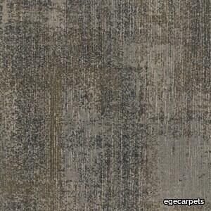
egecarpets > Carpet
Our attention is caught by the light but shadows have more to say. Since classical times, artists have understood their value. They’re mysterious, feed the imagination and add drama. Shadows are complex and tell stories about objects out of view. They can reveal the invisible. In this Shadowplay collection, the multi-level loop construction creates a sculptural texture influenced by the distorted shade and light. Two co-ordinating patterns, Umbra and Obscura, can be used alone or together to compose layered shadows which dance across the floor. Tone on tone neutrals are complimented by haloes of colour which trace abstract shape and fade quietly away The collection is a great visual toolbox where you can achieve very different looks depending on the sizes and shapes you choose. Shadowplay comes in a wide palette of contemporary colours from subtle tone-on-tone shades to more rich tones carefully coordinated for perfect combinations. It allows different spatial options that help define areas such as meeting points and quiet or communal zones, as well as catering to social distancing requirements and wayfinding.
ReForm Shadowplay Umbra ink
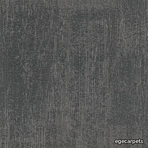
egecarpets > Carpet
Our attention is caught by the light but shadows have more to say. Since classical times, artists have understood their value. They’re mysterious, feed the imagination and add drama. Shadows are complex and tell stories about objects out of view. They can reveal the invisible. In this Shadowplay collection, the multi-level loop construction creates a sculptural texture influenced by the distorted shade and light. Two co-ordinating patterns, Umbra and Obscura, can be used alone or together to compose layered shadows which dance across the floor. Tone on tone neutrals are complimented by haloes of colour which trace abstract shape and fade quietly away The collection is a great visual toolbox where you can achieve very different looks depending on the sizes and shapes you choose. Shadowplay comes in a wide palette of contemporary colours from subtle tone-on-tone shades to more rich tones carefully coordinated for perfect combinations. It allows different spatial options that help define areas such as meeting points and quiet or communal zones, as well as catering to social distancing requirements and wayfinding.
ReForm Shadowplay Umbra taupe
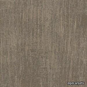
egecarpets > Carpet
Our attention is caught by the light but shadows have more to say. Since classical times, artists have understood their value. They’re mysterious, feed the imagination and add drama. Shadows are complex and tell stories about objects out of view. They can reveal the invisible. In this Shadowplay collection, the multi-level loop construction creates a sculptural texture influenced by the distorted shade and light. Two co-ordinating patterns, Umbra and Obscura, can be used alone or together to compose layered shadows which dance across the floor. Tone on tone neutrals are complimented by haloes of colour which trace abstract shape and fade quietly away The collection is a great visual toolbox where you can achieve very different looks depending on the sizes and shapes you choose. Shadowplay comes in a wide palette of contemporary colours from subtle tone-on-tone shades to more rich tones carefully coordinated for perfect combinations. It allows different spatial options that help define areas such as meeting points and quiet or communal zones, as well as catering to social distancing requirements and wayfinding.
ReForm Shadowplay Obscura sand
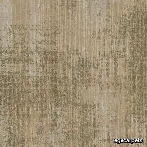
egecarpets > Carpet
Our attention is caught by the light but shadows have more to say. Since classical times, artists have understood their value. They’re mysterious, feed the imagination and add drama. Shadows are complex and tell stories about objects out of view. They can reveal the invisible. In this Shadowplay collection, the multi-level loop construction creates a sculptural texture influenced by the distorted shade and light. Two co-ordinating patterns, Umbra and Obscura, can be used alone or together to compose layered shadows which dance across the floor. Tone on tone neutrals are complimented by haloes of colour which trace abstract shape and fade quietly away The collection is a great visual toolbox where you can achieve very different looks depending on the sizes and shapes you choose. Shadowplay comes in a wide palette of contemporary colours from subtle tone-on-tone shades to more rich tones carefully coordinated for perfect combinations. It allows different spatial options that help define areas such as meeting points and quiet or communal zones, as well as catering to social distancing requirements and wayfinding.
Susan Chair
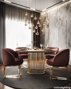
castrolighting > Armchair
The Susan collection celebrates beauty in the delicacy expressed in a spellbinding furniture design. The fineness of construction implemented in its structure – Susan Chair introduces the unique concept of bringing a soft sophistication to its appearance, evoking relaxed elegance and grace given by its charismatic brass lines with many subtle curves and thin metal frame. This elegant chair features polished brass legs that provide a completely exclusive and deluxe look, lending delicate flair to any modern ambiance in an art deco setting. All the eye-popping Susan Chair details are individually applied by hand. The chair’s most interesting part and most prominent elements that make it distinctive are gently curved armrests with a pinch of delicate and warm feminine charm, being beyond more than just beautiful. The ultra-stylish beige leather back and super comfortable lounging seat adorned with twisted gold-plated brass gives this handmade furniture piece the ultimate feeling of contemporary cozy chic. The classy design combines perfectly with many interior styles and fits beautifully in the grand residences, luxury villas, penthouses, and mansions. It brings warmth and tenderness to the most demanding living spaces, being a perfect elegant addition to the stylish living room, kitchen, bedroom, or dining room furniture set. This luxury handcrafted furniture piece is incorporated to stun interior design and fashion enthusiasts with its one-of-a-kind refinement and delicateness. Its iconic style grants timeless allure to the most exquisite interiors, making the residential space a serene retreat. The new lifestyle signature design is created by tailoring sophistication into brass. Pair this luxurious soft chair with Charlotte Ring Dining Table to create a cosmopolitan ambiance. VIEW FULL FAMILY
Matrice Struttura

florim > Wallcovering
An atlas of modular signs to be combined in a wide variety of layouts. «We love concrete as a material, its versatility and its plain, austere look. We have completed our carefully designed surfaces with graphic patterning inspired by the human actions of weaving and embroidering.» Barbara Brondi & Marco Rainò To appreciate the profundity of the design project undertaken by Barbara Brondi and Marco Rainò for Cedit, it is both necessary and explanatory to start from the title the collection bears. In modern usage the term Matrice, in Italian, refers to a die or mould used to reproduce an object, but its origins are much more remote, with a meaning closer to the English “matrix”, meaning the underlying basis of something. The root of the word is related to Mater or mother: the name Matrice thus relates to the origin or cause of something. This dichotomy is expressed in several levels within the work of these architects, who study the world from a sophisticated conceptual approach and then transform it into a design. Starting from the idea of ceramic coverings, which have always been a tool not so much of architecture as of interior design, the artists work back to the origin of the surface and its decoration within their own discipline: they look at what we used to call the modern age, where modernity has also brought an uncompromising brutality, and where the use of bare concrete became the statement of an attitude to life with no time to spare for manners. Concrete is originally a liquid material, intended for shaping, which can therefore absorb and retain any type of mark created by the material and mould used to form it. Architects midway between rationalism and brutalism have used the rough-and-ready language of concrete combined with a last, elegant, anthropic decorative motif impressed on the material, that makes the concept of covering superfluous, because its place, in its older meaning of decoration rather than functional cladding, is taken by the regular patterning created in the material itself. There are therefore various grounds for believing that, in this collection, the artists are once again working in architectural terms. Firstly, with a simplicity typical of BRH+, they reduce the initial concepts to their minimal terms. So although this is a collection of coverings for walls, indoor floors, outdoor pavings and curtain walls, a great deal of time was spent on destructuring the idea of the ceramic covering itself. Unfortunately, nowadays there is no space in the contemporary construction sector for the radical approach of the past, so the cladding designed for the building actually lays bare the interior, using the choice of material – accurately interpreted (with shade variation) on the basis of an assortment of various types – to restore visual elegance and a fundamental severity. Attention to scale is another architectural feature: Matrice offers modules with architectural dimensions and different sizes through the development of “large slabs”, eliminating the visual regular grid effect. Thanks to this visual reset, geographic forms are perceived to emerge from dense, grey concrete surfaces decorated as in bygone days by special processes and by weathering during drying. The various types of slab, each an atlas of subtle, vibrant signs on the surfaces, comprise finishes that reproduce the visual effect of reinforced concrete – with the aggregates in the cement more clearly visible, of formwork – with the signs impressed on the concrete by the timber used, of a structured surface resembling bare cement plaster, of ridged and streaked surfaces – with patterning resembling some kinds of linear surface finishing processes – and finally a smooth, or basic version, over which Matrice exercises the dichotomy referred to earlier. It is on these surfaces that Brondi and Rainò have imagined additional design reverberations, a figurative code that rejects the concept of the grid, previously inseparable from that of the module: by means of a vocabulary of graphic marks cut into the slabs with a depth of 3 mm (the width of the gap left between modules during installation), they provide a framework for infinite combinations of possible dialogues. Just as in embroidery, which is based on grids of stitches and geometric repetitions, and where every stitch is at right-angles to another one to construct forms and decorations. Also taken from embroidery is the idea of introducing a degree of “softness” to reduce the stiffness of intentionally deaf surfaces. There is the impression of patterns that can continue for infinity, as in textile weaving, and a scale that, unlike the surface being worked on, is imagined as suspended and lightweight. They may not admit it, but BRH+ know a lot about music, including electronic music, and it appears to me that this organised tangle of infinite signs – unidentifiable without an overview – is rather like the representations of synthesized sounds. Sounds that are produced by machines, and thus “woven” by sampling and overlapping sounds of the most unlikely origins, combined to form jingles which, once heard, are imprinted indelibly on the brain. This may be why I am so interested in the space between this “melodic film” and its deaf, damp substrate. The eyes can navigate this suspended reality without fear of disturbance. So we are faced with different surfaces, different sizes and different graphic signs. But only one colour (surprise!) to prevent a cacophony not just of signs but also of possible interpretations: the artists retain their radical principles (and their generosity), and as curators, a role in which they are skilled, they leave the players (architects and installers) to add their own interpretations. In their hands this colour, expressed in Matrice, will produce motifs on surfaces in living spaces for someone else. This stylish covering and its workmanship will be left to the hands of someone who will probably never read this, but will be on a building site, with the radio playing on a stereo system, concentrating on installing the very pieces we describe. So a radical, apparently silent, design project like this has repercussions for the real world we live in. Matrice has no form of its own but merely acquires the ornamentation drawn on its surfaces by a second group of artists. And here this routine action, standardised by the form approved for production and workmanlike efficiency, is the origin and cause of change, generating a variability of choices and interpretations, on that dusty building site where music plays and mortar flows.
ReForm Shadowplay Umbra blush
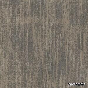
egecarpets > Carpet
Our attention is caught by the light but shadows have more to say. Since classical times, artists have understood their value. They’re mysterious, feed the imagination and add drama. Shadows are complex and tell stories about objects out of view. They can reveal the invisible. In this Shadowplay collection, the multi-level loop construction creates a sculptural texture influenced by the distorted shade and light. Two co-ordinating patterns, Umbra and Obscura, can be used alone or together to compose layered shadows which dance across the floor. Tone on tone neutrals are complimented by haloes of colour which trace abstract shape and fade quietly away The collection is a great visual toolbox where you can achieve very different looks depending on the sizes and shapes you choose. Shadowplay comes in a wide palette of contemporary colours from subtle tone-on-tone shades to more rich tones carefully coordinated for perfect combinations. It allows different spatial options that help define areas such as meeting points and quiet or communal zones, as well as catering to social distancing requirements and wayfinding.
ReForm Shadowplay Obscura ink
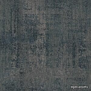
egecarpets > Carpet
Our attention is caught by the light but shadows have more to say. Since classical times, artists have understood their value. They’re mysterious, feed the imagination and add drama. Shadows are complex and tell stories about objects out of view. They can reveal the invisible. In this Shadowplay collection, the multi-level loop construction creates a sculptural texture influenced by the distorted shade and light. Two co-ordinating patterns, Umbra and Obscura, can be used alone or together to compose layered shadows which dance across the floor. Tone on tone neutrals are complimented by haloes of colour which trace abstract shape and fade quietly away The collection is a great visual toolbox where you can achieve very different looks depending on the sizes and shapes you choose. Shadowplay comes in a wide palette of contemporary colours from subtle tone-on-tone shades to more rich tones carefully coordinated for perfect combinations. It allows different spatial options that help define areas such as meeting points and quiet or communal zones, as well as catering to social distancing requirements and wayfinding.
ReForm Shadowplay Obscura taupe
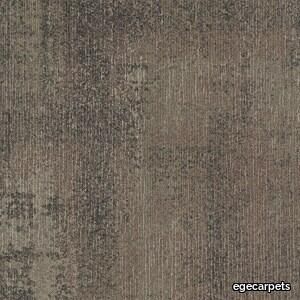
egecarpets > Carpet
Our attention is caught by the light but shadows have more to say. Since classical times, artists have understood their value. They’re mysterious, feed the imagination and add drama. Shadows are complex and tell stories about objects out of view. They can reveal the invisible. In this Shadowplay collection, the multi-level loop construction creates a sculptural texture influenced by the distorted shade and light. Two co-ordinating patterns, Umbra and Obscura, can be used alone or together to compose layered shadows which dance across the floor. Tone on tone neutrals are complimented by haloes of colour which trace abstract shape and fade quietly away The collection is a great visual toolbox where you can achieve very different looks depending on the sizes and shapes you choose. Shadowplay comes in a wide palette of contemporary colours from subtle tone-on-tone shades to more rich tones carefully coordinated for perfect combinations. It allows different spatial options that help define areas such as meeting points and quiet or communal zones, as well as catering to social distancing requirements and wayfinding.
ReForm Shadowplay Umbra moss
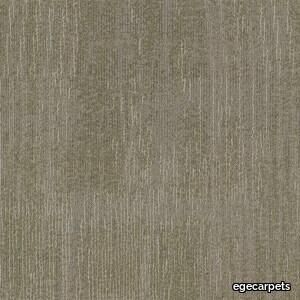
egecarpets > Carpet
Our attention is caught by the light but shadows have more to say. Since classical times, artists have understood their value. They’re mysterious, feed the imagination and add drama. Shadows are complex and tell stories about objects out of view. They can reveal the invisible. In this Shadowplay collection, the multi-level loop construction creates a sculptural texture influenced by the distorted shade and light. Two co-ordinating patterns, Umbra and Obscura, can be used alone or together to compose layered shadows which dance across the floor. Tone on tone neutrals are complimented by haloes of colour which trace abstract shape and fade quietly away The collection is a great visual toolbox where you can achieve very different looks depending on the sizes and shapes you choose. Shadowplay comes in a wide palette of contemporary colours from subtle tone-on-tone shades to more rich tones carefully coordinated for perfect combinations. It allows different spatial options that help define areas such as meeting points and quiet or communal zones, as well as catering to social distancing requirements and wayfinding.
ReForm Shadowplay Umbra beige
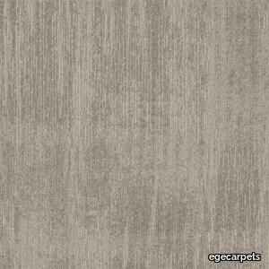
egecarpets > Carpet
Our attention is caught by the light but shadows have more to say. Since classical times, artists have understood their value. They’re mysterious, feed the imagination and add drama. Shadows are complex and tell stories about objects out of view. They can reveal the invisible. In this Shadowplay collection, the multi-level loop construction creates a sculptural texture influenced by the distorted shade and light. Two co-ordinating patterns, Umbra and Obscura, can be used alone or together to compose layered shadows which dance across the floor. Tone on tone neutrals are complimented by haloes of colour which trace abstract shape and fade quietly away The collection is a great visual toolbox where you can achieve very different looks depending on the sizes and shapes you choose. Shadowplay comes in a wide palette of contemporary colours from subtle tone-on-tone shades to more rich tones carefully coordinated for perfect combinations. It allows different spatial options that help define areas such as meeting points and quiet or communal zones, as well as catering to social distancing requirements and wayfinding.
Milana
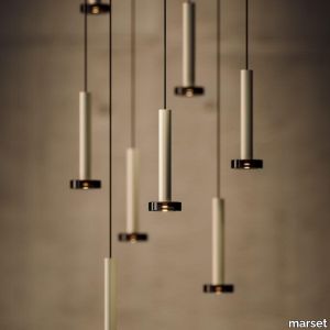
marset > Ceiling lamp
Moving the point of light, that’s the idea behind the new design by Jaume Ramírez. Milana involves a system of modular suspension lamps that combine with one another and can be moved both vertically and horizontally.Paradoxically, this new design starts by deconstructing the archetype of a lamp; by synthesizing it as much as possible, only a cylindrical body remains, suspended with a built-in LED. To this cylinder we can add different conical shades in oyster white and black in several sizes. But most ingenious of all is that each of these lamps can have a simple counterweight such that when they are hung between two points, they can be moved. An almost imperceptible lens covers the LED and distributes the light. If only the cylindrical lamp is used, the downward-directed light is impeccable, and when a shade is added, the light escapes, illuminating the lamp itself. This new lighting system gives the user control of the light, offering a new conceptual proposal. Furthermore, the Milana collection is now also available with a pressed glass accessory, in a smoked finish. A feature that adds volume and nuance to your lighting. This version is 24 V-ready, a technical detail that allows several lamp units to be connected to a single light source. With the pressed glass version of Milana, light sets can be created to illuminate large spaces. Covering and baring lamps, moving them up, down and sideways. Mixing cylindrical shapes or combining them with decorative lamps. Milana lets you create countless compositions, a symphony of light. A cluster accessory is also available for the Milana collection, allowing you to connect several pendant lamps at once to a single point of light. This offers the freedom to build with light, to illuminate large spaces and to create compositions.
Horizonte
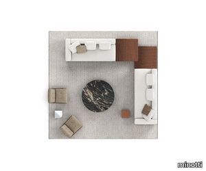
minotti > Sofa
A floating island with square lines that marks the horizon of the living space. The new system by Marcio Kogan / studio mk27 takes shape from a suspended base, a solid thin line covered in leather, fabric or both, on which generous volumetric padded elements rest. Perfectly consistent with Marcio Kogan's design philosophy, the Horizonte modular seating system is the result of a clear architectural vision: a rigorous shape, raised seven centimetres off the ground thanks to a recessed plinth in matt black varnished metal, which gives the sofa a special feeling of suspension. A platform on which the upholstered elements are located - seats, backrests and armrests - all conceived as large cushions with bold proportions and a strong personality. It is not only the dimensions that characterise these modules, but also their unprecedented softness, capable of maintaining a precise formal aesthetic, despite their welcoming sinkable effect. Comfort is in fact guaranteed by an innovative technology that uses pocketed springs inserted in variable-density polyurethanes that allow the memory of the shapes to be maintained and the seat to return to its original form, modelling itself to the shape of the user. The base on which the upholstered volumes rest is made from a clever combination of materials: entirely in leather or fabric or in an original mix of both to create an even more refined and prestigious look. In the fabric version, the two strips are coupled with a zip, hidden by a creased seam, presented as an aesthetic motif that allows for the practical and quick removal of the covering. On the other hand, in the base entirely covered in leather, the covering is lapped: refined and inspired by the world of haute couture,this production technique means that the strips of leather are sewn together by folding back the edges. The seemingly simple appearance of Horizonte gives rise to a sophisticated style code that can be used in a wide range of configurations. By combining modules, sloping elements and others with built-in coffee table, an overall narrative that could continue forever without interruption is created. For some elements, the base under the upholstered elements juts out from the seat cushion to accommodate a shelf, available in different sizes and configurations. Like a full stop in punctuation, the module is inserted between the seats, enriched by a top attached to the base of the sofa: this does not interrupt the fluidity of the shape, adding a multifunctional top in Dark Brown stained Canaletto walnut, Liquorice lacquered ash, Calacatta and Grigio Orobico marble, or smoothed matt Nero Marquina and brushed Belvedere granite. In addition to the top, interspersed between the cushions, the Horizonte family also includes coffee tables and a side table. The latter has been designed in perfect aesthetic continuity with the Horizonte seating system, from which it takes both the detail of the matt black varnished metal base and the thickness of the top: a horizontal groove engraved on the solid wood bullnose edge recalls the same concept of geometry used in the base. The coffee and side tables also reflect the same style, with floor support in polished Bronze varnished metal and tops in Dark Brown stained Canaletto walnut or Liquorice coloured ash. The different sizes and heights of the coffee and side tables allow for a play of superimpositions that invigorates the horizontality of the entire family.
ReForm Shadowplay Obscura storm
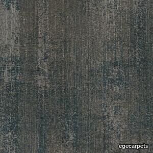
egecarpets > Carpet
Our attention is caught by the light but shadows have more to say. Since classical times, artists have understood their value. They’re mysterious, feed the imagination and add drama. Shadows are complex and tell stories about objects out of view. They can reveal the invisible. In this Shadowplay collection, the multi-level loop construction creates a sculptural texture influenced by the distorted shade and light. Two co-ordinating patterns, Umbra and Obscura, can be used alone or together to compose layered shadows which dance across the floor. Tone on tone neutrals are complimented by haloes of colour which trace abstract shape and fade quietly away The collection is a great visual toolbox where you can achieve very different looks depending on the sizes and shapes you choose. Shadowplay comes in a wide palette of contemporary colours from subtle tone-on-tone shades to more rich tones carefully coordinated for perfect combinations. It allows different spatial options that help define areas such as meeting points and quiet or communal zones, as well as catering to social distancing requirements and wayfinding.
Miniatures .02
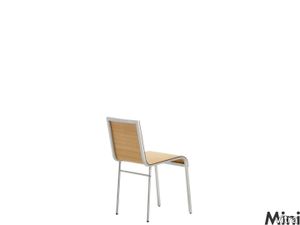
vitra > Styling
Belgian designer and interior architect Maarten Van Severen was an idiosyncratic figure on the international design scene. His work was noted for its intense engagement with a few basic furniture types, such as the chair, table, chaise longue, shelving and cabinet, for which he developed fundamental solutions. <br/><br/>Like Jean Prouvé, Van Severen regarded his experiments in the workshop and his close physical contact with the materials to be a vital element of the design process. This was the reason why, up until the mid 90s, when he started working with industrial partners, he produced all his designs in the workshop that he had set up in 1987. <br/><br/>This included the CNº II chair (later .02), introduced in 1992. This chair, with its simplicity of form, has a seat and backrest crafted from a continuous piece of material – a sheet of aluminium or thin plywood – set on an aluminium base. The CNº II formed the basis for his subsequent collaboration with Vitra to develop the .03 chair, which was introduced to the market in 1998 and marked his international emergence as a designer.