Glyde Oak 22246
moduleo > Floor plank
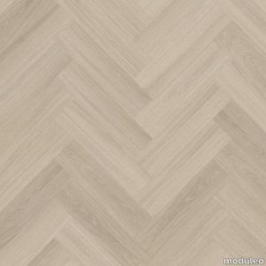
Simplicity rules in this lightly grained oak pattern. With its soft, toned-down pattern and matte finish, Glyde Oak is the perfect starting point for any interior. Minimal, yet warm. A true all-rounder.
Glyde Oak 22877
moduleo > Floor plank
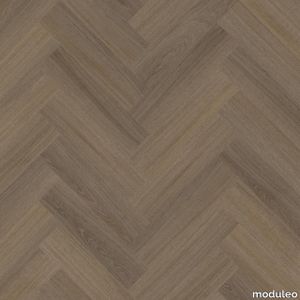
Simplicity rules in this lightly grained oak pattern. With its soft, toned-down pattern and matte finish, Glyde Oak is the perfect starting point for any interior. Minimal, yet warm. A true all-rounder.
Blues rectangular table
turri > Side table
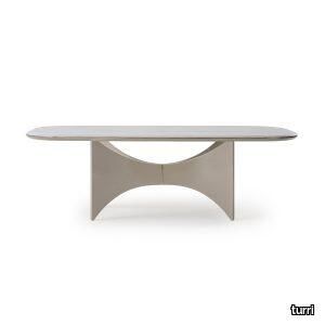
The table of the Blues collection has a base that evokes wings, both aesthetic and functional, supporting the top, in an elegant game of lines. A metal detail makes the central meeting point sophisticated. The top is characterized by rounded corners and circular and light lines, as well as the profile, always rounded and enriched on the entire perimeter with the same metal detail of the base. The different varieties of materials and finishes of the top – in wood or marble – and of the base – in walnut or glossy lacquered wood – make the table a design element suitable for any interior. The Blues table is available in different finishes as per sample card.
Beaubien Atelier 03
lambertetfils > Ceiling lamp
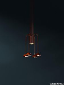
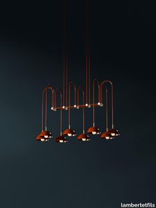
Guided by the images of a waterfall and a weeping willow, the Beaubien Atelier provides a vertical focal point that shines in any space.
Beaubien Atelier 05
lambertetfils > Ceiling lamp
Guided by the images of a waterfall and a weeping willow, the Beaubien Atelier provides a vertical focal point that shines in any space.
Beaubien Atelier 06
lambertetfils > Ceiling lamp
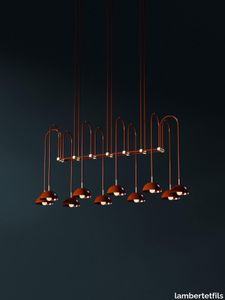
Guided by the images of a waterfall and a weeping willow, the Beaubien Atelier provides a vertical focal point that shines in any space.
Refolo
cassina > Sofa
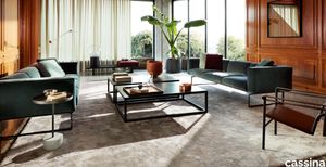
The top is made up of 19 strips of wood and supported on graceful legs; a simple anchoring system allows the sofa seat cushions and those for the backrest to be positioned at any point along the structure.
Square
sciroccoh > Accessories
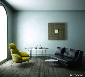
Squared lines with a contemporary touch. Square is a steel radiator with wall installation characterized by distinctive measures and innovative design. Strong point is its central heart where valve, holder and hydraulic connections are cleverly masked by the humidifier element, which makes its design clean and minimal. The design is completed by the multiple colour combinations that can be created between the heating body and the humidifying tray.
Drain KIT - SQUARE DRAIN KIT Showertec
profilitec > Accessories
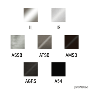
Drain KIT - SQUARE DRAIN KIT Showertec Showertec STC - SQUARE DRAIN KIT is a shower kit for vertical drains that contains the grid support system (plastic) and the grid (stainless steel or aluminium). The system combined with the STC shower trays and STC Flange kit allows you to create shower systems with point drainage and central drain.
MUDR tileable linear drain channel
profilitec > Accessories
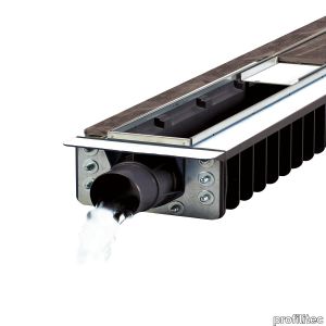
MUDR tileable linear drain channel The Multidrain MUDR is a system that allows the realization of a pre-slope tiled linear drain by combining different modules up to 6.25 meters using only one discharge point. The system needs 7 cm height under tile.
TRIARC PENDANT
bertfrank > Ceiling lamp
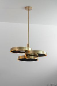
Three intersecting brass discs hang from a single drop rod. Grouped together with two or more pendants – a trio of Triarcs, for example – it creates a sculptural focal point, a stunning visual statement. Available with opal or black diffusers.Please write to us at [email protected] to let us know your required drop height, referencing your order number.Standard dispatch time: 6-8 weeks.
SHEAR PENDANT XL
bertfrank > Ceiling lamp
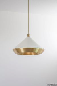
Make a statement with our XL Size Pendant, a masterpiece in brass and turned metal. The brushed finish on the inner shade emits a grand, warm light. Perfect for those seeking a bold focal point. Personalise your pendant with our selection of brass finishes and powder coat options for a truly unique and striking piece.
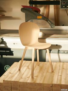
Arc
mitab > Chair
CHAIRS ARC REFRESH & RENEW Designed and built with heavy contract use in mind, with Mitab’s Refresh & Renew initiative you can repair and reinvigorate tired chairs simply and conveniently with clear pricing. From the point of view of sustainability selecting furniture with the longest in-service life is the most effective way of reducing CO2 emissions due to purchasing and user behaviours. SUSTAINABILITY Chair and armchair in 3 base configurations, 4-leg, wooden base or sledge base. Frame in tubular steel, steel wire or ash wood. Base in standard RAL (black, white or silver), chrome, Selected RAL or Anycolour RAL. Seat/back in compression moulded wood. Clear stain lacquered seat or with cold foam upholstered in standard fabrics or c.o.m. Stackable in configurations chair with 4-legs or sledge base. Optional metal armrests.
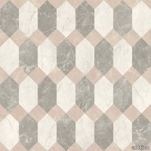
Polygon Key Mini DC602
amtico > Floor plank
Cool, fresh hues work with a contrasting pop of blush, for a trend-led marble combination that will make a stunning focal point in chic spaces.
Graphite Slate

amtico > Floor plank
Urban, minimal, modern, this is a beautiful starting point for contemporary space
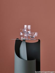
Sferico Joe Colombo, 1968
karakterCopenhagen > Styling
Joe Colombo believed in democratic and functional design. In his lifetime he designed a wide range of different drinking glasses. Something that seems very to the point as he was said to love drinking and smoking. Unfortunately this undoubtedly contributed to his young demise, but we’d like to think he would be pleased to see that his creations live on. In 1968 he designed a series of six glasses, all based on geometrical figures. True to his democratic and functional take on design, all the glasses were intended for a wide range of different usage—such as water, long drinks, whisky, wine, beer, juice, champagne, ice cream and so on. Karakter is proud to bring some of the very finest glasses to your table and will introduce the six different Joe Colombo glasses.
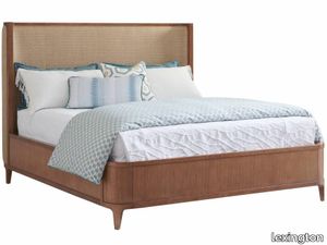
Villa Park Upholstered Bed
lexington > Bed frame
The Villa Park upholstered bed offers a gentle return on the headboard which is mirrored on the footboard with soft radius corners. The returns on the outside of the headboard are also upholstered to the point where the panel flattens out in the back. The standard fabric is 431641 Mirage, which is an indoor performance fabric with a contemporary parquet geometric pattern in shades of desert sand and gold. The headboard is also available in your choice of custom fabrics.
Freeport Square Mirror
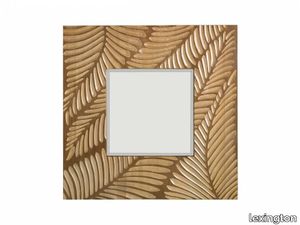
lexington > Styling
The square mirror features an intricate carved palm frond motif. To create a distinctive look, pair with the Sand Point buffet.
Key Largo Cocktail Table With Glass Top
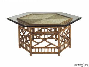
lexington > Coffee table
The six-sided woven rattan base with leather binding is reflected in the matching angles of the enlarged glass top. Similarly, the woven lampakani is presented in six triangles to replicate yet draw the entire design to a center focal point.
Multidot
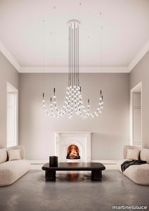
martinelliluce > Ceiling lamp
Remembering the chandeliersInspired by the chandeliers of the past, Multidot offers a modern interpretation of this suspension, updating it from a compositional, expressive and technological point of view.
Portus

lammhults > Chair
Portus is a gracious architectural family of products with a clear visual identity. The seating series offers many possibilities – a stopping point, a meeting point, a relaxing space or a sharing space – all created by the combination of three simple elements: a soft sculptural bench, an ergonomic support cushion alternatively decoration pillows, and a shapely back.
Drop
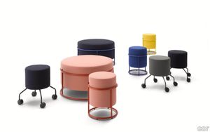
cor > Pouf
Drop by Pauline Deltour is the name of a whole family consisting of a mobile roller stool, a stackable stool and large pouf. The small components are mobile, while the large pouf forms a meeting point in the office. What they all have in common is that they are laid-back. A round, fully visible steel frame enfolds each upholstered body. Tone in tone. Four legs with rollers turn the small stool into the office run-about — an incredibly practical colleague. The perfect additive for a mobile working envi-ron-ment. “I share my office with friends,” says the French designer, “and on holiday I use Airbnb.” It is precisely this lightness and joy that Drop ema-nates. A dash of French savoir vivre.
Eclipse Wall Light
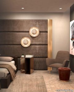
castrolighting > Wall lamp
The Eclipse Handmade Wall Light is named after the solar eclipse phenomena. When the moon slowly starts to rotate to the point it almost aligns with the Sun and the Earth, the moon creates a shadow that partially inhibits sunrays from being seen from earth. Recreating this natural wonder, the Eclipse gold wall sconce is composed of two rounded brass plates, placed in front of each other, with a slight distance between them, only allowing little crescents of light to shine through. The front plate is hammered by hand, using modern handcraft technics, that reflects in the shining gold plated plate in the back. Featuring touches of modern, contemporary and mid century modern styles, alongside it's delicate luxury shade, this handmade wall sconce is the perfect fit for a hallway, bedroom, living room or dining room, it’s warm light brings a calm and relaxing ambiance. #graceofnature VIEW FULL FAMILY #blossomelegance
Eclipse Floor Lamp
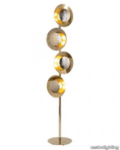
castrolighting > Floor lamp
The Eclipse Handmade Floor Light is named after the solar eclipse phenomena. When the moon slowly starts to rotate to the point it almost aligns with the Sun and the Earth, the moon creates a shadow that partially inhibits sunrays from being seen from earth. Recreating this natural wonder, the Eclipse gold floor lamp is composed of two rounded brass plates, placed in front of each other, with a slight distance between them, only allowing little crescents of light to shine through. The front plate is hammered by hand, using modern handcraft technics, that reflects in the shining gold plated plate in the back. With touches of modern, contemporary and mid century modern styles, the luxury shade is the perfect fit for a hallway, bedroom, living room or dining room, it’s warm light brings a calm and relaxing ambiance. VIEW FULL FAMILY
Helios Fire Bowl
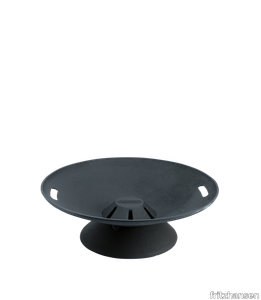
fritzhansen > Styling
An atmospheric series made for all the seasons, Helios includes the essentials to create warmth and comfort outdoors–from a crackling fire to a sizzling grill. The free-standing Helios Fire Bowl offers comforting warmth all year round—and a focal point for outdoor gatherings. Cast in iron with handle inserts that make it easy to move when not in use. A removable ash tray underneath ensures the area stays clean.
COME TOGETHER - Leather sofa _ Poltrona Frau
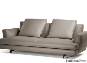
Poltrona Frau > Sofa
The **Come Together modular sofa system** is a contemporary masterpiece designed for the social and post-social media era, serving as a physical meeting point to foster connection, conversation, and shared experiences. Created by Ludovica and Roberto Palomba, this ultra-modern sofa system features a deliberately limited number of elements that allow for infinite configurations, making it adaptable to any space. Upholstered in premium Pelle Frau® leather or fabric, the sofa exudes elegance, with optional Cuoio Saddle leather bands and buckles adding a touch of sophistication. The architectural design includes blade-shaped or cylindrical feet in black anodised aluminium or brushed steel, while subtle stitching on the armrests creates a refined graphic detail. Versatile accessories, such as equipped units with hidden storage compartments and end units with wide shelves, enhance functionality, making it ideal for relaxation, work, or social gatherings. A 3D file of the product is available for download, allowing for seamless integration into design plans. Crafted by **Poltrona Frau**, a renowned Italian luxury furniture brand founded in 1912, the Come Together sofa reflects the company’s commitment to timeless design, exceptional craftsmanship, and the use of luxurious materials, solidifying its reputation as a leader in high-end interior design.
UNTERLINDEN CHANDELIER FREE - LED adjustable aluminium chandelier _ Artemide
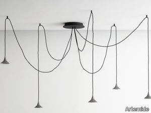
Artemide > Ceiling lamp
The Unterlinden Chandelier Free is a versatile and adjustable LED chandelier crafted from high-quality aluminum, featuring five suspension elements that converge at a central point, allowing for customizable arrangements with its 2.5-meter-long cables. Designed in collaboration with the renowned architectural firm Herzog & de Meuron, this chandelier embodies a sleek, modern aesthetic and offers professional-grade illumination with its high-efficiency precision lens, delivering 5x350 lumens at a color temperature of 2700K or 3000K. The lamp’s die-cast aluminum body showcases a unique finish achieved through a natural oxidation process, halted and preserved with a clear coating. Part of the expanded Unterlinden family, this chandelier is ideal for contemporary spaces, offering both functionality and artistic appeal. A downloadable 3D file of the product is available for detailed visualization and planning. Artemide, the esteemed Italian lighting and design company behind this product, has been a global leader in innovative lighting solutions since its founding in 1960, renowned for blending cutting-edge technology with timeless design.
UNTERLINDEN CHANDELIER FREE - LED adjustable brass chandelier _ Artemide
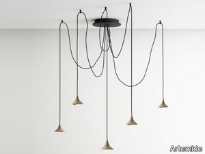
Artemide > Ceiling lamp
The Unterlinden Chandelier Free is an elegant, adjustable LED chandelier crafted from brass, featuring five suspension elements that converge at a central point, with 2.5-meter-long cables allowing for customizable layouts. Available in a brass finish, it offers a warm color temperature of 2700K/3000K, delivering 5x350 lumens with a 5x7.5W LED output, and is designed for 220-240V voltage with an IP20 rating. The chandelier is part of the Unterlinden family, developed in collaboration with the acclaimed architectural firm Herzog & de Meuron, known for projects like the Feltrinelli Foundation in Milan. Its die-cast brass body showcases a unique finish achieved through a natural oxidation process, complemented by a high-efficiency precision lens for professional-grade illumination. A 3D file of the product is available for download, enabling detailed visualization and planning. Artemide, the supplier, is a globally recognized Italian design company founded in 1960, celebrated for its innovative lighting solutions and timeless designs that blend functionality with aesthetic appeal, making it a leader in the lighting and interior design industry.
GATWICK - Oval wooden dining table _ Molteni & C.
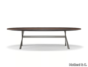
Molteni & C. > Table
The Gatwick oval table, designed by Milanese architect Rodolfo Dordoni, draws inspiration from London’s bustling Gatwick Airport, symbolizing a meeting point for global travelers, much like a dining table where people gather. Featuring a sleek aluminum frame available in contemporary finishes such as black chrome, zinc, black nickel, and pewter (satin finish), it supports elegant rectangular or oval tops crafted from eucalyptus wood or marble, sourced from the Molteni&C collection. A 3D file of the table is available for download, allowing for detailed visualization and planning. Molteni & C., the esteemed Italian supplier behind this design, has been a leader in high-quality furniture and interior solutions since its founding in 1934, offering timeless, versatile pieces that blend elegance with functionality for both residential and commercial spaces.
EUCALIPTO - Mirrored glass sideboard with doors _ B&B Italia
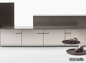
B&B Italia > Cabinet
The Eucalipto series, designed by Antonio Citterio for B&B Italia, is a sophisticated collection of storage units tailored for living rooms, dining areas, or any space requiring a striking focal point. These units, available in various configurations, feature a sleek acrylic finish with an ink-black interior and three exterior variants: black, bronze, or petroleum blue structures paired with grey or bronzed mirrors, backpainted glass, or glossy eucalyptus wood. Inside, smoky crystal shelves and pull-out trays add a touch of celestial elegance, while optional die-cast legs in black chrome or pewter allow for versatile placement. Notably, each unit can be finished on all sides, making it ideal for central room placement as a dramatic partition. A 3D file of the product is available for download, offering a detailed preview for design planning. B&B Italia, a globally renowned Italian furniture brand established in 1966, is celebrated for its innovative, high-quality designs and collaborations with leading designers, making it a trusted name in premium contemporary furniture.
EUCALIPTO - Eucalyptus highboard with drawers _ B&B Italia
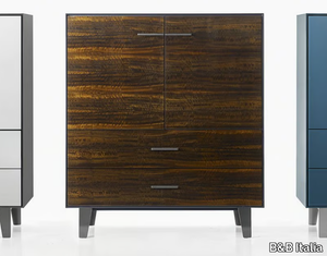
B&B Italia > Cabinet
The Eucalipto series, designed by Antonio Citterio for B&B Italia, is a sophisticated collection of storage units tailored for living rooms, dining areas, or any space requiring a striking focal point. These units, akin to the Cozy pedestal table, introduce a unique blend of glamour and modernity to B&B Italia’s portfolio. The standout feature is the smooth acrylic finish, available in three captivating variants: a black structure paired with grey mirror, black backpainted glass, or glossy eucalyptus wood; a bronze structure complemented by bronzed mirror, bronze backpainted glass, or glossy eucalyptus wood; and a petroleum blue structure with grey mirror or petroleum blue backpainted glass. Inside, smoky crystal shelves and pull-out trays add a celestial glow, while the option of die-cast legs in black chrome or pewter, in two heights, enhances versatility. Additionally, the Eucalipto units can feature a finished back, allowing them to serve as stunning room dividers. A 3D file of the product is available for download, offering a detailed preview for design planning. B&B Italia, a globally renowned Italian furniture brand established in 1966, is celebrated for its innovative, high-quality designs and collaborations with top-tier designers, making it a leader in contemporary furniture for both residential and commercial spaces.
EUCALIPTO - Contemporary style glass highboard with doors with drawers _ B&B Italia
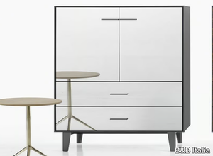
B&B Italia > Cabinet
The Eucalipto series, designed by Antonio Citterio for B&B Italia, is a sophisticated collection of storage units tailored for living rooms, dining areas, or any space requiring a striking focal point. These units, akin to the Cozy pedestal table, introduce a unique blend of glamour and modernity to B&B Italia’s portfolio. The standout feature is the smooth acrylic finish, available in three stunning variants: a black structure paired with grey mirror, black backpainted glass, or glossy eucalyptus wood; a bronze structure with bronzed mirror, bronze backpainted glass, or glossy eucalyptus wood; and a petroleum blue structure complemented by grey mirror or petroleum blue backpainted glass. Inside, smoky crystal shelves and pull-out trays add a celestial touch, while the option of die-cast legs in black chrome or pewter, available in two heights, enhances versatility. Additionally, each unit can feature a finished back, allowing it to serve as a dramatic room divider. For those interested, a downloadable 3D file of the product is available for further exploration. B&B Italia, a globally renowned Italian design company established in 1966, is celebrated for its innovative, high-quality furniture and collaborations with top designers, making it a leader in contemporary interior solutions.
ARNE - Fabric sofa _ B&B Italia
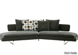
B&B Italia > Sofa
The Arne sofa, designed by B&B Italia, is a contemporary piece crafted to foster leisure and social interaction, featuring a gracefully curved silhouette that envelops users in comfort. Ideal for creating a central focal point in any room, it invites relaxation, conversation, and shared moments, whether placed in the middle of a space or against a wall. Its lightweight and airy aesthetic is achieved through sleek aluminium supports, giving the illusion that the seat and backrest are elegantly suspended. The sofa is constructed with a durable internal frame of tubular steel and steel profiles, upholstered with high-quality materials such as Bayfit® flexible foam, sterilized down, and polyester fibre covers, ensuring both comfort and longevity. Available in fabric or leather finishes, the Arne sofa combines modern design with timeless elegance. A 3D file of the product is also available for download, allowing for seamless integration into design plans. B&B Italia, a globally renowned Italian furniture brand established in 1966, is celebrated for its innovative, high-quality designs and collaborations with leading designers, offering premium furniture for both residential and commercial spaces.
MOVED - MDF secretary desk with drawers _ Roche Bobois
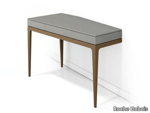
Roche Bobois > Desk
The Moved Collection, a striking asymmetrical desk designed by the talented Sandra Demuth, features a unique offset design that challenges traditional parallelism, with its tripod base appearing to vanish into the wall, creating the illusion of a fourth support point. Crafted with a matte lacquer MDF top, two drawers, and a solid oak base, this piece is available in various finishes and is proudly manufactured in Europe. A 3D file of the product is also available for download, allowing for a closer look at its innovative design. Roche Bobois, the esteemed French luxury furniture and home decor brand founded in 1960 and headquartered in Paris, is renowned for its contemporary, high-quality designs and collaborations with top designers, making it a global leader in premium interior solutions.
CALATHEA - Trestle-based leather and fabric easy chair _ Giorgetti
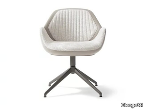
Giorgetti > Chair
The Calathea collection by Giorgetti offers a range of elegantly designed armchairs, including a guest armchair with a sturdy metal base, available in various upholstery options such as full leather or a combination of leather and fabric, with customizable features like quilting and inserts. The collection also includes executive and small armchair variants, featuring a 5-point revolving base, height-adjustable gas springs, and fixed or tilting mechanisms, with finishes in pewter or ash wood in natural, anthracite grey, biscuit, and ash grey tones. The non-removable covers ensure durability and a seamless aesthetic. A 3D file of the product is available for download, allowing for detailed visualization and integration into design projects. Giorgetti, an esteemed Italian luxury furniture brand established in 1898, is renowned for its timeless elegance, exceptional craftsmanship, and innovative designs, making it a global leader in high-end interior solutions.
CALATHEA - Fabric easy chair _ Giorgetti
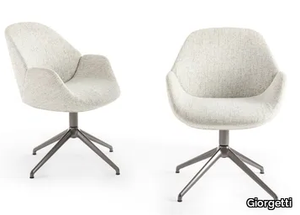
Giorgetti > Chair
The Calathea guest armchair is a luxurious seating option featuring a sleek leather upholstery with a quilted insert, supported by a durable metal base. This elegant piece is part of a versatile family of seats, crafted with flexible cold-foamed polyurethane and covered with high-quality fiber. Available in multiple configurations, the Calathea series includes an executive armchair with a 5-point revolving base, rotating castors, and height-adjustable gas spring, as well as a guest armchair and a small armchair with an ash wood base in various finishes. The upholstery options range from single-color leather to two-tone designs with leather exteriors and fabric or leather interiors, with or without quilting and inserts. Notably, the 3D file of the Calathea armchair is available for download, allowing for seamless integration into design projects. Manufactured by Giorgetti, a renowned Italian luxury furniture brand established in 1898, this product reflects the company’s legacy of exceptional craftsmanship, innovative design, and the use of premium materials, making it a perfect choice for high-end residential and commercial interiors.
CALATHEA - Swivel leather executive chair _ Giorgetti
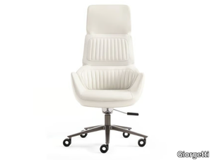
Giorgetti > Chair
The Calathea collection by Giorgetti features a luxurious swivel executive wing chair crafted in premium leather, complete with castors and height-adjustable functionality. This family of seats is designed with rigid cold-foamed polyurethane cores, enveloped in fiber for added comfort and durability. Available in multiple variants, the collection includes an executive armchair with a 5-point revolving base, rotating castors, and a gas spring for height adjustment, as well as a fixed and tilting mechanism. The pewter-finished metal base, wheels, and seat connection add a sleek, modern touch. Upholstery options range from single-color leather to two-tone designs with leather exteriors and fabric or quilted interiors, offering customizable elegance. Additionally, the collection includes a guest armchair with similar features and a small armchair with an ash wood base available in natural, anthracite grey, biscuit, and ash grey finishes. Notably, the 3D file of the product is available for download, allowing for seamless integration into design plans. Giorgetti, an esteemed Italian luxury furniture brand founded in 1898, is renowned for its timeless elegance, exceptional craftsmanship, and innovative designs, making it a preferred choice for high-end residential and commercial interiors worldwide.
CALATHEA - Fabric easy chair _ Giorgetti
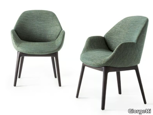
Giorgetti > Chair
The Calathea guest armchair features a sturdy wood base and is available with either fabric or leather upholstery, offering a blend of comfort and sophistication. This versatile family of seats is crafted with rigid cold-foamed polyurethane and covered with fiber, ensuring durability and support. The Calathea collection includes an executive armchair with a 5-point revolving base, rotating castors, height-adjustable gas spring, and a fixed or tilting mechanism, all finished in a sleek pewter metal. Upholstery options include single or dual-tone leather, with the internal section available in fabric or leather, customizable with or without quilting or inserts. The guest armchair variant shares similar features, while the small armchair boasts an ash wood base in natural, anthracite grey, biscuit, or ash grey finishes. Notably, the 3D file of the product is available for download, allowing for seamless integration into design plans. Giorgetti, the esteemed Italian luxury furniture brand behind Calathea, has been a global leader in high-end interior design since its founding in 1898 in Meda, Italy, renowned for its timeless elegance, exceptional craftsmanship, and innovative designs that cater to both contemporary and traditional interiors.
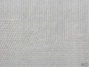
CHADDAR - Contemporary style solid-color rectangular wool rug _ GAN
GAN > Carpet
Charlotte Lancelot, the creative mind behind some of GAN’s most beloved collections, brings her passion for needlepoint to life once again with the CHADDAR rug collection. Inspired by traditional Indian sheets known for their intricate designs and durability, CHADDAR combines the ancient art of petit point embroidery with contemporary aesthetics, offering a unique blend of texture and neutral tones that effortlessly enhance any space. Available in two sizes (170x240 cm / 5’7’’x7’11’’ and 200x300 cm / 6’7’’x9’10’’) and four natural, undyed colors (white, grey, camel, and charcoal), each rug showcases a mesmerizing interplay of stitches, transitioning from intricate leaf or spike patterns to more linear designs. Crafted from 100% new wool with a PVC net base, CHADDAR embodies the timeless beauty of handwork, making it a perfect addition to modern interiors. A 3D file of the product is also available for download, allowing for seamless integration into design projects. GAN, a globally recognized interior design brand founded in 1941 and headquartered in Spain, is celebrated for its innovative, high-quality rugs and textiles that blend contemporary style with artisanal craftsmanship, catering to diverse design preferences worldwide.
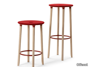
MOVE ON - Barstool with footrest _ Offecct
Offecct > Stool
The MOVE ON stool, designed by Stockholm-based architect and designer Mattias Stenberg in collaboration with Offecct, is a lightweight and durable seating solution featuring a recyclable aluminum frame that is easy to assemble and disassemble. This design reflects Offecct's Lifecircle philosophy, emphasizing sustainability and innovation, and follows the success of Stenberg's previous creations like the Carry On stool and On Point table. A 3D file of the MOVE ON stool is available for download, offering further flexibility for designers and architects. Offecct, a leading Swedish interior design supplier founded in 1990, is renowned for its high-quality, sustainable furniture and lighting solutions, blending contemporary aesthetics with functionality for both residential and commercial spaces.
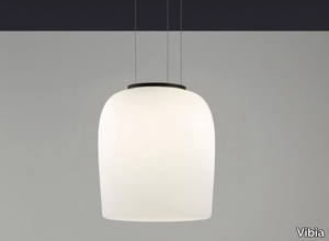
GHOST 4987 - LED pendant lamp _ Vibia
Vibia > Ceiling lamp
The Ghost 4987 hanging lamp embodies an ethereal elegance, combining large-scale design with a delicate aesthetic. Suspended by nearly invisible cables, this sculptural pendant lamp creates a striking focal point in any space, hanging low for a dramatic effect. Crafted from mouth-blown opal triplex glass, its smooth surface emits a warm, inviting glow, making it a perfect blend of artistry and functionality. The lamp features a mat opal triplex blown-glass diffuser and a steel ceiling rose, powered by a 37.2W LED with a 2700K color temperature, delivering 5547 lumens of high-quality light with a CRI >90. It includes a constant current driver (1050 mA, 110~240V, 50/60Hz) and is rated IP20, with an efficiency of 85.34 lm/W and a total flux of 3604.01 lm. A 3D file of the product is available for download, allowing for seamless integration into design projects. Vibia, the supplier, is a globally recognized lighting design brand headquartered in Barcelona, Spain, renowned for its innovative, contemporary lighting solutions that blend functionality with minimalist aesthetics.
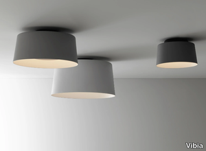
TUBE - LED aluminium ceiling lamp _ Vibia
Vibia > Ceiling lamp
The **Tube** collection by renowned Japanese designer Ichiro Iwasaki, in collaboration with Vibia, offers a versatile and innovative lighting system that seamlessly blends functionality with modern aesthetics. This collection features a network of polycarbonate-diffused tubes that channel light horizontally and vertically, creating a fluid interplay of point and ambient lighting. Available in four dimensions (ranging from 22 to 53 cm) and multiple color options—light grey, medium grey, graphite, and off-white—the Tube system allows for endless customization, making it ideal for diverse architectural spaces. The collection includes both hanging and ceiling-mounted options, enabling designers to craft unique configurations tailored to specific needs. Powered by high-efficiency LED technology (2700K, CRI >90) with constant current drivers, the Tube system ensures optimal light output and energy efficiency. Additionally, a downloadable 3D file of the product is available for designers to visualize and plan installations with precision. Vibia, a globally recognized lighting brand founded in 1987 and headquartered in Barcelona, is celebrated for its cutting-edge designs and commitment to quality, making it a trusted partner for contemporary lighting solutions.
RAPHAEL - Leather armchair with armrests _ Minotti
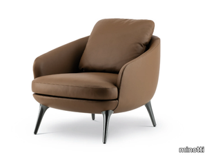
minotti > Armchair
The Raphael collection, inspired by the light and sophisticated style of the Italian-Danish design duo GamFratesi, redefines living spaces with its refined tailoring and adaptable single furnishing pieces, offering the comfort of traditional modular seating systems while becoming the focal point of any room. The collection features three sofa variants (linear, semi-curved, and asymmetrical semi-curved), four armchair styles, two dining armchairs, and two footstools, all designed to suit smaller domestic spaces while meeting the high standards of decorators and interior designers. The organic, generously proportioned forms are accentuated by sophisticated upholstery that highlights the sinuous lines, with options for modern feet in die-cast bronze, polished pewter aluminum, or licorice-stained ash, as well as swivel bases for select armchairs. Each piece in the Raphael family boasts its own unique identity and silhouette, blending classic forms with modern reinterpretations, making it a timeless yet contemporary addition to any living space. The collection is versatile, catering to various everyday scenarios, from relaxation to conviviality, hospitality, and intimate domestic moments. A 3D file of the product is available for download, allowing for seamless integration into design projects. Minotti, the esteemed Italian luxury furniture brand behind Raphael, has been a leader in high-end interior design since its founding in 1948, renowned for its impeccable craftsmanship, minimalist elegance, and global presence, with showrooms in major cities like Milan, New York, and Shanghai.
N°204 DOUBLE - Adjustable steel wall lamp _ DCWéditions
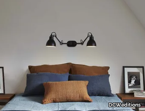
DCWéditions > Wall lamp
This versatile double lamp, crafted from durable steel, features an E27 socket and a 15W ESL bulb, making it an ideal lighting solution for various spaces such as over a bed, behind a sofa, or above a work surface. Its unique design allows two lamps to operate from a single power point, offering both practicality and aesthetic appeal. Perfect for reading or creating a cozy ambiance, this lamp has been praised for its ability to enhance domestic harmony by providing balanced lighting. A 3D file of the product is available for download, allowing for detailed visualization and planning. DCWéditions, the supplier, is a prestigious French design house established in 2008, celebrated for its innovative and stylish lighting and furniture that blend contemporary aesthetics with functional design.
N°302 DOUBLE - Adjustable steel ceiling lamp _ DCWéditions
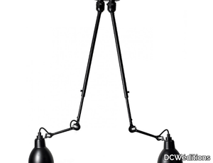
DCWéditions > Ceiling lamp
The Double Lamp by DCWéditions is a versatile and practical lighting solution, perfect for placement over a bed, behind a sofa, or above a work surface, offering the convenience of powering two lamps from a single power point. Crafted from durable steel and equipped with an E27 socket compatible with a 15W ESL bulb, this lamp combines functionality with sleek design. For those interested in customizing or visualizing the lamp in their space, a downloadable 3D file is available. DCWéditions, established in 2008 and headquartered in France, is celebrated for its innovative and high-quality lighting and furniture designs that blend contemporary aesthetics with meticulous craftsmanship, catering to both residential and commercial environments globally.
GLOBE BURST - LED polycarbonate chandelier _ Tom Dixon
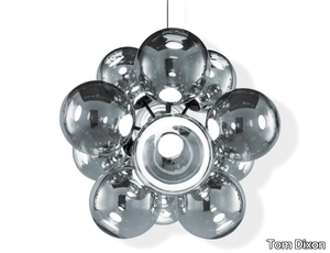
Tom Dixon > Ceiling lamp
The **Globe Burst** is a stunning, large-scale chandelier featuring 12 highly reflective chrome Globe shades arranged in a fixed, single-point configuration, paired with a sleek gloss black fitting. Designed with Tom Dixon's integrated LED module, the spherical orbs create a mesmerizing play of light, offering perfect mirror-like reflections during the day and a captivating display of internal reflections when illuminated. The LED module ensures exceptional performance, including energy efficiency, dimmability, and a longer lifespan, with fully serviceable components and replacement drivers available. Specifications include 12 x 6W LEDs, 7100 lumens, a CRI >90, and a warm 3000K color temperature, with dimming compatibility for both leading and trailing edge systems. Available in Silver, Copper, and Opalescent finishes, the Globe Burst is a testament to Tom Dixon's obsession with spherical forms and minimalist design, making it a standout piece for modern interiors. A downloadable 3D file of the product is also available for design planning. **Supplier Description:** Tom Dixon, a renowned British designer and manufacturer, is celebrated for its modern, innovative lighting, furniture, and accessories, crafted with premium materials like copper, brass, and marble, and designed to suit a variety of interior styles and budgets.
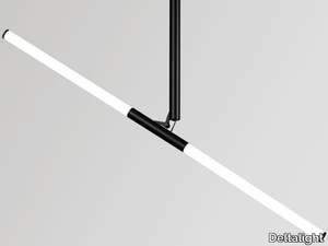
XY180 - LED adjustable ceiling lamp with fixed arm _ Deltalight
Deltalight > Ceiling lamp
The XY180 is an adjustable LED ceiling lamp featuring a fixed arm, available in a sleek black finish, designed to offer versatile lighting with adjustable angles of 0-120° and 360° rotation. It includes two LED FLEX strips (8.9W each, CRI>90, 3000K, 1050lm), an IP20 rating, and an energy class E, making it both functional and energy-efficient. Part of a 3-piece luminaire collection by OMA, the XY180 embodies a design philosophy rooted in the interplay of point, line, and surface, reflecting architectural principles. Its modular design allows for endless configurations, combining tube lights for ambient, shared lighting and spotlights for focused, hierarchical illumination, making it ideal for workspaces, homes, and public interiors. A downloadable 3D file of the product is available for further customization and planning. Deltalight, the supplier, is a renowned Belgian-based lighting manufacturer founded in 1987, celebrated for its innovative, high-end lighting solutions that blend cutting-edge technology with elegant design, catering to both residential and commercial projects worldwide.
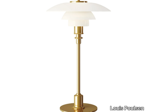
PH 2/1 - Opal glass table lamp _ Louis Poulsen
Louis Poulsen > Table lamp
The PH 2/1 fixture delivers soft, harmonious, and glare-free lighting, designed with a reflecting multi-shade system based on a logarithmic spiral, ensuring the light source is perfectly centered at the spiral’s focal point. Available in finishes like brass metallised, black metallised, or high-lustre chrome plating, it features mouth-blown white opal glass shades and machined brass components, offering both elegance and durability. With an IP20 ingress protection rating and energy-efficient A+ to C class performance, it uses a 33W QT-ax 14 G9 light source and includes a 1.75m vinyl cord with an in-line switch. A 3D file of the product is available for download, allowing for detailed visualization and planning. Louis Poulsen, a Danish lighting pioneer since 1874, is celebrated for its timeless, innovative designs that blend functionality with aesthetic appeal, making it a trusted name in high-quality lighting solutions worldwide.
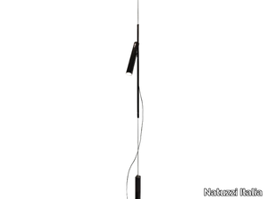
COLOSSEO - Swivel metal pendant lamp _ Natuzzi Italia
Natuzzi Italia > Ceiling lamp
The Colosseo lighting collection embodies simplicity and linearity, elegantly encased within a sleek metal cylinder that transforms into a striking focal point when illuminated. This exquisite piece combines meticulous craftsmanship, intricate detailing, and cutting-edge technology, featuring a telescope diffuser crafted from a 14-mm diameter polished and painted metal tube, adjustable to suit your preferences. Available in sophisticated finishes such as rose gold, champagne, and glossy black chrome, the Colosseo comes in floor (classic or with a white plexiglass lampshade), table, and pendant versions to complement any space. A 3D file of the product is also available for download, allowing for seamless integration into design plans. Designed by Natuzzi Italia, a globally acclaimed Italian brand founded in 1959, the Colosseo reflects the company’s legacy of creating luxurious, high-end furniture and home accessories that blend timeless elegance with modern innovation. Explore more at [Natuzzi Italia](https://www.natuzzi.it).
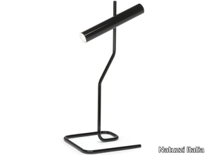
COLOSSEO - Adjustable metal table lamp _ Natuzzi Italia
Natuzzi Italia > Table lamp
The Colosseo lighting collection embodies simplicity and linearity, elegantly encased within a sleek metal cylinder that transforms into a striking focal point when illuminated. This exquisite piece combines meticulous craftsmanship, intricate detailing, and cutting-edge technology, featuring a telescope diffuser crafted from a polished and painted metal tube with a 14-mm diameter, adjustable to suit your preferences. Available in luxurious finishes such as rose gold, champagne, and glossy black chrome, the Colosseo comes in floor (classic or with a white plexiglass lampshade), table, and pendant versions to complement any space. A 3D file of the product is also available for download, allowing for seamless integration into design plans. Manufactured by Natuzzi Italia, a globally acclaimed Italian brand founded in 1959, the Colosseo reflects the company’s legacy of creating high-end, luxury furniture and home accessories that blend contemporary and classic design with unparalleled elegance and functionality. Explore more at [Natuzzi Italia](https://www.natuzzi.it).