Raphael "Dining"
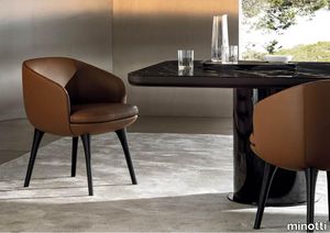
minotti > Chair
The characteristic light and sophisticated style trait of Italian-Danish duo GamFratesi inspires Raphael: a new way of designing the living space thanks to the use of single furnishing pieces with refined tailoring, capable of becoming protagonists of the space, and expressing the same comfort as traditional modular seating systems. Three sofa variants, four types of armchairs, two dining little armchairs and two footstools, all conceived as adaptable to smaller domestic contexts, while still meeting the high demands of decorators and interior designers. Organic forms, with generous and cosy proportions, are enhanced by sophisticated upholstery that masterfully interprets its distinctive sinuous lines. The Raphael sofas and armchairs stands on the floor on modern feet in die-cast Bronze or polished Pewter aluminium or Licorice-stained ash, the design of which adapts to the morphology of the seating shapes. The result is a furnishing piece with classic forms reinterpreted in a modern key. The armchairs are also available with a swivel four-spoke die-cast aluminium base in Bronze or polished Pewter. Each individual element of the family has its own identity and silhouette. The sofas are available in three variants: linear, semi-curved and asymmetrical semi-curved, the latter animated by the series of sinuous lines given by the backrest, punctuated by a gentle change of heights. The armchairs are characterised by their comfortable seating, not only in the larger model, but also in the smaller version and in the dining version, which is available both fixed, with legs in Licorice-coloured ash, and with a swivel four-spoke die-cast aluminium base in Bronze or polished Pewter. The details, shapes and overall aesthetics of Raphael make it a contemporary furnishing piece with a timeless character, designed to meet the different situations of everyday life: from moments dedicated to relaxation to those conceived for conviviality, from hospitality occasions to the more intimate ones of domestic life.
Criade Warm grey

auping > Box spring
The Criade, with its slender lines and refined details, is a sleek box spring with a distinctive design. The steel frame carries the design and the horizontal line connects the two box springs. This variant in Deep black with electric adjustable mesh base, topper and Cushion headboard in Facet / Dark grey is a real eye-catcher in your bedroom. The refined legs give the Criade's design an airy feel while the steel frame provides a solid base. Head and footboard are placed directly on the frame, leaving the floor free. The use of the different materials creates the design characteristic of Auping. The Criade is a richly padded box spring: the box contains a mesh base and pocket springs. The Auping mesh base is eighty percent open and therefore the box spring ventilates very well. The pocket springs in both the box spring and the mattress ensure that you can turn easily at night and have good support during your sleep. View the Criade box spring This Criade box spring includes Comfort mattress and Comfort topper. Want to make a different choice? The Criade box spring is available with all our mattresses and toppers, change your choice in the configurator. Our collection consists of 4 box springs that you can put together exactly as you wish. Choose your own colours, materials and accessories. In total, there are 2.8 billion possibilities in our online configurator. Looking for inspiration for your own bedroom or want to know more about our beds? Then take a look at the online lookbooks.
Kiruna Deep black
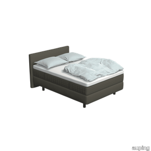
auping > Box spring
The Kiruna box spring is the most luxurious box spring. This is distinguished by the rich appearance and the use of natural materials. As soon as you lie down, you experience it for yourself. This adjustable 2-person Kiruna box spring 1M Deep black with Unik mattress and Unik headboard in Reflect / Black grey gives a luxurious look to your bedroom. For the Kiruna box spring you can choose from 95 different fabrics. They each differ in colour and structure. In our stores you can see, feel and give you advice on which one fits best on the box spring of your choice. There are five fabric groups. The luxurious Kiruna box spring has a refined design with attention to every detail and very high-quality finish. There are two headboards for the Kiruna: the slender and stylish Sami and the classic Unik. Or combine with one of the headboards of our Original box spring. To subtly add colour to the Kiruna box spring and your bedroom, you can choose 1 of the ten Auping colours for the legs. Discover the Kiruna box spring The unique Kiruna mattresses have no less than 7 zones so that your body is perfectly supported and you lie comfortably. The Sami mattress has a sleek finish, while the Unik mattress has an extra rich look due to graceful handles, a piping all around and refined side stitching. Our collection consists of 5 beds and 4 box springs that you can put together completely according to your wishes. Choose your own colours, materials and accessories. In total, there are 2.8 billion possibilities in our online configurator. Looking for inspiration for your own bedroom or do you want to know more about our Box springs? Then take a look at the online lookbooks.
Chimera Ritmo Azzurro
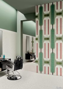
florim > Wallcovering
In <em>Chimera,</em> Elena Salmistraro merges rigour with self-expression, in a graphic grammar laden with symbolic meaning. <em>Empatia </em>speaks to the emotions with graphics that interpret, through a highly individual abstract code, the stage make-up of a clown, with the aid of superimposed geometric forms and images. <em>Radici </em>is a tribal statement, a tribute to primitive ritual custom, evoked by the interplay between a sequence of triangles and rectangles and a set of figurative fragments. <em>Ritmo</em> is inspired by fabrics, suggesting the rhythmic alternation of woven yarns through a largely linear pattern. In <em>Colore, </em>the upheaval of a background of small isolated spots generated by a parametric digital program is combined with densely packed repeated forms. "The Chimera collection is rather like a book with four different chapters: I set out to differentiate these graphic motifs to create four totally different stories."<br></br>Elena Salmistraro It all starts with drawing. A <em>passion</em> for drawing. An <em>obsession</em> with drawing. Drawings like spider-webs, obsessively filling spaces, in a kind of manual choreography or gymnastics, a continuous flow. Elena Salmistraro draws all the time. She draws everywhere. Mostly on loose sheets or random surfaces. First and foremost with pen and pencil. Her drawings only acquire colour at a later stage. Often - just like Alessandro Mendini used to do - she draws "monsters": fascinating yet disturbing, subversive forms. The denser, more contorted the shape, the more obvious its underlying truth. For Elena, drawing is an intimate act. It is relaxing. And therapeutic. With an unrivalled communicative strength. Because drawing gives shape to ideas: you both give form to the world and reveal yourself. This passion, combined with natural graphic talent, has guided Elena Salmistraro in her project for Cedit: an experimental series of ceramic slabs produced using a high-definition 3D decorative technique. The explicit aim is to transform surfaces beyond their original flatness so that a new, visual and tactile, three-dimensional personality emerges, sweeping aside the coldness and uniformity that ceramic objects often inevitably convey.Elena Salmistraro has always viewed ceramics as a democratic material, in view of their accessibility, and the infinite potentials for shaping matter that they provide. She began working and experimenting with ceramics very early in her career, just after she graduated from the Milan Politecnico in 2008. She came into contact with small artistic craft firms specialising in smallproduction lots, and cut her teeth on projects that demanded the hand-processing of every detail, and finishes of high artistic value, for the high end of the market. The large corporations and galleries came later, but here again Elena kept faith with her desire to make mass-produced pieces unique, and to combine artistic value with specifically industrial characteristics. The monkey-shaped <em>Primates</em> vases reflect this method and intention, aiming to excite, surprise and charm. Antiminimalist and hyper-figurative, playful, ironic and a rich image-maker, often drawing on anthropology and magic, over the years Salmistraro has built up her own fantastic universe, inhabited by ceramic bestiaries, painted jungles and a cabinet like a one-eyed cyclops , always finding inspiration and inputs in nature and always aiming to reveal the extraordinary in the everyday. Given this background, it was almost inevitable she would work with Cedit: constantly seeking new talents and new approaches, as well as designs that break down the boundaries of ceramics and release them into the realm of art and innovation, the Modena company has recognised Elena Salmistraro as a leading contemporary creative spirit and involved her in a project intended to experiment with fresh ideas in materials and synaesthetics.Salmistraro's collection for Cedit is entitled <em>Chimera</em> and consists of large ceramic slabs, which can be enjoyed not only visually, through their patterns and colours, but also on a tactile level. Like the chimera in the "grotesque" tradition, monstrous in the etymological sense of the word with its merging of hybrid animal and vegetable shapes, the Cedit project attempts to originate a synaesthetic form of ceramics, through a three-dimensional development that exactly reproduces the texture of leathers and fabrics, creating an absolutely new kind of layered effect, with a tactile awareness that recalls the passion of grand master Ettore Sottsass for "surfaces that talk". And the surfaces of the slabs Salmistraro has created really seem to talk: in <em>Empatia </em>clown faces add theatricality to the cold gleam of marbles, interspersed with references to Art Déco graphics; <em>Radici</em> uses the textures of leathers and hide as if to re-establish a link between ceramics and other materials at the origins of human activity and creativity; in <em>Ritmo</em> the texture of cloth dialogues with pottery, almost in homage to the tactile rationalism of warp and weft, of which Bauhaus pioneer Anni Albers was one of the most expressive past interpreters ; finally, <em>Colore</em> has a spotted base generated by computer to underline the contrast between analogue and digital, the graphic sign and the matter into which it is impressed. It is an aesthetic of superimposition and mixing, and especially of synaesthesia: as in her drawings, in the <em>Chimera </em>slabs Elena Salmistraro's art is one of movement and acceleration. A process not of representation but of exploration. Of the world and of oneself. Almost a kind of Zen, for distancing oneself from the world to understand it more fully. In every sense.
Courage

mitab > Table
SOFA COURAGE Courage is a modular based system with seating elements and backrests that can be endlessly combined. The graphic simplicity comes from the design brief asking for an archetypal product based on the golden ratio. The different elements have 2 sections of fabric, creating a “bottom line” which is intended to bond the different parts together, yet allowing for the upper part to be selected in different colours or fabrics creating a varied interior. Courage have a base frame of metal, different parts for different elements. There is no visible fittings or damage when Courage is built together. ADD ELECTRICS To support connected users on the move Courage can be specified with integrated electrical power outlets neatly fitted into the seat and easily accessible. PAIR WITH ORBIT The Orbit swivelling table perfectly compliments Courage’s form and function and has been designed to be natively mounted to Courage’s seat modules. VERSATILE MODULARITY Courage’s modular design comprising numerous elemental forms enables it to be configured in an almost infinite number of compositions. From small geometric islands to sprawling landmasses of comfort, Courage provides a much needed stopping place. COMMITTED Courage has been independently certified by Möbelfakta a widely respected certification scheme that assess and validate the sustainability credentials of furniture and products so consumers can make more informed choices. Modular sofa system with several seat, back and arm units. Base frame and connection fittings in powder coated metal frame in standard RAL (black). Seat with wood base and cold foam upholstered in standard fabrics or c.o.m. Backrests with optional one or two soft sides. Arm units with table top in ash natural. Multiple fabric configuration and electrical outlets available as add-on. (Electrical outlets is not possible with seats in H.36cm)
Revive Dark grey
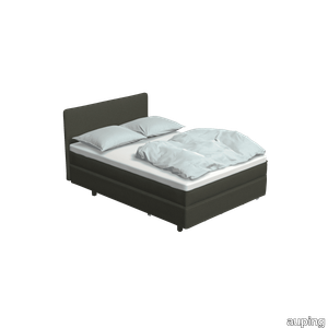
auping > Box spring
The Auping Revive gives your sleep and your bedroom a real upgrade. The Auping Revive is a bed with the looks of a box spring and is available in two variants. This variant has a flat mesh base with an upholstered box spring mattress and a top mattress. The combination of the Revive mattress and the Auping mesh base ensure optimal ventilation, the open structure of the mesh base ensures optimal ventilation, allowing your mattress to breathe easier and last longer, and for you to step out of bed every day feeling refreshed. Are you a hotel manager and do you consider the Auping Revive for in your hotel? Please visit this page. The bed base of the Auping Revive consists of a mesh base with wheels under the front legs and a cover around the frame. The cover makes the bed look like a box spring, but without the heaviness, so it’s easy to move and has plenty of useful storage space underneath. The bed's wheels and light weight also make it easy to slide apart (not applicable for the 140 cm width), so that you can clean properly under the bed. Learn more about the Revive boxspring Our collection consists of 4 box springs. The Original, Criade and Kiruna can be designed completely to your whishes. Choose the colour, fabrics and accessories you like. There are 2,8 billion configurations available in our dream bed configurator. Looking for inspiration for your bedroom or do you want to learn more about one of our box springs? Take a look at our box spring pages.
Lawson "Dining"
minotti > Chair
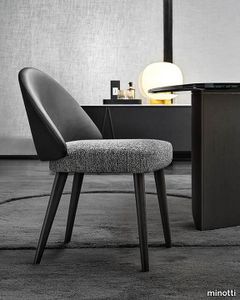
With the fluid line of its shapes and the equilibrium of its soft volumes, the Lawson seating system explores different types of chairs, offering innovative solutions that push out the traditional style boundaries, ranging from small lounge armchairs to the larger easy chair, and even sofas. The design features a look based on the juxtaposition of materials: on one side there is leather, which follows the curve of the enveloping backrest, in turn becoming an armrest and on the other side there is the fabric of the cushions, with its haute couture feel. The many different layouts of the system, with its interesting range of alternating depths, mean it is perfect for creating both small, intimate spaces, as well as arrangements featuring several elements, all fit to occupy larger spaces with grace. With its natural elegance, Lawson is ideal for residential interiors, but also reveals a strong vocation for the hospitality sector, thanks to its versatile modularity. Sofas and armchairs sit on metal feet with a chrome or polished Pewter finish, a jewel-detail that adds a touch of sophistication to the piece. The wide variety of elements in the Lawson family also includes an armchair with legs in Moka-coloured ash wood or covered in leather, a detail that also characterises the lounge armchair and dining chair. Each piece can be used in a wide range of potential combinations of materials and colours. And while the impression made by Lawson oozes with Seventies style if the arrangement includes pieces with black leather, structured fabric upholstering and feet with a chrome finish, instead, a more decorative spirit shines through if the option chosen features velvet and chenille.
Rilievi Nebbia
florim > Wall Paint
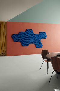
The alternation and symbiosis between concave and convex, recessed and raised. <p>Rilievi is a work of design balanced between different historic periods: while the volumetric relief tile modules are inspired by artistic experiments conducted in Italy during the Sixties and Seventies, the large slabs are the outcome of research into materials and technology that has only come to fruition in very recent times. The shadow effects generated on the surfaces of the slabs by the light striking the projecting parts of the modules create an unusual impression of architectural depth found virtually nowhere else in ceramic coverings, laying the bases for a new decoration interior design language.</p> This project simply embodies perfection - a term which certainly sets the bar high in a description of a new product for launch on the market. But when an enlightened manufacturer is capable of encapsulating a designer's personal research in a product to be added to its range, the outcome is a perfect synthesis. A perfect synthesis between untrammelled creativity and market trends. CEDIT had the insight needed to perceive, identify and rework the immense potential of Practice Practice Practice "“ a self-produced project by Zaven (Enrica Cavarzan and Marco Zavagno "“ and realised that its sophisticated design, originated by pure, pristine input (unadulterated by external factors except the noblest of them all, research) could provide the basis for an innovative, successful collection. I might add, a collection unique of its kind. Zaven is also a name that comes with guarantees; the two partners are good at what they do. Their work always starts from personal curiosity and investigations, the study of other stories (as in this case inspiration was drawn from the output of artist and activist Nino Caruso) and individual interests, which are broken down, developed, optimised and prepared for transformation into something fresh.Enrica Cavarzan and Marco Zavagno have a masterly ability to transform their own wishes and passions into design work of the greatest breadth and, as we see here, the widest, richest application. Their use of ceramics as a material is clearly outstanding and reflects a method precisely founded on the desire to look at things from an unusual viewpoint, under a different light. And to be daring. Zaven have an unconventional approach to convention. In the specific case of the Rilievi collection, the "modules" created for CEDIT seem to explode off the walls; in fact, they are constructed by combining the two-dimensional slab with its three-dimensional decor.Rilievi seems to be seeking space. More space. Even though these modules have actually established a dialogue with the wall from which they are born. At the same time, they hypnotise us with their tight sequence of lines, the pattern that is always different although its root is the same, and the intriguing, unusual colours that add another vital factor to the finished product. Their firm grounding in graphic design (and here we have come back to two-dimensional effects, of the kind most often associated with a wall covering) easily evolves into a facade which seems to have been carved with a chisel - although this is not the case. These modules are conceived to convey an impression of movement, and the three models, in seven colour combinations, create a powerful effect on a surface, which is never passive but rather an organic contributor to the forms and colours involved in the fascinating combinations. The slab is very much present and has the same worth and status as the relief pattern associated to it. In the light of this dichotomy between the linear and the sculpted, expressed through the skilfully balanced visual expedients, the use of repetition adds vigour to the module's intrinsic meaning. As we have seen, a rejection of facile, superficial creative dynamics in favour of an investigation reaching above and beyond has always been a central, clearly recognisable feature of this Venice-based duo, who already have impressive international partnerships to their credit, including the London Design Festival, the Kalmar Konstmuseum, the Paris Designer Days, Ca' Foscari University, the Venice Biennale, the Sandretto Re Rebaudengo Foundation, the Sindika Dokolo Foundation and the V-A-C Foundation, and also won the 2018 Wallpaper Design Award. Graphics, advertising and product design: the pair have always opted for a type of design closely linked to the observation of everyday items, followed by their reinterpretation in a version applied to experimentation with materials. This duality, combined with their energetic yet elegant visual language, forms Enrica and Marco's primary code, experienced in this specific context through serial carvings. On walls.
Palosanto
marset > Wall lamp
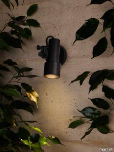
Subtle without going as far as minimalism, the new Palosanto collection lamp is an extremely flexible, versatile solution for direct illumination outdoors. Available as a wall lamp and also as a bollard in three heights: 30, 60 and 90 cm. The 30- and 60-cm lamps include one spotlight, while the taller version can have one or two. In every version, the spotlight can be placed at the chosen height along the stem. This enables the position of the light to adapt to the growth of surrounding vegetation.As well as providing illumination, each spotlight also gives protection and reflection: a honeycomb grille captures peripheral light and prevents glare, while at the same time part of the light emitted is reflected and released through the back of the lamp, gently illuminating the body of the diffuser. This creates an interplay of lights to form a decorative halo, echoing the warmth of the interior light. In addition, the spotlight of this wall fixture can be rotated manually by up to 360 degrees, while the cable remains fully visible, an aesthetic detail that provides the freedom to decide direction of the light. The angle of opening of each spotlight is 32 degrees, and the colour temperature is 2700 K. For Christophe Mathieu, the design process consists first and foremost of observing and creating an object with wide-ranging possibilities that will be timeless in its use. That was his thinking behind this new collection, which can use its light to accentuate the outdoors, reveal architectural details, light a path or spotlight a tree. His new design is compact, flexible, and hard-wearing, even in tough climatic conditions. It is the epitome of simplicity, easy to install, and can be integrated into any landscaping project, whether residential or contract. Palosanto also offers a range of filters to soften the light, dim it towards the shadow, and adjust it to the surroundings. This leads to greater control over the lighting it can provide. What more could you ask for?
Rilievi Terra

florim > Wall Paint
The alternation and symbiosis between concave and convex, recessed and raised. <p>Rilievi is a work of design balanced between different historic periods: while the volumetric relief tile modules are inspired by artistic experiments conducted in Italy during the Sixties and Seventies, the large slabs are the outcome of research into materials and technology that has only come to fruition in very recent times. The shadow effects generated on the surfaces of the slabs by the light striking the projecting parts of the modules create an unusual impression of architectural depth found virtually nowhere else in ceramic coverings, laying the bases for a new decoration interior design language.</p> This project simply embodies perfection - a term which certainly sets the bar high in a description of a new product for launch on the market. But when an enlightened manufacturer is capable of encapsulating a designer's personal research in a product to be added to its range, the outcome is a perfect synthesis. A perfect synthesis between untrammelled creativity and market trends. CEDIT had the insight needed to perceive, identify and rework the immense potential of Practice Practice Practice "“ a self-produced project by Zaven (Enrica Cavarzan and Marco Zavagno "“ and realised that its sophisticated design, originated by pure, pristine input (unadulterated by external factors except the noblest of them all, research) could provide the basis for an innovative, successful collection. I might add, a collection unique of its kind. Zaven is also a name that comes with guarantees; the two partners are good at what they do. Their work always starts from personal curiosity and investigations, the study of other stories (as in this case inspiration was drawn from the output of artist and activist Nino Caruso) and individual interests, which are broken down, developed, optimised and prepared for transformation into something fresh.Enrica Cavarzan and Marco Zavagno have a masterly ability to transform their own wishes and passions into design work of the greatest breadth and, as we see here, the widest, richest application. Their use of ceramics as a material is clearly outstanding and reflects a method precisely founded on the desire to look at things from an unusual viewpoint, under a different light. And to be daring. Zaven have an unconventional approach to convention. In the specific case of the Rilievi collection, the "modules" created for CEDIT seem to explode off the walls; in fact, they are constructed by combining the two-dimensional slab with its three-dimensional decor.Rilievi seems to be seeking space. More space. Even though these modules have actually established a dialogue with the wall from which they are born. At the same time, they hypnotise us with their tight sequence of lines, the pattern that is always different although its root is the same, and the intriguing, unusual colours that add another vital factor to the finished product. Their firm grounding in graphic design (and here we have come back to two-dimensional effects, of the kind most often associated with a wall covering) easily evolves into a facade which seems to have been carved with a chisel - although this is not the case. These modules are conceived to convey an impression of movement, and the three models, in seven colour combinations, create a powerful effect on a surface, which is never passive but rather an organic contributor to the forms and colours involved in the fascinating combinations. The slab is very much present and has the same worth and status as the relief pattern associated to it. In the light of this dichotomy between the linear and the sculpted, expressed through the skilfully balanced visual expedients, the use of repetition adds vigour to the module's intrinsic meaning. As we have seen, a rejection of facile, superficial creative dynamics in favour of an investigation reaching above and beyond has always been a central, clearly recognisable feature of this Venice-based duo, who already have impressive international partnerships to their credit, including the London Design Festival, the Kalmar Konstmuseum, the Paris Designer Days, Ca' Foscari University, the Venice Biennale, the Sandretto Re Rebaudengo Foundation, the Sindika Dokolo Foundation and the V-A-C Foundation, and also won the 2018 Wallpaper Design Award. Graphics, advertising and product design: the pair have always opted for a type of design closely linked to the observation of everyday items, followed by their reinterpretation in a version applied to experimentation with materials. This duality, combined with their energetic yet elegant visual language, forms Enrica and Marco's primary code, experienced in this specific context through serial carvings. On walls.
Raphael
minotti > Armchair
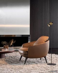
The characteristic light and sophisticated style trait of Italian-Danish duo GamFratesi inspires Raphael: a new way of designing the living space thanks to the use of single furnishing pieces with refined tailoring, capable of becoming protagonists of the space, and expressing the same comfort as traditional modular seating systems. Three sofa variants, four types of armchairs, two dining little armchairs and two footstools, all conceived as adaptable to smaller domestic contexts, while still meeting the high demands of decorators and interior designers. Organic forms, with generous and cosy proportions, are enhanced by sophisticated upholstery that masterfully interprets its distinctive sinuous lines. The Raphael sofas and armchairs stands on the floor on modern feet in die-cast Bronze or polished Pewter aluminium or Licorice-stained ash, the design of which adapts to the morphology of the seating shapes. The result is a furnishing piece with classic forms reinterpreted in a modern key. The armchairs are also available with a swivel four-spoke die-cast aluminium base in Bronze or polished Pewter. Each individual element of the family has its own identity and silhouette. The sofas are available in three variants: linear, semi-curved and asymmetrical semi-curved, the latter animated by the series of sinuous lines given by the backrest, punctuated by a gentle change of heights. The armchairs are characterised by their comfortable seating, not only in the larger model, but also in the smaller version and in the dining version, which is available both fixed, with legs in Licorice-coloured ash, and with a swivel four-spoke die-cast aluminium base in Bronze or polished Pewter. The details, shapes and overall aesthetics of Raphael make it a contemporary furnishing piece with a timeless character, designed to meet the different situations of everyday life: from moments dedicated to relaxation to those conceived for conviviality, from hospitality occasions to the more intimate ones of domestic life.
Cromatica Verde
florim > Wall Paint
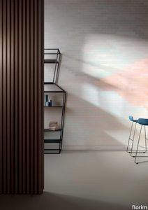
A lexicon of colour shades for mixing. A large size and its submultiples. «This work represents a reflection on colour, and above all a proposal on how to transfer the multiplicity of shades typical of a hand-crafted piece into a project produced on a large scale.» Andrea Trimarchi & Simone Farresin Studio Formafantasma base their work in the design world on a strong vocation for research. Simone Farresin and Andrea Trimarchi view every project as an opportunity for study and the acquisition of new knowledge, and their love of speculation establishes a dialectic rapport with the situations offered by each new client. Whether it involves a material, a type or a production method, the first phase of their design process is the mapping of what the specific case places at their disposal. With Cedit, an analysis of the company's past and present was central to the inputs. Inevitably, since "Looking back to look forward" has been the design duo's mission statement for years. In this case, in particular, the company's history was a real treasure trove, a fine blend of memory and technology: on the one hand, the excellence of production technologies now extended with the added potential arising from the engineering of large-sized ceramic tiles, and on the other a wealth of experience build up with great designers of the past, from Zanuso to Noorda, through to <strong>Ettore Sottsass</strong>. Andrea and Simone decided to focus on Sottsass - who started designing for Cedit back in the late Seventies - and made an in-depth study of one of the colour charts he developed towards the end of the Nineties. A spread of colours which gave its name to the "41 Colors" collection, included in the catalogue of the period as a real alphabet for what has proved to be a lasting design language. Colour was much more than just a compulsory step in the dialogue between designer and producer, since Sottsass had already discovered the power of the mystery intrinsic to this universe of invention.<br /><br />With Cedit the master-designer, a long-established lover of ceramics and their crafted unpredictability, found a way of transferring his personal feeling for colour to a wide audience, through industrial mass production. And this assumption is another factor Formafantasma have inherited, interpreting it today with new, even more efficient technical resources just as capable of expressing the secrets of colour. «The concept of colour "in isolation" - Sottsass explained in a 1992 text - classified colour, Pantone, as they call it now, "scientific" colour, is something I still refuse to accept. (...) Colours, the idea of colour, are always intangible, they slip slowly away like words, that run through your fingers, like poetry, which you can never keep hold of, like a good story.» And Formafantasma seem to have chosen that distinction between colour "in isolation" and "intangible" yet ever-present colour as the basis of their work. However, their approach draws on their unique vocation for research and the technical resources of the third millennium. «This work - they explain to us - is a reflection on colour, and above all on <strong>how to bring the multiplicity of shades typical of a hand-crafted piece into a large-scale project</strong>.» The designers look at large, monochrome slabs and turn to the engineers for details of their secrets, their processing stages, the phases in their production. They appreciate that the colour of ceramic material, its ineffable secret, can still be present in the series and large tile sizes in which Cedit leads the way. They understand that this is, in itself, an expressive power which does not need channelling into forms, motifs and signs. But above all, they treat the surface as a large canvas on which they spread pure colour, which tends to be uniform but in fact is never really a "scientific", totally monochrome hue: it is not a Pantone. And this is the source of the fundamental insight, which only children of the transition from the analogue to the digital era could achieve, the reward for those who draw on the past to look to the future.<br /><br />The designers cut the slab into lots of regular pieces, not necessarily of the same size. They restore its identity as a "tile", a familiar name with something ancient about it, but which stands for a module, a unit of measurement, a building block. There is nothing nostalgic about this - on the contrary, the vision is completely new, and the portions of slab created can be reassembled with no restrictions, breaking down the unity of the whole and reviving its essence starting from its structure. As the cards in the pack are shuffled, what emerges is not a figure or motif but the representation of colour itself and its physical nature. It is live matter, born from the meeting of vibrating forces, the mixing of ever-varying percentages of the basic ingredients. And Formafantasma present us with the corpuscular, fragmented essence of these small frames of space and crystallised time, which reveal the code and formula of their composition. So Cromatica is a collection made up of six colours which actually have an infinite number of declinations and compositional possibilities. It is a "discrete" combination in the mathematical sense of the term, capable of generating multiple, variable subsets. At the same time, each slab can be used in its entirety, leaving the impression of analogue continuity unchanged. But what really amazes is the comparison and dialogue between the two approaches: a stroke of genius, laying clear the mysterious appeal the artificial reproduction of colour has always held for mankind. Because, as Sottsass said, «colours are language, a powerful, magical, intangible, flexible, continuous material, in which existence is made manifest, the existence that lives in time and space».
Original Warm grey With Straight headboard and Warm grey table
auping > Bed frame
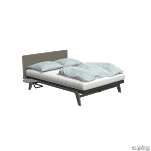
The Original is a minimalist bed with strong lines. The steel frame with aluminium legs gives an elegant look. This variation in Warm grey with 1 motor eletric adjustable mesh base, Straight headboard and a matching Warm grey table completes your bedroom. The bed is inspired by one of Auping's very first designs, the Cleopatra, and is available in ten colours. So chances are your favourite colour is among them. Designed in 2007, the Original is part of a family of iconic beds. The design was inspired by the Cleopatra, one of Auping's first design classics. In 2014, the Auping Original was awarded the Good Industrial Design (GIO) award. Besides design, this award is mainly about function, originality and innovation. In addition to this, the design must also be made with respect for people and the environment. Would you like to know more about the Original? Check out the Original lookbook. Have a look at the Original The Original is available with all our mattresses, make your choice in the configurator. Need help making a choice? In the configurator, go to the mattress selector for advice. Our collection consists of 5 beds that you can put together entirely as you wish. Choose your own colours, materials and accessories. In total, there are 2.8 billion possibilities in our online configurator. Looking for inspiration for your own bedroom or want to know more about our beds? Then take a look at the online lookbooks.
Patio
minotti > Sofa
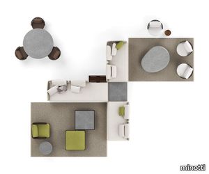
Having explored the use of woods, such as iroko and teak, with Patio, designed by Italian-Danish studio GamFratesi, Minotti proposes an unexpected mix of different materials: aluminium, wood, stone, cord. The outdoor seating system, with its highly versatile modularity, is conceived as a dynamic mosaic, composed of tesserae in simple geometric shapes, which can be pieced together as desired, and reconfigured to suit the available space and the mood to be created. The design of the sofa base structure enables the back elements to be arranged in various set positions all along the perimeter, to design conversation, relaxation, and vis-à-vis areas, spacing out the seats with coffee tables, and complementing them with ottomans and benches. A solution capable of meeting the requirements of both small metropolitan terraces, and extensive outdoor spaces, thanks to the two depths: 83 and 98 cm. The variety of potential compositions becomes even more interesting when the selected materials are masterfully combined: the extruded aluminium base with matt finish in the shades of Ecru and Dark Brown is accompanied by steel backrests, covered in woven polypropylene cord in the same shades, according to a Scandinavian-type geometric design. Some of the seating elements feature a handy tray in Dark Brown stained solid mahogany or in natural teak, with grooves for draining water, attached to the structure. Patio offers an interesting range of furnishing accessories, from coffee tables with top in brushed fine-grain Basaltina stone, benches, and square and rectangular ottomans with extruded aluminium base, in a creative mix of materic textures and sophisticated, natural colours. The system offers a rich variety of sofas in different measurements and configurations, in addition to central and end units, armchairs, loveseat, sunbeds and double daybeds. All the elements share the same feet and the same joints at the back in die-cast aluminium, varnished with a refined polished, anti-touch Bronze finish.
1119 Brickell Dark
gerflor > Floor plank
The 12 traditional and vintage colours in Gerflor's Senso 20 Lock range will bring an authentic and rustic touch to any home interior. The bevelled straight edges give Gerflor's Senso Lock planks a rustic look to create the impression of softwood planks that have been painstakingly crafted by a skilled joiner. This simple yet sleek range fluctuates between natural wood designs with grey reflections of time-worn patina, chic and stylish light wood designs like "Dew Beige" that conjure up images of energising birch floorboards, and sleek and sophisticated imitation stone and ceramic tiles like "Tuscan" and "Travertin".The PVC planks and tiles in the Senso 20 Lock collection are fitted with an interlocking system that is revolutionary in terms of its simplicity and speed. Forget all about the headache of trying to fit the flooring by tilting planks in every direction. With Gerflor's Senso 20 Lock range, simply line up one plank against another and press to snap them together. There is no need for a saw when it comes to cutting. A utility knife will do the job! Not only is this range easy to fit, but it is also extremely easy to clean with just some soapy water.The perfectly waterproof Senso 20 Lock range can be fitted in every room of the home, such as dining rooms, kitchens and even bathrooms and toilets! The flooring is designed to withstand frequent foot traffic as the home's occupants go about their everyday lives. With its 0.20 mm wear layer and PU surface treatment, Gerflor Senso 20 Lock is not only moisture-resistant, but also compatible with underfloor heating systems. Featuring an abrasion group T rating, antistatic design and non-slip surface, Gerflor Senso 20 Lock is extremely hard-wearing and comes with aSenso 20 Lock planks and tiles are 100% recyclable as part of the brand's determination to protect the environment, which includes upcycling offcuts (click here to find out more).
Chimera Empatia Nero

florim > Wall tile-stone-brick
In <em>Chimera,</em> Elena Salmistraro merges rigour with self-expression, in a graphic grammar laden with symbolic meaning. <em>Empatia </em>speaks to the emotions with graphics that interpret, through a highly individual abstract code, the stage make-up of a clown, with the aid of superimposed geometric forms and images. <em>Radici </em>is a tribal statement, a tribute to primitive ritual custom, evoked by the interplay between a sequence of triangles and rectangles and a set of figurative fragments. <em>Ritmo</em> is inspired by fabrics, suggesting the rhythmic alternation of woven yarns through a largely linear pattern. In <em>Colore, </em>the upheaval of a background of small isolated spots generated by a parametric digital program is combined with densely packed repeated forms. "The Chimera collection is rather like a book with four different chapters: I set out to differentiate these graphic motifs to create four totally different stories."<br></br>Elena Salmistraro It all starts with drawing. A <em>passion</em> for drawing. An <em>obsession</em> with drawing. Drawings like spider-webs, obsessively filling spaces, in a kind of manual choreography or gymnastics, a continuous flow. Elena Salmistraro draws all the time. She draws everywhere. Mostly on loose sheets or random surfaces. First and foremost with pen and pencil. Her drawings only acquire colour at a later stage. Often - just like Alessandro Mendini used to do - she draws "monsters": fascinating yet disturbing, subversive forms. The denser, more contorted the shape, the more obvious its underlying truth. For Elena, drawing is an intimate act. It is relaxing. And therapeutic. With an unrivalled communicative strength. Because drawing gives shape to ideas: you both give form to the world and reveal yourself. This passion, combined with natural graphic talent, has guided Elena Salmistraro in her project for Cedit: an experimental series of ceramic slabs produced using a high-definition 3D decorative technique. The explicit aim is to transform surfaces beyond their original flatness so that a new, visual and tactile, three-dimensional personality emerges, sweeping aside the coldness and uniformity that ceramic objects often inevitably convey.Elena Salmistraro has always viewed ceramics as a democratic material, in view of their accessibility, and the infinite potentials for shaping matter that they provide. She began working and experimenting with ceramics very early in her career, just after she graduated from the Milan Politecnico in 2008. She came into contact with small artistic craft firms specialising in smallproduction lots, and cut her teeth on projects that demanded the hand-processing of every detail, and finishes of high artistic value, for the high end of the market. The large corporations and galleries came later, but here again Elena kept faith with her desire to make mass-produced pieces unique, and to combine artistic value with specifically industrial characteristics. The monkey-shaped <em>Primates</em> vases reflect this method and intention, aiming to excite, surprise and charm. Antiminimalist and hyper-figurative, playful, ironic and a rich image-maker, often drawing on anthropology and magic, over the years Salmistraro has built up her own fantastic universe, inhabited by ceramic bestiaries, painted jungles and a cabinet like a one-eyed cyclops , always finding inspiration and inputs in nature and always aiming to reveal the extraordinary in the everyday. Given this background, it was almost inevitable she would work with Cedit: constantly seeking new talents and new approaches, as well as designs that break down the boundaries of ceramics and release them into the realm of art and innovation, the Modena company has recognised Elena Salmistraro as a leading contemporary creative spirit and involved her in a project intended to experiment with fresh ideas in materials and synaesthetics.Salmistraro's collection for Cedit is entitled <em>Chimera</em> and consists of large ceramic slabs, which can be enjoyed not only visually, through their patterns and colours, but also on a tactile level. Like the chimera in the "grotesque" tradition, monstrous in the etymological sense of the word with its merging of hybrid animal and vegetable shapes, the Cedit project attempts to originate a synaesthetic form of ceramics, through a three-dimensional development that exactly reproduces the texture of leathers and fabrics, creating an absolutely new kind of layered effect, with a tactile awareness that recalls the passion of grand master Ettore Sottsass for "surfaces that talk". And the surfaces of the slabs Salmistraro has created really seem to talk: in <em>Empatia </em>clown faces add theatricality to the cold gleam of marbles, interspersed with references to Art Déco graphics; <em>Radici</em> uses the textures of leathers and hide as if to re-establish a link between ceramics and other materials at the origins of human activity and creativity; in <em>Ritmo</em> the texture of cloth dialogues with pottery, almost in homage to the tactile rationalism of warp and weft, of which Bauhaus pioneer Anni Albers was one of the most expressive past interpreters ; finally, <em>Colore</em> has a spotted base generated by computer to underline the contrast between analogue and digital, the graphic sign and the matter into which it is impressed. It is an aesthetic of superimposition and mixing, and especially of synaesthesia: as in her drawings, in the <em>Chimera </em>slabs Elena Salmistraro's art is one of movement and acceleration. A process not of representation but of exploration. Of the world and of oneself. Almost a kind of Zen, for distancing oneself from the world to understand it more fully. In every sense.
Cromatica Opale

florim > Wall Paint
A lexicon of colour shades for mixing. A large size and its submultiples. «This work represents a reflection on colour, and above all a proposal on how to transfer the multiplicity of shades typical of a hand-crafted piece into a project produced on a large scale.» Andrea Trimarchi & Simone Farresin Studio Formafantasma base their work in the design world on a strong vocation for research. Simone Farresin and Andrea Trimarchi view every project as an opportunity for study and the acquisition of new knowledge, and their love of speculation establishes a dialectic rapport with the situations offered by each new client. Whether it involves a material, a type or a production method, the first phase of their design process is the mapping of what the specific case places at their disposal. With Cedit, an analysis of the company's past and present was central to the inputs. Inevitably, since "Looking back to look forward" has been the design duo's mission statement for years. In this case, in particular, the company's history was a real treasure trove, a fine blend of memory and technology: on the one hand, the excellence of production technologies now extended with the added potential arising from the engineering of large-sized ceramic tiles, and on the other a wealth of experience build up with great designers of the past, from Zanuso to Noorda, through to <strong>Ettore Sottsass</strong>. Andrea and Simone decided to focus on Sottsass - who started designing for Cedit back in the late Seventies - and made an in-depth study of one of the colour charts he developed towards the end of the Nineties. A spread of colours which gave its name to the "41 Colors" collection, included in the catalogue of the period as a real alphabet for what has proved to be a lasting design language. Colour was much more than just a compulsory step in the dialogue between designer and producer, since Sottsass had already discovered the power of the mystery intrinsic to this universe of invention.<br /><br />With Cedit the master-designer, a long-established lover of ceramics and their crafted unpredictability, found a way of transferring his personal feeling for colour to a wide audience, through industrial mass production. And this assumption is another factor Formafantasma have inherited, interpreting it today with new, even more efficient technical resources just as capable of expressing the secrets of colour. «The concept of colour "in isolation" - Sottsass explained in a 1992 text - classified colour, Pantone, as they call it now, "scientific" colour, is something I still refuse to accept. (...) Colours, the idea of colour, are always intangible, they slip slowly away like words, that run through your fingers, like poetry, which you can never keep hold of, like a good story.» And Formafantasma seem to have chosen that distinction between colour "in isolation" and "intangible" yet ever-present colour as the basis of their work. However, their approach draws on their unique vocation for research and the technical resources of the third millennium. «This work - they explain to us - is a reflection on colour, and above all on <strong>how to bring the multiplicity of shades typical of a hand-crafted piece into a large-scale project</strong>.» The designers look at large, monochrome slabs and turn to the engineers for details of their secrets, their processing stages, the phases in their production. They appreciate that the colour of ceramic material, its ineffable secret, can still be present in the series and large tile sizes in which Cedit leads the way. They understand that this is, in itself, an expressive power which does not need channelling into forms, motifs and signs. But above all, they treat the surface as a large canvas on which they spread pure colour, which tends to be uniform but in fact is never really a "scientific", totally monochrome hue: it is not a Pantone. And this is the source of the fundamental insight, which only children of the transition from the analogue to the digital era could achieve, the reward for those who draw on the past to look to the future.<br /><br />The designers cut the slab into lots of regular pieces, not necessarily of the same size. They restore its identity as a "tile", a familiar name with something ancient about it, but which stands for a module, a unit of measurement, a building block. There is nothing nostalgic about this - on the contrary, the vision is completely new, and the portions of slab created can be reassembled with no restrictions, breaking down the unity of the whole and reviving its essence starting from its structure. As the cards in the pack are shuffled, what emerges is not a figure or motif but the representation of colour itself and its physical nature. It is live matter, born from the meeting of vibrating forces, the mixing of ever-varying percentages of the basic ingredients. And Formafantasma present us with the corpuscular, fragmented essence of these small frames of space and crystallised time, which reveal the code and formula of their composition. So Cromatica is a collection made up of six colours which actually have an infinite number of declinations and compositional possibilities. It is a "discrete" combination in the mathematical sense of the term, capable of generating multiple, variable subsets. At the same time, each slab can be used in its entirety, leaving the impression of analogue continuity unchanged. But what really amazes is the comparison and dialogue between the two approaches: a stroke of genius, laying clear the mysterious appeal the artificial reproduction of colour has always held for mankind. Because, as Sottsass said, «colours are language, a powerful, magical, intangible, flexible, continuous material, in which existence is made manifest, the existence that lives in time and space».
Criade Blush
auping > Box spring
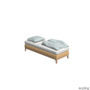
With its slender lines and refined details, the Criade is a sleek box spring with a distinctive design. The steel frame carries the design and the horizontal line connects the two box springs. This variant has a Blush frame and is upholstered in Reflect / Sand beige, and has an Inizio mattress is a real eye-catcher in your bedroom. The refined legs give the Criade's design an airy feel while the steel frame provides a solid base. Head and footboard are placed directly on the frame, leaving the floor free. The use of the different materials creates the design characteristic of Auping. The Criade is a richly padded box spring: the box contains a mesh base and pocket springs. The Auping mesh base is eighty percent open and therefore the box spring ventilates very well. The pocket springs in both the box spring and the mattress ensure that you can turn easily at night and have good support during your sleep. View the Criade box spring This Criade box spring includes an Inizio mattress. Want to make a different choice? The Criade box spring is available with all our mattresses and toppers, change your choice in the configurator. Our collection consists of 4 box springs that you can put together exactly as you wish. Choose your own colours, materials and accessories. In total, there are 2.8 billion possibilities in our online configurator. Looking for inspiration for your own bedroom or want to know more about our beds? Then take a look at the online lookbooks.
Original Dusty red With risers in Sand beige
auping > Bed frame
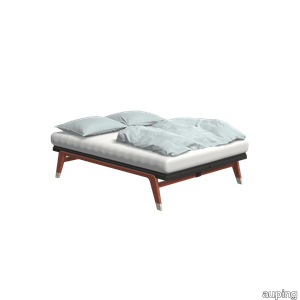
The Original is a minimalist bed with strong lines. The steel frame with aluminium legs gives an elegant look. This variation in Dusty red with 1 Motor eletric adjustable mesh base and Sand beige base legs completes your bedroom. The bed is inspired by one of Auping's very first designs, the Cleopatra, and is available in ten colours. So chances are your favourite colour is among them. Designed in 2007, the Original is part of a family of iconic beds. The design was inspired by the Cleopatra, one of Auping's first design classics. In 2014, the Auping Original was awarded the Good Industrial Design (GIO) award. Besides design, this award is mainly about function, originality and innovation. In addition to this, the design must also be made with respect for people and the environment. Would you like to know more about the Original? Check out the Original lookbook. Have a look at the Original The Original is available with all our mattresses, make your choice in the configurator. Need help making a choice? In the configurator, go to the mattress selector for advice. Our collection consists of 5 beds that you can put together entirely as you wish. Choose your own colours, materials and accessories. In total, there are 2.8 billion possibilities in our online configurator. Looking for inspiration for your own bedroom or want to know more about our beds? Then take a look at the online lookbooks.
Criade Night blue
auping > Box spring
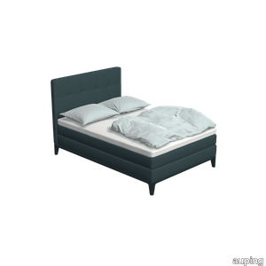
With its slender lines and refined details, the Criade is a sleek box spring with a distinctive design. The steel frame carries the design and the horizontal line connects the two box springs. This variant in Night blue with topper and Square headboard in Grid / Denim is a real eye-catcher in your bedroom. The refined legs give the Criade's design an airy feel while the steel frame provides a solid base. Head and footboard are placed directly on the frame, leaving the floor free. The use of the different materials creates the design characteristic of Auping. The Criade is a richly padded box spring: the box contains a mesh base and pocket springs. The Auping mesh base is eighty percent open and therefore the box spring ventilates very well. The pocket springs in both the box spring and the mattress ensure that you can turn easily at night and have good support during your sleep. View the Criade box spring This Criade box spring includes Comfort mattress and Comfort topper. Want to make a different choice? The Criade box spring is available with all our mattresses and toppers, change your choice in the configurator. Our collection consists of 4 box springs that you can put together exactly as you wish. Choose your own colours, materials and accessories. In total, there are 2.8 billion possibilities in our online configurator. Looking for inspiration for your own bedroom or want to know more about our beds? Then take a look at the online lookbooks.
Cromatica Bianco

florim > Wall Paint
A lexicon of colour shades for mixing. A large size and its submultiples. «This work represents a reflection on colour, and above all a proposal on how to transfer the multiplicity of shades typical of a hand-crafted piece into a project produced on a large scale.» Andrea Trimarchi & Simone Farresin Studio Formafantasma base their work in the design world on a strong vocation for research. Simone Farresin and Andrea Trimarchi view every project as an opportunity for study and the acquisition of new knowledge, and their love of speculation establishes a dialectic rapport with the situations offered by each new client. Whether it involves a material, a type or a production method, the first phase of their design process is the mapping of what the specific case places at their disposal. With Cedit, an analysis of the company's past and present was central to the inputs. Inevitably, since "Looking back to look forward" has been the design duo's mission statement for years. In this case, in particular, the company's history was a real treasure trove, a fine blend of memory and technology: on the one hand, the excellence of production technologies now extended with the added potential arising from the engineering of large-sized ceramic tiles, and on the other a wealth of experience build up with great designers of the past, from Zanuso to Noorda, through to <strong>Ettore Sottsass</strong>. Andrea and Simone decided to focus on Sottsass - who started designing for Cedit back in the late Seventies - and made an in-depth study of one of the colour charts he developed towards the end of the Nineties. A spread of colours which gave its name to the "41 Colors" collection, included in the catalogue of the period as a real alphabet for what has proved to be a lasting design language. Colour was much more than just a compulsory step in the dialogue between designer and producer, since Sottsass had already discovered the power of the mystery intrinsic to this universe of invention.<br /><br />With Cedit the master-designer, a long-established lover of ceramics and their crafted unpredictability, found a way of transferring his personal feeling for colour to a wide audience, through industrial mass production. And this assumption is another factor Formafantasma have inherited, interpreting it today with new, even more efficient technical resources just as capable of expressing the secrets of colour. «The concept of colour "in isolation" - Sottsass explained in a 1992 text - classified colour, Pantone, as they call it now, "scientific" colour, is something I still refuse to accept. (...) Colours, the idea of colour, are always intangible, they slip slowly away like words, that run through your fingers, like poetry, which you can never keep hold of, like a good story.» And Formafantasma seem to have chosen that distinction between colour "in isolation" and "intangible" yet ever-present colour as the basis of their work. However, their approach draws on their unique vocation for research and the technical resources of the third millennium. «This work - they explain to us - is a reflection on colour, and above all on <strong>how to bring the multiplicity of shades typical of a hand-crafted piece into a large-scale project</strong>.» The designers look at large, monochrome slabs and turn to the engineers for details of their secrets, their processing stages, the phases in their production. They appreciate that the colour of ceramic material, its ineffable secret, can still be present in the series and large tile sizes in which Cedit leads the way. They understand that this is, in itself, an expressive power which does not need channelling into forms, motifs and signs. But above all, they treat the surface as a large canvas on which they spread pure colour, which tends to be uniform but in fact is never really a "scientific", totally monochrome hue: it is not a Pantone. And this is the source of the fundamental insight, which only children of the transition from the analogue to the digital era could achieve, the reward for those who draw on the past to look to the future.<br /><br />The designers cut the slab into lots of regular pieces, not necessarily of the same size. They restore its identity as a "tile", a familiar name with something ancient about it, but which stands for a module, a unit of measurement, a building block. There is nothing nostalgic about this - on the contrary, the vision is completely new, and the portions of slab created can be reassembled with no restrictions, breaking down the unity of the whole and reviving its essence starting from its structure. As the cards in the pack are shuffled, what emerges is not a figure or motif but the representation of colour itself and its physical nature. It is live matter, born from the meeting of vibrating forces, the mixing of ever-varying percentages of the basic ingredients. And Formafantasma present us with the corpuscular, fragmented essence of these small frames of space and crystallised time, which reveal the code and formula of their composition. So Cromatica is a collection made up of six colours which actually have an infinite number of declinations and compositional possibilities. It is a "discrete" combination in the mathematical sense of the term, capable of generating multiple, variable subsets. At the same time, each slab can be used in its entirety, leaving the impression of analogue continuity unchanged. But what really amazes is the comparison and dialogue between the two approaches: a stroke of genius, laying clear the mysterious appeal the artificial reproduction of colour has always held for mankind. Because, as Sottsass said, «colours are language, a powerful, magical, intangible, flexible, continuous material, in which existence is made manifest, the existence that lives in time and space».
Oltremare Panchetta
sabaitalia > Armchair
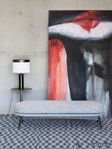
The seating collection “Oltremare” designed by Antonio Marras and produced in collaboration with Saba, stems from a far-away past and place, full of history, recollection, memories overflowing with suggestions and visions. And this is how Antonio Marras presented an object so dear to him that he defines a sacred-idol, that narrates of his land, of his sea, but mostly, of his story. We named it Oltremare, because all things have a soul and every soul has a name. Oltremare encloses within its inlets the classic and the modern. The curve is a line that can be tamed: it forms a wave, a fold, it creates a place but it also offers an escape route. In our utopian world we investigated the relationship between the curved line and the act of seating, asymmetric shapes that become backrests and sink into extremely comfortable seats pushing past the rectangular schemes so dear to the sober lines of designing sofas. The asymmetric curves that enclose it are the inspirations for the Oltremare armchair that completes the collection alongside a padded bench. A comfortable nest suspended on a slim varnished metal base, whose essential lines render, by contract, the armchair’s silhouette even more interesting. Oltremare is a seating system that, even though winks at the past, it communicates a strong contemporary soul and is suitable by nature to various interpretations. Fully removable covers.
Fris

marset > Ceiling lamp
Drawing thin beams of light in a space with each one of them pointing in any direction. This is why we have created Fris, a multi-purpose lighting system, available in a wall/ceiling or pendant version, which allows you to combine several units in different sizes and positions, each one aiming its own beam of light.Its design consists of a glass tube that encases the light. What makes it unique is that the glass not only protects the light, but also provides a mechanical function, suspending the whole system and allowing the lamp to rotate and the light to be steered in a certain direction. As a result, the glass is both material and function. Through the transparent glass we see the lamp’s interior, which consists of two profiles: one includes the light source and the other acts as a parabola, projecting a crisp, intense light. This system makes it possible to compose light structures and to join a set of lamps by means of different assembly and hanging accessories. In the pendant version, each Fris unit is supported by a strap, so that several can be placed horizontally, in line, one on top of the other, or perpendicularly, creating intersections of light. They can also function separately as an individual lamp. The other version can be fixed to the ceiling or wall. The pendant version is available in three lengths of 80, 155 cm and 215 cm and the version for ceiling or wall comes in another three lenghts 80, 155, and 215 cm. There is also a more technical version where the light is distributed in cells with independent lenses, achieving a UGR of under 19. Fris offers a very versatile and functional design for precise lighting of any type of project. An ingenious system that boldly tackles a previously unresolved issue: to have a set of lamps where each one directs the light individually.
Sendai
minotti > Sofa
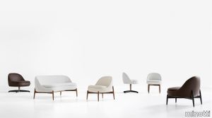
Named after the city of trees, Sendai, this line of furnishing pieces consists of a small sofa, an armchair, a lounge armchair and dining and lounge little armchairs. Like slender trunks, the elegant, polished legs, in Canaletto walnut solid wood stained Light Brown, or Licorice lacquered ash, rest on the ground, lifting the enveloping upholstered body and creating a soft rhythm of vertical lines. The possibility of having the armchair, the dining little armchair and the lounge armchair also in the 360° swivel version with return (base in polished Bronze-coloured varnished metal, with sheathed spokes in solid ash with an open-pore Licorice-coloured lacquer, or in solid Canaletto walnut with Light Brown stain) makes the Sendai seats particularly comfortable for both residential and hospitality environments. The compact and well-proportioned silhouette of both the seats and the small sofa, opens up to a new way of using the dining space: as a living room within the living room, a hybrid situation, such as when dinner is served on a large table, while guests meet and socialise round a lounge table. A new, more intimate way of opening up new visual and proportional horizons of the living space, both in homes and in hospitality venues. In 2023, the elegant and airy Sendai family of seats expands, with a new enveloping sofa, a comfortable swivel armchair with armrests and a footstool. The design of the armchair, with its upholstered frame resting on a 360° swivel base with return mechanism, also stems from the desire to have a larger seat whose comfort is ensured by a higher backrest and the presence of comfortable armrests, perfect for ensuring a satisfying sensation of relaxation, especially when used in combination with the footrest.
Horizonte
minotti > Sofa
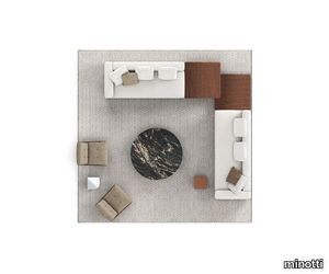
A floating island with square lines that marks the horizon of the living space. The new system by Marcio Kogan / studio mk27 takes shape from a suspended base, a solid thin line covered in leather, fabric or both, on which generous volumetric padded elements rest. Perfectly consistent with Marcio Kogan's design philosophy, the Horizonte modular seating system is the result of a clear architectural vision: a rigorous shape, raised seven centimetres off the ground thanks to a recessed plinth in matt black varnished metal, which gives the sofa a special feeling of suspension. A platform on which the upholstered elements are located - seats, backrests and armrests - all conceived as large cushions with bold proportions and a strong personality. It is not only the dimensions that characterise these modules, but also their unprecedented softness, capable of maintaining a precise formal aesthetic, despite their welcoming sinkable effect. Comfort is in fact guaranteed by an innovative technology that uses pocketed springs inserted in variable-density polyurethanes that allow the memory of the shapes to be maintained and the seat to return to its original form, modelling itself to the shape of the user. The base on which the upholstered volumes rest is made from a clever combination of materials: entirely in leather or fabric or in an original mix of both to create an even more refined and prestigious look. In the fabric version, the two strips are coupled with a zip, hidden by a creased seam, presented as an aesthetic motif that allows for the practical and quick removal of the covering. On the other hand, in the base entirely covered in leather, the covering is lapped: refined and inspired by the world of haute couture,this production technique means that the strips of leather are sewn together by folding back the edges. The seemingly simple appearance of Horizonte gives rise to a sophisticated style code that can be used in a wide range of configurations. By combining modules, sloping elements and others with built-in coffee table, an overall narrative that could continue forever without interruption is created. For some elements, the base under the upholstered elements juts out from the seat cushion to accommodate a shelf, available in different sizes and configurations. Like a full stop in punctuation, the module is inserted between the seats, enriched by a top attached to the base of the sofa: this does not interrupt the fluidity of the shape, adding a multifunctional top in Dark Brown stained Canaletto walnut, Liquorice lacquered ash, Calacatta and Grigio Orobico marble, or smoothed matt Nero Marquina and brushed Belvedere granite. In addition to the top, interspersed between the cushions, the Horizonte family also includes coffee tables and a side table. The latter has been designed in perfect aesthetic continuity with the Horizonte seating system, from which it takes both the detail of the matt black varnished metal base and the thickness of the top: a horizontal groove engraved on the solid wood bullnose edge recalls the same concept of geometry used in the base. The coffee and side tables also reflect the same style, with floor support in polished Bronze varnished metal and tops in Dark Brown stained Canaletto walnut or Liquorice coloured ash. The different sizes and heights of the coffee and side tables allow for a play of superimpositions that invigorates the horizontality of the entire family.
Tesori Anelli grigio
florim > Wallcovering
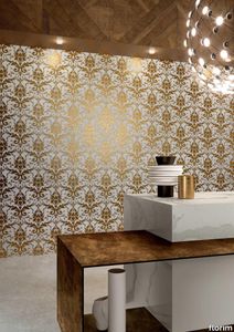
East and West, a synthesis archieved through Italian taste. «My work often takes me to far-off lands, also remote in terms of their culture and traditions. Even without my being aware of it, I then metabolise these traditions and include them in the designs I subsequently produce.» Matteo Nunziati <p>"It is the architect's task to create a warm, livable space. Carpets are warm and livable. He decides for this reason to spread one carpet on the floor and to hang up four to form the four walls. But you cannot build a house out of carpets. Both the carpet and the floor and the tapestry on the wall required structural frame to hold them in the correct place. To invent this frame is the architect's second task."When Adolf Loos wrote his revolutionary essay on the "principle of cladding" in 1898, architecture was just entering the modern age. Building meant imagining structures capable of putting together different materials, but, Loos affirmed, it must also respect their individual characteristics. "Every material possesses a formal language which belongs to it alone and no material can take on the forms proper to another", the Austrian master therefore maintained. And there is no doubt that the spirit of these words extended throughout most Twentieth Century architecture, regardless of its location or style. When we look at Matteo Nunziati's designs for the CEDIT Tesori collection, we seem to be seeing geometrical purity and attention to detail at the service of a new "truth" of material. Because Matteo Nunziati views ceramics as a form of fabric.<br /> The woven patterns he imagines for the various styles in his collection "“ from Arabian to damask to more geometrical motifs "“ constantly seek to provide the soft, iridescent look of time-worn linen. In them, ceramics are raised from the status of poor relation of marble to become a luxury wall covering in their own right: almost a wallpaper, suitable however for both floors and walls, and an absolutely versatile material. No longer only for beautifying bathrooms, they can create new moods in every room of the house (and elsewhere) starting from the living-room. Naturally, the revolution has been mainly technological. The large slabs produced by CEDIT are more than 3 metres tall, and since they eliminate the serial repetition typical of conventional tiles, they generate a new relationship between the surface and its decoration. However, Nunziati does not use this to create, artist-like, a more eye-catching decorative composition that emphasises the slab's dimensions. Quite the opposite; the patterns he offers us attempt to break down what is left of the boundaries between substrates. In particular, the Arabian and damask styles, in the version with "timeworn" patterning, convey the idea of the ceramic slab as an abstract, almost non-existent material which melts into the decorative motif applied to it, in a kind of pure wall covering.<br /> Through the patient selection of geometrical motifs and tests to verify their suitability for application to ceramic slabs, Nunziati aims to achieve a new material rather than a mere decoration, making this clear by also exploring its tactile dimension, with gouged and relief motifs. His "principle of coverings" therefore relates to ceramics' essence rather than their image: highlighting the versatility which, as we all know, has made ceramics an absolute material, a kind of cement that incorporates structure and finish in a virtually infinite range of applications. This is clearly indicated by the reference to the mashrabiya, a term meaning place where people drink in Arabic, which in Arabian architecture originally referred to the kind of veranda where people used to meet and rest, and over time has come to mean the wooden gratings that screened these places from the sun. Inspired by his trips to the Middle East, for Nunziati the geometric patterns of the mashrabiya become both an outline of his method of work and the form of what in fact becomes the key element in a new idea of space: a real location conceived around a strong, livable surface in which physical substance and decoration overlap to the point where they merge.</p>
Tesori Anelli bianco

florim > Wallcovering
East and West, a synthesis archieved through Italian taste. «My work often takes me to far-off lands, also remote in terms of their culture and traditions. Even without my being aware of it, I then metabolise these traditions and include them in the designs I subsequently produce.» Matteo Nunziati <p>"It is the architect's task to create a warm, livable space. Carpets are warm and livable. He decides for this reason to spread one carpet on the floor and to hang up four to form the four walls. But you cannot build a house out of carpets. Both the carpet and the floor and the tapestry on the wall required structural frame to hold them in the correct place. To invent this frame is the architect's second task."When Adolf Loos wrote his revolutionary essay on the "principle of cladding" in 1898, architecture was just entering the modern age. Building meant imagining structures capable of putting together different materials, but, Loos affirmed, it must also respect their individual characteristics. "Every material possesses a formal language which belongs to it alone and no material can take on the forms proper to another", the Austrian master therefore maintained. And there is no doubt that the spirit of these words extended throughout most Twentieth Century architecture, regardless of its location or style. When we look at Matteo Nunziati's designs for the CEDIT Tesori collection, we seem to be seeing geometrical purity and attention to detail at the service of a new "truth" of material. Because Matteo Nunziati views ceramics as a form of fabric.<br /> The woven patterns he imagines for the various styles in his collection "“ from Arabian to damask to more geometrical motifs "“ constantly seek to provide the soft, iridescent look of time-worn linen. In them, ceramics are raised from the status of poor relation of marble to become a luxury wall covering in their own right: almost a wallpaper, suitable however for both floors and walls, and an absolutely versatile material. No longer only for beautifying bathrooms, they can create new moods in every room of the house (and elsewhere) starting from the living-room. Naturally, the revolution has been mainly technological. The large slabs produced by CEDIT are more than 3 metres tall, and since they eliminate the serial repetition typical of conventional tiles, they generate a new relationship between the surface and its decoration. However, Nunziati does not use this to create, artist-like, a more eye-catching decorative composition that emphasises the slab's dimensions. Quite the opposite; the patterns he offers us attempt to break down what is left of the boundaries between substrates. In particular, the Arabian and damask styles, in the version with "timeworn" patterning, convey the idea of the ceramic slab as an abstract, almost non-existent material which melts into the decorative motif applied to it, in a kind of pure wall covering.<br /> Through the patient selection of geometrical motifs and tests to verify their suitability for application to ceramic slabs, Nunziati aims to achieve a new material rather than a mere decoration, making this clear by also exploring its tactile dimension, with gouged and relief motifs. His "principle of coverings" therefore relates to ceramics' essence rather than their image: highlighting the versatility which, as we all know, has made ceramics an absolute material, a kind of cement that incorporates structure and finish in a virtually infinite range of applications. This is clearly indicated by the reference to the mashrabiya, a term meaning place where people drink in Arabic, which in Arabian architecture originally referred to the kind of veranda where people used to meet and rest, and over time has come to mean the wooden gratings that screened these places from the sun. Inspired by his trips to the Middle East, for Nunziati the geometric patterns of the mashrabiya become both an outline of his method of work and the form of what in fact becomes the key element in a new idea of space: a real location conceived around a strong, livable surface in which physical substance and decoration overlap to the point where they merge.</p>
1034 Cordoba Black & White
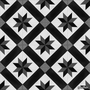
gerflor > Floor plank
This collection features planks and tiles with a dozen imitation designs, including wood parquet flooring ("Puzzle"), concrete and cement tiles ("Provence Blue"). Senso Premium Easy is an open invitation to give your floor covering a personalised touch by mixing and matching the different designs to your heart's content! All the models in this collection can be combined together, meaning that you can separate different spaces within the home or even create original designs. Give your floor a makeover and turn it into your very own pride and joy.With Gerflor's Senso Premium Easy collection, there is no need to glue planks and tiles to the floor or clip them together. These loose-lay planks and tiles rely on their own weight when it comes to fitting and staying in place! They can even be repositioned if you make a mistake This removable floor covering is so quick and easy to fit that you can actually do it yourself. A compatible primer must first be applied to the substrate, such as Bostik Universal Primer. Gerflor Senso Premium Easy is quick and easy to clean with a broom or vacuum cleaner. To remove the most stubborn stains, wipe with a well-wrung damp mop and some neutral detergent. Unlike a real parquet floor, you will not need any wax or oil to keep your floor covering sparkling and looking brand new!The planks and tiles in the Senso Premium Easy collection offer considerable stability, a non-slip surface and superior resistance to wear, impacts, scratches and residual indentation. Senso Premium Easy is ideal for large shops, retail premises, restaurants, offices and obviously every room in your home. This product is also perfectly resistant to water and moisture, so look no further when looking to renovate your home's wet areas (bathrooms, kitchens, etc.).planks and tiles are 100% recyclable as part of the brand's determination to protect the environment, which includes upcycling offcuts (click here to find out more).178 x 1219 mm, 228 x 1492 mm and 457 x 914 mm;
Oltremare
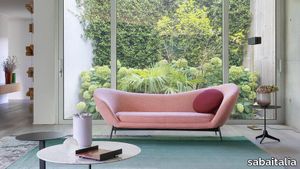
sabaitalia > Sofa
The seating collection “Oltremare” designed by Antonio Marras and produced in collaboration with Saba, stems from a far-away past and place, full of history, recollection, memories overflowing with suggestions and visions. And this is how Antonio Marras presented an object so dear to him that he defines a sacred-idol, that narrates of his land, of his sea, but mostly, of his story. We named it Oltremare, because all things have a soul and every soul has a name. Oltremare encloses within its inlets the classic and the modern. The curve is a line that can be tamed: it forms a wave, a fold, it creates a place but it also offers an escape route. In our utopian world we investigated the relationship between the curved line and the act of seating, asymmetric shapes that become backrests and sink into extremely comfortable seats pushing past the rectangular schemes so dear to the sober lines of designing sofas. The asymmetric curves that enclose it are the inspirations for the Oltremare armchair that completes the collection alongside a padded bench. A comfortable nest suspended on a slim varnished metal base, whose essential lines render, by contract, the armchair’s silhouette even more interesting. Oltremare is a seating system that, even though winks at the past, it communicates a strong contemporary soul and is suitable by nature to various interpretations. Fully removable covers.
Chimera Colore Bianco

florim > Wall Paint
In <em>Chimera,</em> Elena Salmistraro merges rigour with self-expression, in a graphic grammar laden with symbolic meaning. <em>Empatia </em>speaks to the emotions with graphics that interpret, through a highly individual abstract code, the stage make-up of a clown, with the aid of superimposed geometric forms and images. <em>Radici </em>is a tribal statement, a tribute to primitive ritual custom, evoked by the interplay between a sequence of triangles and rectangles and a set of figurative fragments. <em>Ritmo</em> is inspired by fabrics, suggesting the rhythmic alternation of woven yarns through a largely linear pattern. In <em>Colore, </em>the upheaval of a background of small isolated spots generated by a parametric digital program is combined with densely packed repeated forms. "The Chimera collection is rather like a book with four different chapters: I set out to differentiate these graphic motifs to create four totally different stories."<br></br>Elena Salmistraro It all starts with drawing. A <em>passion</em> for drawing. An <em>obsession</em> with drawing. Drawings like spider-webs, obsessively filling spaces, in a kind of manual choreography or gymnastics, a continuous flow. Elena Salmistraro draws all the time. She draws everywhere. Mostly on loose sheets or random surfaces. First and foremost with pen and pencil. Her drawings only acquire colour at a later stage. Often - just like Alessandro Mendini used to do - she draws "monsters": fascinating yet disturbing, subversive forms. The denser, more contorted the shape, the more obvious its underlying truth. For Elena, drawing is an intimate act. It is relaxing. And therapeutic. With an unrivalled communicative strength. Because drawing gives shape to ideas: you both give form to the world and reveal yourself. This passion, combined with natural graphic talent, has guided Elena Salmistraro in her project for Cedit: an experimental series of ceramic slabs produced using a high-definition 3D decorative technique. The explicit aim is to transform surfaces beyond their original flatness so that a new, visual and tactile, three-dimensional personality emerges, sweeping aside the coldness and uniformity that ceramic objects often inevitably convey.Elena Salmistraro has always viewed ceramics as a democratic material, in view of their accessibility, and the infinite potentials for shaping matter that they provide. She began working and experimenting with ceramics very early in her career, just after she graduated from the Milan Politecnico in 2008. She came into contact with small artistic craft firms specialising in smallproduction lots, and cut her teeth on projects that demanded the hand-processing of every detail, and finishes of high artistic value, for the high end of the market. The large corporations and galleries came later, but here again Elena kept faith with her desire to make mass-produced pieces unique, and to combine artistic value with specifically industrial characteristics. The monkey-shaped <em>Primates</em> vases reflect this method and intention, aiming to excite, surprise and charm. Antiminimalist and hyper-figurative, playful, ironic and a rich image-maker, often drawing on anthropology and magic, over the years Salmistraro has built up her own fantastic universe, inhabited by ceramic bestiaries, painted jungles and a cabinet like a one-eyed cyclops , always finding inspiration and inputs in nature and always aiming to reveal the extraordinary in the everyday. Given this background, it was almost inevitable she would work with Cedit: constantly seeking new talents and new approaches, as well as designs that break down the boundaries of ceramics and release them into the realm of art and innovation, the Modena company has recognised Elena Salmistraro as a leading contemporary creative spirit and involved her in a project intended to experiment with fresh ideas in materials and synaesthetics.Salmistraro's collection for Cedit is entitled <em>Chimera</em> and consists of large ceramic slabs, which can be enjoyed not only visually, through their patterns and colours, but also on a tactile level. Like the chimera in the "grotesque" tradition, monstrous in the etymological sense of the word with its merging of hybrid animal and vegetable shapes, the Cedit project attempts to originate a synaesthetic form of ceramics, through a three-dimensional development that exactly reproduces the texture of leathers and fabrics, creating an absolutely new kind of layered effect, with a tactile awareness that recalls the passion of grand master Ettore Sottsass for "surfaces that talk". And the surfaces of the slabs Salmistraro has created really seem to talk: in <em>Empatia </em>clown faces add theatricality to the cold gleam of marbles, interspersed with references to Art Déco graphics; <em>Radici</em> uses the textures of leathers and hide as if to re-establish a link between ceramics and other materials at the origins of human activity and creativity; in <em>Ritmo</em> the texture of cloth dialogues with pottery, almost in homage to the tactile rationalism of warp and weft, of which Bauhaus pioneer Anni Albers was one of the most expressive past interpreters ; finally, <em>Colore</em> has a spotted base generated by computer to underline the contrast between analogue and digital, the graphic sign and the matter into which it is impressed. It is an aesthetic of superimposition and mixing, and especially of synaesthesia: as in her drawings, in the <em>Chimera </em>slabs Elena Salmistraro's art is one of movement and acceleration. A process not of representation but of exploration. Of the world and of oneself. Almost a kind of Zen, for distancing oneself from the world to understand it more fully. In every sense.
Criade Pine green
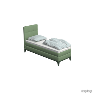
auping > Box spring
With its slender lines and refined details, the Criade is a sleek box spring with a distinctive design. The steel frame carries the design and the horizontal line connects the two box springs. This variant in Pine green with topper and Square headboard in Peach / Eucalyptus is a real eye-catcher in your bedroom. The refined legs give the Criade's design an airy feel while the steel frame provides a solid base. Head and footboard are placed directly on the frame, leaving the floor free. The use of the different materials creates the design characteristic of Auping. The Criade is a richly padded box spring: the box contains a mesh base and pocket springs. The Auping mesh base is eighty percent open and therefore the box spring ventilates very well. The pocket springs in both the box spring and the mattress ensure that you can turn easily at night and have good support during your sleep. View the Criade box spring This Criade box spring includes Comfort mattress and Comfort topper. Want to make a different choice? The Criade box spring is available with all our mattresses and toppers, change your choice in the configurator. Our collection consists of 4 box springs that you can put together exactly as you wish. Choose your own colours, materials and accessories. In total, there are 2.8 billion possibilities in our online configurator. Looking for inspiration for your own bedroom or want to know more about our beds? Then take a look at the online lookbooks.
Archeologie Archeologie Grigio
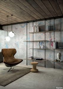
florim > Wall Paint
The poetics of the wall. The forgotten wall. «A wall is like a book to be opened, a journey into the interior, revealing the experiences, memories, signs and symbols which this fragment of masonry has absorbed over the centuries.» Franco Guerzoni <p>It is difficult to resist the beauty of Franco Guerzoni's art, created by a rare harmony of feeling and intellect, poetry and mind. The artist expresses this through paintings which, although complex in structure, are joyous and sensual, with bright colours made, like those of the great masters of the past, from choice powdered ingredients. A painter with a technique rich in traditional skills, Guerzoni offers a version of modernity involving an intense fundamental relationship with his images and with space. In fact, the dialectic between painting and space, form and architecture, time and memory seems to be essential to his art. As his works specifically created for CEDIT clearly express, his creations achieve a perfect balance between the spatial dimension and intensely lyrical use of colour, which here becomes a soft, liquid form of matter, wandering across the surface of a dazzling lime-plaster white. White, metaphor for the clear light of day, as it was in the large, complex canvases exhibited in his personal exhibition at the 1990 Venice Biennale, is the background for forms of colour which renew the pleasure to be had from painting and the memory of an image glimpsed on the vast expanse of the surface. In the more recent works, these voluptuous shades are transformed into subtle shadows of colour that delicately caress the surface.</p> <p> </p> <p> All it takes is one wall, the only surviving wall of what was once a house, on which time has recorded its own, unavoidable passing, leaving traces of colour that is still vibrant, although faded in places, to allow the memory of the image to transpire, fragile and uncertain, in the physicality of the surface, to bear tangible witness to the existence of history, a mysterious visual memory, the extension into the present of the life of things. A memory of the past on a contemporary wall. The idea of memory is central to Franco Guerzoni's poetics: private, secret memory and the collective memory of the past. Fragmentary and indecipherable, perceived by the artist with the aid of what is left of the images, the fragment. A relic of a totality which can no longer be reconstructed but only imagined in poetic terms, the fragment, a fraction of an image conserved by time, guides the artist's fantastic archaeological journey in search of the world's memory. However, this journey takes him in the opposite direction to the archaeologist, for whom the fragment - fundamental because it reveals a trace of the past is the starting-point for an attempt to reconstruct history. For Guerzoni, the fragment is the endpoint of his work, the goal for which he strives in his investigation of the surface, as he digs deep down, leafing through the deposits of time and memory.</p> <p> </p> <p>Like the large pages of a book traced with fragile sketches, embryonic forms whose meaning has been lost in time, leaving only fleeting traces, uncertain, ambiguous, mysterious morphologies. It marks the start of a journey into the mind of the artist-archaeologist, an adventurous journey into the inextricable labyrinth of the mind, to unearth what is hidden, shuffling the cards in a perennial contamination of images, memory, signs and traces, in search of a meaning, which no sooner appears than it is lost, merging into time and once again becoming a dream, an imaginary journey into fantasy and wonder. And this is the case in the tryptic created for CEDIT, which placed a new challenge before the artist: to transfer "his" image, the remains and fragments of a forgotten wall onto a new material for him “stunning, large-sized ceramic slabs“ and a real wall, without this tautology betraying the painting's deep meaning, its fertile magic of lines and colours, from which the image is born. And the artist is fully aware of this. Guerzoni describes his art as a "gamble": a gamble that is a critical test, an act of daring, dangerous and risky. This is the challenge he sets himself. It is a challenge he easily overcomes, expressing himself on these large walls with a rediscovered pleasure in painting, no longer restrained and apparently absorbed by the dense, uneven coloured surface but set free and almost luxuriously accentuated. In his large, demanding works for CEDIT, Guerzoni achieves a new, consummate mode of painting, in which the architecture of the surfaces provides a poetic meeting-point between the two founding components of his style, the complex, well thought-out composition and the lyricism of colour.</p>
Kiruna Sand beige
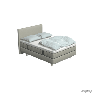
auping > Box spring
The Kiruna box spring is the most luxurious box spring. This is distinguished by the luxurious appearance and the use of natural materials. As soon as you lie down, you experience it yourself. This 2-person Kiruna box spring Sand Beige with Unik mattress and Unik headboard upholstered in Remix / Grey gives your bedroom a luxurious look. For the Kiruna box spring you can choose from 95 different fabrics. They each differ in colour and structure. In our stores you can see, feel and give you advice on which one fits best on the box spring of your choice. The luxurious Kiruna box spring has a refined design with attention to every detail and very high-quality finish. There are two headboards for the Kiruna: the slender and stylish Sami and the classic Unik. Or combine with one of the headboards of our Original box spring. To subtly add colour to the Kiruna box spring and to your bedroom, you can choose 1 of the ten Auping colours for the legs. Kiruna box spring lookbook The unique Kiruna mattresses have no less than 7 zones so that your body is perfectly supported and you lie comfortably. The Sami mattress has a sleek finish, while the Unik mattress has an extra rich look due to graceful handles, a piping all around and refined side stitching. Our collection consists of 4 box springs that you can put together completely according to your wishes. Choose your own colours, materials and accessories. In total, there are 2.8 billion possibilities in our online configurator. Looking for inspiration for your own bedroom or do you want to know more about our box springs? Take a look at the online lookbooks.
Kiruna Pine green
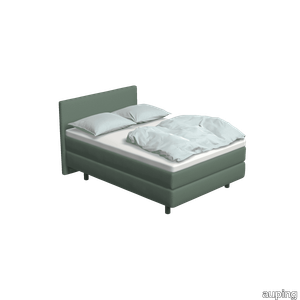
auping > Box spring
The Kiruna box spring is the most luxurious box spring. This is distinguished by the rich appearance and the use of natural materials. As soon as you lie down, you experience it for yourself. This 1-person Kiruna box spring Pine green with Sami headboard and Sami mattress in re-wool 868 Soft green gives a luxurious look to your bedroom. The luxurious Kiruna box spring has a refined design with attention to every detail and very high-quality finish. There are two headboards for the Kiruna: the slender and stylish Sami and the classic Unik. Or combine with one of the headboards of our Original box spring. To subtly add colour to the Kiruna box spring and your bedroom, you can choose 1 of the ten Auping colours for the legs. Discover the Kiruna box spring The unique Kiruna mattresses have no less than 7 zones so that your body is perfectly supported and you lie comfortably. The Sami mattress has a sleek finish, while the Unik mattress has an extra rich look due to graceful handles, a piping all around and refined side stitching. Our collection consists of 5 beds and 4 box springs that you can put together completely according to your wishes. Choose your own colours, materials and accessories. In total, there are 2.8 billion possibilities in our online configurator. Looking for inspiration for your own bedroom or do you want to know more about our Box springs? Then take a look at the online lookbooks.
Chimera Colore Grigio

florim > Wall Paint
In <em>Chimera,</em> Elena Salmistraro merges rigour with self-expression, in a graphic grammar laden with symbolic meaning. <em>Empatia </em>speaks to the emotions with graphics that interpret, through a highly individual abstract code, the stage make-up of a clown, with the aid of superimposed geometric forms and images. <em>Radici </em>is a tribal statement, a tribute to primitive ritual custom, evoked by the interplay between a sequence of triangles and rectangles and a set of figurative fragments. <em>Ritmo</em> is inspired by fabrics, suggesting the rhythmic alternation of woven yarns through a largely linear pattern. In <em>Colore, </em>the upheaval of a background of small isolated spots generated by a parametric digital program is combined with densely packed repeated forms. "The Chimera collection is rather like a book with four different chapters: I set out to differentiate these graphic motifs to create four totally different stories."<br></br>Elena Salmistraro It all starts with drawing. A <em>passion</em> for drawing. An <em>obsession</em> with drawing. Drawings like spider-webs, obsessively filling spaces, in a kind of manual choreography or gymnastics, a continuous flow. Elena Salmistraro draws all the time. She draws everywhere. Mostly on loose sheets or random surfaces. First and foremost with pen and pencil. Her drawings only acquire colour at a later stage. Often - just like Alessandro Mendini used to do - she draws "monsters": fascinating yet disturbing, subversive forms. The denser, more contorted the shape, the more obvious its underlying truth. For Elena, drawing is an intimate act. It is relaxing. And therapeutic. With an unrivalled communicative strength. Because drawing gives shape to ideas: you both give form to the world and reveal yourself. This passion, combined with natural graphic talent, has guided Elena Salmistraro in her project for Cedit: an experimental series of ceramic slabs produced using a high-definition 3D decorative technique. The explicit aim is to transform surfaces beyond their original flatness so that a new, visual and tactile, three-dimensional personality emerges, sweeping aside the coldness and uniformity that ceramic objects often inevitably convey.Elena Salmistraro has always viewed ceramics as a democratic material, in view of their accessibility, and the infinite potentials for shaping matter that they provide. She began working and experimenting with ceramics very early in her career, just after she graduated from the Milan Politecnico in 2008. She came into contact with small artistic craft firms specialising in smallproduction lots, and cut her teeth on projects that demanded the hand-processing of every detail, and finishes of high artistic value, for the high end of the market. The large corporations and galleries came later, but here again Elena kept faith with her desire to make mass-produced pieces unique, and to combine artistic value with specifically industrial characteristics. The monkey-shaped <em>Primates</em> vases reflect this method and intention, aiming to excite, surprise and charm. Antiminimalist and hyper-figurative, playful, ironic and a rich image-maker, often drawing on anthropology and magic, over the years Salmistraro has built up her own fantastic universe, inhabited by ceramic bestiaries, painted jungles and a cabinet like a one-eyed cyclops , always finding inspiration and inputs in nature and always aiming to reveal the extraordinary in the everyday. Given this background, it was almost inevitable she would work with Cedit: constantly seeking new talents and new approaches, as well as designs that break down the boundaries of ceramics and release them into the realm of art and innovation, the Modena company has recognised Elena Salmistraro as a leading contemporary creative spirit and involved her in a project intended to experiment with fresh ideas in materials and synaesthetics.Salmistraro's collection for Cedit is entitled <em>Chimera</em> and consists of large ceramic slabs, which can be enjoyed not only visually, through their patterns and colours, but also on a tactile level. Like the chimera in the "grotesque" tradition, monstrous in the etymological sense of the word with its merging of hybrid animal and vegetable shapes, the Cedit project attempts to originate a synaesthetic form of ceramics, through a three-dimensional development that exactly reproduces the texture of leathers and fabrics, creating an absolutely new kind of layered effect, with a tactile awareness that recalls the passion of grand master Ettore Sottsass for "surfaces that talk". And the surfaces of the slabs Salmistraro has created really seem to talk: in <em>Empatia </em>clown faces add theatricality to the cold gleam of marbles, interspersed with references to Art Déco graphics; <em>Radici</em> uses the textures of leathers and hide as if to re-establish a link between ceramics and other materials at the origins of human activity and creativity; in <em>Ritmo</em> the texture of cloth dialogues with pottery, almost in homage to the tactile rationalism of warp and weft, of which Bauhaus pioneer Anni Albers was one of the most expressive past interpreters ; finally, <em>Colore</em> has a spotted base generated by computer to underline the contrast between analogue and digital, the graphic sign and the matter into which it is impressed. It is an aesthetic of superimposition and mixing, and especially of synaesthesia: as in her drawings, in the <em>Chimera </em>slabs Elena Salmistraro's art is one of movement and acceleration. A process not of representation but of exploration. Of the world and of oneself. Almost a kind of Zen, for distancing oneself from the world to understand it more fully. In every sense.
Original bed Cool grey With Straight headboard and table Cool grey
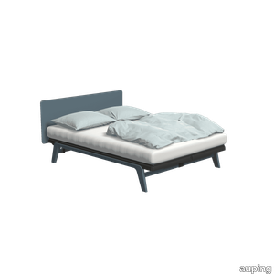
auping > Bed frame
The Original is a minimalist bed with strong lines. The steel frame with aluminum legs gives an elegant look. This variation in Cool grey with a Straight headboard and matching Cool grey table completes your bedroom. The bed is inspired by one of Auping's very first designs, the Cleopatra, and is available in ten colours. So there is a good chance that your favorite color is among them. Designed in 2007, the Original is part of a family of iconic beds. The design was inspired by the Cleopatra, one of Auping's first design classics. In 2014, the Auping Original was awarded the Good Industrial Design (GIO) award. Besides design, this award is mainly about function, originality and innovation. In addition to this, the design must also be made with respect for people and the environment. Would you like to know more about the Original? Check out the Original lookbook. Have a look at the Original This Original bed includes the Inizio mattress. Do you want to make another choice? The Original is available with all our mattresses, change your choice in the configurator. Need help making a choice? In the configurator, go to the mattress selector for advice. Our collection consists of 5 beds that you can put together entirely as you wish. Choose your own colours, materials and accessories. In total, there are 2.8 billion possibilities in our online configurator. Looking for inspiration for your own bedroom or want to know more about our beds? Then take a look at the online lookbooks.
Konoha
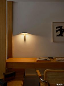
marset > Wall lamp
For designers George Yabu and Glenn Pushelberg, design is about telling stories. This is certainly true in their new Konoha model, a twin-function wall lamp that tells us what types of lighting we need around us and offers all the right possibilities to make them happen. Out of curiosity and analysis, the designers have taken a number of variables into account, especially those linked to our emotions; light is arguably the most intimate element in an environment, so its design must be thoughtful, functional and purposeful.The Yabu Pushelberg design studio, which is world-renowned for its many hospitality projects, believes that hotel room lighting is often redundant. Every room needs direct and ambient light, which is why they have chosen to include both functions in a single design. The result is a simple, discreet wall lamp with a shade over a directed spotlight that turns through 360°. The shade, like a hat, covers the spotlight, allowing the light to be directed upwards, bounce off the inside and project a beam of soft light, creating warm ambient lighting. If instead the spotlight is focused downwards, it projects a beam of direct light, turning the fixture into a reading lamp. The Konoha design is available in a range of colours, with neutral and organic shades that fit seamlessly into any space. It can be used as a reading lamp in waiting rooms, bedrooms or hotels. Or it can be a point of light in walkways, a wall lamp in restaurants or a way to bring ambient lighting to hotel entrances. Konoha invites users to interact with its light and use it throughout the day, harnessing its two, or even more, functions.
Rilievi Sabbia

florim > Wall Paint
The alternation and symbiosis between concave and convex, recessed and raised. <p>Rilievi is a work of design balanced between different historic periods: while the volumetric relief tile modules are inspired by artistic experiments conducted in Italy during the Sixties and Seventies, the large slabs are the outcome of research into materials and technology that has only come to fruition in very recent times. The shadow effects generated on the surfaces of the slabs by the light striking the projecting parts of the modules create an unusual impression of architectural depth found virtually nowhere else in ceramic coverings, laying the bases for a new decoration interior design language.</p> This project simply embodies perfection - a term which certainly sets the bar high in a description of a new product for launch on the market. But when an enlightened manufacturer is capable of encapsulating a designer's personal research in a product to be added to its range, the outcome is a perfect synthesis. A perfect synthesis between untrammelled creativity and market trends. CEDIT had the insight needed to perceive, identify and rework the immense potential of Practice Practice Practice "“ a self-produced project by Zaven (Enrica Cavarzan and Marco Zavagno "“ and realised that its sophisticated design, originated by pure, pristine input (unadulterated by external factors except the noblest of them all, research) could provide the basis for an innovative, successful collection. I might add, a collection unique of its kind. Zaven is also a name that comes with guarantees; the two partners are good at what they do. Their work always starts from personal curiosity and investigations, the study of other stories (as in this case inspiration was drawn from the output of artist and activist Nino Caruso) and individual interests, which are broken down, developed, optimised and prepared for transformation into something fresh.Enrica Cavarzan and Marco Zavagno have a masterly ability to transform their own wishes and passions into design work of the greatest breadth and, as we see here, the widest, richest application. Their use of ceramics as a material is clearly outstanding and reflects a method precisely founded on the desire to look at things from an unusual viewpoint, under a different light. And to be daring. Zaven have an unconventional approach to convention. In the specific case of the Rilievi collection, the "modules" created for CEDIT seem to explode off the walls; in fact, they are constructed by combining the two-dimensional slab with its three-dimensional decor.Rilievi seems to be seeking space. More space. Even though these modules have actually established a dialogue with the wall from which they are born. At the same time, they hypnotise us with their tight sequence of lines, the pattern that is always different although its root is the same, and the intriguing, unusual colours that add another vital factor to the finished product. Their firm grounding in graphic design (and here we have come back to two-dimensional effects, of the kind most often associated with a wall covering) easily evolves into a facade which seems to have been carved with a chisel - although this is not the case. These modules are conceived to convey an impression of movement, and the three models, in seven colour combinations, create a powerful effect on a surface, which is never passive but rather an organic contributor to the forms and colours involved in the fascinating combinations. The slab is very much present and has the same worth and status as the relief pattern associated to it. In the light of this dichotomy between the linear and the sculpted, expressed through the skilfully balanced visual expedients, the use of repetition adds vigour to the module's intrinsic meaning. As we have seen, a rejection of facile, superficial creative dynamics in favour of an investigation reaching above and beyond has always been a central, clearly recognisable feature of this Venice-based duo, who already have impressive international partnerships to their credit, including the London Design Festival, the Kalmar Konstmuseum, the Paris Designer Days, Ca' Foscari University, the Venice Biennale, the Sandretto Re Rebaudengo Foundation, the Sindika Dokolo Foundation and the V-A-C Foundation, and also won the 2018 Wallpaper Design Award. Graphics, advertising and product design: the pair have always opted for a type of design closely linked to the observation of everyday items, followed by their reinterpretation in a version applied to experimentation with materials. This duality, combined with their energetic yet elegant visual language, forms Enrica and Marco's primary code, experienced in this specific context through serial carvings. On walls.
West
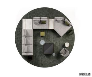
minotti > Sofa
A faceting effect livens up and interrupts the cubism that sets the morphology of the West system apart from the clichés of modern design. Characterised by its suitability for use in a wide range of different contemporary and traditional arrangements, West also features glints of pure creativity, such as the chaise-longue, available in pentagonal or hexagonal form and the elements that stand out for their striking backrests in saddle hide, ergonomically shaped to rise and support the rear cushion. True elements of surprise, they break up the compositional layout, creating a stylistic point of interest, and interrupting the continuous effect of the fabric covering, visually lightening the volume at the rear. A solution designed to optimise both look and form, created with the know-how about design and the savoir-faire associated with fine tailoring that have always distinguished the Minotti brand. Every element of the system is made with exquisite goose down padding to ensure maximum comfort, features cushions finished with a piping that defines their profile and a distinctive aluminium strip, slightly rounded at the edges which skims the floor, in a brand new polished Brandy colour finish. West leaves plenty of room for interesting compositional possibilities: it enters a harmonious dialogue in terms of both colour and shape with the Amber coffee tables, is complemented by the Side coffee tables, with their frame in saddle hide that evokes that of the backrest and enhanced by the Clive consoles, which play around with surfaces, even setting one over another. The combination of the two looks of West, one with backrest in saddle hide and the other more conventional version with padded backrest and armrest - creates original arrangements and unusual textural and colour pairings, with saddle hide taking centre stage in a range of new, exclusive colours.
Original Pine green With Straight headboard in Pine green
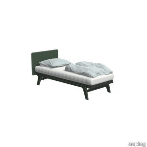
auping > Bed frame
The Original is a minimalist bed with strong lines. The steel frame with aluminium legs gives an elegant look. This variation in Pine green and Straight headboard in Pine green completes your bedroom. The bed is inspired by one of Auping's very first designs, the Cleopatra, and is available in ten colours. So chances are your favourite colour is among them. Designed in 2007, the Original is part of a family of iconic beds. The design was inspired by the Cleopatra, one of Auping's first design classics. In 2014, the Auping Original was awarded the Good Industrial Design (GIO) award. Besides design, this award is mainly about function, originality and innovation. In addition to this, the design must also be made with respect for people and the environment. Would you like to know more about the Original? Check out the Original lookbook. Have a look at the Original The Original is available with all our mattresses, change your choice in the configurator. Need help making a choice? In the configurator, go to the mattress selector for advice. Our collection consists of 5 beds that you can put together entirely as you wish. Choose your own colours, materials and accessories. In total, there are 2.8 billion possibilities in our online configurator. Looking for inspiration for your own bedroom or want to know more about our beds? Then take a look at the online lookbooks.
Patio
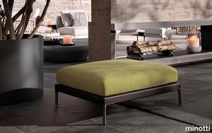
minotti > Styling
Having explored the use of woods, such as iroko and teak, with Patio, designed by Italian-Danish studio GamFratesi, Minotti proposes an unexpected mix of different materials: aluminium, wood, stone, cord. The outdoor seating system, with its highly versatile modularity, is conceived as a dynamic mosaic, composed of tesserae in simple geometric shapes, which can be pieced together as desired, and reconfigured to suit the available space and the mood to be created. The design of the sofa base structure enables the back elements to be arranged in various set positions all along the perimeter, to design conversation, relaxation, and vis-à-vis areas, spacing out the seats with coffee tables, and complementing them with ottomans and benches. A solution capable of meeting the requirements of both small metropolitan terraces, and extensive outdoor spaces, thanks to the two depths: 83 and 98 cm. The variety of potential compositions becomes even more interesting when the selected materials are masterfully combined: the extruded aluminium base with matt finish in the shades of Ecru and Dark Brown is accompanied by steel backrests, covered in woven polypropylene cord in the same shades, according to a Scandinavian-type geometric design. Some of the seating elements feature a handy tray in Dark Brown stained solid mahogany or in natural teak, with grooves for draining water, attached to the structure. Patio offers an interesting range of furnishing accessories, from coffee tables with top in brushed fine-grain Basaltina stone, benches, and square and rectangular ottomans with extruded aluminium base, in a creative mix of materic textures and sophisticated, natural colours. The system offers a rich variety of sofas in different measurements and configurations, in addition to central and end units, armchairs, loveseat, sunbeds and double daybeds. All the elements share the same feet and the same joints at the back in die-cast aluminium, varnished with a refined polished, anti-touch Bronze finish.
Kiruna Cool grey
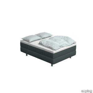
auping > Box spring
The Kiruna box spring is the most luxurious box spring. This is distinguished by the rich appearance and the use of natural materials. As soon as you lie down, you experience it for yourself. This 2-person Kiruna box spring Cool grey with Unik mattress, upholstered in Clara / Cool grey gives a luxurious look. For the Kiruna box spring you can choose from 95 different fabrics. They each differ in colour and structure. In our stores you can see, feel and give you advice on which one fits best on the box spring of your choice. There are five fabric groups. The luxurious Kiruna box spring has a refined design with attention to every detail and very high-quality finish. There are two headboards for the Kiruna: the slender and stylish Sami and the classic Unik. Or combine with one of the headboards of our Original box spring. To subtly add colour to the Kiruna box spring and your bedroom, you can choose 1 of the ten Auping colours for the legs. Discover the Kiruna box spring The unique Kiruna mattresses have no less than 7 zones so that your body is perfectly supported and you lie comfortably. The Sami mattress has a sleek finish, while the Unik mattress has an extra rich look due to graceful handles, a piping all around and refined side stitching. Our collection consists of 5 beds and 4 box springs that you can put together completely according to your wishes. Choose your own colours, materials and accessories. In total, there are 2.8 billion possibilities in our online configurator. Looking for inspiration for your own bedroom or do you want to know more about our Box springs? Then take a look at the online lookbooks.
Kiruna Warm grey
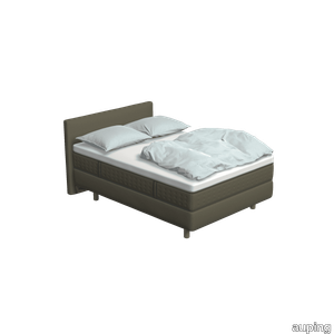
auping > Box spring
The Kiruna box spring is the most luxurious box spring. This is distinguished by the rich appearance and the use of natural materials. As soon as you lie down, you experience it for yourself. This 1-person Kiruna box spring Warm grey with Unik mattress and Unik headboard in Maze / Taupe gives a luxurious look to your bedroom. The luxurious Kiruna box spring has a refined design with attention to every detail and very high-quality finish. There are two headboards for the Kiruna: the slender and stylish Sami and the classic Unik. Or combine with one of the headboards of our Original box spring. To subtly add colour to the Kiruna box spring and your bedroom, you can choose one of the ten Auping colours for the legs. Discover the Kiruna box spring The unique Kiruna mattresses have no less than 7 zones so that your body is perfectly supported and you lie comfortably. The Sami mattress has a sleek finish, while the Unik mattress has an extra rich look due to graceful handles, a piping all around and refined side stitching. Our collection consists of 4 box springs that you can put together completely according to your wishes. Choose your own colours, materials and accessories. In total, there are 2.8 billion possibilities in our online configurator. Looking for inspiration for your own bedroom or do you want to know more about our Box springs? Then take a look at the online lookbooks.
Rilievi Cielo

florim > Wall Paint
The alternation and symbiosis between concave and convex, recessed and raised. <p>Rilievi is a work of design balanced between different historic periods: while the volumetric relief tile modules are inspired by artistic experiments conducted in Italy during the Sixties and Seventies, the large slabs are the outcome of research into materials and technology that has only come to fruition in very recent times. The shadow effects generated on the surfaces of the slabs by the light striking the projecting parts of the modules create an unusual impression of architectural depth found virtually nowhere else in ceramic coverings, laying the bases for a new decoration interior design language.</p> This project simply embodies perfection - a term which certainly sets the bar high in a description of a new product for launch on the market. But when an enlightened manufacturer is capable of encapsulating a designer's personal research in a product to be added to its range, the outcome is a perfect synthesis. A perfect synthesis between untrammelled creativity and market trends. CEDIT had the insight needed to perceive, identify and rework the immense potential of Practice Practice Practice "“ a self-produced project by Zaven (Enrica Cavarzan and Marco Zavagno "“ and realised that its sophisticated design, originated by pure, pristine input (unadulterated by external factors except the noblest of them all, research) could provide the basis for an innovative, successful collection. I might add, a collection unique of its kind. Zaven is also a name that comes with guarantees; the two partners are good at what they do. Their work always starts from personal curiosity and investigations, the study of other stories (as in this case inspiration was drawn from the output of artist and activist Nino Caruso) and individual interests, which are broken down, developed, optimised and prepared for transformation into something fresh.Enrica Cavarzan and Marco Zavagno have a masterly ability to transform their own wishes and passions into design work of the greatest breadth and, as we see here, the widest, richest application. Their use of ceramics as a material is clearly outstanding and reflects a method precisely founded on the desire to look at things from an unusual viewpoint, under a different light. And to be daring. Zaven have an unconventional approach to convention. In the specific case of the Rilievi collection, the "modules" created for CEDIT seem to explode off the walls; in fact, they are constructed by combining the two-dimensional slab with its three-dimensional decor.Rilievi seems to be seeking space. More space. Even though these modules have actually established a dialogue with the wall from which they are born. At the same time, they hypnotise us with their tight sequence of lines, the pattern that is always different although its root is the same, and the intriguing, unusual colours that add another vital factor to the finished product. Their firm grounding in graphic design (and here we have come back to two-dimensional effects, of the kind most often associated with a wall covering) easily evolves into a facade which seems to have been carved with a chisel - although this is not the case. These modules are conceived to convey an impression of movement, and the three models, in seven colour combinations, create a powerful effect on a surface, which is never passive but rather an organic contributor to the forms and colours involved in the fascinating combinations. The slab is very much present and has the same worth and status as the relief pattern associated to it. In the light of this dichotomy between the linear and the sculpted, expressed through the skilfully balanced visual expedients, the use of repetition adds vigour to the module's intrinsic meaning. As we have seen, a rejection of facile, superficial creative dynamics in favour of an investigation reaching above and beyond has always been a central, clearly recognisable feature of this Venice-based duo, who already have impressive international partnerships to their credit, including the London Design Festival, the Kalmar Konstmuseum, the Paris Designer Days, Ca' Foscari University, the Venice Biennale, the Sandretto Re Rebaudengo Foundation, the Sindika Dokolo Foundation and the V-A-C Foundation, and also won the 2018 Wallpaper Design Award. Graphics, advertising and product design: the pair have always opted for a type of design closely linked to the observation of everyday items, followed by their reinterpretation in a version applied to experimentation with materials. This duality, combined with their energetic yet elegant visual language, forms Enrica and Marco's primary code, experienced in this specific context through serial carvings. On walls.
Tam Tam
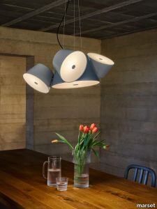
marset > Ceiling lamp
With the Tam Tam collection, Fabien Dumas shows us his knack for innovation: bringing together various lamps in one and allowing each to send light in any direction. The design features a central light source, to which various satellite lamps -between 3 and 5- can be added to project light from any angle.Imaginative and playful, Tam Tam is dynamic in its configuration and expressive in its colours. The extensive collection, which comes in pendant, wall and floor lamps, has harnessed colour since its inception to create volume and accentuate spaces. A decade later, the collection is getting an update to offer new possibilities. The glossy finishes have become semi-matte and new, softer colours have been added, including blue-grey and khaki for the central lamp and silver-grey and olive yellow for the satellite lamps. The combination of colours is what harmonises the whole. Besides colour and texture, Tam Tam has also evolved to offer the possibility of including more powerful light sources. New ideas to expand the collection, new colours to create a fresh look, new varieties to offer users maximum flexibility, and new options to improve the quality of light. The Tam Tam is moving forward in every way possible.
Tesori Monile bianco

florim > Wallcovering
East and West, a synthesis archieved through Italian taste. «My work often takes me to far-off lands, also remote in terms of their culture and traditions. Even without my being aware of it, I then metabolise these traditions and include them in the designs I subsequently produce.» Matteo Nunziati <p>"It is the architect's task to create a warm, livable space. Carpets are warm and livable. He decides for this reason to spread one carpet on the floor and to hang up four to form the four walls. But you cannot build a house out of carpets. Both the carpet and the floor and the tapestry on the wall required structural frame to hold them in the correct place. To invent this frame is the architect's second task."When Adolf Loos wrote his revolutionary essay on the "principle of cladding" in 1898, architecture was just entering the modern age. Building meant imagining structures capable of putting together different materials, but, Loos affirmed, it must also respect their individual characteristics. "Every material possesses a formal language which belongs to it alone and no material can take on the forms proper to another", the Austrian master therefore maintained. And there is no doubt that the spirit of these words extended throughout most Twentieth Century architecture, regardless of its location or style. When we look at Matteo Nunziati's designs for the CEDIT Tesori collection, we seem to be seeing geometrical purity and attention to detail at the service of a new "truth" of material. Because Matteo Nunziati views ceramics as a form of fabric.<br /> The woven patterns he imagines for the various styles in his collection "“ from Arabian to damask to more geometrical motifs "“ constantly seek to provide the soft, iridescent look of time-worn linen. In them, ceramics are raised from the status of poor relation of marble to become a luxury wall covering in their own right: almost a wallpaper, suitable however for both floors and walls, and an absolutely versatile material. No longer only for beautifying bathrooms, they can create new moods in every room of the house (and elsewhere) starting from the living-room. Naturally, the revolution has been mainly technological. The large slabs produced by CEDIT are more than 3 metres tall, and since they eliminate the serial repetition typical of conventional tiles, they generate a new relationship between the surface and its decoration. However, Nunziati does not use this to create, artist-like, a more eye-catching decorative composition that emphasises the slab's dimensions. Quite the opposite; the patterns he offers us attempt to break down what is left of the boundaries between substrates. In particular, the Arabian and damask styles, in the version with "timeworn" patterning, convey the idea of the ceramic slab as an abstract, almost non-existent material which melts into the decorative motif applied to it, in a kind of pure wall covering.<br /> Through the patient selection of geometrical motifs and tests to verify their suitability for application to ceramic slabs, Nunziati aims to achieve a new material rather than a mere decoration, making this clear by also exploring its tactile dimension, with gouged and relief motifs. His "principle of coverings" therefore relates to ceramics' essence rather than their image: highlighting the versatility which, as we all know, has made ceramics an absolute material, a kind of cement that incorporates structure and finish in a virtually infinite range of applications. This is clearly indicated by the reference to the mashrabiya, a term meaning place where people drink in Arabic, which in Arabian architecture originally referred to the kind of veranda where people used to meet and rest, and over time has come to mean the wooden gratings that screened these places from the sun. Inspired by his trips to the Middle East, for Nunziati the geometric patterns of the mashrabiya become both an outline of his method of work and the form of what in fact becomes the key element in a new idea of space: a real location conceived around a strong, livable surface in which physical substance and decoration overlap to the point where they merge.</p>
Kiruna Night blue
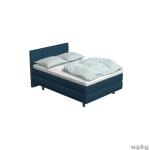
auping > Box spring
The Kiruna box spring is the most luxurious box spring. This is distinguished by the rich appearance and the use of natural materials. As soon as you lie down, you experience it for yourself. This adjustable 2-person Kiruna box spring 1M Night blue with Sami mattress and Sami headboard in Remix / Royal blue gives a luxurious look to your bedroom. For the Kiruna box spring you can choose from 95 different fabrics. They each differ in colour and structure. In our stores you can see, feel and give you advice on which one fits best on the box spring of your choice. There are five fabric groups. The luxurious Kiruna box spring has a refined design with attention to every detail and very high-quality finish. There are two headboards for the Kiruna: the slender and stylish Sami and the classic Unik. Or combine with one of the headboards of our Original box spring. To subtly add colour to the Kiruna box spring and your bedroom, you can choose 1 of the ten Auping colours for the legs. Discover the Kiruna box spring The unique Kiruna mattresses have no less than 7 zones so that your body is perfectly supported and you lie comfortably. The Sami mattress has a sleek finish, while the Unik mattress has an extra rich look due to graceful handles, a piping all around and refined side stitching. Our collection consists of 5 beds and 4 box springs that you can put together completely according to your wishes. Choose your own colours, materials and accessories. In total, there are 2.8 billion possibilities in our online configurator. Looking for inspiration for your own bedroom or do you want to know more about our Box springs? Then take a look at the online lookbooks.
Dipping Light
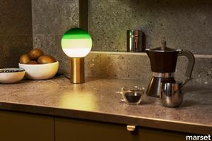
marset > Table lamp
Beyond its function as a lamp, the Dipping Light seeks to excite. When it’s turned on, its different shades of paint sift the light, creating a magical ambient effect. When it’s off, its colored glass sphere is an object charged with beauty, and eye-catching design piece for a shelf, bedside, or table.Jordi Canudas is an alchemist of light. He experiments with it, seeking always to be surprised and learn from it. He wants to capture the essence of light. With this goal in mind, the Dipping Light was created as yet another experiment – dipping a lit bulb into paint several times – with the end result of this table lamp. The various layers of paint draw concentric circles and capture the light, moderating its intensity. The paint becomes the shade, colouring and texturizing the light. A brass o graphite base is added for support. This artisanal process will make each lamp a unique and exclusive creation. The table version doesn’t settle for just two sizes: the most poetic of lamps offers more uses and comes in a stand-alone portable version and with another diameter – ø20 cm – halfway between the small and the large versions. There is also a choice of finish for the base between brushed brass and graphite, while the colours of the bulb remain the same.
Quadrado
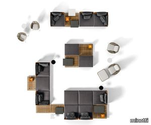
minotti > Sofa
Inspired by the classic teak duckboard used in the yachting industry to facilitate the outflow of water, the Brazilian architect Marcio Kogan developed Quadrado, a modular system consisting of suspended square platforms that furnish outdoor spaces with exceptional lightness and flexibility. A flexible and dynamic furnishing, of undisputed quality and comfort, which perfectly dialogues with the surrounding environment: a young and contemporary proposal that invites informal and original solutions. The wooden bases welcome comfortable padded cushions with backrests in a special fibre woven with wicker-effect, available in Mud colour or plain Liquorice colour. The sitting elements are interspersed with wooden surfaces that feature trays or candle holders, that can be arranged as desired with a surprising interlocking effect. A circular armchair joins this outdoor landscape characterized by its broad compositional freedom. For the concept, Kogan was inspired by the Japanese Metabolist architecture of the Fifties and Sixties, defined by modular volumes. Originally conceived for large living areas with 102x102 cm modules, Quadrado also integrates within its range a more compact version with 87x87 cm modules that can be combined together to adapt to more limited urban, residential and Hospitality contexts. The Quadrado double daybed, with its substantial proportions - 242x180 cm - creates an extracomfy nest in which to sit back, relax and dream. It is designed in the form of a niche, with alcove marked out by the teak duckboard backrest and armrests, and it is completed by a large mattress and soft, enveloping cushions. The double daybed sits on two metal crosspieces in Bronze.
Lawson
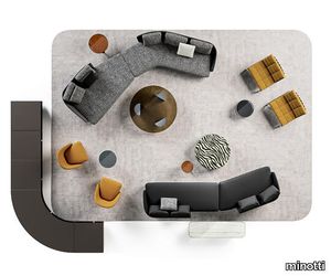
minotti > Sofa
With the fluid line of its shapes and the equilibrium of its soft volumes, the Lawson seating system explores different types of chairs, offering innovative solutions that push out the traditional style boundaries, ranging from small lounge armchairs to the larger easy chair, and even sofas. The design features a look based on the juxtaposition of materials: on one side there is leather, which follows the curve of the enveloping backrest, in turn becoming an armrest and on the other side there is the fabric of the cushions, with its haute couture feel. The many different layouts of the system, with its interesting range of alternating depths, mean it is perfect for creating both small, intimate spaces, as well as arrangements featuring several elements, all fit to occupy larger spaces with grace. With its natural elegance, Lawson is ideal for residential interiors, but also reveals a strong vocation for the hospitality sector, thanks to its versatile modularity. Sofas and armchairs sit on metal feet with a chrome or polished Pewter finish, a jewel-detail that adds a touch of sophistication to the piece. The wide variety of elements in the Lawson family also includes an armchair with legs in Moka-coloured ash wood or covered in leather, a detail that also characterises the lounge armchair and dining chair. Each piece can be used in a wide range of potential combinations of materials and colours. And while the impression made by Lawson oozes with Seventies style if the arrangement includes pieces with black leather, structured fabric upholstering and feet with a chrome finish, instead, a more decorative spirit shines through if the option chosen features velvet and chenille.