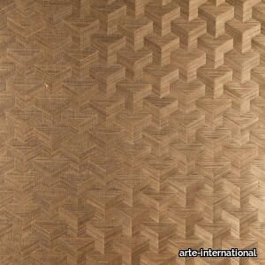
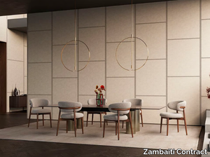
Indienne
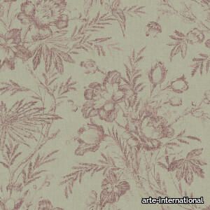
arte-international > Wallcovering
A centuries-old pattern which has been given a radically new reinterpretation. It has a popular weathered effect, while the linen structure adds a touch of roughness.
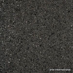
Lin
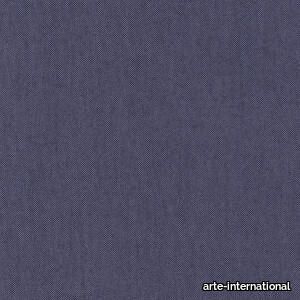
arte-international > Wallcovering
This wallpaper is as warm and tactile as linen, with the same natural appearance.
Araldica Cemento
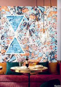
florim > Wallcovering
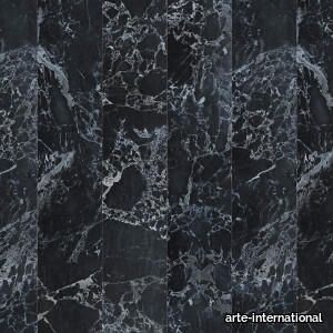
The miscellany of bright, contrasting, pure colours. The manifest extroversion of decor. The solutions provided to complete the range are in a different tone: reflecting the desire to "stage" a clear contrast with the multicolour ceramic wall coverings, these slabs are in completely neutral shades, in the grey frequencies of concrete.<br /><br />«The collection is intended to create a struggle, a fight. Between something very stiff, which sees itself as governed by clear rules, and a variable, marbled paper, which aims to be completely free.»<br />Federico Pepe "Once upon a time, there was a Roman emperor who lived on a huge splinter in space, a spaceship of multi-coloured marble, where techno music played incessantly. That day he left his spaceship to go to dinner at the Sun King's home, riding his sinuous golden dragon with blood-red eyes."If there were a book with these opening words, Federico Pepe would have designed its cover. And if the book were made into a film, he would definitely be its writer and director. Federico is not an author, director or screenwriter, but this does not prevent him from drawing on his natural ability to create stories through flashes of imagination.Federico Pepe's career started in advertising, a family tradition, which he gradually transformed and built into many other things, in a constant, inevitable investigation of creativity in all its possible forms. He very soon understood that commission work was not enough for him, and he began to explore further afield. The first of these other fields was art, but the consolidated mechanisms on which galleries and gallery owners operate soon became a new limit from which he had to break free: this apparently expanding horizon turned out to be a restrictive cage, more a defining label than an infinite learning opportunity. And definitions are one of the things which least describe Federico: anyone trying to distil his work into two words would find its essence disappearing before their own eyes. He has occupied many roles and engaged in many professions to give shape to his ideas, and in all of them he has excelled, created and led teams, and won awards. Adman, creative director, graphic designer, printer, gallery owner, publisher, curator, performer, painter, designer, director: Pepe does, rather than is, all these.<br /> He works, builds and makes things happen because he is not led by instinct alone and does not succumb to idle whim; he does not rush aimlessly around and does not simply await the inspiration or idea of the century. Quite the opposite. His work comes about and produces results only thanks to strict self-discipline, a design method made up of constant verification, the precise sharing of tasks and roles, the compulsive exploration of unknown contexts, daily physical exercise, the carefully measured use of social media, and occasional spells of isolation in the mountains he loves. It is no coincidence that he created Le Dictateur, a dual-faced entity which may be both his child and his spiritual guide, both friend and boss, part madness and part dictator. Le Dictateur is not Federico's alter ego: it is his superpower. It is not a mask, since in it he actually transforms himself into an artistic project.Le Dictateur is both result and origin of Federico Pepe's work. "I think ideas are born from predisposition," Federico explained to me in 2014. "Not in the sense that "˜we are born predisposed,' but for daily preparation. In this domain I believe that discipline is pivotal. The real talents today are very rigorous people, those who work hard, exchange a lot, think a lot, and know how to apply and balance many different things." An approach which has made him the best-kept secret on the Italian creative scene, a fact well known not only to Pierpaolo Ferrari, Maurizio Cattelan, Nico Vascellari, Jacopo Benassi and Patricia Urquiola, but also to the companies, both large and small, which have turned to him over the years. He has worked and continues to work with them all, designing by laying the foundations of designs naturally expressed in episodes, in a serial pattern which not only gradually builds up Federico's own creative story, but also offers his clients designs so special that they would be virtually impossible without him.<br /> This self-discipline generates heat and energy in such quantities that "“ if it were not imprisoned within the geometrical grids of graphic design "“ it might generate a thermonuclear reaction. The blood running through the veins of his images is black as ink, red as sealing-wax, white as plaster and golden as lava. But there is more, too. His crystal-clear visions are able to break down the slender membrane which separates analogue from digital. He sees matter as absolutely central, but he makes it vibrate with an unusual two-dimensional quality. This can be seen in the way he carves marble with coloured squiggles, recollections of faces briefly sketched as vectors. It is discovered in the skill with which he invades plates and bowls of the finest, monitor-shiny porcelain with geometrical patterns. It becomes tangible in the love with which he brings to life the paper of his publishing projects, peopled with highly elegant, powerfully symmetrical, often kaleidoscopic graphics. It can be admired in the precision with which a metallic factory flooring becomes fabric on an ancient loom, after its resolution is decreased from 300 dpi to 8 bits. It is enjoyed in the hyperbolic repetition of faces and hands in acrylic on canvas in his painting studio, in which every work conserves copy and paste reminders of its predecessor. It amazes in the doors of exquisite metal sideboards, profane glass panels, hand-made but born through the glass of a screen.<br /> A career which has led almost naturally to an encounter with CEDIT, with whom he has created an aesthetically courageous collection, part punk and part aristocratic austerity. The Araldica project's very name evokes strength and nobility, and it is grounded in a past whose weight does not drag it backwards but rather catapults it forwards into the future. Here, Federico's digital geometries become the most solid of materials, taking shape in a graphic object, condensing stories and images into three or two dimensions. In Pepe's and CEDIT's space, Euclidean geometrical forms encounter the marble of Phidias, the intricate patterns of the floor of Milan Cathedral merge into the Baroque images of the marbles found in Roman art galleries, and private space opens out to the infinite space of a thousand possible universal histories.
Buildtech/2.0 Build Coal TU
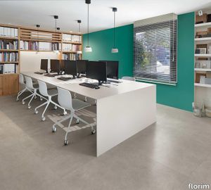
florim > Wallcovering
Buildtech/2.0 assures the realization of ever-current projects To the four colors, White, Bone, Mud and Coal in Tinta Unita, Granigliata and Cemento, 10 solid bold colors are being added, only intensifying the "brutality".<br />
Euridice Tela
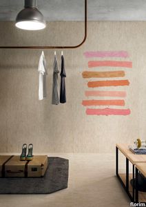
florim > Wallcovering
The mystery and poetry of painting. Art that inhabits space. «In the past, art was expected to transfer the object, or work of art, from the inanimate to the animate world. Now, since we know that the whole world is animate, the task of the artist is to interact with the intelligence of matter.» Giorgio Griffa Born in Turin in 1936, Giorgio Griffa is now ranked as one of Italy's most important abstract painters of the Twentieth Century. He began to paint when he was very young, just 10 years old, and for two decades his work was figurative, fairly traditional in subjects and style. His mature work developed later, in the mid Sixties, in the context of the abstract-expressionist and tachiste movements, which based their language on a concept of painting as a sequence of actions, like a repeated sign or form of writing. Rather than a representation, painting became the direct expression of a mental state, a precise psychic temperature, an internal beat.Historically, his work has been classified as part of this "analytical painting" movement, which concentrated on analysing itself and its internal mechanisms: surface, substrate, colour and sign. However, Giorgio Griffa's work seems to stand apart from that of his fellow artists, and nowadays it is difficult to place it firmly within the historic analytical and conceptual painting movements. His abstract works, consisting of simple signs repeated on the canvas, seem to be not so much an analysis of the act of painting as a homage to painting itself and its history. And this is one of the delightful, central paradox's of Griffa's work: in spite of their conceptual approach, his paintings have <strong>a fascinating lyrical component, a radiant musicality, very different from the cold, unemotional mood of the neo-avantgardes</strong>.<br /> In this sense his works are something of a mystery for the art world, as lovely as they are indefinable, because in them everything seems to be at once both simple and complex. The types of canvas the artist uses (jute, hemp, cotton or linen) are simple. His painted signs are also simple, or even anonymous: a series of vertical or horizontal lines and - only from the Eighties onwards - stylised floral motifs, friezes and spirals. Yet Griffa entrusts this apparent simplicity with the task of saying what is unsayable by its very nature; of plumbing the depths of the mystery of creation and the unknown. Seemingly banal and obvious at first glance, Griffa's work is actually layered with references to the history of art, Stone Age painting, Zen philosophy, music and "“ as we have seen "“ the artistic avantgarde of his own age.All these characteristics are very much to the fore in the artist's works for CEDIT Ceramiche. For this historic brand, Griffa has created five works involving a series of lyrical, minimalist signs, which recall the motifs current in the late Sixties and Seventies. The range of colours in which these signs are presented, with complementary colours and half-tones, seem to be drawn from the Renaissance and the art of Venice and its region in the Sixteenth and Seventeenth Centuries. The other fundamental point of reference is Matisse, the painter who rejoiced in colour and in whose images signs and colours are nicely balanced.<br /> Griffa's collection for CEDIT sets out to use <strong>modular repetition of signs</strong> to build up genuine spatial environments for everyday living. The partnership with a ceramics manufacturer is a particularly fertile one for the Turin-born artist. In fact, his pictorial language "“ based on the concept of an anonymous sign open to potentially infinite repetition "“ seems to be ideally suited to large-scale reproduction and the decoration of entire interiors. The concepts of fragmentation and incompletion can be easily applied to the decoration of living-spaces of varying sizes, as if they were "portions" of a larger whole, an expanding universe. All Griffa's works use a repertoire of timeless signs, actions repeated over the millennia, on a complex trajectory that combines art, craftsmanship and decoration. In the project for CEDIT, this ancient story of experimentation with the potentialities of sign, colour and matter comes to a kind of natural, fascinating fruition.
Neutra 6.0 05 quarzo
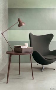
florim > Wallcovering
After a decade of success, the Neutra collection becomes a container of colors and increasingly advanced materials and transforms into Neutra 6.0. The surfaces thereby create scenery for pure sensory pleasure, where nothing is left to chance, but everything is always skillfully calibrated to the search for a new bon ton where the body and mind can be rejuvenated. The perfect integration between man and the space in which he lives is expressed through a simple architecture where you can spread your artistic sign on the surfaces, in the colors and in the furnishing for an unrepeatable result from which your own creative identity emerges.
Neutra 6.0 04 ferro

florim > Wallcovering
After a decade of success, the Neutra collection becomes a container of colors and increasingly advanced materials and transforms into Neutra 6.0. The surfaces thereby create scenery for pure sensory pleasure, where nothing is left to chance, but everything is always skillfully calibrated to the search for a new bon ton where the body and mind can be rejuvenated. The perfect integration between man and the space in which he lives is expressed through a simple architecture where you can spread your artistic sign on the surfaces, in the colors and in the furnishing for an unrepeatable result from which your own creative identity emerges.
Tesori Monile grigio
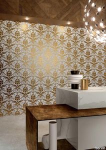
florim > Wallcovering
East and West, a synthesis archieved through Italian taste. «My work often takes me to far-off lands, also remote in terms of their culture and traditions. Even without my being aware of it, I then metabolise these traditions and include them in the designs I subsequently produce.» Matteo Nunziati <p>"It is the architect's task to create a warm, livable space. Carpets are warm and livable. He decides for this reason to spread one carpet on the floor and to hang up four to form the four walls. But you cannot build a house out of carpets. Both the carpet and the floor and the tapestry on the wall required structural frame to hold them in the correct place. To invent this frame is the architect's second task."When Adolf Loos wrote his revolutionary essay on the "principle of cladding" in 1898, architecture was just entering the modern age. Building meant imagining structures capable of putting together different materials, but, Loos affirmed, it must also respect their individual characteristics. "Every material possesses a formal language which belongs to it alone and no material can take on the forms proper to another", the Austrian master therefore maintained. And there is no doubt that the spirit of these words extended throughout most Twentieth Century architecture, regardless of its location or style. When we look at Matteo Nunziati's designs for the CEDIT Tesori collection, we seem to be seeing geometrical purity and attention to detail at the service of a new "truth" of material. Because Matteo Nunziati views ceramics as a form of fabric.<br /> The woven patterns he imagines for the various styles in his collection "“ from Arabian to damask to more geometrical motifs "“ constantly seek to provide the soft, iridescent look of time-worn linen. In them, ceramics are raised from the status of poor relation of marble to become a luxury wall covering in their own right: almost a wallpaper, suitable however for both floors and walls, and an absolutely versatile material. No longer only for beautifying bathrooms, they can create new moods in every room of the house (and elsewhere) starting from the living-room. Naturally, the revolution has been mainly technological. The large slabs produced by CEDIT are more than 3 metres tall, and since they eliminate the serial repetition typical of conventional tiles, they generate a new relationship between the surface and its decoration. However, Nunziati does not use this to create, artist-like, a more eye-catching decorative composition that emphasises the slab's dimensions. Quite the opposite; the patterns he offers us attempt to break down what is left of the boundaries between substrates. In particular, the Arabian and damask styles, in the version with "timeworn" patterning, convey the idea of the ceramic slab as an abstract, almost non-existent material which melts into the decorative motif applied to it, in a kind of pure wall covering.<br /> Through the patient selection of geometrical motifs and tests to verify their suitability for application to ceramic slabs, Nunziati aims to achieve a new material rather than a mere decoration, making this clear by also exploring its tactile dimension, with gouged and relief motifs. His "principle of coverings" therefore relates to ceramics' essence rather than their image: highlighting the versatility which, as we all know, has made ceramics an absolute material, a kind of cement that incorporates structure and finish in a virtually infinite range of applications. This is clearly indicated by the reference to the mashrabiya, a term meaning place where people drink in Arabic, which in Arabian architecture originally referred to the kind of veranda where people used to meet and rest, and over time has come to mean the wooden gratings that screened these places from the sun. Inspired by his trips to the Middle East, for Nunziati the geometric patterns of the mashrabiya become both an outline of his method of work and the form of what in fact becomes the key element in a new idea of space: a real location conceived around a strong, livable surface in which physical substance and decoration overlap to the point where they merge.</p>
FORMS - MADONE LIN - Linen wall fabric _ Élitis

Élitis > Wallcovering
**Product Description:** Forms - Madone Chenille is a luxurious 3D wallcovering crafted from pure linen, certified Master of Linen, and made in France. This innovative design combines futuristic accents with raw, avant-garde aesthetics, featuring soft undulations, quilted forms, and geometric patterns that create a unique visual and tactile experience. The collection includes a variety of materials such as wool, linen, and faux-suede, offering a blend of bold and natural textures. The Madone Chenille variant, with its velvety chenille finish, adds a touch of softness and sophistication, making it ideal for monochrome or color-blocked decors. Additionally, a downloadable 3D file of the product is available for design visualization. **Supplier Description:** Élitis, a prestigious French interior design brand established in 1988, is celebrated for its innovative, high-quality wallcoverings, fabrics, and furniture, blending contemporary luxury with timeless elegance.
MERIDA - PARTITURA - Raffia wall fabric with graphic pattern _ Élitis

Élitis > Wallcovering
The **Merida - Partitura** is a sophisticated raffia wall covering mounted on a non-woven backing, offering permanent fire resistance and excellent lightfastness. Crafted from 100% raffia, it is available in three elegant colorways: *Un luxe artisanal* (RM 1020 02), *Nature citadine* (RM 1020 60), and *Chic et insolent* (RM 1020 80). Inspired by a vibrant and artistic vision, this collection from the Merida line captures the interplay of light and shadow as it filters through geometric windows, casting dynamic patterns on concrete walls and lush foliage, evoking the essence of a modern urban oasis. A 3D file of the product is available for download, allowing for seamless integration into design projects. Élitis, the supplier behind this exquisite product, is a globally recognized French interior design brand founded in 1988, celebrated for its innovative, high-quality wallcoverings, fabrics, and furniture that blend contemporary luxury with timeless elegance.
VESTIAIRE MASCULIN - CASUAL - Striped cotton wall fabric _ Élitis

Élitis > Wallcovering
**Casual** is a sophisticated textile wallcovering that exudes a Parisian couture ambiance, inspired by timeless androgynous icons immortalized in film. Available in two distinct finishes—**RM 1013 01: Décontraction apparente** and **RM 1013 80: Un chic urbain**—it combines elegance with urban chic. Crafted from a blend of 50% cotton, 30% viscose, 10% linen, and 10% polyester on a non-woven backing, it offers a useful width of 135cm (53"). The material is both permanently fire-resistant and highly light-resistant, making it ideal for various interior spaces. The design celebrates the natural elegance of fibers like linen, jute, and raffia, with subtle metallic sheens reminiscent of a gentleman's cufflink, adding a touch of timeless sophistication. A 3D file of the product is available for download, allowing for precise visualization and planning. For further details, refer to the manufacturer's collection **VESTIAIRE MASCULIN - CASUAL Élitis**. **Élitis**, a prestigious French interior design supplier founded in 1988, is celebrated for its innovative and luxurious wallcoverings, fabrics, and furniture, blending contemporary aesthetics with timeless craftsmanship.
VESTIAIRE MASCULIN - L'ESSENTIEL - Solid-color cotton wall fabric _ Élitis

Élitis > Wallcovering
**L'Essentiel** is a sophisticated textile wallcovering that exudes a Parisian couture ambiance, inspired by timeless androgynous icons immortalized in film. Available in two elegant finishes—**RM 1014 01 - Le goût de la simplicité** and **RM 1014 80 - Une délicate sobriété**—this product combines natural fibers like linen, jute, and raffia with a subtle metallic sheen, evoking the refined elegance of a gentleman's cufflink. Crafted with 50% CO, 30% VI, 10% LI, and 10% PL on a non-woven backing, it features a useful width of 136cm (53"), permanent fire resistance, and excellent light resistance. A 3D file of the product is available for download, allowing for seamless integration into design projects. **Élitis**, the supplier behind this exquisite creation, is a globally recognized French brand founded in 1988, celebrated for its innovative and luxurious wallcoverings, fabrics, and furniture that blend contemporary style with timeless elegance.
ARBUS - Solid-color fabric _ Dedar
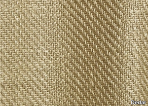
Dedar > Wallcovering
Here’s a refined and expanded product description, including a concise supplier overview and a note about the 3D file: *"This elegant, solid-color fabric offers timeless versatility for upholstery, drapery, or decorative accents, available in a curated selection of hues to suit any design scheme. A downloadable 3D file of the product is also available for digital visualization. Sourced from Dedar, a prestigious Italian textile house founded in 1976, renowned for its innovative, high-end fabrics and wallcoverings that blend craftsmanship with contemporary design."* Let me know if you'd like any further adjustments!
FITZCARRALDO - Linen wallpaper / fabric _ Dedar
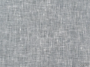
Dedar > Wallcovering
**Fitzcarraldo** is an elegant wallcovering crafted from pure linen gauze with an airy, open weave, featuring subtle slubbed textures and a soft palette of streaked pastel tones that lend walls the delicate freshness and timeless sophistication of fabric-bound book covers. The material is composed of 100% linen with a 100% non-woven backing, ensuring both breathability and durability. A downloadable 3D file of the product is available for design visualization. For further details, refer to **Dedar**—a prestigious Italian design house founded in 1976, celebrated for its luxurious textiles and wallcoverings that blend artistry with craftsmanship. Explore their collections at [www.dedar.com](http://www.dedar.com).
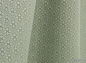
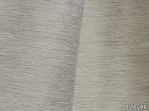
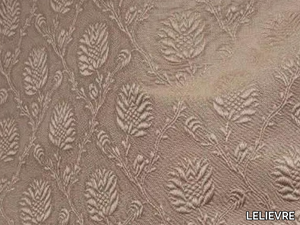
JEAN PAUL GAULTIER - AFRIKA - Polyolefin fabric with floral pattern _ LELIEVRE
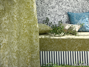
LELIEVRE > Wallcovering
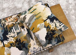
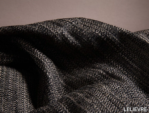
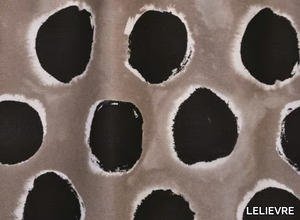
JEAN PAUL GAULTIER - CONSTRUCTIVISME - Printed polyester fabric with graphic pattern _ LELIEVRE
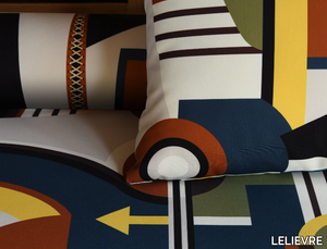
LELIEVRE > Wallcovering
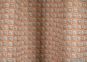
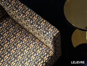
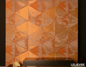
JEAN PAUL GAULTIER - AZULEJOS - Cotton upholstery fabric with graphic pattern _ LELIEVRE
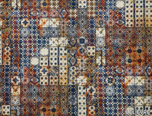
LELIEVRE > Wallcovering
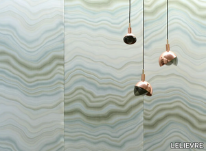
TASSINARI & CHATEL - MARLY BORDURE - Embroidered silk fabric with floral pattern _ LELIEVRE
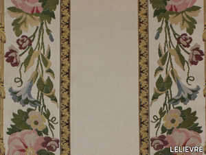
LELIEVRE > Wallcovering
TASSINARI & CHATEL - LESZCZYNSKI - Silk wall fabric with floral pattern _ LELIEVRE
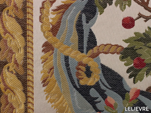
LELIEVRE > Wallcovering
