Matrice Essenza
florim > Wallcovering
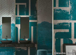
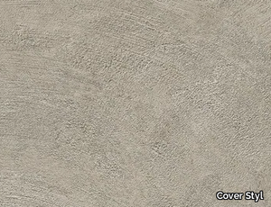
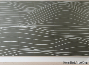
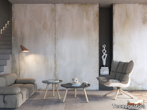
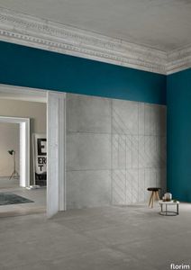
An atlas of modular signs to be combined in a wide variety of layouts. «We love concrete as a material, its versatility and its plain, austere look. We have completed our carefully designed surfaces with graphic patterning inspired by the human actions of weaving and embroidering.» Barbara Brondi & Marco Rainò To appreciate the profundity of the design project undertaken by Barbara Brondi and Marco Rainò for Cedit, it is both necessary and explanatory to start from the title the collection bears. In modern usage the term Matrice, in Italian, refers to a die or mould used to reproduce an object, but its origins are much more remote, with a meaning closer to the English “matrix”, meaning the underlying basis of something. The root of the word is related to Mater or mother: the name Matrice thus relates to the origin or cause of something. This dichotomy is expressed in several levels within the work of these architects, who study the world from a sophisticated conceptual approach and then transform it into a design. Starting from the idea of ceramic coverings, which have always been a tool not so much of architecture as of interior design, the artists work back to the origin of the surface and its decoration within their own discipline: they look at what we used to call the modern age, where modernity has also brought an uncompromising brutality, and where the use of bare concrete became the statement of an attitude to life with no time to spare for manners. Concrete is originally a liquid material, intended for shaping, which can therefore absorb and retain any type of mark created by the material and mould used to form it. Architects midway between rationalism and brutalism have used the rough-and-ready language of concrete combined with a last, elegant, anthropic decorative motif impressed on the material, that makes the concept of covering superfluous, because its place, in its older meaning of decoration rather than functional cladding, is taken by the regular patterning created in the material itself. There are therefore various grounds for believing that, in this collection, the artists are once again working in architectural terms. Firstly, with a simplicity typical of BRH+, they reduce the initial concepts to their minimal terms. So although this is a collection of coverings for walls, indoor floors, outdoor pavings and curtain walls, a great deal of time was spent on destructuring the idea of the ceramic covering itself. Unfortunately, nowadays there is no space in the contemporary construction sector for the radical approach of the past, so the cladding designed for the building actually lays bare the interior, using the choice of material – accurately interpreted (with shade variation) on the basis of an assortment of various types – to restore visual elegance and a fundamental severity. Attention to scale is another architectural feature: Matrice offers modules with architectural dimensions and different sizes through the development of “large slabs”, eliminating the visual regular grid effect. Thanks to this visual reset, geographic forms are perceived to emerge from dense, grey concrete surfaces decorated as in bygone days by special processes and by weathering during drying. The various types of slab, each an atlas of subtle, vibrant signs on the surfaces, comprise finishes that reproduce the visual effect of reinforced concrete – with the aggregates in the cement more clearly visible, of formwork – with the signs impressed on the concrete by the timber used, of a structured surface resembling bare cement plaster, of ridged and streaked surfaces – with patterning resembling some kinds of linear surface finishing processes – and finally a smooth, or basic version, over which Matrice exercises the dichotomy referred to earlier. It is on these surfaces that Brondi and Rainò have imagined additional design reverberations, a figurative code that rejects the concept of the grid, previously inseparable from that of the module: by means of a vocabulary of graphic marks cut into the slabs with a depth of 3 mm (the width of the gap left between modules during installation), they provide a framework for infinite combinations of possible dialogues. Just as in embroidery, which is based on grids of stitches and geometric repetitions, and where every stitch is at right-angles to another one to construct forms and decorations. Also taken from embroidery is the idea of introducing a degree of “softness” to reduce the stiffness of intentionally deaf surfaces. There is the impression of patterns that can continue for infinity, as in textile weaving, and a scale that, unlike the surface being worked on, is imagined as suspended and lightweight. They may not admit it, but BRH+ know a lot about music, including electronic music, and it appears to me that this organised tangle of infinite signs – unidentifiable without an overview – is rather like the representations of synthesized sounds. Sounds that are produced by machines, and thus “woven” by sampling and overlapping sounds of the most unlikely origins, combined to form jingles which, once heard, are imprinted indelibly on the brain. This may be why I am so interested in the space between this “melodic film” and its deaf, damp substrate. The eyes can navigate this suspended reality without fear of disturbance. So we are faced with different surfaces, different sizes and different graphic signs. But only one colour (surprise!) to prevent a cacophony not just of signs but also of possible interpretations: the artists retain their radical principles (and their generosity), and as curators, a role in which they are skilled, they leave the players (architects and installers) to add their own interpretations. In their hands this colour, expressed in Matrice, will produce motifs on surfaces in living spaces for someone else. This stylish covering and its workmanship will be left to the hands of someone who will probably never read this, but will be on a building site, with the radio playing on a stereo system, concentrating on installing the very pieces we describe. So a radical, apparently silent, design project like this has repercussions for the real world we live in. Matrice has no form of its own but merely acquires the ornamentation drawn on its surfaces by a second group of artists. And here this routine action, standardised by the form approved for production and workmanlike efficiency, is the origin and cause of change, generating a variability of choices and interpretations, on that dusty building site where music plays and mortar flows.
Le Papier Tissé
arte-international > Wallcovering
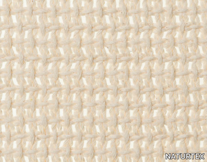
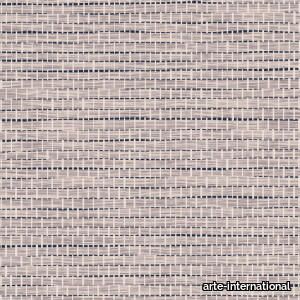
Le Papier Tissé is inspired by woven paper. The fine structure of the paper strips shows the natural fibres and results in a play of slight colour nuances.
Pulse
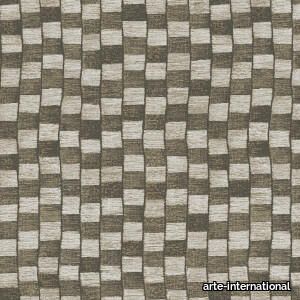
arte-international > Wallcovering
The cube pattern of Pulse is somewhat surrealistic because of its squiggly lines. This pattern also seems to come from the wardrobe of Twiggy, Jackie Kennedy or Brigitte Bardot. This design with vintage vibes is also finished with flock, providing you with ultra-soft walls.
WASHI wallpaper by NLXL
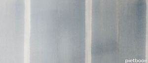
pietboon > Wallcovering
Washi, meaning Japanese paper, is traditional handmade paper of which its rich history dates back to 610 AD. Though the paper nowadays enjoys a contemporary following used for different purposes, it still holds the same characteristics of strength, durability, lightness, warmth and flexibility as the traditional version. Impressed by the paper’ characteristics, versatility and beauty, Studio Piet Boon used it as an inspiration for this wallpaper design: a modern interpretation of Japanese washi paper.
Pyxis
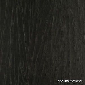
arte-international > Wallcovering
The pleated covering of Pyxis boasts a contemporary look & feel with a matt finish.
Tie-tami Wallcovering
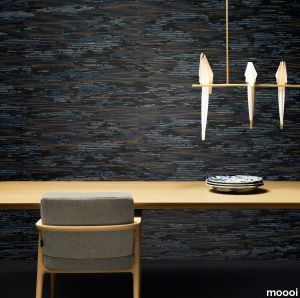
moooi > Wallcovering
Treat your eyes to the rich and versatile colours of spectacular sunset. This jute and raffia wallcovering honouring the ancient Japanese flooring solution of woven tatami-mats pictures abstract clouds that slowly drift by while the day gives way to night.
Damier
arte-international > Wallcovering
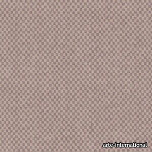
Damier has a uniform appearance from a distance, but close-up you will be overwhelmed by the multitude of squares in contrasting shades. The linen texture lends the print a very gentle and subtle look. The transitions are not quite perfect and this means the pattern is not too tight.
Bandeau
arte-international > Wallcovering
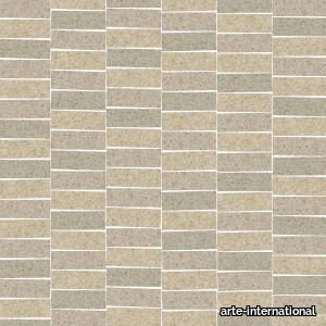
Large sheets with mica flakes are hand-dyed for this pattern. Then rectangles are stamped out of them with the utmost care. These shapes are then glued by hand into the pattern, so that they impart a beautiful yet not too rigid effect.
Ecoline
arte-international > Wallcovering
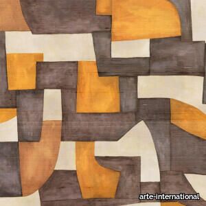
A seemingly arbitrary arrangement of abstract shapes in natural colours gives this pattern an informal vibe. The Ecoline paint adds a unique watercolour effect to the design, which is printed on non-woven.
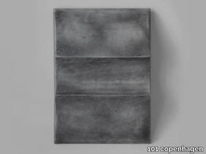
SCULPT ART TRIANGLE - MINI - Recycled paper Decorative panel _ 101 copenhagen
101 copenhagen > Wallcovering
Scope
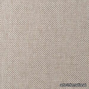
arte-international > Wallcovering
Scope is a plain wallcovering inspired by a steppe, a treeless, vast landscape mostly of grasses. The woven finish gives Scope a soft look, making it a very versatile design.
Tessera
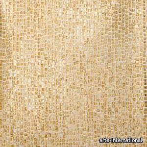
arte-international > Wallcovering
Tessera draws its inspiration from the small squares made of stone, ceramic, terracotta or glass that are used to make mosaic floors or decorative jewellery. This pattern has a highly luxurious feel thanks to the shiny look in the metallic shades of silver, gold, bronze and rose.
Anicca
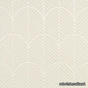
arte-international > Wallcovering
The Japanese term Anicca means changeable in nature. The diagonal lines in this design are uneven and vary in thickness, so that an appealing visual dynamic emerges. The pronounced texture creates a fascinating 3D effect that really brings a room to life, while the soft, seductive velvet finish is almost irresistibly tactile.
Flex
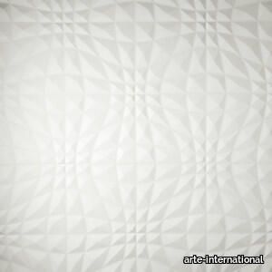
arte-international > Wallcovering
Angular, geometric blocks. At a distance, the blocks become smaller forming a rigid and ‘hilly’ décor.
Ondas
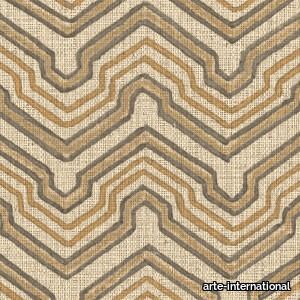
arte-international > Wallcovering
This ethnic pattern with folklore colours is based on an interpretation of natural wickerwork. It carries you along on an endless stream of geometric waves.
Matrice Struttura

florim > Wallcovering
An atlas of modular signs to be combined in a wide variety of layouts. «We love concrete as a material, its versatility and its plain, austere look. We have completed our carefully designed surfaces with graphic patterning inspired by the human actions of weaving and embroidering.» Barbara Brondi & Marco Rainò To appreciate the profundity of the design project undertaken by Barbara Brondi and Marco Rainò for Cedit, it is both necessary and explanatory to start from the title the collection bears. In modern usage the term Matrice, in Italian, refers to a die or mould used to reproduce an object, but its origins are much more remote, with a meaning closer to the English “matrix”, meaning the underlying basis of something. The root of the word is related to Mater or mother: the name Matrice thus relates to the origin or cause of something. This dichotomy is expressed in several levels within the work of these architects, who study the world from a sophisticated conceptual approach and then transform it into a design. Starting from the idea of ceramic coverings, which have always been a tool not so much of architecture as of interior design, the artists work back to the origin of the surface and its decoration within their own discipline: they look at what we used to call the modern age, where modernity has also brought an uncompromising brutality, and where the use of bare concrete became the statement of an attitude to life with no time to spare for manners. Concrete is originally a liquid material, intended for shaping, which can therefore absorb and retain any type of mark created by the material and mould used to form it. Architects midway between rationalism and brutalism have used the rough-and-ready language of concrete combined with a last, elegant, anthropic decorative motif impressed on the material, that makes the concept of covering superfluous, because its place, in its older meaning of decoration rather than functional cladding, is taken by the regular patterning created in the material itself. There are therefore various grounds for believing that, in this collection, the artists are once again working in architectural terms. Firstly, with a simplicity typical of BRH+, they reduce the initial concepts to their minimal terms. So although this is a collection of coverings for walls, indoor floors, outdoor pavings and curtain walls, a great deal of time was spent on destructuring the idea of the ceramic covering itself. Unfortunately, nowadays there is no space in the contemporary construction sector for the radical approach of the past, so the cladding designed for the building actually lays bare the interior, using the choice of material – accurately interpreted (with shade variation) on the basis of an assortment of various types – to restore visual elegance and a fundamental severity. Attention to scale is another architectural feature: Matrice offers modules with architectural dimensions and different sizes through the development of “large slabs”, eliminating the visual regular grid effect. Thanks to this visual reset, geographic forms are perceived to emerge from dense, grey concrete surfaces decorated as in bygone days by special processes and by weathering during drying. The various types of slab, each an atlas of subtle, vibrant signs on the surfaces, comprise finishes that reproduce the visual effect of reinforced concrete – with the aggregates in the cement more clearly visible, of formwork – with the signs impressed on the concrete by the timber used, of a structured surface resembling bare cement plaster, of ridged and streaked surfaces – with patterning resembling some kinds of linear surface finishing processes – and finally a smooth, or basic version, over which Matrice exercises the dichotomy referred to earlier. It is on these surfaces that Brondi and Rainò have imagined additional design reverberations, a figurative code that rejects the concept of the grid, previously inseparable from that of the module: by means of a vocabulary of graphic marks cut into the slabs with a depth of 3 mm (the width of the gap left between modules during installation), they provide a framework for infinite combinations of possible dialogues. Just as in embroidery, which is based on grids of stitches and geometric repetitions, and where every stitch is at right-angles to another one to construct forms and decorations. Also taken from embroidery is the idea of introducing a degree of “softness” to reduce the stiffness of intentionally deaf surfaces. There is the impression of patterns that can continue for infinity, as in textile weaving, and a scale that, unlike the surface being worked on, is imagined as suspended and lightweight. They may not admit it, but BRH+ know a lot about music, including electronic music, and it appears to me that this organised tangle of infinite signs – unidentifiable without an overview – is rather like the representations of synthesized sounds. Sounds that are produced by machines, and thus “woven” by sampling and overlapping sounds of the most unlikely origins, combined to form jingles which, once heard, are imprinted indelibly on the brain. This may be why I am so interested in the space between this “melodic film” and its deaf, damp substrate. The eyes can navigate this suspended reality without fear of disturbance. So we are faced with different surfaces, different sizes and different graphic signs. But only one colour (surprise!) to prevent a cacophony not just of signs but also of possible interpretations: the artists retain their radical principles (and their generosity), and as curators, a role in which they are skilled, they leave the players (architects and installers) to add their own interpretations. In their hands this colour, expressed in Matrice, will produce motifs on surfaces in living spaces for someone else. This stylish covering and its workmanship will be left to the hands of someone who will probably never read this, but will be on a building site, with the radio playing on a stereo system, concentrating on installing the very pieces we describe. So a radical, apparently silent, design project like this has repercussions for the real world we live in. Matrice has no form of its own but merely acquires the ornamentation drawn on its surfaces by a second group of artists. And here this routine action, standardised by the form approved for production and workmanlike efficiency, is the origin and cause of change, generating a variability of choices and interpretations, on that dusty building site where music plays and mortar flows.
