Storie Masseria
florim > Wall Paint
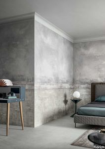
The faded wall fresco, damp stains in plaster. «Technological innovation enables us to reproduce on large-sized ceramic materials all the effects of wear and stratification that normally only time is able to create.» Giorgia Zanellato & Daniele Bortotto Children stare at the walls of a farmhouse, wondering what the cracks are, and whether every mark is a path and every path is a story. They think that miniature beings live in the air pockets that have formed, and the detaching plaster is like an avalanche cascading from a glacier. They don't ask why the colours are as they are, because they just had to be like that. And every square centimetre becomes the first page of an adventure that restarts at every break in the pattern. Could this be why we say that both textures and plots have twists, and stories are woven? As even children know, walls are tales. Not only do they contain adventures, emotions, moments, loves and hates and record them on their surfaces; their uneven, active surfaces generate new imaginary worlds, in which one can literally get lost. The "Storie" collection by Giorgia Zanellato and Daniele Bortotto brings this metaphor to three-dimensional life by expressing the moods, loves and hates and moments that the walls and floors of old Italian homes conserve, and capturing them in a frozen instant. The theme of time and the changes wrought in matter by the passing seasons, weather and human action have always been a strong source of inspiration for architects: some have tried to freeze it, while others have used sleight of hand to embrace it while resisting its effects, and yet others have accelerated, anticipated, directed and re-created it.<br /> Zanellato and Bortotto do all these things at once, engaging in a duel with History with a capital H, in which it is never clear who is winning: design or object, man or nature, culture or time. And it is probably this unresolved tension which makes the "Storie" designs so universal and meaningful, so intimate and yet familiar. The floor is the only thing we can be certain that everyone entering our home will touch, and at the same time it is the most intimate part, the most steeped in private happenings. They talk about having your "feet firmly on the ground". This image stands for common sense, but also a recognition of how things are, how things work. The wall is a synecdoche, too: it is the part of the home that expresses an idea of solidity, the layering of time, the passage of lives. "Storie" gives form to this metaphor by drawing a line that links the most classical of taste to a sophisticated modernity of taste and style. The two designers did a great deal of background work for this project: old Italian homes, country villas, noble palazzos, farmhouses and old factors, which become an unlimited source of motifs, colours, textures and materials. But, perhaps unconsciously, literature also re-emerges from this survey of locations, with its blend of aestheticism and decadence, with echoes of Wilde and D'Annunzio, Ruskin and Huysmans. "Storie" would be the ideal backdrop for Des Esseintes, the dandy in "A Rebours". And in fact the collection clearly has strong theatrical connections, arising partly from its storytelling connotations but also from its scene-setting potential.<br /> It represents life, which we are, have been and wish to continue to be. And it is thrilling to realise that this vision comes from the youngest designers in CEDIT's new era, who have successfully taken a confident, cultured, astute, sidelong approach to the most ancient of topics, with a persuasive effect which appears, at least, to be not at all intimidated by the many stories, the type of product they are dealing with, the catalogue in which they are included, the designers who have gone before them or, naturally, the adventures that lie concealed in the historic dwellings they reproduce. The reference to Italy, on the other hand, is in perfect harmony with the work of the brand and its past and present designers: it is intrinsic to the perfection of the production process that underlies the collection, the relationship with the brand's tradition and its local roots, and the intelligent, strategic use of its innovations in the treatment of this complex material.Child's play? Yes, but with the integrity and ability to enchant unique to specific designs, capable of an immediacy of vision and feeling that makes them little novels written in cement.
Cromatica Bianco
florim > Wall Paint
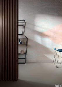
A lexicon of colour shades for mixing. A large size and its submultiples. «This work represents a reflection on colour, and above all a proposal on how to transfer the multiplicity of shades typical of a hand-crafted piece into a project produced on a large scale.» Andrea Trimarchi & Simone Farresin Studio Formafantasma base their work in the design world on a strong vocation for research. Simone Farresin and Andrea Trimarchi view every project as an opportunity for study and the acquisition of new knowledge, and their love of speculation establishes a dialectic rapport with the situations offered by each new client. Whether it involves a material, a type or a production method, the first phase of their design process is the mapping of what the specific case places at their disposal. With Cedit, an analysis of the company's past and present was central to the inputs. Inevitably, since "Looking back to look forward" has been the design duo's mission statement for years. In this case, in particular, the company's history was a real treasure trove, a fine blend of memory and technology: on the one hand, the excellence of production technologies now extended with the added potential arising from the engineering of large-sized ceramic tiles, and on the other a wealth of experience build up with great designers of the past, from Zanuso to Noorda, through to <strong>Ettore Sottsass</strong>. Andrea and Simone decided to focus on Sottsass - who started designing for Cedit back in the late Seventies - and made an in-depth study of one of the colour charts he developed towards the end of the Nineties. A spread of colours which gave its name to the "41 Colors" collection, included in the catalogue of the period as a real alphabet for what has proved to be a lasting design language. Colour was much more than just a compulsory step in the dialogue between designer and producer, since Sottsass had already discovered the power of the mystery intrinsic to this universe of invention.<br /><br />With Cedit the master-designer, a long-established lover of ceramics and their crafted unpredictability, found a way of transferring his personal feeling for colour to a wide audience, through industrial mass production. And this assumption is another factor Formafantasma have inherited, interpreting it today with new, even more efficient technical resources just as capable of expressing the secrets of colour. «The concept of colour "in isolation" - Sottsass explained in a 1992 text - classified colour, Pantone, as they call it now, "scientific" colour, is something I still refuse to accept. (...) Colours, the idea of colour, are always intangible, they slip slowly away like words, that run through your fingers, like poetry, which you can never keep hold of, like a good story.» And Formafantasma seem to have chosen that distinction between colour "in isolation" and "intangible" yet ever-present colour as the basis of their work. However, their approach draws on their unique vocation for research and the technical resources of the third millennium. «This work - they explain to us - is a reflection on colour, and above all on <strong>how to bring the multiplicity of shades typical of a hand-crafted piece into a large-scale project</strong>.» The designers look at large, monochrome slabs and turn to the engineers for details of their secrets, their processing stages, the phases in their production. They appreciate that the colour of ceramic material, its ineffable secret, can still be present in the series and large tile sizes in which Cedit leads the way. They understand that this is, in itself, an expressive power which does not need channelling into forms, motifs and signs. But above all, they treat the surface as a large canvas on which they spread pure colour, which tends to be uniform but in fact is never really a "scientific", totally monochrome hue: it is not a Pantone. And this is the source of the fundamental insight, which only children of the transition from the analogue to the digital era could achieve, the reward for those who draw on the past to look to the future.<br /><br />The designers cut the slab into lots of regular pieces, not necessarily of the same size. They restore its identity as a "tile", a familiar name with something ancient about it, but which stands for a module, a unit of measurement, a building block. There is nothing nostalgic about this - on the contrary, the vision is completely new, and the portions of slab created can be reassembled with no restrictions, breaking down the unity of the whole and reviving its essence starting from its structure. As the cards in the pack are shuffled, what emerges is not a figure or motif but the representation of colour itself and its physical nature. It is live matter, born from the meeting of vibrating forces, the mixing of ever-varying percentages of the basic ingredients. And Formafantasma present us with the corpuscular, fragmented essence of these small frames of space and crystallised time, which reveal the code and formula of their composition. So Cromatica is a collection made up of six colours which actually have an infinite number of declinations and compositional possibilities. It is a "discrete" combination in the mathematical sense of the term, capable of generating multiple, variable subsets. At the same time, each slab can be used in its entirety, leaving the impression of analogue continuity unchanged. But what really amazes is the comparison and dialogue between the two approaches: a stroke of genius, laying clear the mysterious appeal the artificial reproduction of colour has always held for mankind. Because, as Sottsass said, «colours are language, a powerful, magical, intangible, flexible, continuous material, in which existence is made manifest, the existence that lives in time and space».
Neutra 6.0 07 petrolio
florim > Wall Paint
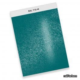
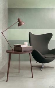
After a decade of success, the Neutra collection becomes a container of colors and increasingly advanced materials and transforms into Neutra 6.0. The surfaces thereby create scenery for pure sensory pleasure, where nothing is left to chance, but everything is always skillfully calibrated to the search for a new bon ton where the body and mind can be rejuvenated. The perfect integration between man and the space in which he lives is expressed through a simple architecture where you can spread your artistic sign on the surfaces, in the colors and in the furnishing for an unrepeatable result from which your own creative identity emerges.
