
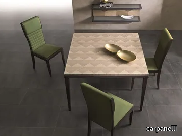

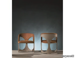
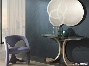
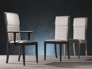
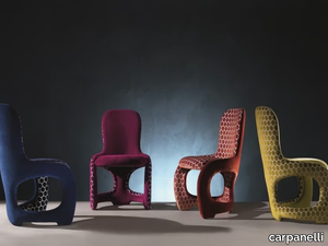
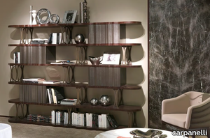
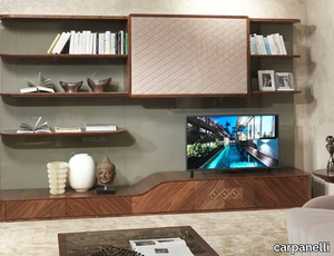
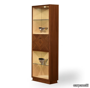
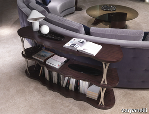
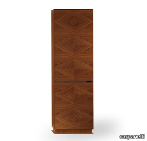
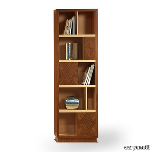
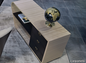
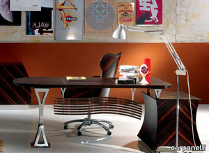
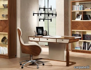
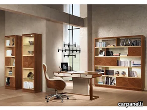
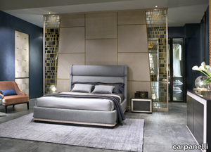
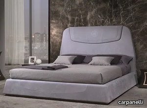
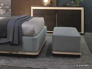
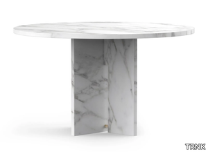
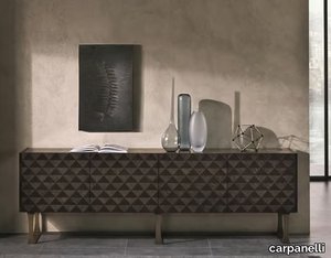
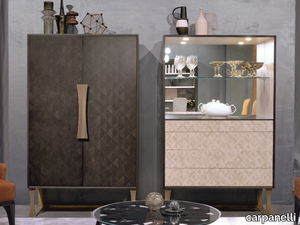
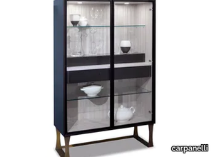
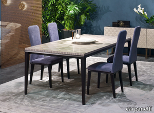
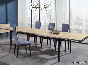
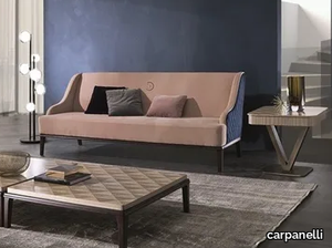
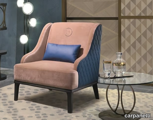
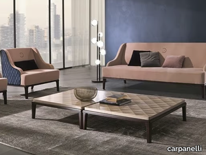
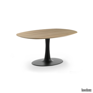
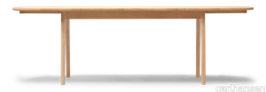
SUPPLIER: CARPANELLI
COLLECTION: SQUARE
TYPE: FURNITURE

OTHER SUPPLIERS
A wide range of product from near to 3,000 suppliers around the world.


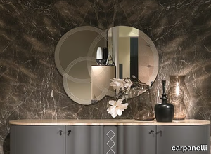
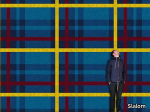
Other Products From This Supplier
A wide range of product from furniture to finishes to meet the desire of all designers.

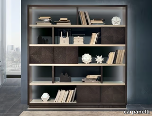


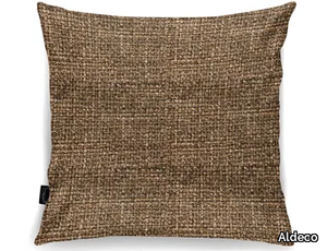
Recently Viewed Products
A wide range of product from furniture to finishes to meet the desire of all designers.
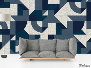

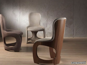
Products From the Same Collection
A wide range of product from furniture to finishes to meet the desire of all designers.
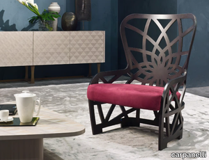
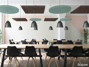
Recommended Products
A wide range of product from furniture to finishes to meet the desire of all designers.
70/70 Table
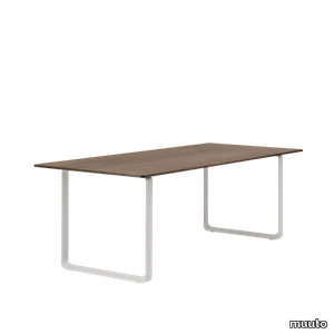
muuto > Table
The 70/70 Table is designed with a simple expression, paired with subtle, understated details that reveal themselves upon closer inspection. Adding character to the design, the details of the 70/70 Table include the triangular shape of its base for a modern expression and the slanted edges of the table top. Available in a variety of sizes and finishes, the 70/70 Table is an ideal match for any dining area, home office, workplace or hospitality area.
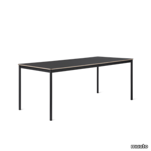
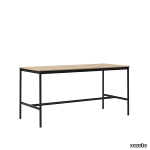
Workshop Table
muuto > Table
The Workshop Table joins together the ideals of Scandinavian craftsmanship and subtle detailing for a deliberately simple and archetypal expression. With its tabletop in either oak veneer or linoleum harmoniously carving itself into the solid oak frame, the Workshop Table brings a refined and understated appearance to any setting.
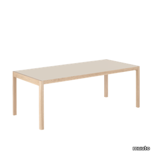
Base Table
muuto > Table
The Base Table references the heritage of Scandinavian design through its simple frame and subtle details. With its design harking back to the essence of a table, the Base Table features a veneer edge for a touch of Scandinavian materiality, paired with the elegant shapes of its table top and frame. Use the design in any home, workplace, educational institution or hospitality space for notes of Scandinavian simplicity.
Base High Table
muuto > Table
The Base High Table references the heritage of Scandinavian design through its simple frame and subtle details. With its design harking back to the essence of a table, the Base High Table comes with either a veneer edge for a touch of Scandinavian materiality or an edge in ABS for a monochrome appearance, paired with the elegant shapes of its table top and frame. Use the design in any workplace, educational institution or hospitality space for notes of Scandinavian simplicity.
Linear System Configurations

muuto > Table
The Linear System Table is a simple yet refined table with subtle details and references to the Scandinavian design heritage. Its legs are cut into half-circles and joined with the table for a light expression while the slender overhang at both ends of the table makes for a refined expression. The Linear System Table is available as a freestanding table to be used on its own, as predesigned configurations or as Middle and End Modules that can be configured to the exact needs of your space.
Base Table With Castors
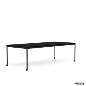
muuto > Table
Simple and elegant lines, joined by the functionality of castors. Frame is made from extruded aluminum, painted with an acrylic paint initially developed for outdoor interiors and building facades. Organize and manage cords and wires with our Cable Management. Our Power Outlet can be added to the Base Table. Made-to-order: Laminate with ABS or plywood edge in black or white. Linoleum with plywood edge in black. Nanolaminate finish in either black or white. Bases available in Black or White with matching castors.
Toveri Dining
leolux > Table
Studio Truly Truly has designed a wonderfully luxurious dining table to join the Toveri family by Leolux. Just like the coffee tables, the Toveri dining table is an interplay of soft shapes and hard materials, shadows and curves.
Bondi
leolux > Table
Leolux was looking for something new, a table that adds a pop of colour to the interior. Bondi is the perfect answer. Its unusual organic leaf shape is the first thing to stand out, with space for at least five users.
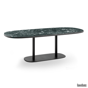
Columna
leolux > Table
Columna is a table built on pure form, with the base and table top connected by a straight column. The only playful element Hugo de Ruiter allowed is the way the column links to the base: like an ancient marble column.
Viscount of wood rectangular
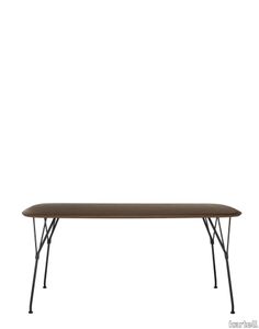
kartell > Table
VISCOUNT OF WOOD tables are the latest addition. These naturally composed tables complement the collection's choice of seats and create a sustainable living area in which wood plays a central role thanks to its lightweight properties. These large items of furniture feature top-quality materials and advanced manufacturing technology. The square and rectangular versions with four legs come in five sizes (100x100, 145x80, 160x90, 190x90 and 240x100) and three top finishes: light ash with two darker shades, flamed walnut and a third, characterised by thin strips of different tones of dark wood. The legs are in chrome or black.
Glossy marble oval
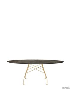
kartell > Table
A family of tables ideal for the home and office. The light steel structure is made particular by the use of the cross element that joins the legs on each of the four sides, supporting the top. The collection comprises square, oval and round versions.
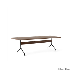
Pavilion AV18
&tradition > Table
Available in three sizes, the larger, six or eight-person Pavilion table is ideal for an office meeting room or dining space while the smaller, four-person version is a perfect addition to the home. The table can be matched with the Pavilion desk to provide a cohesive design experience, and cable management can be easily inserted into the table due to the location of the stretcher.
Pavilion AV24
&tradition > Table
Available in three sizes, the larger, six or eight-person Pavilion table is ideal for an office meeting room or dining space while the smaller, four-person version is a perfect addition to the home. The table can be matched with the Pavilion desk to provide a cohesive design experience, and cable management can be easily inserted into the table due to the location of the stretcher.
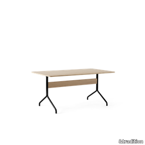
In Between SK4
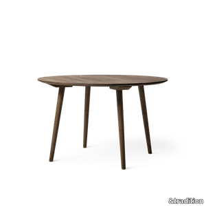
&tradition > Table
Inspired by the Scandinavian heritage of design and furniture craftmanship, In Between is a result of Sami Kallio’s solid grounding in traditional wood- working techniques and his eye for ingenious detail. It started with a single chair which later resulted in a series of furniture including both tables and bar stools. Get this In Between dining table in three different variants.
BM1160 Hunting Table
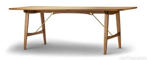
carlhansen > Table
Børge Mogensen designed the BM1160 Hunting Table for the Copenhagen Cabinetmakers’ Guild Furniture Exhibition in 1950. The table combines excellent woodwork with elegant metal brace bars, creating a bold and organic whole.
CH002 Dining Table
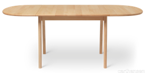
carlhansen > Table
The CH002 is the smaller of two dining tables that Hans J. Wegner created in 1982. The table expresses Wegner’s functional design philosophy through an appealing solution for modern interiors. The CH002 is crafted to fit smaller spaces, and can be extended easily with two accompanying leaves.
CH006 Dining Table
carlhansen > Table
At 90 x 138 cm, the CH006 is a longer version of the CH002 dining table, designed in 1982. The table, with solid extension frames and built-in grip for the two hinged extension leaves with rounded edges, illustrates Hans J. Wegner’s visionary approach to functional design. The CH006 table is versatile and can be adapted to smaller gatherings as well as larger dinner parties.
UPHOLSTERY
A wide range of Upholstery and materials provided by our suppliers to satisfy your needs.
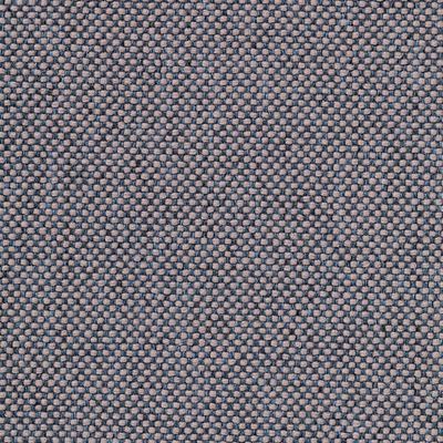
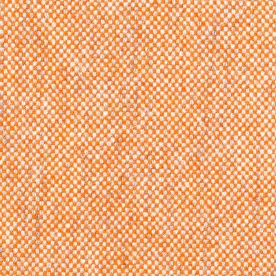
auckland - 7071.18
Upholstery > vescom
auckland - 7071.28
Upholstery > vescom
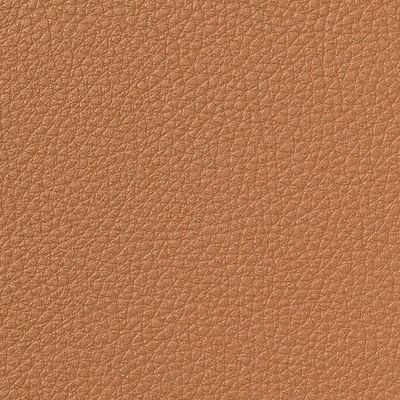
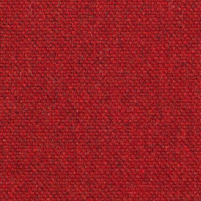
harding - 7070.07

Upholstery > vescom
harding - 7070.08
Upholstery > vescom
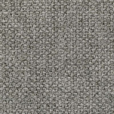
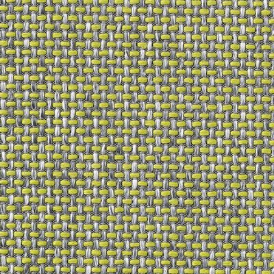
furka plus - 7064.14

Upholstery > vescom
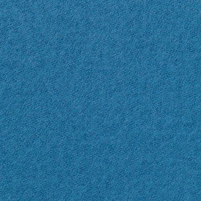
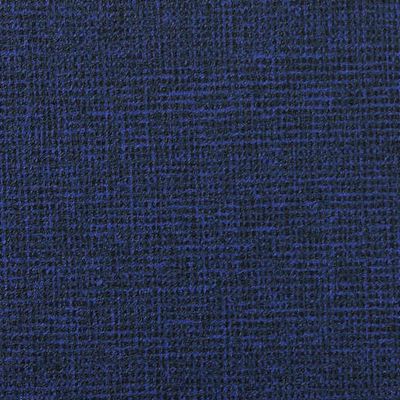
acton - 7062.20
Upholstery > vescom
leone plus - 7054.02
Upholstery > vescom
noss - 7058.13
Upholstery > vescom
lani - 7060.49
Upholstery > vescom
wolin - 7050.32
Upholstery > vescom
wolin - 7050.35
Upholstery > vescom
hestan - 7035.11

Upholstery > vescom
hestan - 7035.22
Upholstery > vescom
cyprus - 7038.15
Upholstery > vescom
lindau - 7028.01

Upholstery > vescom
lindau - 7028.09
Upholstery > vescom
dalma - 7024.13

Upholstery > vescom
dalma - 7024.14
Upholstery > vescom