
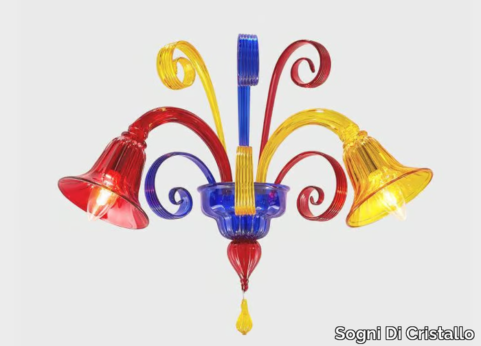

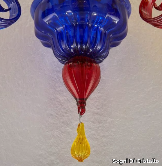

SUPPLIER: SOGNI DI CRISTALLO
COLLECTION: CLASSICI VENEZIANI
TYPE: LIGHTING
OTHER SUPPLIERS
A wide range of product from near to 3,000 suppliers around the world.


Other Products From This Supplier
A wide range of product from furniture to finishes to meet the desire of all designers.
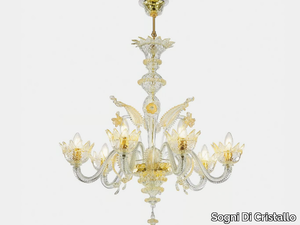
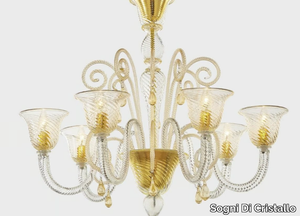
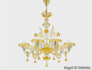
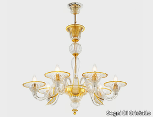
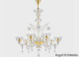
CA' REZZONICO DOMUS AUREA - Murano glass chandelier _ Sogni Di Cristallo
Sogni Di Cristallo > Ceiling lamp
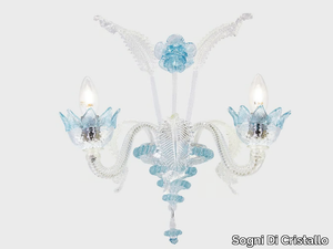
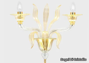
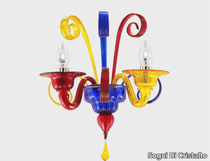
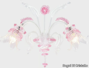
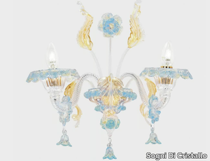
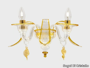
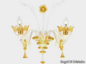
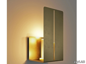
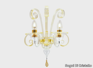
NETTUNO ORIGINAL EDITION - Murano glass wall lamp _ Sogni Di Cristallo
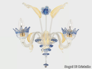
Sogni Di Cristallo > Wall lamp
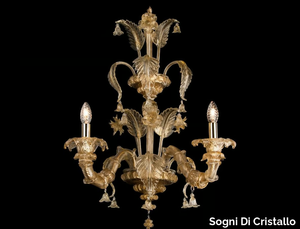
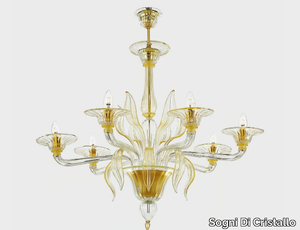
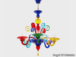
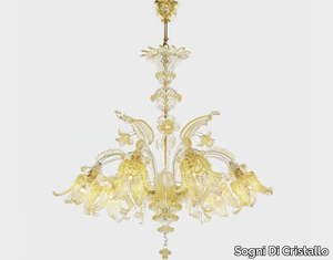
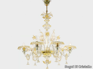
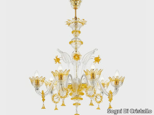
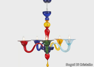
NETTUNO ORIGINAL EDITION - Murano glass chandelier _ Sogni Di Cristallo
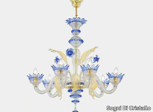
Sogni Di Cristallo > Ceiling lamp


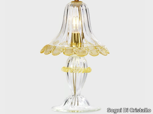
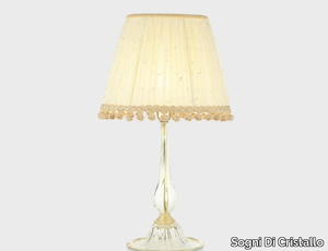
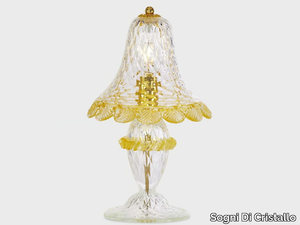
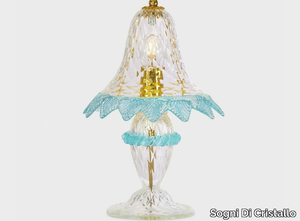
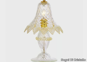
CA' REZZONICO GOLD - Handmade Murano glass table lamp _ Sogni Di Cristallo
Sogni Di Cristallo > Table lamp

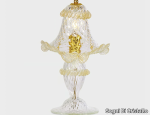
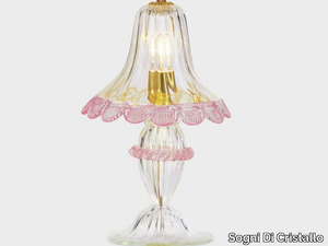
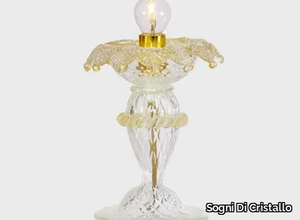
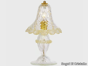
EURIDICE ORO - Handmade Murano glass table lamp _ Sogni Di Cristallo
Sogni Di Cristallo > Table lamp
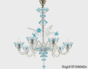
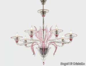
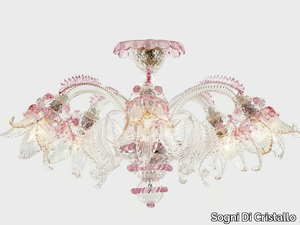
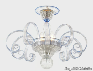
DOLOMITI ICE EDITION - Murano glass chandelier _ Sogni Di Cristallo
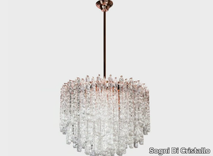
Sogni Di Cristallo > Ceiling lamp
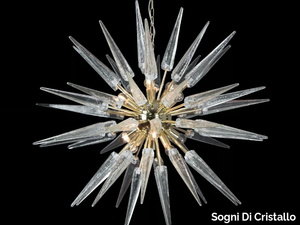
SPUTNIK ORIGINAL EDITION - Murano glass chandelier _ Sogni Di Cristallo
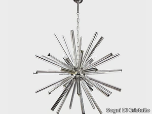
Sogni Di Cristallo > Ceiling lamp
Recently Viewed Products
A wide range of product from furniture to finishes to meet the desire of all designers.
EGO - F5739SC - Countertop single handle washbasin mixer _ Rubinetteria Giulini
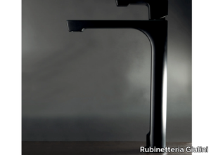
Rubinetteria Giulini > Tap
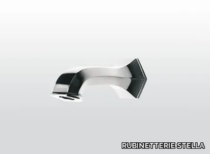
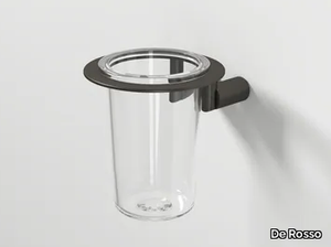
BD0-07 - Ceiling mounted brass shower arm _ Rubinetterie Mariani
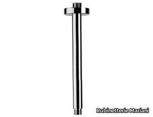
Rubinetterie Mariani > Sanitary accessories
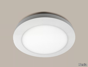
CLASSIC GLOBE - Matt opal glass and porcelain wall lamp / ceiling lamp _ Ifö Electric
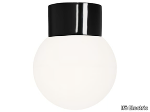
Ifö Electric > Wall lamp

GILDA - Tartan textile effect wallpaper _ Adriani e Rossi edizioni
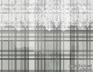
Adriani e Rossi edizioni > Wallpaper
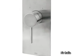
PEPE XL 12519 - Recessed shower set with hand shower _ Rubinetterie Frattini
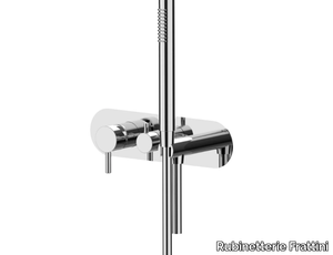
Rubinetterie Frattini > Tap
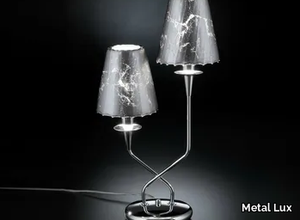
LARA 4400/16+4-SH/P - Shaded gold plated chandelier with Schoeler crystals _ Possoni Illuminazione
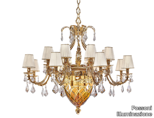
Possoni Illuminazione > Ceiling lamp
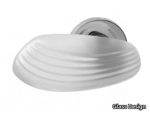
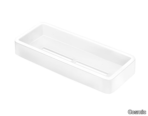
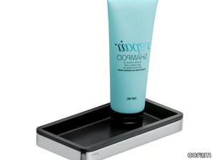
ARCHITECT 2900239 - Wall-mounted stainless steel soap dish for shower _ Cosmic
Cosmic > Sanitary accessories

Products From the Same Collection
A wide range of product from furniture to finishes to meet the desire of all designers.
NETTUNO ORIGINAL EDITION - Murano glass wall lamp _ Sogni Di Cristallo
Sogni Di Cristallo > Wall lamp
NETTUNO ORIGINAL EDITION - Murano glass chandelier _ Sogni Di Cristallo
Sogni Di Cristallo > Ceiling lamp
CA' REZZONICO GOLD - Handmade Murano glass table lamp _ Sogni Di Cristallo
Sogni Di Cristallo > Table lamp
EURIDICE ORO - Handmade Murano glass table lamp _ Sogni Di Cristallo
Sogni Di Cristallo > Table lamp
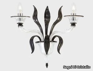
MERCURIO D'ORO - Handmade Murano glass wall lamp _ Sogni Di Cristallo
Sogni Di Cristallo > Wall lamp
MERCURIO WITH CURLS - Handmade Murano glass ceiling lamp _ Sogni Di Cristallo
Sogni Di Cristallo > Ceiling lamp
Recommended Products
A wide range of product from furniture to finishes to meet the desire of all designers.
Calm Wall Lamp
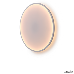
muuto > Wall lamp
Calm Wall Lamp offers a new perspective on lighting altogether, with a rare blend of atmospheric lighting and sculptural qualities. While it is inherently functional, it is also a work of art in its own right. Its textile surface gently diffuses the light, forming a gradient from its edge to the central light source. The ability to adjust the lighting temperature allows the user to create calm, atmospheric light according to their own preferences and needs. A matte rubber band frames Calm Wall Lamp, lending a crisp edge to the softness of the organic design.
Rime Wall Lamp
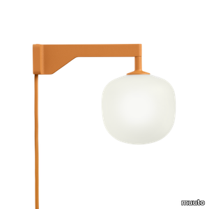
muuto > Wall lamp
The Rime Wall Lamp brings an elegant perspective to the glass light through its semi-transparent glass that has been sandblasted for a refined expression. The design features a characteristic form, inspired by the shape of acorns, complemented by the geometric shape of its arm. The Rime Wall Lamp features a dimmability light source, allowing for its user to adjust the light intensity to their individual needs, be it in the home, a restaurant or a hotel room.
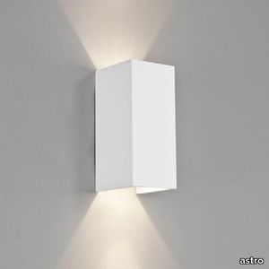
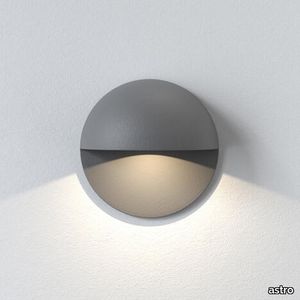
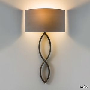
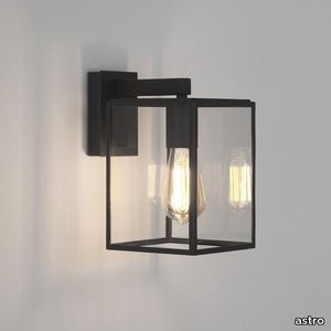
Milo 300 Gloss Glaze White
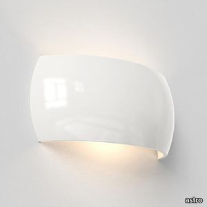
astro > Wall lamp
This stylish wall light provides atmospheric mood lighting, casting a generous wash of light upwards and downwards.Carefully finished by hand, Milo's restrained design allows it to blend in anywhere. Use one wall light to gently illuminate a dark corner, a cluster to form atmospheric pools of light, or a row to draw the eye along a corridor, hallway or staircase.
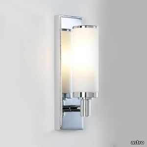
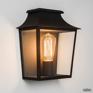
Versailles 400 Phase Dimmable Bronze
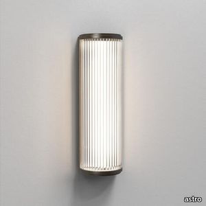
astro > Wall lamp
Our Versailles 400 wall light is inspired by classic 1930s designs, updated with a modern dimmer function. It's intended primarily for bathrooms, but the streamlined design complements any space. Made from individual glass rods with bronze end caps, it provides functional, glare-free task lighting that exudes vintage glamour.

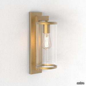
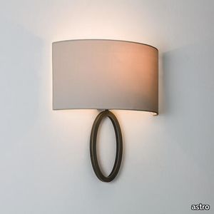
Caserta Bronze
astro > Wall lamp
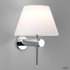
You are currently viewing our Caserta wall light. The compatible shades available are sold separately and can be added below using our shade chooser.
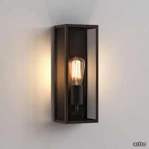
Lima Bronze
astro > Wall lamp
You are currently viewing our Lima wall light. The compatible shades available are sold separately and can be added below using our shade chooser.
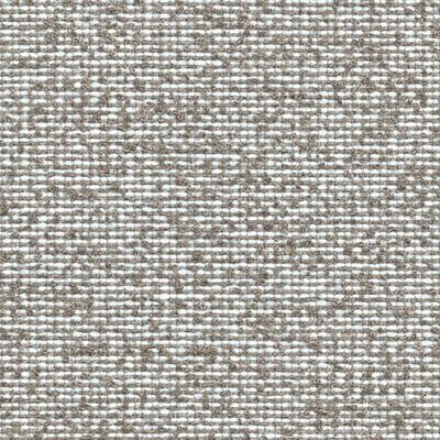
UPHOLSTERY
A wide range of Upholstery and materials provided by our suppliers to satisfy your needs.
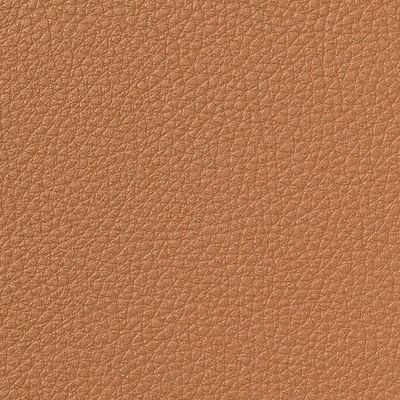
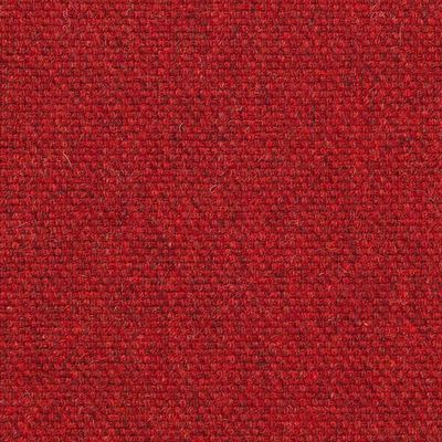
auckland - 7071.18
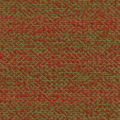
Upholstery > vescom
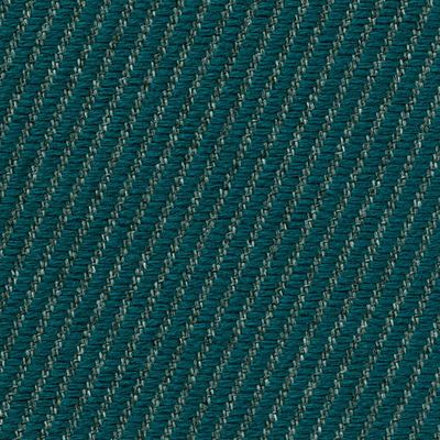
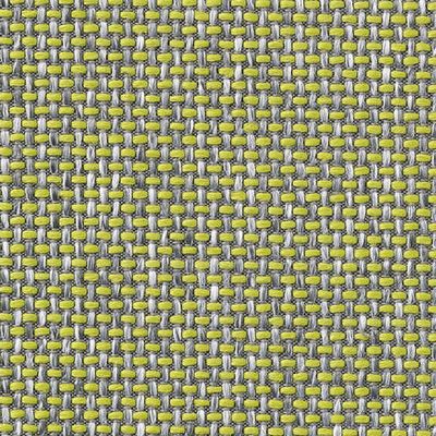
auckland - 7071.28
Upholstery > vescom
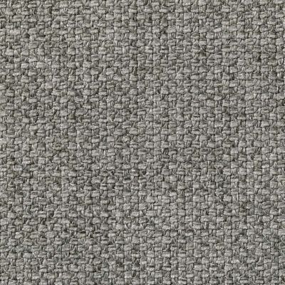
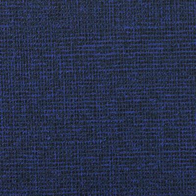
harding - 7070.07

Upholstery > vescom
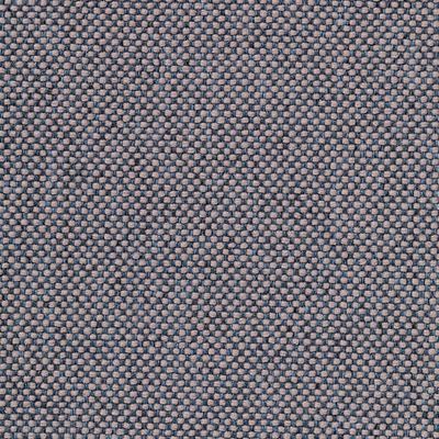
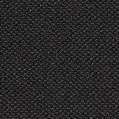
harding - 7070.08
Upholstery > vescom
furka plus - 7064.14
Upholstery > vescom
acton - 7062.20
Upholstery > vescom
leone plus - 7054.02
Upholstery > vescom
noss - 7058.13
Upholstery > vescom
lani - 7060.49
Upholstery > vescom
wolin - 7050.32
Upholstery > vescom
wolin - 7050.35
Upholstery > vescom
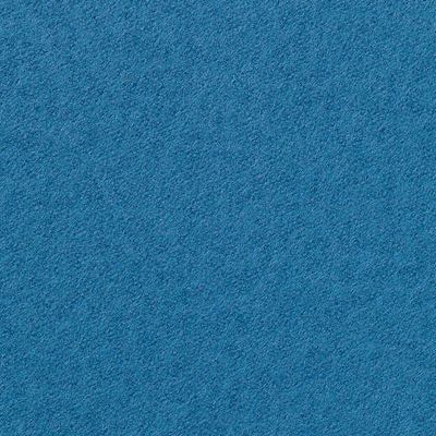
hestan - 7035.11

Upholstery > vescom
hestan - 7035.22
Upholstery > vescom
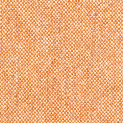
cyprus - 7038.15
Upholstery > vescom
lindau - 7028.01

Upholstery > vescom
lindau - 7028.09
Upholstery > vescom
dalma - 7024.13

Upholstery > vescom
dalma - 7024.14
Upholstery > vescom